
Abi Campbell’s modest home is a world away from the luxury five-bedroom house she once had in London – but she couldn’t be happier. The Victorian cottage is half the size but has twice the punch now she has put her own stamp on it with her ‘blue period’.
Read on to find out how she transformed it into the perfect family house, giving it a fresh new look, then browse the rest of our real home transformations. Read our guide on renovating a house, too, for more guidance.

Abi painted the tongue-and-groove panelling white in order to maximise the light in the narrow staircase and hall. The stairs themselves are engineered oak by Waxed Floors. The stairwell makes a good display space for more framed artwork
Abi has completely transformed the property with her Amercian-inspired design ideas, antique furniture and French-style panelling. It took just three months to modernise the dated interior in a whirlwind renovation project, which involved stripping her new home back to a shell and redesigning every room.
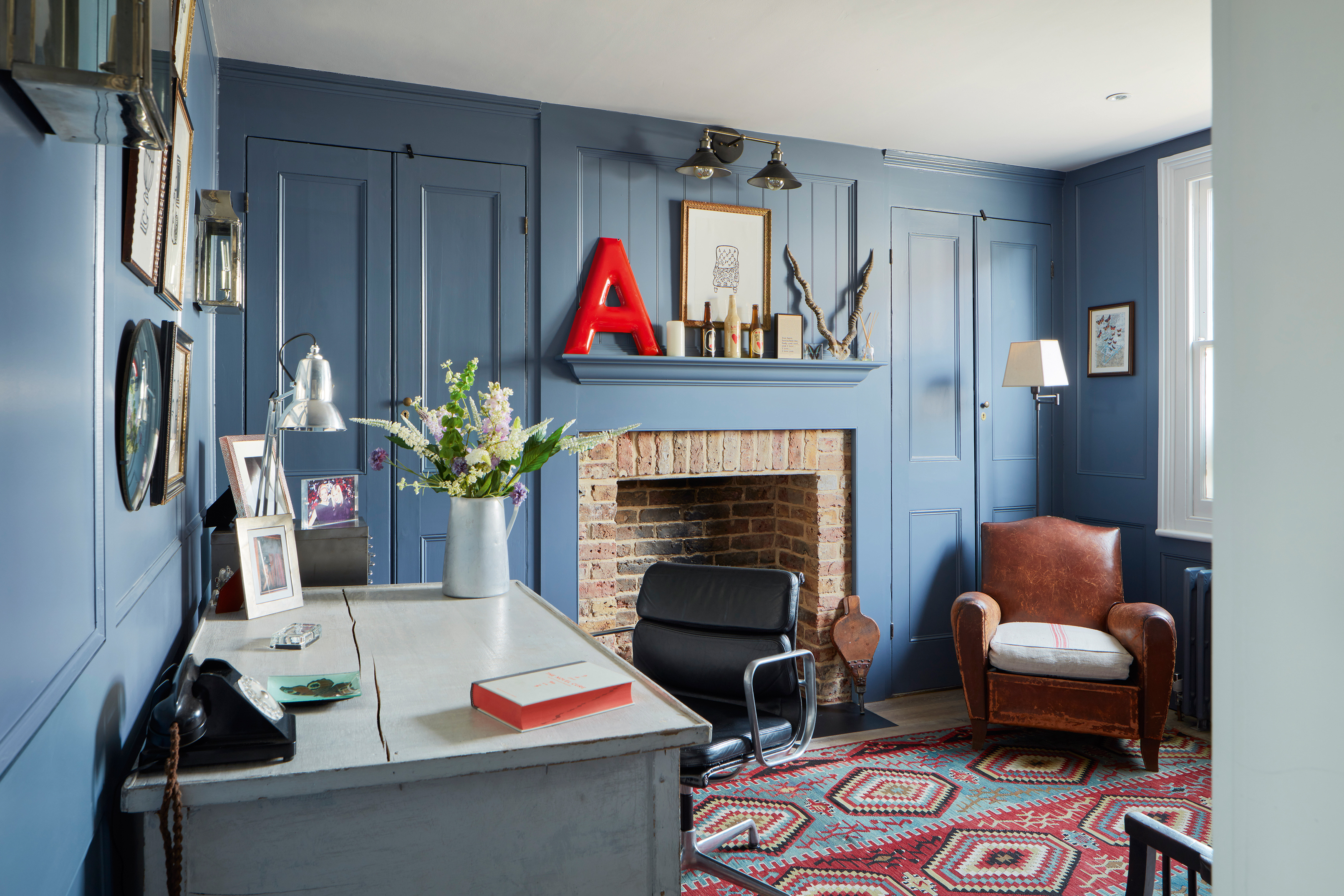
The original fireplace had been boarded up, so was rebuilt by Fireplace Restoration in Surrey. The leather tub chair is from
La Belle Étoffe, the kilim rug is from The Rug Stores, and the red A letter, part of an old American gas station sign, is from Etsy
THE STORY
Owner Abi Campbell is a photographer and travel writer. She lives here with daughter Jemima and son Ellis, and their Russian Blue cat, Luna.
Property A three-bedroom Victorian worker’s cottage in Cobham, Kent.
What she did Abi updated the plumbing, electrics, kitchen, bathroom and floors, decorated throughout and added wall panelling.
‘The house really had been well loved by the previous owners, but the décor was dated, the rooms were used very differently to the way they are now, and it felt generally dark and cramped,’ says Abi. ‘I was on a mission to maximise the space.’
The property had already been extended, so the first thing Abi did was work out how she could use the space more efficiently for her own needs. By removing doors, moving the dining room from the front of the house to the back – next to the kitchen – and redesigning the kitchen and bathroom layouts, she quickly created a better flow.

Hugo Guinness prints hang over a Shaker-style bench bought for £100 online and re-covered with French linen. The unusual wall light fittings are from Soho Home
‘I wanted the house to draw you in and have a sense of purpose,’ she says. ‘Although it’s small I wanted it to feel light and spacious, without losing its relaxed sense of homeliness and comfort.’
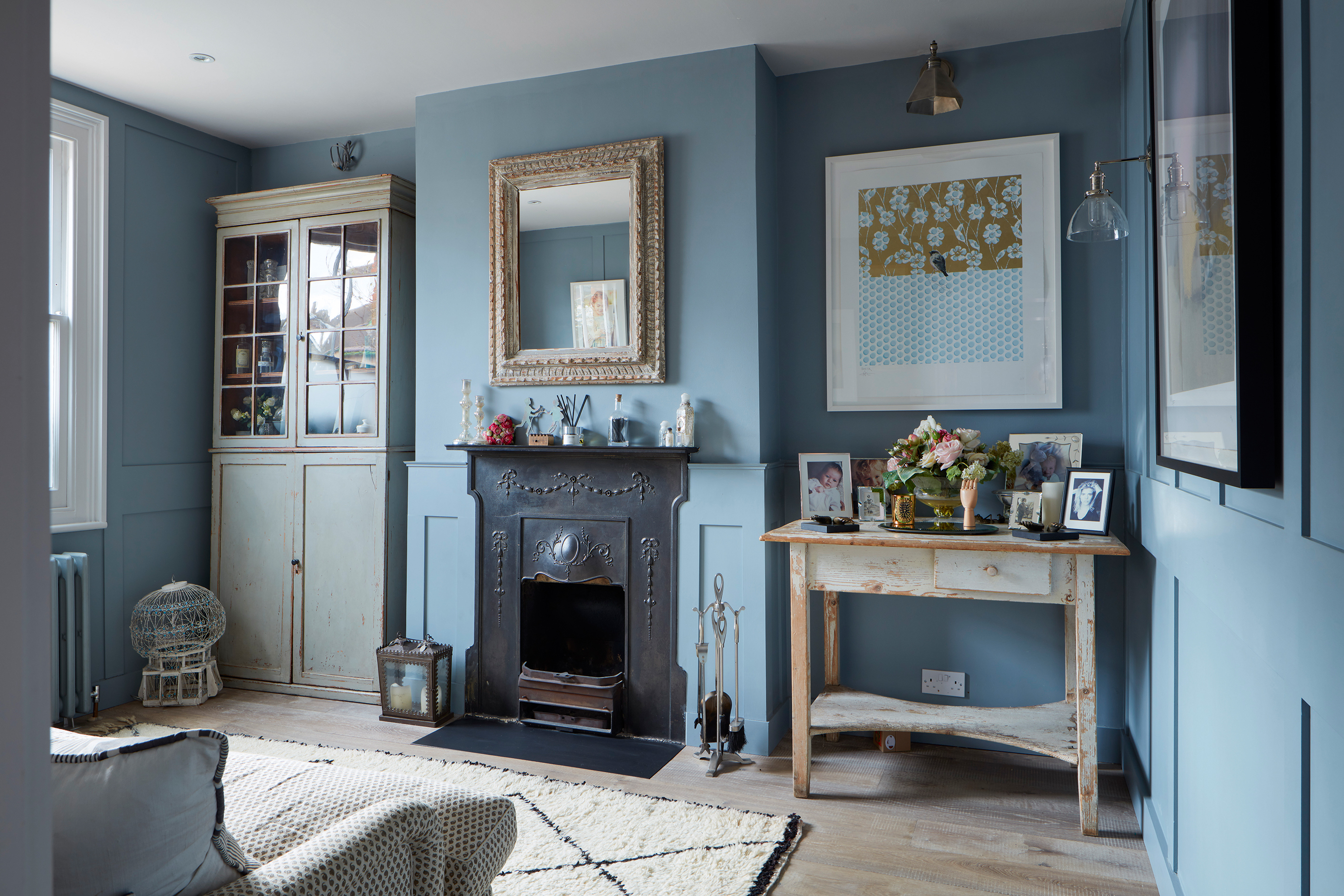
The original living room fireplace inspired the MDF panelling; Abi bought the old mirror above it at The Decorative Antiques & Textiles Fair. The glazed cabinet in the alcove is on loan from Abi’s sister and the Benny rug is from a market stall
She began by stripping out all the interior fixtures and fittings and taking it back to a shell. Having renovated houses before, she knew it made practical and financial sense to do everything in one go, and get it finished before moving in, so she set herself a strict timescale and managed everything, from the sourcing of building materials to the commissioning of tradespeople and interior design.
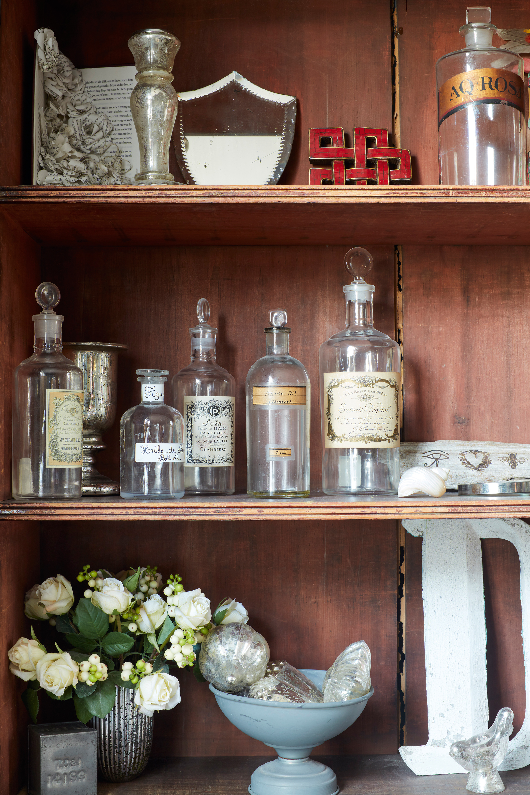
‘I threw myself into it and became obsessive about detail, spending hours researching everything to get exactly what I wanted,’ says Abi.
‘As I’m a photographer, I understand the importance of light, so I am particularly passionate about getting the lighting right in my home. I sourced most of my fittings through Etsy and drew up a lighting plan very early on, because I believe it is the most important part of the house. Lighting creates atmosphere, so I don’t give up until I find what I’m looking for, and if I can’t find what I’m looking for I have it made.’
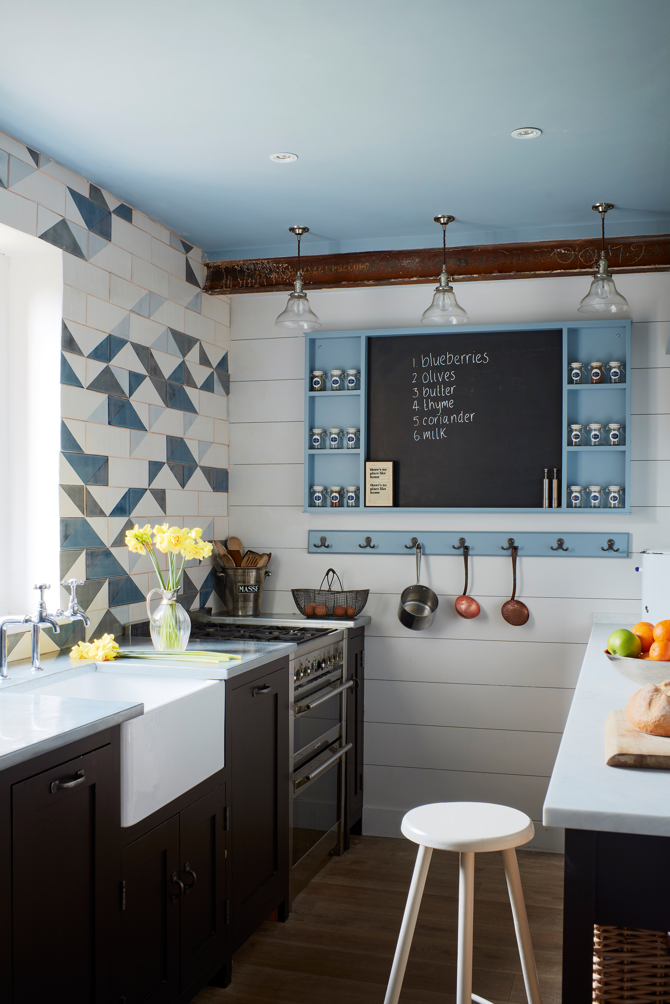
The tiny kitchen has been redesigned with zinc worktops and dark brown units by cabinetmaker Charlie Kingham. Handmade bespoke wall tiles from Smink Things are given a touch of ‘chaos’ with an abstract feature wall
The house was rewired and new floors laid, including aged-style floorboards throughout. The kitchen is small and had been full of cupboards on all sides, including the walls, which made it ‘look like a cupboard’, so Abi gave Charlie Kingham of Marylebone carte blanche to create a kitchen that would open up the small space.
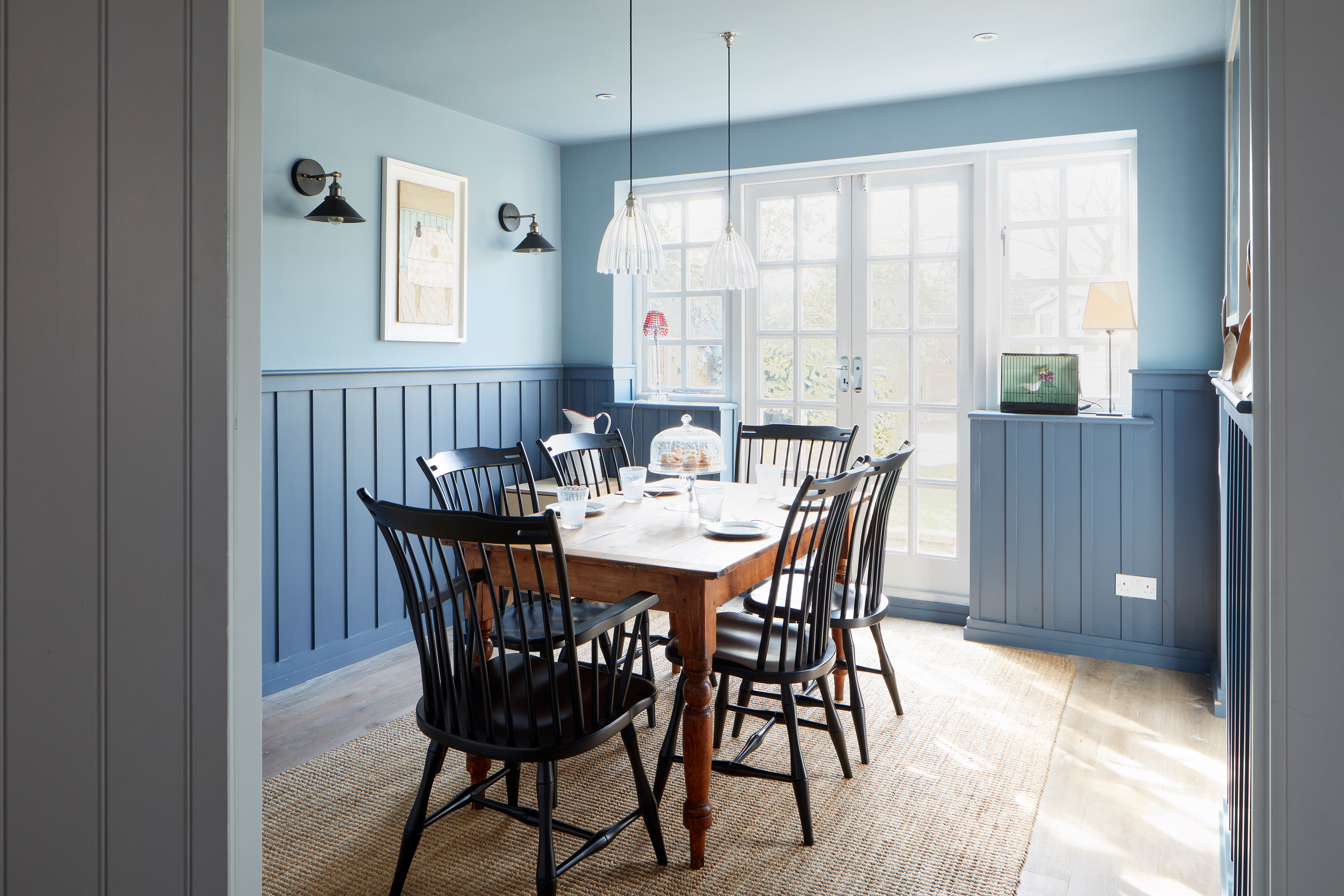
The table was an Ebay find and the Shaker chairs were made by Devin Ulery for Custom Made and shipped from America. The sisal rug is from Ikea
Choosing paint colours was a challenge, and it took 82 samples to find the right shade of blue, inspired by a house she had stayed at in Iceland. ‘I call it my blue period,’ she laughs.
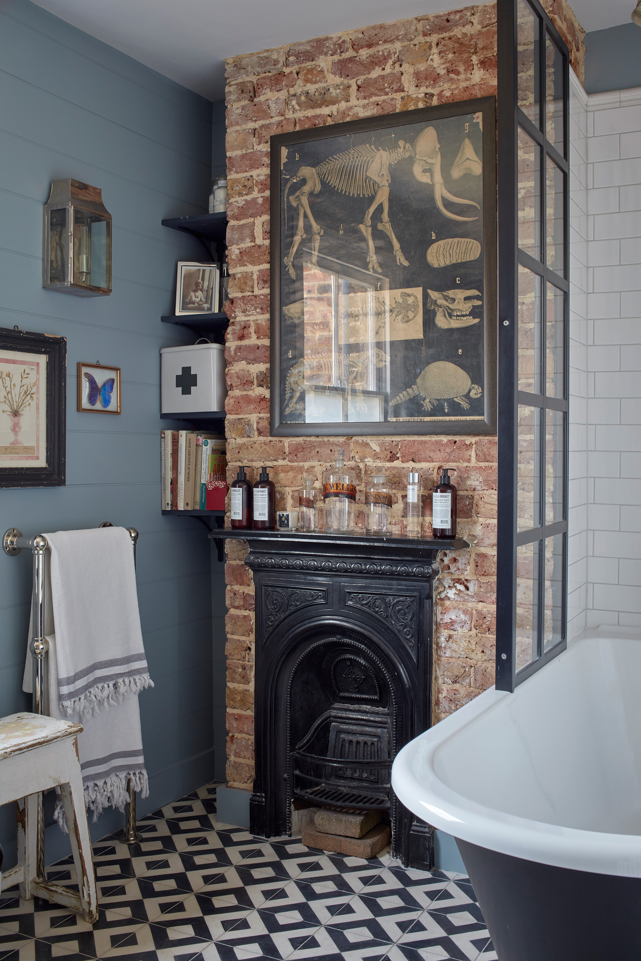
Abi designed her luxurious bathroom scheme around the exposed brick chimney breast and cast-iron fireplace. Period fittings from Catchpole & Rye are complemented with more contemporary handmade concrete floor tiles from Rockett St George
‘Even my cat is a Russian Blue. Every room has a shade of it somewhere, but all the woodwork is white to create contrast. Blue is difficult to get right so I painted samples onto paper plates and stuck them on the walls to see how the shades worked in various lights and in different rooms.’
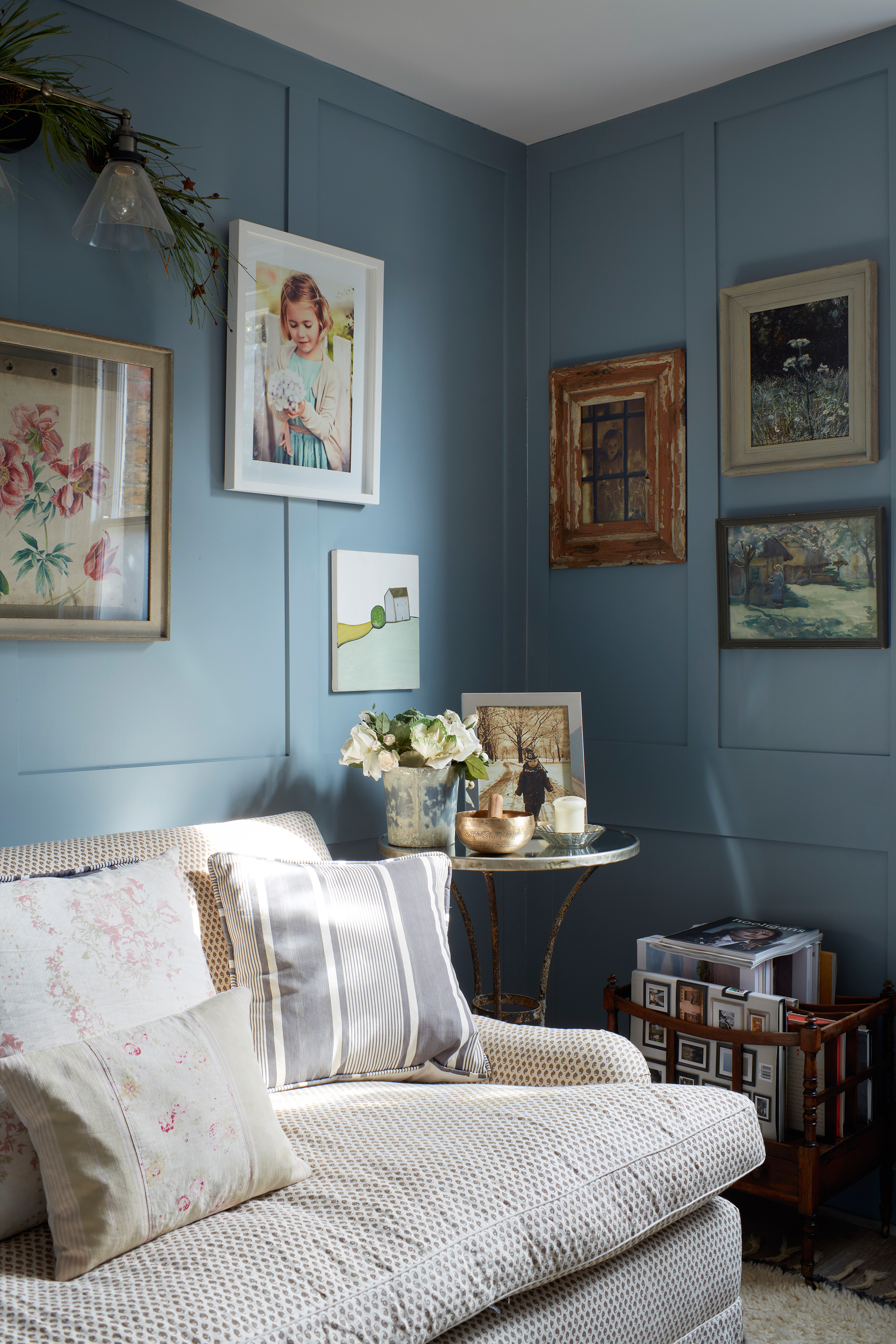
Abi brought the sofa from her previous home and that once belonged to the late designer Annabel Evans, whose work inspired the style of this house. The artwork displayed on the living room walls is a mix of Charming Baker, Abi’s photography and antiques shop finds
To keep the ceilings looking as high as possible, Abi removed the coving and had panelling made out of MDF, which, when painted, creates a lovely period feature. She likes to mix and match furniture and accessories from all periods, including lots of modern art, which adorns the walls in every room, as well as antiques, upcycled furniture and contemporary design ideas.

Industrial meets Shaker style in Ellis’ bedroom, with a cast-iron bed frame from Coast to Country and a cabinet from Ebay. The peg rails above the bed are from Soho Home
‘I put all the experience and ideas I’ve gathered from previous projects into this, to create something that is very mixed, but mainly Scandi or New England style,’ explains Abi. ‘A lot of my inspiration came from the late designer Annabel Evans – including the painted panelling and well-worn furniture. I really admired her so this is my take on her style.’
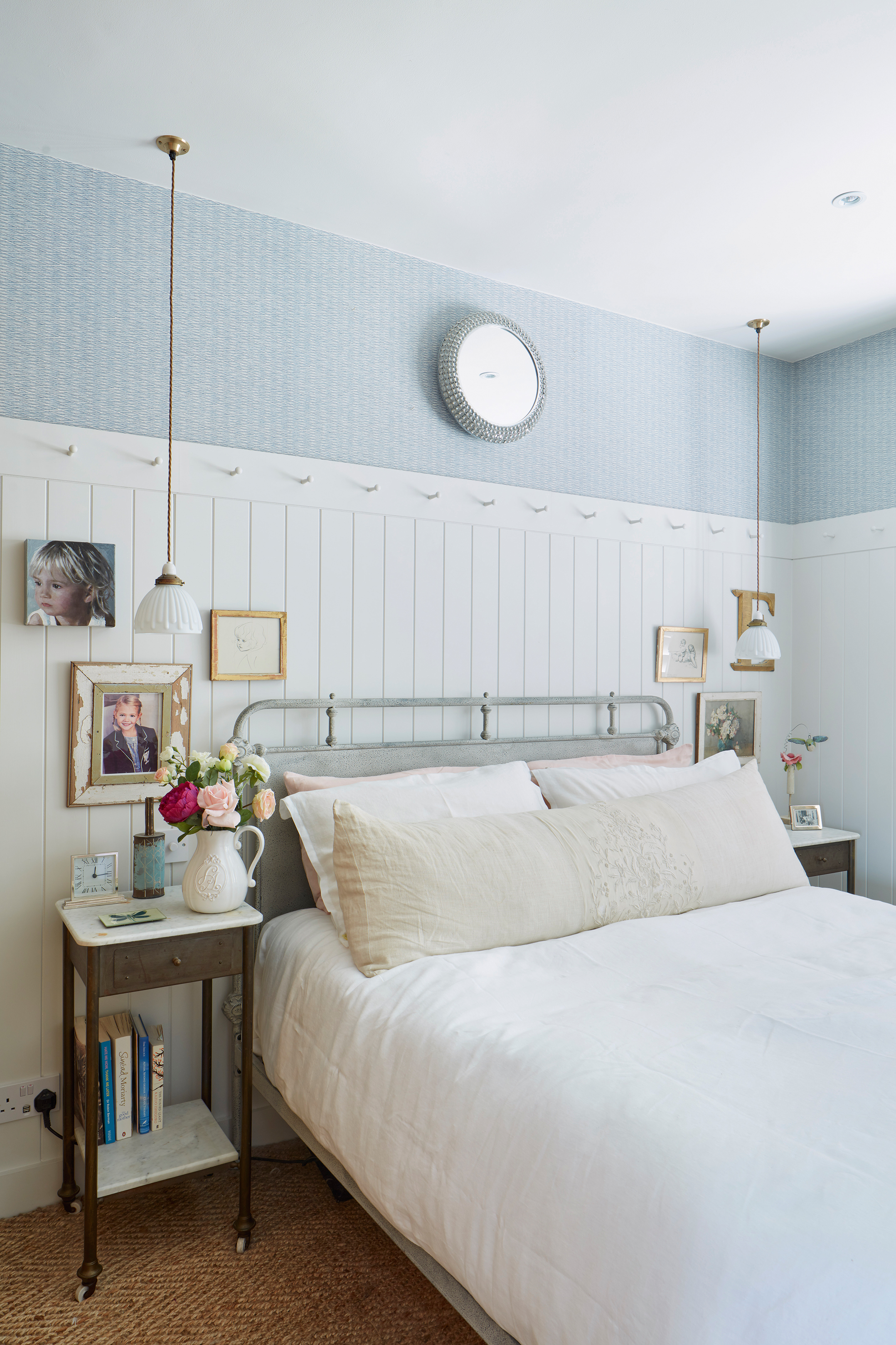
White painted matchboard and Dutch design wallpaper from Tissus d’Hélène emphasise the soft light in the main bedroom. The Shaker pegs and bedside table were found on Ebay
It took Abi just three months to get the house renovated and decorated ready to move in, always with the aim of moving again before long.‘I moved out of the city to be closer to the children’s school,’ she says.
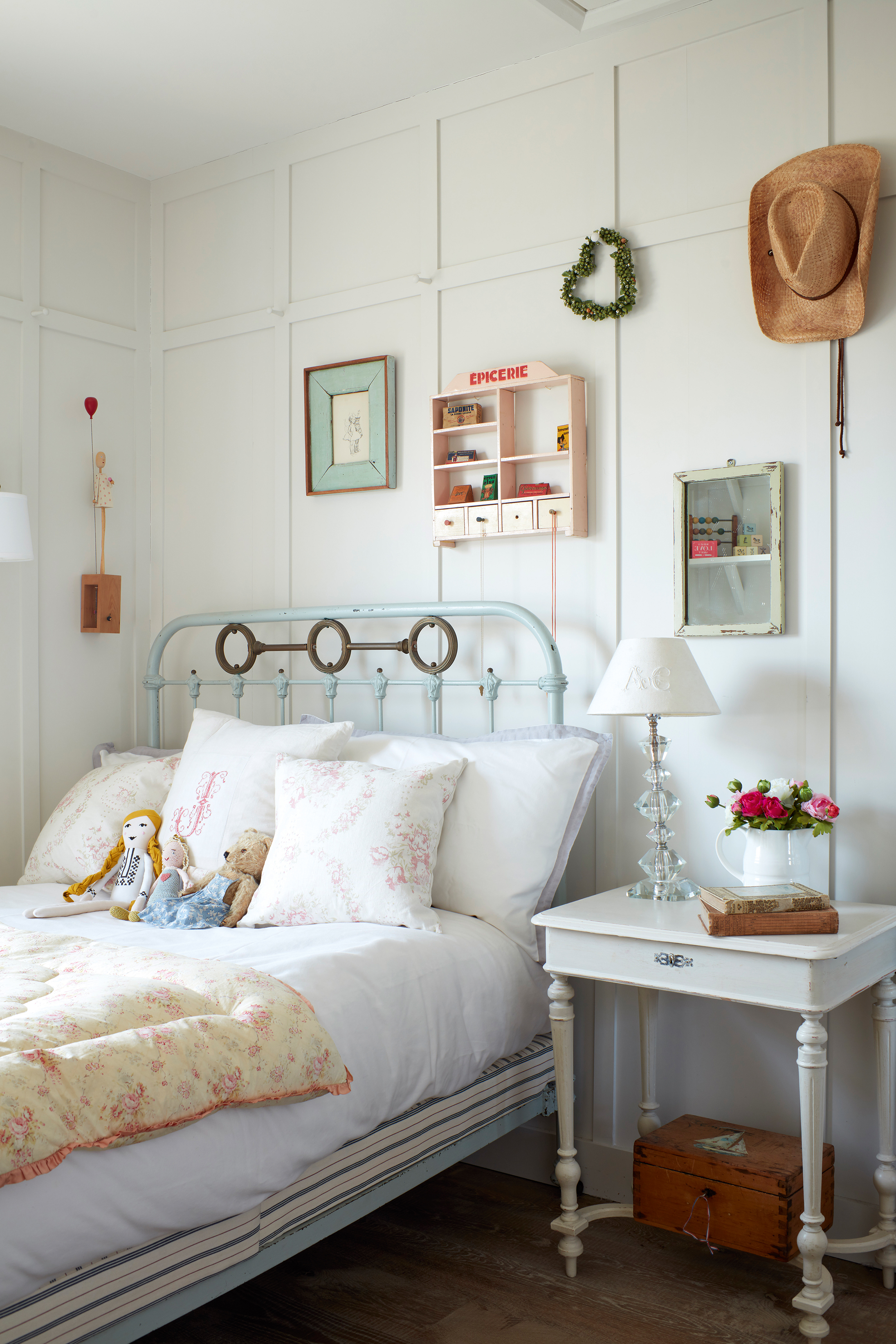
The original wall panelling in daughter Jemima’s room is painted in Flake White by Fired Earth. The bed was another Ebay find and is teamed with smaller furniture from Josephine Ryan Antiques
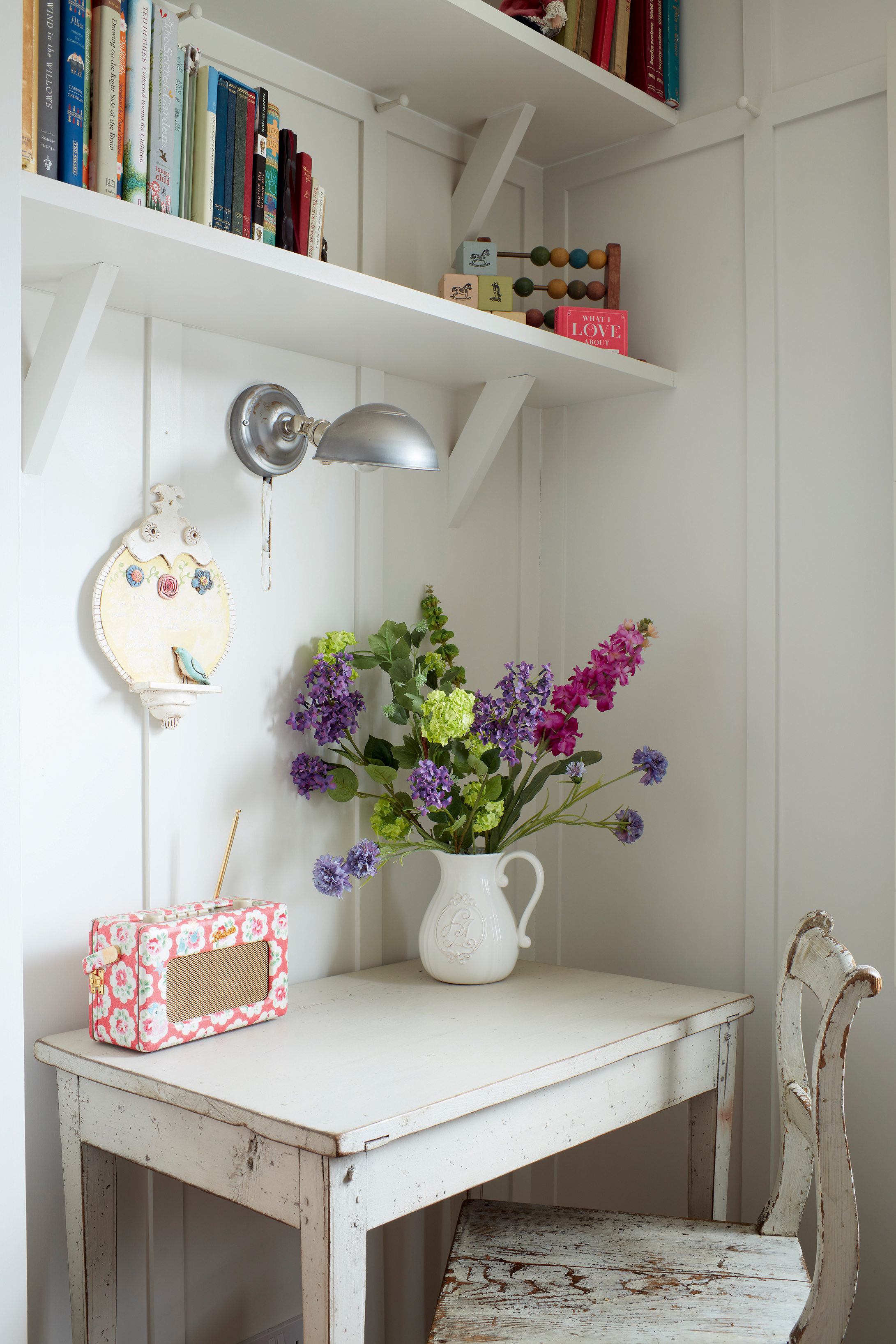
The desk in Jemima’s room was from The Decorative Antiques & Textiles Fair and the chair was an online find. Shelving was made by GP Carpentry. The radio is a Cath Kidston design for Roberts
‘The location of the cottage was ideal, but it was only ever meant to be a stopgap until I found something bigger – I hadn’t bargained on falling in love with it. A big house with all its trappings doesn’t make you happy. Less space means less cleaning and less responsibility. It also brings the family together. Unlike other houses I’ve lived in, I feel completely at home in this cottage – I can actually see myself being here for ever.’
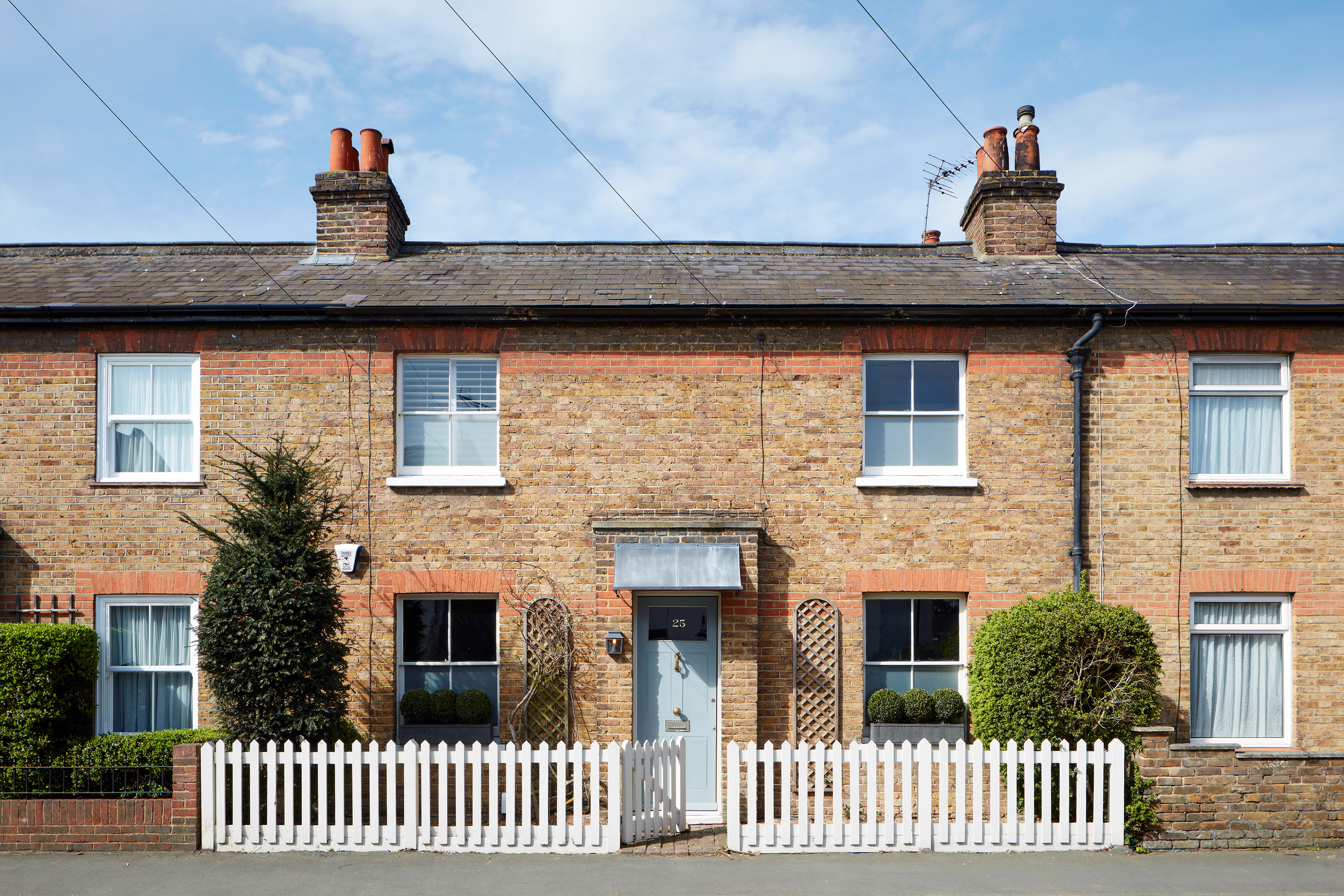
Abi updated the exterior of her Victorian home with a zinc porch and door painted in Fired Earth’s Storm. A neat fence, and shutters from The New England Shutter Company, complete the look
EXPLORE MORE VICTORIAN INTERIORS
Join our newsletter
Get small space home decor ideas, celeb inspiration, DIY tips and more, straight to your inbox!
-
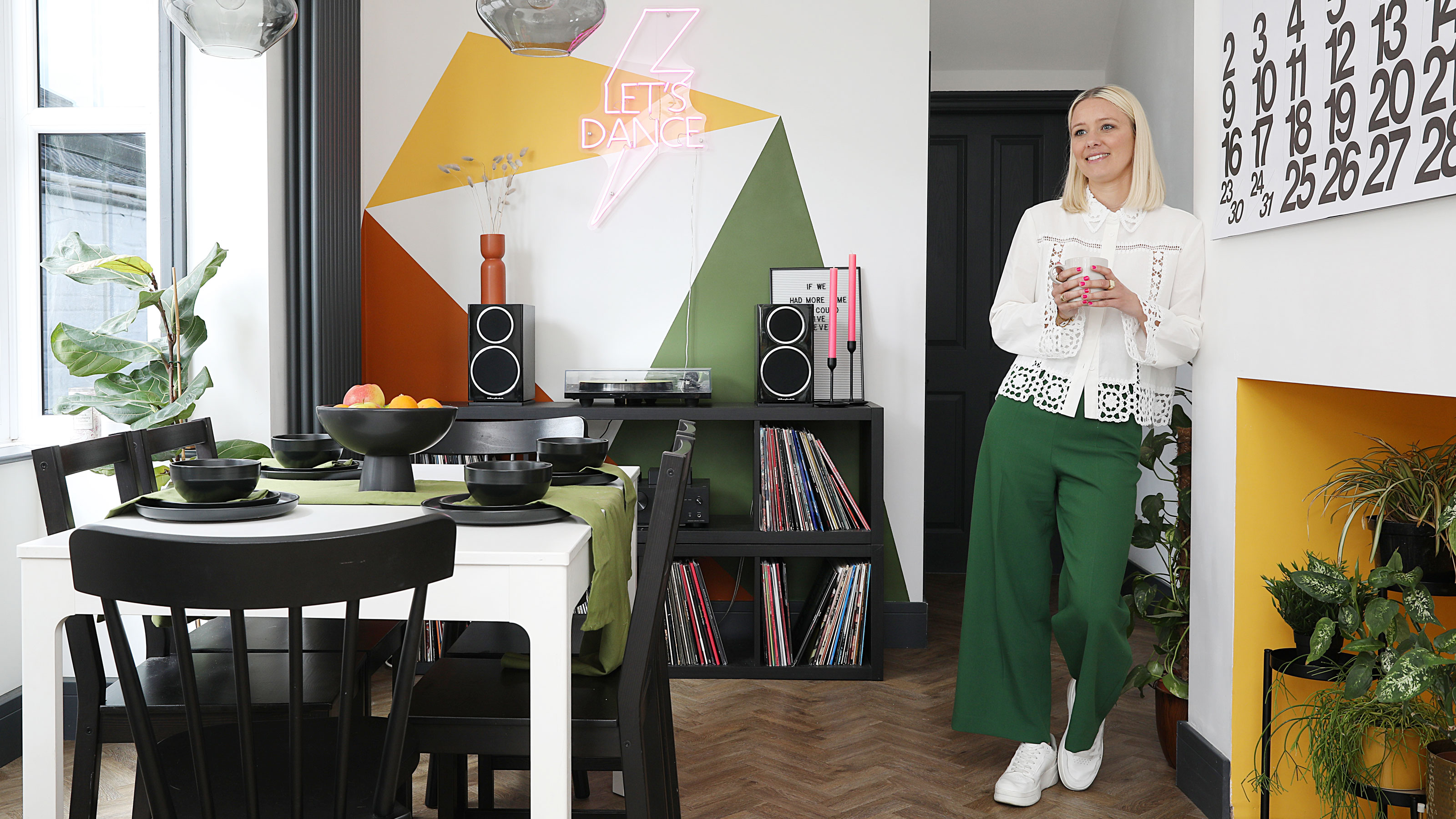 This colourful home makeover has space for kitchen discos
While the front of Leila and Joe's home features dark and moody chill-out spaces, the rest is light and bright and made for socialising
By Karen Wilson
-
 How to paint a door and refresh your home instantly
Painting doors is easy with our expert advice. This is how to get professional results on front and internal doors.
By Claire Douglas
-
 DIY transforms 1930s house into dream home
With several renovations behind them, Mary and Paul had creative expertise to draw on when it came to transforming their 1930s house
By Alison Jones
-
 12 easy ways to add curb appeal on a budget with DIY
You can give your home curb appeal at low cost. These are the DIY ways to boost its style
By Lucy Searle
-
 5 invaluable design learnings from a festive Edwardian house renovation
If you're renovating a period property, here are 5 design tips we've picked up from this festive Edwardian renovation
By Ellen Finch
-
 Real home: Glazed side extension creates the perfect garden link
Louise Potter and husband Sean's extension has transformed their Victorian house, now a showcase for their collection of art, vintage finds and Scandinavian pieces
By Laurie Davidson
-
 I tried this genius wallpaper hack, and it was perfect for my commitment issues
Beware: once you try this wallpaper hack, you'll never look back.
By Brittany Romano
-
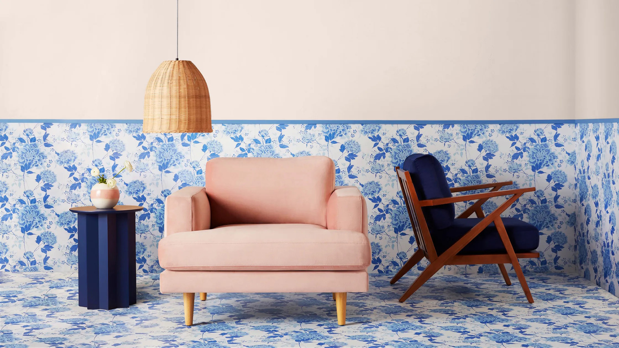 Drew Barrymore's new FLOWER Home paint collection wants to give your walls a makeover
Drew Barrymore FLOWER drops 27 brand-new paint shades, and every can is made from 100% post-consumer recycled plastic.
By Brittany Romano