

Their growing family and changing needs presented Emma and Julien Barber with the classic homeowner’s dilemma: should they move to a bigger property or adapt the house where they had been happily settled for more than 10 years?
Emma and Julien had got as far as looking at other properties to see what was on the market before opting for an extension to their 1920s semi in Swindon.
‘We’re just down the road from the children’s school and nursery, and my mum and other close family and friends live nearby, so it was a relief really when we decided to stay here,’ explains Emma.
Find out what they did next before exploring more real home transformations for inspiration and our extensions page for practical advice.
Fact file
Planning the extension
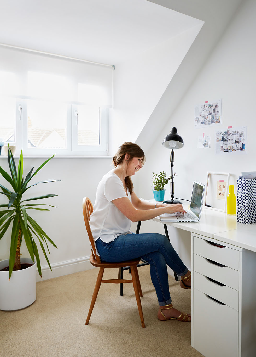
With the decision made, the couple had to think about what they needed from the house that the existing layout wasn’t giving them. The answer was obvious: ‘Space – both upstairs and downstairs,’ says Emma. ‘As the children are getting bigger, they need more room to play and to store their toys, and, elsewhere, we need grown-up space. Plus, as I’m building up my business, EB Interiors, I wanted to squeeze a separate home office that could double as a bedroom into the plans.’
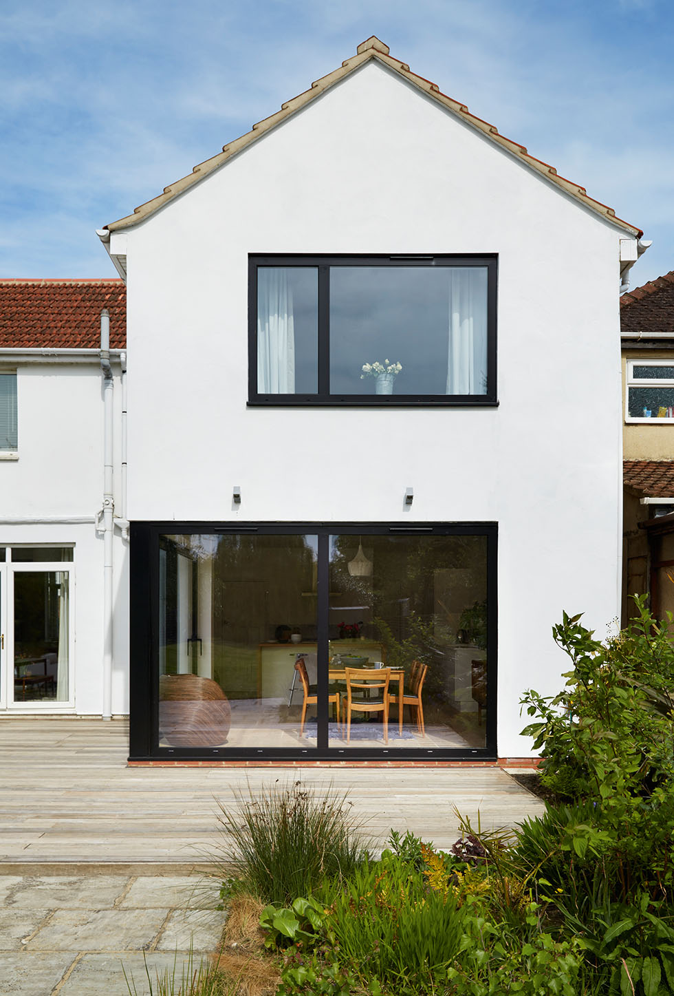
After 10 years of managing with a tiny square kitchen and very little work space, Emma and Julien wanted an open-plan, family kitchen-diner, fully glazed on two sides, with sliding patio doors opening on to the garden from the working end of the kitchen. With these requirements in mind, the couple were ready to brief the architect, Emma’s cousin Bill Pier.
Planning the extension
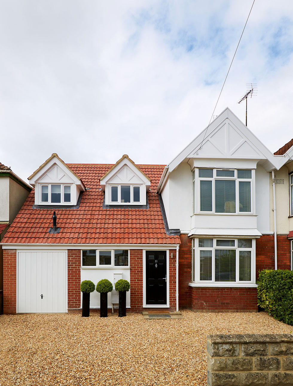
By knocking down the old garage set back from the house, Emma and Julien could see there’d be space for a two-storey side and rear extension, to give a small garage at the front with an extra bedroom/home office above it, and, at the rear above the extended kitchen-diner, a larger master bedroom.
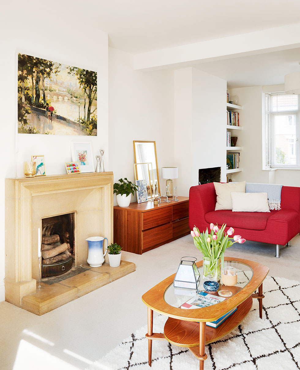
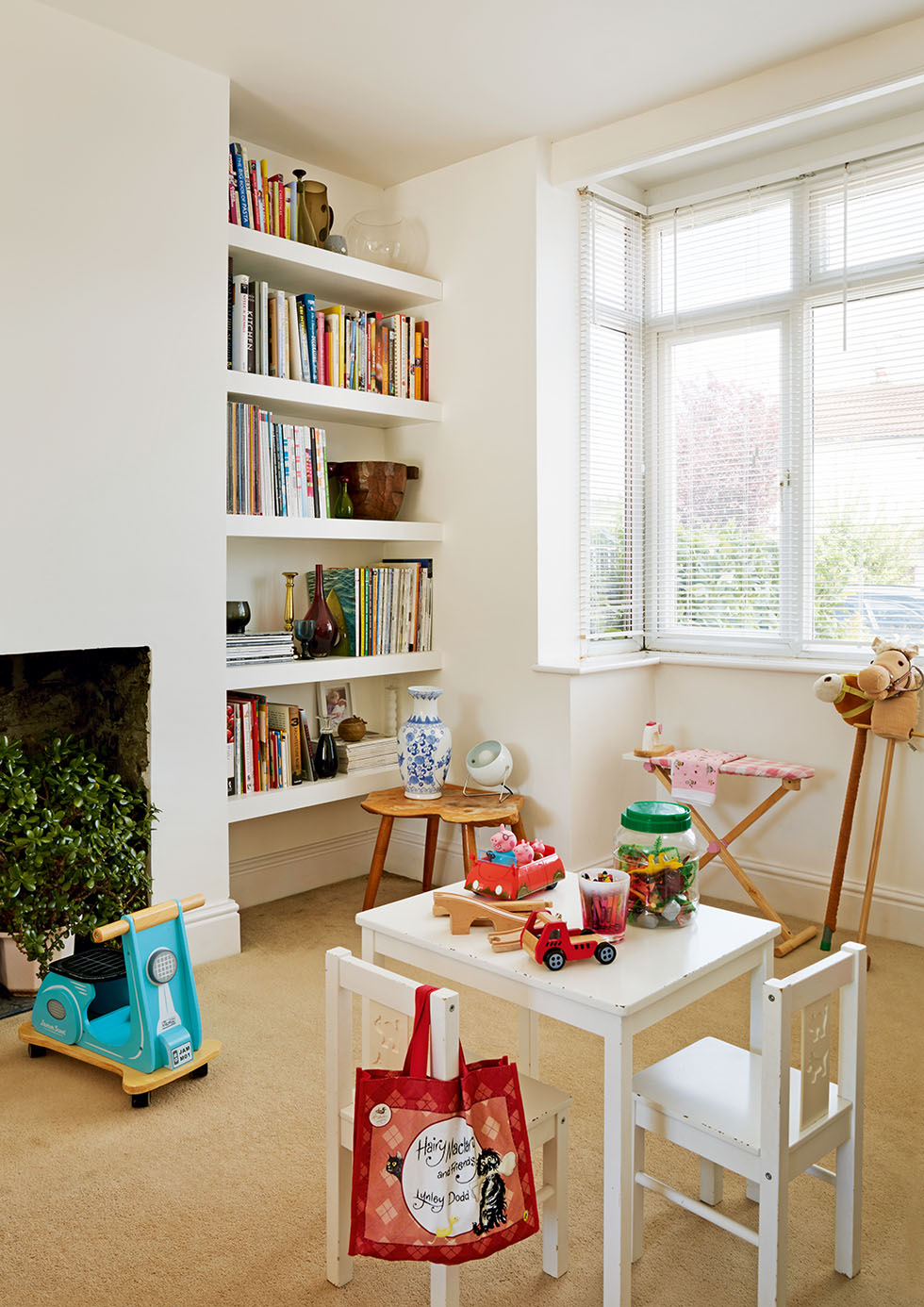
Removing the wall between the old home office/dining room at the front of the house and the living room at the back would also create a long, double-aspect living room, with space for the children’s books and toys at one end.
The couple had always envisaged a modern extension, but one that would still be sympathetic to the age of the house and its surroundings. ‘It’s the way I approach most of my designs,’ says Emma. ‘I like to bring together favourite objects and family mementoes, and use them in my decorating schemes to add character and a sense of family and history.’
‘Going from such an enclosed kitchen to something that was so bright and airy was central to the build.’ – Emma Barber
Gaining planning permission
That was the theory, and Bill drew up the plans accordingly, submitting them to the local planning authority in January 2014. However, the couple’s original plans for an oak-clad flat-roof extension at the rear were rejected. ‘They felt it was getting too modern,’ explains Emma. By May 2014, revised plans, featuring a more traditional tiled, pitched roof, were approved. Local builders AJM Property Maintenance started work in September.
Modernising the kitchen
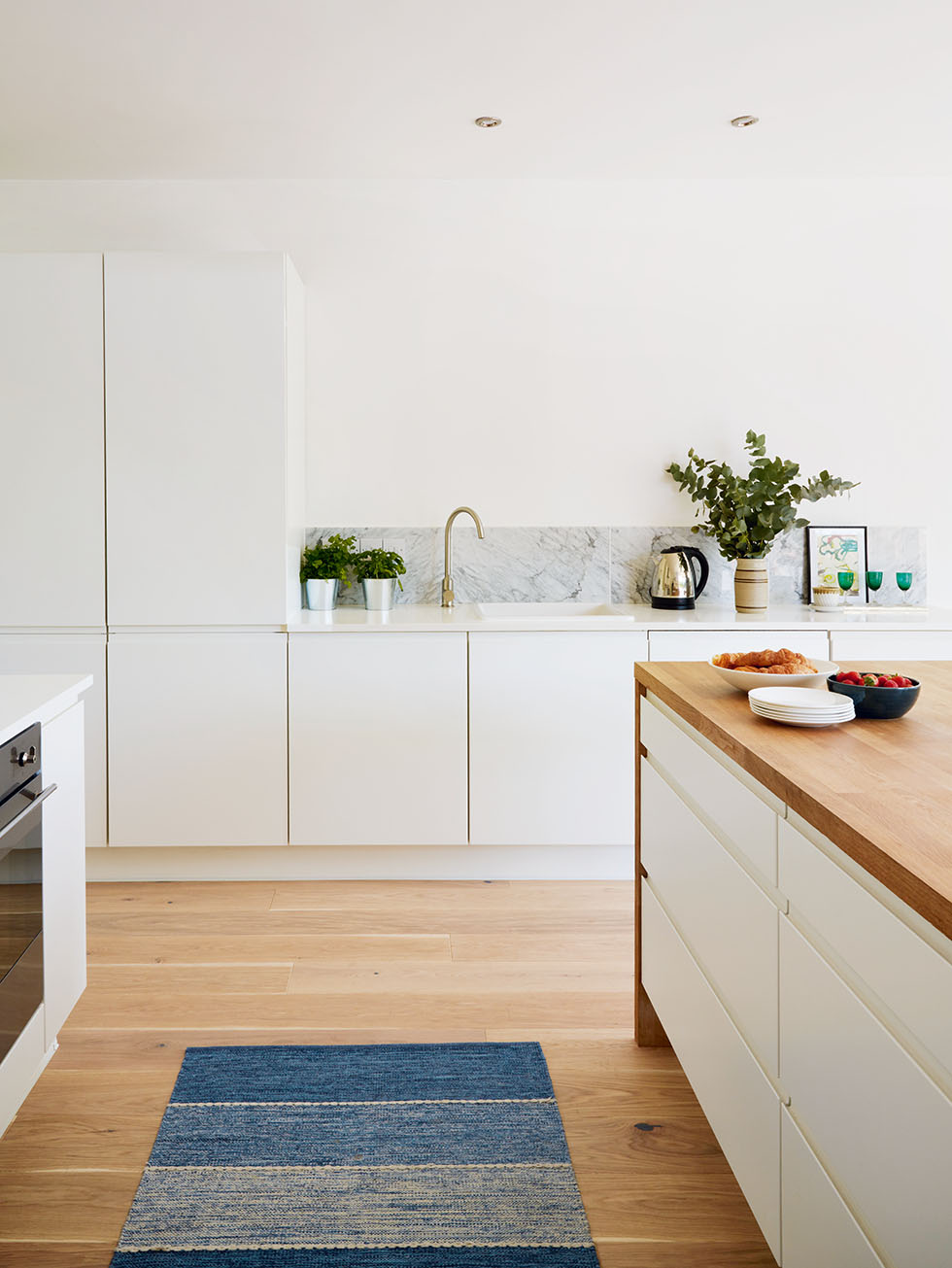
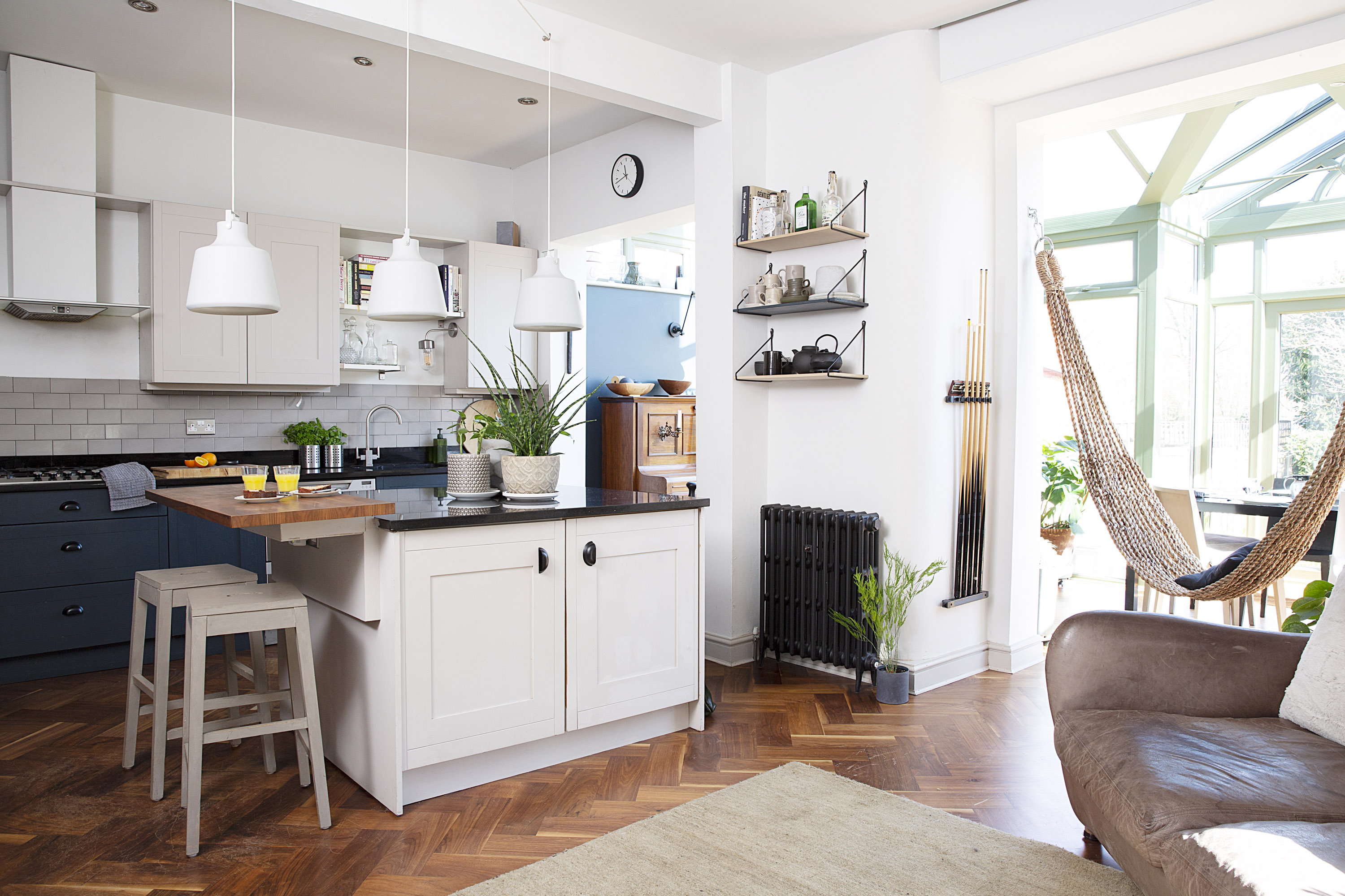
The couple’s preference for the new kitchen included white minimalist units. ‘I didn’t want any handles, and the finish had to be matt,’ says Emma. ‘I searched everywhere before coming across a design that was perfect, as well as a bargain, at 65 per cent off that weekend.’
For the island, she chose a solid oak worktop, while the other base units are topped with a white Minerva worktop, both of which were sourced online from a company ‘who’d given us great service in the past,’ says Emma. ‘We’d only recently redone the old kitchen, so it made sense to save money on the sink and taps by reusing them.’ Engineered wood flooring in a warm tone completes the look.
The extension was finished five days before Christmas 2014. ‘As soon as the builders left, Julien and I were frantically painting everywhere, as we’d promised everyone Christmas lunch at our house,’ says Emma. ‘We didn’t get the tree up until that weekend – all the children’s friends’ houses had had their decorations up for weeks, and we just had dust!’
The interior design scheme
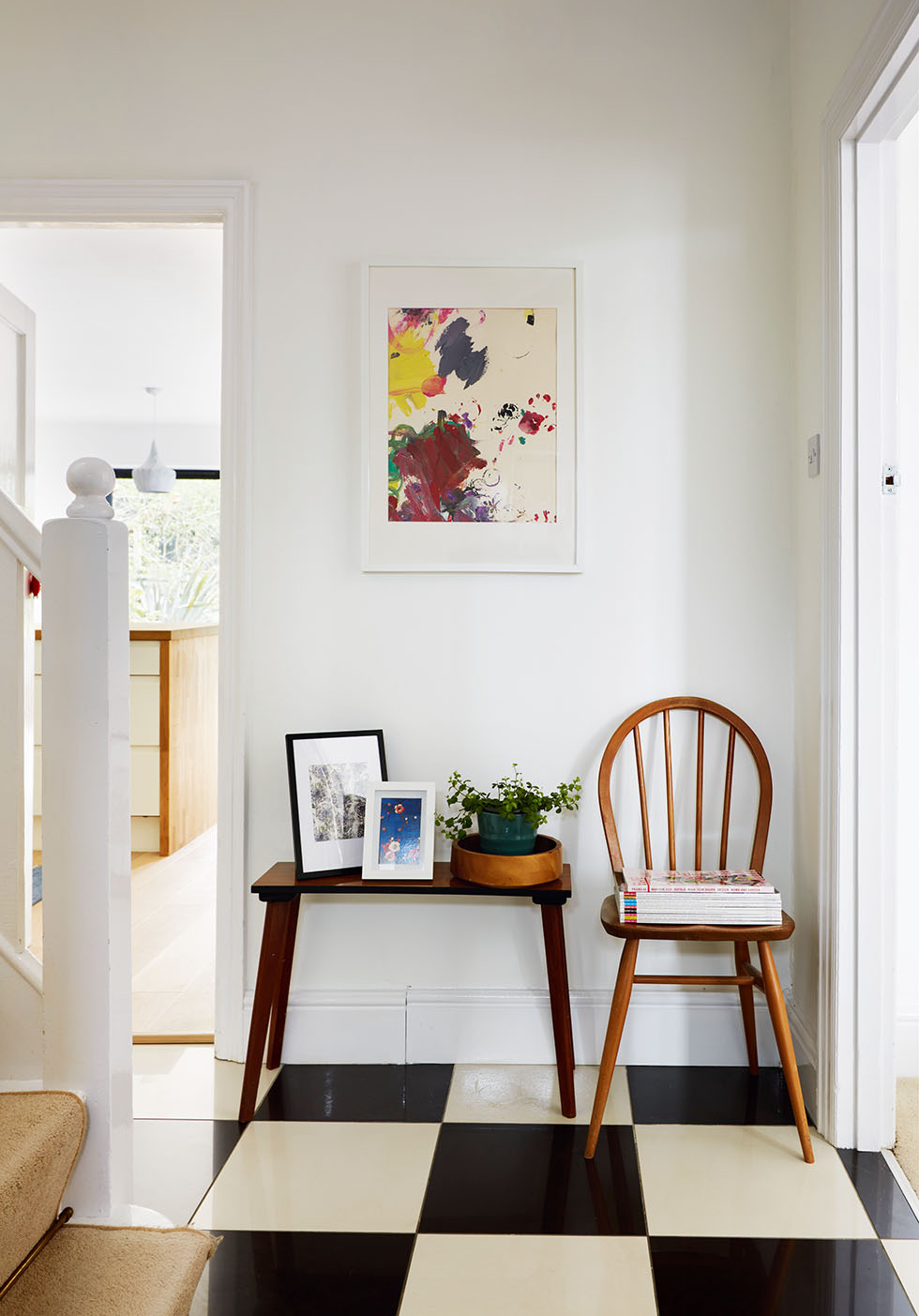
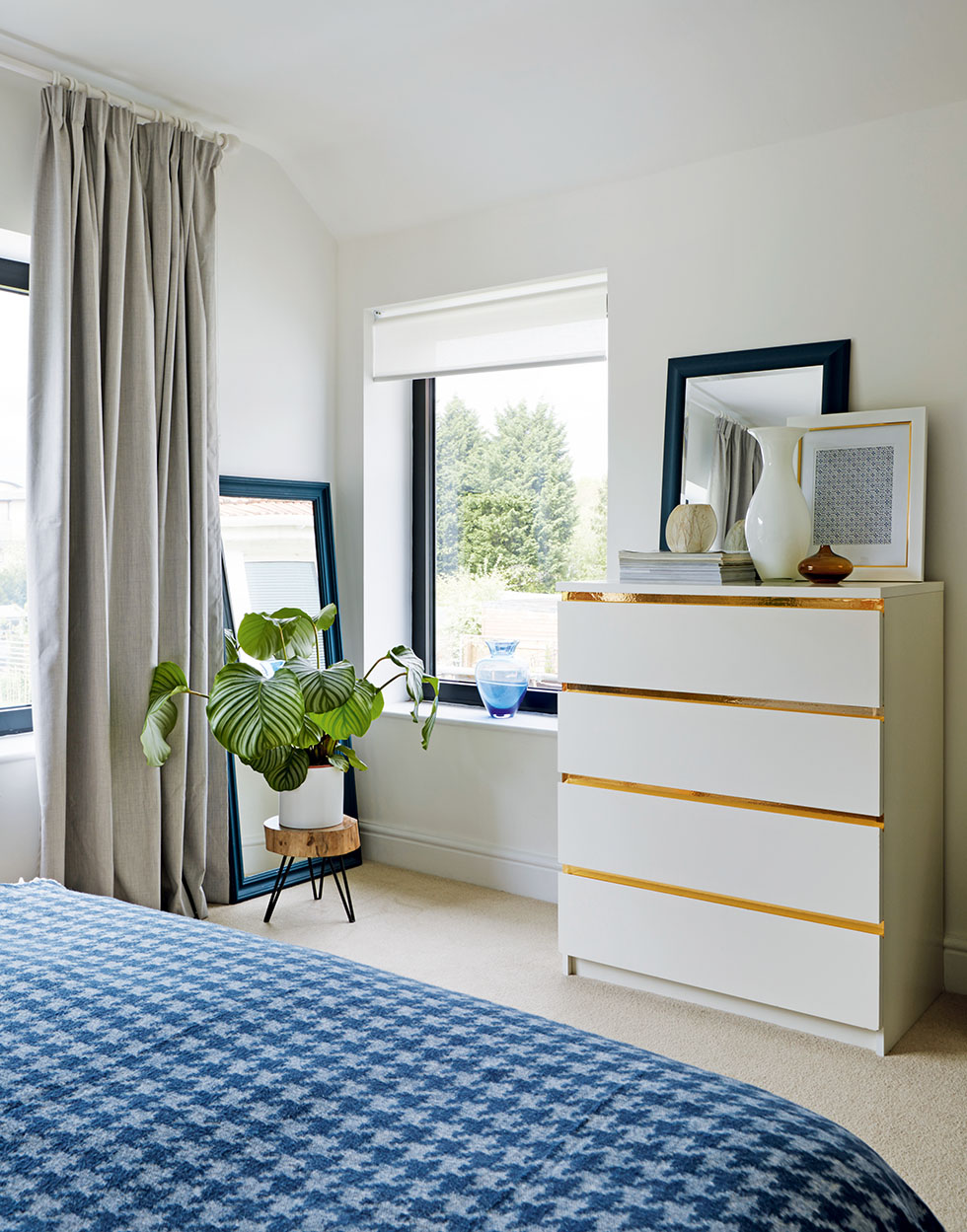
Now that the dust has settled, and all the finishing touches are complete, it is still very much a late-1920s house. The staircase, internal doors and living room fireplace are all original, and from the front of the house there’s no hint of a modern rear extension. Emma has softened the contemporary lines of the cabinetry in the new space with retro-style dining furniture, and the room is dotted with family treasures. ‘The big table used to be in the dining room, where you couldn’t really see it at all, but now, even when it’s extended to seat 10, it still fits well, and the space isn’t overwhelmed by it,’ says Emma.
The interior colour scheme
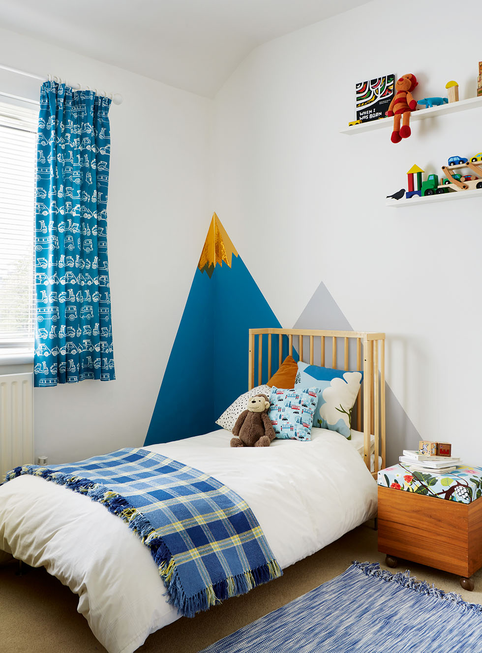
She has kept the walls of the house white throughout, bar one in Neve’s room. ‘Maybe we’ll inject some colour into the scheme later, but I prefer to celebrate a piece, giving things a very neutral backdrop,’ she explains. ‘Especially in the kitchen, with all the green from the garden – I didn’t think we needed much more in the way of colour.’
The finished project
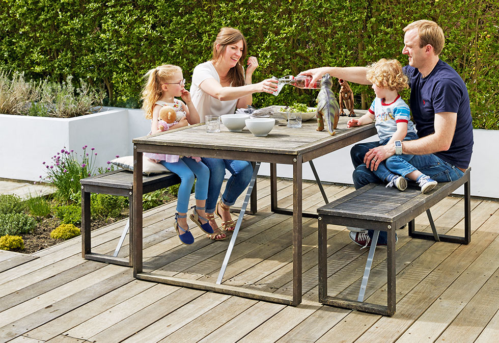
Emma and Julien are proud of what they’ve achieved, and that they only went over their initial budget by five per cent. ‘In most people’s books that’s not an overspend, it’s a contingency,’ quips Julien, who says his only input was the budgeting. ‘We spent more on the groundworks as a tree had just been cut down and the ground hadn’t had chance to settle, so we needed deeper foundations.’
‘We work well as a team,’ adds Emma. ‘Julien’s used to setting the budget and, in my job, I always have to work to one. You don’t have to spend a small fortune to create a different look, and that’s the approach I take with my clients. It can be done to everyone’s budget and be a beautiful home for a family, too.’
Project notes
My best advice
‘It’s important to choose your builders well. We went with our gut feeling, but ours also came highly recommended by our neighbours. There were a few little things that cropped up – as always with a big project – but the builders were brilliant and came up with solutions as opposed to difficulties. For us as a family it worked better to know we were in safe hands.’
What I’ve learnt
‘I was surprised at how different things look when you put them into new surroundings. For instance, our Habitat Sarang rattan chair used to be upstairs on the landing, where it never got used. But we’ve moved it into the corner of the kitchen, and now we love to sit
My favourite item
‘In the chair’s place, I’ve put one of my most treasured possessions – a metal trunk that my godmother Ros decorated for my 18th birthday, with my childhood photos all over it. It makes me smile every time I come upstairs.’
Design inspiration
‘Julien made the shelves and wardrobe for Neve’s room (right), painting the doors in Middleton Pink, Parma Gray and Teresa’s Green by Farrow & Ball. Neve is obsessed with Disney princesses, however, so calls them Elsa blue, Anna green and Merida pink.’
If I could have done things differently…
‘…we’d have moved out during the build. When we had the kitchen taken out, Julien was away for a week, so he was in a hotel, having all his meals cooked, while I was at home with the children and no kitchen! Next time, we’re all going with him!’
The costs
The couple bought the house for £204,000 in 2004, and have spent around £84,500 extending and renovating it.
The costs | Row 0 - Cell 1 |
| Building work, including fees, electrics and plumbing | £54,500 |
| Kitchen | £10,950 |
| Glazing | £10,212 |
| Decoration | £3,122 |
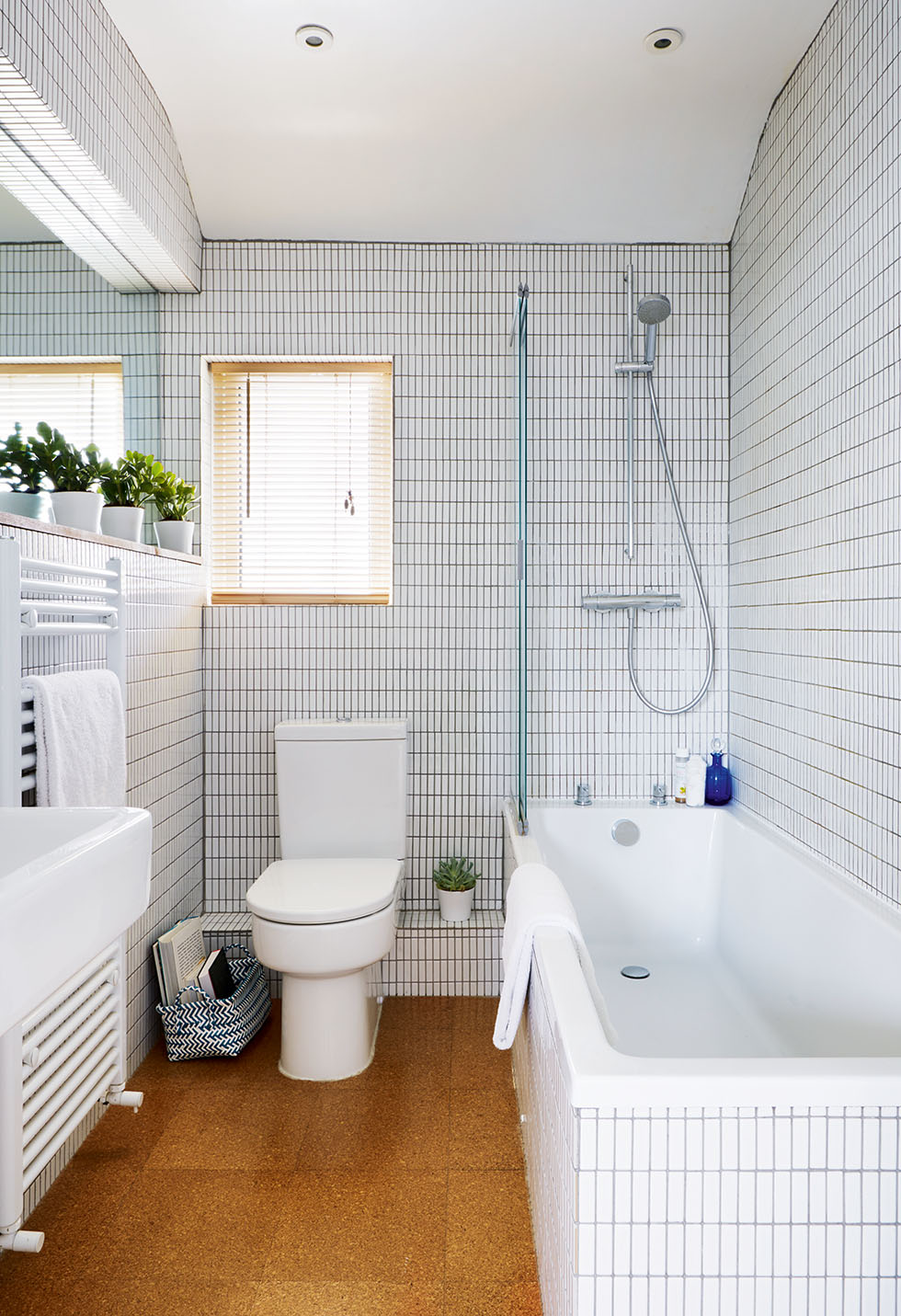
| Bathroom | £3,000 |
| Architect/structural engineer free | £2,250 |
| Landscaping | £600 |
| Tiles and tiling | £226 |
| TOTAL | £84,500 |
More real home transformations:
Join our newsletter
Get small space home decor ideas, celeb inspiration, DIY tips and more, straight to your inbox!
-
 Real home: an architect's Victorian house renovation
Paula and Andy's house was love at first sight, but the property needed significant renovation to suit their busy family life
By Ellen Finch
-
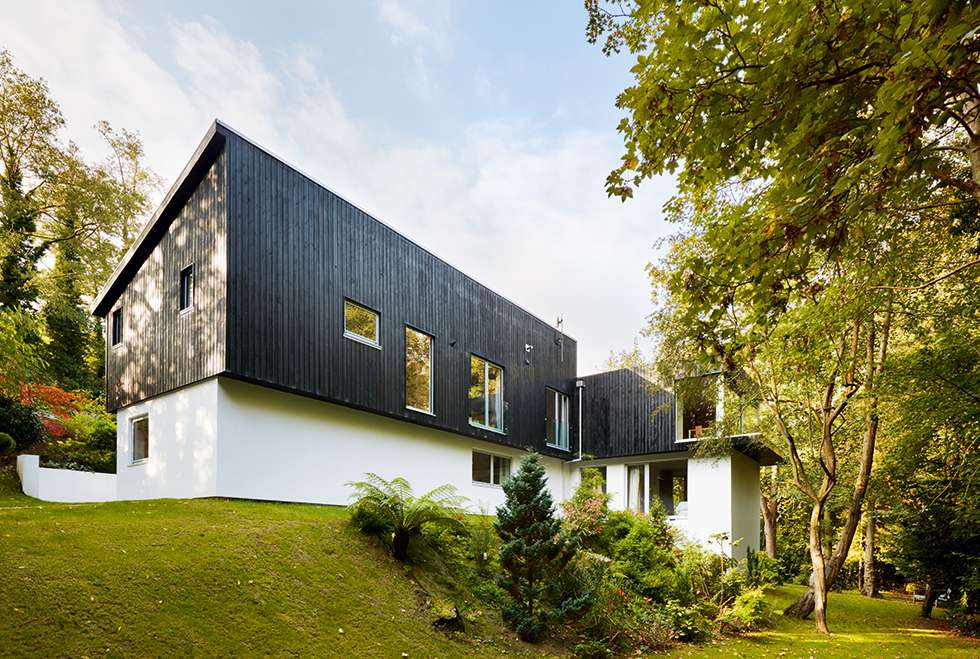 Real home: a 1960s house with modern extension
Su and Jim Bonner doubled the size of their 1960s house with an ultra-modern extension
By Victoria Jenkins
-
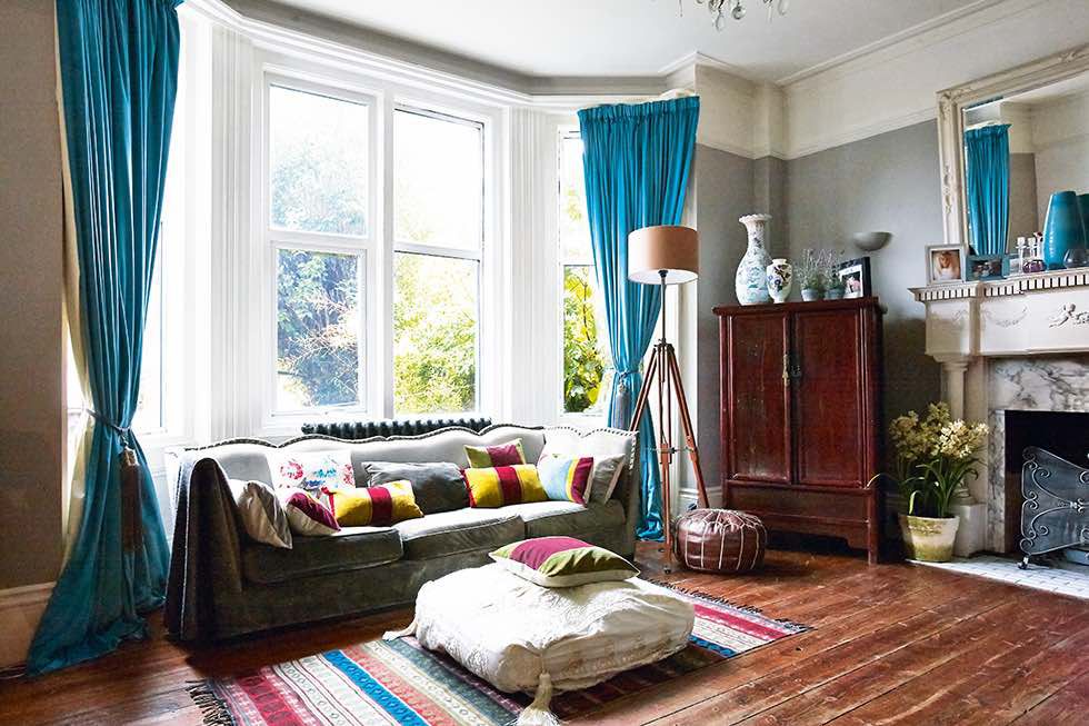 Real home: a family apartment renovation in Brighton
Digging out the damp cellar beneath a ground-floor flat and taking time over the renovation process has added an extra level and family charm to Debbie Statham’s Victorian home
By Andrea Childs
-
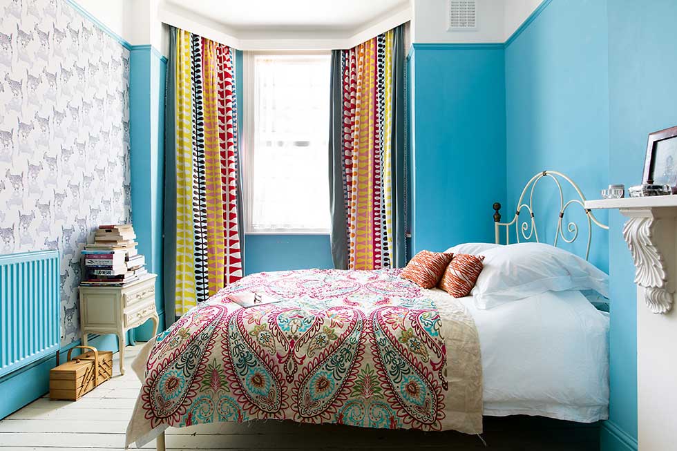 Real home: a colourful seaside Victorian villa renovation
Juan Ces turned a drab period property into a stylish family home brimming with colour and personality after a creative renovation project
By Maxine Brady
-
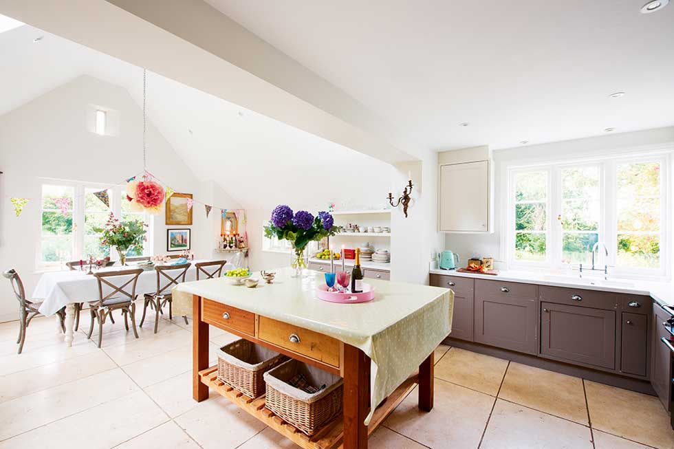 Real home: a traditional kitchen extension to a country home
Annabel and Jack Diggle extended their period house to create a family-friendly, light-filled kitchen-diner
By Kathy Hurst
-
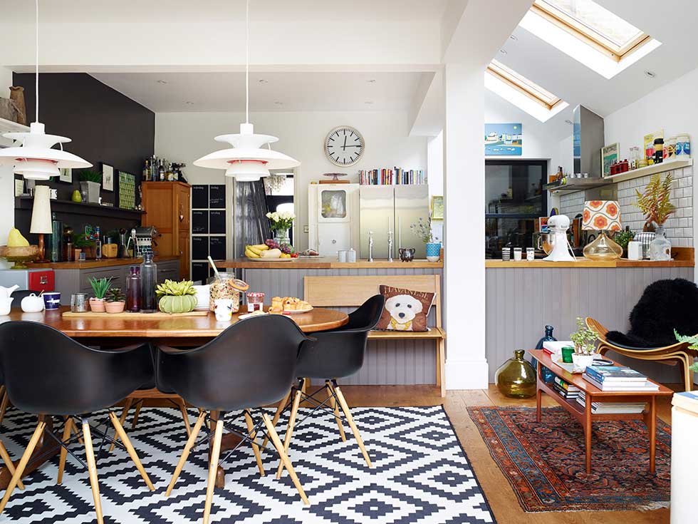 Real home: a stylish loft conversion and side return extension to a terraced family home
Space was tight in Fi Duke and Paul Briggs’ three-bedroom terraced home, until a loft conversion and side-return extension transformed the Essex property into a stylish family space
By Anna Tobin
-
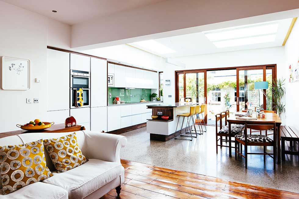 Real home: maximising light with a modern kitchen extension
Frieda and Frazer Furlong’s new rear extension turned their small kitchen into a bright family space
By Penny Crawford-Collins
-
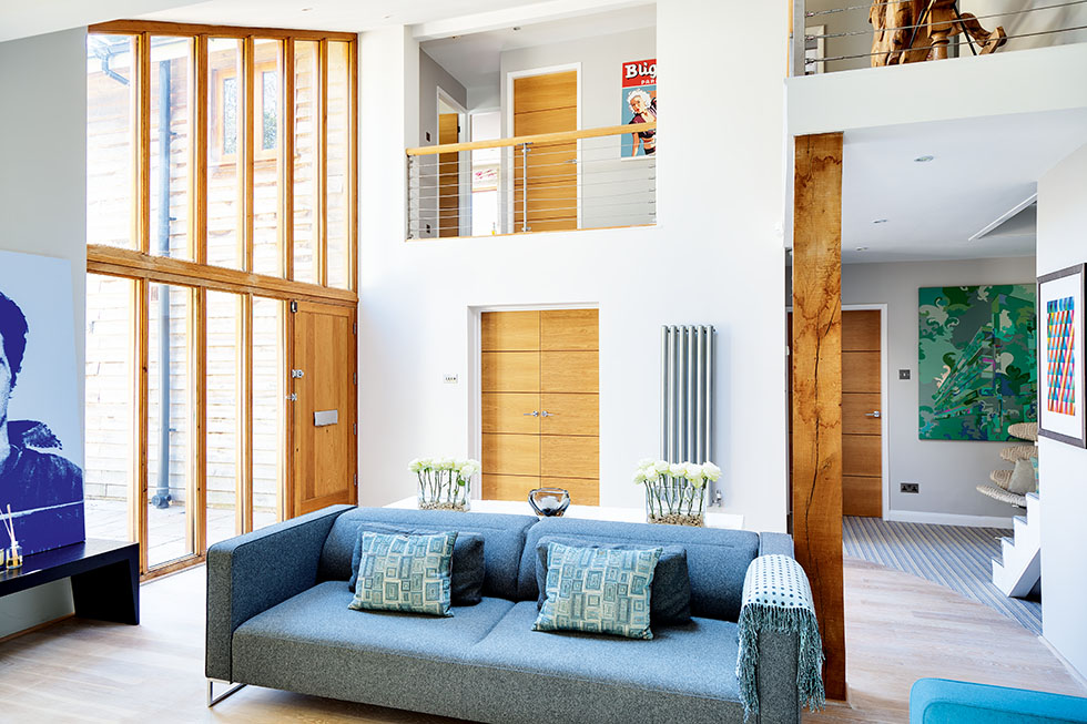 Real home: an extended country family home
Ian and Lisa Solley added an entrance hall, spacious kitchen and family room to their dated house, then gave the interior and exterior a modern makeover
By Mandi Miller