Architect Rob Pollard and wife Emma were on the hunt for a project when they found a three-bedroom 1970s home in a village near Rye in East Sussex. Rob had ambitious plans for totally transforming the chalet bungalow into a sleek and boxy four-bedroom timber-clad property. After buying in 2016, shortly before their daughter, Olivia, was born, they lived in it for two years before starting work. This allowed time for them to develop and tweak ideas for this radical revamp. The project began in 2018, and they rented locally while work went on – even staying with Rob’s parents for the final month after unexpected delays. Finally, in the summer of 2019, the family, now including new baby Imogen, moved back into their dream home as a band of four…
If you're planning on to tackling your own project, whether big or small, we have masses of ideas and helpful advice on what to do and where to start in our feature on house renovation.
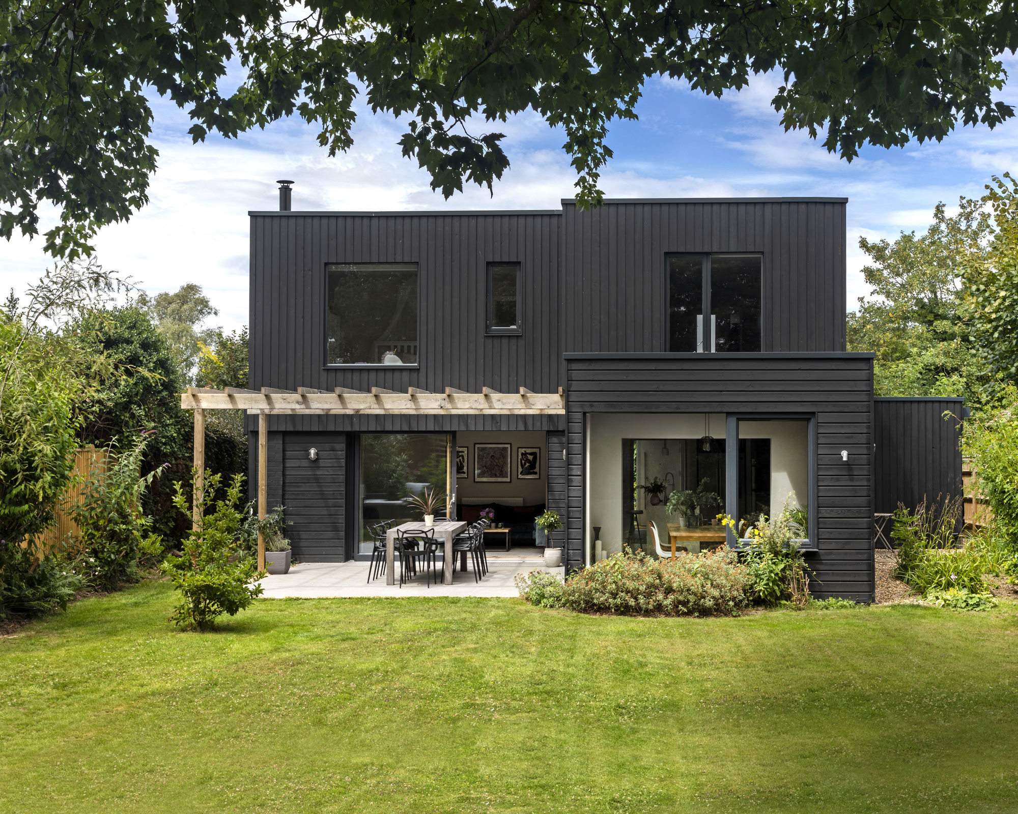
Once a 1970s chalet bungalow, the house is now a contemporary, timber-clad home
- For more real home transformations, head to our hub page.
Profile
The owners Rob Pollard, co-director at RX Architects, his wife, Emma, and daughters Olivia and Imogen
The property A four-bedroom revamped 1970s detached house near Rye, East Sussex
Project cost £220,000 plus VAT
‘We lived in the original building for two years before work began and our ideas developed over that period,' says Rob. 'The original building was a series of quite a few rooms, but they were all very small and dark.
'Our plan was to knock them through downstairs to open up the space. We removed the pitched roof and added an entirely new first-floor structure on top of the original walls before cladding it all. It was a cost-effective way to essentially double the space we had.'
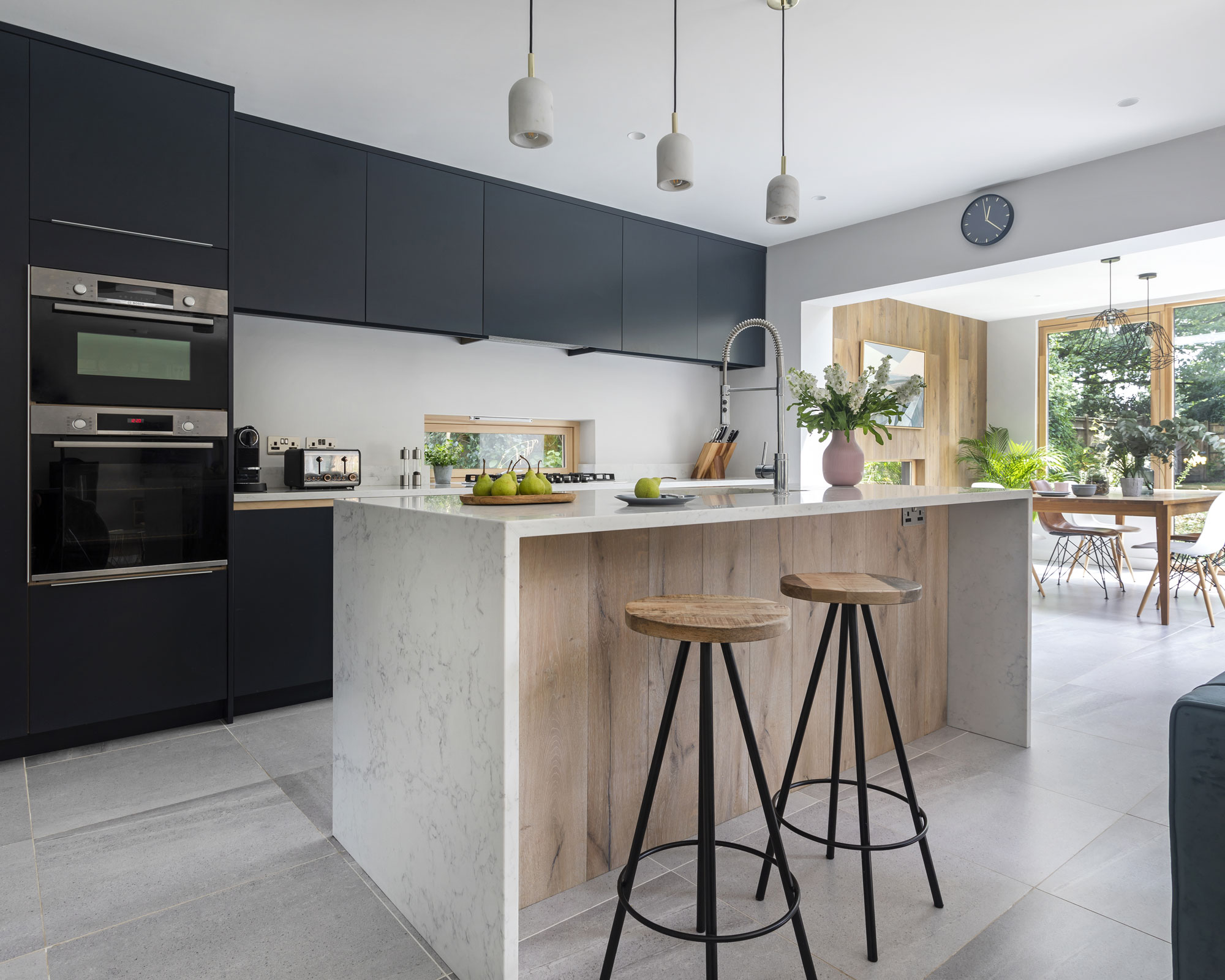
Vast glass doors flood the space with light and charcoal units offset the pale walls and worktops. Units, Chartwood Design, painted in Railings, Farrow & Ball. Work surfaces, Silestone. Tap, Crosswater. Appliances, Bosch. Walls painted in Shadow White, Farrow & Ball. Pendant lights, Made

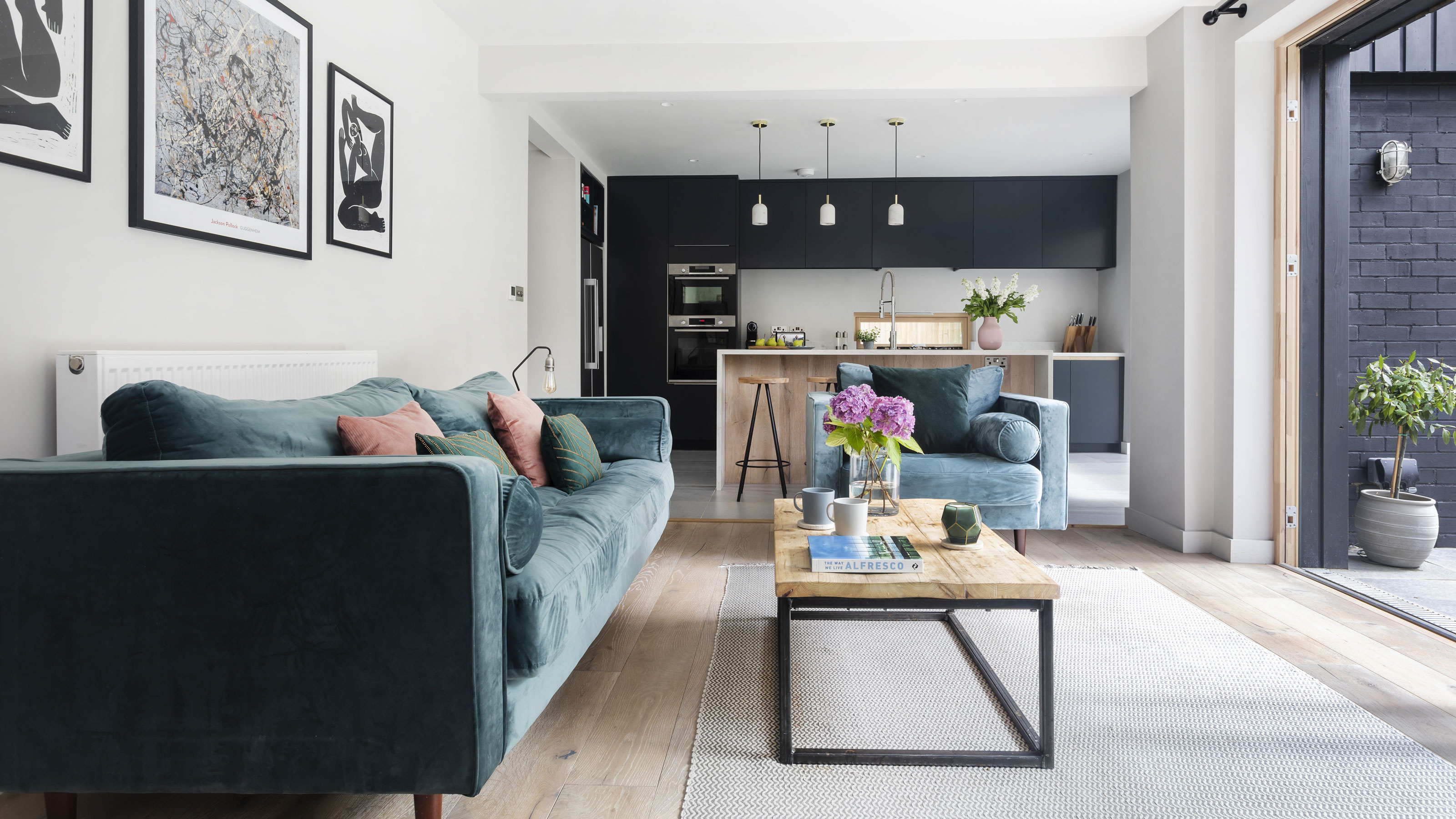
The open-plan space suits the family perfectly, and Rob has achieved his aim of bringing the outside in. ‘Our plan was to bring in much more light and connection to the garden,’ he says. Sofas, Made. Coffee table, RCC Furniture. Side table, Maisons du Monde. Walls painted in Shadow White, Farrow & Ball. Oak flooring, UK Flooring Direct
‘We bought the house with the intention of doing a project – we saw it as a blank canvas,' adds Emma. 'We wanted something we could add some value and personality to while creating something specifically for us.
‘The process marked some real milestones in our lives. We were visiting the project with Olivia during her toddler years, and before long we were walking around the site with me pregnant and getting bigger by the day! The project makes us reminisce about our family growing more than the build itself.'
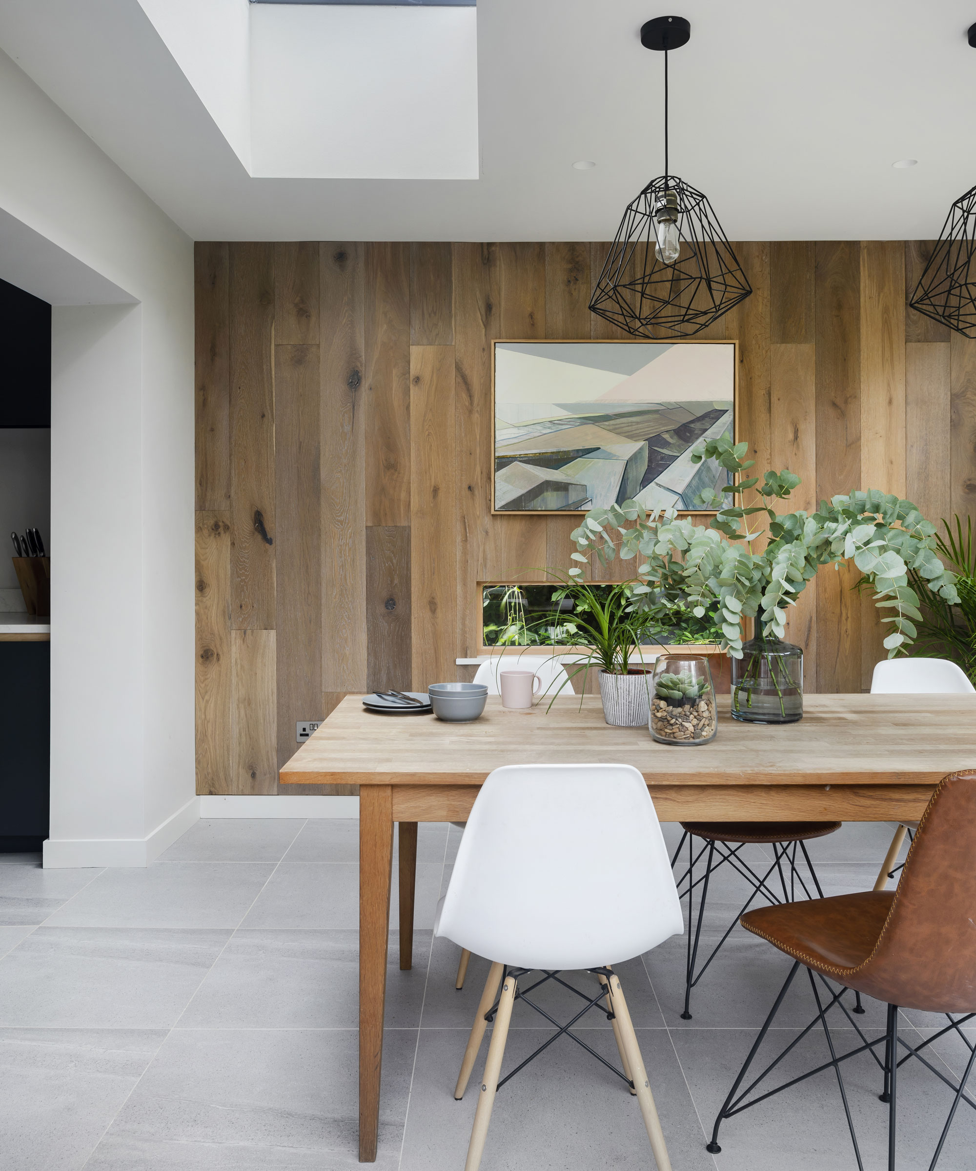
Excessoak floorboards clad the dining room wall. Dining table, Maisons du Monde. Chairs, Furnwise. Walls painted in Shadow White, Farrow & Ball. Pendant lights, Industville
‘It was quite a stressful project because I was two years into setting up my new architecture practice, RX Architects, when it began,' continues Rob. 'We had a toddler and Emma became pregnant again, which all added to the pressure of getting the project done not only how we wanted, but on time and on budget. Fortunately, the builder was someone we’d known professionally and personally for many years, so we were in good hands.'
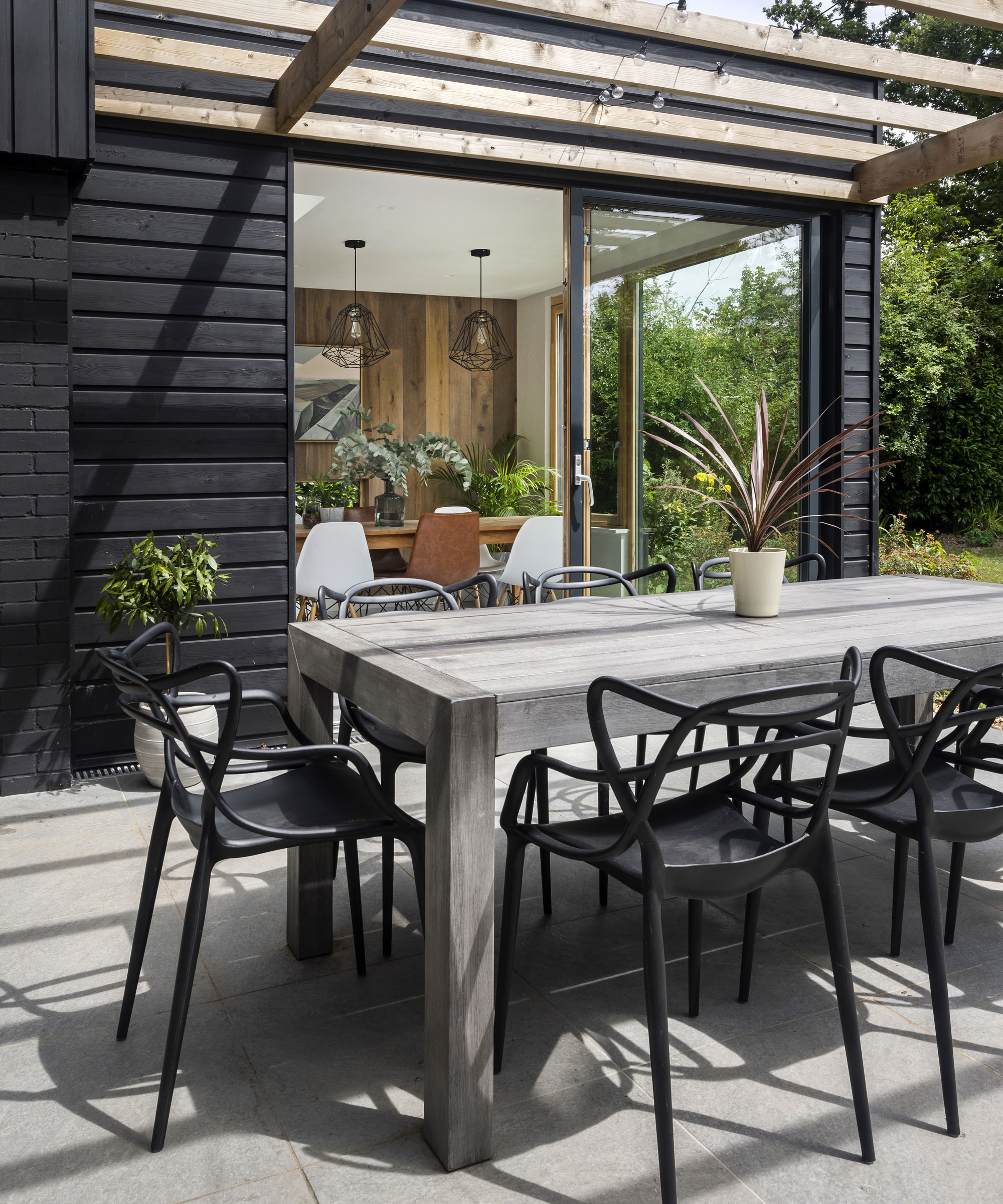
The couple have made an extended entertaining space with a patio and wooden awning. Table, Alexander Rose. Chairs, John Lewis & Partners
‘For us, moving out and renting was essential. When you’re living on site during a project it can take over and become all-consuming, so it’s good to have some distance,' says Emma. 'It reduces stress levels in what is already a fraught process, and the costs of renting are undoubtedly no more than the extra costs of builders having to work around you and taking longer to do it.
‘Luckily, we both agreed on most things throughout the project, though we didn’t think we would initially. We had strong ideas but settled on things quickly. Rob was in charge of design/architecture and project management while I concentrated on the timings and decorating choices.'
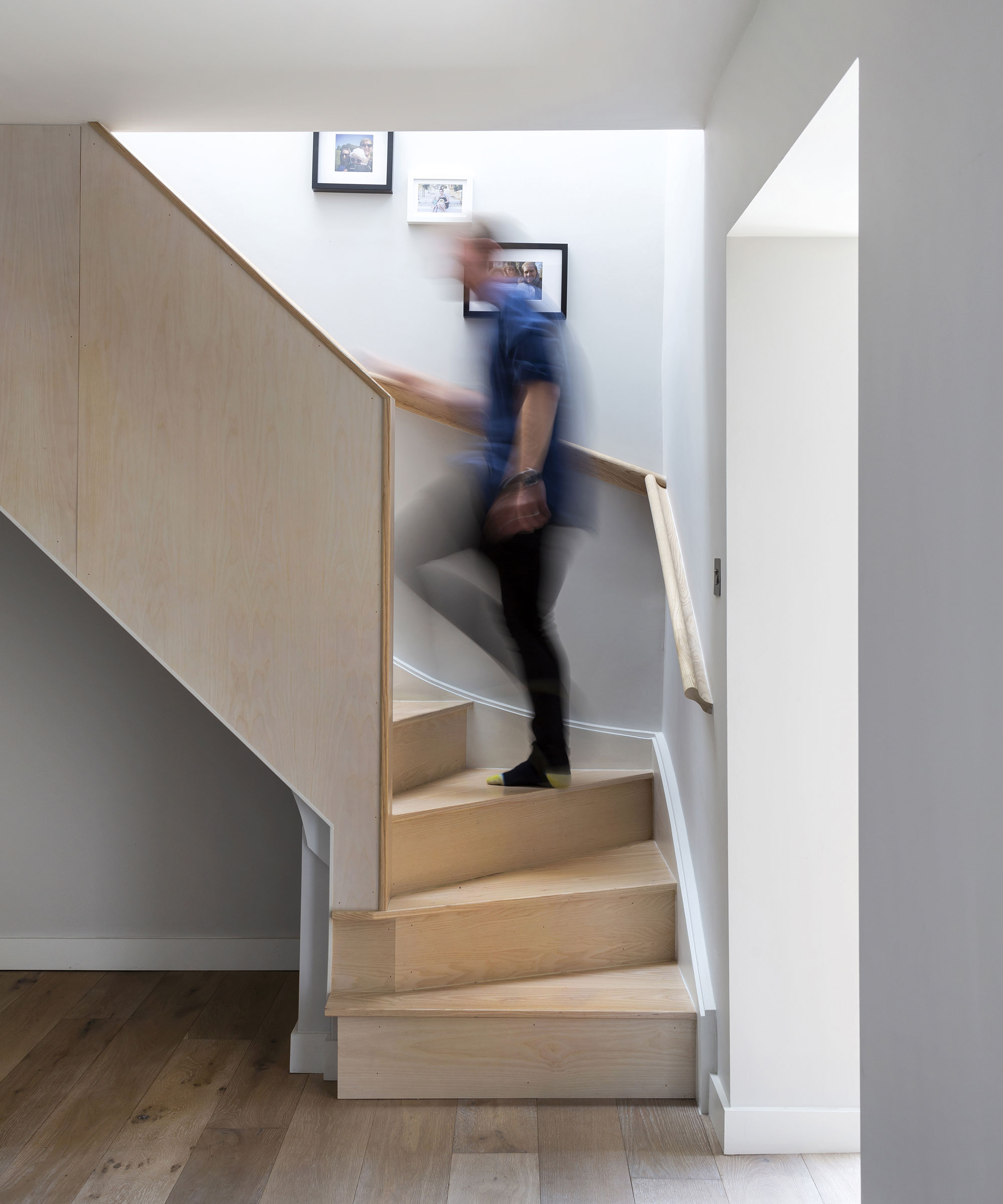
Rob had the idea of cladding the old staircase in maple rather than replacing it, saving money
‘Everything went pretty smoothly until near the end,' recalls Rob. 'Our plumber did the first fix but was called to another job that was delayed, which meant our original nine-month target date was pushed back a month. Also, when the glazing arrived on the lorry, we hadn’t realised we needed to supply our own lifting equipment.
'Six of us tried grabbing the corners and carrying the glazing off the lorry, but the doors wouldn’t budge because some of them weighed over 700kg! I ended up driving around local plant companies and begging to hire equipment. While it wasn’t funny at the time, it makes us laugh to look back on.'

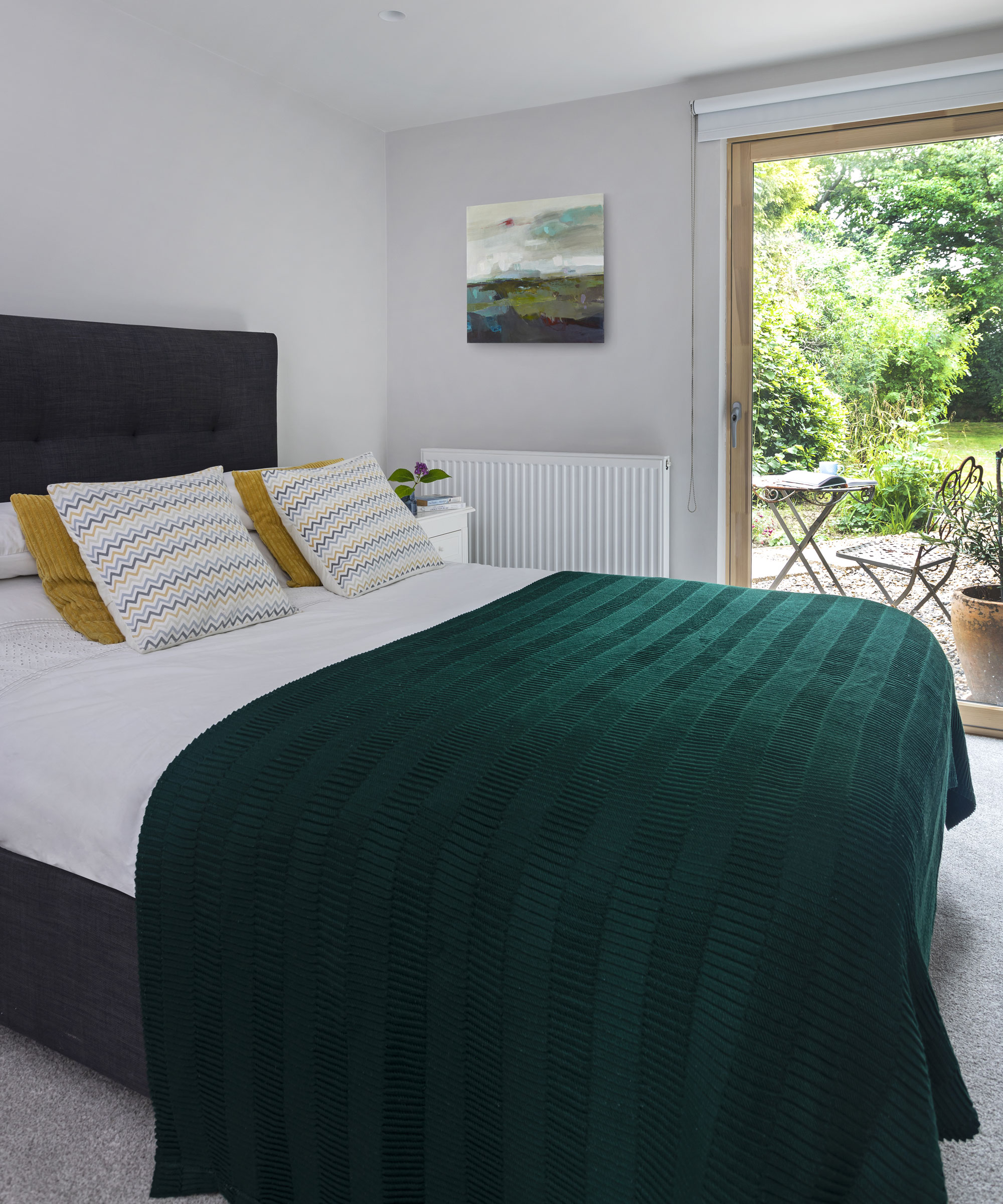
Instead of creating an extra bedroom upstairs, the couple decided they wanted a large master suite, complete with en suite and walk- through wardrobes. Bed, Made. Bedside tables, Maisons du Monde. Back wall painted in Inchyra Blue, Farrow & Ball
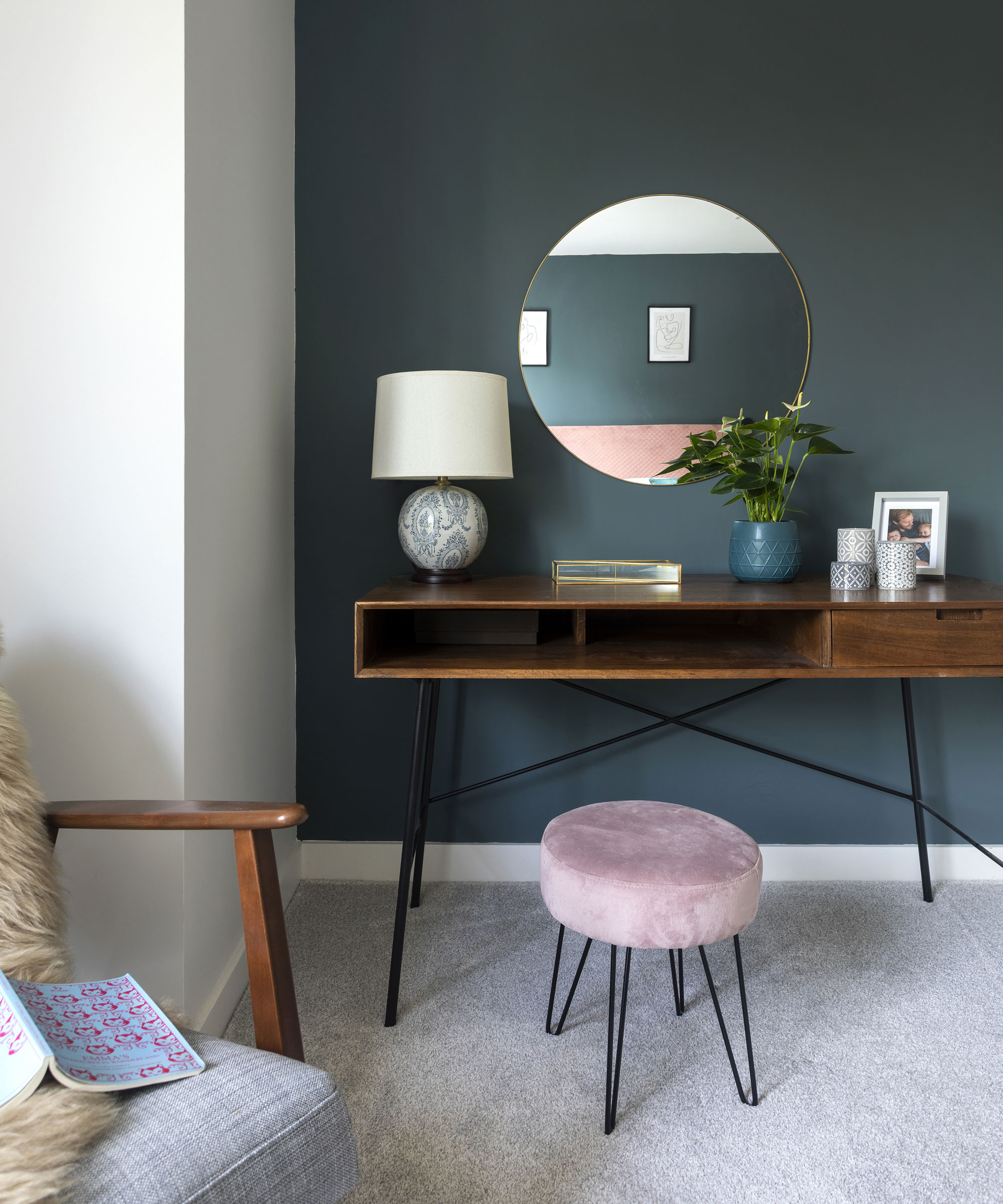
Dressing table , Maisons du Monde. Back wall painted in Inchyra Blue, Farrow & Ball. Chair, Ikea
‘Because I had a lot of contacts I could call in favours from, we saved a fair bit of money throughout. We also used leftover cladding to line the interior porch wall and make a boot-room storage unit, and clad the rear face of the kitchen island and the dining room wall with excess floorboards. We overclad the original 1970s stairway with new maple boards for a low-cost transformation.
‘With lots of research and by knowing good suppliers, you can get some very good rates and savings.’
- Find more boot room ideas.
- Guest bedroom ideas and looks to inspire.
Contact
Architect RX Architects
Kitchen and built-in wardrobes Chartwood Design
Glazing Russell Timber Technology
'We love living in the house – we designed it completely to suit us and our lifestyle, and it really works,' says Emma. 'We have a large kitchen/dining/sitting room downstairs, as well as a separate playroom and spare bedroom. Upstairs, the girls have matching bedrooms with large windows – Rob set the sills at 400mm so they can stand and see the views out.
'They then share a large family bathroom. We could have fitted another bedroom in upstairs but wanted to have a big master suite – so instead we created a large bedroom, walk-through wardrobe and spacious en suite with a skylight over our shower.
‘Our favourite part of the house, though, is the open-plan space overlooking the garden. It works so well for us as a young family.’
- Find more open plan kitchen ideas.
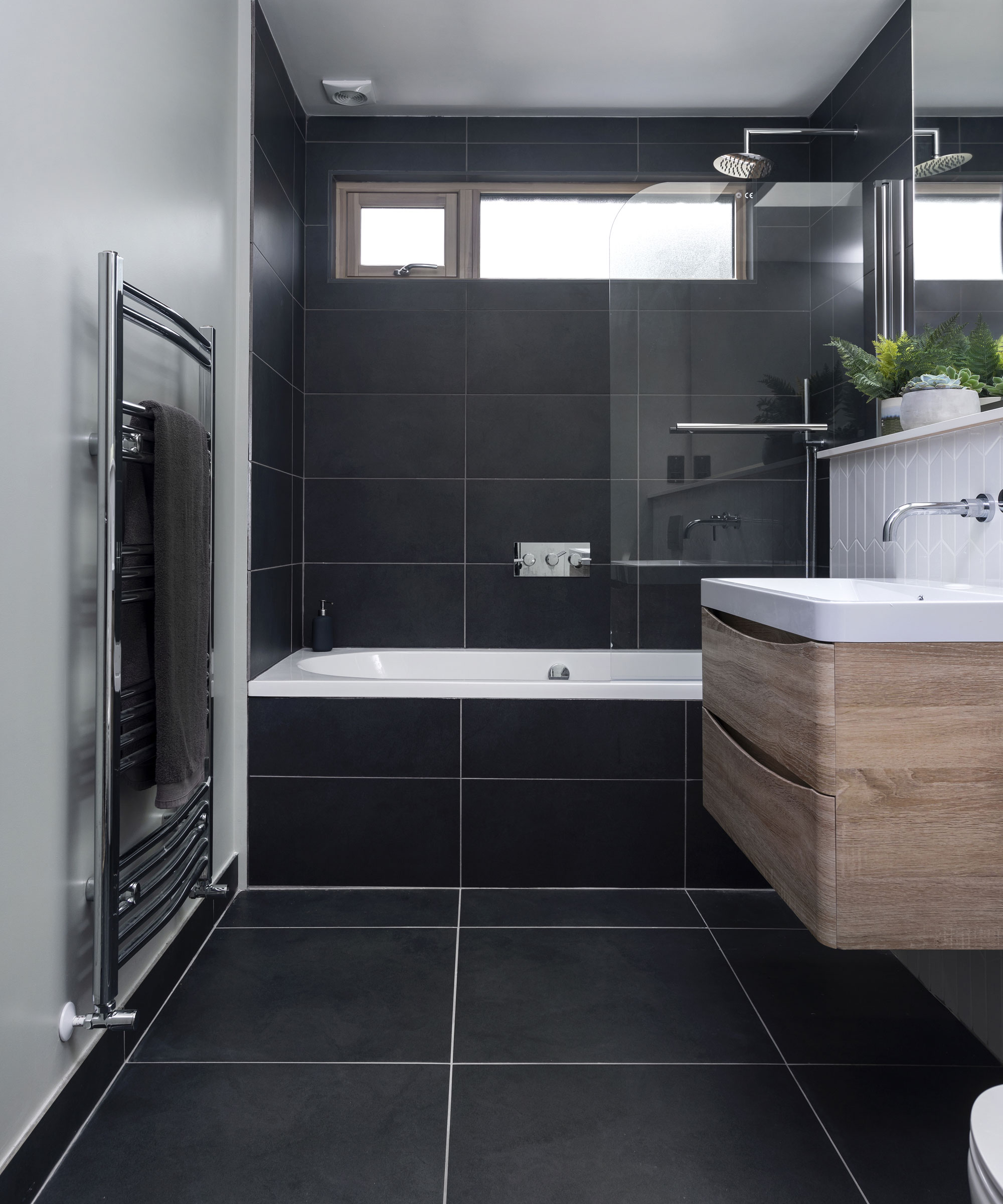
While dark tones can often make a room feel smaller, the use of large tiles in this case actually creates an illusion of space. Sanitaryware, Crosswater. Vanity unit, Drench. Tiles, Tiles Direct. Walls painted in Shadow White, Farrow & Ball
Subscribe to Real Homes magazine
Want even more great ideas for your home from the expert team at Real Homes magazine? Subscribe to Real Homes magazine and get great content delivered straight to your door. From inspiring completed projects to the latest decorating trends and expert advice, you'll find everything you need to create your dream home inside each issue.
Join our newsletter
Get small space home decor ideas, celeb inspiration, DIY tips and more, straight to your inbox!
-
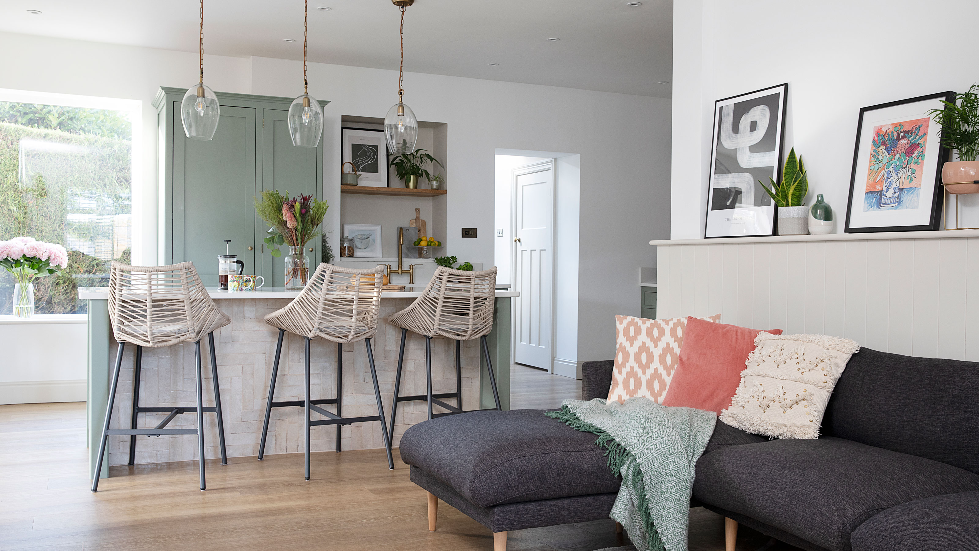 Planning makes perfect when designing this dream home
Becks and Martin Huntley spent lots of time on design and layout to get the most out of their space when renovating
By Karen Wilson
-
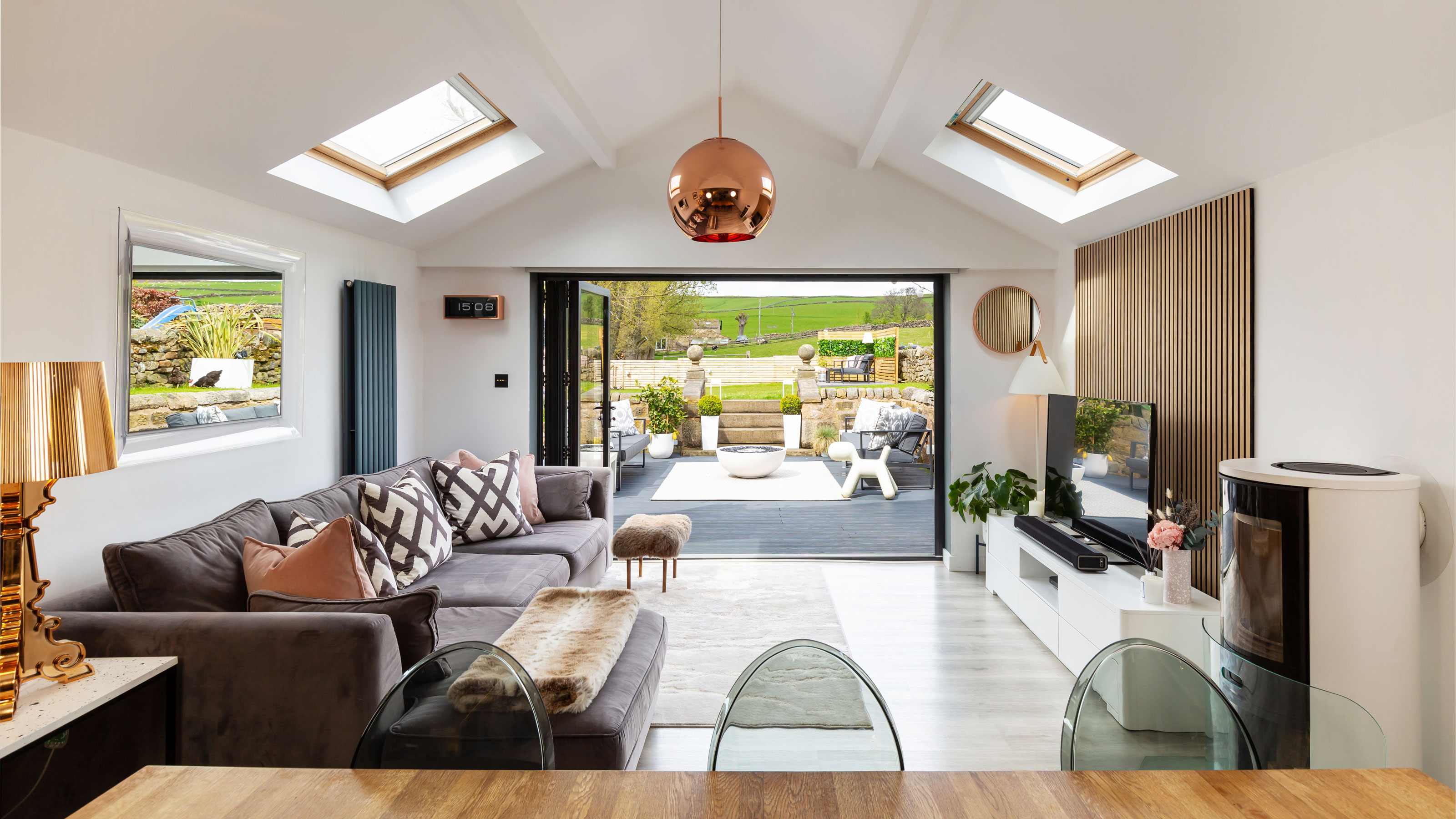 Interior design enthusiast's converted farm home is a showcase for luxe style
Sam Marlow, the founder of Lime Lace, used all her skills to give the renovated period property a signature look
By Alison Jones
-
 Real home: Long-term extension project creates the perfect family space
Kate and Adam’s three-pronged renovation took over a decade – but was well worth the wait
By Karen Wilson
-
 Real home: knocking through for more space without extending
By knocking together a warren of disjointed rooms, Patsy and Al have created a new hub to their home without needing to extend
By Karen Wilson
-
 Before and after: an extended 1930s home with quirky creative touches
After a side and rear extension and a full-blown makeover, this house is fit for a family
By Karen Wilson
-
 Before and after: a modern kitchen extension with cool industrial touches
We love this contemporary extension – especially that surprise pop of colour…
By Ellen Finch
-
 Real home: this interior designer's home is a masterclass in layering texture
Notebooks at the ready – this extended terrace is packed with stylish ideas to steal
By Ellen Finch
-
 Before and after: this interior designer extended her family home for £50k
All thanks to a combination of skill and imagination
By Ellen Finch
