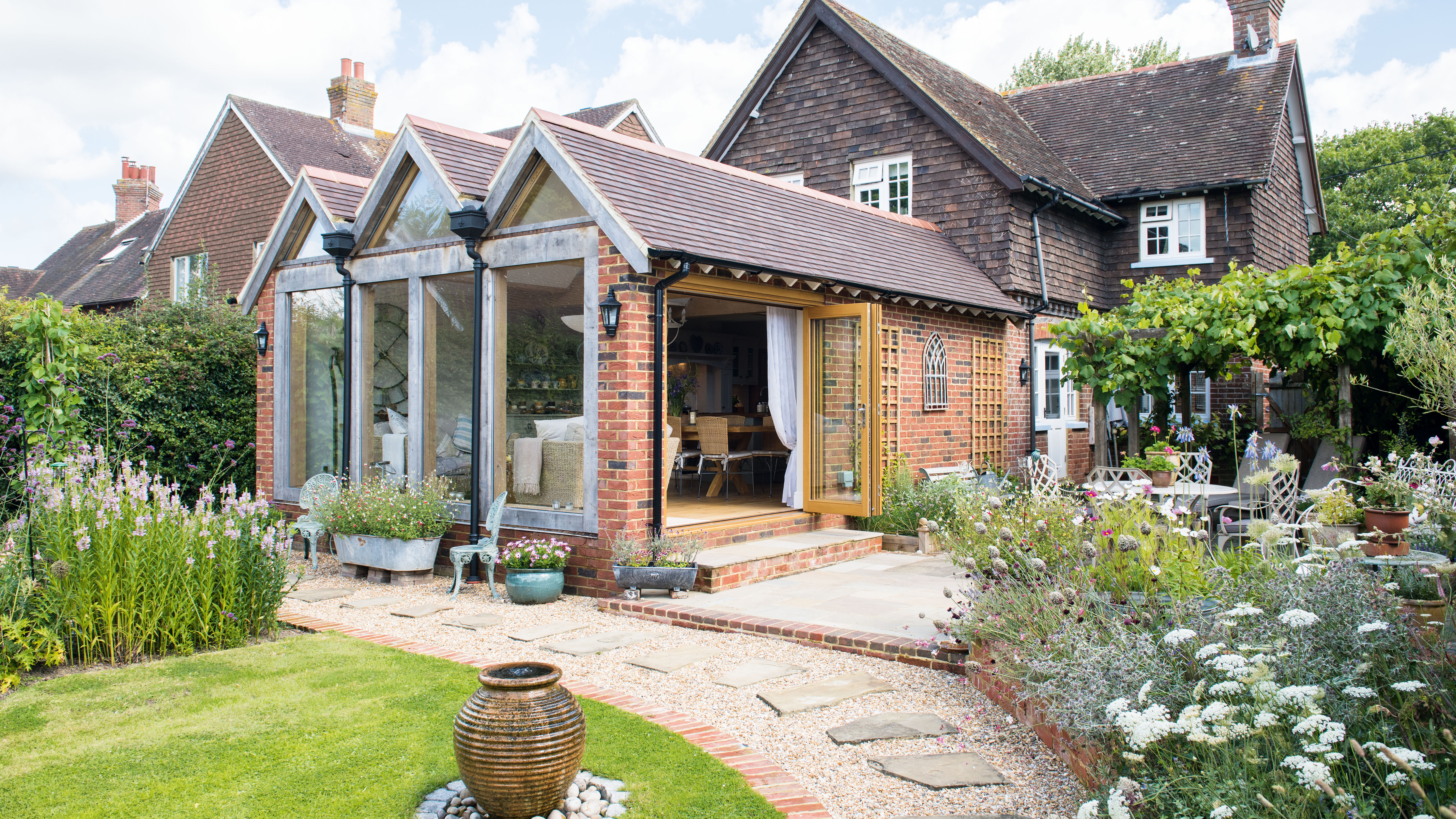
With its pretty peaked roof and hand-hewn oak beams, it’s clear there’s nothing off-the-peg about this stunning kitchen-diner.
‘Building the extension was exciting because it was our first project together, and we wanted to get it right,’ says Deborah. The aim was to bring light, space and elevation to the rear of the property, and to connect it with the garden that Deborah plants and prunes with green-fingered passion.
Find out what they did next, then browse through more real home transformations and extensions.
Project notes
Owners: Deborah Eustice, performance director for an educational trust, and her husband Mal, an aviation safety consultant
Property: A late-Edwardian, three-bedroom house in Kirdford, West Sussex. The property is in a Conservation Area and was built as a dairy manager’s cottage
What they did: Knocked down the rear wall and adjacent brick outbuilding, and built a new kitchen-diner with a vaulted roof and large windows that give a view onto the garden
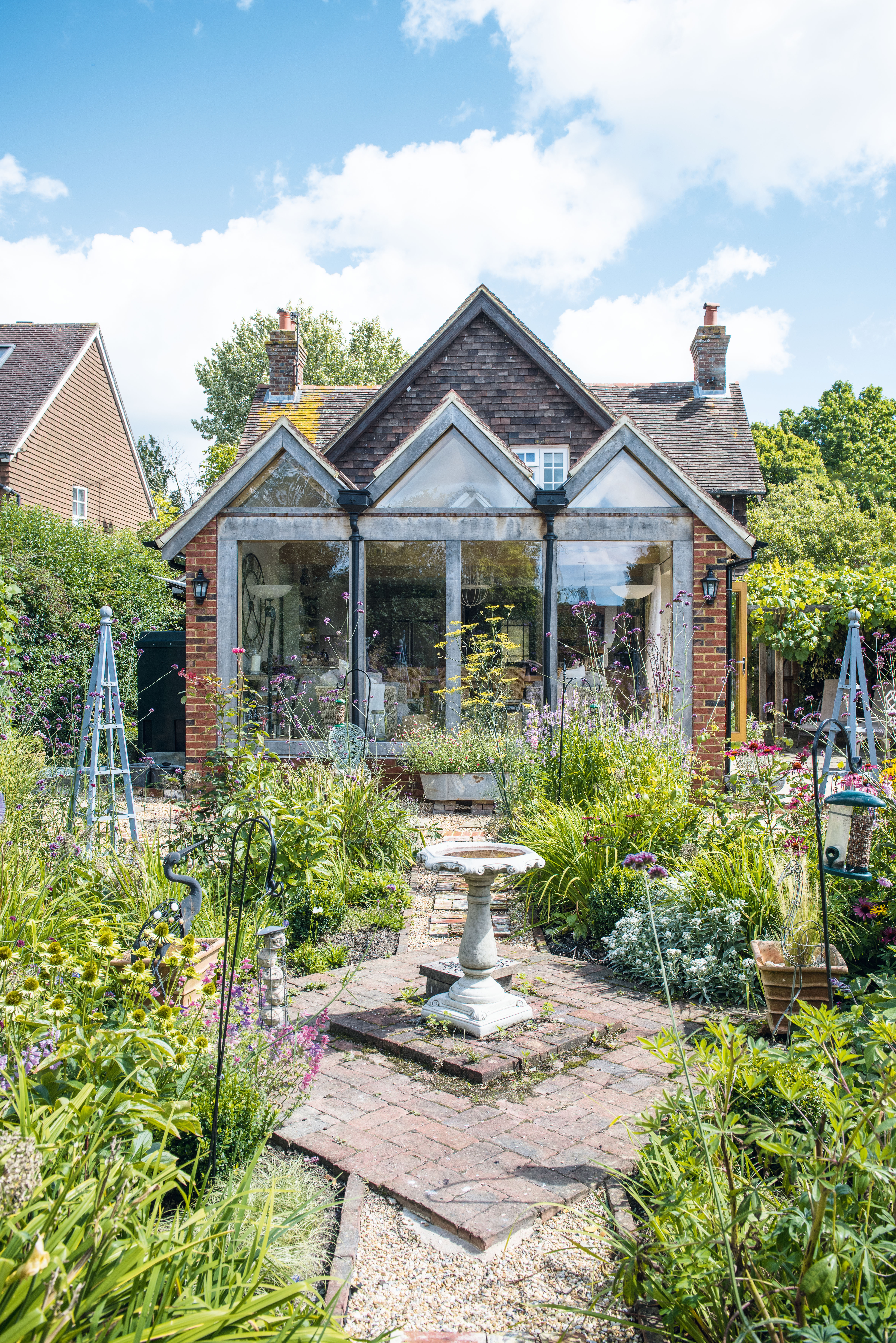
As the property sits within a Conservation Area, the couple wouldn’t have been allowed to build a double-storey extension even if they’d wanted to. ‘Not building high gave us freedom to be more creative,’ says Deborah, who worked with an architect to reflect the quirky roofline of the house with three gables.
Huge green oak beams support the structure, with eight Velux windows running along the central peaked roof to flood the room with light. ‘I envisioned it as a barn, but I think it’s more like a cathedral,’ Deborah laughs.
Deborah had a clear idea of what she wanted for the space – painted, Shaker-style units; a range cooker, and ‘the biggest island I could find,’ she says. ‘I spent many a happy hour with graph paper and scissors, plotting where everything would go and how to organise the cooking, eating and seating areas.’
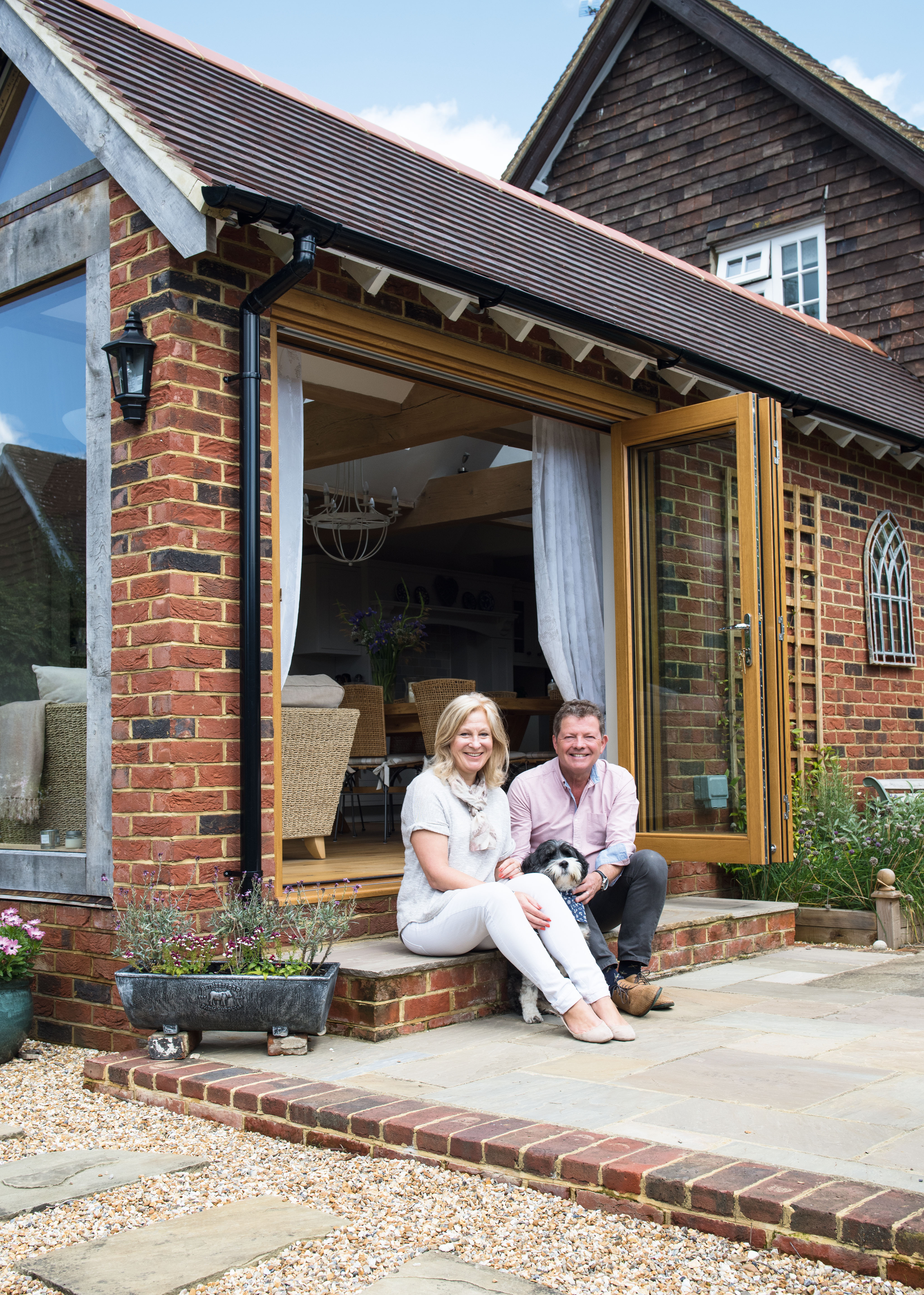
Deborah and Mal Eustice on the step of their extension
MORE FROM PERIOD LIVING
Period Living is the UK's best-selling period homes magazine. Get inspiration, ideas and advice straight to your door every month with a subscription.
The attention to detail was worth it to create a layout that functions well and flows easily from one area to the next. ‘I love cooking, and this kitchen is the most practical I’ve ever had,’ says Deborah.
And rather than installing full-width doors at the rear of the room, they put in a side entrance instead. ‘There would have been an awkward step down to the garden otherwise, and I would have had to landscape it differently,’ Deborah explains. ‘This way, I can enjoy an uninterrupted view into the garden at the back without trying to squeeze past the sofas to get outside.’
As a thank you for putting up with the disruption of the building work, the couple invited all of their friends in the village. ‘This kitchen is brilliant for parties,’ says Mal. ‘Put on the music and the room itself provides the atmosphere.’
Deborah and Mal wanted to bring light, space and height to the back of their Edwardian home, and this extension with three gables does exactly that. The solid oak sliding doors that open onto the terrace are from Vufold
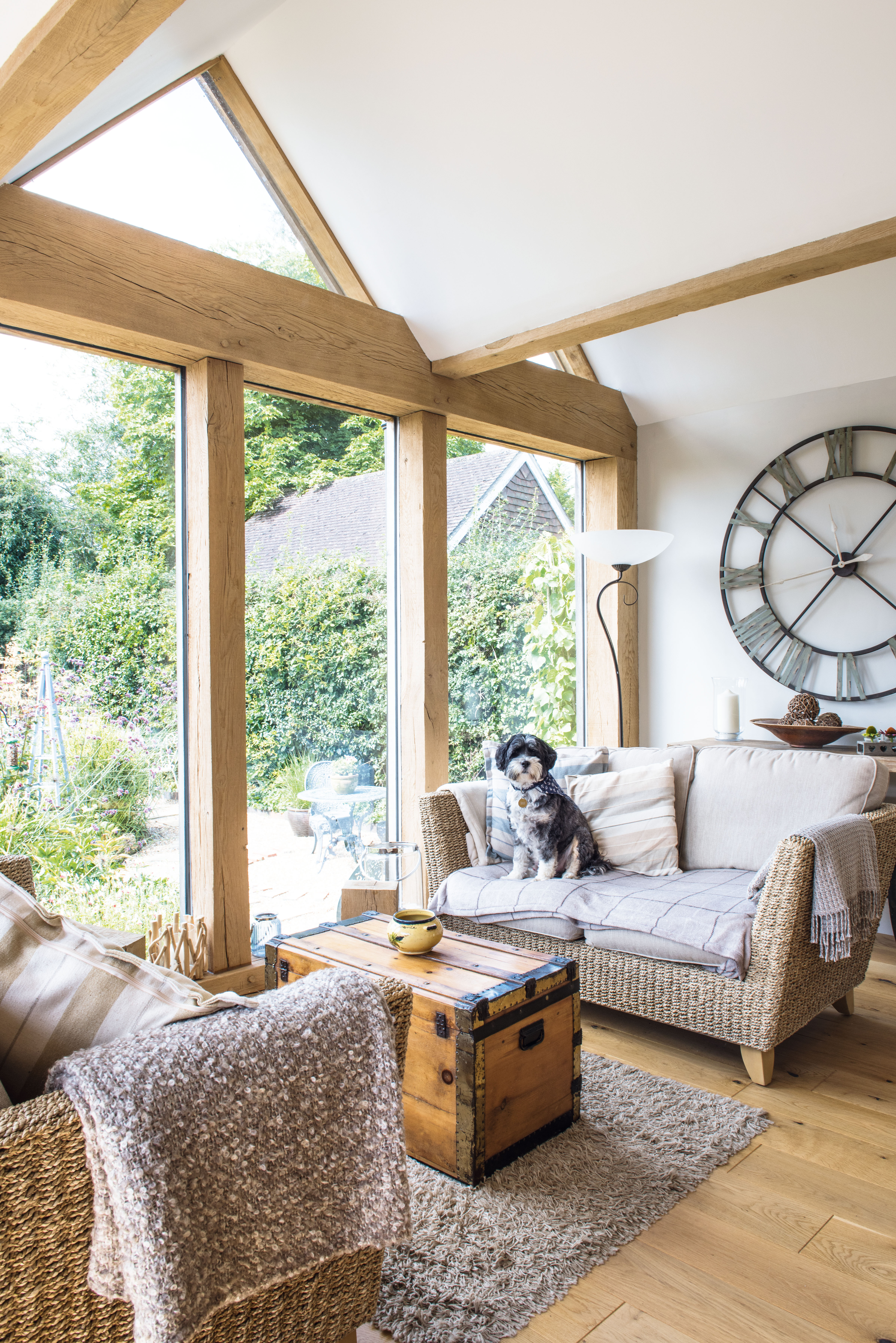
This is Deborah’s – and Tibetan terrier Bertie’s – favourite spot from which to enjoy the garden. The sofas are from her old home, the clock is from local vintage shop, With Love, and the trunk is from Mabel’s Emporium
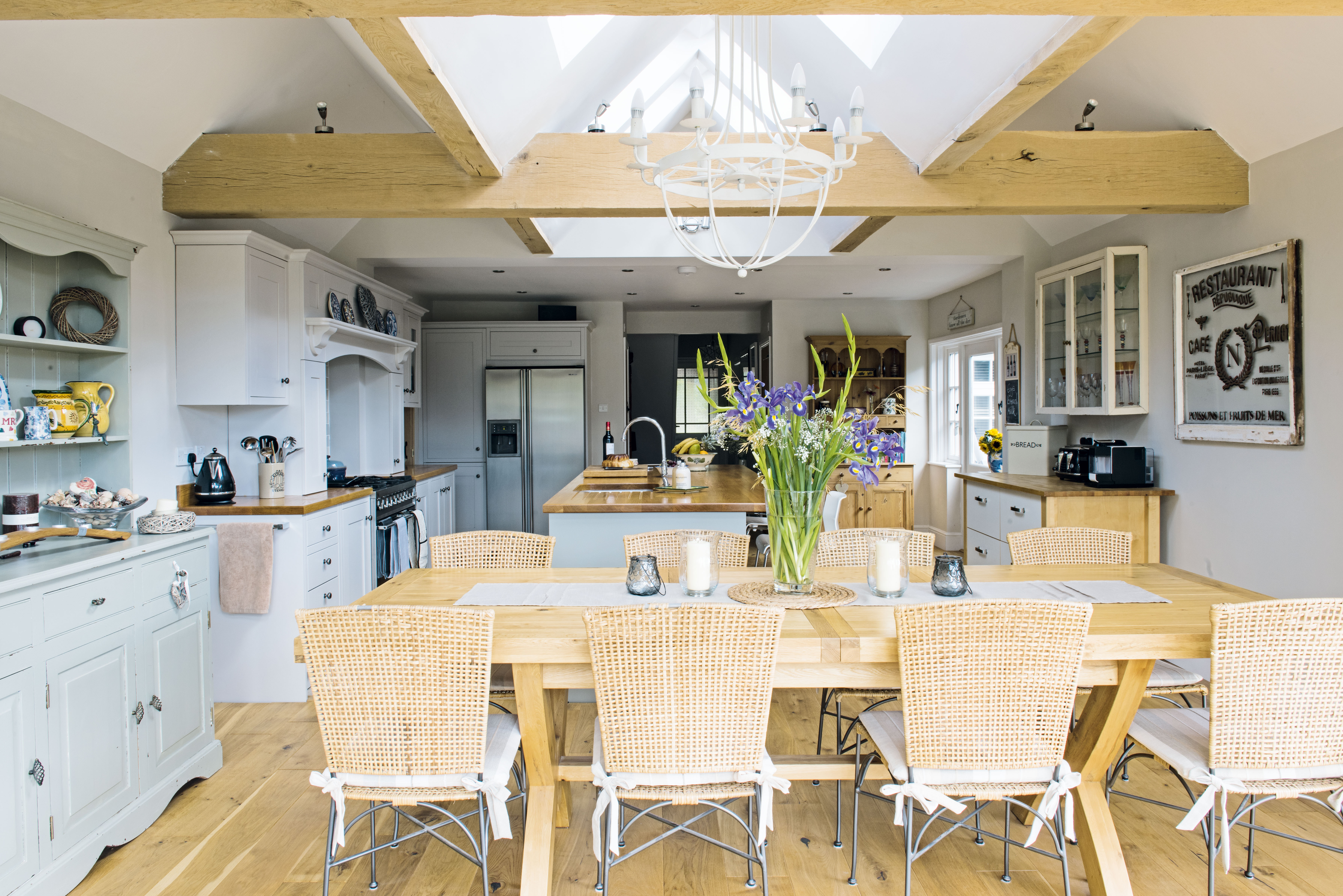
The table, which easily seats 10 people, came from their neighbours’ furniture company Oakapple Trading, who also supplied the elegant chandelier. The dining chairs are vintage John Lewis – about 20 years old. Deborah brought the dresser from her previous home and painted it in Farrow & Ball’s French Gray. The engineered oak floor is from Flooring Supplies
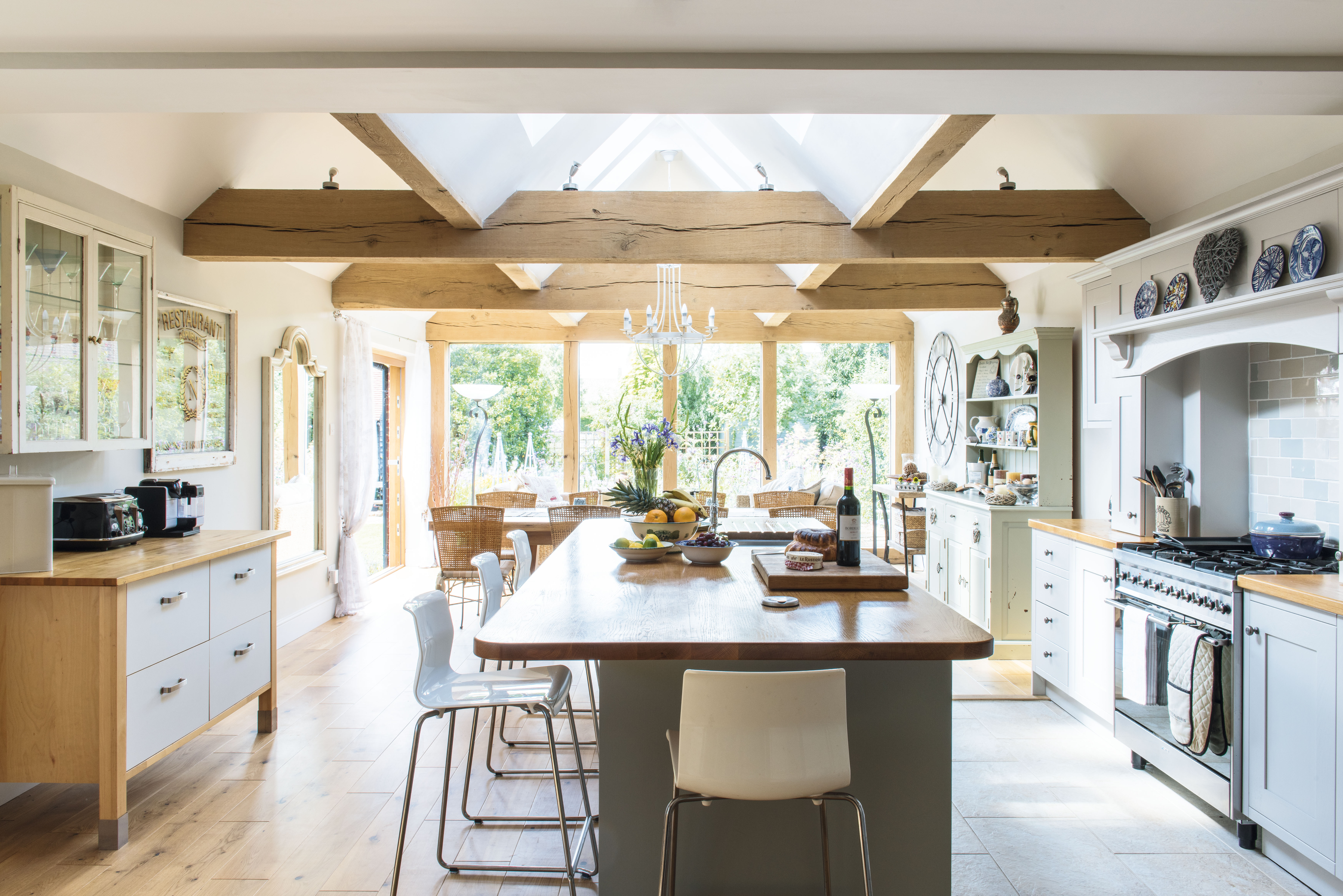
The Shaker-style in-frame kitchen, with solid oak worktop, is from local Sussex company HKS. Deborah had the island unit painted in Lamp Room Gray and the remaining cabinets painted in Cornforth White, both Farrow & Ball. The chest of drawers on the left and the Glen stools are from Ikea

Deborah designed the garden to look at its best through the wall of glass
More real home transformations:
Join our newsletter
Get small space home decor ideas, celeb inspiration, DIY tips and more, straight to your inbox!