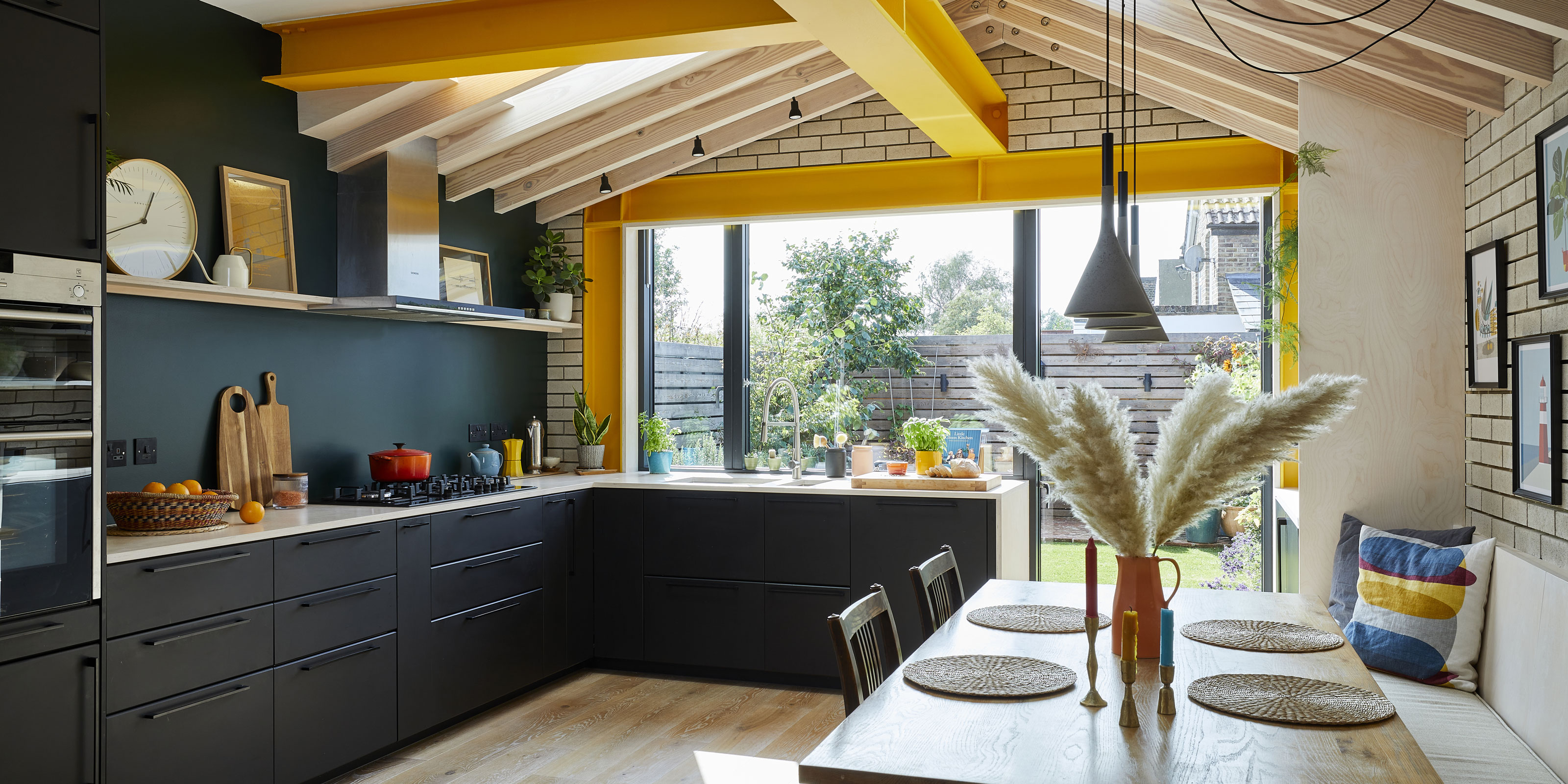

Yellow is one of those colours that instantly puts a smile on your face. Even the smallest hint of it can flood a space with sunny feeling – and it’s the power of this colour that drew George Woodrow to it when he was designing a kitchen extension for his young family. The large, sociable space he’s created has left the old galley kitchen totally unrecognisable – save for the bright yellow steels that trace the outline of the old footprint on the ceiling.
Of course, there’s much more to this extension than yellow steels, and George’s thoughtful design is evident throughout the space, from the bespoke joinery that combines aesthetics and practicality to the carefully considered flow between rooms. Over the next few pages, George talks through the ideas behind his project – and how to design a space that’s built with young children in mind.
If you have plans to extend your home, like George and his family, we have masses of ideas and helpful advice on what to do and where to start.
- For more real home transformations, head to our hub page.
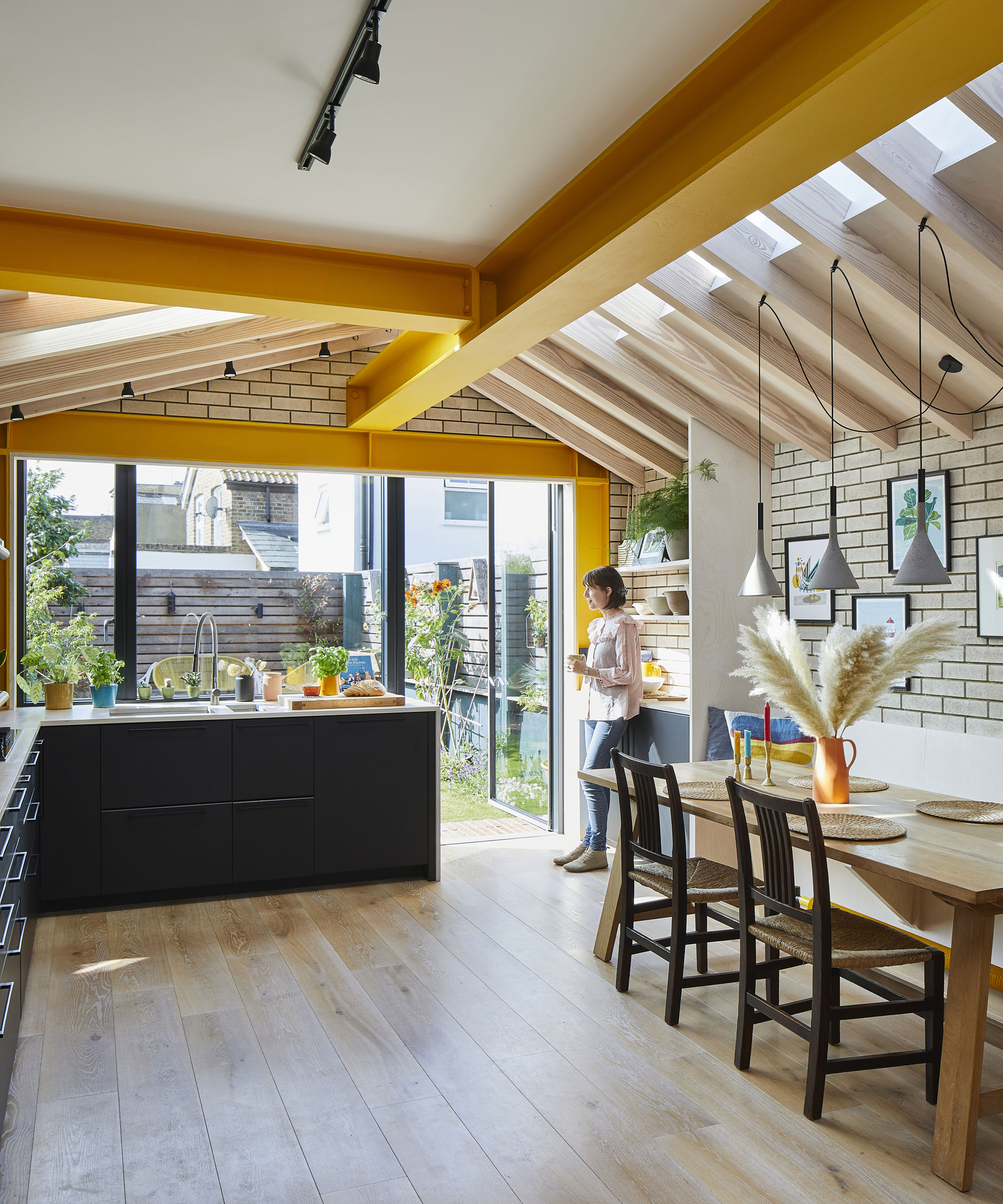
Old PVC doors from the dining room, and a frosted window from the utility, have been replaced with a large window and pivot door for easy access to the garden Windows and door, Velfac. Beams painted in Traffic Yellow RAL 1023. Joinery, Decor House Construction. Table, Barker & Stonehouse
‘The layout we inherited wasn’t the original one – the guy who lived here before us had tinkered around with it as a DIY project,’ says George. ‘The opening between the dining and living rooms was already there, and the kitchen was a simple galley. It led into a pre-1950s utility at the very back with a frosted window, which made the house feel totally disconnected from the garden.
Profile
The owners Architect George Woodrow, his partner, Rosie, who works in internal communications, and their children Agatha and Sidney
The property A three-bed Edwardian end-of-terrace in
Hampton, London
Project cost £142,500 (including first-floor renovation)
‘Because the hallway led straight into the dining room, the table became a bit of a dumping ground for when you came in from work. There was no differentiation of zones. The staircase had no bannister, either – a disaster waiting to happen with young children!’
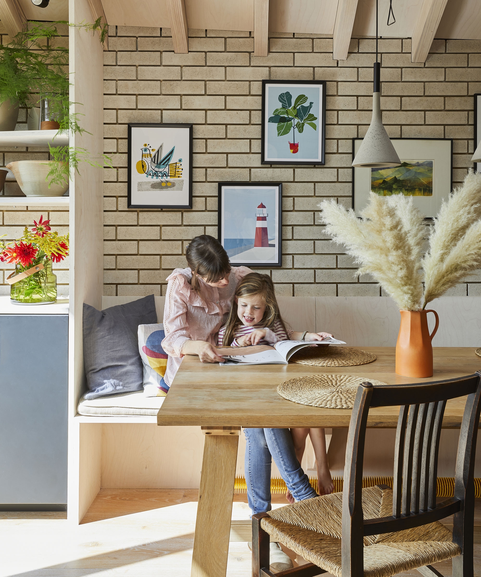
Chairs that belonged to George’s late grandparents have been rewoven for the kitchen by a furniture restorer. Joinery, Decor House Construction. Cushion, Window Seat Cushions. Radiator (under bench), Bisque. Foscarini pendant lights, Holloways of Ludlow. Prints, John Lewis & Partners
‘The plot had a long side garden, which offered space for an addition. Though our extension is a wraparound, it’s only classed as a side return extension. The structure’s been designed to support a future attic ‘pod’ room over the bathroom. The yellow steels define the outline of the old kitchen and the utility.
‘We were keen to have as much floor space as possible in the kitchen, so went for an L-shaped layout with no island. We can still move through the space while the kids have got toys spread out across the floor. The wall with the boundary is slightly angled. We played into that by making storage along it either side of the bench seat, with varying depth and width.’
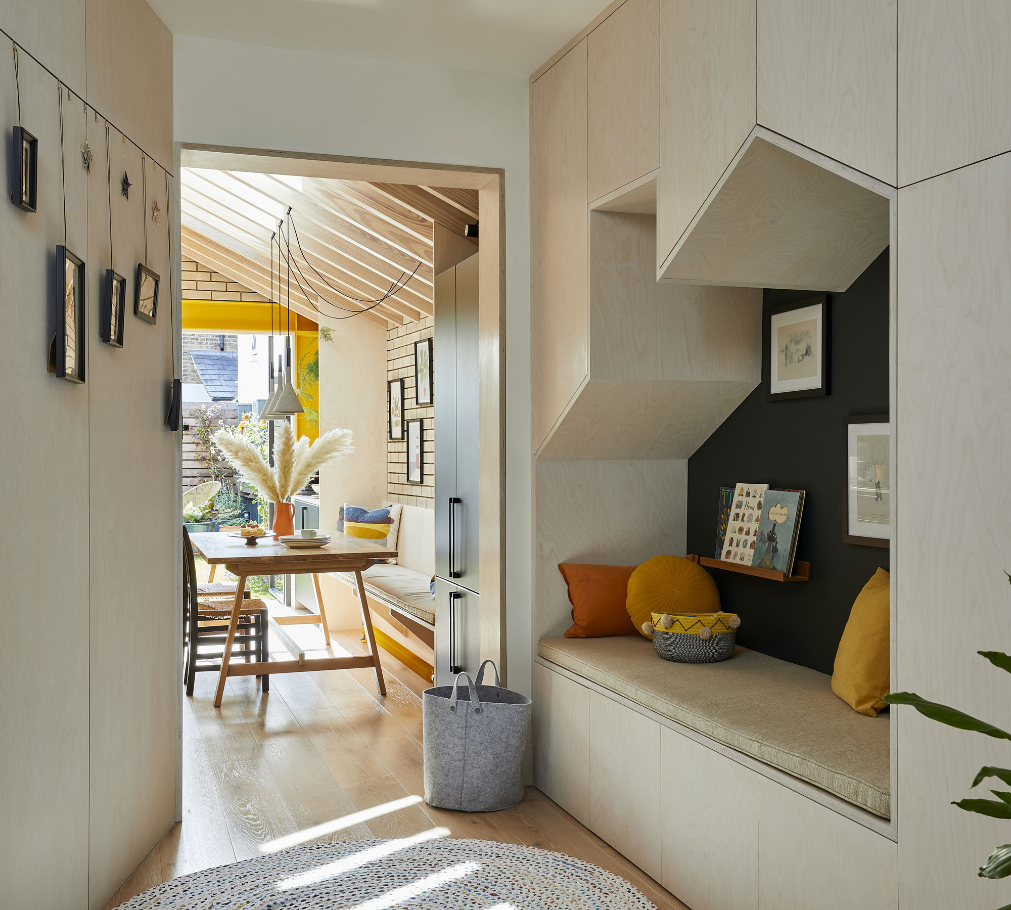
Bespoke sloped storage maximises space in the playroom. The couple installed new sash windows at the back to match the aluminium windows of the kitchen. Joinery, Decor House Construction. Bench cushion, Window Seat Cushions
‘We used wood fibre insulation in the extension. It’s made from waste products from the timber industry, which allows the building to “breathe”, and it’s much healthier for the builders working on it as well as the inhabitants.
‘After some consideration, we decided not to have a fully-glazed opening to the garden. Over the past few years, I’ve seen overheating in the summer become more of an issue, and clients are increasingly looking for more shading for that reason. The only thing I might have changed is having a roof vent overhead, rather than fixed glass – but at the time we were weighing up the aesthetics of that extra framing, too.’
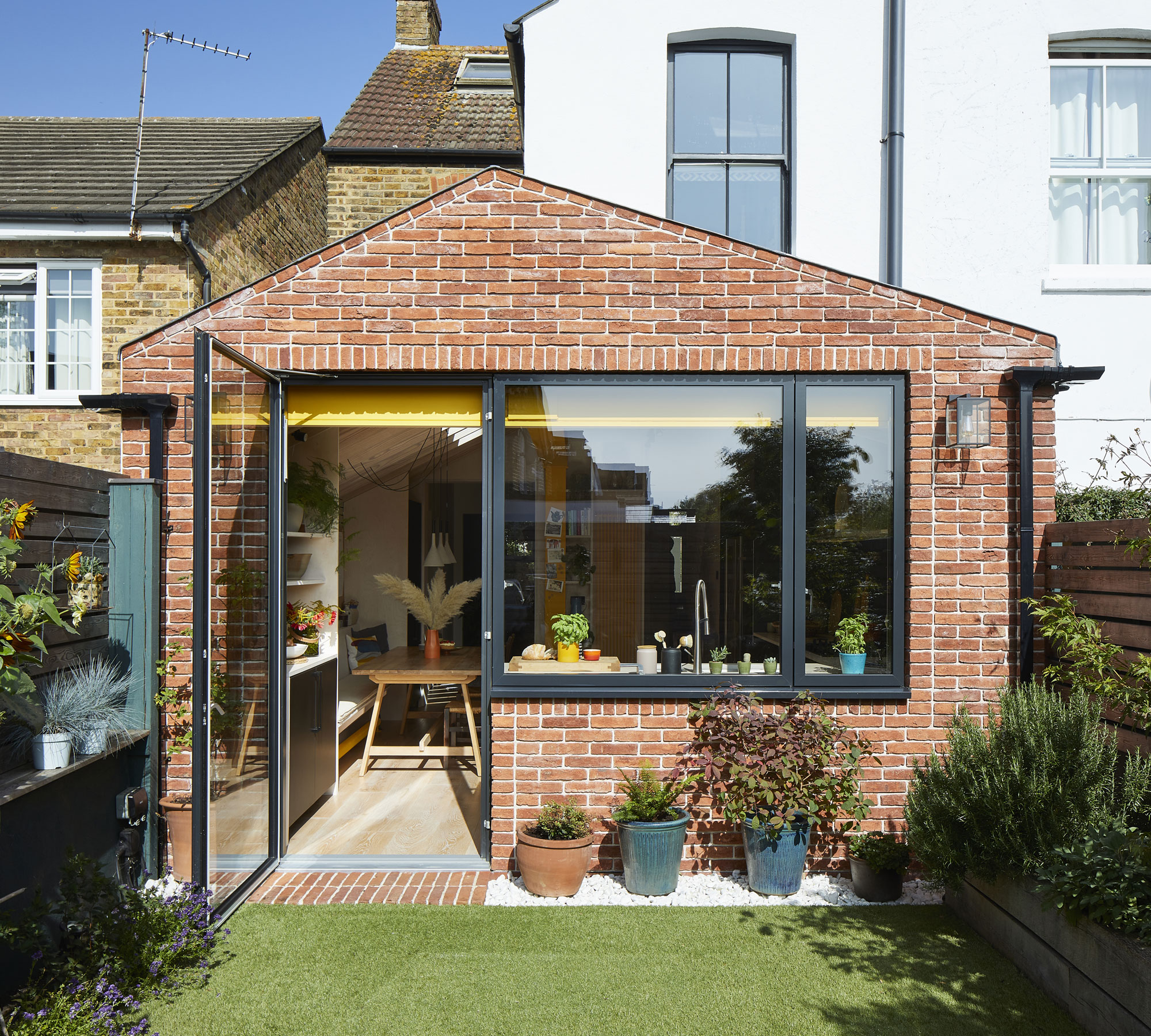
Glazing, Velfac. Bricks, Imperial Bricks
‘Design wise, all of the elements came together later on. The one that created a sense of cohesion was painting the steels yellow. The radiators were one of the first purchases we made, but it wasn’t until much later in the project we decided to switch up the rusty-red steels to match them. I’ve never regretted adding the yellow – it’s such an uplifting colour and stops the size of the steels from feeling oppressive.
‘We’ve used dark green in the living room and playroom as well as at the back of the kitchen to tie it all together. Since we don’t have a huge amount of kitchen stuff, we use the shelf above the units to display things like plants, clocks and pictures.’
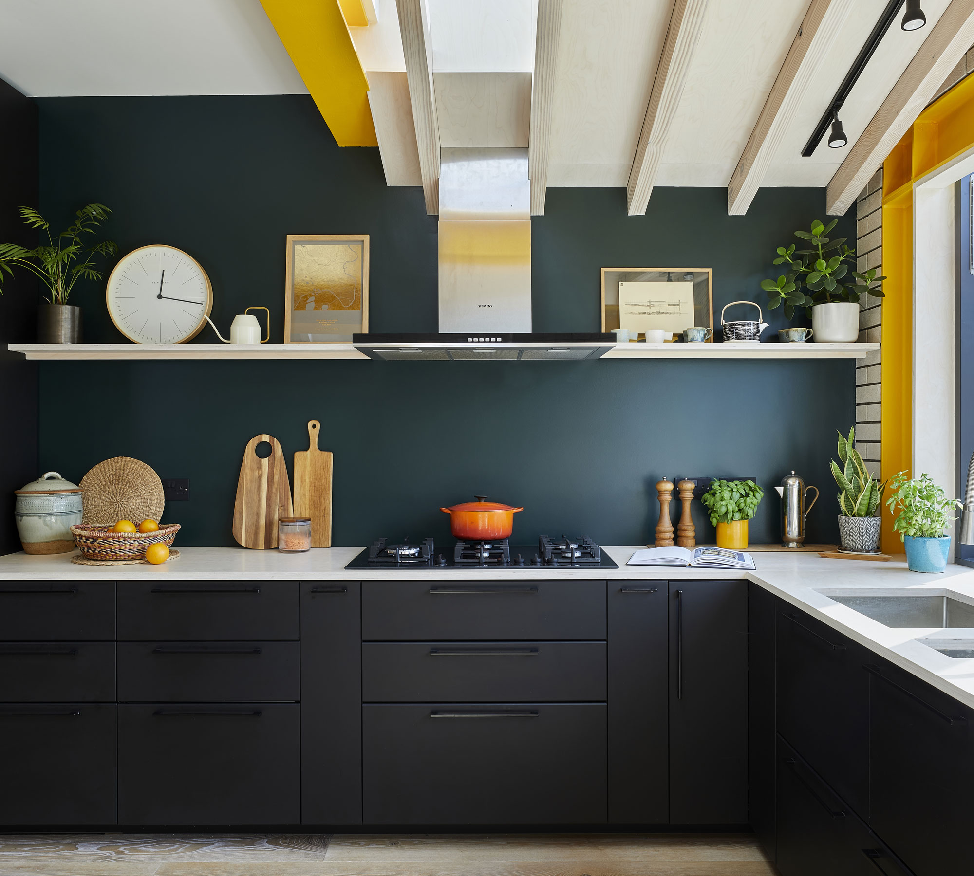
George made savings by opting for Ikea units, updated with new handles, plywood worktop and a painted splashback. Kitchen units, sink and dishwasher, Ikea. Wall painted in Black Green, Leyland Trade. Oven, hob and hood, John Lewis & Partners. D-line handles, Ironmongery Direct. Birch plywood worktop, Moss Timber
‘I know kitchen companies say to put a large proportion of the budget for the kitchen; I tell clients the opposite. If you are extending, the shell is the part you’ll never want to touch again. You’ll update a kitchen, but you’ll likely never reroof. Our kitchen has lots of budget-friendly touches – we painted the splashback and used plywood for the worktop; with two kids, it’ll get bashed up anyway!
Contacts
Architect Woodrow Architects
Rear windows and door Velfac
Pine and plywood supply Moss Timber
‘My favourite parts of the space are the fun yellow steels and flexibility of the playroom joinery. We have gained valuable floor space, which is crucial in a medium-sized house, and improved our interaction with the outdoors. The kids love running in and out, and we feel we have a proper garden now.’
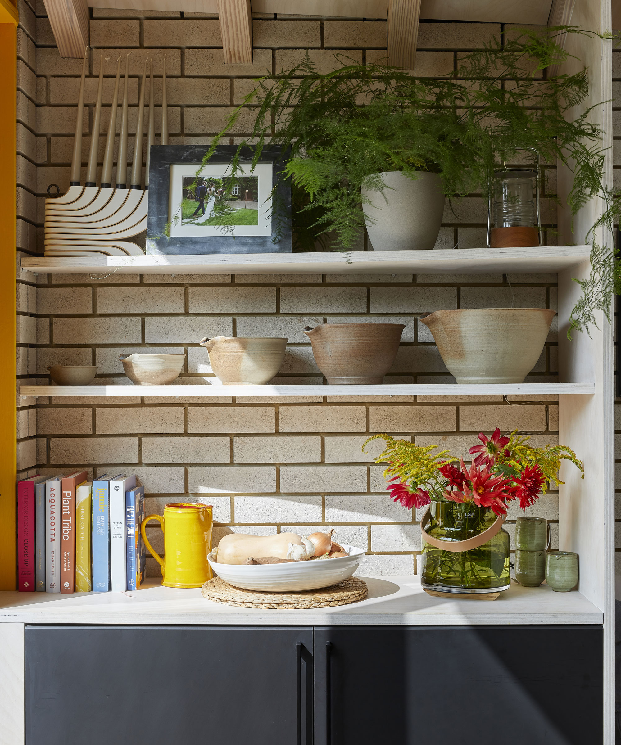
The open shelves are used for displaying an eclectic and appealing array of objects Joinery, Decor House Construction
Subscribe to Real Homes magazine Want even more great ideas for your home from the expert team at Real Homes magazine? Subscribe to Real Homes magazine and get great content delivered straight to your door. From inspiring completed projects to the latest decorating trends and expert advice, you'll find everything you need to create your dream home inside each issue.
Join our newsletter
Get small space home decor ideas, celeb inspiration, DIY tips and more, straight to your inbox!

Formerly deputy editor of Real Homes magazine, Ellen has been lucky enough to spend most of her working life speaking to real people and writing about real homes, from extended Victorian terraces to modest apartments. She's recently bought her own home and has a special interest in sustainable living and clever storage.
-
 You won't believe this stunning five-bed family home used to be a tiny two-bed
Katie and Stuart went big with a double-story extension to create a dream space for themselves and their daughters
By Ifeoluwa Adedeji Published
-
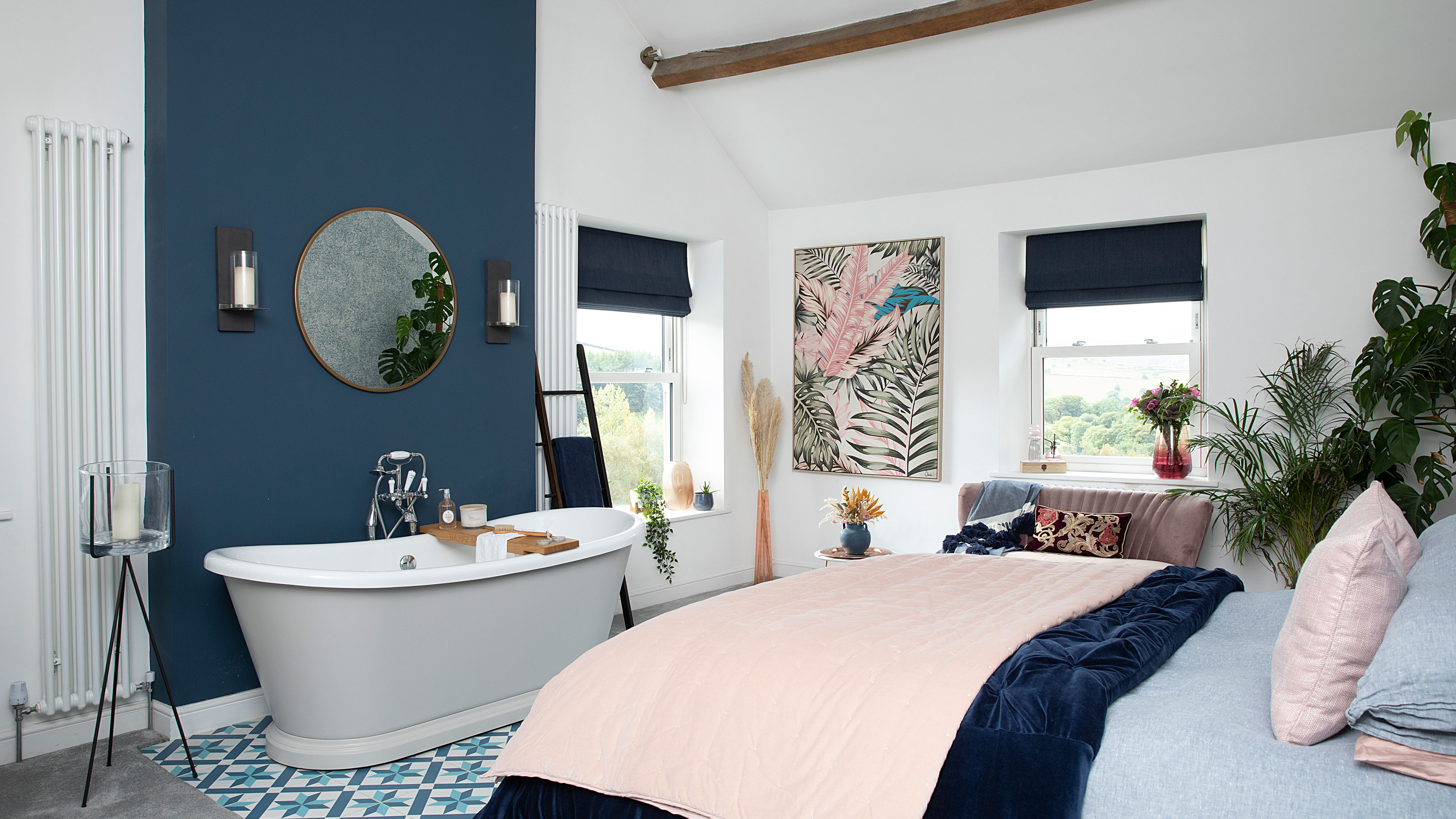 The freestanding bath in this dreamy bedroom is sheer five-star luxury
Emma and Martin wanted a suite just like in an upscale hotel — mission totally accomplished.
By Ellen Finch Published
-
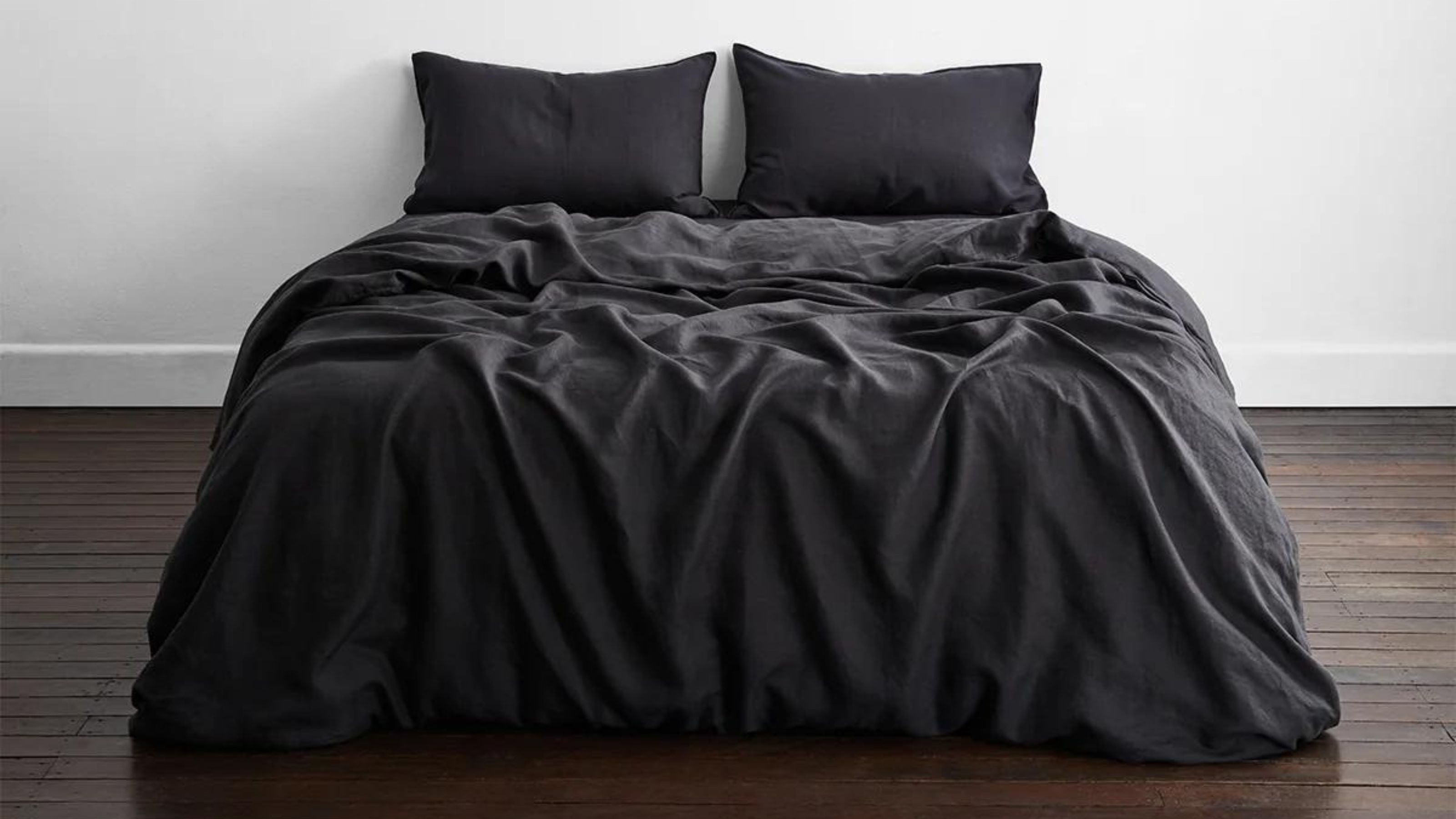 I just know 2023 is going to be all about black bedding sets
White sheets are out, black bedding sets are in — here's everything you need to know about this bedroom decor trend
By Louise Oliphant Published
-
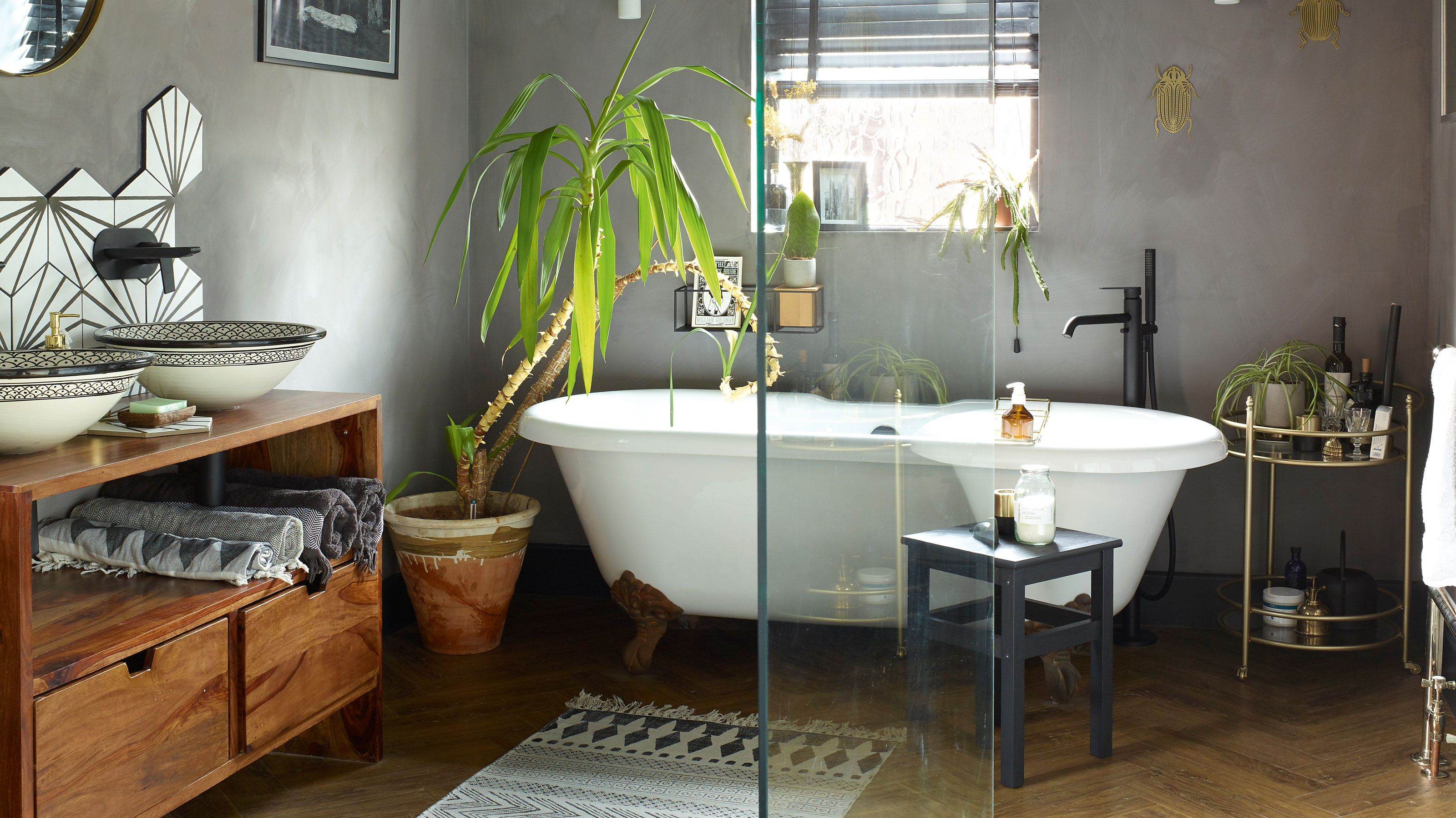 A bland beige bathroom is transformed into a STUNNING contemporary sanctuary
First-time homeowners Ellie and Oliver’s new bathroom is a well-planned fusion of modern pieces and exotic touches
By Ellen Finch Published
-
 Restored seaside home oozes coastal charm
Laura and James Simpson turned a rundown eyesore into a stylish and welcoming family home featuring the colours of the sea
By Sharon Smith Published
-
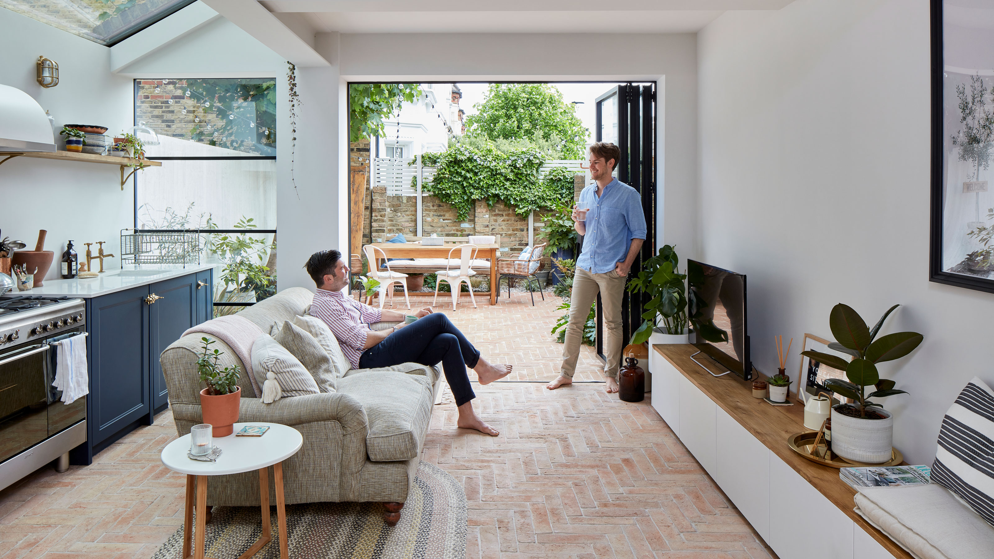 Real home: Extended kitchen/garden room has the flavour of Italy
Memories of the palazzo where they married inspired David and Andrew’s ‘bella’ new kitchen
By Alison Jones Last updated
-
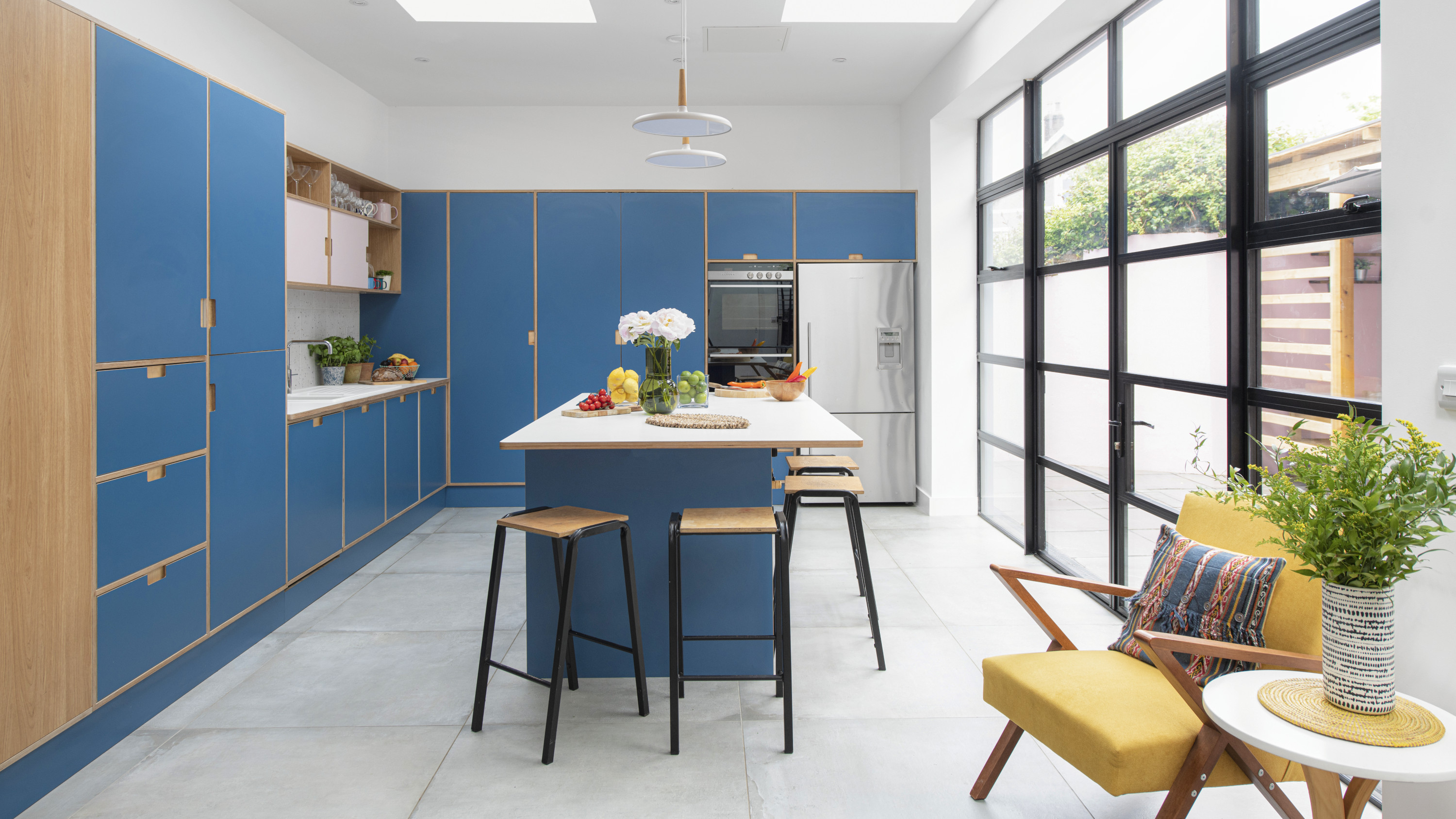 Before and after: cool plywood kitchen shows bespoke is the way to go
This extended space is packed with ideas
By Ellen Finch Last updated
-
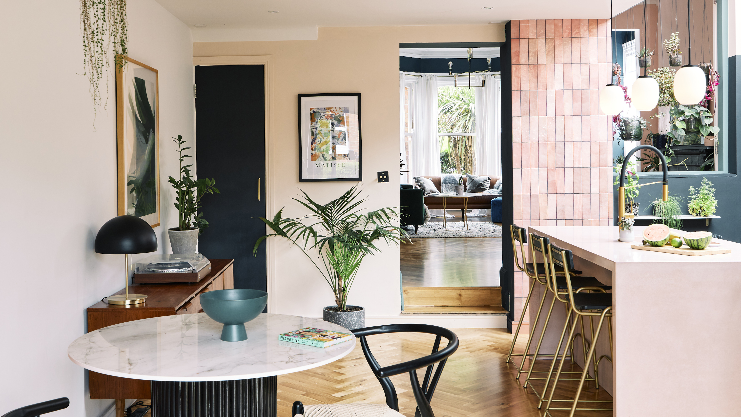 Before and after: this fashion buyer's £30k kitchen reno is full of ingenious cost-saving ideas
Plus there's some pretty serious colour inspo here
By Amelia Smith Last updated
