Patience has been a virtue for Kate and Craig Moorhouse, who have waited 15 years to create their dream ground-floor extension. After renting a Victorian terraced house in the bustling but pricey Manchester suburb of Chorlton, they moved five minutes away to the quieter enclave of Firswood, where they’d found an abundance of 1930s semis with driveways and gardens that would’ve fetched a premium where they used to live.
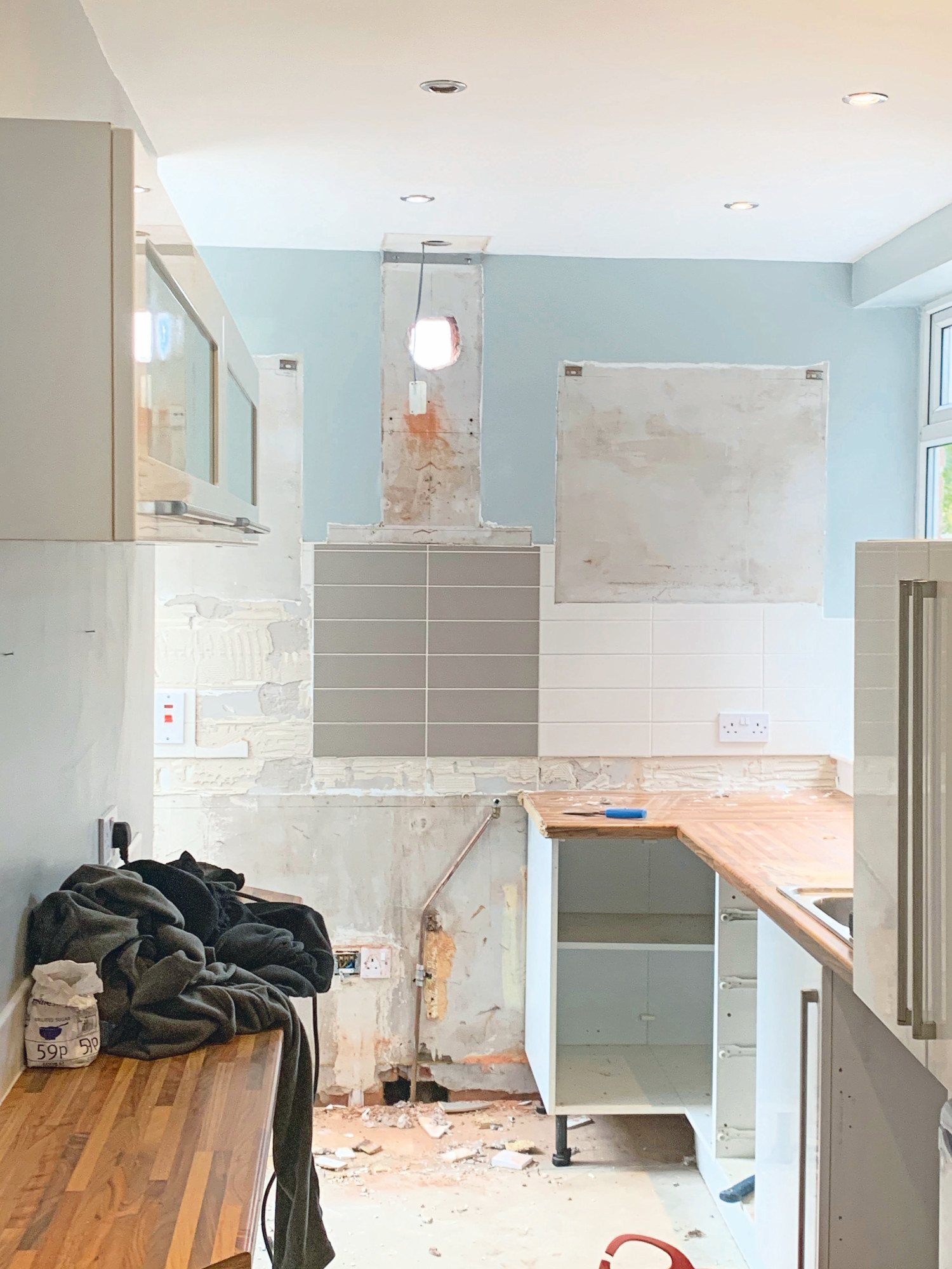
After whittling down their shortlist, they settled on a 1930s house in a quiet location. 'With plans to have a baby, we didn’t think about extending,' says Kate. 'Instead we focused on ripping out the smelly carpets, rewiring, replacing the back boiler, fixing the roof and updating the kitchen and bathroom.'
Their new home had scope for an ambitious remodel, but these plans went on the back burner with the arrival of son Herbie. ‘It was a while before we could afford to really change the layout of our home, and it started with trying to fit in a downstairs loo,' says Craig. 'Other neighbours had installed one under the stairs, but it would’ve been tight. As there was a garage with asbestos roof at the side, it made sense to knock it down and add a side return extension – which would give us an office and utility, too.'
The side extension was finished in six weeks – then lockdown hit. Nine weeks later, the couple finished the hob with a new rear extension, completing their plans for a Scandi-style open-plan kitchen, dining and living area. Below, Kate and Craig explain how they pulled it off.
The kitchen
Profile
The owners Kate Moorhouse, a graphic designer and owner of Solo Design Studio (@solodesignstudio; solodesign.studio), her husband, Craig, group design manager for flooring company James Halstead, their son, Herbie, and cats Teddy and Doris
The property A three-bedroom 1930s semi in Manchester
Project cost £95,000
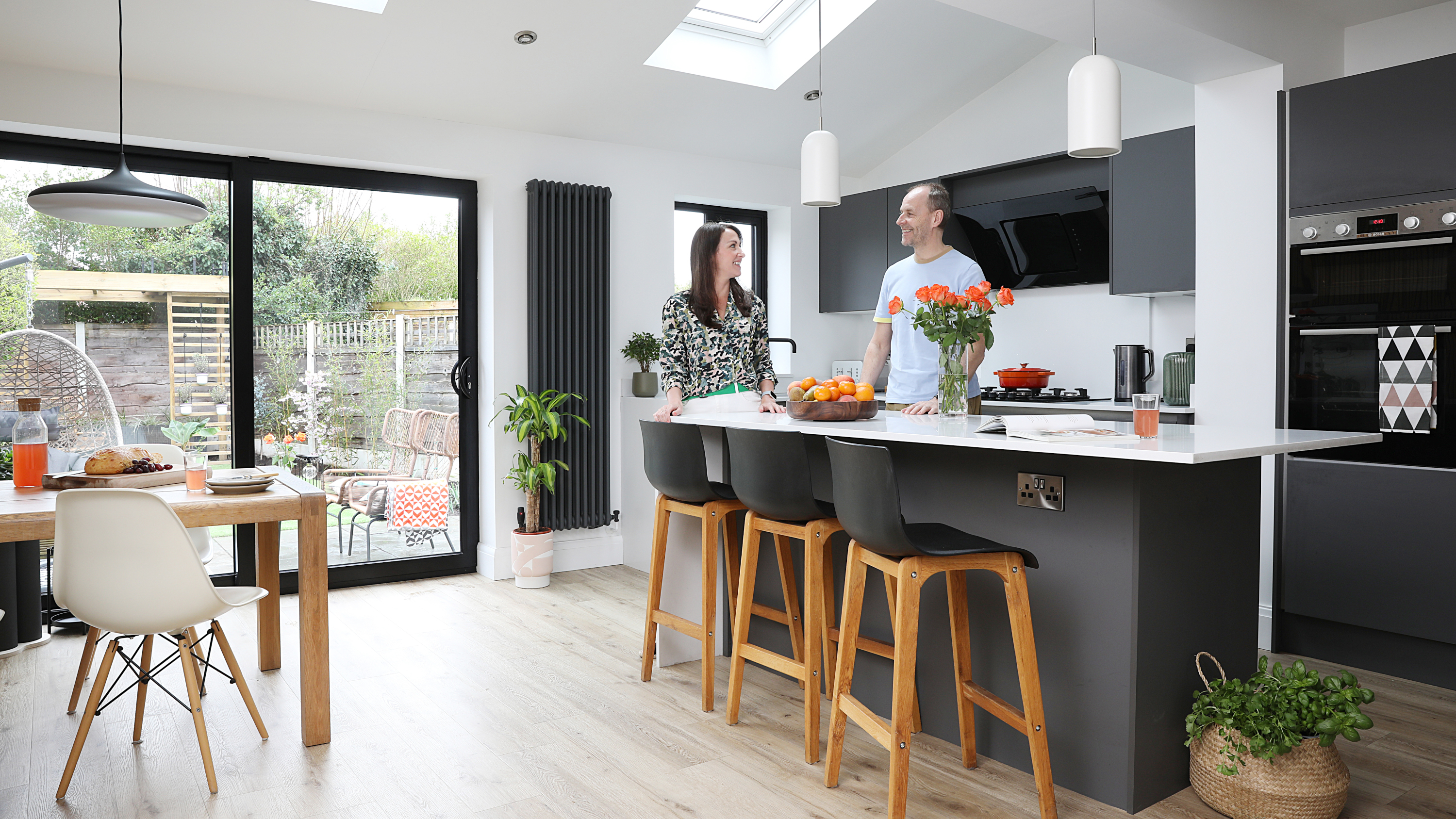
'After visiting a neighbour’s house and seeing their open-plan living dining and kitchen space, we decided to use the same architect and extend at the back,' says Kate. 'We do a lot of entertaining and cooking but I was tucked away in the tiny galley kitchen, so it really appealed to me, and we could remortgage for the extra funds needed.
‘The design has a pitched roof, which gives us more light, more ceiling height and is more in keeping with the style of the house,' Kate adds. 'As I’m a graphic designer and Craig is a product designer, we could talk about things from a design perspective and justify our reasoning. We’re both trained in colour, so all our paints are mixed using the NCS colour system at Johnstone’s paints, and we both love a pared-back architectural style.'
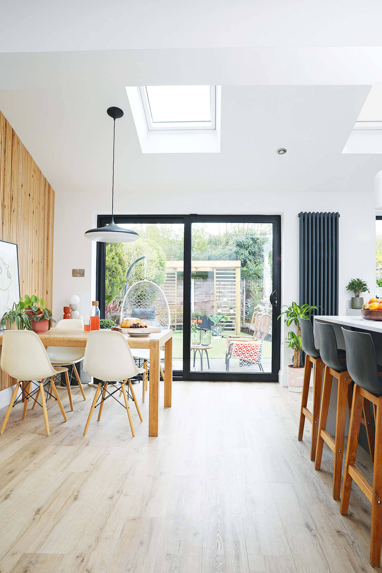
Sliding doors, The Window Factory. Garden furniture, Made, Aldi and Wayfair. Stools, Lakeland Furniture
Black aluminium sliding doors were chosen after much research and advice from an architect friend. ‘Bi-folds running the full width of the house look amazing, but we wanted a window by the sink for an L-shaped kitchen,’ says Kate. ‘With sliding doors this size you see more of the glass compared to three-pane bi-folds, and they’re so handy with pets.'
‘I was keen to create little pockets of spaced out mood lighting,' says Craig. 'There are spotlights for an overall flat light, under counter kitchen lights and a remote control pendant light over the dining table that changes from natural light during the day to warm light in the evening. Kate initially wanted smoked glass island pendants, but I felt something simpler that would shine down onto the quartz worktop would be more dramatic. The lighting and extra sockets put us over budget by around £1,000, but it was worth it as people often comment on the feel of it.'
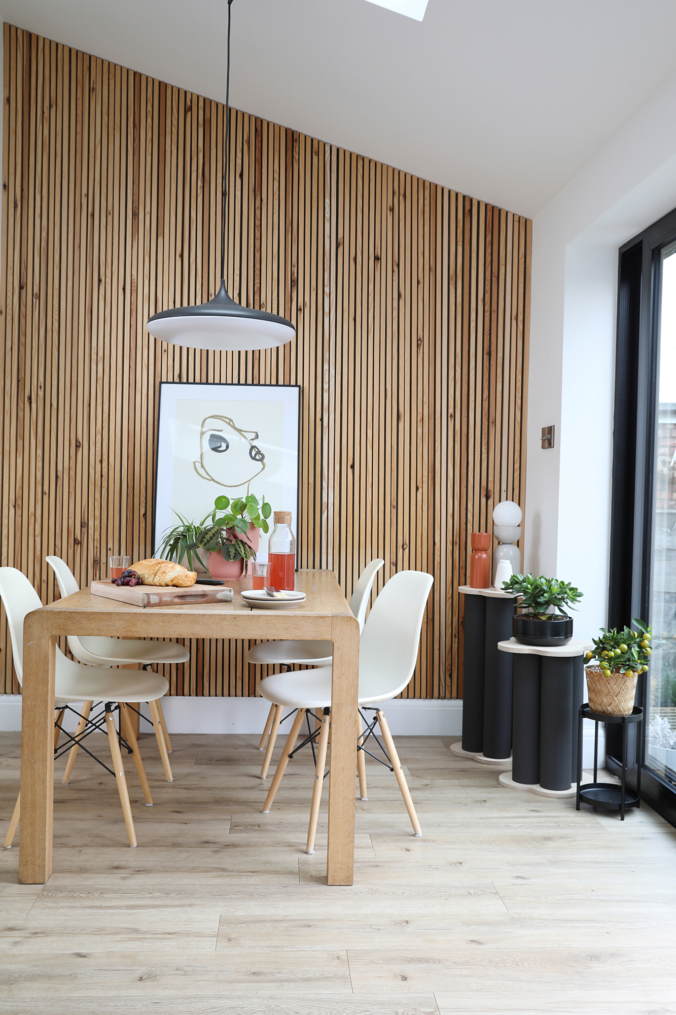
Dining table, Habitat. LVT flooring, Polyflor. Pendant light, Phillips Hue. Dining chairs, Lakeland Furniture. Artwork, Paper Collective
‘The slat wall in the dining area was my idea as I love natural materials,' says Kate. 'I used two by one inch wooden strips and had a joiner cut them in half lengthways. It was a real challenge angling the top section and tapering it down to the skirting boards. Needless to say the joiner hated me by the end, and hasn’t been back since! We’ve left it bare to see how the wood changes over time. I made the clover-shaped side tables from cardboard tubes, which I painted, then my step-dad made the birch ply tops.’
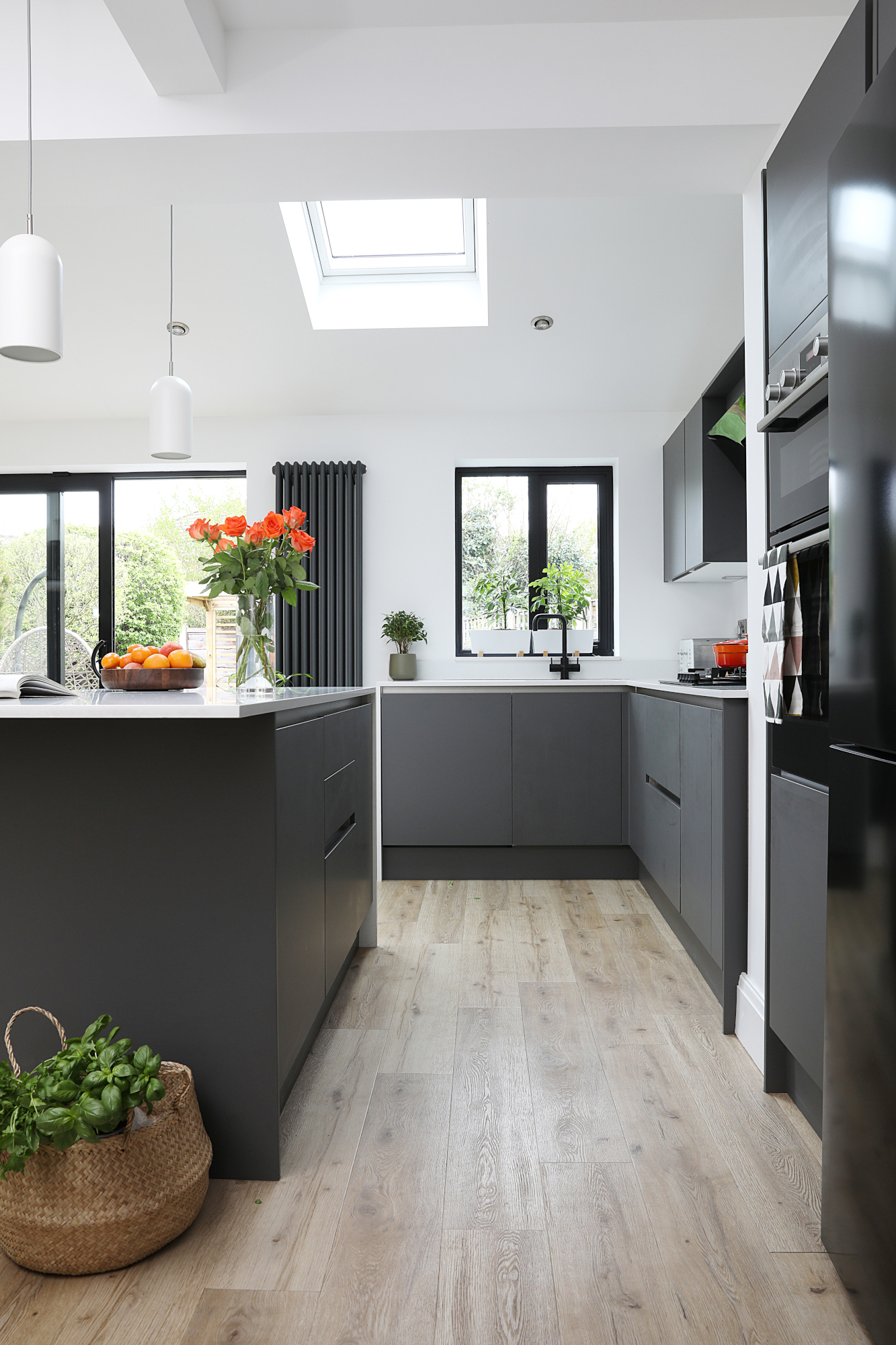
Integra Nova kitchen, sink and tap, all Magnet. Island pendant lights, John Lewis & Partners. Quartz work surfaces, Universal Granite. Appliances, ao.com and Appliances Direct
‘Our first choice was a Shaker-style kitchen to suit the front of the house, but we couldn’t find a colour we liked,’ says Kate. ‘Instead we picked more modern units for the colour, which morphed the direction of the whole design.’
‘To save money, we opted for cheaper units in the utility and kept the more impactful handless units for the kitchen,' adds Craig. 'As a flooring designer, I also selected a new light oak LVT, which I’d recently developed for Polyflor. Although we didn’t envisage it would take quite as long to do, the new space has really brought the three of us closer together. Even though you don’t have those sound barriers anymore, it’s such a sociable space and we spend so much time in here.’
The snug
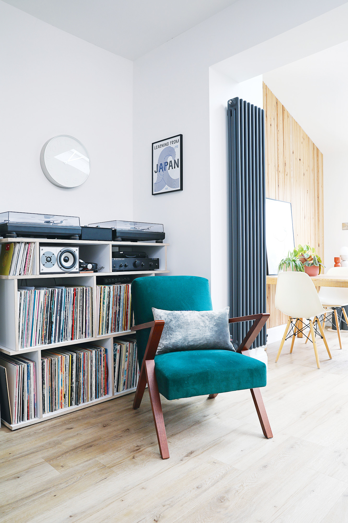
As a member of the DJ Collective ‘Too Many Daves’, Craig ensured the alcove was big enough for his decks and record collection, then had a bespoke unit made. ‘One area I was quite particular about was the alcove in the open-plan living space, as it had to house my decks and records,' he says.
'When the chimney breast was taken back to brick and replastered, they found some pipes that had to be boxed in. The new wider steel pillar on the other side made the alcove smaller as well. As soon as the plaster was on, I grabbed my decks and mixer and laid them on the floor to make sure everything fit!'
The living room
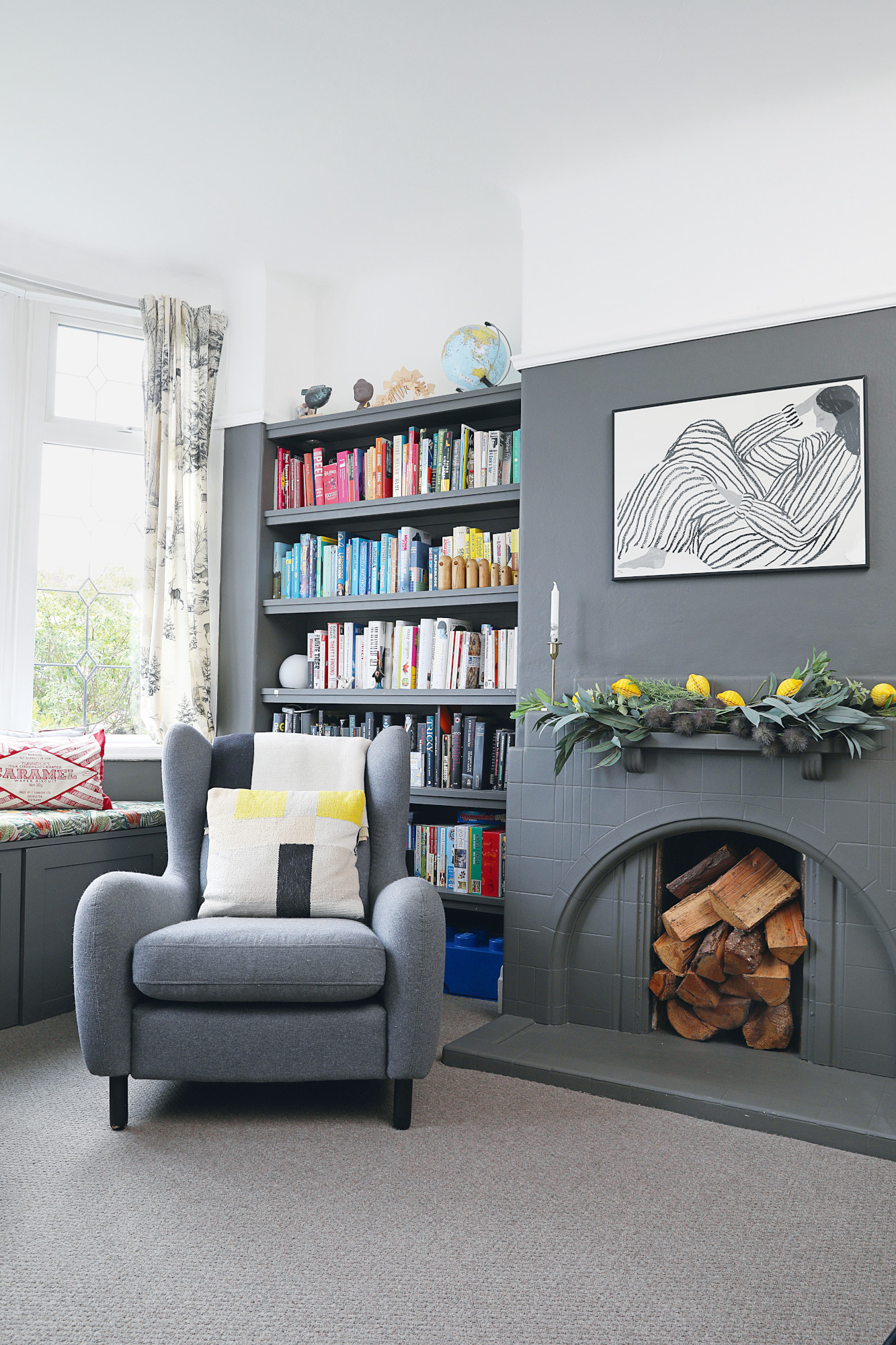
Chair and cushion, Made. Sofia Lind ‘Bored’ print, Alice in Scandiland. Paper lemons, Oliver Bonas. Faux foliage, Dunelm. ‘Caramel’ cushion, Nikki McWilliams. Curtains, H&M
The front room used to house the dining table and became a dumping ground for toys before transforming into a room for home schooling during Covid. ‘A joiner made the window seat,' says Kate. 'I painted it purple, but it looked awful, so I went for dark grey, which feels cosy.'
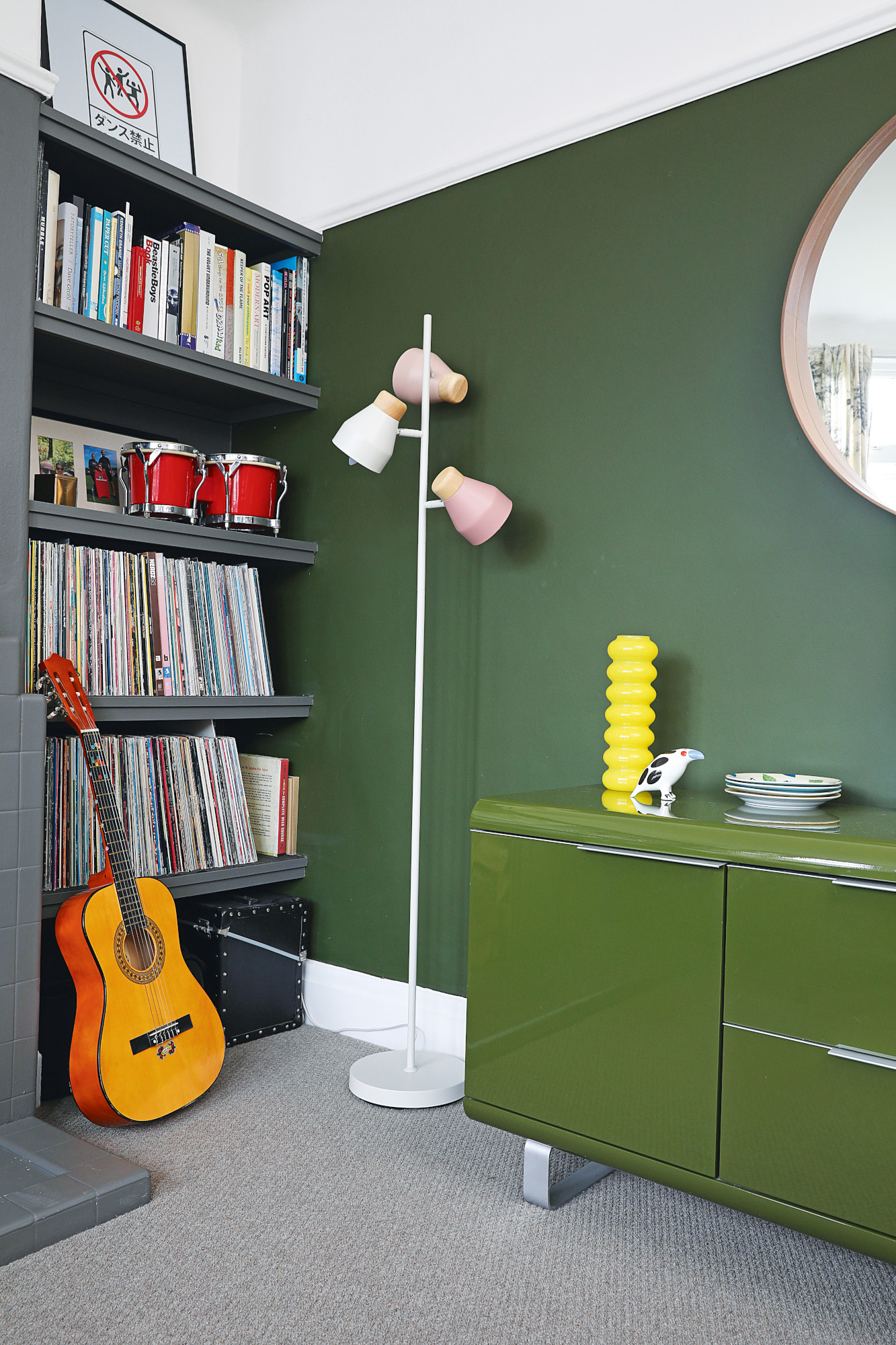
Sideboard, Ebay. Floor lamp, Made. Yellow vase, Dunelm. Ski Hobnail carpet from the Norway Colour range, Lifestyle Floors
‘We painted the wall to match the green sideboard,’ says Kate. ‘Craig’s record collection has been thinned out with his favourites moved to the open-plan space, so he plays them a lot more.’
Herbie's bedroom
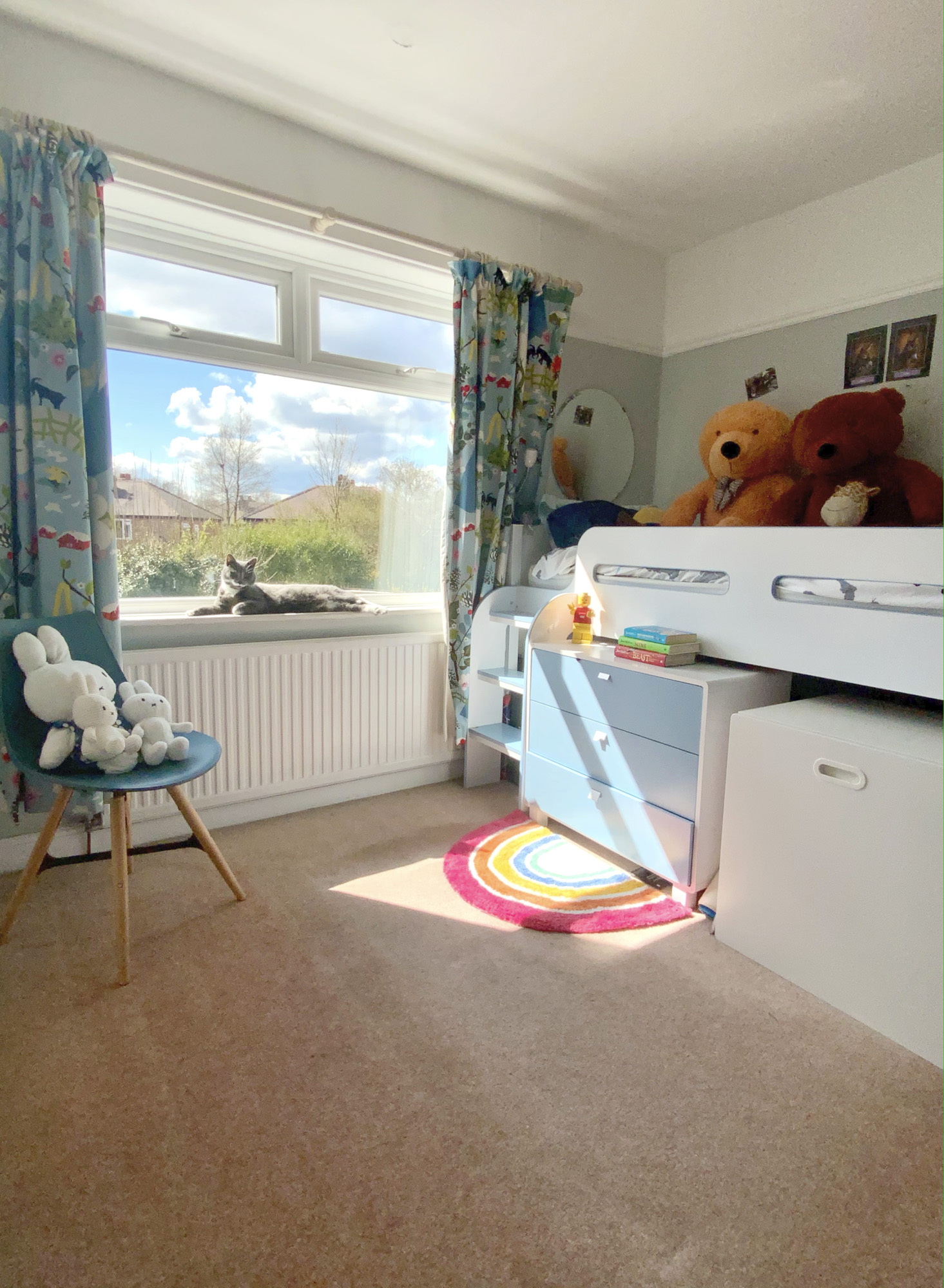
With Herbie due to start secondary school, Kate wanted to banish the blue walls and cabin bed before creating a more grown up look. ‘He’s a fan of Fortnite but we didn’t want a theme he might grow out of, so we decided on a monochrome scheme,’ she says. ‘Limiting the mural to behind the bed makes it easier to change in future.’
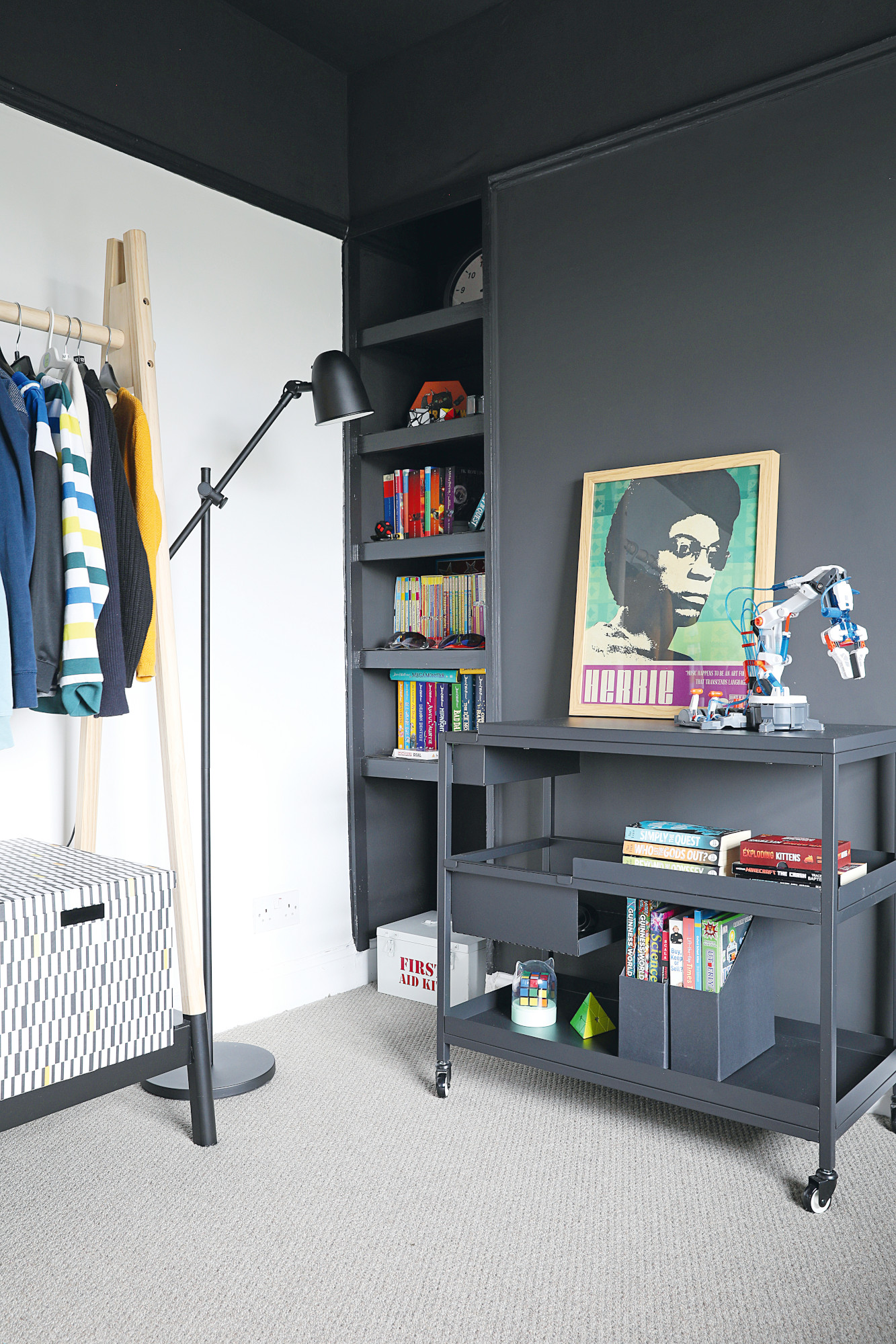
Black unit and floor lamp, Ikea. ‘Herbie’ print, Magik City. Hanging clothes rail, JYSK
After taking a door off the alcove cupboard, Kate painted the open shelves, ceiling and one wall black. ’Herbie looks at my design work a lot, so he was happy to try a black ceiling,’ says Kate. ‘It’s given the room a cave-like feel, which is great since he spends more time in here now.’
The home office
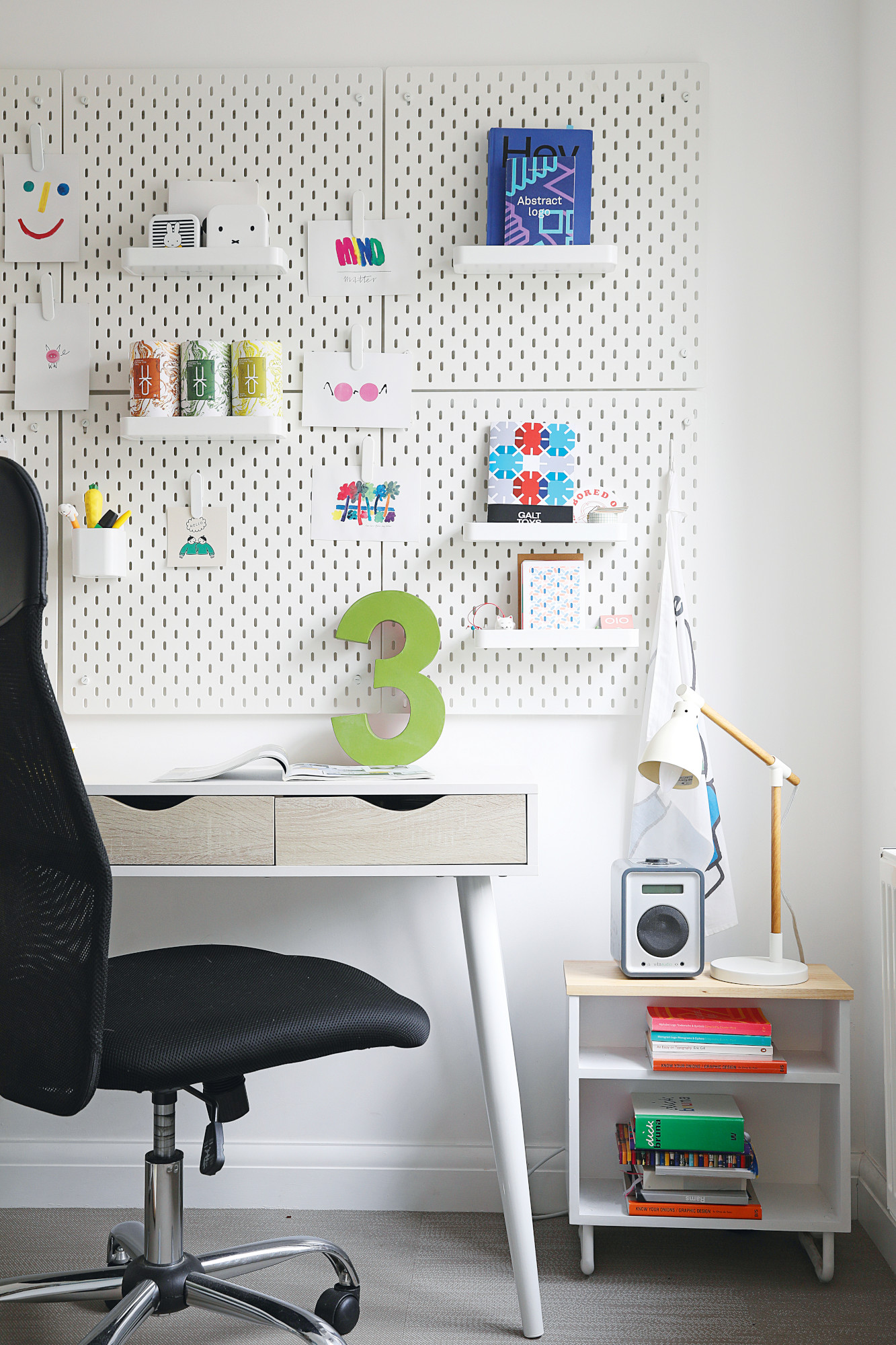
Desk and chair, Wayfair. Pinboard panels and lamp, Ikea. Side table, John Lewis & Partners
Costs & contacts
Building work £50,000
Kitchen and appliances £9,000
Joinery £5,000
Plumbing £5,000
Electrics and lighting £5,000
Sliding doors and windows £5,000
Garden £4,000
Decoration, painting and furniture £4,000
Worktops and splashback £3,000
Utility £3,000
Flooring £2,000
Architect Emma Craig, emmacrg@gmail.com
Builder ALK Brickwork & Building Services, 07931 993309, a.l.k.brick@gmail.com
Floor fitter John Gavin Flooring, 07939 067686
‘As I’m primarily in the office and Kate works from home, she dealt with the builders’ day-to-day queries, but we spoke on every point,' says Craig. 'Sometimes she’d convince me and sometimes it was the other way around. Fortunately, our tastes are quite similar; we like a mix of traditional, such as picture rails and stained glass, with a contemporary twist.'
‘It wasn’t easy working and home schooling during Covid,' Kate admits. 'I heard every bang and we had to make up a few garden games involving bricks. However, the builder was amazing. He wasn’t the cheapest, but he lives round the corner and was so organised, giving us a breakdown of every payment stage.' Now, she has a home office that makes the upheaval worth it. 'My office was inspired by working in several graphic design studios and coffee shops around Manchester,’ she says. ‘The panelling is great for all my bits and pieces.’
The bathroom
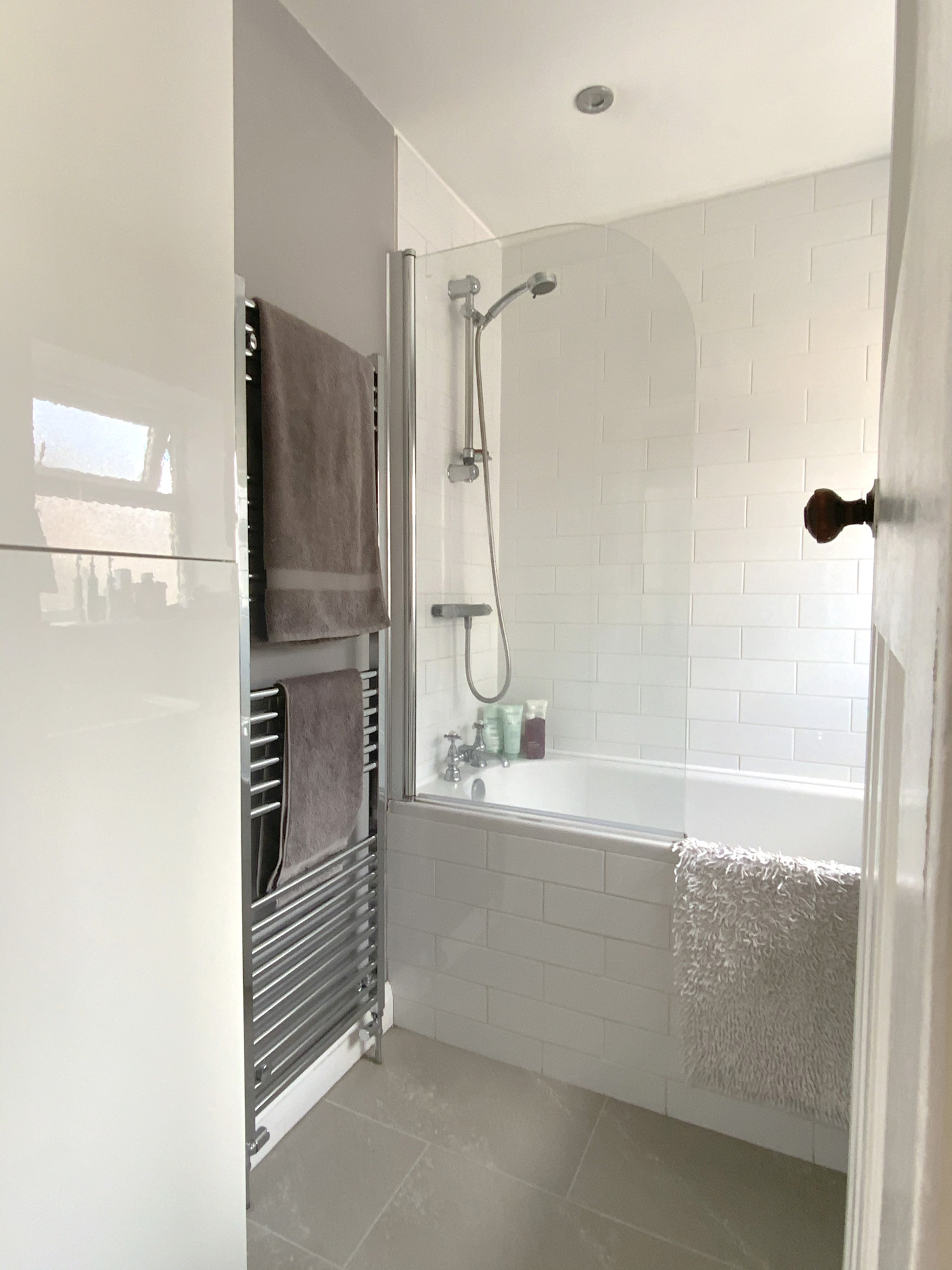
As the bathroom suite is around 12 years old, the couple gave it a mini makeover recently until they can afford to completely change it.
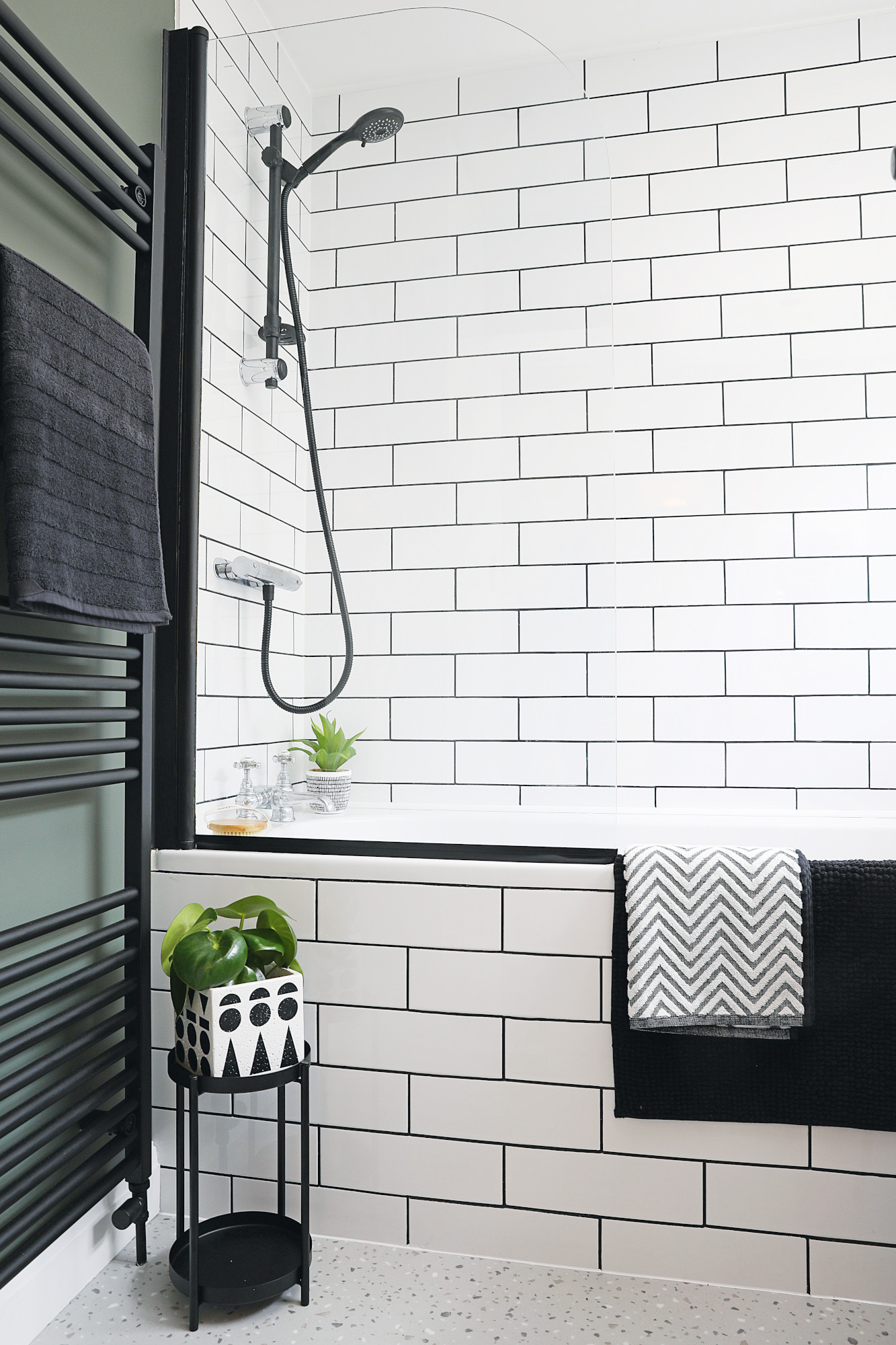
Tiles, Topps Tiles. Shower, Victorian Plumbing. Architex vinyl flooring, Polyflor. Shower screen, Screwfix. For a similar radiator, try Bathroom Mountain
‘We freshened up the tiles with a black grout pen, spray painted the radiator and shower screen, bought a new shower head and laid terrazzo vinyl sheet flooring,’ says Kate. ‘It mirrors the look in the ground-floor cloakroom.’
The master bedroom
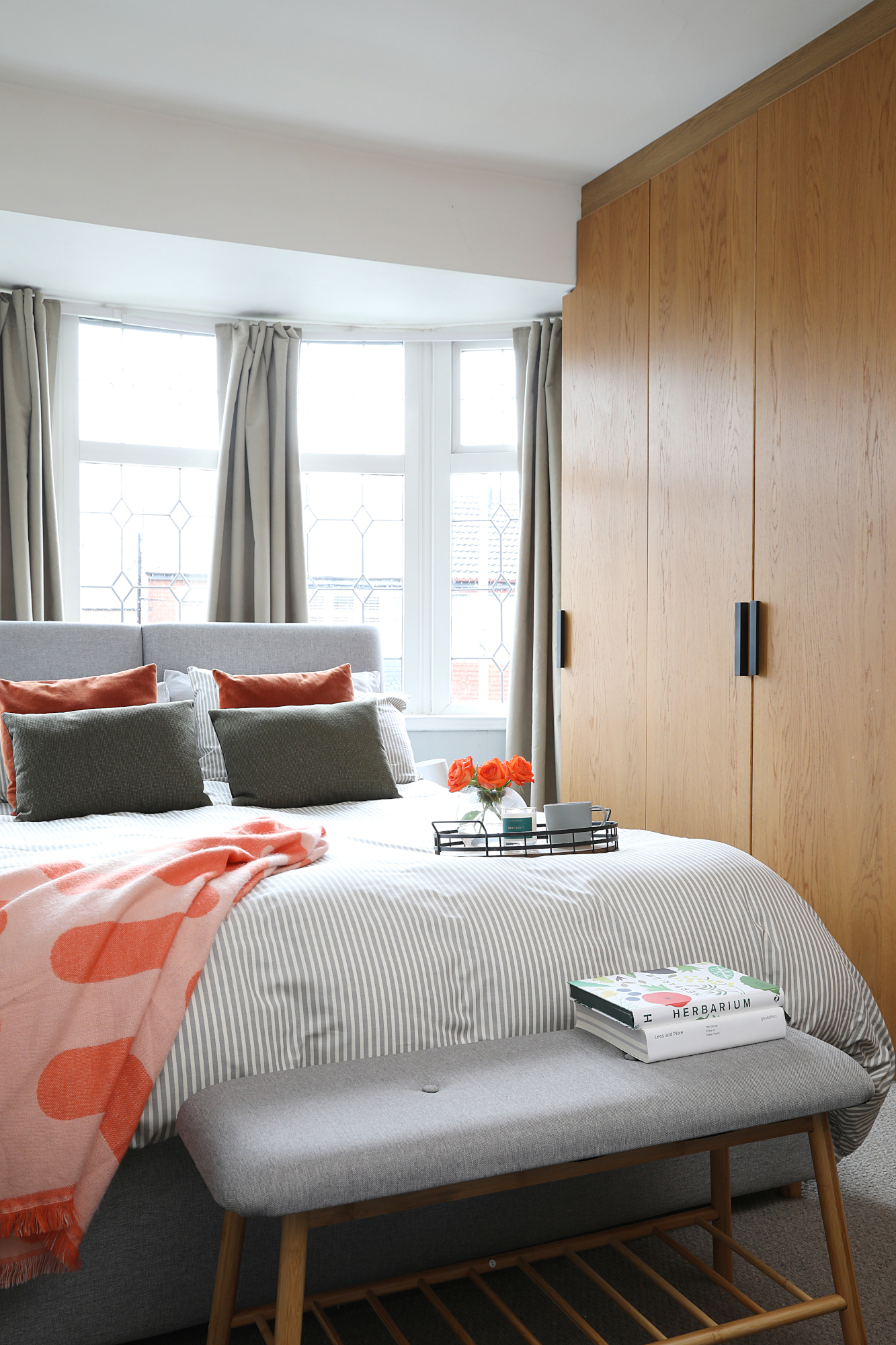
Kate made panelling for the bedroom from flexible MDF as a quick fix, but plans to change this area again with a paint effect or 3D panelling. In time we hope to convert the loft into a bedroom suite with freestanding bath and Crittall doors leading into a dressing room,' she says. The old bathroom on the first floor would become a wet room style shower, and the family would have a guest bedroom for Craig’s mum visiting from Devon.
‘When we first moved here, the area was considered a bit twee and not very cool, but there are more and more young professional families moving in,' Kate adds. 'I can’t see us moving as we love the area and our neighbours so much.’
Subscribe to Real Homes magazine
Want even more great ideas for your home from the expert team at Real Homes magazine? Subscribe to Real Homes magazine and get great content delivered straight to your door. From inspiring completed projects to the latest decorating trends and expert advice, you'll find everything you need to create your dream home inside each issue.
Join our newsletter
Get small space home decor ideas, celeb inspiration, DIY tips and more, straight to your inbox!
-
 Planning makes perfect when designing this dream home
Becks and Martin Huntley spent lots of time on design and layout to get the most out of their space when renovating
By Karen Wilson Published
-
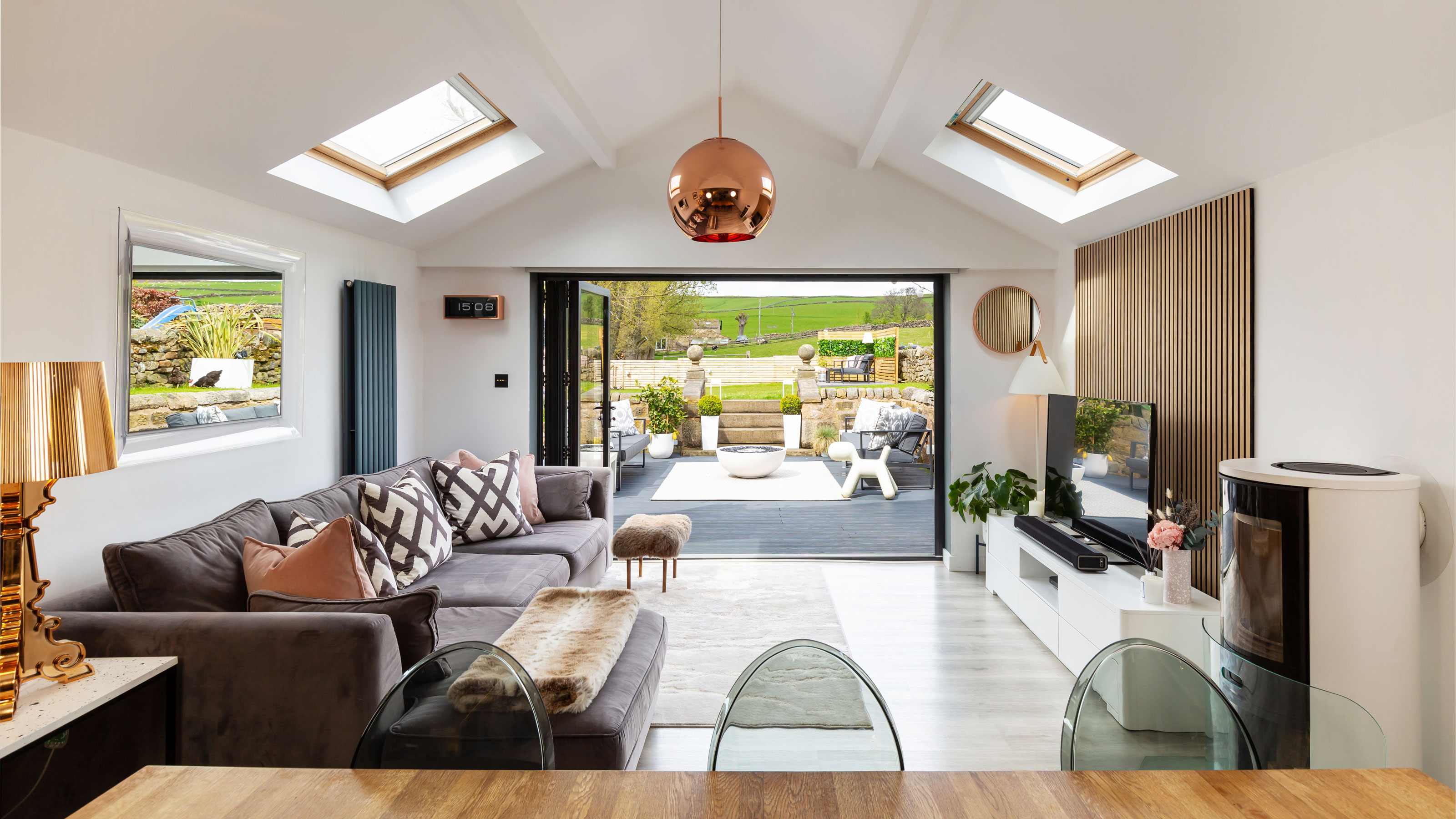 Interior design enthusiast's converted farm home is a showcase for luxe style
Sam Marlow, the founder of Lime Lace, used all her skills to give the renovated period property a signature look
By Alison Jones Published
-
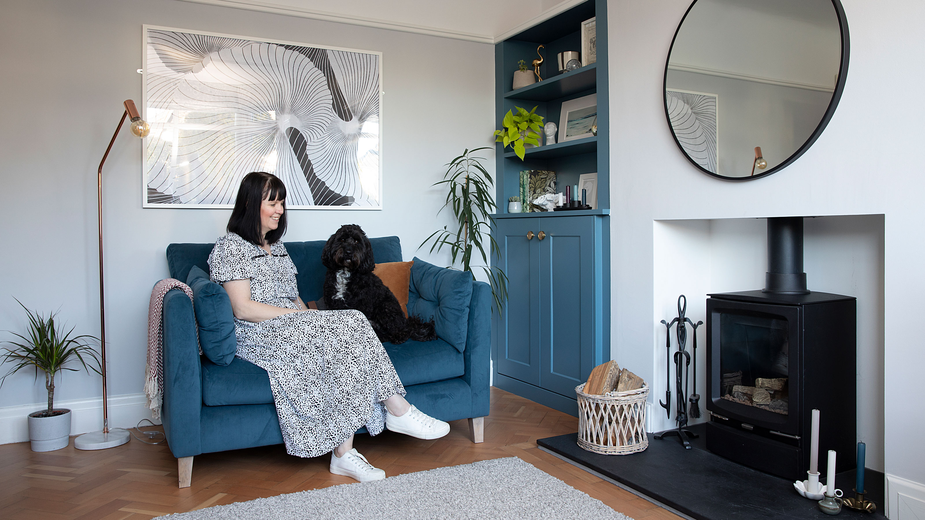 Real home: Long-term extension project creates the perfect family space
Kate and Adam’s three-pronged renovation took over a decade – but was well worth the wait
By Karen Wilson Last updated
-
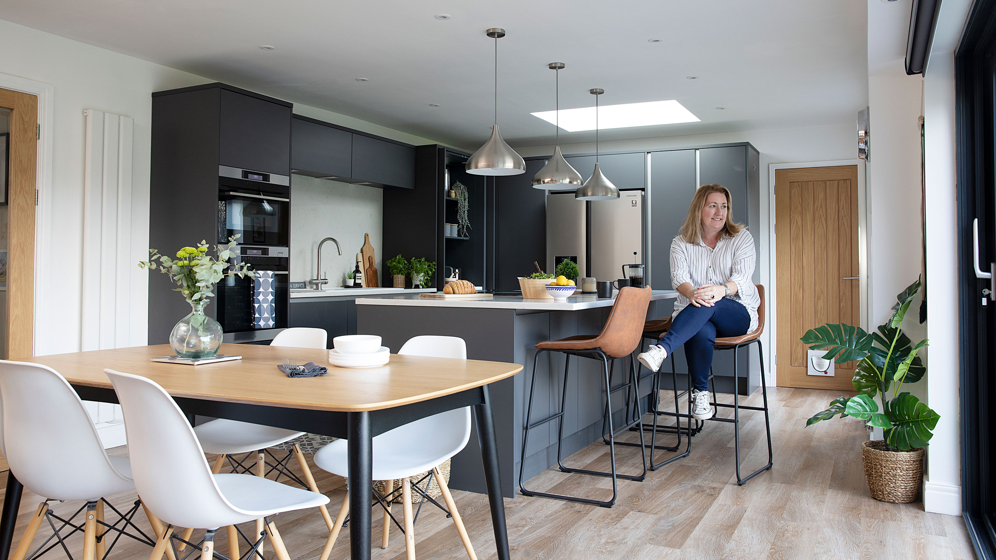 Real home: knocking through for more space without extending
By knocking together a warren of disjointed rooms, Patsy and Al have created a new hub to their home without needing to extend
By Karen Wilson Last updated
-
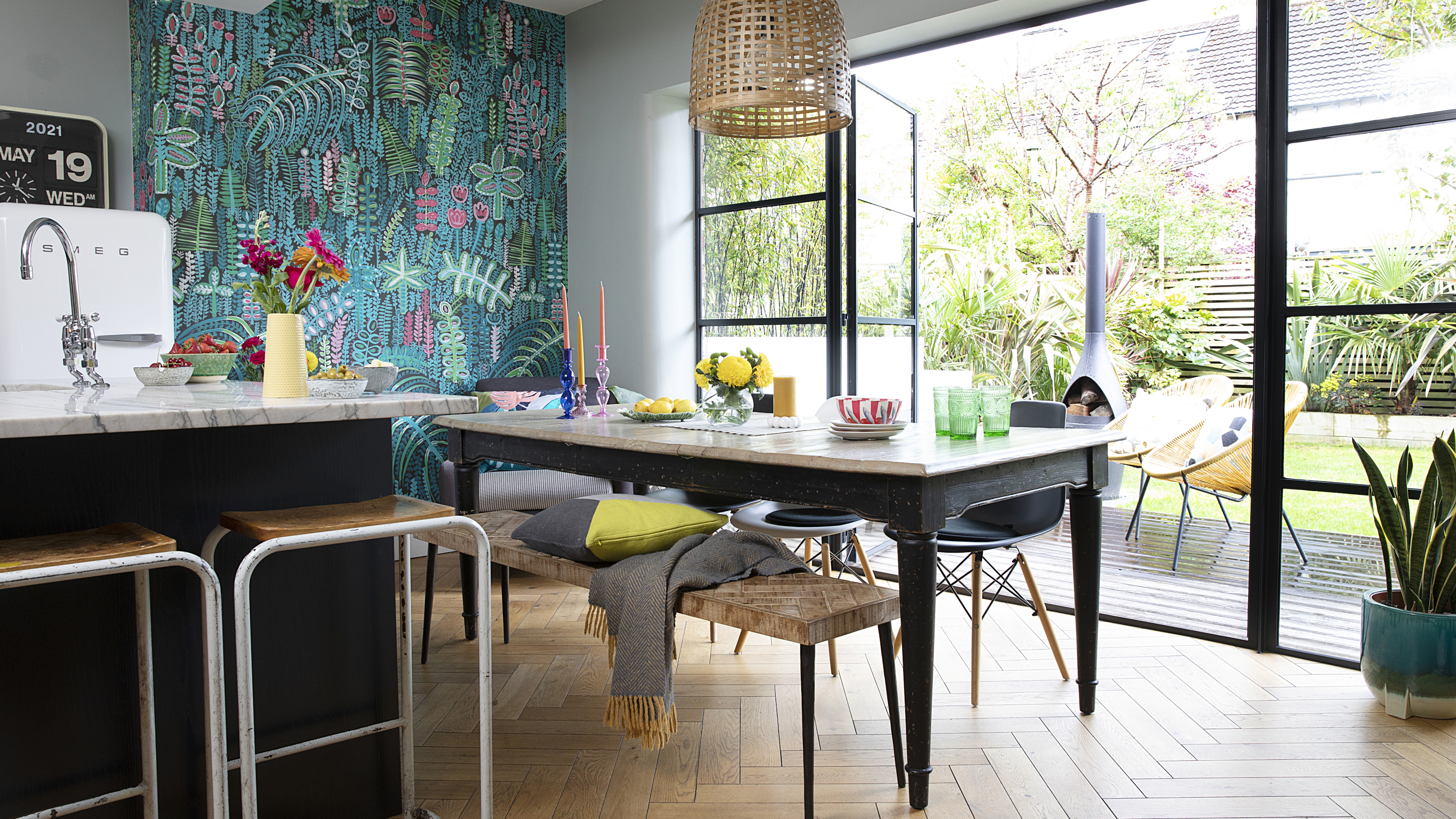 Before and after: a modern kitchen extension with cool industrial touches
We love this contemporary extension – especially that surprise pop of colour…
By Ellen Finch Last updated
-
 Real home: this interior designer's home is a masterclass in layering texture
Notebooks at the ready – this extended terrace is packed with stylish ideas to steal
By Ellen Finch Published
-
 Before and after: this interior designer extended her family home for £50k
All thanks to a combination of skill and imagination
By Ellen Finch Published
-
 Real home: this DIY-savvy family makes the case for open-plan living
And with a huge renovation done for just over £70k, they've got some cost-cutting tips to share, too
By Karen Wilson Published
