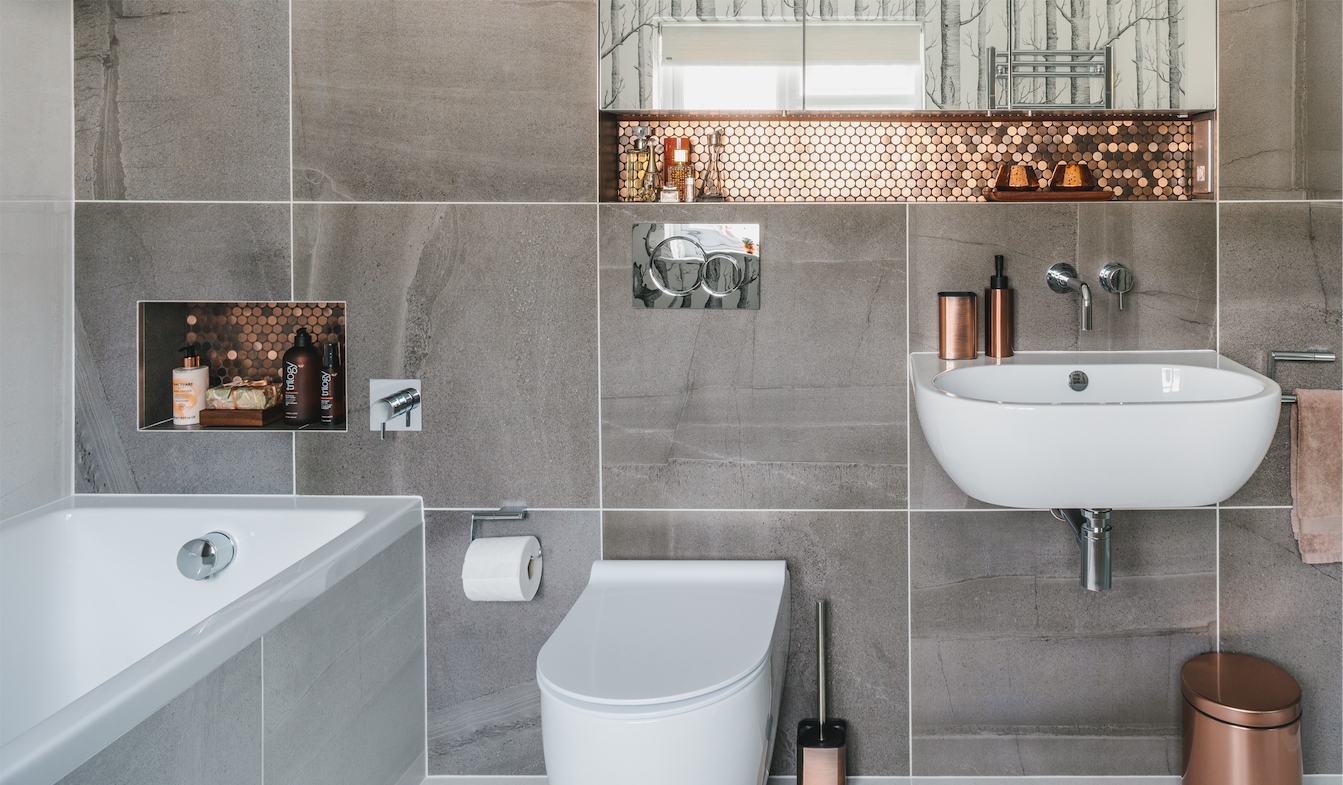

How gorgeous is this bathroom makeover? It's always interesting to see how professional interior designers decorate their own homes. Do they stick to their own rules? Do they follow trends? Do they go flamboyant and push their skill to the max?
After living in the hustle and bustle of London for many years, interior designer Anna, her partner Matt, and their daughter Mia, upped sticks and moved to the pretty spa town of Cheltenham. They found the perfect property with large rooms in a friendly neighbourhood.
And as you would expect, Anna couldn't wait to put her own stamp on the place, beginning with the bathroom. Her calming style, meticulous eye and insider knowledge is evident in every aspect of her design. Here's how she did it.
Updating your bathroom? Check out these bathroom ideas.
The before
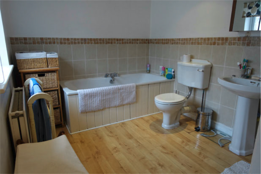
The existing family bathroom was already a good size, but in desperate need of modernising. ‘It was dated and gloomy. I wanted to make it more visually interesting – relaxed but luxurious, and suitable for the whole family,’ says Anna.
She began by playing around with layouts to get the most out of the space, but soon realised the existing layout was the best. This was ideal, as less rearranging means less plumbing work, which always means lower costs.
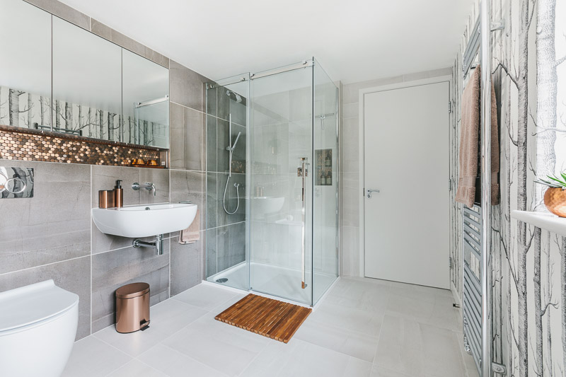
When planning her design, Anna considered storage a top priority. She decided to add a stud partition along the entire length of one wall. The stud wall houses a large recessed mirrored cabinet, plus shelving over the bath and sink. Despite making the room technically smaller, it means that both clutter and pipes can be hidden away. It also allows the basin, WC and taps to be wall-hung, giving the illusion of more space, with a clean, minimalist look.
The process
Anna hired bathroom fitter, Americo Sousa, who was recommended to her, and the project took just three weeks in total. Her friendly neighbours were a life-saver during this time, as they allowed the family to pop next door for a shower. ‘It was also very handy that we have a downstairs toilet,’ she recalls.
As a stickler for detail, Anna’s biggest concern was that the large-format tiles she chose wouldn’t quite align with the mirrored storage cabinet, as they had to be millimetre-perfect to line up.
Despite sleepless nights and lots of measuring and re-measuring, when delivered, the alignment was just a couple of millimetres out - disaster! But alas, her bathroom fitter managed to make it work by adjusting the hinges on the cabinet doors to get them to line up.
The details

Anna chose large-format slate-effect tiles for the walls and floors to make the space feel larger. ‘I love the combination of light and dark greys, but I knew the cool tones would make it seem quite cold, so I added touches of copper to give it the warmth it desperately needed,’ says Anna.
She spotted the shimmery brushed-copper mosaic tiles a year before starting her project but, as they weren’t suitable for bathrooms, she searched high and low for something similar. ‘Other copper tiles were polished, and that would’ve been too garish,’ she adds.
A perfectionist at heart, she went back to the original tiles she’d fallen in love with, found an industrial sealant used for boats, and coated the tiles with that to protect them against splashes.
She then picked up the copper tone in accessories throughout the bathroom, adding just enough metallic shine for a warm, luxurious feel. Recessed LED lighting accentuates the tiles for a calming ambiance, while Anna also incorporated spotlights for more practical tasks.
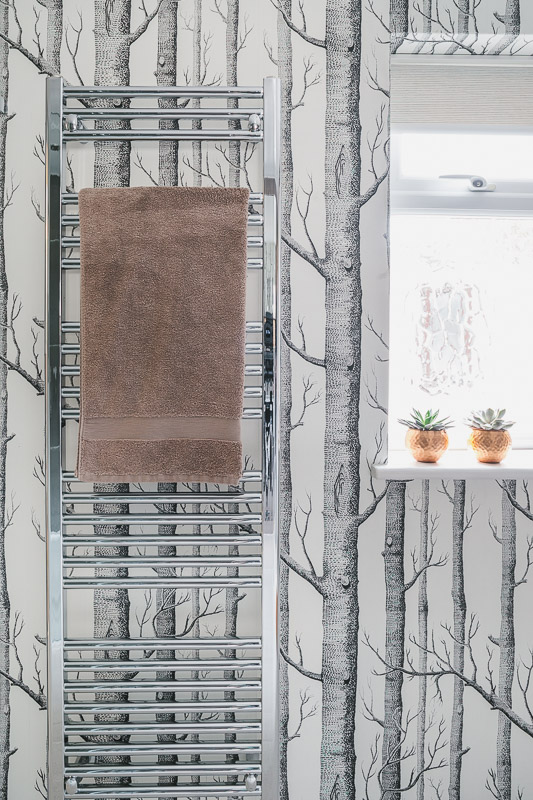
With her passion for design, Anna wanted a nature-inspired scheme. She chose to create a feature wall around the window by hanging striking Woods wallpaper from Cole & Son. ‘I adore this design and it fits in perfectly with the grey tiles,’ Anna says. ‘Even though it’s not specifically designed for bathroom use, it wasn’t going to be in direct contact with water, so I simply sealed it with Polyvine decorators’ varnish for extra protection.’
Now the space is finished, Anna is thrilled with the final result, and is so glad she made every effort to get exactly what she wanted. If her budget allowed for it, she would’ve boxed in the end of the bath and put recessed shelves above it, but instead compromised with a wall-mounted cupboard.
‘My favourite thing about my bathroom is the wallpaper,’ says Anna. ‘People don’t expect it, and when the shower screen gets steamed up, it looks like misty woods.’
Join our newsletter
Get small space home decor ideas, celeb inspiration, DIY tips and more, straight to your inbox!

After joining Real Homes as content producer in 2016, Amelia has taken on several different roles and is now content editor. She specializes in style and decorating features and loves nothing more than finding the most beautiful new furniture, fabrics and accessories and sharing them with our readers. As a newbie London renter, Amelia’s loving exploring the big city and mooching around vintage markets to kit out her new home.
-
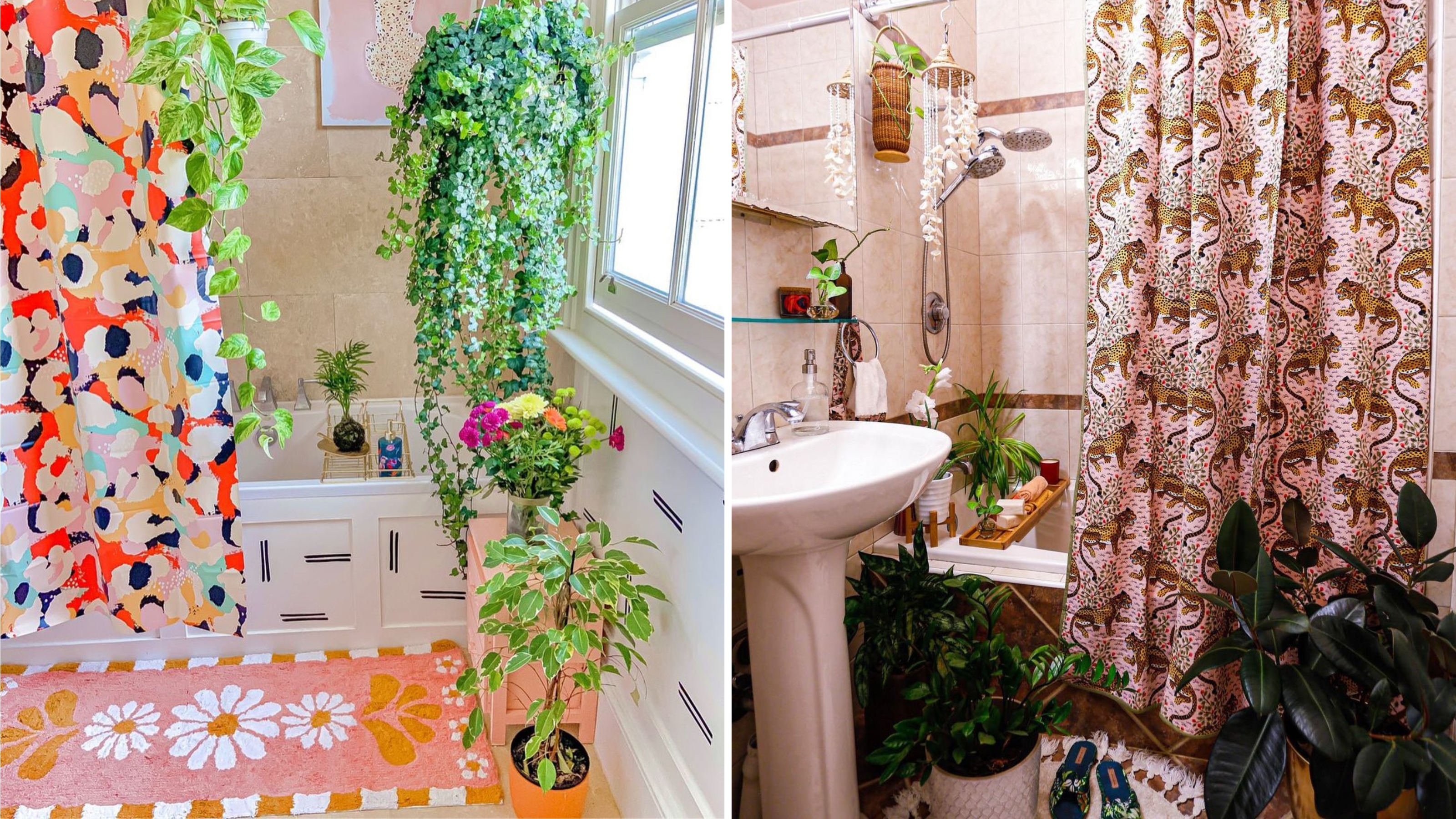 8 of the best small bathroom shower curtain ideas
Discover these small bathroom shower curtain ideas to inject style and personality into your space. Everything from vibrant patterns to neutrals.
By Megan Murray
-

 The Hello Klean showerhead made those bumps on my skin disappear — it currently has 30% off
See how the Hello Klean showerhead has transformed my hair and skin. Having initially been a bit skeptical of ads on Instagram, I can vouch for this eco-friendly accessory.
By Christina Chrysostomou
-
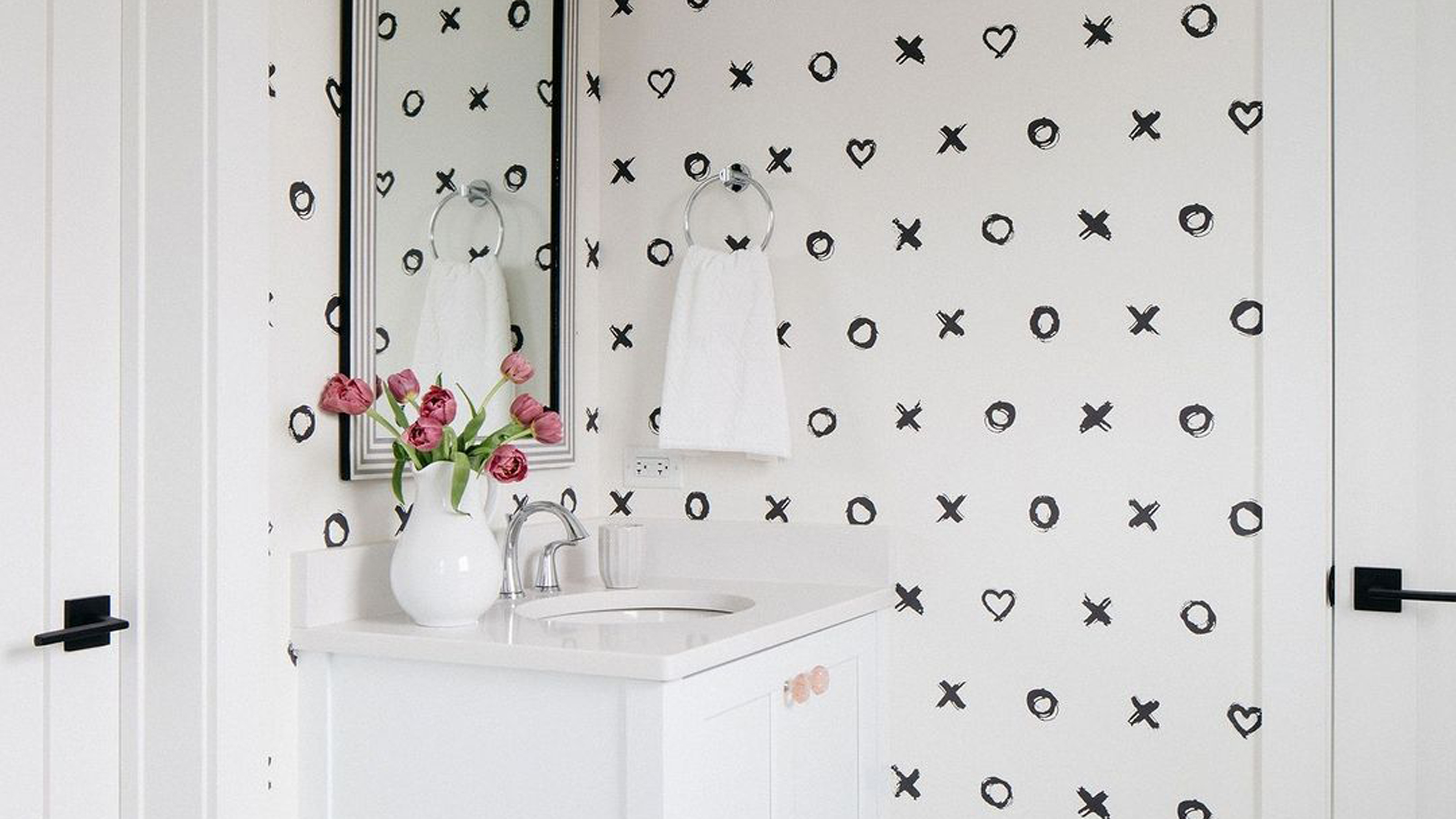 7 small bathroom vanity ideas to copy if you can't splash the cash
We curated seven small bathroom vanity ideas that are worth copying to keep cosmetics and your bank balance in check
By Christina Chrysostomou
-
 12 cute bathroom decor buys to beautify small washrooms
These cute bathroom decor picks will add the ultimate dose of personality to even tiny rental washrooms for a styled and refreshed aesthetic.
By Nishaa Sharma
-
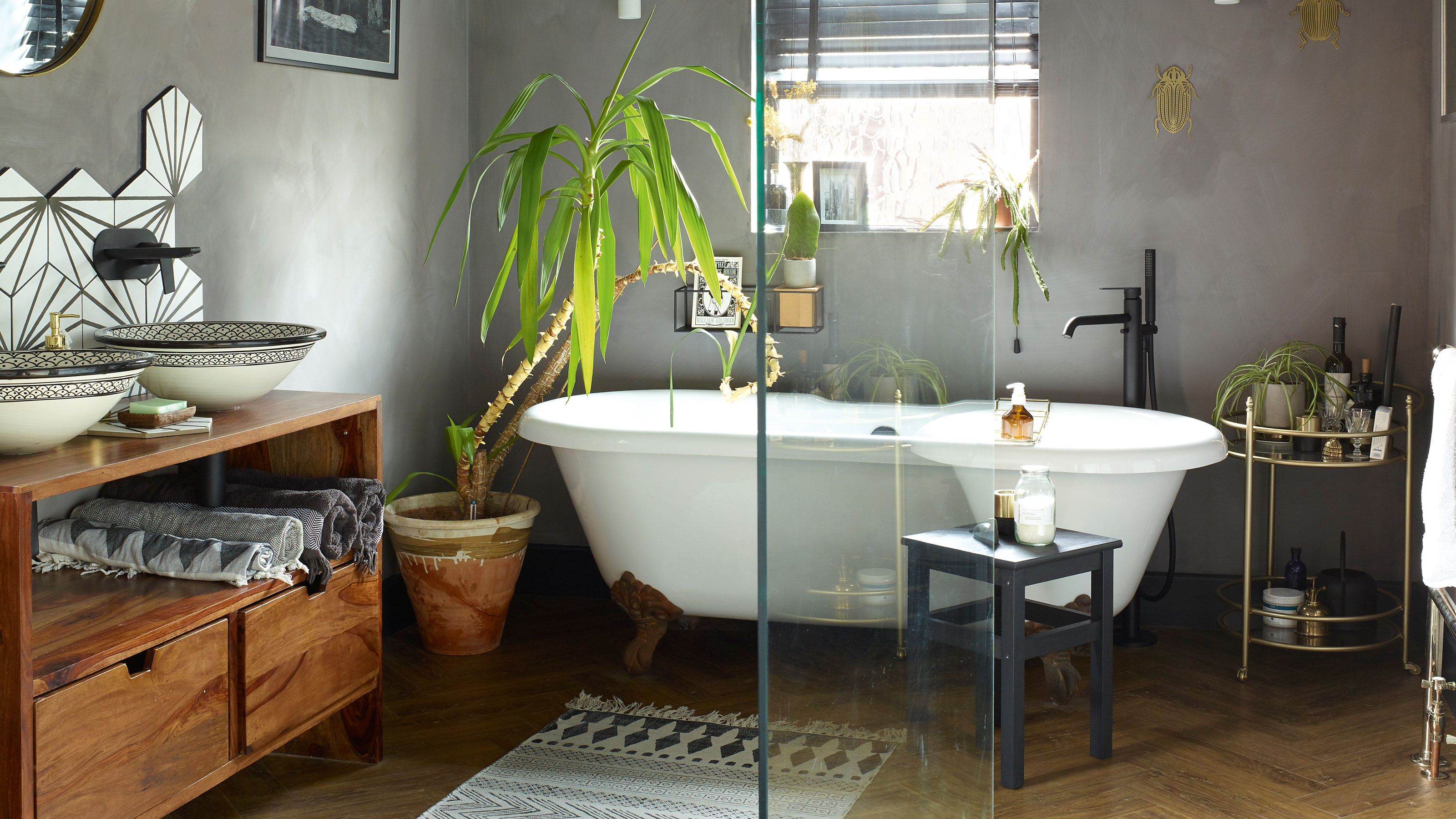 A bland beige bathroom is transformed into a STUNNING contemporary sanctuary
First-time homeowners Ellie and Oliver’s new bathroom is a well-planned fusion of modern pieces and exotic touches
By Ellen Finch
-
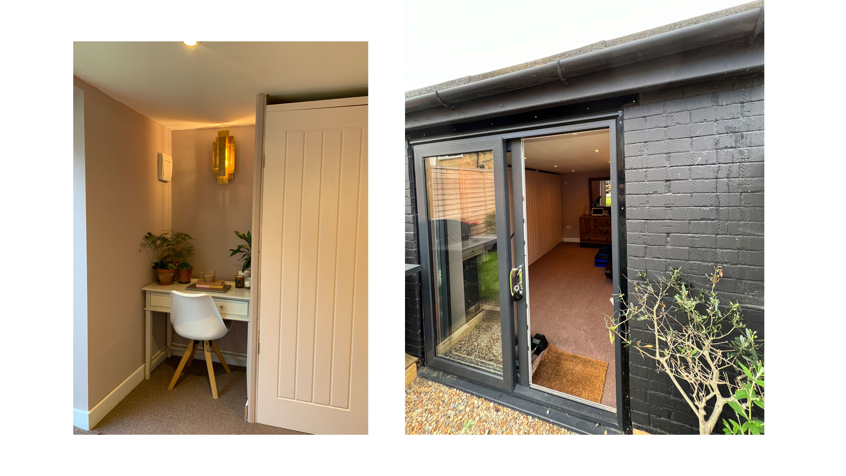 How to turn a garden room into a modern home office
Transforming a garden room into a home office is an awesome way to add function and personality to an unused outbuilding
By Kate Sandhu
-
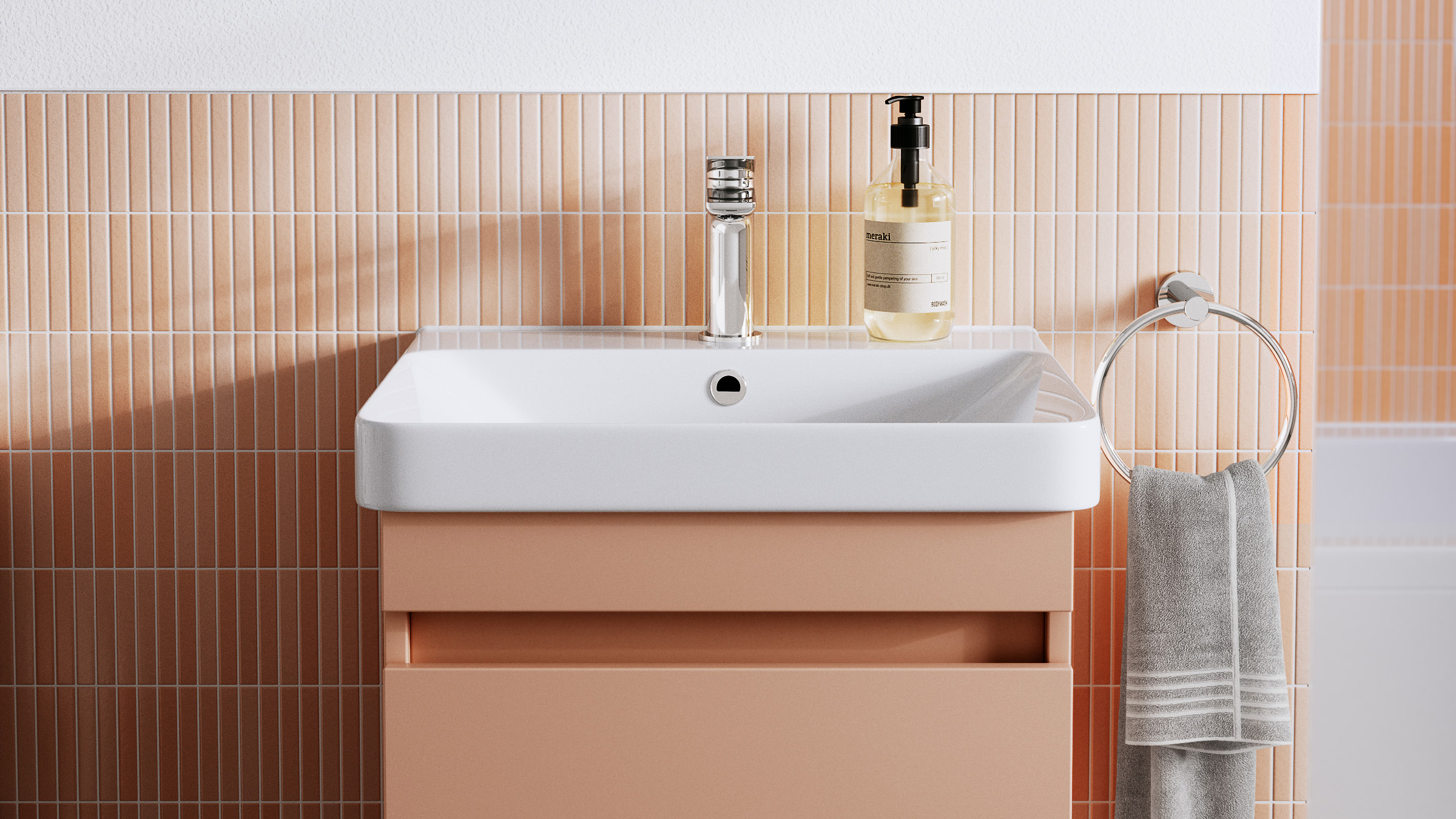 Experts reveal why this popular color isn't the one for bathrooms
This trending pastel shade could ruin a tranquil bathroom aesthetic
By Amelia Smith
-
 How to increase water pressure: what to do if your shower power is low
Wondering how to increase water pressure? If the force from your faucet has fallen, try these quick fixes.
By Christina Chrysostomou