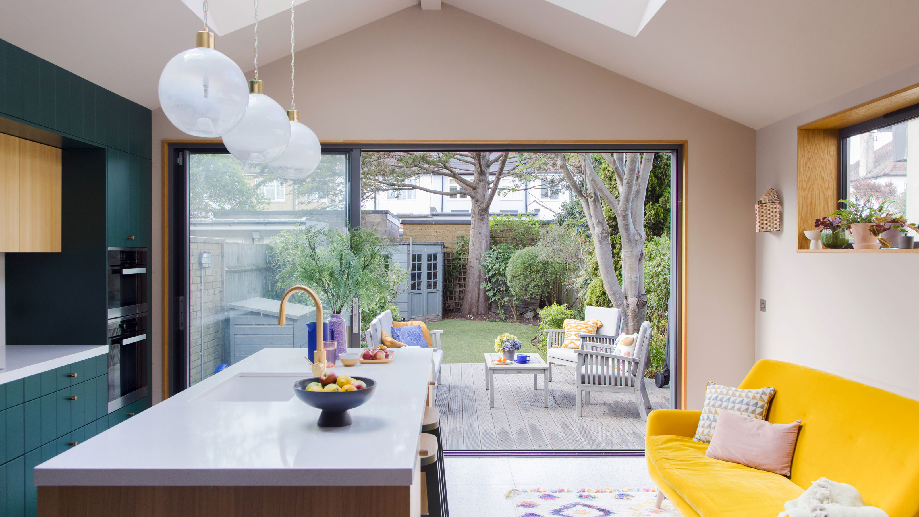

Whenever you renovate a house of a certain age – whether that’s mid-century or more than 100 years ago – you’ll inevitably end up dealing with the legacy of the previous owners’ design decisions.
Some are built to last, like the enduring and colourful tiled hall floors that the Victorians loved. Others look outdated after only a couple of decades. For Bethany Childs and her family, the conservatory that was added to the back of their 1920s house somewhere round the 1980s, and a tacked-on downstairs toilet, had definitely had their day.
They were sacrificed in pursuit of light and openness, and a fresh green colour scheme that’s a nod to Bethany’s American heritage.
We chatted to her to discover how a clumsily extended space became a showpiece kitchen built for entertaining that’s the apple of her eye…
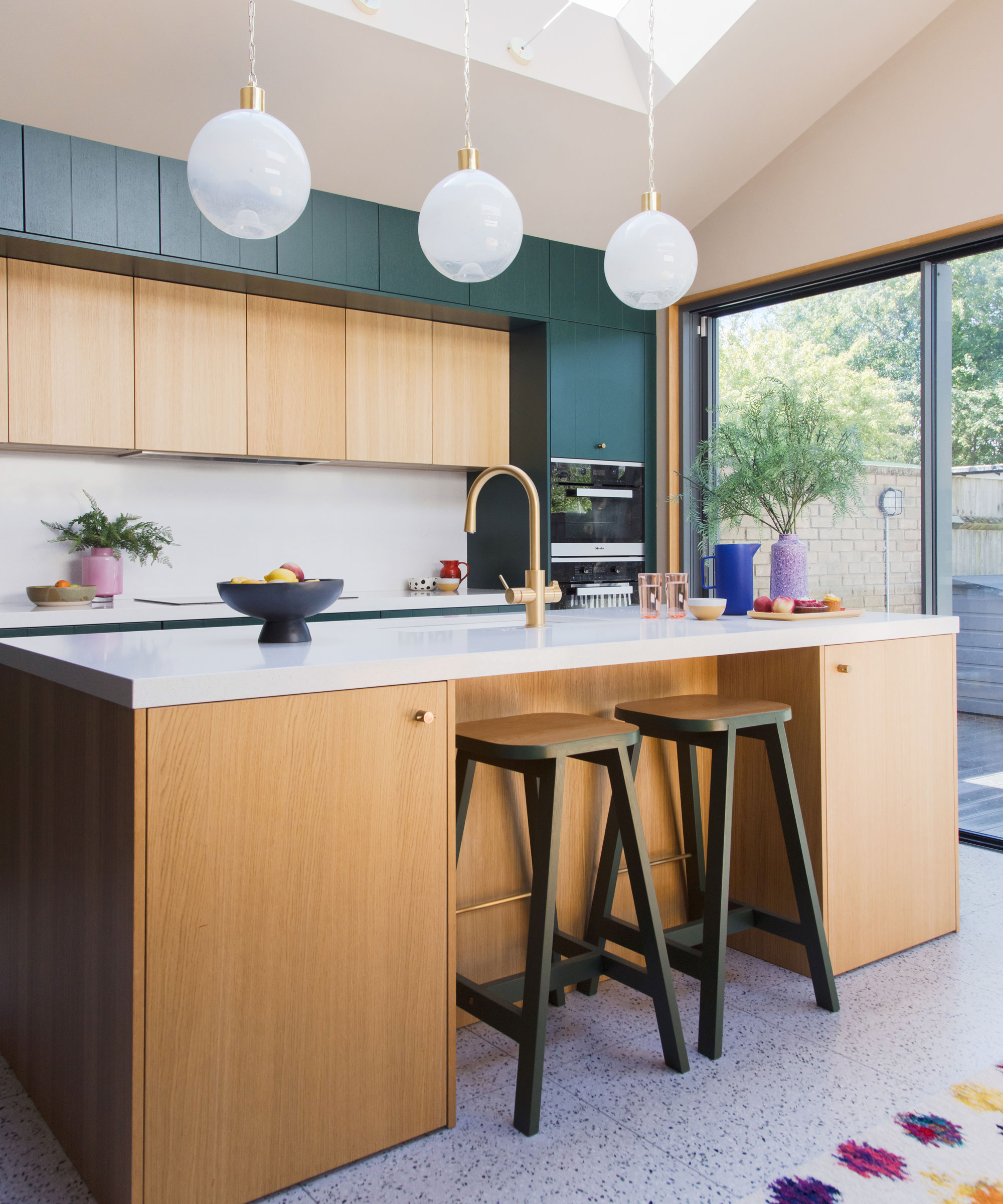
The green-painted units are complemented by the natural wood of the kitchen island and wall cupboards. Silestone worktop, Such Designs. Handles, Mini Circus from Superfront. Ovens and hob, Miele. G4 All in One tap, Zipwater. Beech bar stools, Another Country. Walls painted in Soba by Paint & Paper Library
'My husband and I are both American, and have lived in London since 2005. We bought this house six and half years ago and it was our first proper project. I didn’t anticipate living in a 1920/30s house: they weren’t what I was drawn to. But when we looked at the housing options around here, we really liked the width of them – the rooms feel open and spacious.
Profile
The owners Bethany Childs, a pilates instructor, and her husband, Clancy, chief product officer for an AI tech company, live here with their children, Beckett and Archer
The property A 1930s end-of-terrace house in north-west London
Project cost £200,000
‘The kitchen was a hodge-podge of the original old-fashioned galley with a dining room off to the side and a big fireplace. They attached a conservatory in the 1980s/90s, and there was the old loo towards the back that was probably an outhouse. It was a few different spaces squashed together.’
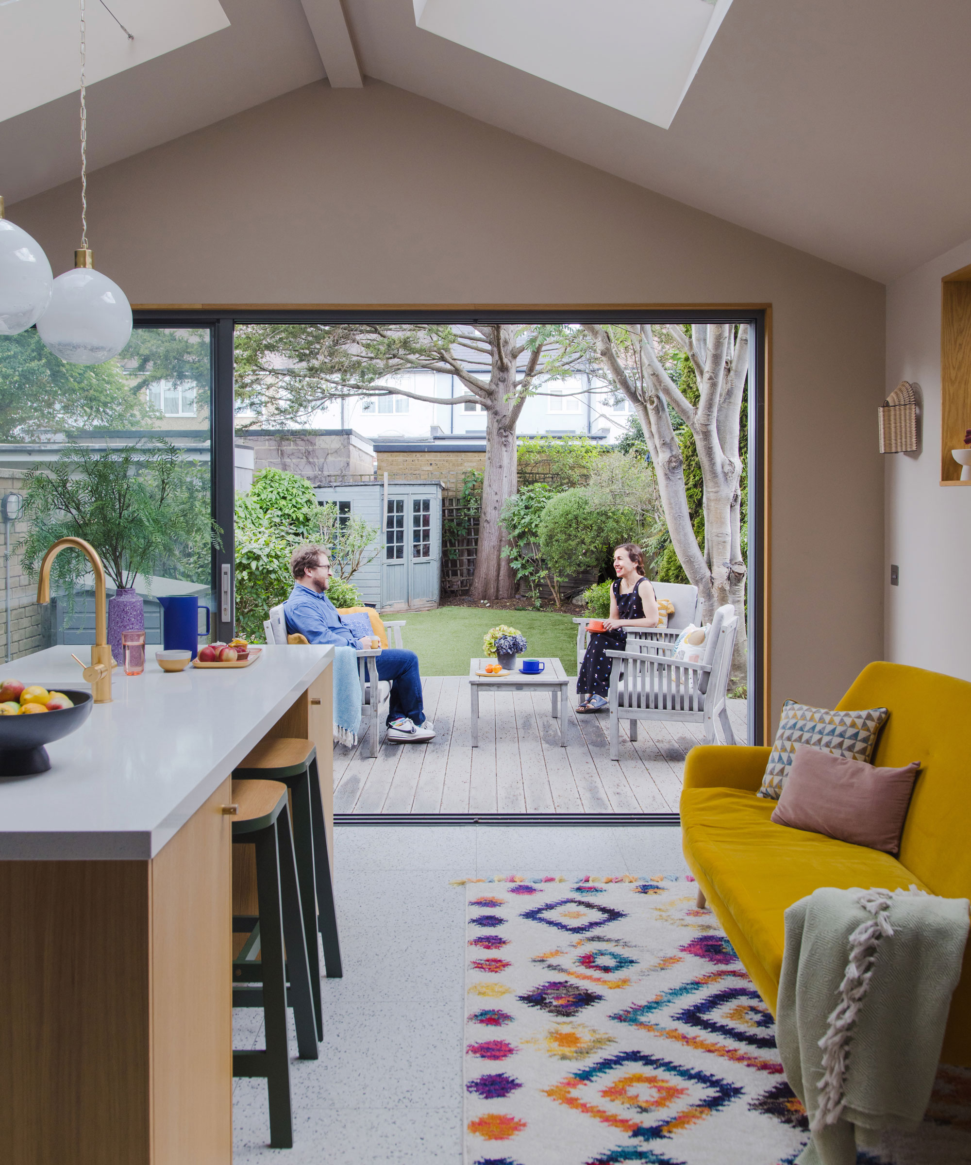
‘We thought about bi-folds, but the way they intruded when folded wasn’t ideal. These have really slim metal frames to maximise the amount of glass and view. With three sliding panels, we can open two at once.' Cortizo sliding doors and rooflights, Southern Windows
'We lived in the house for three years before starting work in 2019. We wanted to see what worked and how we’d use it. We didn’t increase the footprint as we didn’t want to lose any garden. But we really needed to open it up and make more storage and a better space for entertaining. We hired a local architect who’d done a house a street away that I really liked. In addition to the new kitchen, they carved some space out between it and the front living room to create a utility and loo.
‘I found interior designer Claudia Urvois, who was also local, and approached her to help us lift the design. She and I took on the choices of all the materials and the colours.’
‘I’d always loved green kitchens. It took a while to find the right shade because a lot were coming up grey and not very vibrant. Claudia had the idea of looking at American paint companies, and that’s when we found it. This colour green is really traditional in New England, so I was drawing on my roots.
‘We worked with local kitchen company Such Designs, but the units were made in Germany. We wanted it to feel modern and fresh, and the flush cabinets struck the right note.
‘Claudia and I played on the combination of green and natural tones by getting the builder to put oak insets into the window frames and door frames as well.’
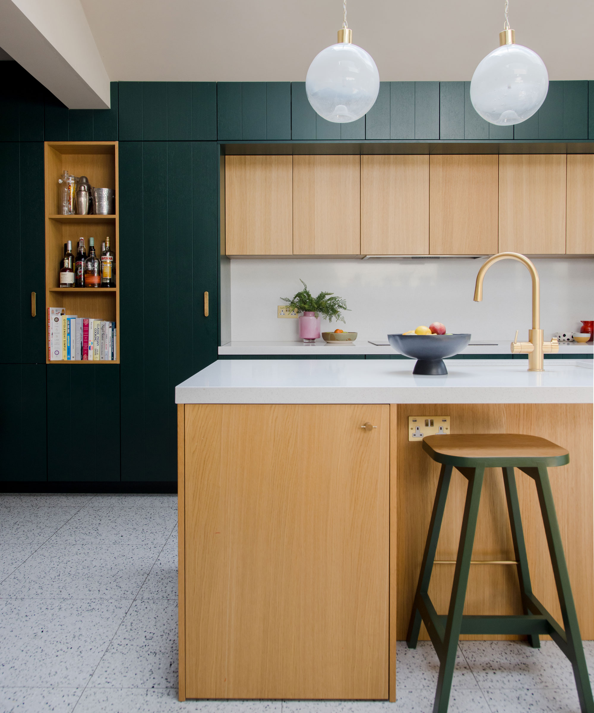
‘The lights are from the 1960s from the Czech Republic. We found them in Retrouvius, an amazing reclamation store. Claudia designed it so they’re suspended from the skylight. Our builders didn’t love doing that but it all came together. ’Kitchen units, Rotpunkt, custom painted in Hunter Green, Benjamin Moore. Terrazzo tile flooring, Diespieker
‘Work started in February 2019 and it was done by July. We moved out to a rental in the neighbourhood. We have two children and just knew it would be really stressful to live in it, because the building site always extends further than you think it’s going to, and we were essentially doing the entire ground floor.
‘The build went pretty smoothly. At one point we hit some Victorian drains in the ground, which slowed us down a bit, but I don’t think that’s uncommon in London.
‘The units weren’t in when we moved back so we had to set up a temporary kitchen. But we’re so glad that we did it in 2019 instead of 2020.’
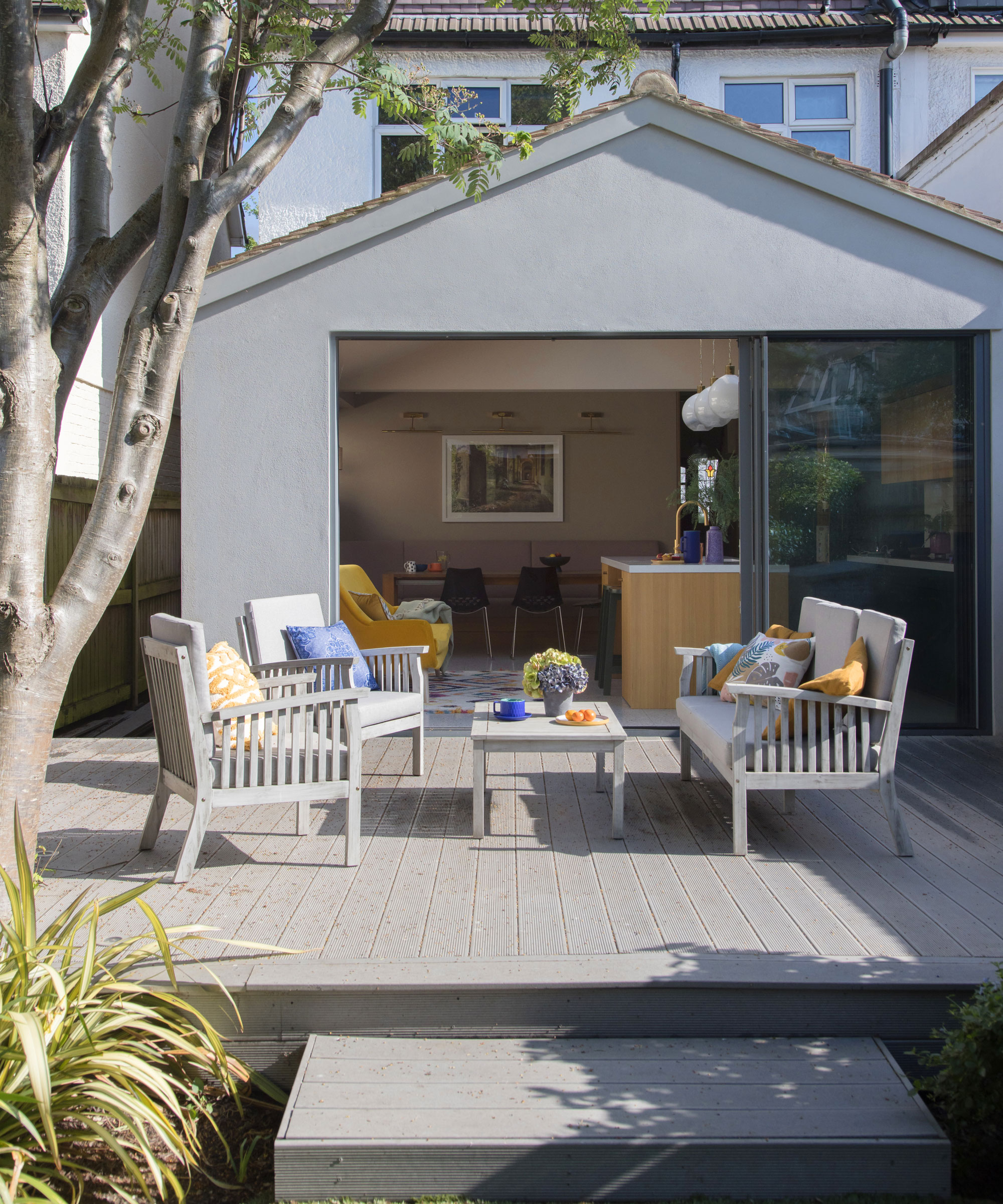
‘My favourite part about the kitchen is the colour. People always comment on it, and three years later I’m still really happy with it – it was a good call.
‘I also love the pendant lights over the island. That was a learning curve! We discovered retrofitting vintage lights is challenging to get right – it’s definitely not as simple as buying off the shelf – but it’s worth it because they’re quite unique and beautiful. At night they reflect up into the skylights.
Contacts
Architects Newman Zieglmeier
Interior designer Claudia Urvois Design
Kitchen supplier Such Designs
‘Calling in the professionals to help was the best way to go. Using their expert knowledge and taste elevated the design and the finished product, and we had a team who could problem solve. It was a game changer.’
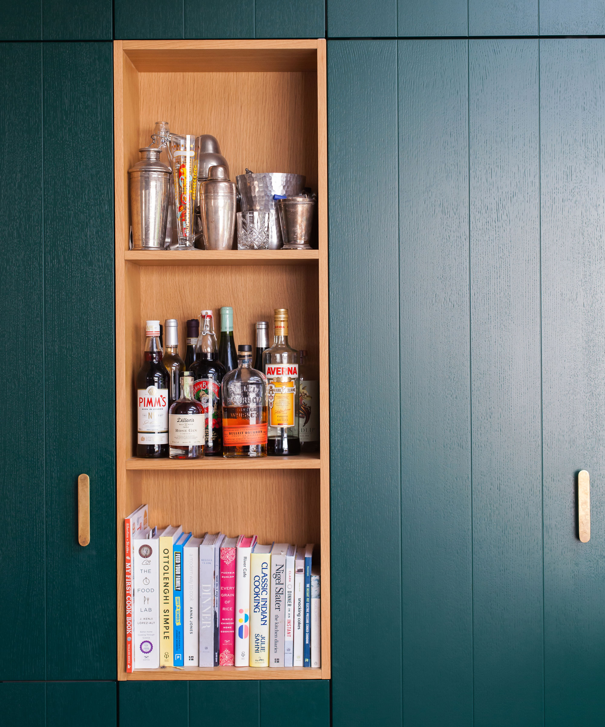
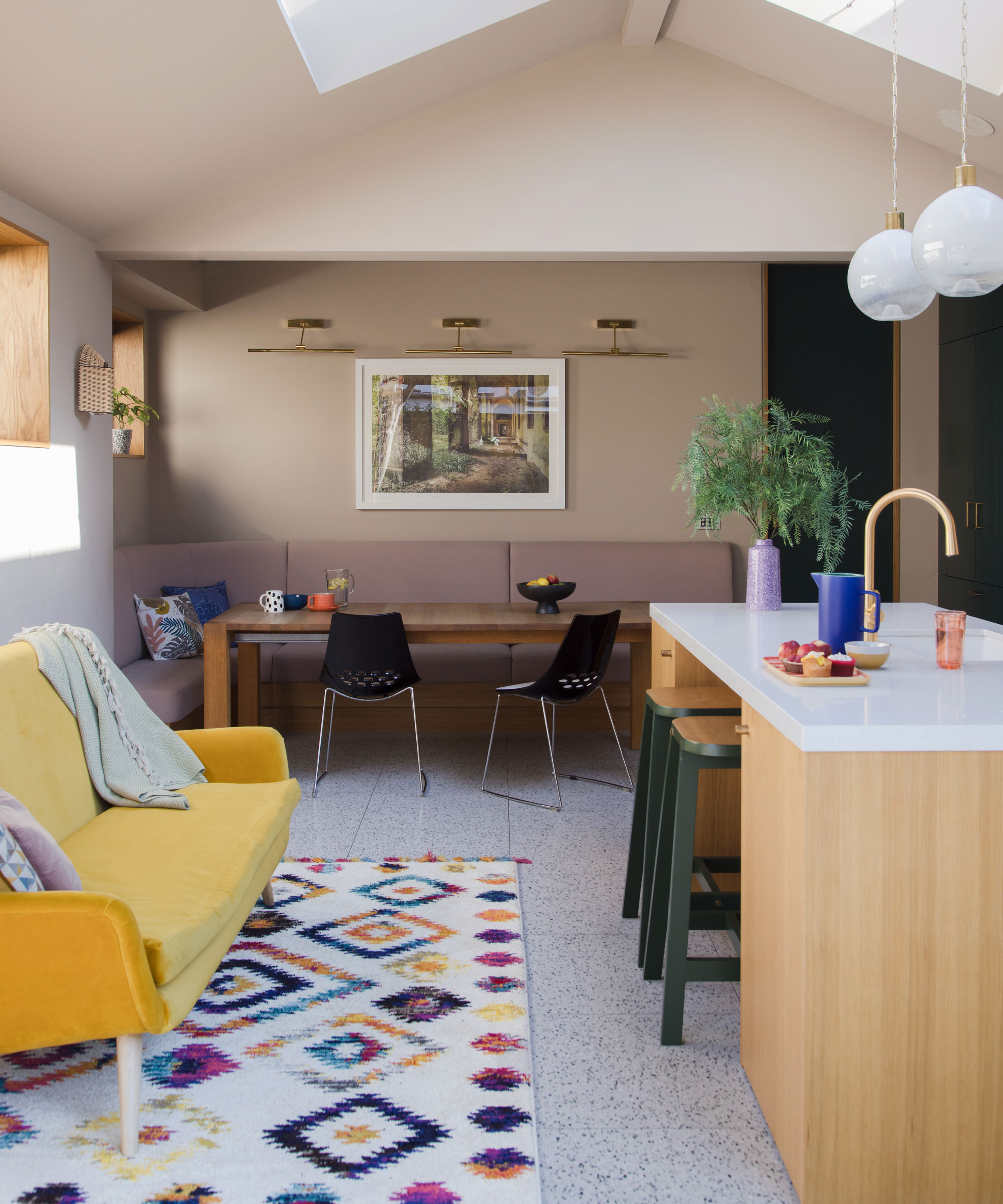
'Some decisions were dictated, like creating the little shelves. There’s a pipe running down behind so we couldn’t have a full-depth cabinet, but we wanted to do something. Our builder and designer came up with the idea of the bookshelf.’
Subscribe to Real Homes magazine Want even more great ideas for your home from the expert team at Real Homes magazine? Subscribe to Real Homes magazine and get great content delivered straight to your door. From inspiring completed projects to the latest decorating trends and expert advice, you'll find everything you need to create your dream home inside each issue.
Join our newsletter
Get small space home decor ideas, celeb inspiration, DIY tips and more, straight to your inbox!

Alison is Assistant Editor on Real Homes magazine. She previously worked on national newspapers, in later years as a film critic and has also written on property, fashion and lifestyle. Having recently purchased a Victorian property in severe need of some updating, much of her time is spent solving the usual issues renovators encounter.
-
 Amazon's bestselling Keurig K-Mini Coffee Maker sale is on now with 40% off — here's why 97,000 customers love it
Amazon's bestselling Keurig K-Mini Coffee Maker sale is on now and offers 40% off. Here's why we and thousands of customers love it. Plus, some alternatives
By Punteha van Terheyden
-
 Pros reveal the 10 kitchen cabinet design mistakes to avoid, and what to do instead
The 10 common kitchen cabinet design mistakes when choosing and installing kitchen cabinets. Solutions to problems and how to avoid the issues.
By Isabella Charlesworth
-
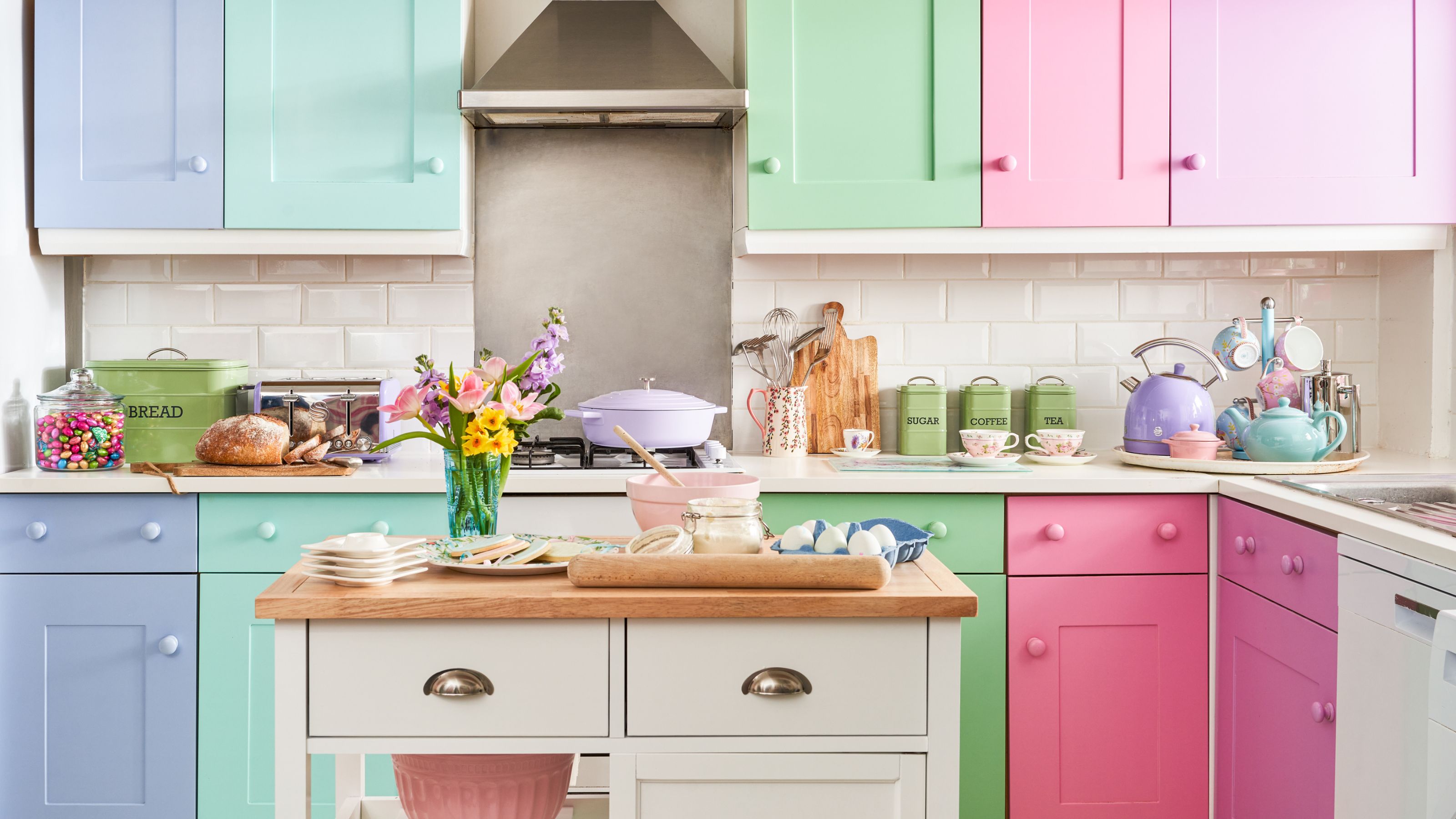 10 pretty pastel kitchen ideas that are utterly dreamy and delicious
Ice cream sweet pastel kitchen ideas are perfect for adding playfulness. We've asked designers for their favorite ways to bring these in light shades
By Eve Smallman
-
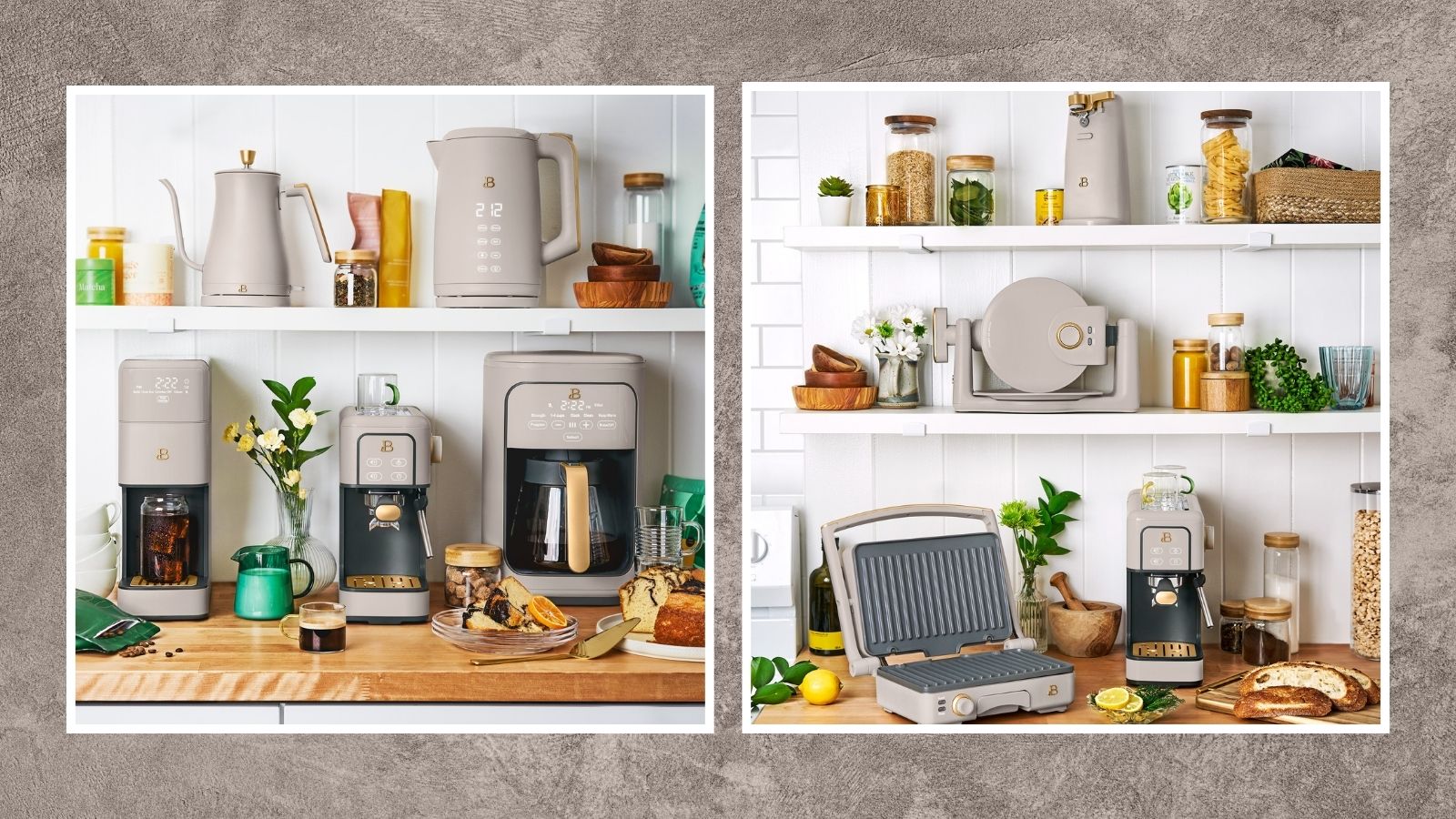 New Beautiful by Drew Barrymore kitchen appliances just dropped, and they'll take your brunch game to new levels
New Beautiful by Drew Barrymore kitchen appliances just dropped — learn all about the waffle maker, espresso maker, electric can opener, and space-saving kitchen island
By Danielle Valente
-
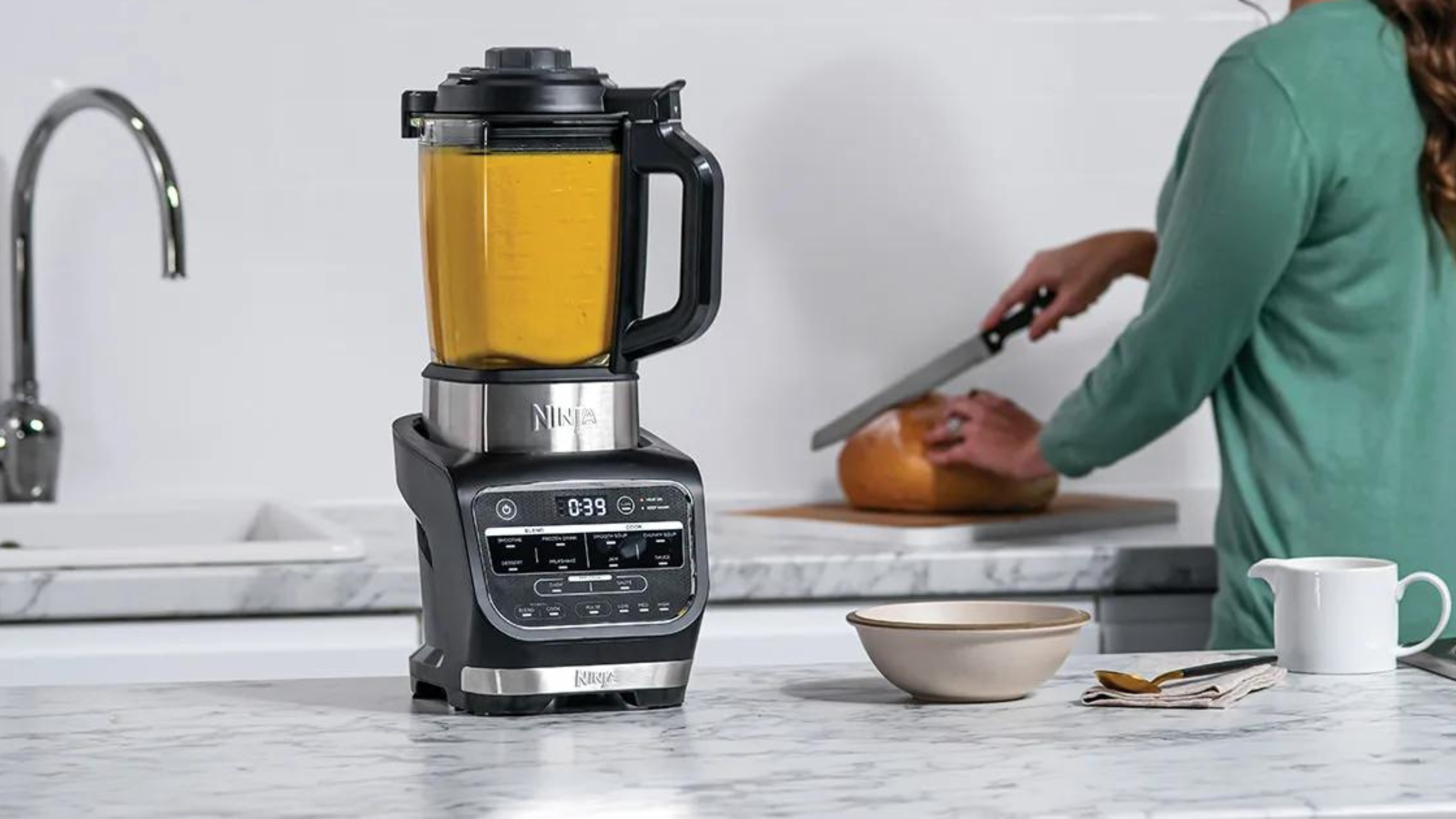
 The Ninja Foodi hot and cold blender has turned my kitchen into a fancy no-waste restaurant
Using the Ninja Foodi cold and hot blender, I've made hearty soups from just 65 cents per serving
By Christina Chrysostomou
-
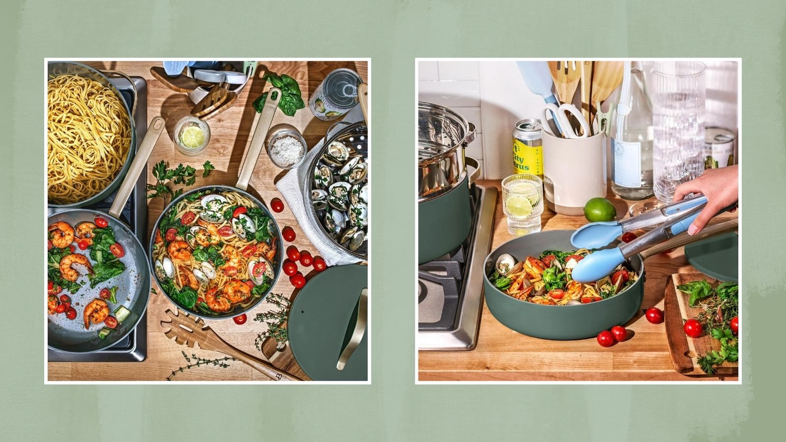 Drew Barrymore drops a new color in her Beautiful kitchen line just in 'thyme' for the holidays
Check out our edit of the Drew Barrymore cookware set and kitchen appliances in the limited-time "thyme green"
By Danielle Valente
-
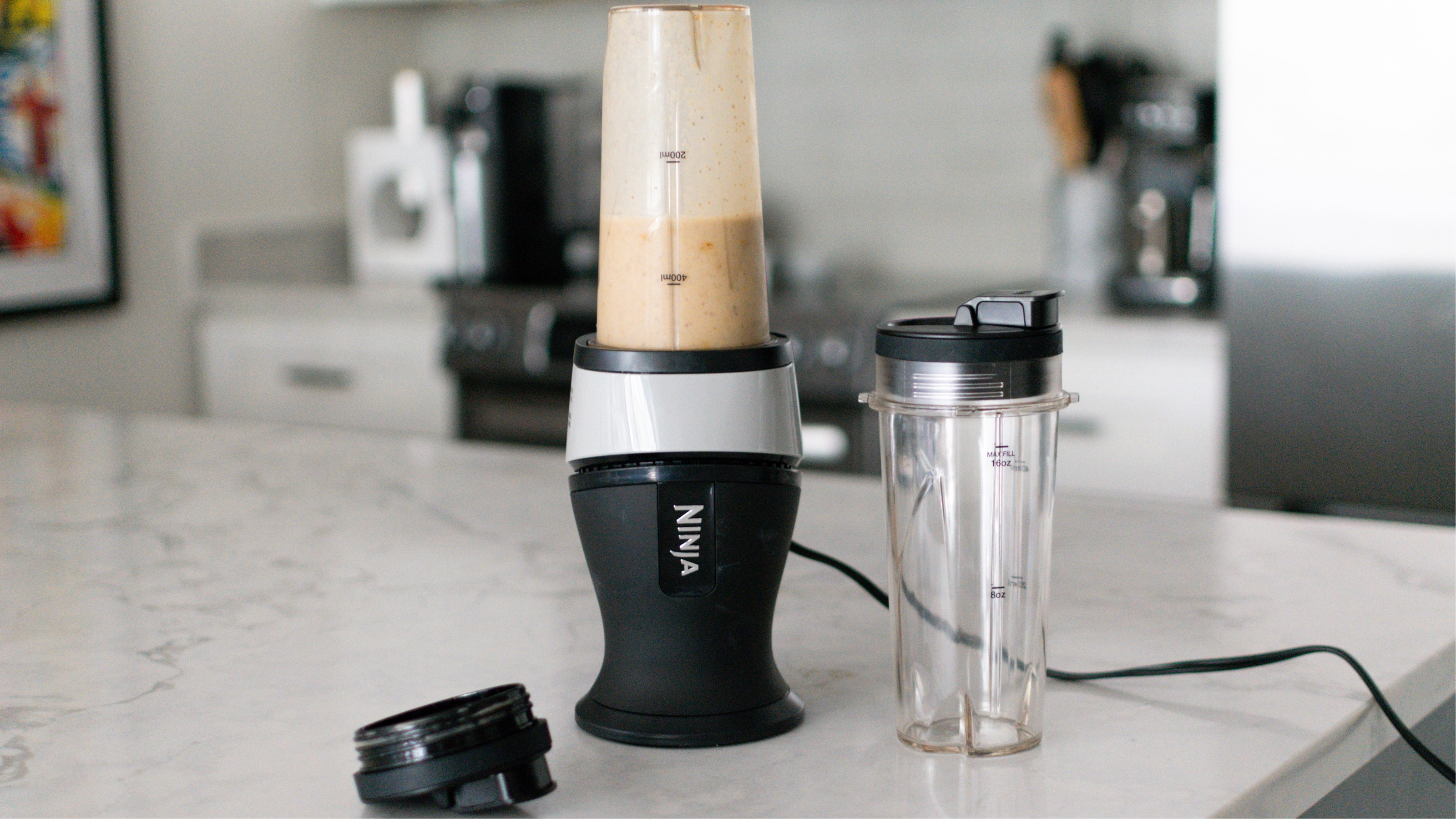
 The Ninja Fit blender is so compact that I no longer dread pulling out this type of appliance
Learn more about the Ninja Fit blender in our comprehensive review after testing the kitchen gadget for several weeks and understanding all of its pros and cons.
By Heather Bien
-

 Review: this Ninja pods and grounds coffee maker has solved our bean debate
The Ninja pods and grounds coffee maker makes everything from hot black coffee to milky brews with a frothed top and even iced drinks. See what else it's capable of in our review.
By Heather Bien
