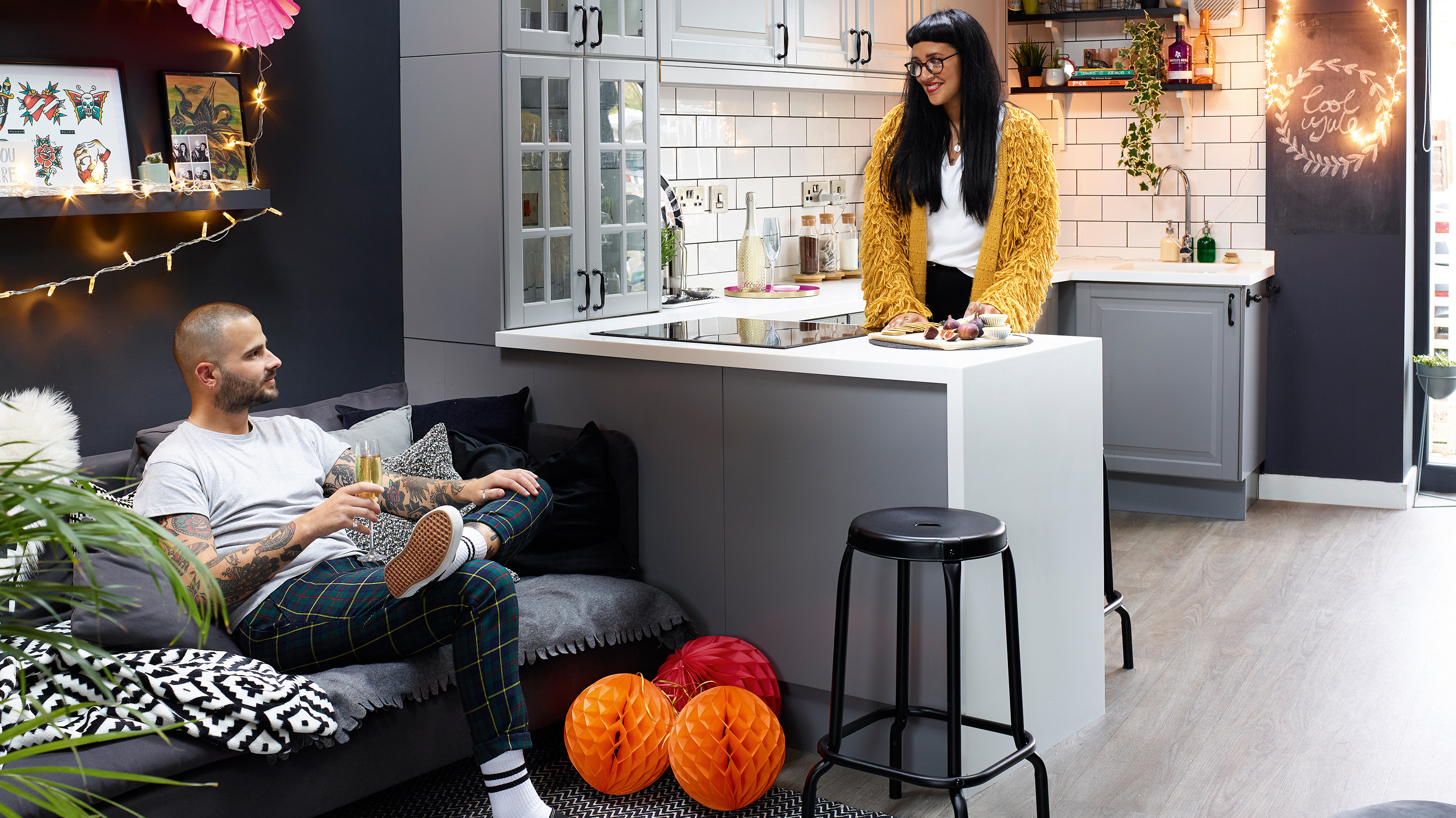
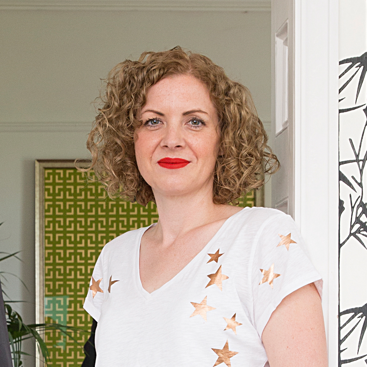
Buying a first home together is right up there as one of the most exciting (albeit expensive) things you’ll do in your life, giving you the chance to make your mark on a space that is finally your own.
For Roxanne and Michael, picking up the keys to their new home was the start of a whirlwind DIY adventure that’s seen them completely transform the blank, beige walls of their 1980s semi into a dark grey haven that’s full of drama and character.
Find out how they got on, then browse more real home transformations, and find out how to renovate a house in our expert guide. See more Christmas houses on our dedicated page, too.
PROJECT NOTES
The owners: Roxanne Hudson, an operations manager for Cow Vintage, her partner Michael Biagioni, a buyer for Sainsbury’s, and their dog, Monty
The property: A three-bedroom, 1980s semi-detached house in Leicester
Project cost: £6,000
Since getting her hands on the three-bedroom home, Roxanne has worked her magic to give the space a sense of personality. Although the couple fell in love with the kitchen extension and open-plan layout, the lacklustre colour schemes did little to fire their imagination, and Roxanne couldn’t wait to whip out the paintbrushes.
We’re not just talking the odd feature wall here and there, though: she’s gone all out with her edgy style, and now dark grey walls form the wow-factor backdrop to every room scheme.
Speaking to Roxanne, it’s clear she’s always been drawn to dark colours, and decorating the house in similar tones was a natural step. But don’t be fooled into thinking that dark means cold and boring. There’s a real warmth to the couple’s home, with each room flowing effortlessly into the next.
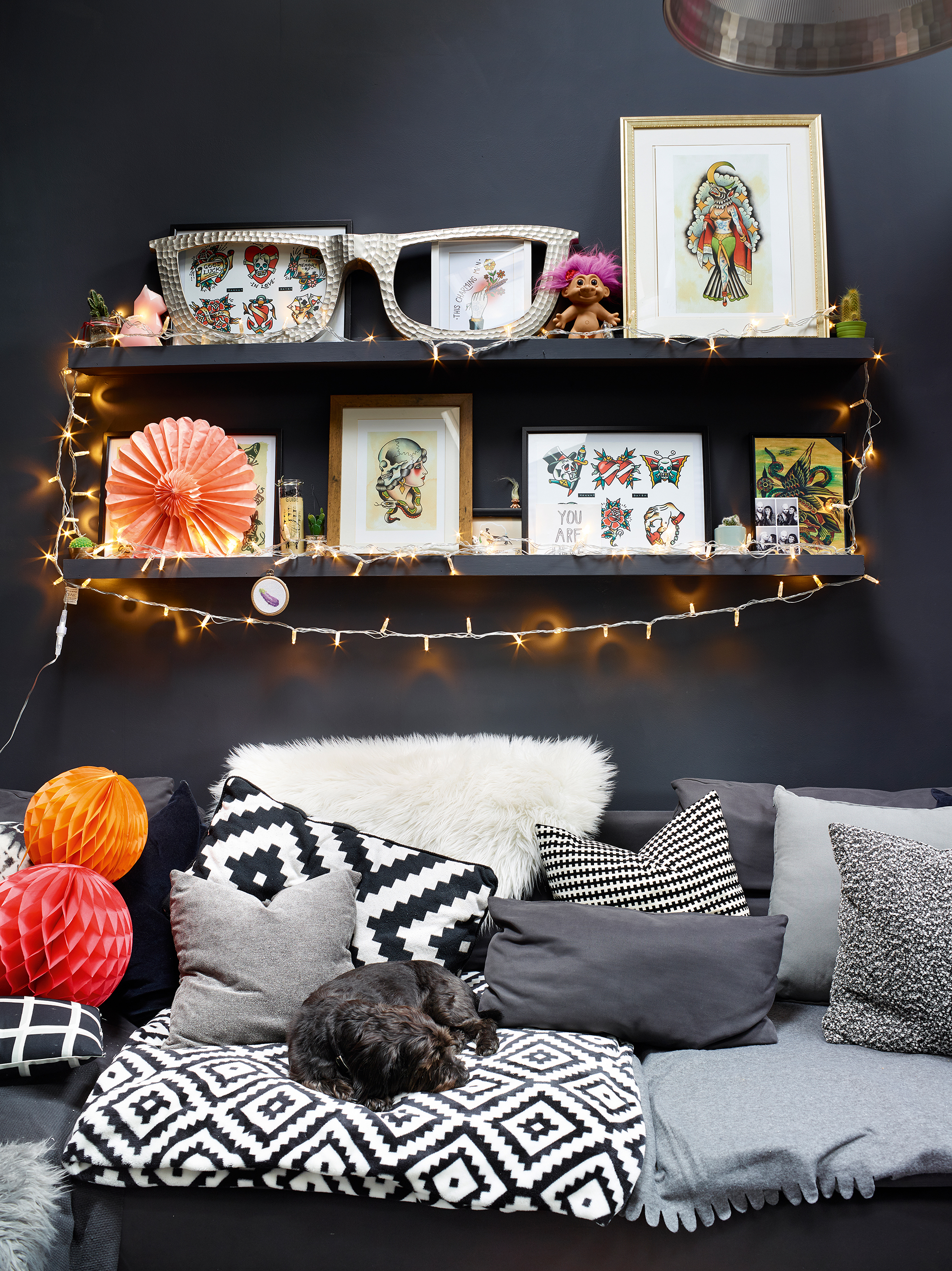
Plus Roxanne is a clever shopper, mixing Scandi-inspired designs from Ikea and great-value homeware from the likes of Matalan and H&M with vintage buys, showing that a modest budget doesn’t have to limit your aspirations.
If you’re daring enough to try something, it’s amazing what can be achieved with a can-do attitude and an eye for colour. As the couple gear up for Christmas, we couldn’t wait to get Roxanne’s advice for pulling together a successful scheme.
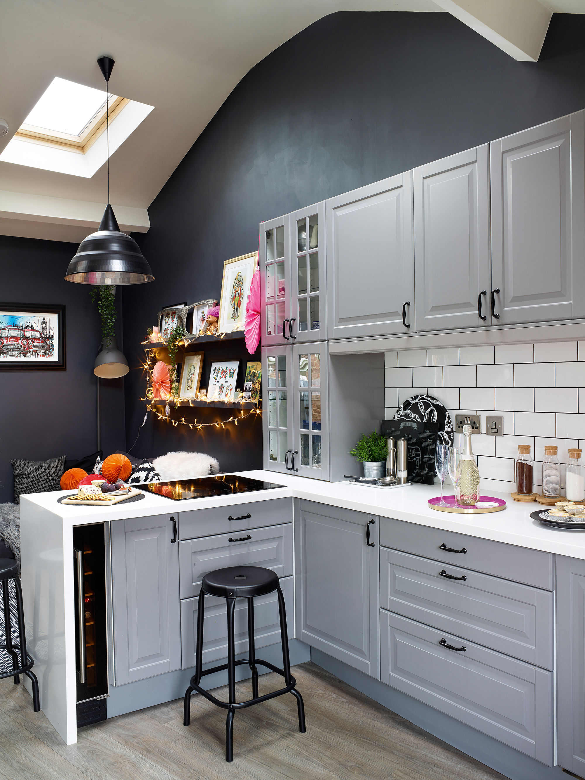
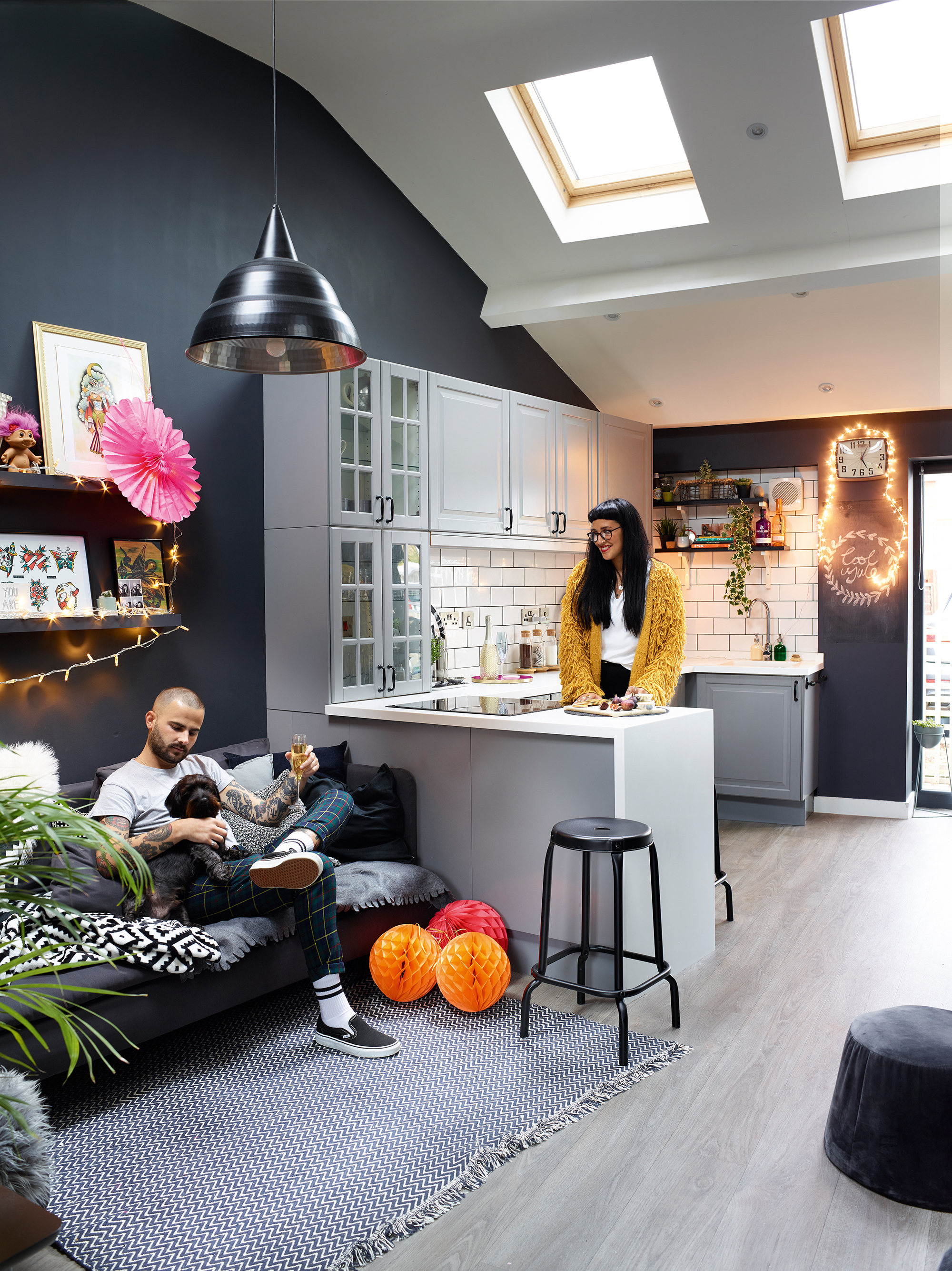
The high ceilings and sense of space won over Roxanne and Michael as soon as they saw the house. New wall tiles have smartened up the kitchen. Kitchen units and bar stool, Ikea. Wall tiles, Walls & Floors
'The kitchen was the room that sold the house to us as soon as we saw it online,' says Roxanne. 'We were living in Michael’s two-bedroom Victorian terraced house, but wanted to buy a home together.
'This one ticked off lots of things on our wishlist, such as a garden for our dog Monty and an open-plan entertaining space, plus it didn’t need huge amounts of work.
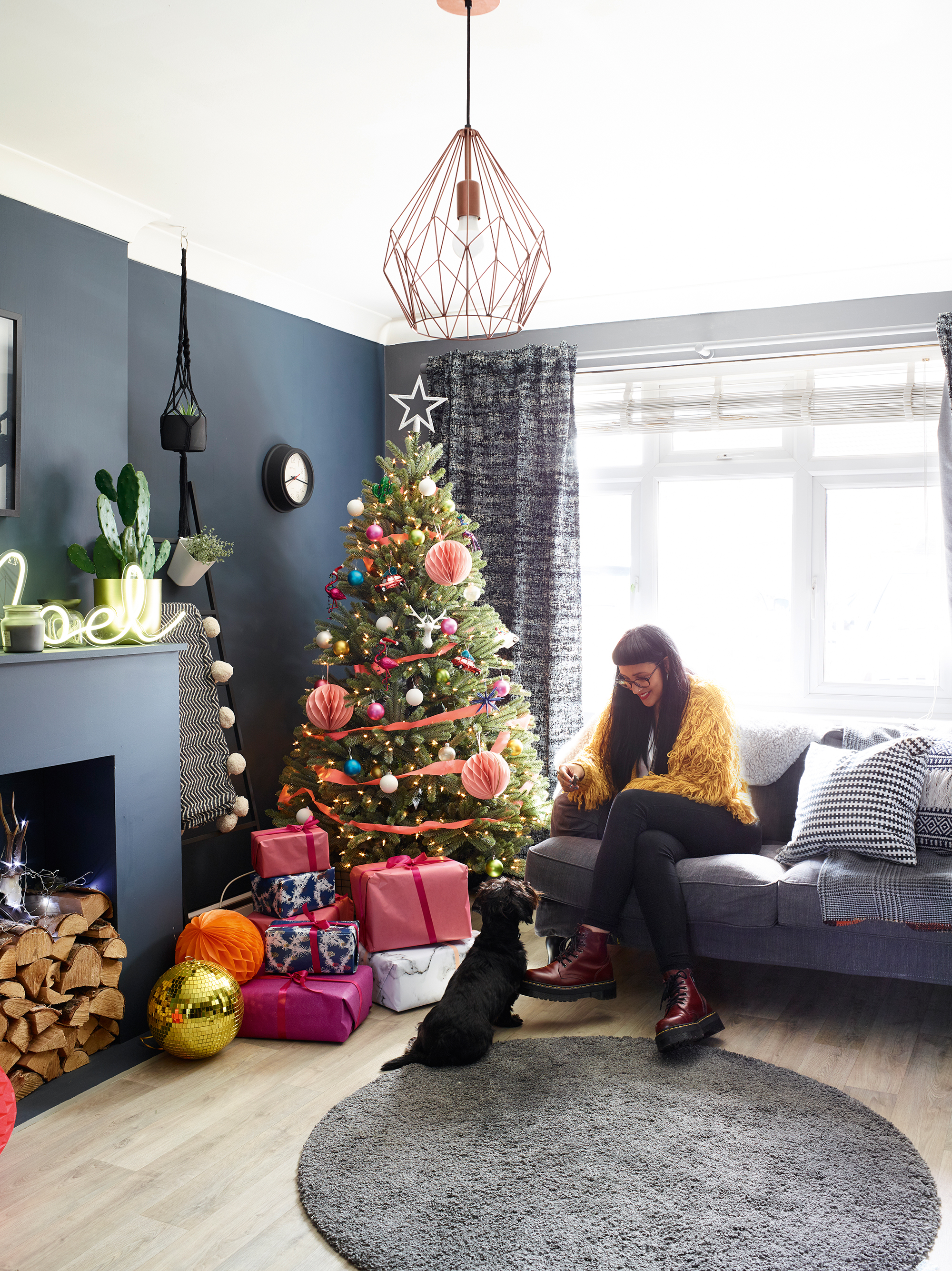
Neon decorations pop against the dark background in the living room. Walls painted in Thunder Cloud and Silver Tarnish, both Valspar. Sofa and rug, Ikea. Ladder, Søstrene Green. Royal Blue Spruce Artificial pre-lit 6ft tree, Balsam Hill. Shatterproof baubles, Homebase. Wrapping paper, Cox & Cox. Star tree decoration, Cancer Research
MORE FROM REAL HOMES MAGAZINE
Want to see inside more stunning homes? Each month, Real Homes magazine features everything from modern extensions to cleverly redesigned family spaces. Get the magazine delivered straight to your door with a fantastic subscription deal.
'The previous owners added the extension and we love how the vaulted ceiling and rooflights create such a feeling of height and light. Although we’ve kept the original kitchen units, we’ve changed the look and feel of this room, painting the pale green walls dark grey to give it a more modern, funky edge.
'We also updated the tiling in the kitchen, opting for black grouting for added impact. With the new corner sofa in place, we now spend most of our time in this space in the evening after work, and we can’t wait to welcome family and friends here this Christmas.'
'I originally went for a navy and white scheme in the living room, but it didn’t feel cosy enough so the white walls soon became grey in here too,' says Roxanne. 'This tends to be our quiet room, and it’s also the space I escape to when Michael has his Lads’ Tuesday nights in the kitchen.
'When it comes to buying things for the house, Ikea is usually my first port of call. I’m always in there! Sometimes I pop in for a quick look round to get some new accessories to change up a room scheme, other times I’ll make a long list and go on
a big shopping spree, but I always find something I love.'
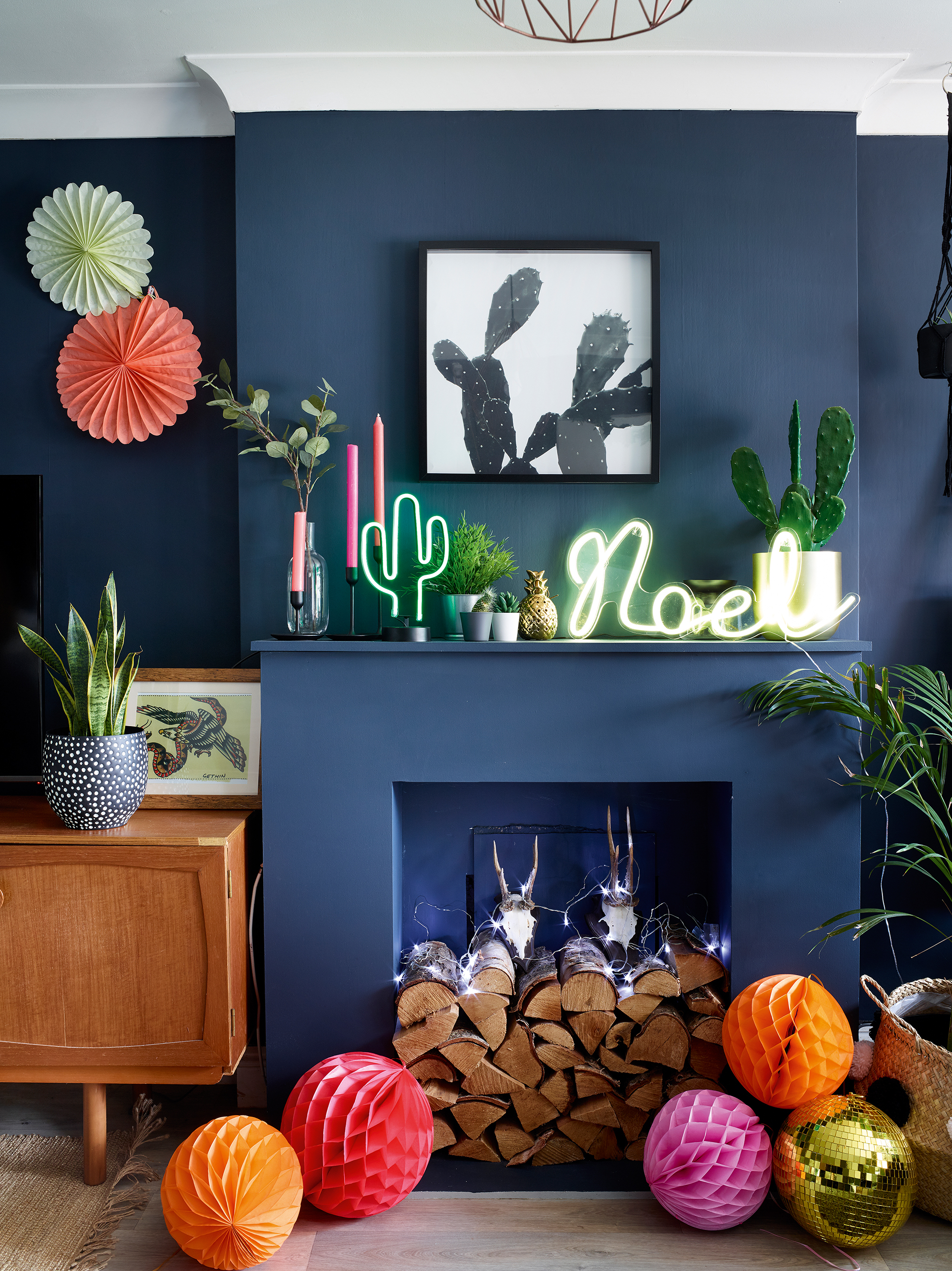
Vibrant decorations add a fun touch to the painted fireplace. Mirror, Ikea. Vintage sideboard, local charity shop. Paper decorations, Talking Tables. Gold disco ball, Rockett St George. Noel neon light, Lights4fun
'Even though we haven’t changed the layout in the house or added any additional space, it feels like a completely different property to the one we bought,' explains Roxanne. 'We painted four rooms within the first week of moving in – I was on a mission!
'I’ve learned a great deal in the last year, such as the importance of finding your core style, sticking to what you like and not getting distracted by what someone else has done.
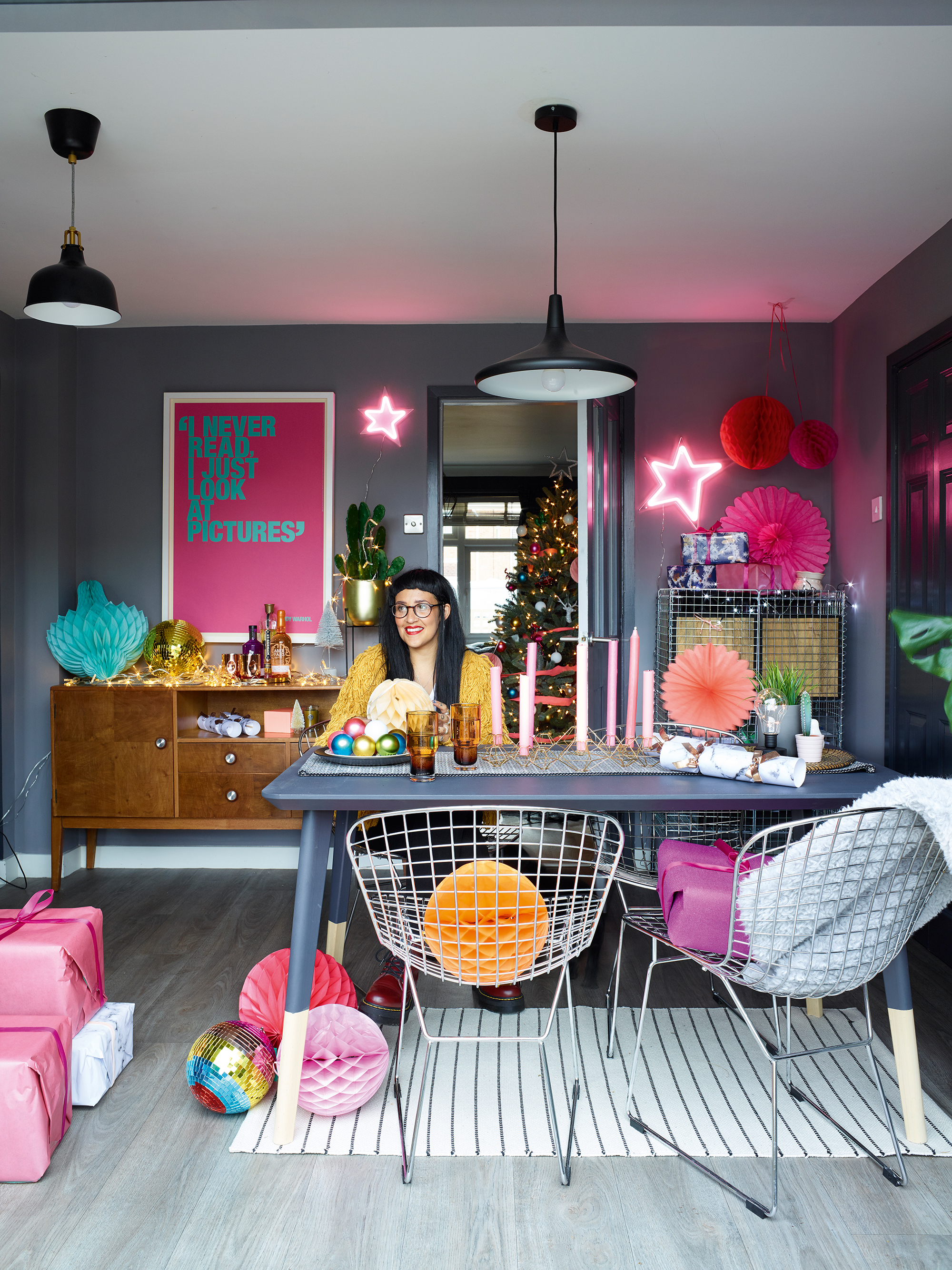
Walls painted in Pewter Medallion, Valspar. Table, pendant light, metal unit and plant stand, Ikea. Chairs, Ebay. Pendant (over table), Aldi. Rug, H&M. Paper decorations and disco ball, Talking Tables. Gold disco ball, Rockett St George.
'I originally joined Instagram to look for inspiration for my home,' she adds, 'and I love that it’s a great source of ideas, whatever your budget. Seeing how other people decorated with dark colours gave me the confidence to really go for it in my own house.
'I could see that it was possible to have a grey scheme without making the house feel dark and unwelcoming. I find it funny that I’ve ended up decorating how I dress, so a combination of grey, black and white with odd pops of bright colour to add interest.
'It’s amazing how a couple of coats of paint can transform anything – even the wooden Ikea table has had a grey makeover. I primed the surface and then painted over the pale wood, and it now works better with the rest of the scheme.'
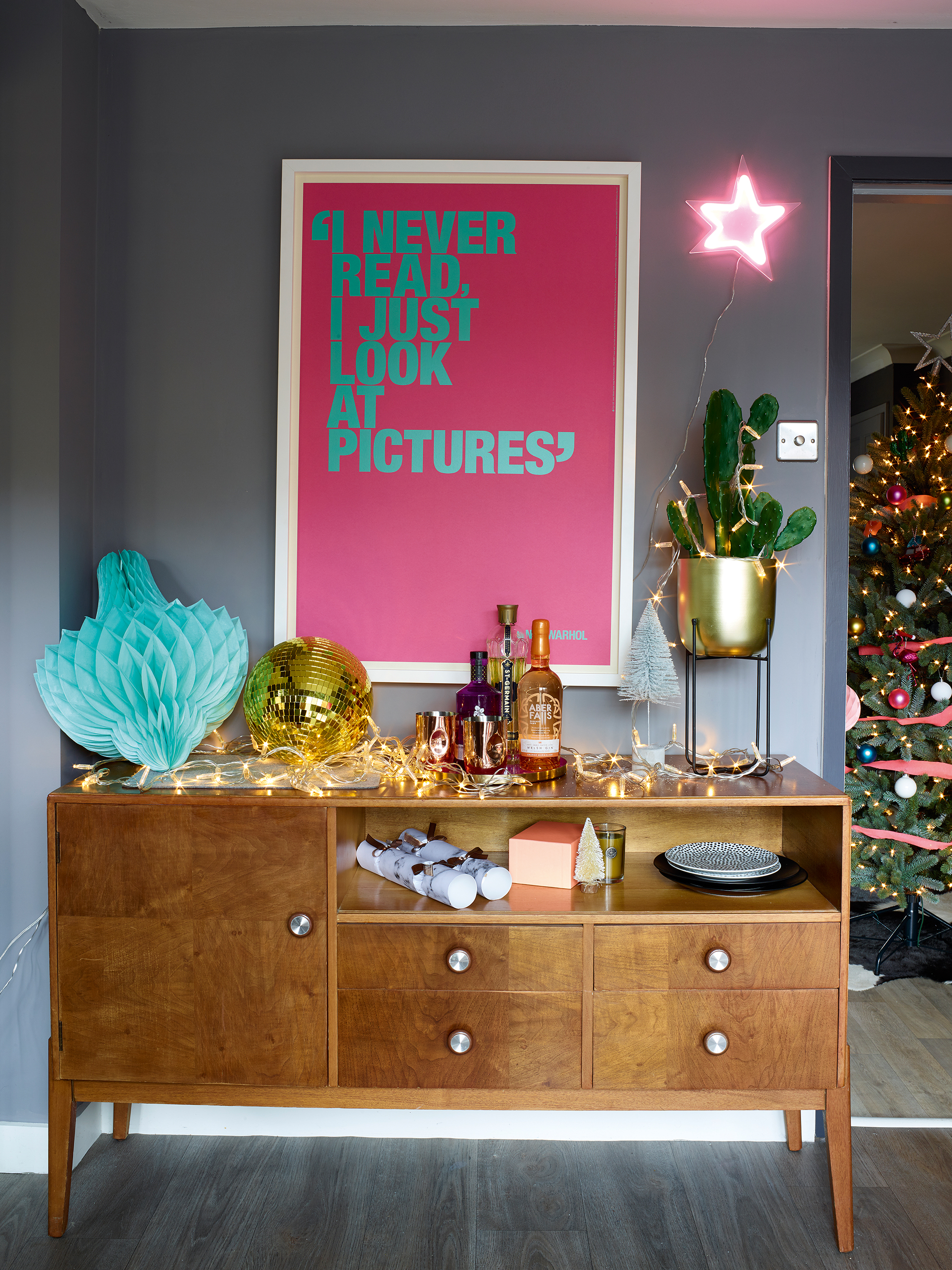
Vintage furniture takes pride of place in the dining room. Sideboard, charity shop. I Never Read print, King & McGaw. Fairy lights and neon lights, Lights4fun. Brush mini trees, wrapping paper and crackers, all Cox & Cox
'Our bedroom was the first room we tackled when we bought the house as we wanted to have one room finished where we could unwind at the end of a busy day.
'I originally went for a dark red wall, but it jarred with the rest of the house once I’d decorated the other rooms and it didn’t feel particularly restful.
'We’ve simply painted over the original wallpaper on the back wall and I quite like how in certain lights you can still see a hint of the pattern through the paint.'
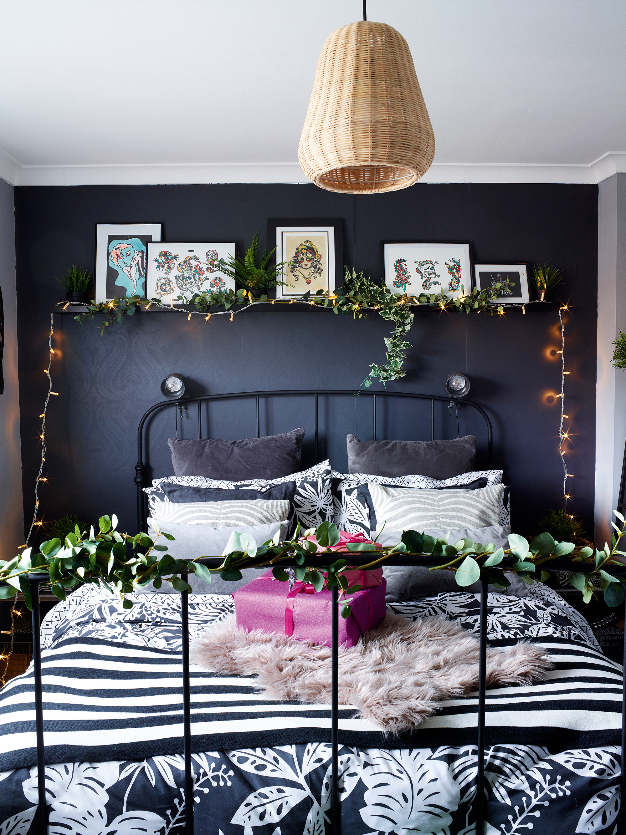
Faux greenery and fairy lights give the master bedroom a festive touch. Walls painted in Dinner Jacket and Callisto, both Valspar. Ikea bed, Gumtree. Bedding, Ikea. Faux Eucalyptus stems, Wyld Home. Fairy lights, Lights4fun
'We haven’t had a huge budget to update this house,' says Roxanne, 'so we’ve had to be clever with some of our furniture choices. I’d always wanted this Ikea bed, but it was no longer available and I couldn’t find anything similar for the same price.
'After an online search, however, I managed to find the Ikea one for even less than its original price. We’ve also updated basic wardrobes by painting them the same colour as the walls. Go for furniture in a shape and style that suits your room, and pretty much anything can be repainted to match the scheme.'
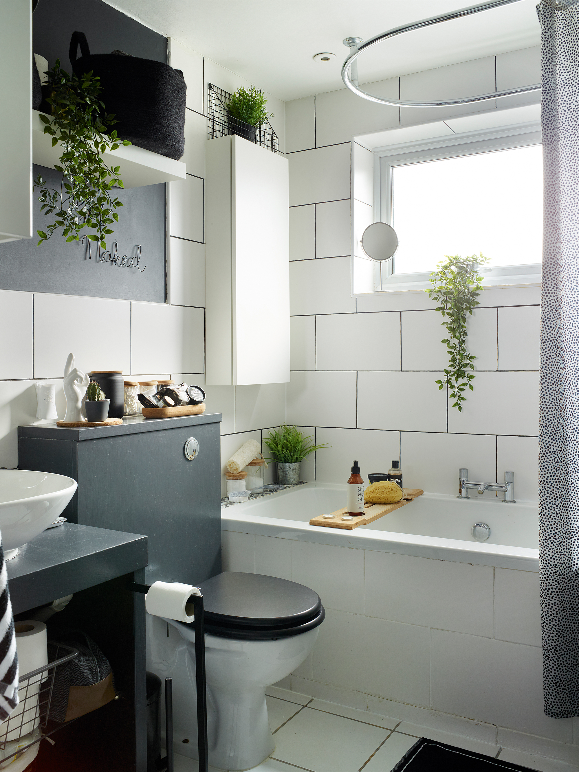
'Our original plan was to gut this room and fit a brand new bathroom, but we soon realised it was going to be too expensive and we struggled to find someone who could do the work for us,' explains Roxanne.
'A downside to being one of the first in our group of friends to take on a project like this means that we don’t have anyone to ask for recommendations on tradespeople they’ve used. For now, we’ve given the existing fittings a makeover until we feel confident enough to take on a bigger redesign.
Painting the wall, toilet cistern and sink surround has updated the space, and we’ve covered the dark paint with a clear sealant to prevent it peeling in the humidity. We’ve also used a black grout pen on top of the white grouting to give the tiles a more modern, industrial vibe.'
Contacts
- Paint Valspar
- Kitchen Ikea
- Wall tiles Walls & Floors
More Christmas houses to browse:
Join our newsletter
Get small space home decor ideas, celeb inspiration, DIY tips and more, straight to your inbox!
-
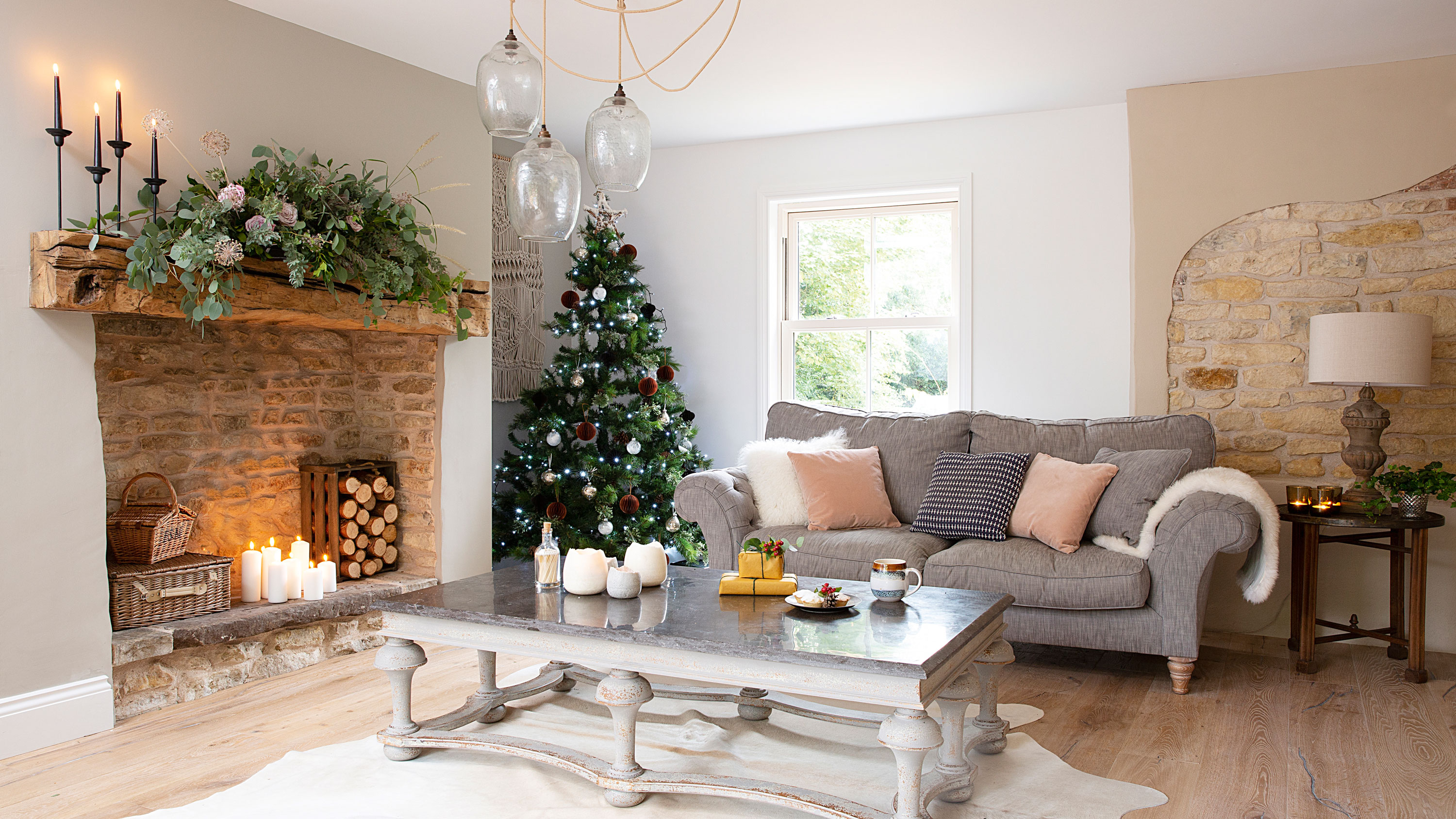 Christmas house: a 17th-century mill house conversion is the perfect festive setting
With a huge inglenook fireplace and exposed stonework, Laura and Mark Stubbs’ converted mill house comes into its own at Christmas
By Karen Wilson
-
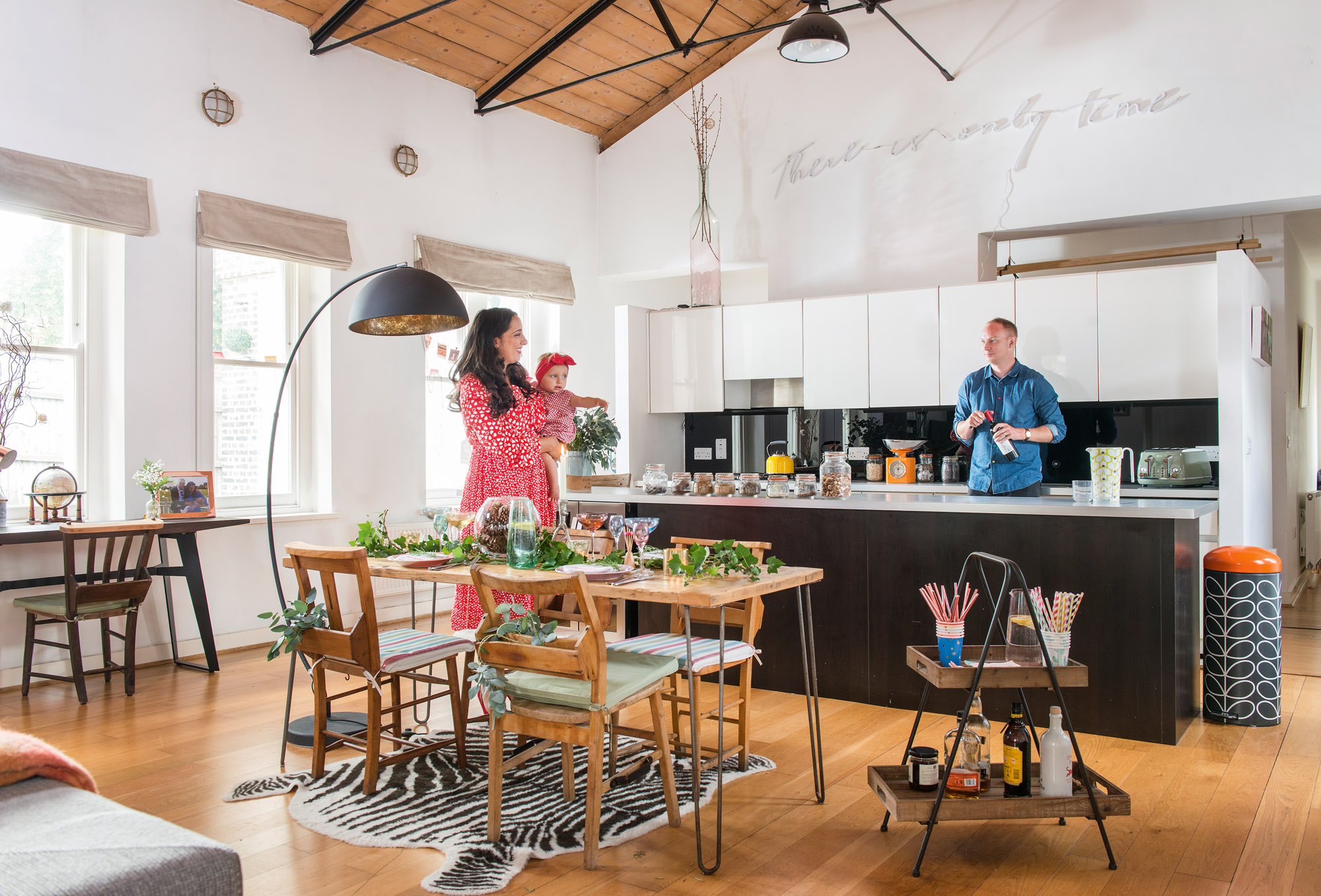 Christmas house: a Victorian pump house transformed into the perfect entertaining space
Luise and Ben’s quirky Victorian pump house renovation has taken years to perfect – we find out why it was well worth the wait...
By Natalie Flaum
-
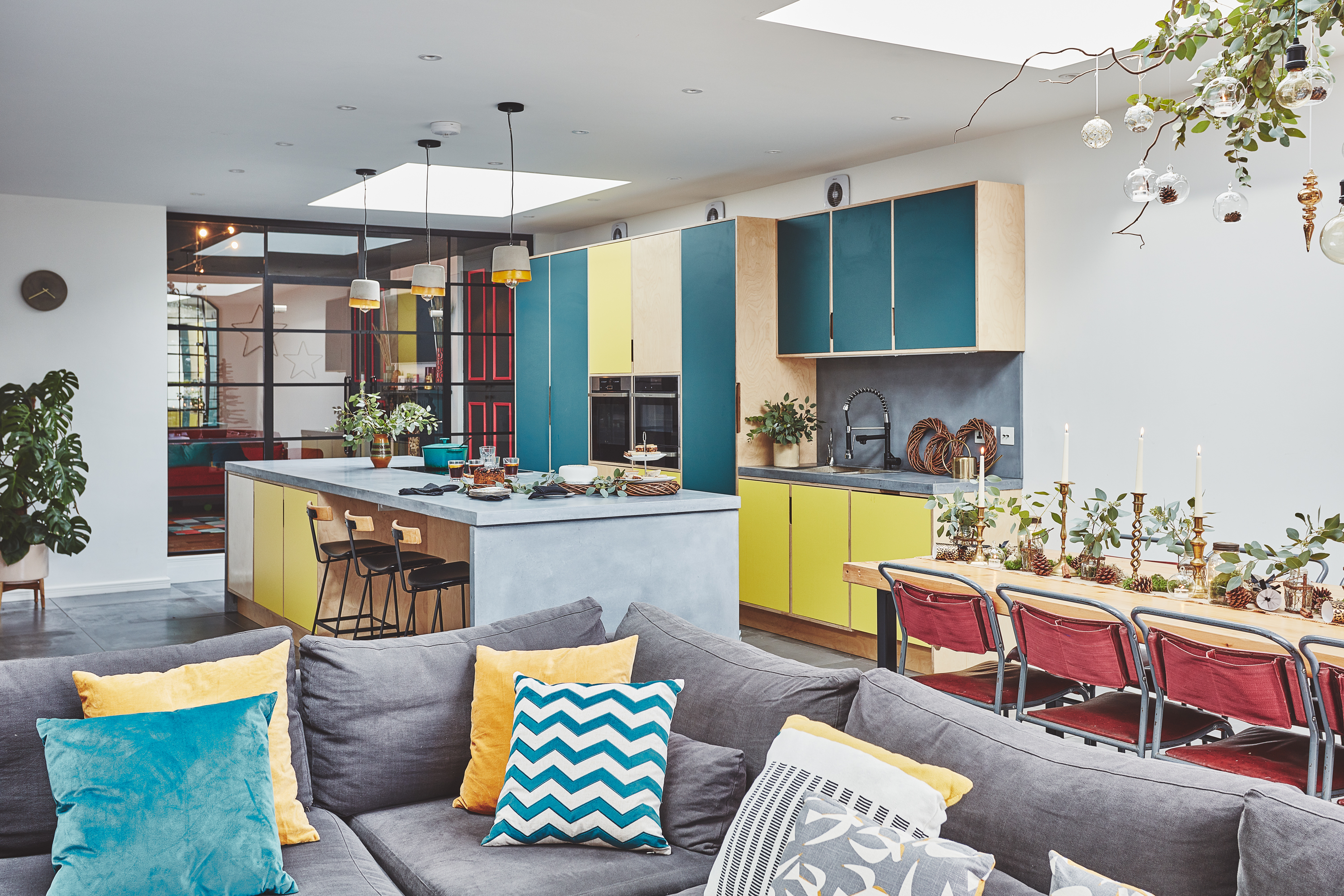 Christmas house: a Victorian renovation with a modern festive twist
Lucy and Dan's extended Victorian home sees them through dinner parties, family living and a fair few Christmas gatherings
By Ellen Finch
-
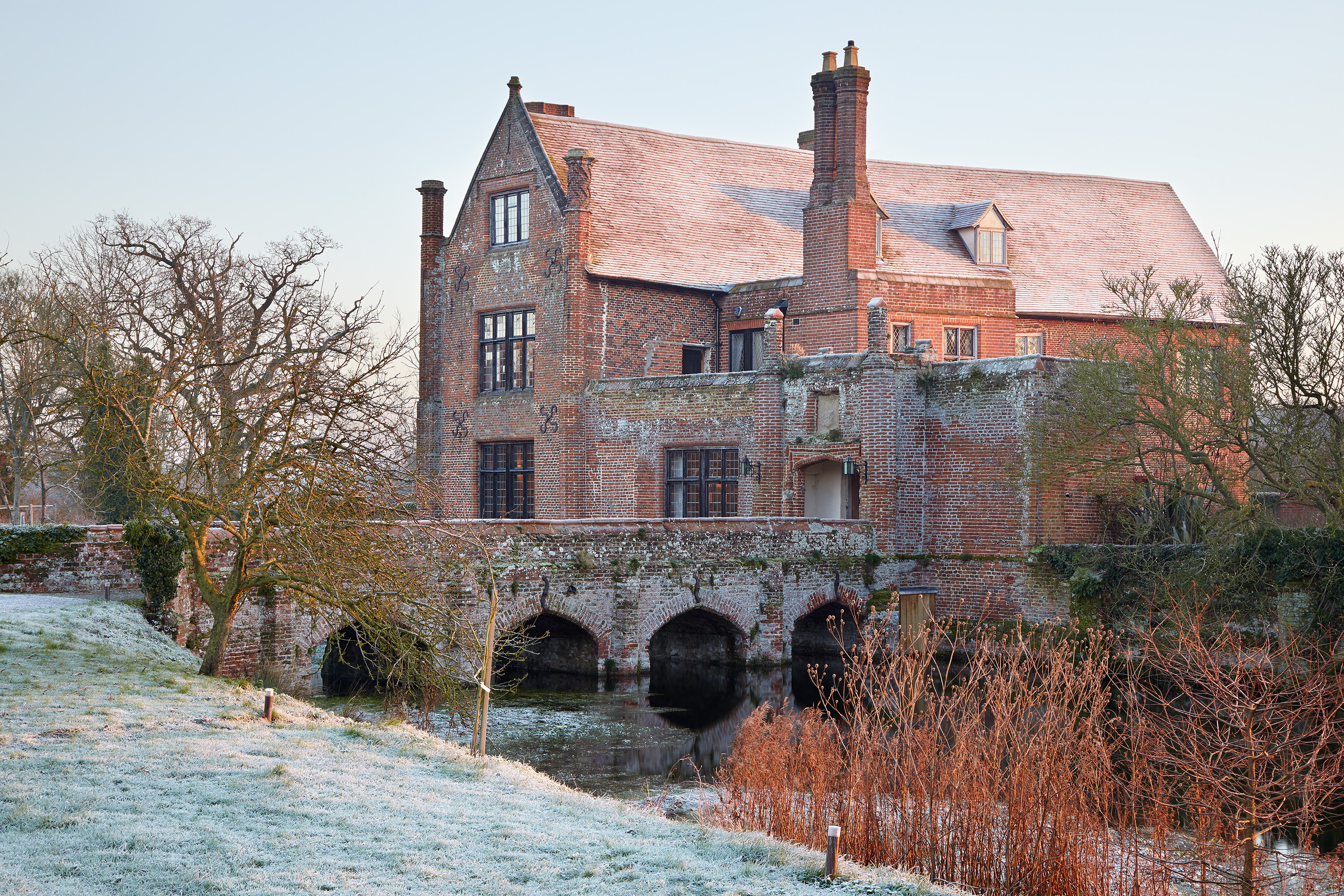 Christmas house: a medieval moated manor house
This magnificent medieval moated manor house is home to Caroline Spurrier and a host of fascinating stories
By Karen Darlow
-
 Christmas house: a renovated Cotswold stone cottage
Christian and Jessica Fleming worked hard to make the Cotswold stone house they inherited their own, creating light, spacious interiors
By Karen Darlow
-
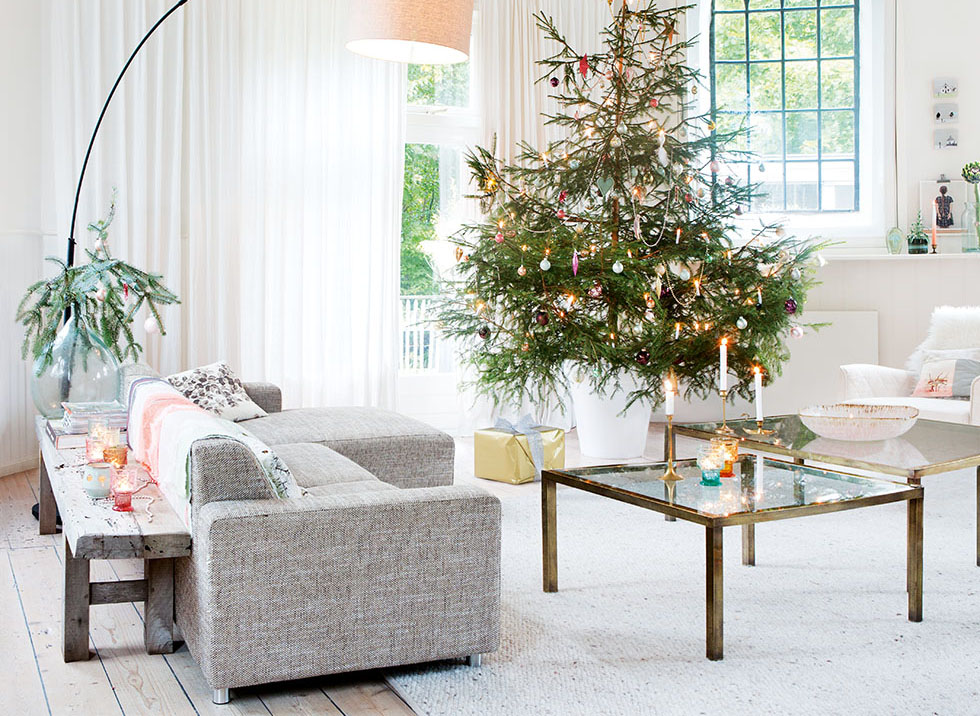 Christmas house: a beautiful church conversion home
Maaike and Onno Goldbach have put their own stamp on this beautifully renovated church building in the Netherlands
By Karen Darlow
-
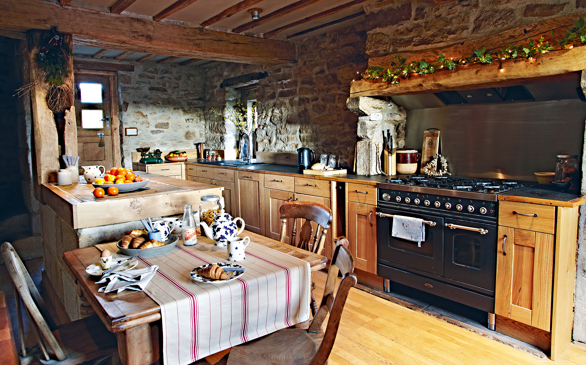 Christmas house: a renovated derelict farm
Lisa and Richard Swaine dedicated 16 years to renovate a derelict farm, creating a stunning family home
By Suzanne Webster
-
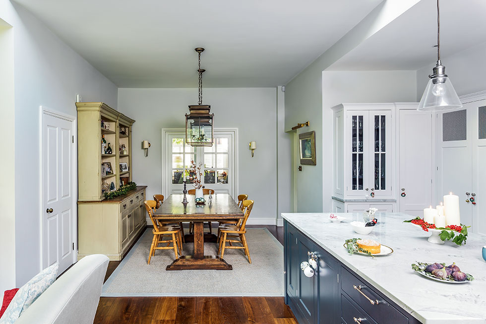 Christmas house: a family-friendly kitchen extension
With its stunning copper-roofed extension, Annie and Oli Doherty’s kitchen-diner is a mix of modern and traditional style, and the perfect family space
By Kathy Hurst