
Looking back at photos of my teenage years, I can’t help but cringe at some of my rather questionable outfit choices. Over time, and through years of trial and error, I’ve developed a style that works for me and makes me feel good. Crafting a fashion style is very much like crafting an interiors style– it takes time. While those experimental years tend to happen much later in life – often when we’ve reached the milestone of homeowner – it’s crucial that we go through them in order for our personal style to evolve.
Wandering around Jessica’s colorful home, I get the impression this is the work of an experienced crafter. Far more than just an impeccably well-considered decorating scheme, this is a living and breathing work in progress. The fun and fearless design decisions, color courage shining through in every room and the journey it took to get there, made this home a worthy winner of Best Makeover in our annual awards. I couldn’t wait to find out how Jessica gained her creative flair.
For more real home transformations, head to our hub page.
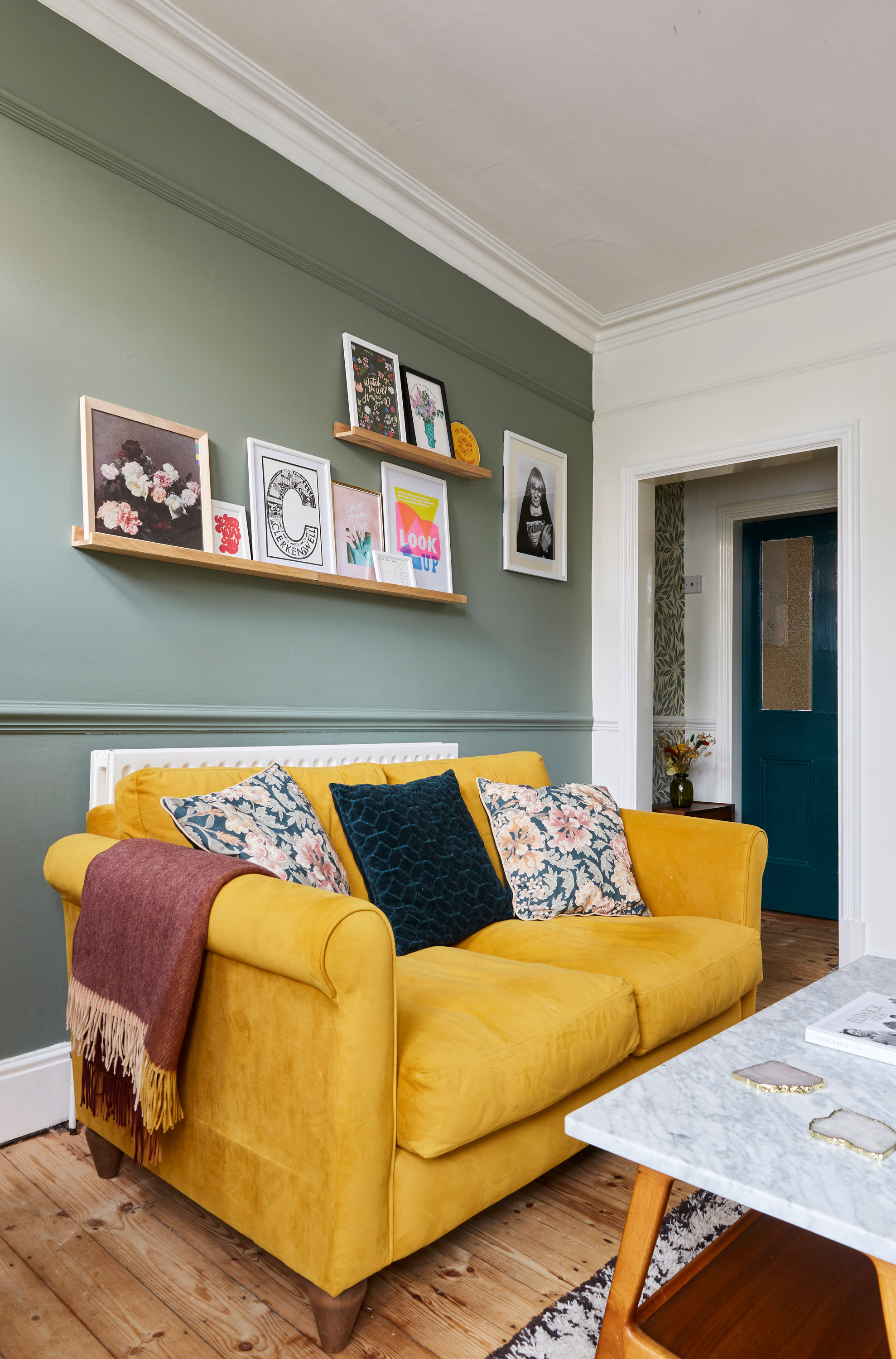
The living room was the first space where I used a mood board to plan out my decorating scheme before buying a single thing. I mapped out all the colours and textures I wanted on paper, so I knew they’d fit together perfectly,’ says Jessica.‘If you compare the mood board to the completed room, it’s an exact match!’ Sofa, The Lounge Co. Cushions, H&M Home. Picture shelves, Amazon. Coffee table, West Elm. Rug, La Redoute. Art prints above the sofa, East End Prints, Max Made Me Do It, andLucy Loves This.
Q– I adore colour, and I’m impressed by your playful use of paint. Have you always gone for a vibrant palette?
The profile
The owners Jessica Clark (@charminglifebyjess), who works in interior styling and marketing, and husband Brett, who works in IT, live here with their three-year-old son, Wren
The property A two-bed Victorian terrace in Leicestershire
Project cost £18,500
A– Not at all! This is the first house I’ve owned, so when we moved in and I was faced with lots of empty walls to decorate for the first time ever, I found it a little daunting. As I began planning my first decorating scheme, I thought everything had to be crisp white and minimal for it to look nice. I wanted clean lines and simple styling – I wasn’t really that into color. I think I was even scared of it, and white felt very safe. Looking back at old photos, I honestly can’t believe how different it looked.
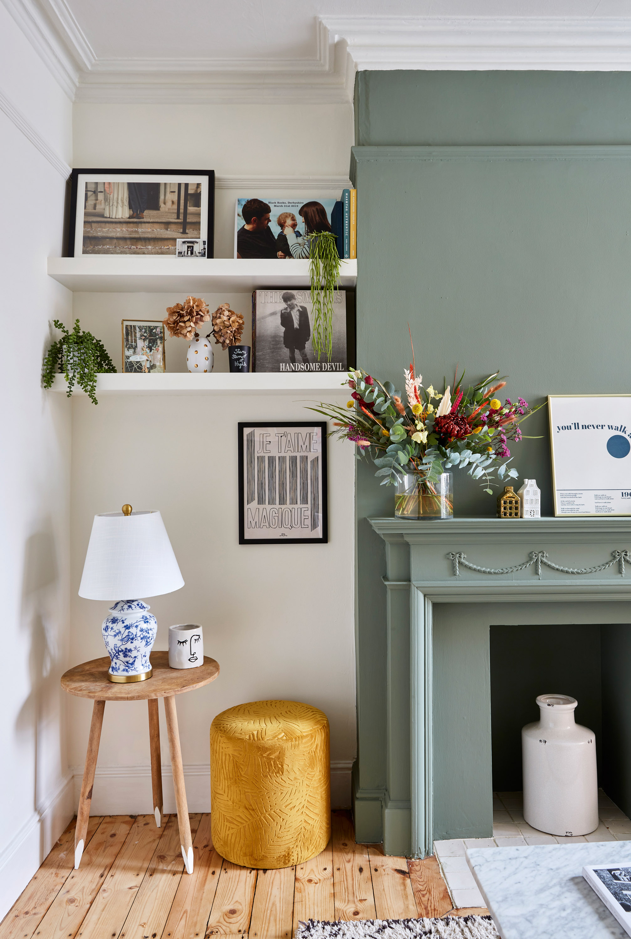
Walls painted in Green 02 and White 03, Lick. The flooring is original.
Q– That’s such a stark contrast to how it is now – complete opposite ends of the spectrum! I totally understand the security of white, but what made you change tack?
A– I began following interiors accounts on Instagram and Pinterest, and the exposure to so many different styles and ideas really helped me to define what I did and didn’t like. With so many colorful and decorative ideas out there, I started to find my white space a little overwhelming. I began seeing my white home not as completed project, but as a blank canvas from which I could get creative. I guess I just needed time to find my feet with it, and in the past few years I feel that I have.

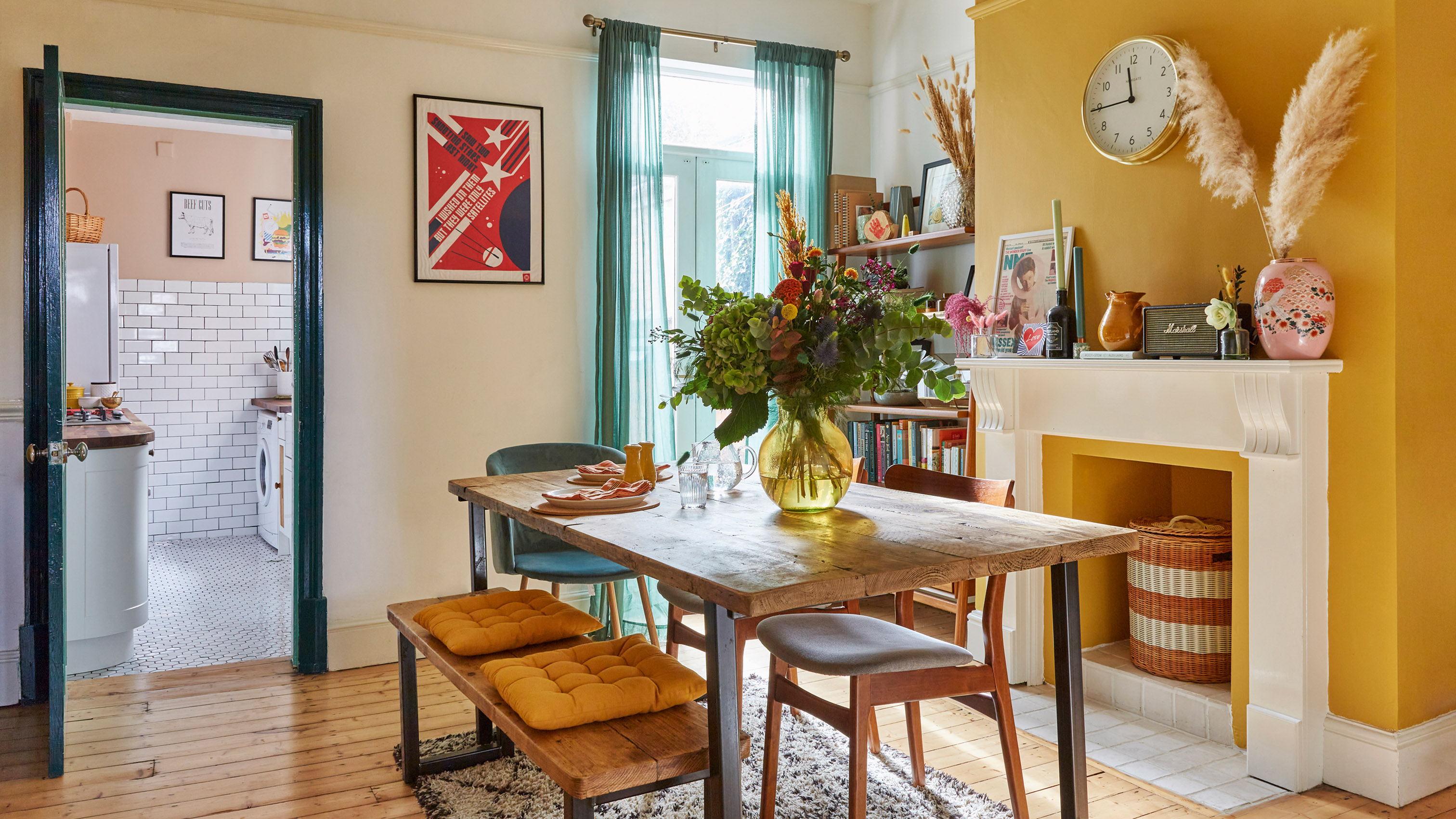
Feature wall, Yellow Pink, Little Greene Paint Company
Q– I can tell you’re a fashion lover, but the big difference between developing interior and fashion styles is that in your home, you need to consider your family’s preferences. Was Brett also involved in the design process?
A– Interiors are a real passion of mine, and my style has definitely progressed as I’ve gotten older. I’d say that I lead the way, but of course, it had to be a space
that we all loved. Luckily Brett and I have quite similar tastes. Choosing the paint colors was a joint decision. We picked out shades we liked, ordered a ton of samples and spent a lot of time mulling them over together. We’re a good team – I love the ideas side and the planning, Brett is more methodical in figuring out how to get it done. We’re always looking for what we can update next.
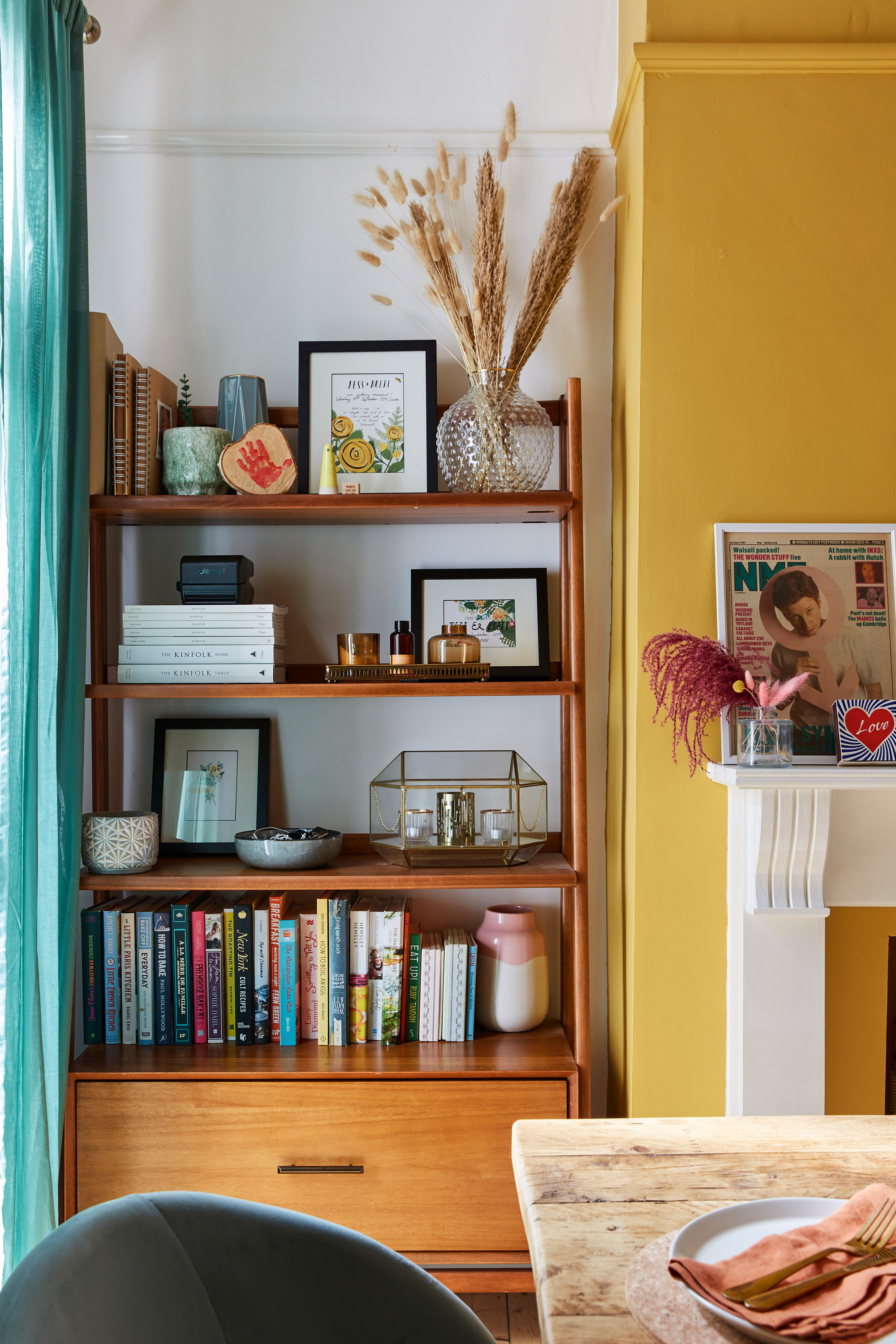
Wooden shelving unit, West Elm
Q– Your kitchen is a similar size to mine. It’s safe to say they’re not the biggest of spaces, but yours is surprisingly bright, airy and inviting. How did you do it?
A– We completely gutted both the kitchen and bathroom, so we had the creative freedom of starting from scratch. As the kitchen was one of our biggest expenses, we went for a classic style that won’t date. We wanted open storage up top to make the space feel bigger. When Brett and I were in a café in Amsterdam, we noticed some shelving that we knew would be perfect. Brett sketched out a similar design and our joiner created it. The green window frame and door are more recent additions – I saw the idea on Instagram and knew it would liven up the traditional design.
- Dealing with a small kitchen too? Check out all our small kitchen ideas.
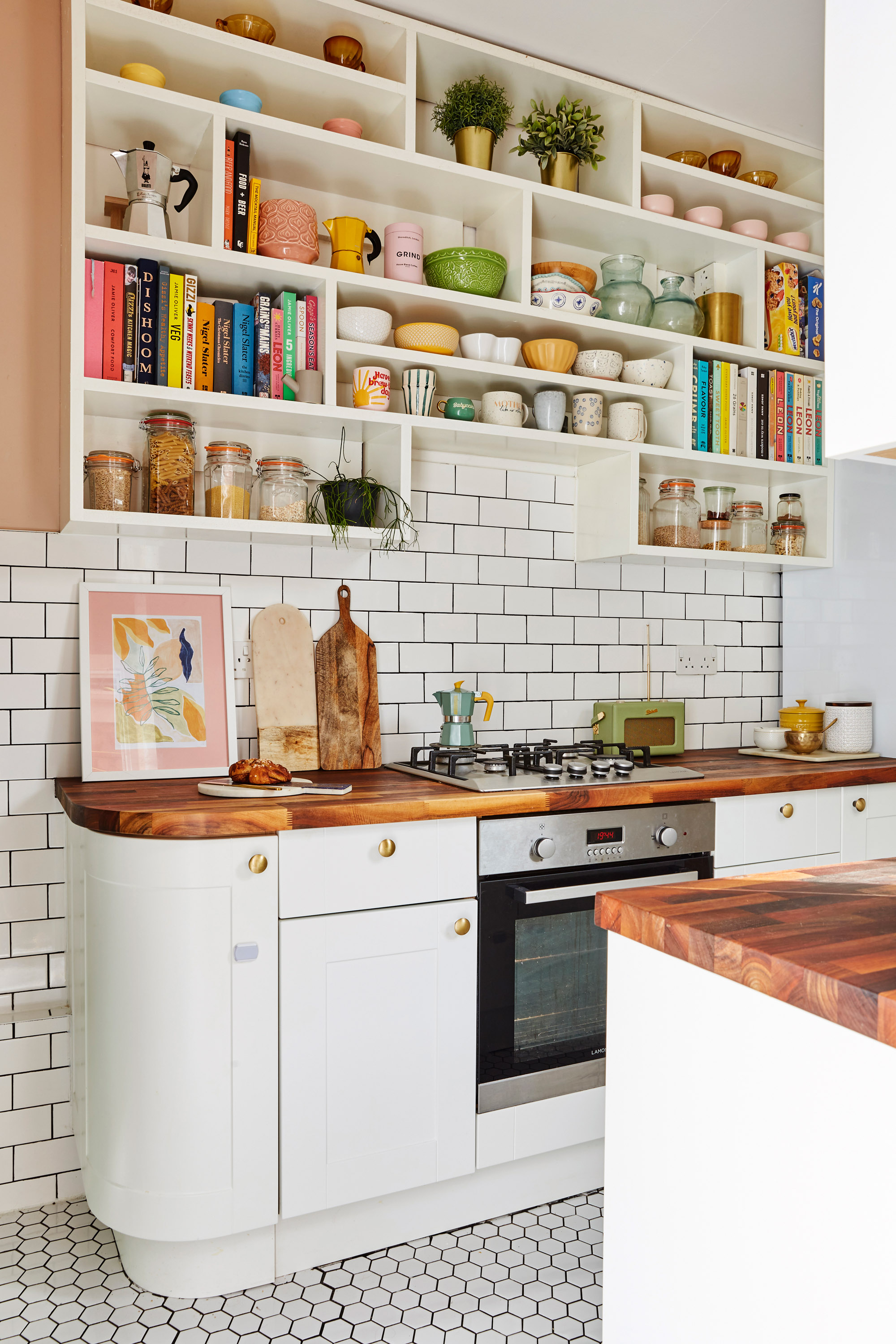
Kitchen units, Howdens. Shelves, made bespoke by Satterthwaite Property Services
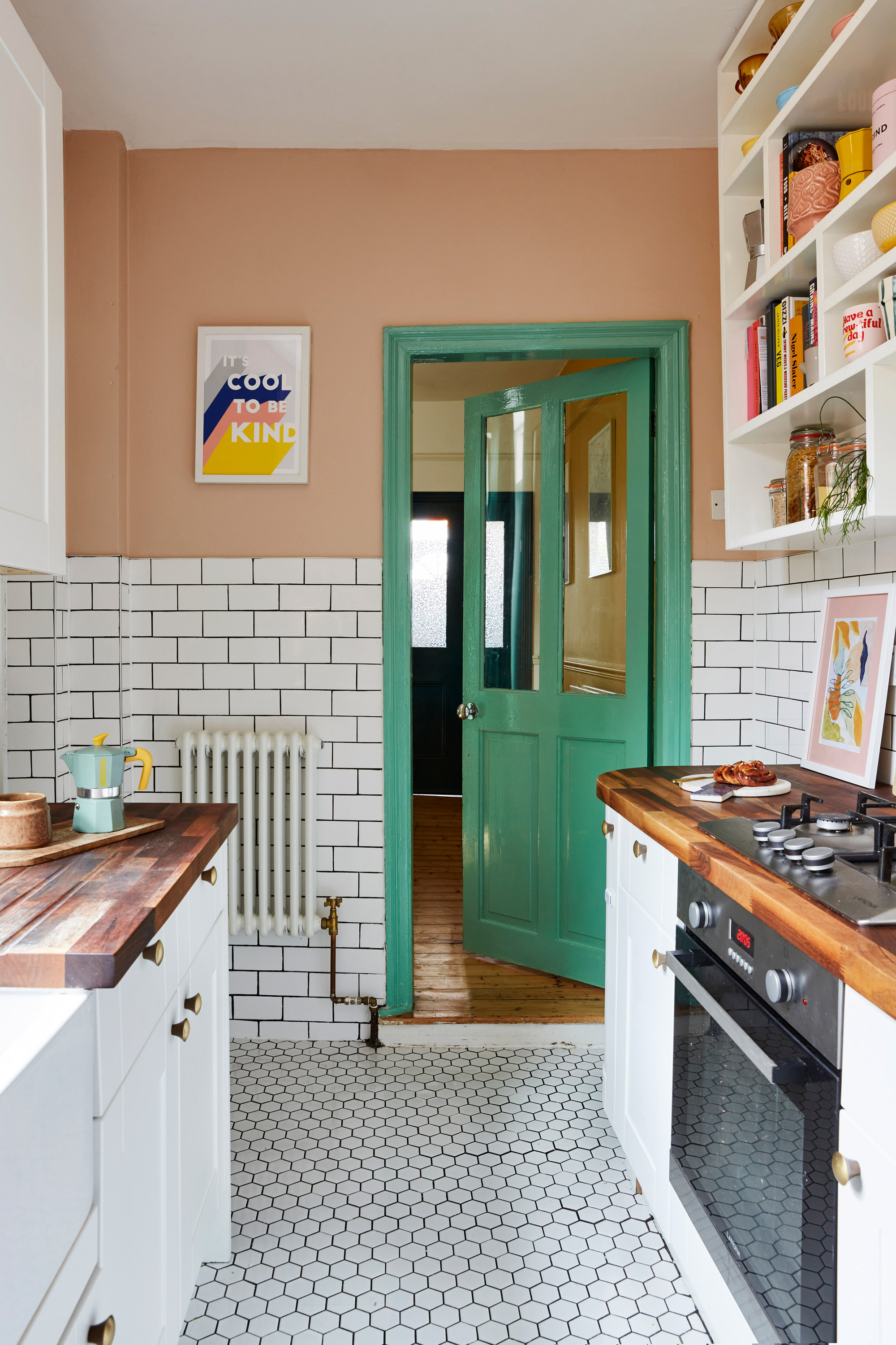
Window frames painted in Arsenic, Farrow & Ball. Flooring, Tons of Tiles.
Q– Several studies have found that color can impact our mood. As your home has been both pure white and very colorful, have you noticed any difference in how your space makes you feel?
A– Oh, definitely – the most obvious difference is in the bathroom. When we first had it done it was all white. I liked it for a while but as my confidence grew it began to feel quite bare and empty. We decided on color blocking to avoid having to navigate a paintbrush around the WC and basin, but it’s surprising how just a splash of color completely lifts the room. When you walk in it feels so bright, happy and complete. The yellow and pink is a lovely sight to be greeted with every morning, and is a fun backdrop to Wren’s bath time.
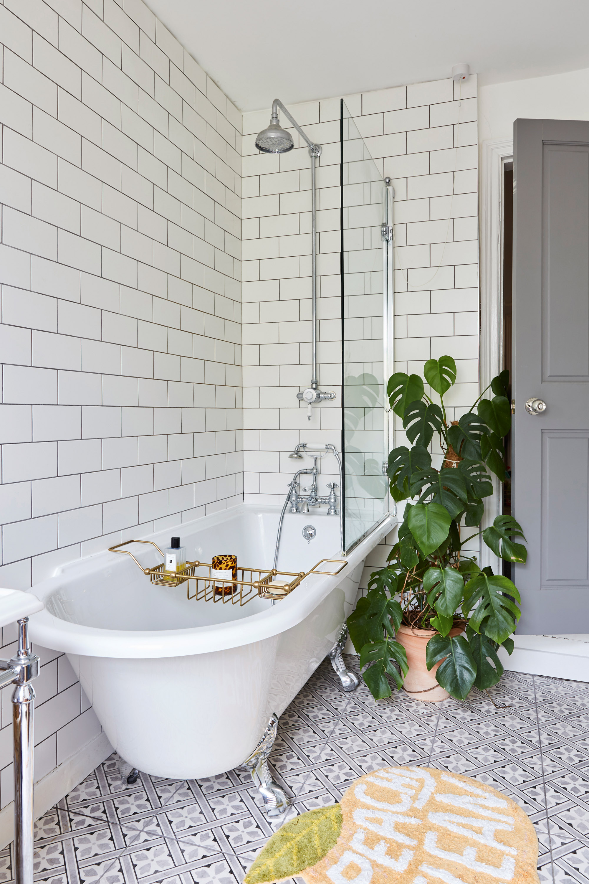
As Jessica’s creativity and confidence grew, she began to see her white bathroom as less of a completed space and more of a blank canvas. ‘I was keen to try out colour blocking, and this seemed the perfect place. It’s south facing with a big window, so it’s very bright anyway, but with the pop of yellow and soft pink, it really feels like such a happy and positive room.’ Burlington Hampton bath, WC and shower, Heritage Bathrooms. Wall tiles, Walls & Floors. Floor tiles, Laura Ashley at Victorian Plumbing.
Q– I have to say that your bathroom suite is dreamy – it’s exactly what I’d choose. But how did you manage a bathroom renovation with a little one in tow?
A– Wren was only four months when we installed the new bathroom, so we moved into my mum’s! There was a lot of upheaval as we completely changed the layout – we weren’t keen on the shower being right next to the wooden window frame, so we moved it to the opposite side. The process was made a lot smoother by the fact that we had a great relationship with our builder. I was originally set on a freestanding claw foot bath, but he suggested sealing one length and end against the wall
to prevent water dripping down, potentially damaging the floor. His input proved invaluable. It was actually really exciting to come back every few days and see the progress.
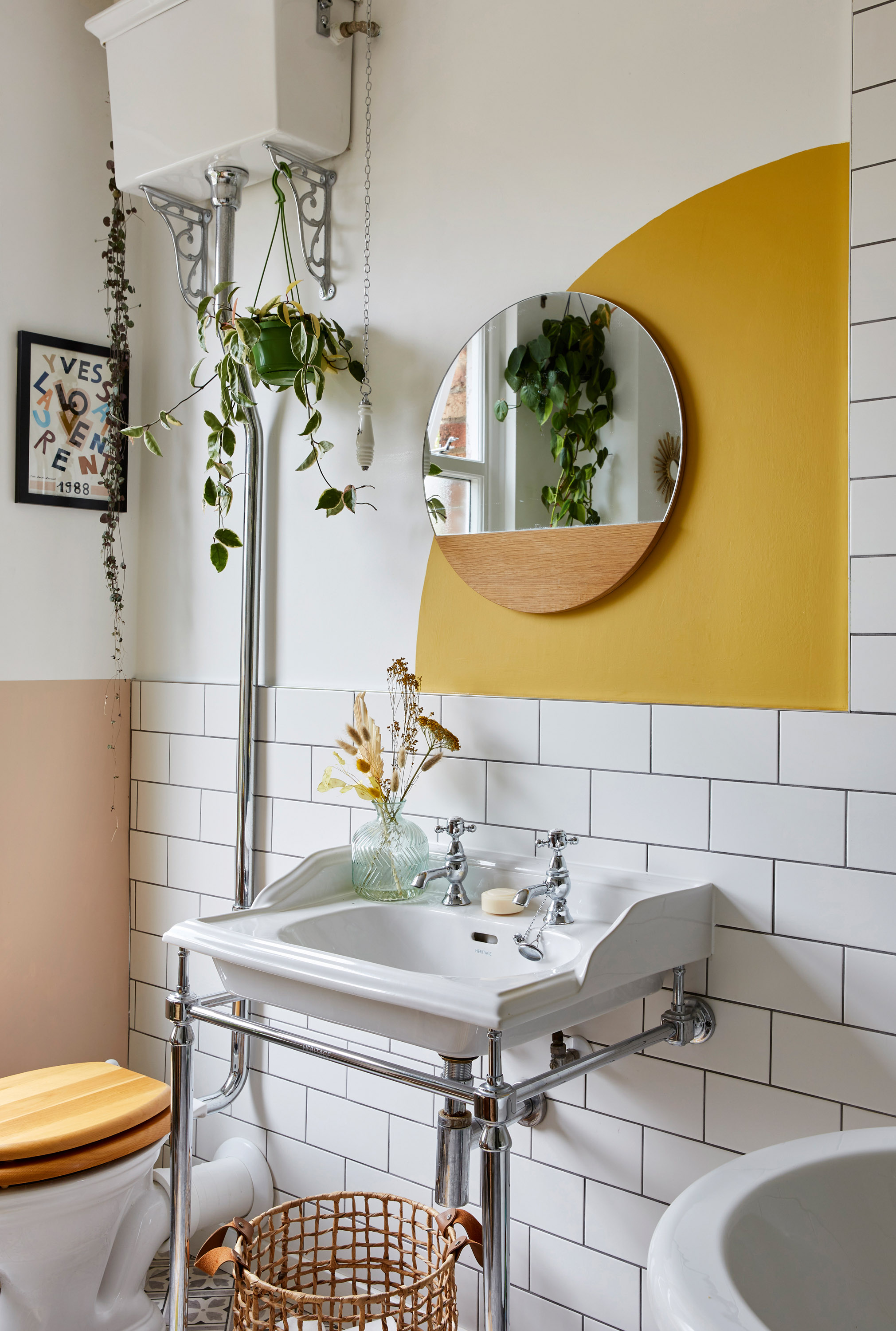
Burlington basin, Heritage Bathrooms. Walls painted in Setting Plaster, Farrow & Ball and Yellow-Pink, Little Greene
- Find more lovely bathroom ideas in our full feature
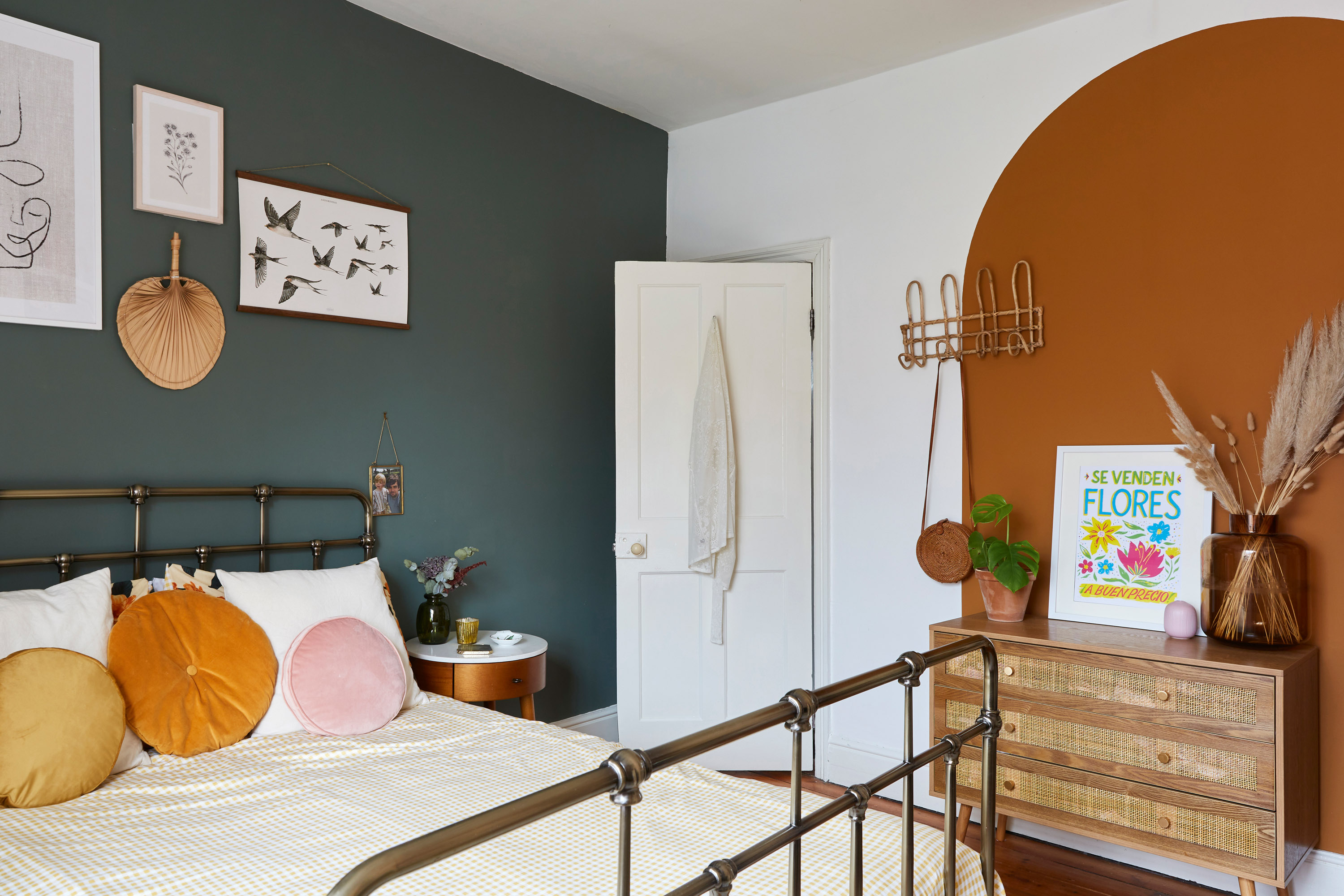
A statement arch shape forms a focal point in the bedroom. ‘To create the arch, we fashioned a compass by pinning the middle point of a full circle, tying a pencil to the other end of the string and drawing the arch. We both fell in love with this paint colour and knew we had to use it somewhere.’ Bed, Made. Bird print above the bed, Arminho. Bedside tables, West Elm. Chest of drawers, Beautify. Cushions, Not on the High Street. Bamboo hooks, Sunday Living. Pampas grass, The Bloom Project. Walls painted in Green Smoke, Farrow & Ball; Orange 02, Lick; and Brilliant White, Dulux
Q– I can tell you’re a fashion lover, but the big difference between developing interior and fashion styles is that in your home, you need to consider your family’s preferences. Was Brett also involved in the design process?
Contacts
Kitchen fitter: Satterthwaite Property Services
Bathroom fitter: Gordon Home Solutions
A– Interiors are a real passion of mine, and my style has definitely progressed as I’ve gotten older. I’d say that I lead the way, but of course it had to be a space that we all loved. Luckily Brett and I have quite similar tastes. Choosing the paint colors was a joint decision. We picked out shades we liked, ordered a ton of samples and spent a lot of time mulling them over together. We’re a good team – I love the ideas side and the planning, Brett is more methodical in figuring out how to get it done. We’re always looking for what we can update next.
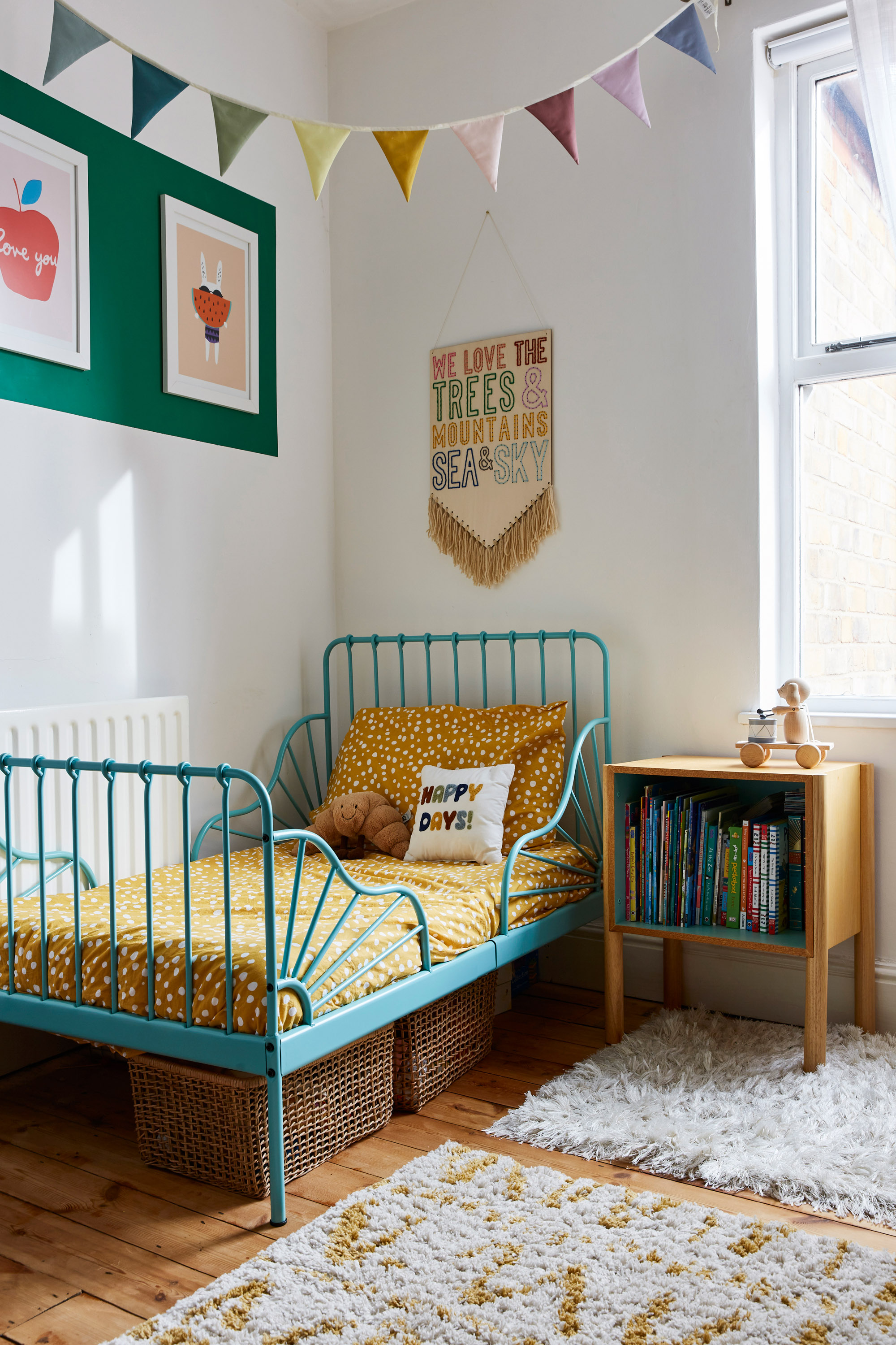
In her son’s bedroom, Jessica combined Wren’s favourite colours with her creative eye for a playful and fun space. ‘It’s my favourite room in the house,’ she says. Bed, Ikea. Wall hanging, Cotton Clara. Bunting, Arket. Bedside table, Urban Outfitters. Art print above bed, East End Prints. Walls painted in Verdigris Green, Farrow & Ball
Q– One last question, and it’s a big one. You took inspiration from other people’s homes, and now on the pages of this magazine, your home is the inspiration. What one piece of advice would you give?
A– At the start of the process, I was impulsive with my decisions and that lead to mistakes. The tiny ceramic hexagon tiles on my kitchen floor, for example, are a nightmare to clean and prone to chipping, but I’d never have thought about that beforehand. I would advise thinking about how things will work on a practical
level more thoroughly, as it really does make a difference to your overall home happiness. Also, making a mood board for your decorating scheme is an essential. I’d never decorate a room without one now, and it’s really fun to do!
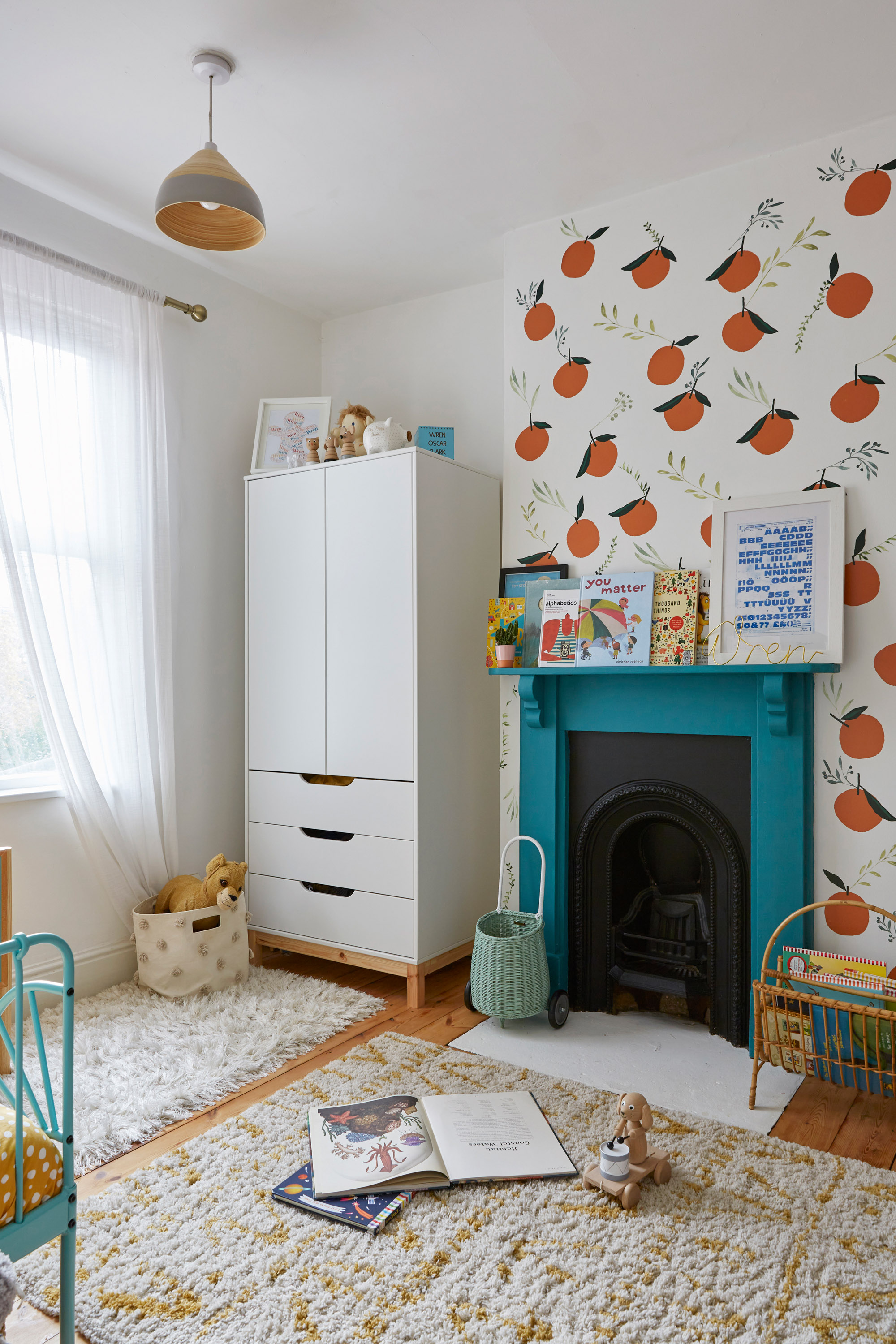
‘I love peaches so I was determined to have them in the house somewhere,’ says Jessica. ‘I fell in love with a wallpaper on Pinterest, but couldn’t find it anywhere. I discovered these stickers on Etsy and stuck them close together to recreate the look – it’s such a statement feature wall, and Wren loves them.’ Magazine rack: vintage. Wardrobe, Argos.
Subscribe to Real Homes magazine
Want even more great ideas for your home from the expert team at Real Homes magazine? Subscribe to Real Homes magazine and get great content delivered straight to your door. From inspiring completed projects to the latest decorating trends and expert advice, you'll find everything you need to create your dream home inside each issue.
Join our newsletter
Get small space home decor ideas, celeb inspiration, DIY tips and more, straight to your inbox!

After joining Real Homes as content producer in 2016, Amelia has taken on several different roles and is now content editor. She specializes in style and decorating features and loves nothing more than finding the most beautiful new furniture, fabrics and accessories and sharing them with our readers. As a newbie London renter, Amelia’s loving exploring the big city and mooching around vintage markets to kit out her new home.
-
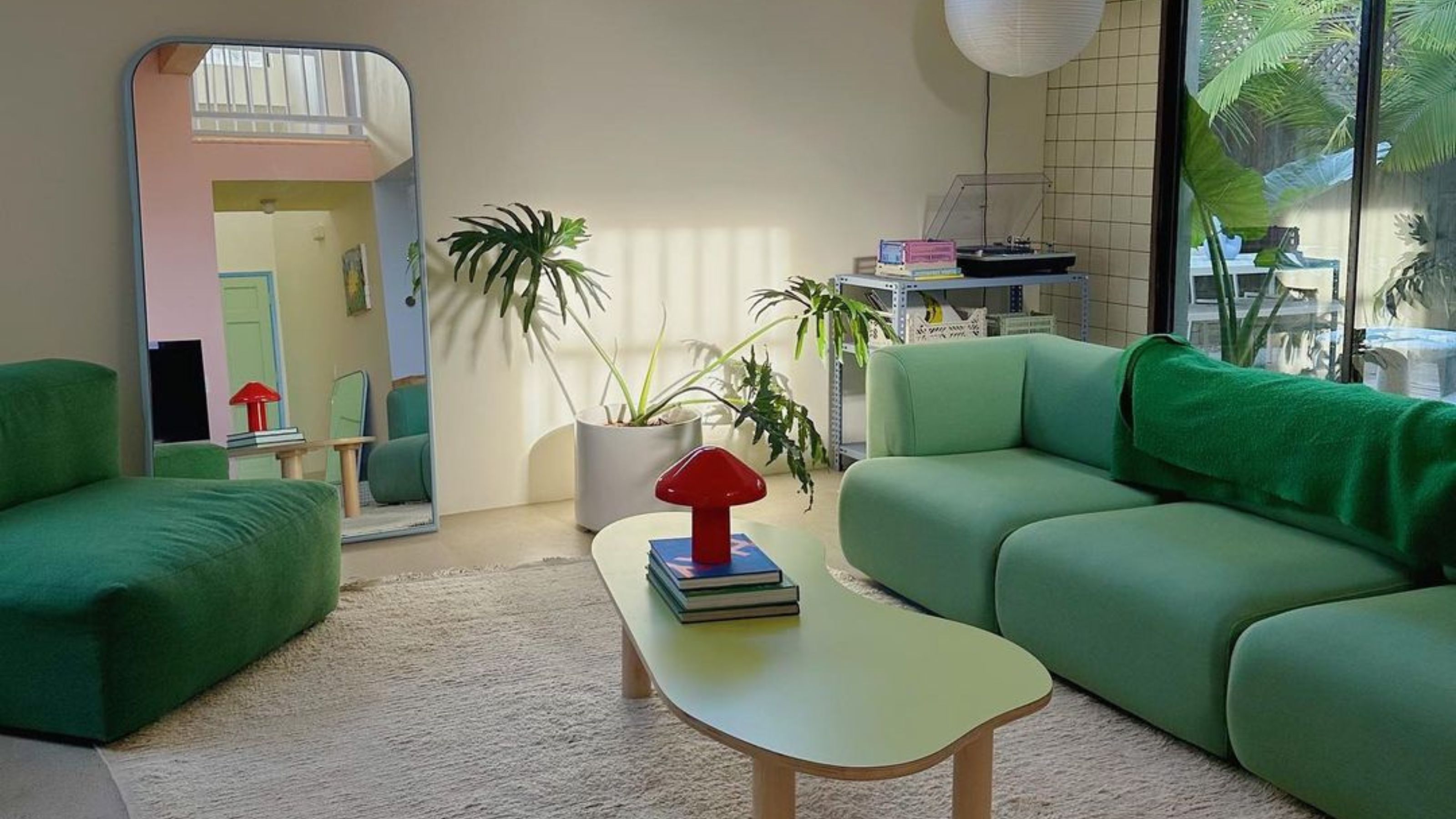 5 Gen Z and millennial influencers to follow for all things homes and interiors
Need some on-trend home and interior inspo? These are the five millennial and Gen Z influencer accounts I can't stop scrolling for small homes and rentals
By Louise Oliphant
-
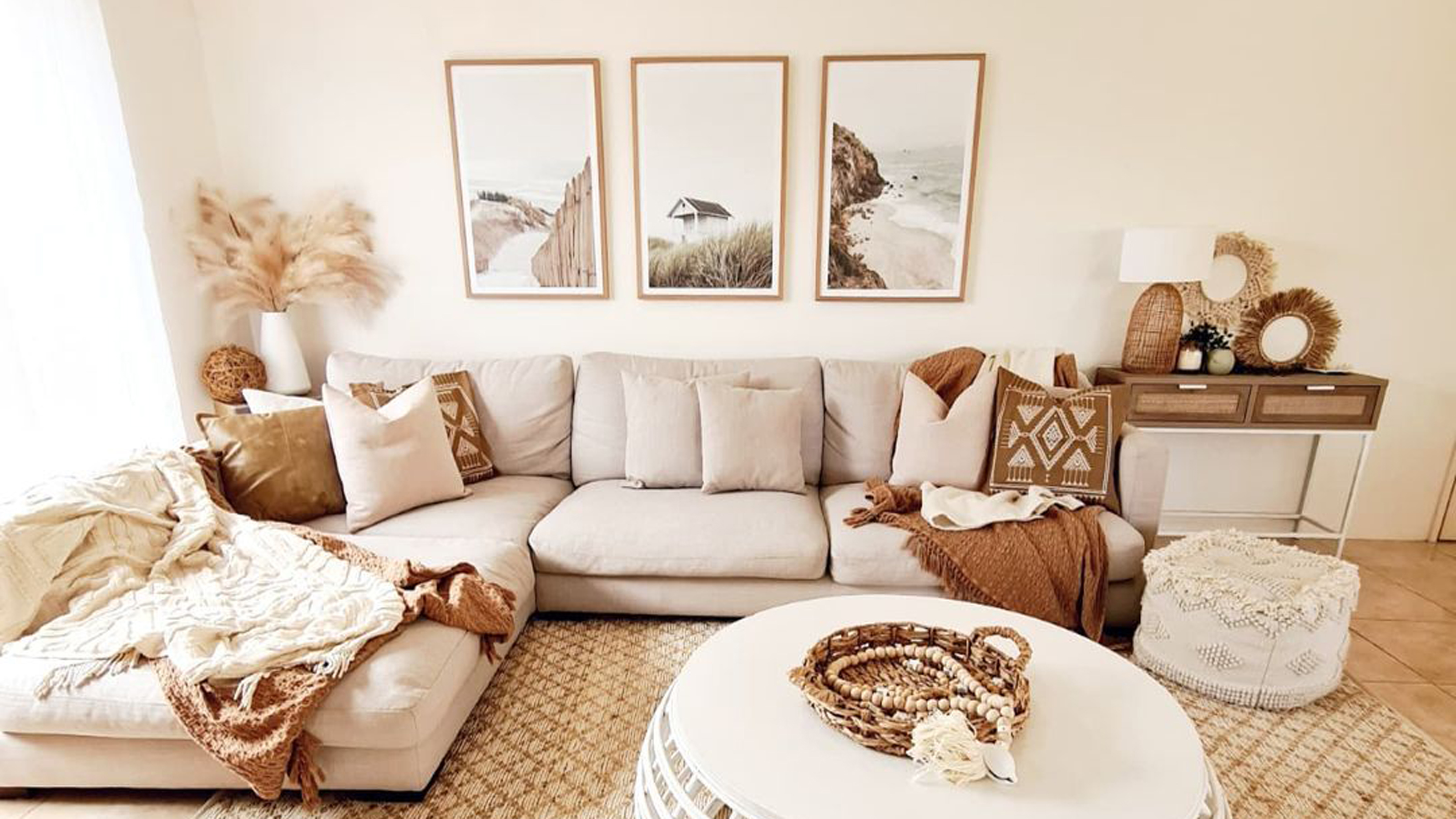 8 calming paint colors to create a blissful home sanctuary
Relax, revive and renew with a soothing palette of mindful paint shades.
By Sophie Warren-Smith
-
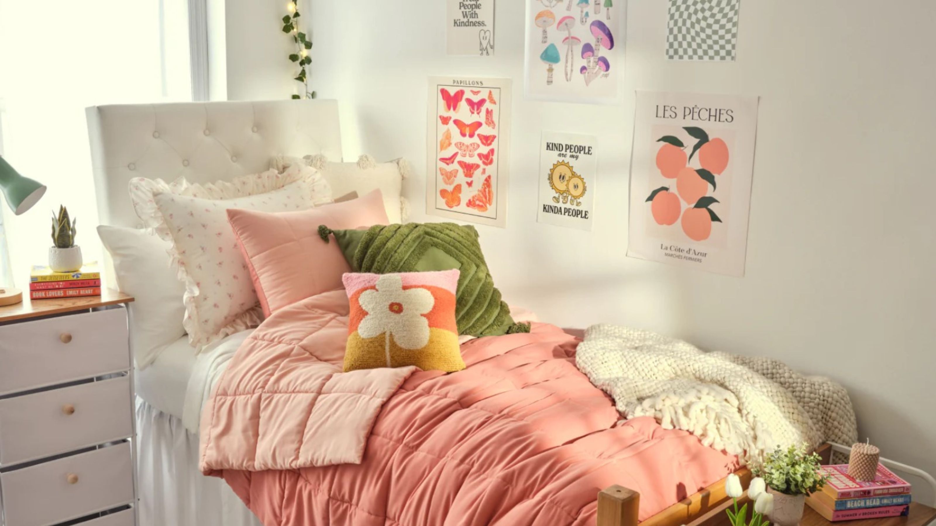 10 dorm room ideas to make your place the cutest on campus
Heading to college soon? These dorm room ideas range from sweet styles to savvy solutions...
By Eve Smallman
-
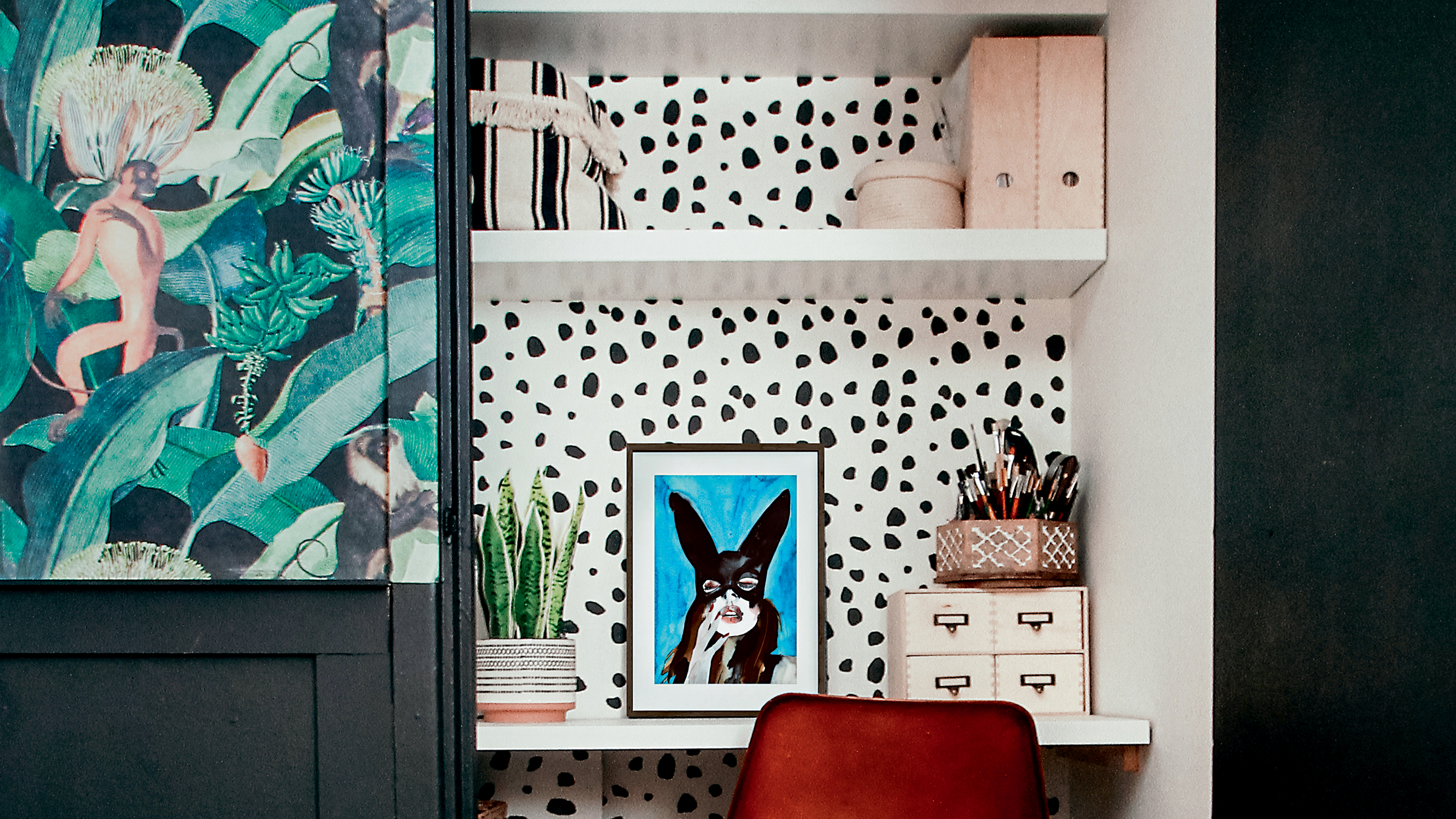 Alcove ideas: 25 ways to style an awkwardly shaped space
From home offices to cozy reading nooks, copy these alcove ideas to create an inspiring space – with shelving or not...
By Hebe Hatton
-
 It's true, Target's Studio McGee collection has all of your holiday decorating handled
Target's new Studio McGee installment will deck all of your halls — and so much more!
By Brittany Romano
-
 Spotted: 9 celebrity home decor brands that will have you living like your favorite A-listers
So many celebrity home decor brands to shop for, so little time.
By Brittany Romano
-
 This World Market mirror rivals *that* designer best-seller (at a fraction of the price!)
This World Market mirror is a dead-on doppelganger for Anthropologie's version — but at a fraction of the price.
By Brittany Romano
-
 Chloé Lukasiak reveals how she's decorating her first 'big girl' apartment
Chloé Lukasiak reveals the process of designing and decorating her 'young but chic' apartment.
By Brittany Romano
