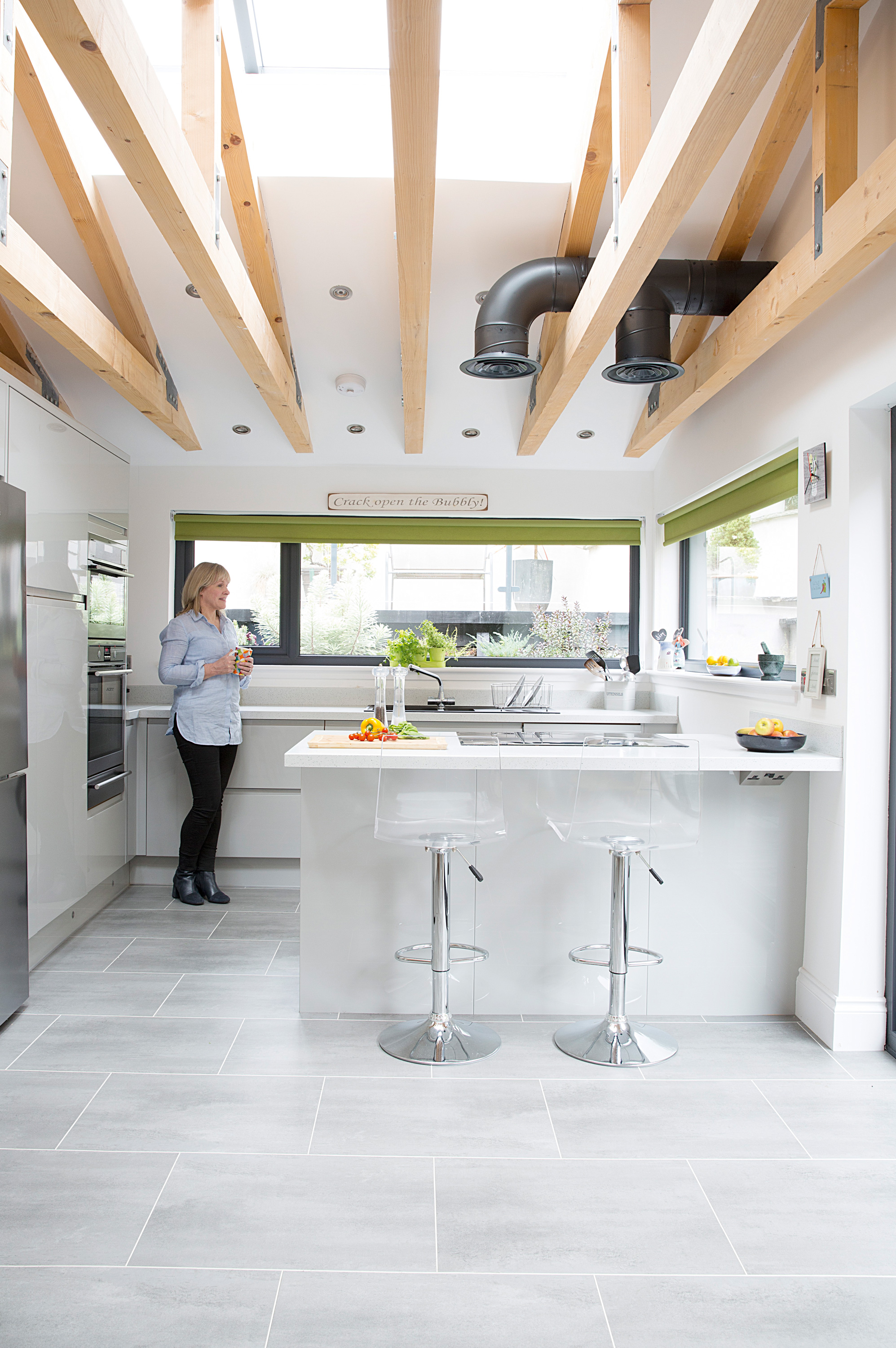
When newlyweds Heather and Jim Stewart moved into their new home together a month after getting married, priority number one was to create more space for entertaining family.
The Edwardian property had classic period looks, but the kitchen was small and blocked from the steeply rising back garden by a utility. With four grown-up children to host on weekend visits, the couple set about creating the perfect open-plan entertaining space – achieving the indoor-outdoor link we all covet.
But they had to dig deep to achieve their dream kitchen, shifting 200 tonnes of earth from the slope behind their house to to give them the space they needed to extend.
Are you thinking of extending your kitchen? We've got lots of help and advice on what to do and where to start.
The before
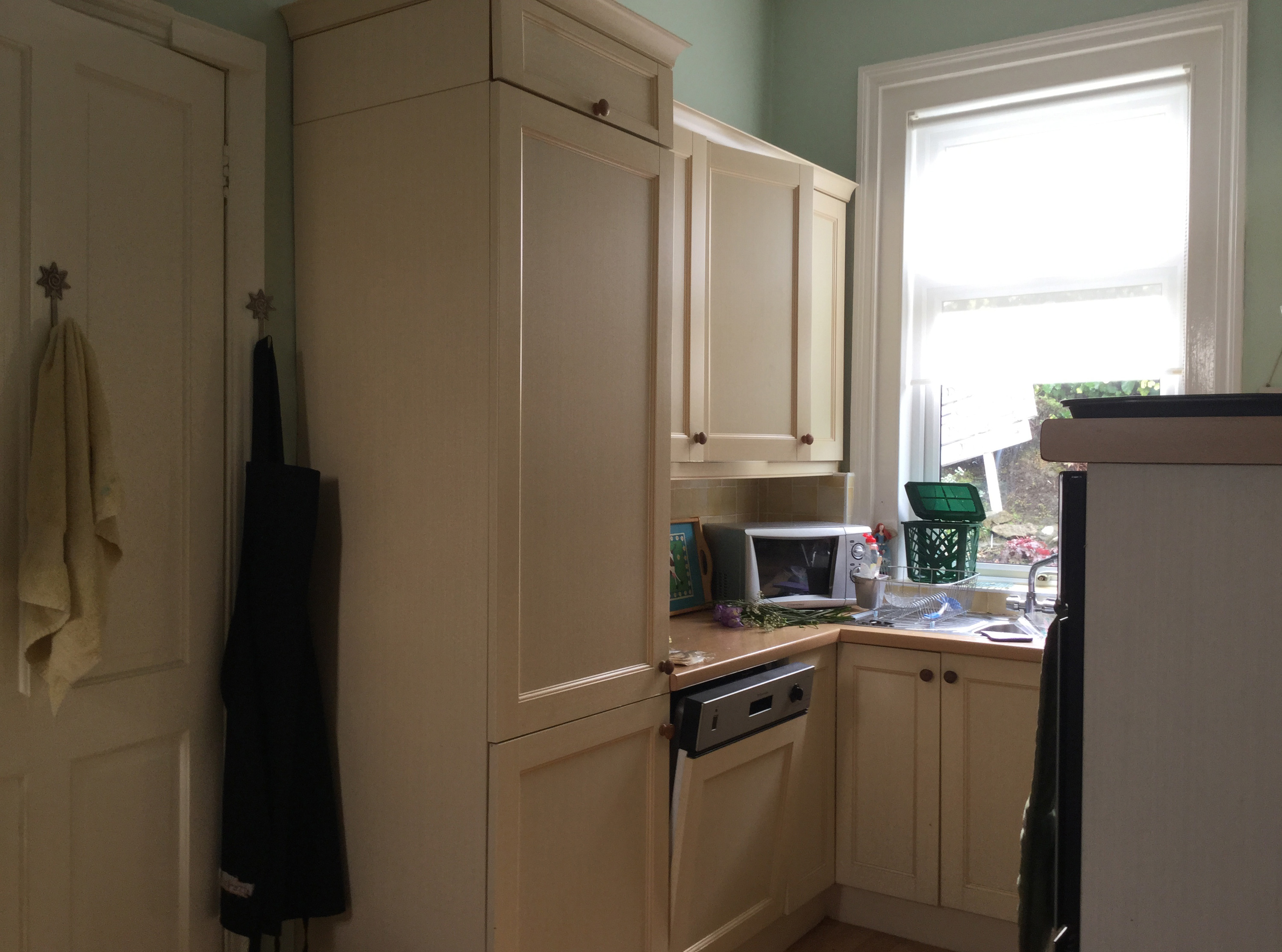
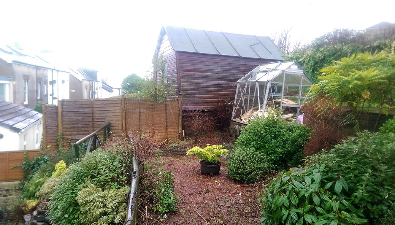
‘We loved this house in the first 20 seconds we viewed it,’ Heather says, ‘but we didn’t appreciate how poor the light was in the kitchen until we moved in. At first, we were going to make do with the original layout as there was a big, serviceable dining room, but having a utility room, toilet and outhouse between the kitchen and garden meant there was no connection to the outside space. We wanted to upsize as we needed space to seat ourselves, our kids and their partners when they visit. It was time to try modern, open-plan living.’
Lifestyle benefits aside, Heather and Jim were eager to inject interest into their spacious kitchen-diner, like the architectural oak beams that highlight the sloping extension roof.
The process
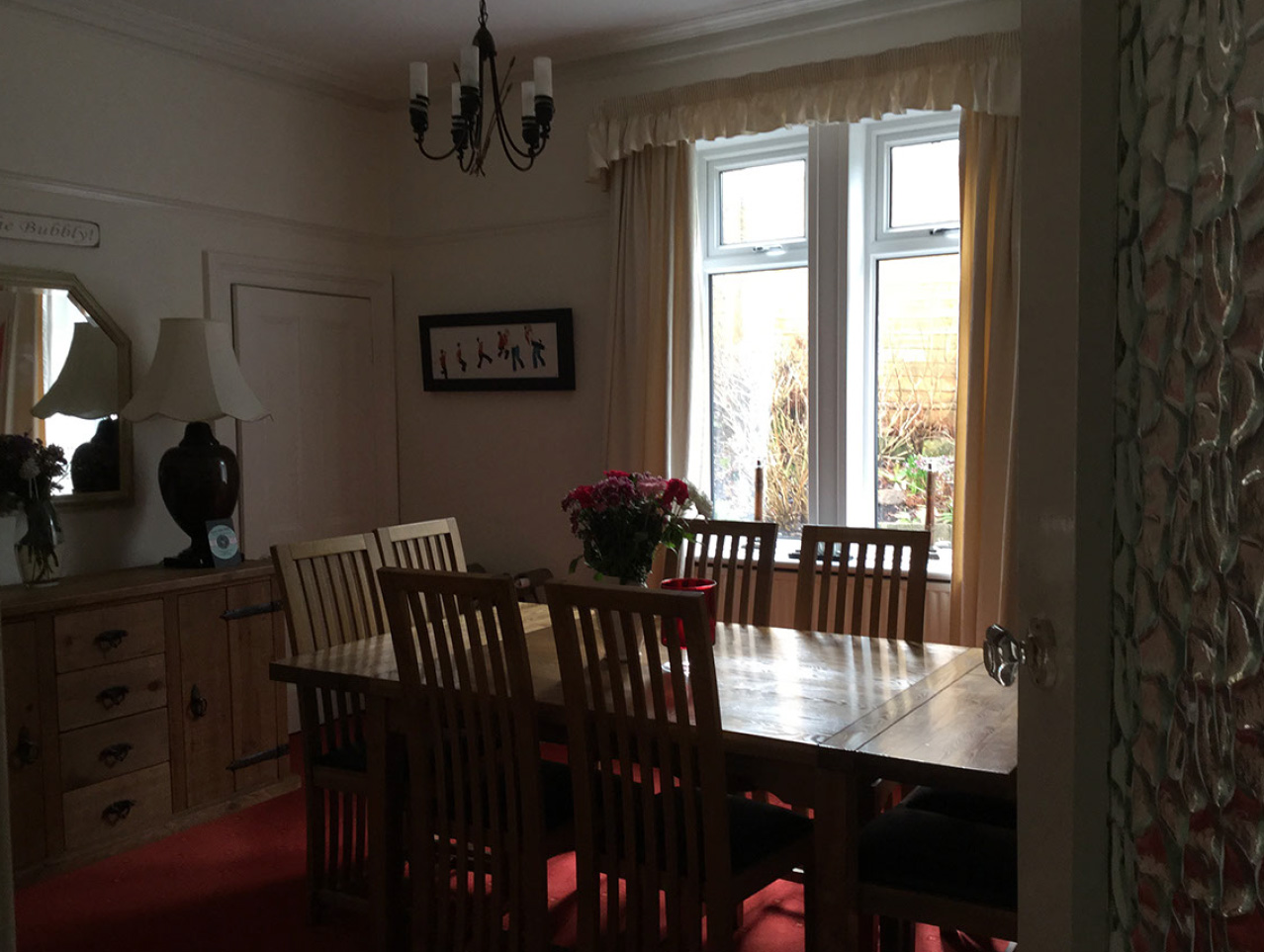
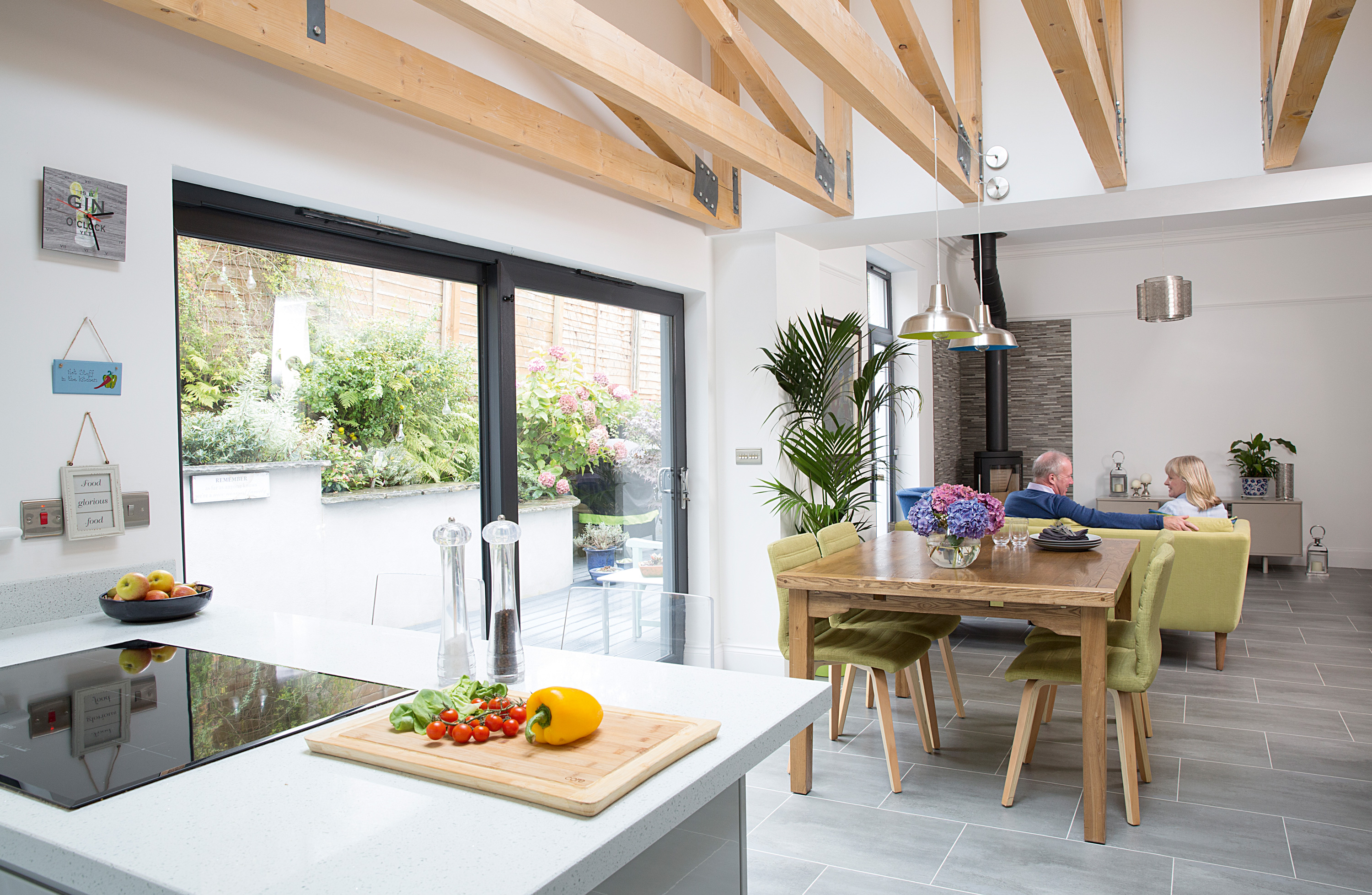
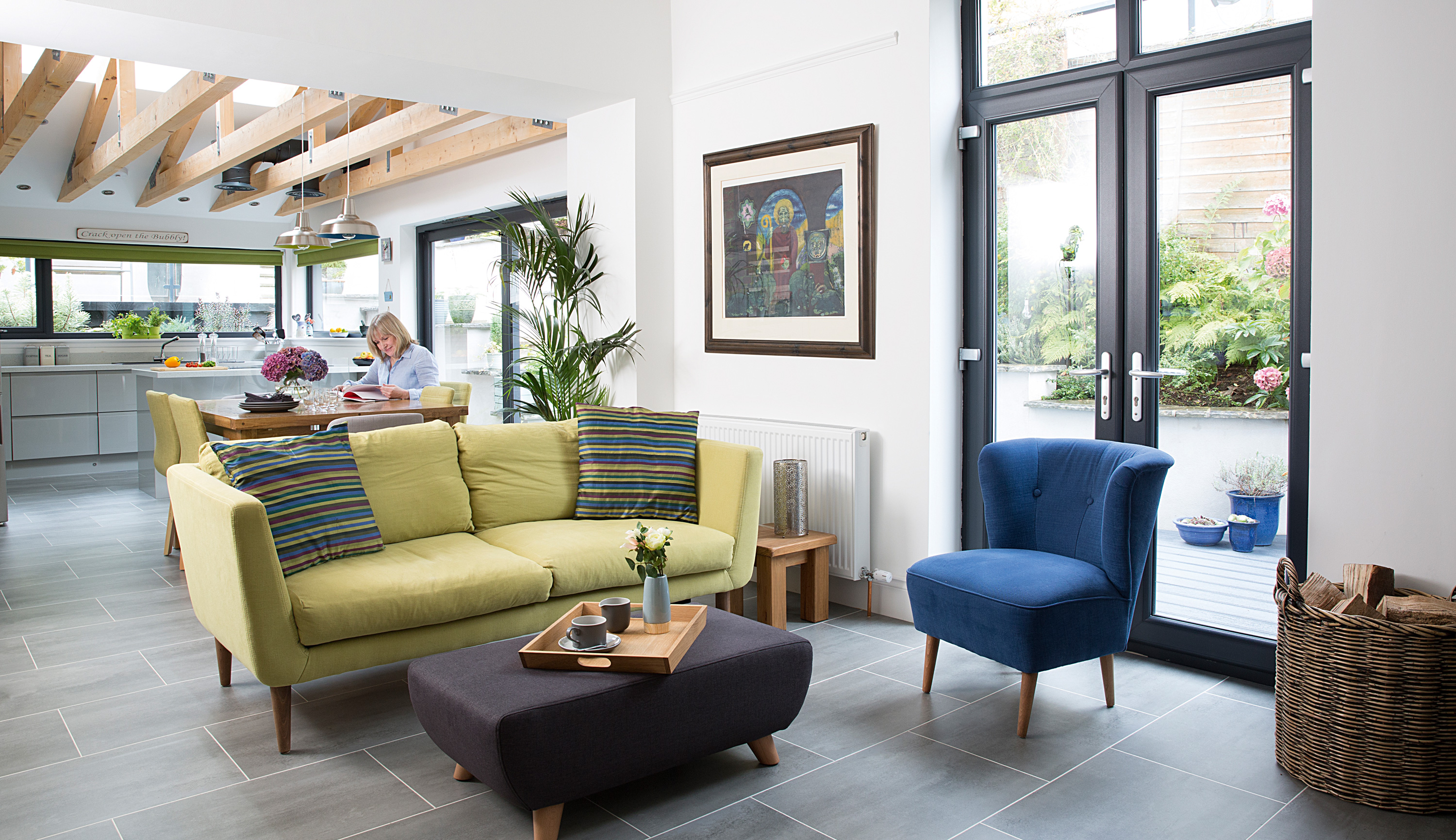
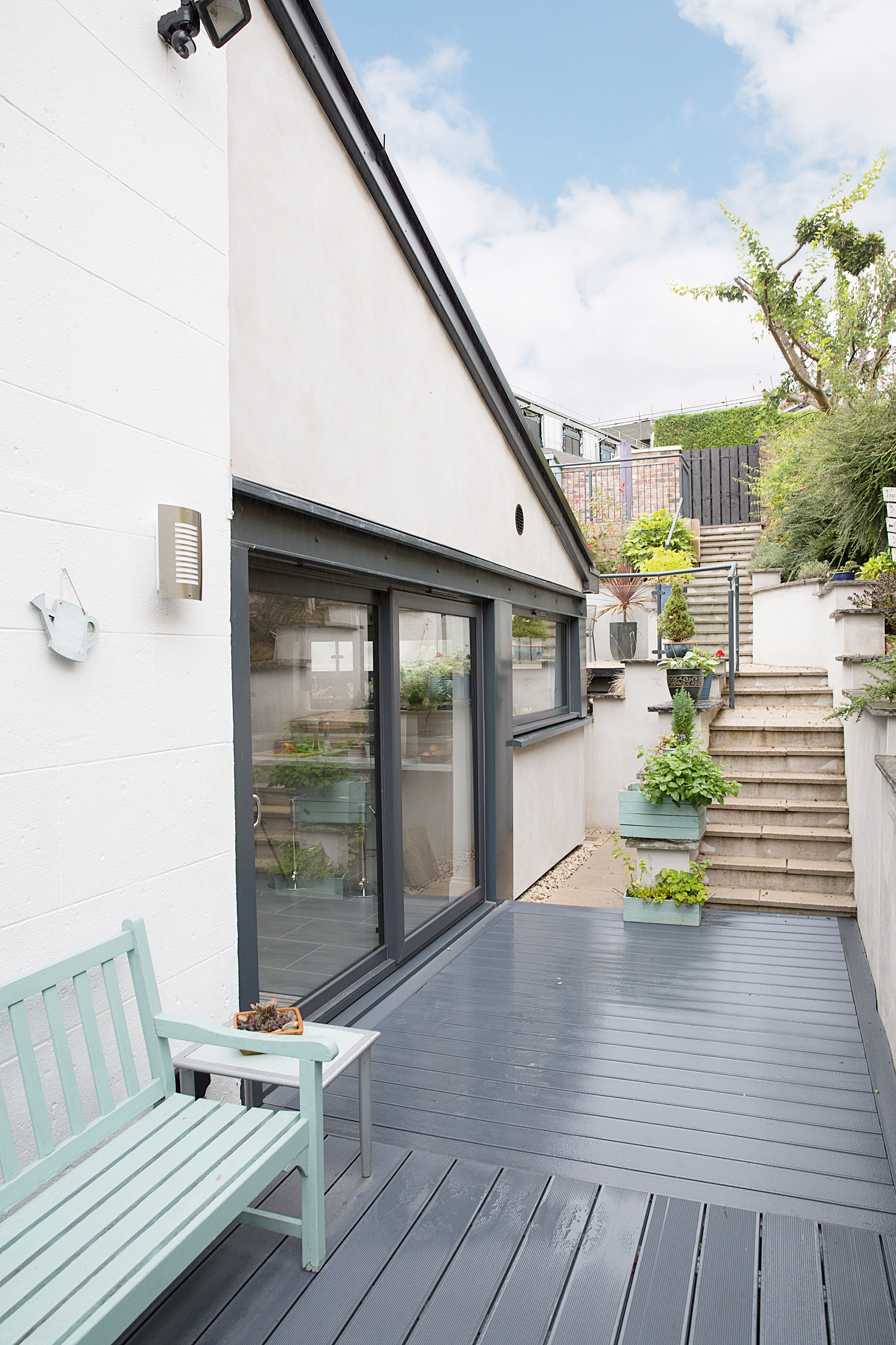
The grand plan involved making the dining room, kitchen and utility beyond it one large space. ‘‘I’d worked with the architects twice before, so I knew they’d make a great team,’ says Jim. ‘We knocked through the warren of rear rooms and extended one metre beyond the footprint. It required extensive groundworks to remove 200 tonnes of earth from the sloping rear garden and build a new retaining wall using bricks from the internal dividing walls we’d knocked down. Luckily, there was a single-track road at the top of the garden for access, but the job required underpinning and specialist house insurance to cover us during the build.
'Rather than bi-fold doors, we chose larger-than-average commercial spec windows across two sides of the extension to frame the garden views, as well as two sets of doors and a big skylight. ‘The exposed beams were fabricated on site, and they’re a major feature of the room – they add warmth and create a really attractive shadowing effect. We decided to move the hob to the island to make it more sociable, but that meant the overhead extractor we’d ordered didn’t fit between the roof trusses, so we commissioned a bespoke extractor. I love it because it’s totally unique to this house.'
The details
'Jim project managed the build, but I took control of the kitchen design,’ reveals Heather. ‘I wanted a clean-lined look, so I picked high-gloss units teamed with Maxtop Quartz work surfaces to reflect the light. It’s all drawers because I don’t like cupboards and there isn’t much wall space. Jim suggested the grey luxury vinyl tile flooring, but I’d never had it before so I was unsure. It’s so soft and warm underfoot, it’s easy to clean, and nothing breaks when you drop it. We’ve used it throughout the house so you don’t see the join between the old and new parts.’
‘I can enjoy my terraced garden now, and I’m embracing open-plan living. The space has three distinct parts that follow the sun, which we call lower, middle and upper earth! It’s taken a while to get used to cooking in an open space – you have to be relaxed about mess – but it’s great for parties and family gatherings. The only downside is that our beautiful front room gets neglected.'
Join our newsletter
Get small space home decor ideas, celeb inspiration, DIY tips and more, straight to your inbox!
-
 Makeup expert's renovated home is a maximalist’s dream
Makeover expert Sophie Hannah and her husband, Robin, have transformed their run-down Victorian townhouse into a home bursting with colour and pattern.
By Laura Ewart
-
 My DIY range hood and backsplash build gave my kitchen the perfect farmhouse finish
I craved charm in my kitchen space and adding a custom range hood and shelving was the best move.
By Brooke Waite
-
 How to install under kitchen cabinet lighting
If your kitchen feels a little dark and gloomy, installing LED lighting under cabinets is a great way to illuminate your counter space in no time at all.
By Kate Sandhu
-
 How to remove an oven door
Puzzled about how to remove an oven door for cleaning or maintenance? Here's all the info you need.
By Claire Douglas
-
 How to install kitchen cabinet handles
Simply knowing how to install kitchen cabinet handles yourself could see you give your cooking space an instant facelift.
By Kate Sandhu
-
 How to DIY a microcement backsplash for a cool, budget kitchen upgrade
Learn how to DIY a backsplash out of microcement for a cool polished concrete look in your kitchen, that won't cost the earth.
By Claire Douglas
-
 How to install laminate countertops in the kitchen
Learn how to install laminate countertops yourself and know which materials will need professional input
By Sarah Warwick
-
 Exclusive: Bobby Berk shares easy way to elevate your rented kitchen for $20
Shake things up for the New Year with the interior designer's rented kitchen tip
By Millie Hurst