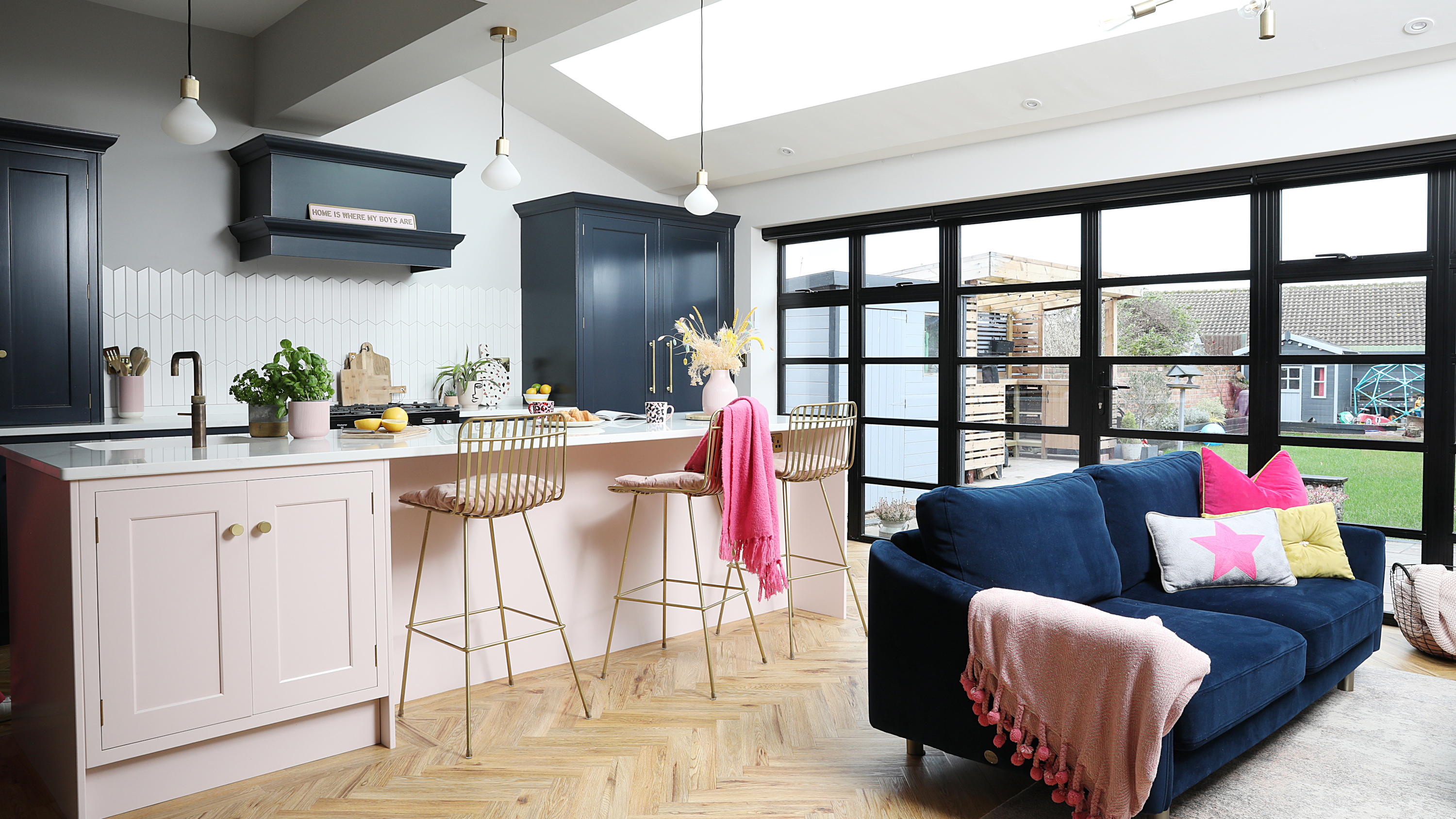
Until the wall comes down, it’s difficult to visualise how a knock-through and extension will look. Having spent over three years saving for their building project, Katy and Tony Middleton didn’t want to take any chances and hired interior designer Liz Ennis to ensure the new open-plan kitchen diner and family room in their Victorian house was perfectly planned.
The couple sold their modern three-bedroom house in 2017 and bought a run-down four-bedroom detached property on their favourite street, just three weeks before their second son, George, was born. Extending out by three metres, the project fell within permitted development rules, and knocking together the kitchen and rear reception room gave them space to include a utility and cloakroom, too.
Katy tells us how the countless hours spent sourcing their two-tone kitchen, Crittall-look windows, LVT flooring and space-saving furniture have finally paid off.
Awkward layout
Profile
The owners Katy Middleton (@homewiththemiddletons), an interiors assistant at Wolfe Interiors, lives here with her husband, Tony, a managing director, and sons Jacob, six, and George, four
The property A four-bedroom detached Victorian house in Chapeltown, Sheffield
Project cost £93,500
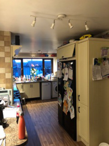
‘Our long galley kitchen was cold and dark, with an arch through to the boys’ playroom-cum-dining room,' says Katy. 'It was hard to cook and entertain them at the same time. I’ve always loved to bake and cook, but felt I lost that part of me.
‘We wanted to raise the ceiling back up and have a huge open-plan space. We got four quotes to knock through and extend, but there was £30,000 difference between them. Our builder was the second cheapest. Since he had two boys of a similar age, we felt he’d understand the upheaval and work around us. The project started weeks after the first lockdown. Thankfully he finished the utility first, so we used that instead of washing pots in the bath!’
Wish list
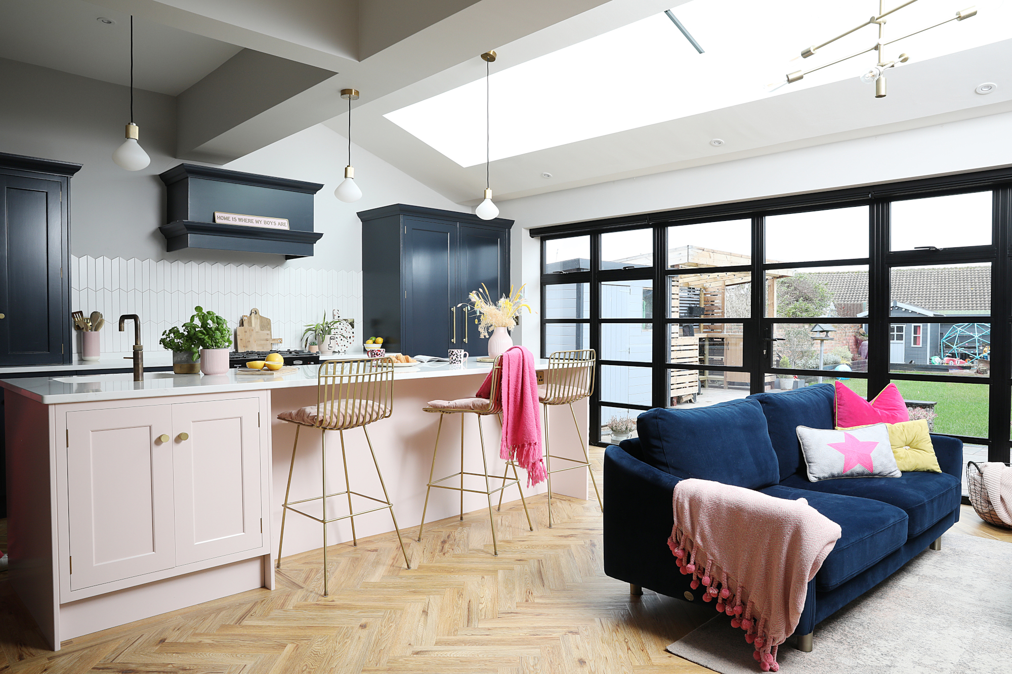
Kitchen, Concept Interiors. Cabinets painted in Bond Street, Mylands. Island painted in Calamine, Farrow & Ball. Bar stools, Rockett St George. White chevron splashback tiles, Mandarin Stone. Island and living room pendant lights, Dowsing & Reynolds. Sofa, Snug. Rug, Made. Star cushion, Firefly Deco on Etsy
‘As well as a child-friendly space, I wanted an island for entertaining friends and no wall cupboards that might enclose the room. We used to have a huge American fridge-freezer covered in magnets, so an integrated one was a must, while a larder cupboard hides the small appliances. My husband’s stipulations were a drinks cabinet, hot water tap and sink moulded from the worktop. Designer Kieron at Concept Interiors was very helpful, happy to work with our ideas
‘Our interior designer, Liz Ennis, was also invaluable. She suggested moving the toilet and utility on the plan, and helped with the lighting, radiator positions, layout and colours.’
Let there be light
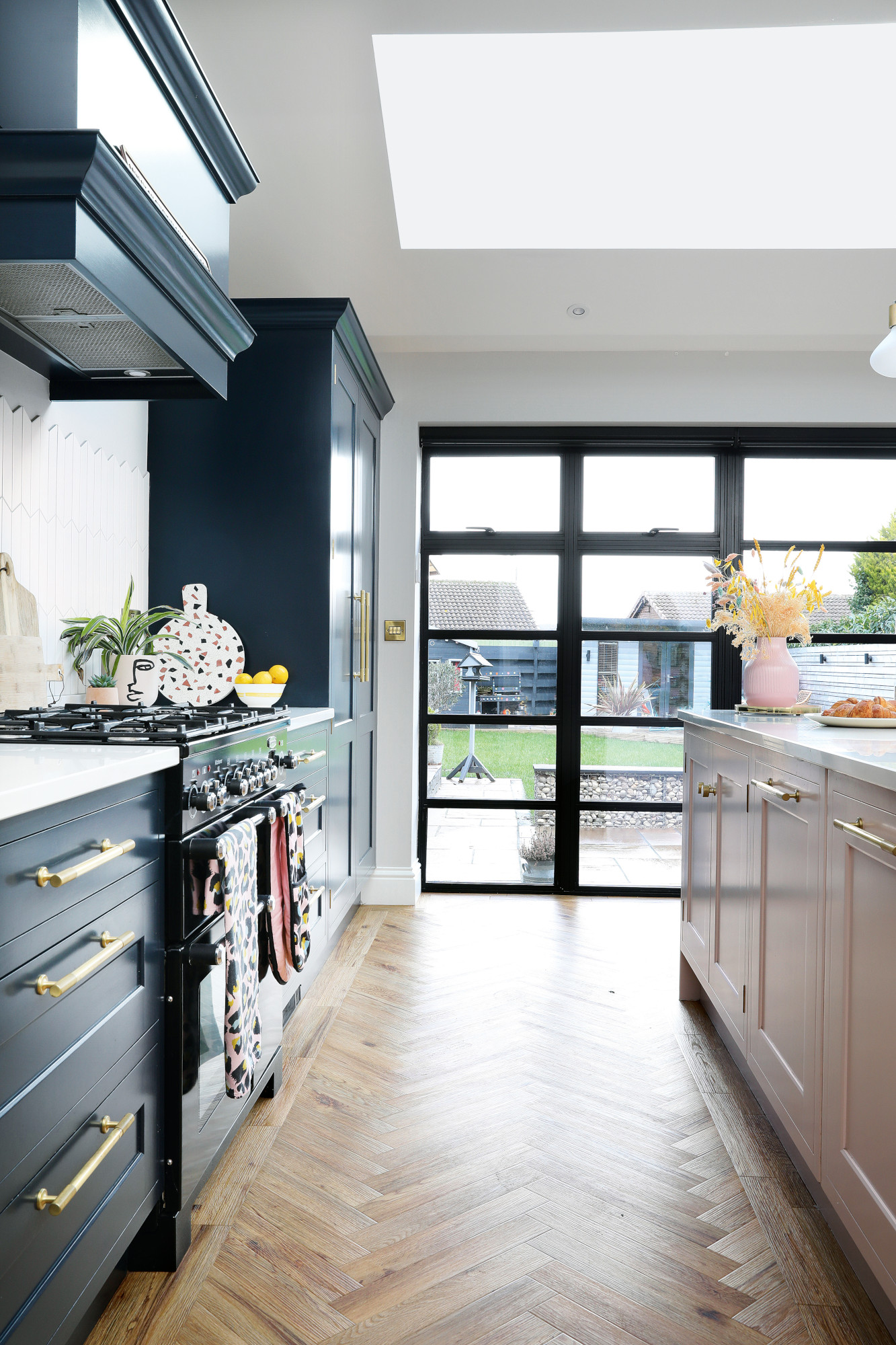
Brass handles, Armac Martin. Range cooker, Rangemaster. LVT French Oak Herringbone flooring, Project Floors. Aluminium doors, 1st Folding Sliding Doors
‘I wanted glass across the whole of the rear as it’s a private garden, but I didn’t want bi-fold doors as we’d rarely have them fully open and I didn’t want flies coming in. I was quite keen on sliding doors and considered Crittall doors too, but they were so expensive.
‘On a trip to the Ideal Home Show in Birmingham, I found a company that did an aluminium version of Crittall doors. The two middle doors open out so we still have a good-sized two-metre opening. They also created a skylight for our pitched roof instead of four Velux windows. The only issue was
not having any windows for ventilation, but they solved this by making the top panes of the doors openable.’
Finishing touches
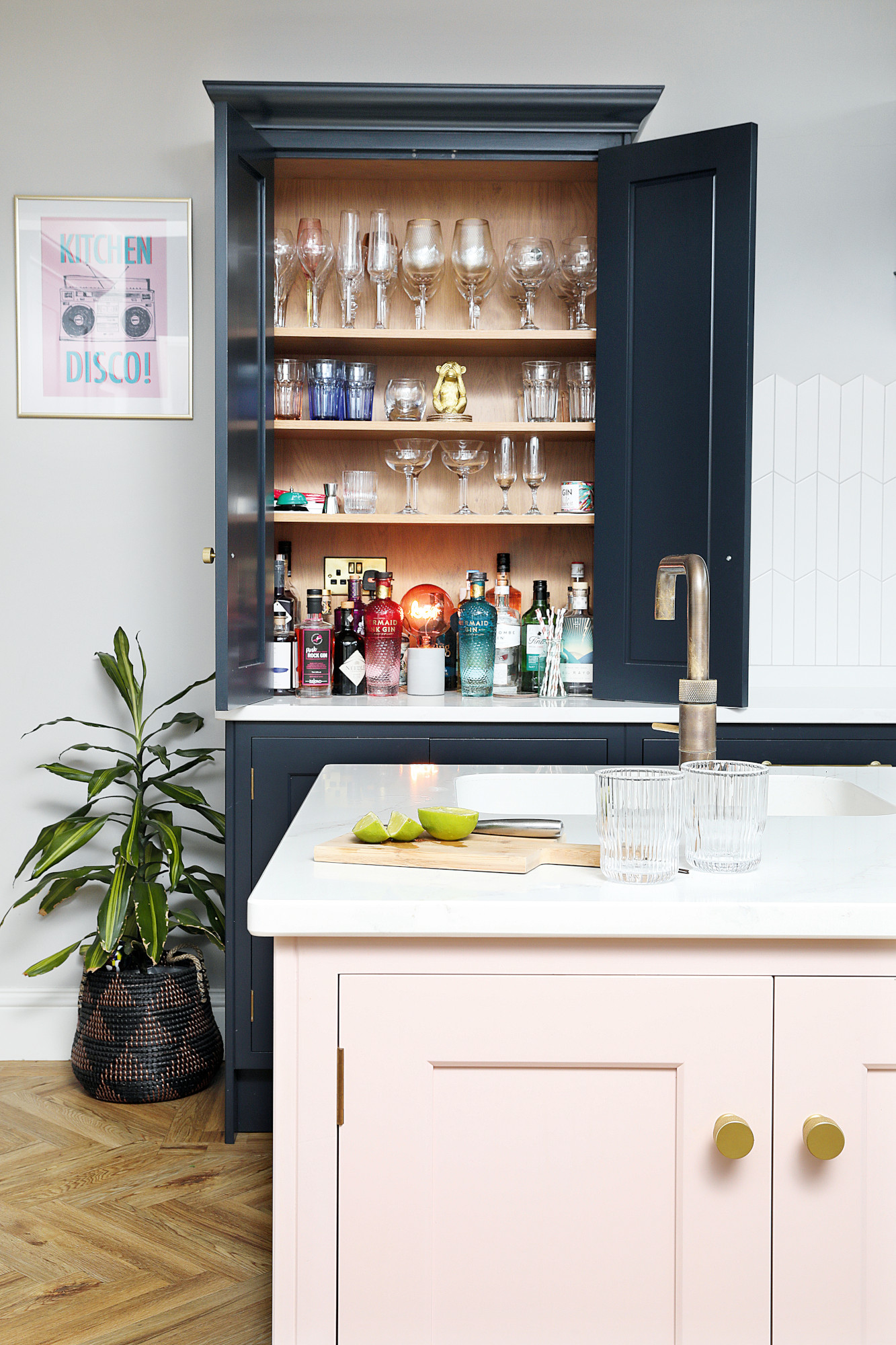
Worktop and integrated sink in Silestone Et Calacatta Gold, Natural Stone Surfaces. ‘Kitchen Disco’ print, Disko Kids. Bulb light, Oliver Bonas
Costs & contacts
Build £45,000
Kitchen and appliances £30,000
Glazing £10,000
Flooring £3,000
Furniture £3,000
Professional fees £1,500
Decorating and tiles £1,000
Interior designer Wolfe Interiors
Builder H Register & Son
Architect DK Designs
‘White tiles aren’t usually me – I prefer things to be loud! But the shape and pattern makes it look different and the light grey grout matches the wall colour.
‘Choosing the right furniture took time. It looks like a big room, but once you put a dining table and sofa in there, it quickly eats up the space. Having a concrete table made to the perfect size was a game changer. I love the quirky rounded edges and we picked the stone colours for the terrazzo ourselves.
‘Liz suggested wishbone dining chairs, which I loved, but they couldn’t be pushed right under; instead I found some with industrial-look legs that match the Crittall-style doors.’
Balancing the budget
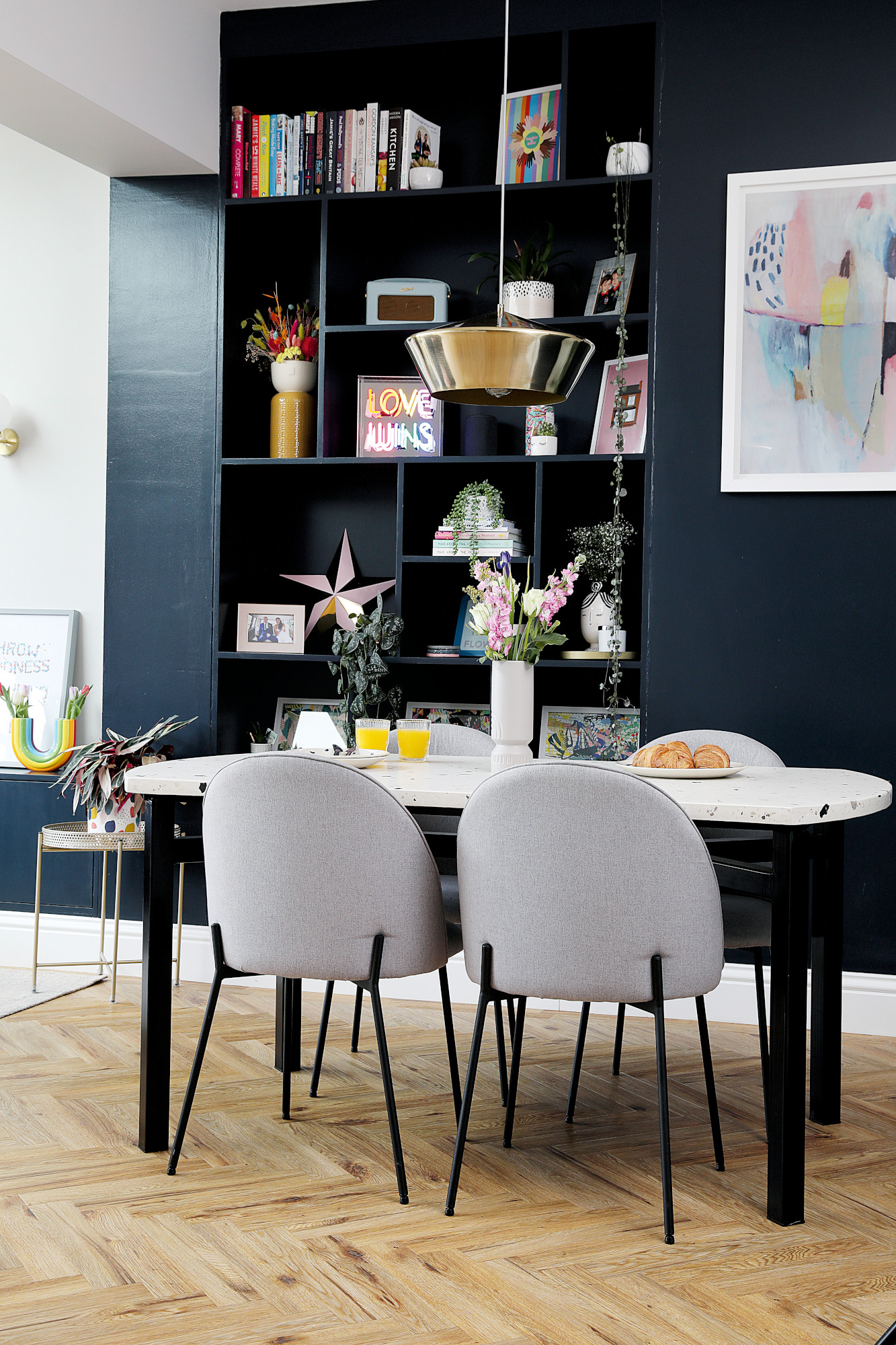
Concrete terrazzo table, Kelham Island Concrete. Chairs, Jysk. Abstract print, Lola Donoghue. Pendant, House Of. ‘Love Wins’ light up box, Oliver Bonas
‘Inevitably the project went over budget. The build cost more as an old extension had to be knocked down and rebuilt in reclaimed bricks. As it’s our forever home, we also spent more on the doors, skylight and kitchen. But we saved money by shopping around for the dining table, pendant light and chairs, reusing our original oven and picking LVT flooring over wood, which still gave us the look we wanted.
‘I feel so happy with the space now; it’s the hub of the home. The kids do homework or craft at the table while I’m cooking and we live in here most of the time. I kept in touch with Liz and now I work as her assistant – so the project gave me a new career, too.’
Subscribe to Real Homes magazine
Want even more great ideas for your home from the expert team at Real Homes magazine? Subscribe to Real Homes magazine and get great content delivered straight to your door. From inspiring completed projects to the latest decorating trends and expert advice, you'll find everything you need to create your dream home inside each issue.
Join our newsletter
Get small space home decor ideas, celeb inspiration, DIY tips and more, straight to your inbox!
