Real home: an extended terraced house fit for a family
Planning ahead, Corina Papadopoulou and her husband Franco Ofili added an extension and remodelled the layout of their Victorian property, to maximise space in their family home

Get small space home decor ideas, celeb inspiration, DIY tips and more, straight to your inbox!
You are now subscribed
Your newsletter sign-up was successful
Corina Papadopoulou, Franco Ofili and their two young children had outgrown their existing home, so they decided to look for a house with more living space, but still within the Kensal Rise area, where Corina’s boutique is based.
House prices had risen sharply in recent years, so they were thrilled to find the house they now call home at a knock-down price seven years ago.
Find our how they transformed the property, then explore more real more transformations and extensions.
Article continues below‘The property had been on the market for more than a year,’ says Corina.
‘It had no period features, so no-one wanted it, but we didn’t mind. I’m Swedish, so I like clean lines, and Franco has similar taste.’
Fact file
The owners: Corina Papadopoulou who owns children’s boutique Kidsen (Kidsen.co.uk) with her husband Franco Ofili, who also runs his own digital agency. They live here with their two daughters, Melina, nine and Maya, six.
The shabby interior, with its woodchip walls, linoleum flooring and built-in orange pine furniture, hadn’t been touched for decades, so the couple ripped out the dated fittings and stripped back the property to a shell. ‘We wanted the ground-floor space to flow and feel light and open,’ says Corina. ‘We liked the idea of a kitchen and dining area leading outside, but didn’t want to lose any of the garden, so it made sense to use the area at the back of the house that had a glass lean-to attached and extend into the side return.’
The couple brought in local architectural practice Claridge Architects, which took on the task of drawing up plans for the 10-square-metre extension and arranged the planning application. ‘They understood immediately what we wanted to achieve,’ recalls Corina. ‘They really know these Victorian terraced houses, so it turned out to be a straightforward project. It took about six weeks to get approval, and the process was pretty seamless. Our neighbours took a little convincing, but I’m pleased to see that they have since had a similar extension built.’
Get small space home decor ideas, celeb inspiration, DIY tips and more, straight to your inbox!
While they continued living in their former home, a two-bedroom flat nearby, the couple hired a team of builders and tradespeople to work on the whole house at once. ‘We had a clear idea of how we wanted the end result to be, so it took around three months from start to finish,’ recalls Corina. ‘Although we went over the original schedule by about four weeks, we had already allowed for a contingency in the budget, realising that building works generally overrun.’
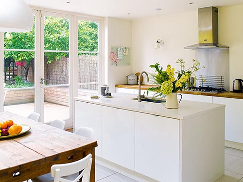
To realise her dream, Corina enlisted the help of her friend Angela Howell, an interior designer. Angela worked out the ground-floor layout, which included Corina’s request for a downstairs WC and utility room, while keeping the basic structure almost the same. She incorporated a bank of floor-to-ceiling kitchen units along the load-bearing wall that separates the kitchen and utility room, and also created an island with more storage space. ‘Angela’s help was invaluable and made the project stress-free,’ says Corina. ‘She had so many clever ideas and used every centimetre of available space.’

The open-plan kitchen-diner has handleless units for a seamless look.
Angela avoided wall units and used push-click door openers, so, without handles, the cabinets blend seamlessly into the background and give the kitchen a spacious feel. Corina had her own ideas too, designating some of the cupboards within the island unit for the girls’ crayons, colouring books and melamine plates. ‘Our children always want to play wherever we are, so this allows them to reach their things and help themselves if they want to sit here,’ says Corina. ‘We hang out here all the time as a family and it’s lovely in summer when we can open the French windows.’

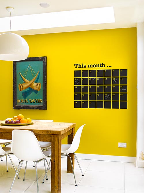
A brightly painted wall is the focal point of the dining room, accessorised with pieces that mix contemporary and vintage styles.
The rustic farmhouse table contrasts with the glossy surfaces opposite and ties in with the oak worktops. The yellow wall was another way to bring in warmth. ‘I wanted a splash of colour and my current obsession is yellow,’ says Corina. ‘We added the black wall calendar as we thought the contrast would be striking, and it’s useful to know what we’re all up to on any day.’
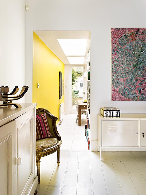
A passageway housing a large built-in shelf unit, where the family can store their large collection of books and CDs, leads through from one side of the dining area to the living room. At one end of this space there is a home office area for Franco, while at the other end, along the wall where the chimneybreast would once have been, Angela created a bank of unobtrusive low-level cupboards for hiding away clutter and children’s toys.

The passageway connecting the dining and living areas has built-in shelf units for storage.
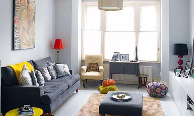
Corina and Franco opted for a palette of soft grey and warm white shades on the walls, floorboards and ceilings throughout. ‘We wanted the new scheme to look modern and minimal, but not sterile,’ explains Corina. Mixing a contemporary Scandinavian style with vintage pieces and colourful accessories has brought character to the house.
A charcoal-grey linen-upholstered sofa is covered with an assortment of eclectic cushions, and, either side, a vintage glass cabinet and chest have been updated with a new coat of paint. They blend easily with the painted floorboards and modern accessories, and are a nod to the history of the period property.
In the home office area an original early artwork by Franco’s brother, Turner prize-winning artist Chris Ofili, hangs on the wall above a white metal sideboard.
There’s a similar uncluttered feel upstairs, with more space-saving ideas from Angela Howell. In the master bedroom, a wall of floor-to-ceiling wardrobes has been painted in the same shade as the floorboards to unite them.’ Blackout blinds at the windows roll up from the windowsill rather than down, allowing for both light and privacy when they’re open. The overall feel is peaceful, light and modern. ‘We wanted it to feel plain, without fussy patterns, but also cosy,’ explains Corina. This soft palette extends to the bathroom, where a fitted vanity unit maximises the storage space available. Corina has softened the modern scheme with more antique market finds.
As Corina currently uses the third bedroom as a home office, the girls share a bedroom, which is painted in a shade of taupe, with pretty butterfly stickers dotted across the wall. ‘In Sweden we don’t stereotype girls and boys into pink and blue and I didn’t want them to have a garish, sugary pink bedroom,’ says Corina. ‘I brought in some colour with the yellow shelving, blue desk and purple wall stickers.’
The overall effect is a warm and inviting family home that’s perfectly suited to modern life, and reflects both the period of the property and the personalities of its owners. ‘Melina was tiny and Miya only a newborn baby when we moved in,’ says Corina. ‘We really had to think ahead as to how we wanted the space to work as the girls grew older. The new design really works for the way that we live, so we’re thrilled with how it has turned out.’