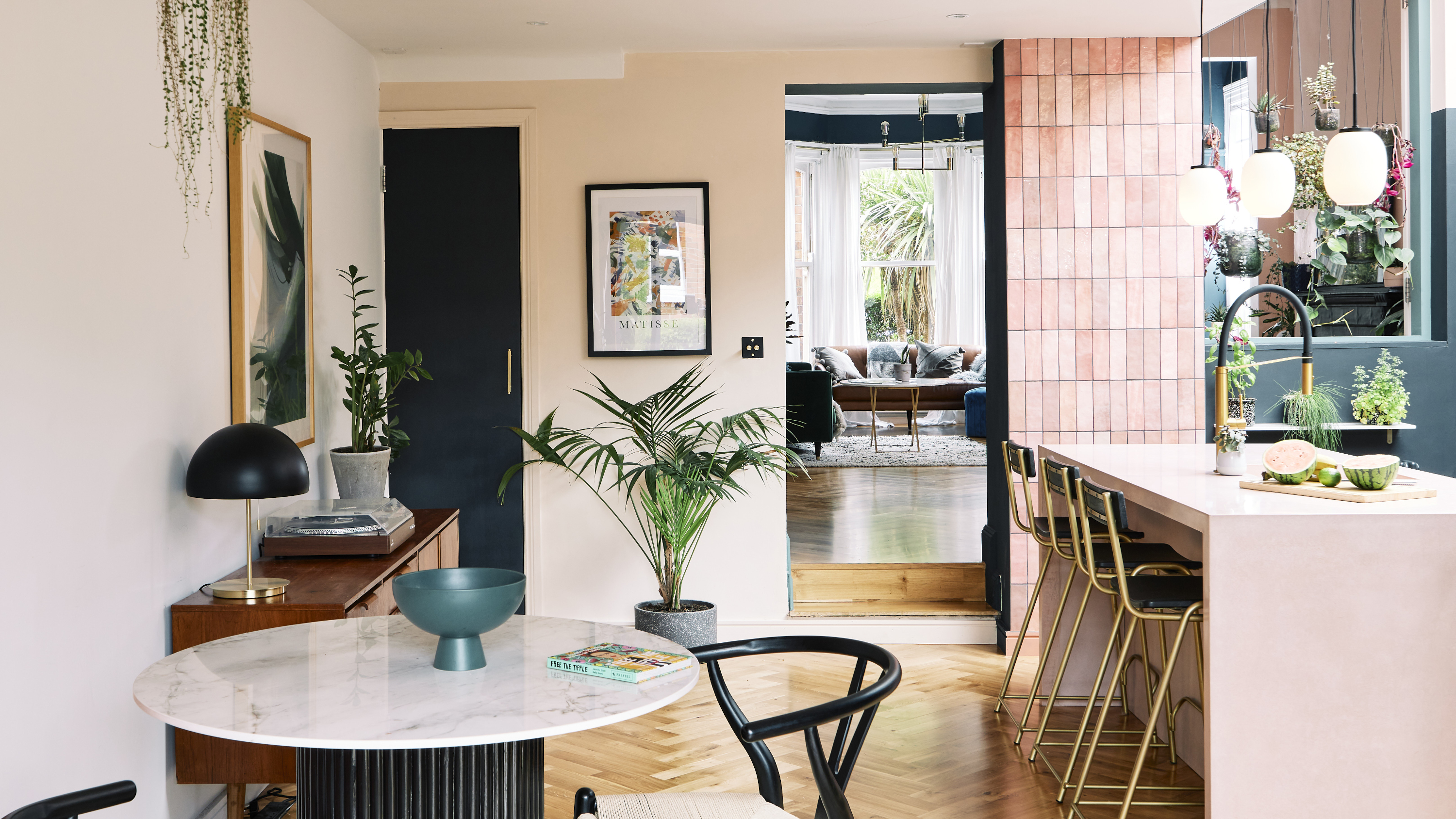

Laura’s house is one of those where there’s something beautiful to look at from every angle. And that doesn’t happen accidentally. As a fashion buyer, Laura is very much used to considering textures, fabric weights, colours, and how all of these things sit together. So when turning her hand to interior design, she was armed and ready with a lot of the essential skills. ‘Choosing an outfit is quite a small scale, but choosing a room scheme is much larger and kind of a more scary feat,’ says Laura. ‘But that doesn’t mean that playing it safe is necessarily the best idea.’
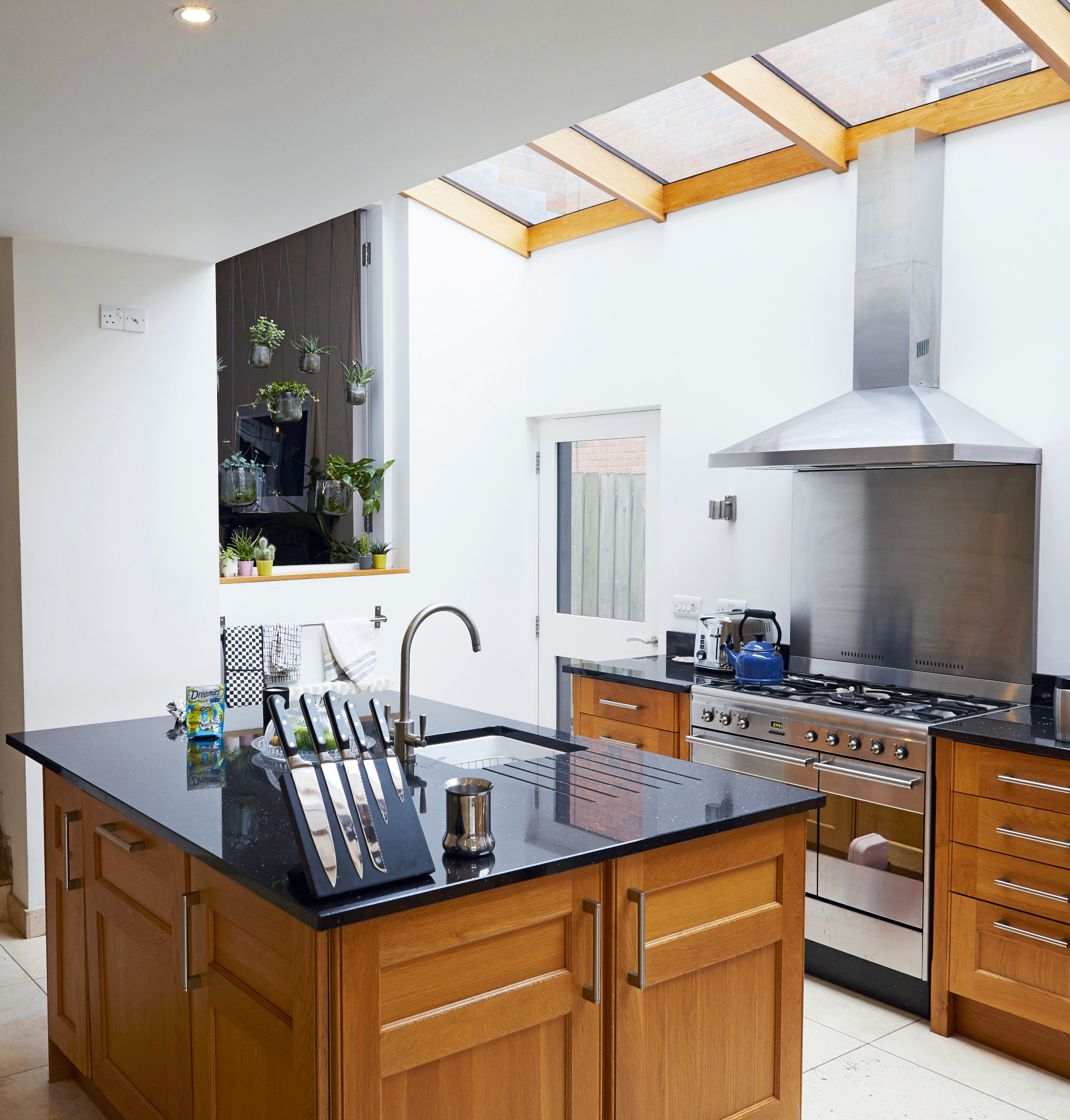
For her budget kitchen renovation, Laura thought carefully about where to spend money and where to save – opting, for example, to respray the existing units, but investing in a concrete island to bring the space to life. Check out the transformation below.
The before
Profile
The owners Laura Magee (@deco.dwelling), a fashion buyer, lives here with her husband, Jonny Kernohan, a software developer, and their cat, George
The property A four-bed Victorian semi-detached house in Belfast
Project cost Approx. £30,000 (for whole house)
After years of living in London and then Cardiff, Laura and her husband, Jonny, relocated to Ballyhackamore, Northern Ireland. Because they were living in a different country at the time, they called on the help of Laura’s parents to speed things along. ‘My mom and dad viewed the property and sent us a video. My mum’s videoing wasn’t the best, but we could see the house had good bones, so we put an offer in,’ says Laura.
The couple were excited to put their own stamp on the space. The existing layout included a large front room, and small snug leading into the kitchen. ‘We’re very sociable people and we wanted to be able to use our home to gather friends and family, but with the smaller separate rooms, the layout seemed quite old fashioned,’ says Laura.
Modern living space
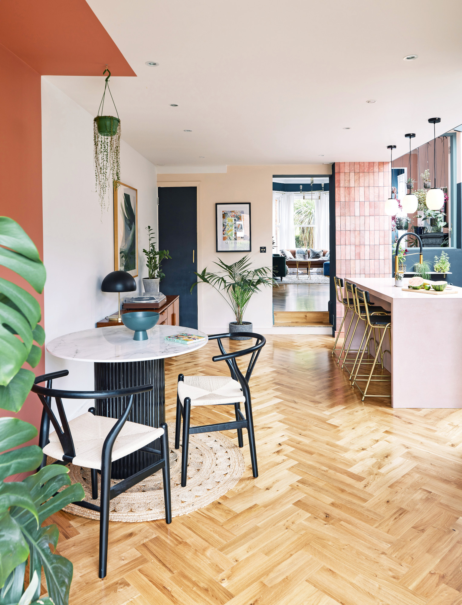
Table top, Cosentino. Chairs, Where Saints Go. Walls painted in Red 03 and Pink 02, Lick
The couple decided to knock down the wall between the snug and kitchen – which, unfortunately, was load bearing. ‘We had to get architectural and engineering drawings done to make sure we didn’t make the house fall down.’
They had an RSJ beam installed to support the ceiling and laid down plywood to even out the floor levels. ‘It works so much better for us now,’ Laura adds. ‘It’s more of a modern living space.’
Laura added a strip of terracotta paint to help zone the dining area in the kitchen. Taking it right up to the ceiling gives an almost canopy-like feel. ‘I plan to hang a pendant light above the table, too,’ she says.
Framing the view
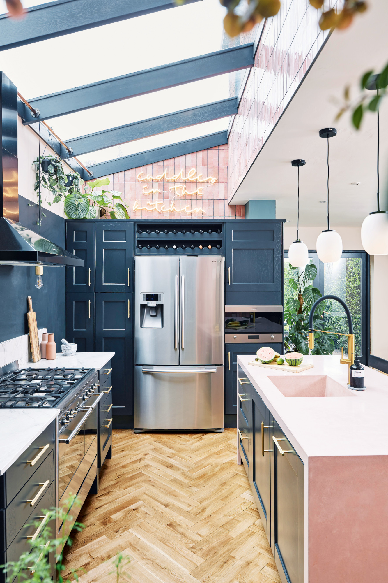
Cooker and extractor fan, Smeg. Tiles, Tons of Tiles. Tap, Lusso Stone. Flooring, Junckers
Laura’s approach to her kitchen design was all about sightlines. She separated them into three distinct views – from the dining room, the door, and looking directly at the back wall with the cooker. This gave her three clear canvases, of sorts, to work with. ‘I was learning as I went along,’ she explains. ‘I don’t even know how many mood boards I made, but the more I did, the more I kept changing my mind, as I tried to figure out what colours and textures would work best. My job in fashion definitely influences my décor.'
Spend and save
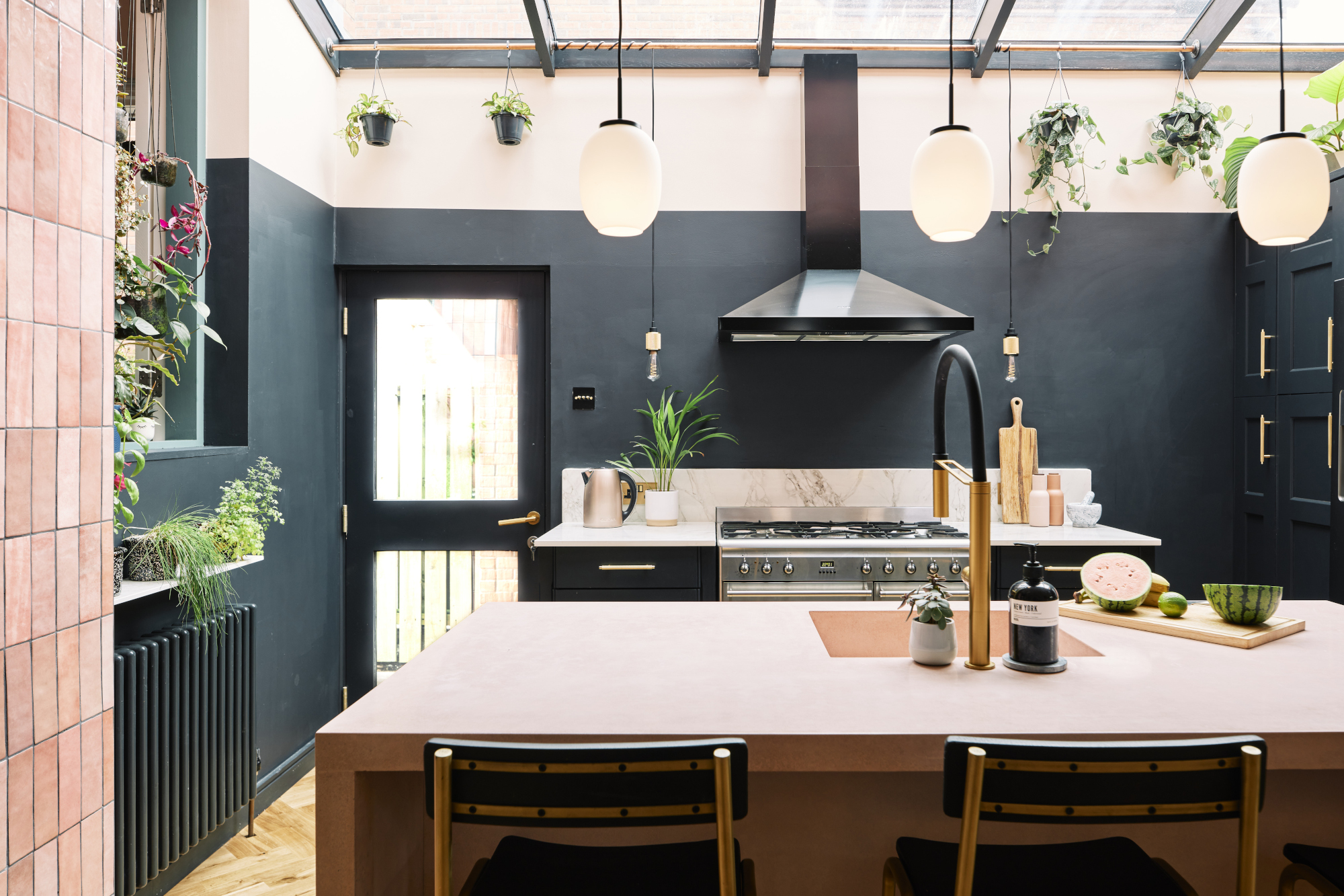
Sink, Crete Tops. Bar stools, Rockett St George. Lights, Dyberg Larsen. Walls painted in Off Black, Farrow & Ball and Green 04, Lick
Costs & contacts
Kitchen £10,000
Furniture £8,000
Building work £3,000
Kitchen sprayers Your Style Spraying Solutions
Kitchen fitter Jamie McGivern via MyBuilder.com
Tiler Serious Tiling, serioustiling.co.uk
The solid oak kitchen cabinets were in good condition, so the couple had them resprayed in a statement dark blue. They did invest in a new pink concrete island. ‘That was a bone of contention with Jonny at first,’ says Laura, ‘but now we both really love it. It was too big to fit through the front door so had to go through the neighbour’s fence, which we paid a joiner to fix.’
One of the most striking elements in the kitchen is the tiling, inspired by Pinterest. ‘I saw a picture of a bar in New York with these vertical metro tiles, and I thought it was so cool – I knew I wanted them somewhere in my home.’
Colour and texture
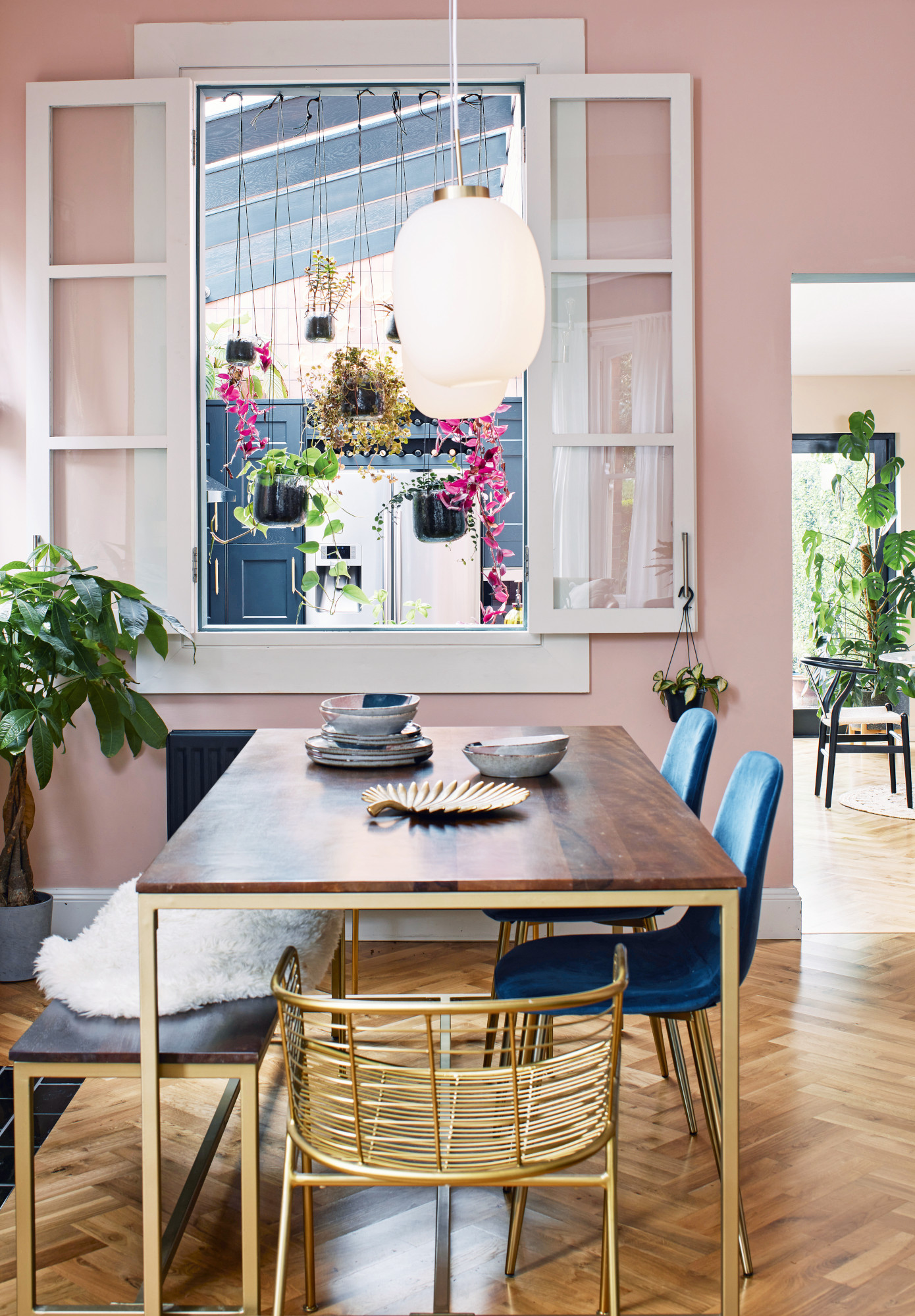
Dining set, Made. Planters, Nkuku. Paint, Alhambra Stone, Craig & Rose
Laura took the property’s original exterior window and repurposed it as an interior window into the dining area. She’s hung planters for a quirky design feature, which maintains privacy while allowing light to pass through.
While this beautiful home may look complete, Laura has even more up her sleeve. With plans to update the windows and swap the rear French doors for wider bi-folds, this space is very much a work in progress – and we’re excited to see how it evolves.
The kitchen brings Laura’s love of colour and texture to life. ‘I’m over the moon with it,’ says Laura. ‘It’s just a really cool space to be in and we spend most of our time in here.’ From the pink island to the neon sign, the space is bursting with personality. ‘Jonny loves cooking on a Friday night,’ says Laura. ‘I’ll be drinking a cocktail and we’ll have the neon light on. I just love it.’
Subscribe to Real Homes magazine
Want even more great ideas for your home from the expert team at Real Homes magazine? Subscribe to Real Homes magazine and get great content delivered straight to your door. From inspiring completed projects to the latest decorating trends and expert advice, you'll find everything you need to create your dream home inside each issue.
Join our newsletter
Get small space home decor ideas, celeb inspiration, DIY tips and more, straight to your inbox!

After joining Real Homes as content producer in 2016, Amelia has taken on several different roles and is now content editor. She specializes in style and decorating features and loves nothing more than finding the most beautiful new furniture, fabrics and accessories and sharing them with our readers. As a newbie London renter, Amelia’s loving exploring the big city and mooching around vintage markets to kit out her new home.
-
 Restored seaside home oozes coastal charm
Laura and James Simpson turned a rundown eyesore into a stylish and welcoming family home featuring the colours of the sea
By Sharon Smith Published
-
 Real home: Extended kitchen/garden room has the flavour of Italy
Memories of the palazzo where they married inspired David and Andrew’s ‘bella’ new kitchen
By Alison Jones Last updated
-
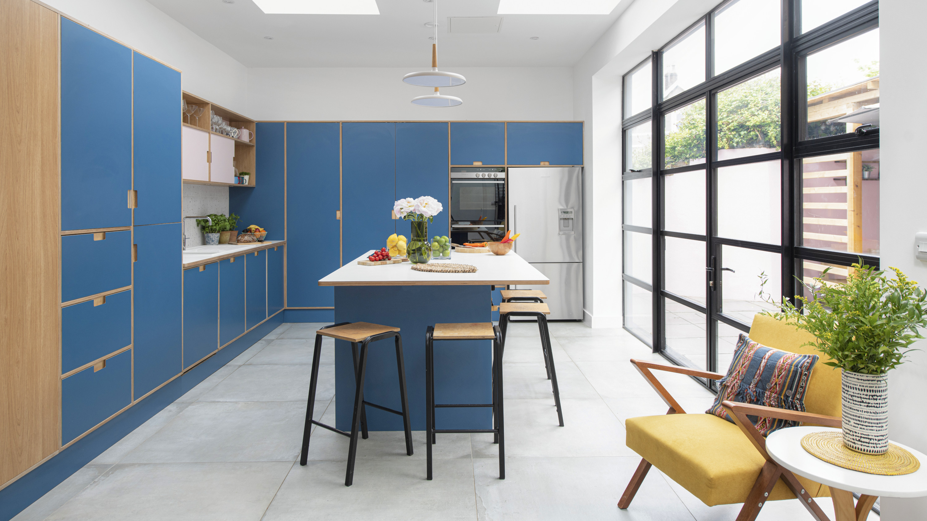 Before and after: cool plywood kitchen shows bespoke is the way to go
This extended space is packed with ideas
By Ellen Finch Last updated
-
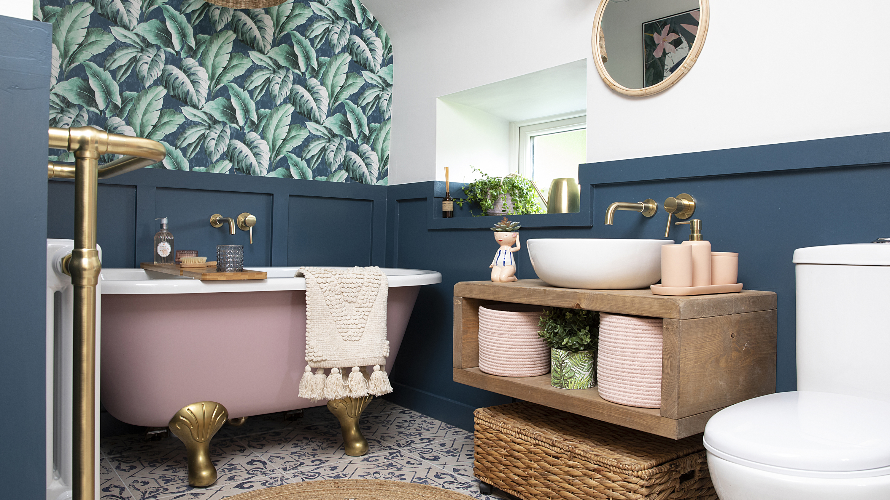 Before and after: a pretty yet practical family bathroom renovation for £6,000
From dated carpet and '80s wallpaper to a dreamy, kid-friendly sanctuary…
By Ellen Finch Published
-
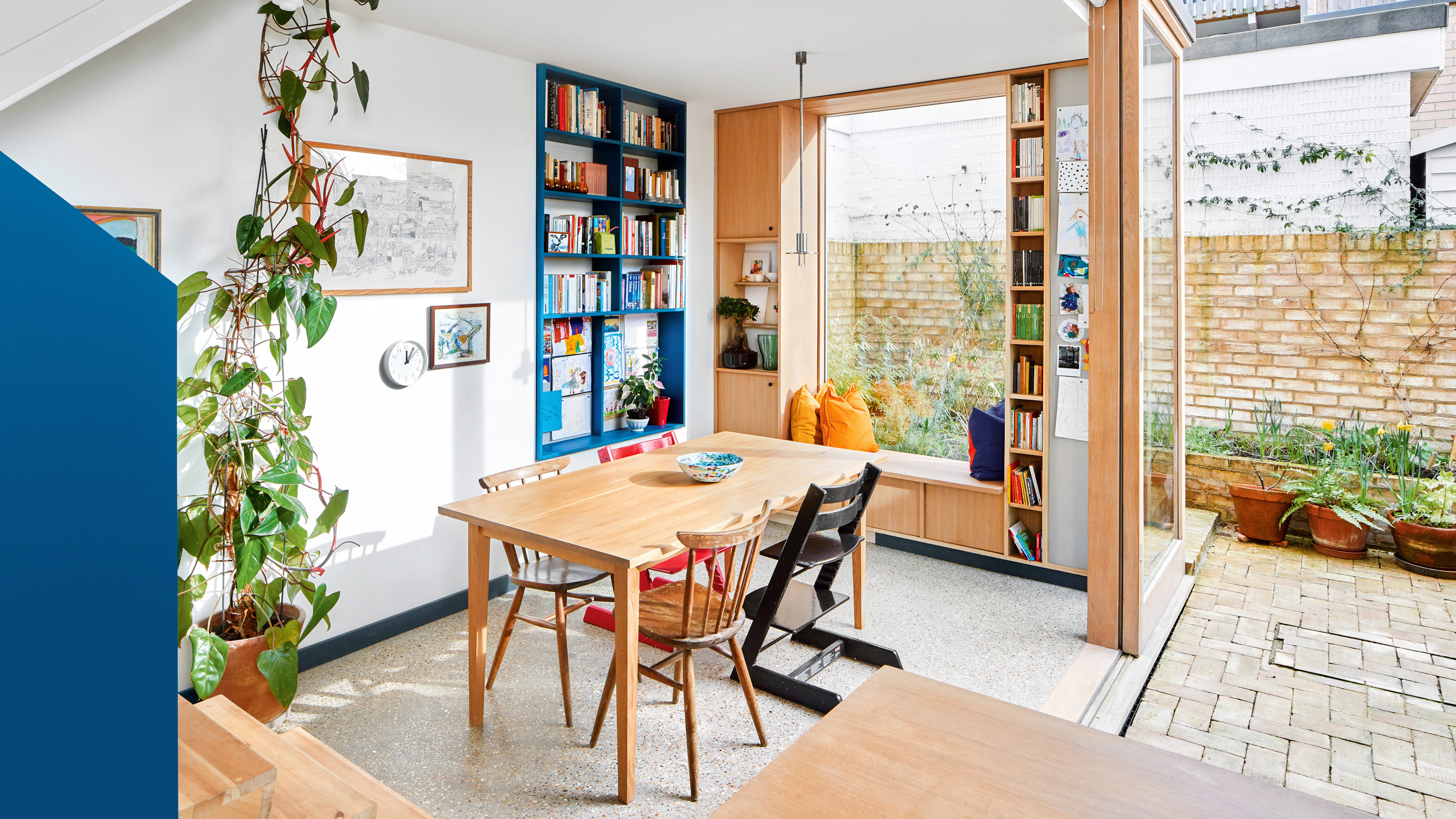 Before and after: from dark basement kitchen to uber-cool extended family space
Architects Emma and Ross had their professional skills to draw from – but they still have plenty of tips for a standout, budget-friendly look
By Ellen Finch Published
-
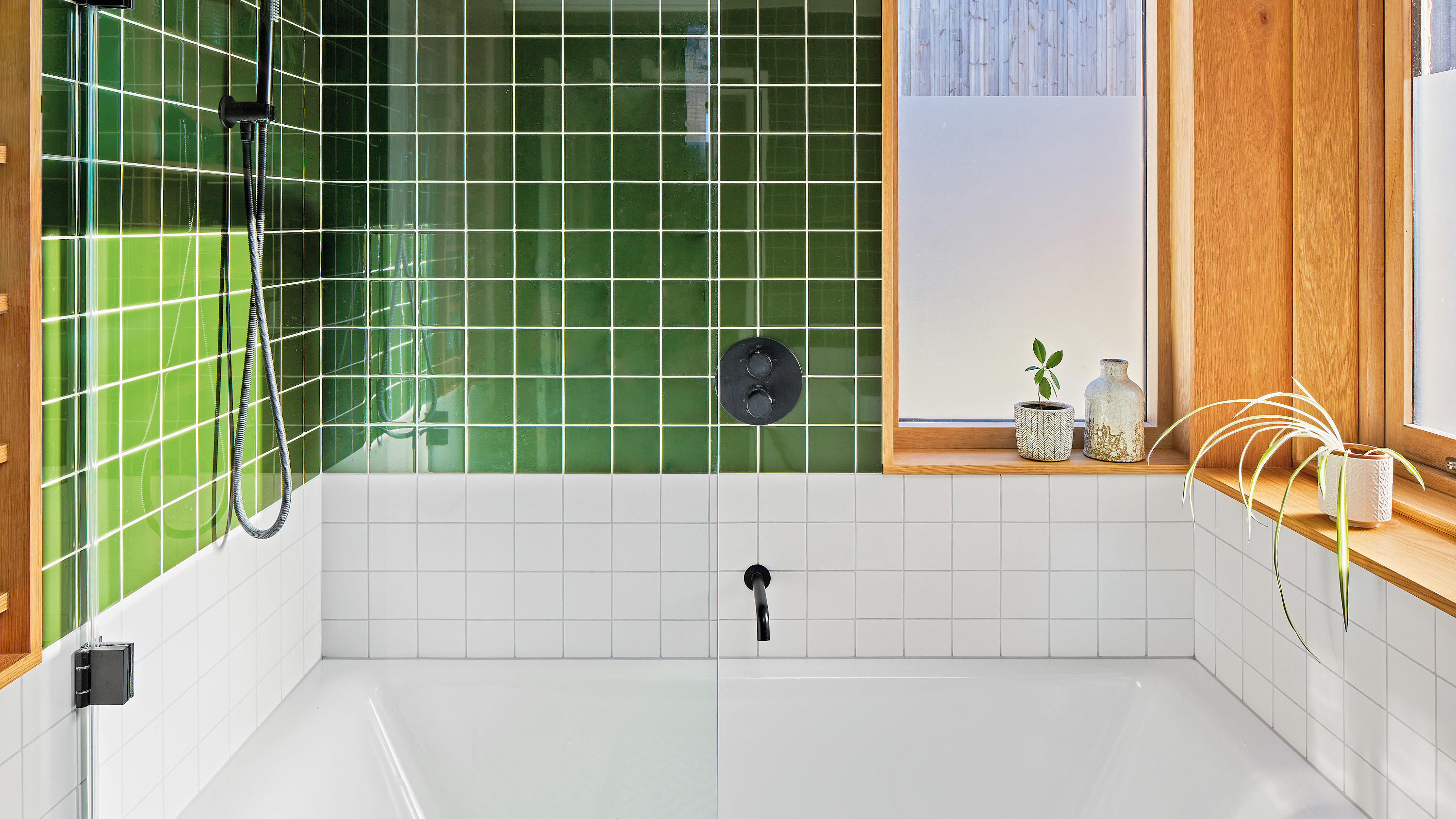 This small bathroom makeover is a lesson in space-saving design
Planning your own small bathroom makeover? Take note of these tips
By Ellen Finch Published
-
 Real home: a lick of paint turned this tired Victorian living room into a nature-inspired haven
Turns out green and black is the dream colour combination
By Sean O'Connell Published
-
 Real home: this homeowner transformed her childhood home bathroom for £5,000
We've fallen head over heels for the industrial scheme and plaster pink colour palette
By Karen Wilson Last updated
