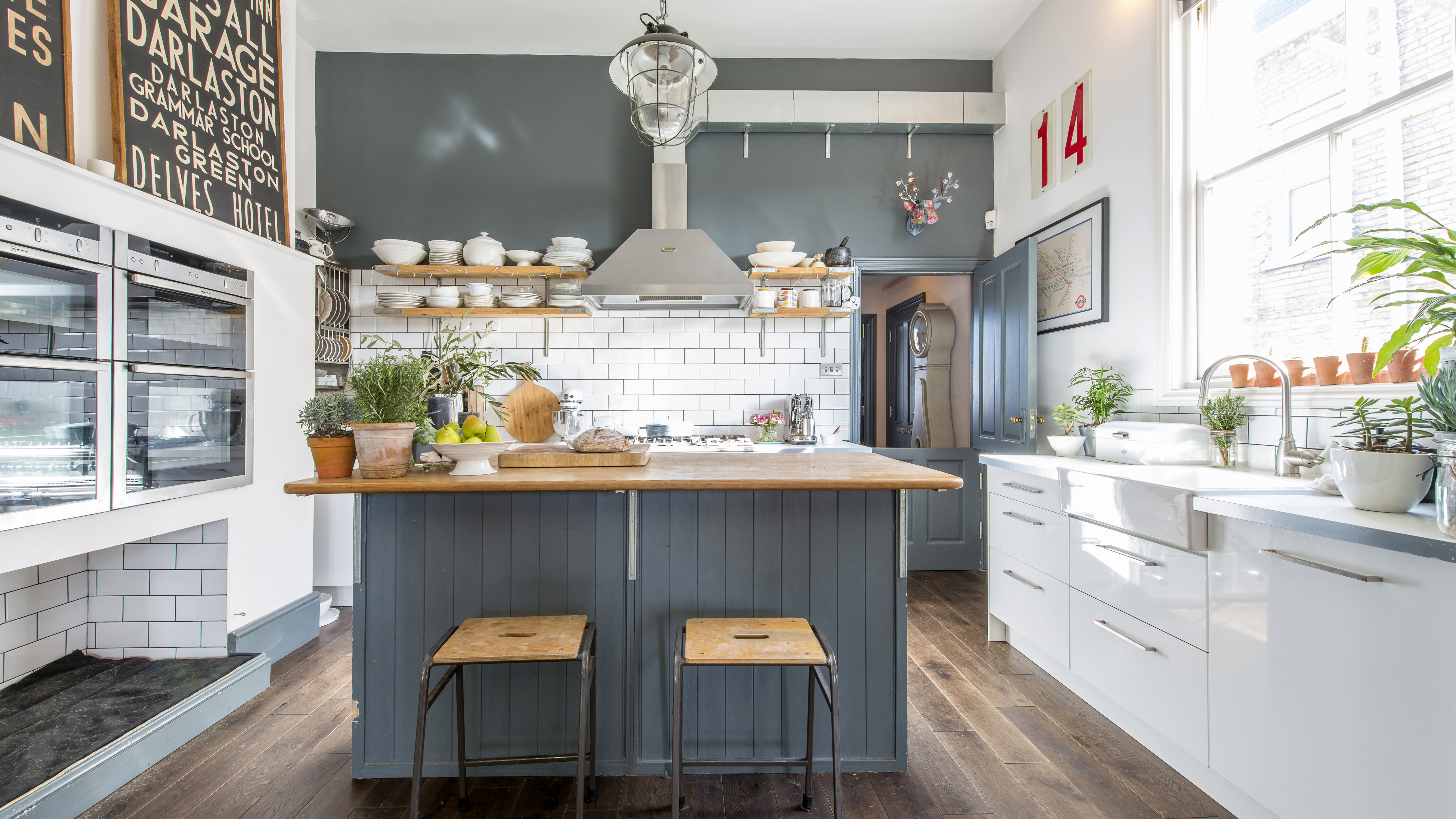
Ask Lydia and Mark about any piece of furniture in their home and they’ll tell you an interesting story. From the kitchen island made from an old bookcase salvaged from a skip, to the design classics picked up on camping trips in their VW Campervan, their home is a treasure trove of memories.
Project notes
The owners: Lydia Wood-Power, a jewellery designer at lydiawoodpower.com, lives here with her husband Mark, a builder, and their dogs Angus, the Westie, and Parker, the Dalmatian
The property: A six-bedroom, detached former doctors' surgery built in 1888, in Ramsgate
Total project cost: £85,000
Even the property itself is the basis for a great tale. Built in 1888, it was a doctors’ surgery until around two years before the couple bought it in 2013, complete with a warren of treatment rooms, a reception area, office and a caretaker’s residence.
‘We discovered lots of charts and memorabilia when we first moved in,’ recalls Mark. ‘We kept several pieces to use as accessories, such as a door sign that reads “interview room”.’
Relocating from London to Ramsgate for a new life by the coast, the couple had sold their home and café business to finance the move. ‘We had our eye on the former surgery as we thought it had great potential, but it was under offer from a developer who planned to turn it into five flats,’ explains Lydia. ‘Luckily for us, the sale fell through so we jumped at the chance to buy it.’
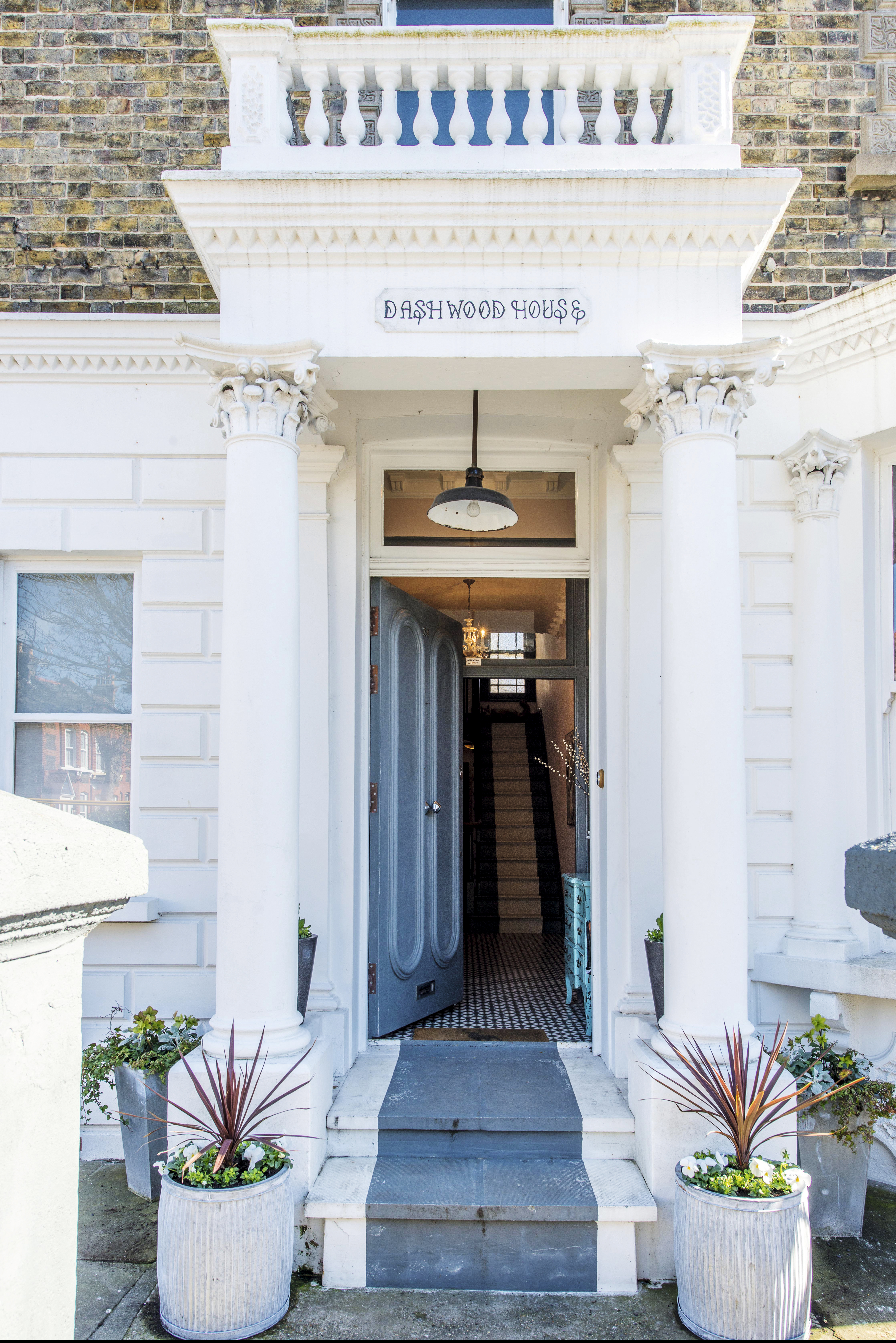
The front door of Lydia and Mark's home in Ramsgate
Planning the project
As the former surgery already had living quarters on the first floor, complete with a small but dated kitchen, it made sense for the couple to live there while they finalised ideas for their renovation project.
Mark contacted the architect who had designed the scheme for the proposed five flats, and worked up a new layout using the floorplans for that as the basis of the design.
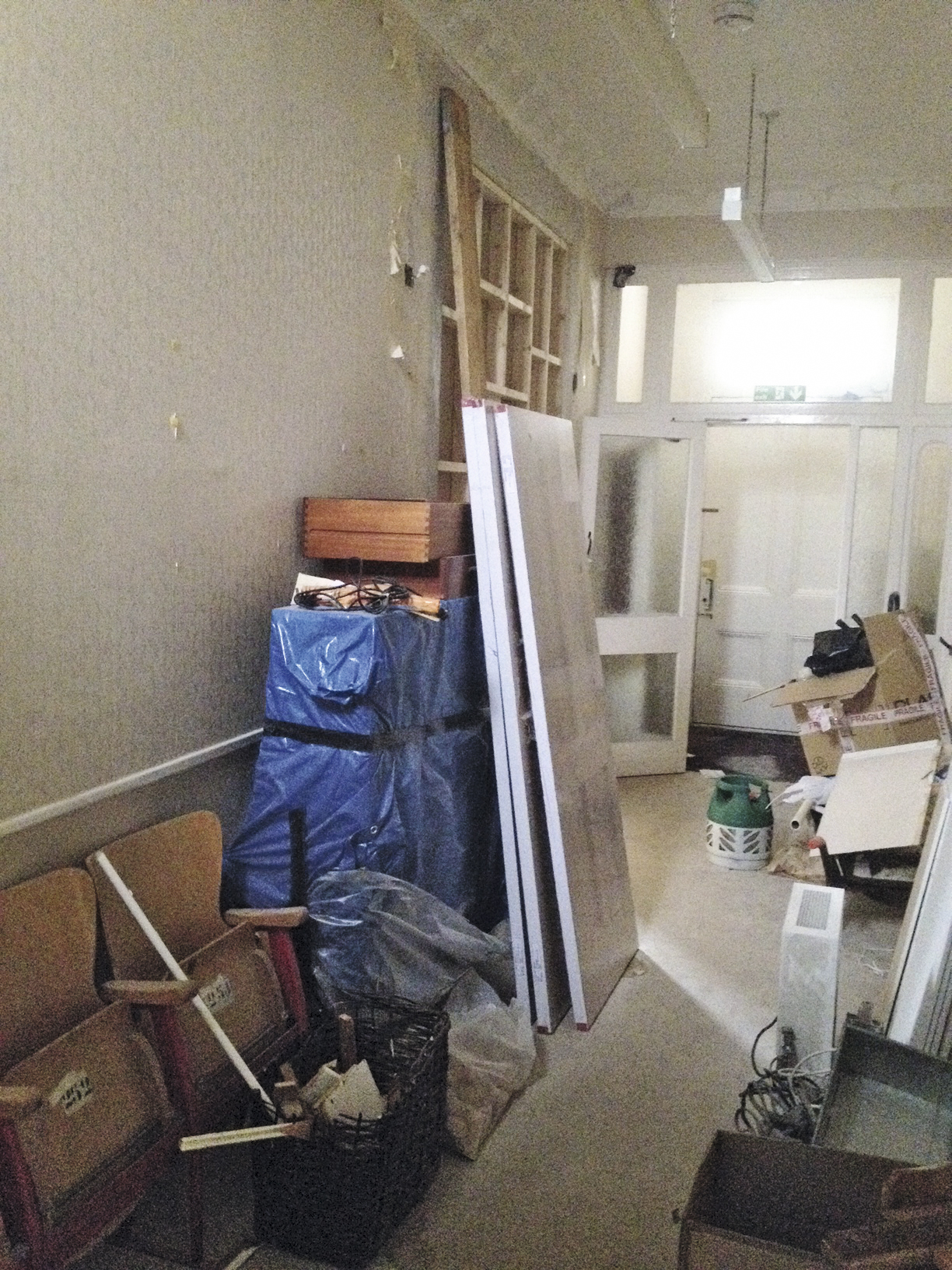
The existing hallway was cramped and cluttered
The couple decided to knock down several stud walls that originally formed the many small consultation rooms, creating space for an open-plan kitchen-diner linked to the garden, a more formal dining room and a living room.
The first floor would house several bedrooms and two bathrooms, while the second floor would have space for two further bedrooms, a bathroom and a bedroom/home office.
Before any work could start, however, Mark and Lydia had to apply to the local authority for permission to change the use of the building from commercial to residential. ‘It took around a year to finally get the go ahead,’ recalls Mark.

Mark and Lydia relocated the staircase and this new design was made by a local carpenter. For a similar chest of drawers, try Out There Interiors
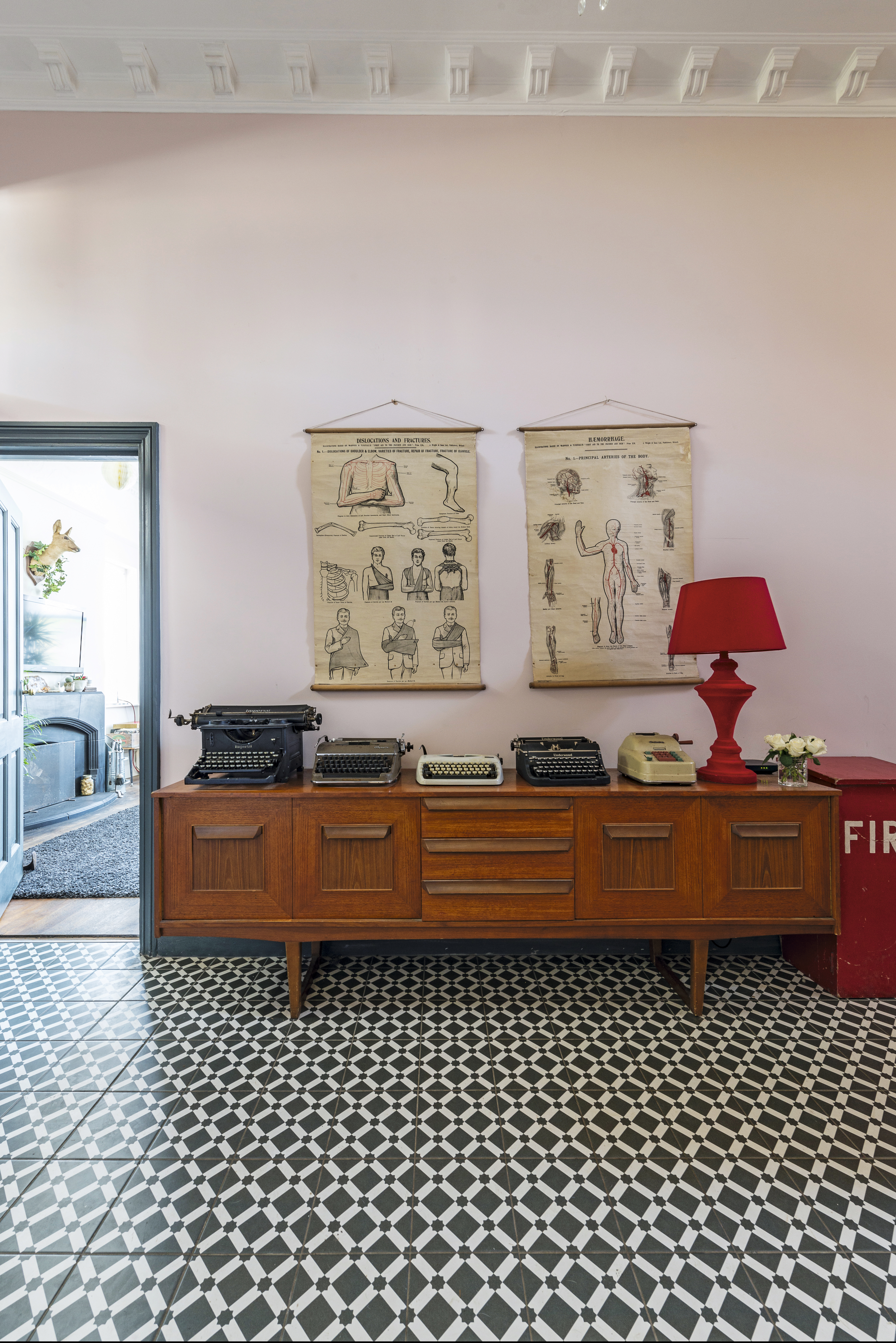
Monochrome tiles from Tile Giant create a striking feature in the hallway. The walls are painted in Calamine by Farrow & Ball. For a similar sideboard, try Ebay
Ground floor redesign
To make the renovation more manageable, the couple agreed to tackle each floor separately, starting with the ground floor, where the kitchen was top of their to-do list.
Although Mark planned to tackle a great deal of the work himself, the couple hired builder Spencer Lee to help with the construction work, including removing the necessary walls, fitting bi-fold doors in the kitchen-diner and updating the plumbing.

With its original fireplace, the generously-sized en suite bathroom is an elegant space. A large oval bath and floorstanding tap take centre stage, and there's also plenty of room for a large walk-in shower. All the fittings are from Victoria Plum
At the rear of the house, a wall was knocked down and two new RSJs installed to open up the layout. Modern Ikea units have been teamed with a large island unit, which Mark cleverly made from an old bookcase.
The chimney breast has been put to good use as the perfect spot for integrated appliances, and there’s even space underneath for a built-in bed for the couple’s two dogs, Parker and Angus.
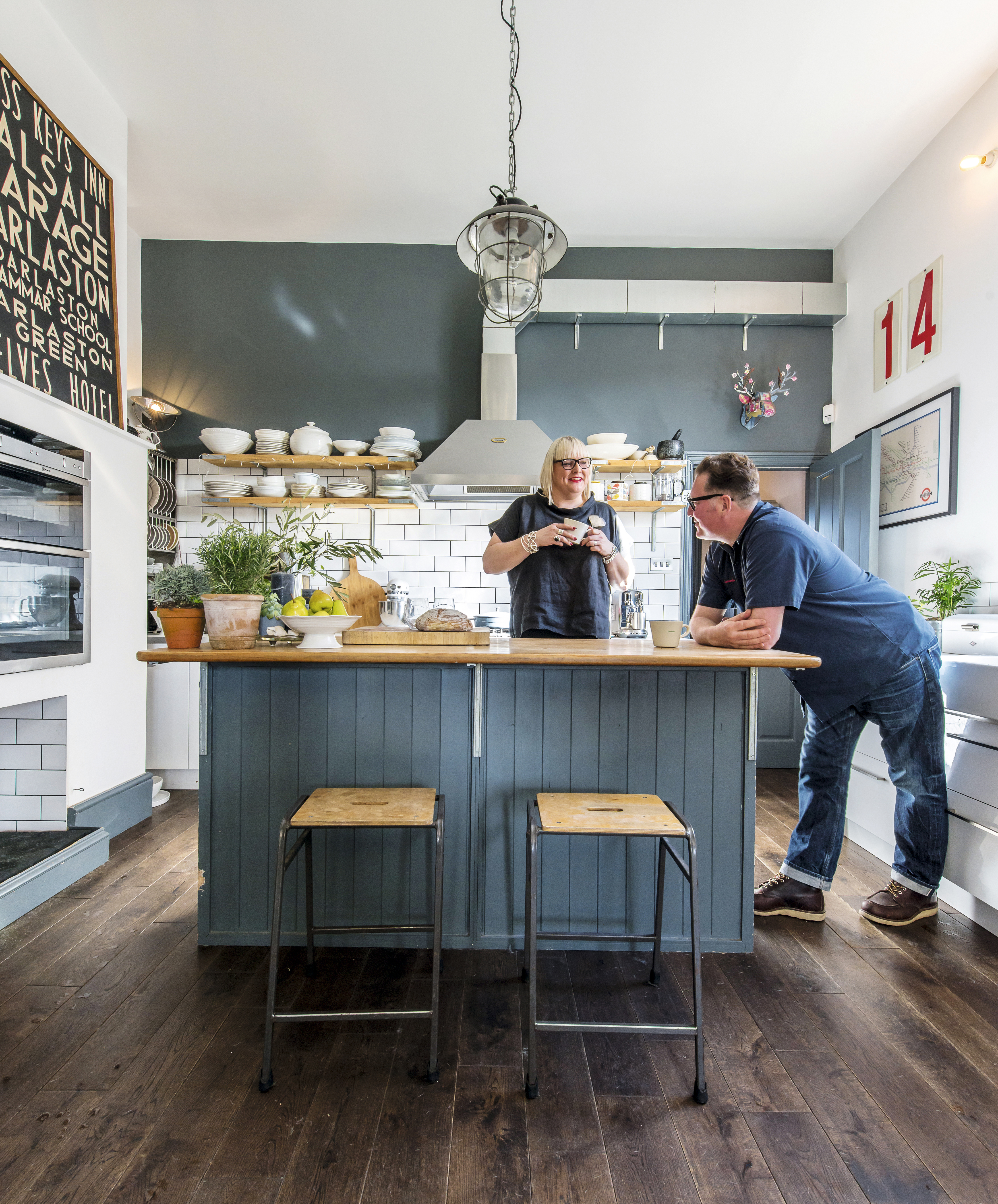
To keep down costs, the couple sourced affordable fittings, including kitchen units, sunk and tap from Ikea, which have been combined with an island unit made from a bookcase and scaffolding planks. Sleek appliances, such as the oven from Neff, give the kitchen a modern edge. Brick-style tiles from Tile Giant stand out against the walls, painted in Down Pipe by Farrow & Ball. For similar bar stools, try Cult Furniture
The separate dining room at the front of the house is more traditional in style and features a beautiful sash bay window, classic-style furniture and a collection of teapots, cups and saucers left over from Lydia’s time running the café. ‘We love to entertain and cook for friends, so the redesigned layout is ideal,’ says Mark.
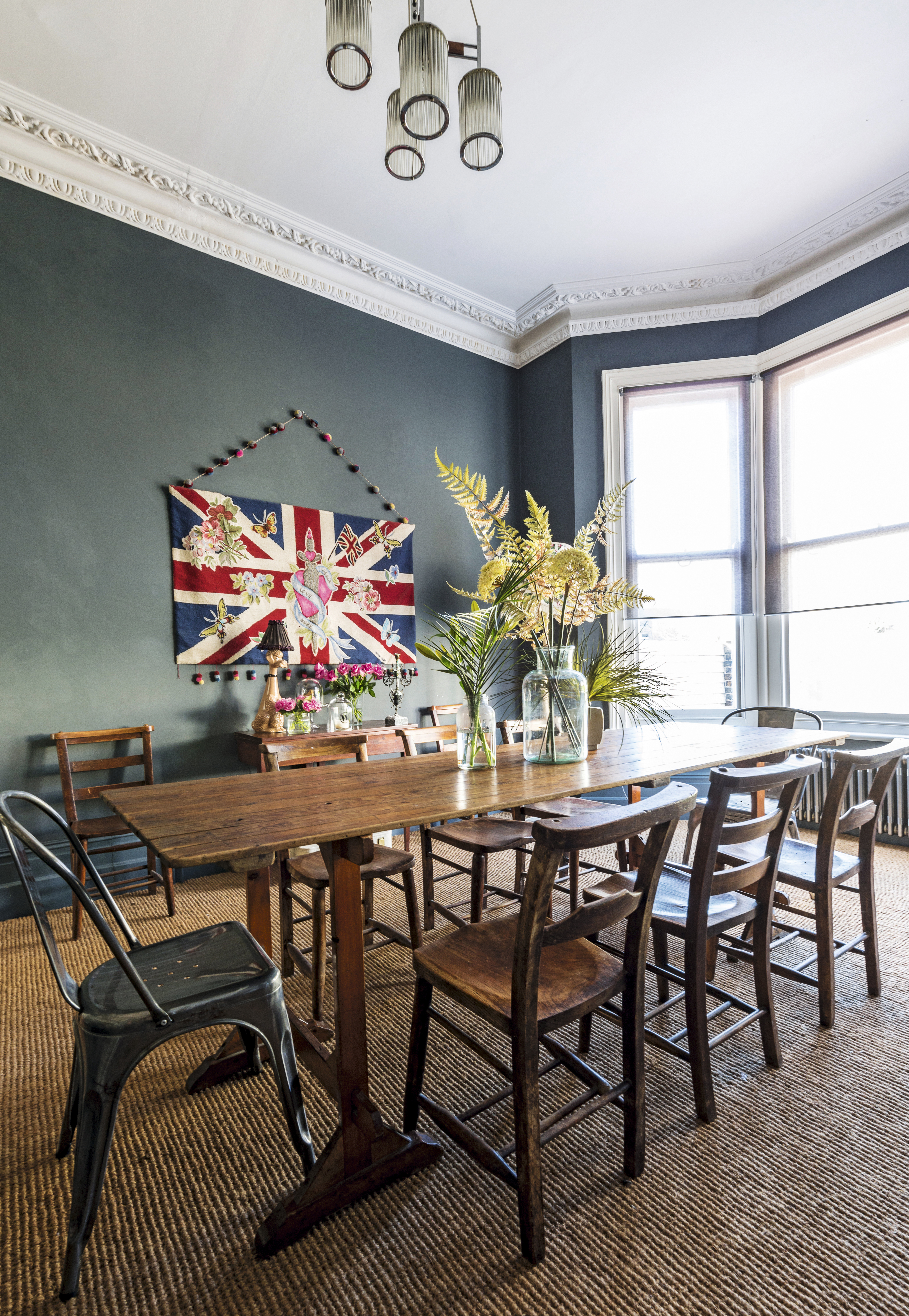
The formal dining area epitomises the elegant style of the original period property. The large table is from Junk Deluxe in Margate and the chairs are from Baileys Home & Garden. The walls are painted in Farrow & Ball and the natural-style carpet is from Crucial Trading

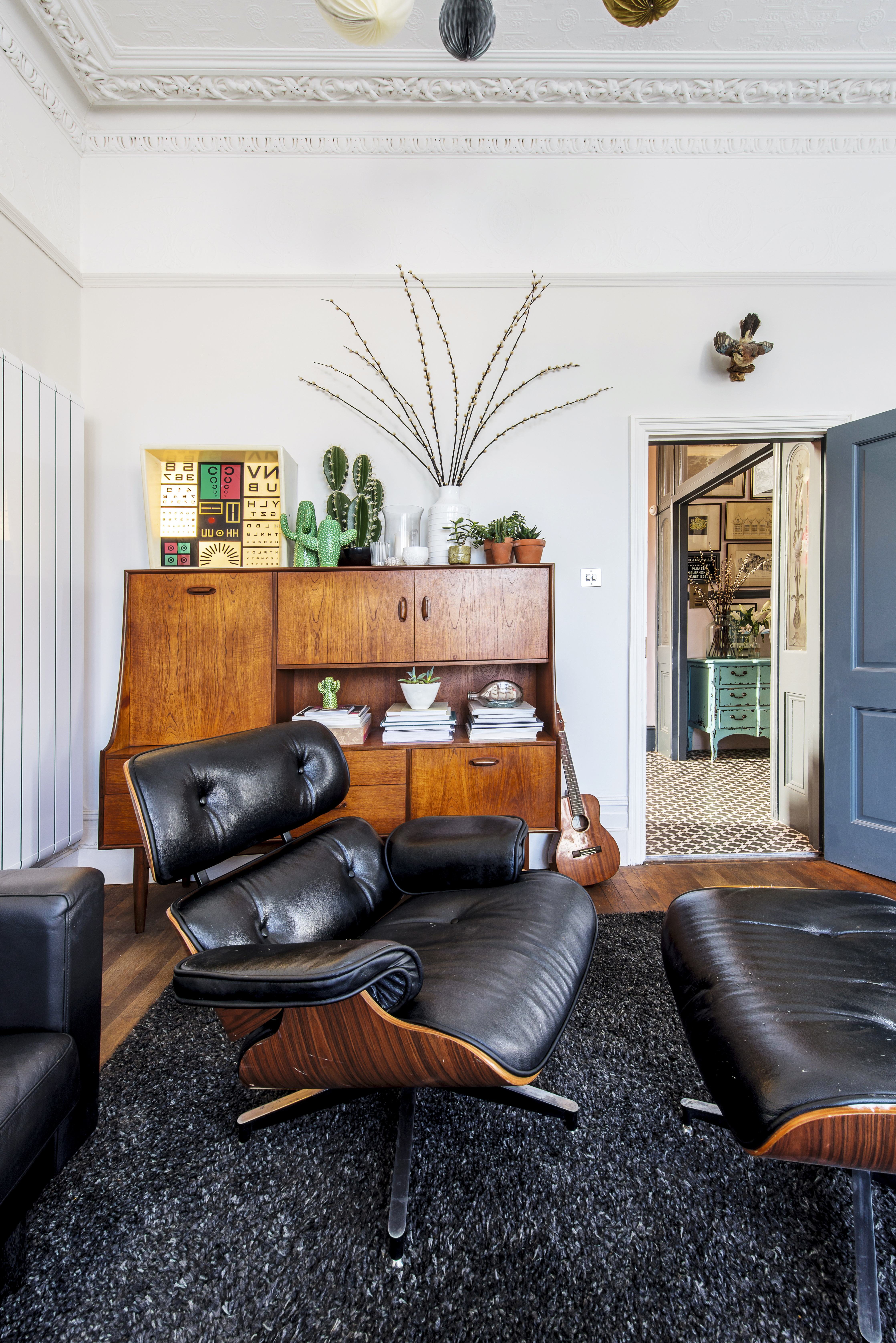
Above and below: To maximise the natural light, the couple chose a neutral scheme for this space. Showcasing the couple's eye for great buys, the space features an array of design classics, including Mies van der Rohe Barcelona footstools and an Eames lounger; find originals on Ebay. The sofa is from Ikea and the rug is from Ebay; find similar at Modern Rugs
Design challenges
Costs
Construction: £40,000
Decorating: £25,000
Bathrooms: £8,000
Kitchen: £7,000
Doors: £3,000
Stairs: £2,000
Total: £85,000
House purchase cost in 2014: £303,000
Estimated current value: £700,000
Potential profit: £312,000
In keeping with the grand proportions and period details of the main living rooms, the hallway is equally impressive. ‘The old stairs ran along the wall at the back of the house, which made for quite an awkward layout, so we wanted to fit a flight of stairs leading directly from the entrance hall in the centre of the house, but it was important they matched the original style above,’ explains Mark.
‘This posed more of an issue than we’d hoped as current building regulations specify wider stair treads, but as that would have looked mismatched we appealed to be allowed to maintain the older measurements, which was approved, and the new stairs were then made by a local joiner.’

Woodwork painted in Down Pipe by Farrow & Ball give the first floor of the house a sense of drama
Second phase
With a fully functioning kitchen on the ground floor, Mark and Lydia moved their living quarters to the transformed space and saved up to remodel the upper floors. ‘To help finance the rest of the project, we sold a portion of the rear garden to a local builder, who is now building a townhouse on the site,’ explains Lydia.

Vibrant pink bedding from Missoni and a floral rug from Dunelm add a burst of colour to the main bedroom. The bed is from Loaf and the walls are painted in Mole's Breath by Farrow & Ball. For a copper-effect lampshade, try Made.com
The old kitchen upstairs was turned into a dressing room for Lydia, complete with plenty of storage for her collection of vintage clothes and shoes. The other rooms were converted into spacious bedrooms, all decorated with vintage store finds and an on-trend grey colour palette.
‘I love using grey as a backdrop, as it’s warm in tone and creates a perfect blank canvas,’ says Lydia. ‘We brought a lot of the furniture with us from our old house, but we find it difficult to walk past a charity shop without going in, so we’re always adding new items to our house.’

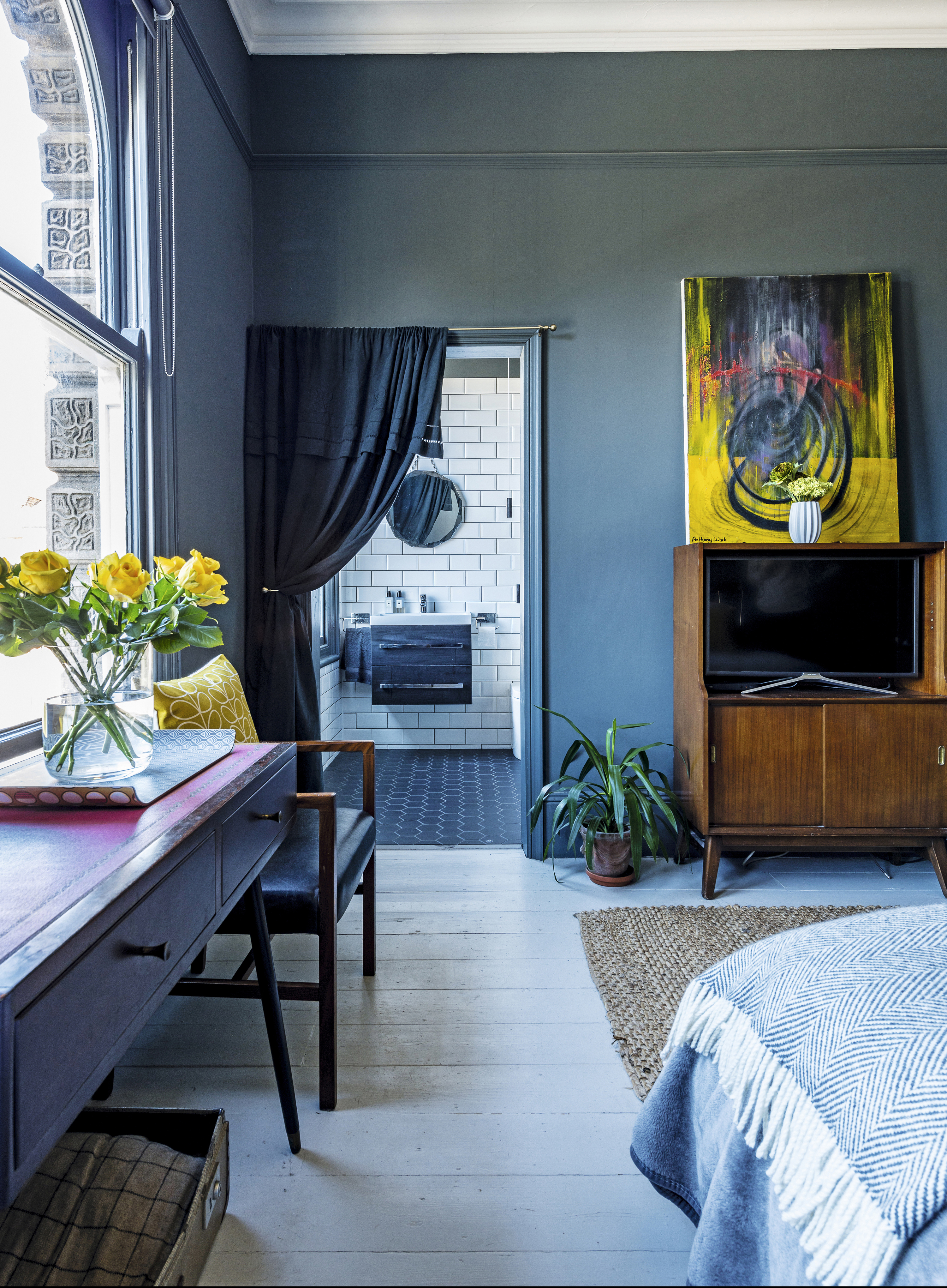
Above and below: Situated at the front of the house where it benefits from large sash windows, the walls in this room are painted in the couple's favourite shade of Down Pipe by Farrow & Ball. A bed from Dreams has been teamed with bedside tables from Ebay, chairs from Margate Retro and a large flag on the wall from Petticoat Lane Emporium to create an eclectic scheme
Project success
Mark and Lydia are putting the finishing touches to the second floor of their property, where the additional bedrooms are now flooded with light thanks to several skylights.
After four years of hard work, they’re justifiably proud of the space they’ve created. With remnants of the property’s past existence combined with the couple’s eclectic furniture, the surgery’s transformation into a character-filled home is complete. ‘I wouldn’t change anything about how the house looks,’ says Mark. ‘We’ve really maximised its potential as a home.’

Vintage botanical prints add a splash of colour to the walls
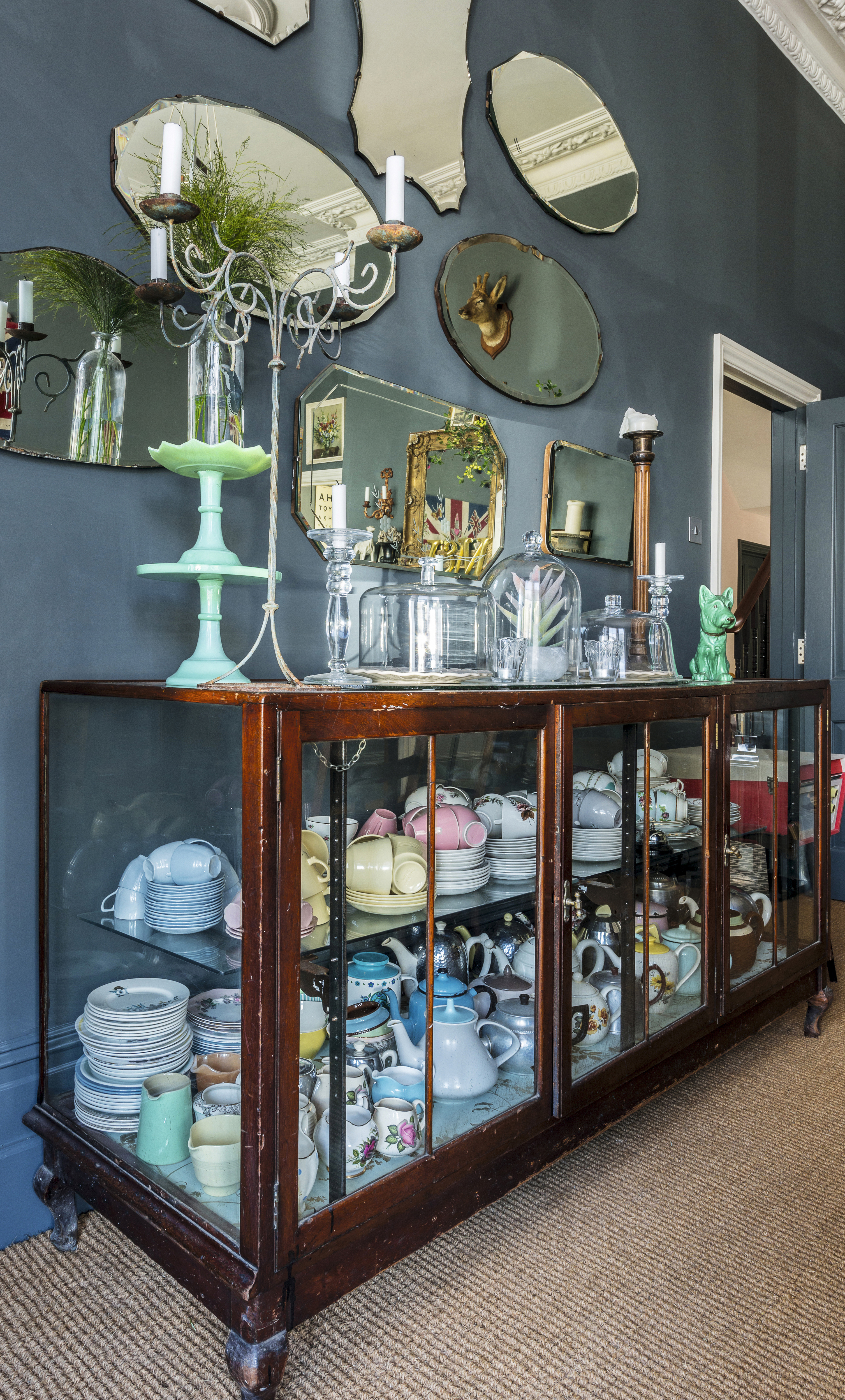
The sideboard from Rupert Blanchard in Margate is perfect for displaying china
Contacts
- Builder: Spencer Lee
- Kitchen: Ikea
- Bathroom: Victoria Plum
- Carpet: Crucial Trading
Join our newsletter
Get small space home decor ideas, celeb inspiration, DIY tips and more, straight to your inbox!