Real home: a contemporary glass box kitchen extension
Adding a modern extension with full-height glazing has transformed Sarah and James Paul's dark basement into a light-filled kitchen-diner that links indoors and out

Get small space home decor ideas, celeb inspiration, DIY tips and more, straight to your inbox!
You are now subscribed
Your newsletter sign-up was successful
Sarah and James love the outdoors, so the chance to buy a spacious semi-detached house backing onto woodland in north London was too good an opportunity to miss.
Project notes
The owners: Sarah Paul, who is currently studying, and her husband James, a hedge fund manager, live here with their 11-year-old daughter Teresa and their two Siberian cats
The property: A six-bedroom, Edwardian semi-detached house in north London
Total project cost: £320,000
But despite the desirability of the property’s location, the interior left a lot to be desired and the couple knew it would need extensive work if it was to become their dream home.
‘In the past, the house had been divided up into flats, and although the previous owners had converted it back into a single dwelling, it hadn’t been done very successfully,’ explains Sarah. ‘The layout felt very higgledy piggledy and there was no sense of flow between each of the different spaces.’
The existing basement kitchen, located in the centre of the lower-ground floor, was a key problem area, with little light and no link to the outdoors. Sarah and James wanted to extend the rear of the house and relocate the kitchen to the new space, where it could benefit from views of the garden.
Find out how they did it, then explore more real home transformations and extensions.

Instead of mirroring the period features of the Edwardian house’s original architecture, the extension contrasts old and new, with a striking brick and glazed design. Glazed doors on the upper-ground floor lead out to a terrace area on the roof of the kitchen
As the couple planned to renovate other parts of the house at the same time, they decided to continue living in their previous home on a nearby street for the duration of the work.
‘We’ve lived through a renovation project before and didn’t want to repeat the experience,’ says Sarah.

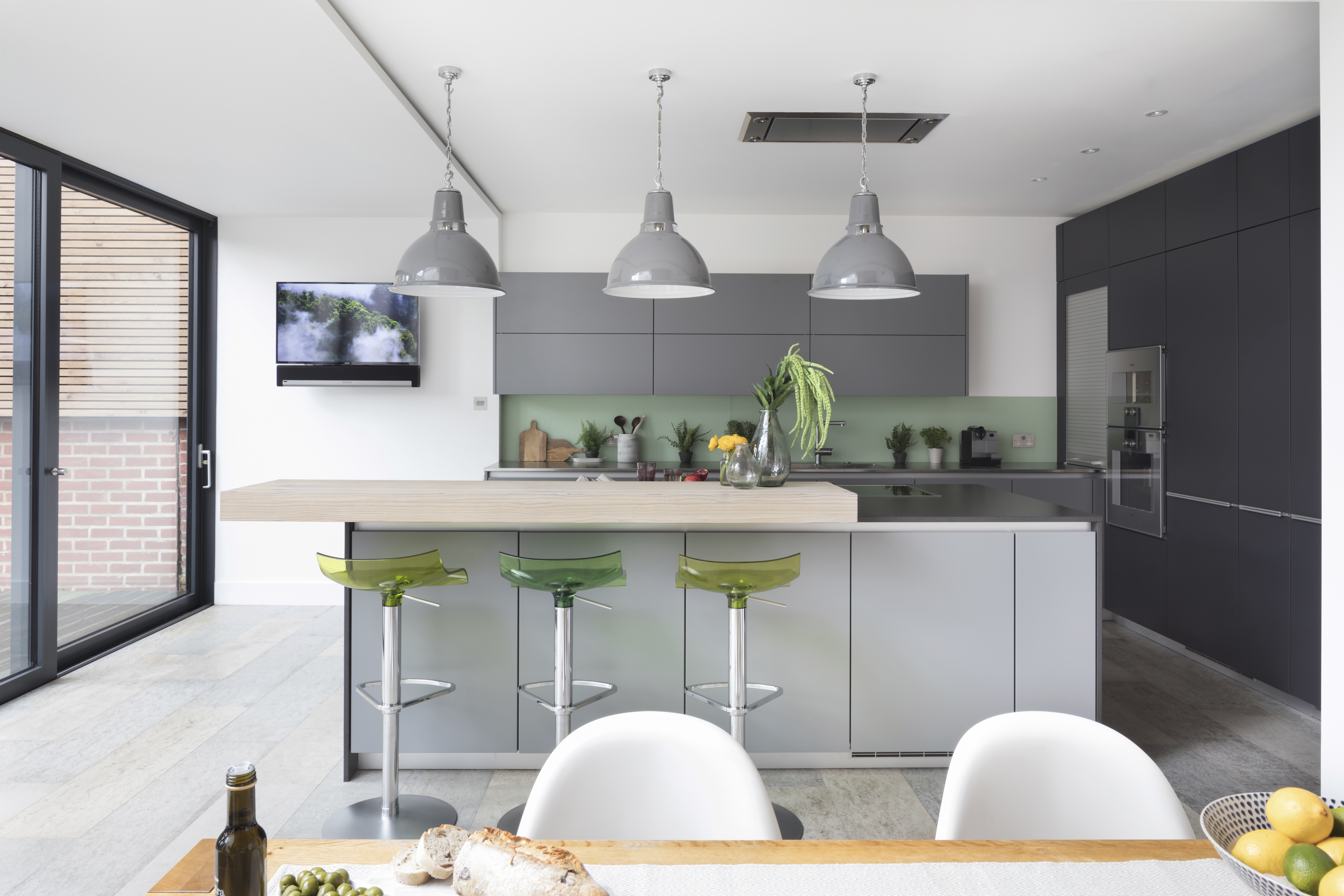
The staggered ceiling heights and wood-clad detailing subtly separate the different areas of the open-plan space into defined cooking and dining zones. The Domed Maxlume pendant lights are from Trainspotters and the Vitra Panton dining chairs are from Heal's. For a similar dining table, try the Lucido table from Heal's
The house is situated in a Conservation Area, so the couple sought an architect to help them obtain the necessary planning permission.
‘We wandered up and down nearby streets and wrote down the names of the architects listed on the boards of homes having building work done, then checked their websites and arranged to meet the ones we liked most,’ explains Sarah. They settled on Andrew Mulroy of Mulroy Architects, and commissioned their builders through the company, too.

Sarah mixed matt handleless units in complementary grey tones with slim worktops and contrasting wooden breakfast bar, all from Poggenpohl Wigmore Kitchens. Pam bar stools, Ligne Roset; the concrete floor tiles in natural grey, from Concreate, are a practical, hardwearing solution for this open-plan space
MORE FROM REAL HOMES MAGAZINE

Want to see inside more stunning homes? Each month, Real Homes magazine features everything from modern extensions to cleverly redesigned family spaces. Get the magazine delivered straight to your door with a subscription deal.
The builders excavated and extended the cramped basement to remove the split-level structure, creating room for an open-plan kitchen-diner extension. High ceilings to one side of the room increase the feeling of space, while a glazed section of roof allows light to flood the room. The modern materials and contemporary sliding doors mean the new addition stands out against the original period property, creating an eye-catching combination of styles.
'We only extended around two metres from the rear of the house, but the extra height makes the entire space feel much bigger than it actually is,' says Sarah. 'Thanks to the extensive glazing and full-height doors, the garden feels like an extension of our home.'
When it came to the fixtures and fittings, Sarah and James decided on a sleek, minimalist look to suit the architecture of the extension. ‘There are very few period features left in the house because previous owners ripped them out, so we decided to keep the area contemporary,’ says Sarah. They finally settled on elegant units in subtle tones of grey from Poggenpohl.

The exposed brick wall adds warmth and texture to the dining area in the new extension
‘We’ve always liked mixing shades of the same colour and grey allows you to do that really easily,’ explains Sarah. ‘It also contrasts well with brighter colours, like the vibrant green bar stools.’

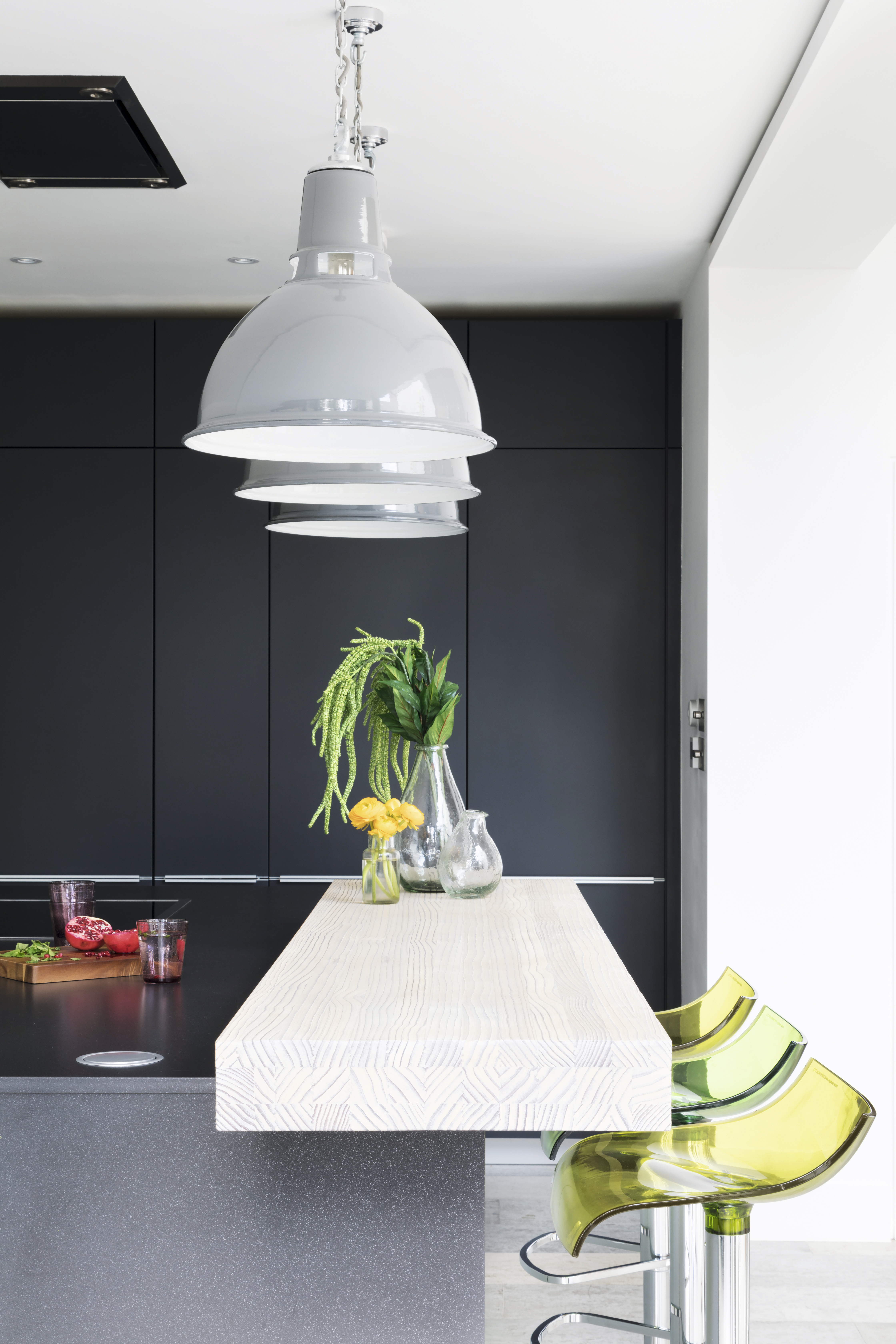
An extra-wide modern induction hob suits the clean lines of the grey worktops, while a contrasting chunky wooden work surface defines the raised breakfast bar area on the island unit.
The modern, light-filled space Sarah and James have created is a far cry from the dark and dated rooms of the original layout.

The industrial-style Dunlop Factory light shades from Trainspotters illuminate the breakfast bar area and throw a warm glow over the kitchen space when dusk falls. Glass vases, The Ginger Pear. Sprays of artificial Amaranthus, Audenza
With contemporary glazing opening up views of the garden and the woodland beyond, the couple can finally fully enjoy the impressive outlook that first drew them to the property.
‘It’s a fantastic space that doesn’t just look great,' says Sarah, 'it also works really well for modern family life.’

The induction hob is flush to the worktop so it doesn’t detract from the sleek lines of the island unit. Hob, dishwasher, fridge, freezer, pyrolitic oven and combi steam oven, all Poggenpohl Wigmore Kitchens
CONTACTS
Architects Mulroy Architects
Kitchen Poggenpohl Kitchens
More real home transformations:
Get small space home decor ideas, celeb inspiration, DIY tips and more, straight to your inbox!