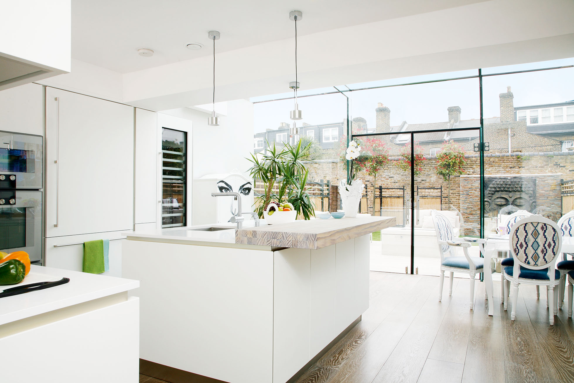
‘We were renting a maisonette in London’s Kensington when we started house-hunting, but soon realised that buying a property in that area would be a stretch,’ says Tatiana. ‘As my hair salon is local, I didn’t want to move too far away, but we looked for a long time with little success.’
Eventually the couple came across a terraced house in Notting Hill and were struck by its huge potential. ‘It had permitted development to create a basement and there was a partially renovated loft,’ says Tatiana. ‘But it had been rented out and was looking a little neglected, with an overgrown garden.
‘We knew it could still be a lovely home with the ground floor opened up and the loft properly converted, so we bought it anyway,’ she adds. The sale went through and the couple stayed in their rented flat while work got underway.'
Find out what they did next, then browse through more real home transformations and discover more about extending a house.
‘First, we hired a structural engineer to assess the viability of excavating the basement. He said it would be a challenge, but possible.’ It now includes a cinema room, home office, utility, two bedrooms, as well as a wellness suite with Jacuzzi.
To find tradespeople, Tatiana asked for recommendations from the builders who had refurbished her salon not long before, and, once an architect was appointed, he made further suggestions.
Shawn visited the site every day to oversee work. ‘It was pretty much an empty shell as most of the internal walls had been removed,’ says Tatiana. When the excavation began, water started to pour into the space, and had to be pumped out while the cement base was poured.
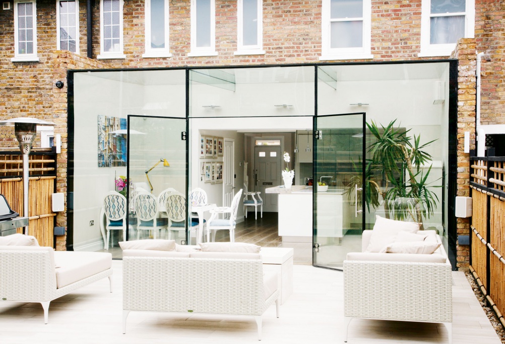
‘We couldn’t predict how long the work would take, and at times it moved slowly, but after seven months things started to take shape.’ On the ground floor, the living room was kept at the front while the old conservatory was knocked down and replaced with a glass-box structure.
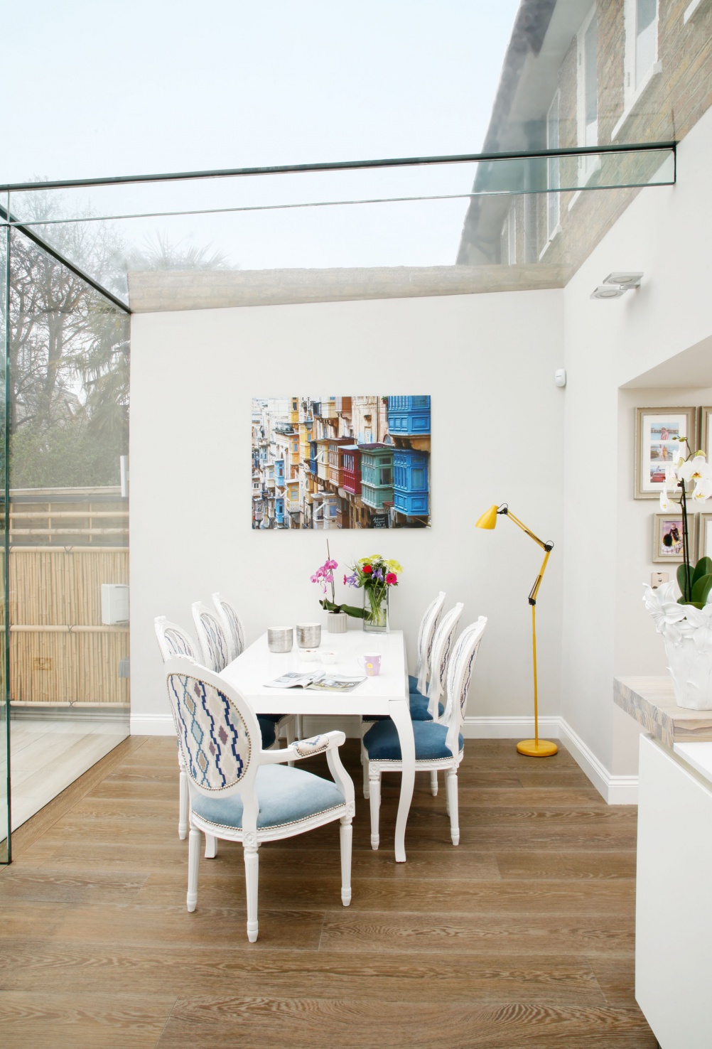
‘A steel beam across the rear has allowed the space to be completely open to the kitchen in the middle,’ says Tatiana, ‘and a wide walkway makes the front living room feel part of it, too.
‘I love how there’s a seamless view from the front door through to the Buddha water feature in the garden,’ she adds. ‘Having so much glazing in the new extension also makes the garden feel like part of the kitchen.’
MORE FROM REAL HOMES MAGAZINE

Want to see inside more stunning homes? Each month, Real Homes magazine features everything from modern extensions to cleverly redesigned family spaces. Get the magazine delivered straight to your door with a subscription deal.
When it came to planning the kitchen, Tatiana and Shawn wanted a contemporary design to complement the sharp lines of the glass extension. ‘We wanted a multifunctional, minimalist space where we can move easily between areas,’ Tatiana explains. ‘It had to be modern, shiny and hi-tech, but also inviting.’
After visiting several showrooms, the couple fell in love with a stunning Italian design. ‘It had the combination of practicality, quality and price that we were looking for, and a good choice of appliances,’ says Tatiana. ‘We opted for handleless units for a streamlined finish, an off-white stone worktop, and a chunky light oak breakfast bar to add warmth.’
The kitchen company advised on the best layout. ‘I knew I wanted a sink in the island so that I could chat to Shawn and friends while preparing food,’ Tatiana says.
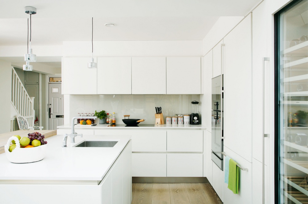
The space has been enhanced immensely by well-thought-out lighting.
The couple sourced all the lighting online, and supplemented their fixed fittings with freestanding table and floor lamps to create atmospheric pools of light in the evening. ‘I like to mix up styles,’ explains Tatiana, ‘so we went for a modern dining table and combined it with Victorian chairs, which I painted and had reupholstered.
Once the kitchen had been completed, Tatiana and Shawn could think about linking the kitchen-diner to the outside.
‘We wanted to create a zen-like space with Asian-style influences,’ says Tatiana,
A year after the project began, the couple were able to move in and start enjoying the space. ‘It was a month before our son Xander was born, so it was just in time,’ says Tatiana. ‘We’re really proud of the space now. It’s great for family life, but also amazing for entertaining. It may look like a small cottage from the front, but, inside, the modern architectural style of the kitchen is quite surprising.’
Images: Alison Hammond
More real home transformations:
Join our newsletter
Get small space home decor ideas, celeb inspiration, DIY tips and more, straight to your inbox!
-
 17 glass extension ideas – light-filled spaces to inspire your project
A glazed extension is a striking addition to any home, whether it's traditional or modern. Be inspired by these beautiful glass extension ideas to start planning your own.
By Hebe Hatton
-
 Glass extensions: how to cost, plan and design a glazed extension
Planning a glass extension? Find project inspiration and specialist advice for your own glazed extension
By Sarah Warwick
-
 Real home: a Victorian mid terrace gets a striking open-plan kitchen extension
Being brave enough to take on a major renovation and extension project has paid off as this once unloved terrace is now a stunning home to be proud of
By Beth Murton
-
 Real home: a terraced home transformed with a loft and rear extension
Along with a team of architects, Matt Jones transformed his house into a bright and open modern home
By Ellen Finch
-
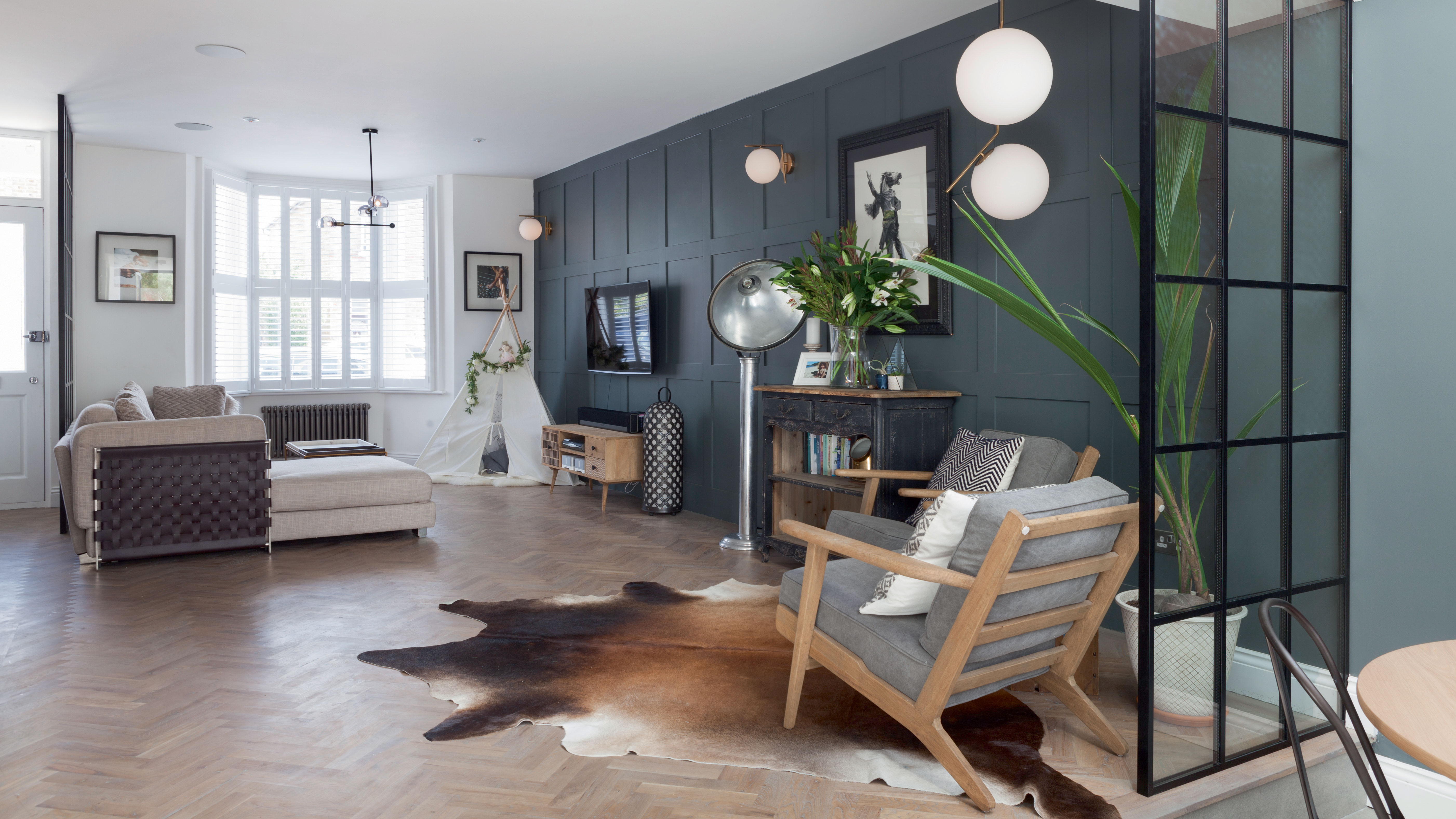 Terraced house design: 11 ideas to transform a Victorian property
These terraced house design ideas offer flexibility and variety. Get an idea of what can be achieved with our pick of amazing transformations
By Lucy Searle
-
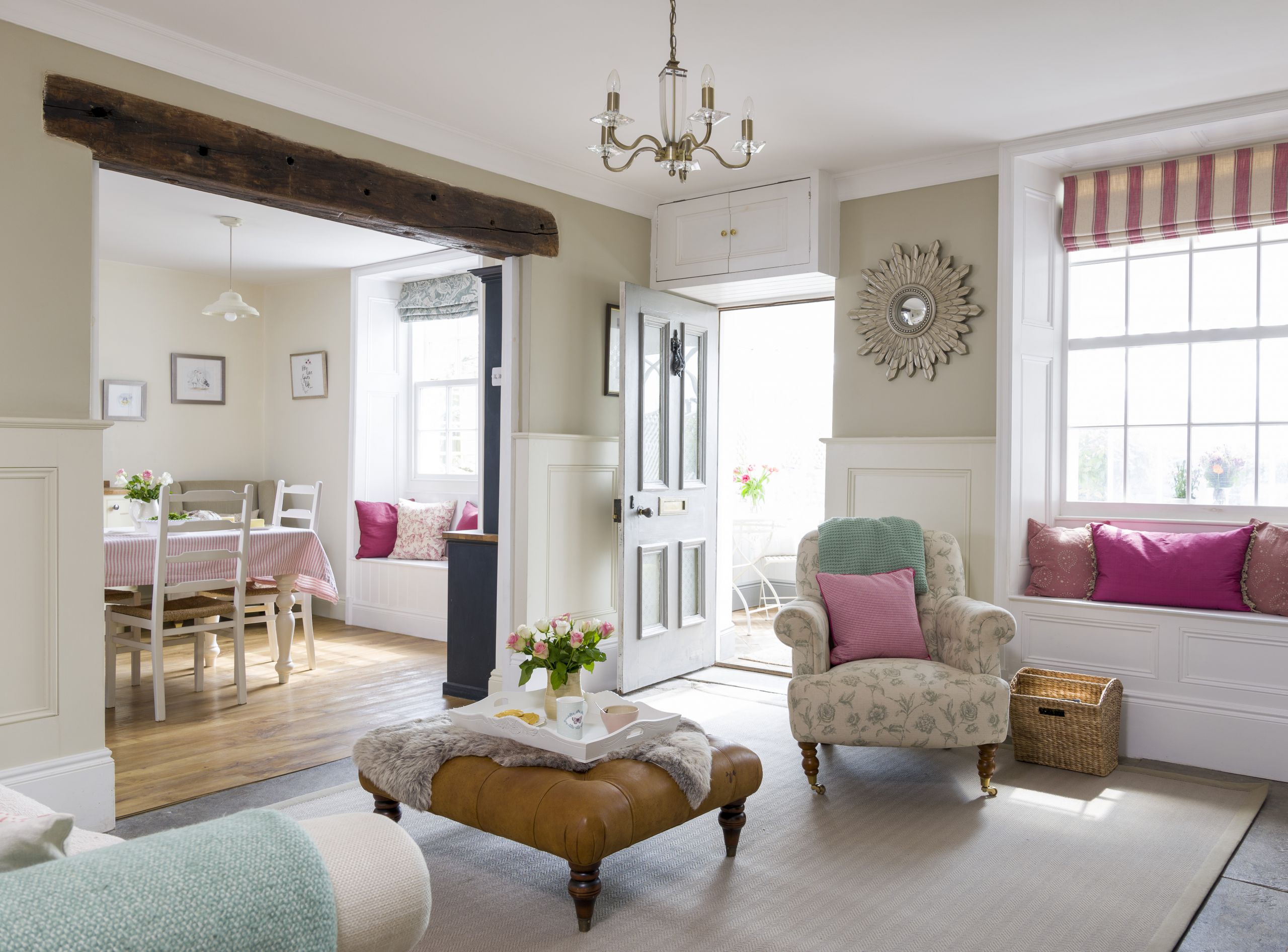 10 traditional open plan room design ideas
If you love period properties and open plan living, be inspired to live life to the full – these homes offer the best of both worlds
By Emily Shaw
-
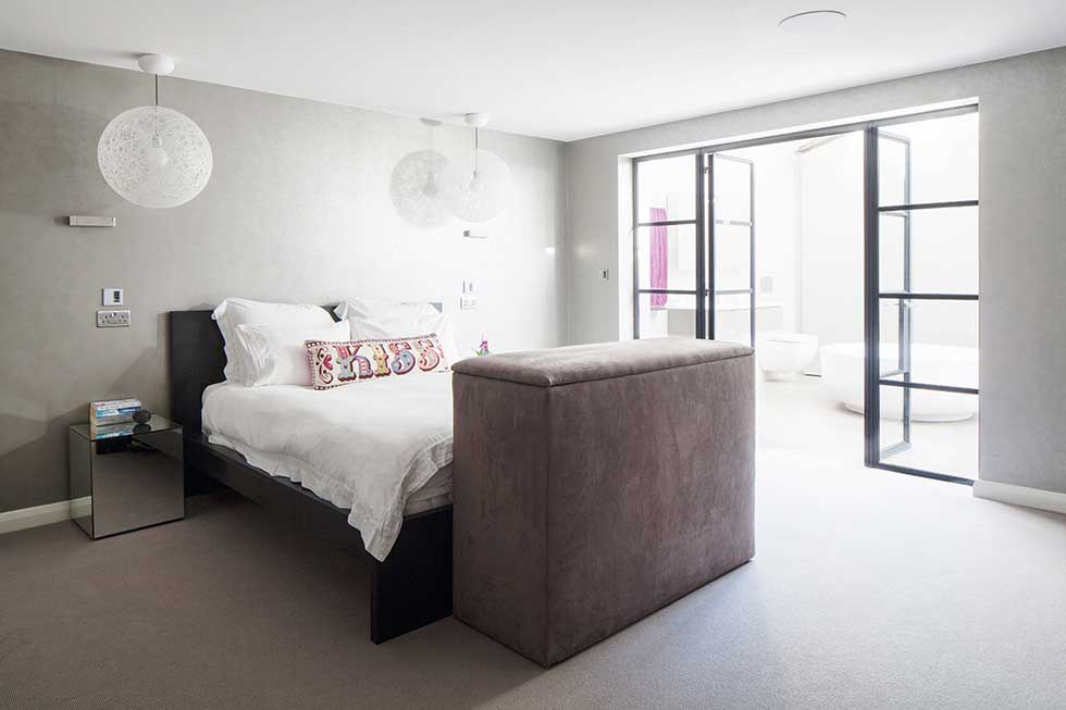 Real home: a redesigned power station penthouse
Danielle Kingdon and Russell Dawkins gutted their top-floor flat in a converted power station to create a more practical layout for accessible living
By Anna Cottrell
-
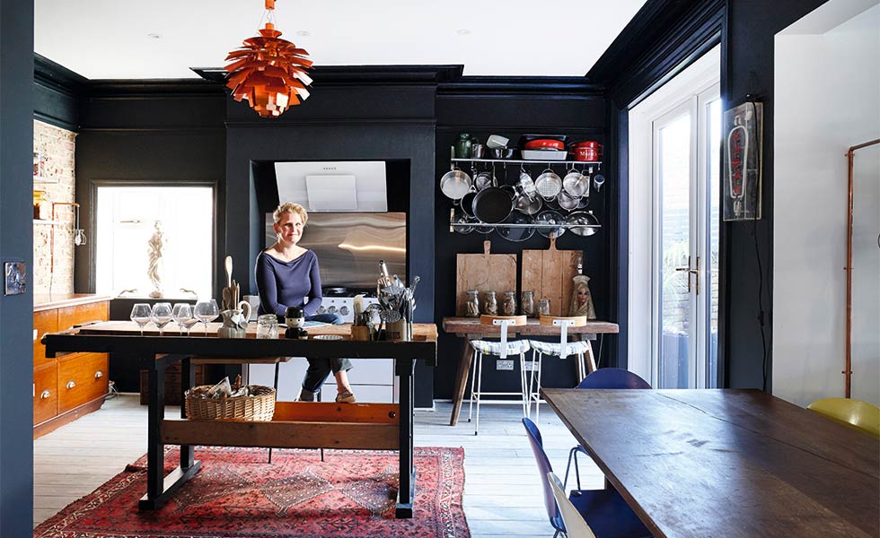 Real home: a colourful Edwardian house renovation
By tackling the project herself, Serena Hunt successfully applied her unique style to a once-run-down Edwardian property
By Beth Murton