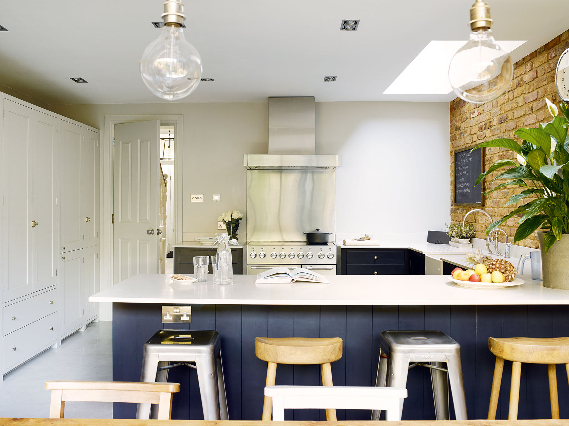

Designing a new kitchen for your home? Be inspired by this kitchen extension, which allowed the owners to create a beautiful kitchen diner with bags of built-in storage and a utility room – and check out all our room transformations for more clever ideas.
In 2013, Jo and Gary Durden decided to entirely remodel the ground floor of their west London home. 'Our boys were constantly coming home with muddy rugby kits, and we desperately needed a utility room, so we took the decision to block off the narrow end of the living room to create a utility space and a larger cloakroom,’ she explains.
‘In order to compensate for having a smaller living room, it made sense to make better use of the back of the house and create a larger family kitchen and dining space.’
Fact file
- The owners: Jo Durden and her husband Gary, a property developer, live here with their two sons, Henry, 13 and Freddie, 11
- The property: A five-bedroom Victorian mid-terraced house
- The location: Chiswick, west London
- What they spent: The couple’s kitchen extension project cost around £78,000
Gary’s work as a property developer meant that he had an architect on hand to draw up plans for the new design, which entailed extending into the side return as well as lengthening the room by taking a metre from the garden. Both Jo and Gary had a very clear idea of what they wanted the new room to
When the couple discovered that their neighbours were planning a similar home extension, they agreed to join forces to source a builder. ‘We thought that it made sense to bring in one team for both sets of works, and it was also useful having two parties looking for the right contractor,’ Jo explains. ‘We obtained a number of quotes before choosing a fantastic builder, John Shopland.’
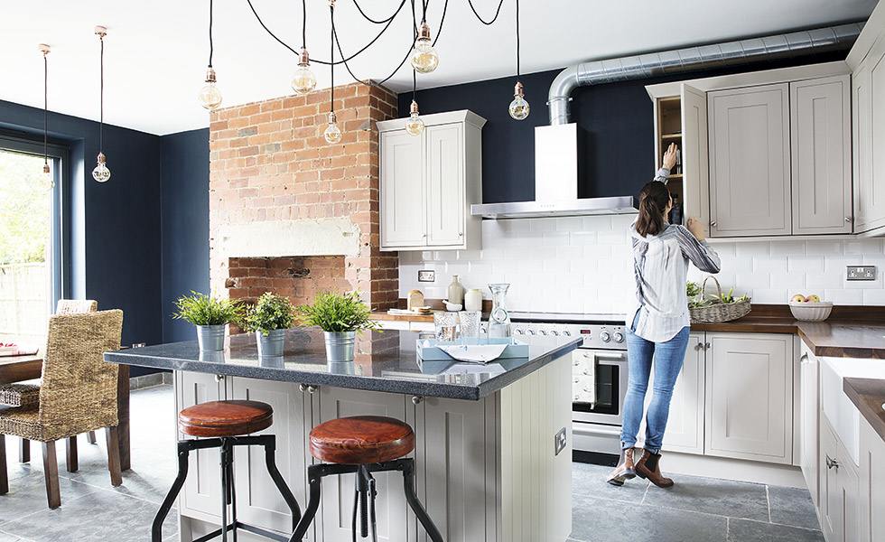
The contractor was able to start on the neighbours’ extension first, while Jo and Gary finalised their plans. Their previous kitchen, installed soon after they bought the property, had been a glossy white design, but this time Jo wanted to source simple Shaker units that she could team with industrial features for a contemporary edge. A pared-back Suffolk design by Neptune provided the look she was after.
The building work started in July 2013 and took just over five months, during which the family lived in the first and second floors of the house. ‘At first we didn’t have a kitchen at all, but once the new utility was created, we were able to have a makeshift cooking area in there,’ Jo recalls. ‘The builders were great, but even so, it was quite a challenge. The upside, though, was that I was on site every day and able to make decisions quickly.’
While Jo was eager to hunt down many of the fittings herself, she also felt that she needed some guidance, so called in Nicola Pratt of LIFE Style as a project manager. ‘I’d seen some of Nicola’s projects and really liked her style,’ says Jo. ‘She was brilliant at interpreting my ideas and helping me to create the look I wanted.’
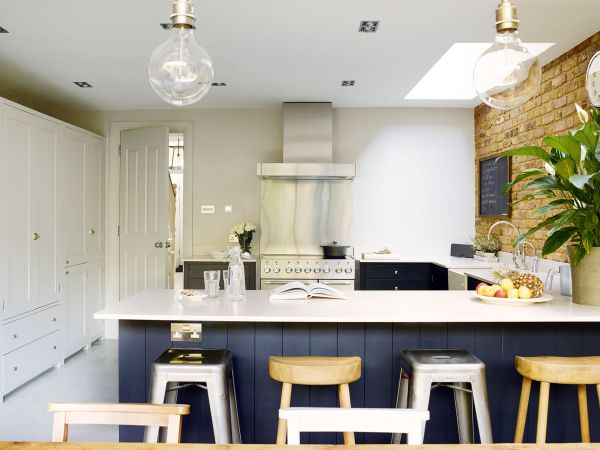
The couple’s old kitchen was a U-shape, and Nicola proposed a similar layout, but making use of the new, wider dimensions, ensuring an unobstructed passage from the doorway through to the garden, while one end forms a sociable breakfast bar, dividing the kitchen and dining space.
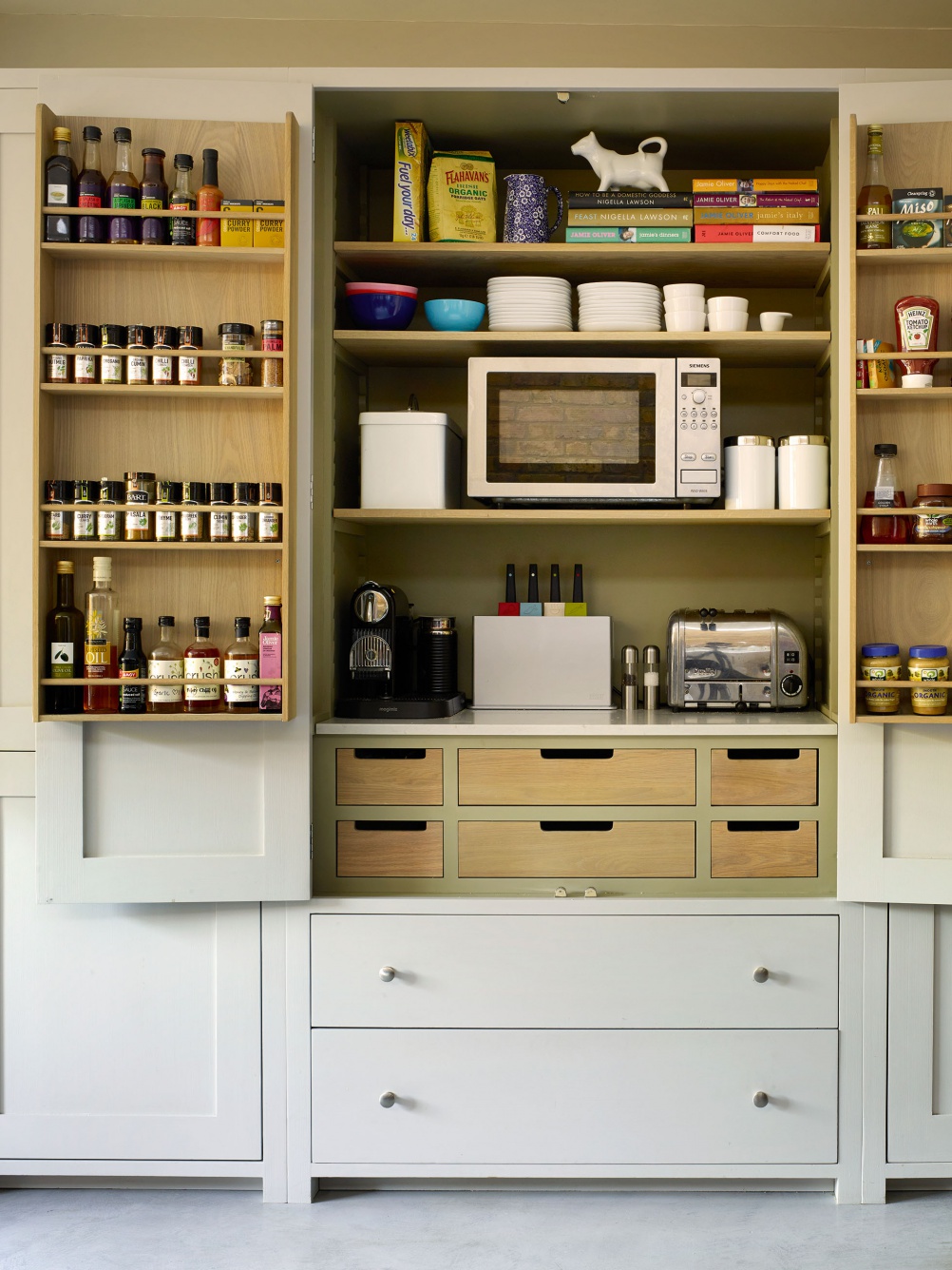
Along the opposite wall is a bank of tall cupboards housing larder units and the fridge-freezer. ‘I specified a lot of storage,’ says Jo, ‘and I now have so much that some of the cupboards are still empty!’
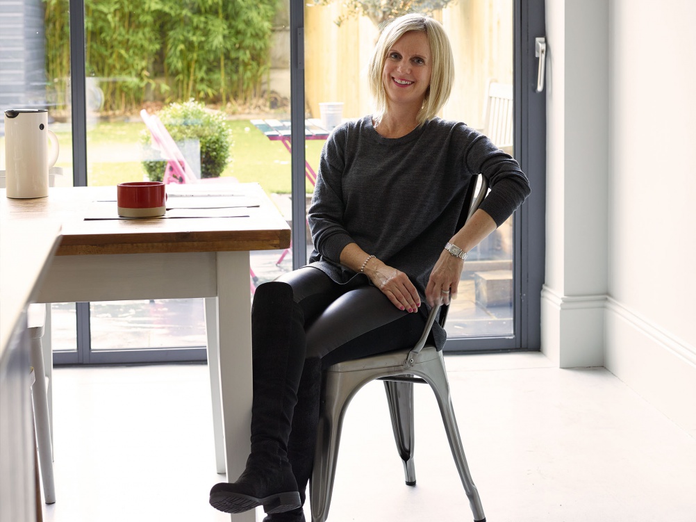
Jo admits to favouring a monochrome palette: ‘I don’t really go for bright colours!’ So, to prevent the space becoming cold, Nicola suggested natural materials, such as brick, timber, concrete and glass. ‘The brick wall adds character, and stops it from becoming a pale grey box,’ says Jo. ‘The worktops are composite stone but look exactly like Carrara marble – plus they’re easier to maintain than the real thing.’
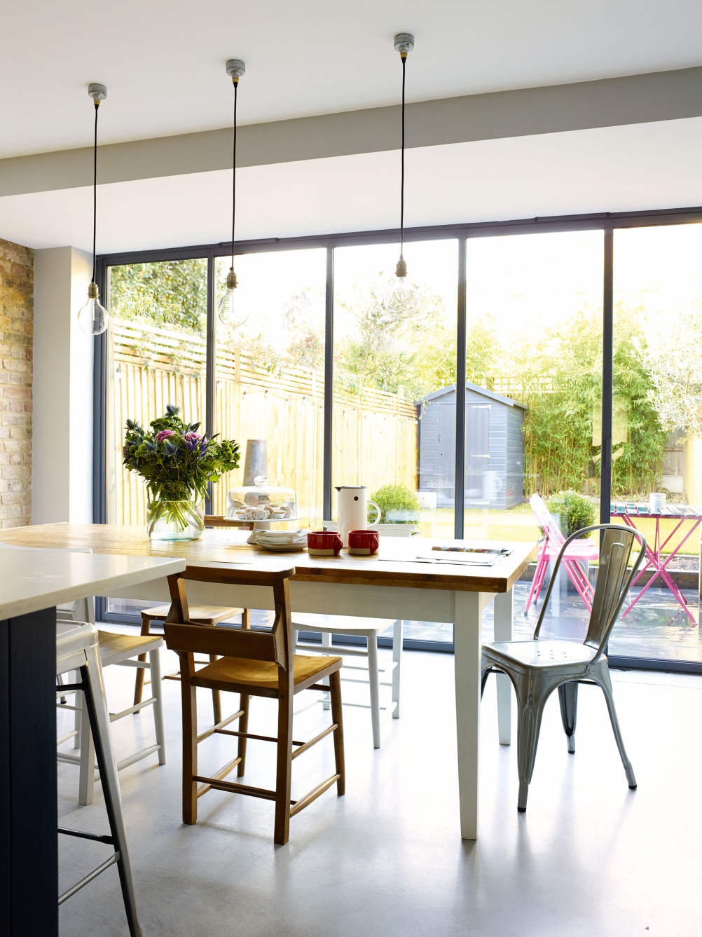
The bank of cupboards is the same warm grey as the walls, while the other units, in a smart dark navy, provide contrast. The polished concrete floor, with underfloor heating, adds to the palette of subtle greys – its smooth surface proving popular with the couple’s sons for skateboard practice.
Light-filled and spacious, the new kitchen is now a multifunctional room the whole family uses. ‘I must admit that with my new range cooker, I enjoy cooking more,’ Jo adds. ‘With a space like this,it somehow makes it a lot easier.’
Project notes
Follow Jo Durden’s advice for redesigning your kitchen
My top tip
‘I went through stacks of interiors magazines to create a folder of tear sheets that gave me ideas for the style of the space. This really helped me to show Nicola from LIFE Style the look I wanted to create.’
Design idea
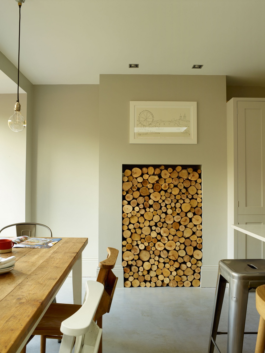
‘As the new underfloor heating was so efficient, we realised that we wouldn’t get much use out of the planned wood-burning stove. Instead, we decided to fill the chimneybreast with decorative logs from the Little Log Company.’
My go-to website
‘Urban Cottage Industries has an excellent range of industrial-style lighting, and you can customise lamps with different fittings – the choice of flex alone is astonishing. We chose the Factorylux “Made for You” Simple pendant lights.’
I particularly love…
‘…the fact that this is now a much more sociable room. Having a bigger space means that it’s easier to entertain friends. I’m also cooking a lot more – and I think I’ve actually become better at it!’
My best buy
‘I did a lot of research to find the thin-framed aluminium slide and pivot doors (right). They were expensive but worth it, as they let in lots of light and don’t obscure the view of the garden.’
If I could do it again…
‘…I would try to live off site during the work. Being without the extra space for nearly six months was quite a challenge!’
The costs | Row 0 - Cell 1 |
| Building work | £38,500 |
| Kitchen cabinetry and installation | £22,000 |
| Slide and pivot doors | £6,000 |
| Appliances | £4,140 |
| Work surfaces | £3,000 |
| Flooring | £2,400 |
| Lighting | £1,200 |
| Sink and taps | £650 |
| TOTAL | £77,890 |
Author: Rachel Leedham
Love this kitchen? More ideas here:
- Shaker kitchens: design tips and 12 ideas to create your classic kitchen
- How to paint kitchen cabinets
- How to plan a kitchen extension
Join our newsletter
Get small space home decor ideas, celeb inspiration, DIY tips and more, straight to your inbox!
-
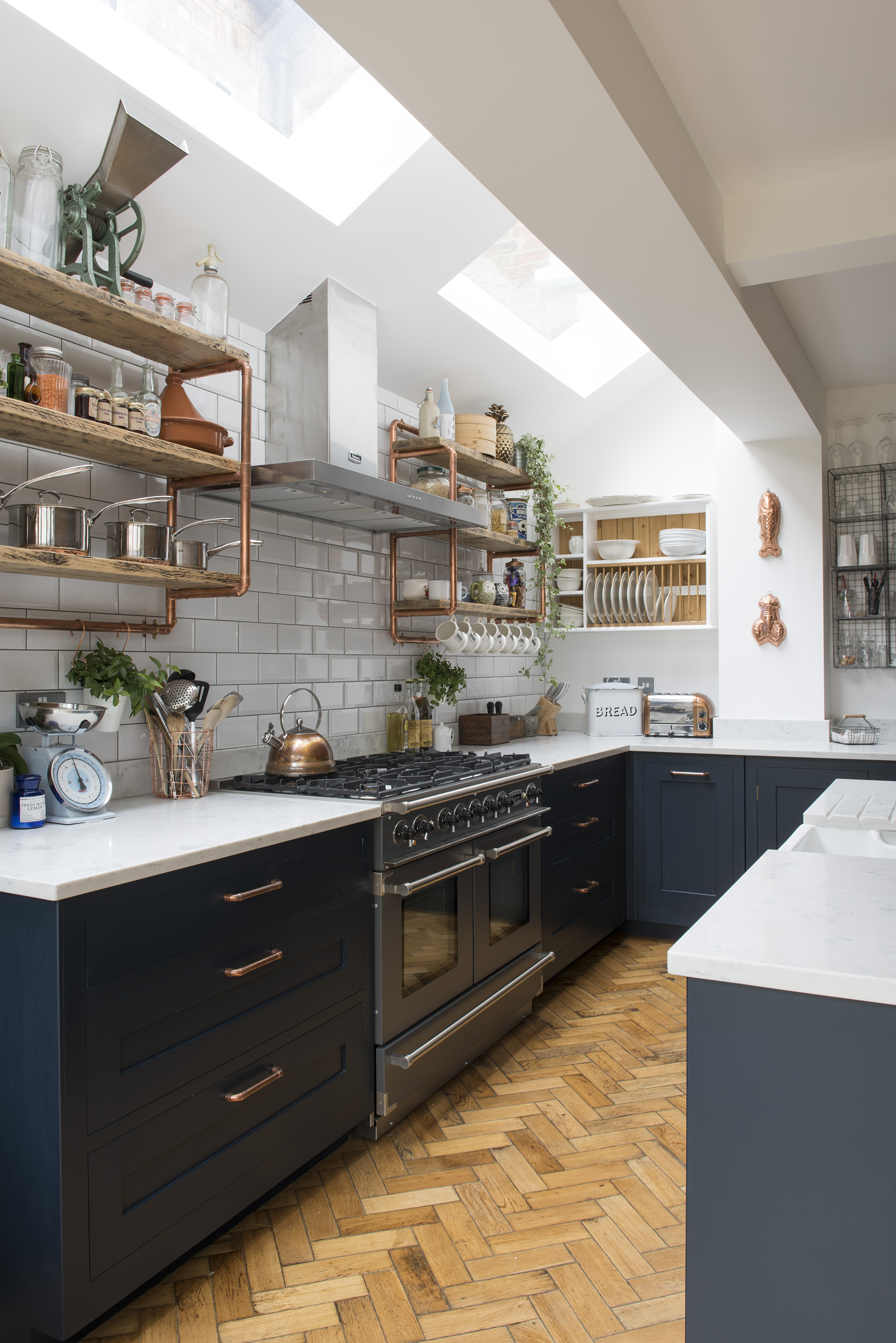 Georgian and Victorian kitchen inspiration: how to design and style yours
Whether humble and informal or elaborate with an air of grandeur, the best kitchens in Georgian and Victorian homes share key design elements that exude period charm
By Linda Clayton
-
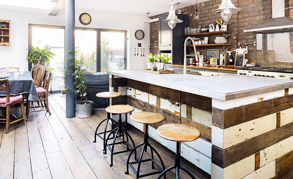 Real home: an industrial-style renovation of a Victorian terraced home
Pippa Mundy gacve her Cardiff Victorian terraced house a unique and industrial look with reclaimed furniture and materials
By Laura Crombie
-
 Kitchen case study: Creating an industrial-style kitchen-diner
Knocking two rooms into one has allowed Olivia and Daniel Lynan to create their dream kitchen-diner with simple industrial touches
By Laura Crombie