
Making the decision to hire an architect is often a case of weighing up the pros and cons. On the one hand, it’s an additional expense. On the other hand, if you choose well, you’ll receive guidance on everything from planning restrictions to layout and design, all while taking your own ideas into account. The end result will be a functional, fluid space that works perfectly for your lifestyle.
That’s exactly what Vanessa and Paul found when they hired Paula of Butterfield Architecture to help them design an extension to their Edwardian semi. With a background in design, Vanessa had plenty of ideas for how the space should look, but Paula’s skills were invaluable in making the space work for them and dreaming up solutions the couple had never thought of themselves. As a result, the family have a stunning, sociable kitchen-diner stamped with their unique take on an industrial scheme. Below, Vanessa explains how they created this wonderful space and don't regret hiring an architect, one bit.
A radical change
Profile
The owners Vanessa Stevens, a textile designer, her husband, Paul, a finance business partner, and their son, Lewis
The property A three-bed Edwardian semi near Manchester
Project cost £70,000
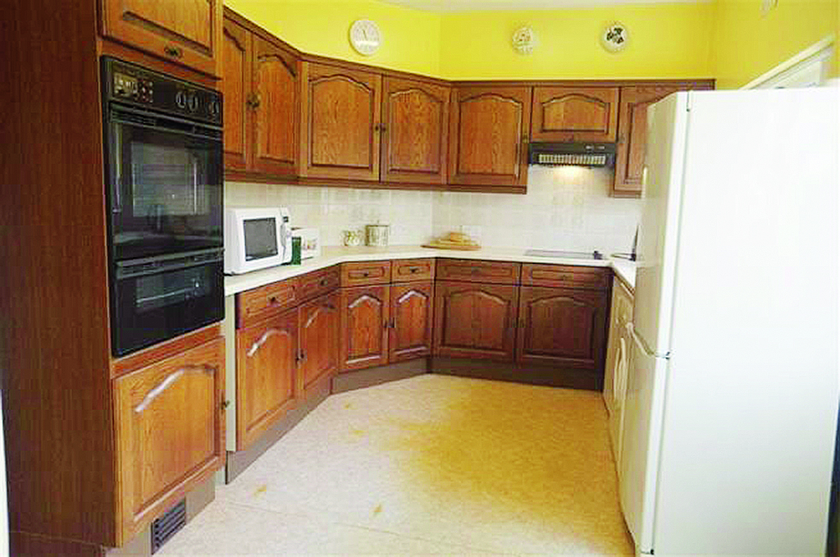
‘This house was owned previously by two 85-year-old brothers, who’d lived here all their lives,’ says Vanessa. ‘When we moved in, the kitchen was poky, with a small pantry and an outside coal bunker. Our main aim was to make the space more family-friendly; we wanted a sociable kitchen-diner. We live in a very green area and we wanted to take advantage of that by bringing it in through the back of the property.
‘As there weren’t any particularly interesting features at the rear of the house, we thought it’d be nice to do something completely radical with an extension. Architect Paula Butterfield is local to us; we loved her designs, so we hired her to work with us.’
Professional input
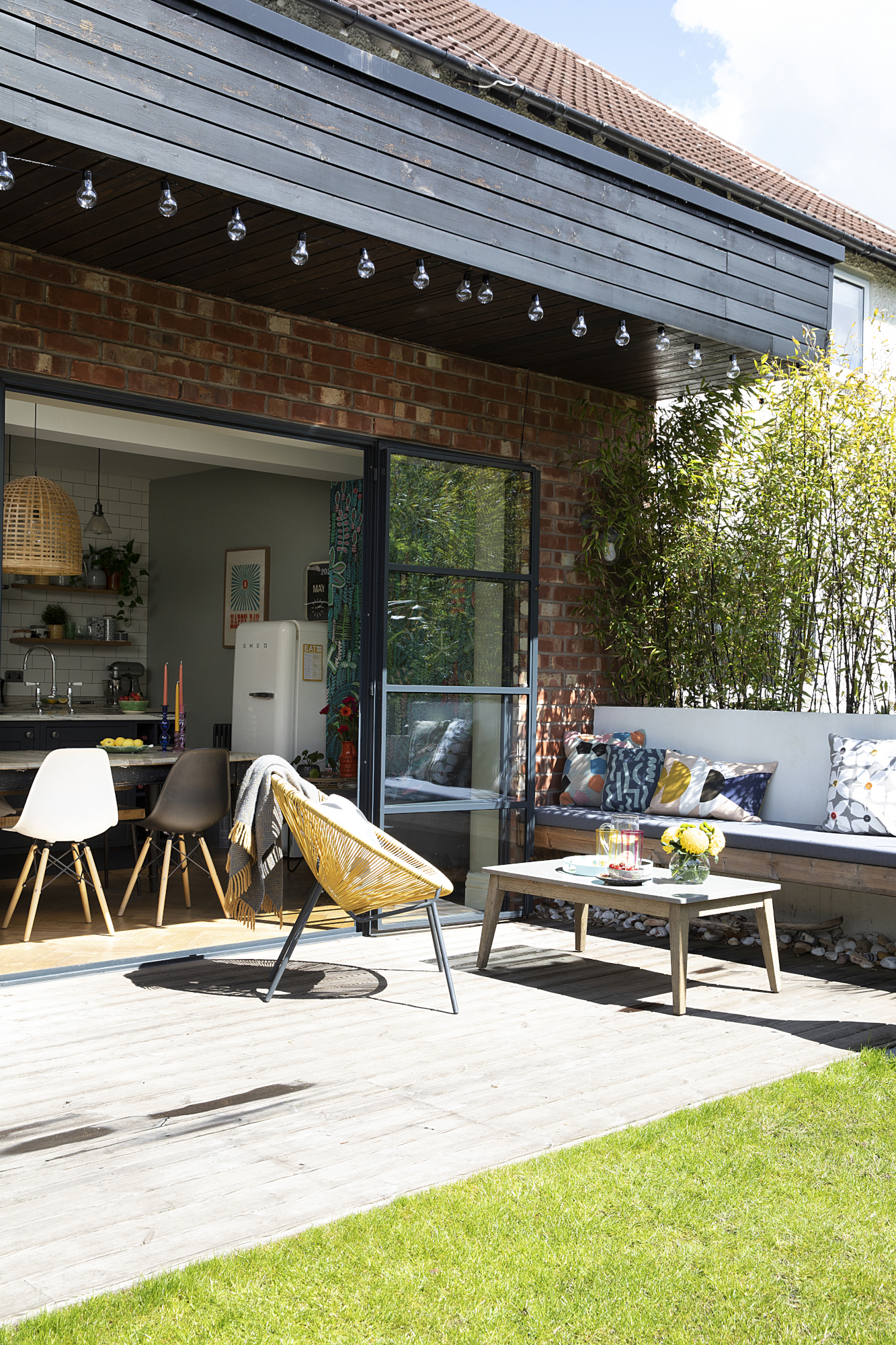
Crittall doors, John Knight Glass. Decking, Benchmark Timber. Chair, John Lewis & Partners. Seating built by Andy Lewis Landscapes. For festoon lights, try Lights4fun. For a similar wood burner, try the Morsø Kamino
‘I’ve always liked wood clapperboard-style extensions and thought it would work well as a mixed-media look along with traditional brickwork and metal door frames. We also knew we wanted Crittall windows and doors in the space. We rented while the work was done – I’ve experienced the dust and dirt that comes with a renovation in the past, so I knew to stay away!
‘Paula’s input in terms of layout was invaluable. We wanted an island, but a chimney stack in the corner took a decent chunk off the back of the wall and made it difficult to run units along. Paula moved the door on the back wall and took the chimney stack out to create the layout we wanted.’
Long-lasting style
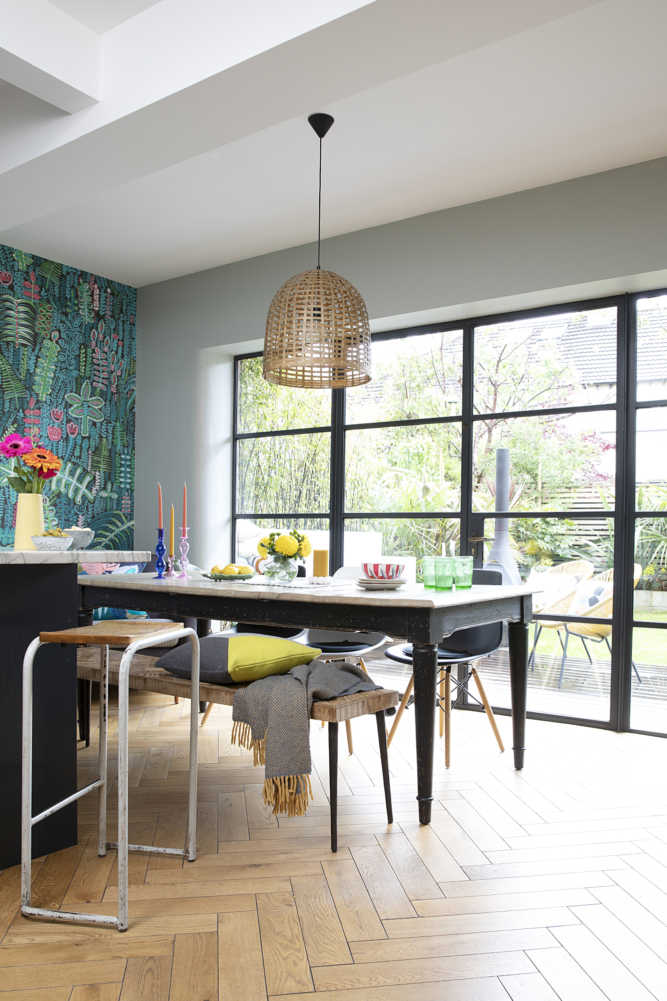
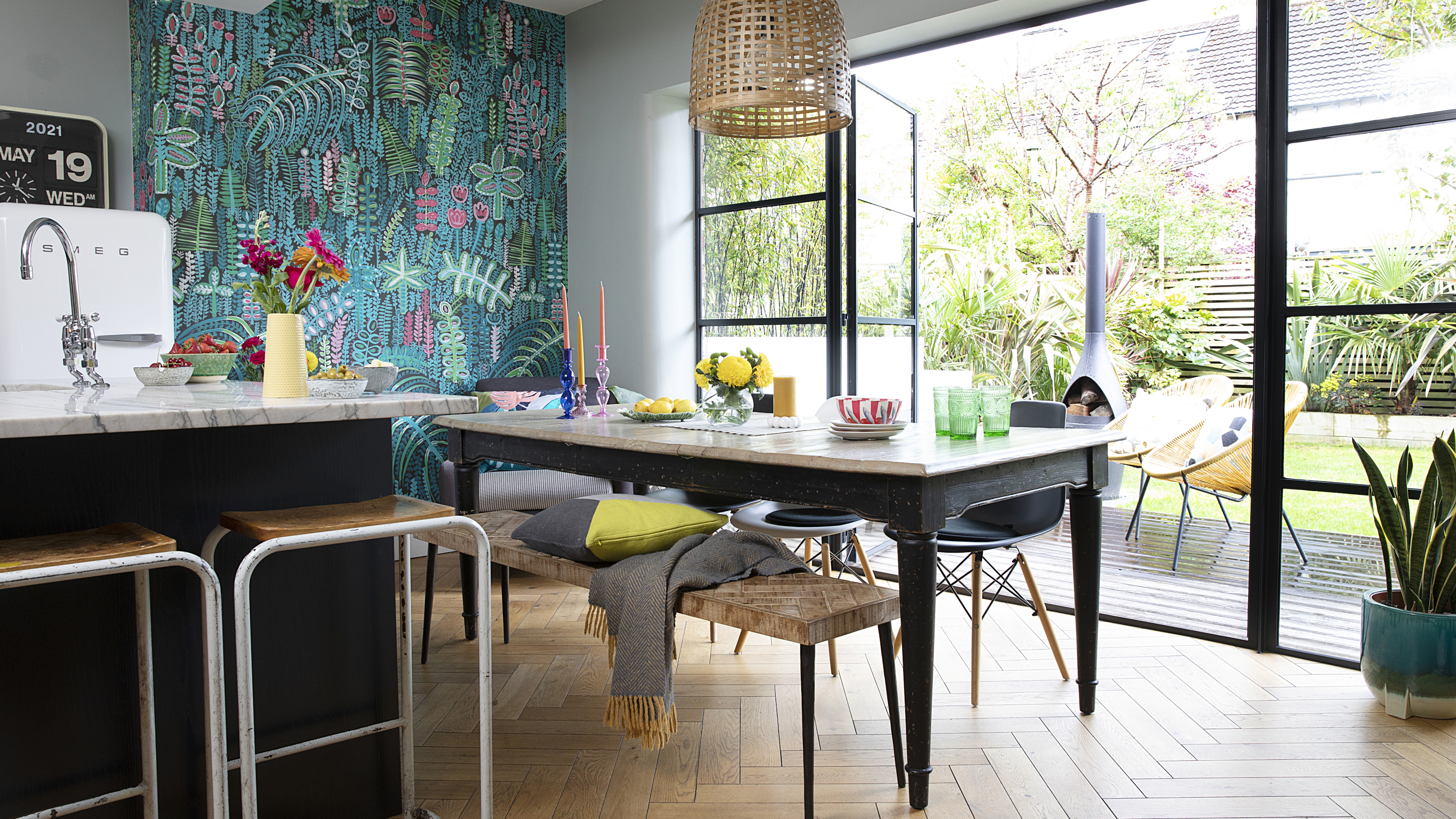
Pendant light, Rockett St George. Table, Loaf. Bench, Graham & Green. Chairs, Cult Furniture
‘Back in 2016, the industrial look was just coming through. It was all about dark kitchen units, glass, rattan and metro tiles. It had quite a fresh new feel, and we ended up going down that route for the kitchen. It contrasts with the rest of the house. If I was braver at the time, I might have exposed the beams, but I thought it might be too industrial for an Edwardian home.
‘The style has had longevity, to be honest. Friends who are remodelling their kitchens now will come and say, “Oh, we’re looking at flooring like that” or point out the units. In a way, it’s a bit of a blank canvas – the fixtures and fittings have changed, with more brass and gold than there was at the time.’
Design decisions
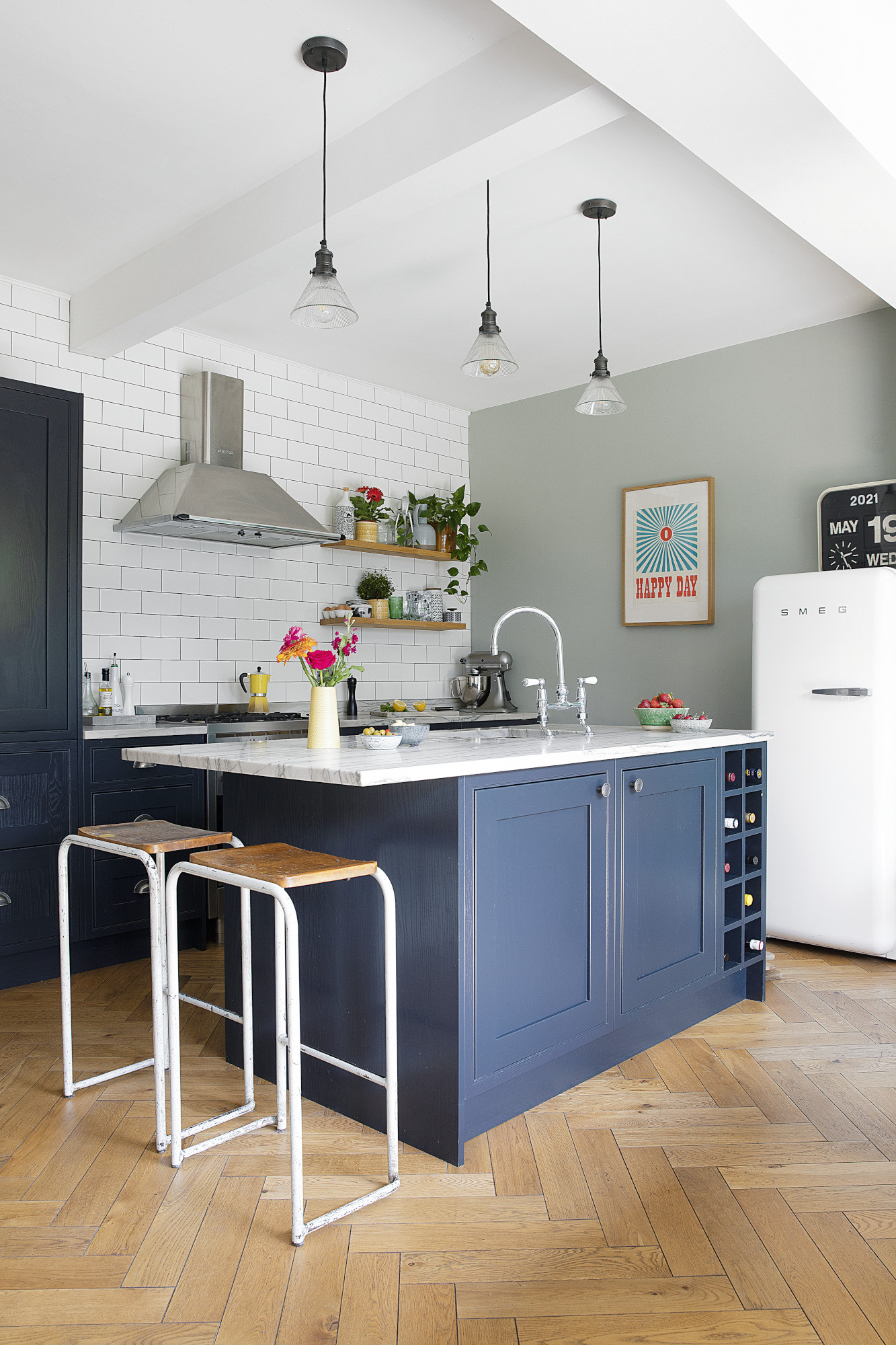
The bar stools are science lab stools from the University of Manchester. Units, DIY Kitchens. ‘Happy Day’ print, Rockett St George. Wall painted in Light Blue, Farrow & Ball. Pendant lights, Industville. Flooring, Ted Todd
Costs & contacts
Build work £40,000
Fixtures and fittings £17,000
Furniture and décor £10,000
Professional fees £3,000
Architect Butterfield Architecture
Landscaping Andy Lewis Landscapes
Kitchen DIY Kitchens
‘For the garden, we went for as many tropical plants as we could get away with in Manchester. The wallpaper, which we chose later, ties in with it. Working in design and fashion, you constantly see trends change. I’d seen and liked this paper for a while, though, and I figured that as I hadn’t got sick of it yet, it was a good sign!
‘There’s always been a bit of a battle of the wills – with Paul being a finance business partner, I’d often have my designer budget reined in by the purse strings. If we could, I’d have created as big a utility room as possible. The one we have is adequate, but I sometimes wish it was three times bigger to fit everything in.’
Outdoor connection
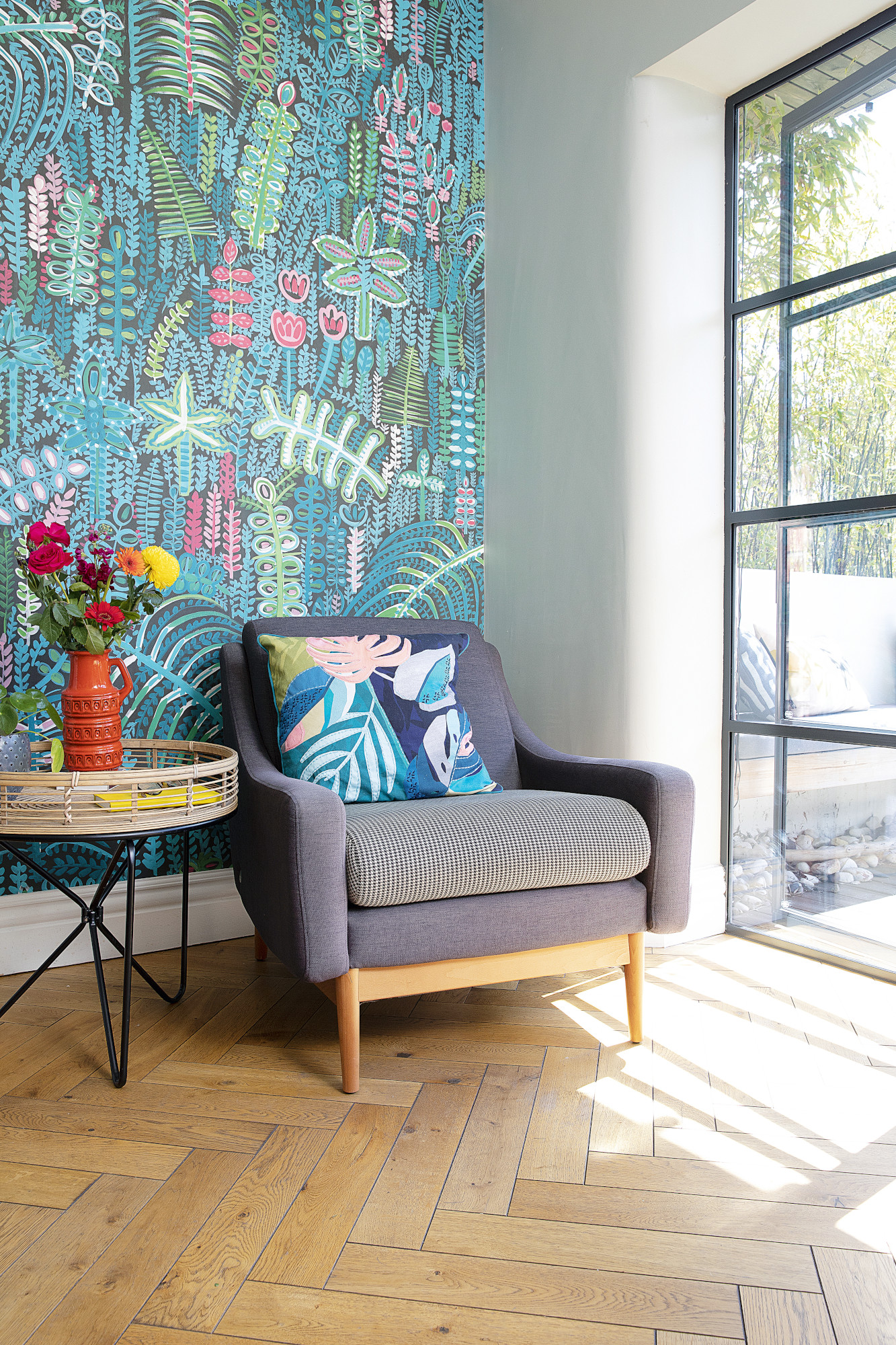
Wallpaper, Lucy Tiffney. Armchair, John Lewis & Partners
‘My favourite part of the space is definitely the doors. When we came to designing the garden afterwards, I was really glad we’d raised the deck level to be flush with the floor – I love the way it flows seamlessly between the spaces. It’s lovely sitting at the table with the doors wide open. The sun hits the floor and creates all sorts of reflections and shadows.
‘This is such a sociable space; the connection to the garden makes it feel like an extension to the kitchen. It suits the way we live now to a tee. In the winter, we’ll hibernate at the front of the house – but come summer, the garden becomes our lounge and we live in the kitchen-diner.’
Subscribe to Real Homes magazine
Want even more great ideas for your home from the expert team at Real Homes magazine? Subscribe to Real Homes magazine and get great content delivered straight to your door. From inspiring completed projects to the latest decorating trends and expert advice, you'll find everything you need to create your dream home inside each issue.
Join our newsletter
Get small space home decor ideas, celeb inspiration, DIY tips and more, straight to your inbox!

Formerly deputy editor of Real Homes magazine, Ellen has been lucky enough to spend most of her working life speaking to real people and writing about real homes, from extended Victorian terraces to modest apartments. She's recently bought her own home and has a special interest in sustainable living and clever storage.
-
 Planning makes perfect when designing this dream home
Becks and Martin Huntley spent lots of time on design and layout to get the most out of their space when renovating
By Karen Wilson Published
-
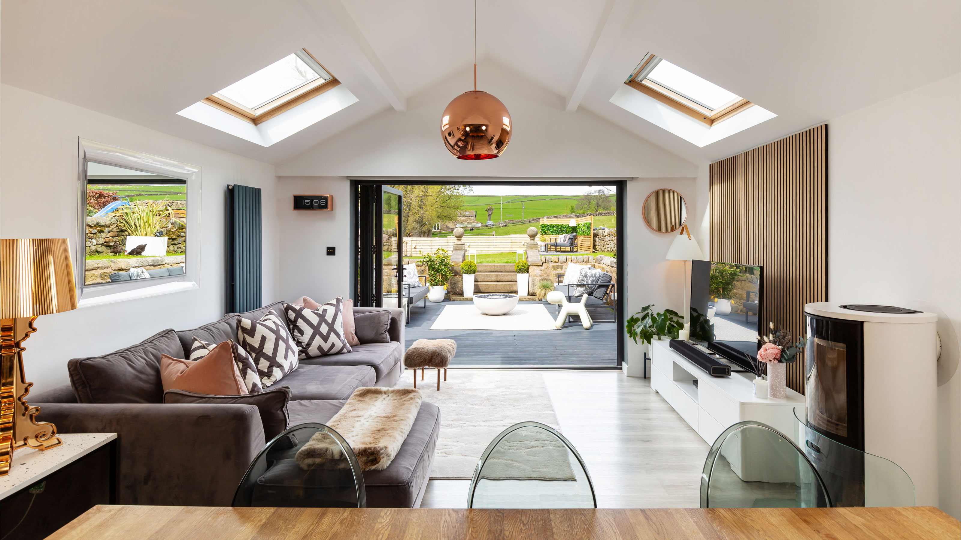 Interior design enthusiast's converted farm home is a showcase for luxe style
Sam Marlow, the founder of Lime Lace, used all her skills to give the renovated period property a signature look
By Alison Jones Published
-
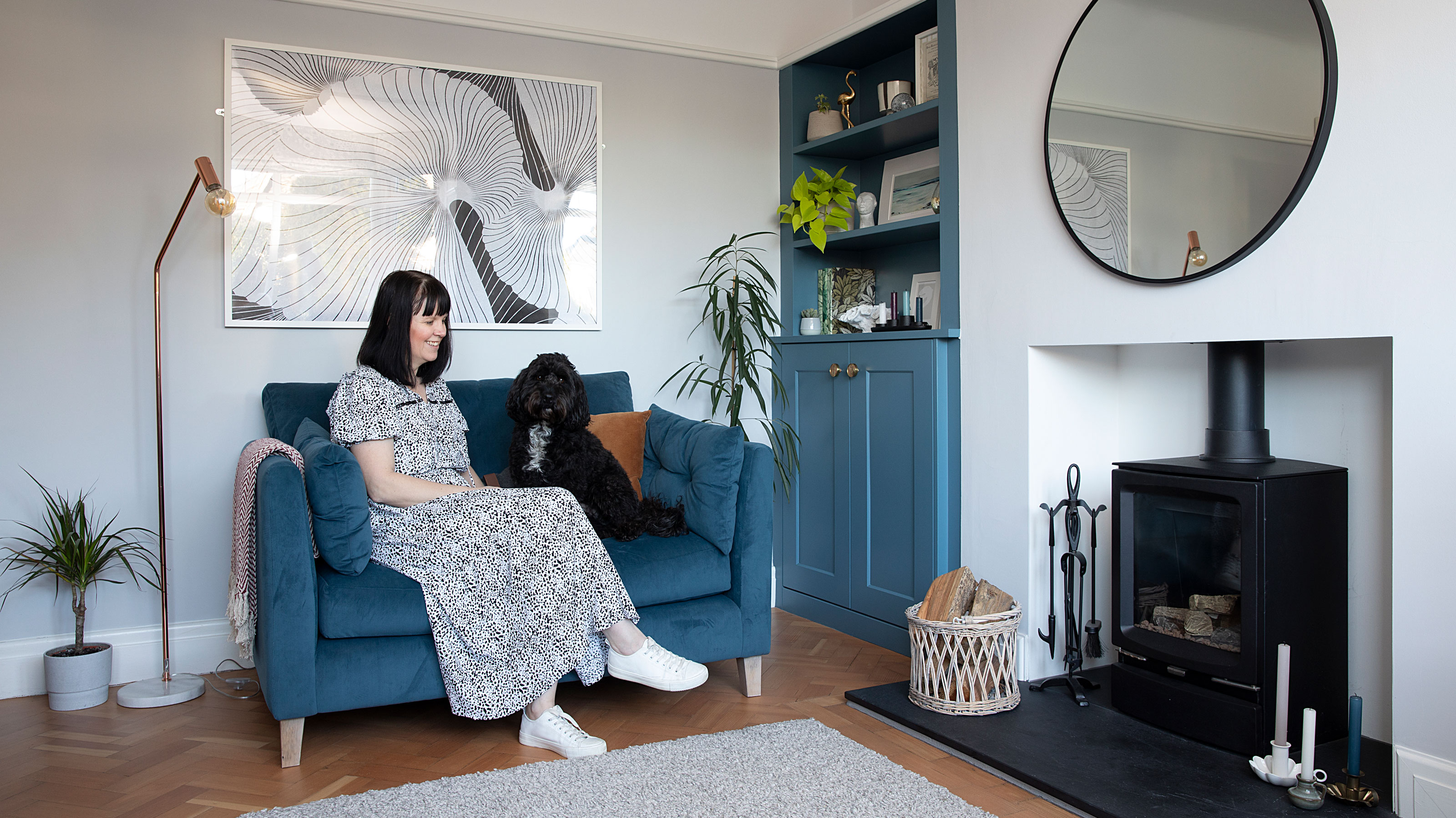 Real home: Long-term extension project creates the perfect family space
Kate and Adam’s three-pronged renovation took over a decade – but was well worth the wait
By Karen Wilson Last updated
-
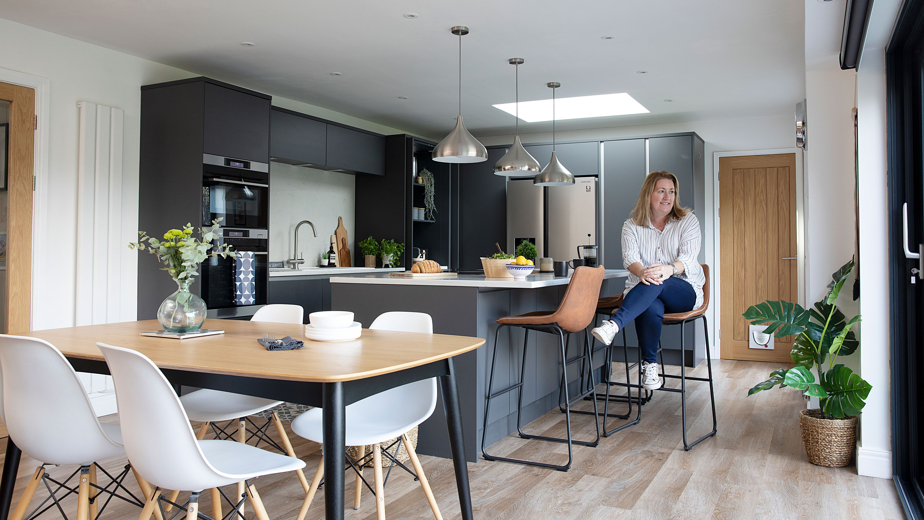 Real home: knocking through for more space without extending
By knocking together a warren of disjointed rooms, Patsy and Al have created a new hub to their home without needing to extend
By Karen Wilson Last updated
-
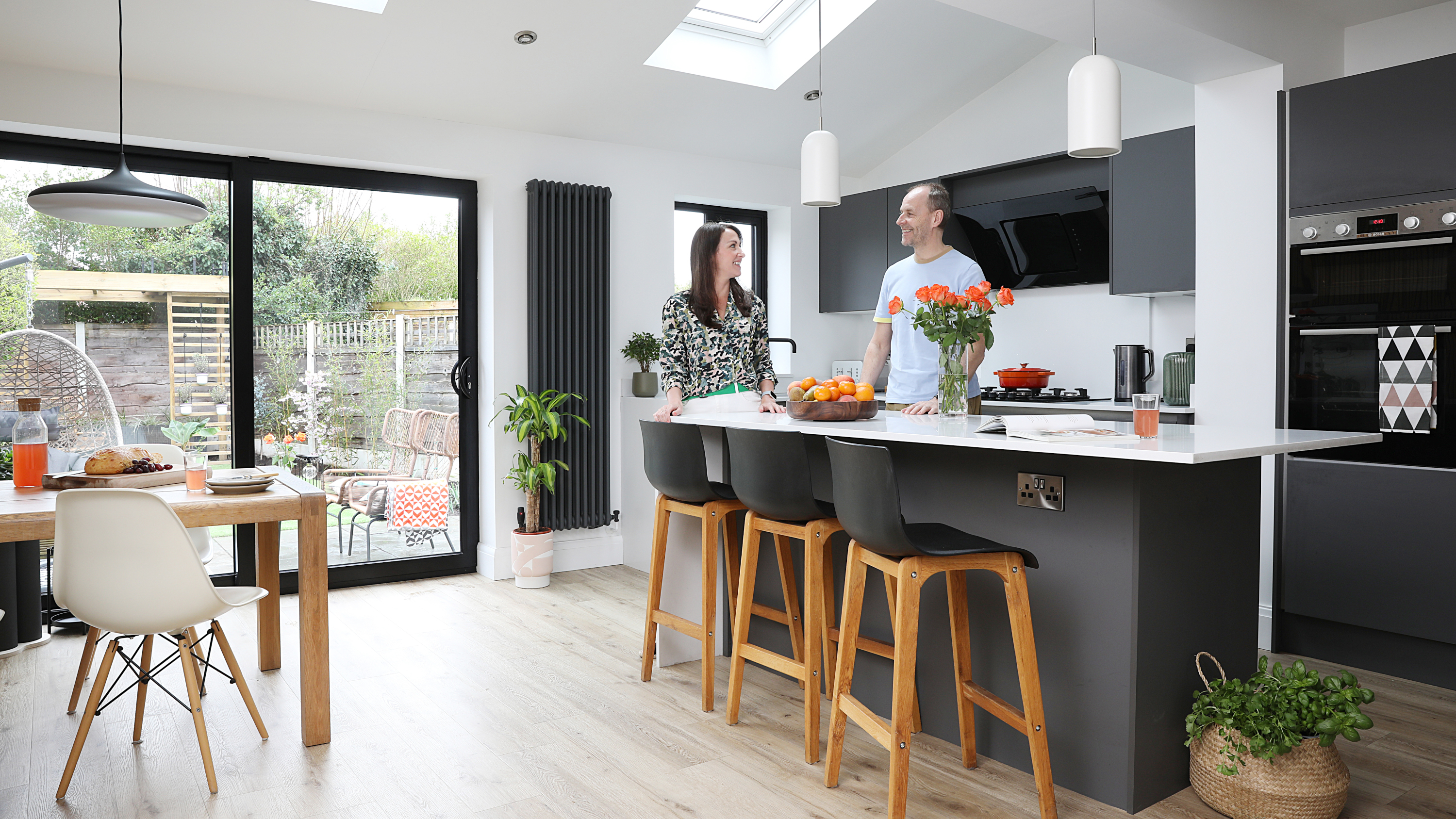 Before and after: an extended 1930s home with quirky creative touches
After a side and rear extension and a full-blown makeover, this house is fit for a family
By Karen Wilson Published
-
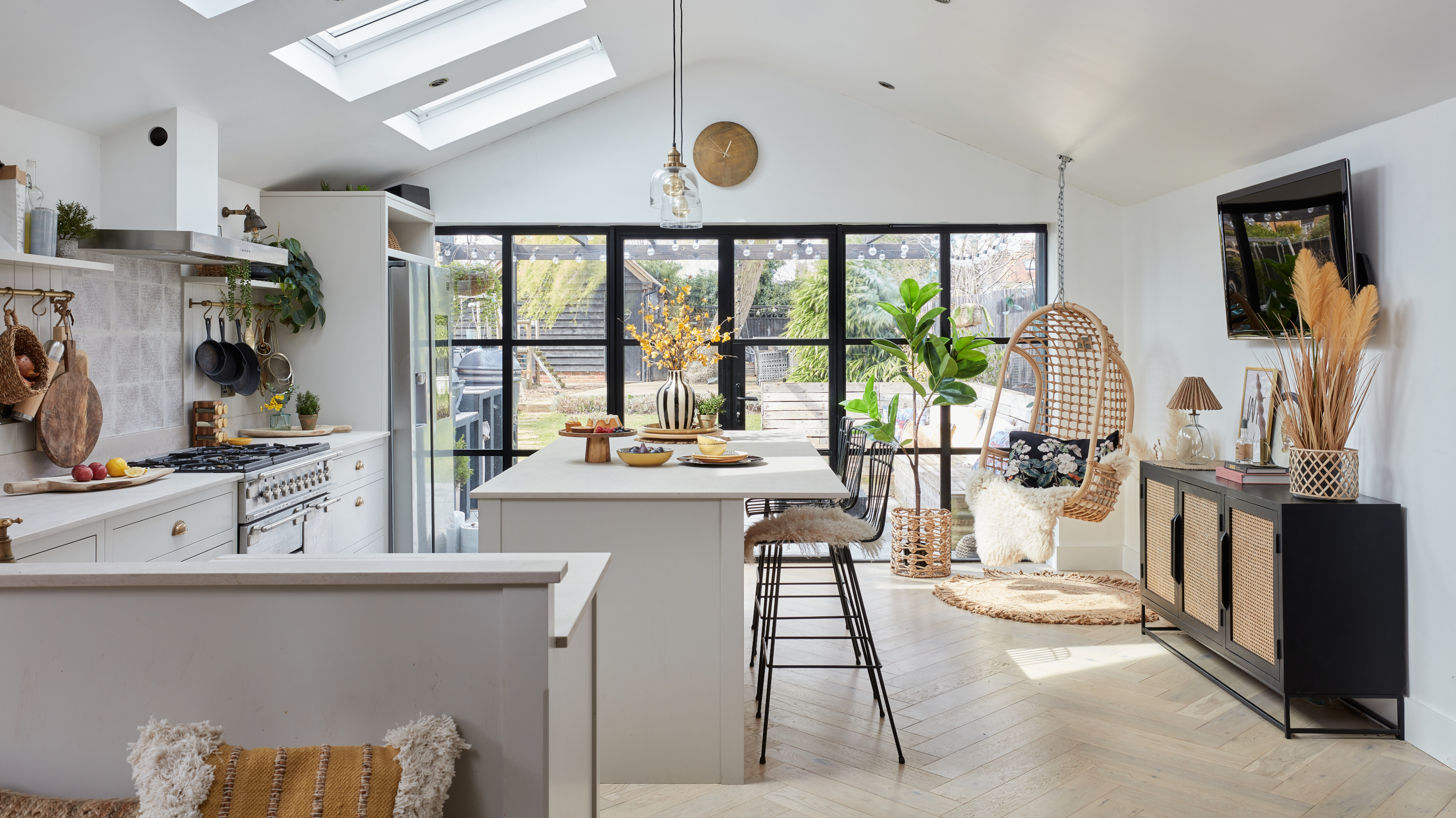 Real home: this interior designer's home is a masterclass in layering texture
Notebooks at the ready – this extended terrace is packed with stylish ideas to steal
By Ellen Finch Published
-
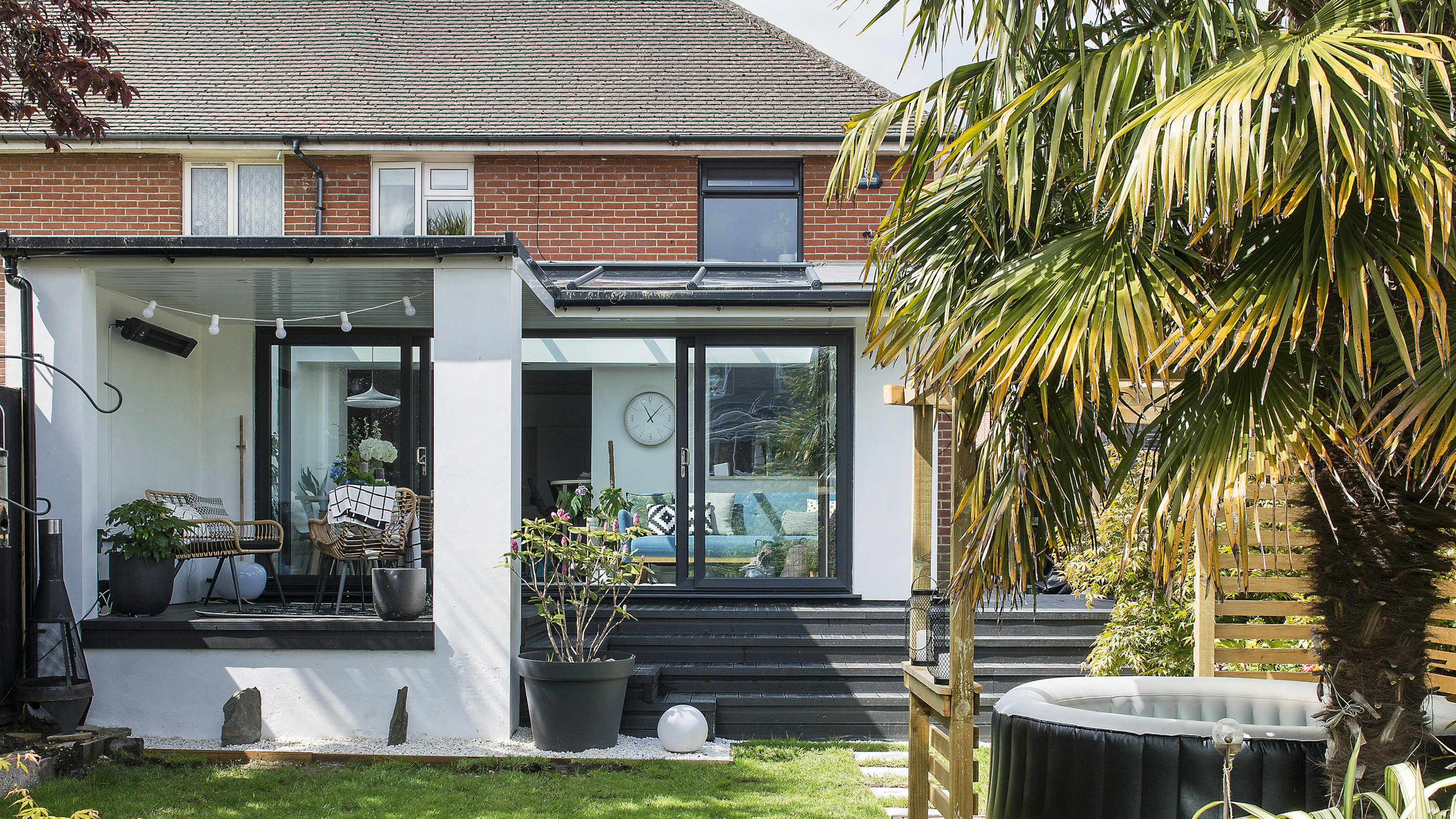 Before and after: this interior designer extended her family home for £50k
All thanks to a combination of skill and imagination
By Ellen Finch Published
-
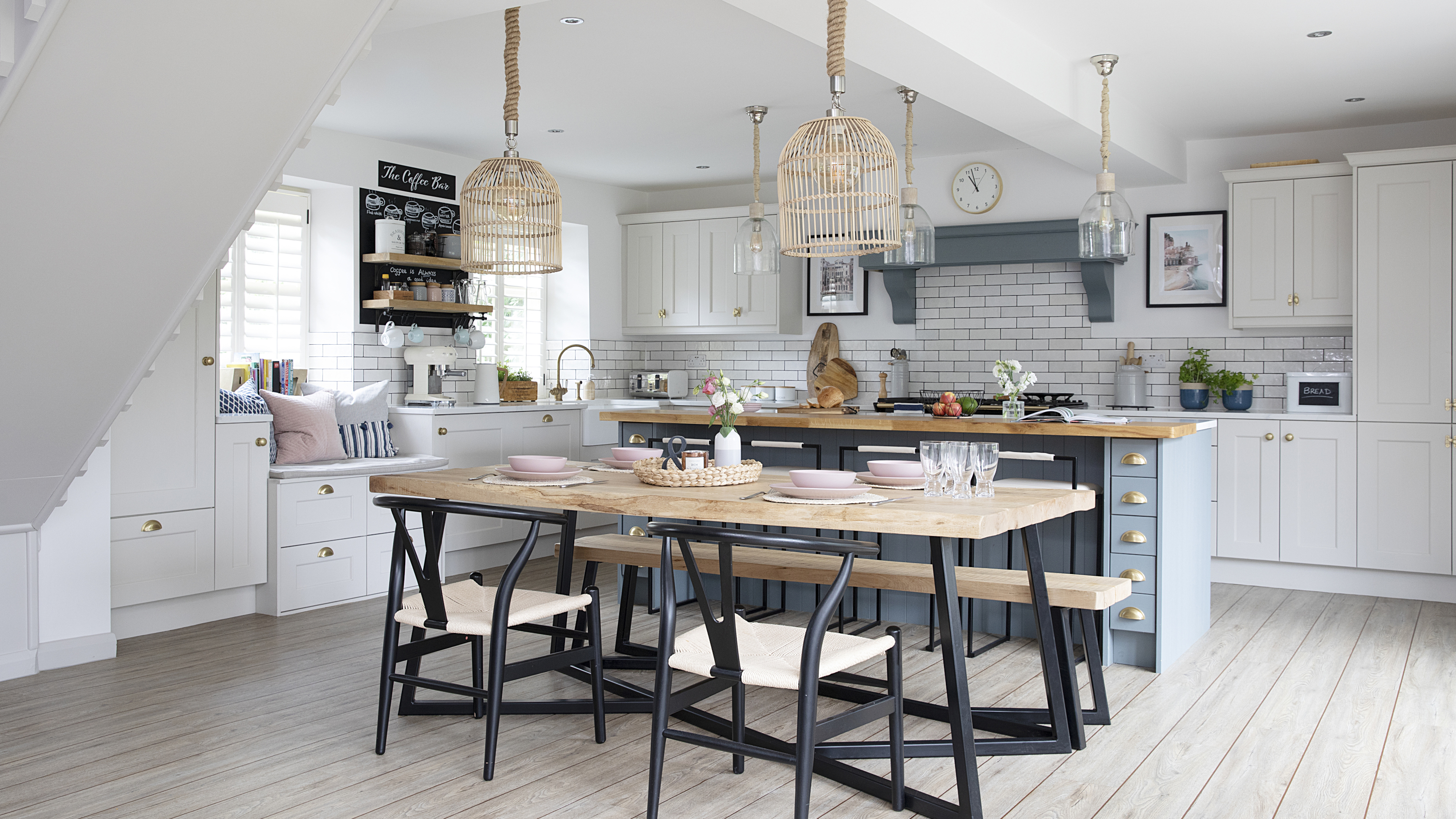 Real home: this DIY-savvy family makes the case for open-plan living
And with a huge renovation done for just over £70k, they've got some cost-cutting tips to share, too
By Karen Wilson Published
