
Having grown up in southern Africa, Robin and Ian are both accustomed to a more temperate climate, and the indoor-outdoor lifestyle that provides.
Project notes
The owners: Robin Stephenson, a medical secretary, lives here with husband Ian, a structural engineer. They have two children, Liam, 27, and Alexander, 24
The property: A five-bedroom Victorian terraced house, built prior to 1892, in Berkhamsted, Hertfordshire
Total project cost: £116,000
‘We love living in the UK but the weather does mean we aren’t able to use the garden as frequently as we would like,’ explains Robin. ‘In the end, the weather provided the impetus for us to extend the kitchen and bring that patio area into the house so we could use it come rain or shine.’
The couple moved into the Victorian terraced house 23 years ago, and although they had freshened up the kitchen 10 years ago, Robin and Ian both felt it needed a more radical transformation to become their ideal space.
Ian contacted architect Nick Wood, at Blackwood Architects, whom he had worked with professionally in the past, to draw up plans for a three-metre-wide side-return extension.
Find out what they did next, then check out more real home transformations and extensions.

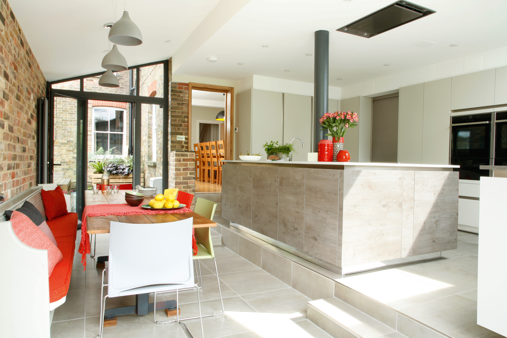
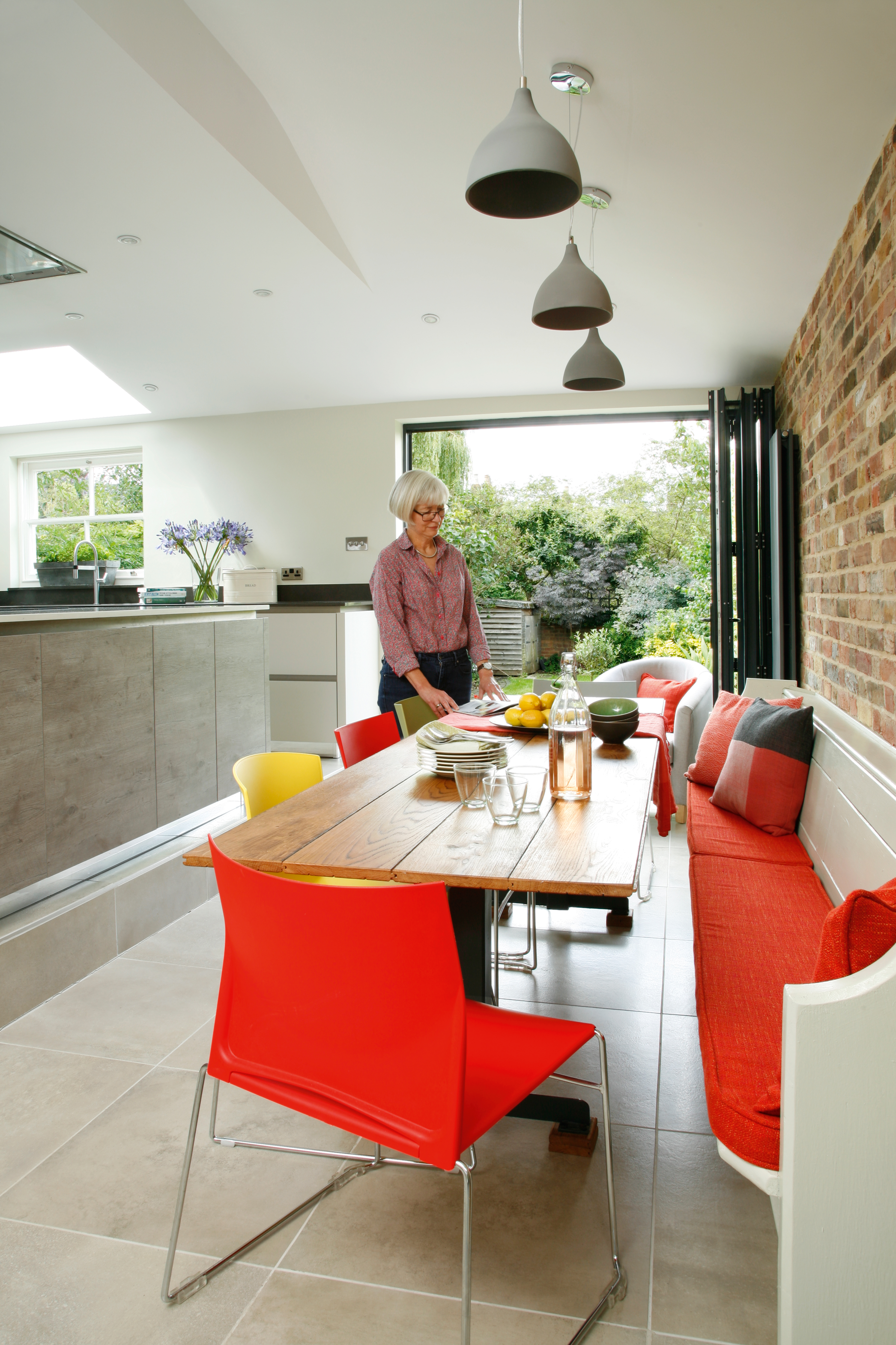
Aluminium framed bi-fold doors from VivaFolio can be opened up to link the extension to the outside space
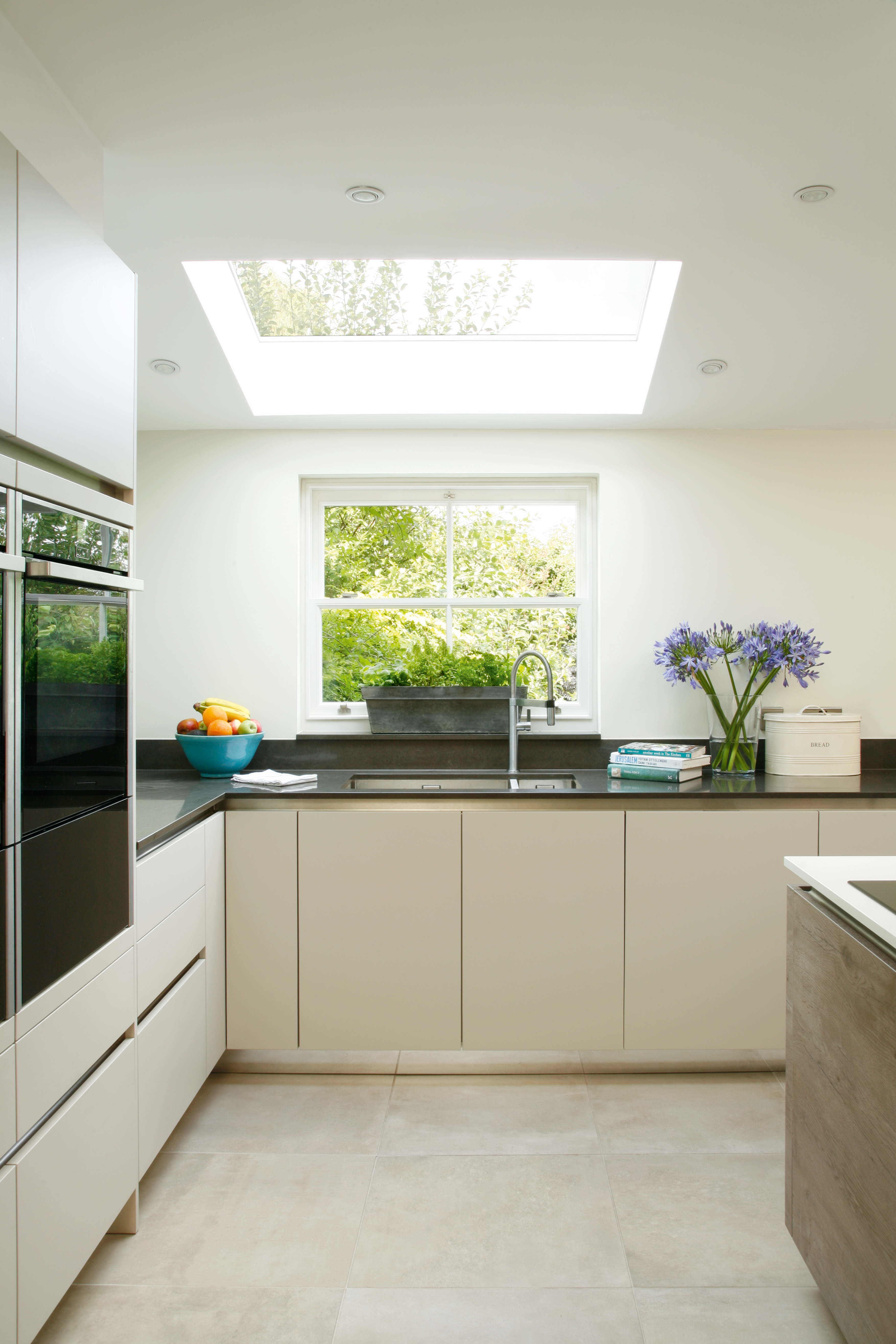
‘We knew we wanted glazed doors at both ends to make it feel like we were connected to the outdoors, as well as a large rooflight above the sink,’ explains Ian.
"It would have looked very clinical without the brick – I’m glad we decided to leave it exposed in the end"
Ian Stephenson
‘The finished space would be open plan but naturally separated into cooking and dining zones thanks to a change in level of the site, which meant a step was necessary.’

Ian designed and built the tabletop using old oak floorboards and a local company fabricated the steel frame; for a similar table, try the Scrumpy, from Loaf. The chairs were bought secondhand and were previously used as demonstrators for office furniture; for similar, try the Eiffel from Dwell
MORE FROM REAL HOMES MAGAZINE

Want to see inside more stunning homes? Each month, Real Homes magazine features everything from modern extensions to cleverly redesigned family spaces. Get the magazine delivered straight to your door with a subscription deal.
Unfortunately, it proved to be a challenge getting the relatively large extension past the local authority’s planning department. Luckily, having discussed their proposals at an early stage, Robin and Ian’s neighbours were happier with the plans, which they felt would actually increase their privacy, and consented to the work.
With planning approval finally granted, Ian and Robin put the project out to tender before settling on a local building contractor, with architect Nick on board as project manager.
Robin’s key requirements included a breakfast area with pull-down door to hide the toaster when not in use, as well as double Neff ovens, a concealed extractor fan, and a sink large enough for a baking tray.
‘The whole kitchen needed to function, but also look crisp,’ she adds. With the plans drawn up, they chose Hawk Interiors to supply and fit their chosen kitchen.

The couple wanted a simple and pared-back kitchen, so chose handleless units in Kashmir, plus a weathered oak-effect finish island, by German brand Rotpunkt
‘We knew we wanted flat, handleless units that would be easy to clean,’ explains Robin. ‘But we found they were quite hard to come by, so we had to go for a German-designed unit to get the look we really wanted, although it was well worth persevering.’
An exposed brick wall is a key feature, although this was very nearly rendered and painted.

‘It would have looked very clinical without the brick – I’m glad we decided to leave it exposed in the end,’ adds Ian.
Now the extension is complete, the couple are able to enjoy the former patio space every day. ‘It doesn’t matter what the weather is like now,’ says Ian. ‘We can sit and enjoy the views of the outdoors without the risk of getting wet.’
Contacts:
- Architects: Blackwood Architects
- Building work: Greystoke Property Services
- Glazed doors & rooflights: VivaFolio
- Kitchen: Hawk Interiors
Read more real home transformations:
Join our newsletter
Get small space home decor ideas, celeb inspiration, DIY tips and more, straight to your inbox!
Laura Crombie is a journalist and TV presenter. She has written about homes and interiors for the last 17 years and was Editor of Real Homes before taking on her current position as Content Director for Country Homes & Interiors, 25 Beautiful Homes Period Living and Style at Home. She's an experienced home renovator and is currently DIY-renovating a 1960s house in Worcestershire. She's been quoted on home design and renovating in The Times, The Guardian, The Metro and more. She's also a TV presenter for QVC and has been a commentator for Channel 4 at Crufts dog show.