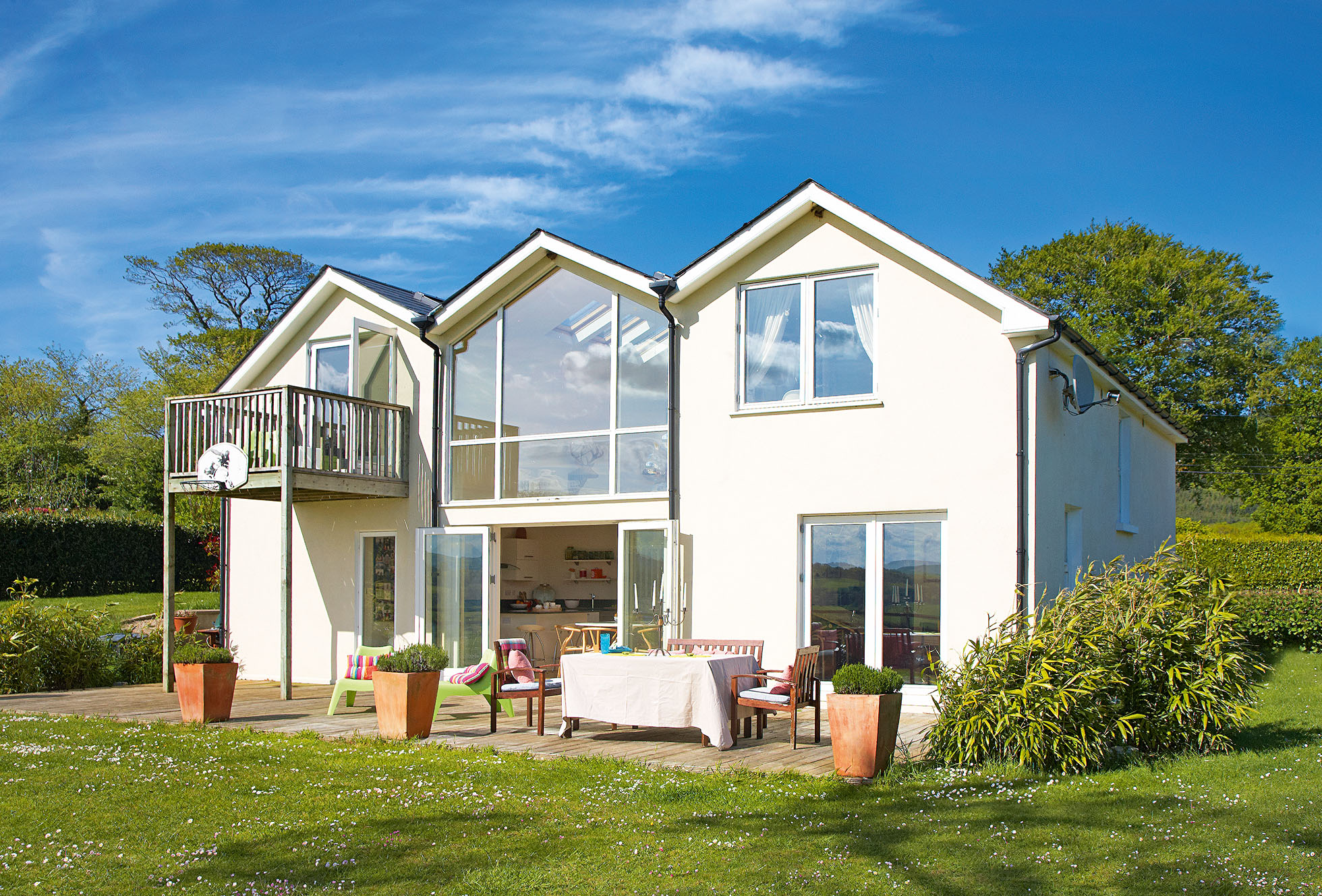
The first time that Eily Roe glimpsed her new home at an open viewing, she turned around and walked straight out of the door, saying, ‘It’s dreadful – absolutely not. It’s in an appalling state!’ Her harsh words, however, were all part of her clever ploy to buy the house. ‘I actually loved it the minute I saw it, and I was just trying to put off the other buyers,’ she laughs.
Eily and husband Conor were living in a small new-build terraced house in the nearby town of Bray, but with their children growing up, they were looking for more space. ‘We wanted a home in the countryside with a large garden,’ says Eily, ‘and preferably a project that we could do up to our own taste.’
It was during the Christmas holidays that the couple first spotted the country cottage for sale in an estate agent’s window, but everything was closed for the holidays and they couldn’t get any more information on the property. ‘We were so intrigued by the house that we decided to drive to the area to see if we could find it,’ says Eily. ‘We drove around for hours.’ They couldn’t find the cottage for sale and eventually pulled over in front of a lovely house with a New England-style timber horse barn set in rolling countryside. ‘I remember saying to Conor what a beautiful spot it was, and how I hoped that the cottage was somewhere nearby.’
Find out what they did next, then browse through more real home transformations and learn more about extending a house.
As it turned out, the cottage was directly behind the house they had admired so much, as Eily discovered when she went to the open viewing in January. ‘I couldn’t believe our luck,’ she says. ‘I thought it the most beautiful place in the world and I was terrified someone else would buy it.’ Luck was on Eily and Conor’s side, as their offer was quickly accepted.
The couple couldn’t afford to do any work to the house once they’d bought it, so they lived in it as it was for several years, saving up for the renovation and extension costs. ‘It was really basic inside when we moved in,’ says Eily. ‘When we first paid the deposit, we came to meet the owners and they were cooking in a pot on an open fire. It was only a holiday home they used in the summer months, so I suppose that it seemed like fun to them.’ There was a small kitchen in a rickety lean-to at the rear of the house, but all it housed was a stove and a sink. There was only a tiny bathroom, a small living room and three bedrooms.
‘The first night that we moved in, we lit the fire and soon after had to run out of the house, which had filled with smoke,’ says Eily. ‘We decided to give up and go to bed, but a bat was sharing the room with us, so we couldn’t get to sleep.’ There was central heating in the house, but no insulation, the windows were draughty and it was freezing in winter. The insects that fell through the tongue-and-groove ceilings were one of the biggest problems, and it was especially annoying when they fell on the beds during the night. ‘Despite all this, we loved it,’ says Eily. ‘It was simply a wonderful place to be.’
One advantage of spending so much time in the house before saving enough to renovate it was that the couple had plenty of time to plan their new home. Eily, a qualified interior designer, had considerable experience, having worked in architectural practices in Ireland, Germany and Australia. She and Conor agreed on what they wanted, and Eily did the design, using a structural engineer for the necessary certification.
MORE FROM REAL HOMES MAGAZINE

Want to see inside more stunning homes? Each month, Real Homes magazine features everything from modern extensions to cleverly redesigned family spaces. Get the magazine delivered straight to your door with a subscription deal.
‘We were aiming to create a warm and welcoming home that was economic to it was, and how I hoped that the cottage was somewhere nearby.’ As it turned out, the cottage was directly behind the house they had admired so much, as Eily discovered when she went to the open viewing in January. ‘I couldn’t believe our luck,’ she says.
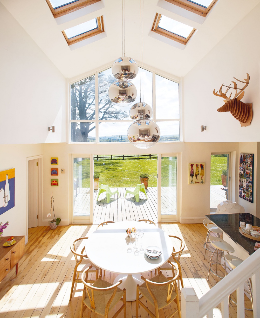
‘I thought it the most beautiful place in the world and I run,’ says Eily. ‘We wanted to make the most of the view by adding a double-height glazed wall along the south-west-facing rear elevation. This would also help to keep the house warm thanks to the passive heat gain from the sun through the glazing. I didn’t want any corridors and hallways in the new layout as I think they’re a waste of space – two doors between living areas and bedrooms is ample privacy and there is no need for a corridor. The most important thing for us, however, was that it would be a house suited to the children – somewhere they would enjoy growing up in.’
When drawing up the plans for the redesign, Eily was careful to remain within specific parameters so that they didn’t have to apply for planning permission.
The extension would be less than 40 square metres, and its height wouldn’t exceed that of the roofline of the original cottage, so that it would remain invisible from the road. ‘The site was perfect in that there was a natural slope to the rear, so we could create a lower-ground-floor level,’ says Eily. ‘The size of the extension wasn’t an issue for us either, as we didn’t want a really large house anyway.’
The new design would retain the original three-bedroom cottage with the living area and front porch, but would change the smallest bedroom into a bathroom. The plan was also to demolish the tiny kitchen and bathroom lean-to so that a new two-storey rear extension could be built in its place.
With all the plans finalised, the couple found a builder through word of mouth and work got underway in November. The family moved into a friend’s holiday home nearby for the year so that they would be out of the way. Eily came back on site constantly, to keep an eye on progress and make decisions on a daily basis so as to avoid any problems during the build. ‘I quickly learned that builders can’t read your mind!’ she laughs.
‘You need to be very clear about what exactly you want.’ The build progressed well and without any major problems, thanks to Eily’s project-management skills, and the family were eventually able to move back into their new home in time for Christmas the following year.
The interior of the house has become a contemporary open-plan space, with the rear wall of the living room having been removed entirely and structural steelwork installed to support the new opening. A new balustrade and staircase lead to the lower level of the double-height dining area, which is filled with light from the rear glazed wall and Velux rooflights. There is a sizeable home office on one side of the lower space, while on the other there is a kitchen, which has been left open to the adjoining dining area. To maximise space in the kitchen area, there is also an enclosed utility room directly behind it.
‘Although I love the open-plan space, I have to say that there is a limit to the amount of different activities that can be carried out at the same time in one space, especially where younger children are involved! In fact, I would now advise anyone who is considering an open-plan space to add a completely separate TV room/den for the children,’ says Eily.
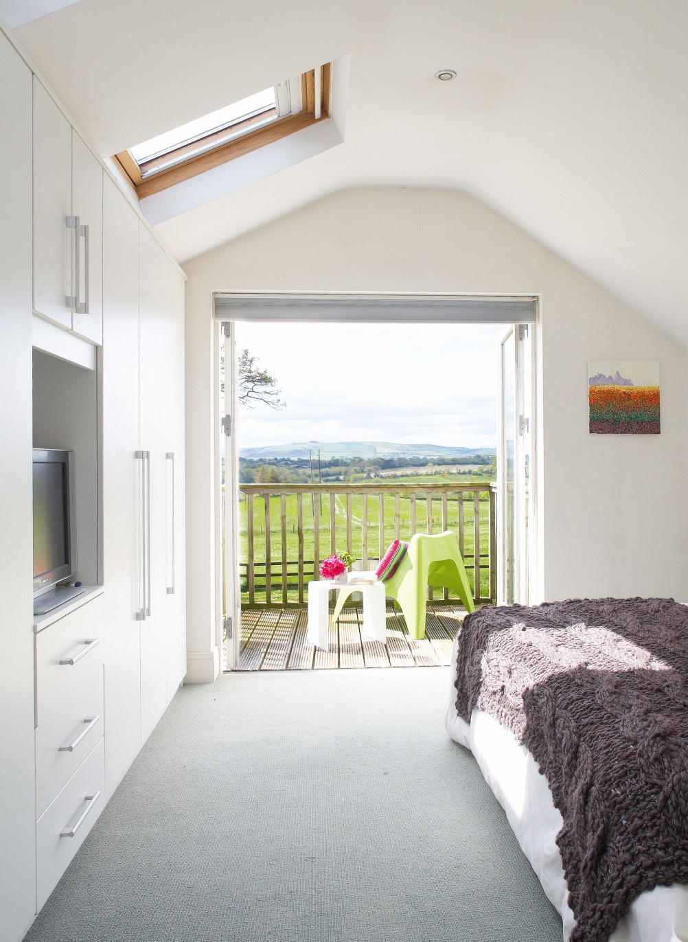
On the new first floor, there is a bedroom on either side of the double-height space, cleverly tucked beneath the eaves of the extension, each with its own staircase. The master bedroom over the kitchen has its own en suite and a south-west-facing balcony, which offers stunning views of the countryside beyond, while the bedroom over the home office shares the bathroom at the foot of its own staircase.
‘My vision for the interiors was very clear,’ says Eily. ‘I wanted white walls and light-coloured timber floors, with a few signature pieces to introduce colour and texture. I only buy furniture and accessories if I see something that I really love. For example, the Italian sofas were expensive, but I thought they were really beautiful. ‘We love living here,’ she continues. ‘It’s a wonderful location and our home is cosy, bright and welcoming – exactly what we set out to achieve. It’s full of sunlight and we love being able to sit outside on the deck all summer long.’
More real home transformations:
Join our newsletter
Get small space home decor ideas, celeb inspiration, DIY tips and more, straight to your inbox!
-
 Real home: a Grade II listed cottage renovation
Taking a bit of a risk, Judy and Stuart Meeke bought a listed cottage without knowing if they would be able to alter it to make it lighter and brighter. The results speak for themselves
By Janet McMeekin Published
-
 Real home: be inspired by this beautiful Grade II-listed Welsh longhouse
Christine and Neville Brown’s cottage in Wales has a long and fascinating history that has shaped the character of their unusual period home
By Heather Dixon Published
-
 Real home: centuries old cottage full of vintage finds and timeless, rustic style
When January Grundy swapped a new-build house for a historic cottage she couldn't wait to maximise its character with antique finds and vintage curios
By Annabelle Grundy Published
-
 Real home: a pretty farm cottage sees an Arts & Crafts inspired restoration
Built from the ancient stones of a ruined abbey, this pretty farm cottage has been given a new lease of life
By Karen Darlow Published
-
 Real home: renovating a Victorian cottage
Overhauling a dated, dark and cold Victorian cottage, Julia Sinclair has extended her home, remodelled the layout and completed the transformation with a fresh and vibrant interior
By Pat Garratt Published
-
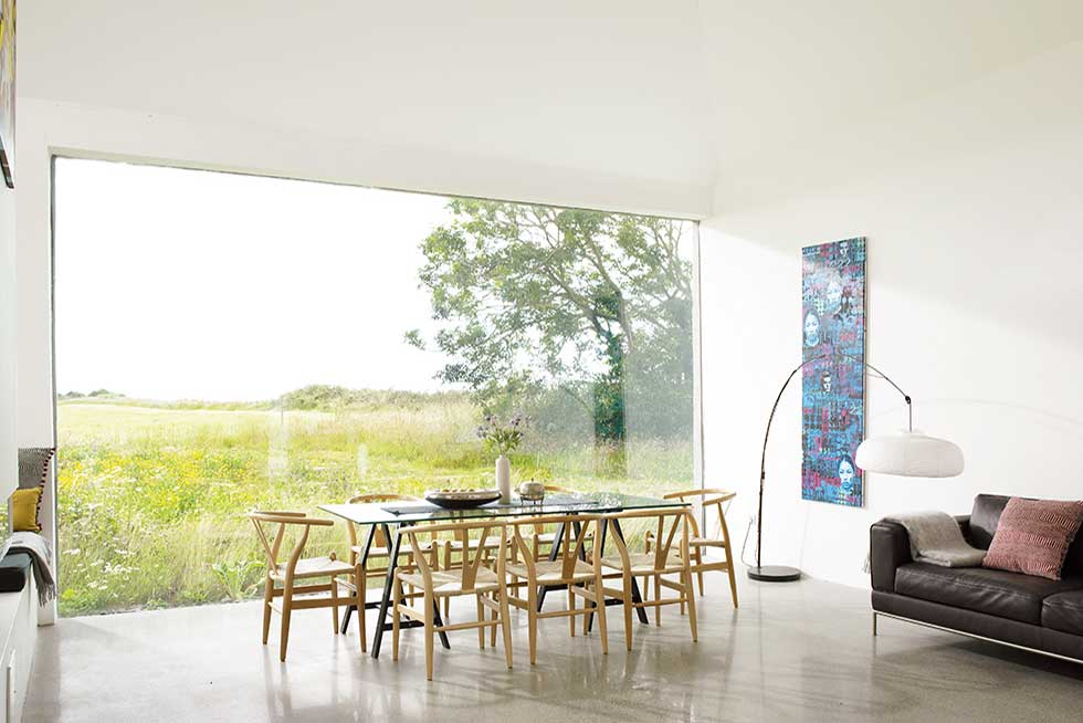 Real home: a contemporary renovation of a farm cottage
Natural light, modern design and open spaces transform this18th-century stone cottage into a contemporary home
By Mandi Miller Published
-
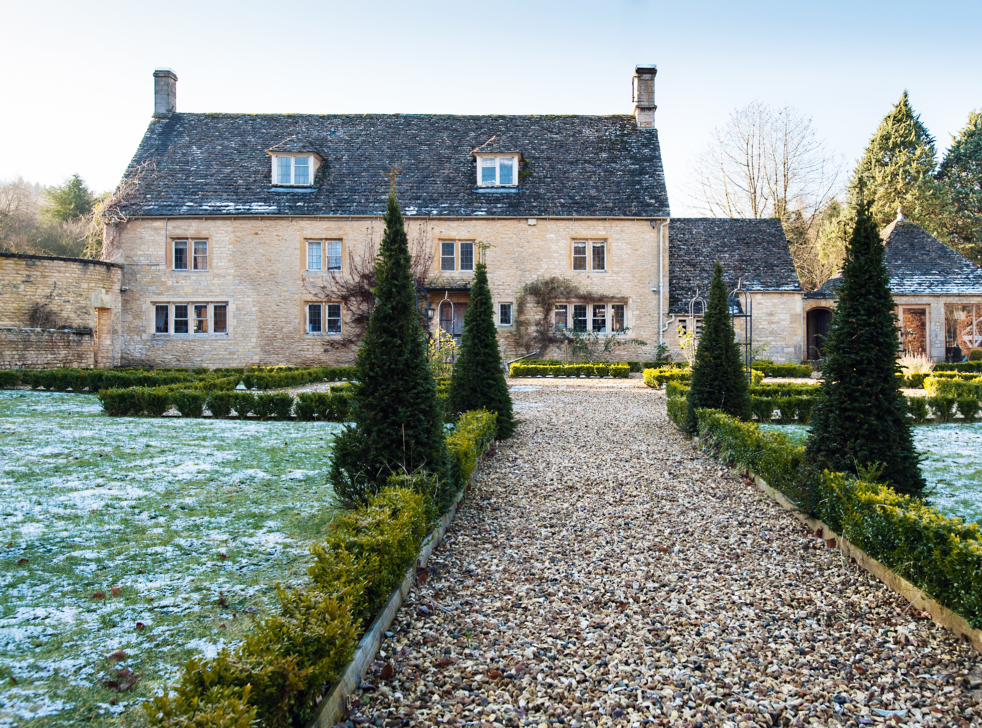 Christmas house: a renovated Cotswold stone cottage
Christian and Jessica Fleming worked hard to make the Cotswold stone house they inherited their own, creating light, spacious interiors
By Karen Darlow Published
-
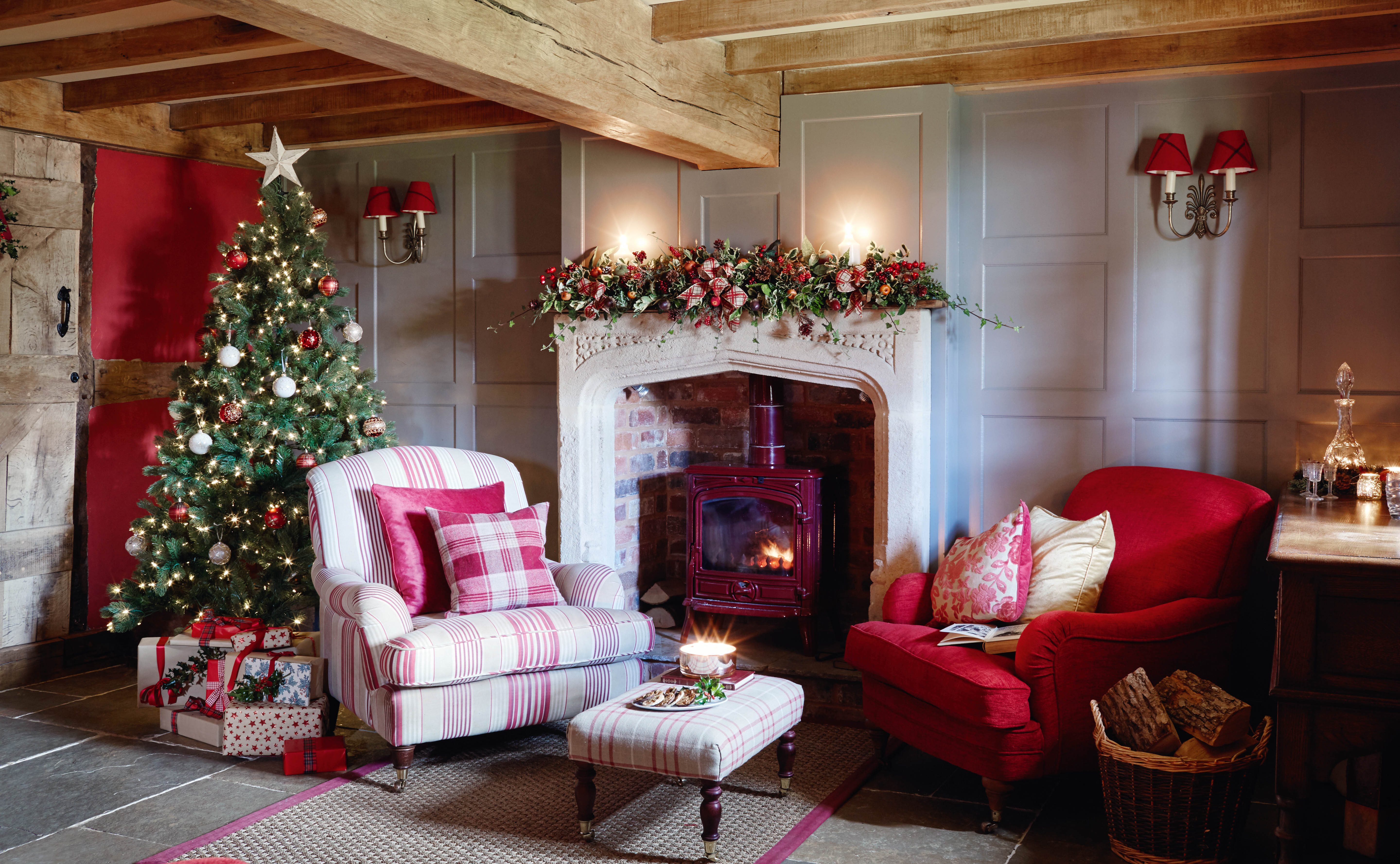 Christmas house: a renovated Tudor cottage
Buying a pocket-size thatched cottage in need of major repairs was a brave move for Alison and Carl Cooper, but one they’ve turned into a big success
By Karen Darlow Published