
Sue and Roger Luckin loved their Victorian seaside townhouse in Eastbourne, East Sussex, but had always longed to live a more rural lifestyle, and so kept a lookout for country properties that were in need of renovation.
‘In 2001, we decided that it was now or never, and we put our house on the market,’ Sue recalls. ‘It sold unexpectedly quickly, leaving us under pressure to find a new home. We had made an offer on a house, but it fell through, and our estate agent suggested we look at a potential building project that was due to come up for sale.’ As an interior designer, Sue was excited at the prospect of getting involved with a renovation project, and both she and Roger were delighted when they viewed the plot.
‘The house was architect-designed in the 1960s, with three bedrooms, and had been built for an artist. It looked very neglected, with even a dead bat hanging from the top of the landing, but the garden was magical,’ Sue remembers. ‘Although it was so overgrown that you couldn’t see how large it was, Roger and I fell in love with the beautiful woodland setting, and we knew that there was the potential to create something quite unique here.’
Fact file
- The owners: Sue Luckin, an interior designer, and her husband Roger, who is retired
- The property: An extended five-bedroom house, originally built in the 1960s, but now with a contemporary style
- The location: Waldron, East Sussex
- What they spent: The couple bought the original house and plot for £310,000 in 2001, and the redesigned property has recently been valued at around £1.4million
Designing the project
Having found an ideal location to build a new home, most people would decide to demolish a dilapidated house, but the Luckins were inspired by its floor-to-ceiling windows that allowed natural light to flood in. ‘We could see why it had been an artist’s home and were impressed by the quality of light. We loved the way the large glass panels made you feel connected to the beautiful landscape outside,’ Sue says.
‘Even more interesting was that the previous owner had built a double and single garage as well as an artist’s studio, all with flat roofs, which immediately provided a huge footprint that we could work with. This gave us the idea of opening up the entire interior of the old house, and building not only around the existing structure, but also over it, to create a much larger property.’
A former architectural draughtsperson, Sue drew up the new plans, employing a structural engineer. ‘I’m really “old school” and always hand-draw my plans,’ she says. While working on the design and applying for planning permission, the couple got on with the job of landscaping the vastly overgrown garden.
‘There was a tiny pond, which we decided to enlarge to make it much more of a feature,’ Sue says. ‘Friends offered us help to cut down some trees, but the silver birches were so magnificent that we preferred to keep them.’
Gaining planning permission
Excited by modern design, but sensitive to the location and the predominantly traditional style of the neighbouring houses, Sue opted for a contemporary interior, but a more traditional exterior. ‘The planners loved what we proposed, although we were required to have a tree survey and provide heat-loss calculations in respect of the glazed areas before permission was granted,’ she explains. ‘I think they liked the fact we were going to use reclaimed and natural materials for the exterior, and that it would look like a traditional country house.’
With permission granted, the builders broke ground, demolishing walls within the 1960s structure to create the large, open-plan area that would become the kitchen and dining space. The roof was removed to accommodate the new steel and oak frame that was built around and over the old house.
Building works
‘We never intended to move out, and lived in the house as the builders worked around us,’ says Sue. ‘I remember one night, in the middle of a storm, the roof tarpaulin was flapping wildly and our lovely neighbours knocked on the door and offered us a bed for the night. We did cope with it all, though, even when we had only one working radiator hanging off a half-demolished wall.’
With no fixed schedule, the building works took five years to complete, and the glass-framed living room heralded the end of the build. ‘Roger designed this room, which was hand-built by two specialist oak craftspeople using traditional techniques,’ says Sue. ‘It sits high in the treeline and leads out onto a raised deck that overlooks the garden and beyond. We opted for large glass panels to maximise the outlook, and it’s magnificent for watching the seasons come and go.’
Interior design
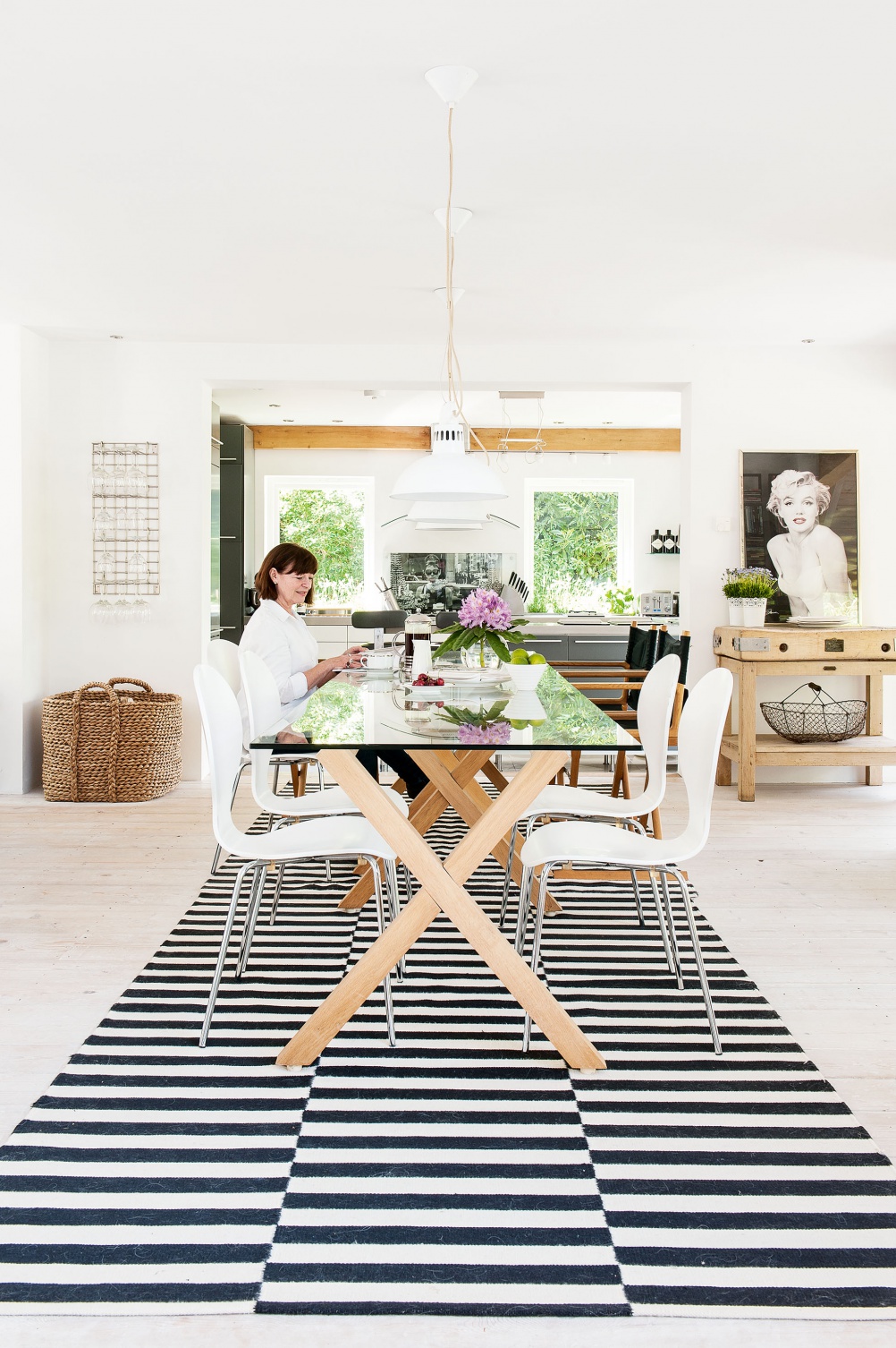
Furnishing the interior of their new home was a job that Sue relished and she applied all her skills as a designer to create a space that reflected the way both she and Roger live. ‘We have always enjoyed travelling, and were influenced by the interiors we had seen over the years, particularly in Africa,’ she says. ‘However, I really wanted the garden to be the hero, so consciously pared down everything, using the fewest materials to bring a sense of flow and cohesion. This was vital to integrate what was left of the old building with the new structure, making it look seamless.’
By keeping the palette simple and painting the entire house in a brilliant white, Sue has maximised the natural daylight and ensured that the eye is drawn towards the windows and the glorious landscape beyond. There are also few visual distractions. A structural support
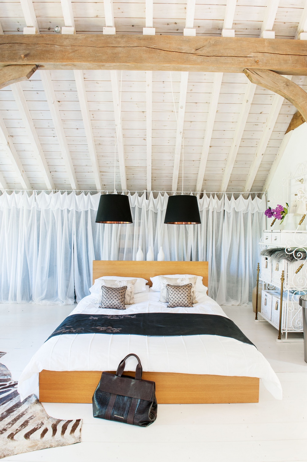
‘The house has some wonderful architectural gems, such as the timber ceiling in the living room, which is functional, but also a fantastic feature. I chose white furnishings that won’t visually fight with the complicated beam design,’ explains Sue. ‘All the rooms in the house form a background to the gardens outside. With the trees in mind, I based our first-floor master bedroom on an African safari lodge we’d once stayed in, which was built high up so that guests could enjoy the views.’
Having spent 14 happy years living in their unique home, Sue and Roger feel that it’s time to seek out another challenging project. ‘The house has given us so much pleasure over the years and the landscape led us by the hand every step of the way, determining how we approached the build,’ Sue says. ‘Having fulfilled the vision we had 14 years ago, we feel privileged to have lived here – we’ve taken a real journey with this house, but now we feel it’s time to take on a new project and pass on this little piece of heaven.’
The costs | Row 0 - Cell 1 |
| Building work, including rewiring, plumbing and the demolition of existing buildings | £320,000 |
| Windows and external doors | £60,000 |
| Landscaping | £50,000 |
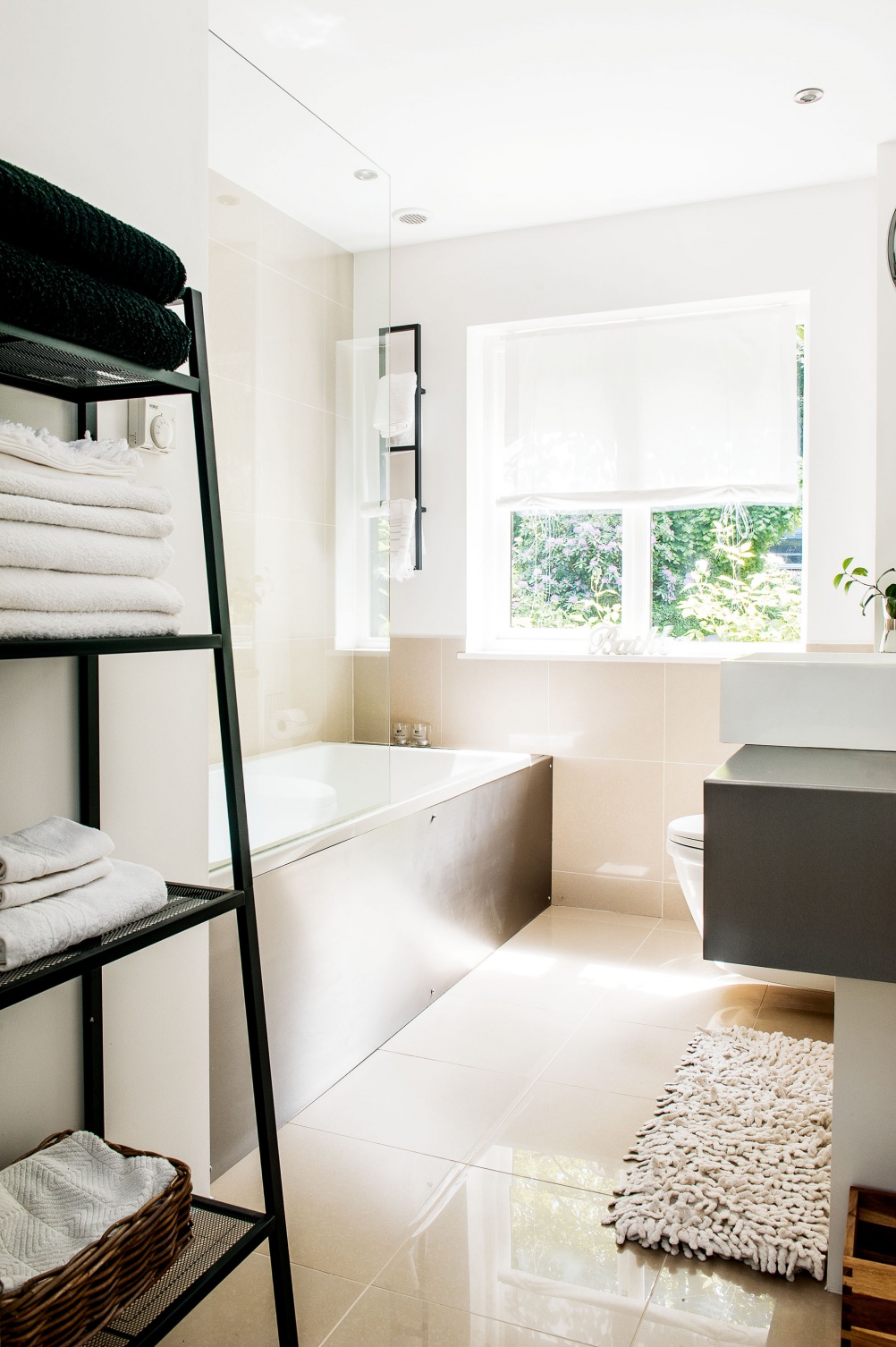
| Bathrooms | £45,000 |
| Consultant fees | £25,000 |
| Kitchen | £20,000 |
| Decoration | £20,000 |
| Flooring | £15,000 |
| Staircase | £15,000 |
| Renewable energy | £15,000 |
| Utility | £10,000 |
| Internal joinery | £10,000 |
| Wood burner | £5,000 |
| Light fittings | £5,000 |
| TOTAL | £615,000 |
Join our newsletter
Get small space home decor ideas, celeb inspiration, DIY tips and more, straight to your inbox!
-
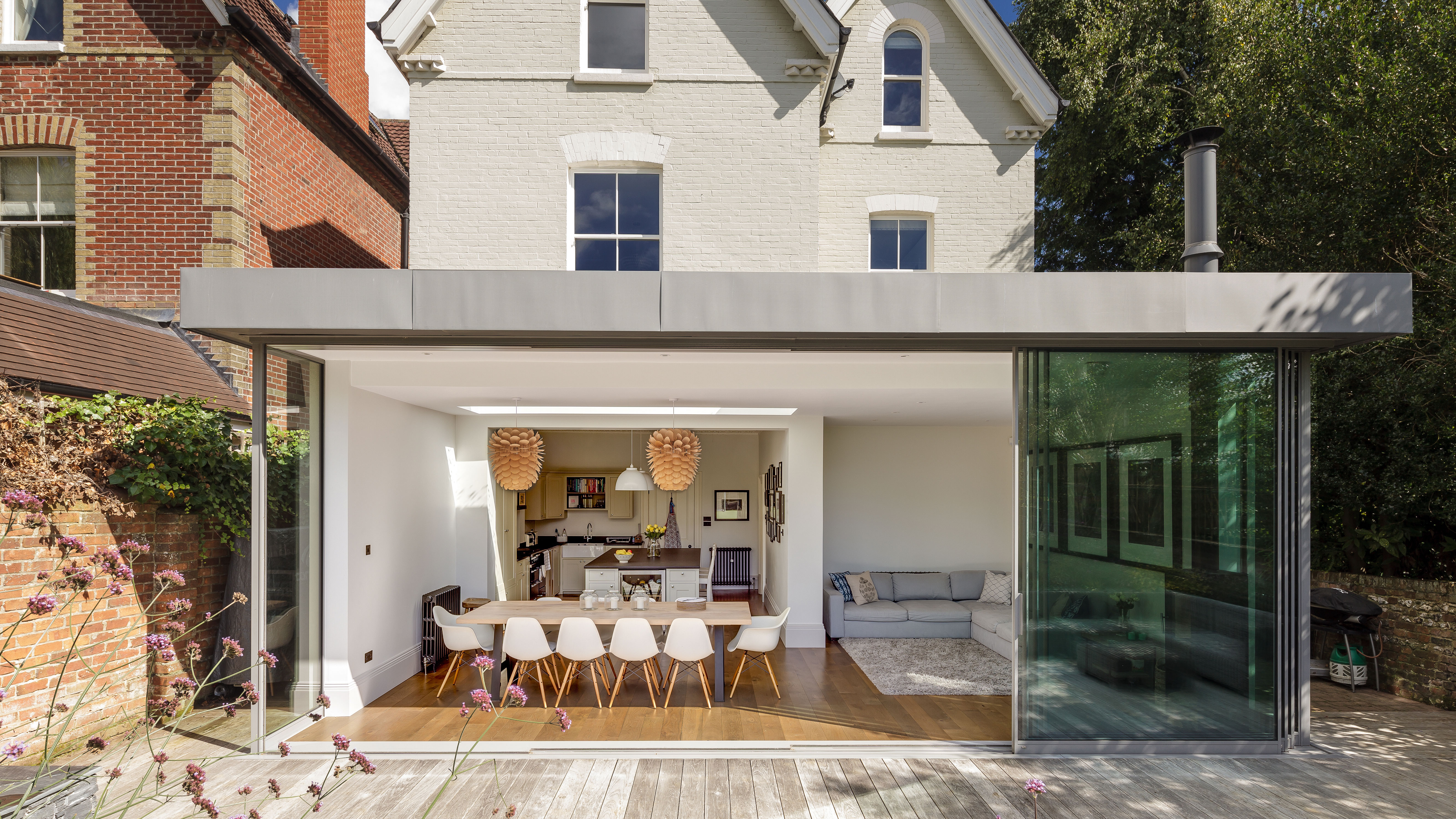 17 glass extension ideas – light-filled spaces to inspire your project
A glazed extension is a striking addition to any home, whether it's traditional or modern. Be inspired by these beautiful glass extension ideas to start planning your own.
By Hebe Hatton
-
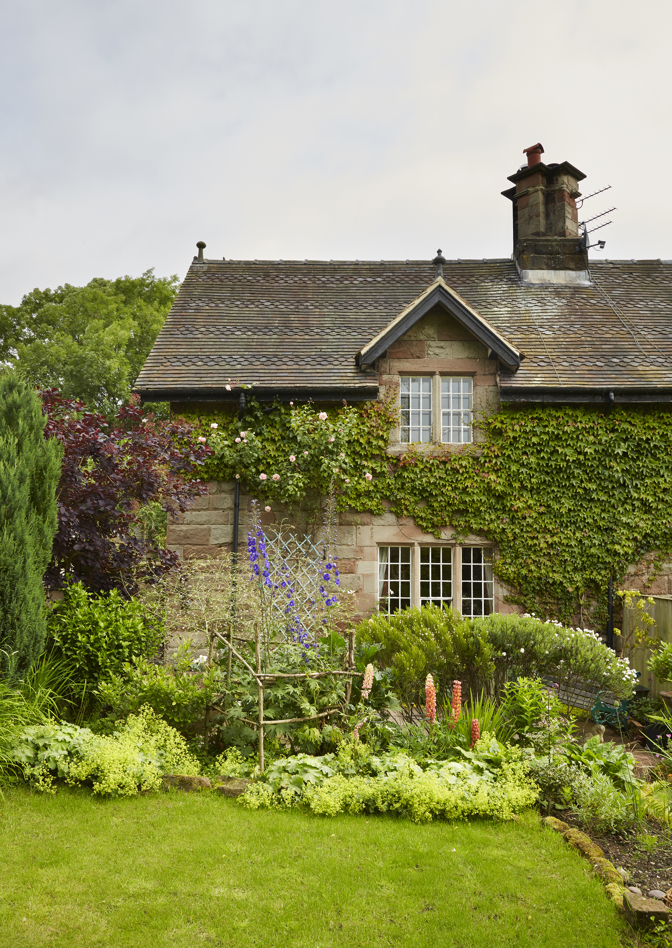 Real home: a pretty farm cottage sees an Arts & Crafts inspired restoration
Built from the ancient stones of a ruined abbey, this pretty farm cottage has been given a new lease of life
By Karen Darlow
-
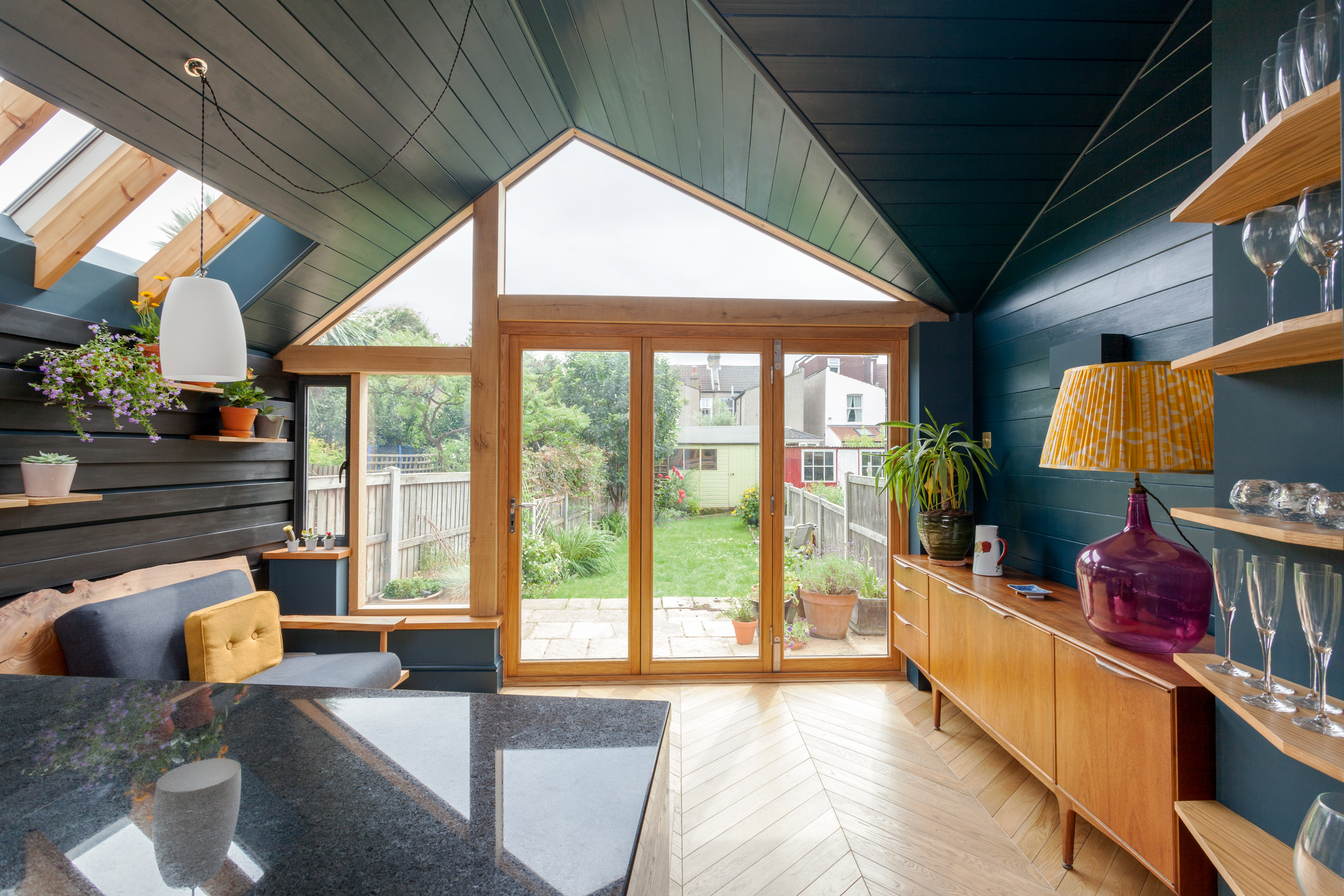 How to build a timber frame extension
Timber frame extensions are quick to assemble, cost-effective and energy efficient, and offer a huge range of design possibilities. Here's what you need to know...
By Lucy Searle
-
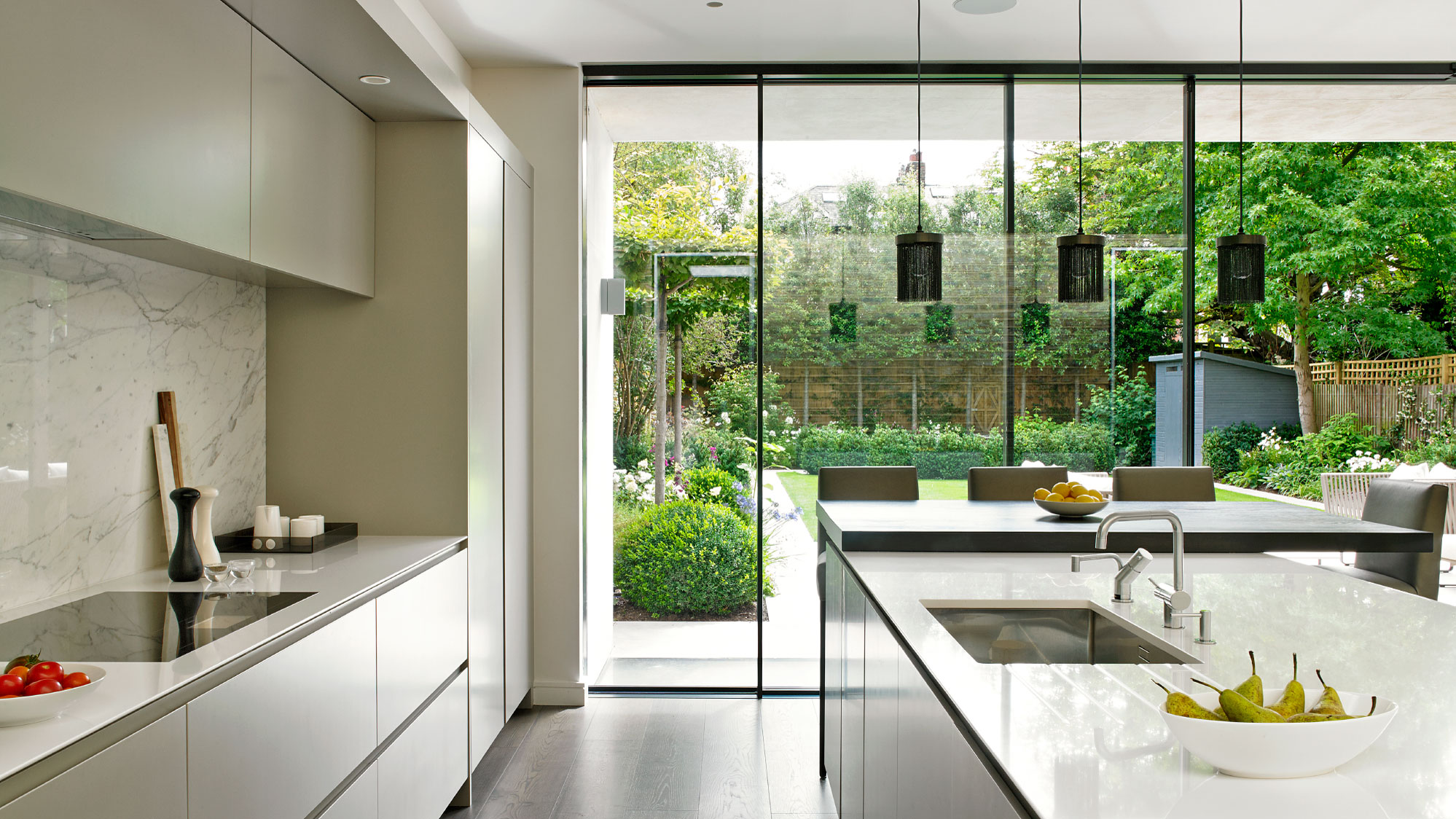 How to create space and light with glazing
From conservatories to orangeries, glass doors and expansive windows, check out our tips on how to create space and light with glazing
By Lucy Searle
-
 11 light filled extension design ideas
Looking for light filled extension design ideas? Make your extension feel larger and brighter with our clever design tricks
By Lucy Searle
-
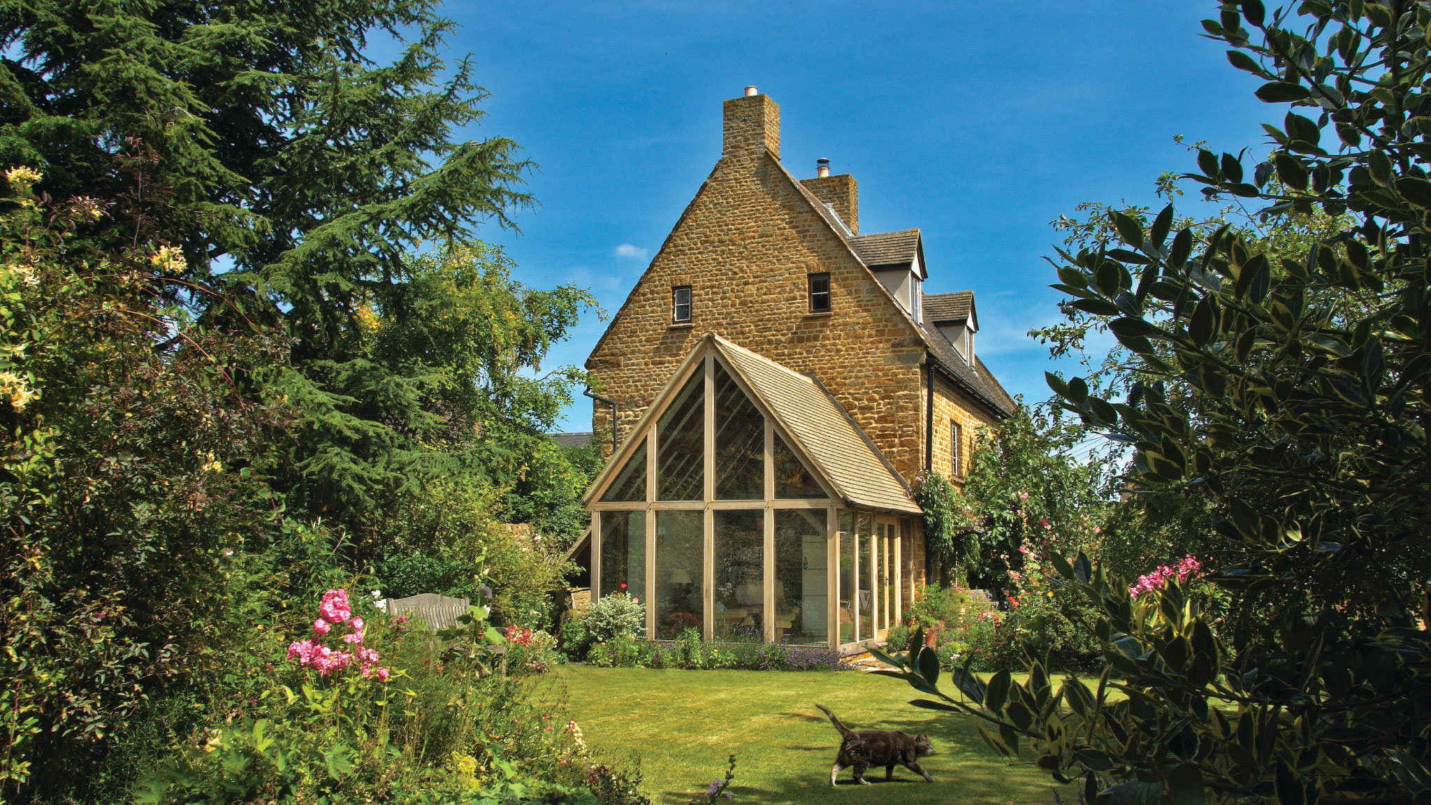 How to add an oak frame extension
Gain extra living space in your home with the addition of a well-executed oak frame extension – a characterful option for a period property
By Lucy Searle
-
 Real home: a spectacular stone cottage is transformed with upcycled finds
With some clever upcycling and renovation work, Val and Norman Rennie have transformed an unloved stone cottage into a dream rural getaway
By Pippa Blenkinsop
-
 Real home: a 1960s house with modern extension
Su and Jim Bonner doubled the size of their 1960s house with an ultra-modern extension
By Victoria Jenkins