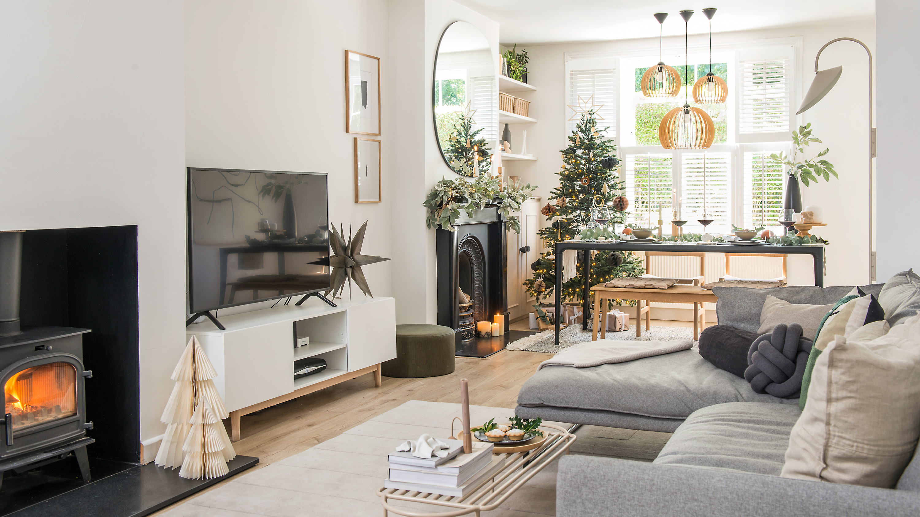
Christmas is a family affair in the Seidler household. With the big day spent with loved ones, the lead-up is full of cosy nights in for Katie and her husband, Russell, with a glass of red wine and a mince pie or two in front of the woodburner. However, Katie, whose Victorian house is in the busy market town of St Albans, will admit that she likes to keep the decorations simple and minimal, with lots of natural elements that fit in with their home’s pared-back Scandi style.
Having bought the three-bedroom property back in 2017, after many years of renting, the couple were keen to make their mark on the place and fill it with their love of Scandinavian design.
Want to makeover your home so it reflects your personal style, just like Katie has? We have lots of ideas and advice on what to do and where to start in our feature on house renovation. For more real home transformations, head to our hub page.
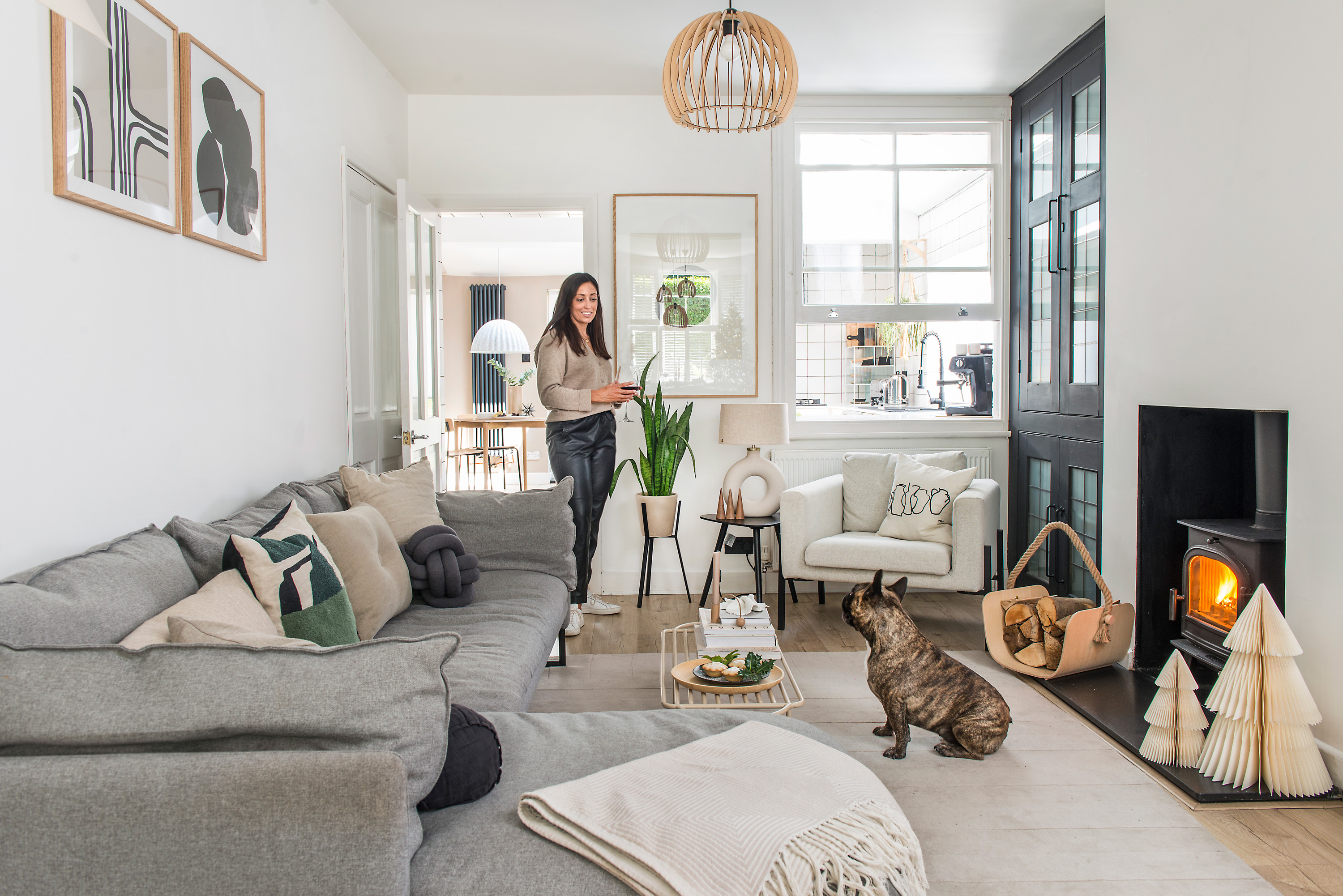
The living room is part of the open-plan space, with a door to the kitchen on the left, and the dining room to the right. ‘Whoever is in the living room is near enough to the kitchen that we can still chat to each other,’ says Katie. The pine cupboard has been painted black and is used to house blankets and wine. The window used to look out over the garden before an extension was added for the kitchen prior to the Seidlers moving in. Armchair and log holder, both Ikea. Lamp base, H&M Home. Lamp shade, Ferm Living. Sofa, Made. Rug, Nordic Knots. Artworks, Studio Paradisi. Coffee table, Bloomingville
Profile
The owners Katie Seidler, an interior designer at @hello_haus, her husband, Russell, a marketing director, and their French bulldog, Henry
The property A three-bedroom Victorian detached house in St Albans
Project cost £17,800
‘Although the house didn’t need any structural work, the interior was very plain and hadn’t been used to its full potential at all,’ says Katie. ‘I could instantly see how we could transform it to make it work for us. Not only was it in the ideal location for us, being close to all our friends and family, but the large kitchen and original sash windows really sold it to me – along with the internal window from the living room to the kitchen and all the bolt-ons, like the loft extension.
'We call this house the Tardis as you really can’t tell how big it is from the outside! I loved the size of all of the rooms and could see that, with some clever space planning and the right furniture, it could become our perfect home.’
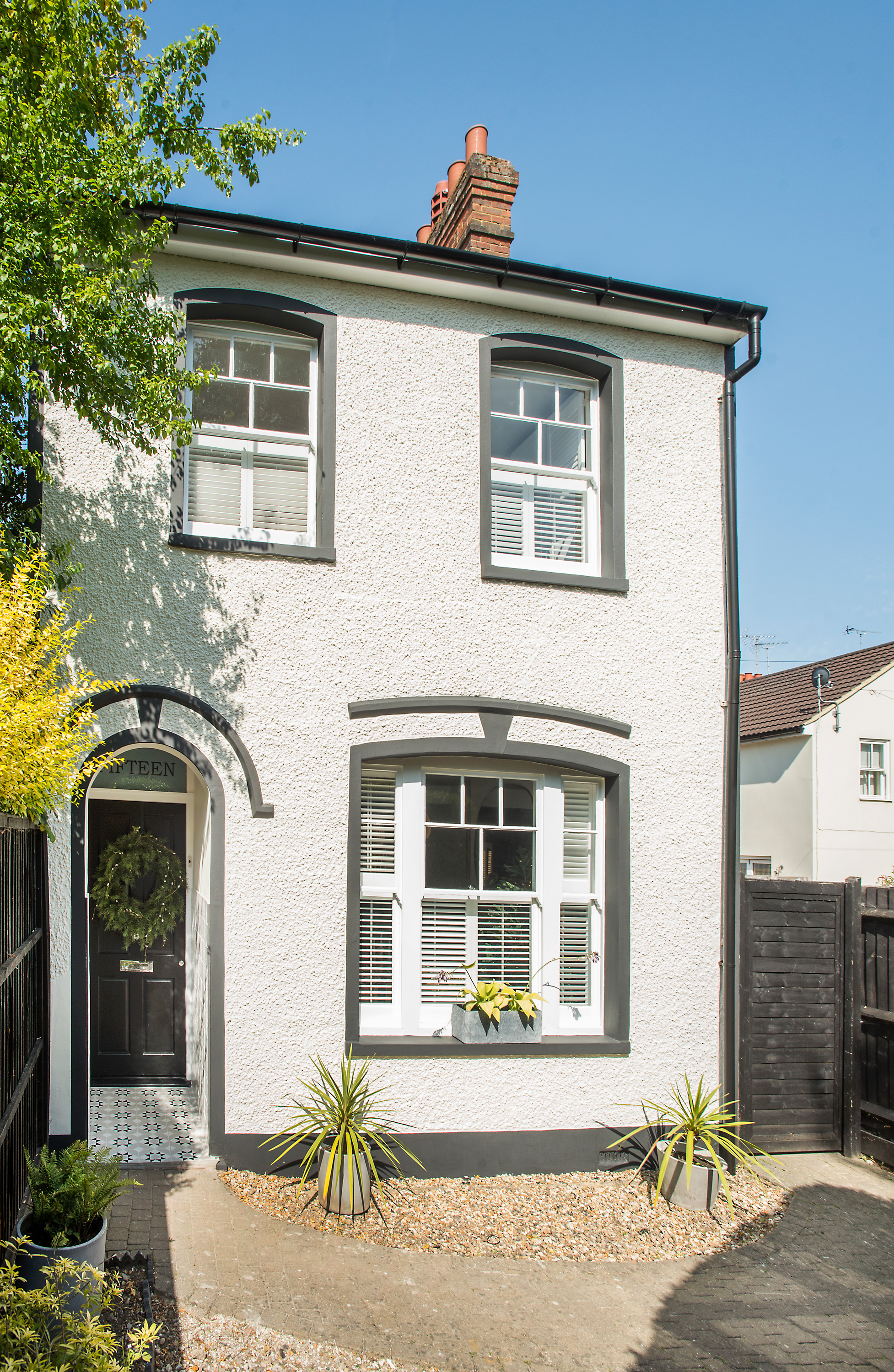
The exterior of the house reflects the neutral colours within
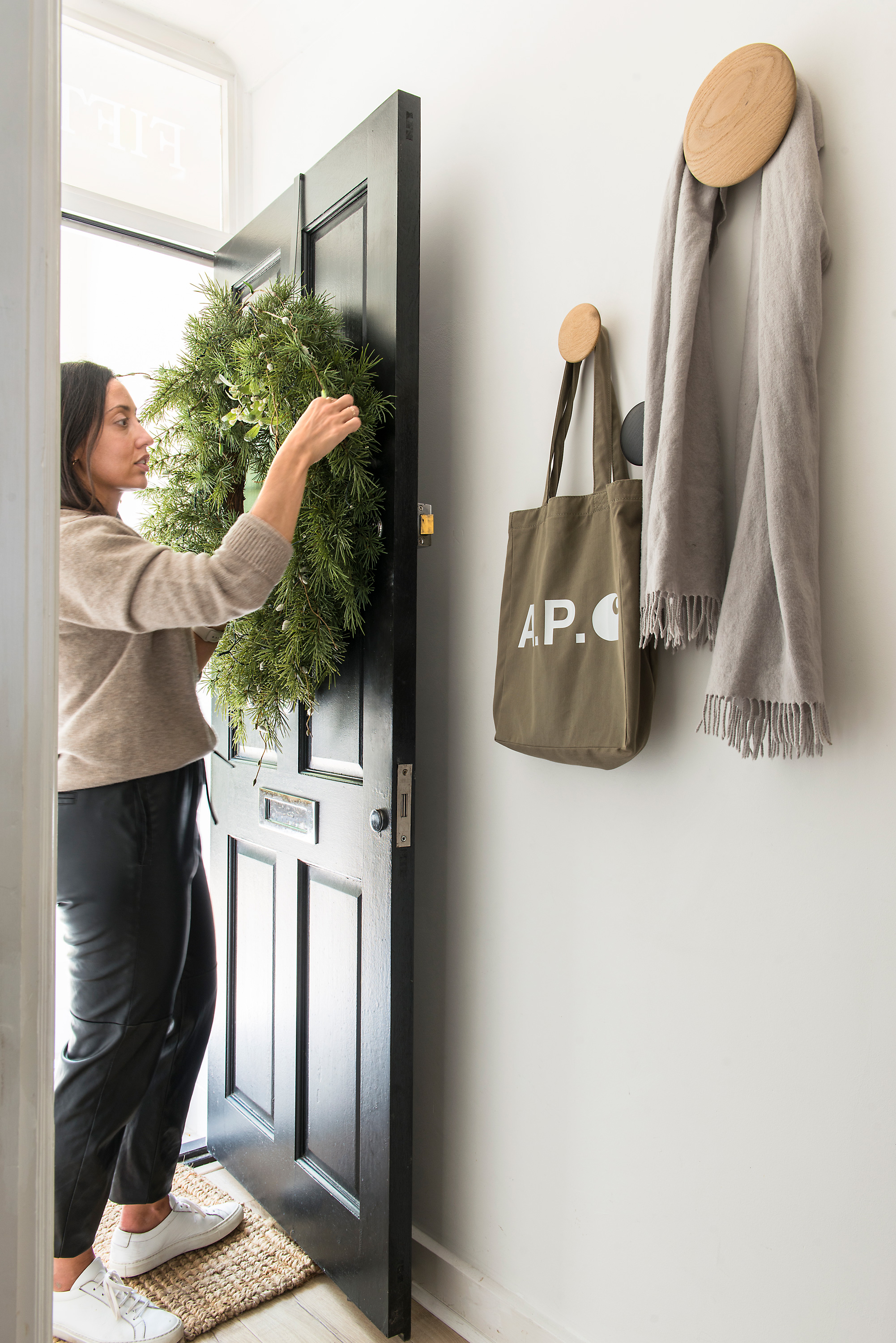
With no major works to be done, painting was carried out and a new wood floor installed. Katie wanted to ensure the house was cohesive, light and serene, and describes her vision as a mix of ‘Japanese style and Scandi design’. Her love of Danish furniture, clean lines and lots of texture were the focus when designing each room, with her eye for detail ensuring every corner and nook has been well planned.
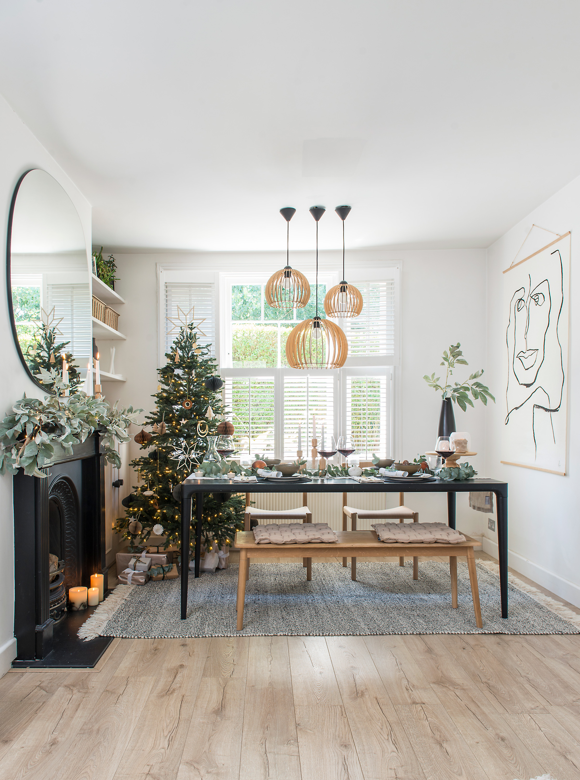
The slimline tree from Balsam Hill is perfect for popping behind the dining table, out of the way but still in view from the living room. ‘The previous owner had the living and dining room as one large living room, but I sectioned it off and centred the sofas around the log burner,’ says Katie. ‘I think we’ve achieved a light, open, uncluttered feel that’s still warm and homely. It’s a real mix of Nordic hygge mixed with Japanese wabi-sabi.’ Chino pendant lights, Amazon. Rug, West Elm. Table, Made by Wood. Chairs, TAKT. Art, The Poster Club. Cushions, Sunday/Monday. Paper Christmas tree decorations, Broste Copenhagen. Umbra wall mirror, Hurn & Hurn. Garland, West Elm. 6” pre-lit Norway Spruce, Balsam Hill
The Seidlers’ living and dining space was previously used as one large living area, but Katie quickly turned it into a more functional room where they could entertain as well as relax. ‘Zoning is key,’ she says, ‘I look at a space and work out how to make the best of the light and furniture placement. I’ve used rugs to turn the two areas into distinct spaces. Everyone needs their home to work for them and I think we need to ensure it’s how we want to live right now and not necessarily worry about future owners.’
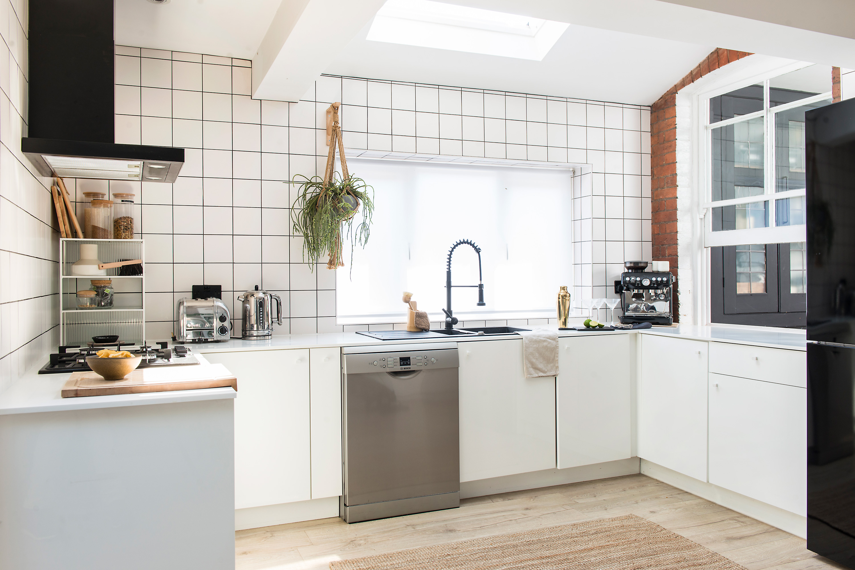
In the kitchen, Katie changed a few elements, such as the worktops, handles and appliances, but has plans to switch it up for a softer, more natural look in the future. Instead of a narrow tiled splashback, the white tiles (with black grout) have been taken up from the top of the cabinetry all the way to the ceiling, creating a neat and ordered appearance. Counter unit, Ikea. Tiles, Tile Mountain. Hanging wall planter, Homesense. Bracket, B&Q
The biggest job the couple had to contend with was the kitchen, where they ripped out the old grey granite worktops and took off redundant wall cabinets to open up the space. The worktops were replaced, the walls were tiled and a new sink, hob, extractor and wall shelves added.
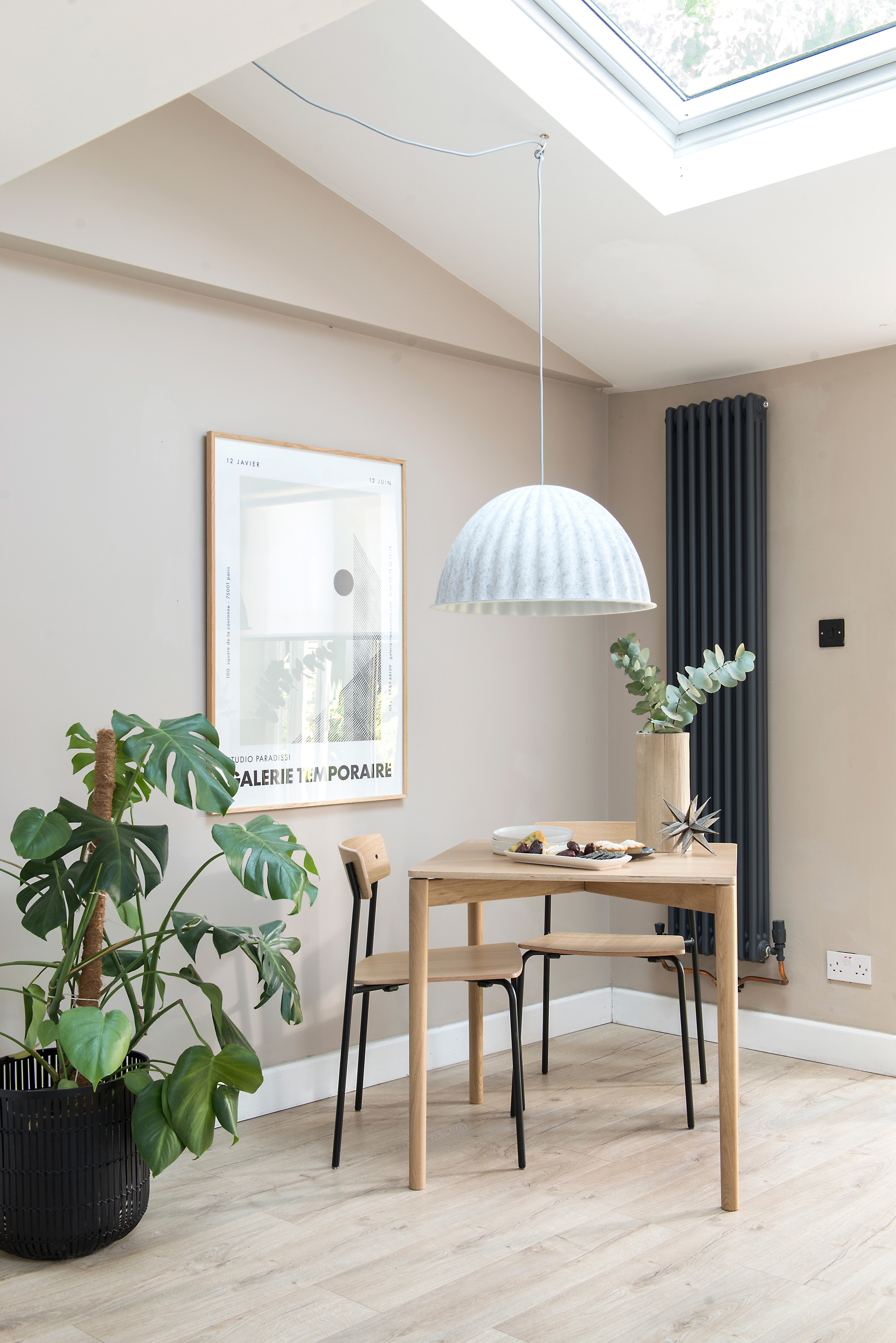
Part of the kitchen has been painted beige to bring warmth to the space, while a small wood table provides an additional dining spot. Overhead, the pendant light is made of 80 per cent recycled PET fibres and is said to enhance the room’s acoustics. Walls painted in Packed Sand, Valspar. Dining table and chairs, TAKT. Plant pot, Made. Under the Bell pendant light, Muuto
Originally, Katie went for a much starker monochrome scheme, but she soon realised it wasn’t for her. ‘The dark walls felt oppressive in my home and wasn’t the vibe I wanted,’ she says. ‘Beige and natural is “me” and that’s how I love to live. I changed the dark walls for more muted tones and a neutral palette, including lots of natural materials. We also ran the same flooring throughout, top to bottom, to bring the rooms together.’
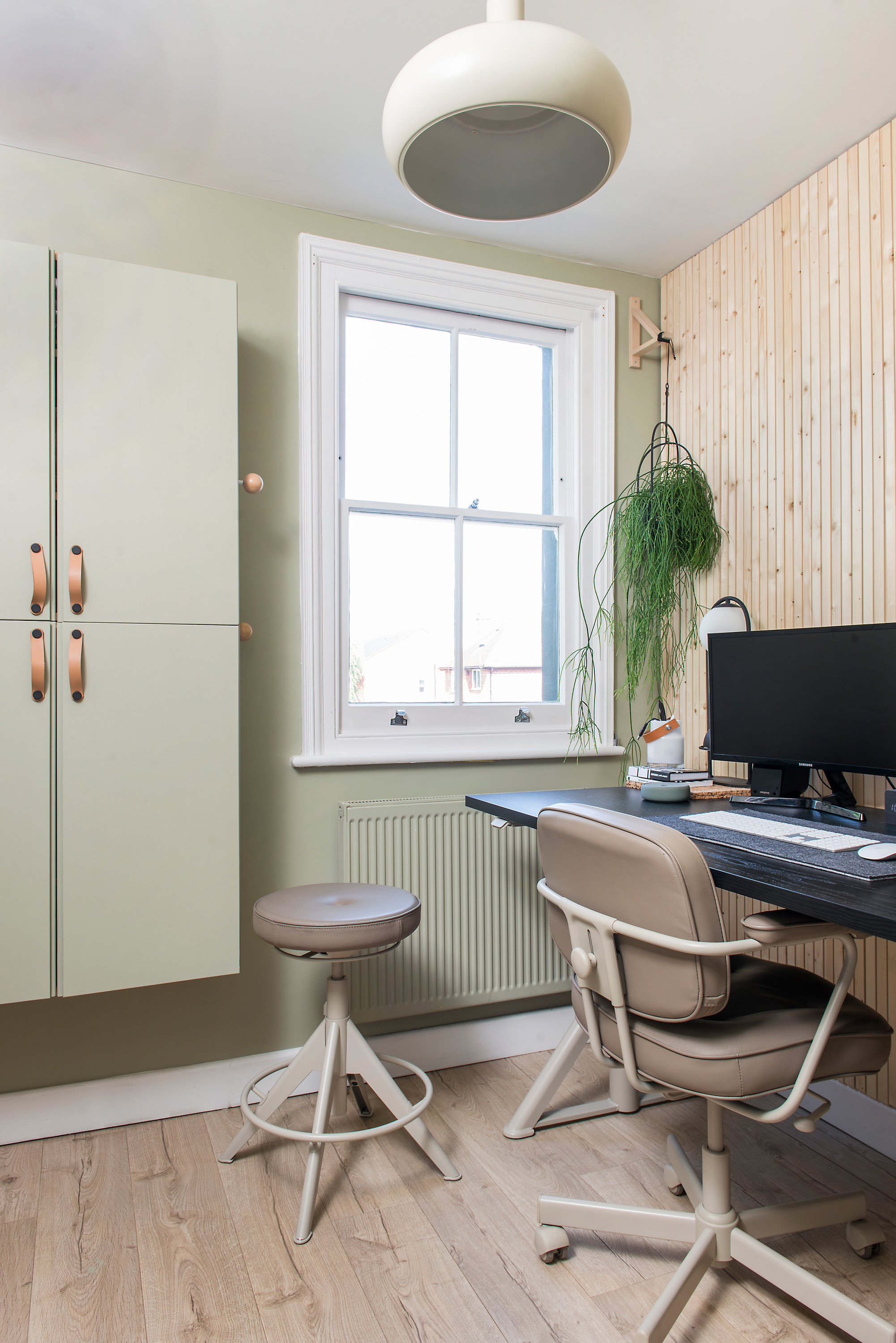
Creating the panelled-effect wall was an easy DIY project that has made a big impact. ‘I love the natural feel in the office, which was created simply by gluing wooden batons onto the wall,’ says Katie. ‘It gives the room warmth and a statement wall that’s calm and subtle.’ Office chair and cupboards, Ikea. Walls painted in Overtly Olive emulsion, Dulux
Nowhere does Katie’s love of natural materials and wood come into play more than in the home office, where Russell has recently installed wooden batons onto the wall for a slatted effect. It adds a warmth to the room that’s calm and subtle, while adding impact, albeit in a more natural form.
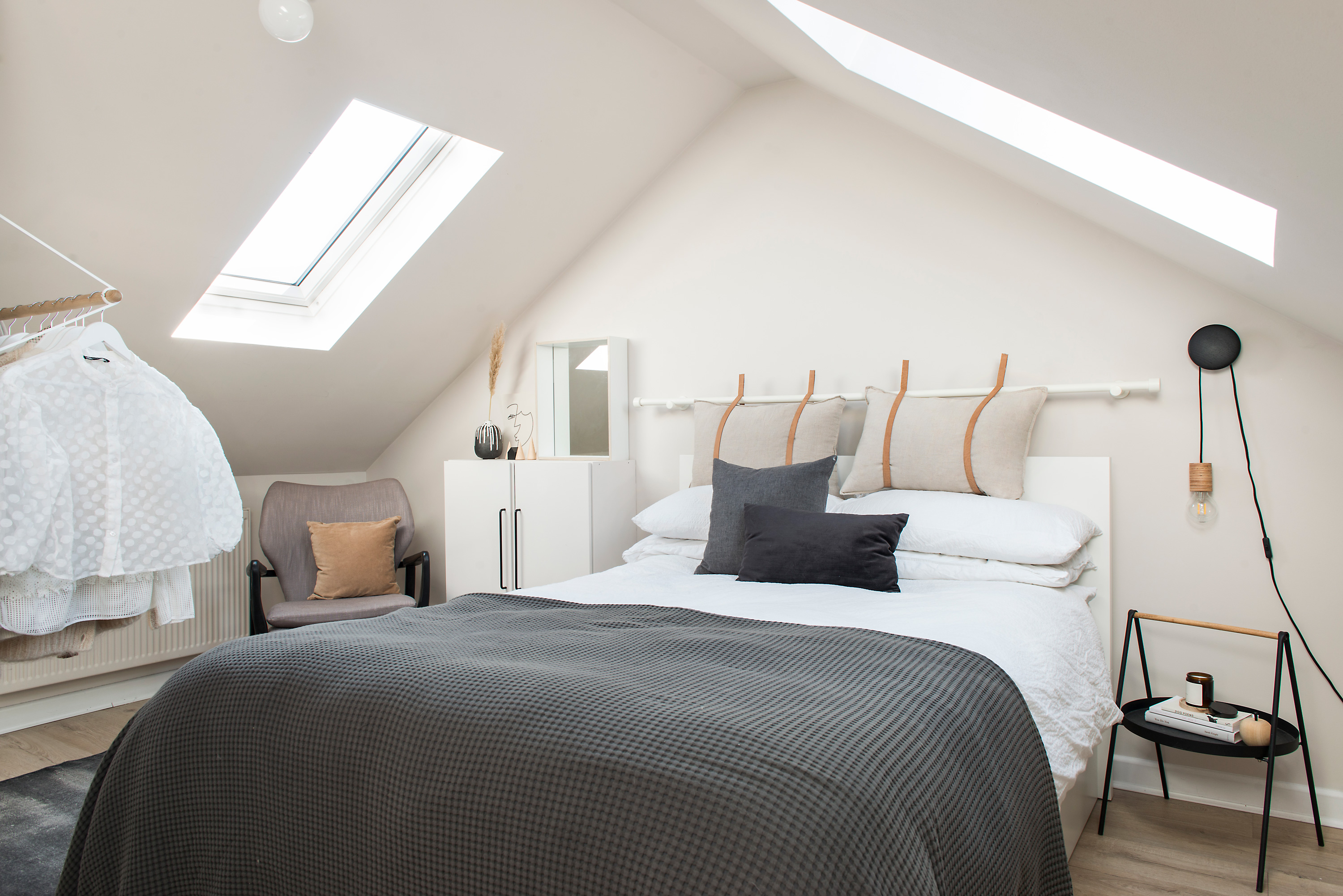
‘The loft room was where we tried to fit three goals into one room,’ says Katie. ‘It needed to be a spare bedroom, have storage space and include a home office for me. It’s probably one of the most practical rooms in the house.’ Parchment emulsion, Craig & Rose. Malm bed, Ikea. Bedside table, Wayfair. Bedside light, Clas Ohlson
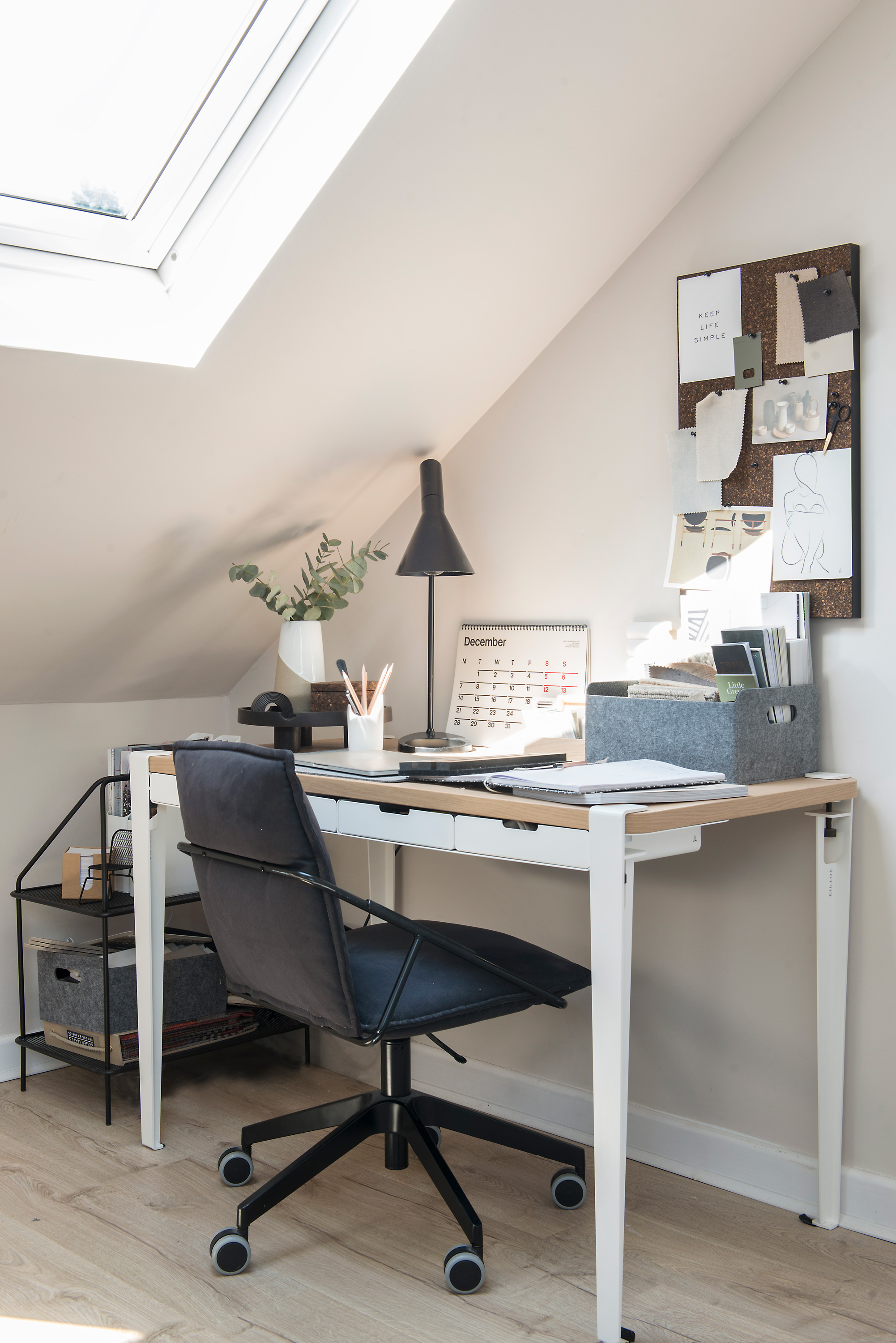
The desk in the second bedroom fits Katie’s brief for furniture that is simple in design. ‘I use a muted, minimal colour palette and combine Japanese and Scandinavian style,’ she says. ‘Both cultures believe in longevity in design and the use of natural materials. I ensure I have lots of layered texture, natural oak and organic shapes throughout my home which delivers on the “Japandi” aesthetic.’ Desk, Tiptoe. Chair, Ikea. Lamp, Homesense
Keeping to the same colours in each room also means they flow from one to the other seamlessly and enables Katie to move furniture and accessories around easily, as they work in every space. ‘Danish brands are my go-to when it comes to furniture and accessories; Ferm Living, Hay, Normann and Takt, for example,’ she says. ‘I love buying from independents that I find on Instagram, too, especially when it comes to ceramics and prints. My favourites are Map Stores, Nest, Earl of East and Studio Paradisi.’
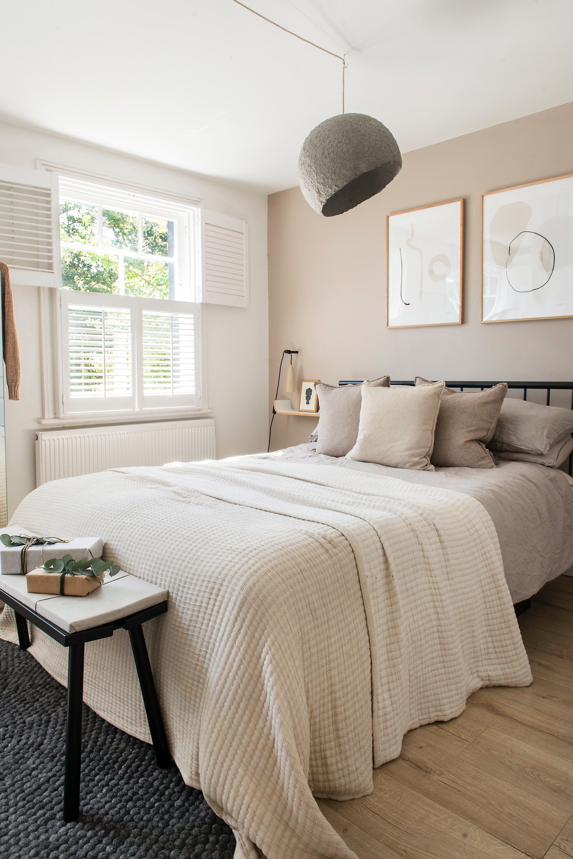
The muted palette continues upstairs, with a beige wall framing the bed and two shelves for bedside tables to keep the spacious feel. Katie advises using a mix of light sources, from wall lights to table lamps, floor and ceiling lights, to create ambience. Wall painted in Packed Sand, Valspar. Penn bed, Made. Pendant light, Crea-Re Studio. Bedspread, Ferm Living. Artworks, The Poster Club
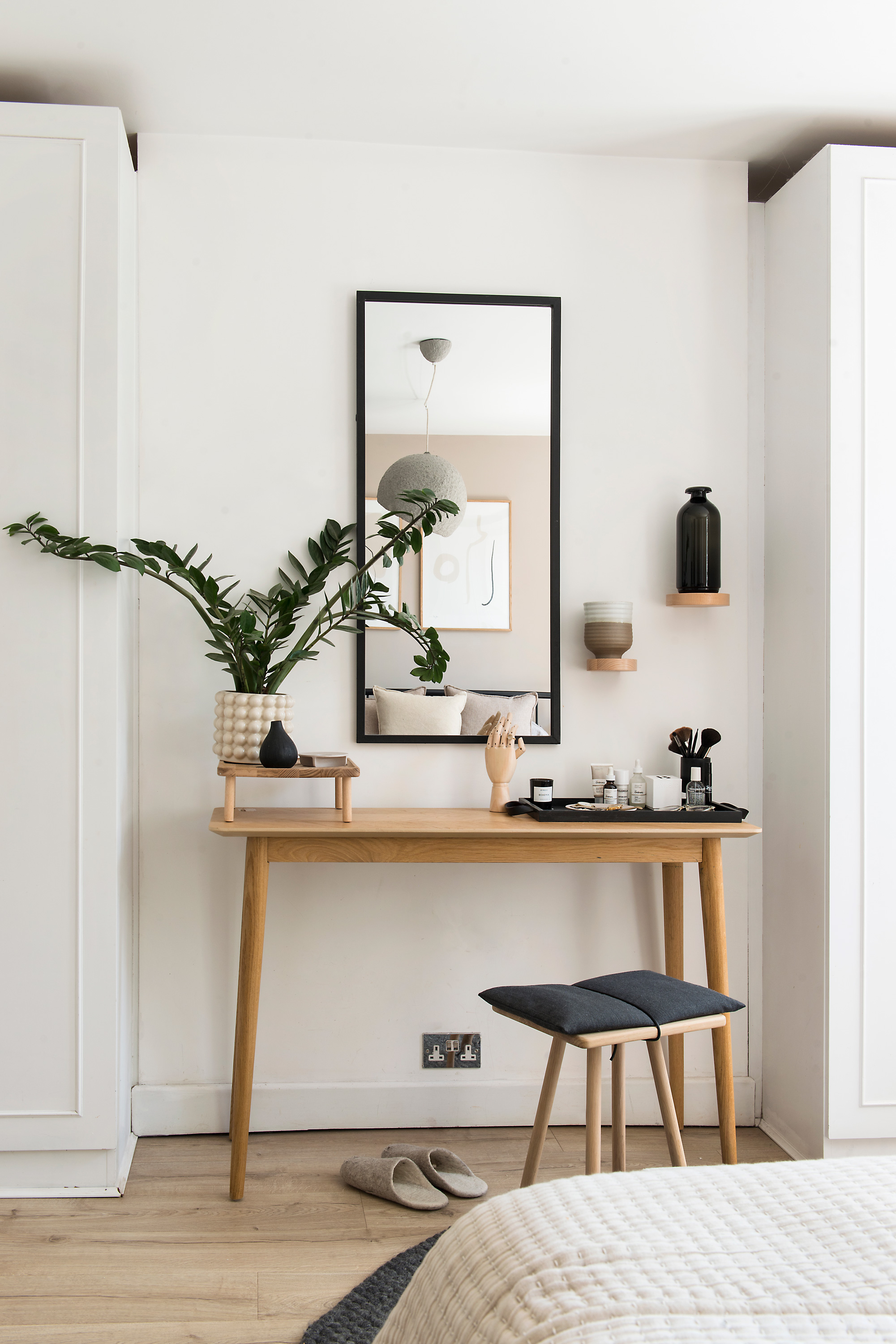
Katie’s inspiration for styling comes from many different sources – cafes, clothing stores and, of course, Pinterest and Instagram. ‘I’m also old school,’ she says, ‘and nothing beats a great interiors magazine to flick through with a coffee!’ In the master bedroom, her dressing area has been kept simple, with Katie using levels to add interest. ‘By using a small wooden platform and wall shelves I am able to use plants and vases to add in texture.’ Dressing table, Homesense. Stool, Skagerak. Shelf (on dressing table), LSA. Mirror, Broste Copenhagen
Contacts
Tree Balsam Hill
Furniture Tiptoe Design
Christmas wrapping and lights Nordic House
With the interior complete, the Seidlers were able to turn their attention to the exterior, where they gave their compact garden a neat refresh. They employed the help of a local company, who landscaped it and built planters around the edge, which took around a month. ‘I’d love a bigger garden so I could build my dream garden office, but we’ve made the best use of the small space,’ she says.
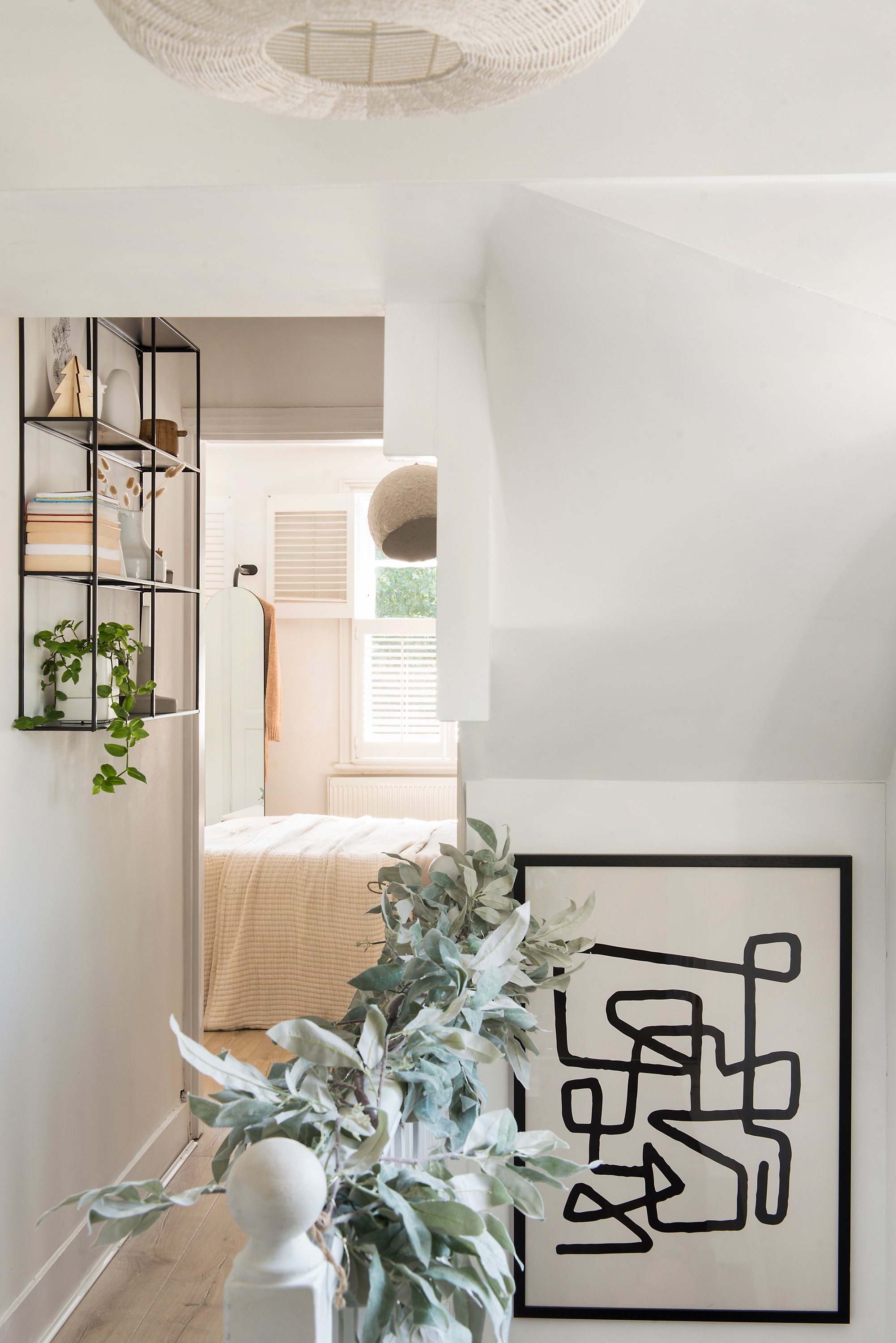
Asked about her finishing touches, Katie confirms that she still has a huge list to go. She’s constantly tweaking the small things and helping the house evolve. ‘I’m not the most patient person and there’s been so much I’ve wanted to change in the house, but it takes time,’ she says. ‘It can’t all be done at once – creating a home you love can be a slow process. I’m so pleased with what we’ve achieved, though, and I’m looking forward to showing off our hard work at Christmas.’
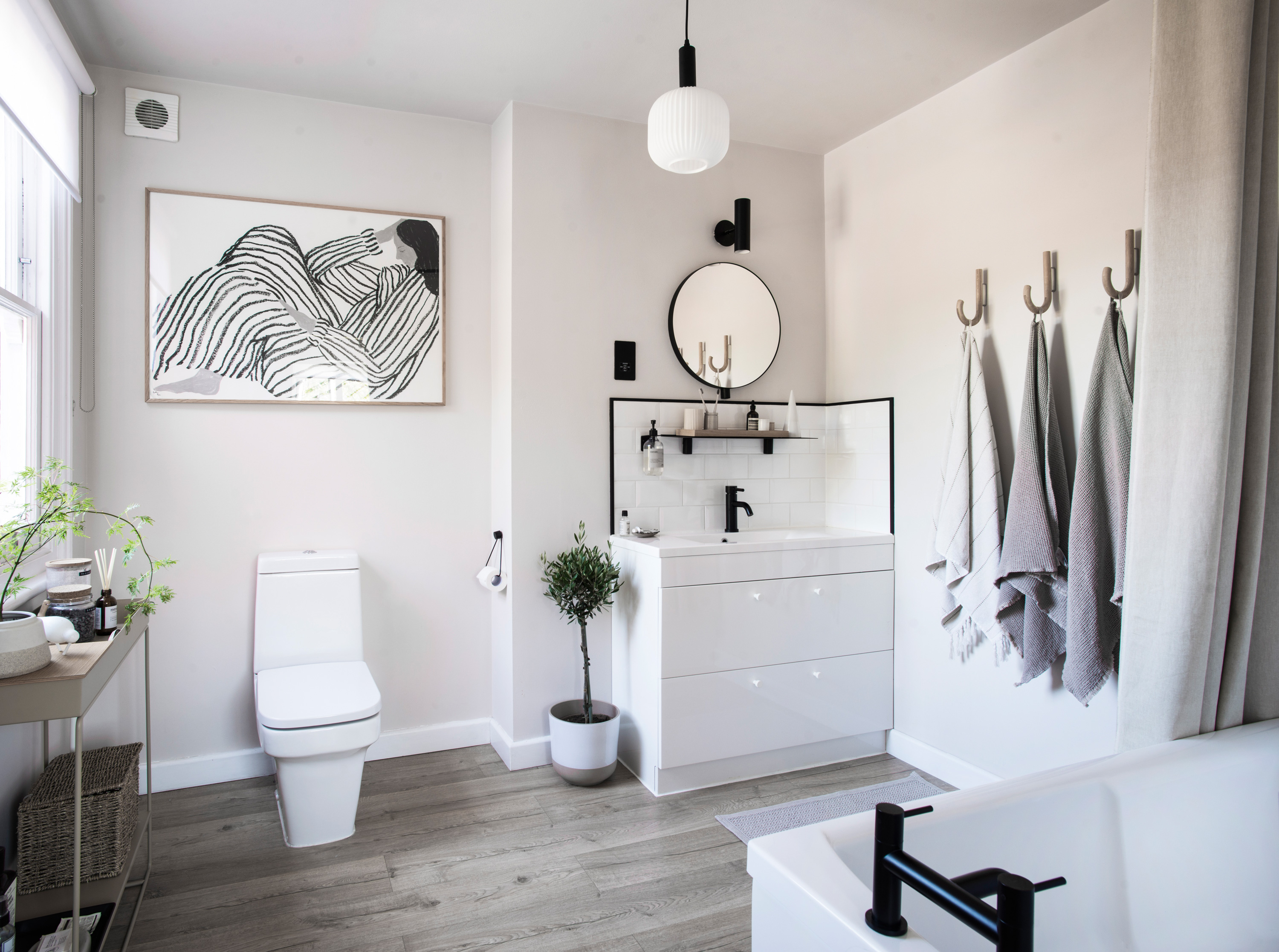
Pale colours have been used in the bathroom as a backdrop for artworks, plants and accessories. ‘By using paint effectively and changing up the small accessories and little details, you can totally transform a space,’ says Katie. Shower curtain, Ferm Living. Mirror, shelf and hooks, Gejst Design
Subscribe to Real Homes magazine
Want even more great ideas for your home from the expert team at Real Homes magazine? Subscribe to Real Homes magazine and get great content delivered straight to your door. From inspiring completed projects to the latest decorating trends and expert advice, you'll find everything you need to create your dream home inside each issue.
More reading:
- Scandi living rooms to inspire a minimalist makeover
- Scandi Christmas decoration ideas
- White kitchen ideas – classic designs for a fresh look
Join our newsletter
Get small space home decor ideas, celeb inspiration, DIY tips and more, straight to your inbox!
-
 This colourful home makeover has space for kitchen discos
While the front of Leila and Joe's home features dark and moody chill-out spaces, the rest is light and bright and made for socialising
By Karen Wilson
-
 How to paint a door and refresh your home instantly
Painting doors is easy with our expert advice. This is how to get professional results on front and internal doors.
By Claire Douglas
-
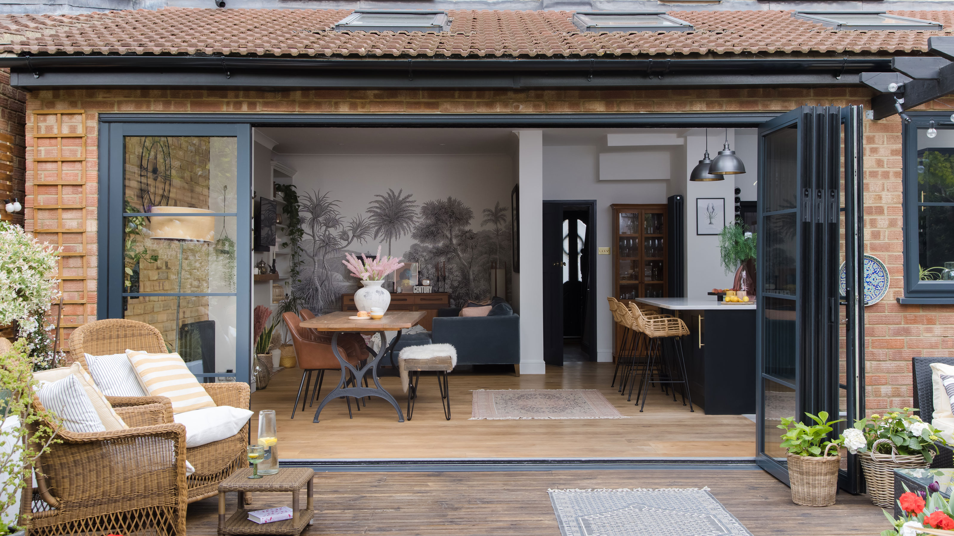 DIY transforms 1930s house into dream home
With several renovations behind them, Mary and Paul had creative expertise to draw on when it came to transforming their 1930s house
By Alison Jones
-
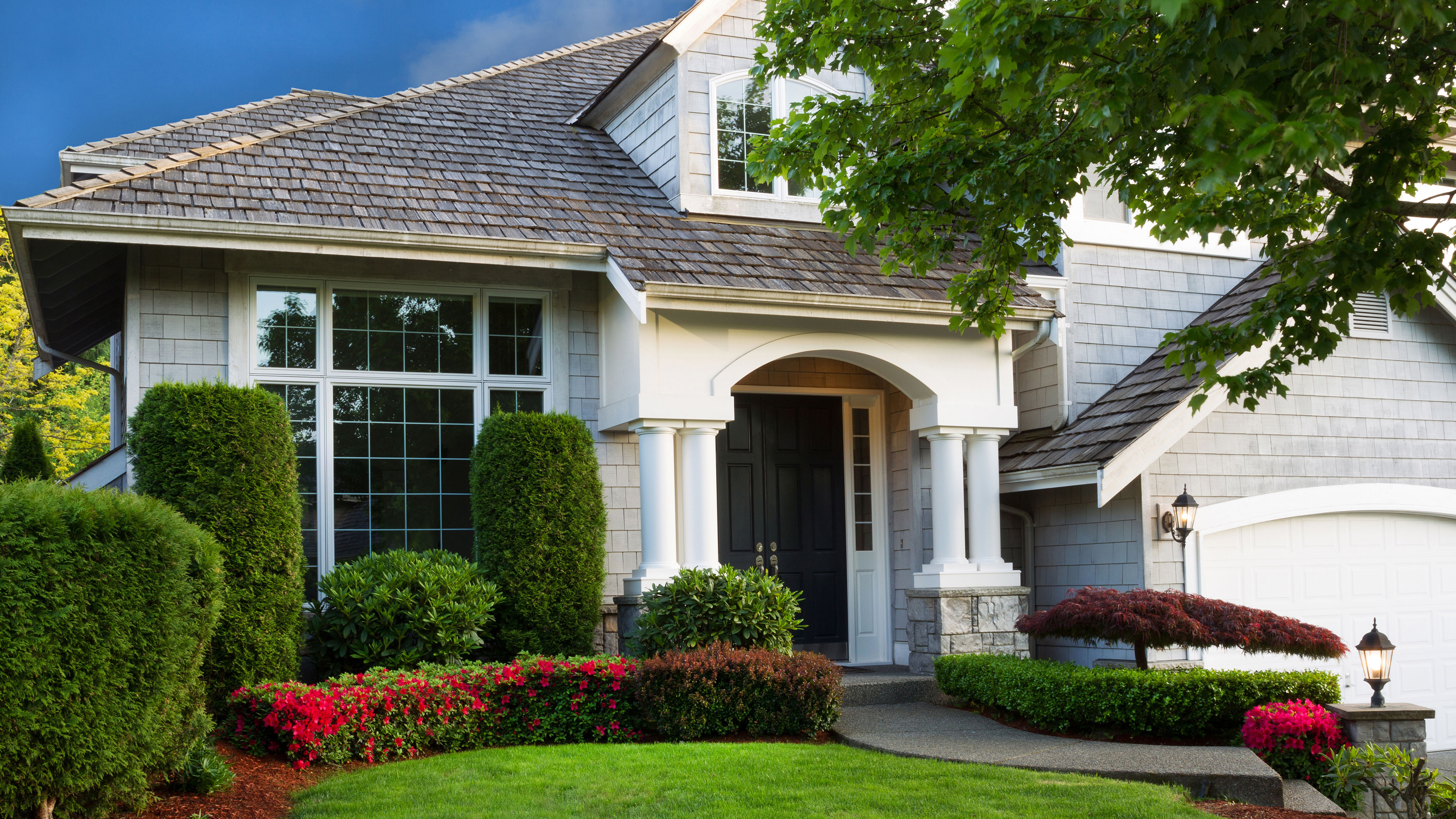 12 easy ways to add curb appeal on a budget with DIY
You can give your home curb appeal at low cost. These are the DIY ways to boost its style
By Lucy Searle
-
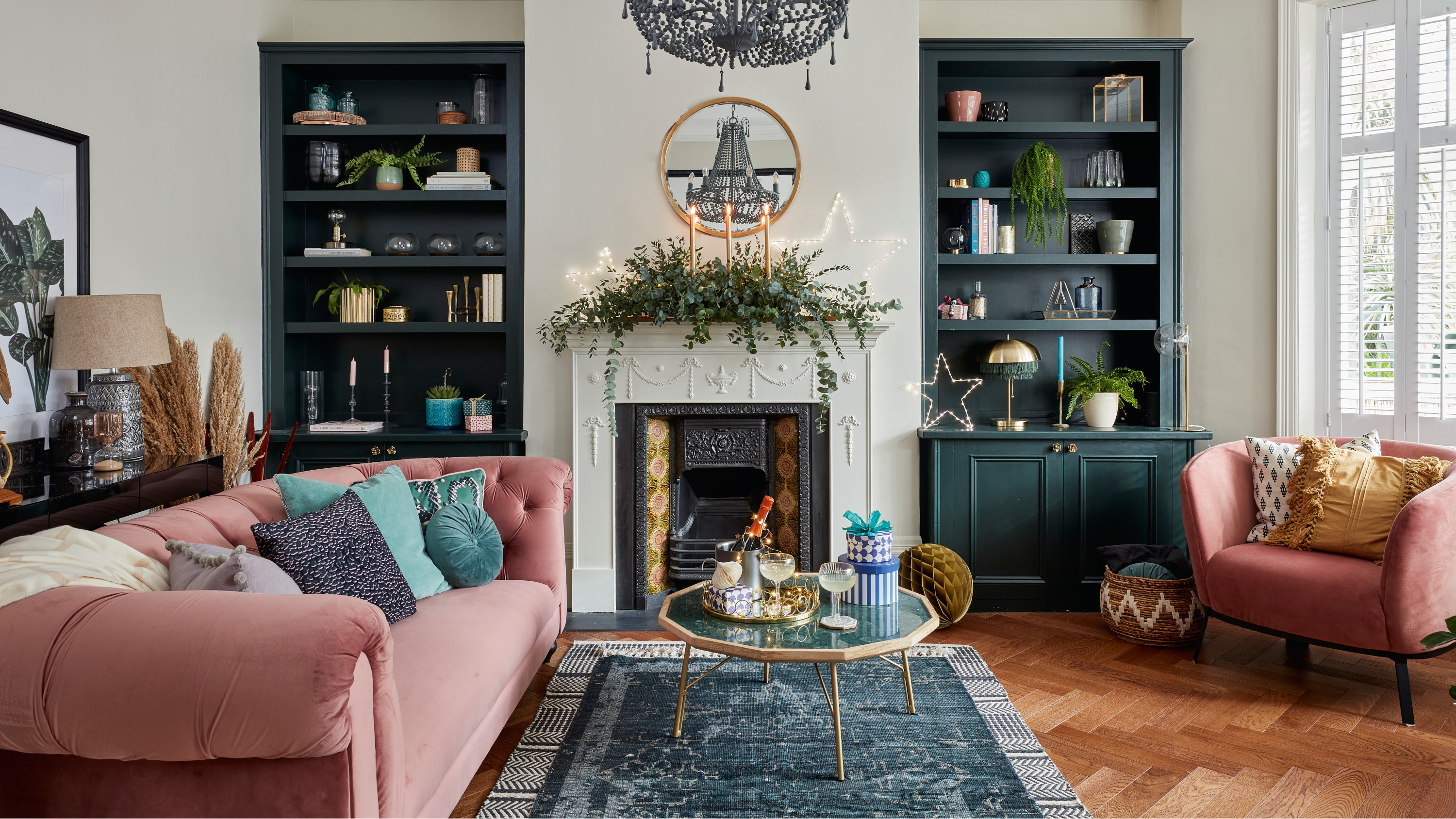 5 invaluable design learnings from a festive Edwardian house renovation
If you're renovating a period property, here are 5 design tips we've picked up from this festive Edwardian renovation
By Ellen Finch
-
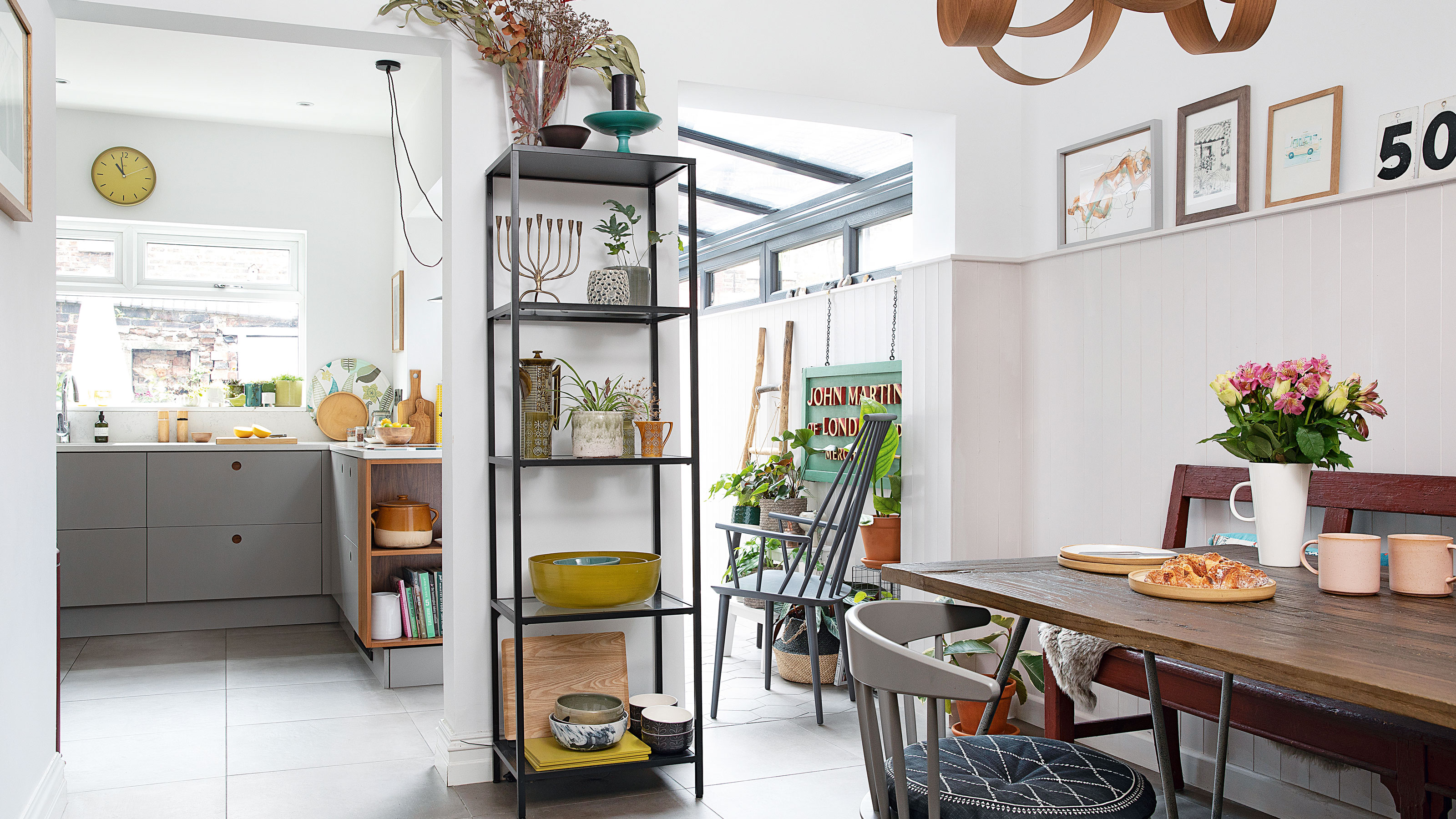 Real home: Glazed side extension creates the perfect garden link
Louise Potter and husband Sean's extension has transformed their Victorian house, now a showcase for their collection of art, vintage finds and Scandinavian pieces
By Laurie Davidson
-
 I tried this genius wallpaper hack, and it was perfect for my commitment issues
Beware: once you try this wallpaper hack, you'll never look back.
By Brittany Romano
-
 Drew Barrymore's new FLOWER Home paint collection wants to give your walls a makeover
Drew Barrymore FLOWER drops 27 brand-new paint shades, and every can is made from 100% post-consumer recycled plastic.
By Brittany Romano
