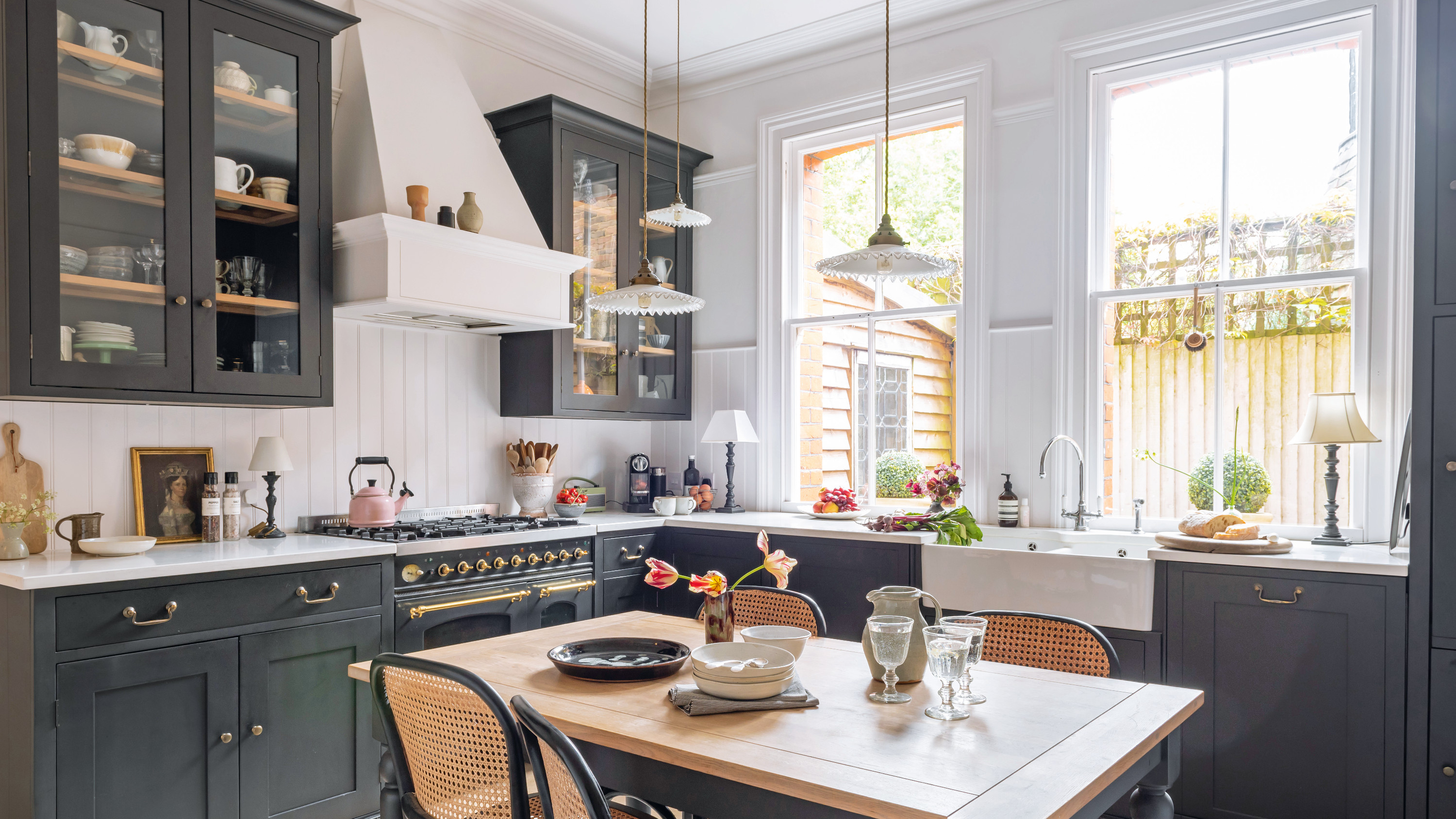

During the 26 years they’ve lived here, Karen and Kevin have seen significant changes to their two-bedroom maisonette. After buying the ground floor of the beautiful Victorian building in 1996, the couple set about creating a home for the two of them until their son, Monty, came along. In need of more space – they’d sacrificed a second bedroom to create a larger kitchen – they bought the basement, then a communal area for the five apartments in the building, from their neighbours, and began a renovation.
Restoring this part of the building to its former glory – the couple found the original, blocked-off entrance to the basement in their own apartment – was the start of an ongoing journey to add charm and personality to their family home, from paneling their bedroom to restoring character to the living room with coving.
It’s clear that Karen's merchandising background and foray into styling have played a huge part in how the home looks today. She’s carefully crafted a beautiful and cohesive scheme across two floors, contrasting strong color palettes with natural textures that soften each room. We asked Karen to talk us through the space.
The kitchen
Profile
The owners Karen McBain, an interior stylist, her husband, Kevin Steer, who renovates houses, their son, Monty, and cat Freddie
The property A two-bed maisonette in a property dating from 1895 in Guildford, Surrey
Project cost £30,000
'We bought the property as a ground floor flat within this Victorian building and, 10 years later, purchased the basement, so it now feels more like a house,' says Karen.
'We’ve knocked down walls (the kitchen was originally two rooms), ripped out the kitchen and bathroom to put in new ones; it’s seen a fair few changes. Whenever we start thinking about moving, we just end up redecorating again instead.
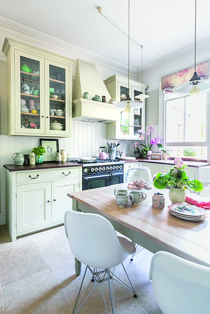
'The kitchen was neutral with a dark wood worktop, and we decided we wanted more contrast, so we sprayed the units just as the first lockdown came into force. Everything suddenly looked very black – we questioned what we’d done for a minute!'
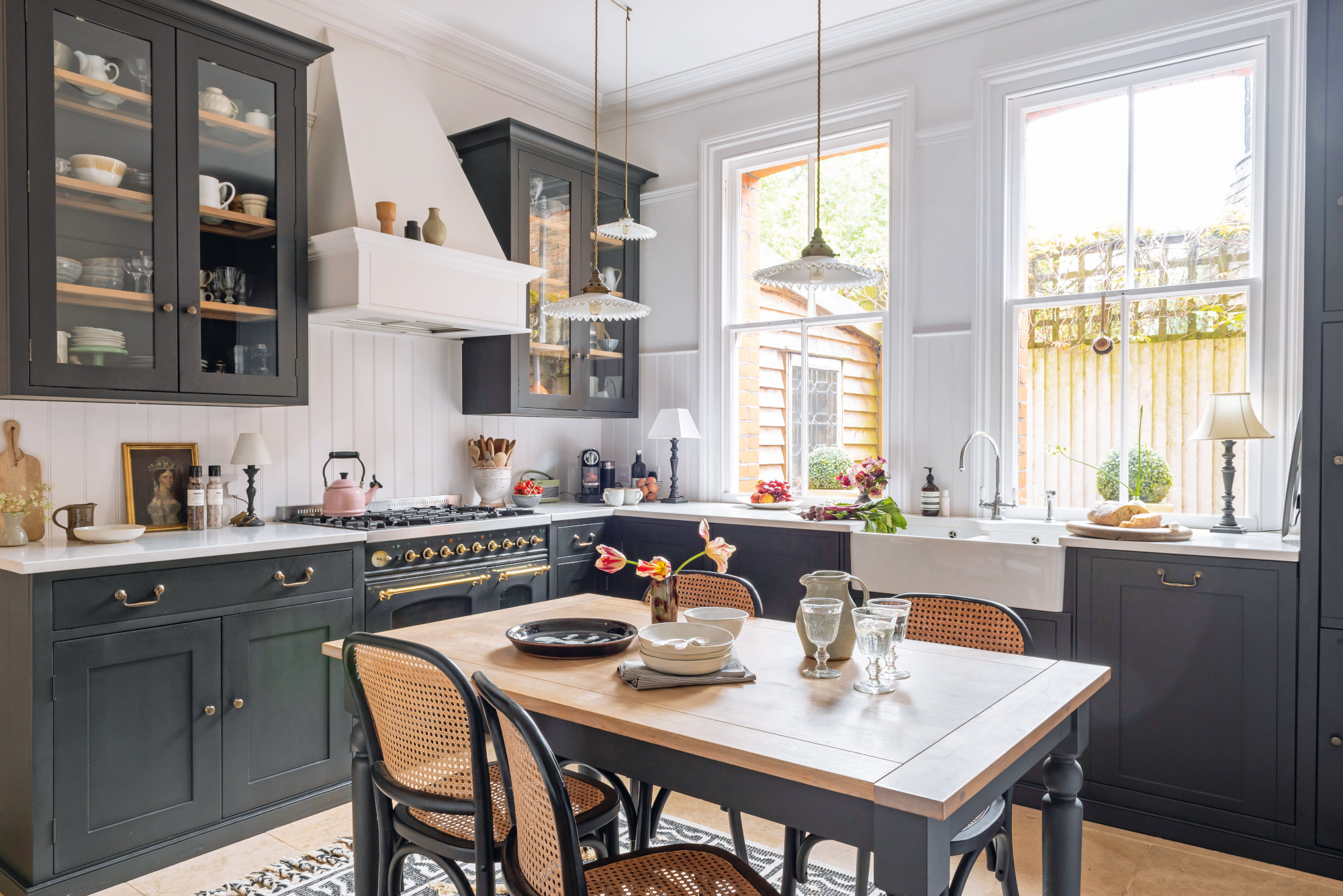
Kitchen units spray painted in Pitch Black, Caperol via Paintshack. Dining table, Neptune, also painted in Pitch Black. Dining chairs, Cox & Cox. Pendant lights, Ardingly Antiques Market, with fittings and cord from Lamps & Lights. Rug, Anthropologie. Panelling paint color matched to Wevet, Farrow & Ball
'We did the color first to try and draw the eye up from the units, and it works: it makes you more aware of the height of the room. The glazed wall units are a great frame for our collection of ceramics – I love artisan pottery so wanted to draw attention to them here. I love Wattle & Daub for vases, cushions, and vintage finds, and Design Vintage for plates and bowls.
'I find it really interesting to look back and see how we moved forward with the color – something got our gut and we decided to go very black and white. We also painted the table legs and looked for some cane furniture to add textural interest.'
The living room
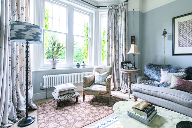
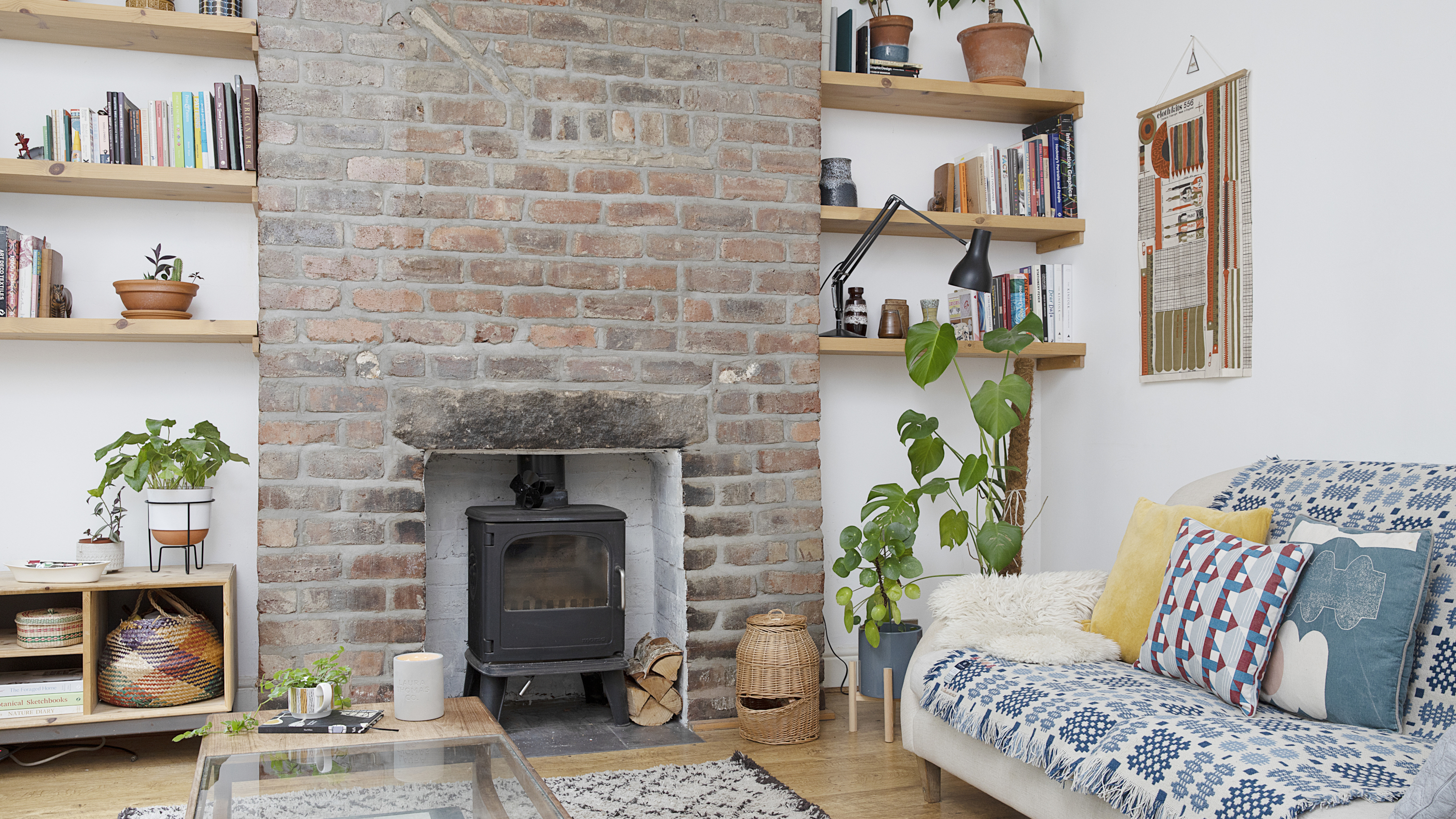
Originally, the living room was painted grey with white skirting, but Karen repainted everything in the same color for added elegance.
'In the lounge, we wanted something more breathable, and have added a couple of new pieces of furniture to give it a new lease of life,' says Karen. 'All of the period features were removed in the 1980s, so we made it a priority to reinstate what we could.'
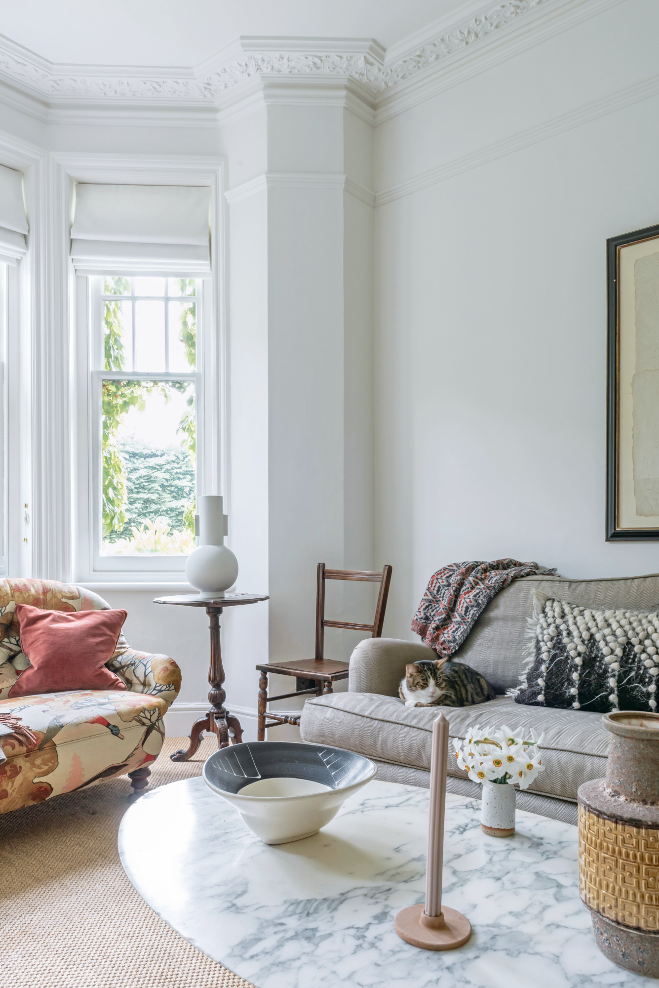
Lounge sprayed with Caperol Amphibolin paint, color-matched to Farrow & Ball. Beige sofa, Sofa.com. Coffee table, Modern Twentieth Century Marks in Westerham. Pots, vases and cushions, Wattle & Daub in Godalming
'We added the coving in the living room to complement the fireplace, which was already here – it’s one of my favorite things about the whole house. That room, in particular, felt much more period in style until the recent update, actually; we got rid of the curtains and some of the more floral accents.'
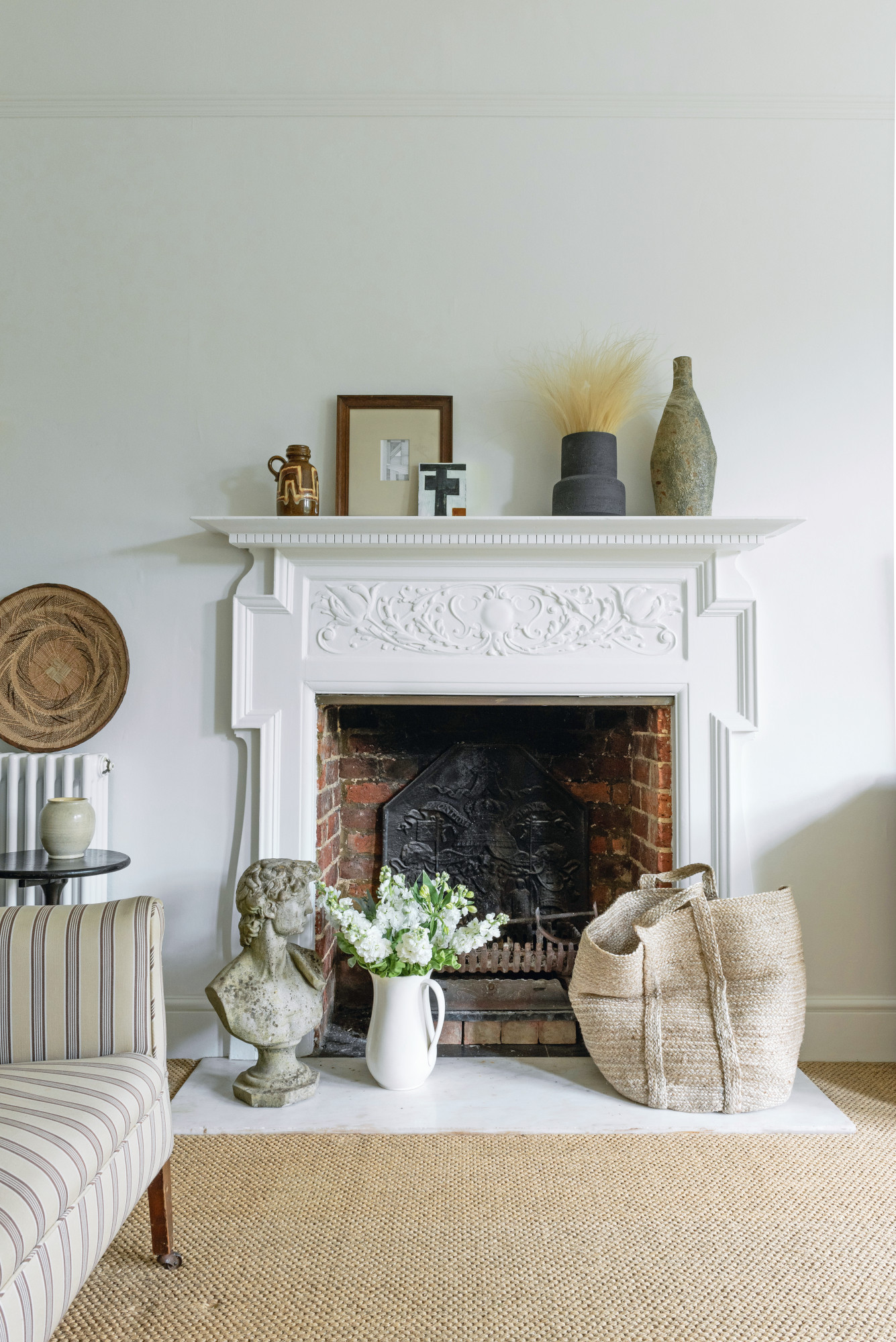
Striped sofa, Kempton Market, upholstered in Ian Mankin fabric
The space is clutter-free, but Karen admits objects find their way into her home. ‘I see so many lovely things every day and I want all of them,’ she says. ‘I’m always trying to be more minimal but things keep creeping back in! Some people are eclectic and some minimal; I’m in between.’
The bedroom
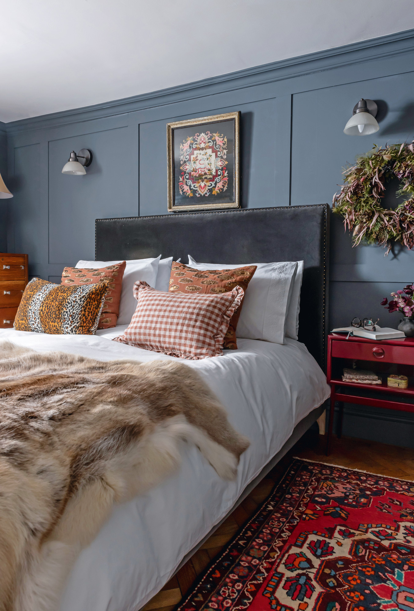
Walls painted in Notting Hill Slate from Designers Guild. Bed, Sofas & Stuff. Wall lights, Ikea. Wreath, Wattle & Daub. Bedside tables, Anthropologie. Cushions, Day Birger Et Mikkelsen and Projektityyny. Throw, Kempton Antique Market
Warm rugs and a wooden floor offset the cool grey paneling in the bedroom. Set in the basement, it fits with the downstairs scheme of dark grey, ash blue, and rust.
'We’ve always gone very light in the bedroom, but as soon as we painted it darker, the transformation was amazing – it felt restful, more cocooning. The same thing happened with the small bathroom. Whenever we paint it light, it doesn’t seem to expand it – so we’ve embraced the darkness in there, too.'
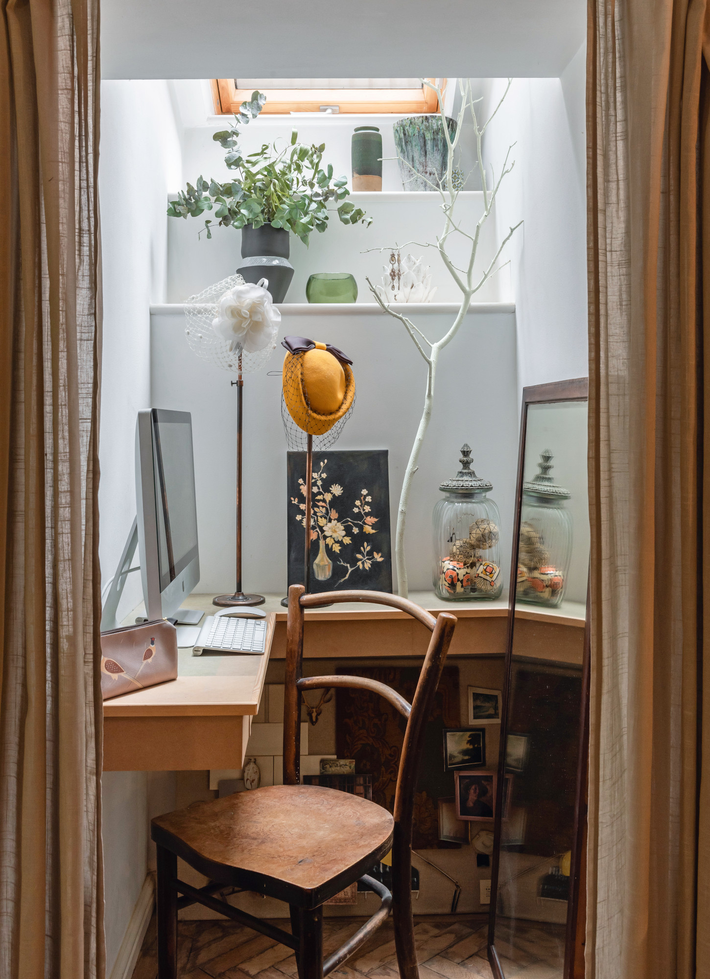
Desk and flower print, both made by Karen. Chair, inherited
A light well in the bedroom makes for the perfect home office design. ‘I’ve always had a love of putting things on display,’ Karen says of the curios on open shelving.
‘I remember putting things out in my bedroom when I was about four years old – and later on, I had a career in merchandising.’
The bathroom
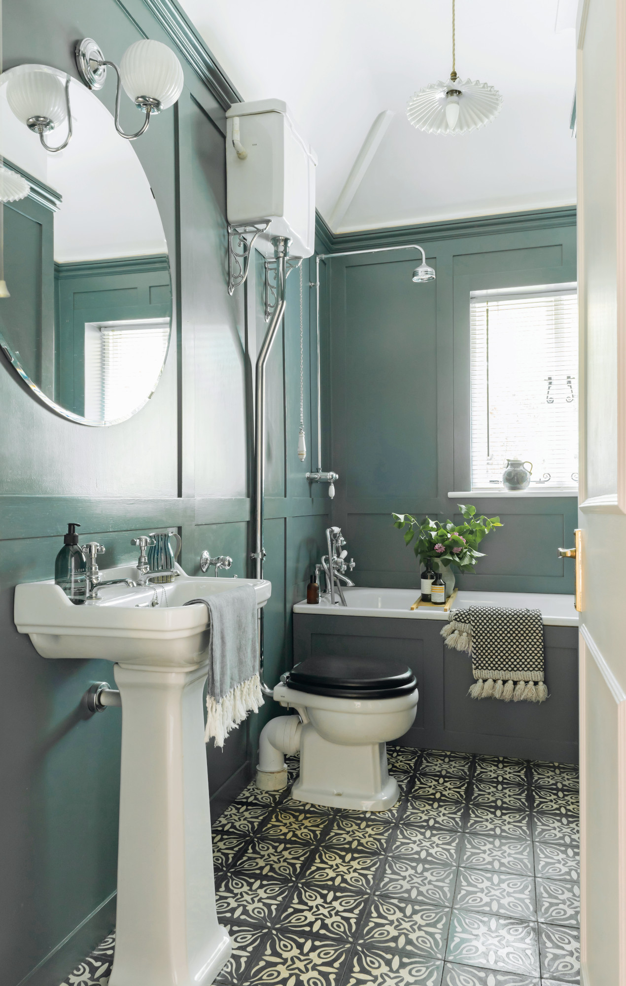
Flooring, Dar Interiors. Walls painted in Notting Hill Slate from Designers Guild. Round mirror, Ikea. Wall light, Lamps & Lights
'We decided we wanted the same color in the bedroom and bathroom for continuity,' says Karen.
'We had paneling in the bathroom before but we took it a lot higher this time, which gives more of a feeling of space. We traced the flooring supplier after we spotted it in Cote in Guildford.'
The teen's room
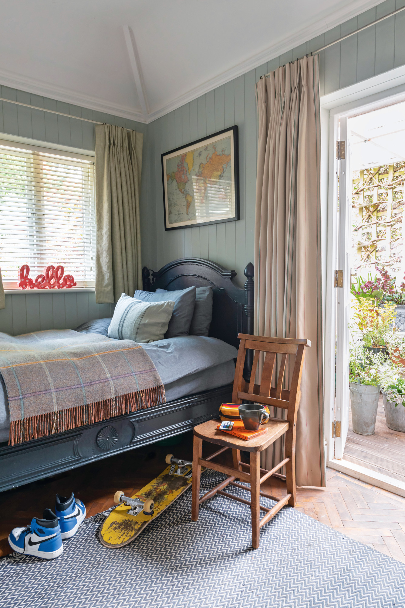
Bed, antique. Walls painted in Blue Gray from Farrow & Ball. Rug, Ikea. ‘Hello’ sign, gift. Curtains, Ian Mankin
Contacts
Quartz worktop Alan Marble Stone
Caperol kitchen paint Paintshack
Cornicing Guildford Plasterworks
Kitchen Neptune
The couple's teenage son, Monty, had a hand in styling his room. ‘He chose the wall color – guided by me,’ Karen laughs.
The herringbone wood floor is from a Harvey Nichols room set. 'Monty’s room is due an update imminently, so I think that will be my next project.'
The garden
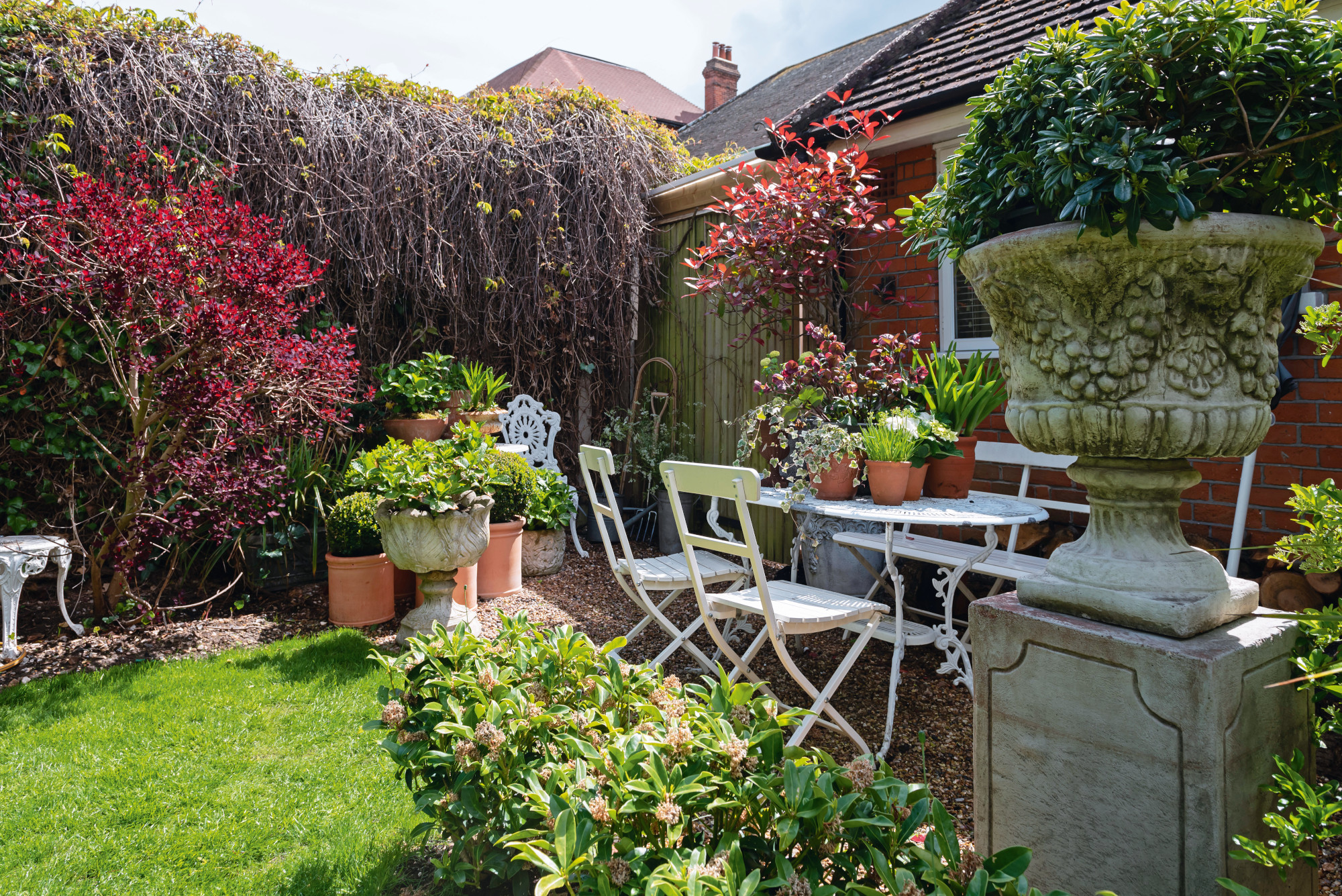
Table and chairs set, Ardingly Antiques Market
A vintage table and chair set make the perfect spot for enjoying the spring sun in the garden. Karen has a hand from her husband when it comes to DIY. 'Kevin was an aircraft engineer until about eight years ago, but he’s always been handy – and now he’s a brilliant carpenter and can do everything.'
'Plumbing, plastering, decorating: the works. I love looking for ideas, which isn’t his thing – but he’s the doer, and I help him do. He definitely has his own opinions but luckily he always seems to like my ideas. He also relishes the challenge of figuring out how to do things, which is very handy.'
Of the house, Karen isn't finished yet. 'We’re always making little tweaks. Plus, once we think we’re done, we end up going back around all of the rooms again – it’s a never-ending project!'
Subscribe to Real Homes magazine
Want even more great ideas for your home from the expert team at Real Homes magazine? Subscribe to Real Homes magazine and get great content delivered straight to your door. From inspiring completed projects to the latest decorating trends and expert advice, you'll find everything you need to create your dream home inside each issue.
Join our newsletter
Get small space home decor ideas, celeb inspiration, DIY tips and more, straight to your inbox!

Formerly deputy editor of Real Homes magazine, Ellen has been lucky enough to spend most of her working life speaking to real people and writing about real homes, from extended Victorian terraces to modest apartments. She's recently bought her own home and has a special interest in sustainable living and clever storage.
-
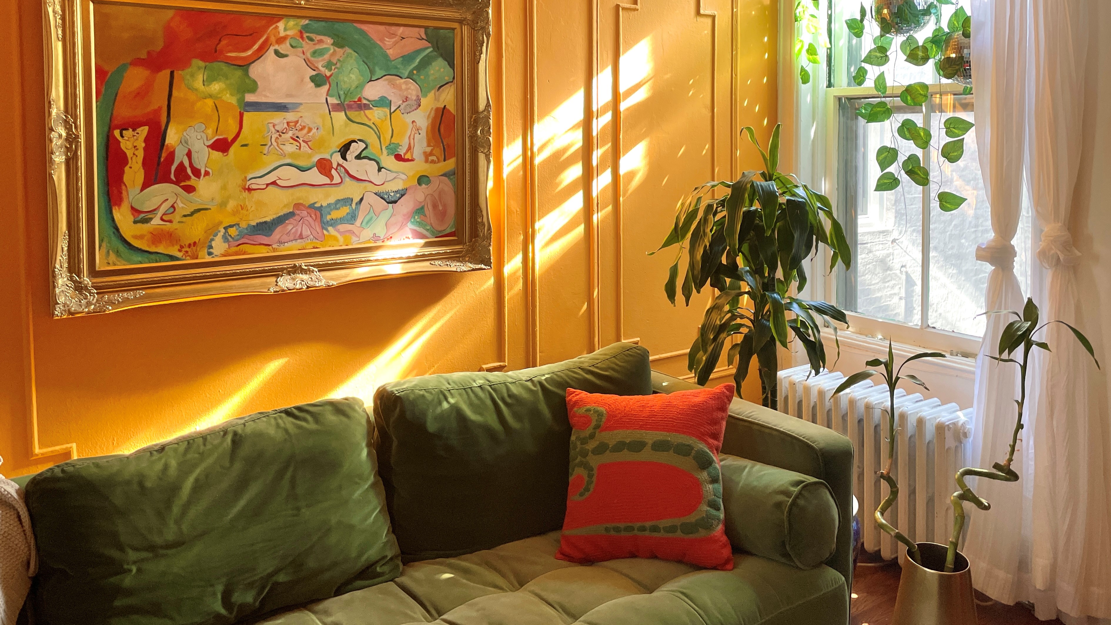 This interior decorator's color-drenched apartment will make you want to throw anything gray out the window
Ally Doman of Doman Decors has a colorful apartment that will make you want to rethink neutral colors and boring palettes. See how she decorated her rental space
By Melissa Epifano Published
-
 Real home: 7 design tips from this Instagrammer's pastel-perfect home
Plus, all the spring decor inspiration you need in one place
By Ellen Finch Published
-
 Before and after: this interiors blogger has added stacks of character to her new build
Plus cost-cutting tips from this £30k reno
By Karen Wilson Last updated
-
 Real home: this interior stylist's London home is the epitome of Scandi cool
Laura and Chris Sabogal’s two-up, two-down Victorian terrace has been transformed into a four-bed family home with a kitchen-diner and spacious loft extension
By Karen Jensen-Jones Published
-
 Real home: 7 design tips from this extended Southsea home full of salvaged and second-hand buys
Including some money-saving ideas we're fully on board with
By Marisha Taylor Published
-
 Real home: 6 ways to make white work in any space from this gorgeous Japandi-inspired home
White doesn't have to be boring – and this home is proof
By Karen Wilson Published
