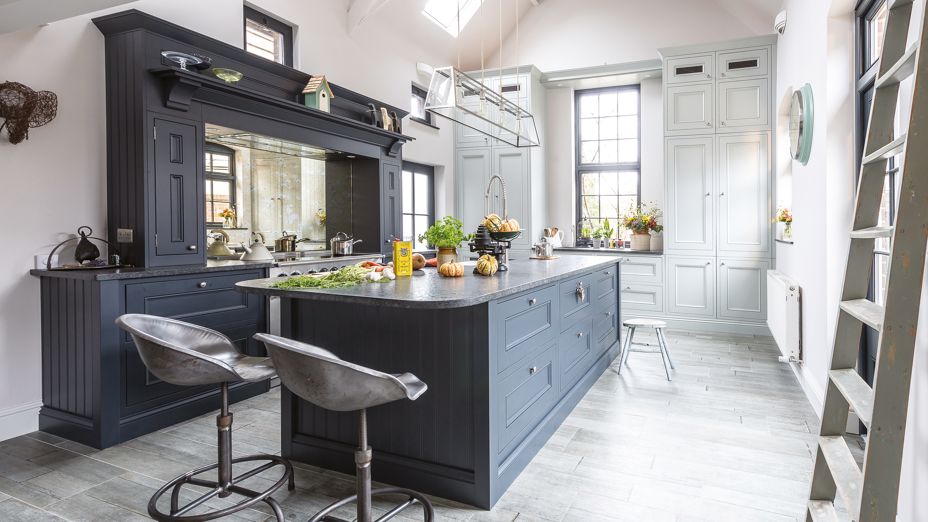
Designing a new kitchen for your home? Be inspired by this former living room – now a beautiful kitchen diner with a living space in the heights of the room's vaulted ceiling – and check out all our room transformations for more clever ideas.
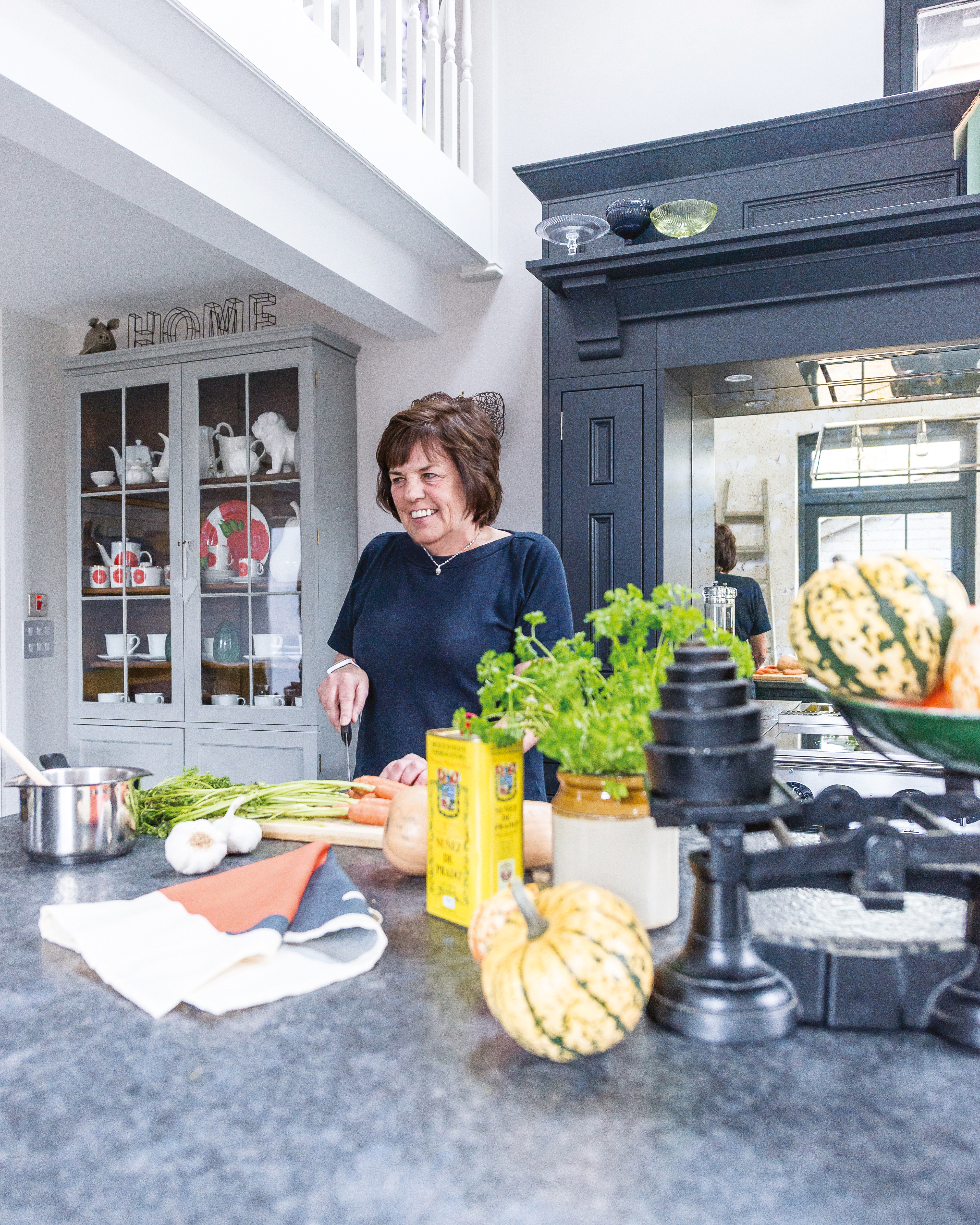
Patricia loves the blue and grey shades of her new kitchen, which complement each other perfectly and make the space a very comfortable place to spend time in
Looking for a traditional home with character was top of Patricia’s wish list when she viewed this former coach house and fell in love with its unconventional interior and untapped potential.
‘It had a lovely feel to it and was located in a beautiful area surrounded by National Trust land, which is perfect for long walks with my dog, Murphy,’ she recalls. ‘The interior was dated but liveable, which was a plus for me as I was looking for a project.’
PROJECT NOTES
The owners: Patricia Howard, a retired estate agent and inventory clerk, lives here with her chocolate Labrador, Murphy
The property: A three-bedroom Edwardian coachhouse and stable conversion in Outwood, Surrey
Total project cost: £170,800
Patricia, a former estate agent who has renovated numerous properties in the past, lived with the house as it was for a year and began to make plans, which included a top-to-toe renovation and remodelling project.
‘The first building work involved demolishing a stable block opposite the house and building an annexe, which I lived in whilst the major renovations to the house took place,’ she explains.

Painting the walls in French Grey Pale by Little Greene makes the room feel brighter, as do the traditional-style uPVC windows from Elwyns. The in-frame kitchen is from 1909, with the tall wall units painted in Partridge Grey, and the island and base units in Charcoal. A leathered black granite worktop, from Town & Country Marble, provides a practical work area. Wood-effect porcelain floor tiles, from BlendART, are a great alternative to timber flooring. For similar bar stools, try the Fallen Fruits industrial heritage tractor seats, from Wayfair. Find a similar pendant light at Davey Lighting. Range cooker, Falcon
The original kitchen included old units that had been repainted several colours over the years, and was in a galley-like room that felt cramped. ‘There was no point in replacing the cabinets as I’d never have fitted everything I wanted into such a narrow space,’ she adds.
‘It made sense to relocate the kitchen into what used to be a sitting room, which I never used as it felt vast and chilly with its high ceiling.’
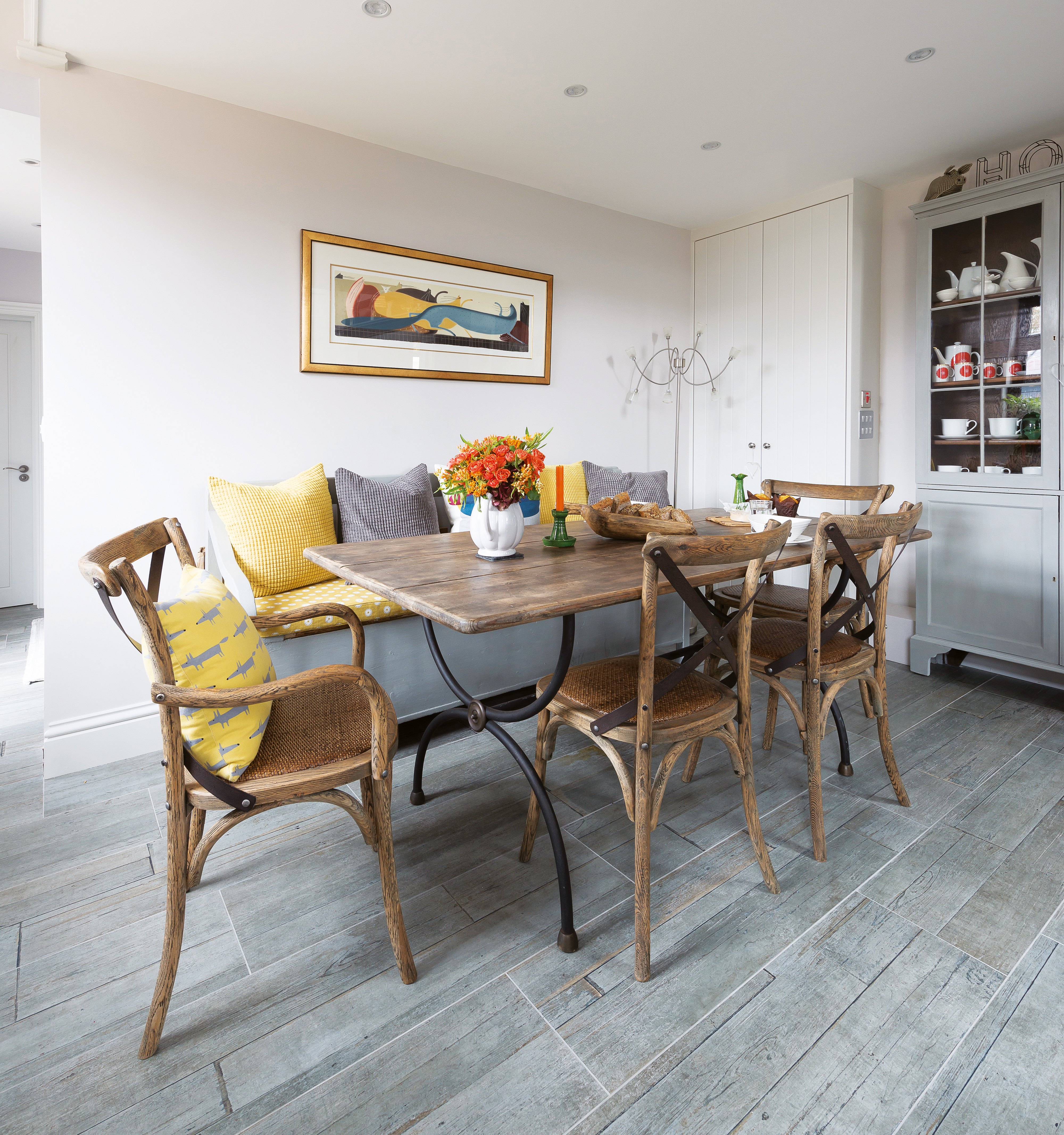
Patricia bought her dining table and chairs at Ardingly International Antiques and Collectors' Fair; for similar, try the Vintage Rustic dining table from Etsy, and Aged Oak Bistro chairs, from Maisons du Monde. Cushions, from John Lewis and Ikea
Patricia didn’t feel she needed an architect as her son Nic Howard, who lives nearby, is a garden designer with a passion for renovating properties. He drew up plans to relocate the kitchen and open up a mezzanine level above to create a new snug-cum-office.
The original kitchen would be divided to create a larger hallway and third bedroom. Building work – carried out by a team recommended by Nic – included removing most of the interior walls and installing a new roof, insulation, plumbing, wiring and windows.

Patricia's new country-inspired Shaker-style kitchen is now the focal point of her home
Nic also helped with the design and layout of the kitchen, which Patricia wanted to have a classic-yet-contemporary look with a large island. ‘He’s got a great eye for colour and detail,’ she explains. ‘We visited several showrooms and took inspiration from the displays we saw.’
Nic addressed the need to bring a sense of scale to the large space by designing two extra-tall storage cupboards either side of a window. ‘Normal-height units would have looked ridiculous with the vaulted ceiling,’ Patricia says. ‘I don’t have a utility, so the left-hand unit houses my washing machine, fridge and freezer, with plenty of room to store the detergents.’
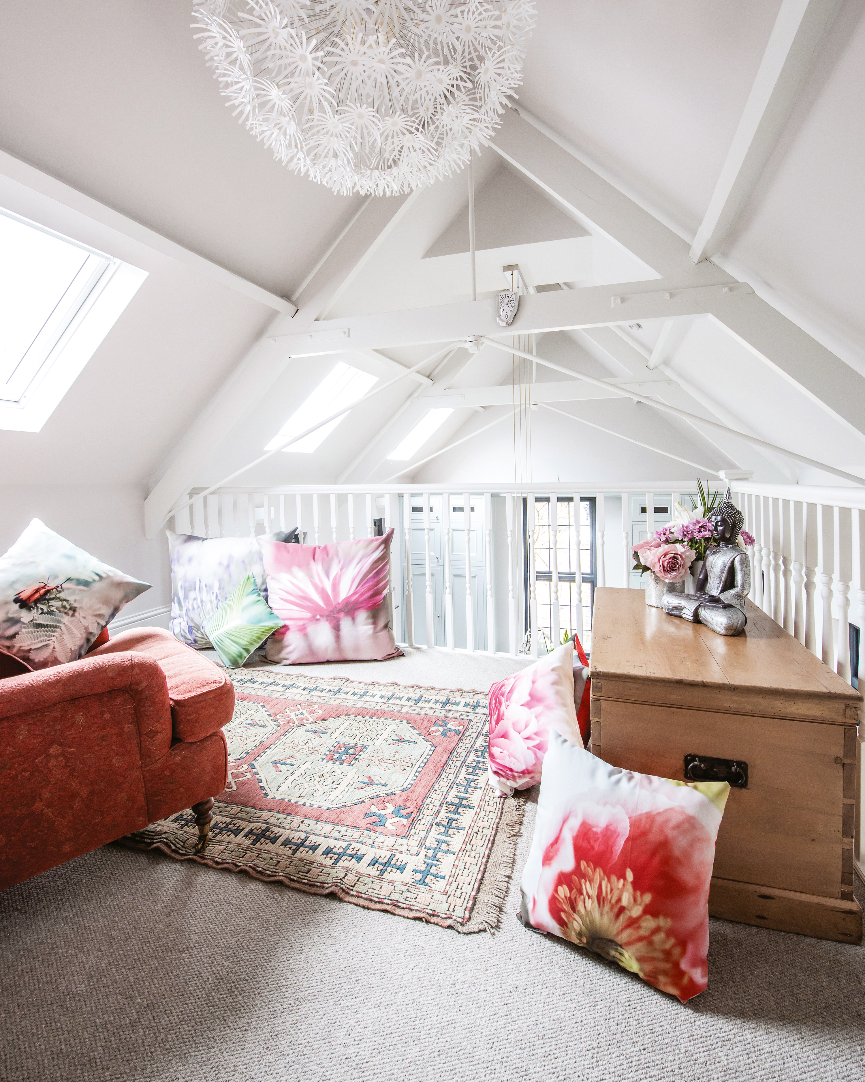
Removing a stud wall has opened up the mezzanine. Floor cushions, Homesense. Armchair, Wesley Barrell. For similar rugs, try The Rug Seller
Although Patricia employed a local company to build and install her new kitchen cabinetry from 1909 Kitchens, she found the experience frustrating as the fitter left unsightly gaps between units. ‘That installer went bankrupt, but fortunately a freelance fitter eventually put everything right,’ she says.
Patricia and Nic chose a dark blue for the island and the cooker surround to anchor the room. ‘The cooker surround and mantle design were inspired by the traditional cooking ranges and inglenooks in Victorian kitchens,’ she adds. ‘While the lighter colour of the tall larder units was chosen to emphasise the beautiful feature window.’
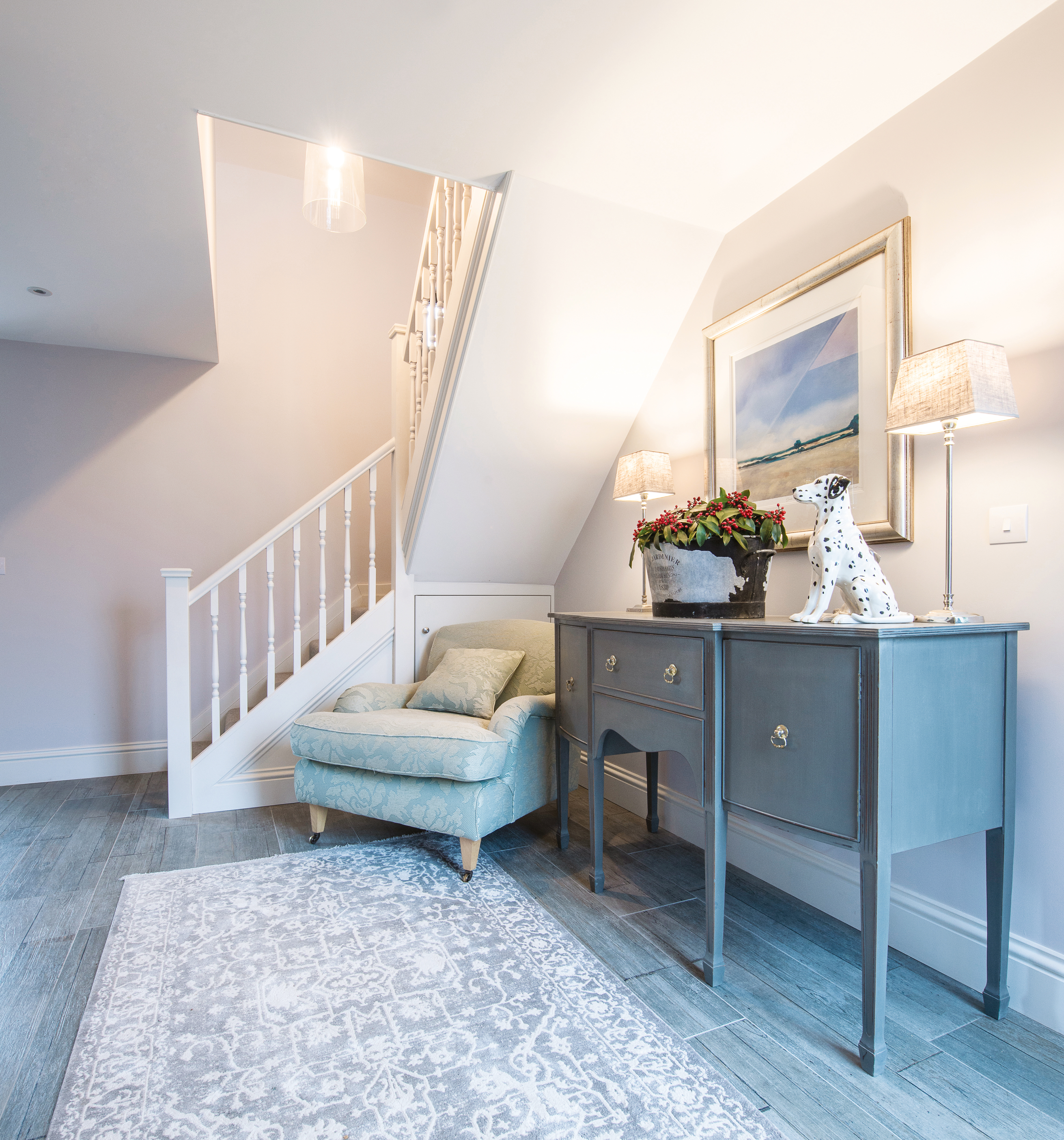
A tranquil blue reception area sits under the new mezzanine. For a similar staircase, try Neville Johnson. For a blue sideboard, try the Cidre from Loaf. For a duck-egg armchair, try Laura Ashley
A quirky element of the design is the mezzanine, which is accessed by a wooden staircase and looks out across the vaulted space. ‘The previous owners had blocked it in with a false wall, which we removed,’ Patricia says. ‘I now use it as an office and a reading nook.'
After a year of upheaval, I have a gorgeous kitchen I spend all my time in and I can finally call this house my home
Patricia Howard
Moving back into her newly renovated home last year gave Patricia a feeling of relief and euphoria, as all her furniture came out of storage and she formally took up residence within the coach house.
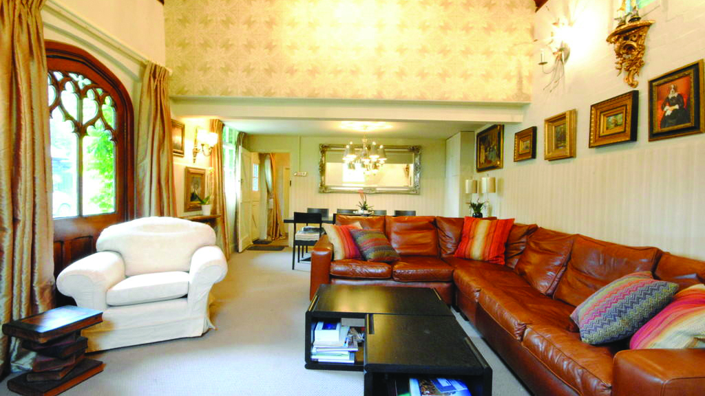
BEFORE: The old living room benefitted from a vaulted ceiling but was cold with old windows and poor insulation
‘It was important to me to have a kitchen where I could entertain on a small or large scale, in a room that would feel informal and welcoming for several people or just me,’ she explains. ‘I did try to stick to a budget, but the windows and underfloor heating took me over. I have no regrets, however, because the room always feels warm, even on the coldest winter’s day.’
COSTS
Building work: £112,000
Windows: £27,000
Kitchen units: £26,000
Flooring: £3,000
Kitchen worktops: £2,800
The success of the project has certainly been a family affair. ‘I couldn’t have achieved this without Nic’s input, and our first Christmas here was the icing on the cake,’ she adds. ‘After a year of upheaval, I have a gorgeous kitchen I spend all my time in and I can finally call this house my home.’
Contacts
- Design: Nic Howard
- Builders: MSCH Construction
- Marble worktop: Town & Country Marble
- Kitchen: 1909 Kitchens
Love this look? More inspiration this way:
- Shaker kitchens: design tips and 12 ideas to create your classic kitchen
- How to paint kitchen cabinets
- Choose the best kitchen flooring
Join our newsletter
Get small space home decor ideas, celeb inspiration, DIY tips and more, straight to your inbox!