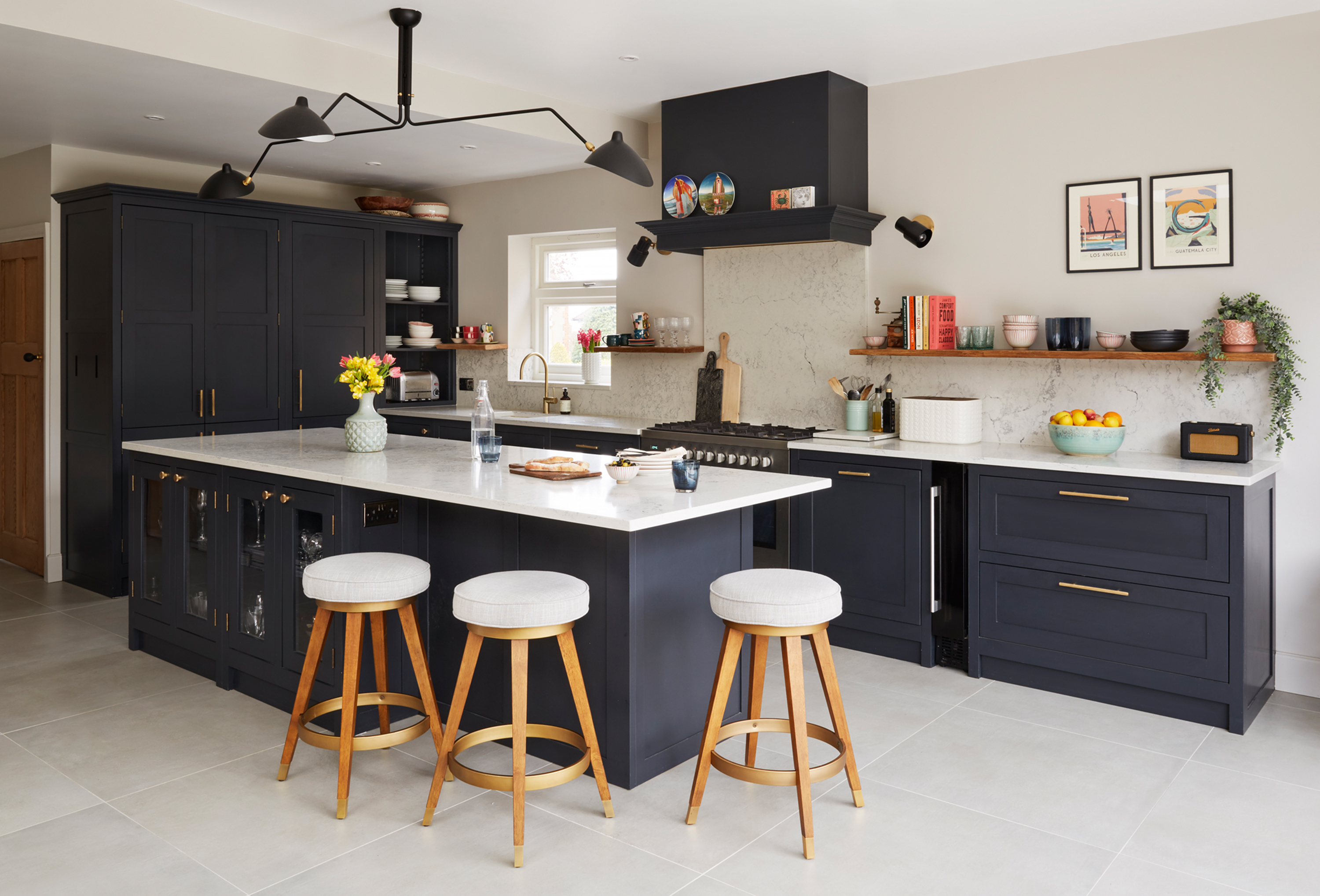

If you’ve ever wanted to tackle an extension on your own, Dani Ellis’ elegant Hertfordshire home is the inspiration you need. Armed with her imagination and a firm grasp of what she wanted from the renovation project she picked up through informal tender, she drew up floorplans, hired a builder and set about bringing her vision to life.
Dani’s home strikes a balance between the open-plan space we dream of come summer, and the snug, cosy spaces that make all the difference when the leaves start to fall. Everything has been meticulously planned, and it shows: each room has a blend of vintage treasures and on-trend pieces that make her home practical as well as beautiful.
Find more real home transformations on our dedicated page and practical information about extending a house in our expert guide. Then read on to find out how Dani created her family home...
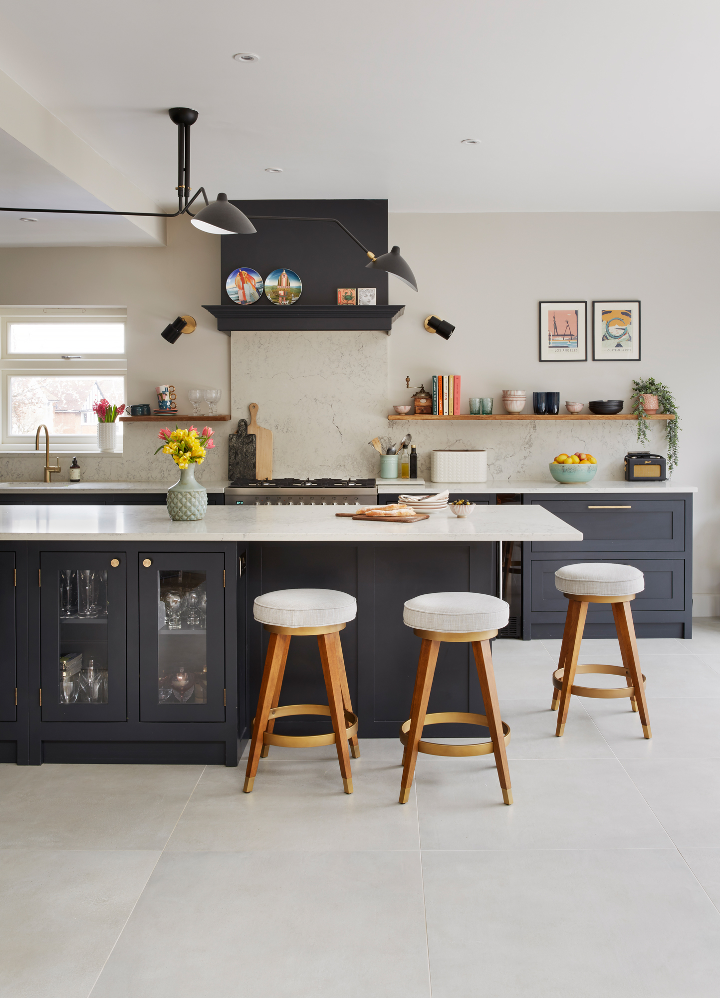
Kitchen units painted in RAL 7026, The Shaker Kitchen Co. Worktops and splashbacks, Caesarstone. Handles, Dowsing & Reynolds. Floor tiles, Mandarin Stone. Stools, West Elm. Ceiling light, Swivel UK. Wall lights, Pooky
Project notes
The owner Dani Ellis, an interior designer, lives with her children Poppy, 14, and Jude, 11, co-parent Matt, and their cockapoo, Frodo.
The property A 1930s semi in Hitchin, Hertfordshire.
Project cost £225,000.
'This house was a complete wreck when we bought it. The old man who’d lived here had moved out six months before we saw it. We’d searched for ages and couldn’t find what we were looking for, but by some miracle, this one came up. Houses on our street don’t come up very often, so we went to visit the property and I completely fell in love. I came back four times, including once with a builder – I wanted a project and I could see that despite the mould, the plants growing inside the house and the general lack of care, it could be a lovely family home.

‘The house was sold through informal tender, so we had to bid for it. I think we won by a few thousand pounds – it was really close. The process took months, so before we completed, I’d already applied for planning permission. I drew up plans and asked an architectural technician to take a look at them, and then once we had the keys, we hired a builder we’d used for our old house – the one I brought along on the viewing.
‘Because we applied for planning early, we were able to start work as soon as we’d got the keys. We rented accommodation around the corner, and I was on site every day for nearly a year. We were quite naive – I thought it’d only take six months – but in that time, I planned every single room down to the lamps and rugs.
‘We ripped the house down to its bare bones. If you went upstairs, you could see all the way through to the roof because we had to remove some ceilings. Looking back, it’s so satisfying to see what a mess it was compared to how it is now – we’ve come a long way.'
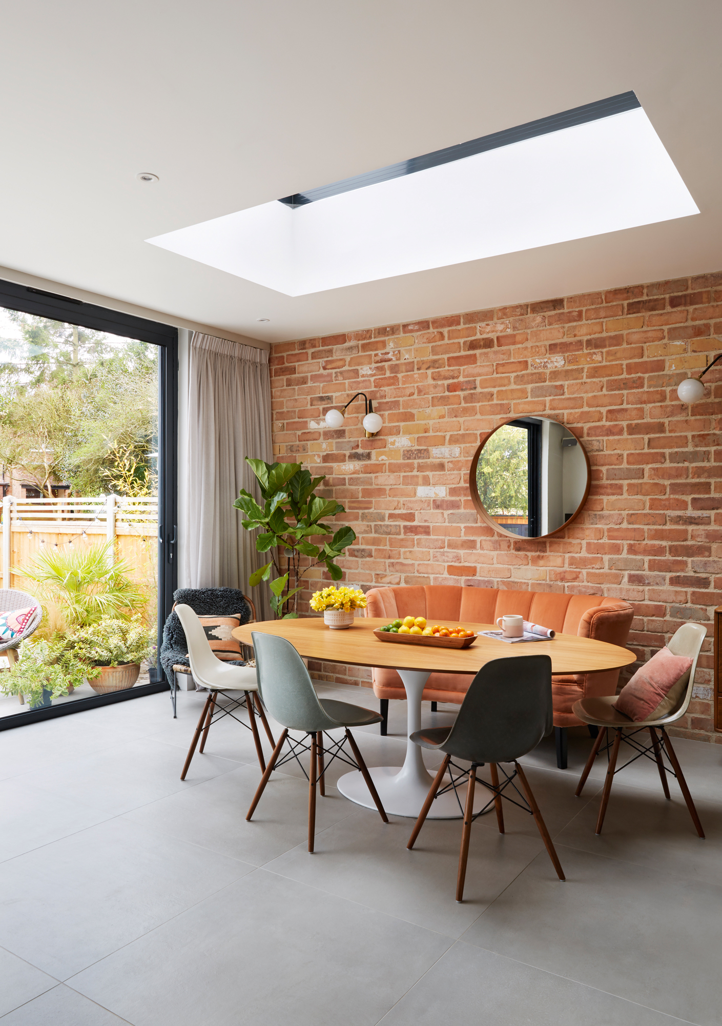
Rooflight, Roof Maker. Tulip dining table, Ebay. Eames dining chairs, Lovely & Co. 1940s banana sofa, vintage. Brick slips, Brick Slips UK. Mirror, Ikea
‘The kitchen extension came first, and then we rebuilt the other rooms as we went along. We financed it all with the money from our old house – we’d downsized, so we had some set aside for the renovation. There were a couple of unforeseen issues that pushed our budget – we had to redo the roof and pull down some ceilings.
‘Lots of people told us we should extend into the loft, but I’m glad we didn’t – it would have meant scrimping on the finishes in the rest of the house, and we didn’t want a huge house with loads of extra rooms anyway.'
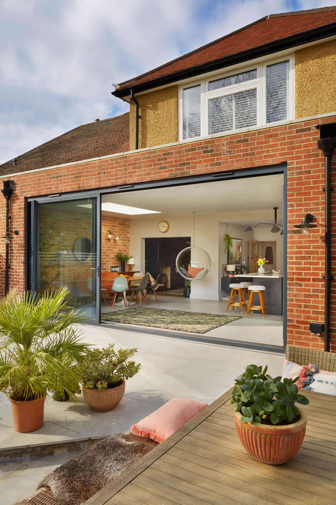
Tiles, Mandarin Stone. Treated scaffolding board decking, Greenroom Gardening. Hanging bubble chair, Ebay. Rug, La Redoute
More from Real Homes
Love your daily dose of Real Homes? Then why not subscribe to our magazine? Packed with fabulous readers' homes, trend features, project advice and easy updates, you'll wonder how you ever lived without it.
‘The kitchen is perfect for entertaining. If a friend comes over for a glass of wine, or when Poppy comes home from school, we’ll sit at the island. I worried it would be too big an expanse of space for just a worktop, but I didn’t want piles of washing
up and cooking splatters on it. Instead, we’ve put the messier things out of the way and positioned the sink out of sight from the dining table.’
I really like mixing old and new, so I’ve got lots of vintage pieces of different value. I saved up and splurged on some original Eames chairs, for example, because it was my dream – but they go alongside an Ikea chair. The whole room scheme came from a coral velvet fabric sample for the sofa. The space is quite big and I wanted to rough it up a bit and give it a bit of edge. I loved the idea of having that sofa against a battered brick wall. I spent hours sourcing the brick slips. These have coral, green and grey in them – perfect for the space.'
'The garden was so overgrown when we bought it that we couldn’t see what we were getting – we didn’t realise it was this wide until we cut it all back! I wanted it to feel Mediterranean, so we have a large patio with light coloured tiles, and the planting is tropical.
‘It’s a huge part of the extension space because of the great big windows. We planted evergreen so that it looks decent all year round. The patio becomes an extension of the house. Last summer, I threw a huge birthday bash for my parents and went completely mad – it looked like we were holding a wedding!'
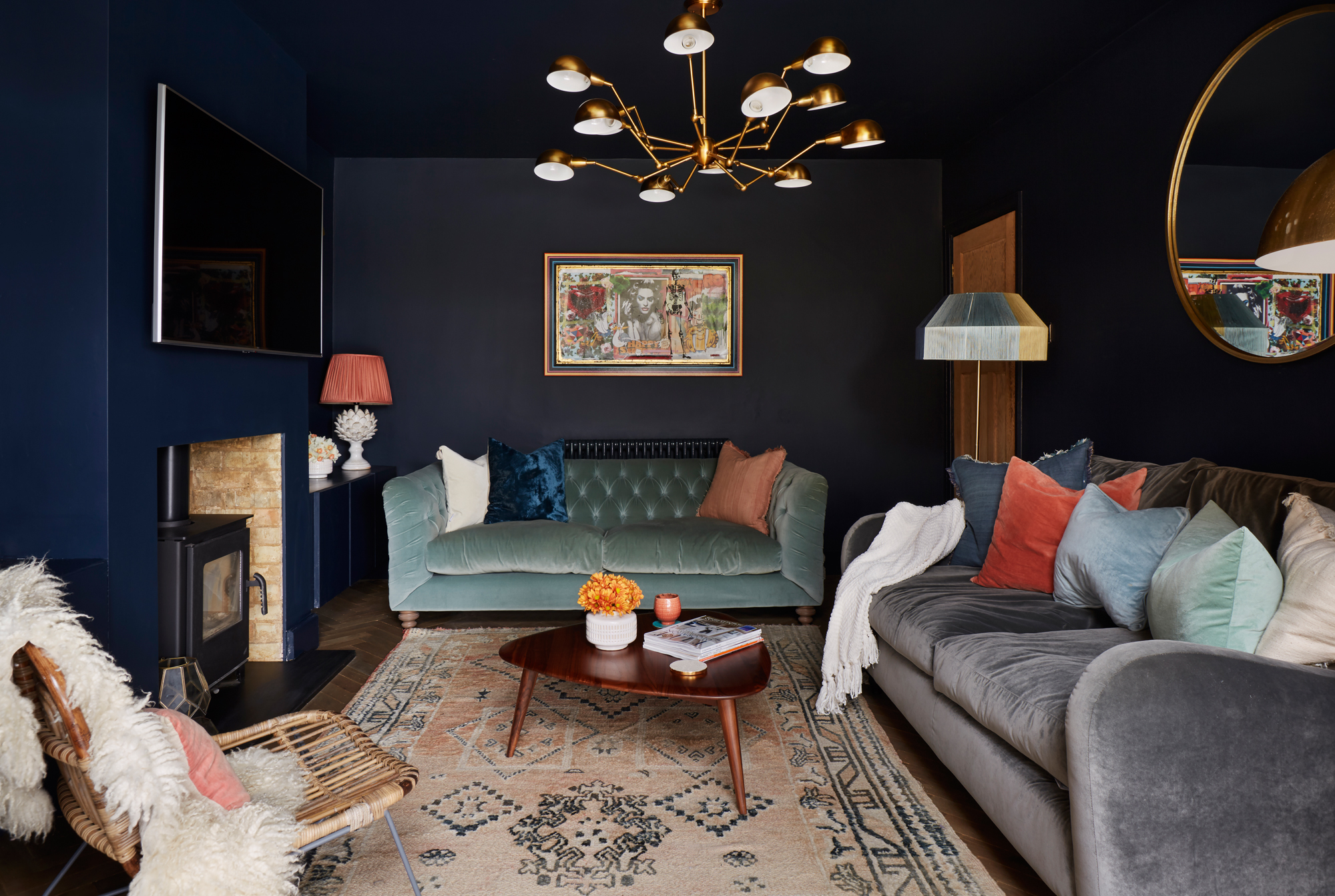
Vintage oak parquet flooring, Broadleaf Timber. Walls and ceiling painted in Basalt, Little Greene. Grey sofa, Made.com. Mint sofa, Rose & Grey. Ceiling light, Dwell. Rug, DK Renewal. Coffee table, La Redoute. Rattan chair, Fly 9. Floor lamp, Ikea, with shade, Oliver Bonas
'I like the idea of an open-plan space, but I also like having a cosy room. I could have knocked the wall down completely but I wanted that separate living space. The front room is used more in the summer, but we use this bit all the time and it comes into its own in the winter.
‘Having it slightly tucked away from the main space also meant I could paint the room dark. It’s cosy, but it still sits in the wider living space. The hanging chair outside wasn’t originally meant to be where it is, but I think it separates the snug from the kitchen even though it’s a transparent material.'
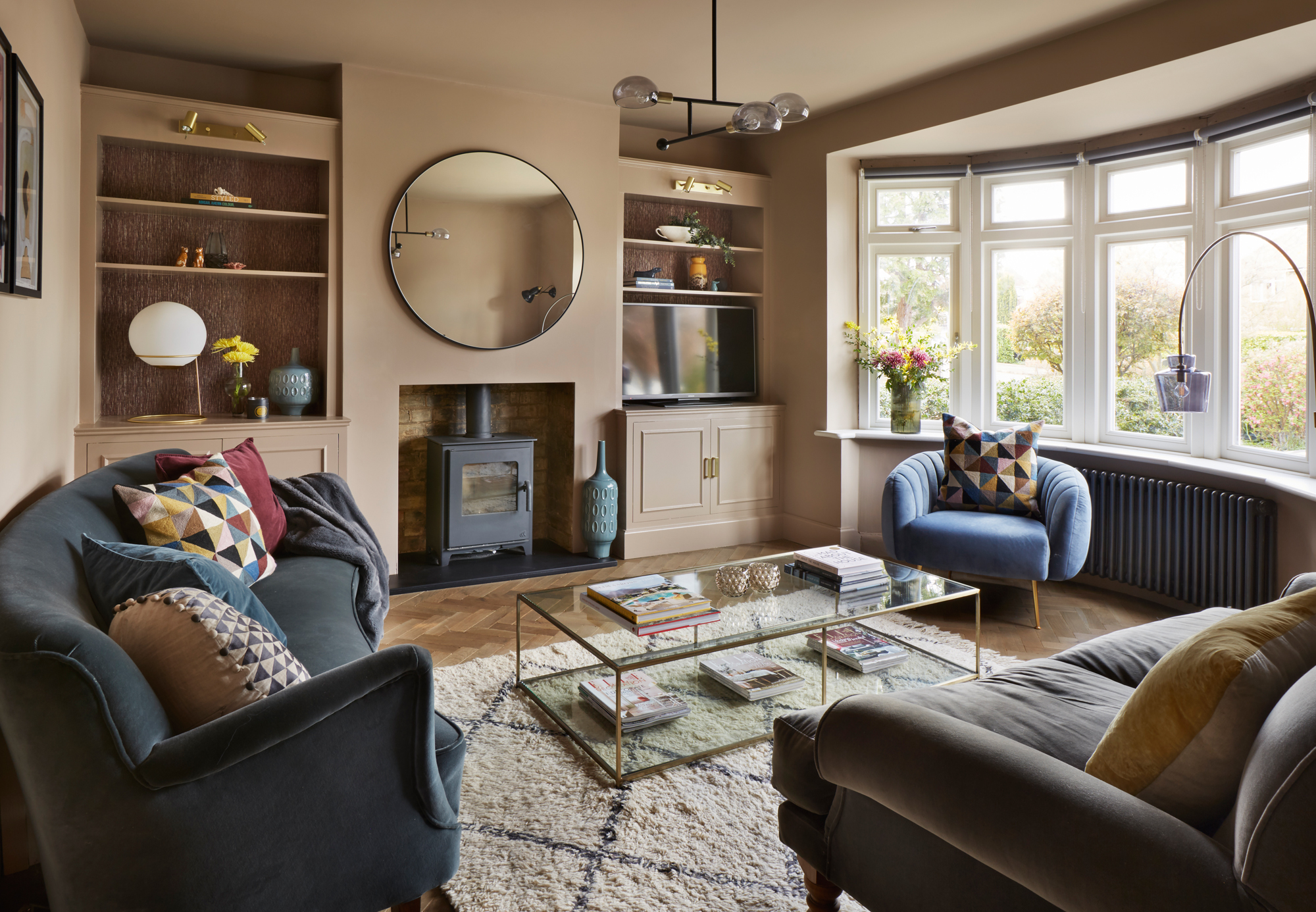
Parquet flooring, Broadleaf Timber. Walls and ceiling painted in Dead Salmon, Farrow & Ball. Grasscloth wallpaper, Graham & Brown. Grey sofa, Sofa.com. Chair, Calvers & Suvdal. Coffee table, La Redoute. Mirror, The White Company. Ceiling light, Made.com. Rug, Trend Carpet
'The log burner makes this room amazing all year round, but when the sun comes around to the front of the house in the early evening every day, it lights the room up and brings out the mushroom-pink colour of the walls. I love to just sit in here in the late afternoon, and Poppy uses it a lot, too. I know some people tend to gravitate towards the back of the house when they have an extension, but we wanted to make sure we used every ounce of space.'
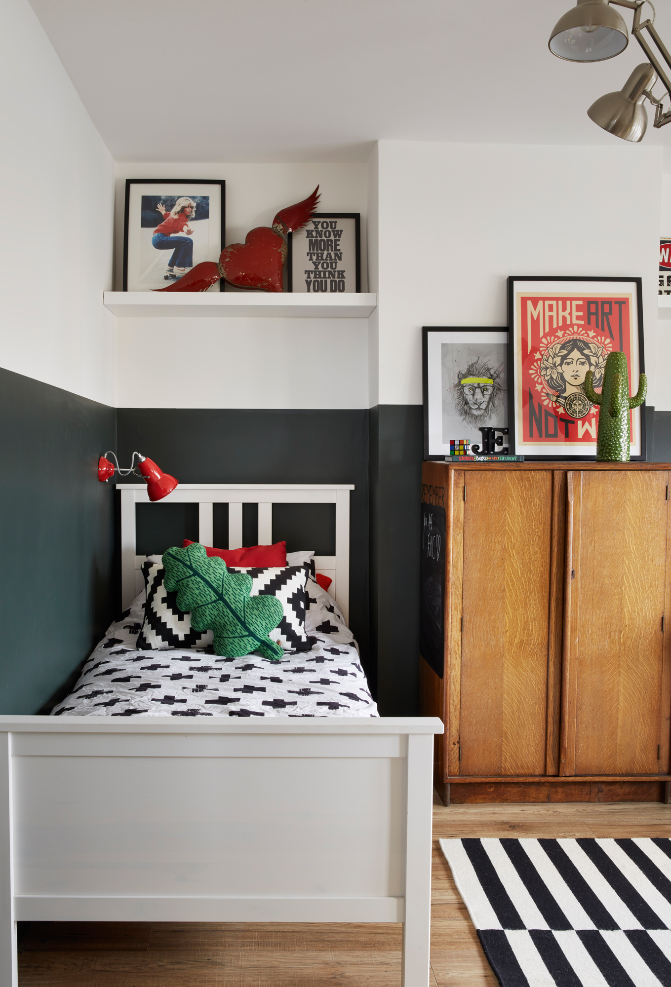
Walls painted in Studio Green, Farrow & Ball. Oak laminate flooring, B&Q. Rug, bed, bedding and Donna Wilson cushions, Ikea. Anglepoise wall light; 1940s cupboard and Shephard Fairey Make Art Not War print, all Ebay
'Jude liked the idea of going dark in his room, so I made him a Pinterest board. He was set on Studio Green for the walls, but we also decided on pops of red because that’s his favourite colour. Most of the prints are from the kitchen gallery wall in our old house – he’s always liked them, especially the skateboarding print and the Make Art Not War one.'
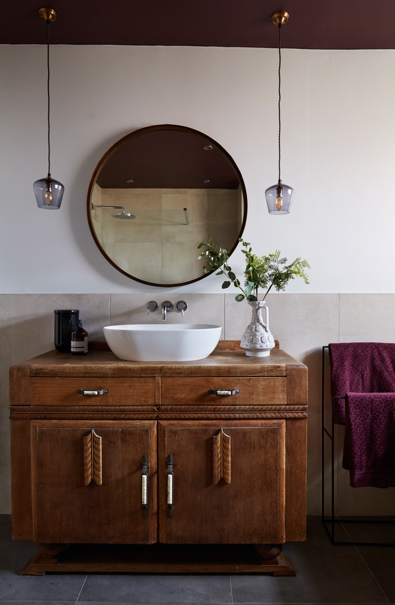
Concrete effect wall and floor tiles, Mandarin Stone. Ceiling painted in Brinjal, Farrow & Ball. Mirror, Select Mirrors. Hanging lights, Pooky
'The bathroom is the one room I struggled with most. I decided to go against the grain and step away from trends. We have square concrete-style tiles, which are quite neutral and timeless. The burgundy ceiling is a lovely enveloping colour when you’re lying in the bath. When I got the paint out, the tradespeople looked at me like I was mad.
‘The vanity unit is an Art Deco piece with original handles that I found on Ebay for £100. I love having something that no one else will have. I asked the plumber to plumb in the sink, and now I’ve got a unique focal point that will stand the test of time.'
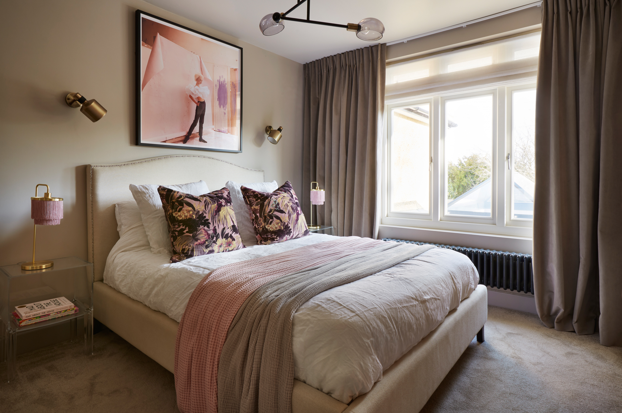
Ceiling painted in Skimming Stone, walls painted in Elephant’s Breath, both Farrow & Ball. Carpet, Charles Wilson. Curtains, The Old Vicarage Curtain Co. Bed and Kartell Ghost bedside tables, John Lewis & Partners. Lamps, Matalan. Bert Frank wall lights, Ebay. Print, King & McGaw
'I wanted my bedroom to feel a bit like a boutique hotel, but the main thing was to have a very soothing vibe from it. I wanted a calm palette with pops of pink, but nothing too girly. I’d loved the cushions from House of Hackney forever so I was thrilled to add them in. I’m a fan of old Vogue prints and I think this one adds a splash of colour. I’ve definitely sided more towards having one single print instead
of gallery walls in this house.'
Contacts
- Interior designer: Rosehaven Studio
- Landscaping: Greenroom Gardening
More on kitchen extensions:
Join our newsletter
Get small space home decor ideas, celeb inspiration, DIY tips and more, straight to your inbox!

Formerly deputy editor of Real Homes magazine, Ellen has been lucky enough to spend most of her working life speaking to real people and writing about real homes, from extended Victorian terraces to modest apartments. She's recently bought her own home and has a special interest in sustainable living and clever storage.
-
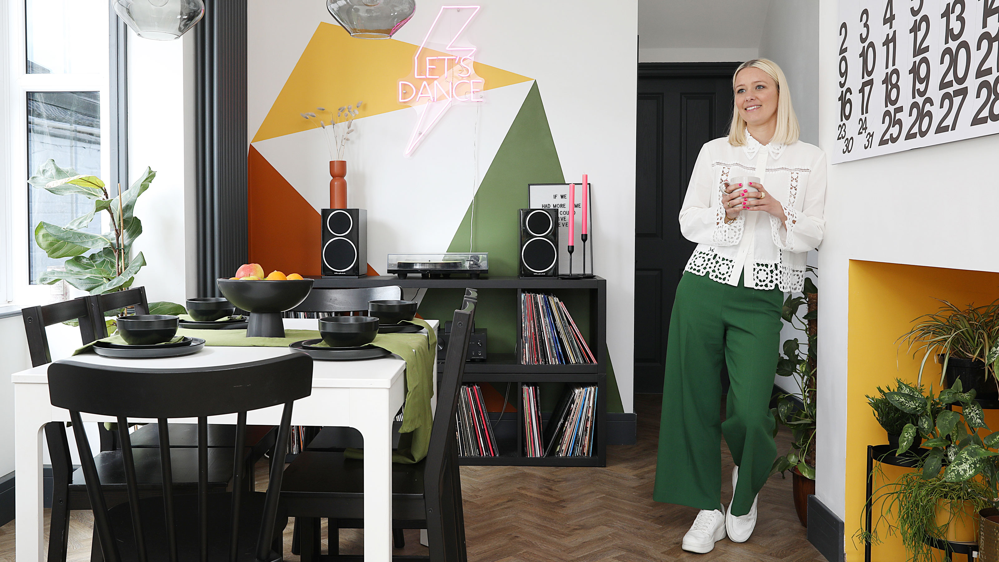 This colourful home makeover has space for kitchen discos
While the front of Leila and Joe's home features dark and moody chill-out spaces, the rest is light and bright and made for socialising
By Karen Wilson Published
-
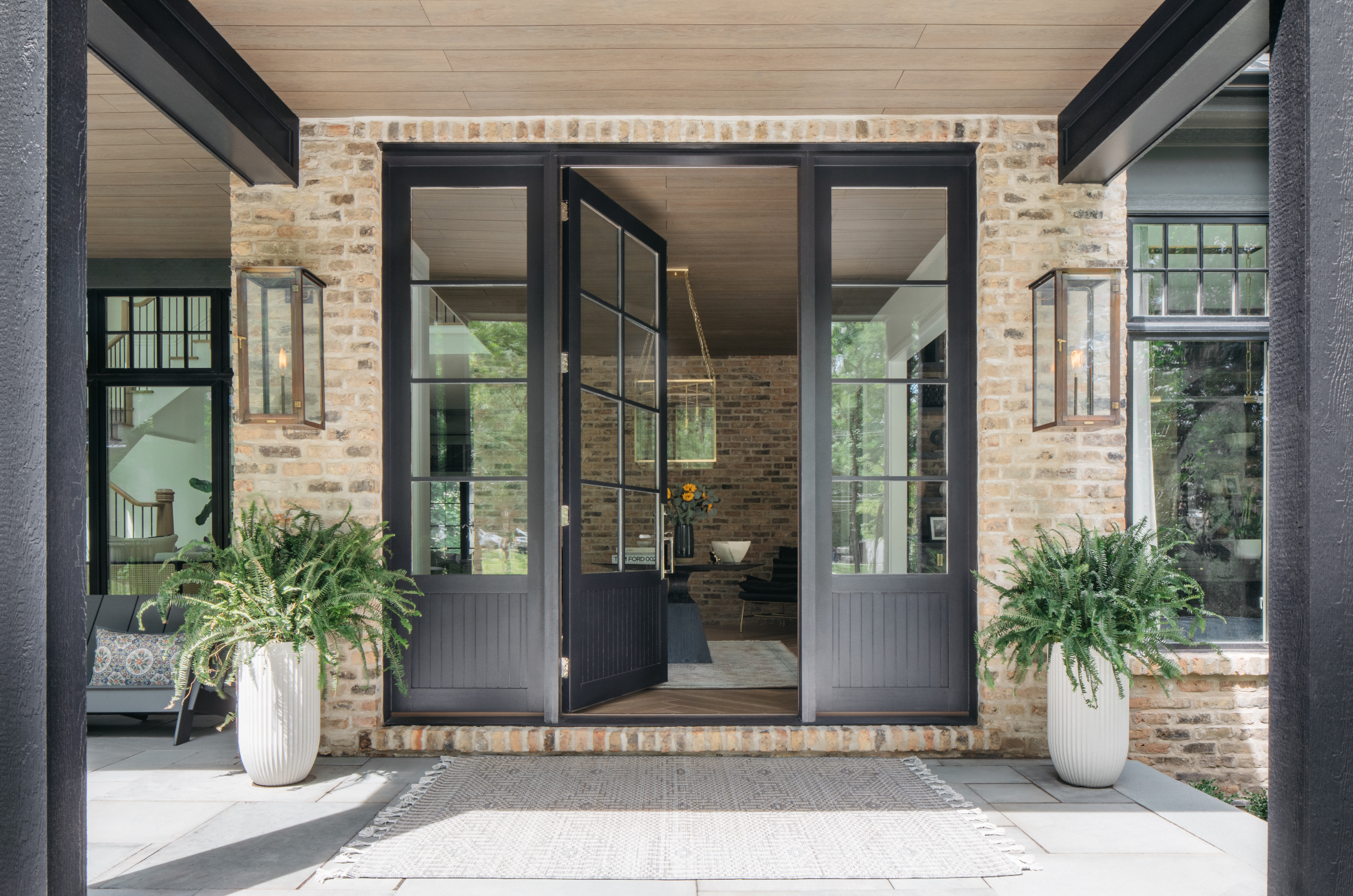 How to paint a door and refresh your home instantly
Painting doors is easy with our expert advice. This is how to get professional results on front and internal doors.
By Claire Douglas Published
-
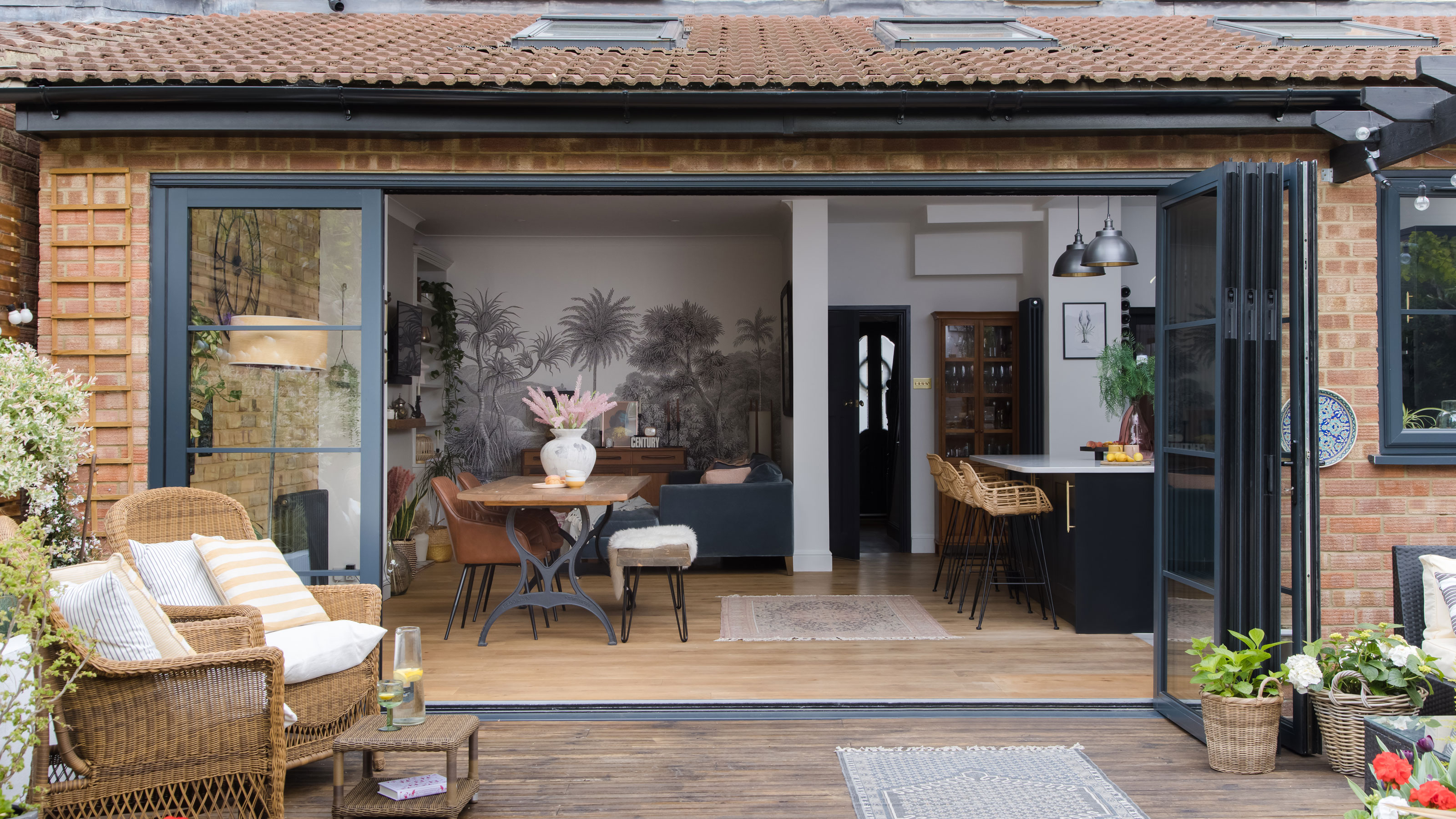 DIY transforms 1930s house into dream home
With several renovations behind them, Mary and Paul had creative expertise to draw on when it came to transforming their 1930s house
By Alison Jones Published
-
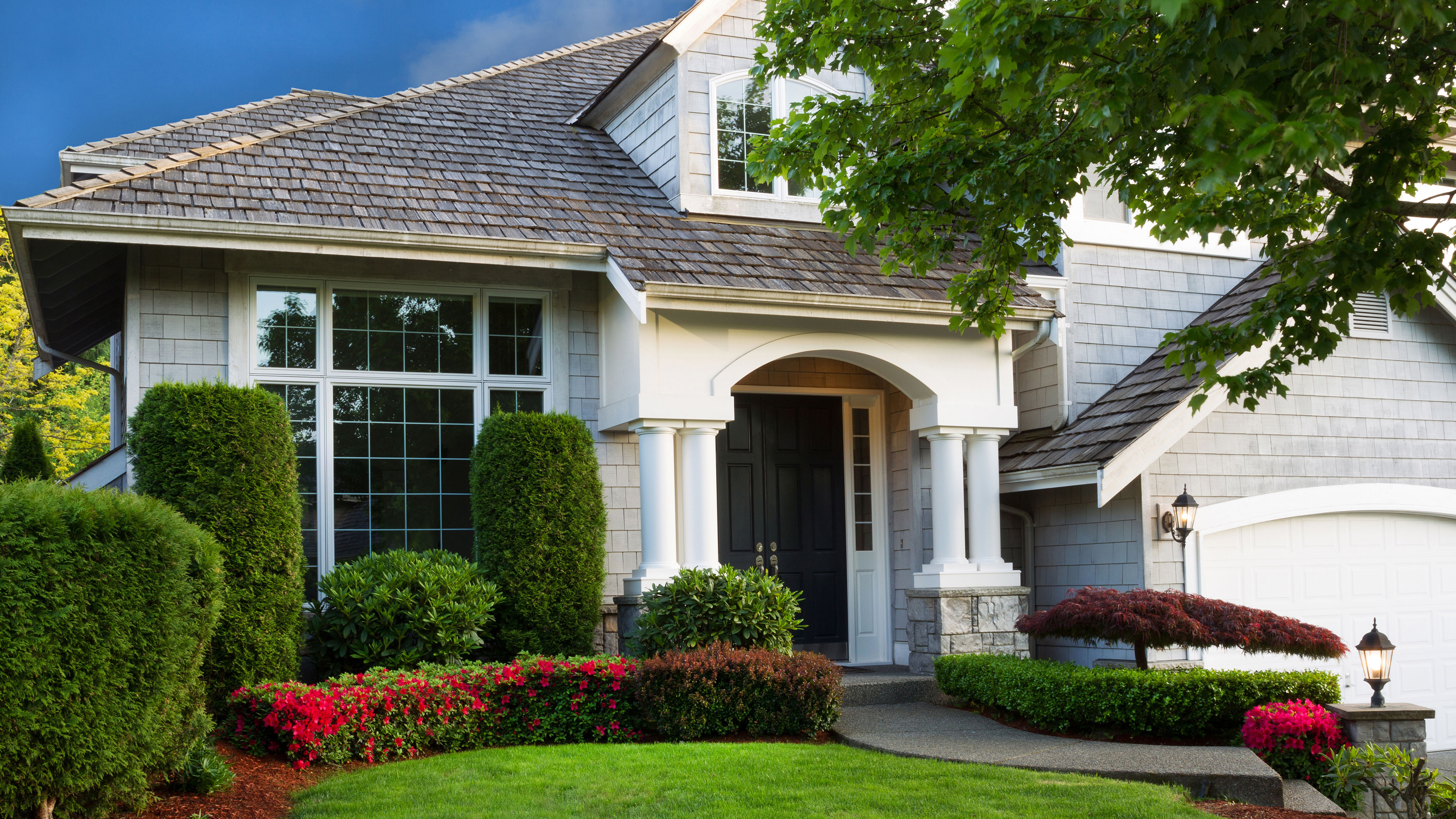 12 easy ways to add curb appeal on a budget with DIY
You can give your home curb appeal at low cost. These are the DIY ways to boost its style
By Lucy Searle Published
-
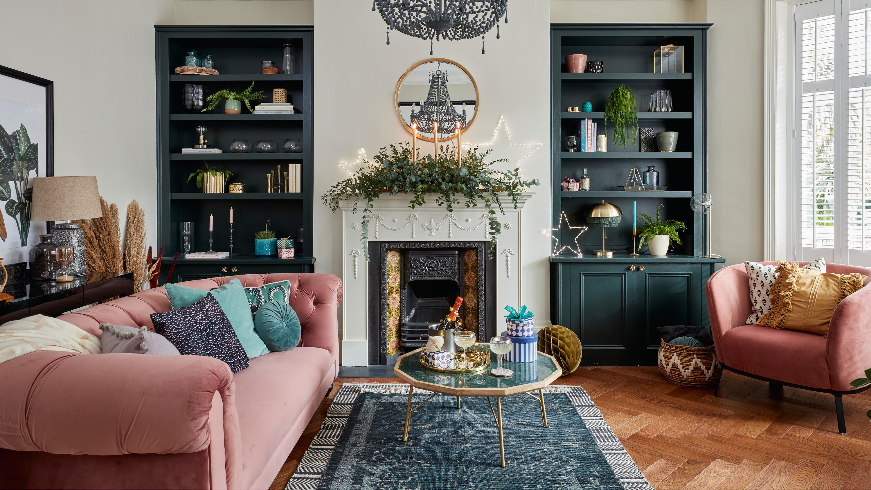 5 invaluable design learnings from a festive Edwardian house renovation
If you're renovating a period property, here are 5 design tips we've picked up from this festive Edwardian renovation
By Ellen Finch Published
-
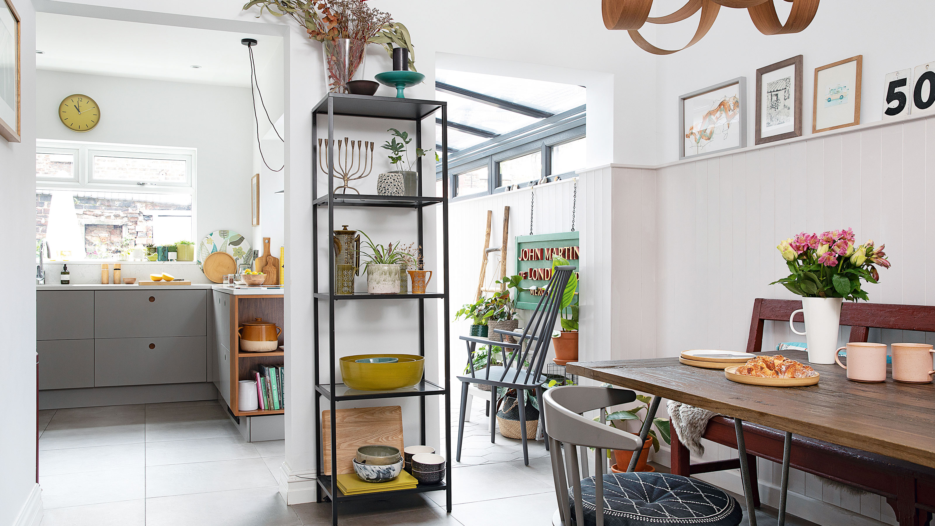 Real home: Glazed side extension creates the perfect garden link
Louise Potter and husband Sean's extension has transformed their Victorian house, now a showcase for their collection of art, vintage finds and Scandinavian pieces
By Laurie Davidson Published
-
 I tried this genius wallpaper hack, and it was perfect for my commitment issues
Beware: once you try this wallpaper hack, you'll never look back.
By Brittany Romano Published
-
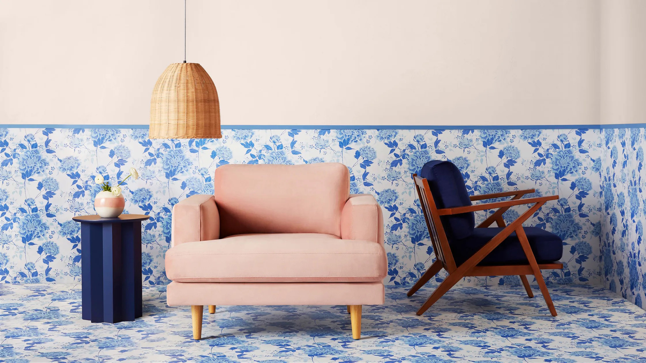 Drew Barrymore's new FLOWER Home paint collection wants to give your walls a makeover
Drew Barrymore FLOWER drops 27 brand-new paint shades, and every can is made from 100% post-consumer recycled plastic.
By Brittany Romano Published