Real home: a colourful and creative Victorian house
This personality-packed home is filled with eye-catching walls, cool DIY ideas and decorating schemes you'll love to try
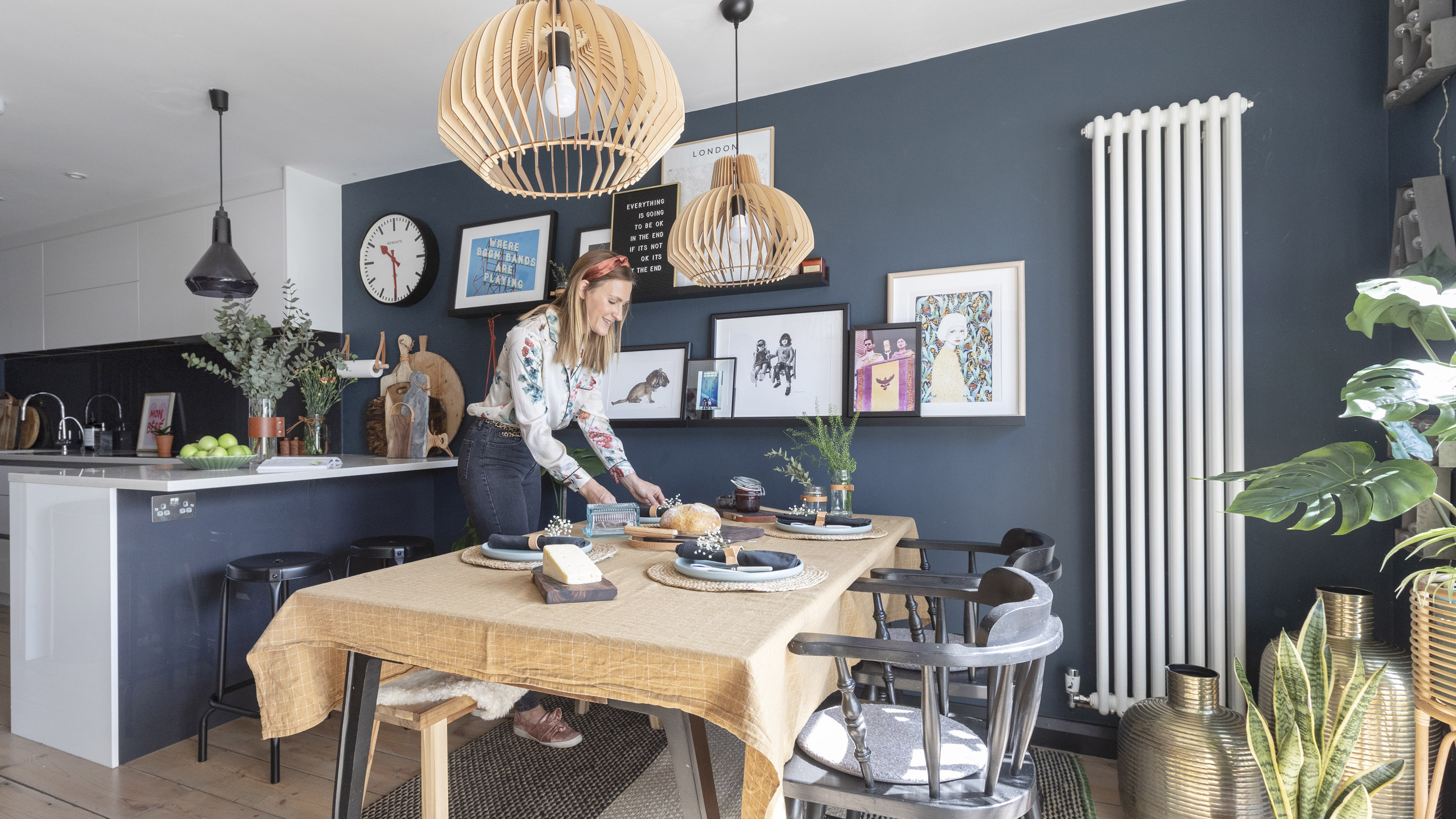
Stepping into the unassuming terraced home of designer Sally Tooth and her family, you’d never guess the explosion of colour, pattern and print that awaits. One of the first things that strikes you is the hand-painted graphic wall in the open-plan playroom, which was recreated from one of Sally’s favourite multicoloured geometric wallpapers, designed by her partner Jay, to complement their own furniture.
‘If you are happy to get painting yourself, I think you can generate real interest in a room without spending a fortune,’ says Sally. ‘We like to go big and bold in all the small spaces in the house. I think Maddi’s room and our downstairs loo are great examples of this.’
Discover more amazing home makeovers on our dedicated page, and practical information on adding a two-storey extension like Sally and Jay have. Read on to find out how the couple have transformed their home.
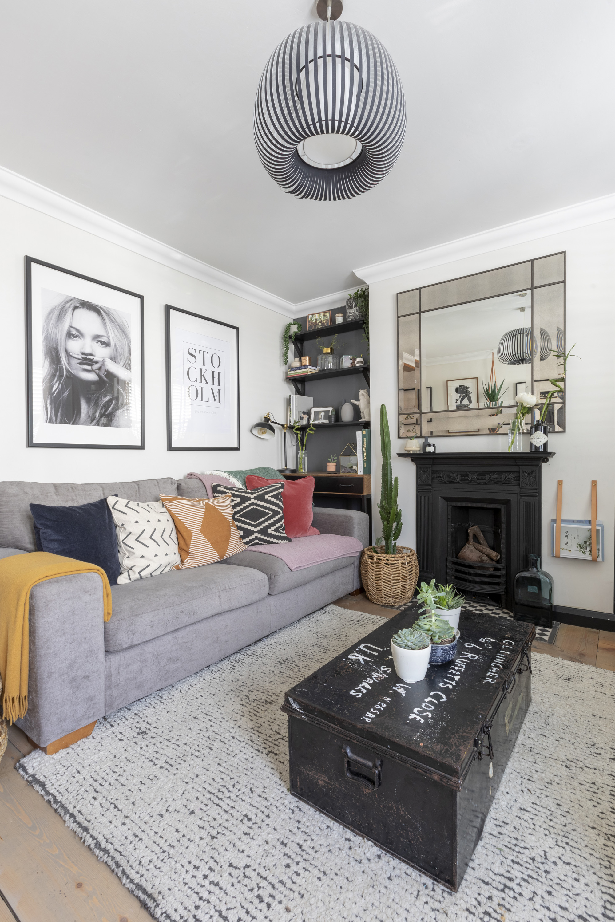
Sally’s living room is a homage to her love of accessories. Shelves are lined with vases, books and trinkets, while houseplants of different heights add greenery to the space. Walls painted in Chalky Downs, Dulux. Alcoves painted in Down Pipe, Farrow & Ball. Sofa and mirror, Next. Pendant light, Wayfair. Rug, Habitat
Project notes
The owners: Sally Tooth, designer and MD of accessories label Konoc, and partner Jay Srimankong, who runs a decorating business, live here with son Rocco, five, and daughter Maddi, four
The property: A three-bedroom Victorian terraced house in Farnham, Surrey
Project cost: £160,000
When the couple bought the house five years ago they saw it as the perfect ‘fixer-upper’. It was near Sally’s parents in Surrey, and just the right size and price range for them to be able to put their unique stamp on the space. ‘The house hadn’t been touched for years and was in a terrible state when we first bought it,’ says Sally.
Renovations began with the complete gutting of the house to make way for moving the stairs, adding on a two-storey extension to the back and reconfiguring the rooms upstairs. Jay did a lot of the cosmetic work himself, but they hired builders to do the bulk of the structural work. ‘We’re hands-on and creative people, and knew this was the best way to create the family home we imagined, so we weren’t daunted by the project,’ Sally says. ‘We were excited.’
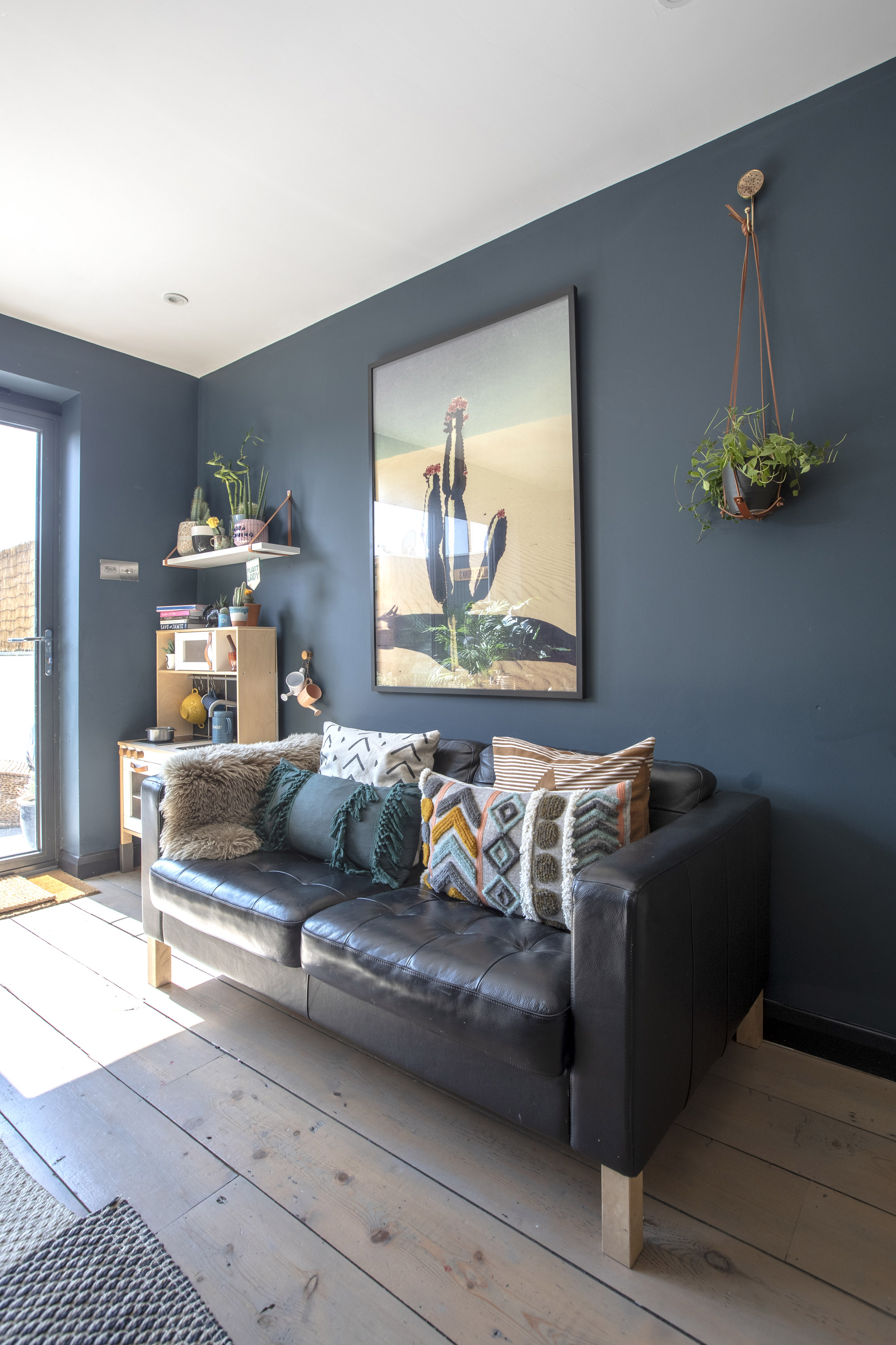
Redesigning and extending the house has created space for an open-plan kitchen/dining/living space at the rear of the property
The couple added in new bathrooms, one new bedroom and new flooring throughout. They also raised and levelled the step-down kitchen, giving the downstairs space a more fluid and open feel. Much of the original character of the property was added in with furniture and period features like the fireplaces, which were found at salvage yards, Ebay, Gumtree and vintage markets.
At this time, the couple had just returned from living in Thailand, where they had first met. With Sally pregnant with their daughter Maddi and their first child Rocco, who had just turned one, in tow, they moved into Sally’s parents’ house, a five-minute drive away, until the house was liveable.
Get small space home decor ideas, celeb inspiration, DIY tips and more, straight to your inbox!
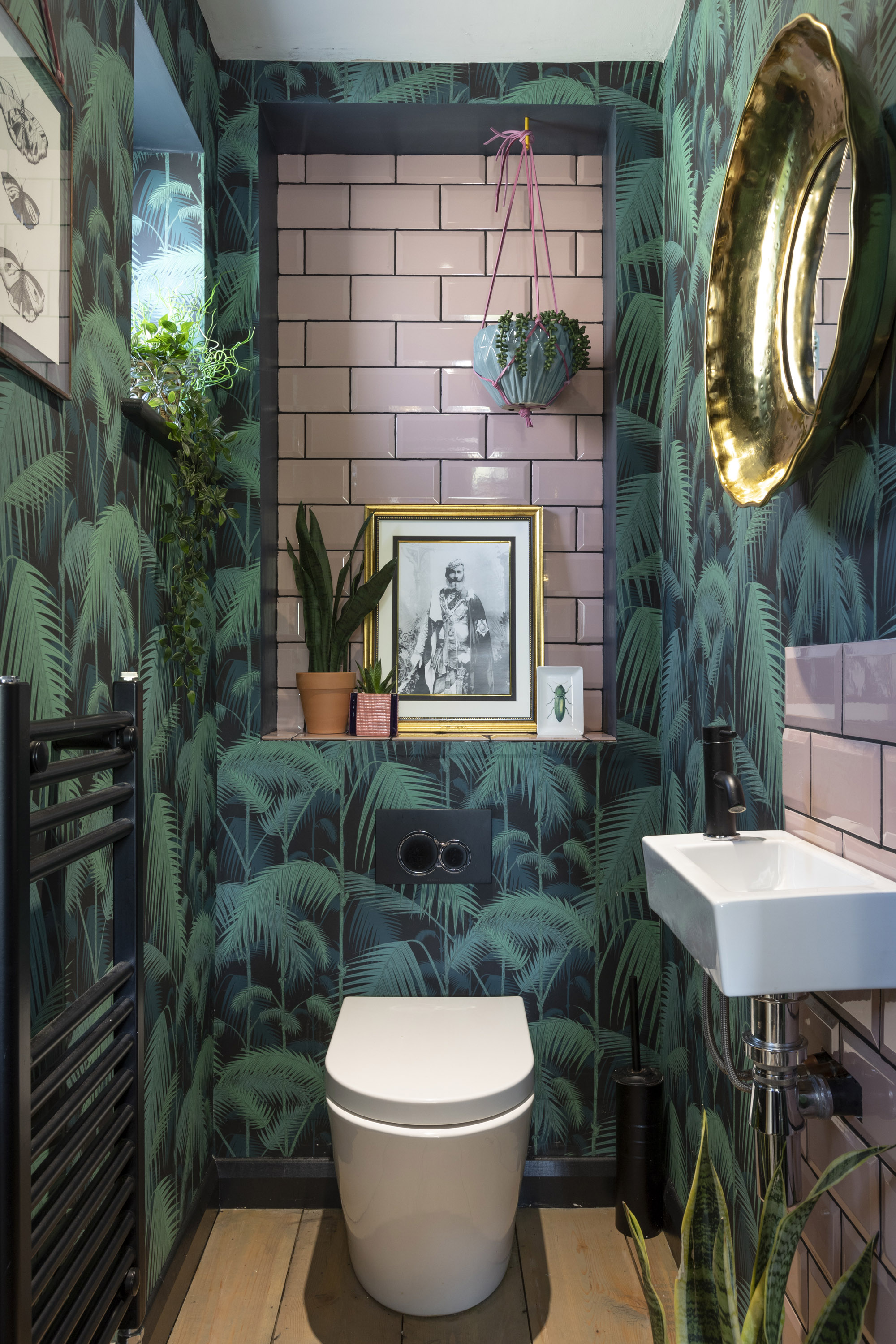
A tropical theme continues into the downstairs cloakroom, which is a haven of a designer-favourite colour combination – pink and green. Palm Jungle wallpaper, Cole & Son. Metro tiles, Tile Giant. For a similar black towel radiator, try Victorian Plumbing
The building work took 18 months to complete, but half of this was done while they were still living in Samui, with Sally’s parents project managing on their behalf. The family were able to move into their refurbished home in 2015, just two months after Maddi was born.
Now their ‘fixer-upper’ is a haven of warmth and colour. From the cocoon-like feel of the dark inky hue in the kitchen-diner to the bright gallery walls in the living room, and with the kids’ bedrooms so full of life and detail, the house is a feast for the senses. ‘For me, accessories make a room,’ says Sally.
Subscribe to Real Homes magazine
Love your daily dose of Real Homes? Then why not subscribe to our magazine? Packed with fabulous readers' homes, trend features, project advice and easy updates, you'll wonder how you ever lived without it.
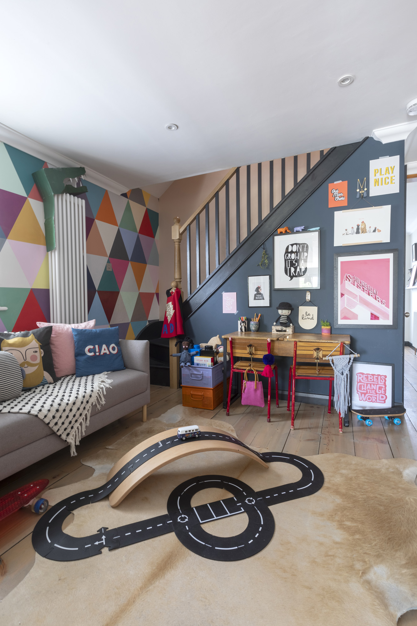
The playroom is Sally’s favourite, with its mix of old and new. It caters to Sally and Jay’s tastes as well as the children’s. Sofa, Habitat. Rug, Wayfair. Rubber track, Acorn & Pip
The kids’ playroom had a vibrant makeover of its own and is full of quirky design details, like the hand-drawn height chart, and the magnetic blackboard where the children can get creative. Jay painted the wall – with a little help from Rocco – before the family moved in.
‘I like having collections of things together – or “organised clutter” as I tend to call it! Plants, books, toys and prints, when displayed with purpose, can make all the difference. I also love crafting – some of my favourite things in the house are the vintage metal crates in the playroom I picked up recently and sprayed orange and mauve.’
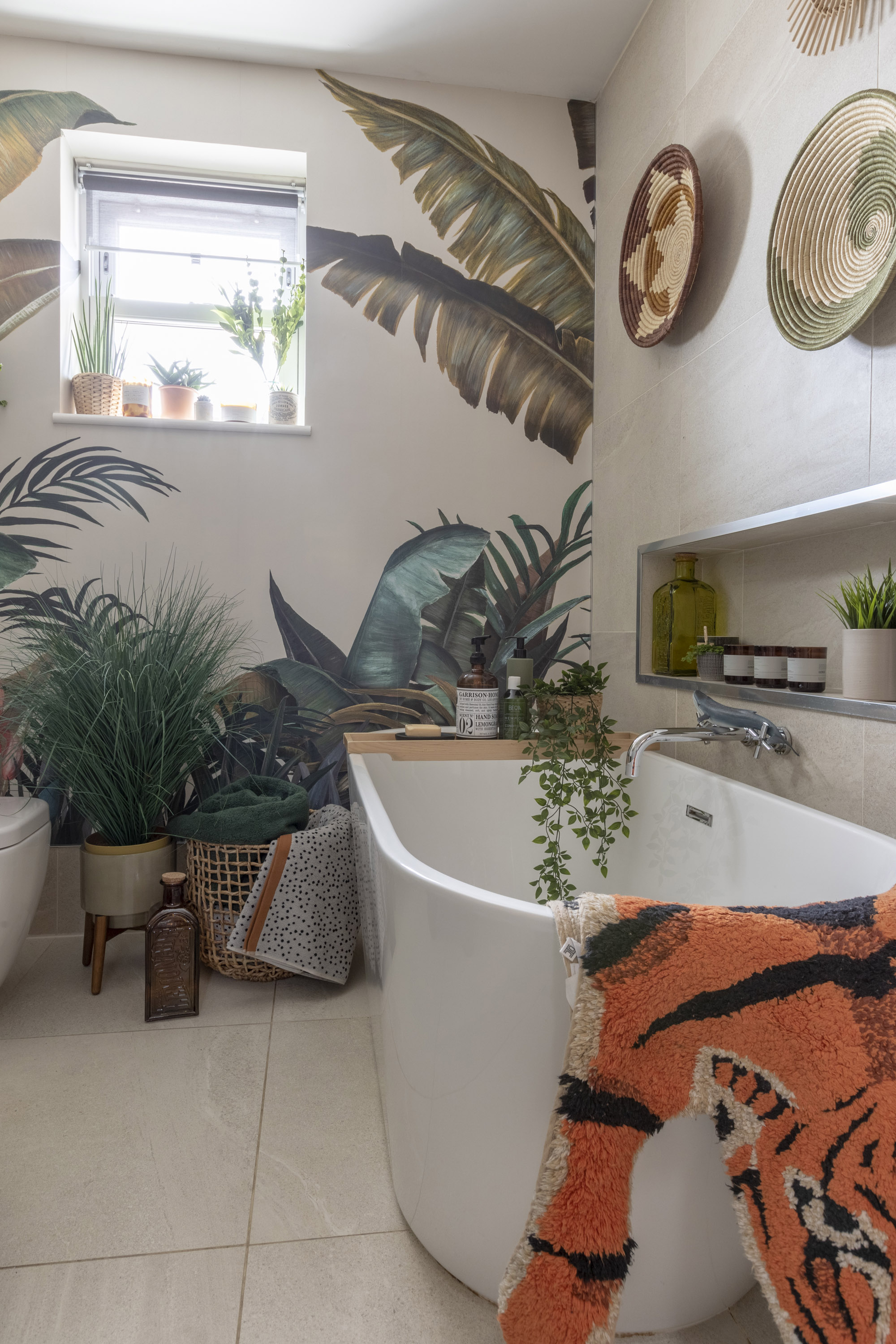
The decor of the family bathroom proves that layers of colour, texture and pattern can work in this functional room just as well as any other. Mural, Photowall. Tiger bath mat, Urban Outfitters.
The bathrooms are also full of retro flair, with punchy tropical wallpaper amid a colour-filled scheme. ‘I feel like functional spaces should never be plain and boring,’ says Sally. ‘I always like to paint and add wallpaper and accessories, and I approach the interior of my bathroom and kitchen just as I do the rest of the house.’
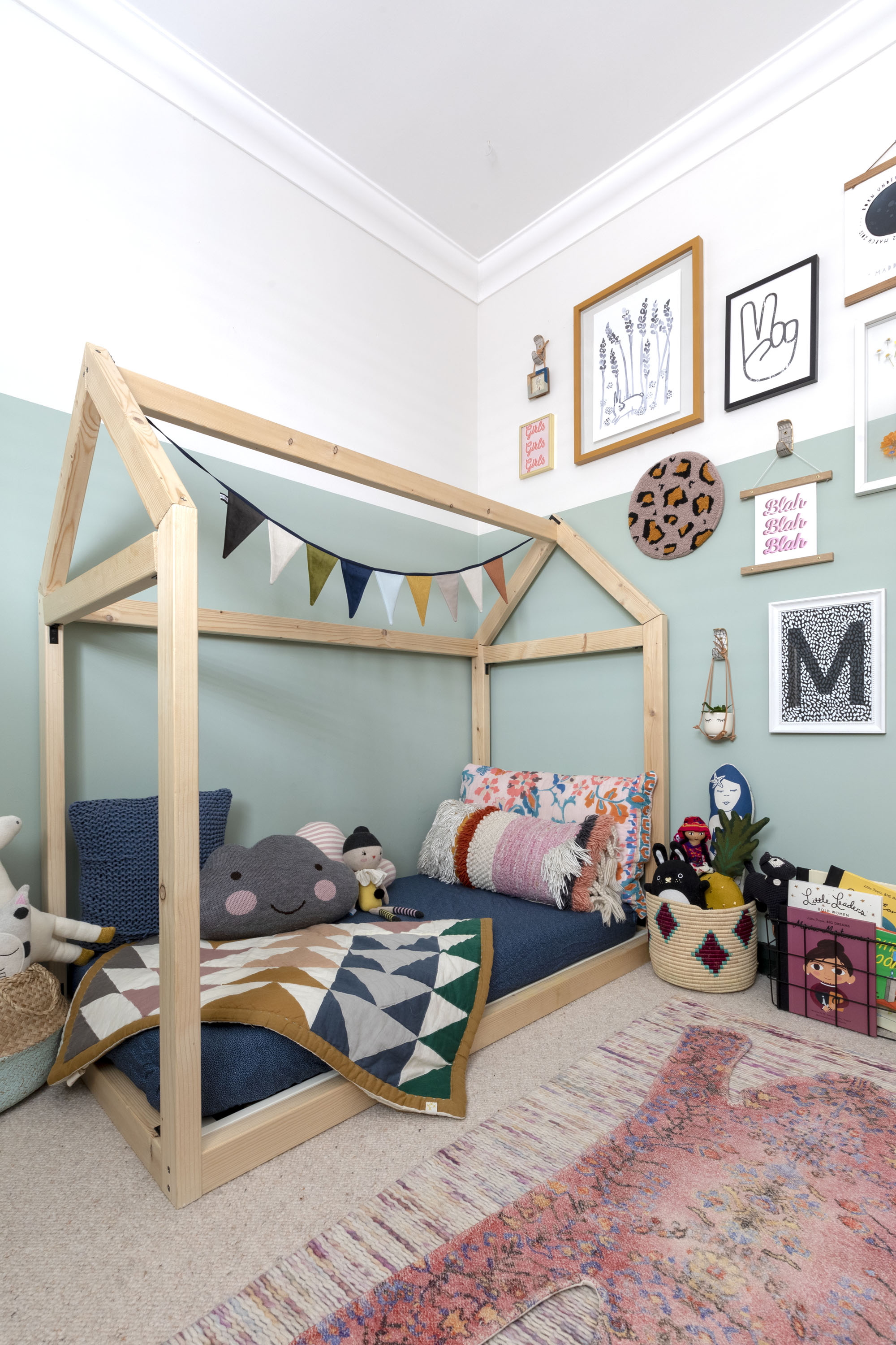
Cool two-tone walls, a gallery of prints and a house-shaped bed make Maddi’s room the perfect place for child’s play. Multicolour rug, B&Q. Bed, Wayfair. Triangle blanket, Camomile London
Now that they’re a few years further on from the original renovation work, is there anything left to be done in the house? ‘At some point we’ll probably do the basement,’ says Sally. ‘But for now, we’re taking a rest and just enjoying living here. It’s everything we could have wished for – and more.’
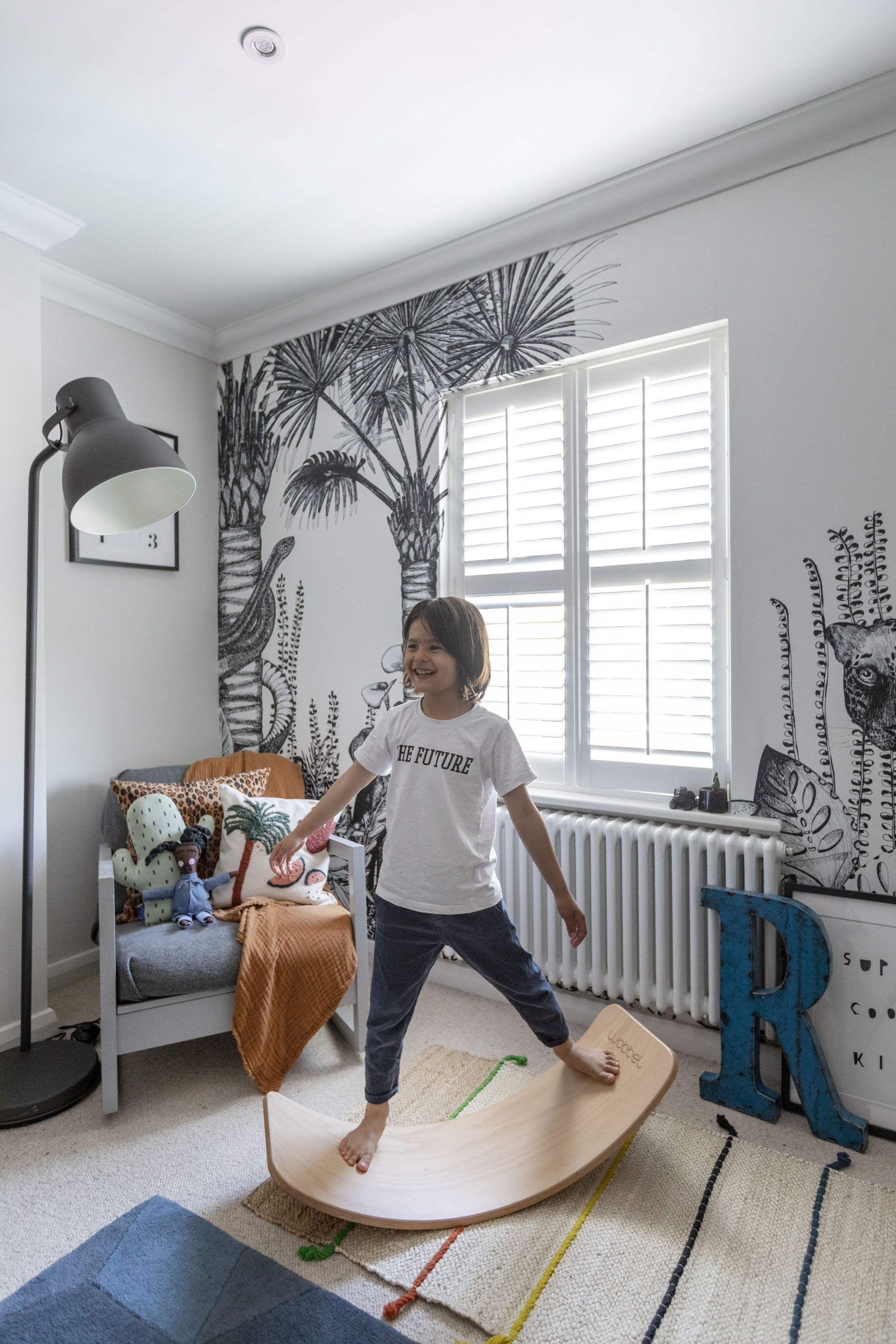
The children’s rooms reflect the family’s artistic expressiveness. In Rocco’s, Sally has created a tropical space where he can get lost in his imagination. Jungle wallpaper, Bien Fait Paris