
Buying your first home is an exciting prospect for any young couple. It’s a chance to leave the rental market and get your foot on the housing ladder, and an opportunity to finally try out the decorating schemes and design ideas you’ve been coveting on Instagram.
For Beth and Tom, their three-bedroom semi wasn’t necessarily going to be their forever home, but it was a space that they could make their own with their unique take on Scandi style.
Read on to find out how they transformed it, then browse the rest of our real home transformations. Read our guide on renovating a house, too, for more guidance.
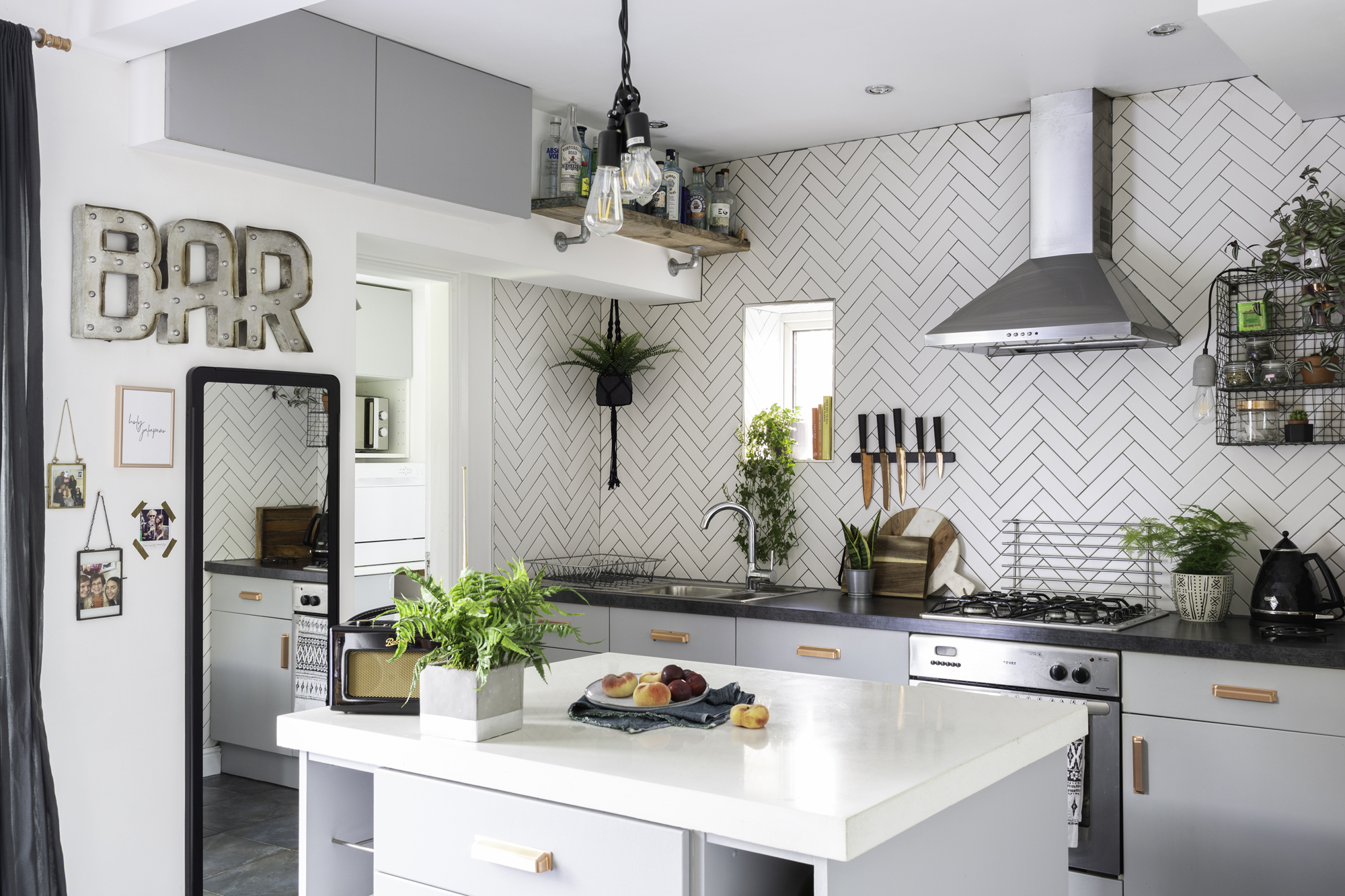
‘I wanted statement tiles, so went for a full wall instead of a splashback,’ Beth says. ‘We just needed to decide whether to go with herringbone or something more linear, which would’ve been easier. But we like a challenge!’
White worktop, handmade. Grey worktop, Howdens via Gumtree. Cupboard doors/drawers paint, Dulux; for a similar colour, try Goose Down. Handles, All Handles & Pulls. Sink, Blanco. Wire shelving, Rose & Grey Interiors. Concrete light, Ebay. Bar sign, HomeSense
Project notes
The owners
Beth Jamison, a technical worker for a cladding materials manufacturer, lives with her fiancé Tom Marsden, a project manager for a precast concrete company
The property
A three-bedroom 1930s semi-detached house in Nottingham
Project cost
£8,700
Q The kitchen captures the Scandi/industrial vibe that we’re loving at the moment. How did you tackle it?
A 'We had a new bathroom put in when we moved in, but in the kitchen, rather than having new units, we decided to utilise what was already there. We kept the cupboards and painted them, which was a bit of a chore – they’re melamine, so we had to find a primer that would work first.
'We also had a stud wall put in to create a utility room. The space used to have a back door and French doors out to the decking area – I think it must have been a separate kitchen and dining area at some point – but we decided we didn’t need two doors, so we put a window in where the back door was to brighten up the utility a bit.'
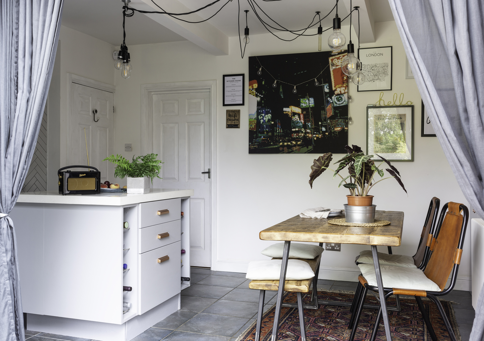
‘The kitchen-diner feels like a big space, especially for the house,’ Beth says. ‘That’s what drew us to the house in the first place.’
Walls painted in white emulsion, Dulux. Chanel and Champagne print, @chelseaprints. New York print, John Lewis & Partners. London print and Hello sign, Violet & Thistle. Canvas, Dwell
Q You’ve certainly used that freedom to your advantage. There are so many clever details and considered touches. I love the herringbone tiling across the kitchen wall. What was it like launching into a renovation project as first-time buyers?
A 'I love getting stuck into projects and having a go at everything, so I really enjoyed the process. But we were quite lucky – our dads were hands-on with it as well. They basically came in, showed us how to do the basics, like tiling, and then left us to it. It took a long time, though.
'There were moments when I thought, ‘Why did we start this?’ But when you come to the end and see the result, knowing you’ve done it all yourself, it’s quite an accomplishment.
'I’m glad you like the tiling, too. We didn’t do the house up with a view to sell – we just did it for our own tastes. We both like that industrial vibe and I think that comes through in the décor.'

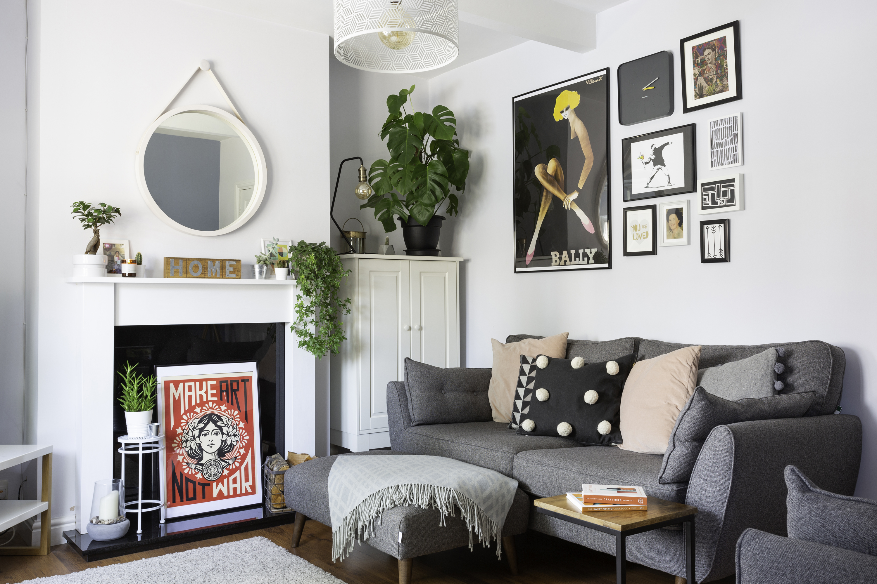
‘I wanted to keep the living room cosy, but still light,’ Beth says. ‘I went for a Scandi vibe, which came from the sofas – we saw those first and they influenced the rest of the scheme.’ The floorboards are original: the couple didn’t have to touch any of the flooring downstairs. Wall paint, Homebase. Cupboard, Ikea. Sofa, French Connection at DFS. Cushions, H&M Home and The Range. Black industrial lamp, ceiling light and nest of tables, Made.com. Mirror, Swoon Editions. Make Art Not War print, Etsy
More from Real Homes
Get more ideas, inspiration and expert advice delivered every month, and a fantastic welcome offer, with a subscription to Real Homes magazine
Q This is a lovely house for a first property. Looking at the before photos, it doesn’t look like it needed a whole lot of work doing – aside from the usual décor updates, obviously! What was it that drew you to it?
A 'We knew we wanted to buy somewhere we’d be able to put our own stamp on. Of course we were looking to add a bit of value, but it wasn’t necessarily about that. We loved the space – we could visualise exactly what we wanted to do with it, which was a good sign.
'It needed a bit of TLC; there was nothing wrong with it, but it wasn’t to our tastes. The big kitchen-diner with an island was what drew us to it. The lounge is the perfect size for the two of us, and the garden was decent – it ticked all the boxes.
'We’ve always seen our first property as a step on the housing ladder rather than our forever home. We just wanted to get away from renting and have our own house – with more freedom to do what we wanted.'
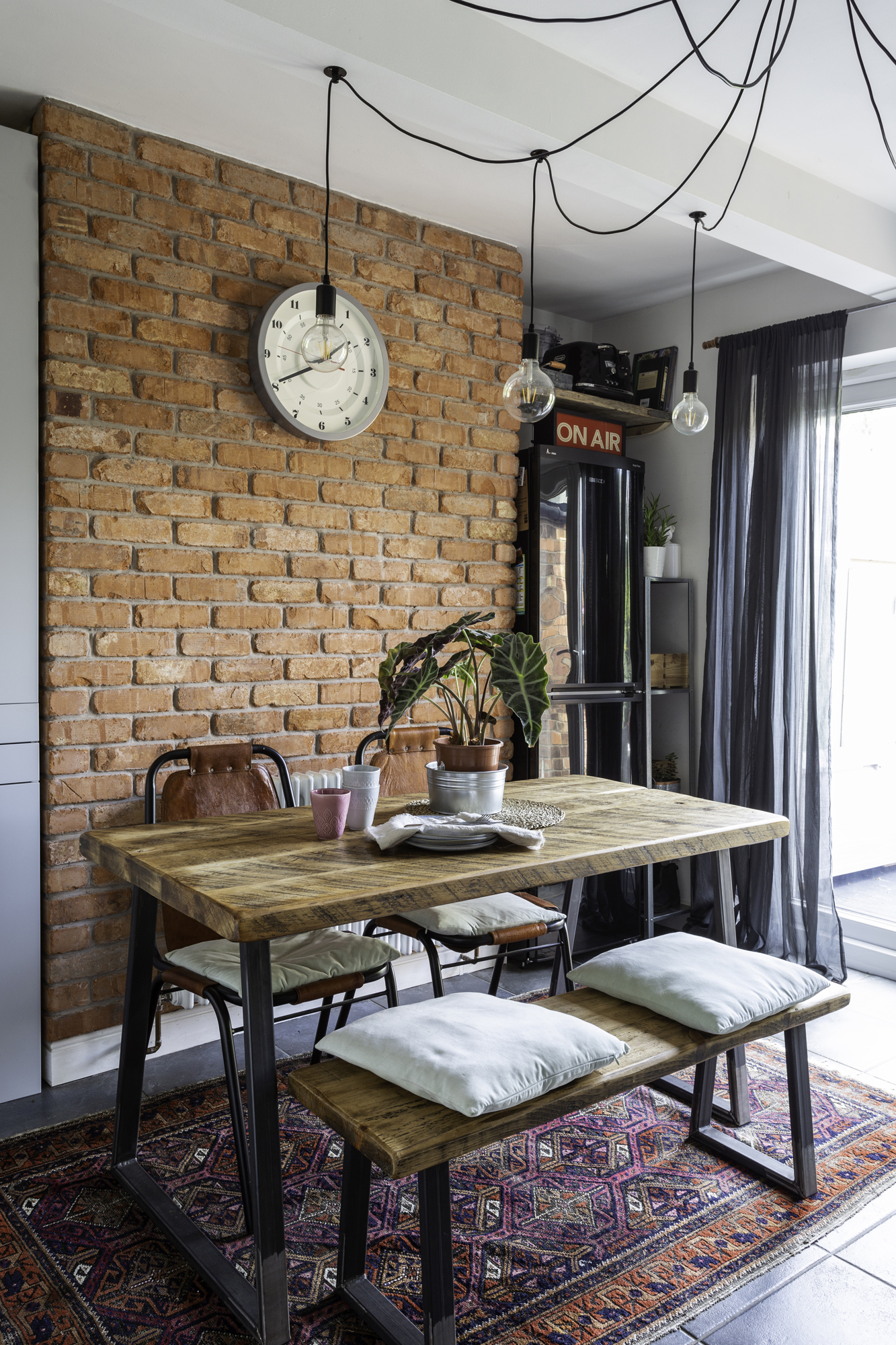
‘We opted for brick slips instead of a proper exposed brick wall because the originals weren’t in great condition – but you still get the same industrial style,’ Beth says. Grey unit and wall clock, Ikea. On Air sign, Violet & Thistle. Brick slips, Brickslips UK. Table and bench, Design Shack Interiors. Chairs, radiator and rug, Ebay. Cushion covers, H&M Home. Ceiling light, Cult Furniture
Q You’ve completely transformed every room in the house. What’s the process been like for you?
A 'We’ve been doing it up bit by bit since we bought it. We haven’t done it full pelt – we did one room, then had a break. We didn’t want it to take over because we both work full time. It would have been easy to let it take up every weekend! The kitchen was definitely the crux of the project.'
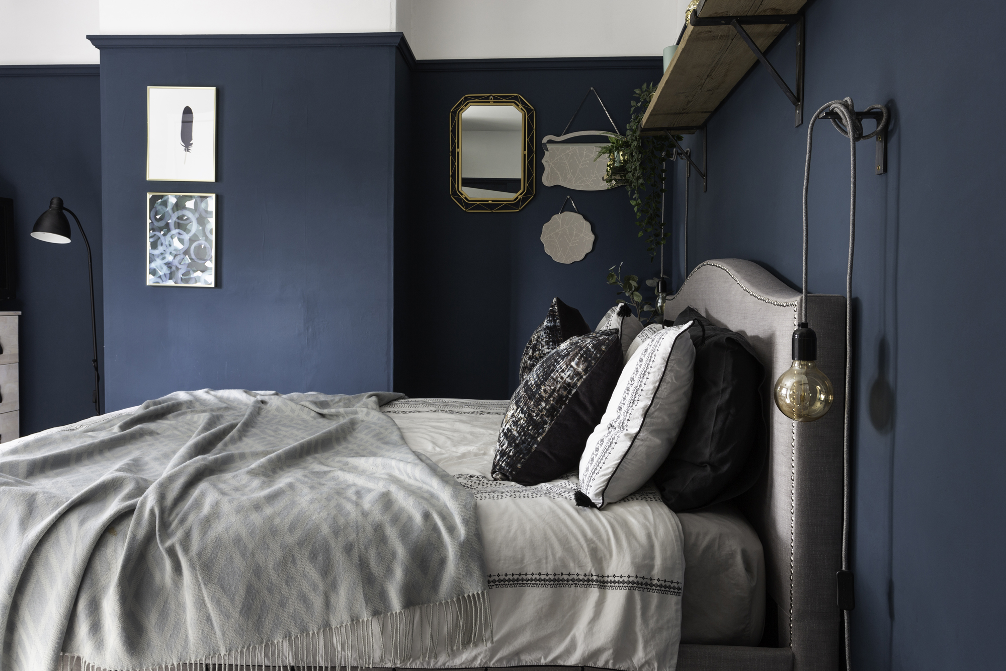
‘I got the inspiration for going dark from Instagram,’ Beth says. ‘I’d thought about it but only went through with it once I’d seen it done elsewhere. I’m glad we did – it makes an impact on the bedroom and it’s quite relaxing.’
Walls painted in Hague Blue, Farrow & Ball. Flooring, Wickes. Rug, Argos. Bed, Wayfair. Bedside lights, Vendimia Lighting Co. Throw, TK Maxx. Prints, Ikea. Bedside tables, Ebay, Bedlinen, cushions and planter, Matalan
Q How have you financed the work?
A 'The only time we got extra funding was for the kitchen, but everything else has been added to as and when. Each month, part of our pay cheques go towards the house. We’ve saved with a lot of mix-and-matching. For the kitchen especially, we bought bits and bobs off Gumtree, including one worktop. The others were from Tom’s old company.
'We scrimped on some parts to save for other, more expensive things. We decided on brick slips for the kitchen-diner chimney rather than exposed bricks, because they weren’t in amazing condition. That was probably quite costly compared to other parts of the project. We did the brick slips ourselves, as well as the tiling and painting, all without too much arguing!'
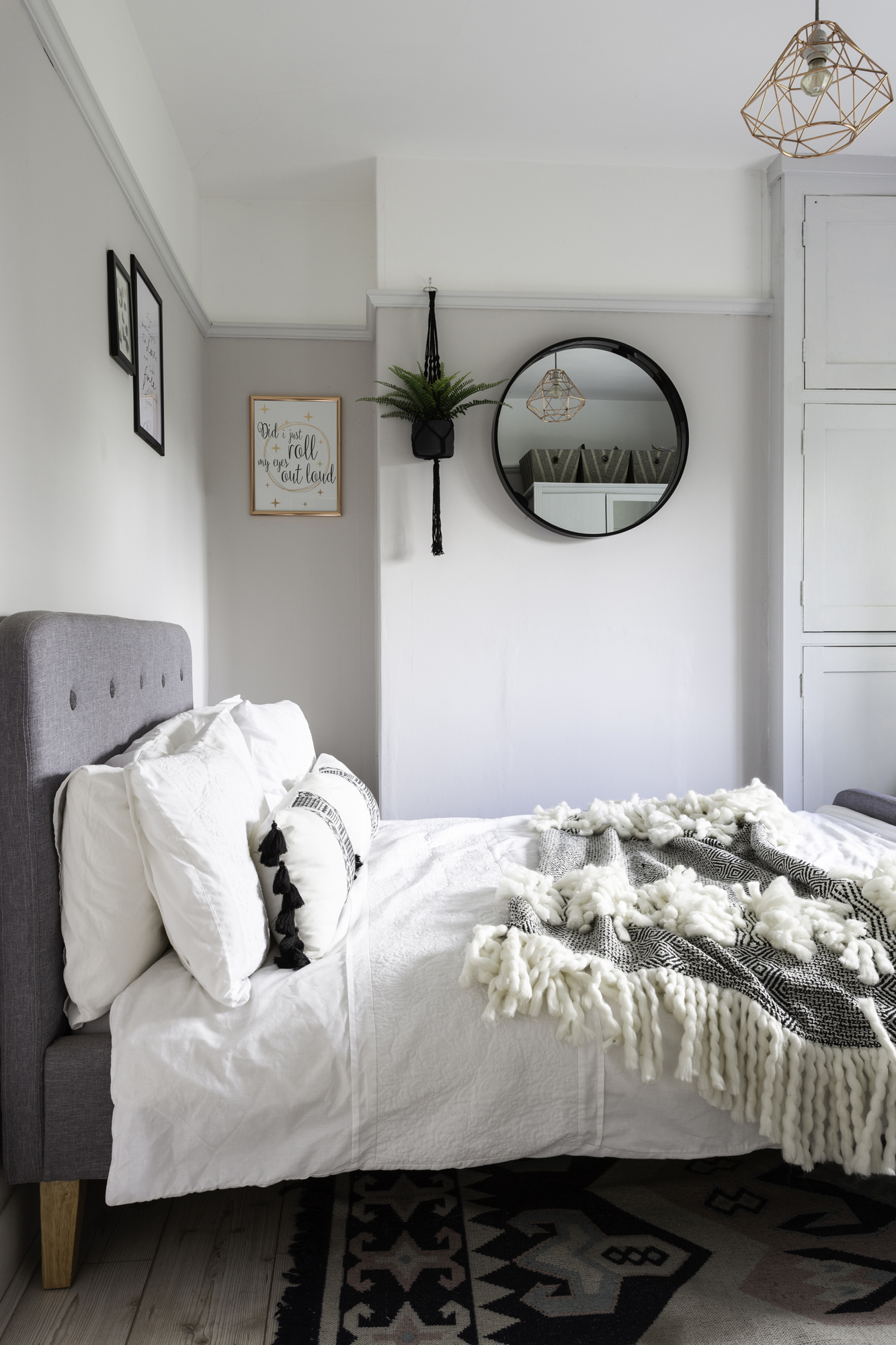
The guest bedroom is used when friends and family visit. The couple found the colour while searching for inspiration for their own room. ‘It’s neutral, but has more depth to it,’ Beth says. ‘I painted the woodwork grey to tie it in.’
Bed and black mirror, Argos. Throw, HomeSense. Ceiling light, Dunelm. Rug, Ebay. Hanging plant, The Watered Garden of Nottingham. For a similar paint colour, try Dorchester Pink Pale, Little Greene
Q It sounds like a lot of work – but it looks like it’s definitely been worth it in the end. What’s your favourite thing about the house?
A 'It would have to be the kitchen. It’s a sociable space. We’ll have family and friends over, and because it’s open plan, whoever’s cooking doesn’t feel out of it. Even when it’s just me and Tom, one of us can be making tea while the other’s pottering around. We spend a lot of time in there – it’s lovely.'
Contacts
- Brick slips: brickslips.co.uk
- Tiles: Tons of Tiles
- Table and bench: Design Shack Interiors
More lovely homes to browse:
Join our newsletter
Get small space home decor ideas, celeb inspiration, DIY tips and more, straight to your inbox!

Formerly deputy editor of Real Homes magazine, Ellen has been lucky enough to spend most of her working life speaking to real people and writing about real homes, from extended Victorian terraces to modest apartments. She's recently bought her own home and has a special interest in sustainable living and clever storage.
-
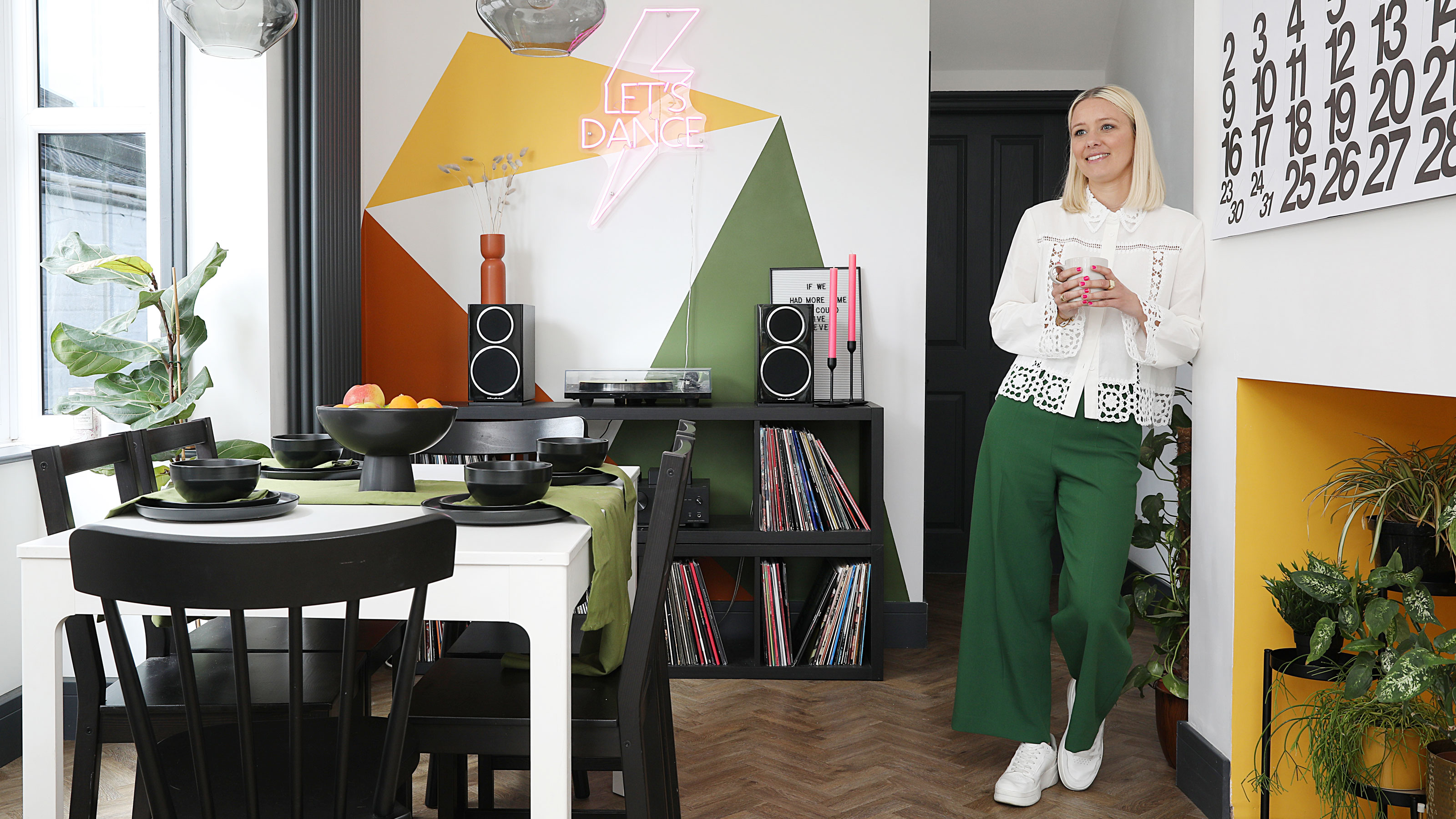 This colourful home makeover has space for kitchen discos
While the front of Leila and Joe's home features dark and moody chill-out spaces, the rest is light and bright and made for socialising
By Karen Wilson Published
-
 How to paint a door and refresh your home instantly
Painting doors is easy with our expert advice. This is how to get professional results on front and internal doors.
By Claire Douglas Published
-
 DIY transforms 1930s house into dream home
With several renovations behind them, Mary and Paul had creative expertise to draw on when it came to transforming their 1930s house
By Alison Jones Published
-
 12 easy ways to add curb appeal on a budget with DIY
You can give your home curb appeal at low cost. These are the DIY ways to boost its style
By Lucy Searle Published
-
 5 invaluable design learnings from a festive Edwardian house renovation
If you're renovating a period property, here are 5 design tips we've picked up from this festive Edwardian renovation
By Ellen Finch Published
-
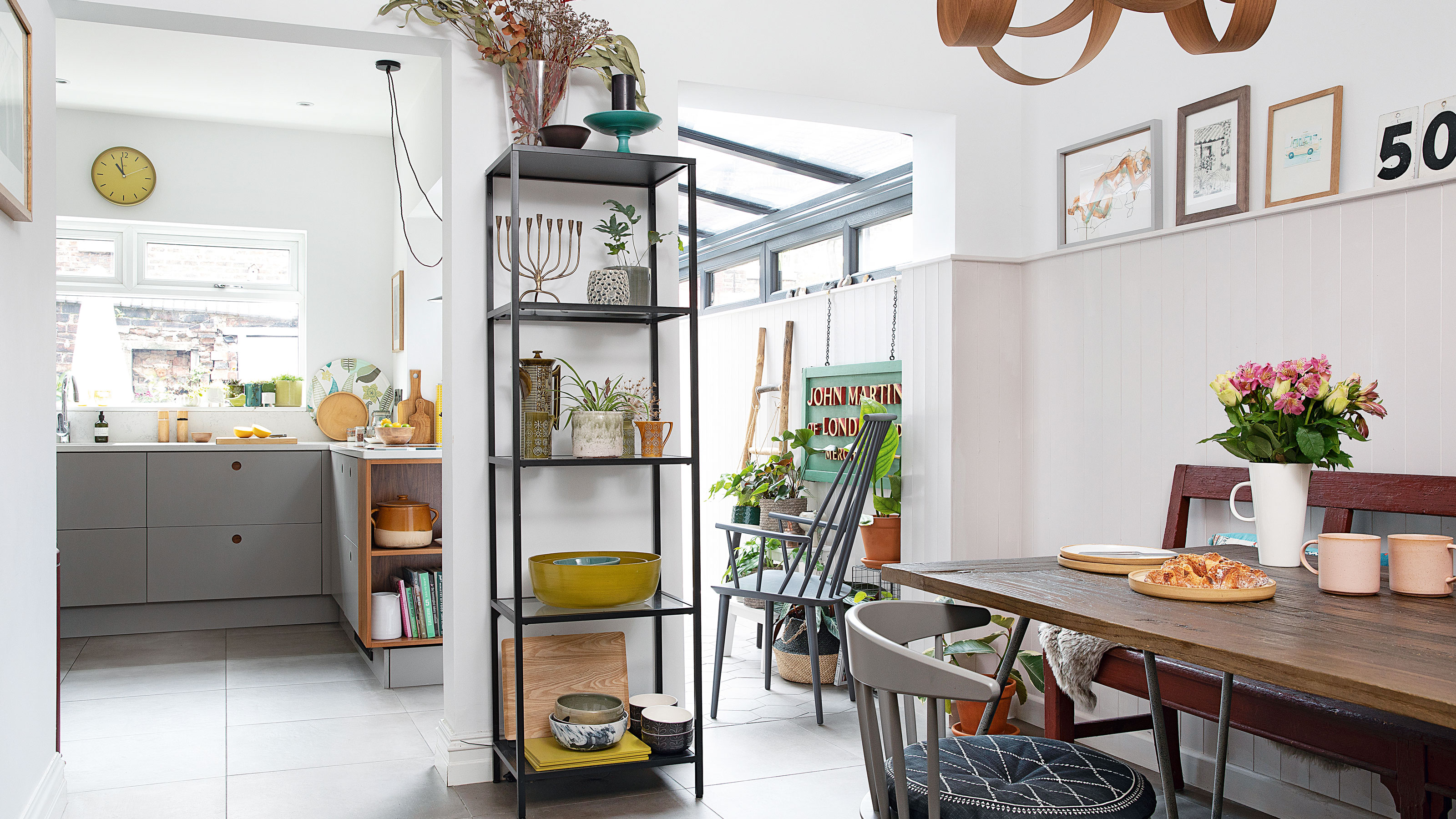 Real home: Glazed side extension creates the perfect garden link
Louise Potter and husband Sean's extension has transformed their Victorian house, now a showcase for their collection of art, vintage finds and Scandinavian pieces
By Laurie Davidson Published
-
 I tried this genius wallpaper hack, and it was perfect for my commitment issues
Beware: once you try this wallpaper hack, you'll never look back.
By Brittany Romano Published
-
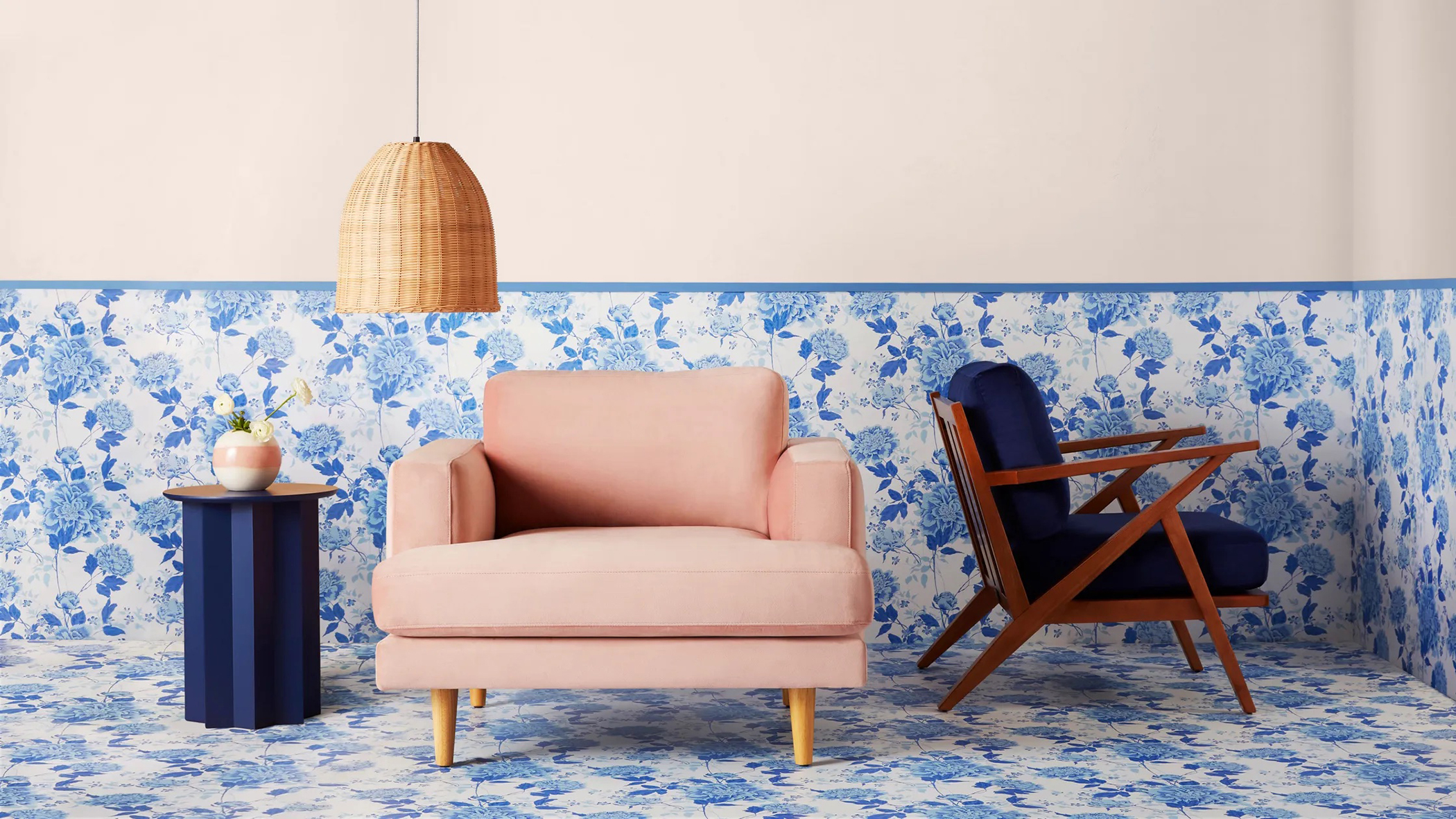 Drew Barrymore's new FLOWER Home paint collection wants to give your walls a makeover
Drew Barrymore FLOWER drops 27 brand-new paint shades, and every can is made from 100% post-consumer recycled plastic.
By Brittany Romano Published