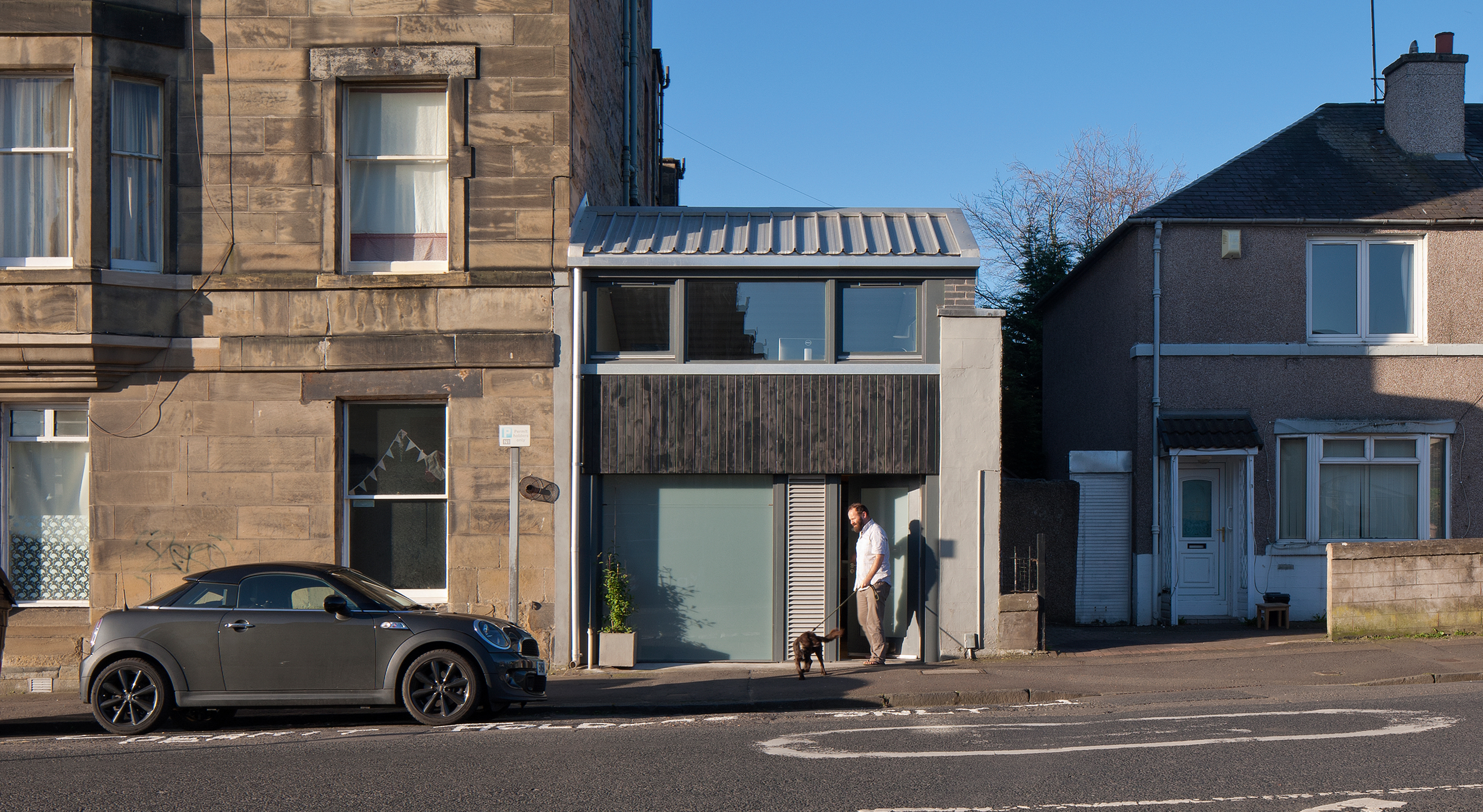
Had first impressions counted for much, Tim and Lizzie Bayman might not be enjoying their current home. Former owners had converted the property from a shop into a dark two-storey family dwelling in the 1980s. ‘It was a terrible conversion,’ recalls Tim. ‘When I showed Lizzie the property details, she said “No way!”.’
Read how Tim got on, and check out our dedicated page for more real home transformations. Read more about house renovation in our expert guide.
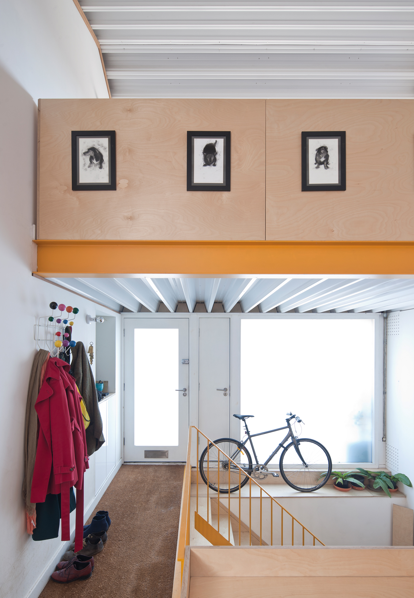
For similar coat hooks, try the Hang It All coat hanger, Cult Furniture. For coating metalwork, try Architectural Coating Solutions
Project notes
The owners Tim Bayman, an architect, and his wife Lizzie, a doctor, live here with their son Theo, four, and spaniel George.
The property A two-bedroom former shop unit in Edinburgh.
Project cost £73,550.
Tim was setting up his own architectural practice and looking for a property renovation as an inaugural project. ‘They’d tried to make the shop more house-like by taking out elements such as the large front window, but that just cut out all the light,’ he recalls. ‘When I first viewed the place I took some general dimensions, put together some ideas, and spoke to the local planners. They said, “anything would be better than what’s there now”.’
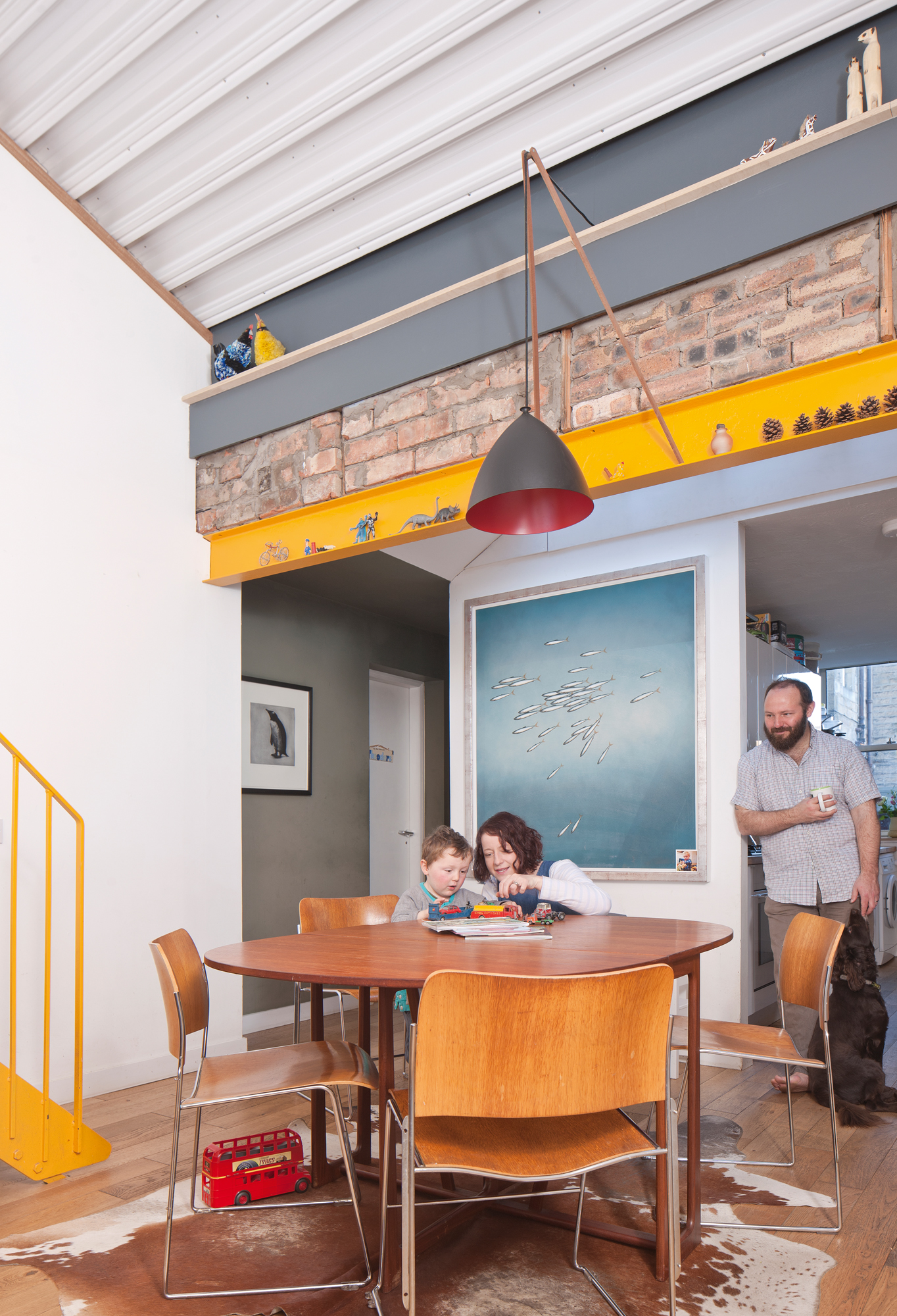
Staircase, Gordon Bow Engineering. Ceiling light, Lampsy. David Rowland 40/4 chairs, Howe
At the time, Tim and Lizzie were living nearby in a small one-bedroom flat. They reviewed the potential of the property, particularly its size, which was almost double what they had, and purchased it for £161,000 – which left a little under £70,000 of their pooled resources to bring the property back to life. ‘The budget wasn’t a huge amount for a complete refit of a house, with the additional cost of a mezzanine as a new office space and a new roof,’ Tim says. ‘For that reason, it made sense to try to build as much as possible myself.’
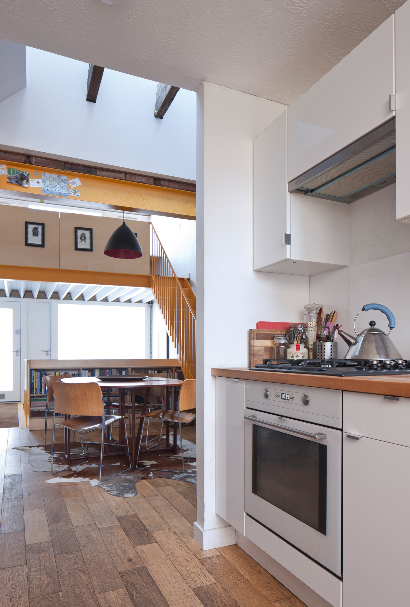
For wood flooring, try Wood & Beyond
With planners onside, Tim collaborated with joiner Guy Scott and Edinburgh-based contractors Inscape Joinery on a five-month refit. He started by reinstating the ‘shop front’ window of the two-storey block. ‘You need a large bit of glass in the front to bring light into the building,’ he explains. He also opted to add a new pitch roof with rooflights, bringing in even more direct sunlight.
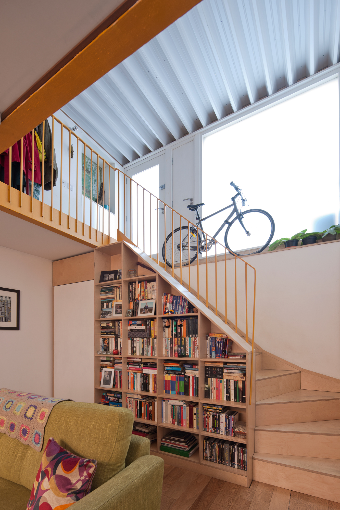
For similar modular bookshelves, try House by John Lewis Cube, John Lewis & Partners
More from Real Homes

Get more ideas, inspiration and expert advice delivered every month, and a fantastic welcome offer, with a subscription to Real Homes magazine
Inside, Tim remodelled the interior to create an open-plan space with a raw, industrial aesthetic. An exposed steel staircase in vibrant yellow leads up to a mezzanine-level office area, while in the other direction, the bespoke plywood staircase reveals a basement living room with woodburning stove. A bedroom and bathroom sit tucked away at the back of the property.
The tight budget meant that more has been conjured from less. ‘The key to this project is that nothing is expensive,’ Tim explains. ‘I knew the scale of the job from the start. The idea that Guy and I would do as much of the work as possible in order to meet the tight budget did inform the design and planning.’
Partitions are simple plywood and the stainless-steel staircase is ‘fairly crude – and deliberately so,’ Tim says. ‘It’s an economic “just enough” approach. I don’t need to take it beyond where it needs to be. The roof material is usually used in supermarkets and big industrial sheds. Aesthetically, I like the alternating stripes. In the same way people like cottages with beams, I like its visible structure.’
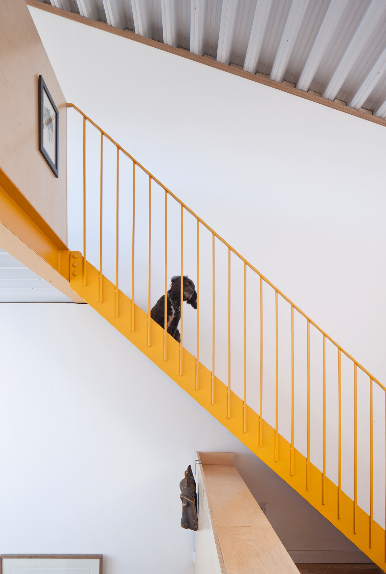
The result is Tim’s ideal family home. ‘As an architect, it was great to be involved in the actual hands-on joinery work, from rough framing to finished birch ply bookshelves,’ he says. ‘I learned I have a love of joinery and a hatred of decorating! If in the future we decide to move, we’d like to build somewhere from scratch.’

Contacts
- Architect: Tim Bayman
- Main contractor: Inscape Joinery
- Engineering: Create Engineering
- Joinery: Broad Workshop
More real homes to browse:
Join our newsletter
Get small space home decor ideas, celeb inspiration, DIY tips and more, straight to your inbox!
-
 This colourful home makeover has space for kitchen discos
While the front of Leila and Joe's home features dark and moody chill-out spaces, the rest is light and bright and made for socialising
By Karen Wilson
-
 How to paint a door and refresh your home instantly
Painting doors is easy with our expert advice. This is how to get professional results on front and internal doors.
By Claire Douglas
-
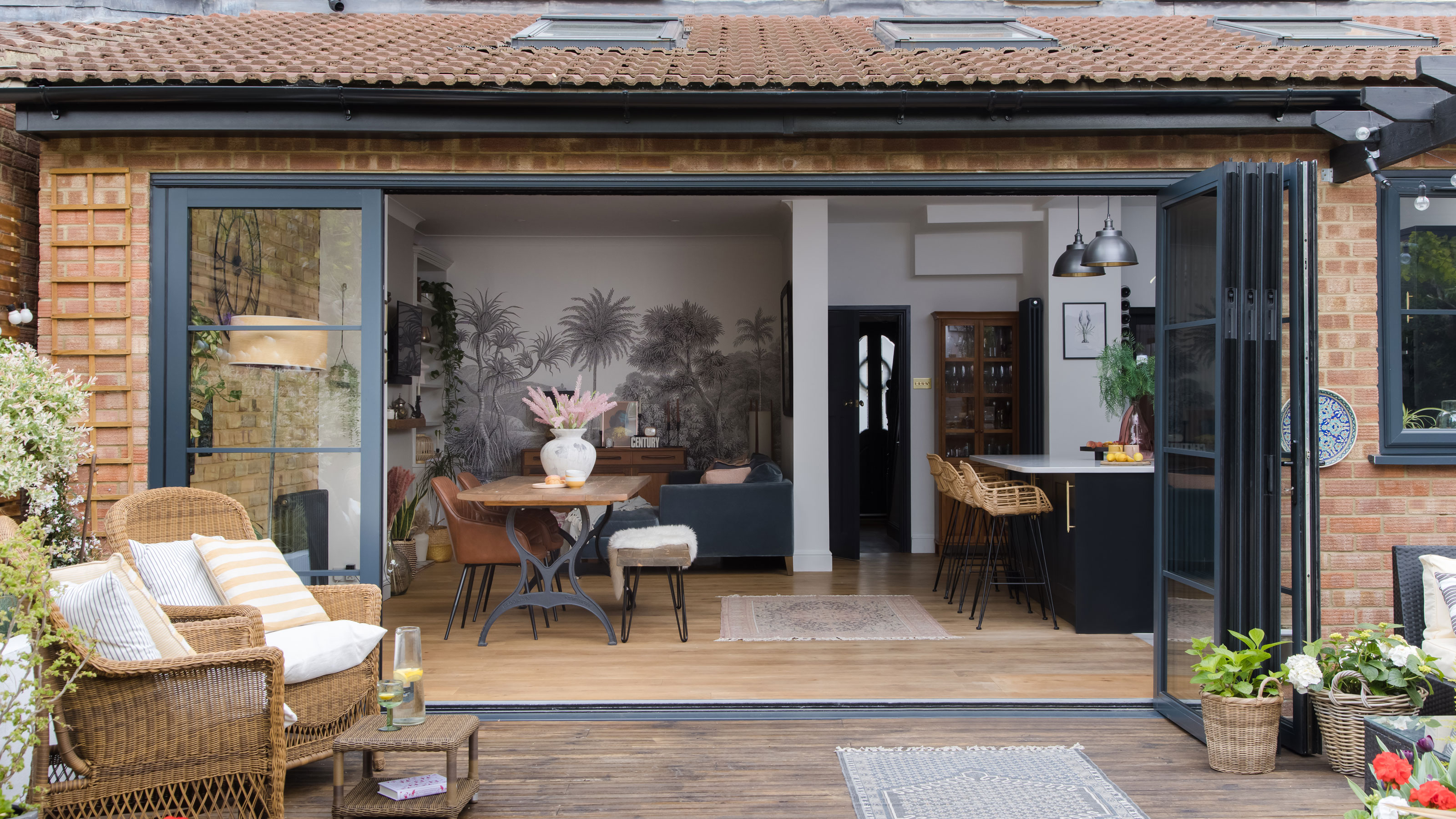 DIY transforms 1930s house into dream home
With several renovations behind them, Mary and Paul had creative expertise to draw on when it came to transforming their 1930s house
By Alison Jones
-
 12 easy ways to add curb appeal on a budget with DIY
You can give your home curb appeal at low cost. These are the DIY ways to boost its style
By Lucy Searle
-
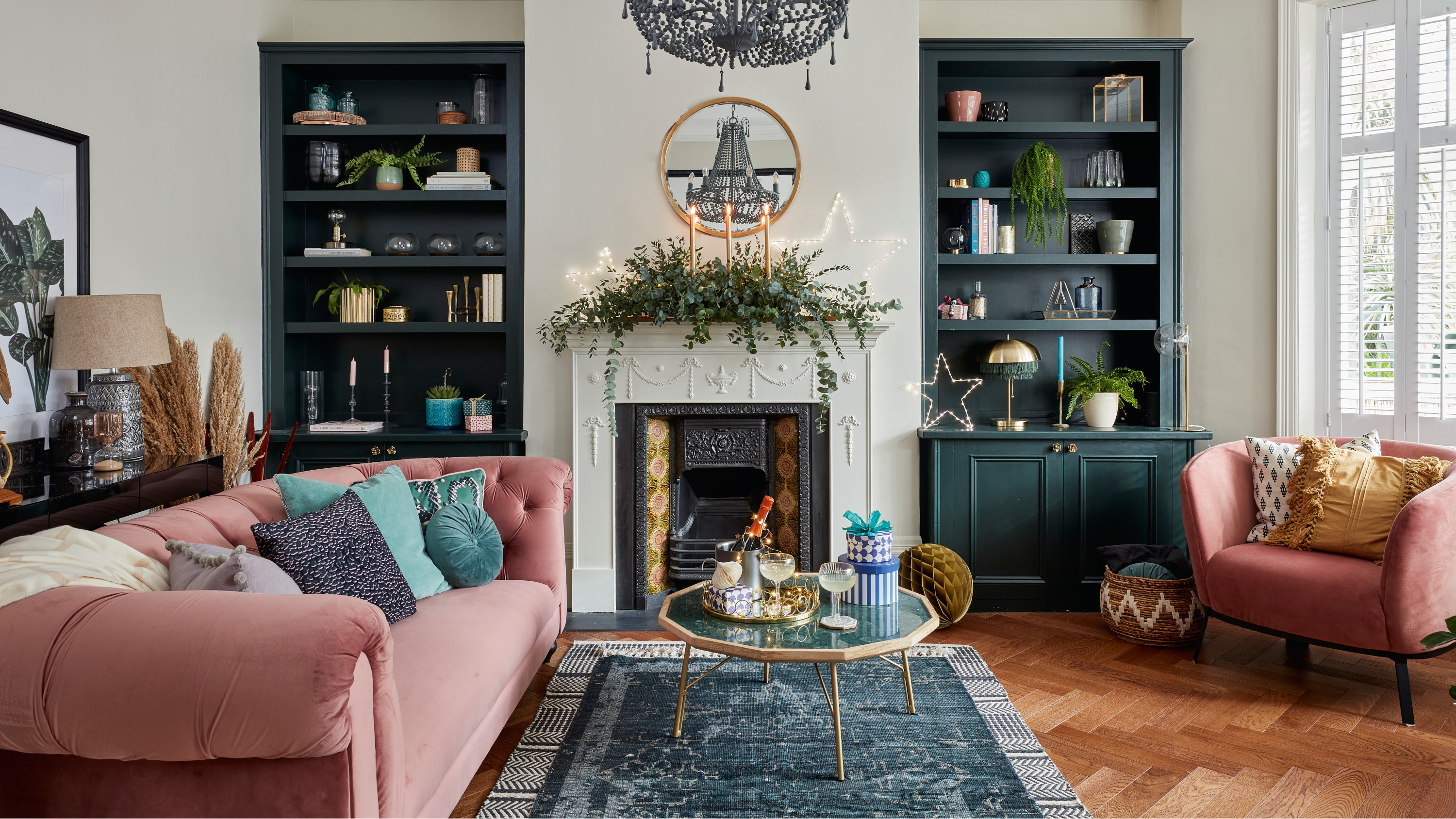 5 invaluable design learnings from a festive Edwardian house renovation
If you're renovating a period property, here are 5 design tips we've picked up from this festive Edwardian renovation
By Ellen Finch
-
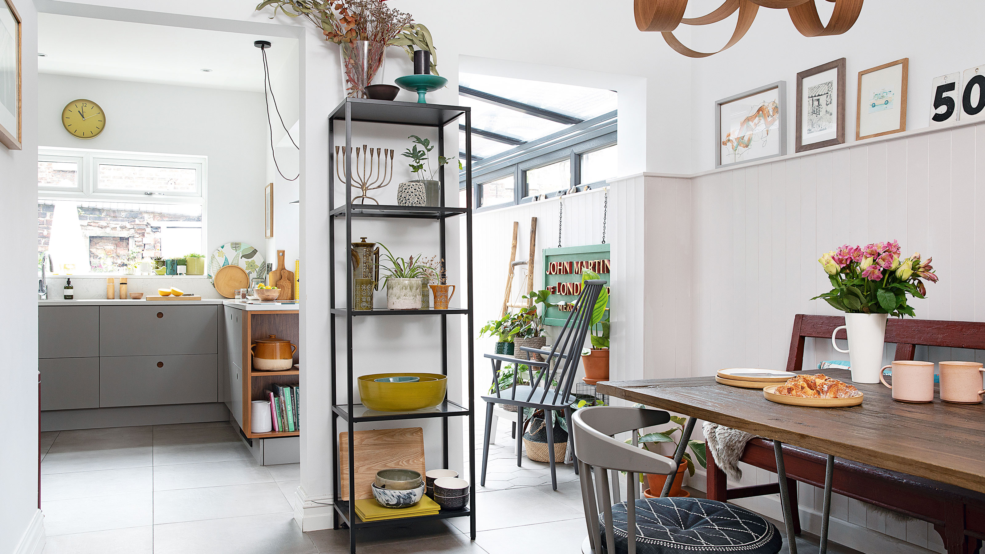 Real home: Glazed side extension creates the perfect garden link
Louise Potter and husband Sean's extension has transformed their Victorian house, now a showcase for their collection of art, vintage finds and Scandinavian pieces
By Laurie Davidson
-
 I tried this genius wallpaper hack, and it was perfect for my commitment issues
Beware: once you try this wallpaper hack, you'll never look back.
By Brittany Romano
-
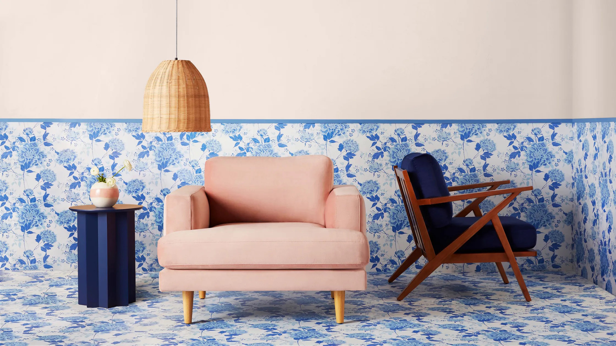 Drew Barrymore's new FLOWER Home paint collection wants to give your walls a makeover
Drew Barrymore FLOWER drops 27 brand-new paint shades, and every can is made from 100% post-consumer recycled plastic.
By Brittany Romano