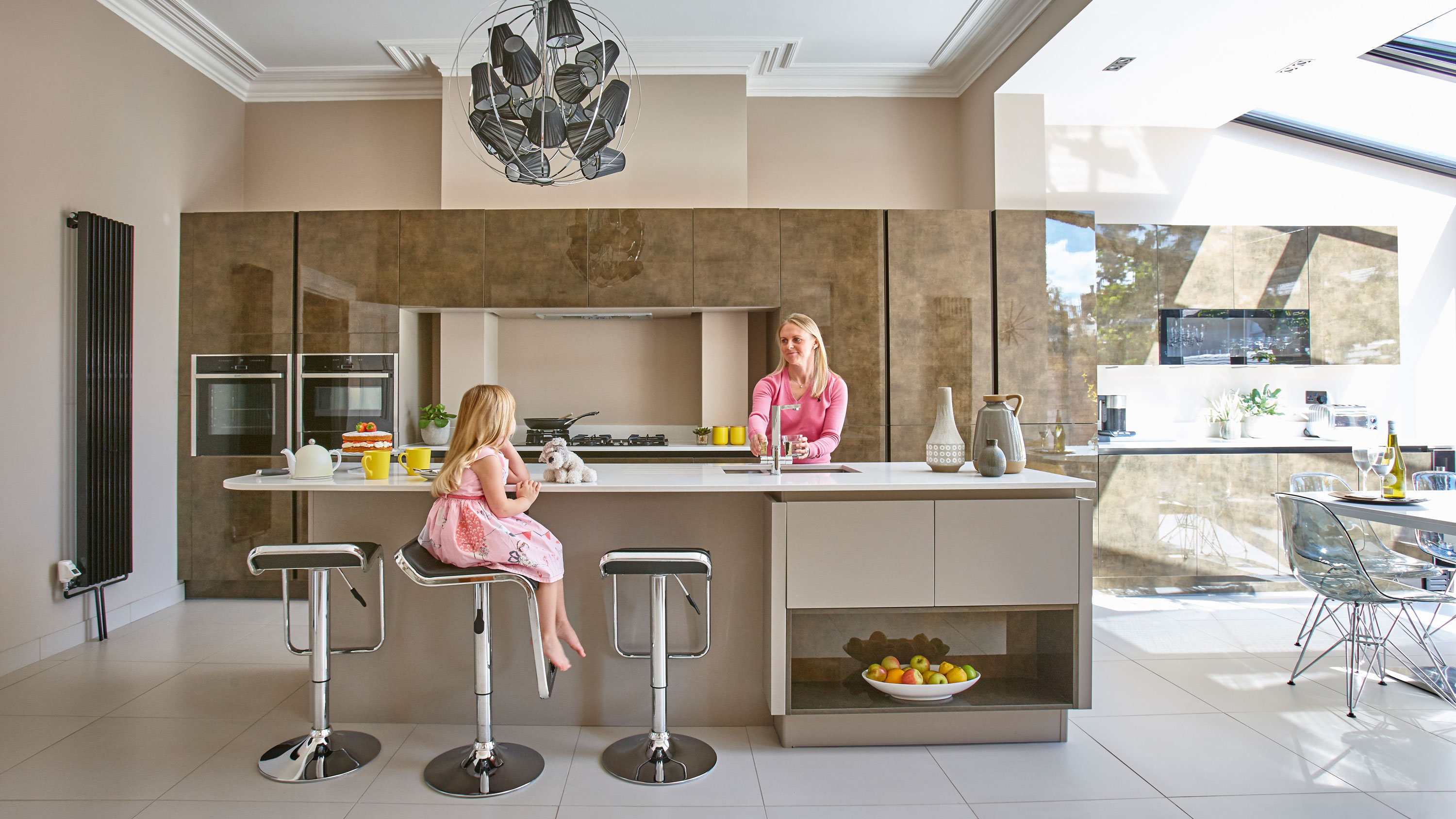

Clare and Richard new glazed kitchen-diner extension was the culmination of years of renovating a dozen homes before they bought this one.
They purchased the house at auction, pipping other bidders to the post in their determination to win this period property. It had everything they’d been looking for – large driveway, generous garden and a garage – features they had struggled to find in the area of Southsea. ‘I went into the estate agents the week before the house went up for bids, and put in an offer at the top of the guide price. We had to have it, I couldn’t let it slip by us,’ says Clare.
They cashed in some investments and within the month, they had the keys. However, the kitchen of their dream home felt detached from the rest of the house. With a bright, open-plan kitchen-diner in mind, Clare reveals how they set about achieving their vision on a budget.
Read on to find out more, and don't miss our guide to kitchen extensions.
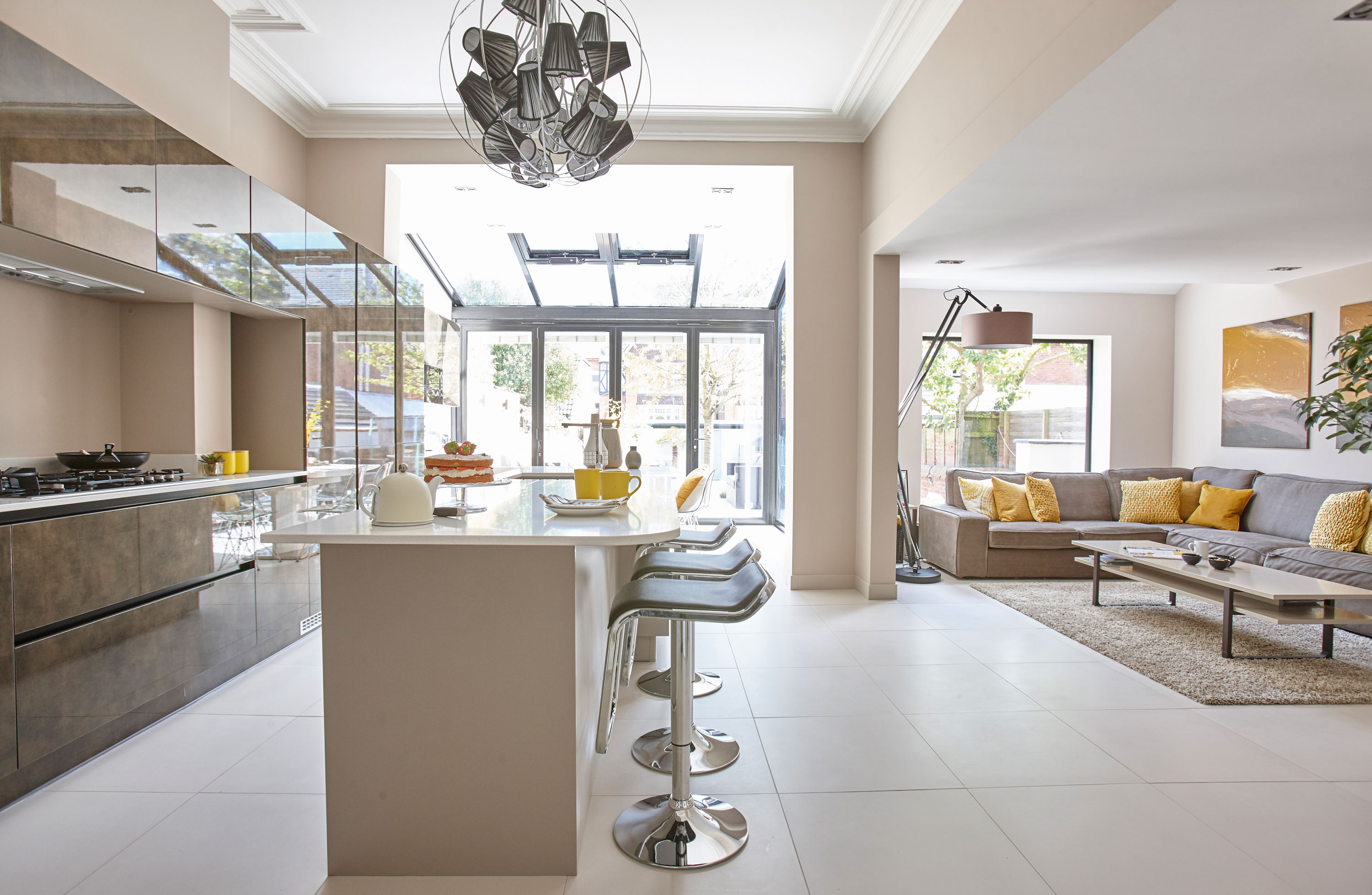
Moving the kitchen into the former dining room and knocking down two walls has created a large bright space where the couple can entertain. Light, Där Lighting. For similar bar stools, try Lakeland Furniture
profile
The owners Clare Hemingway, a project manager, lives here with husband Richard, a telecoms consultant, and their daughters, Isabelle and Jessica.
The property A six-bedroom late Victorian semi-detached house in Southsea, Hampshire.
Project cost £64,000.
‘The house had been untouched since the 1960s and needed renovating from top to bottom. The old kitchen was much smaller and to the side of the house. It was on a lower level with steps down and the only access to the garden was through a side door. We wanted to move it to the dining room, which was lighter with higher ceilings, positioning it in the centre of our home. The dining room was decorated with red velvet wallpaper and an orange shag pile carpet. There was a plastic lean-to conservatory attached to it that had seen better days.
'We’d bought and renovated 12 homes since 2002, so we had lots of experience on what we needed to do. We took on the bulk of the work ourselves to keep our costs low.'

‘While we tackled the first stage of the project, stripping back the house – notoriously dirty and messy work – we decided to stay put in our old home in the short term. It took three months of hard work getting the structural elements completed. Richard spent his early mornings, late evenings and weekends gutting the property and taking everything back to bare brick.
‘Once he was done, we rented out our old house and moved into the basement flat below this house. There were four of us living in a one-bed flat so it was a bit of a squeeze! We sold everything we owned because we had no room to store our furniture. All we had was a couple of suitcases of clothes.’
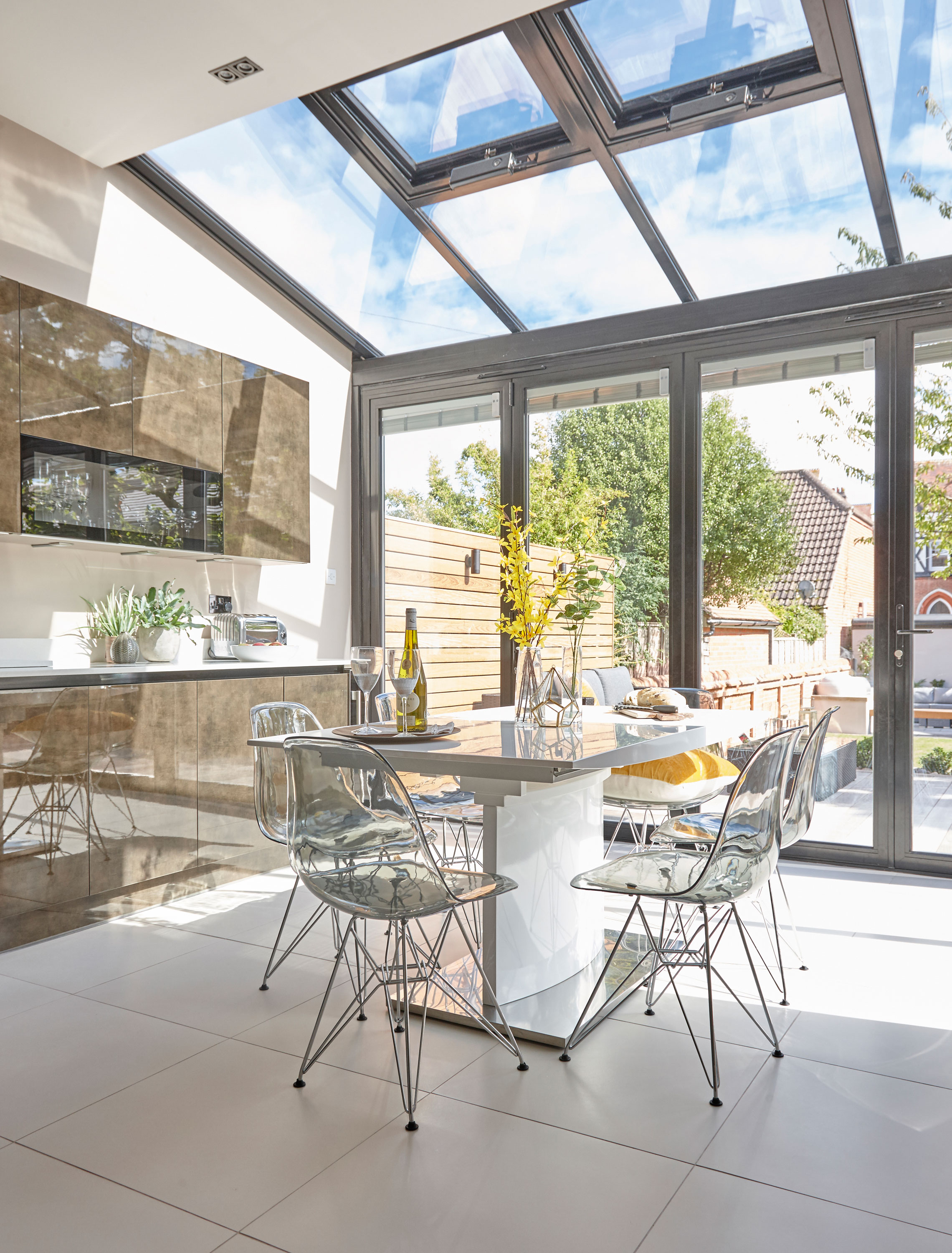
The run of units continues from the kitchen into the dining area to seamlessly link the two. Kitchen units, Sylvarna Kitchens. Flooring, Doga Stone. For similar dining table and chairs, try Dwell. Accessories, Matalan
‘Because we were moving the kitchen to the other side of the house, we had to relocate the plumbing and rewiring, which Richard did himself. He’s taught himself over the years as we’ve been doing up houses, starting on small projects, and now he’s confident taking on a big renovation like this one.
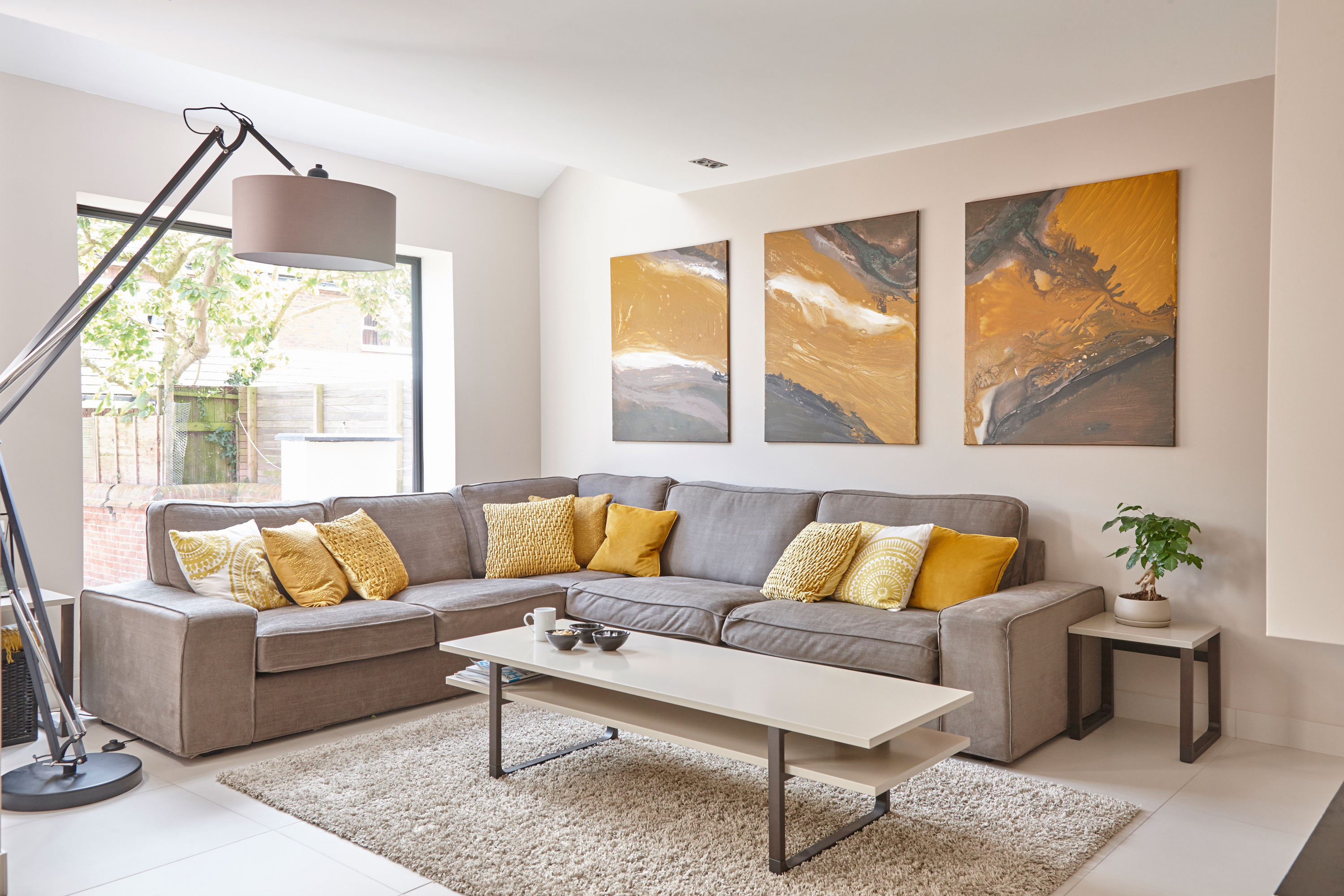
The varied ceiling heights in the open-plan room create different zones – the lowest part houses a cosy snug area. Sofa, Sofa Workshop. Coffee table and rug, Ikea. Lamp, City Lights. Cushions, Debenhams and Matalan
Subscribe to Real Homes

Get ideas and inspiration for your project delivered every month with a subscription
‘We called in a building contractor to help install four large steel beams to support the back of the house – it took eight people to lift them into place! We added a steel frame and in a few months the basic layout was in place.
‘The biggest challenge was coming up with a design to make the rooms seamlessly blend into each other, as the old layout was over different levels, so when we levelled out the floor, the ceilings were still all different heights.’
‘For the kitchen design, we went with our hearts. We saw these bronze door fronts in a showroom and it was love at first sight. They’re a radical departure to the white or grey units we’d been looking at. Our kitchen designer drew up a plan that worked around the chimney breast, with a large central island that doubled as a breakfast bar.
‘We wanted to keep as many original features as we could, including the chimney breast and the ornate ceiling rose. We had units running flush along one wall into the dining area to blend the two spaces together. Ever the handyman, Richard tackled the kitchen himself. It came in 100 boxes and a million little pieces, which he fitted together like a jigsaw puzzle.’
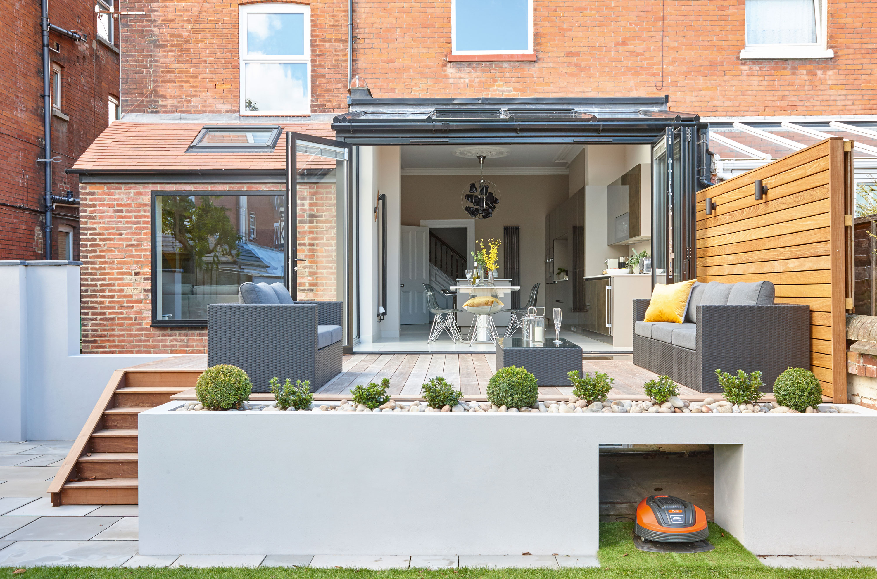
Glazing, Duration Windows
Contacts
Kitchen Sylvarna Kitchens
Flooring Doga Stone
Glazing Duration Windows
Ironmongery VL Architectural Ironmongery
‘Just over a year after we started, we’d finished the bulk of the work, but the room needed a few finishing touches to make the space feel homely. I created a moodboard with loads of samples and referred back to it when I wanted inspiration. I had the paint for the walls made up by colour-matching it to the floor tiles. We struggled to find a light fitting on the high street that was big enough for the ceiling height, so I went online instead. The proportions give the space the look of a smart hotel.
‘It took around 14 months in all, but we took our time to think about all the little details. Doing the bulk of the work ourselves saved a lot of money, and it’s because of that we could afford to splash out on luxury touches to give the kitchen a glamorous look.’
More ideas to browse:
Join our newsletter
Get small space home decor ideas, celeb inspiration, DIY tips and more, straight to your inbox!
-
 This colourful home makeover has space for kitchen discos
While the front of Leila and Joe's home features dark and moody chill-out spaces, the rest is light and bright and made for socialising
By Karen Wilson
-
 How to paint a door and refresh your home instantly
Painting doors is easy with our expert advice. This is how to get professional results on front and internal doors.
By Claire Douglas
-
 DIY transforms 1930s house into dream home
With several renovations behind them, Mary and Paul had creative expertise to draw on when it came to transforming their 1930s house
By Alison Jones
-
 12 easy ways to add curb appeal on a budget with DIY
You can give your home curb appeal at low cost. These are the DIY ways to boost its style
By Lucy Searle
-
 5 invaluable design learnings from a festive Edwardian house renovation
If you're renovating a period property, here are 5 design tips we've picked up from this festive Edwardian renovation
By Ellen Finch
-
 Real home: Glazed side extension creates the perfect garden link
Louise Potter and husband Sean's extension has transformed their Victorian house, now a showcase for their collection of art, vintage finds and Scandinavian pieces
By Laurie Davidson
-
 I tried this genius wallpaper hack, and it was perfect for my commitment issues
Beware: once you try this wallpaper hack, you'll never look back.
By Brittany Romano
-
 Drew Barrymore's new FLOWER Home paint collection wants to give your walls a makeover
Drew Barrymore FLOWER drops 27 brand-new paint shades, and every can is made from 100% post-consumer recycled plastic.
By Brittany Romano