
The transformation of Deborah and Jonathan’s kitchen is so dramatically different that it’s hard to visualise what their Victorian terrace house looked like before they worked their design magic. When the couple moved in, the kitchen had been largely untouched since the 1980s – a simple run of units with a separate pantry
and outside toilet.
In the spring of 2019, the couple forged ahead with their ambitious renovation project to expand the space, transforming how they live in their home forever. Here, Deborah reveals how she’s turned a dated design into a lust-worthy kitchen-diner filled with gold and emerald green touches
If you have plans to extend your house like Deborah and Jonathan, we have lots of advice and ideas on how to do it. For more real home transformations, head to our hub page.
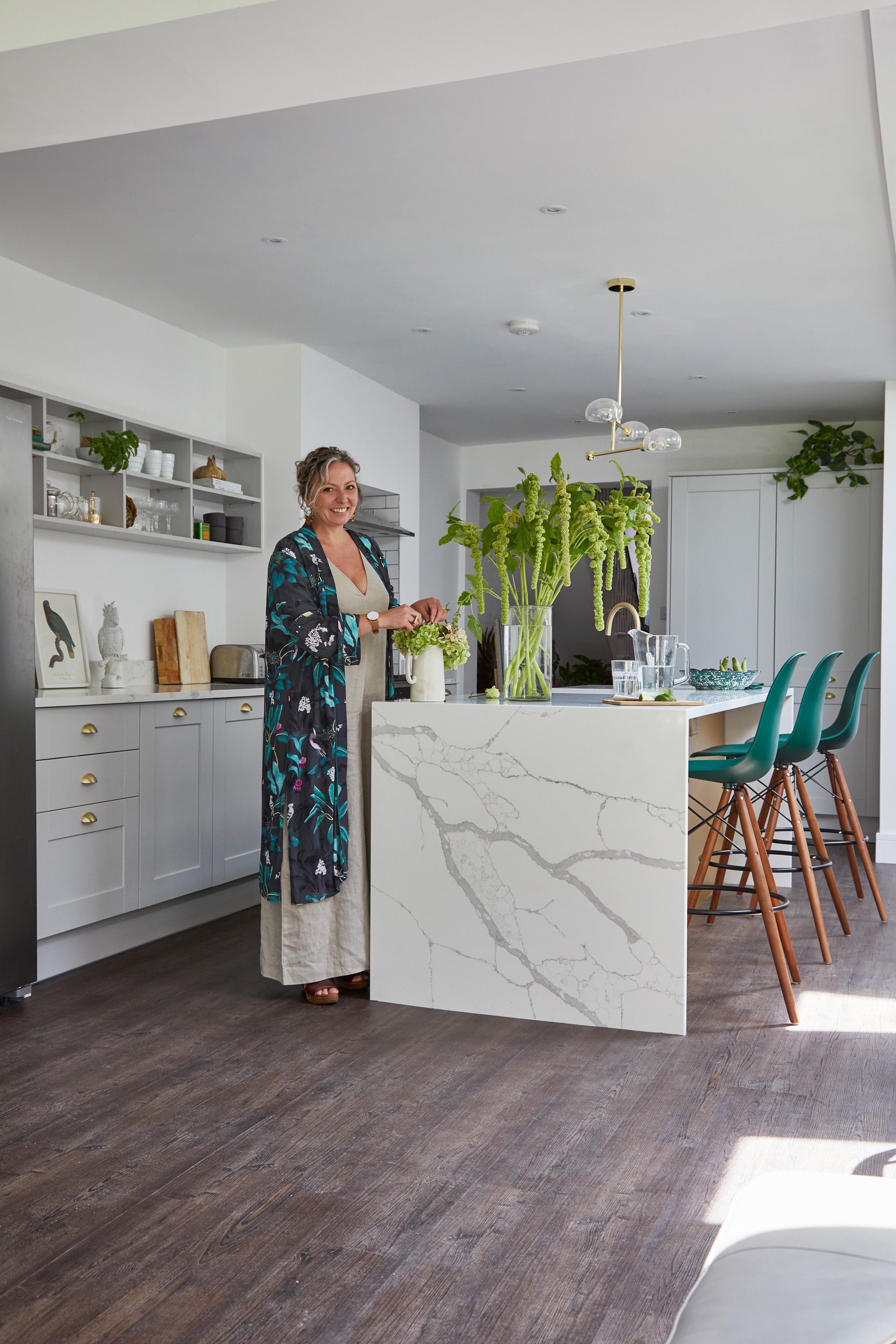
‘We went for white walls to bounce light around, then added gold and green for a luxury touch,’ says Deborah. Kitchen units, double Belfast sink and gold taps, all Howdens. Quartz work surface, Kitchen Stone Worktop. Flooring, Colonia. Pendant light, Wayfair
Profile
The owners Deborah Simpson Boston, who runs lifestyle and interiors blog and online shop Honest Woman (honestwoman.co), her husband, Jonathan, sales director of a luxury British heritage brand, and their miniature labradoodle, Blue
The property A four-bed Victorian semi in Southwick, East Sussex
Project cost A similar extension, decked garden and interior fit out would cost around £85,000
‘After years of living in Brighton, we wanted a lifestyle change. Owning a dog was on our wish list, so we started looking for a house with a generous garden. We sold our one-bed flat and moved further out of the city where we could afford something bigger.'
‘This three-bed Victorian property had been untouched for years. The back was made up of a small galley kitchen, a separate pantry and outside loo. We’d always planned to renovate and extend this area but prioritised the rest of the house first. Our goal for the kitchen was a light and airy multi-functional space with a living area, as well as room to entertain, cook and relax. Aesthetically, the room still had to complement the Victorian building. We knew it would be a major job.’
‘The whole renovation process was pretty speedy considering how much needed to be done. Our architect, Rex, and our builder, Andy, both came highly recommended to us and understood what we wanted to achieve.
‘The former configuration made the space feel narrow and dark, and overlooked the wall in our side return. We wanted views onto our garden. Our architect drew up plans, taking these design elements into account. We didn’t extend further than the current precedent set in our street, which made planning permission run smoothly. Not long after, diggers ripped down the downstairs loo and pulled down the scullery. We were left with a gaping hole at the back of the house. We washed up in the bath for weeks!’

Large bi-folds slide open to allow a full view of the garden from the new kitchen renovation. Jonathan installed the decked area and gravel was put down the side return to complement the new extension. Bi-fold doors, Seeview Windows. Outdoor furniture, Ebay. Decking, Wickes. Outdoor lighting, Screwfix
‘One key part of our kitchen design was having the large bi-fold doors running along the end of the kitchen. We wanted a design made from black metal for an industrial look. We commissioned a local window specialist to make our doors in modern materials to our specifications.
‘We chose off-the-shelf kitchen units so we could splurge on the worktop. I wanted work surfaces that looked like Carrera marble but had the practicality of quartz stone. We searched high and low for a piece with the exact colour and inflections, and found what we wanted in an Arundel stonemason’s yard. The slab of quartz was perfect. It was a major spend but gives the space a luxury look and has elevated a simple kitchen design.’
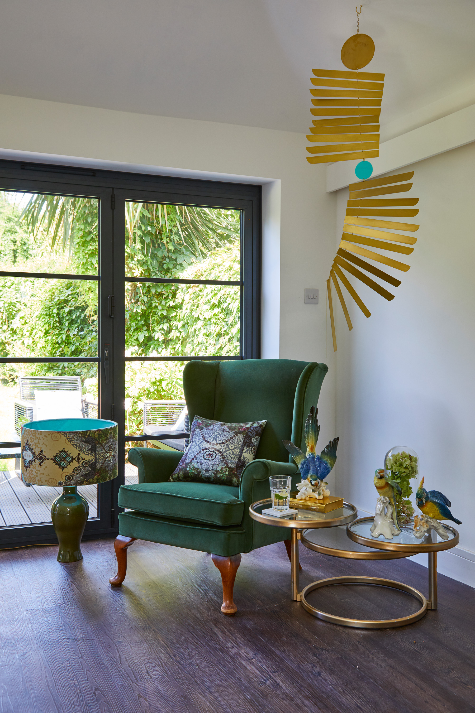
In keeping with the green and gold accents throughout, Deborah hung a mobile by local artist In the Making in the seating area, then spray painted a round table set to match. Parrots and chair, charity shop finds.
‘As the rest of the house is painted in fairly dark hues, we wanted this space to have a lighter and brighter feel – it suits the indoor-outdoor aspect of the extension. We chose Howdens’ Shaker-style units in a light Dove Grey to complement the white walls, with the idea that the kitchen would disappear into the room.
‘I didn’t want wall cupboards; I felt they might make the space feel enclosed. Instead I went for open shelving to display the bits and pieces that I’ve collected from charity shops and antique fairs over the years.
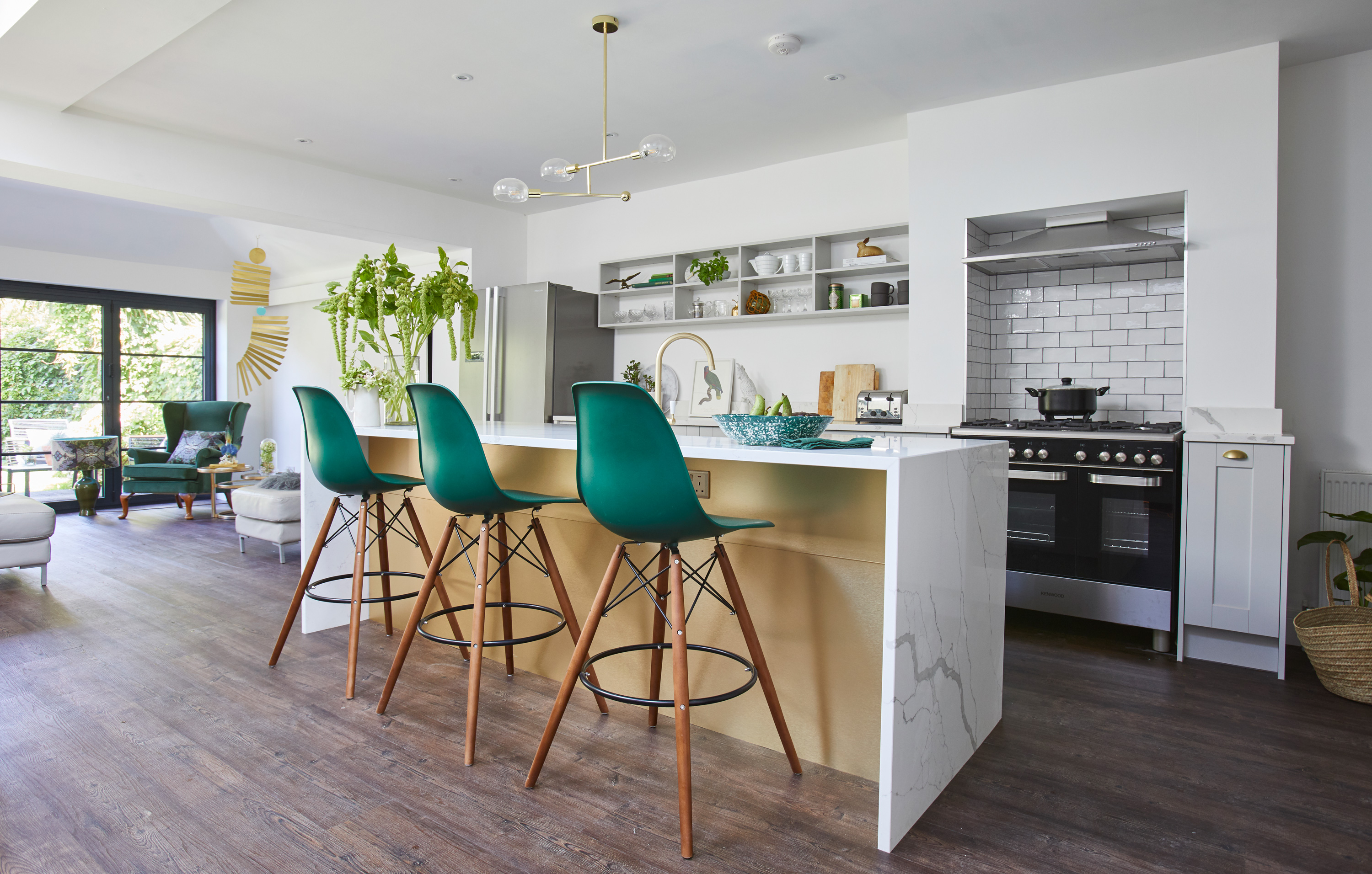
‘To finish off the space and add a showstopping touch, we chose brushed gold cupboard handles and taps as accents – and one side of the island is covered entirely in a gold effect.’

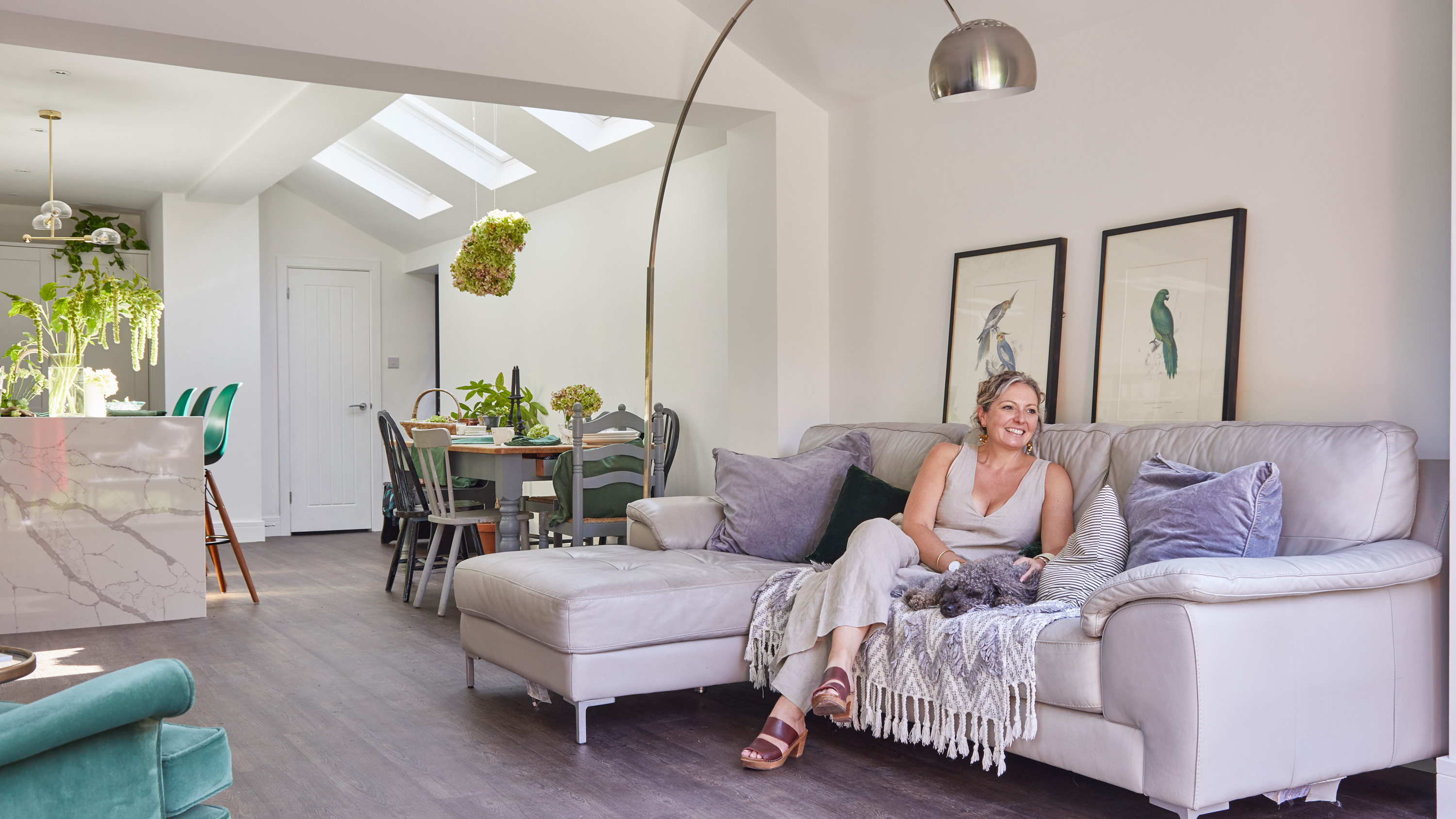
Using furniture they already owned, Deborah has zoned the rear of the extension into a relaxing area for her and Jonathan. Above the sofa hang two prints picked up for £15 each from Ardingly Antiques Fair. Cushions and throws, Honest Woman. For a similar sofa, try Sofa.com. For a floor lamp, try Heal’s
Contacts
Architect Rex Adams of RJA Planning & Building Consultants
Construction WSR West Sussex Renovations, 07951 454452
Bi-fold doors Seeview Windos,
Kitchen Howdens
‘After a few months, I couldn’t wait for the build to be done so I could stamp my interior style on the project. We had a beautiful Arco lamp and an Italian leather sofa in grey, so the colour scheme was always going to be on the grey scale. However, I’m a hoarder of plants and recently trained as a florist, so we decided on a forest green accent. We sourced the Eames stools in green and played around with accessories and cushions in similar colours.
‘We’re really pleased with the room and how effective the layout is. So pleased, in fact, that we’ve hardly spent any time in the other downstairs rooms since it’s been done! After a long beach walk first thing, our weekends are spent sitting on the sofa with the dog beside us, enjoying the views onto our garden.’
Subscribe to Real Homes magazine
Want even more great ideas for your home from the expert team at Real Homes magazine? Subscribe to Real Homes magazine and get great content delivered straight to your door. From inspiring completed projects to the latest decorating trends and expert advice, you'll find everything you need to create your dream home inside each issue.
Join our newsletter
Get small space home decor ideas, celeb inspiration, DIY tips and more, straight to your inbox!
-
 You won't believe this stunning five-bed family home used to be a tiny two-bed
Katie and Stuart went big with a double-story extension to create a dream space for themselves and their daughters
By Ifeoluwa Adedeji Published
-
 The freestanding bath in this dreamy bedroom is sheer five-star luxury
Emma and Martin wanted a suite just like in an upscale hotel — mission totally accomplished.
By Ellen Finch Published
-
 I just know 2023 is going to be all about black bedding sets
White sheets are out, black bedding sets are in — here's everything you need to know about this bedroom decor trend
By Louise Oliphant Published
-
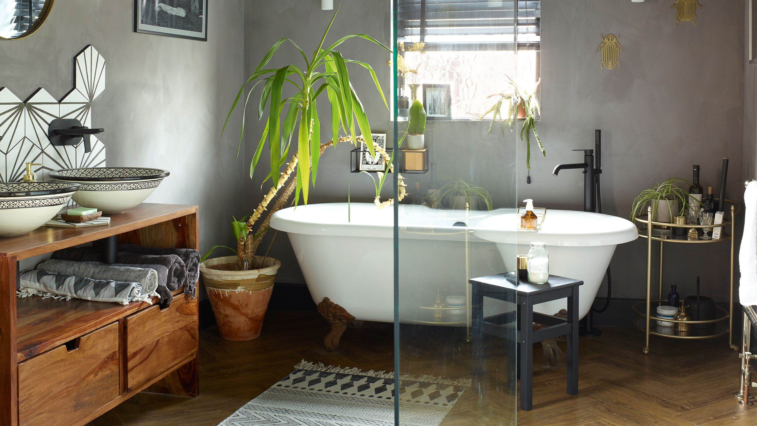 A bland beige bathroom is transformed into a STUNNING contemporary sanctuary
First-time homeowners Ellie and Oliver’s new bathroom is a well-planned fusion of modern pieces and exotic touches
By Ellen Finch Published
-
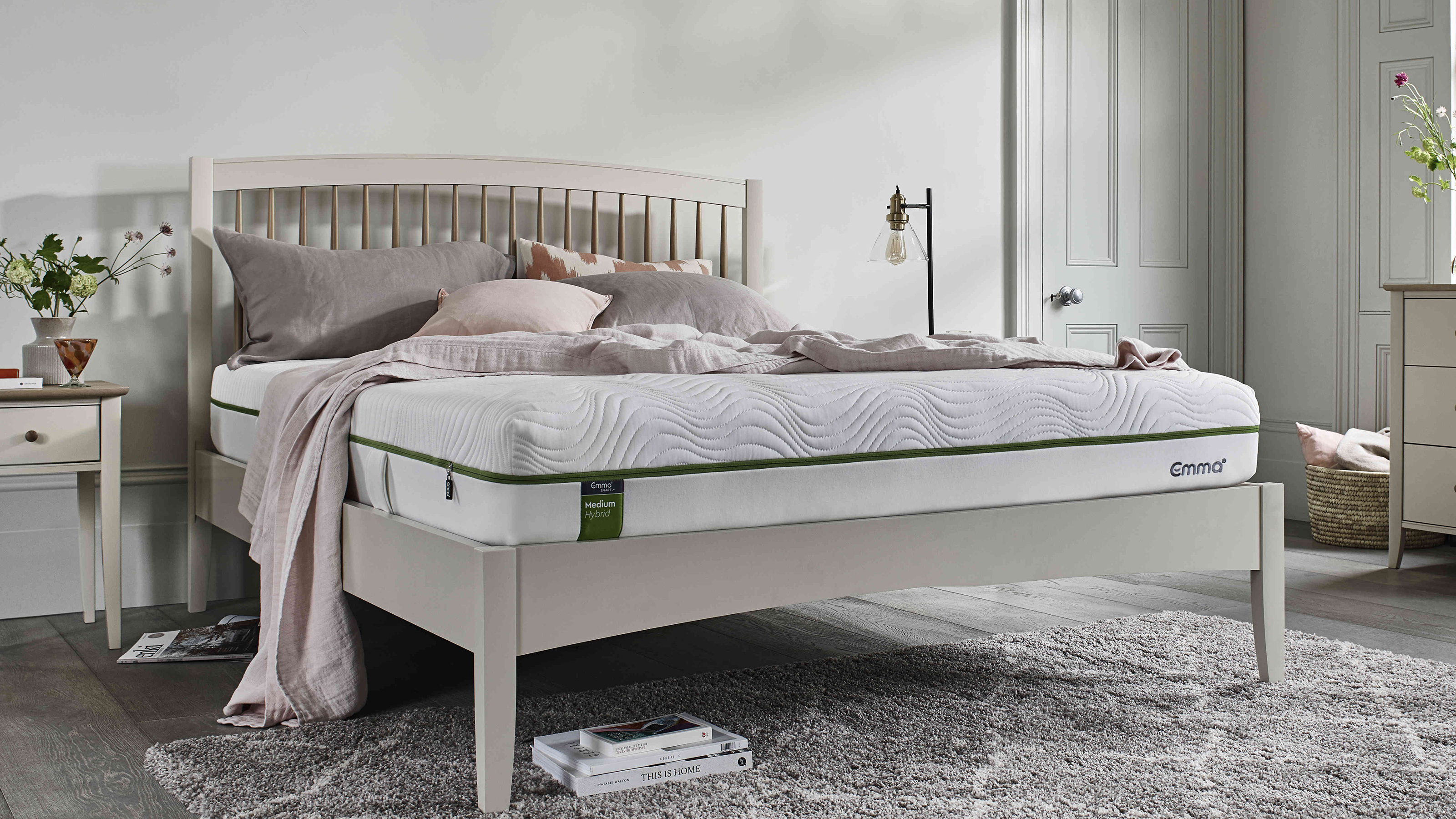 Mattress disposal: how, where, and how much it will cost?
Mattress disposal is tricky. You’ve swapped it for a supportive new design, but how to dispose of the bulky old mattress? Follow our guide to find out...
By Sarah Warwick Published
-
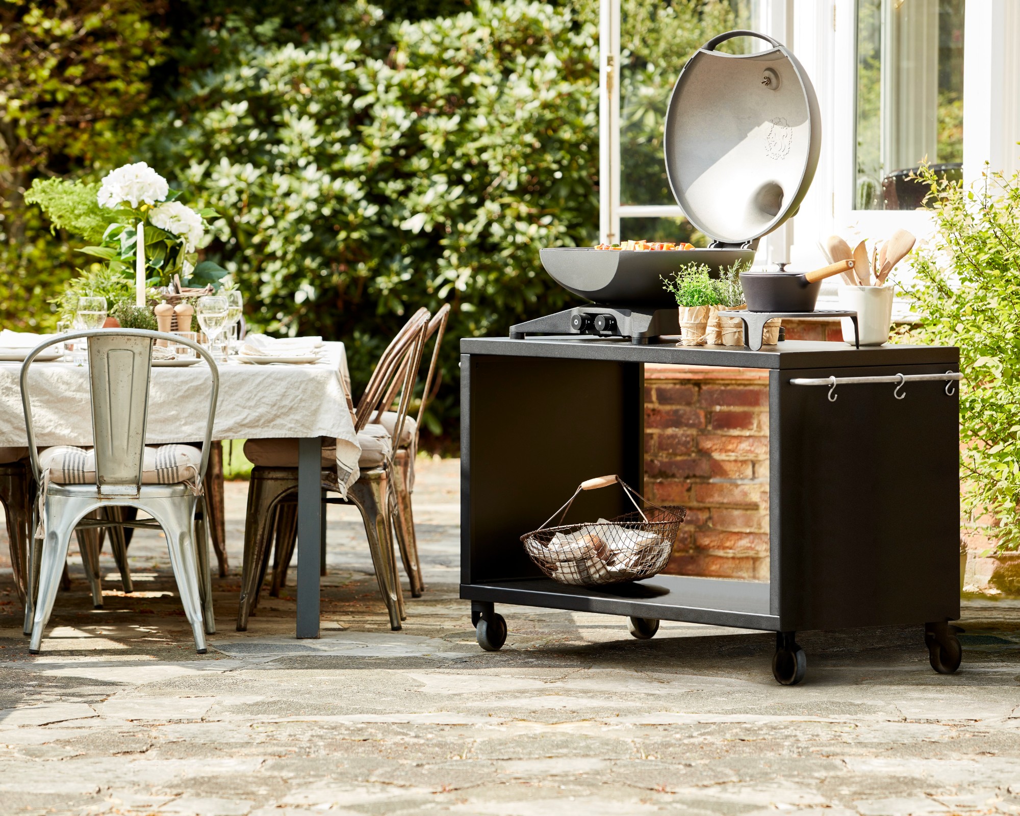 36 outdoor kitchen ideas – enviable and inspiring designs for your backyard
Enjoy alfresco cooking and entertaining all year round with the best outdoor kitchen ideas for every space and budget.
By Sarah Warwick Last updated
-
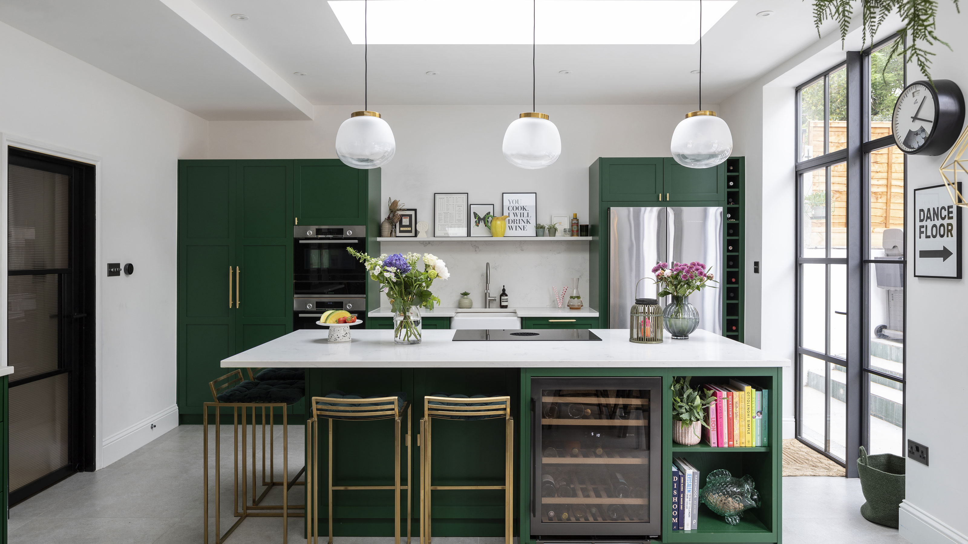 Real home: Gorgeous green kitchen has a fresh feel
A stunning extension and Charley Smith's clear design vision has resulted in a family kitchen-diner that’s ripe for entertaining.
By Ifeoluwa Adedeji Published
-
 [redirected] Best coffee beans: 12 delicious coffees to start your morning with
Your perfect cup of coffee starts with the coffee bean. We're sharing our best-bagged beans from coffee shop favorites to gourmet roasters.
By Jaclyn Turner Published
