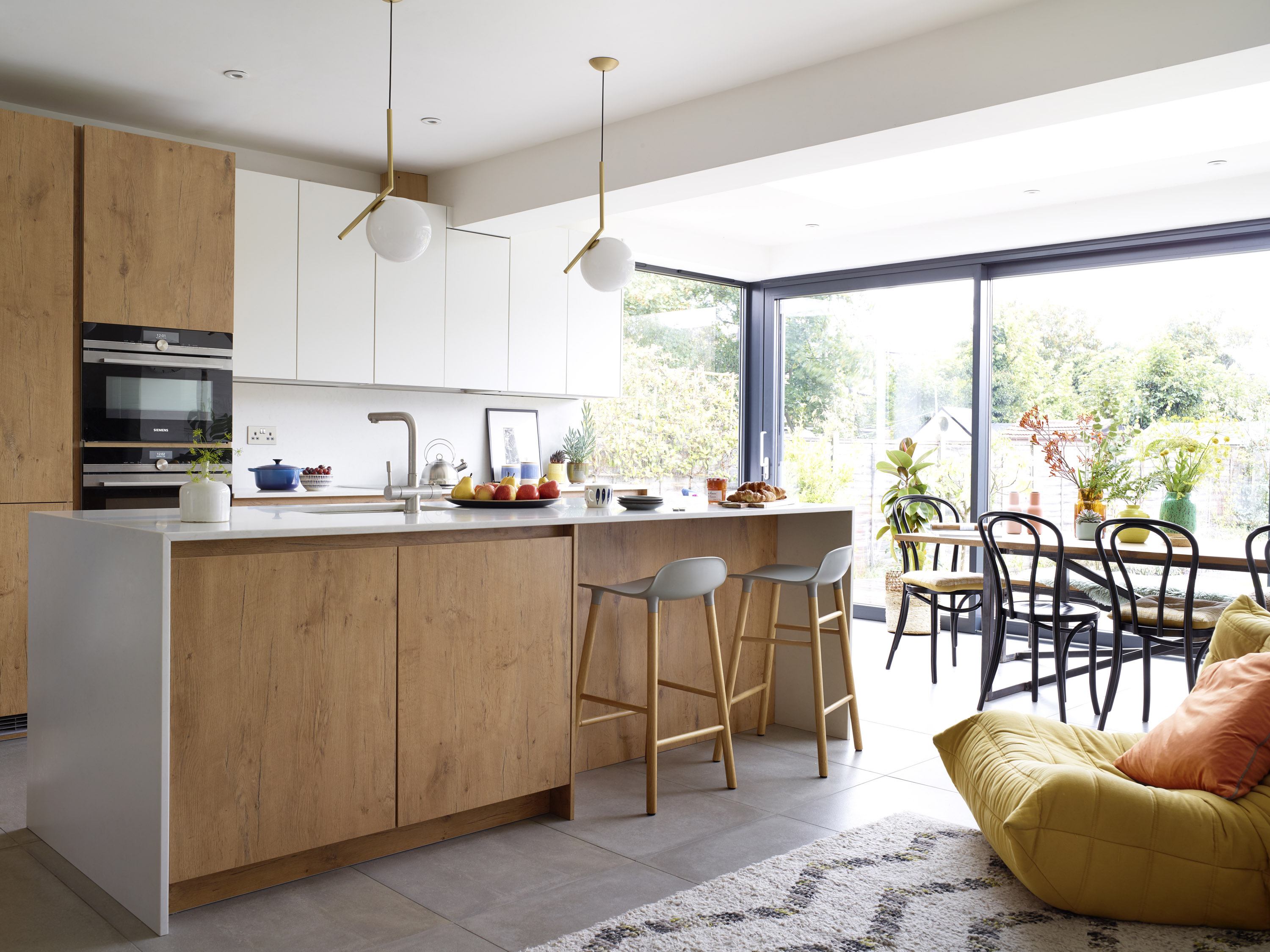
Lucy Alston’s career as a fashion stylist and lifestyle blogger is all about having vision and celebrating beautiful-looking things. So it comes as a shock to learn that she just couldn’t see the charms of this 1930s semi at first. ‘For me, this kind of house had too many granny-in-suburbia connotations,’ she admits. It was her partner, David, who convinced her to take it seriously, pointing out the beautifully proportioned
rooms and sense of space. ‘David has been the driving force in this project from
the start,’ Lucy adds. ‘It could never have happened without him.’
Find more real home transformations on our dedicated page and practical advice on extending a house in our expert guide.
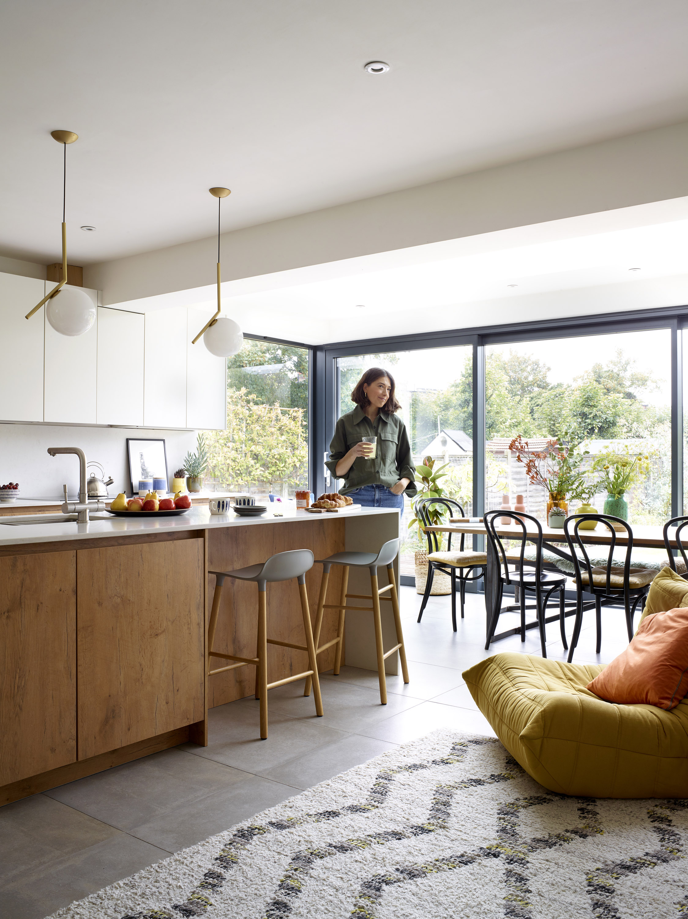
The rooms to the rear have been knocked through and extended to create a light-filled kitchen-dining-living space. ‘I love how people can be sat chatting on the sofa while someone’s cooking and kids are playing close by without causing a huge disruptive mess,’ Lucy says. Sliding doors, Schueco. Flos IC S1 pendant light, John Lewis & Partners. Normann Copenhagen bar stools, Nest. Rug, West Elm. For similar concrete-effect porcelain floor tiles, try the Block tile, Marazzi. Rotpunkt kitchen cabinets in Old Wild Oak and Snow, Amazing Spaces Kitchens
The couple and their then baby daughter, Clemence, now seven, moved here
in 2013 and began work straight away, starting at the front of the house before moving on to the rear extension. They camped in different rooms and rigged up an improvised kitchen in the garage.
‘The dust and upheaval was terrible for all of us – especially Clemence – but would we do it the same way again? Probably,’ Lucy says. ‘We saved a lot of money that we could spend on things like a beautiful sofa.’ David scoured the country to find materials at the best price – even bringing timber down from Scotland – and drafted in builders from his home town in the West Midlands.
Project notes
The owners Lucy Alston, a fashion stylist and lifestyle blogger (@thestylesponge_ ) and partner David Sutton, who works in insurance, and their daughter, Clemence, seven
The property A four-bedroom semi-detached 1930s house in Beckenham, south London
Project cost £180,000
The team took the place back to bare brick, replumbing and rewiring. Their builder came on board as a plasterer, but ended up doing most of the work himself. His father, another builder, drew up the plans to save on architect’s fees, while David devoted a lot of time to taking every measurement with perfect precision. ‘He’s got the right sort of brain for that work, but it was very stressful,’ Lucy says.
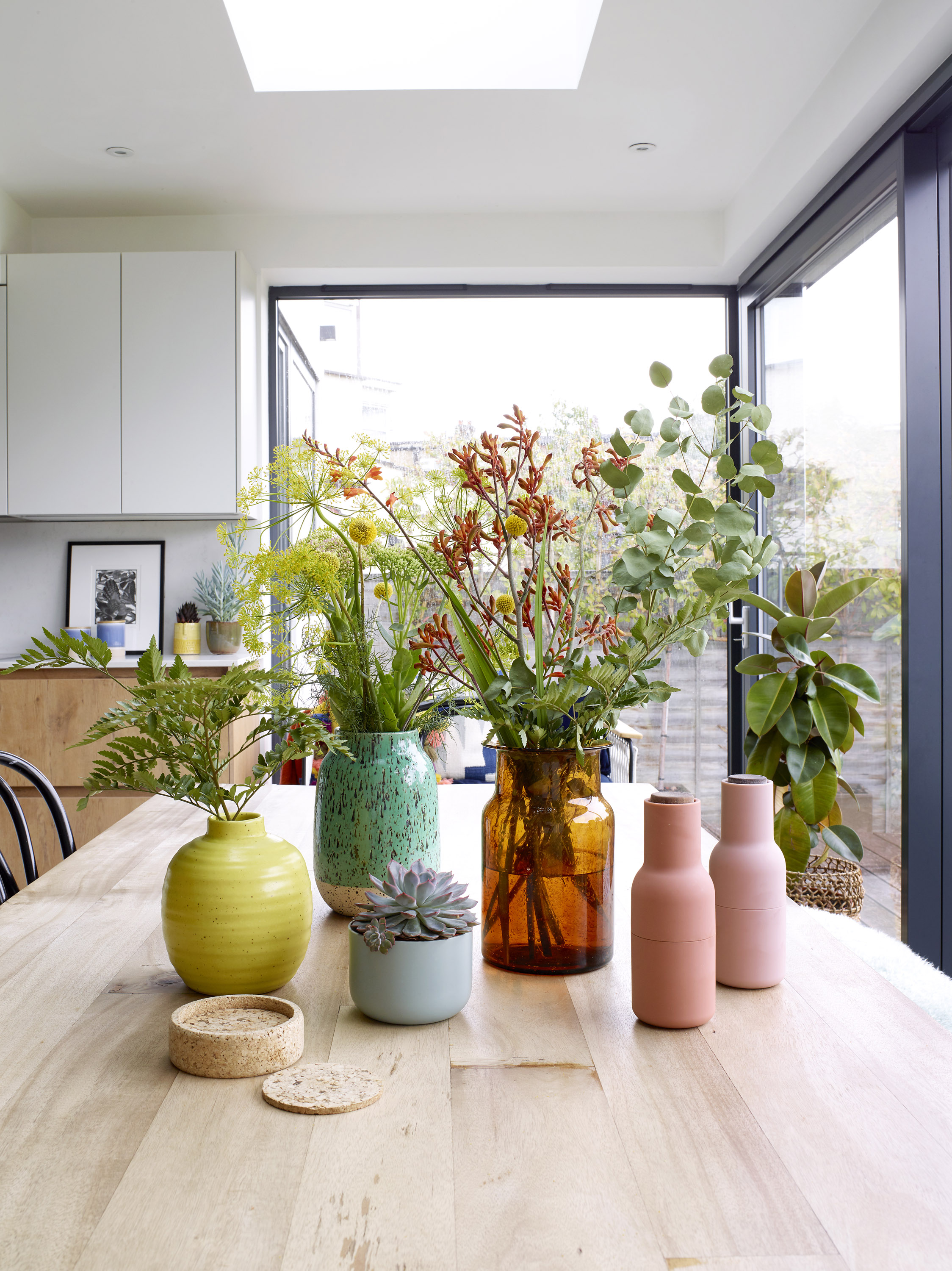
Wood-effect cabinets and table bring warmth to the sleek simplicity of the kitchen, ‘I love the timeless mix of rustic warm wood features with creamy white minimal cabinets.’
David was hands-on with the building work, too. ‘He was so keen to learn and acquire new skills,’ Lucy adds, ‘even though he nearly lost a finger fitting the floor!’
The two of them make a good team, with David handling the practicalities while Lucy deals with the creative side. Despite her initial hang-ups about houses of this era, she has tried to retain the period feel of the rooms while giving the space a refresh. The sitting room, master bedroom and hall all have original doors, fireplaces and stair spindles, many of which had been boarded over during the Sixties craze for streamlining interiors.
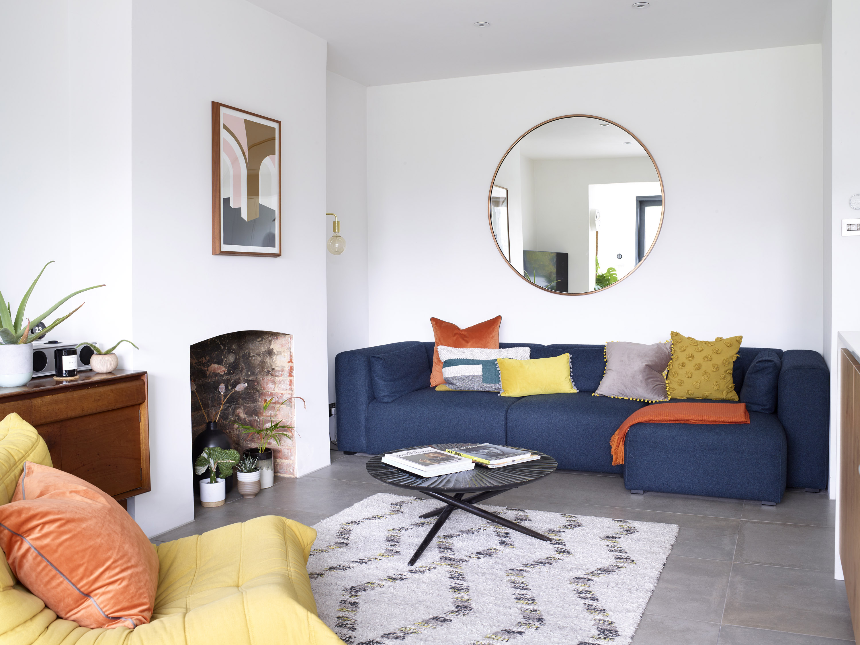
Comfortable seating in bold colours helps to create a laid-back lounge area in the open-plan extension. Hay Mags modular sofa, Haus. Oversized round mirror, West Elm. Rug, West Elm. Cushions, COS x Hay and John Lewis & Partners
At the rear, the couple have incorporated a modern ‘glass box’ extension onto what was once the original kitchen, dining room and pantry. This has given them a vast kitchen-dining-living space as well as a generous utility room, a downstairs WC and shower room. ‘It works so well for family life and for entertaining friends,’ says Lucy.
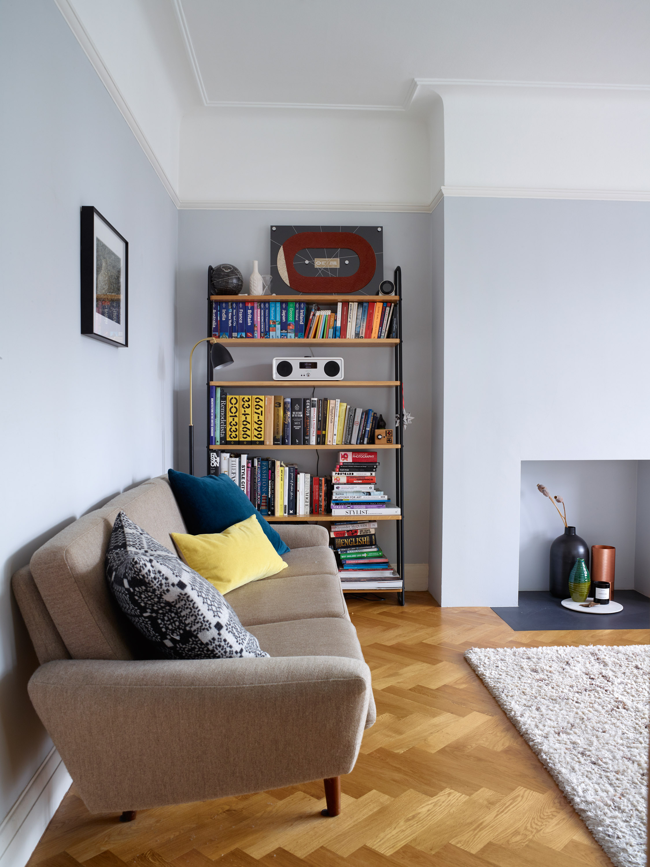
‘The front sitting room is like an oasis of calm,’ Lucy says. ‘I feel very cocooned in here!’ A simple fireplace niche and pale blue walls are a modern update to this period room. Sofa, vintage; for similar, try Swoon Editions. For a similar rug, try the Darwin, John Lewis & Partners. Walls painted in Bone China Blue Pale, Little Greene. Shelving, Heal’s
For the kitchen itself, Lucy wanted a warm look ‘with a seamless, unfussy feel’. She combined a faux wood, chosen for its hardwearing properties, with matt-white worktops and splashbacks. ‘We wanted marble but everyone warned us off it because staining is such an issue. They were right – we used it on the bathroom floor and it’s incredibly porous.’
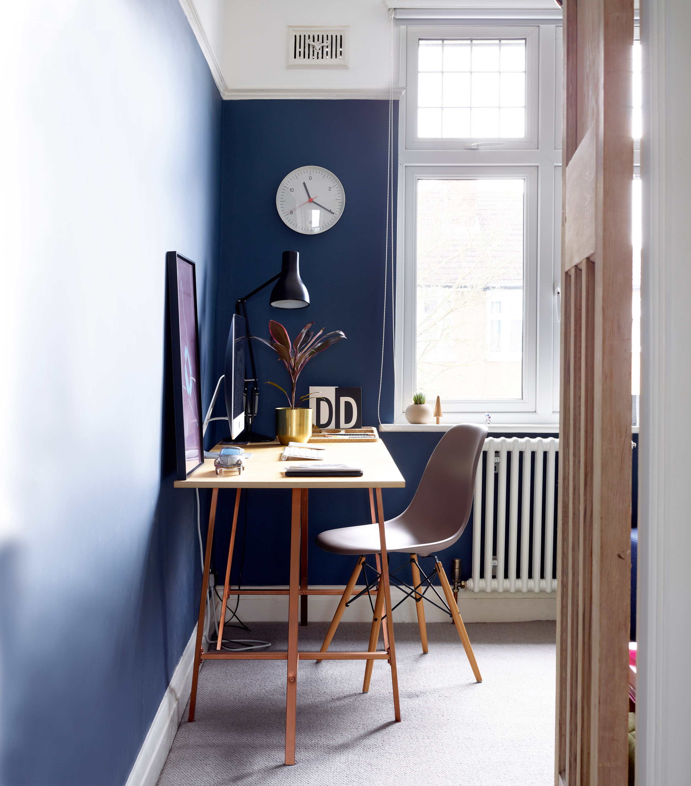
The fourth bedroom serves as David’s study and is painted inky blue. Mid-century-style wooden furniture helps to create a sleek, stylish study. Walls painted in Hicks’ Blue, Little Greene. For a similar desk, try the Gerton/Lerberg desk, Ikea. Eames DSW chair, Aram
A lifelong colour obsessive, Lucy swears by the transformative power of paint. ‘When you’re spending thousands on a sofa, you need to play it safe, but paint is an area where you can have fun and experiment.’ She likes to layer on colour and texture with cushions and throws. Lucy has long been influenced by modern Scandinavian style but is now adding touches of glamorous Italian maximalism. ‘It’s inspired our round mirrors. In a square room, curves bring softness to the space.’
Subscribe to Real Homes
Get ideas and inspiration for your project delivered every month with a subscription
The family couldn’t be happier with the end results. ‘This house lifts our mood when we come home,’ Lucy says. ‘It’s lovely living with all this light. It’s given us all a happier state of mind.’ Lucy advises keeping the end goal in sight when in the middle of a makeover. ‘It can be relentless, so try and accept the here and now, hang onto your vision and remember what you’re in it for.’ Wise words indeed.
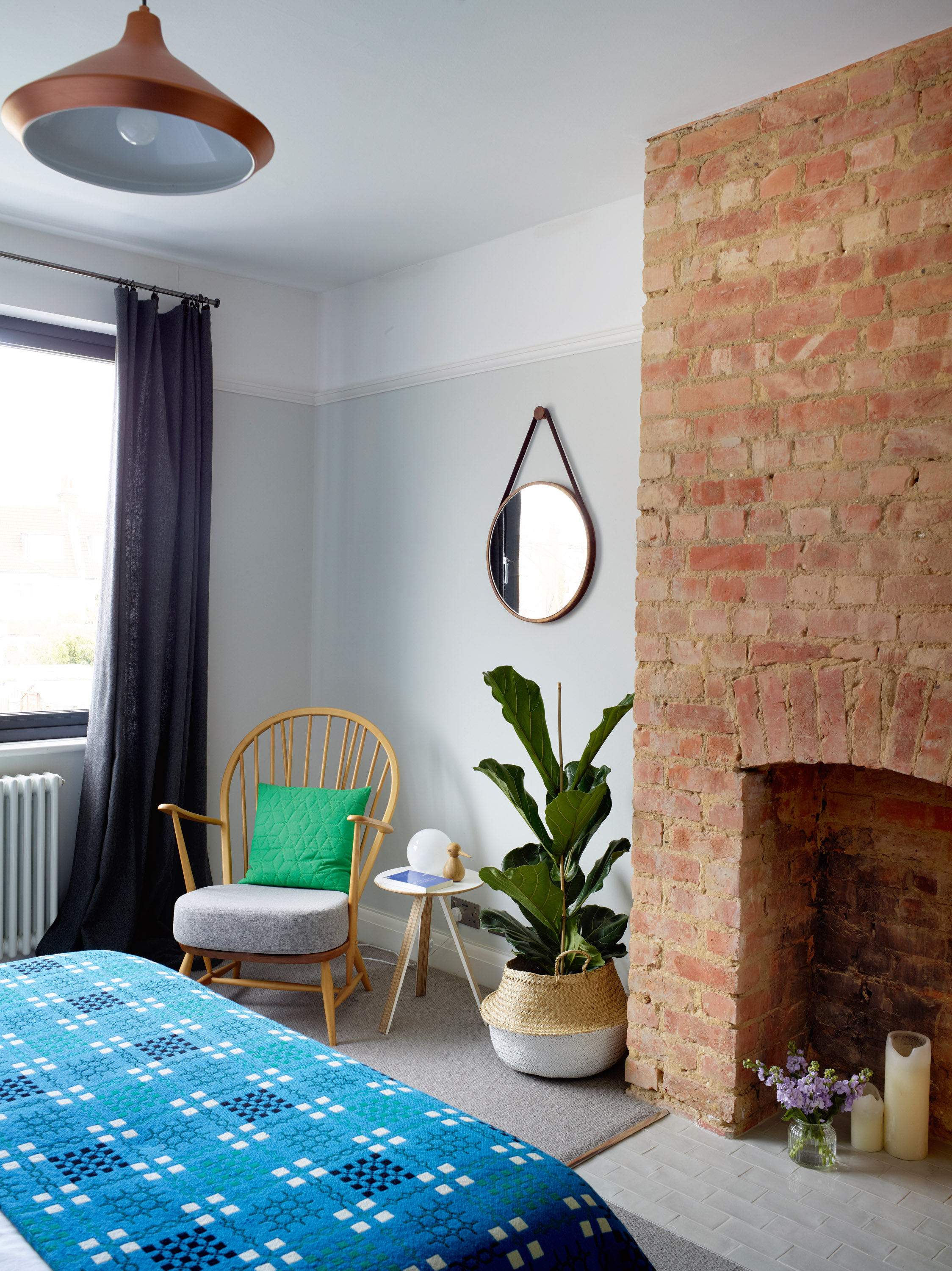
Modernist-style lighting brings this 1930s guest room up to date. An exposed brick fireplace and rustic textiles conjure a cosy mood. For a similar chair, try the Originals Chairmakers chair, Heal’s. Compass Small table, Unto This Last. Walls painted in Mirror, Little Greene
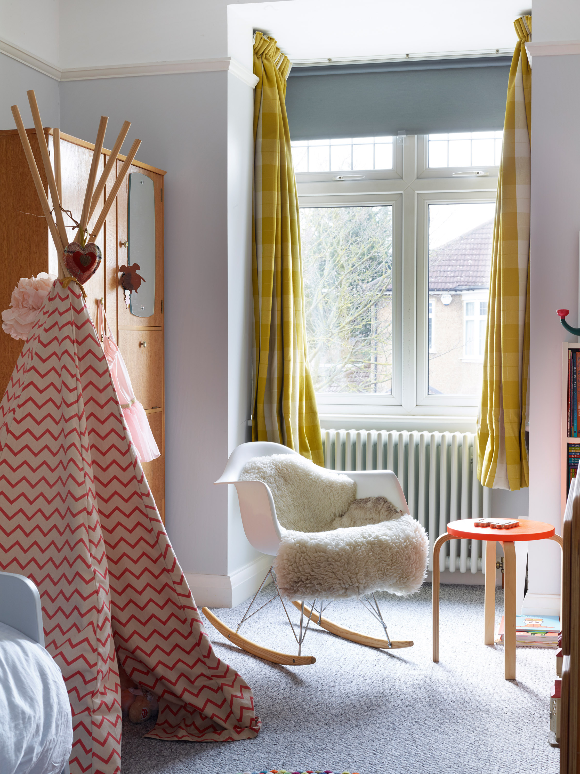
Warm pastel shades and tactile textiles create a cosy space in Clemence’s room. ‘We love snuggling up together to read stories,’ Lucy says. Tepee, Smallable. For a similar chair, try the Eames RAR, Heal’s. Stool, Ikea. Walls painted in Blackened, Farrow & Ball
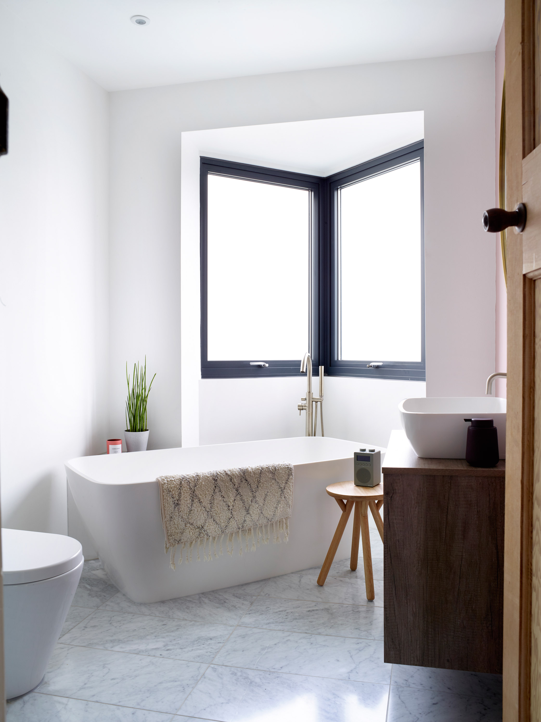
New windows and an off-centre bath give this room a bold modern look. ‘We utilised the space to the max by placing the standalone bath diagonal to one of the windows,’ Lucy says. ‘We kept the original window shape. It looks like you’re on a ship, which I love’. Matt and satin fixtures and fittings soften the look. Vicenza stone bath and basin, Clearwater. Scarlatin stool, La Redoute. Bath mat, HK Living. Feature wall painted in Peach Blossom Light, Little Greene
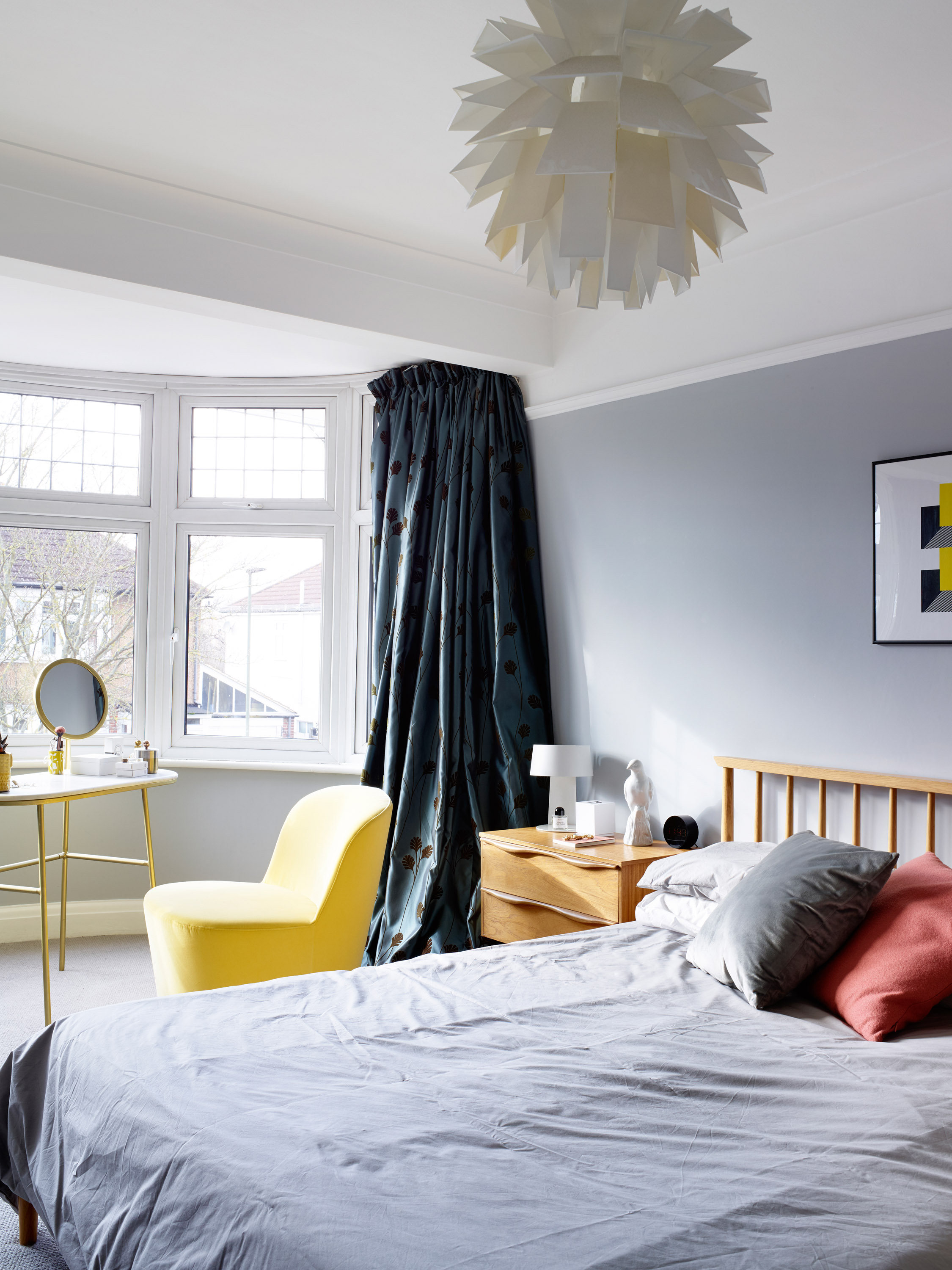
Sunny yellows contrast with elegant greys in this light and
airy bedroom. ‘We could add an en suite but I love the space we have here – and it’s one less bathroom to keep clean and
tidy!’ Lucy says. Walls painted in Gauze Mid, Little Greene. Senzo dressing table, Swoon. Chair, Ikea. Normann Copenhagen pendant light, Trouva. Silk curtains, bespoke
Contacts
- Kitchen: Rotpunkt
- Sliding doors: Schueco doors, installed by Euro Aluminium
Join our newsletter
Get small space home decor ideas, celeb inspiration, DIY tips and more, straight to your inbox!
-
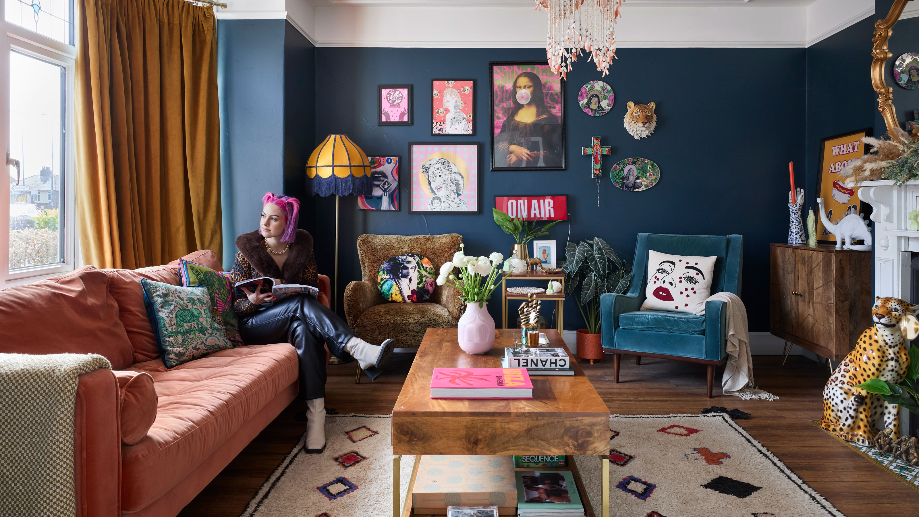 Makeup expert's renovated home is a maximalist’s dream
Makeover expert Sophie Hannah and her husband, Robin, have transformed their run-down Victorian townhouse into a home bursting with colour and pattern.
By Laura Ewart
-
 Before and after: we're lusting after the interior AND exterior of this eclectic kitchen extension
James and Pamela took a slow and steady approach to their design for a space that's perfect from every angle
By Amelia Smith
-
 An old utility becomes a heavenly new kitchen-diner with an indoor-outdoor connection
Heather and Jim faced an uphill task when they had their steeply sloping back garden dug out to make room to extend
By Karen Wilson
-
 Real home: this extended semi is now a colourful family space
Charlotte and Adam Jarega extended and reconfigured their frumpy 1930s house to make way for a modern, family-friendly home
By Abbie Henderson
-
 Real home: this charming cottage has a stunning modern extension
A dramatic double-height extension has taken Steph and Tom Murray’s 400-year-old cottage to another level
By Karen Wilson
-
 Real home: this kitchen extension is packed with colour
Hilary Satchwell and Richard Robinson used an awkward side return to create a bright, multifunctional kitchen-diner
By Ellen Finch
-
 Terraced house design: 11 ideas to transform a Victorian property
These terraced house design ideas offer flexibility and variety. Get an idea of what can be achieved with our pick of amazing transformations
By Lucy Searle
-
 Real home: New York loft-style kitchen extension
John Boon and Susanna Frediani reconfigured their kitchen with industrial features to give it a New York loft style
By Natalie Flaum