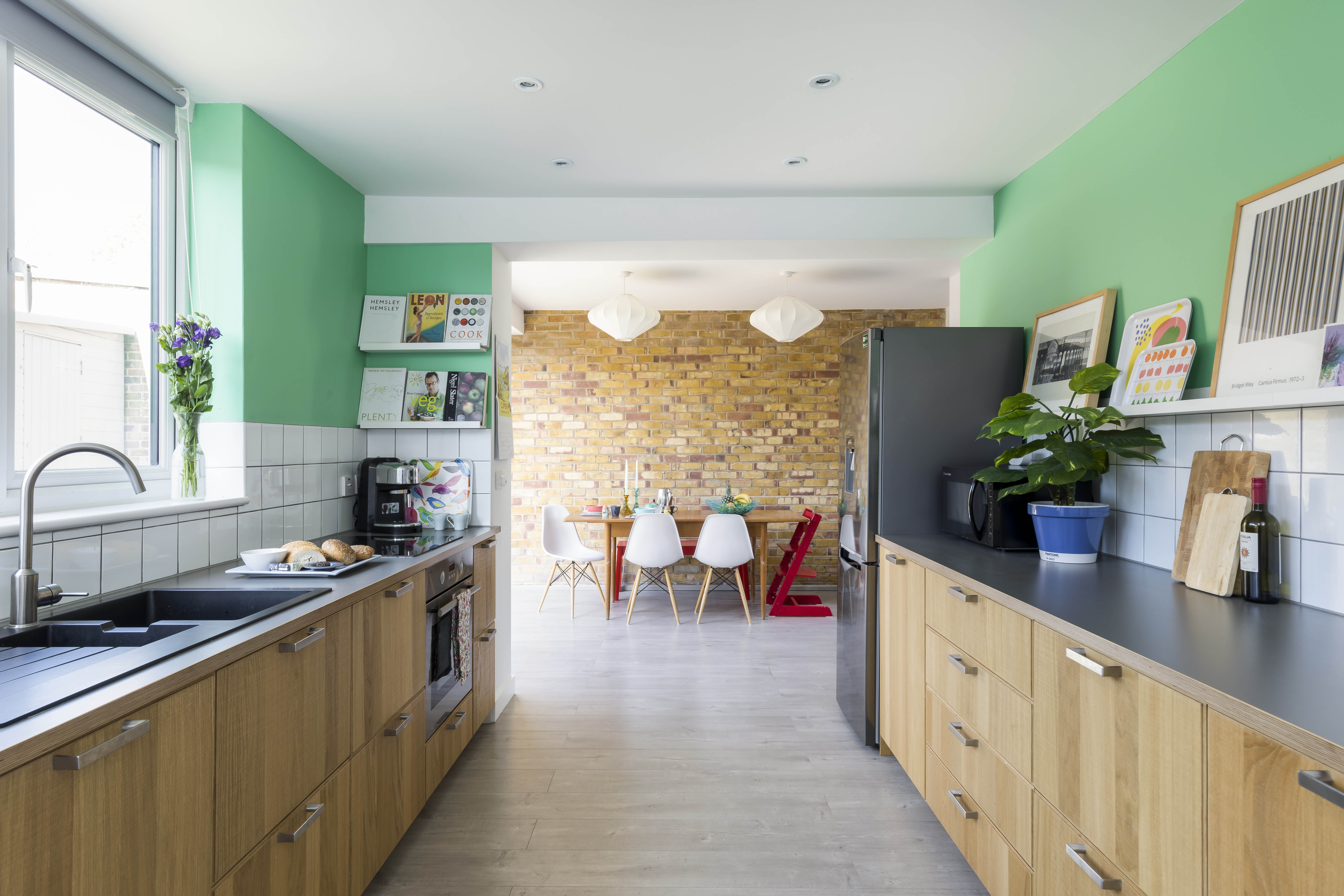

Awkward situations can often lead to creative solutions, and that was certainly the case with Laura and Matt’s end-of-terrace house. Keen to stay put but desperate for
more space, they looked to the oddly shaped, tapered plot of land to the side of their property as a chance to expand their home and create a double storey extension that better accommodated their young family.
Profile
The owners Laura Edwards, a teacher, lives here with her husband, Matt Jackson, who works in communications for London Marathon Events, and their children, Sam, nine, and
Isabel, five.
The property A three-bedroom, 1960s ex-local authority end-of-terrace house in Lewisham, London.
Project cost £143,000
With help from a local architect, the couple designed a standout extension with real architectural merit – a staggered structure that fits snugly in a tight space, complementing the house while setting it apart from its neighbours. For an ordinary ex-council house to undergo such a fantastic transformation is no mean feat.
But one question remained: what could they do with such a strange space? Read on to find out, then use our guide to extending a house to find out everything you need to know. See more real home transformations, too.
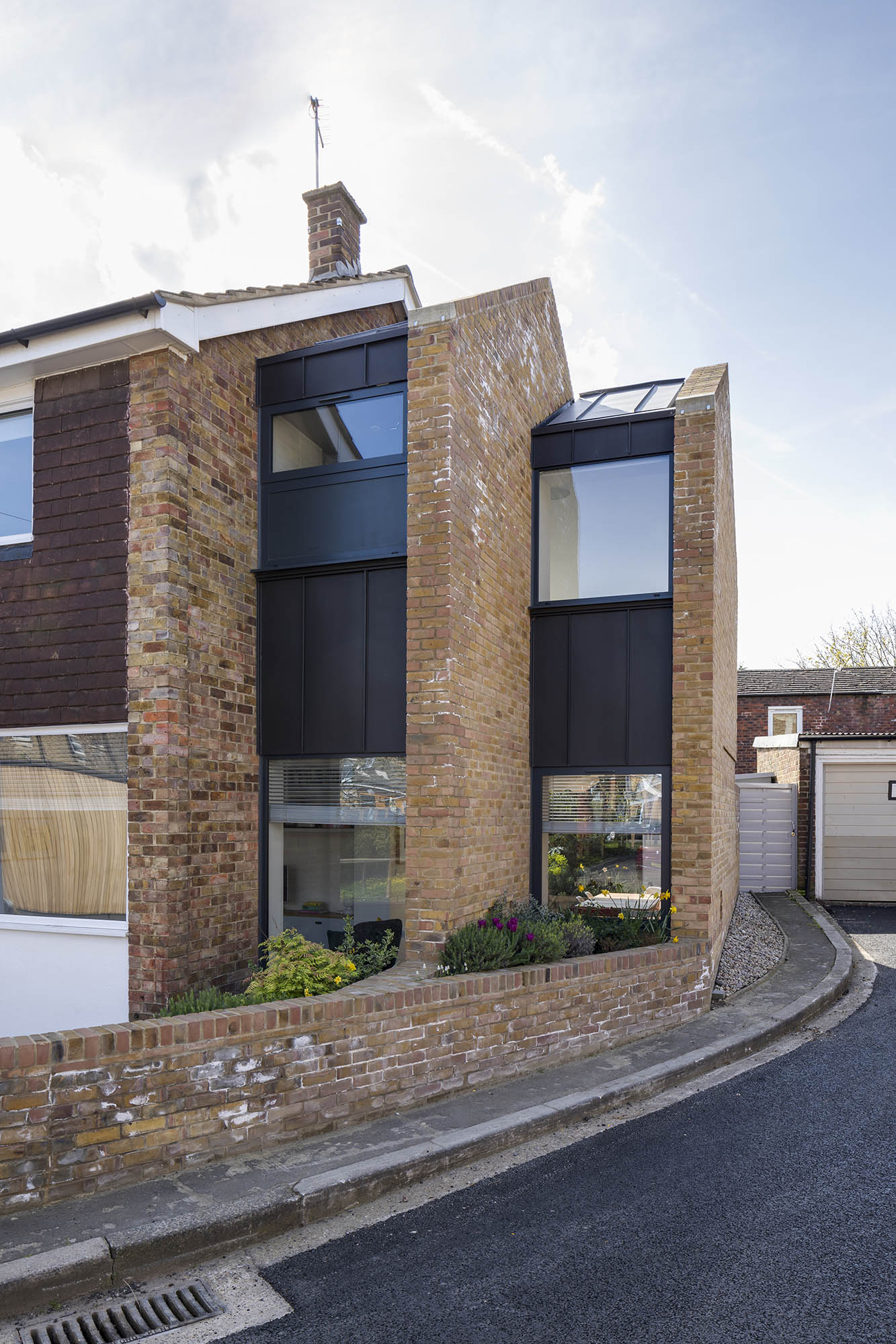
Glazing, Henry & Sons Windows
Of course, the inside of a house is just as important as the exterior, and you can’t underestimate how dramatically even the smallest extension can impact the way you live. As well as creating a new light-filled bedroom for the couple, building an addition has allowed Laura and Matt to revisit the open plan layout of their house and create carefully thought-out zones – all united by the considered use of zingy shades throughout.

Kitchen units, worktop, sink, tap, oven and shelves, Ikea. Splashback tiles, Topps Tiles. Walls painted in Dulux Mix Your Own custom paint; for similar, try Pixie Green. Fridge, Samsung. Radiators, Milano Aruba
'We’d lived in south east London for 10 years and loved the area. It’s got good schools and parks, and is in walking distance of lovely places like Greenwich and Blackheath – but we needed more space. To move to another property nearby, like a period house, would have meant we’d have to pay a lot more,' says Laura.
‘We had an odd-shaped side return that we realised we could do something quite interesting with, so we decided to extend. I found an architect – a work colleague’s husband. I’d seen their house before and loved what they’d done. I liked the idea of doing something to make our own house exactly how we wanted it, rather than spending money on a move.'
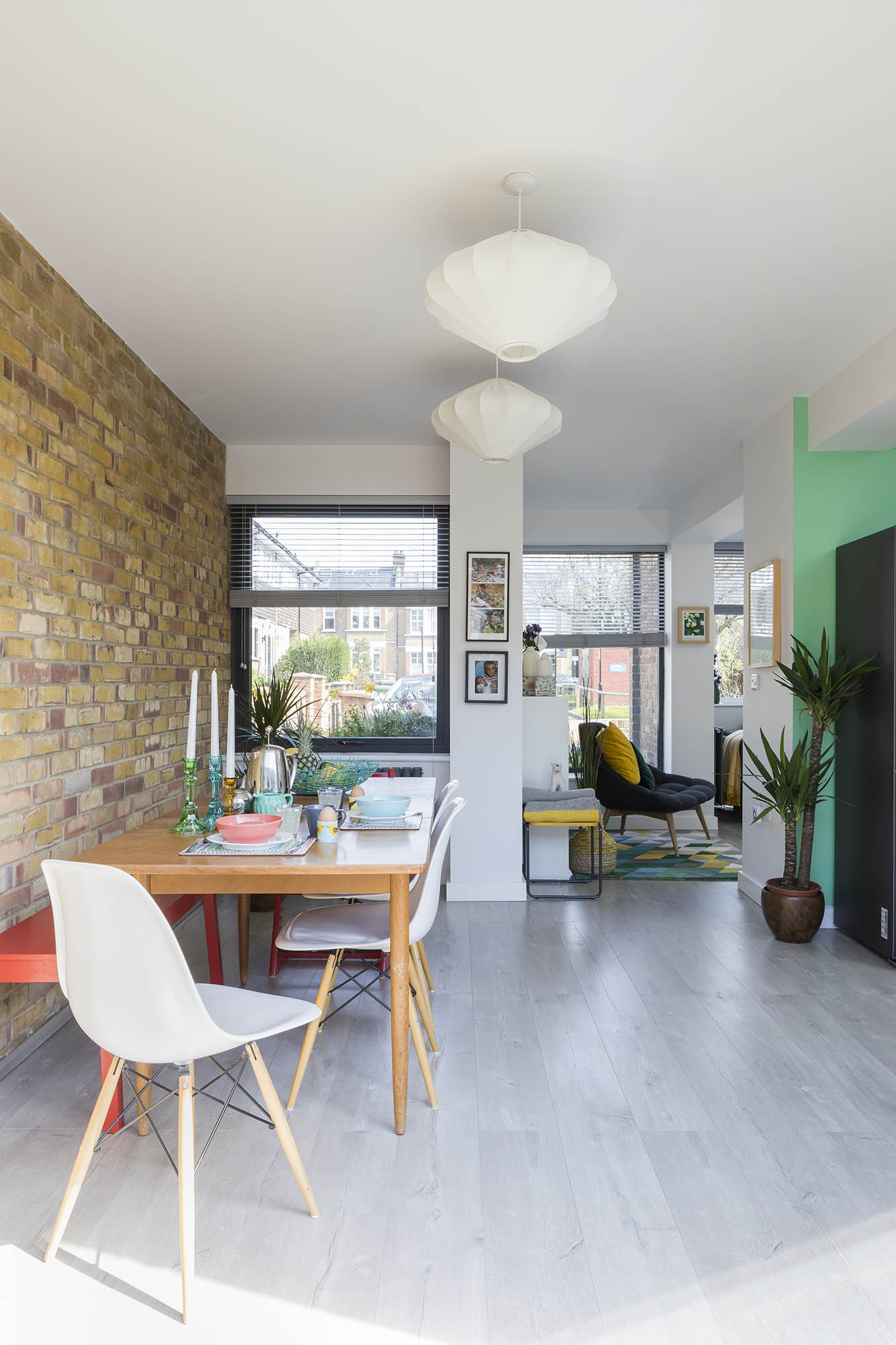
Flooring, Flooring Supplies. Ceiling lights, Made.com
‘The exposed brick wall in the dining area is one of my favourite things. The architects suggested it and it could have gone all the way up into the bedroom – which in hindsight, might have been quite nice. The colours and textures are really interesting – the kids love spotting shapes in them.'
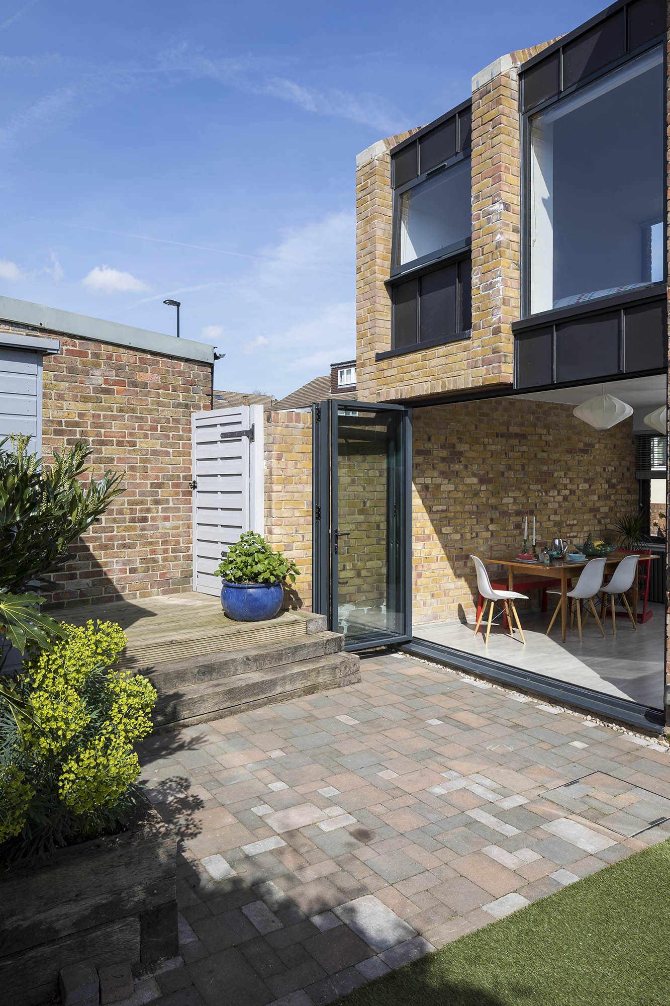
Glazing, Henry & Sons Windows
'Even with the extension, our house is relatively small, so I’ve kept the interior bright, clean and simple. Functionality was important, but it needed to be a space we wanted to come home to and that the kids would enjoy. I think the colours definitely contribute to that.'
More from Real Homes
Get inspiration, ideas and advice straight to your door every month with a magazine subscription
'We’d spoken to the council in advance of the work so we had tips on what they wanted. They were clear that the extension be “subservient” to the original build, and that’s where the architects got the idea for the Russian doll design we have now. I think it’s really clever. The side space was a funny shape – sort of tapered. You couldn’t put a big square box there because there wasn’t the space, so having something that was staggered made sense.
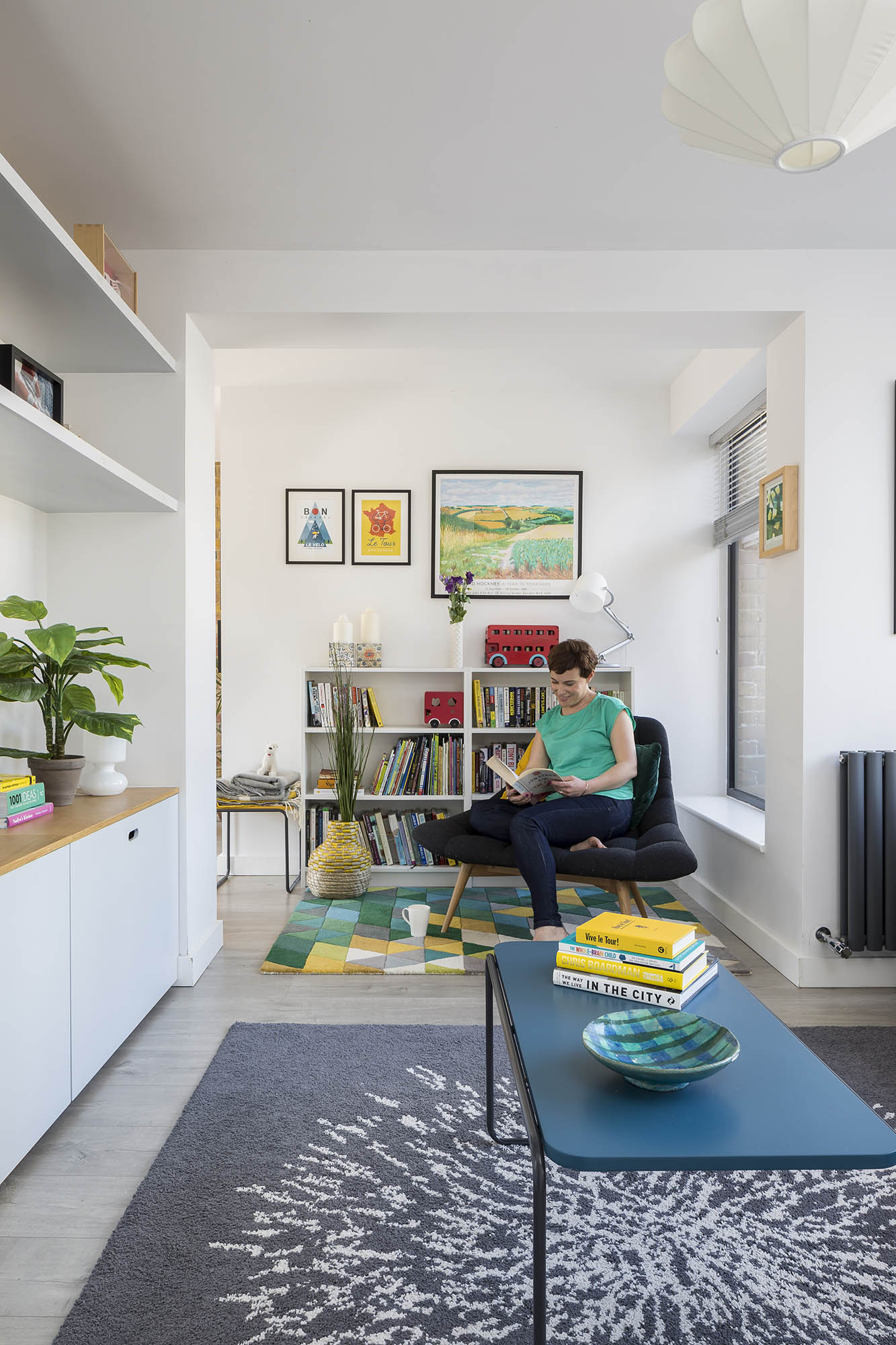
'The ground floor was open plan before we extended, but we were keen to create different zones, including the galley kitchen, dining space and sitting room. Because
of the odd shape of the living room, thanks to the staggered extension, we were able to create this small reading nook. The kids love to pick out a book, and Sam plays his trumpet in here.
'One of the key elements of the living room is the built-in storage, which the architects designed. They were so clever with it – when you come in through the front door, there’s a wall of storage all the way under the stairs up to the back door, as well as in the utility room and larder. It’s massively helpful to have that with two young kids.'
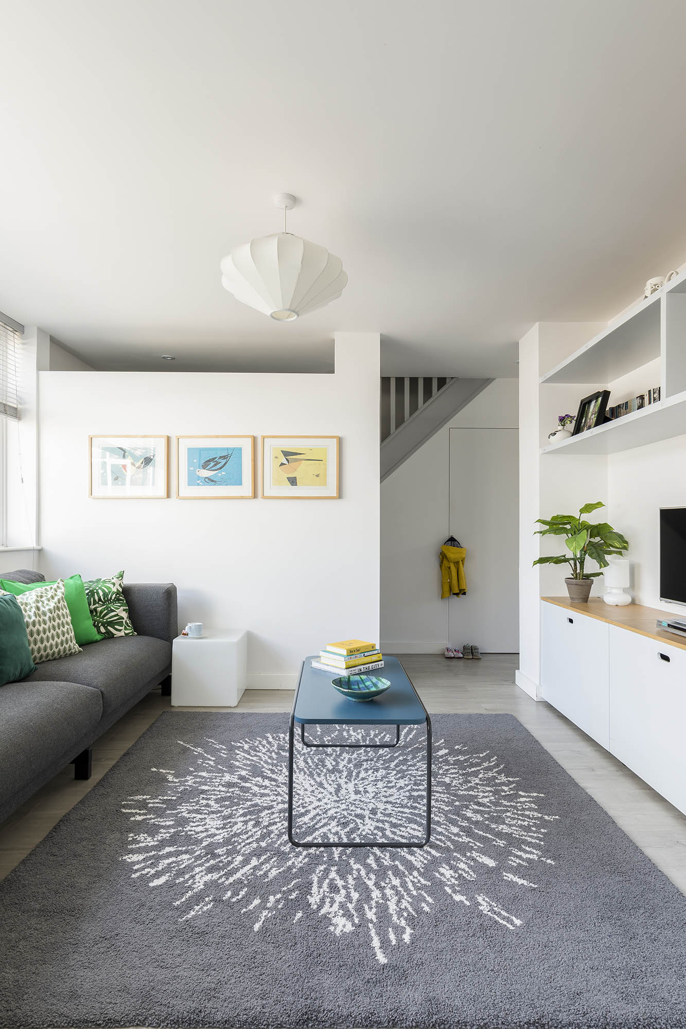
Bespoke storage, Sheppard Homes. Sofa, Ikea. Coffee table, Made.com. Rug, Ikea
‘We had conversations early on with the architects about what we could afford, and we broadly stuck to our budget – even if it meant staggering some things, like the carpentry. There were ideas along the way that they’d come up with – like zinc roofing, which was more costly than standard roofing – that forced us to weigh up where to splash and where to save. We would have loved to go into the roof and create a skylight above the stairwell, but it would have added on another £30,000. It would’ve been lovely, but we definitely didn’t need it.'
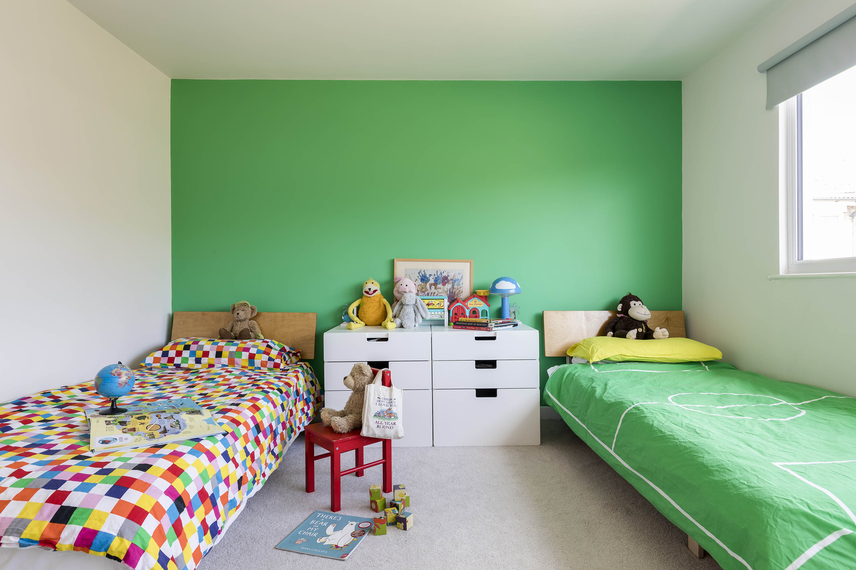
Wall painted in Pixie Green, Dulux. White drawer unit and bedlinen, Ikea. Beds, Warren Evans. Carpet, Carpetright
'Because the kids were sharing a bedroom, we had to find a way to please both of them while giving them some individuality. The bright green paint ties the room in with the rest of the house and makes their space feel fun. We individualised the beds through the duvets. We knew they’d eventually have rooms of their own so we didn’t feel we needed to spend too much time or money. Despite that, they still got the biggest bedroom in the house – it’s lovely and spacious.'
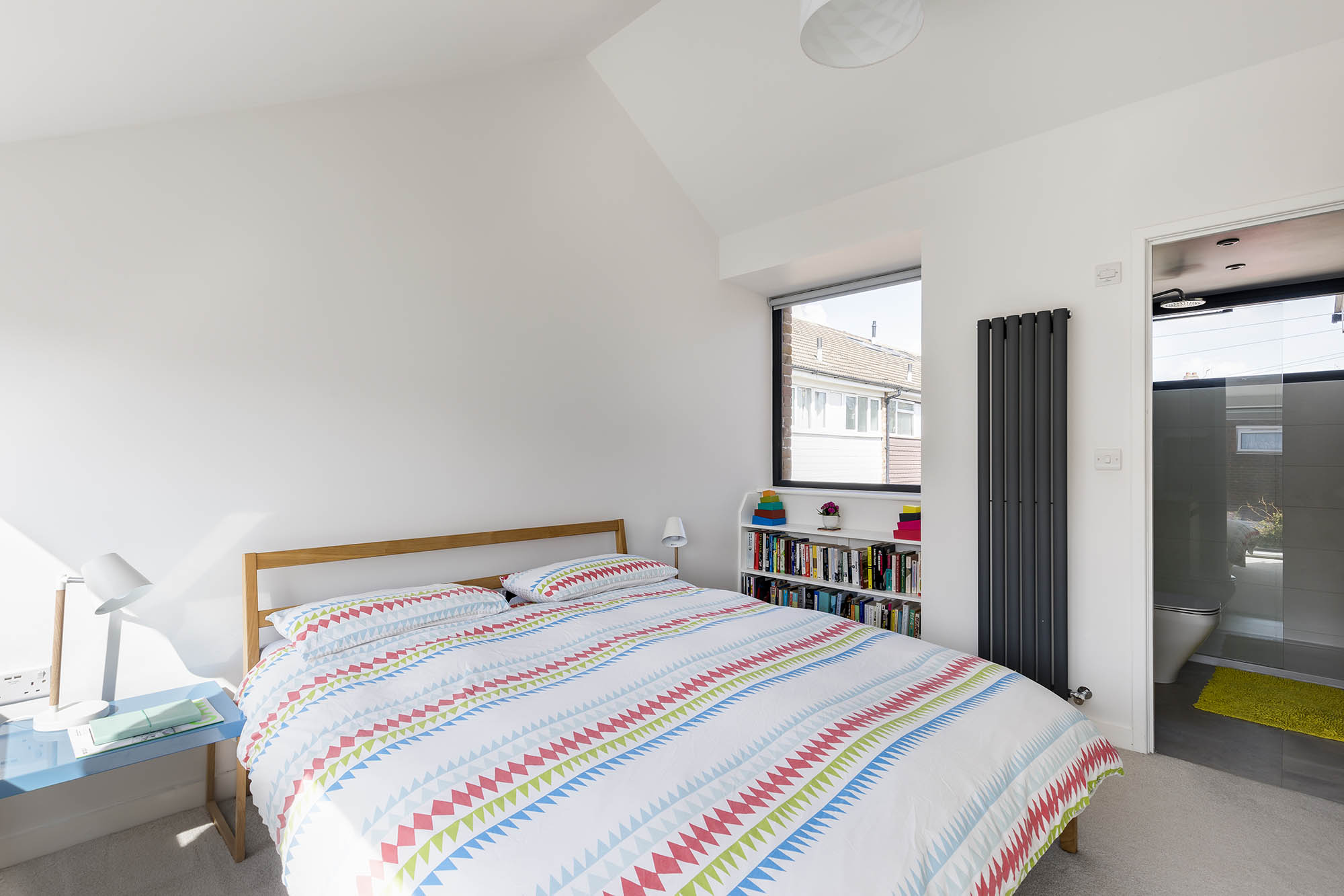
Walls painted in Chalk White, Dulux. Carpet, Carpetright. Bed, Muji. Bedlinen, TK Maxx. Bedside tables and lamps, Habitat. En suite, Deep Blue Bathrooms
'Having big windows was a massive part of creating a master bedroom we’d love to relax in. We have windows both sides of the room so it’s flooded with light. The kids love standing at the window and pushing their noses up it to make funny faces. One end of the room is a sloped alcove, so we got a carpenter to install a wardrobe and custom shelves. We went for a neutral scheme – it’s calming and works really well with the natural light.
'In the summer, the bi-fold doors are one of the nicest features of the house. It makes the whole of the ground floor, including the outside, feel like one big room. The garden is quite small and after we extended, it was reduced in size. But weirdly, it feels bigger now, like it’s an extension of the house, too.'
Contacts
- Architect Selencky Parsons
- Glazing Henry & Sons
- Kitchen Ikea
- Ensuite Deep Blue Bathrooms
More advice and ideas:
Join our newsletter
Get small space home decor ideas, celeb inspiration, DIY tips and more, straight to your inbox!

Formerly deputy editor of Real Homes magazine, Ellen has been lucky enough to spend most of her working life speaking to real people and writing about real homes, from extended Victorian terraces to modest apartments. She's recently bought her own home and has a special interest in sustainable living and clever storage.
-
 This colourful home makeover has space for kitchen discos
While the front of Leila and Joe's home features dark and moody chill-out spaces, the rest is light and bright and made for socialising
By Karen Wilson
-
 How to paint a door and refresh your home instantly
Painting doors is easy with our expert advice. This is how to get professional results on front and internal doors.
By Claire Douglas
-
 DIY transforms 1930s house into dream home
With several renovations behind them, Mary and Paul had creative expertise to draw on when it came to transforming their 1930s house
By Alison Jones
-
 12 easy ways to add curb appeal on a budget with DIY
You can give your home curb appeal at low cost. These are the DIY ways to boost its style
By Lucy Searle
-
 5 invaluable design learnings from a festive Edwardian house renovation
If you're renovating a period property, here are 5 design tips we've picked up from this festive Edwardian renovation
By Ellen Finch
-
 Real home: Glazed side extension creates the perfect garden link
Louise Potter and husband Sean's extension has transformed their Victorian house, now a showcase for their collection of art, vintage finds and Scandinavian pieces
By Laurie Davidson
-
 I tried this genius wallpaper hack, and it was perfect for my commitment issues
Beware: once you try this wallpaper hack, you'll never look back.
By Brittany Romano
-
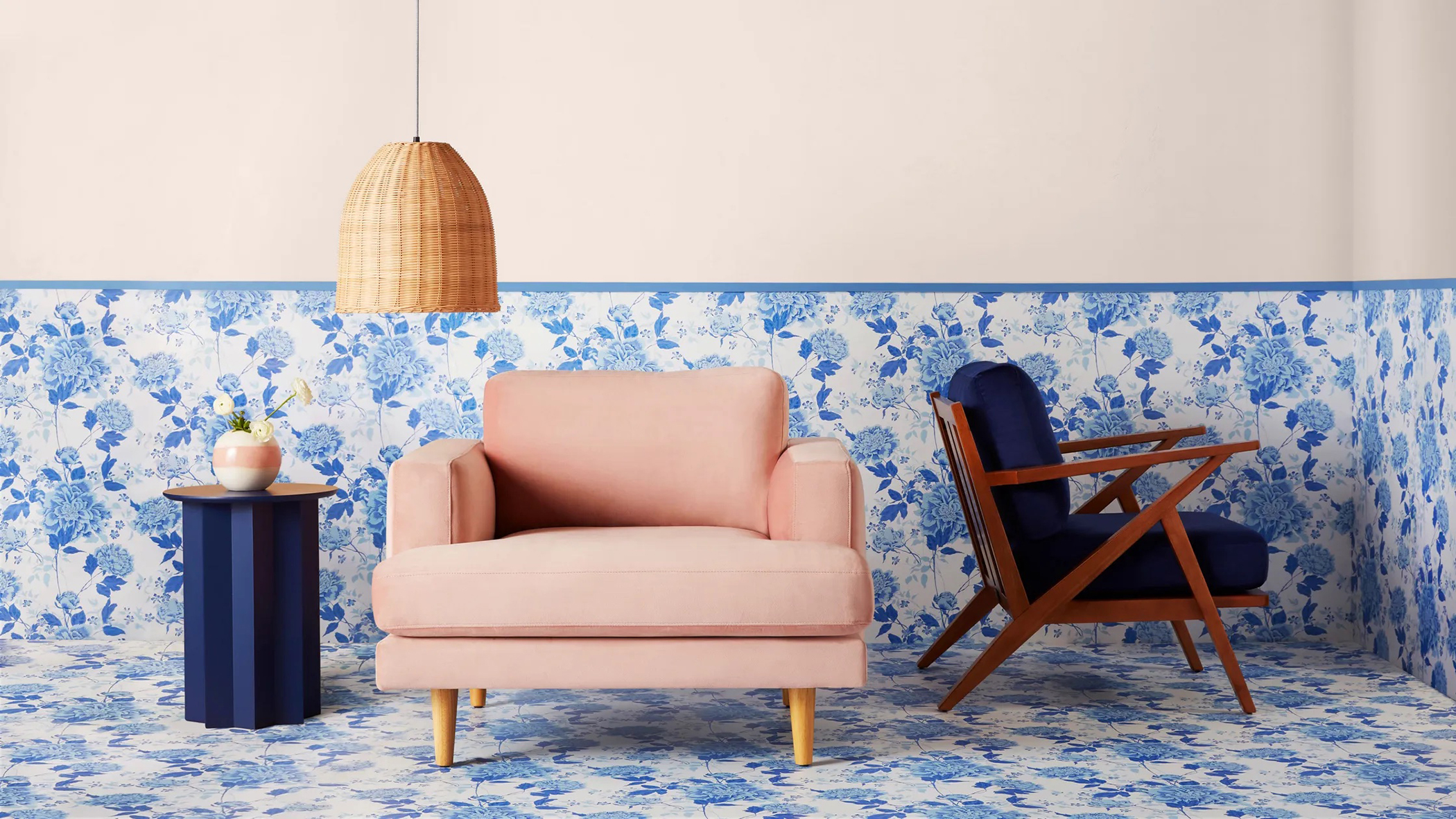 Drew Barrymore's new FLOWER Home paint collection wants to give your walls a makeover
Drew Barrymore FLOWER drops 27 brand-new paint shades, and every can is made from 100% post-consumer recycled plastic.
By Brittany Romano