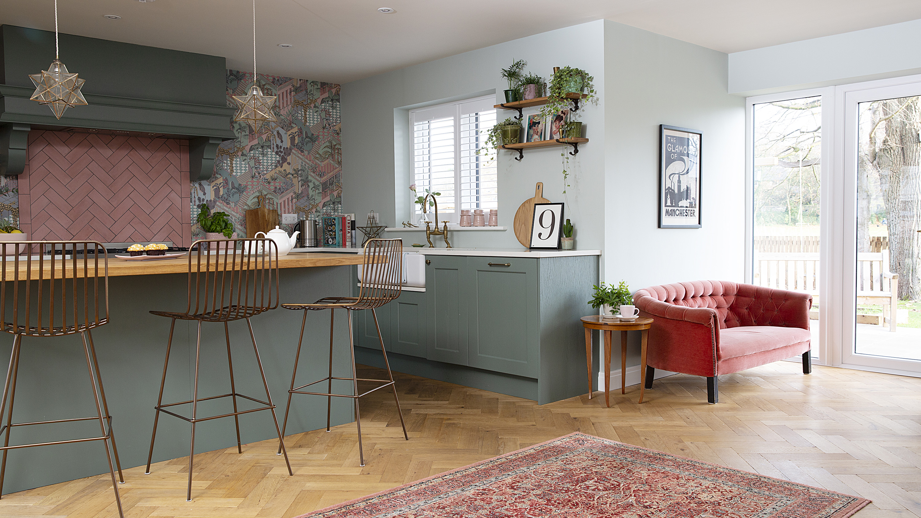
After having twins and becoming a family of five, Lucinda and Jamie sold their 1930s house in Crouch End and left London for a bit more greenery and a slower pace of life in Lancashire.
A period property appealed, but all the primary schools were full in the villages they’d set their hearts on. However, when a small local developer started building eight detached homes near Preston, they decided to buy a five-bedroom house off plan.
Close to the M61 and the airport, it was ideal for Sam’s job managing musicians and DJs, which involves lots of travel. Read on to find out how Lucinda created the country-inspired kitchen-diner at the heart of their new home, and then browse all our real home transformations. Find out how to design an open-plan kitchen in our expert guide, too.
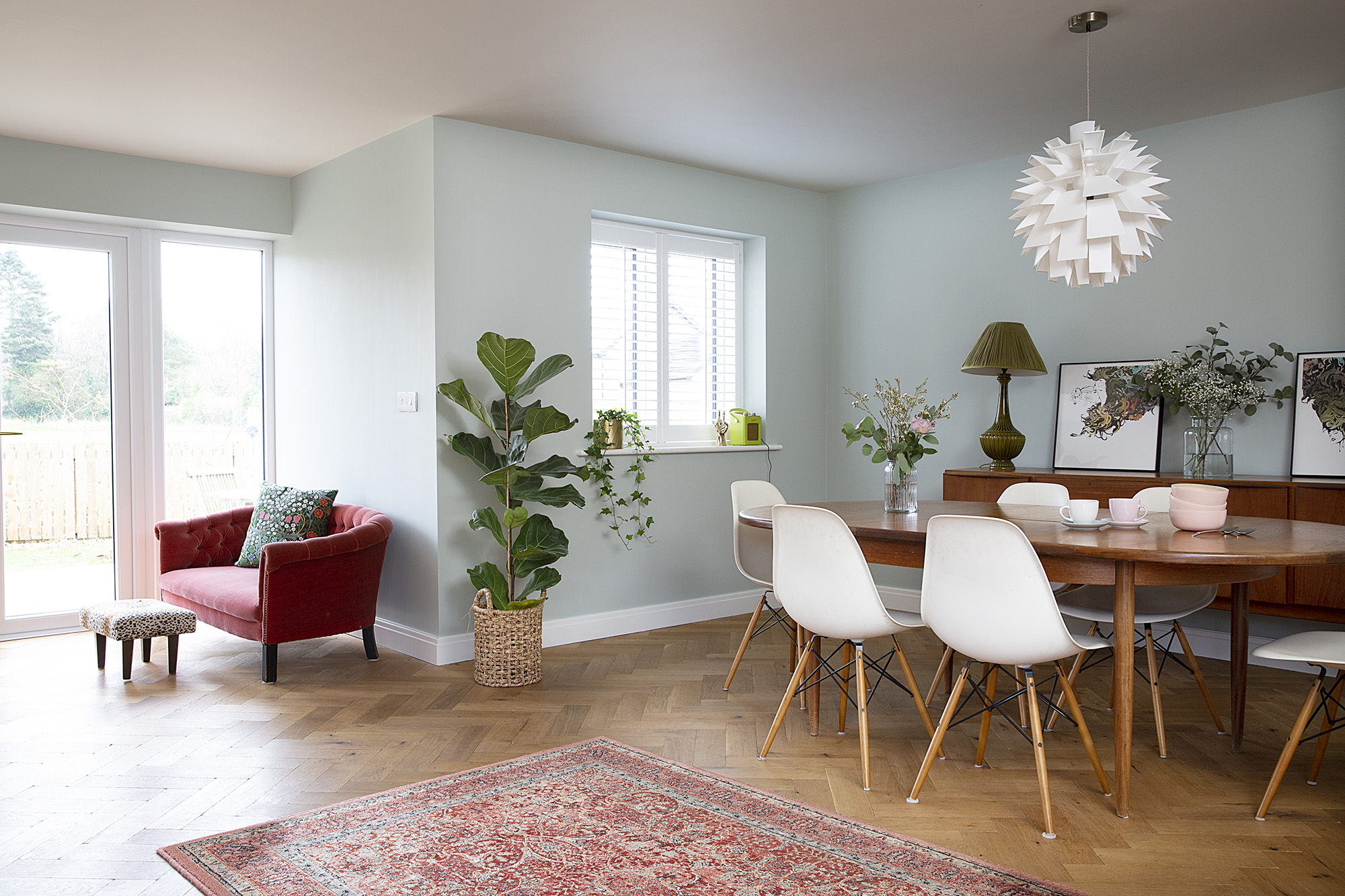
A mixture of new and vintage furniture works well in the dining area. 'Sometimes I go overboard and my husband says it's turning into a granny's house, so it's a constant battle,' says Lucinda. For a similar pendant light, try Indish
Project Notes
The owners Lucinda Holt, a freelance social media and marketing consultant, lives here with her husband, Sam, who works in artist management, and their children, Lola, seven, and twins Violet and Ruby, five.
The property A five-bedroom detached new-build house near Preston, Lancashire.
Project cost A similar kitchen would cost around £17,000.
‘Although we were still in London when the house was built, we were able to have input in the later stages when the interior was being finished off, as we’d moved in with my mum by then,' says Lucinda.
‘We were supposed to be there for five weeks but it turned into five months. If we’d gone with the builder’s spec on everything, it might not have overrun as much, but we wanted to upgrade lots of things. For instance, the Bert & May floor tiles for the hall took 12 weeks to arrive, holding up the installation of the stairs.
‘In the end, the builders banned us from site for three months as we were slowing things down! At the time it was painful – probably more for my mum – but it was a lovely hot summer so we managed to get outside a lot.’
‘When I used to work in Clerkenwell, I popped into the Devol showroom
and fell in love with their Shaker-style kitchens – that was my inspiration.
‘Having lived in cities all our lives, we could never really go rustic, but here we’re surrounded by woodland with four peacocks next door. This led me to pick natural oak parquet flooring, dark green Shaker units with antique bronze handles and a Belfast sink.

This brass tap, sourced by Simply Insignia, is a particular favourite. ‘It was expensive,’ says Lucinda. ‘But we’ve saved money elsewhere with vintage furniture and by not having wall cupboards.’ Belfast sink, Shaws of Darwen. Taps, Perrin & Rowe. Shutters, Aspiration Blinds. Duck egg stripe tea towel, M&S. Star tealight holder, Nkuku. Pink vases, Flying Tiger
'An L-shaped kitchen layout with a large island and hidden appliances made sense and I didn’t want cupboards everywhere, so we just have some shelves at the side for a bit of additional storage. As it’s the first thing you see when you walk in the room, I wanted a kitchen with impact and wow factor.’
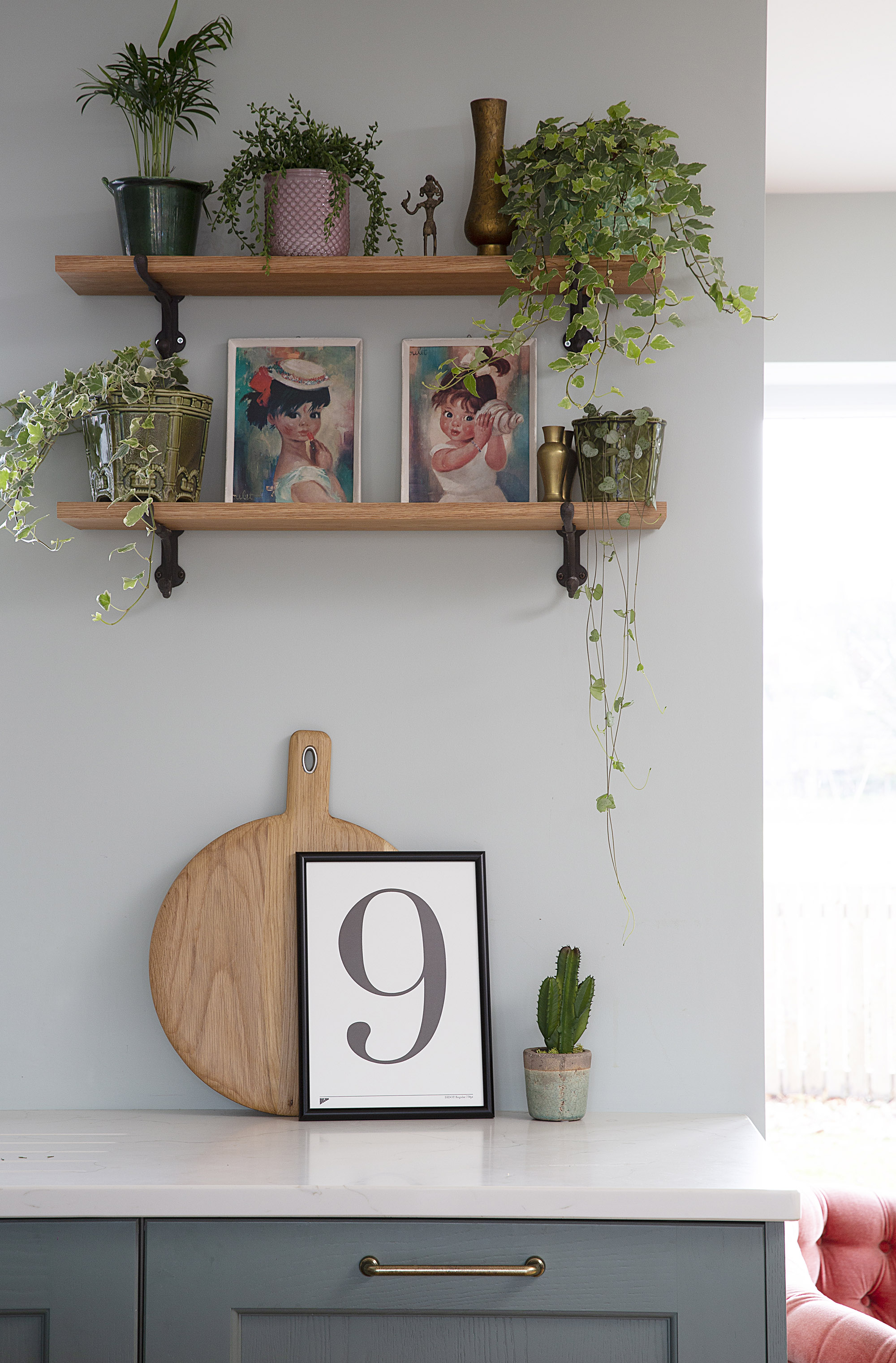
Lucinda has vivid memories of the kitsch pictures that used to be on her grandparents’ walls. ‘We previously put them over the girls’ beds but they were scared of them, so they’ve ended up down here,’ she laughs. The number nine is also significant as the couple were married on 9th September, their children were all born on the 9th and they moved in on the 9th. ‘It’s a number that seems to follow us around,’ she says. Shelves, Rockett St George. Chicstone Amani Quartz worktop, Simply Insignia. Green mix cactus and oak chopping board, M&S. No 9 print, Edit 58
‘The developer put us in touch with a local fitter, Simply Insignia in Preston. They showed us four kitchens in about five different colours, many of them grey. When I said I wanted dark green and brass, they told us it wasn’t in fashion!
'I think they were a little taken aback when we asked for so many changes. However, in the end they really worked with us and let us go more bespoke. We paid a bit more to get the units painted in Farrow & Ball’s Green Smoke, and chose our own tiles and flooring. They also suggested having the doors on the tall cupboards fitted in a larder style, which works much better.
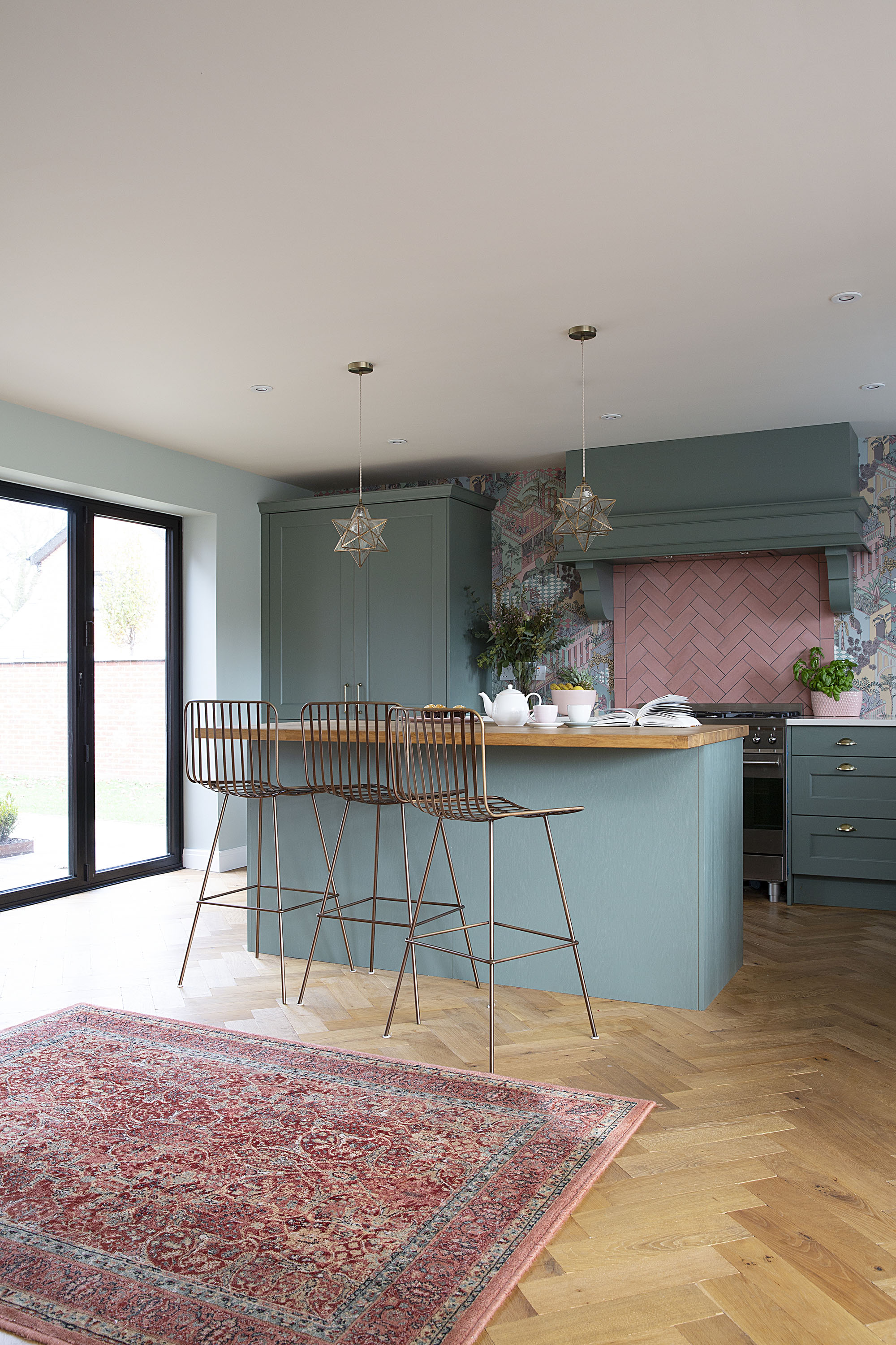
Being able to chose a Farrow & Ball colour has given the kitchen individuality. ‘It was very nearly a much darker shade called Studio Green,’ explains Lucinda. ‘We didn’t have time to test the colour so took a punt on Green Smoke instead, and we’re so happy with the final result.’ Shaker Kitchen units, Simply Insignia. Aged oak flooring, The Natural Wood Floor Co. For a similar rug, try the Hamadan, Carpet Vista
‘We tied everything together by painting the walls a peppermint green shade by Little Greene as it’s great quality and wipes clean.’
‘I had my heart set on wallpapering the back wall from day one as I wanted to inject some character. Our family thought we were crazy as it wouldn’t be practical. My dad still says, “When are you going to get tiles all the way round?”
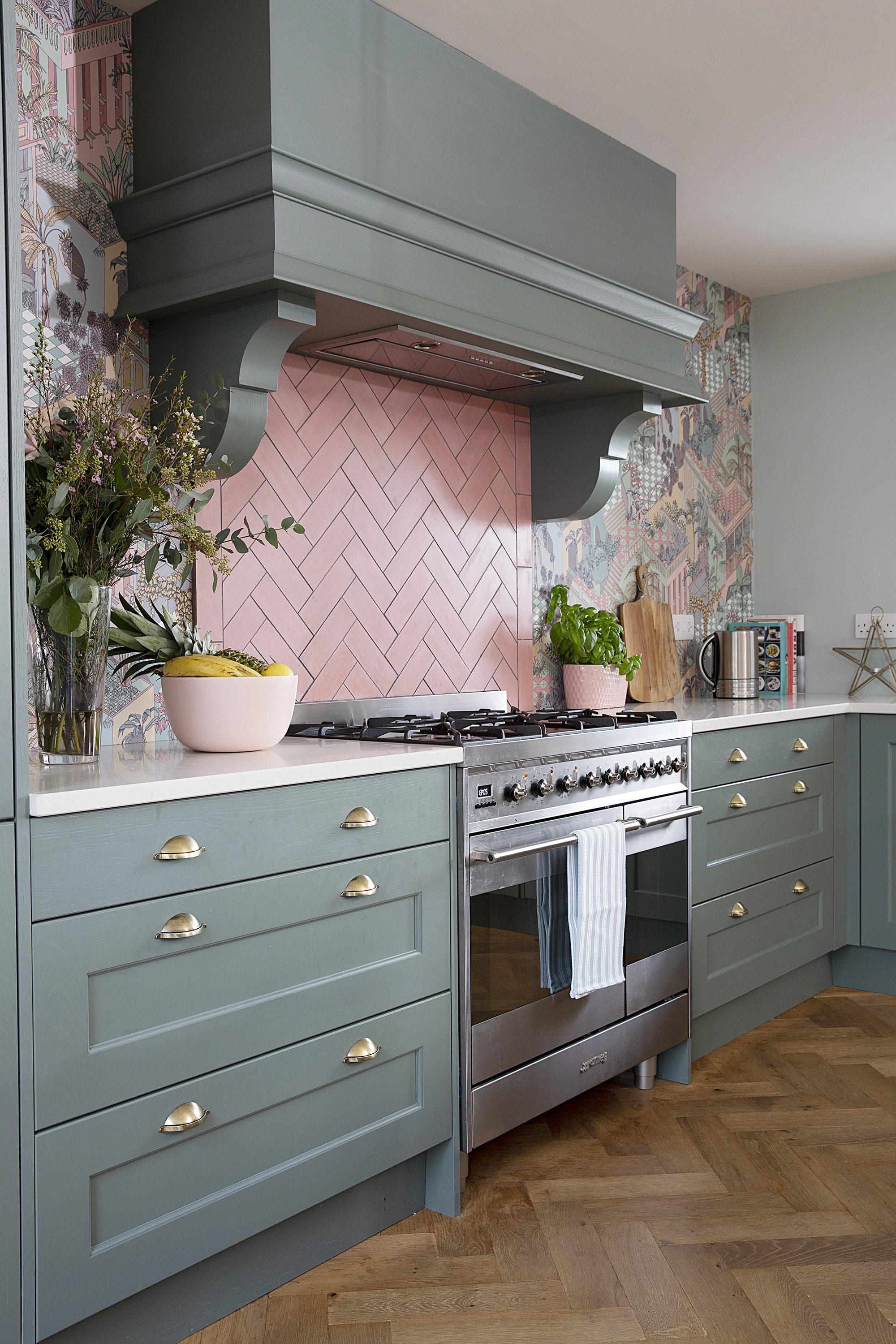
Creating an Instagram poll solved the dilemma of whether to have tiles laid in a brickwork or herringbone formation. ‘Lifestyle blogger @erica_davies assured me that it wouldn’t be too busy,’ says Lucinda. Cooker, Smeg. Tiles, Bert & May. Tea towel, M&S. Pink fruit bowl, Aldi
‘Luckily I bumped into an old friend who has a small interiors shop called JF Interiors, and she had loads of wallpaper to choose from. I fell in love with the Miami design by Cole & Son as it works perfectly with the colour of the tiles and units. At one point we considered putting shelves on either side of the oven, but it would’ve been a shame to cover the lovely wallpaper.
‘My dad needn’t have worried about the lack of tiles – I squirted chocolate cake mixture on the paper the other day and it just wiped off.’
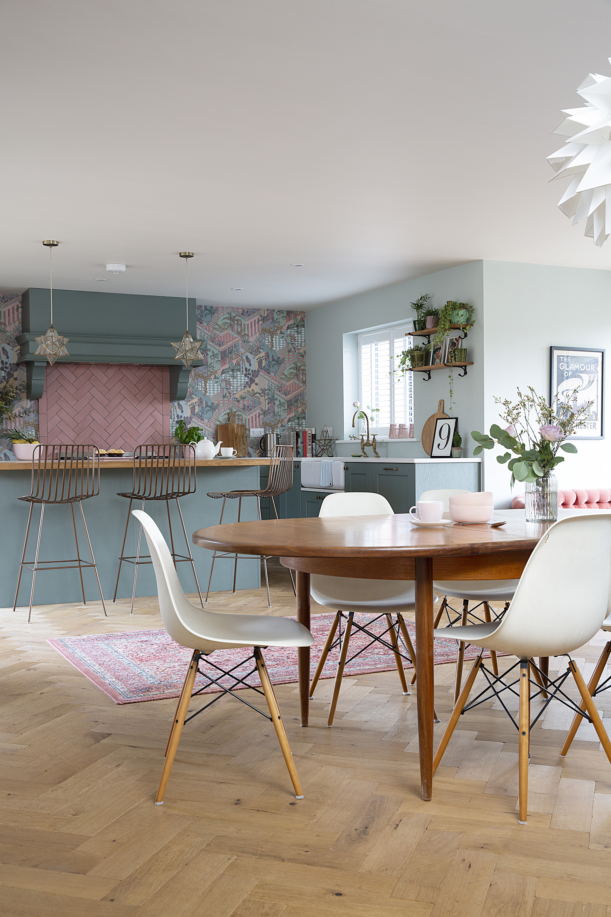
Oak parquet flooring ties in with the pattern of the pink herringbone tiles. 'In our previous home we had dark wood flooring but with the kids it showed up every speck, so we chose a lighter oak', says Lucinda. Aged oak flooring, The Natural Wood Floor Co. Tiles, Bert & May. For a similar table, try Eidelweiss in walnut and black, Made.com. Eames chairs, Vitra
Subscribe to Real Homes magazine

Get all the advice and inspiration you need for your project with a subscription to Real Homes magazine. Sign up today and have your favourite magazine delivered direct to your door every month
‘Friends and family love the new kitchen – it’s so sociable. In summer we open the doors to the courtyard garden, and the whole family comes round at Christmas. I spend time on the sofa gazing at the sky. It sounds trippy, but it’s something I couldn’t do in London.
‘We’re still a bit overwhelmed by it. Our utility room is bigger than our previous kitchen so we have more space than we’ve ever had.
‘The only thing we might add is a built-in bench and window seat to create a snug dining area, but we couldn’t be happier with the way it’s turned out. It’s like the Devol kitchen I wanted but for a fraction of the price. Having moved three times in the past five years, I don’t think we’ll be moving again any time soon.’
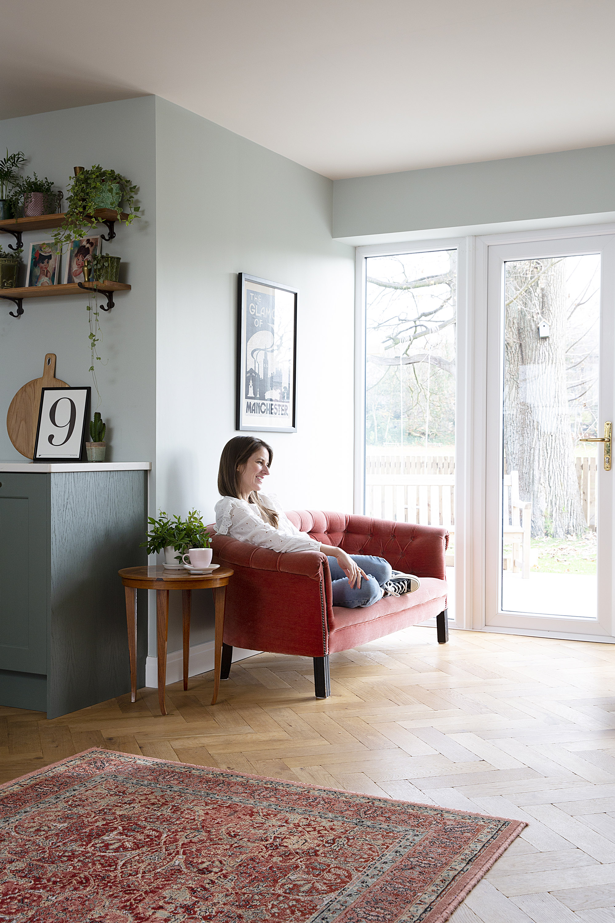
The only thing Lucinda would change is the white patio doors: ‘I’d rather they matched the dark grey bi-folds. @mustardvintage on Instagram suggested spray painting them black, but that’s a job for a weekend when the kids aren’t here.’ Walls painted in Salix, Little Greene. For a similar sofa, try the Loaf Crumble Snuggler in Dusty Rose. John Lewis. Glamour of Manchester print by Reloved Mcr, Rose & Lee Interiors
Contacts
- Kitchen Simply Insignia
- Flooring The Natural Wood Floor Co.
- Tiles Bert & May
- Wallpaper Cole & Son
Inspired to create a similar kitchen?
- Shaker kitchens: design tips and 12 ideas to create your classic kitchen
- L-shaped kitchen design ideas
- Dark and dramatic kitchen design ideas
Join our newsletter
Get small space home decor ideas, celeb inspiration, DIY tips and more, straight to your inbox!
-
 You won't believe this stunning five-bed family home used to be a tiny two-bed
Katie and Stuart went big with a double-story extension to create a dream space for themselves and their daughters
By Ifeoluwa Adedeji
-
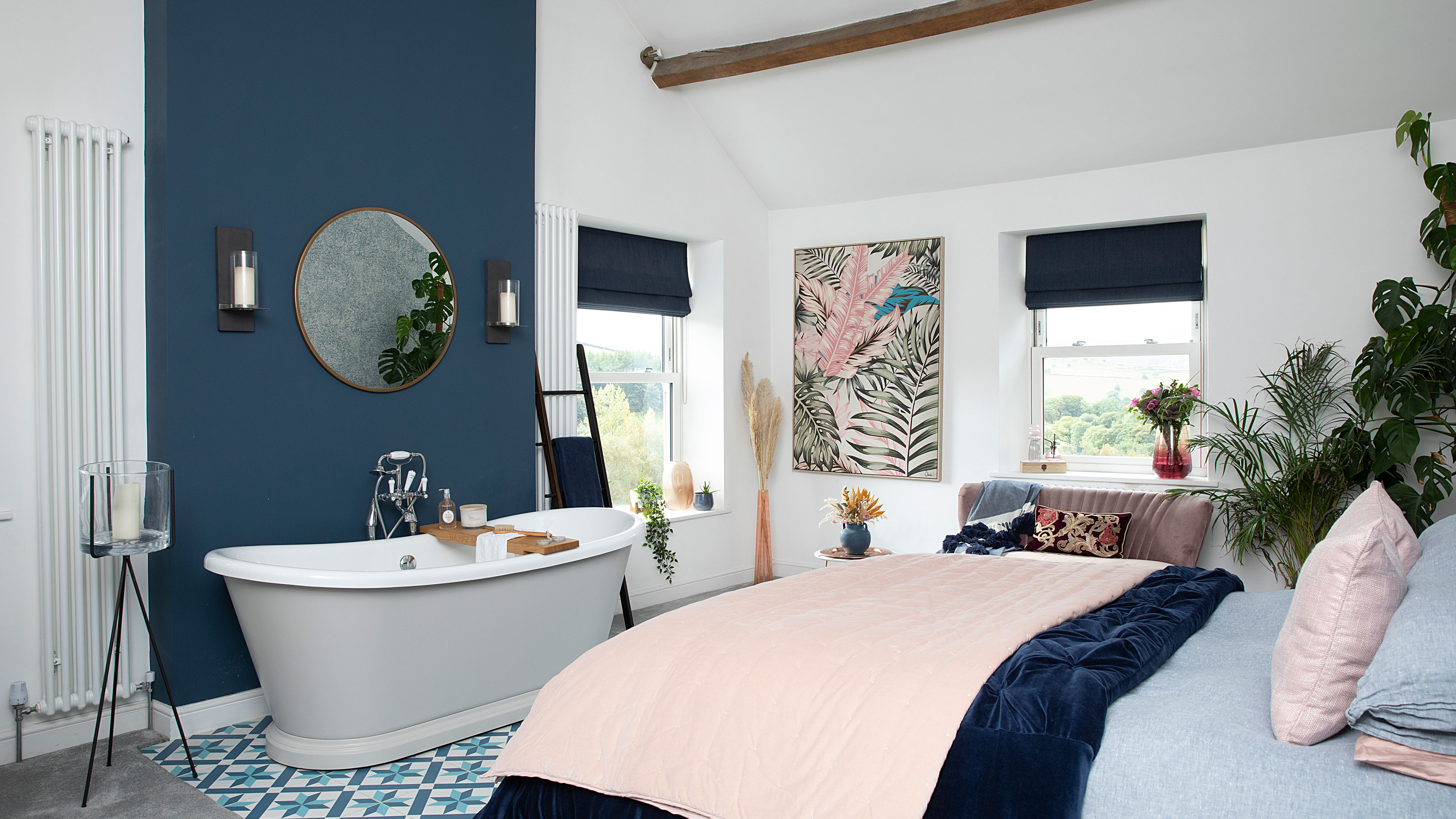 The freestanding bath in this dreamy bedroom is sheer five-star luxury
Emma and Martin wanted a suite just like in an upscale hotel — mission totally accomplished.
By Ellen Finch
-
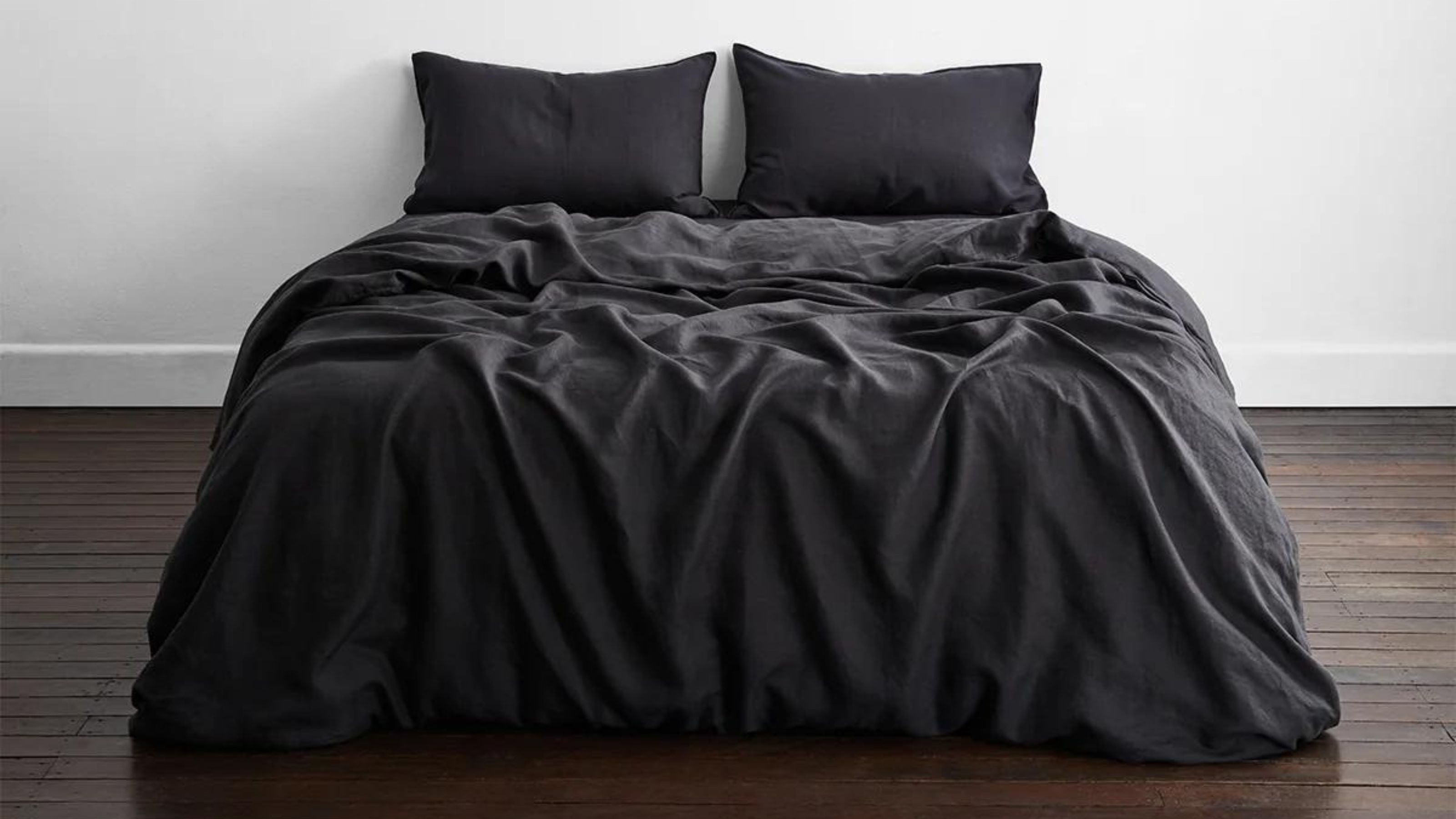 I just know 2023 is going to be all about black bedding sets
White sheets are out, black bedding sets are in — here's everything you need to know about this bedroom decor trend
By Louise Oliphant
-
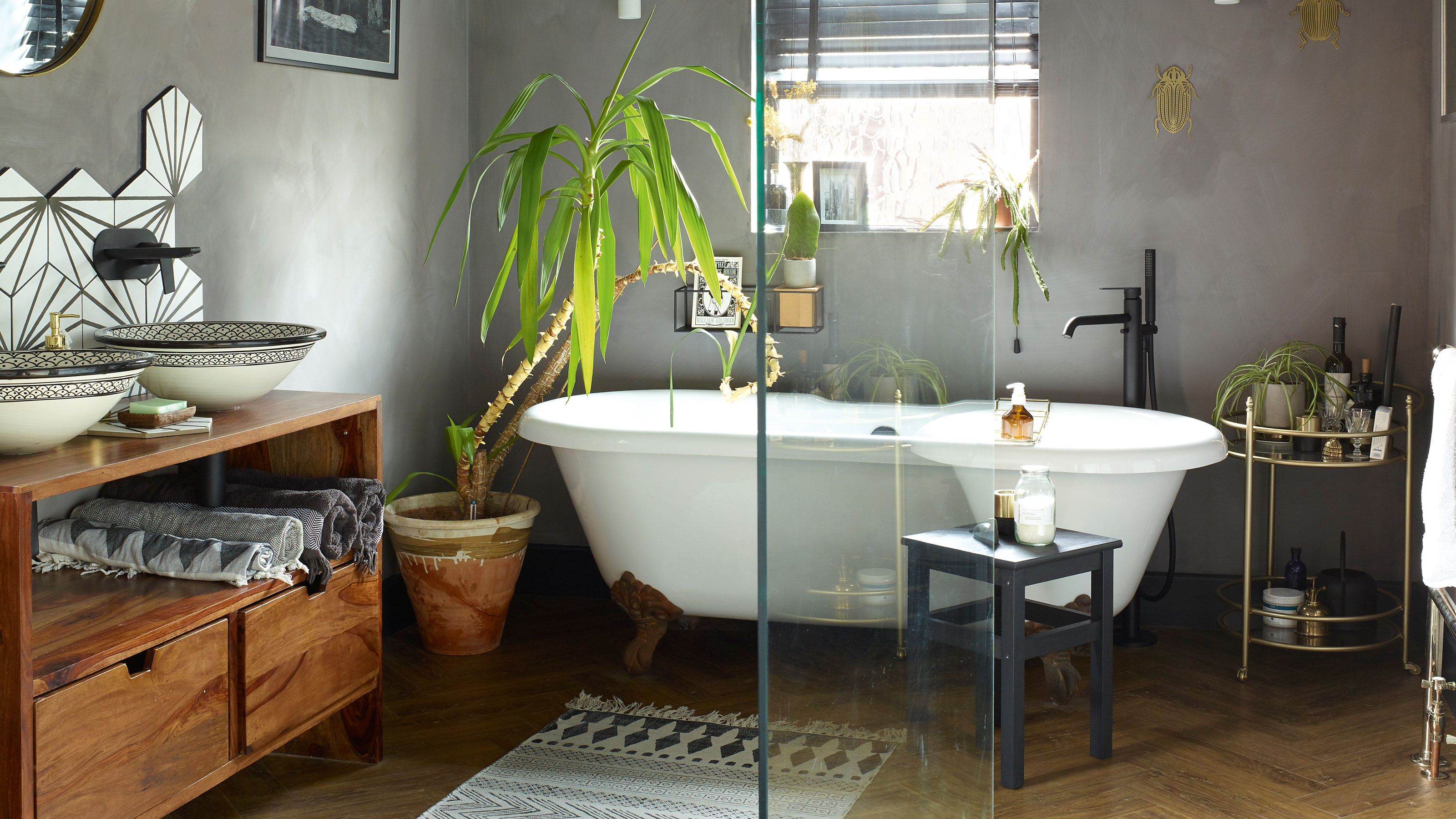 A bland beige bathroom is transformed into a STUNNING contemporary sanctuary
First-time homeowners Ellie and Oliver’s new bathroom is a well-planned fusion of modern pieces and exotic touches
By Ellen Finch
-
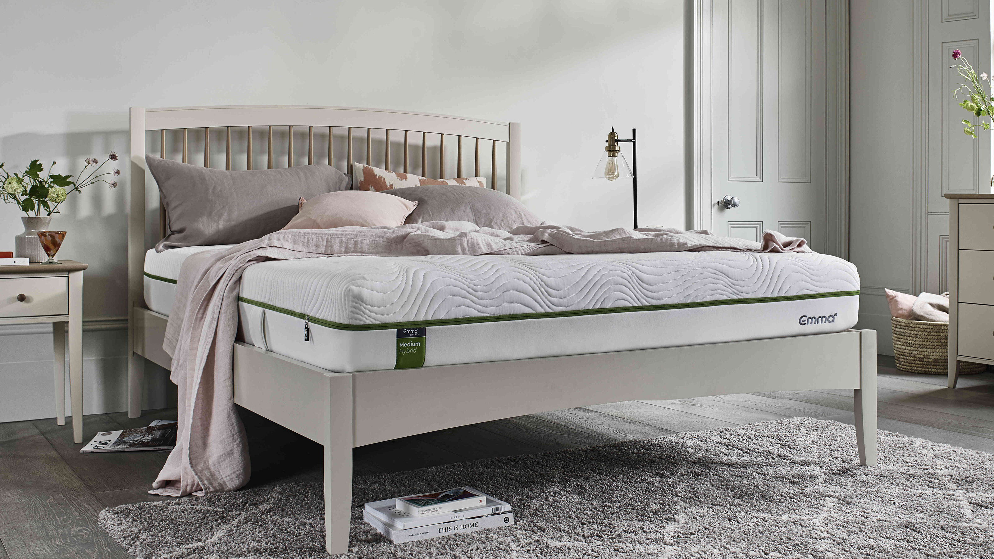 Mattress disposal: how, where, and how much it will cost?
Mattress disposal is tricky. You’ve swapped it for a supportive new design, but how to dispose of the bulky old mattress? Follow our guide to find out...
By Sarah Warwick
-
 36 outdoor kitchen ideas – enviable and inspiring designs for your backyard
Enjoy alfresco cooking and entertaining all year round with the best outdoor kitchen ideas for every space and budget.
By Sarah Warwick
-
 Real home: Gorgeous green kitchen has a fresh feel
A stunning extension and Charley Smith's clear design vision has resulted in a family kitchen-diner that’s ripe for entertaining.
By Ifeoluwa Adedeji
-
 [redirected] Best coffee beans: 12 delicious coffees to start your morning with
Your perfect cup of coffee starts with the coffee bean. We're sharing our best-bagged beans from coffee shop favorites to gourmet roasters.
By Jaclyn Turner