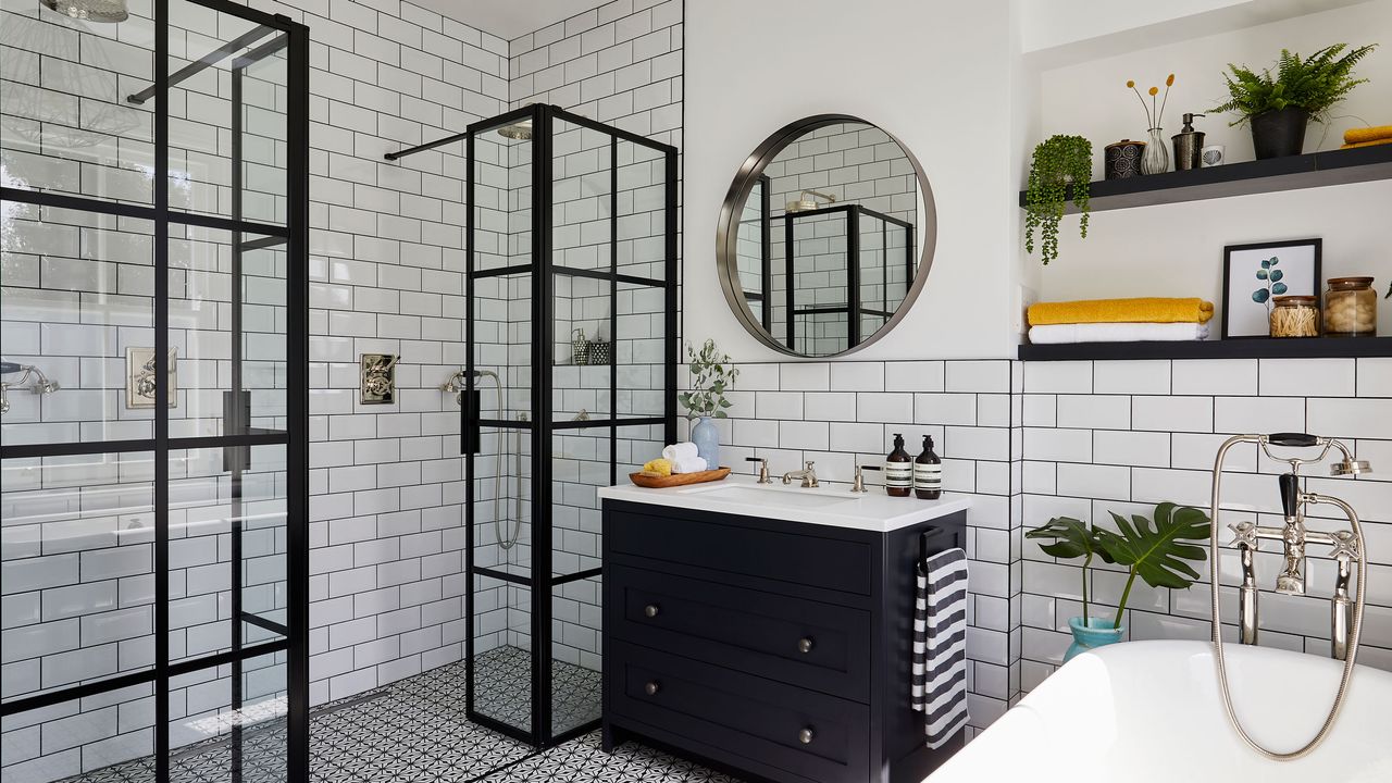

Ali and Neil took on a huge project when they bought their Victorian terrace. In the space of a year, they extended the kitchen, reconfigured the loft space to add a bedroom, sectioned off rooms at the front and top of the property and renovated the driveway and garden.
It’s enough to make anyone feel a bit light-headed – but for Ali, it was part of the challenge. ‘We walked in knowing it was a big project – though we perhaps didn’t realise quite how big,’ she said. ‘It’s one thing moving house and quite another doing a complete renovation! I was lucky enough to be gifted money from my parents when my dad retired, which meant I could make my dream house a reality. My dad sadly passed away and didn’t get to see the result, but Mum tells me he’d be proud of what I achieved.’
If Ali's bathroom inspires you to tackle your own project, we have lots of ideas and helpful advice on our bathroom ideas feature. For more real home transformations, head to our hub page.
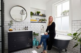
'It still feels exciting and new to come in here every day,' says Ali
The 'before' and all the details
The owners Ali Gunn, who works in asset management, lives with her husband, Neil, head of digital in the charity sector, and their three cats, Ray, Sooty and Sweep
The property A four-bedroom Victorian terrace in Lee,
south-east London
Project cost £40,600
The couple’s bathroom might be a small part of the works, but the resulting space is a haven where they can recuperate after work. By adding modern twists to Victorian classics – like a Crittall-style shower screen contrasted with a traditional roll-top bath – they’ve embraced the historic nature of their home without compromising on contemporary style. A traditional monochrome scheme provides a timeless foundation that Ali can switch up with colour-pop accessories whenever the mood takes her.
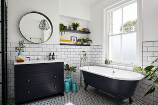
'With black and white base shades, I can accessorise with pops of colour.' Bath, Imperial Bathrooms. Floor tiles, Fired Earth. Wall tiles, Topps Tiles
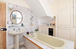
‘We knew this house would be a project when we bought it,' says Ali. 'We moved to the area to be close to family and found this property a street away from my brother’s. The bathroom was awful – think 1970s-style carpentry, really old carpet, a huge airing cupboard with a water tank and a slanted ceiling thanks to a set of stairs leading up to the loft at the side of the house. Bath in the centre of the room with no shower screen. We knew we absolutely had to start again – we needed more space, light and modernisation.’
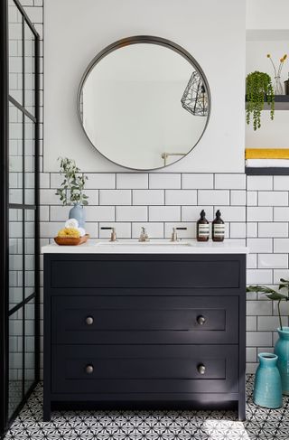
'I wanted to hide away as many of our daily products as possible to keep the bathroom looking tidy.' Vanity unit and sink, Villeroy & Boch. Round mirror and ceiling light, Made
‘We used a local company, Create, for the build work, and they recommended WC One for the bathroom. We had a chat about what we wanted from the space – for example, a big double shower and a roll-top bath. My sister-in-law and I were doing our houses up at the same time, so we swapped research to draw as much inspiration as we could. That, along with Pinterest, meant I was able to bring together an idea of what I was after. I wanted to combine traditional and modern and introduce a timeless scheme – a black and white base with grey accents on the sink and bath, accessorised with pops of colour.’
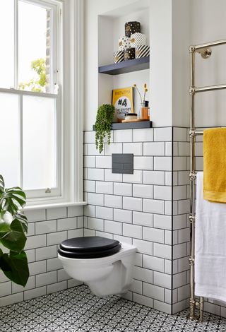
'The toilet rolls are a feature. My husband likes arranging them into different shapes on the shelves.' WC, Imperial Bathrooms. towel rail, Lefroy Brooks. Toilet rolls, Who Gives A Crap
‘I’m all about clean lines and no clutter. We wanted storage under the sink to put soaps and moisturisers away, but we’ve also introduced shelving. The ones near the sink are used for displaying accessories and adding pops of colour, and the shelves behind the toilet display our toilet rolls. It sounds a bit strange, but we use a company called Who Gives A Crap, who produce eco-friendly toilet rolls packaged in trendy black, white and gold patterns. They’ve become a bit of a feature.'
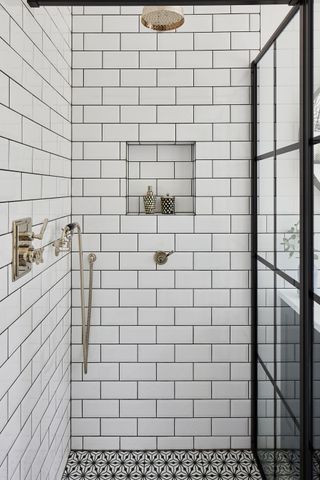
'We opted for nickel taps and mixers because they complement the monochrome colour scheme.' Bath mixer, Lefroy Brooks
‘WC One worked with us on the smaller details, as well as the bigger decisions, like what types of metal we should include. We chose nickel. The company also helped us source the right fixtures and fittings, like the taps and mixers, to fit in with the era of the house but bring a modern twist.
‘The tiles were all my choosing. I knew I wanted a pattern tile for the floor, and my sister-in-law recommended Fired Earth. I ended up going with their black and white geometric tiles, and paired them with simple metro brick tiles on the walls. I wanted one central ceiling light, and I picked one that’s also quite geometric. It contrasts with the floor tiles but complements them, too. I was keen to mix up the patterns I used.’

'We had to have the Crittall-style shower doors made bespoke because they’re so big.' Shower mixer, Lefroy Brooks. Shower screen, Drench
‘Originally we wanted to move the toilet to the other side of the room so it wasn’t the first thing you saw when you walked in. Unfortunately, though, we’d had to put a lot of steel reinforcement beams in during work on the loft, which meant that the waste pipes could only run in a certain way. That’s the only limitation we really had, though – and it doesn’t bother me as much as I thought it would.
‘My favourite part of the room is probably the shower. The Crittall-style doors add a boutique feel to the space. Friends who come round say it’s like being in a hotel! Anyone who goes through a project shouldn’t be under the illusion that it’s quick and painless – things go wrong and you adapt to what’s thrown at you. But we’ve come out of it with something we love.'
Subscribe to Real Homes magazine Want even more great ideas for your home from the expert team at Real Homes magazine? Subscribe to Real Homes magazine and get great content delivered straight to your door. From inspiring completed projects to the latest decorating trends and expert advice, you'll find everything you need to create your dream home inside each issue.
More reading
Join our newsletter
Get small space home decor ideas, celeb inspiration, DIY tips and more, straight to your inbox!

Formerly deputy editor of Real Homes magazine, Ellen has been lucky enough to spend most of her working life speaking to real people and writing about real homes, from extended Victorian terraces to modest apartments. She's recently bought her own home and has a special interest in sustainable living and clever storage.
