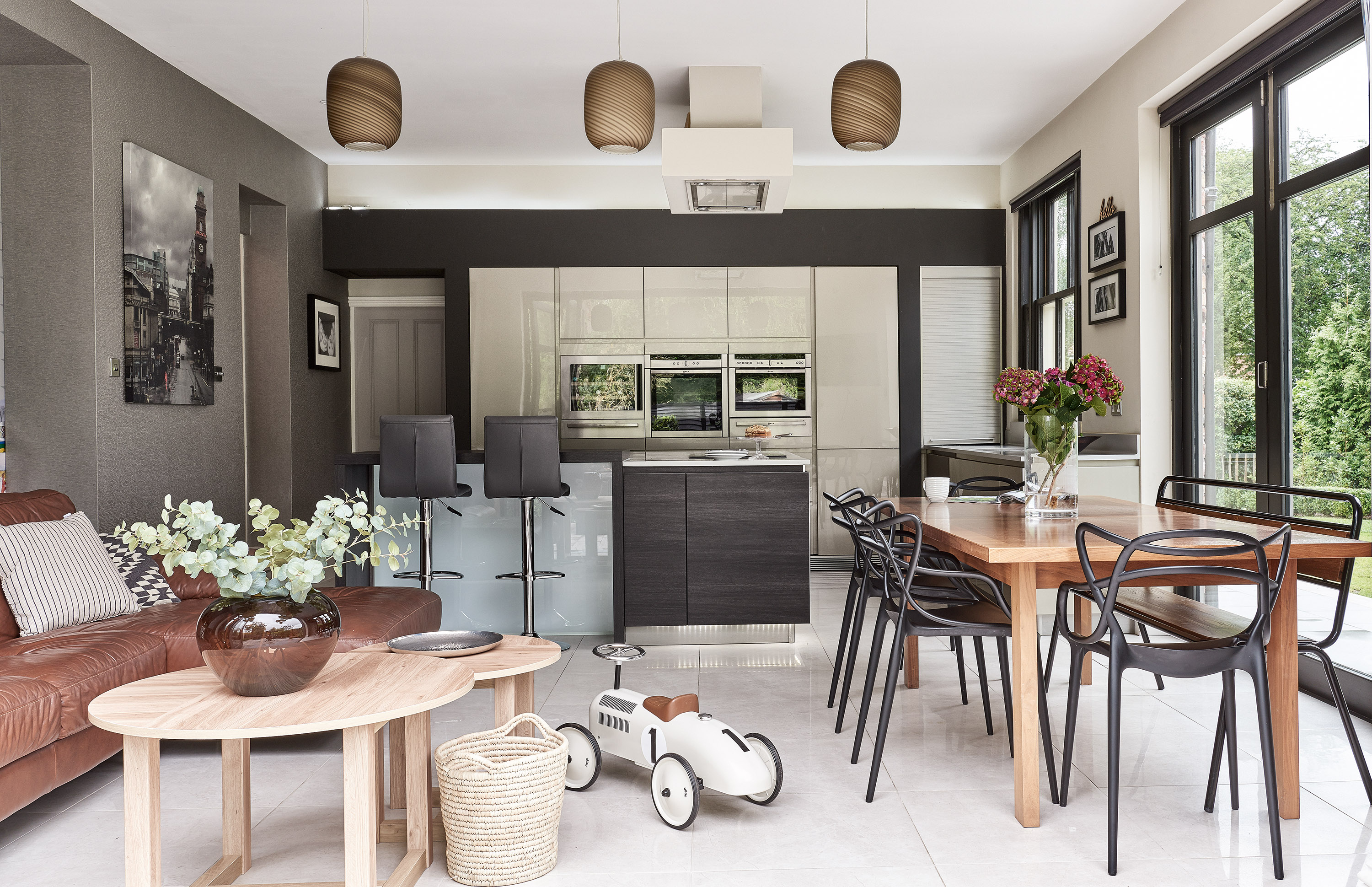
‘I didn’t set out to become a serial house renovator,’ explains Kate Bowl. ‘I just love interior design and know exactly how a house can look when I’ve finished with it, whatever state of disrepair it’s in.’ The house she lives in with her husband, Jonathan, and their three children – an old vicarage – was uninhabitable when the family took it on, but underwent a major transformation.
Find out how they transformed it, then browse the rest of our real home transformations. Read our guide on renovating a house, too, for more guidance.
Profile
The owners Kate Bowl, an interior designer, and her husband, Jonathan, who works for a technology company, live here with their daughter, Grace, five, and twin boys, William and Joseph, three.
The property A late Victorian five-bedroom villa in a suburb of Stockport.
Project cost £476,000.
Because it sits within a conservation area – and is itself a house of local interest – the couple’s options were somewhat limited as to how and where they could extend. It’s taken some creativity and a great deal of patience to get it up to scratch, but the family’s Victorian villa today, with its modern double-storey extension, is unrecognisable from its former state.
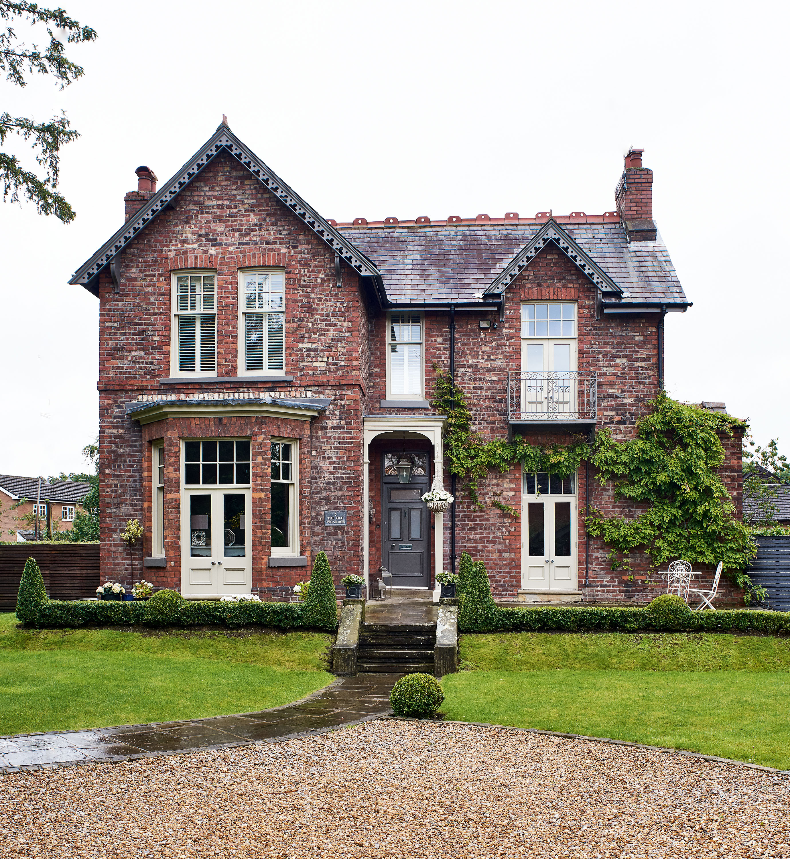
However, it’s Kate’s confidence in her own sophisticated style that’s won her our admiration. When so much of interiors seems to be about trends – whether it’s dark walls, Scandi spaces or Mid-century modern – Kate’s home is a refined, considered reflection of her personal taste. We love riding the zeitgeist bandwagon as much as the next person from time to time, but it’s always refreshing to see a homeowner stick to their guns when it comes to designing their space. Stepping into Kate’s rather welcoming hallway, we couldn’t wait to hear more about what she’s been up to…

'Selling our previous house in Didsbury, moving into a one-bedroom flat and, subsequently, Jonathan’s parents for a short time in between wasn’t the easiest transition into our home. It was just the way it worked out. I viewed the house before Jonathan and I knew I’d love it, so I rang him straight after and said I wanted to live there. Offers were via sealed bids and we were going on holiday two days later. It was a nail-biting few days but we found out we’d won it while skiing in Switzerland,' says Kate.
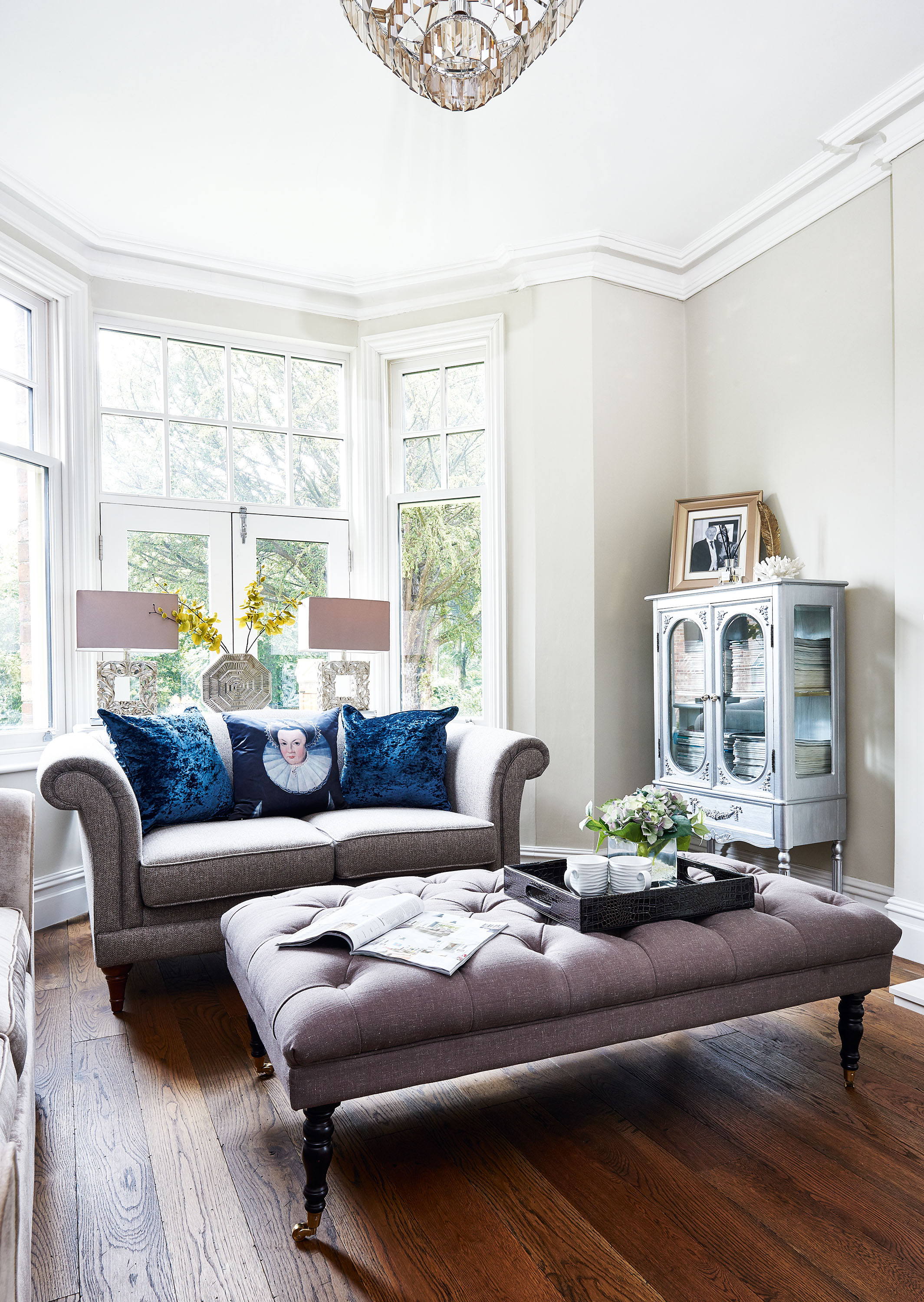
Sofas and chairs, Marks & Spencer. Ottoman and cushions, HomeSense. Lamps, Achica
‘Our plan was to renovate and remodel the existing four-bedroom house to add a further two en-suite bathrooms, demolish the outhouses and build a two-storey extension to create an additional master bedroom. We put in for planning permission in May, but it wasn’t granted until August Bank Holiday. We chose a builder who had done work locally and who also sub-contracted all relevant trades,
but I project-managed the entire renovation myself while heavily pregnant. I was here at least once a day to oversee the work and make decisions. It was worth it – because all the work was done at the same time, the house has a great flow.’
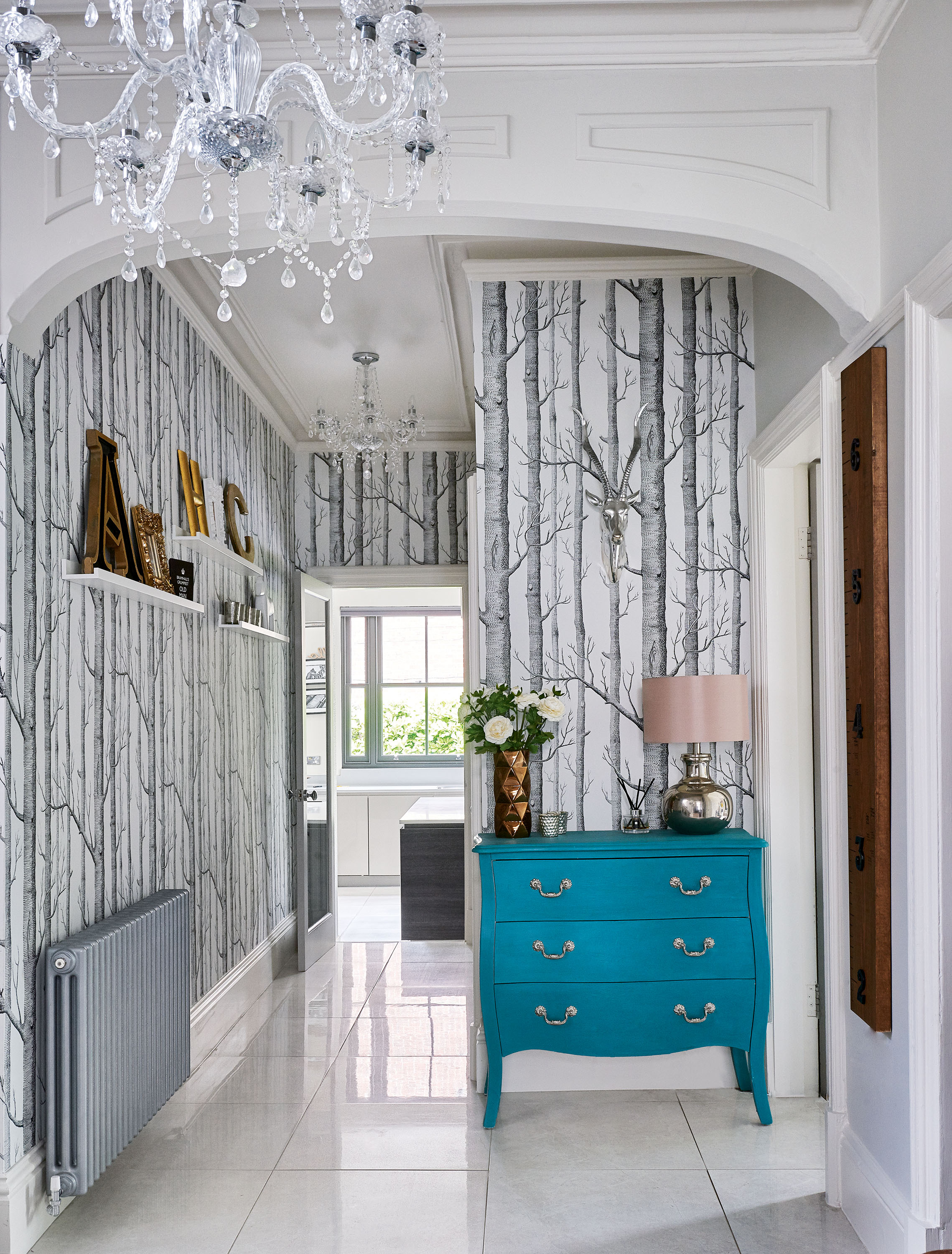
Wallpaper, Cole & Son. For a similar chest of drawers, try Graham & Green
‘We moved in right before Christmas and I thought it would be a good idea to invite the family around for Christmas Day. When my mum went to cook she realised all of the plastic casing was still on the cookers because they’d not been used yet! We spend all of our time in here now, especially with the playroom just off to the side, so I can watch the children play while I’m cooking, relaxing or working.
I love the trends that come and go, but unlike fashion and what you wear, your home will always be a true reflection of your own personal style.
Kate
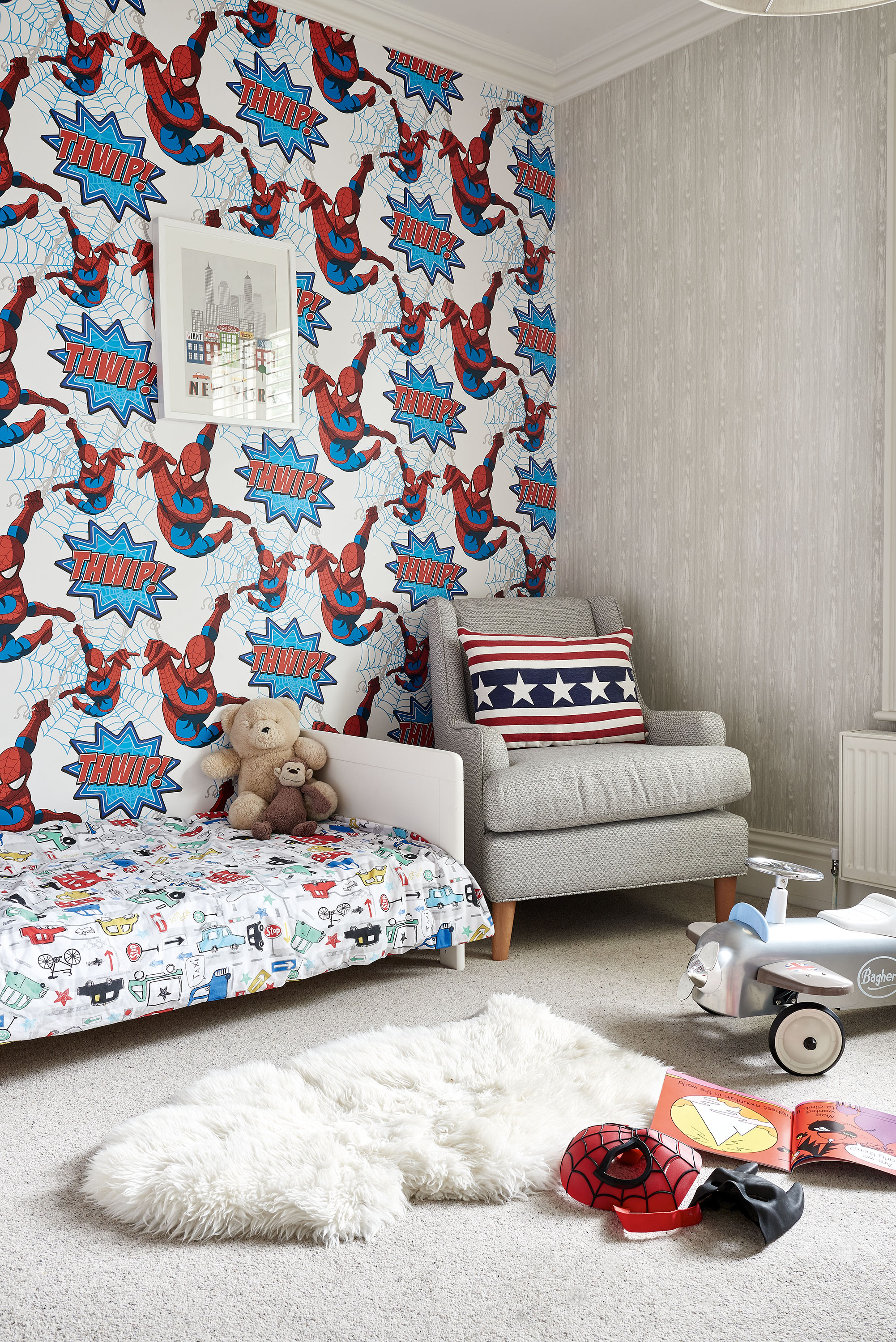
Walls painted in Elephant’s Breath, Farrow & Ball. For similar wallpaper, try Graham & Brown Marvel Superheroes wallpaper, B&Q
'The house needed a fresh eye and a new, modern purpose, but I wanted to keep some rooms as stand-alone spaces – like the more grown-up front sitting room. I like having somewhere special in the house that I can style and dress in a more sophisticated way. I wanted to retain some of the period feeling the house has, which the front rooms, with their bay windows and classic detail, evoke,' explains Kate.
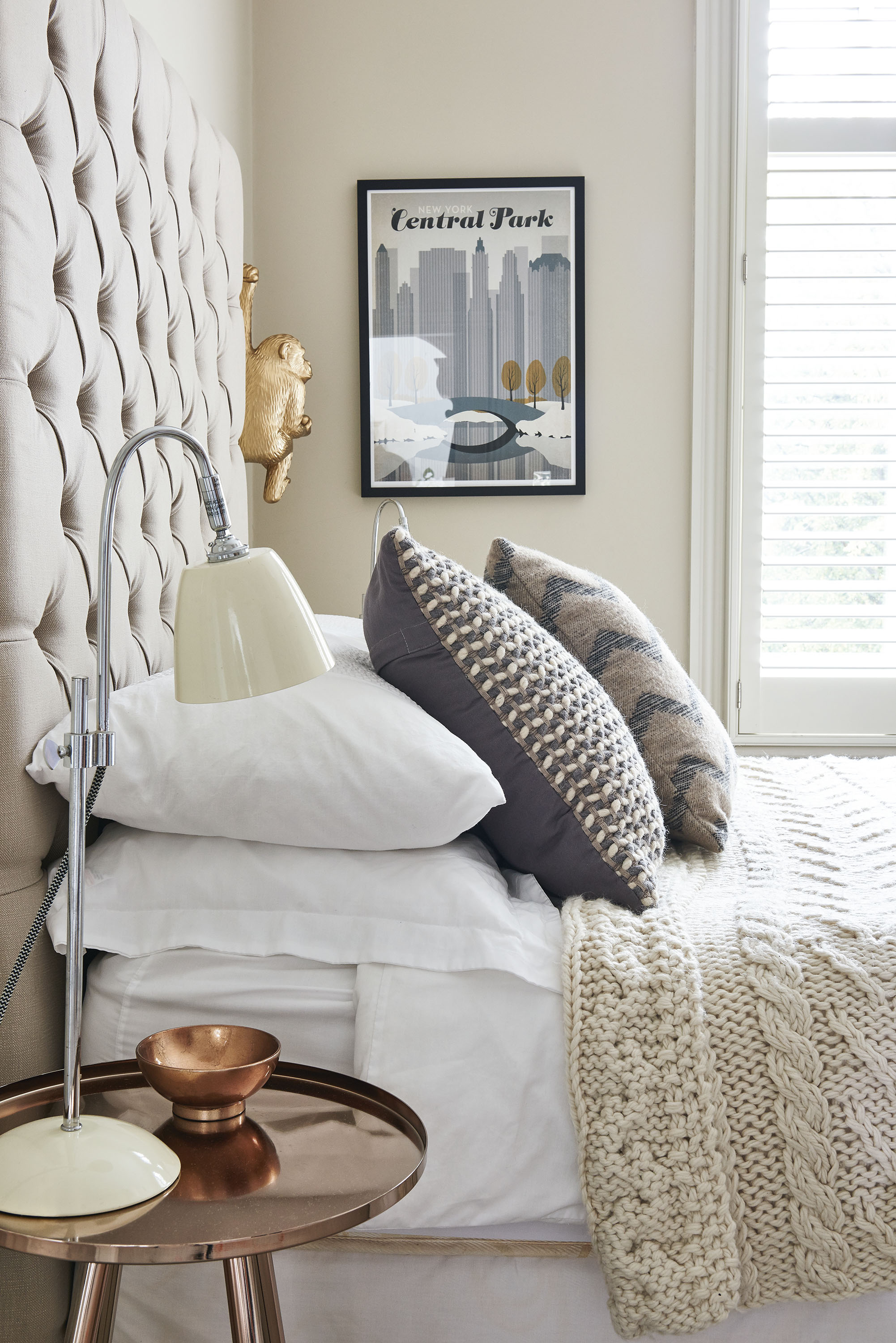
'I’d find it extremely difficult to live in a space that wasn’t really “me”, no matter how “on trend” it was. With interiors, you can’t hide your true style – it will come out one way or another! I’m fascinated with other people’s interiors as it says so much about someone’s personality.'
More from Real Homes
Get inspiration, ideas and advice straight to your door every month with a magazine subscription
'I wanted an eye-catching design for the kids’ room, so I opted for this bold retro-style Spiderman wallpaper – it packs a punch and the boys love it. The other walls are balanced with a calming grey. It’s a children’s room, so it needs to be fun, but I opted for more sophisticated accessories so that the room still feels in keeping with the rest of the house.'
'The extension and renovation was phase one of the project and we’ve since gone on to demolish the old garage at the back of the house, move the drive to the front of the house and build a new double garage with space for a gym/office above. Now I keep looking around the house and thinking “Am I done? What’s next? Shall we move?”'
'One of the nicest parts of the entire project has been the interest from our neighbours – we’ve had some lovely comments about the house since we finished the build. It’s taken a lot longer than we initially thought to complete the additional work that we took on after the house itself was finished, and for that reason it’s turned from a big project into a huge one – but we’re finally happy with it.'
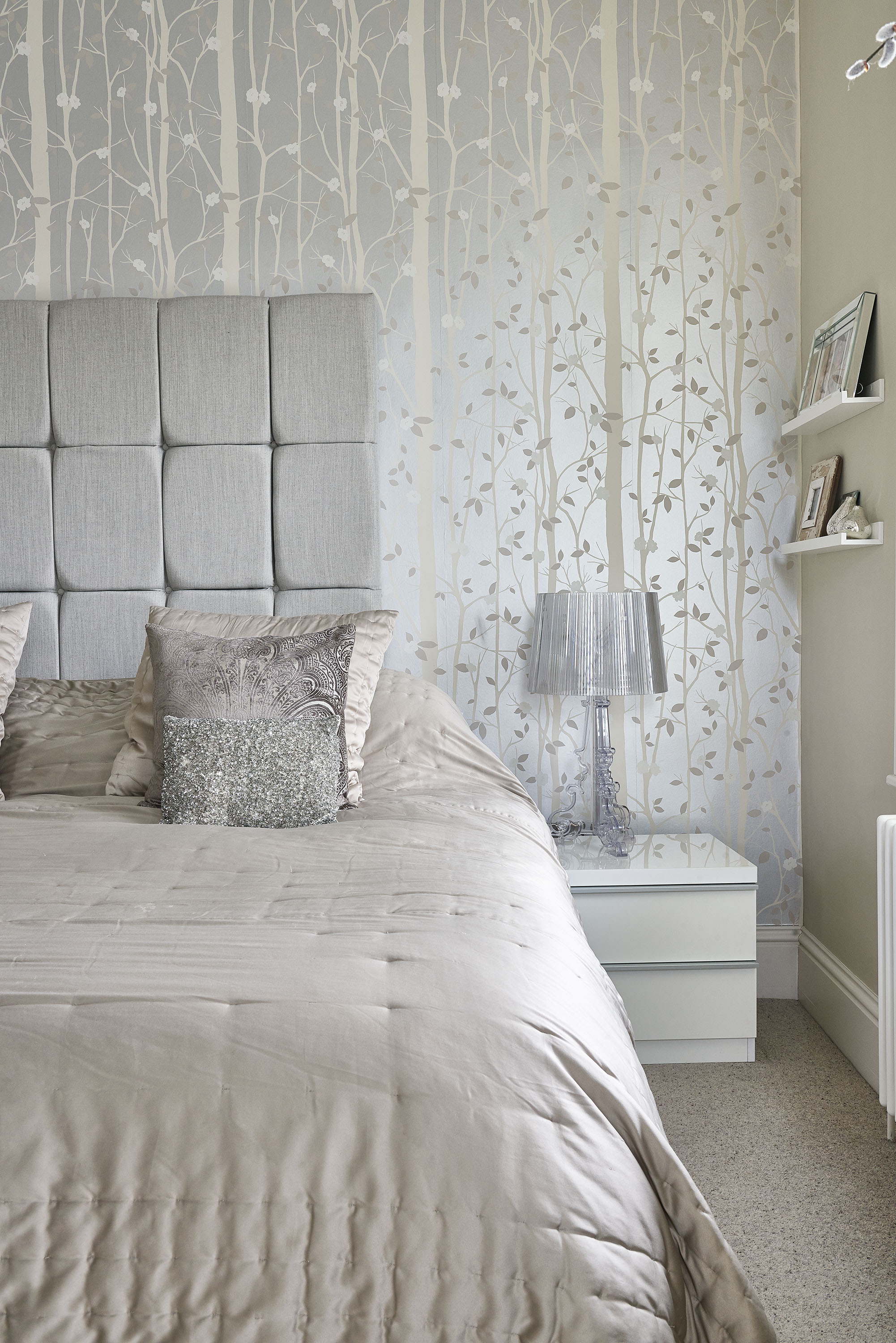
Chandelier, Dwell. Walls painted in Westminster, Sanderson. Cottonwood wallpaper, Laura Ashley. Bourgie table lamps,
Kartell. Armchair, Made.com
'Adding the two-storey extension to the back of house meant we were able to create a spacious master suite. It’s made such a difference to the house and I love our light, bright bedroom with its huge feature chandelier. Although we didn’t make any big changes to our original ideas, we added Velux windows to the landing (where the two roof apexes meet), which weren’t part of the original plan – but we’re really happy with the additions because they flood the landing with light.'

Bathroom, Finishing Touches. For a similar bath, try Soak.com.
For large-format tiles, try Topps Tiles. For a floating vanity unit, try the Monza from Victorian Plumbing
'As a family space, we needed the main bathroom to be practical, but I wanted it to be sophisticated, too. The standalone bath is luxurious but also makes bathtime easy, and the vanity unit has handy extra storage. We chose large-format tiles for a spa-like feel, and over the sink we have a Venetian -style mirror that adds real wow-factor.'
Contacts
- Architect GDA Designs
- Kitchen Ultimo Kitchens
- Bathrooms Finishing Touches
- Garden PALS Landscapes
- Flooring Cheshire Tile Studio
More on Victorian homes
Join our newsletter
Get small space home decor ideas, celeb inspiration, DIY tips and more, straight to your inbox!
-
 This colourful home makeover has space for kitchen discos
While the front of Leila and Joe's home features dark and moody chill-out spaces, the rest is light and bright and made for socialising
By Karen Wilson
-
 How to paint a door and refresh your home instantly
Painting doors is easy with our expert advice. This is how to get professional results on front and internal doors.
By Claire Douglas
-
 DIY transforms 1930s house into dream home
With several renovations behind them, Mary and Paul had creative expertise to draw on when it came to transforming their 1930s house
By Alison Jones
-
 12 easy ways to add curb appeal on a budget with DIY
You can give your home curb appeal at low cost. These are the DIY ways to boost its style
By Lucy Searle
-
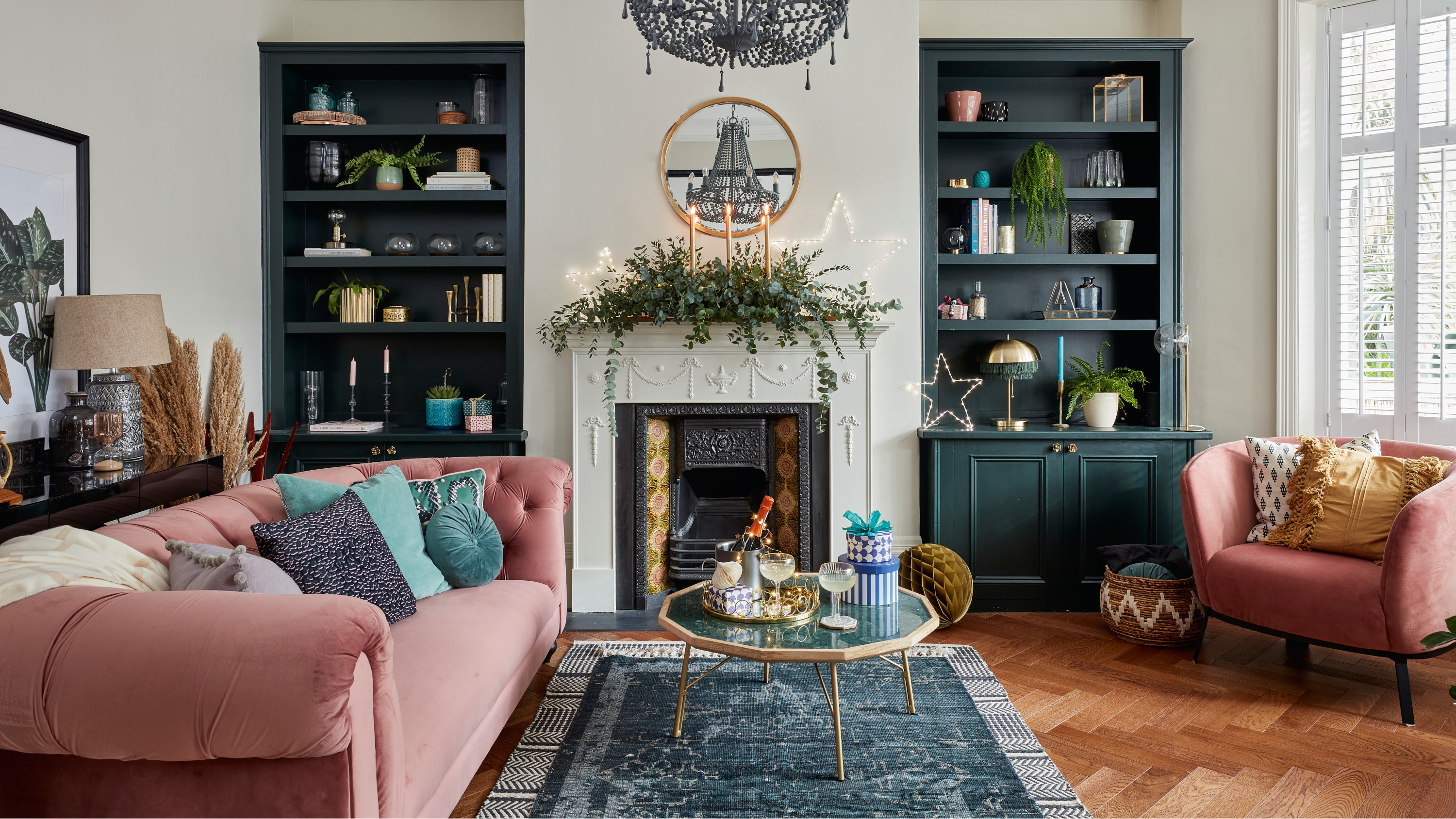 5 invaluable design learnings from a festive Edwardian house renovation
If you're renovating a period property, here are 5 design tips we've picked up from this festive Edwardian renovation
By Ellen Finch
-
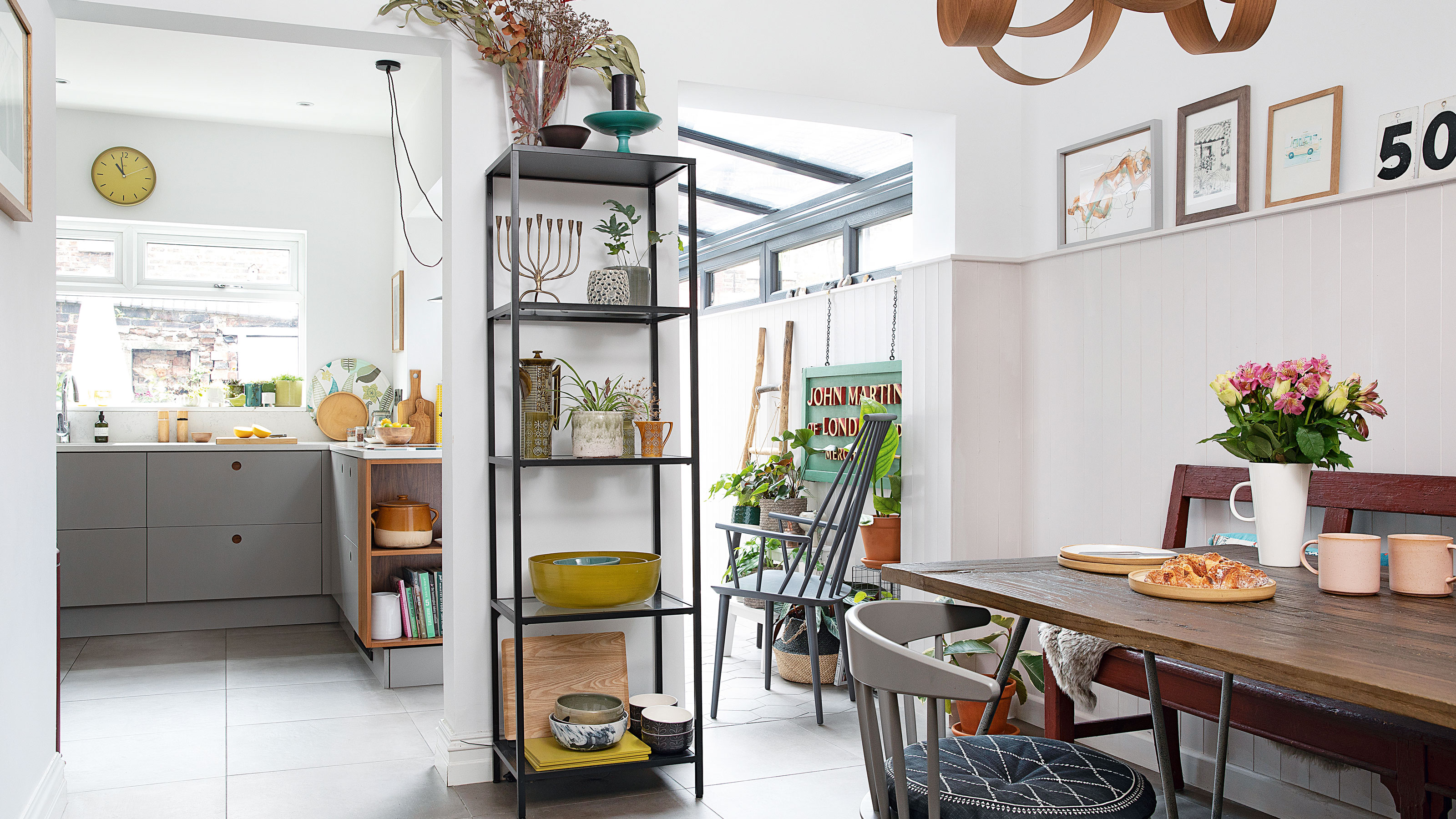 Real home: Glazed side extension creates the perfect garden link
Louise Potter and husband Sean's extension has transformed their Victorian house, now a showcase for their collection of art, vintage finds and Scandinavian pieces
By Laurie Davidson
-
 I tried this genius wallpaper hack, and it was perfect for my commitment issues
Beware: once you try this wallpaper hack, you'll never look back.
By Brittany Romano
-
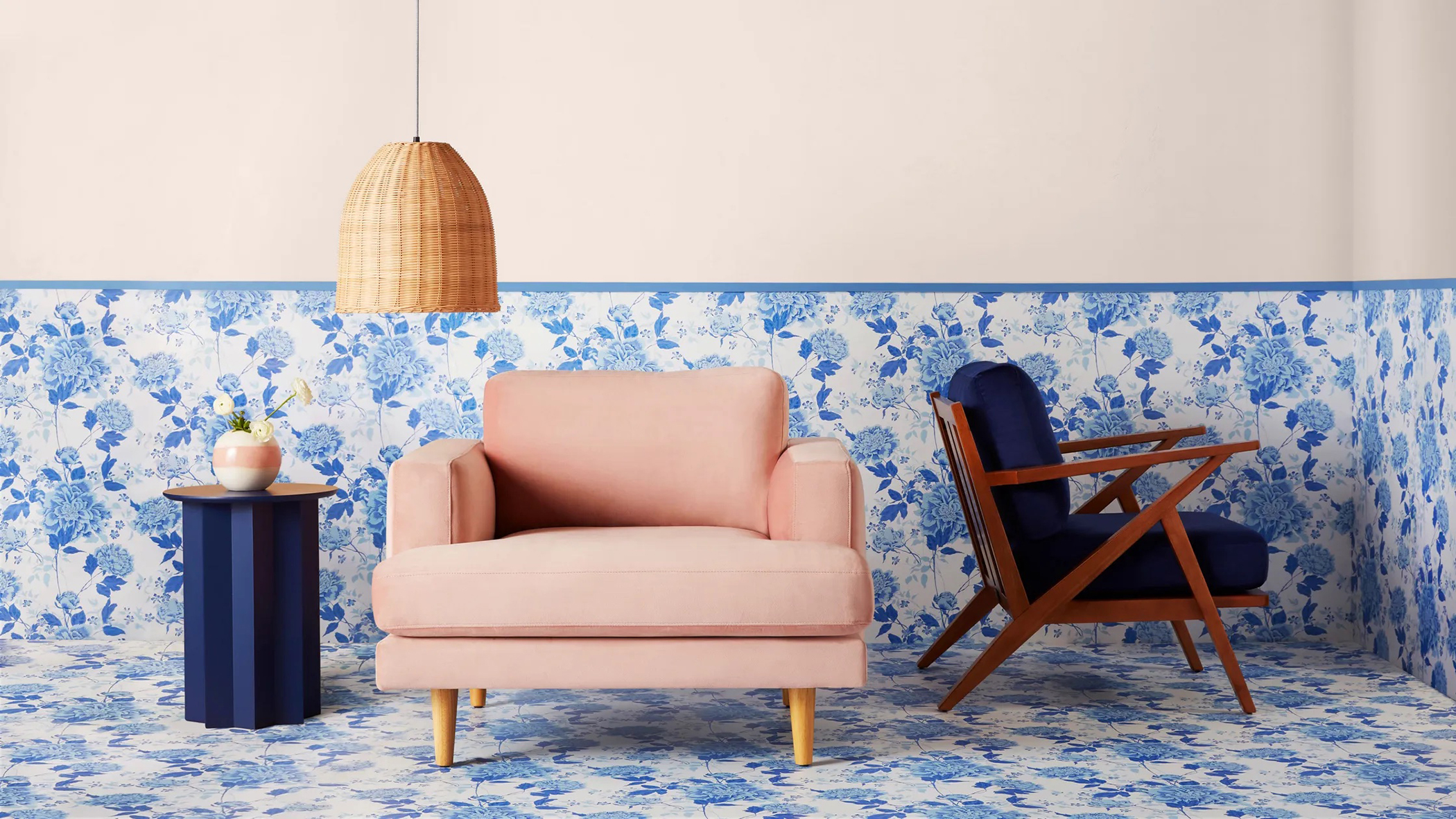 Drew Barrymore's new FLOWER Home paint collection wants to give your walls a makeover
Drew Barrymore FLOWER drops 27 brand-new paint shades, and every can is made from 100% post-consumer recycled plastic.
By Brittany Romano