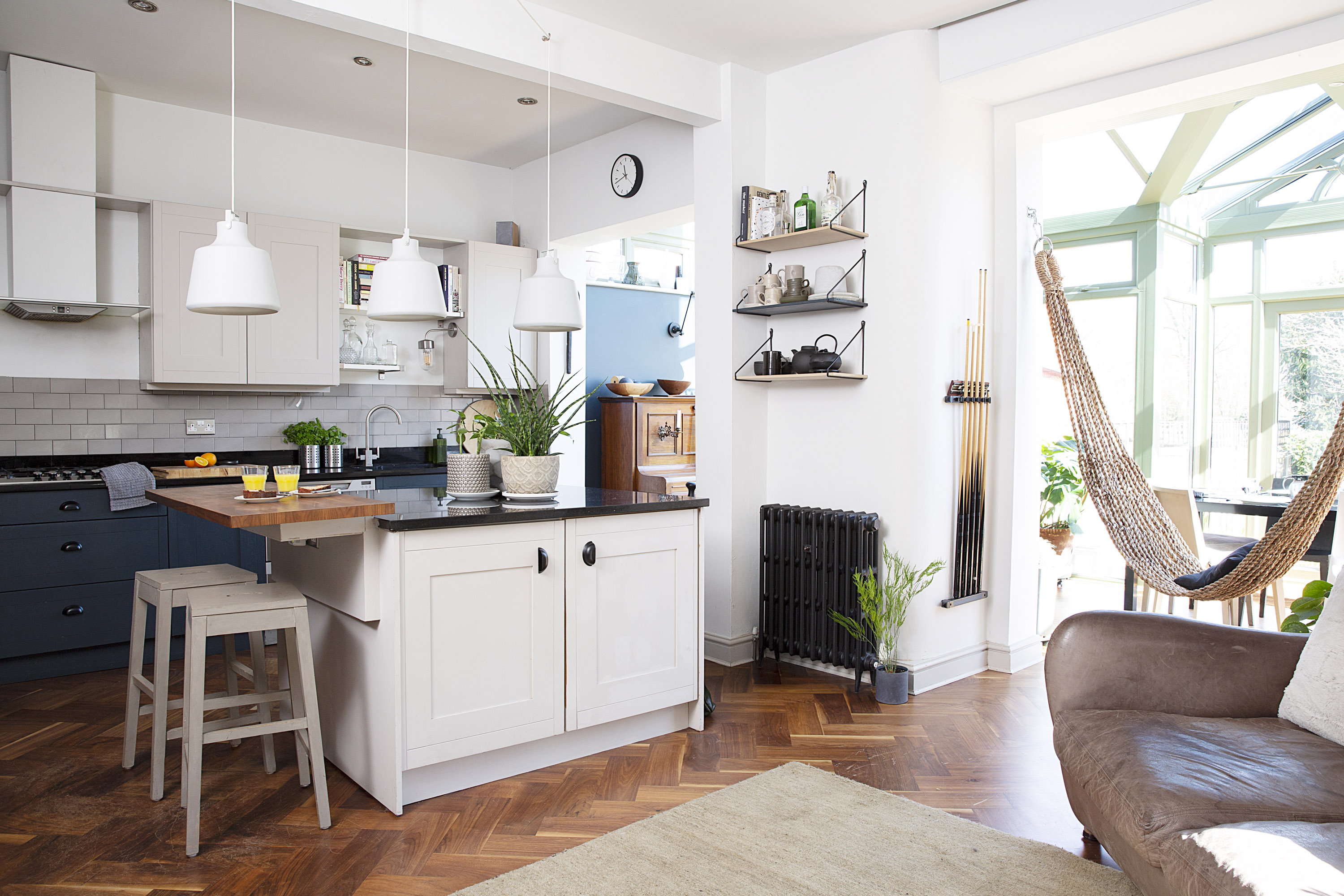

When someone says ‘architect’, what do you picture? It might be sharp lines, double-height rooms or lots of expensive glazing, but the word also encompasses a lot more, as Paula and Andy’s Manchester home shows. Paula has sensitively improved their Victorian house to accommodate the couple’s large family – and plant collection – without sacrificing the property’s beautiful period features.
Paula and Andy have put a lot of love into their home, and from the sophisticated muted green-blue palette to the luxurious hotel-esque loft space, it oozes timeless style. I chatted to Paula to find out how she set about the project – and whether it’s really the chilled-out family home it seems.
Discover more amazing home makeovers on our dedicated page. Read on to find out how the couple have transformed their home.
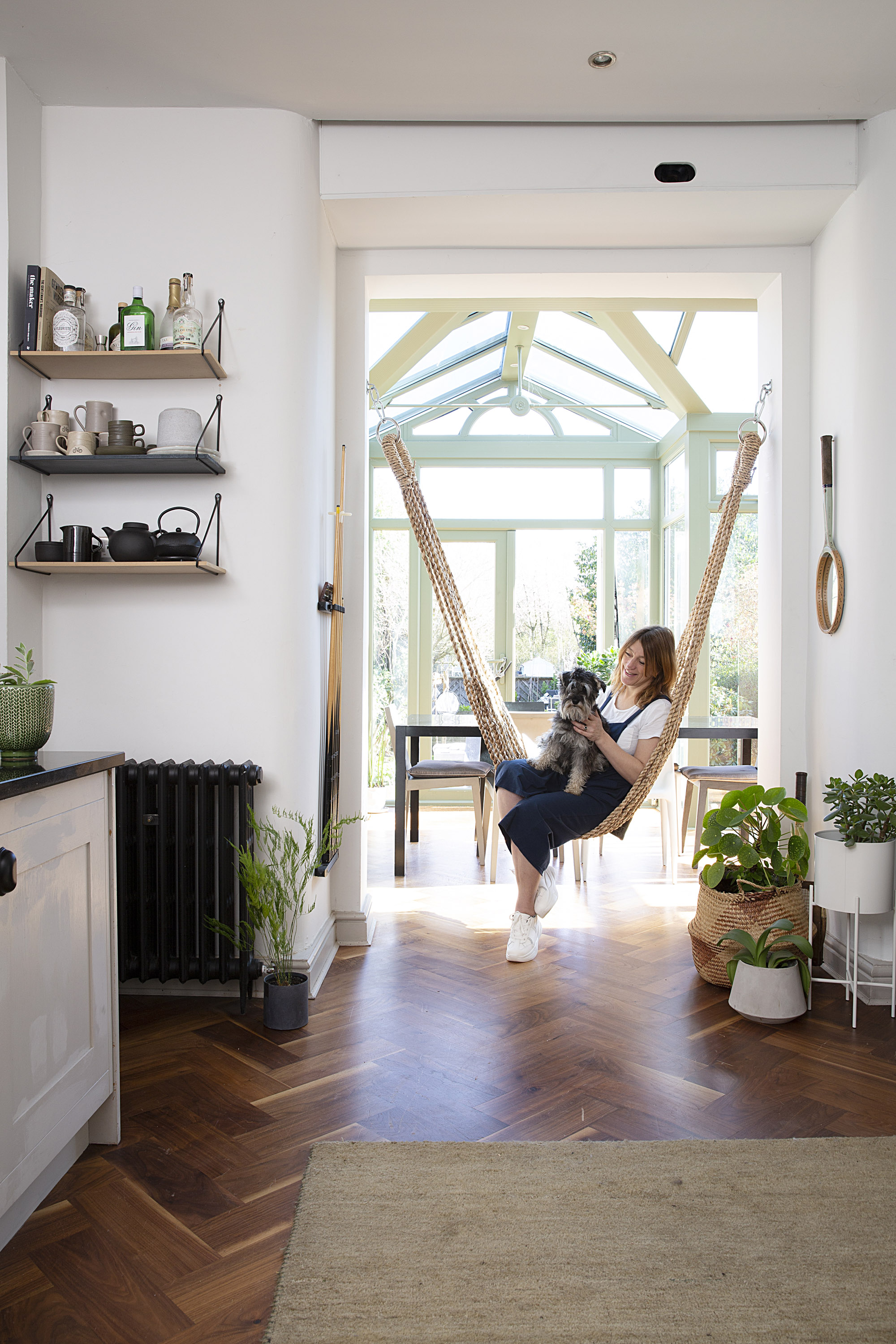
‘Andy fell in love with the hammock in a shop window, so I said, “You can have it, but you’ve got to make it work.” It hangs to the side to open the space up and acts as a divider between the dining room and kitchen/lounge.’ Hammock, Edit & Oak
Q. This house is a bit of a dream! It’s such a gorgeous mix of original features and clean, modern lines. What’s the story behind it – and how excited were you to get it?
A. We bought the house off a lovely family because the couple wanted to downsize. Andy and I had known each other for five years and we were engaged. We initially went for the house next door, which Andy’s friend was selling, but they’d accepted another offer. The estate agent nudged us towards this one, so we went round for a glass of wine and a chat. We were so excited that we bought it before it even went on the market! It took about 10 months to go through. I just remember thinking how privileged we were to have a house like this.
Project notes
The owners Paula Butterfield, an architect, lives with husband Andy, who works for Natural England, children Ruben, 17, Tom, 15, Max, 12, and Soll, 10, their dog, Olive, and cat, Simba
The property A five-bedroom Victorian detached house in Urmston, Manchester
Project cost £80,000
Q. You’ve done a fair bit of work to the property. What was it like when you moved in?
A. It was full of the most amazing wallpaper and patterned carpet. I felt really guilty for getting rid of it, but it just wasn’t to our taste. There was a white uPVC conservatory that we painted green. I told Andy that if we couldn’t paint it, we weren’t buying it! During the first week, we stripped out all the carpets, and we spent months renovating it all. It was about making it suit our family.
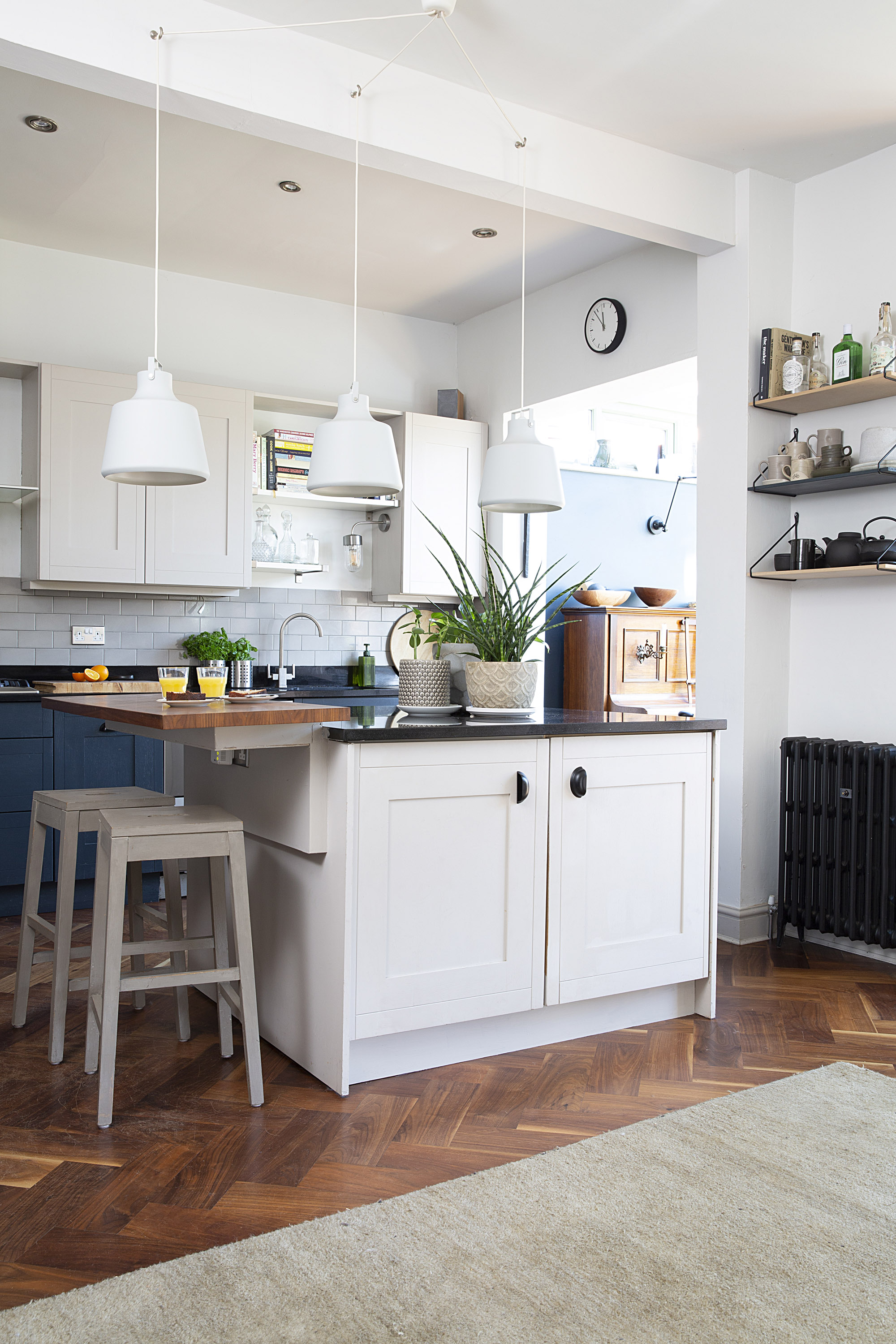
Kitchen painted in Railings, Farrow & Ball. Pendant lights, Made.com. Bar stools and rug, Habitat. Unit handles, Ikea. Metro tile splashback, Fired Earth
Q. With six of you moving in, I imagine that was a mammoth task…
A. The house definitely needed a lot of adapting! The attic floor was previously two bedrooms, but we decided to have all the boys’ rooms on the first floor and create a master up top. We built a utility extension to the side, too. We just didn’t have enough toilets and washing machines. Now, we have washing machines on the first and ground floors, and a locker each to store our bags and shoes.
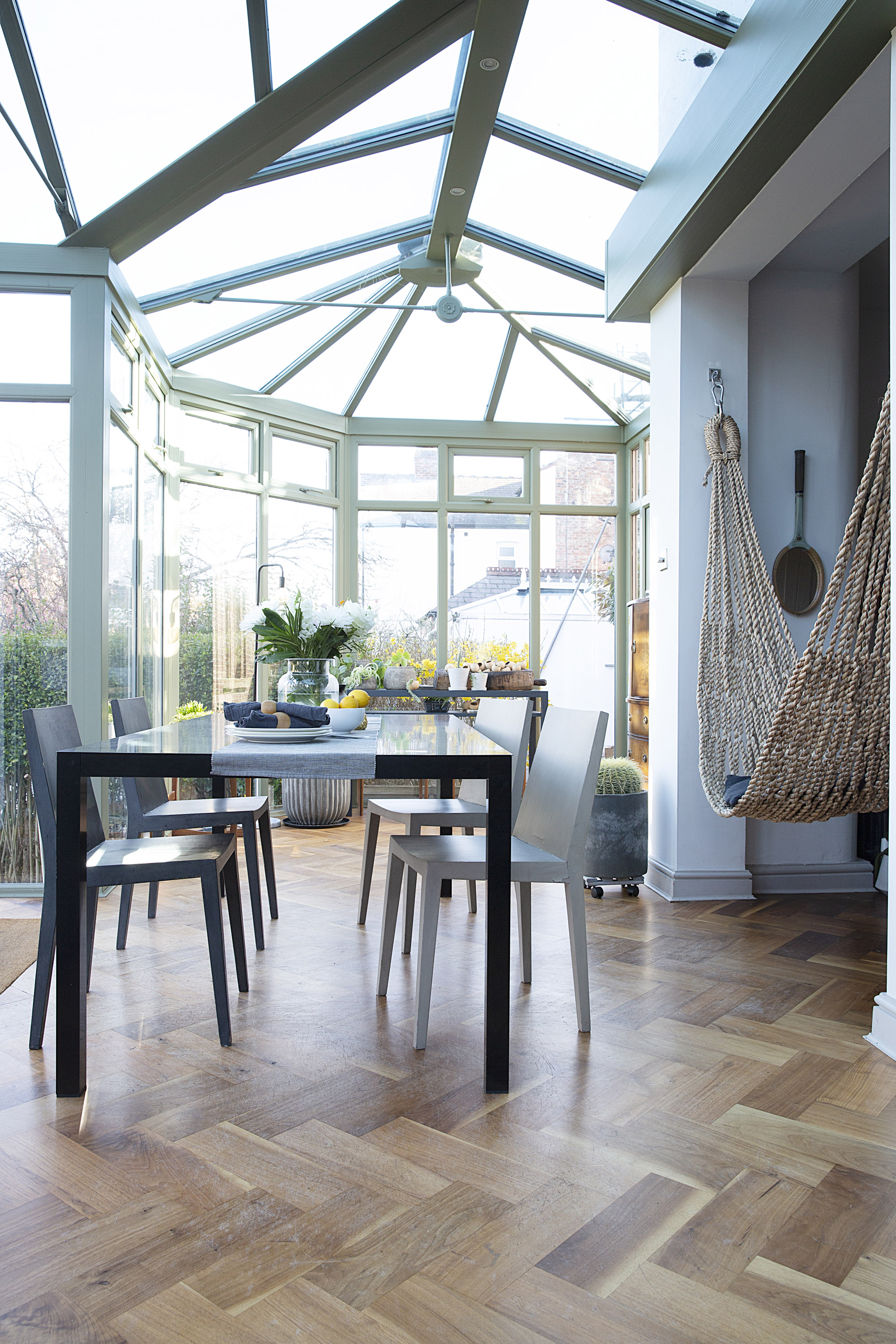
Table and chairs, Habitat
Q. It’s a lot to take on in one go but I imagine, as an architect, you were pretty organised about it all. How did you start?
A. The previous owners very kindly let us go round and measure up before the sale went through. We’d already put together an extensive work schedule and organised builders by the time we completed on the house, so we could put spades in the ground straight away and start the utility extension. Even decorating was expensive. The first quotes came in at the £15,000 mark – the house is big and everything needed stripping and repainting. We stuck to our budget with a few cost-cutting tricks. We kept the existing kitchen, for example, but repainted it and added a wood-burning stove.
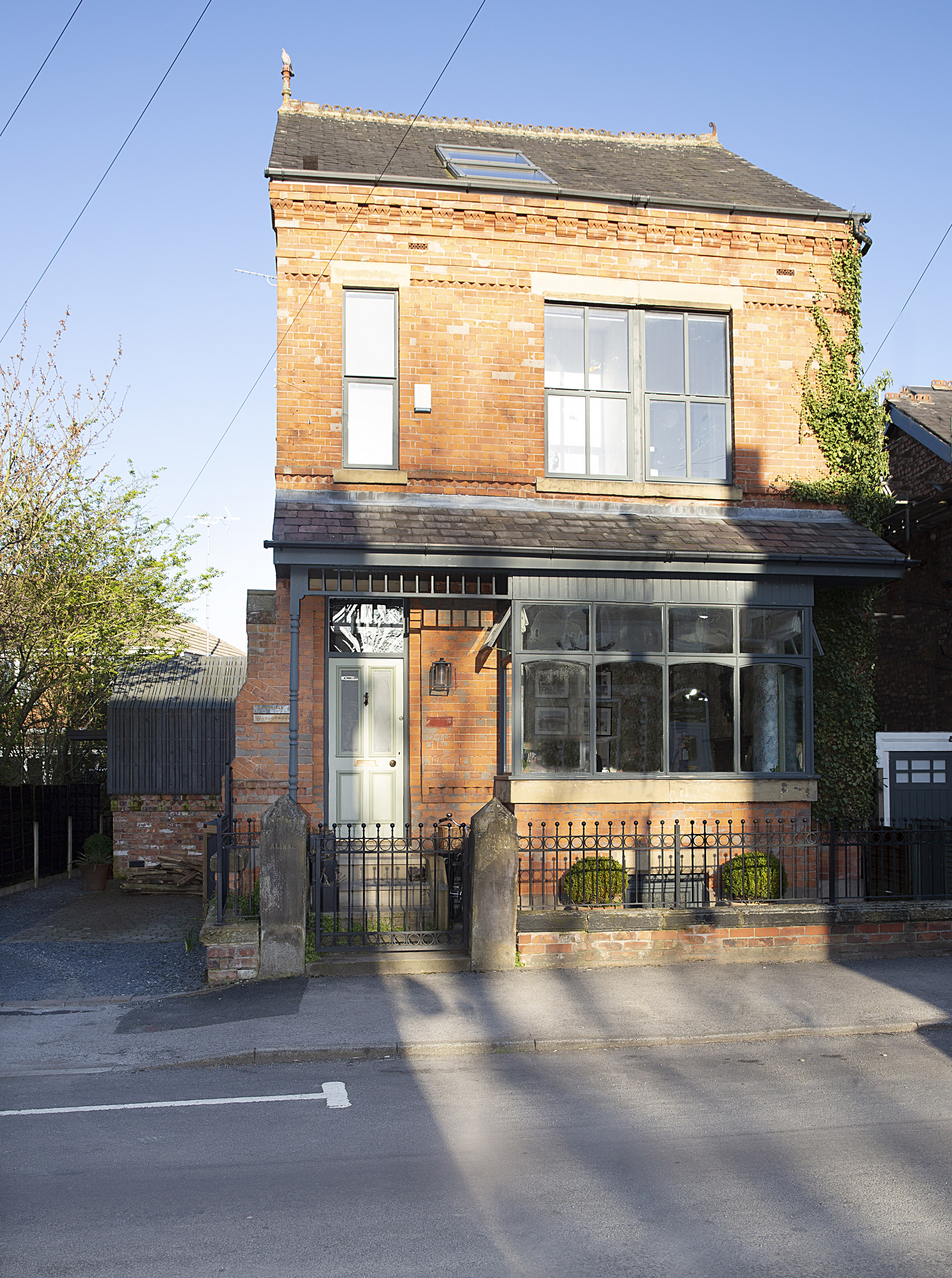
Paula and Andy's Victorian house
Q. There’s something to say for improving on what you already have if you can adapt it for your way of living. What was the biggest challenge of the build?
A. The biggest project we did was the garden. There was a line of trees along one fence that looked really overpowering. We decided we were going to get married in the garden, so for the first summer we spent months digging out tree roots and clearing it all before having decking built. We created our wedding venue, essentially. It was a neighbourly affair – one of our neighbours had recently got married so
they lent us some huge, theatrical letters spelling out ‘Just married’, and another neighbour let us borrow a food tent.
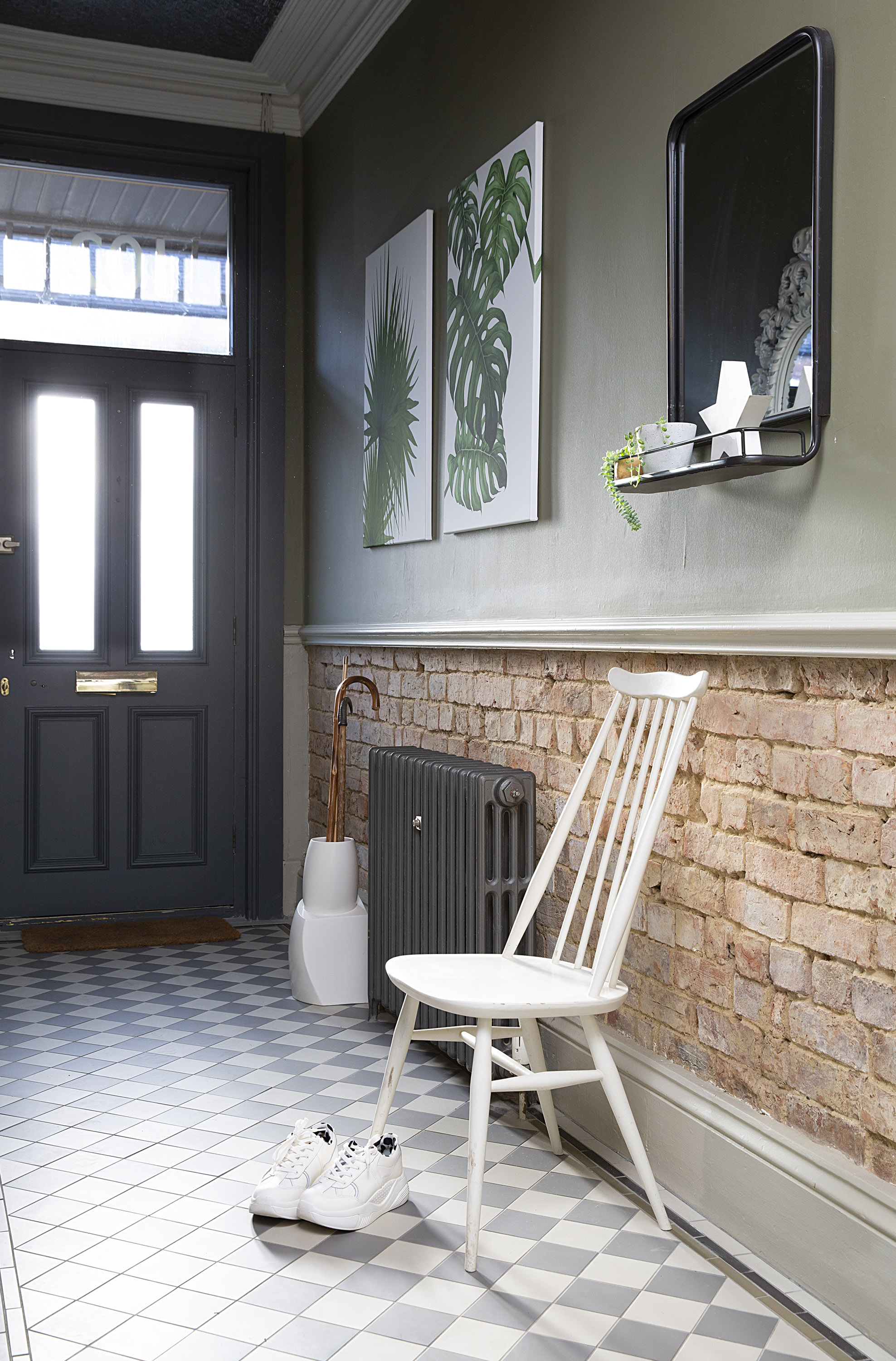
The hallway establishes the scheme of the house as soon as you walk through the door, with Victorian-style tiles, exposed brick and botanical prints. Floor tiles, Original Style. Walls painted in Olive, Farrow & Ball. Mirror, Rockett St George. White chair, vintage Ercol, upcycled with Annie Sloan chalk paint
Q. That’s such a beautiful story! It sounds like it was a real community wedding in the end.
A. (Laughs) It is a good story. Everybody mucked in and we had such a good time – everyone was very neighbourly.
Subscribe to Real Homes magazine
Love your daily dose of Real Homes? Then why not subscribe to our magazine? Packed with fabulous readers' homes, trend features, project advice and easy updates, you'll wonder how you ever lived without it
Q. Back to the house: how did you go about choosing a colour scheme for such a large project?
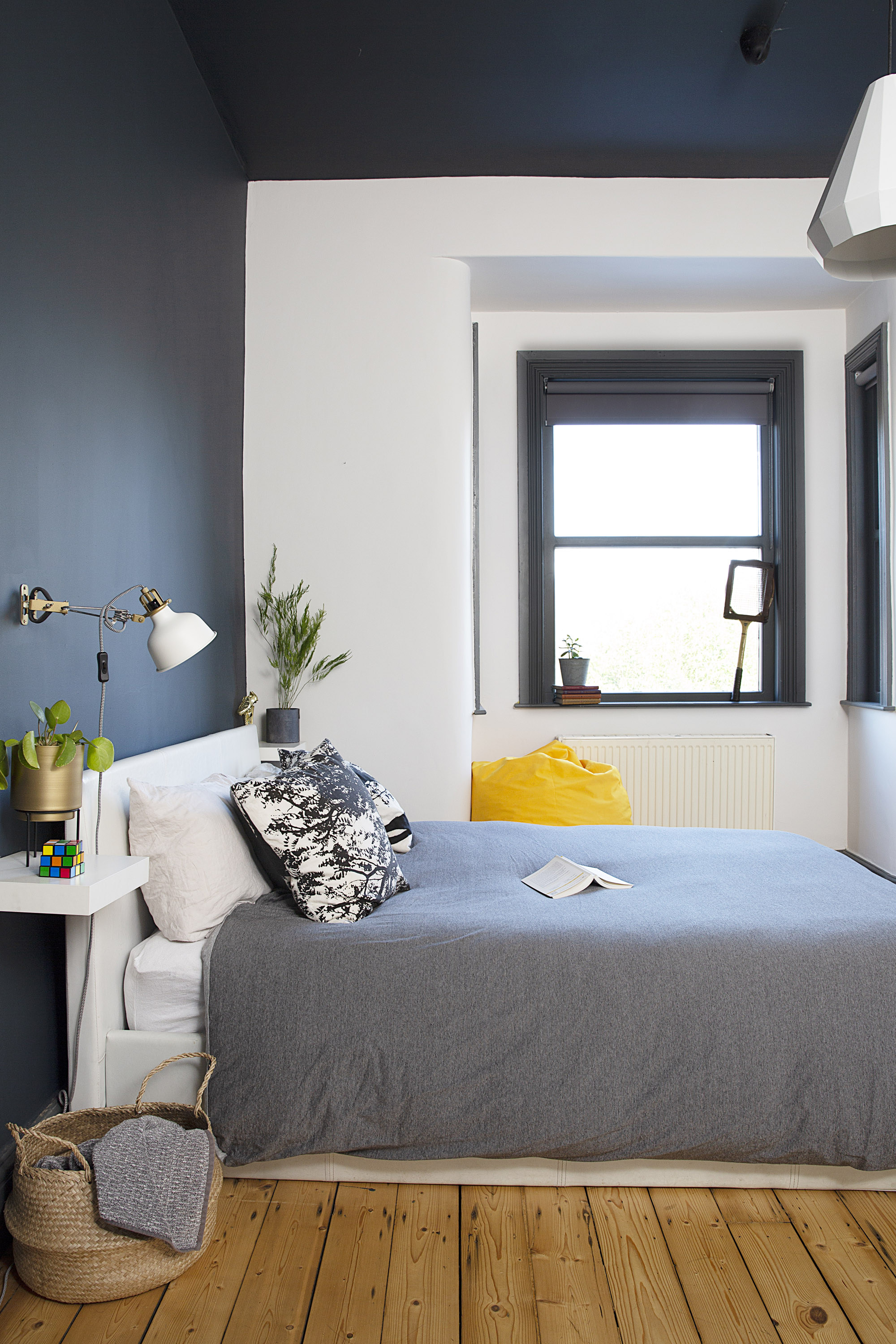
A. I’m really into upcycling and not throwing things away, so anything we had that we could paint, salvage or reuse, we did. I love Farrow & Ball’s greens and greys palette. Dark blue and green weren’t in vogue at the time, but you see them everywhere now! We tested plenty of samples before we moved in so we knew exactly what we were doing. The boys each chose their own signature colours – our only condition was that you couldn’t see them from the hall. That way, they can have their own environment, but there’s still a sense of cohesiveness to the rest of the house.
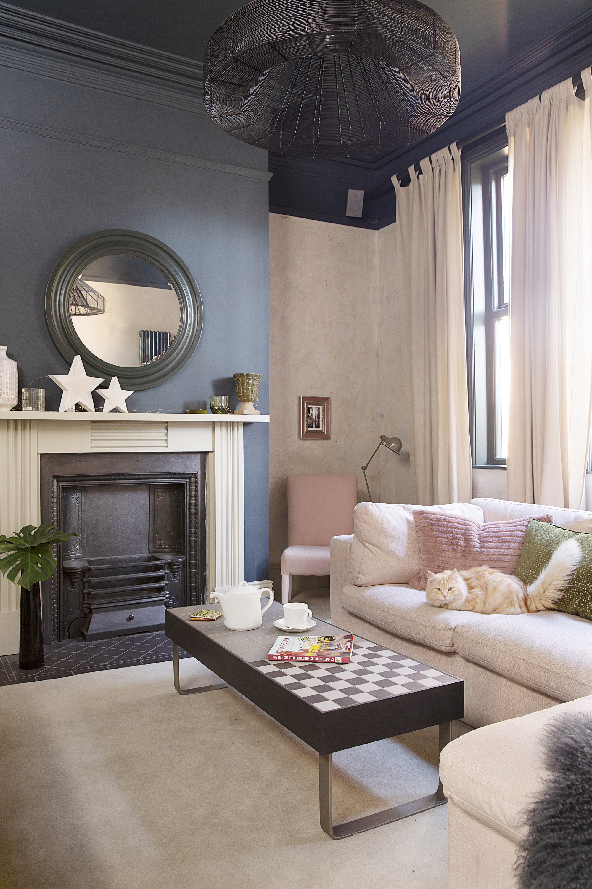
‘This front room is a bit of a hideaway,’ Paula says. ‘The
other rooms are on show, especially the conservatory, so
this is the place to retreat to.’ Carpet, Manchester Carpets. L-shaped sofa, Swoon Editions. Pink cushion, H&M Home. Green cushion, TK Maxx. Ceiling light, Moth. Coffee table, Concrete Juice
Q. The lounge feels a little bit different from the rest of the space, scheme-wise. What were your plans there?
A. The lounge was wallpapered, and when we stripped it off, we found the original plaster underneath, as well as some original paint samples on one wall. We were keen to use the plaster and the samples, so we ended up painting the wall with a round brush to blend it all together. Things like that weren’t planned – we just found original features and worked with them. The living room is a bit of a hideaway in comparison to the rest of the downstairs. It’s snug and a bit darker, cosier – a place to retreat to, especially in the winter months.
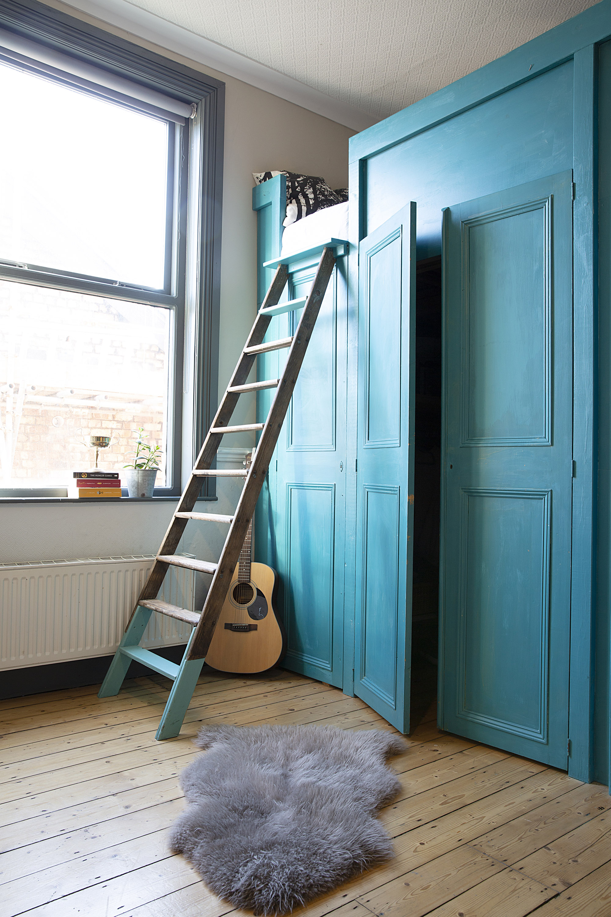
This house is one of those that’s literally never finished. There’s always something to do. Ruben’s bedroom is next: we’re moving his drum kit to the basement and adding lots of plants in to make it more adult.’ For a similar blue paint, try
St Giles Blue, Farrow & Ball
Q. I love the broken-plan layout of the ground floor –
it’s a clever way of creating social, but defined, living areas. How does the space work in reality as a big family?
A. One of the things we thought would be a problem with a big house is that we’d never see each other. That’s why it’s important to have a living space that accommodates a family. Everyone can do their own thing, whether that’s homework, playing music or watching TV, but it still feels like we’re all together. The kitchen itself is big enough for six people, since we love cooking together. We’ve had to be clever with using space, though. There’s a projector above the stove for TV nights, and we have a pool table top and a table tennis net that can be added to the dining table in the conservatory. It makes it an amazing party room – and we’ve all thrown plenty of bashes in there!
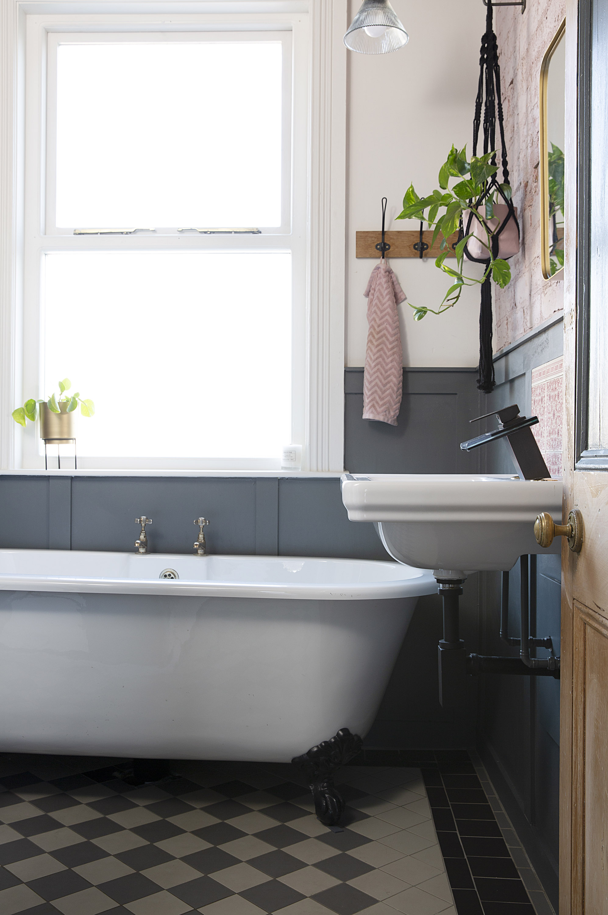
The muted blue palette continues in the bathroom, contrasted with plaster-pink brickwork and traditional Victorian tiled flooring. Floor tiles, Original Style. Towel hooks, Habitat. Bath, Victorian Plumbing. Sink, Vitra. Tap, TradeTaps
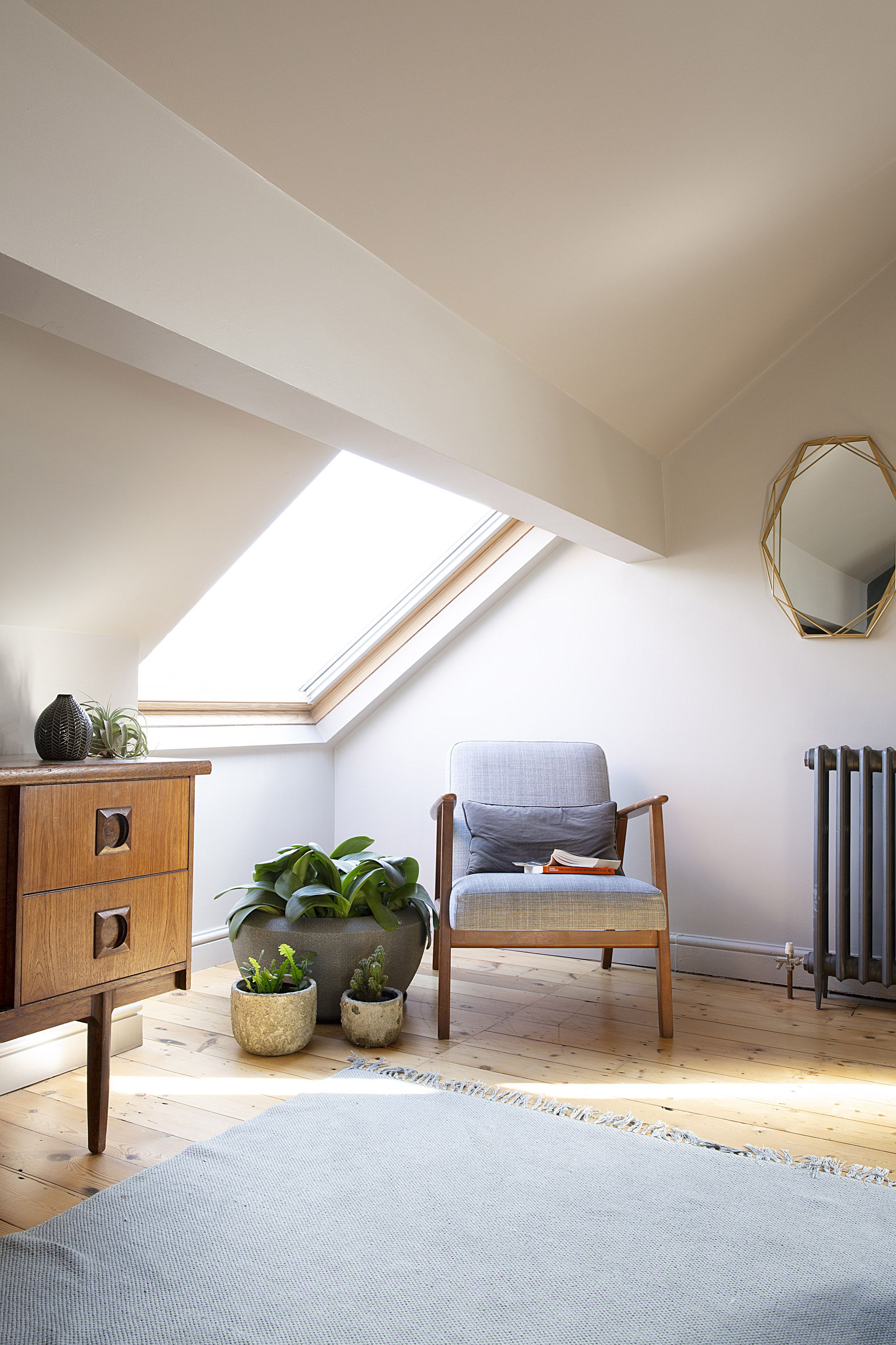
'I knew exactly what I wanted to do with this space. It’s very hotel-like' says Paula
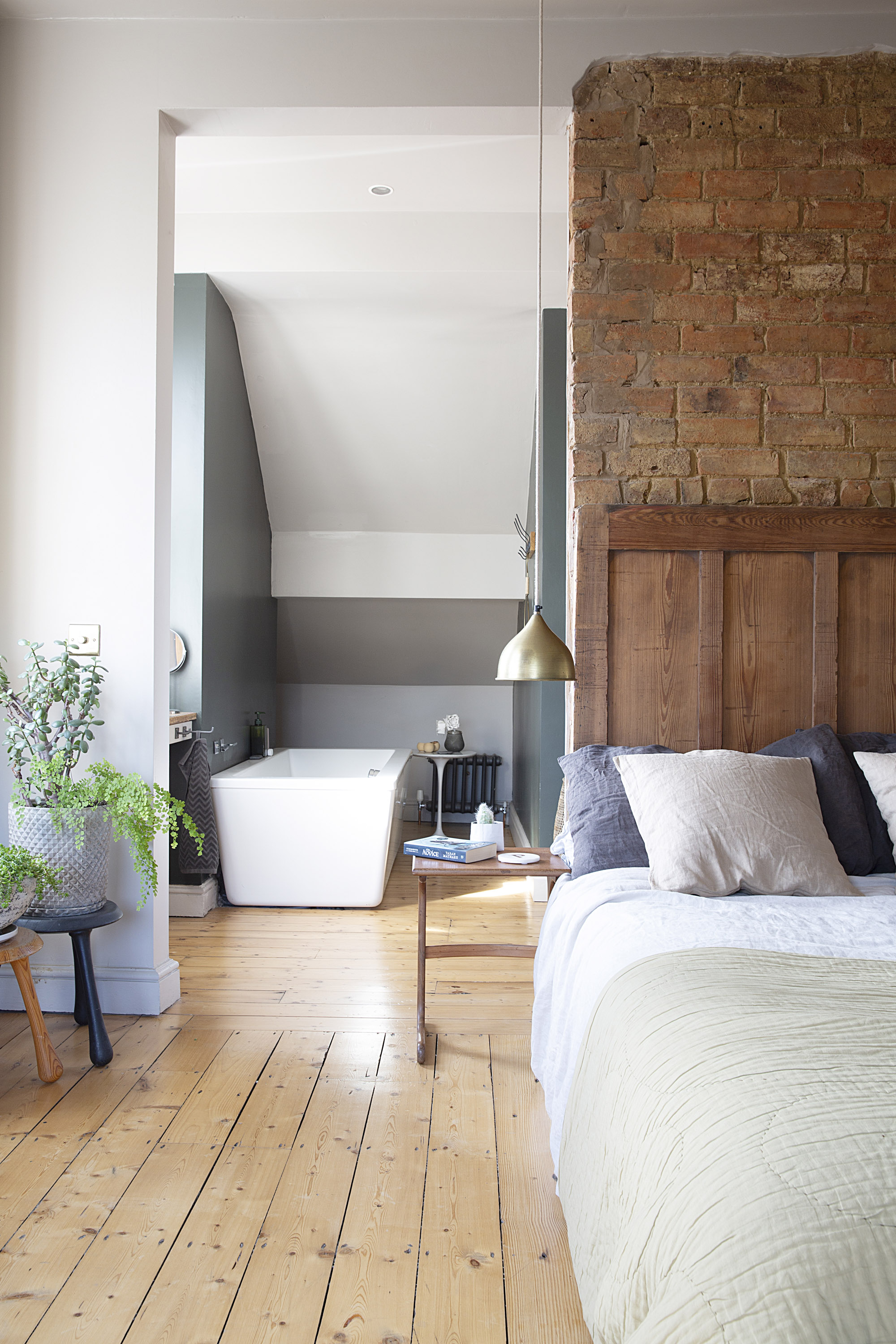
I wanted an open-plan bath area and we kept a wall in so that the bed has something to back onto.’ The bed is bespoke, designed by Paula and made by Andy. Bed linen, Dunelm. Throw, Heal’s. Stools, Habitat. Bedside tables and sideboard, G Plan; try Ebay. Large grey planter and gold mirror, TK Maxx. Armchair, Ikea. Grey rug, Moth of West Didsbury
Contacts
- Architect: Butterfield Architecture
- Structural engineer: BDI Structural Solutions
Join our newsletter
Get small space home decor ideas, celeb inspiration, DIY tips and more, straight to your inbox!

Formerly deputy editor of Real Homes magazine, Ellen has been lucky enough to spend most of her working life speaking to real people and writing about real homes, from extended Victorian terraces to modest apartments. She's recently bought her own home and has a special interest in sustainable living and clever storage.
-
 Victorian houses: get to know your period home's design
Victorian houses are a ubiquitous sight across UK towns and cities. Discover design influences, identify key architectural details, and solve maintenance issues with our expert guide
By Lee Bilson
-
 Real home: we renovated a Victorian terrace with a modern loft conversion
Jason and Kevin transformed an unloved home into a dark and moody Victorian masterpiece – take a tour here
By Ellen Finch
-
 Real home: a colourful and creative Victorian house
This personality-packed home is filled with eye-catching walls, cool DIY ideas and decorating schemes you'll love to try
By Ciara Elliott
-
 Terraced house design: 11 ideas to transform a Victorian property
These terraced house design ideas offer flexibility and variety. Get an idea of what can be achieved with our pick of amazing transformations
By Lucy Searle
-
 Real home: a redesigned power station penthouse
Danielle Kingdon and Russell Dawkins gutted their top-floor flat in a converted power station to create a more practical layout for accessible living
By Anna Cottrell
-
 Real home: a 1960s house with modern extension
Su and Jim Bonner doubled the size of their 1960s house with an ultra-modern extension
By Victoria Jenkins
-
 Real home: a traditional side return kitchen extension
Nicola and Ed Legget updated their kitchen and extended to create a spacious dining area
By Alison Gibb
-
 Real home: a carefully renovated Victorian watermill
A piece of English history brimming with original features, this Victorian watermill has been lovingly renovated for modern living
By Owen Collins