What inspires you? Whether you get your decorating ideas from Scandi Instagram accounts or emulate Mid-century masterpieces with Eames chairs and teak furniture, everyone leans towards a certain style when it comes to their home – even if that style is ‘mix and match’.
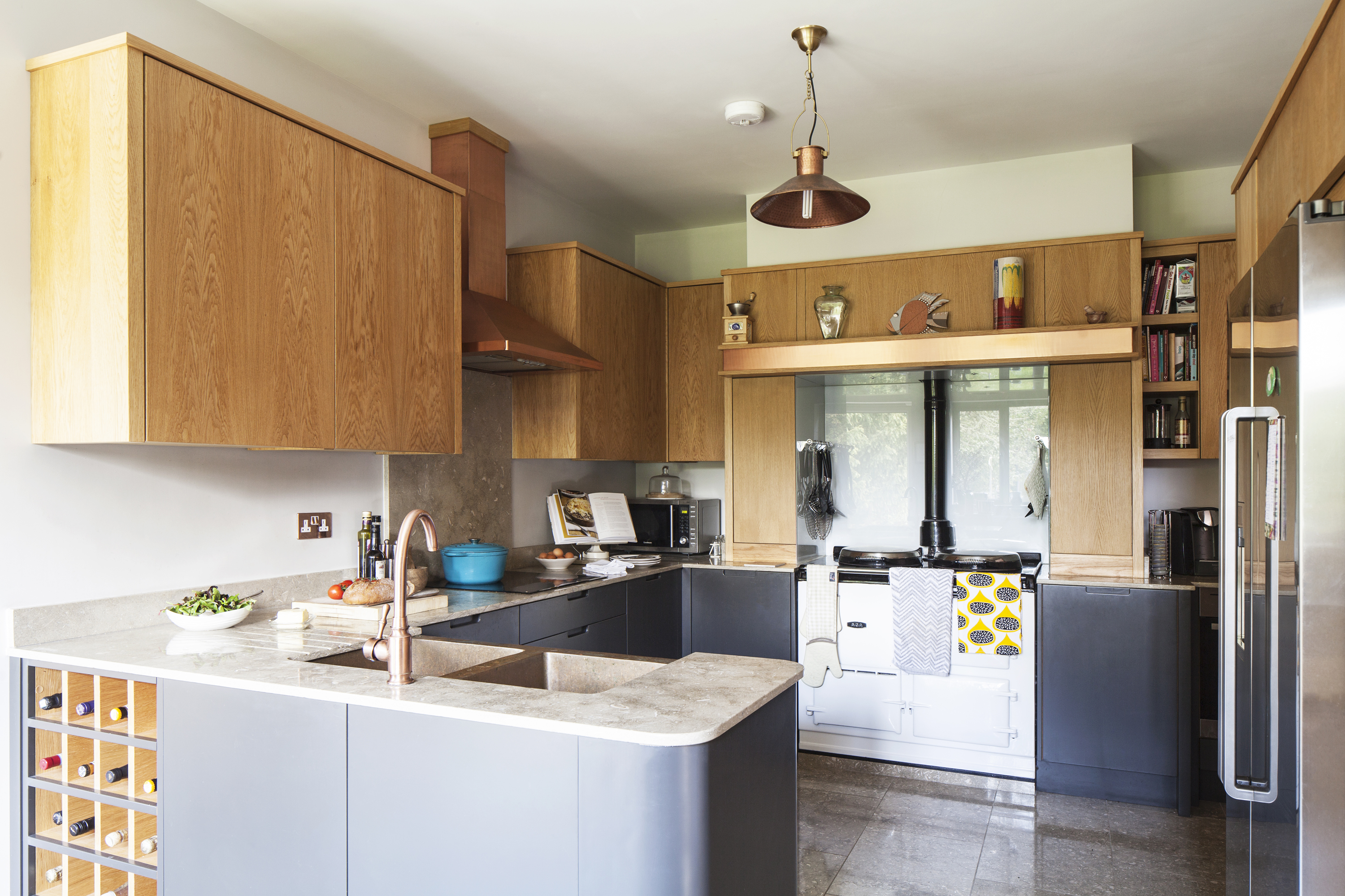
For Karla and Adam, the Arts and Crafts movement that dominated design at the turn of the 19th century was the driving force behind renovating their bungalow and creating their new kitchen. Natural wood units and exposed oak beams lend the space its cosy, comforting feel, while copper accents add a contemporary edge. Read on to find out how they did it… then check out all our real home transformations. Find out how to design the kitchen of your dreams with our ultimate guide, too.
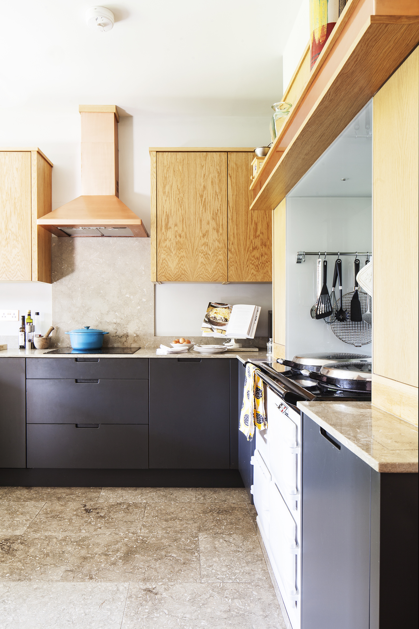
Bespoke kitchen units, Chordal Green. Ceiling, walls and woodwork painted in Dusted Moss 1, 2 and 3, Dulux
Profile
The owners Karla Bradstock, a client relationship manager for a pension administration specialist, lives with her husband Adam, a builder and landscape designer, and their daughters Freya, 10, and Florrie, eight.
The property A 1940s semi-detached home in Farnham, Surrey.
Project cost £44,000 for extension and fitting out the space.
‘We were in the throes of a bungalow-to-house conversion when we tackled our kitchen,’ Karla says. ‘Adam prepared drawings and submitted the planning application for the project. When permission came through, we moved into our neighbours’ home – they were abroad for three months – and Adam worked flat out
to complete all the structural work.
‘We decided we’d extend by three metres to create room for a dining area and a door into a new utility room, and Adam wanted exposed beams in the double-height space. The house is clad in oak and designed with a nod to the Arts and Crafts era so the oak beams tie in well, and we like the fusion between old and new.’
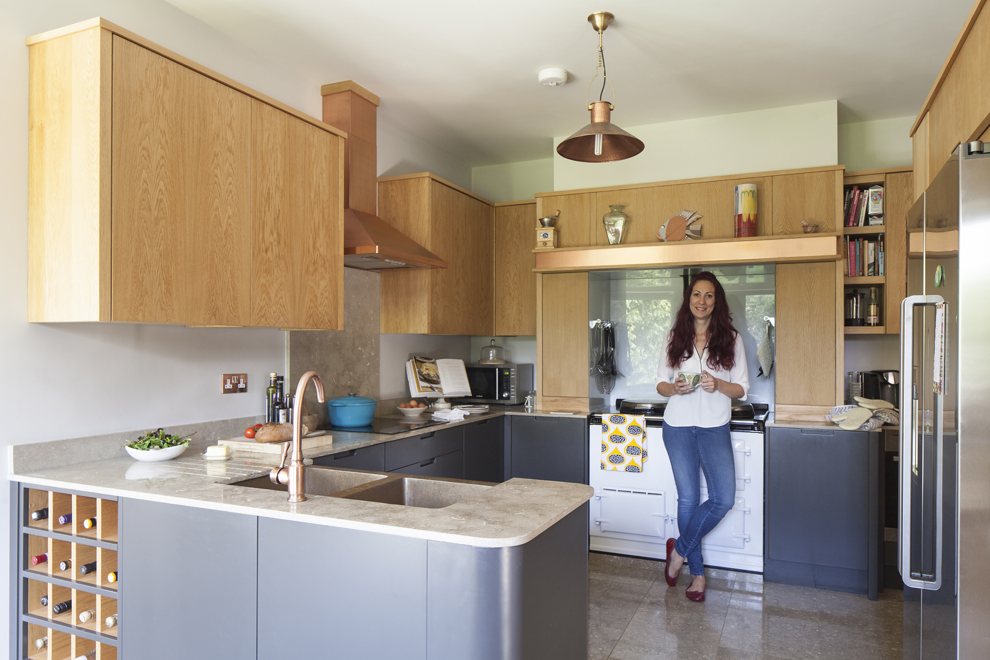
For a similar tap, try Abode’s Pronteau from Tapstore. For a similar sink, try Sinks.co.uk
‘We planned the kitchen layout around the original Aga to avoid any additional costs that might have come with removing and relocating the chimney. We didn’t want to be completely open-plan to the living-dining room, so we put in a second doorway to improve the flow but keep the separation.'
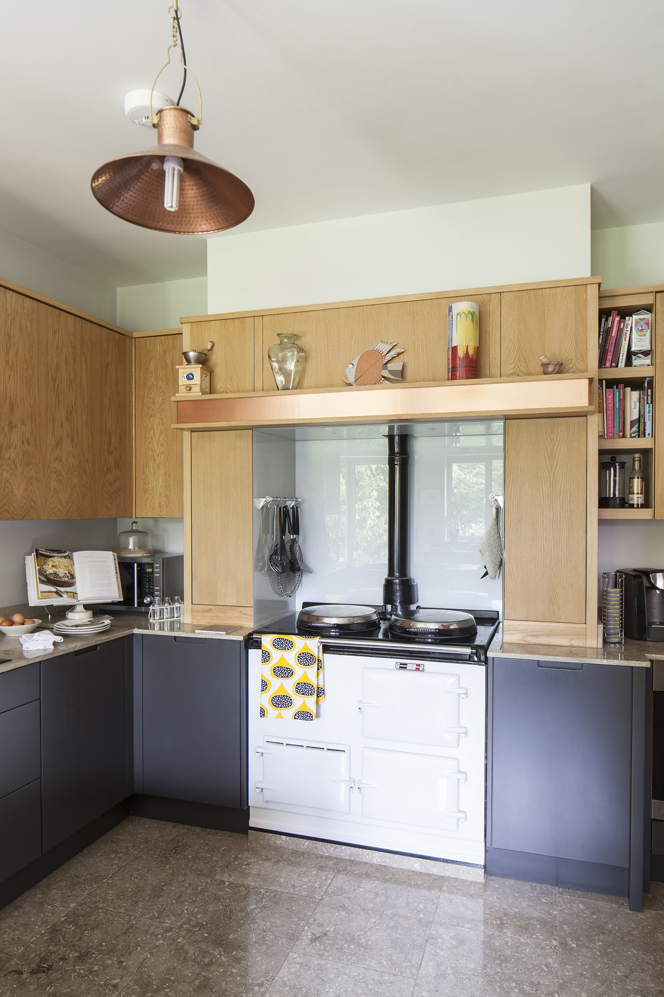
For a similar cooker hood, try the Elica Dolce copper cooker hood from Angel Appliances
More from Real Homes

Want more kitchen content? Get inspiration, ideas and advice straight to your door every month with a magazine subscription.
'The design divides the main cooking area from the work station where I keep my baking equipment and where we make toast and sandwiches as a family. Making the space functional was important – the curve at the end of the peninsula was scaled back to allow room for the pull-out cupboards and fridge-freezer doors.
‘The build took an intense three months, after that we moved back into a shell of a house. Adam worked his way through the rooms for the next few years, but the kitchen was a priority.
‘At first, we investigated copper cabinets, which is how I came across furniture makers Chordal Green as they’d designed something similar for a bar. They produced an initial design, but we decided the copper looked too “blingy” and would be impractical with a young family. We changed tack and decided to make copper a feature instead of the main event.
‘I struggled to find a tap and cooker hood in a contemporary copper style that was still within our budget, so Chordal Green suggested copper plating ordinary steel products.’
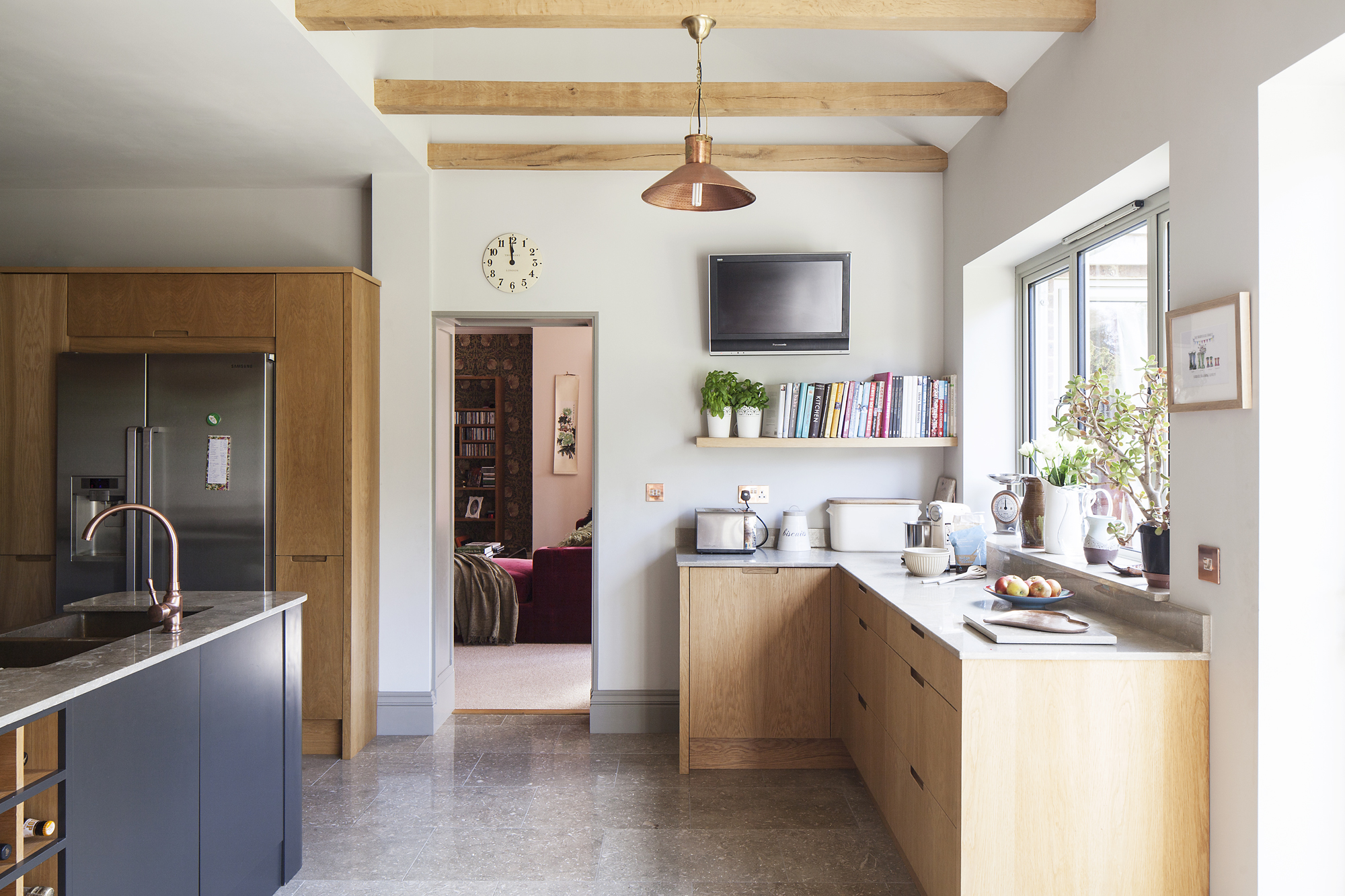
Copper sockets, Sockets & Switches. Windows, Trade Window Supplies
‘Chordal Green went on to plan the layout, and they made the kitchen in their workshop. Natural limestone really appealed to us for the floor and worktop, even though the porous surface isn’t usually recommended in kitchens.
‘We settled on an unpolished finish to help disguise any marks, but there ended up being a mistake in our order that resulted in polished limestone. Acidic spills like lemon or wine do dull the polish, but we wouldn’t choose anything different now – we love the fossil detail and we can always repolish the surfaces.’
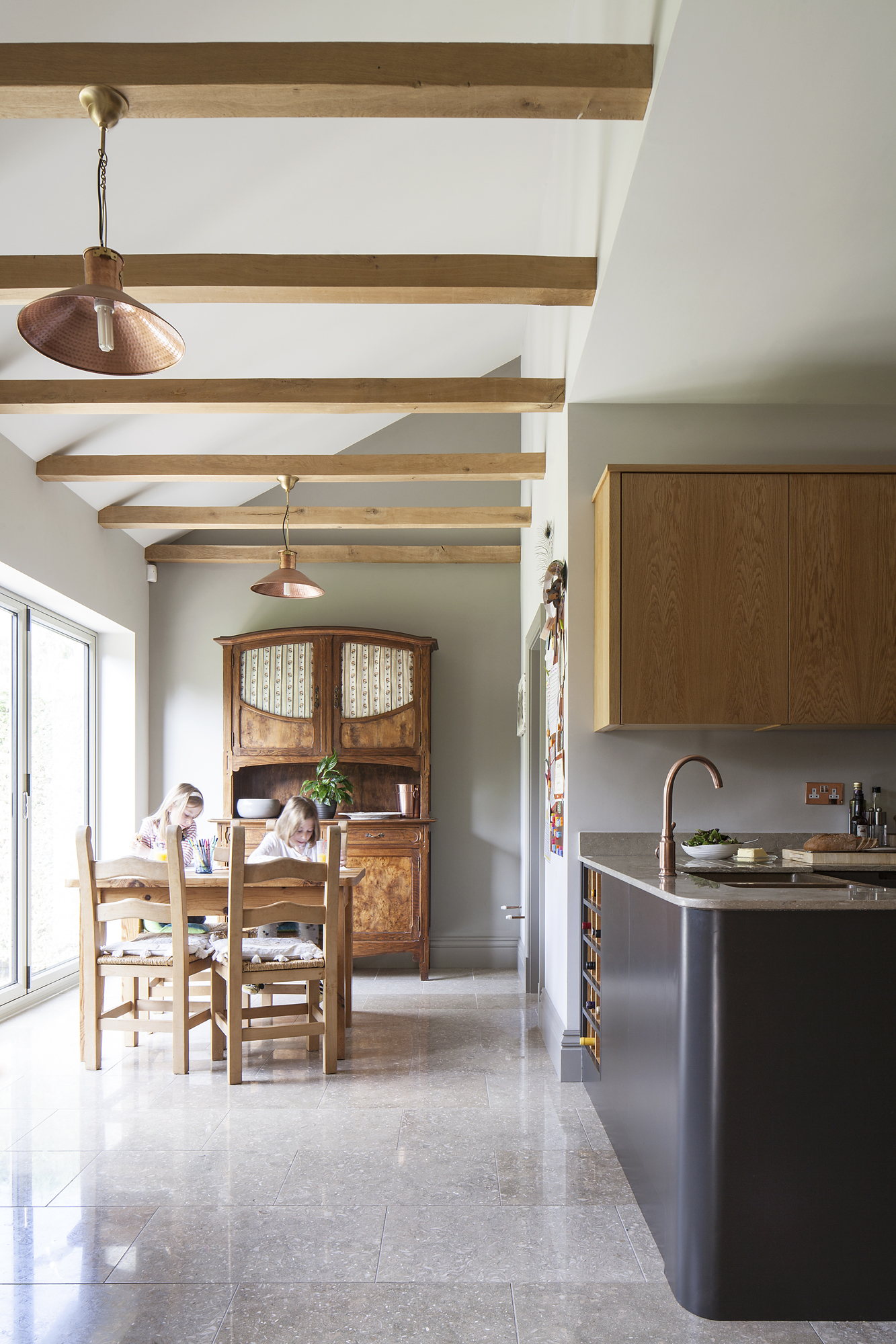
Sliding doors, Trade Window Supplies. Copper light, Not on the High Street. For a similar dining set, try the Corona by Home & Haus at Wayfair
‘Adam, a builder and garden designer, has always liked copper within a garden scheme because of the patina that naturally forms, but our modest budget had to work hard to fulfil our design ambitions. Copper doesn’t seem so original now, but at the time it was a real challenge for me to find all the products at prices we could afford.
‘Now our house is completely finished, we can truly appreciate how our kitchen works within it. The kitchen is the only room in the house that’s come in on budget. The layout really suits us – we sit and eat in here every day, and one of us is always hovering by the Aga in winter. We love the oak beams, the oak cupboards and drawers, and the copper works really well with the wood.’
Contacts
- Design and construction Adam Bradstock Design & Build
- Windows and doors Trade Window Supplies (TWS)
- Kitchen Chordal Green
- Worktop and flooring Alpha Marble & Granite
More real homes to browse:
Join our newsletter
Get small space home decor ideas, celeb inspiration, DIY tips and more, straight to your inbox!
-
 You won't believe this stunning five-bed family home used to be a tiny two-bed
Katie and Stuart went big with a double-story extension to create a dream space for themselves and their daughters
By Ifeoluwa Adedeji
-
 The freestanding bath in this dreamy bedroom is sheer five-star luxury
Emma and Martin wanted a suite just like in an upscale hotel — mission totally accomplished.
By Ellen Finch
-
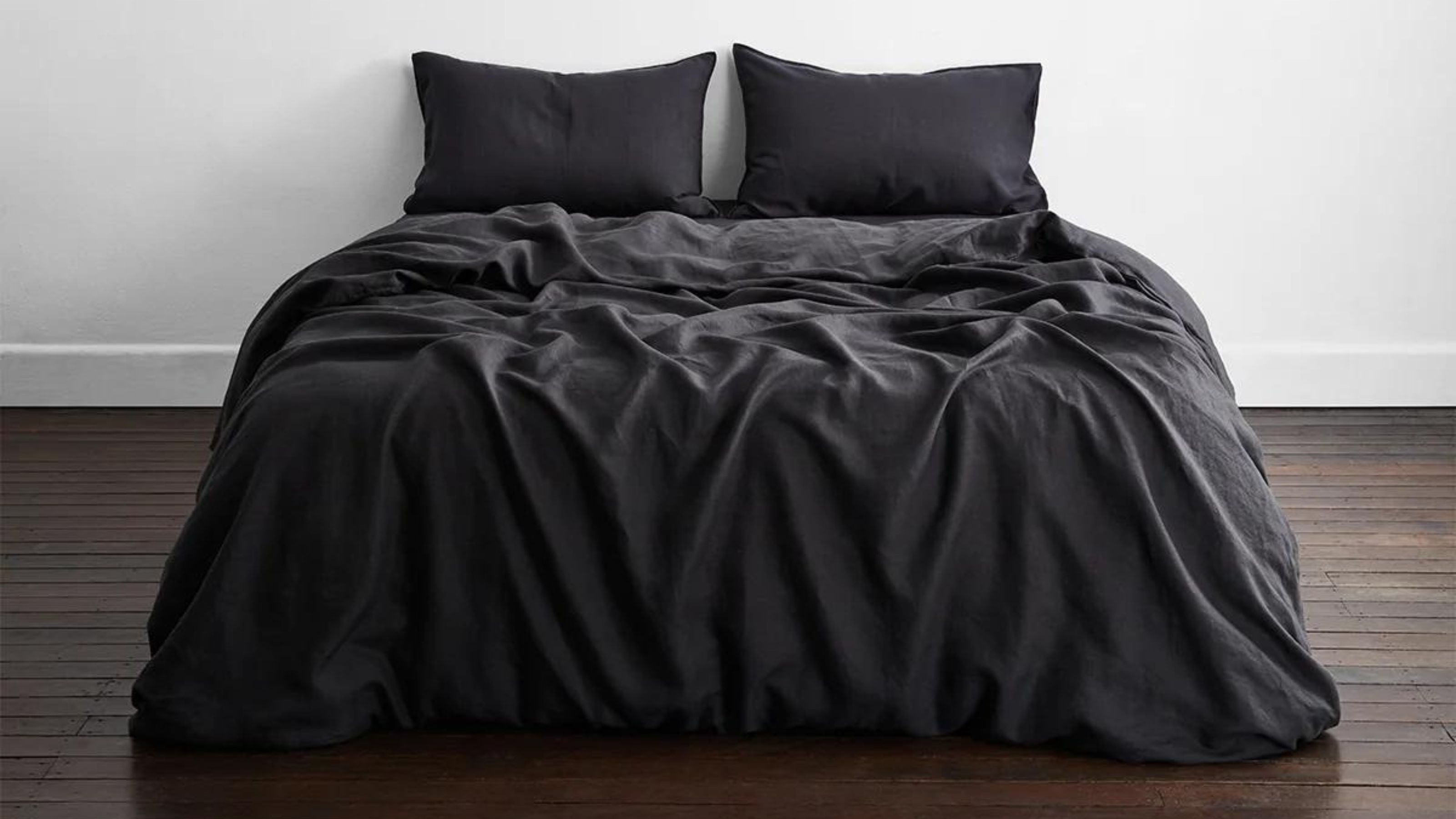 I just know 2023 is going to be all about black bedding sets
White sheets are out, black bedding sets are in — here's everything you need to know about this bedroom decor trend
By Louise Oliphant
-
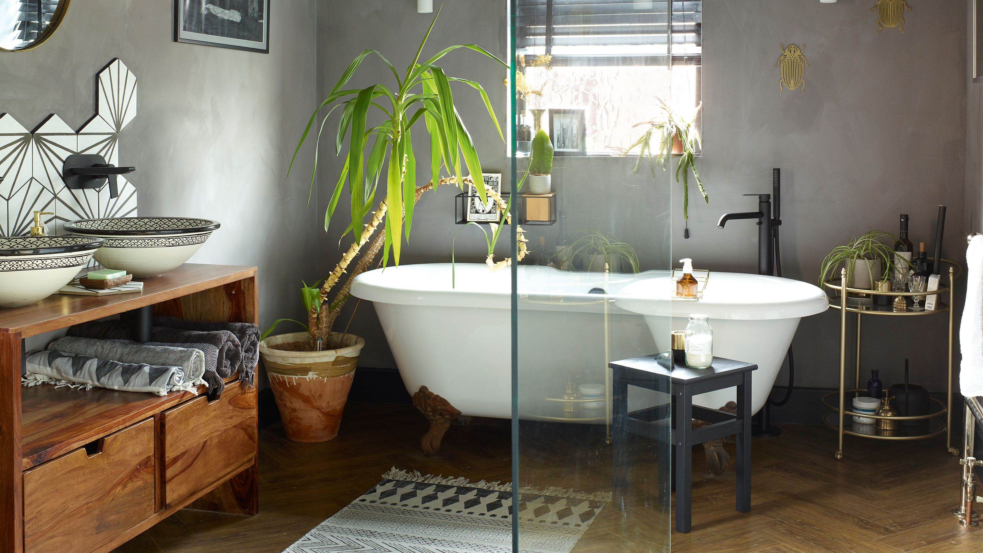 A bland beige bathroom is transformed into a STUNNING contemporary sanctuary
First-time homeowners Ellie and Oliver’s new bathroom is a well-planned fusion of modern pieces and exotic touches
By Ellen Finch
-
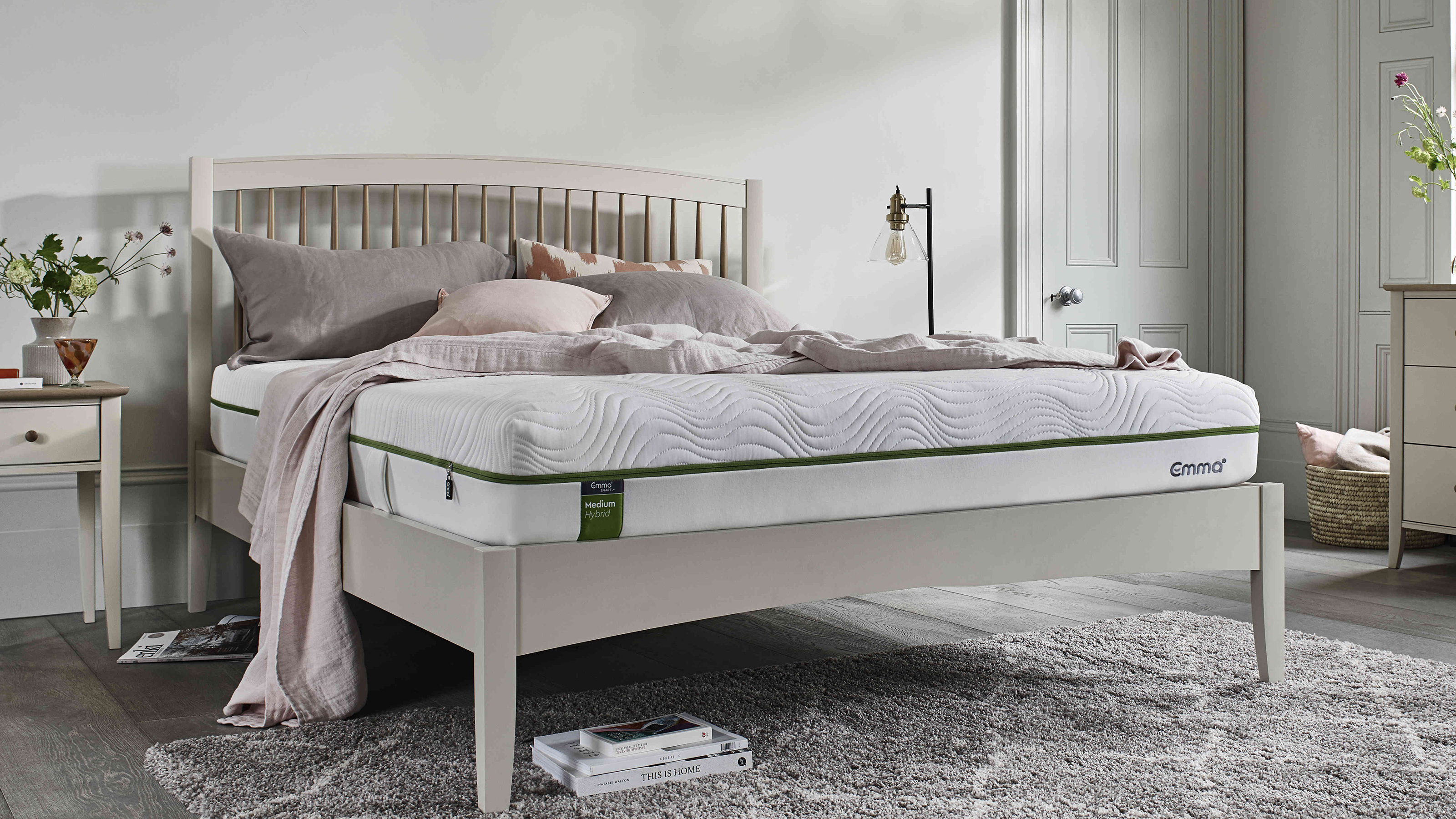 Mattress disposal: how, where, and how much it will cost?
Mattress disposal is tricky. You’ve swapped it for a supportive new design, but how to dispose of the bulky old mattress? Follow our guide to find out...
By Sarah Warwick
-
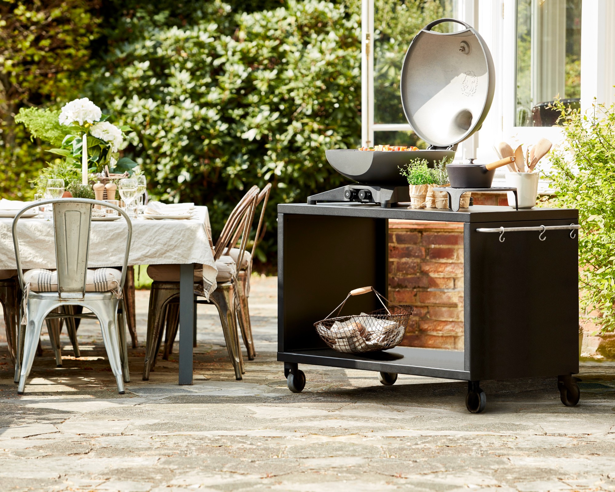 36 outdoor kitchen ideas – enviable and inspiring designs for your backyard
Enjoy alfresco cooking and entertaining all year round with the best outdoor kitchen ideas for every space and budget.
By Sarah Warwick
-
 Real home: Gorgeous green kitchen has a fresh feel
A stunning extension and Charley Smith's clear design vision has resulted in a family kitchen-diner that’s ripe for entertaining.
By Ifeoluwa Adedeji
-
 [redirected] Best coffee beans: 12 delicious coffees to start your morning with
Your perfect cup of coffee starts with the coffee bean. We're sharing our best-bagged beans from coffee shop favorites to gourmet roasters.
By Jaclyn Turner