
When you’re transforming a flat, it doesn’t have to be a headache. If you’re lucky enough to live on the ground floor, there might be the potential to extend and create a kitchen-diner to rival any other extended house – just as Rebecca and Ewan did.
Moving into their new home, the couple – architects by trade – could see the potential of the property as a place they could grow into and shape to suit their lifestyle. After spending a few years saving, they drew on their experience and created their dream kitchen as part of a full-flat overhaul. The result? A cool, pared-back space that embraces open-plan living.
Read the five steps Rebecca took to create her dream kitchen, then head to our real home transformations for more real-life renovation stories.
Project notes
The owners Rebecca and Ewan Graham, who are both architects.
The property A two-bedroom ground floor flat in a Victorian terraced house in Peckham Rye, London.
Project cost £206,000 (including refurbishment of entire flat and garden).
Humble beginnings
‘We bought this flat mainly because we thought it had the potential to extend if we could afford it further down the line,’ Rebecca says. ‘It was a one-bedroom flat with a strange layout. The living room was at the front of the property and benefitted from south-facing light and a lovely big window. The kitchen was in the middle and the bathroom at the rear, which meant there was no view of the garden while we were cooking or eating. Most of the flat was very dark and enclosed. We compromised on the one bedroom because we had that space to grow.’
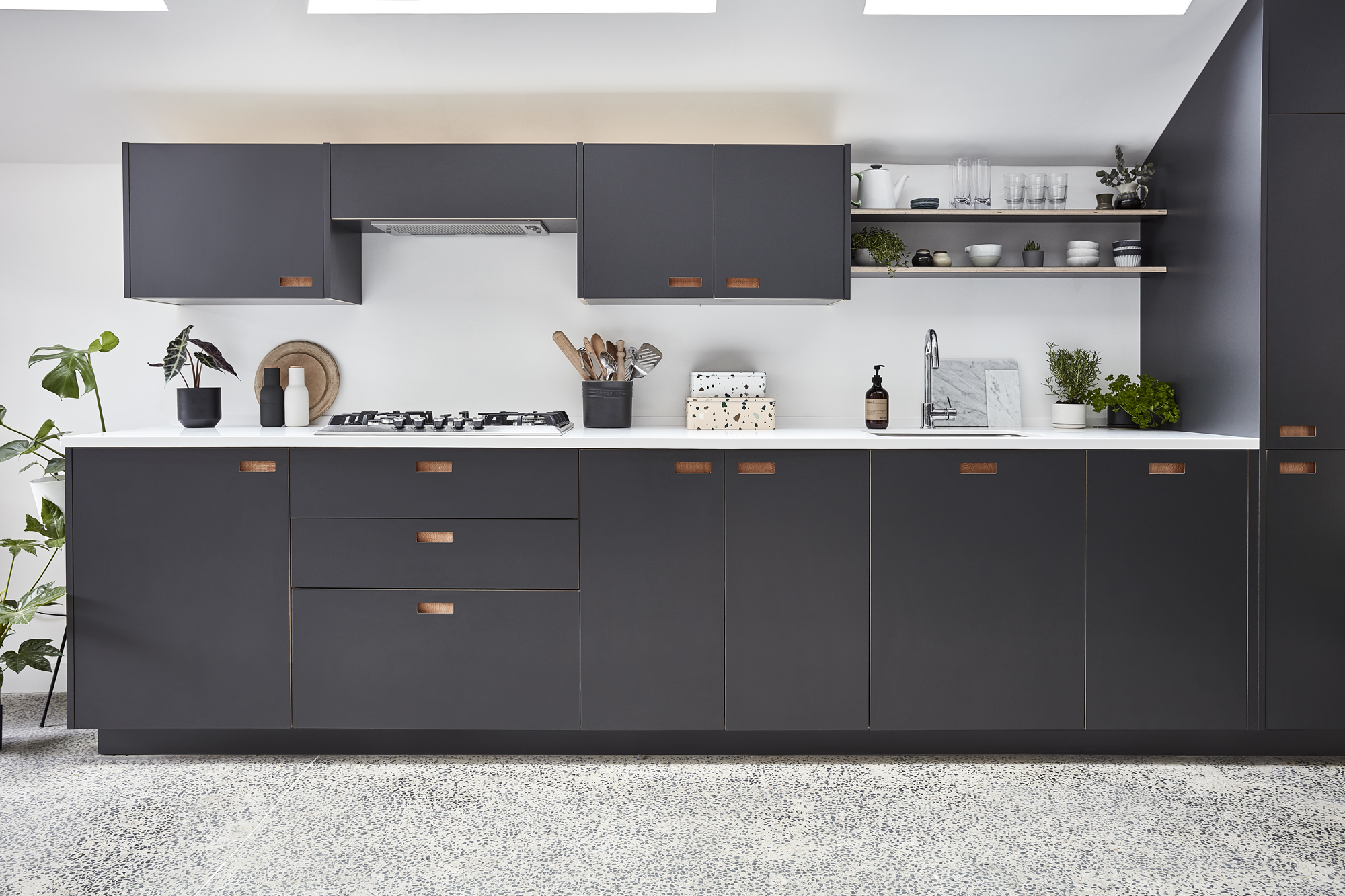
Corian worktop, Total Tops. Franke sink and tap, Burge & Gunson. Hob, Bosch
Total teamwork
‘It was two or three years down the line before we got started. We had planning permission for our design – an open-plan kitchen-diner at the back of the house. The process was a balancing act between extending for the space and to create a second bedroom, but not changing too much of the rest of the house. We did move the bathroom to the centre of the flat.
'Ewan did the main planning and I did the construction drawings. I’m more used to projects of this scale, so I was on site more. Generally, we worked well together. The only point of contention was when I suggested the bathroom door should open out because the space was so small. Our tastes are very similar; I’d pick things and we’d agree on them before purchasing.’
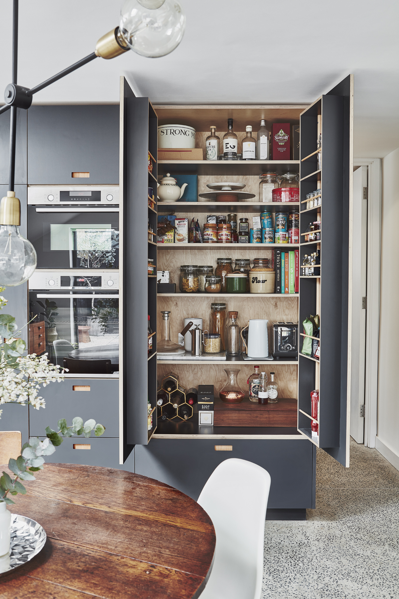
Oven/microwave, Bosch
Building up
‘The project took six months and was quite smooth sailing. The structural integrity of the property meant it needed extra underpinning, and digging out the back was a bit of an unknown. Other than that, the process was okay. We stayed with friends throughout, which was very generous of them. That made the whole project much more doable and affordable.
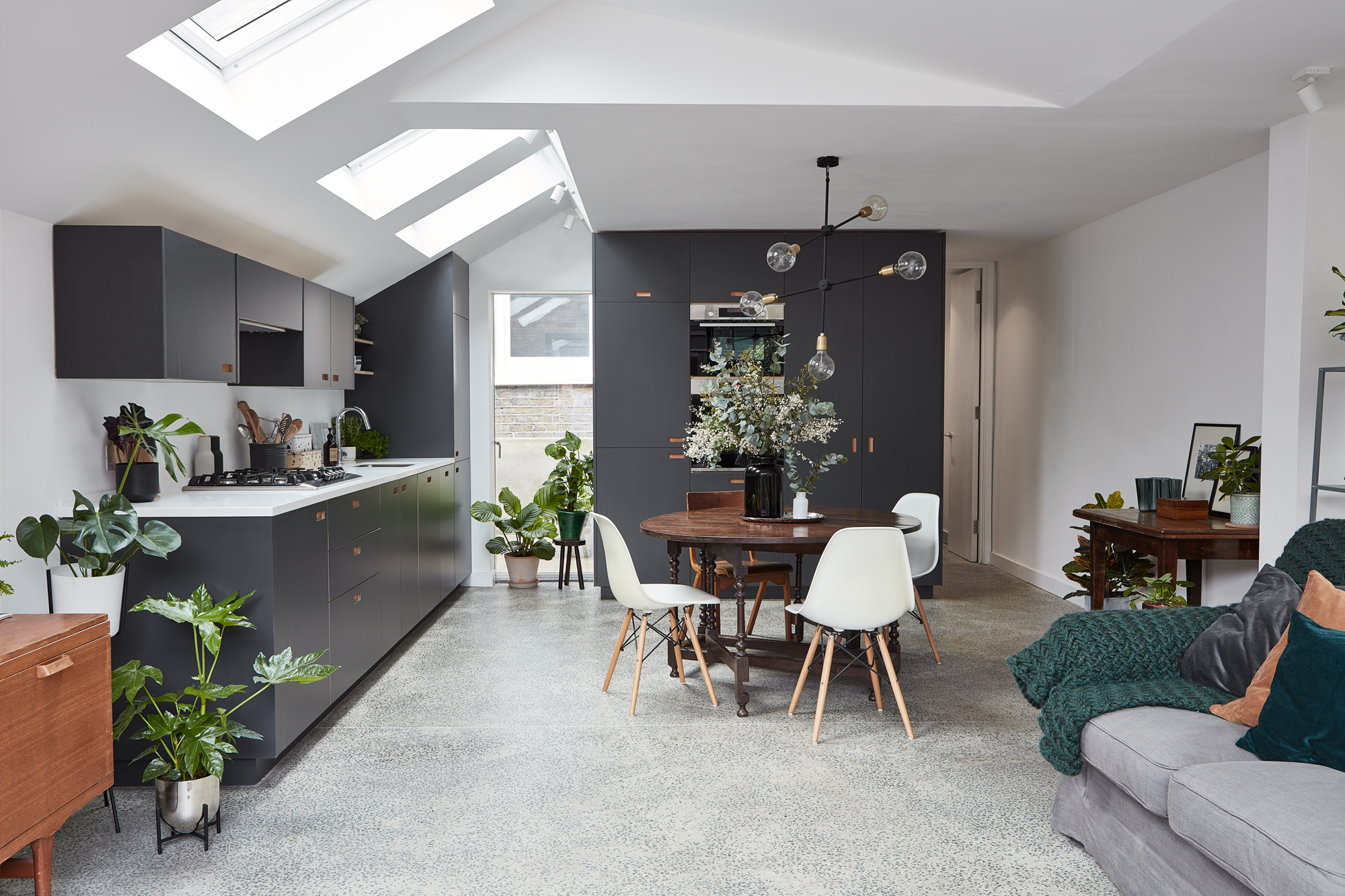
Kitchen, Pluck. Rooflights, Velux. Ceiling light, Nordic Nest
‘We weren’t going to build a separate garden studio because having more builders in would be been expensive, but there was a place in Essex that delivered and installed garden buildings to the property for about a third of the price of what we’d pay to build something on site. It transformed the whole thing from a good project to a better one.’
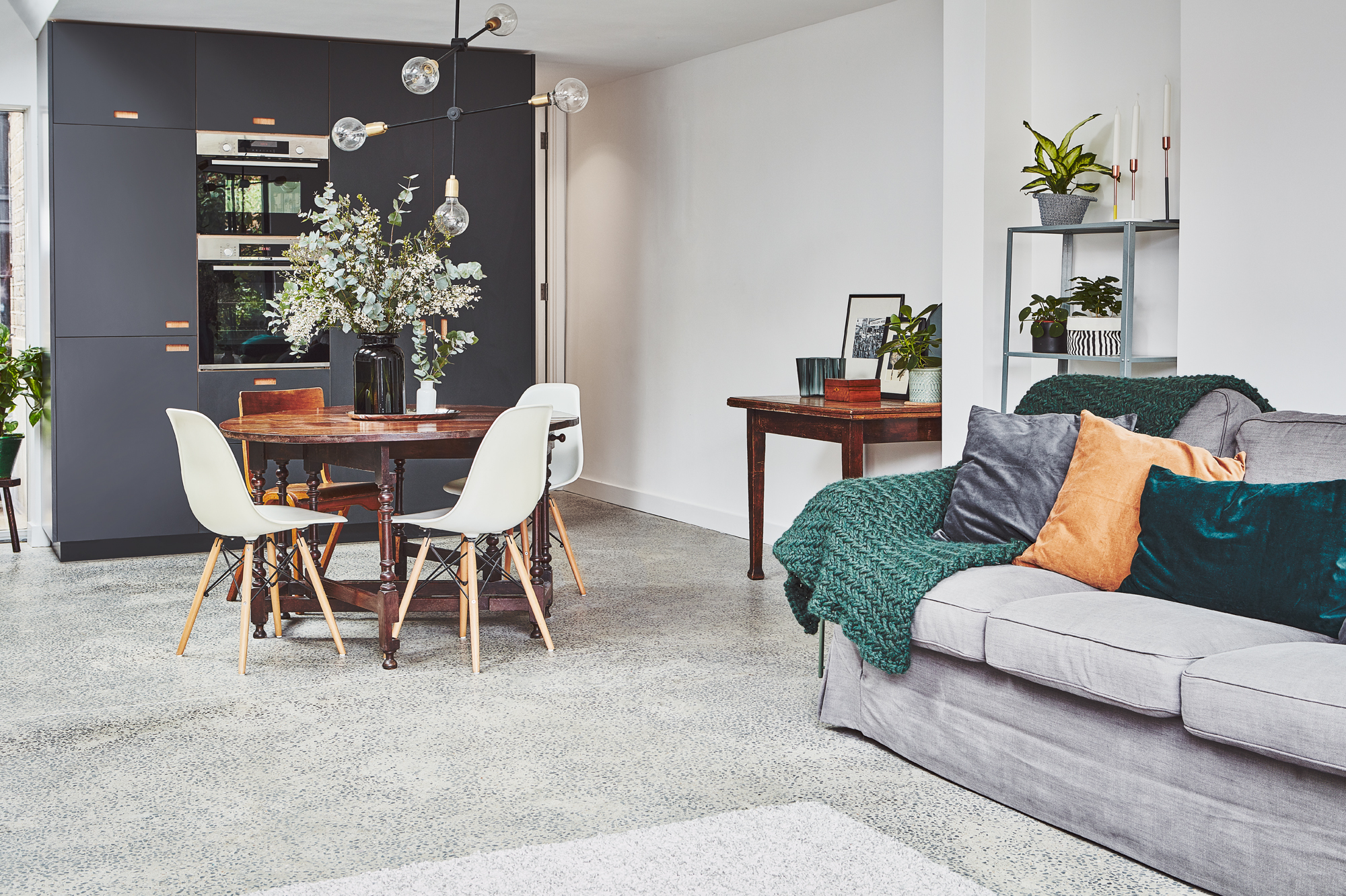
Sofa and shelving unit, Ikea. Blanket, Emma Makes Store
Design details
‘Ewan is quite tall and struggled with the ceiling height in the old flat, but the extension gives him extra space. We wanted to mirror the shape of the back of neighbouring houses, and we felt having it pitched would create interest.
‘Because the back is one room, I wanted the kitchen cabinetry to feel like part of the furniture. We wanted it to be the stand-out feature. Rather than having too many materials, we opted for a concrete floor that could flow from inside to out – and it also has great heating and cooling properties.
‘Finishes on things like the window were kept simple; black, white or dark grey. We have a similar theme in the rest of the house . The concrete floor carries on in the bathroom, and we have white and grey marble tiles in there.’
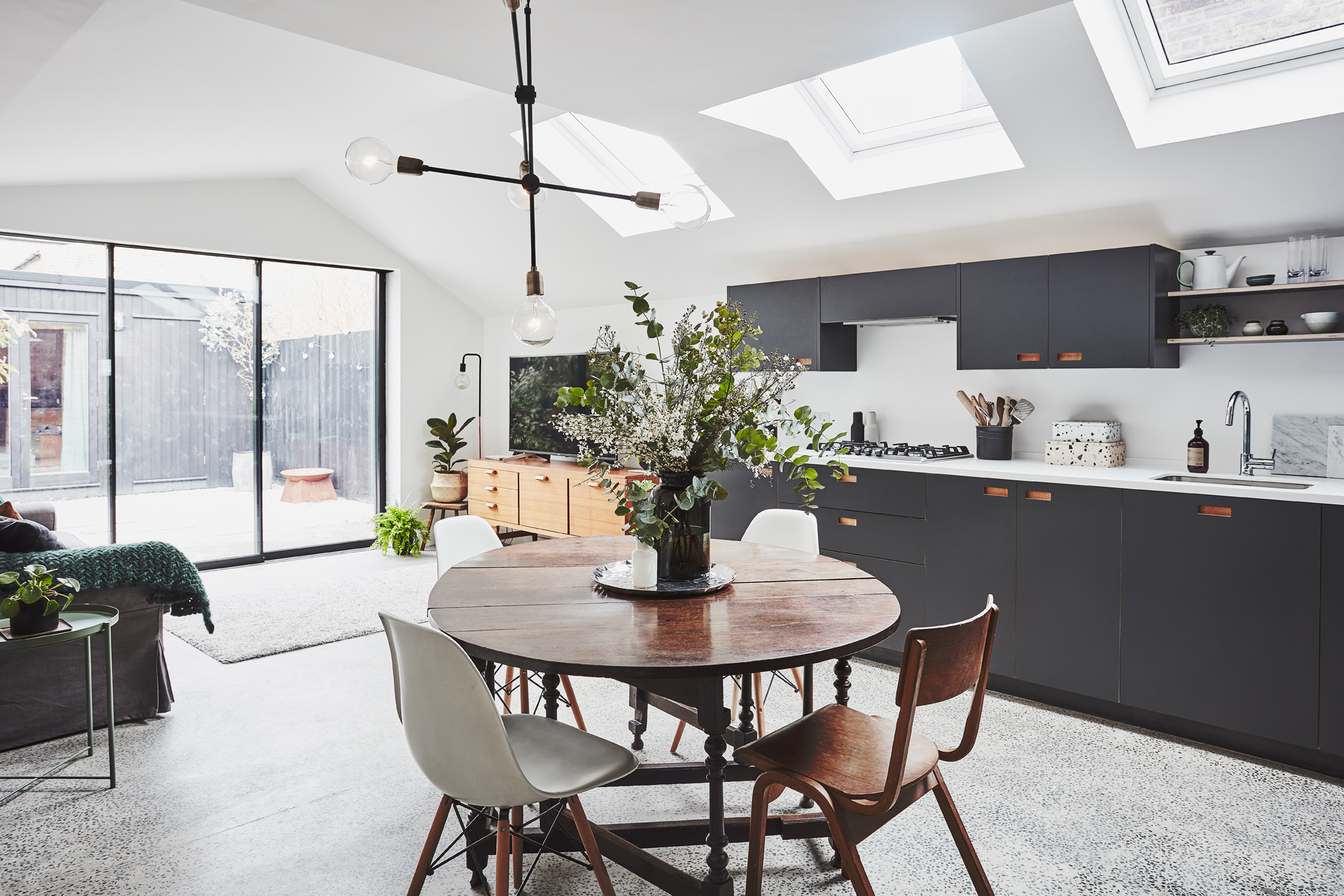
Dining table, vintage. Chairs, Cult Furniture. Sliding doors, Maxlight
Space savers
‘For us, it’s the little things that don’t cost much more but make a huge difference that are important. We have full-height doors for a sense of space, and we added an extra, wider step down to the kitchen to create a platform leading into the extension.
'For the worktops, we went 800mm rather than 600mm deep, and used that extra space to store utensils and appliances without interfering with the prep space. We stacked the boiler over the washing machine to save space, too.
‘When we bought this flat, we were looking for the potential to grow into it. We underestimated how much going open-plan would make a difference, though. Even the north-facing kitchen gets so much light. It feels communal but still private. We absolutely love it.’
Contacts
Don't miss out! Subscribe to Real Homes for more inspiring case studies and expert advice every month
- Architect: Ewan Graham Design
- Sliding doors: Maxlight
- Builder: Altus Construction, 07917 768278
- Structures: Axiom Structures
Like this? You'll love these...:
Join our newsletter
Get small space home decor ideas, celeb inspiration, DIY tips and more, straight to your inbox!

Formerly deputy editor of Real Homes magazine, Ellen has been lucky enough to spend most of her working life speaking to real people and writing about real homes, from extended Victorian terraces to modest apartments. She's recently bought her own home and has a special interest in sustainable living and clever storage.
-
 Housing market forecast: home buyers are rushing to beat rising mortgage rates
The latest housing market forecast reveals a new factor in a hot market – steadily rising mortgage rates
By Anna Cottrell Published
-
 Before & after: A broken-plan layout completes this Edwardian terrace
These happy bunnies have the best of both worlds. Divide and conquer
By Ellen Finch Published
-
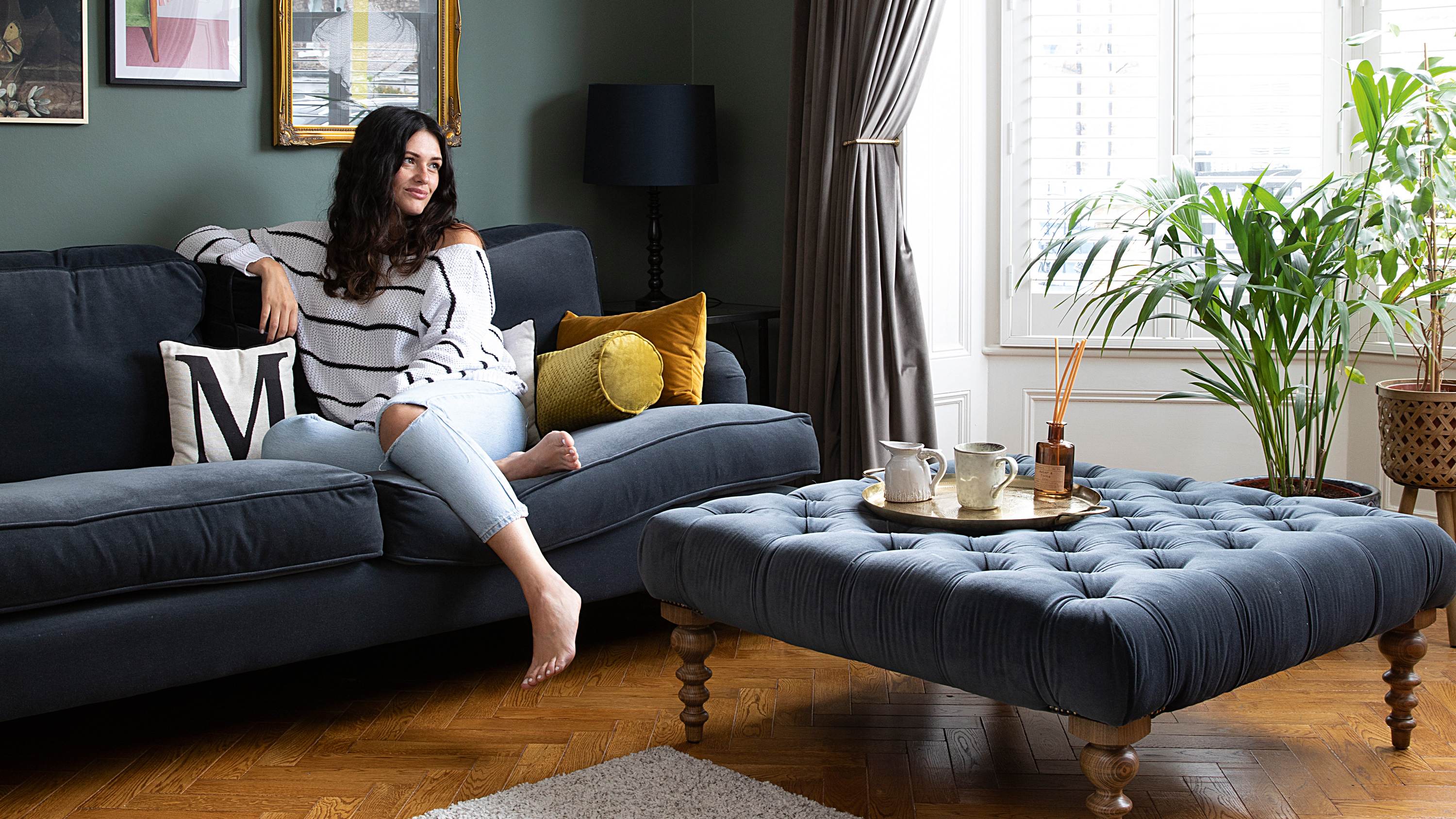 This dark and dramatic house just oozes original charm
The color choices for this gorgeous Victorian home may seem bold, but just take a tour and you'll be reaching for the deep teal paint too...
By Ifeoluwa Adedeji Published
-
 These are the items you’re most likely to lose when moving house - and one could be seriously costly
Don't miss these off your checklist come moving day
By Millie Hurst Published
-
 A new survey reveals the one room we'd add to our home if money were no object
Because you can never have too many books
By Millie Hurst Last updated
-
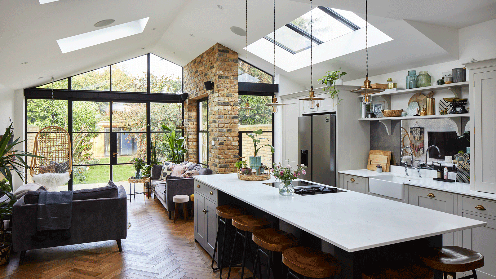 This is what a dream home looks like in 2021 (Hint: there's a fire pit)
Get ready for the home office of dreams
By Millie Hurst Published
-
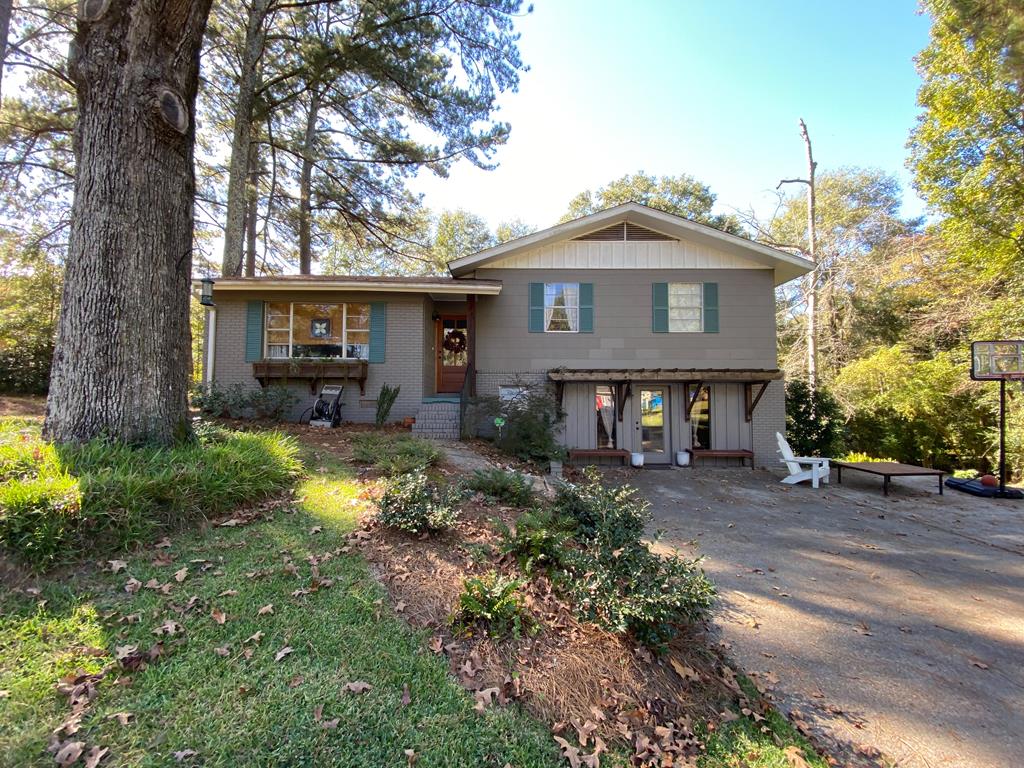 This HGTV 'Home Town' house is on the market for under $200k
See what this Laurel, MS. house from HGTV's Home Town looks like today (and make it yours for under $200,000)
By Grace Stetson Published
-
 This sunbelt city is the top destination for homebuyers looking for value – and sun
Buyers on the move are choosing these Southern cities in what is beginning to be known as the Sunbelt Surge
By Anna Cottrell Published
