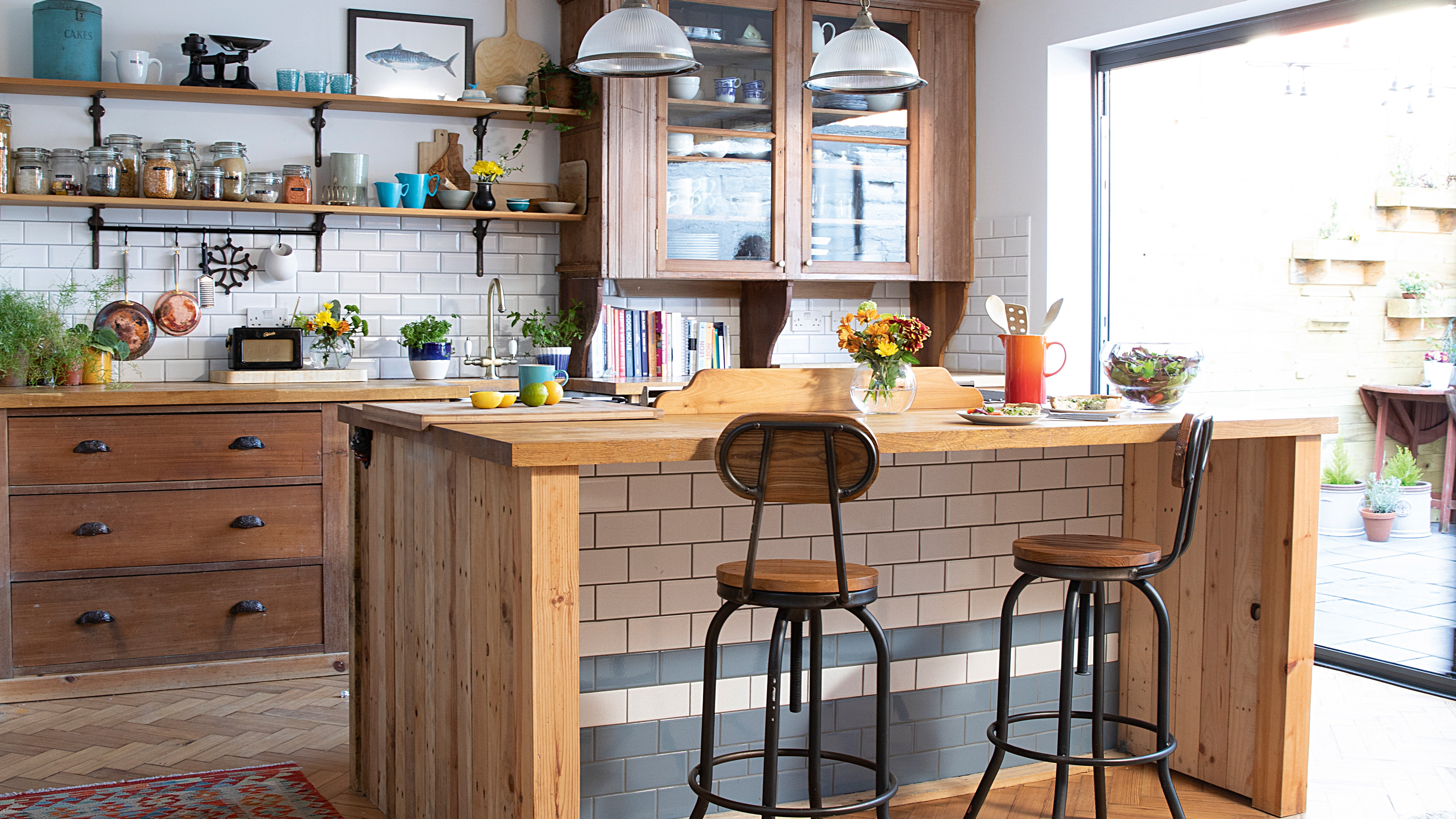
When Caroline Briggs visited Whitley Bay for a walk on the beach in 2014, she knew instantly this was where she wanted to live. After eight years in London, she and her husband had returned to Newcastle while contemplating their next move. Luckily, he was instantly on board with Caroline’s brainwave, with one proviso – the house they bought must have a sea view. Searching online unearthed a beautiful Edwardian terrace with only a road between its frontage and the North Sea. It was an easy sell. The couple’s flat sold within two days, allowing them to snap up their dream coastal home.
Living among the renovation, which included a kitchen extension and new bathroom, wasn’t easy with two young children. However, Caroline and her husband have tackled it gradually room by room, with exciting plans for a loft conversion to create a second-floor suite still to come. While some coastal homes can become a clichéd celebration of seaside living, full of boat motifs, seagulls and anchors,
the couple have opted for restraint and simplicity with honest reclaimed materials, subway tiles and a palette of blue, yellow, white and grey to reflect their surroundings. Having found such a special home, Caroline is adamant she’ll never move again, and who can blame her?
If you are looking at adding on to create your dream space, just like Caroline has, we have lots of ideas and helpful advice on how to do it in our feature on extending a house. For more completed projects, head to our hub page.
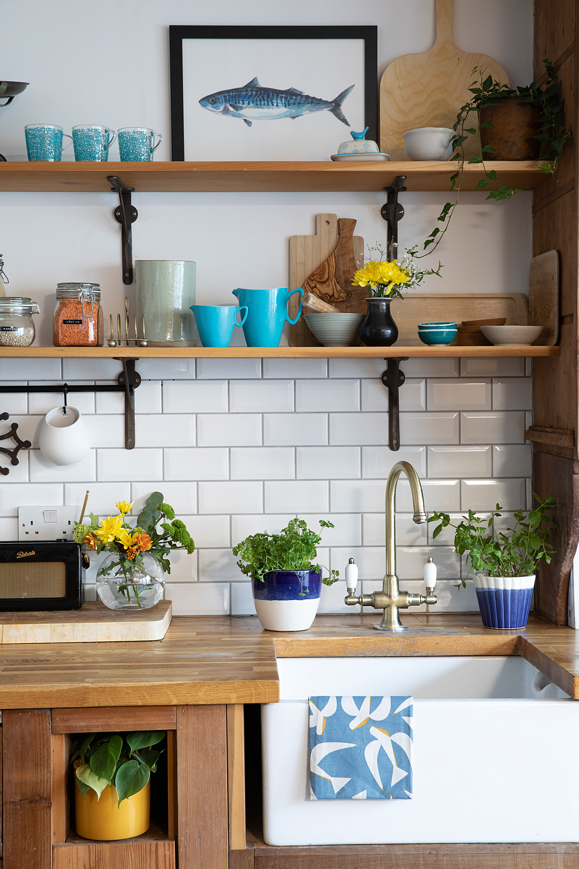
Sink, Rangemaster. Tap, Ebay. Fish painting, For the Love of the North. Herb pots, TK Maxx
'My only disappointment with the house when we viewed it was its poky kitchen,' recalls Caroline. 'It had cold tiles, a brown ceiling and a view of a massive garage in the back garden. I don’t know how I got through the first year with a baby – he’d be in the living room and I was stuck in the depressing kitchen at the back. An extension was a high priority.
‘We designed the new space ourselves and used builders who’d put a leaflet through my sister’s door. They knocked down the old garage, extended out by seven metres and installed bi-fold doors right across the rear. The new space has a big pantry where the old kitchen was and a utility to keep the kitchen area less cluttered.'
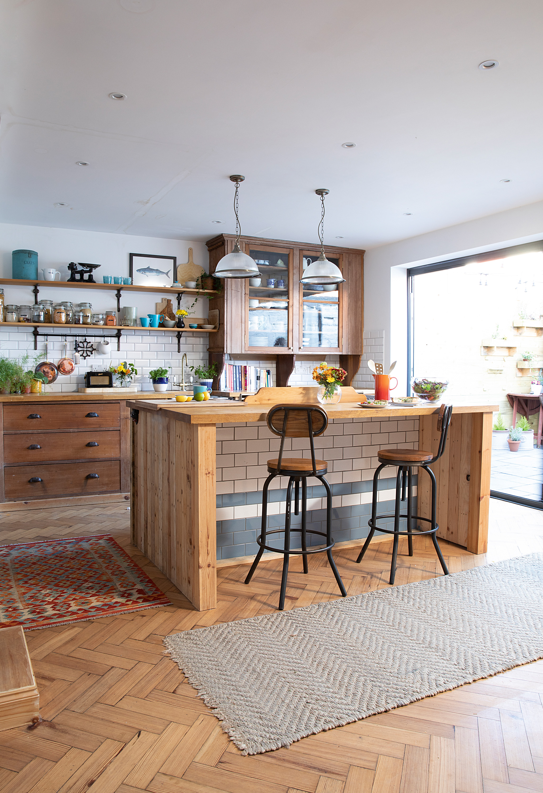
Kitchen, Fern Avenue Antiques of Newcastle. Tiles, Tons of Tiles. Pendant lights, Amazon. Stools, Atlantic Shopping. Rug, Homesense
Profile
The owners Caroline Briggs, a BBC journalist and photographer (@edwardian_seaside_home), lives here with her husband, an accountant, and their two children
The property A four-bedroom Edwardian terraced house in Whitley Bay, Tyne & Wear
Project cost £103,500
'I wanted to keep the Victorian authenticity with nothing fancy, new or glossy. My sister walked into an antiques shop one morning and saw an amazing Victorian kitchen for £1,500. It was a corner design but my brilliant joiner said he could reconfigure it to fit our space. By re-using the sink unit and drawers from the existing kitchen, as well as making a new island from reclaimed timber, he somehow made it work. The blue and white subway tiles on the island replicate the old Victorian glazed bricks and we also re-used some bricks from outside to make planters for the garden. It’s a complete one-off and exactly what I wanted.'
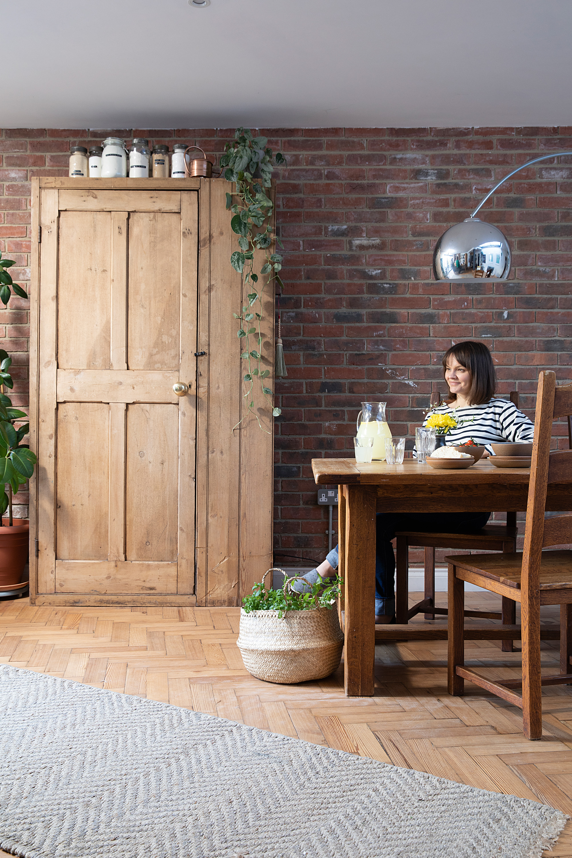
For a similar dining set, try the New Frontier mango wood table and chairs, Barker & Stonehouse. For a floor light, try Dwell. Basket, Ikea
‘I also love the parquet flooring from my children’s school round the corner. I’d jumped straight in the car when the head teacher sent an email to parents saying it was free to take away from the yard. I love the fact that kids have been running over it for 100 years, including mine. To finish off the room, I found a Victorian larder cupboard on Ebay selling for only £150. It’s well-built, has lots of character and works perfectly with the kitchen.'
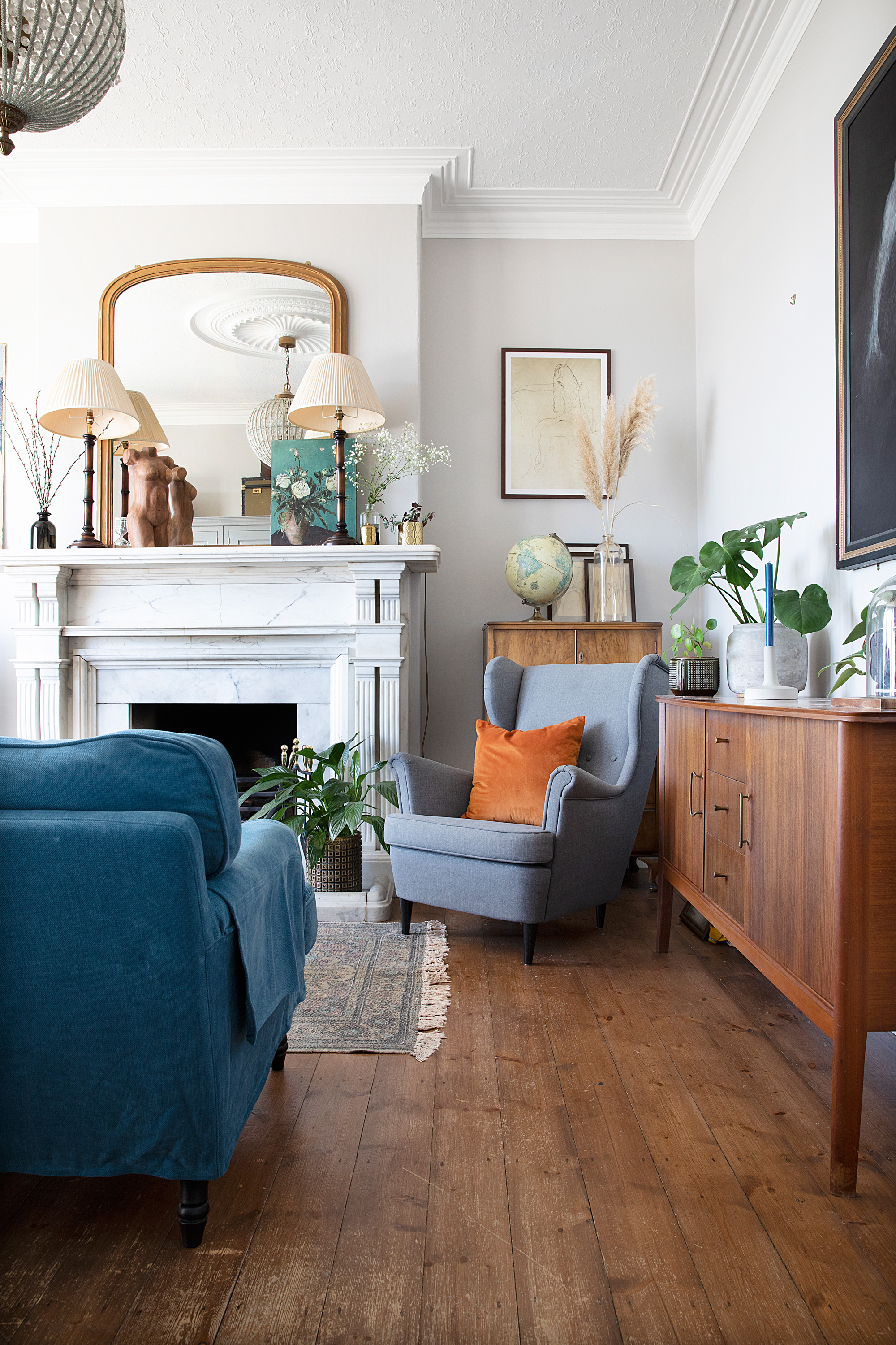
Mirror, Fern Avenue Antiques. Chair, Ikea. Rug, French Connection. Wooden bust, Reclectic. Globe chandelier, Homesense
'When we first moved in, the reception rooms had gold wallpaper, purple carpets and swag curtains, which weren’t really to our taste. Initially we painted the walls a French grey but it never particularly worked with the light and I wanted to get rid of the green second-hand sofas. Because we used these rooms for storage and as a temporary kitchen when the extension was done, I never really fell in love with the front part of the house.
‘It wasn’t until the kitchen was finished that I could hone the colour palette in the living room, which is now based on what’s outside the window. Sometimes houses by the sea fall into the trap of being a bit too themed. Although I have the odd piece elsewhere, like a beautiful seashell print and one gold anchor, I wanted this room to be more of a nod to the sea. It’s the main family room so gets used all the time, but it’s definitely been more of a process compared to the other reception room, which came together more easily.'
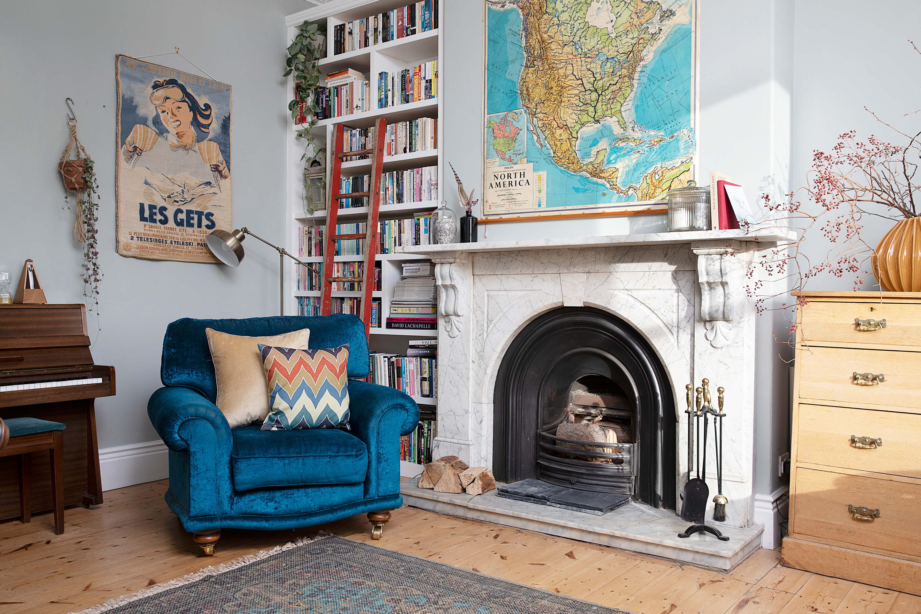
Rug, French Connection. Wall map, Fern Avenue Antiques. Blue chairs, Barker & Stonehouse. Drawers, family heirloom. . Walls painted in Light Blue, Farrow & Ball. Lamps, Ikea. Wall map, Ebay. Cushions, Dunelm
'There’s no TV in the second reception room and the kids don’t tend to use it as much, it's more of a calm, adult space where I can have a cup of tea and not get disturbed. After we sanded the floorboards, our lovely joiner Dave built the alcove storage on either side of the original marble fireplace. Having the books in here means it naturally lends itself to unwinding.
'I saw two blue chairs in a shop in Whitley Bay that worked perfectly with a yellow sofa I’d already bought, and suddenly I had a colour scheme. I really love vintage maps, which are mostly from auctions and antique shops. Overall I like things to be classic with a nod to trends. Mixing and matching furniture works for me. I follow my heart if I like a piece of furniture, and don’t worry about it matching everything else.'
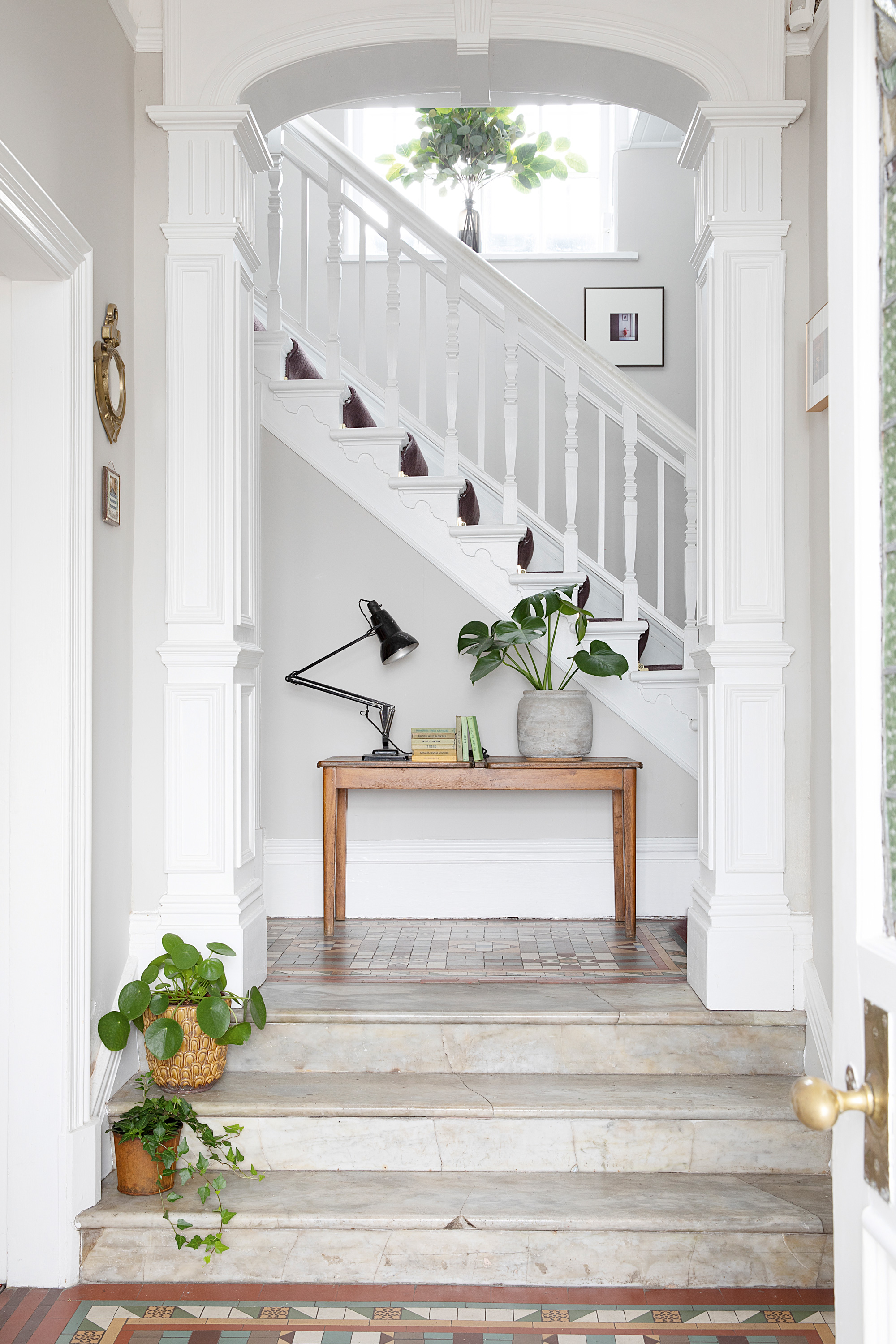
For a similar desk, try the Kort, Tikamoon. Plant pots, Wildflower, Homesense and RE
'One of the reasons we bought the house was the symmetry. I love having two reception rooms on either side of a central hallway and the beautiful tiled floor influenced the colour choices in the rest of the house. There wasn’t much to do in here apart from remove the wallpaper and make it feel calmer with a neutral paint colour. Then I added an old school desk, which was just £15 from a car boot sale and is stuffed with my daughter’s drawings.'
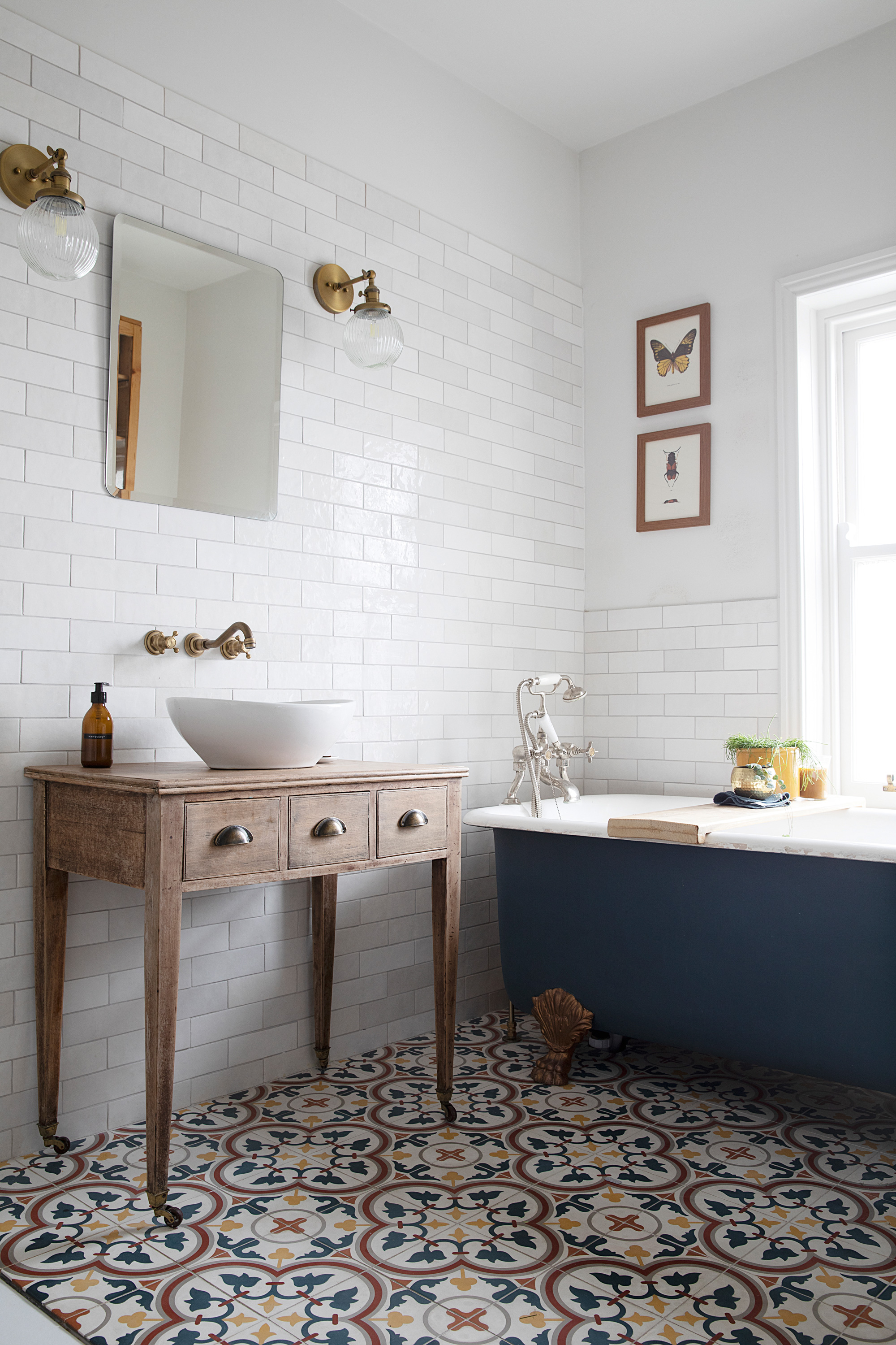
For a similar bath, try the Burlington Bateau double-ended bath, Designer Bathroom Concepts. Moroccan cement floor tiles and Artisan wall tiles, both Best Tile. Wall lights, Pathson. Neue Design mirror, Lions Home. For a similar console table, try Bentley Designs Sophia Oak, Oak Furniture House
'My vision for the bathroom was for classic metro tiles, antique brass fittings and a vintage sink unit. The game changer was removing the chimney breast so we could fit a walk-in shower. My husband found a shower tray that’s flush to the floor and I picked the lovely patterned tiles.
‘We kept the existing cast-iron bath, which we painted blue, and I stripped the Edwardian console table myself before new cup handles and a bowl sink were added. A wooden tressel was another great buy – just £10 from an antiques shop in Warkworth – and is handy for towels. I chose reeded glass lights to match the doors and kitchen lighting downstairs.'
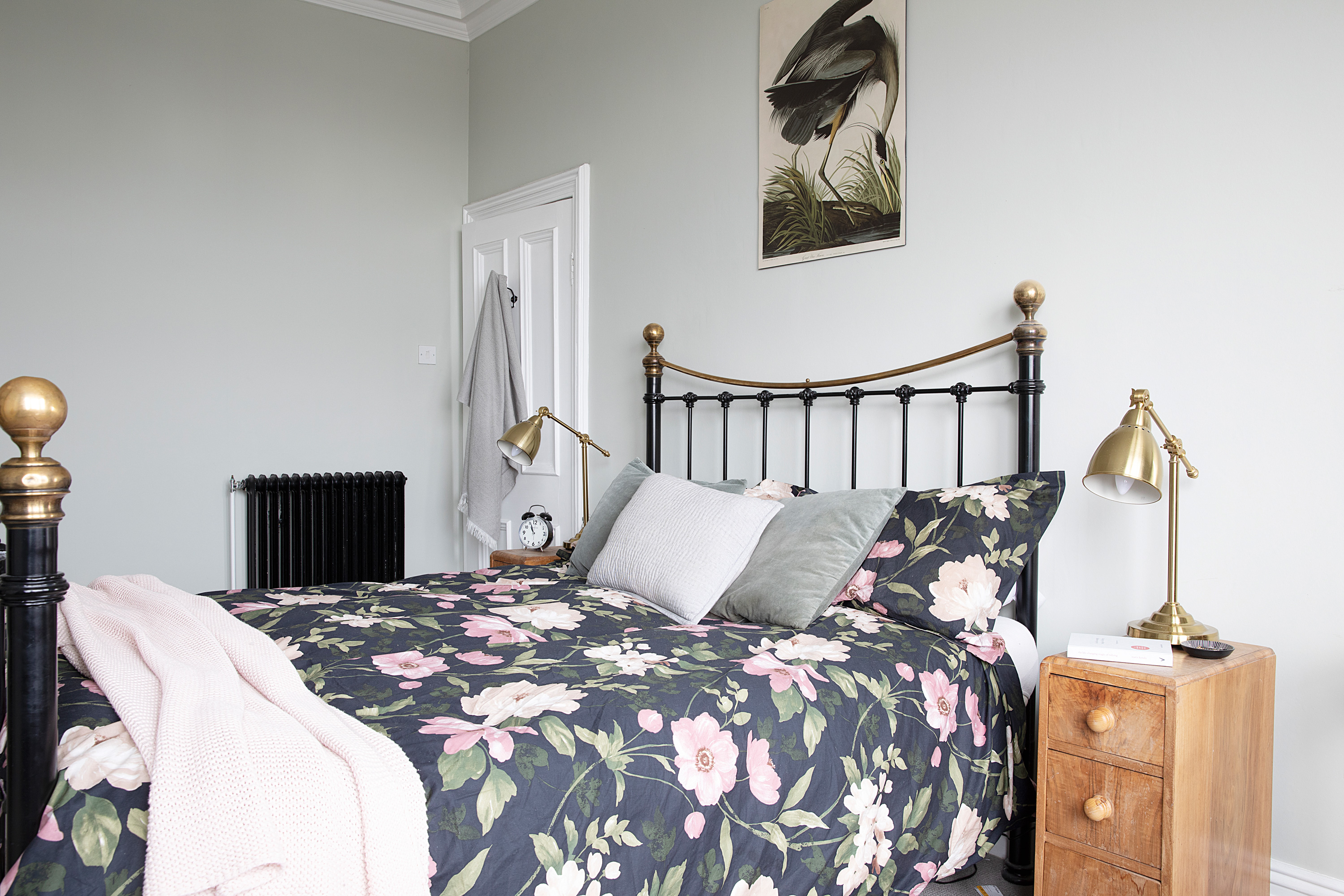
Walls painted in Cromarty, Farrow & Ball. Bed and bedside tables, second hand. Bedding, lamps and pink throw, all Ikea. Great Blue Heron print, Juniqe
'In our bedroom, I wanted a calm feel to reflect the colour palette outside, trying several tester pots before finding the perfect shade. It goes from green to grey to blue, but it works at every point in the day. There’s an original fireplace in here. The tiles influenced the elements of pink and green. We replaced our solid wooden bed with a traditional Victorian design to match the other beds in the house. My husband likes it as you can see the fireplace though the bars.
‘We plan to convert the attic into a master suite overlooking the sea. It’s a Conservation Area but we’re probably the only house on the street without windows in the loft, so I can’t see planning permission being a problem.'
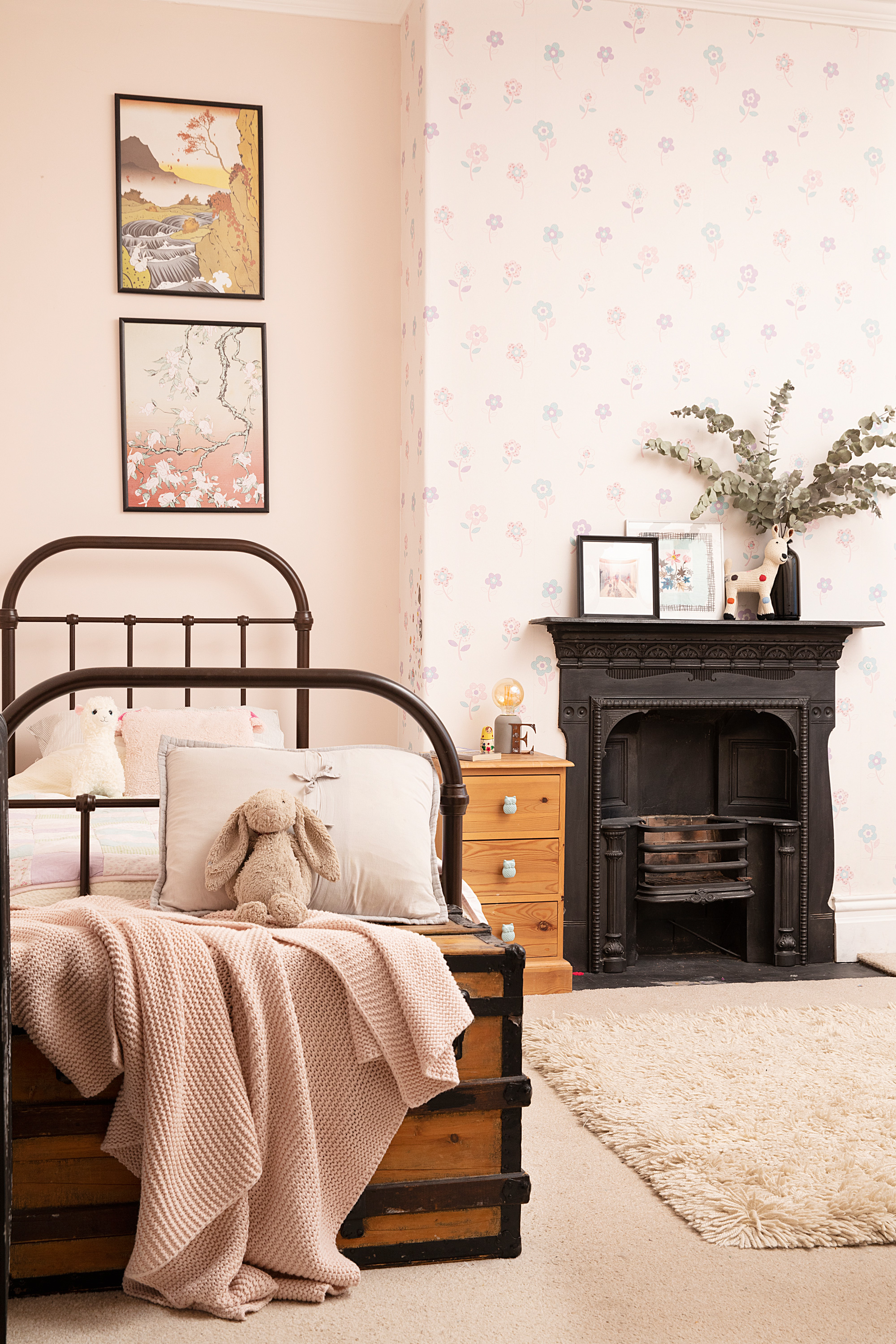
Oliver single bed, Feather & Black. The Bunnies Fall and Bunny Blossom art prints, Kozyndan. For similar wallpaper, try Oriental garden chalk pink floral; walls painted in Camomile, both Laura Ashley. For a similar throw, try the Waffle throw by Belledorm, Wayfair
'Our daughter was only three when we moved in, so her room was the first to be decorated. I wanted her to feel at home in her own little haven. Within the first two weeks we’d replaced the carpet and redecorated in a nice soft pink, which was her favourite colour at the time. The Laura Ashley wallpaper adds a bit of interest to the chimney breast, and I found some lovely Japanese bunny prints, which appealed to my aesthetic, too.
‘I’m very big on getting furniture second hand. I found this Feather & Black hospital-style bed on Ebay and drove to York to pick it up. My brother gave me the trunk, which is handy for soft toys and has the bonus of looking a bit like a pirate’s chest.'
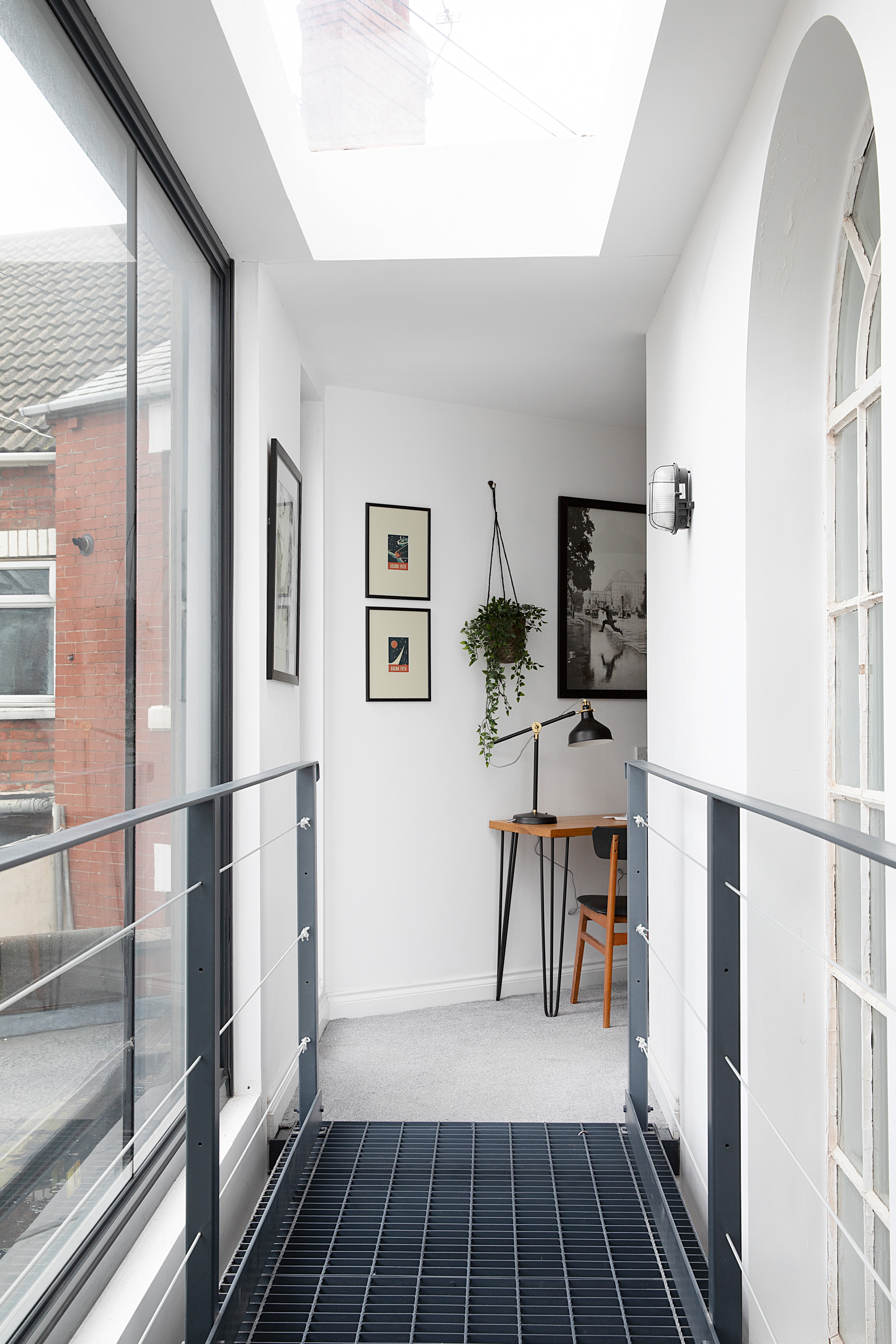
Try The Hairpin Leg Company for a similar desk. Lamp, Ikea. Cult Furniture has a similar chair
Contacts
Fitted wardrobes Top Drawer Furniture
Windows Sashfix
Parquet floor fitting Northern Floorsand
'I wanted to utilise the space above the extension for an office, because we both work from home quite often. We thought about installing stairs leading up from the kitchen, but then I had the idea of losing the separate toilet on the first floor and building a metal grid walkway in front of the lovely arched window. This meant the office could be accessed off the landing. It gave me the double height I wanted, brought more light into the kitchen so we didn’t need an extra roof lantern, and I can hear what’s going on in the kitchen. The kids love it too because they can hang Lego people off it!'
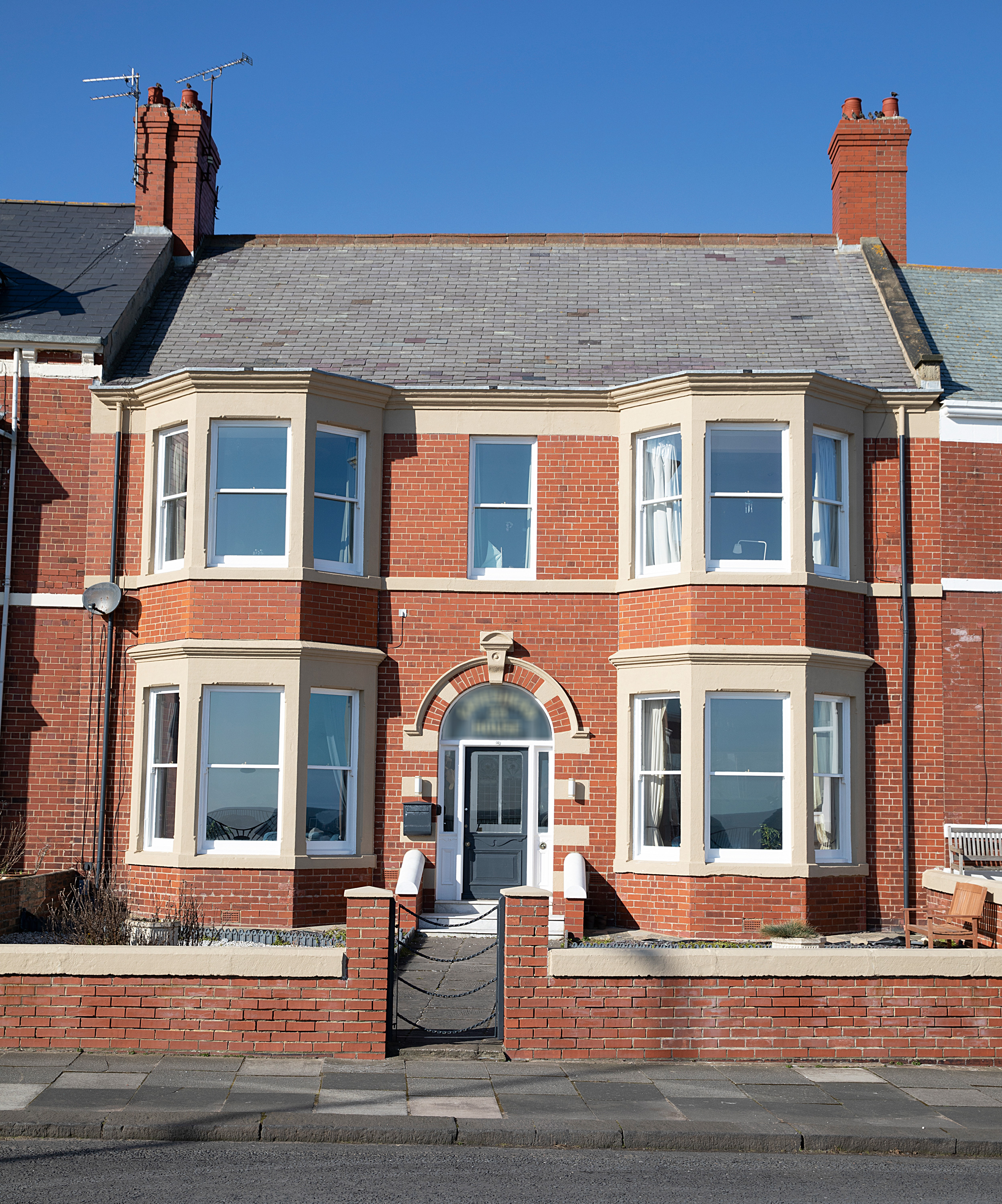
The house has elegant Edwardian proportions with rooms on either side of the entrance, and sea views
Subscribe to Real Homes magazine Want even more great ideas for your home from the expert team at Real Homes magazine? Subscribe to Real Homes magazine and get great content delivered straight to your door. From inspiring completed projects to the latest decorating trends and expert advice, you'll find everything you need to create your dream home inside each issue.
Join our newsletter
Get small space home decor ideas, celeb inspiration, DIY tips and more, straight to your inbox!
-
 This colourful home makeover has space for kitchen discos
While the front of Leila and Joe's home features dark and moody chill-out spaces, the rest is light and bright and made for socialising
By Karen Wilson
-
 How to paint a door and refresh your home instantly
Painting doors is easy with our expert advice. This is how to get professional results on front and internal doors.
By Claire Douglas
-
 DIY transforms 1930s house into dream home
With several renovations behind them, Mary and Paul had creative expertise to draw on when it came to transforming their 1930s house
By Alison Jones
-
 12 easy ways to add curb appeal on a budget with DIY
You can give your home curb appeal at low cost. These are the DIY ways to boost its style
By Lucy Searle
-
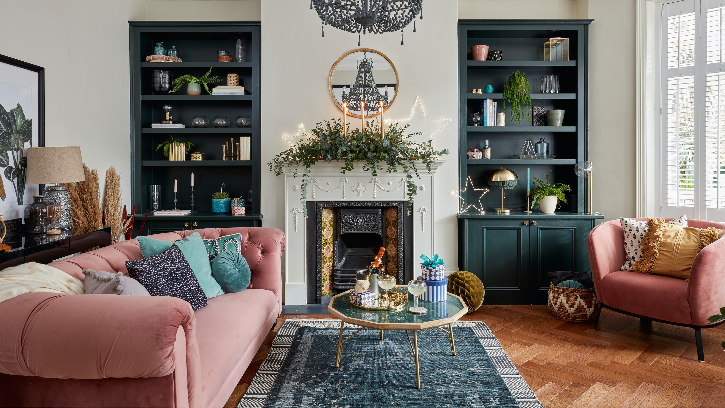 5 invaluable design learnings from a festive Edwardian house renovation
If you're renovating a period property, here are 5 design tips we've picked up from this festive Edwardian renovation
By Ellen Finch
-
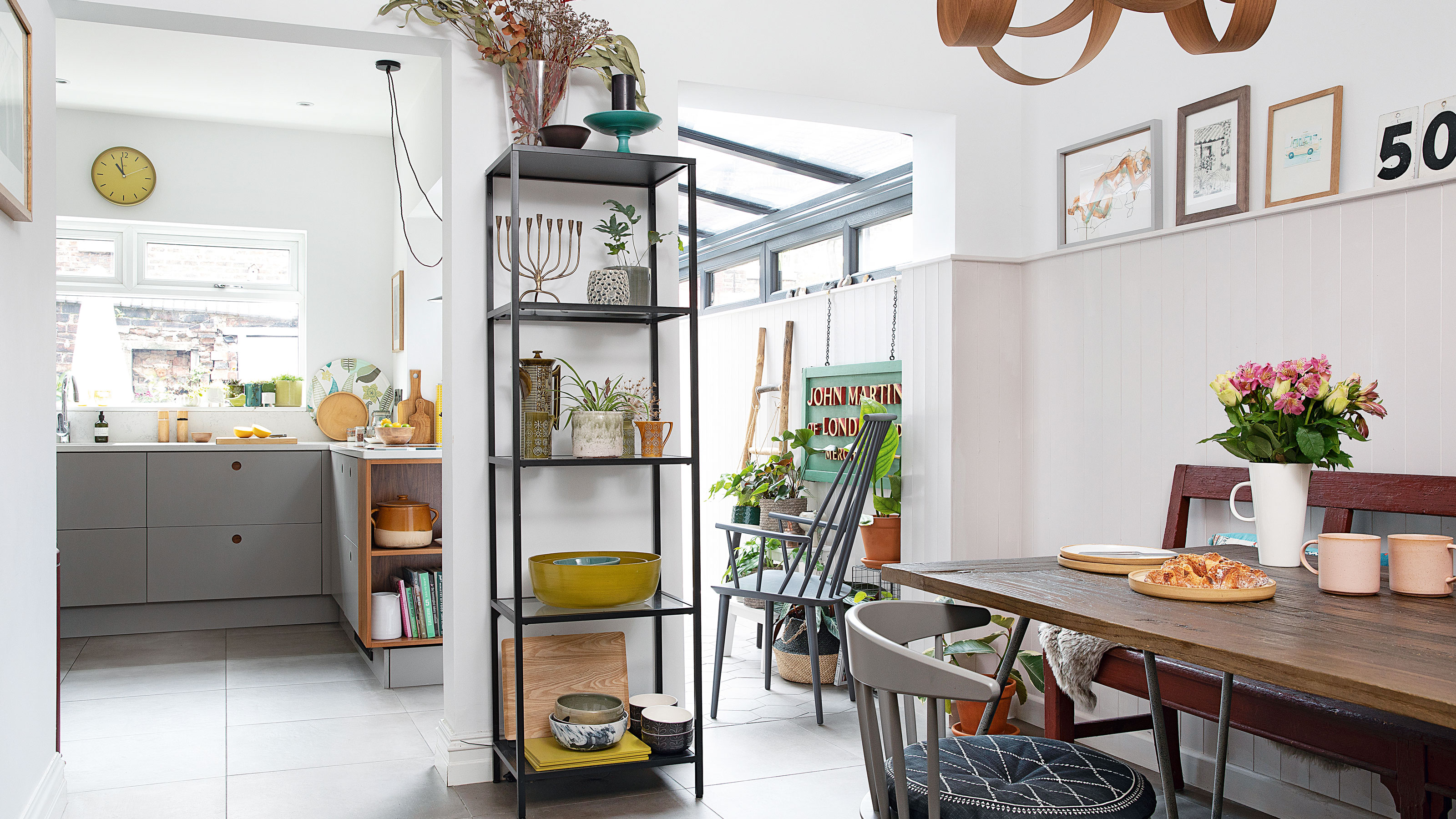 Real home: Glazed side extension creates the perfect garden link
Louise Potter and husband Sean's extension has transformed their Victorian house, now a showcase for their collection of art, vintage finds and Scandinavian pieces
By Laurie Davidson
-
 I tried this genius wallpaper hack, and it was perfect for my commitment issues
Beware: once you try this wallpaper hack, you'll never look back.
By Brittany Romano
-
 Drew Barrymore's new FLOWER Home paint collection wants to give your walls a makeover
Drew Barrymore FLOWER drops 27 brand-new paint shades, and every can is made from 100% post-consumer recycled plastic.
By Brittany Romano
