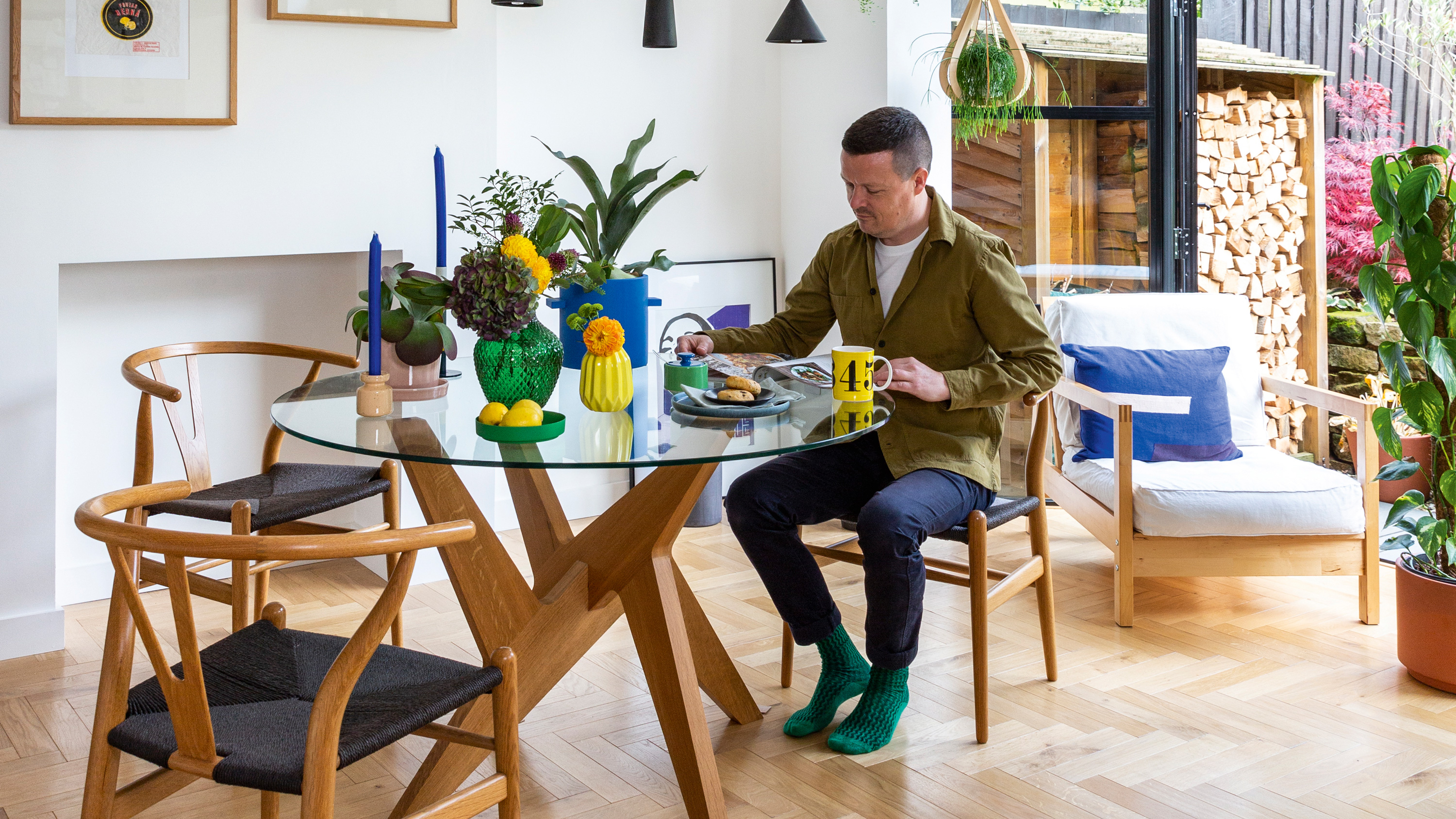

From the outside, Rob and Paul’s 1930s house looks like a typical semi. Step inside, though, and you’re met with a light, bright, plant-filled kitchen-diner that’s full of character. Oak herringbone flooring and a mix of white and oak kitchen units act as a neutral base for pops of colour, from the metro splashback tiles to the bright block of green in the newly-extended garden room. Contemporary aluminium doors open up to the thriving garden the couple inherited from the previous owners – and there’s plenty of room for Rob and Paul, and their cat, Tigger, to while away the summer days.
The kitchen Rob and Paul have created with their architect, Anna Parker, is an example of how an ordinary house is no obstacle to a beautifully designed home – all you need is some imagination and an open mind. Rob talks us through how he and Paul achieved their dream set-up.
If you are planning an extending a house like Rob and Paul, we have lots of ideas and advice about what's possible. For more real home transformations, head to our hub page.
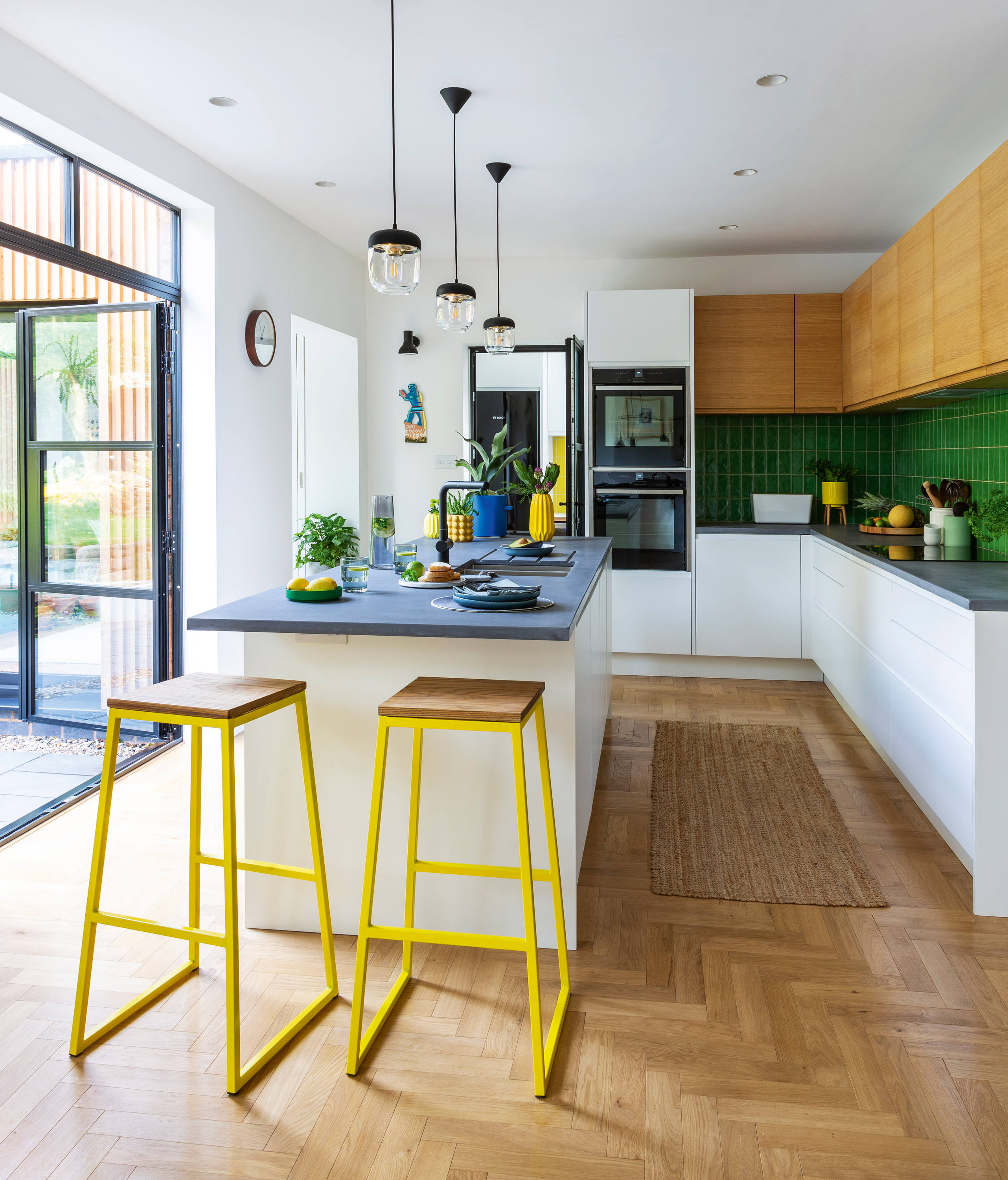
The neutral foundations of the kitchen will appeal to future owners, but the couple have injected plenty of personality through finishing touches. ‘The design as a whole was inspired by Japanese simplicity,’ says Rob. ‘It comes out in things like the way we laid the tiles.’ Burbidge & Co Malmo kitchen, Matthew James Kitchens. Pendant lights, Umage. Bar stools, Cult Furniture. Wall lights, Anglepoise. Tap, Franke
Profile
The owners Rob Kewley (@thehousethatbrumbuilt), a civil servant, his partner, Paul Gardiner, a graphic designer, and their cat, Tigger
The property A four-bedroom 1930s semi in Moseley, Birmingham
Project cost £106,000
‘We bought this house about four years ago. It’s a typical early-1930s semi in that it’s quite unassuming outside, but the rooms are generously proportioned. There was a lounge at the rear that was really tired. The kitchen was dated and cold, and there was a not particularly nice 1980s extension where an alleyway used to be down the side of the house.
‘Paul is a keen cook; we wanted a kitchen where he could prep food while talking to others. We wanted to knock through the rear reception room and the kitchen, but we had no renovation experience. We loved the work Anna had done but wondered if we could afford an architect. What sold us was that she offered to project manage the build, too. Paul and I work full-time, so that was really appealing to us.’
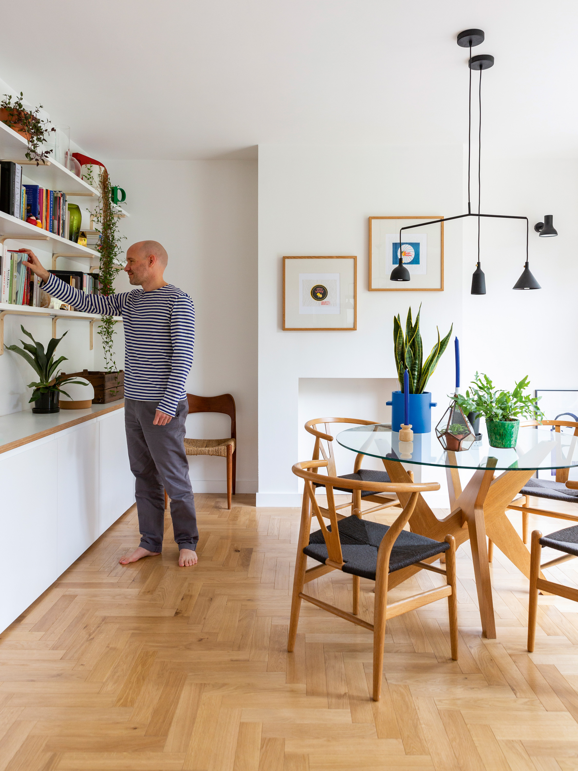
Matthew Hilton table, Case Furniture. Chairs, Swivel UK. Armchair, Ikea. Light, Menu
‘The green garden room was Anna’s idea. We hadn’t envisaged having a traditional reception room there, but she proposed doubling the width of the ugly 1980s extension to create another room. It means we have a sanctuary at the rear of the house from which we can enjoy the lovely garden we inherited from the previous owner.
‘We’re north-west facing, so we get the sun at the back in the morning before it moves to the front of the house. We spend all our time back here, which is why we have so many windows. We went through some quite radical ideas for the glazing – we gave Anna free reign. The heritage aluminium windows we eventually chose have an element of Japanese simplicity to them, and they frame the garden really well.’
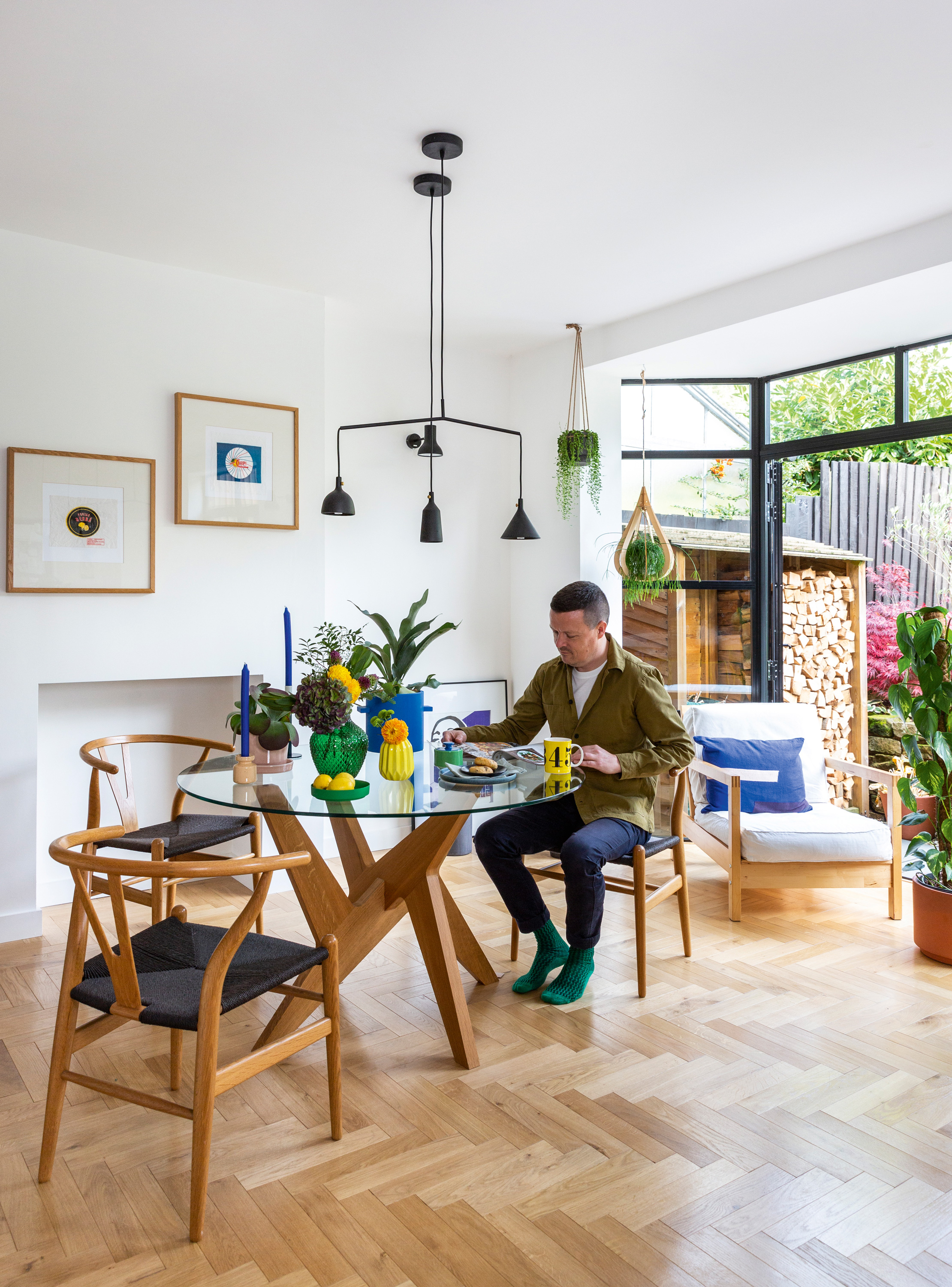
As well as being a great entertaining space, and somewhere Paul can cook without feeling out of the action, the spacious, open-plan layout means the room is perfect for Rob to work from, too. Tectonic oak herringbone flooring, Chauncey. Alitherm Heritage glazing, Smart Architectural Aluminium. Armchair, Ikea
‘We’re both used to going camping, so in a way, living in during the build was a bit like that. The builders put a temporary kitchen in our hallway and there wasn’t a huge amount of dust because the builders closed off the back of the house. We were having our main bathroom done at the same time, so we only had a small cloakroom basin and an outdoor tap.
‘The build went on longer than anticipated because of problems with the glazing, which took a further 18 weeks to be rectified. We had the kitchen in place but no floor and the windows were all boarded up. Builds almost always throw up something that trips you up, though – and looking back, we weren’t too traumatised by it. You go through the process and learn from it.’
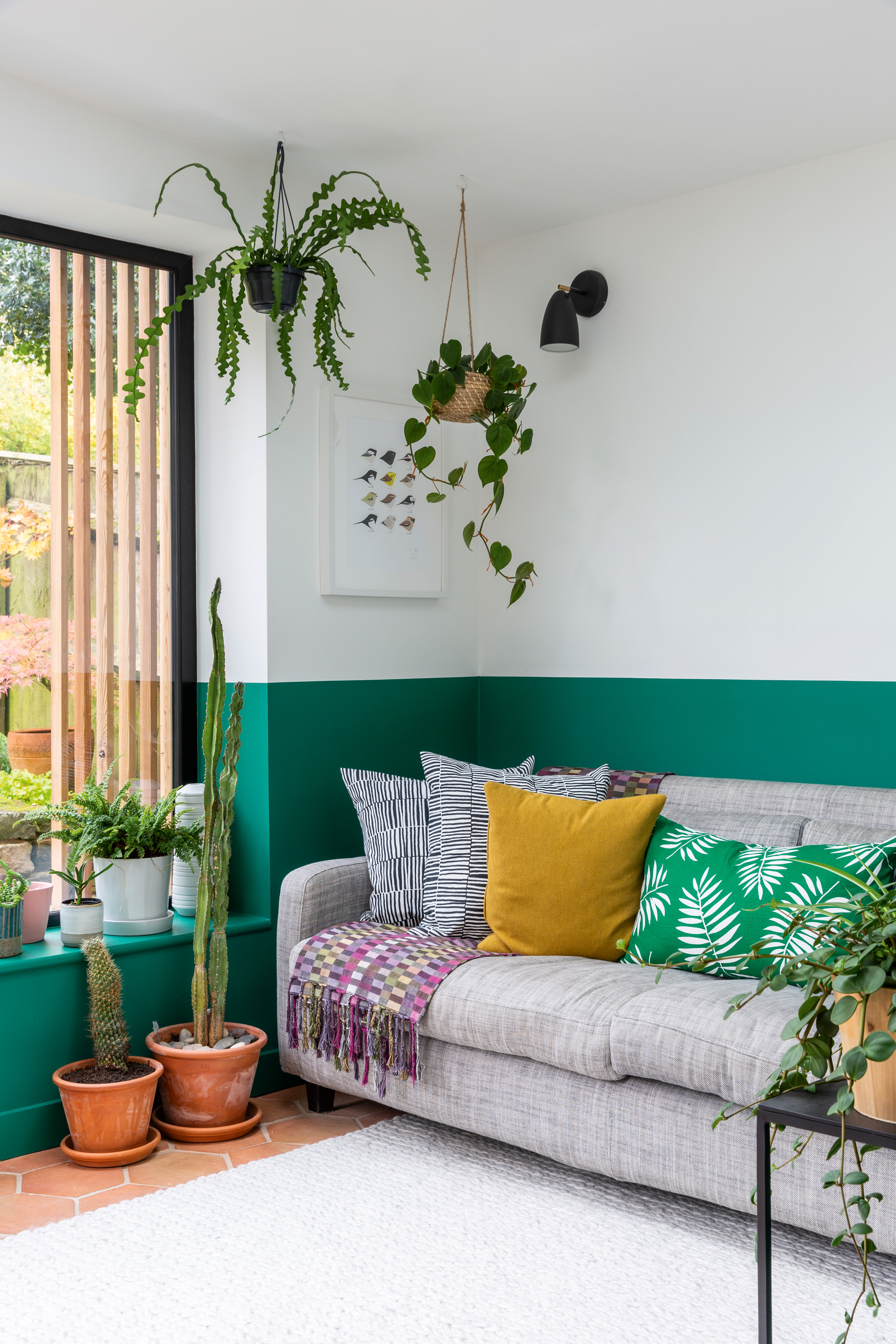
The couple’s architect, Anna, suggested adding an extra room to the open-plan kitchen to better connect the space to the established garden. ‘The band of colour lends interest without feeling overwhelming,’ says Rob. Terracotta floor tiles, Baked Earth. Green walls painted in Poison, Zoffany Paints. Sofa, Habitat. Cushions, Ikea
‘We both wanted something relatively timeless. If this isn’t our forever home, we wanted a scheme that wasn’t so personal it would put off future buyers, although we hope we’ve managed to inject some of ourselves into it, too.
‘The concrete worktops were Anna’s idea. Because the kitchen is white, we were worried it might feel cold when the light moves to the front of the house, so we added oak wall cabinets and wooden flooring to lend it warmth. We weren’t sure whether to paint the whole thing green, but settled on this half-height effect. Colour-blocking brings interest to a plain room, and adding plants makes it feel lived in. I’ve got a stressful job and Paul has a long commute – we wanted a calm, nature-inspired space to retreat to.’
Contacts
Architect Intervention Architecture
Builder Wow Developments
Kitchen Matthew James Kitchens
‘Our whole experience was a steep learning curve. We did spend more than planned, but it’s a once in a lifetime opportunity, so we kept as many of the features of our original design as possible. We were going to scrap the underfloor heating, but I’m glad we kept it – it makes the space more livable. We did make compromises; the rooflight in the garden room is off the shelf rather than bespoke, and we originally planned for the big picture window to be openable.
‘I spend almost all my time in this space, including when I’m working from home. It’s always great to see people come in and look surprised at what they find. We’re proud of what we’ve achieved and it still feels exciting when I walk in. We don’t take it for granted.’
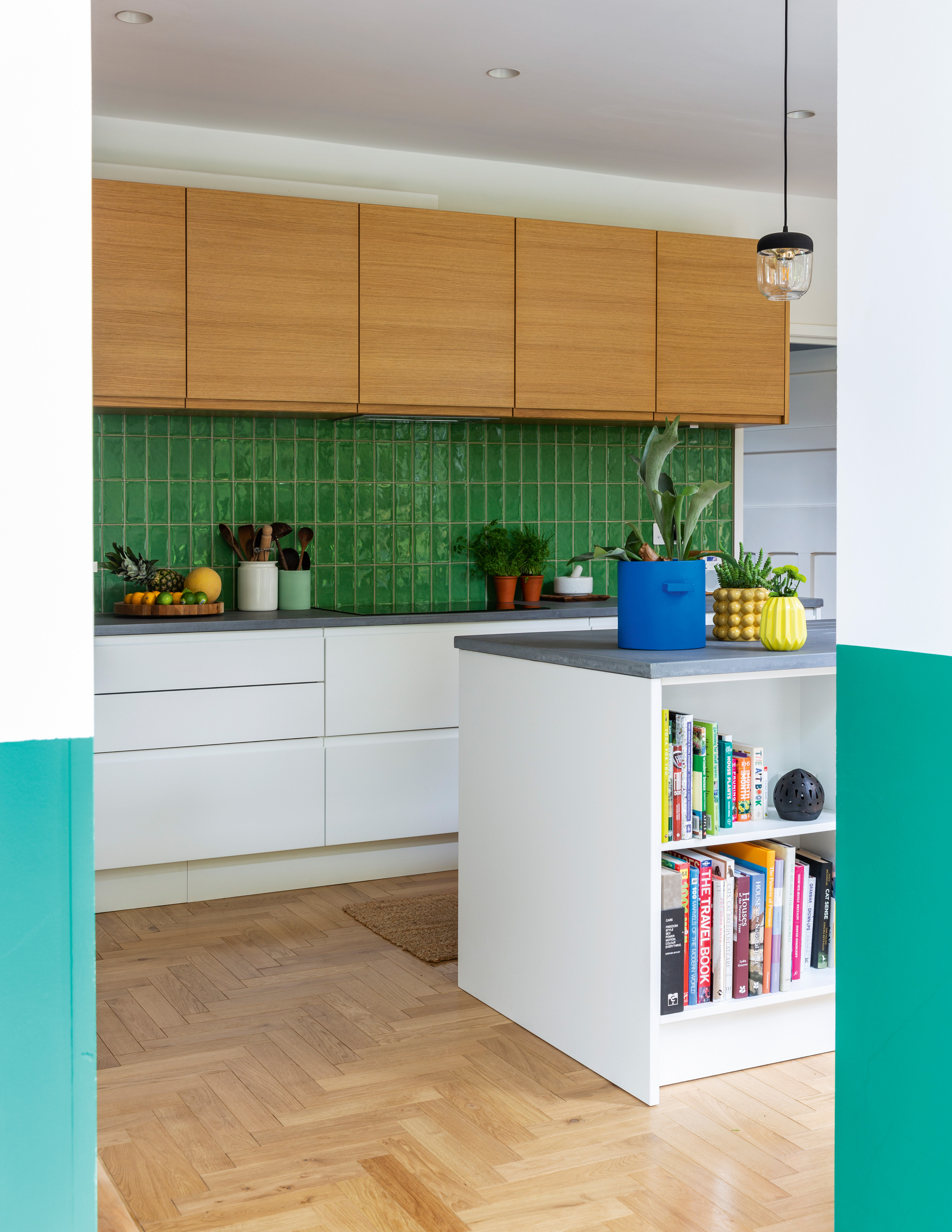
Worktop, Da Vinci Designer Concrete. Splashback tiles, Porcelain Superstore
Subscribe to Real Homes magazine
Want even more great ideas for your home from the expert team at Real Homes magazine? Subscribe to Real Homes magazine and get great content delivered straight to your door. From inspiring completed projects to the latest decorating trends and expert advice, you'll find everything you need to create your dream home inside each issue.
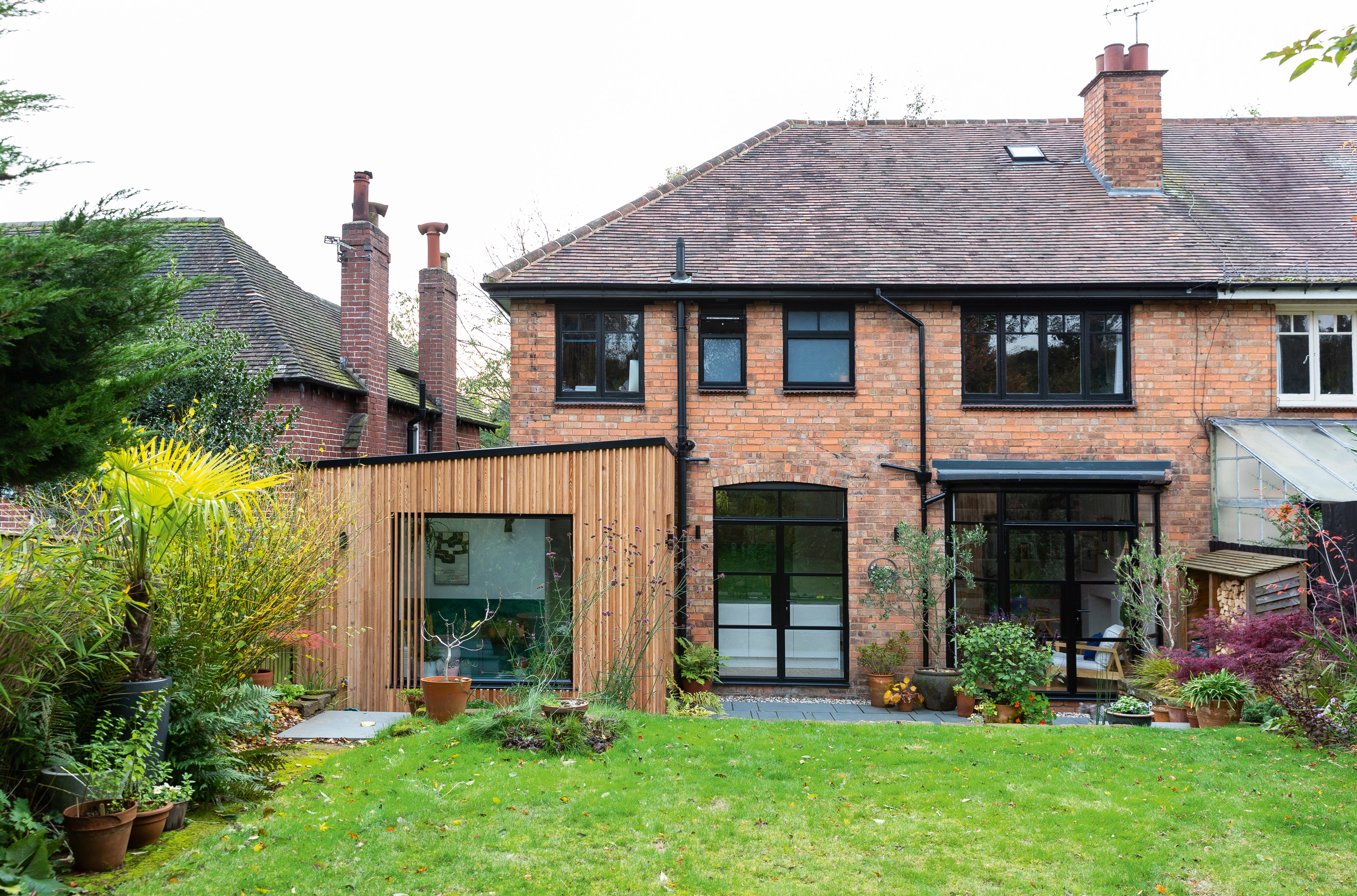
‘People are always surprised to see this at the back of a very normal-looking house,’ says Rob. ‘Our neighbours have knocked through to create a kitchen-diner now – we think we might have had an influence!’ Planed Siberian larch cladding, Vincent Timber. Brazilian grey slate paving, Infinite Paving. Picture window and glazed door, Origin
Join our newsletter
Get small space home decor ideas, celeb inspiration, DIY tips and more, straight to your inbox!

Formerly deputy editor of Real Homes magazine, Ellen has been lucky enough to spend most of her working life speaking to real people and writing about real homes, from extended Victorian terraces to modest apartments. She's recently bought her own home and has a special interest in sustainable living and clever storage.
-
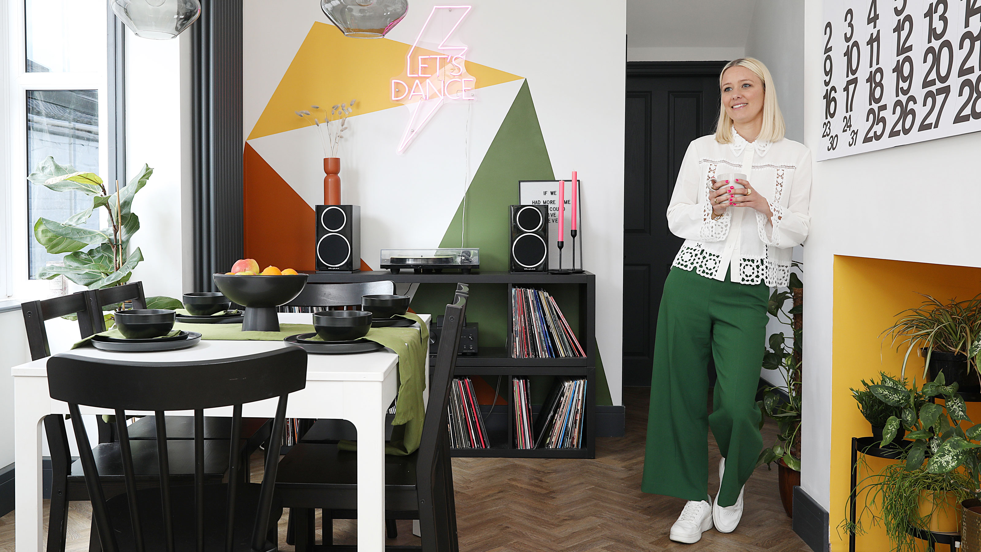 This colourful home makeover has space for kitchen discos
While the front of Leila and Joe's home features dark and moody chill-out spaces, the rest is light and bright and made for socialising
By Karen Wilson Published
-
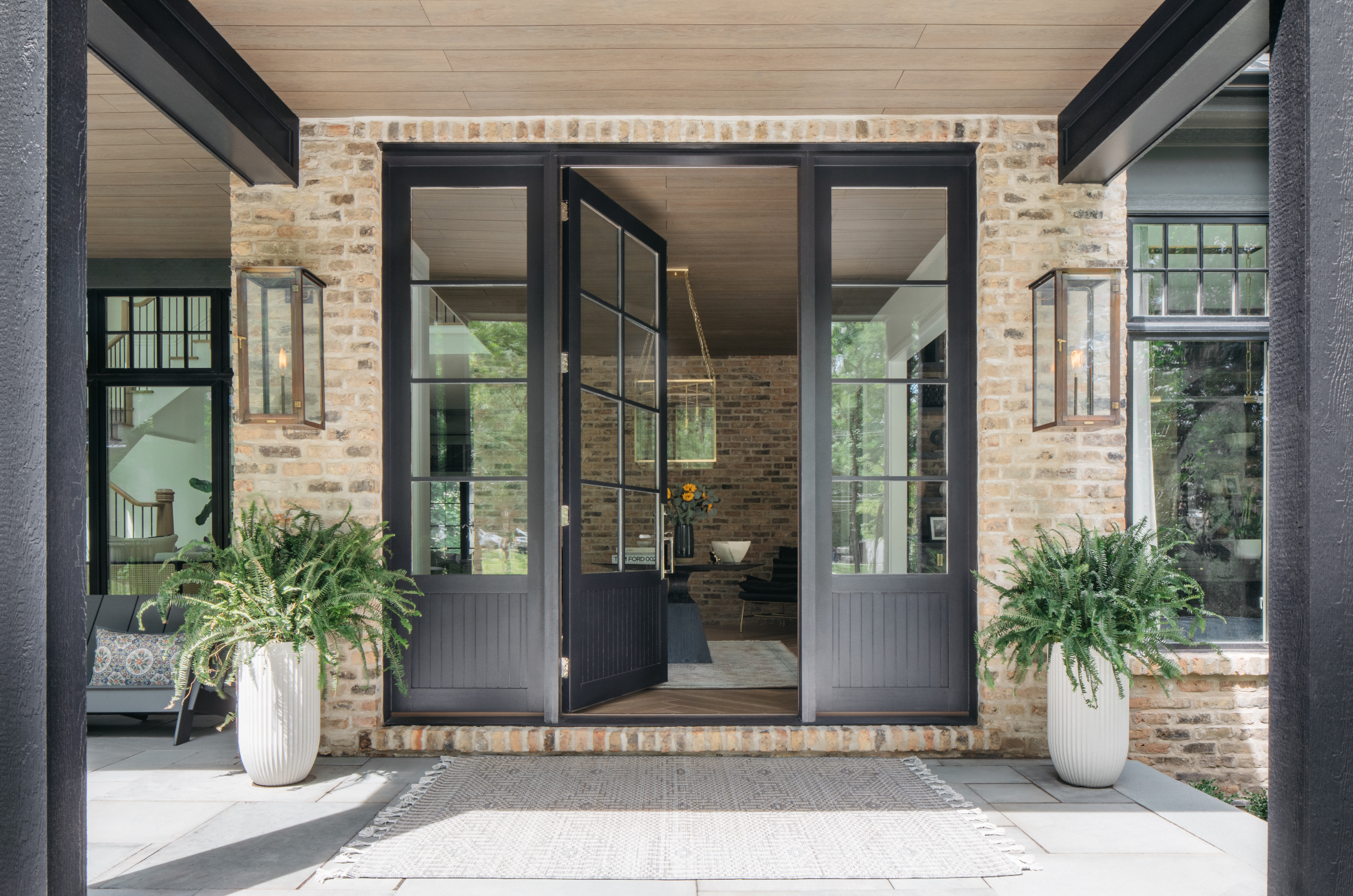 How to paint a door and refresh your home instantly
Painting doors is easy with our expert advice. This is how to get professional results on front and internal doors.
By Claire Douglas Published
-
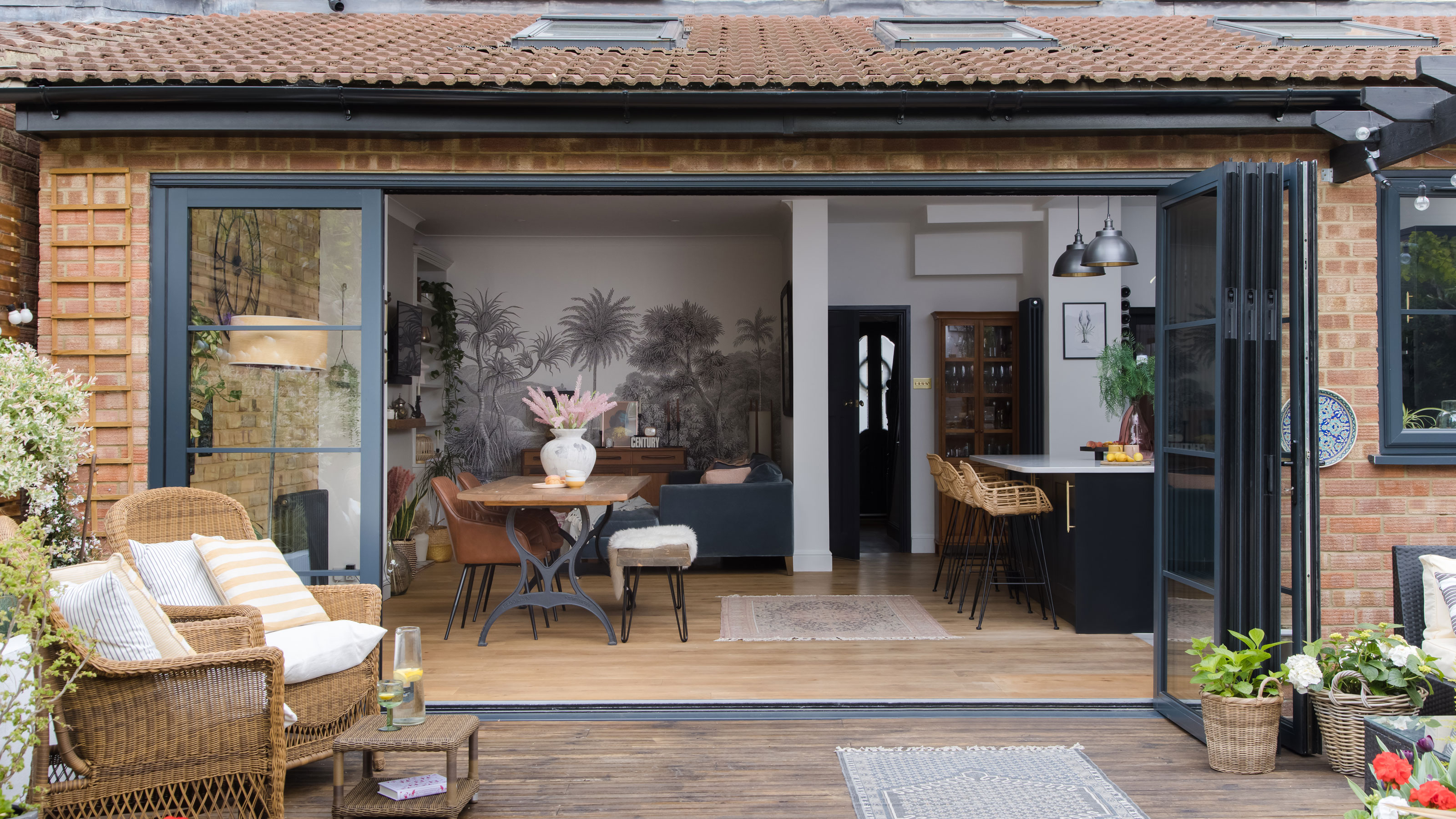 DIY transforms 1930s house into dream home
With several renovations behind them, Mary and Paul had creative expertise to draw on when it came to transforming their 1930s house
By Alison Jones Published
-
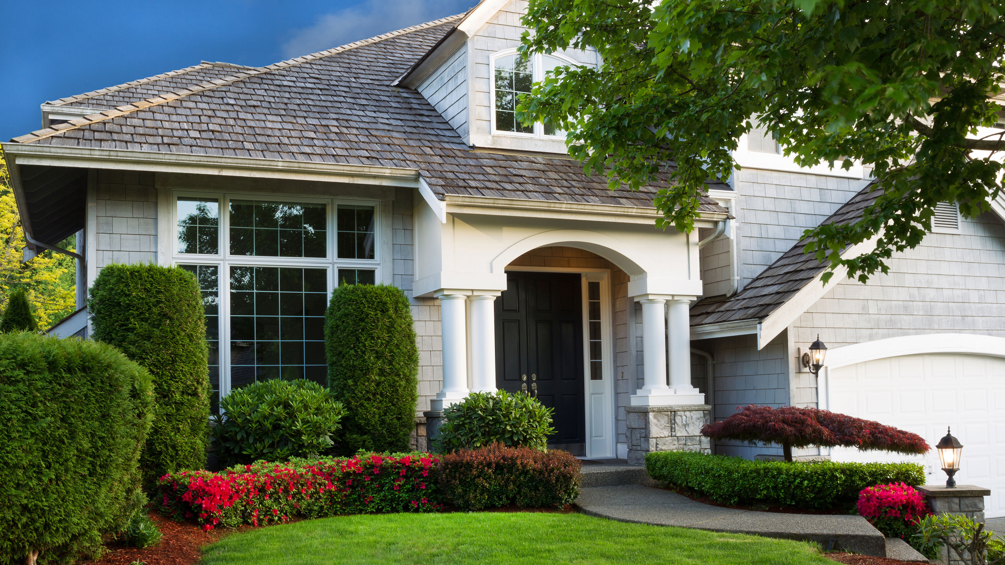 12 easy ways to add curb appeal on a budget with DIY
You can give your home curb appeal at low cost. These are the DIY ways to boost its style
By Lucy Searle Published
-
 5 invaluable design learnings from a festive Edwardian house renovation
If you're renovating a period property, here are 5 design tips we've picked up from this festive Edwardian renovation
By Ellen Finch Published
-
 Real home: Glazed side extension creates the perfect garden link
Louise Potter and husband Sean's extension has transformed their Victorian house, now a showcase for their collection of art, vintage finds and Scandinavian pieces
By Laurie Davidson Published
-
 I tried this genius wallpaper hack, and it was perfect for my commitment issues
Beware: once you try this wallpaper hack, you'll never look back.
By Brittany Romano Published
-
 Drew Barrymore's new FLOWER Home paint collection wants to give your walls a makeover
Drew Barrymore FLOWER drops 27 brand-new paint shades, and every can is made from 100% post-consumer recycled plastic.
By Brittany Romano Published
