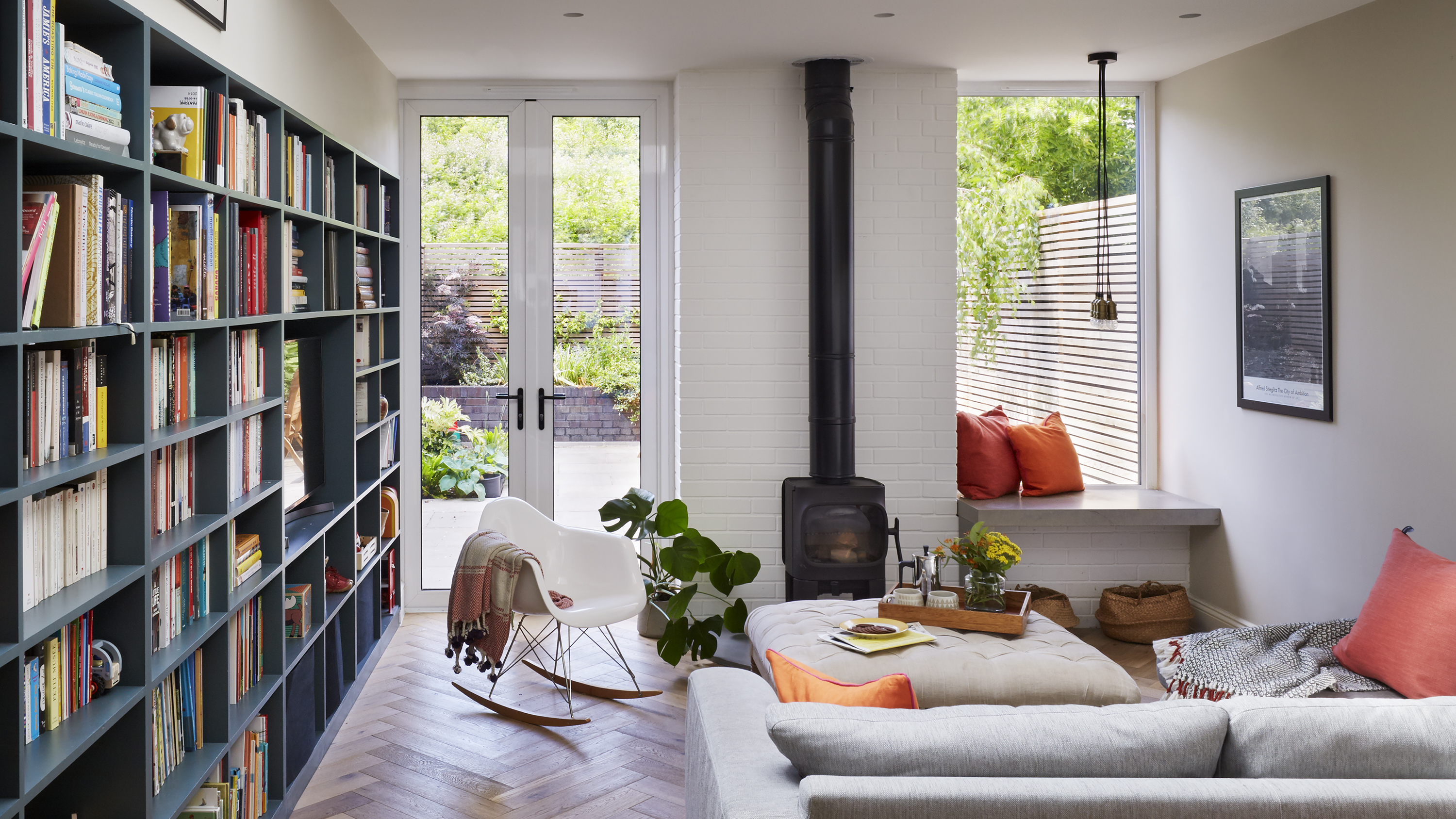

The benefits of working with an architect on your extension or renovation project are endless. Not only can they help to bring your vision to life, they can lend an expert eye to suggest where you could be making better use of a small space, bringing more light into a room, or adding seemingly simple features that become invaluable to your daily routine.
Ludivine and her husband Phil saw these benefits and more when they enlisted a local architect to help them realise their dream of a family home. Keen to create a flexible house in which their young family could grow up, the couple collaborated with a team of experts who helped them consider the way they use their home – and then shaped the project around that lifestyle. They even worked with an interior architect to design the chic, muted colour scheme that brings each room together.
Below, Ludivine delves into the process as she takes us on a tour of her home. Want more inspiration? Explore the rest of our completed projects.
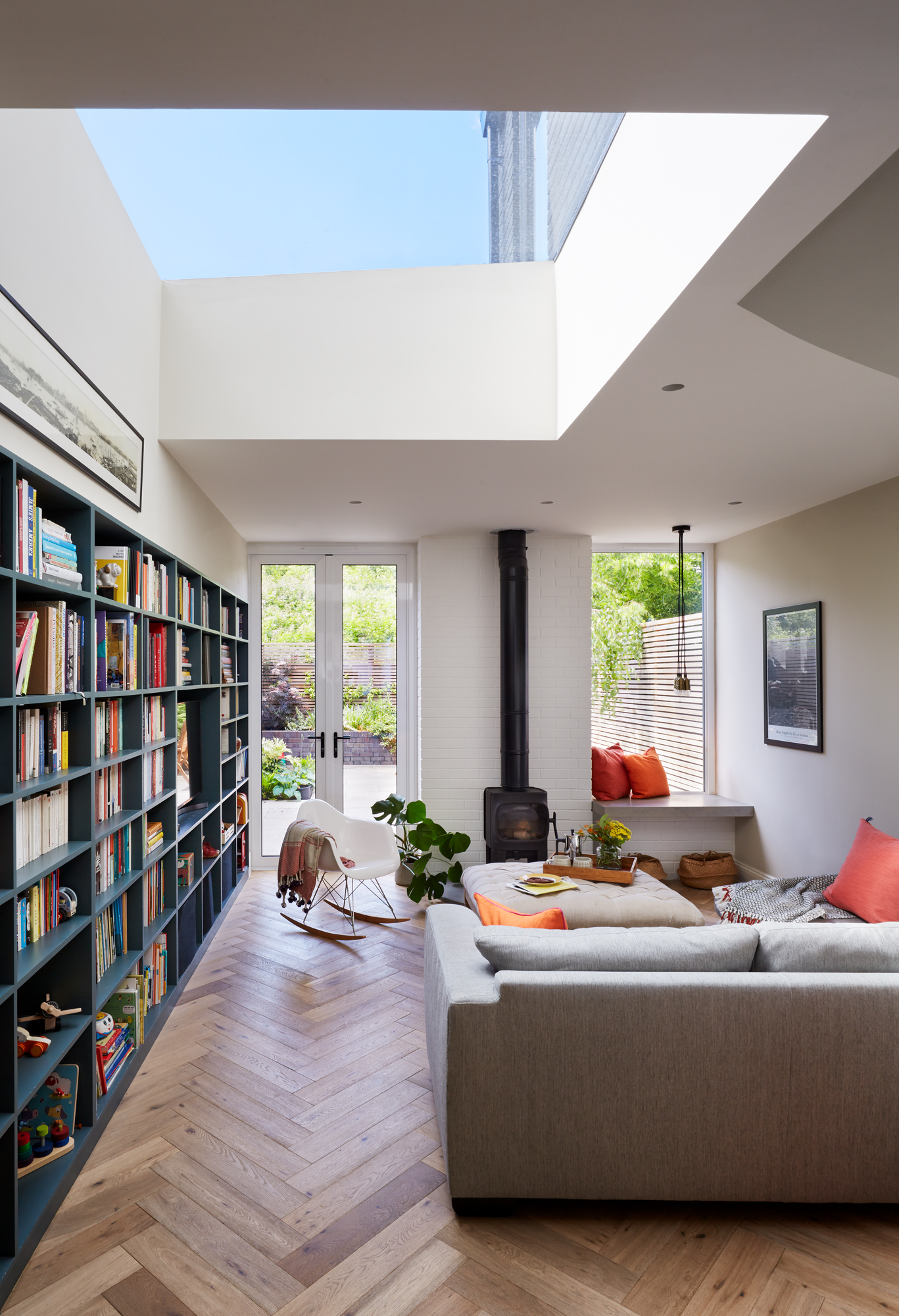
Glazing, Glazing Vision. Stove, Jotul. Sofa, John Lewis & Partners. Footstool, Swoon. Pendant lights, Made
Project notes
The owner
Ludivine, a university lecturer, her husband, Phil, a barrister, and their children, Elliott, four, and Camille, one, and a baby on the way
The property
A five-bedroom Victorian terraced house in north London
Project cost
£200,500
'We looked at the archives when we bought this house and discovered that its first owner was a book binder in the 19th century. It had always had four levels, but owners since had created a makeshift loft conversion. It’s a narrow house, but it’s also very long and very tall. The kitchen and dining room were on the ground floor and the living room on the first floor, and there was a bathroom and separate toilet. It was all in pretty good condition – it even had original floorboards.'
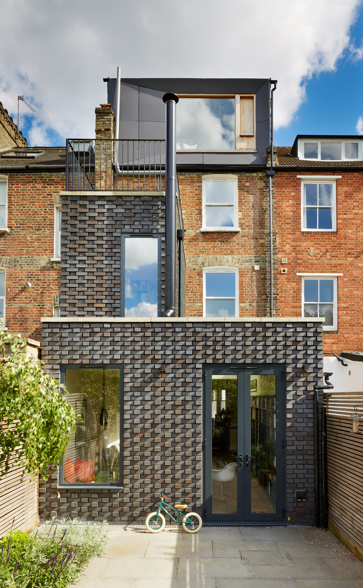
Loft cementboard cladding, Marley. Paving, London Stone
‘We lived here for three years before we did any major work. We knew we wanted an extension and bought the house with the view of doing work when we could afford it. It’s actually coincided nicely with the major milestones in our lives – the children. I had Elliott right before we completed the loft conversion, then Camille when we did the bigger extension.
‘We knew we wanted an architect. We needed someone who could help me think outside the box, and working with Trevor Brown and his team, including his interior designer Odeta, did exactly that. We were looking for someone who knew the area, and his business was local. It’s grown and grown since we’ve known him, which is amazing to see.'
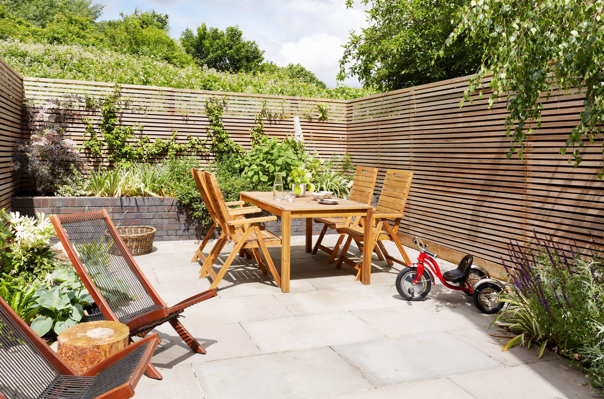
'We hesitated for a long time about paving the garden over. While it’s lovely to have greenery outside, if we had grass we’d need space for a lawnmower, too, and we physically couldn’t fit that in. We’re lucky to have a nature reserve behind our house, so we have trees all around us, as well as plenty of parks for when the kids want to run around.
‘It’s about compromise. What’s so wonderful about extending is that it’s about how to make it work for your life. We don’t particularly enjoy gardening, so we designed the garden so we don’t have lots to do but can still enjoy the space.'
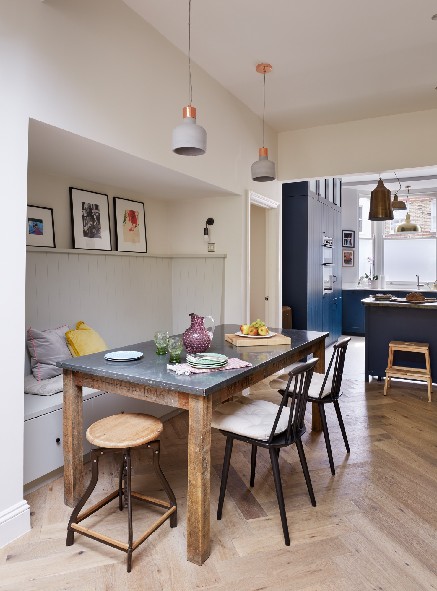
Panelling painted in Cromarty, Farrow & Ball. Pendant lights, Cox & Cox. Dining table, Quirky Interiors. Hay chairs, Ebay. Bar stool, John Lewis & Partners
More from Real Homes
Love your daily dose of Real Homes? Then why not subscribe to our magazine? Packed with fabulous readers' homes, trend features, project advice and easy updates, you'll wonder how you ever lived without it.
'We were pretty far-sighted at the beginning of the project. We knew we wanted kids – I’m currently expecting our third – and we didn’t want to have to move later on. Thinking about the space in that way, it was clear that the existing layout – the kitchen and dining room downstairs and the living room upstairs – would be a nightmare with children. When Elliott was little, he was always up and down, so we couldn’t even leave him in the living room while we made a cup of tea. It wasn’t a child-friendly space; this open-plan downstairs layout is so much easier.
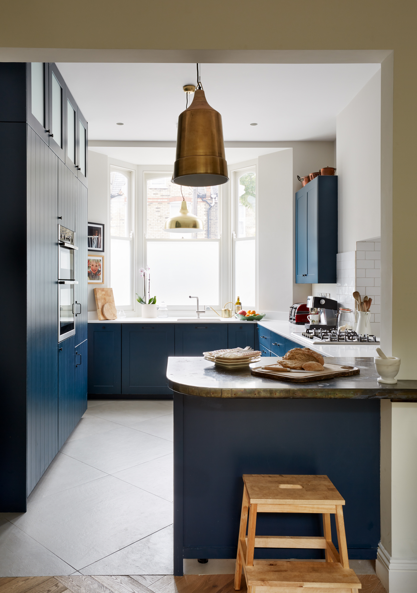
Flooring, Mandarin Stone. Metro tiles, Tons of Tiles. Worktop, Imperial Marble. Tap, Blanco. Pendant lights, Graham & Green. Wooden step stool, Ikea. Walls painted in Ammonite and units in Hague Blue, both Farrow & Ball
'A dark kitchen was on my list, but I was so unfamiliar with the idea of colour. Being French, we use a lot less colour in our clothes and our homes, so I was a bit hesitant to go ahead and paint something dark blue, but Trevor and Odeta were totally on board with it. I learned so much from them. I wouldn’t love the house anywhere near as much if I hadn’t done it with this fantastic team on board.'
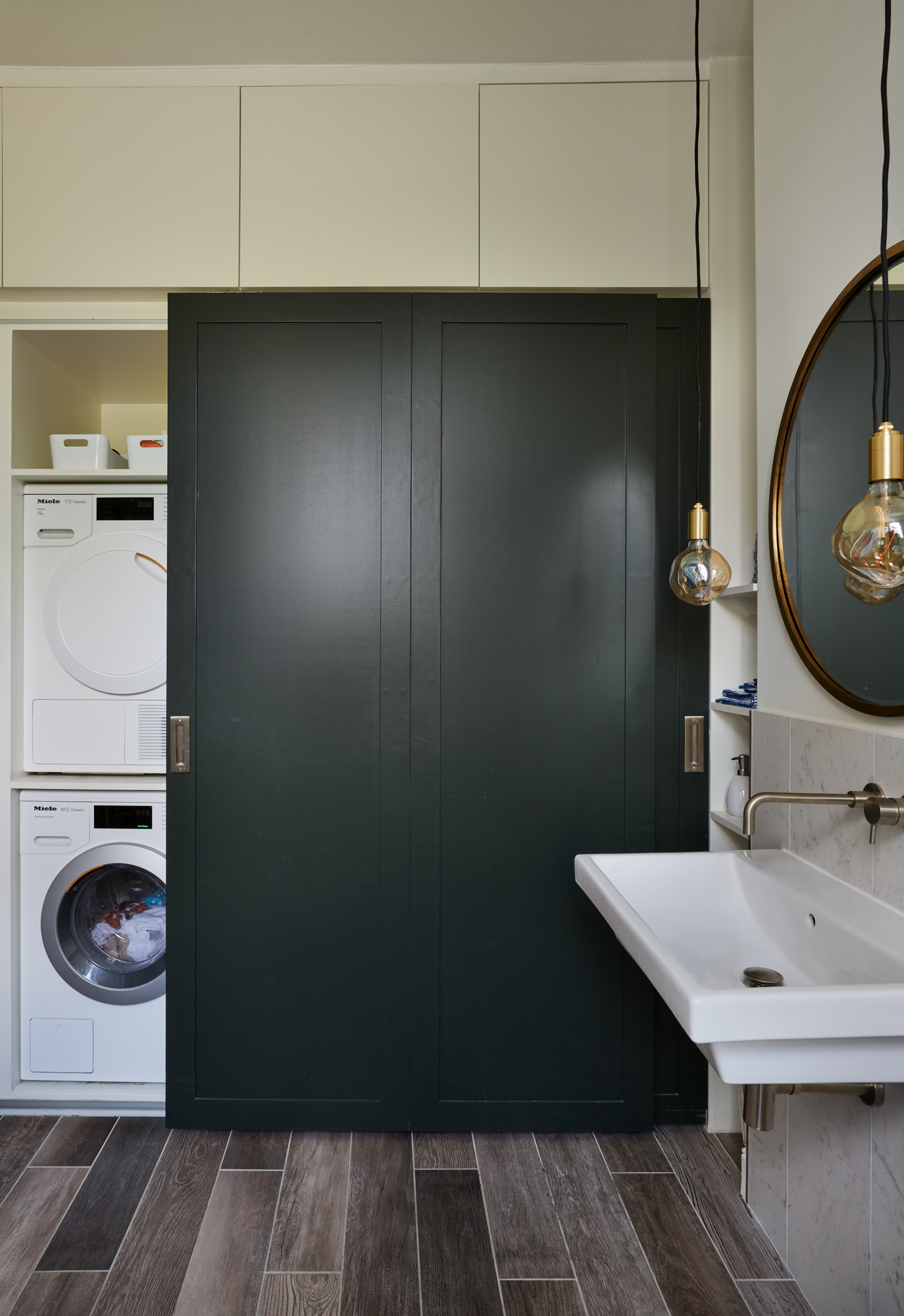
Flooring and splashback, Mandarin Stone. Tap, Aston Matthews. Sink, Bathstore
'I liked the idea of a partly green bathroom, and the plants help to offset the colour. Having the laundry space in here was mostly a case of necessity – it couldn’t be anywhere else! I tried everything I could to create a separate room for it, but Trevor rightly pointed out that it would just mean creating more of the small, bitty spaces that we wanted to get rid of in the first place. It’s also handy having it near the bedrooms.'
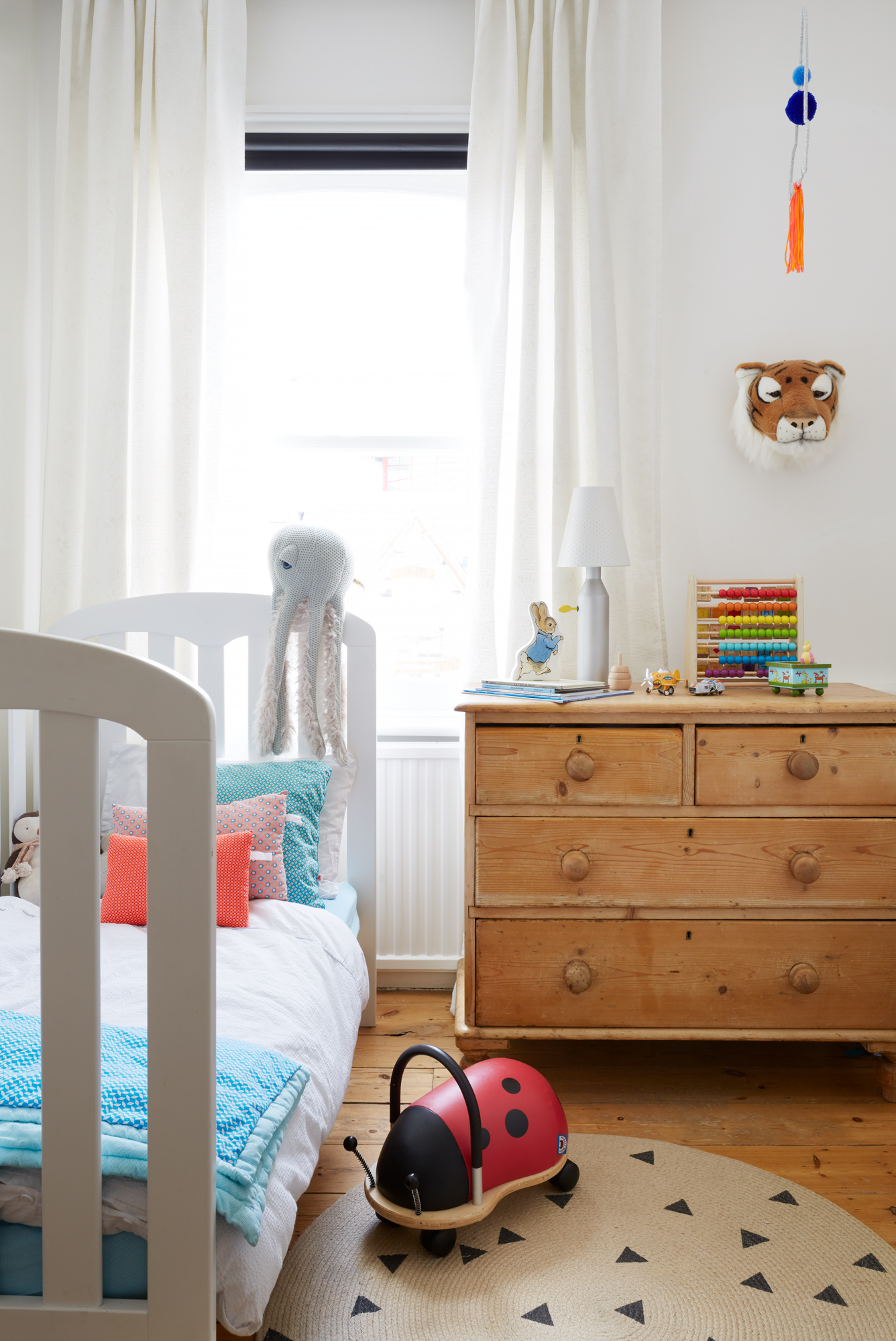
Bed, John Lewis & Partners. Octopus, BigStuffed. Wheelybug ladybird, After Noah. Tiger head, Smallable. Rug, Ferm Living
'I’ve always liked interiors. My mum curated our house carefully and thoughtfully, and it’s made me pay attention to the spaces I inhabit. I have a certain vision of the things I like, such as in the children’s rooms, but when I put it down into a moodboard, there’s lots of different things going on. Trevor and Odeta got me to think about uniformity. The gorgeous joinery throughout was custom built by the build team, which adds to this continuity.'
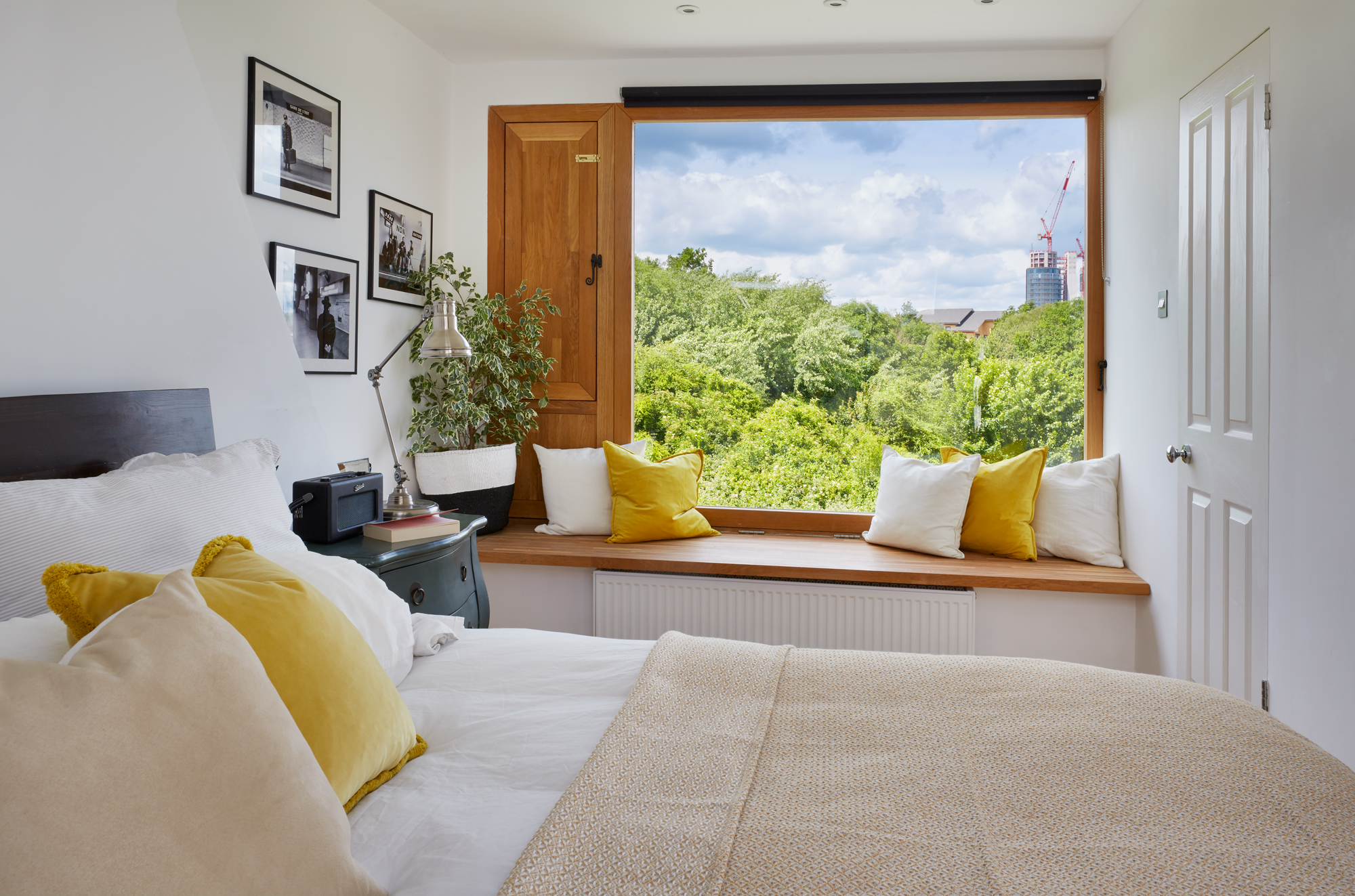
Window blinds, John Lewis & Partners. Bed, Warren Evans. Bedside table, Made. Table lamp, TK Maxx
'Trevor drew up the plans for an open, airy loft conversion. We didn’t need a big room for our bedroom because we’re not in here often. It taught me a lot, especially that building projects, as well as motherhood, are hard! The work started when Elliott was six weeks old and we were sleeping on a mattress in the living room for weeks. We moved out temporarily for our subsequent and main extension project.
'I love the picture window in the loft. It brings in so much light. The décor in here is predominantly white and clean – more minimalistic than the other spaces. When you open the window and feel the breeze, it’s such a refreshing space. I love waking up in here, and it’s cosy and secluded – a relaxing space we can disconnect in after a day around the kids.'
Contacts
- Architect: Trevor Brown Architect
- Build team: CR Building Contractors
- Glazing: Glazing Vision
- Loft cementboard cladding: Marley
Read more:
Join our newsletter
Get small space home decor ideas, celeb inspiration, DIY tips and more, straight to your inbox!

Formerly deputy editor of Real Homes magazine, Ellen has been lucky enough to spend most of her working life speaking to real people and writing about real homes, from extended Victorian terraces to modest apartments. She's recently bought her own home and has a special interest in sustainable living and clever storage.
-
 5 Gen Z and millennial influencers to follow for all things homes and interiors
Need some on-trend home and interior inspo? These are the five millennial and Gen Z influencer accounts I can't stop scrolling for small homes and rentals
By Louise Oliphant
-
 8 calming paint colors to create a blissful home sanctuary
Relax, revive and renew with a soothing palette of mindful paint shades.
By Sophie Warren-Smith
-
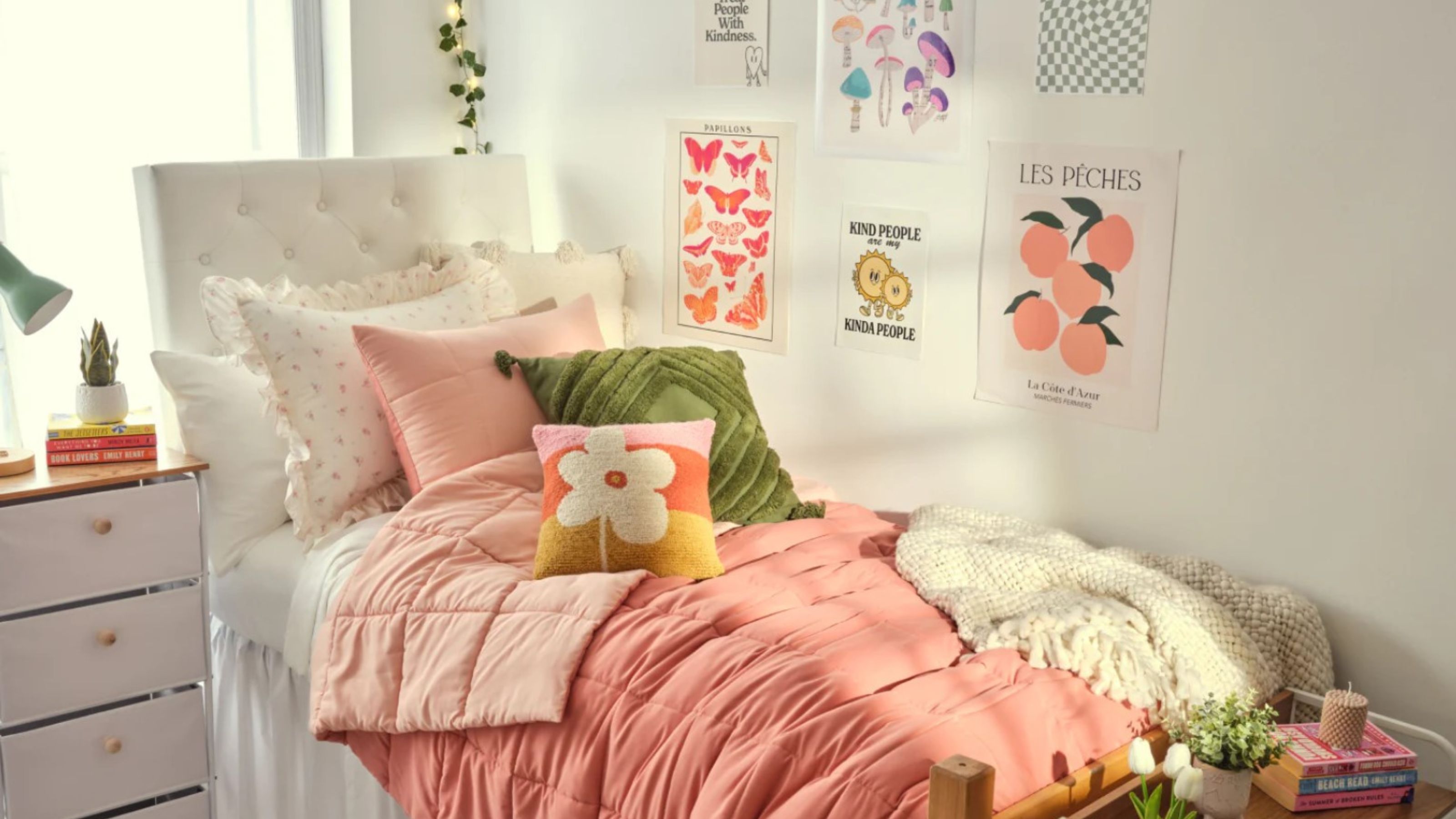 10 dorm room ideas to make your place the cutest on campus
Heading to college soon? These dorm room ideas range from sweet styles to savvy solutions...
By Eve Smallman
-
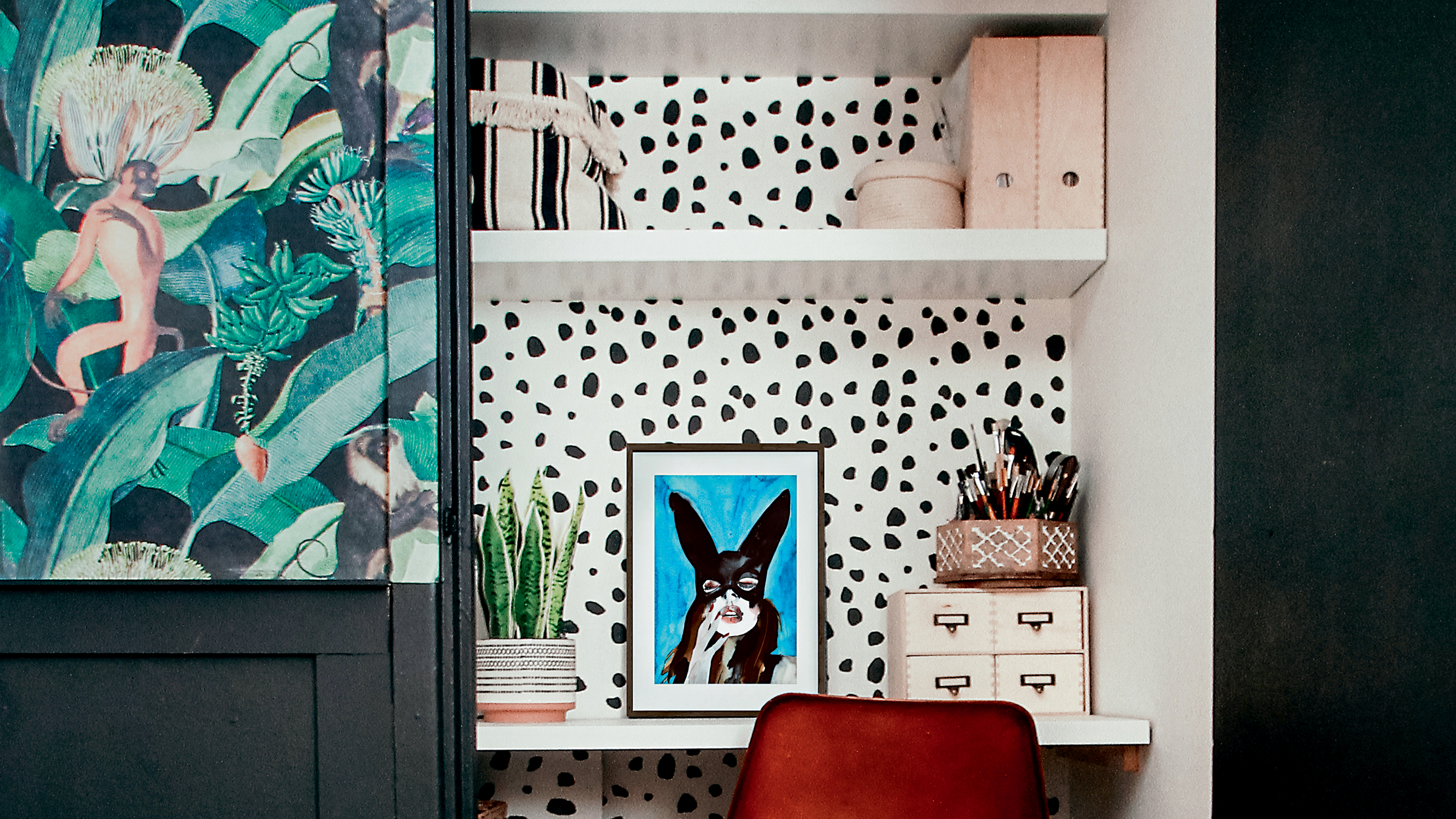 Alcove ideas: 25 ways to style an awkwardly shaped space
From home offices to cozy reading nooks, copy these alcove ideas to create an inspiring space – with shelving or not...
By Hebe Hatton
-
 It's true, Target's Studio McGee collection has all of your holiday decorating handled
Target's new Studio McGee installment will deck all of your halls — and so much more!
By Brittany Romano
-
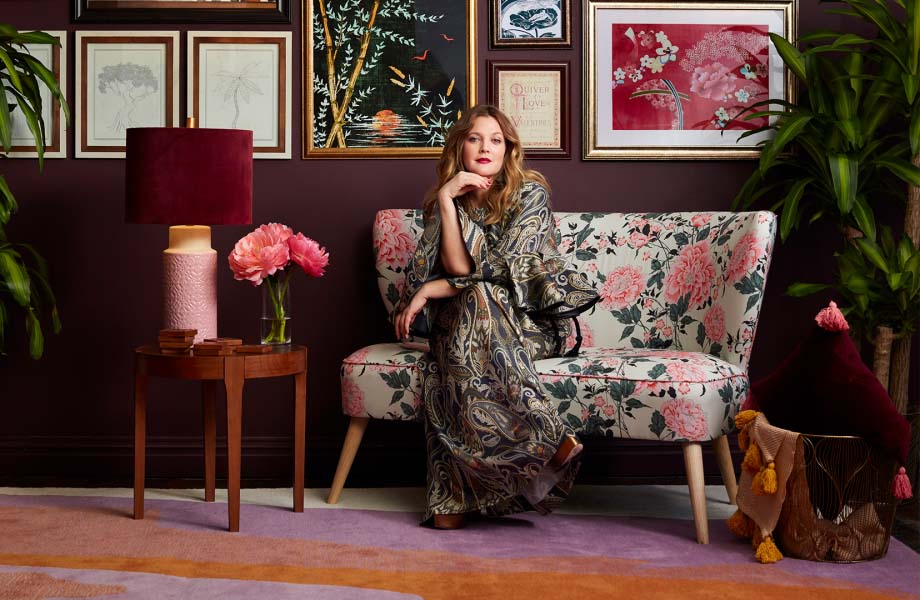 Spotted: 9 celebrity home decor brands that will have you living like your favorite A-listers
So many celebrity home decor brands to shop for, so little time.
By Brittany Romano
-
 This World Market mirror rivals *that* designer best-seller (at a fraction of the price!)
This World Market mirror is a dead-on doppelganger for Anthropologie's version — but at a fraction of the price.
By Brittany Romano
-
 Chloé Lukasiak reveals how she's decorating her first 'big girl' apartment
Chloé Lukasiak reveals the process of designing and decorating her 'young but chic' apartment.
By Brittany Romano