When Ali and Rob moved into their dated Edwardian terrace, which had been occupied by its previous owners since the 1930s, a full-scale renovation was on the cards. After months of living with parents, they were keen to get started straight away. But with just weeks until the arrival of their first baby, progress was limited. There was only time to make two rooms habitable before the new member of the family arrived, so the couple’s grand plans were temporarily put on hold.
It wasn’t until almost a year later, when their carefully-considered open-plan extension was complete, that the house really came into its own as a space for family living and flexible working. With Ali’s experience as an interior stylist, their home is now both practical and pleasing to the eye, with a kitchen-diner-living area that offers a multifunctional space for work, play, cooking and entertaining. Here, the couple talk through the process of creating their dream home
If you are planning to create your ideal kitchen-diner by extending your house, we have lots of expert advice on how to do it. For more real home transformations, head to our hub page.
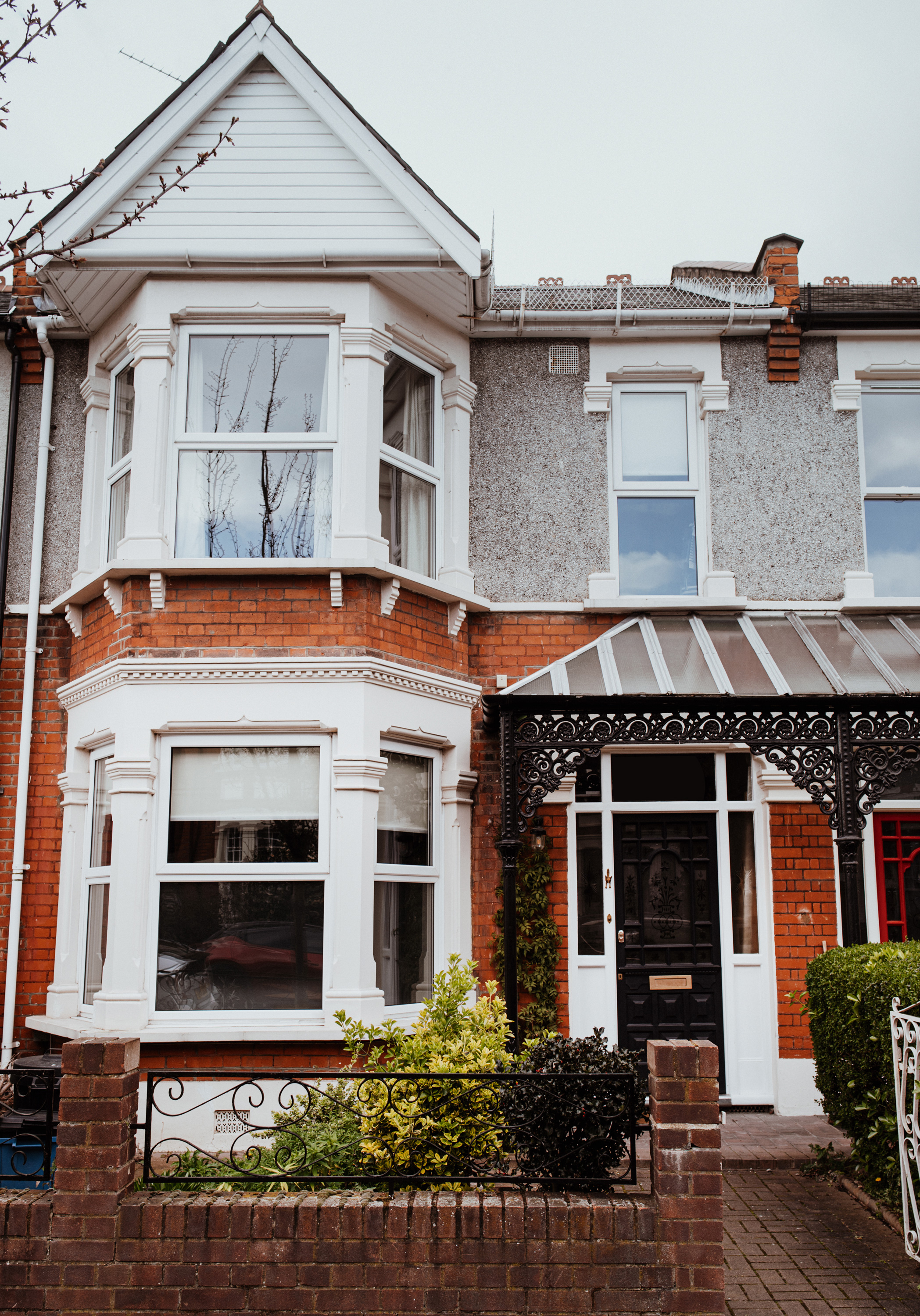
Ali had always longed to own a period house, and this one retained much of its original charm
Profile
The owners Ali Lovett, an interior stylist (alisonlovett.co.uk) and wedding planner (unionweddings.co.uk) lives with her husband, Rob, a creative partner at Facebook, son Ellis, daughter Rae, and miniature schnauzer Betty
The property A three-bedroom Edwardian terrace in Aldersbrook, east London
Project cost £92,400
‘Ever since my first job at an interiors magazine 12 years ago, I’ve always dreamed of owning a period home, somewhere I could put into practice all the things I’d learned along the way,' says Ali. 'It was a slow start waiting to move in, taking over seven months to complete. During this time we’d sold our flat and were living at my parents, and the clock was ticking because I was pregnant.
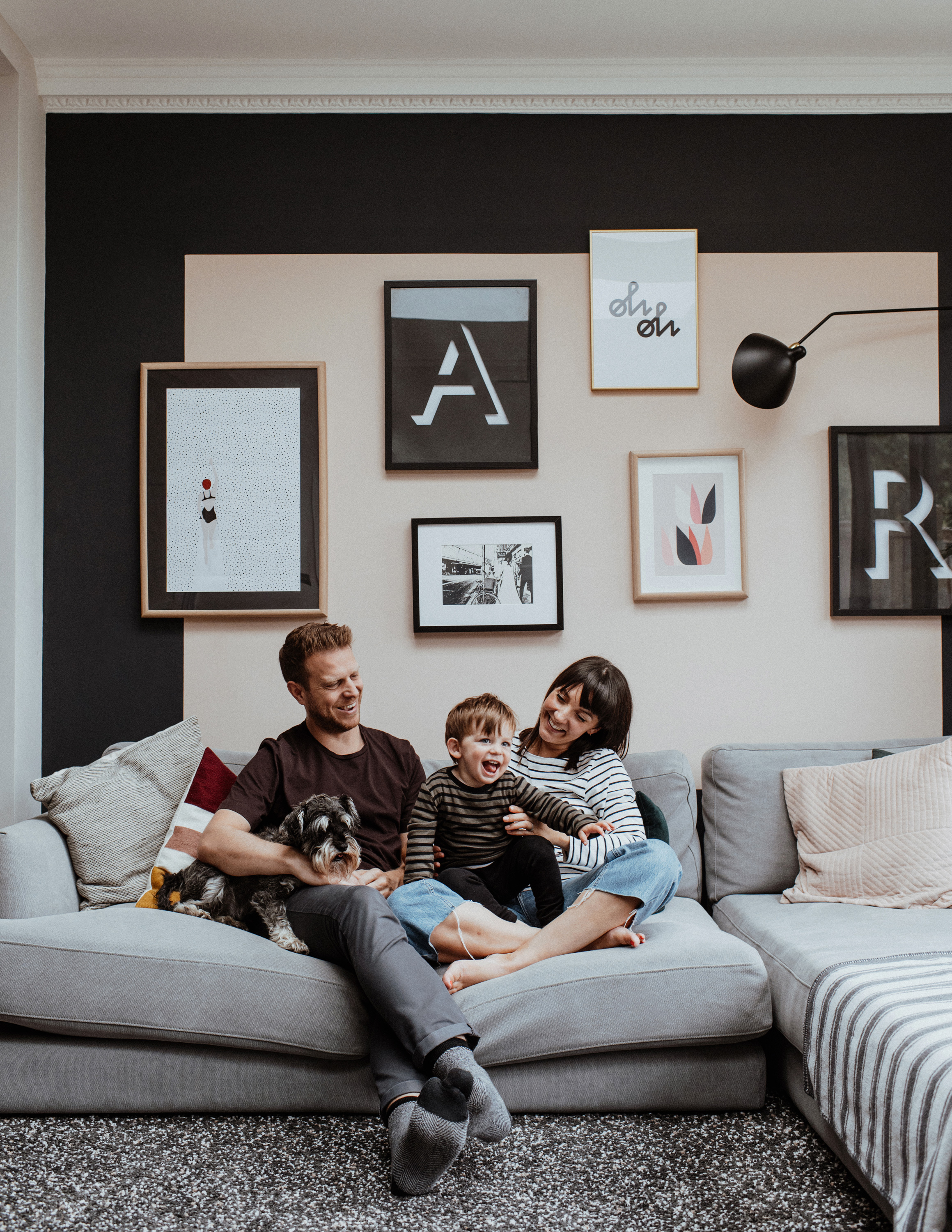
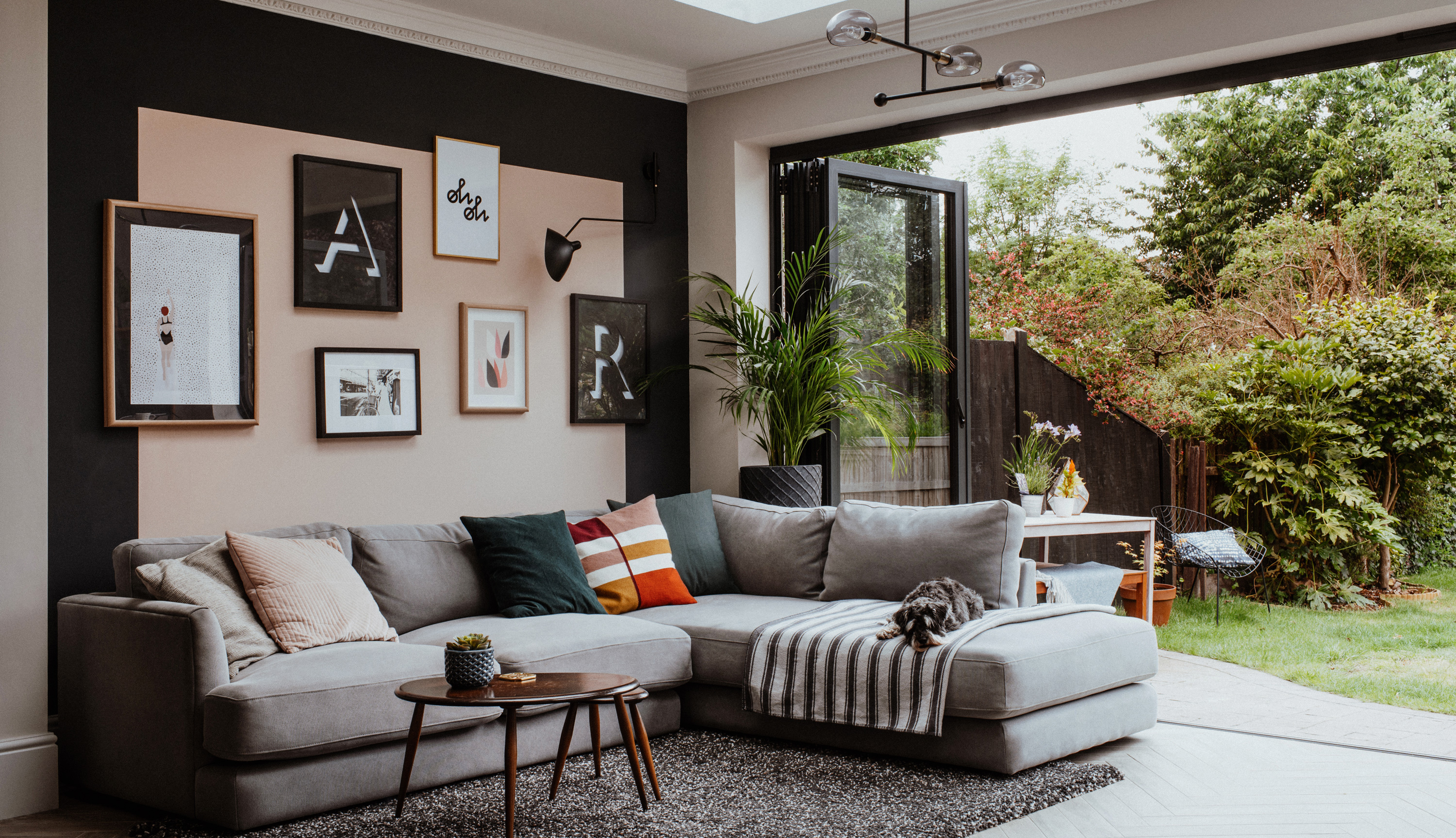
The peach-pink gallery wall has been framed with an edge of dark colour to give definition to the space. ‘I swap the prints around my house quite a lot because I like to refresh the space regularly,’ says Ali. ‘Rob made the 3D “A” and “R” – they were the last part of the “BAR” sign for our wedding.’ Bi-fold doors and skylights, Vivafolio. Coving, Plaster Mouldings Direct. Sofa, West Elm. Cushions, H&M Home. Ercol nest of tables, Ebay. Ceiling light, Made (all main image) Rug and frames, Ikea. Gallery wall painted in Temple, Paint & Paper Library, and Railings, Farrow & Ball. Woodwork painted in Sleeping Inn, Valspar. Striped throw, Ian Mankin. Wall light, Bluesuntree. Swimmer and Oh Oh prints, both Juniqe. Flower print, King & Mcgaw
‘In the end we moved in with just three weeks to go until the baby arrived. Luckily our builders, who are family friends, could jump straight in and get to work. They managed to redecorate two rooms before Ellis arrived – though they were still madly painting the final coat of the master bedroom when we all arrived home from hospital.'
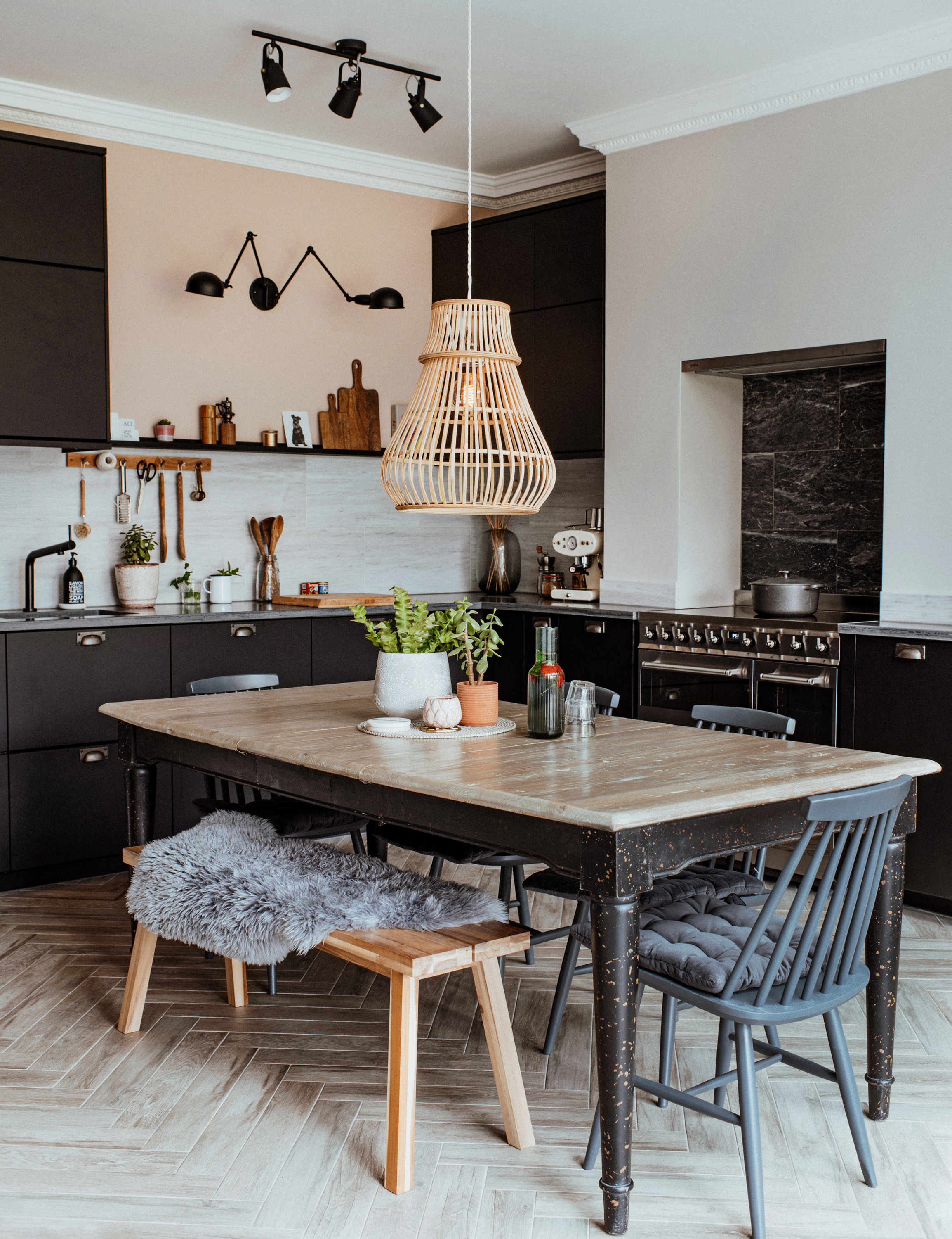
All the furniture has been carefully selected to make the space multifunctional. ‘Rob is a keen cook and we both love entertaining,’ says Ali. ‘We chose an extendable dining table that seats up to 12, a pendant light that can be hooked up and a sofa split into two and moved. It means we can host dinner parties or create a huge dance floor!’ Dining chairs, Ebay, painted in Railings, Farrow & Ball. Table, Loaf. Kitchen cabinets and bench, Ikea. Sheepskin throw, Dunelm. Pendant light over dining table, Broste Copenhagen at Amara. Drawer and door handles, Dowsing & Reynolds. Floor tiles and Apollo Slabtech worktop, Wickes. Marble splashback tiles, Mandarin Stone. Kitchen wall painted in Temple, Paint & Paper Library. Coving painted in Sleeping Inn, Valspar. Range cooker, Smeg. Kitchen wall light, Wayfair. Ceiling light over kitchen, Made. Coving, Plaster Mouldings Direct
‘We fell in love with Aldersbrook and put offers on several houses along our road,' Rob reveals. 'It’s a hidden gem – a small Conservation Area of Edwardian houses surrounded by green space, but with train connections into Liverpool Street.
‘We did less DIY than I’d planned due to lack of time, but I did strip all the wallpaper to save cash (no mean feat when there’s layers of woodchip on three-metre high ceilings!). I’m the practical voice to Ali’s creative vision. When it came to making decisions, we discussed every layout option in minute detail. We’d decided on three different locations for the kitchen at various points! It was a meticulous process, but it meant there’s nothing we regret. I’m proud we achieved all this on a fairly modest budget.'

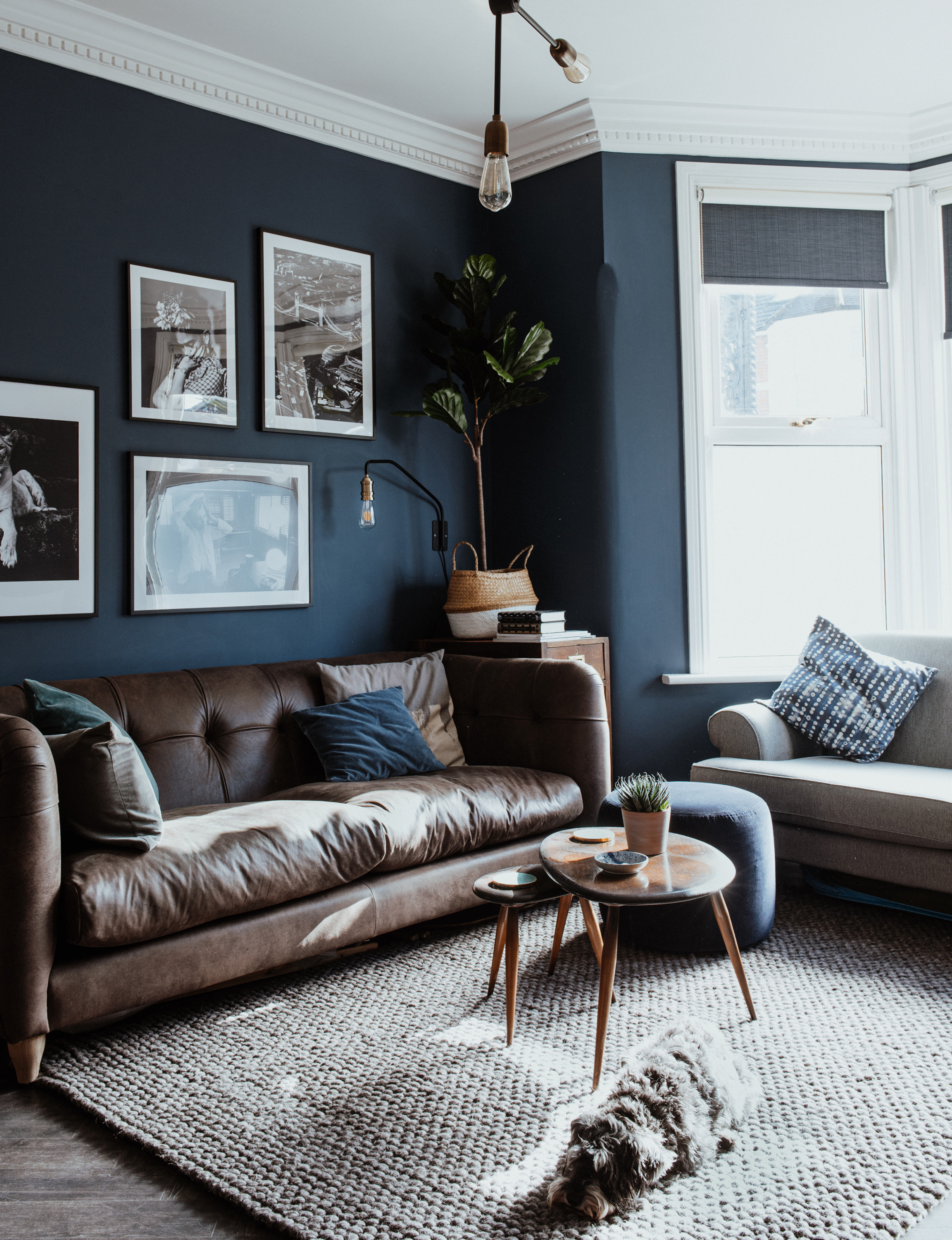
The living room is Ali and Rob’s child-free, grown-up sanctuary. ‘It’s got a reading corner, an old fashioned bar in the sideboard and my yoga mat ready for online classes. We recently added a gas stove, which heats up in an instant in winter. I love the dark blue shade – it feels both cosy and calm.’ Blinds, Blinds2go. Floor, Amtico. Hearth tiles, British Ceramic Tiles. Fire surround and sideboard, Ebay. Stove, Valor. Walls painted in Stiffkey Blue, Farrow & Ball. Coving, Plaster Mouldings Direct. Andy Warhol print, King & McGaw. Armchair, blue throw and picture ledges (painted), all Ikea
‘After giving ourselves six months to adjust to life with a new baby, we started our big kitchen extension,' says Ali. 'I loved the planning process and made mood boards and sketches of every area. I found making some of the final decisions quite tough, though – after many years as a stylist, I’ve collected a lot of ideas, tear sheets and Pinterest boards. Luckily Rob is the decisive one. I didn’t realise before this project quite how much of a perfectionist he is – the small details have to be just right, which in reality means everything was finished to a really high standard.'
‘The extension took four months in total, and the hardest part was living upstairs in the spare bedroom throughout, making one-pot meals in our makeshift kitchen and washing up in the shower,' says Rob. 'Now it’s finished, my favourite thing about the house is that it’s really flexible. You can often find me cooking in the kitchen while Ellis plays and Ali works at the table. Next we plan to redesign the garden, starting with a huge patio and using the same porcelain tiled flooring as inside to create an even larger flowing space for entertaining during summer months.'
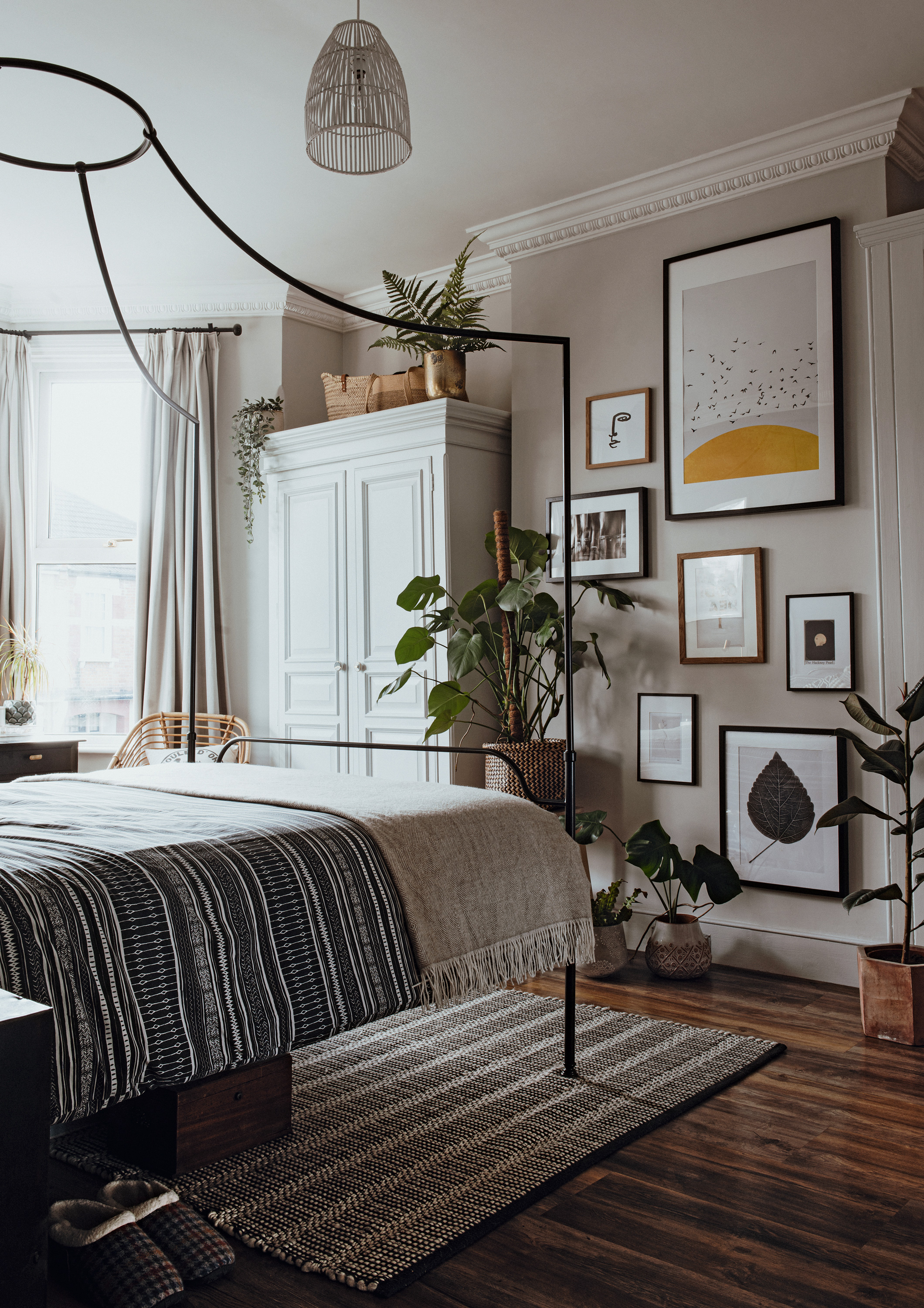
A muted colour palette, subtle patterns and tactile textures make the master bedroom an inviting, grown-up space. ‘The scheme is based around some large mirrors I bought from Sunbury Antiques Market before we even bought the house,’ says Ali. ‘They were from a French chateau and I fell in love with their rustic charm. The sunlight streams in here on bright mornings so I’ve filled it with plants. I often work sat on the bed with a coffee.’ Four-poster bed, The White Company. Curtains, The Natural Curtain Company. Walls painted in Ammonite and Down Pipe, Farrow & Ball. Coving, Plaster Mouldings Direct. Flooring, Karndean. Rug, B&Q. Wardrobe, Ebay. Rattan chair and bedside tables, Sunbury Antiques Market. Frames, Ikea. Prints, Juniqe and collected postcards. Throw, Amara. Rattan light shade and bedlinen, H&M Home. Plant pots, Anthropologie
‘The only real setback we had, through no fault of our builders, was when the screed was laid during a heatwave,' Ali recalls. 'It didn’t set and it led to a delay of about a week. That might not seem like much, but every day counted when we were living in one hot room upstairs with a baby and a dog. Luckily we could spend lots of time in the local park.
‘When baby number two, Rae, was on the way, we just wanted to finish the hallway before her arrival. It seemed like a luxury this time round with no noisy building work, a lovely kitchen and even a bath!’
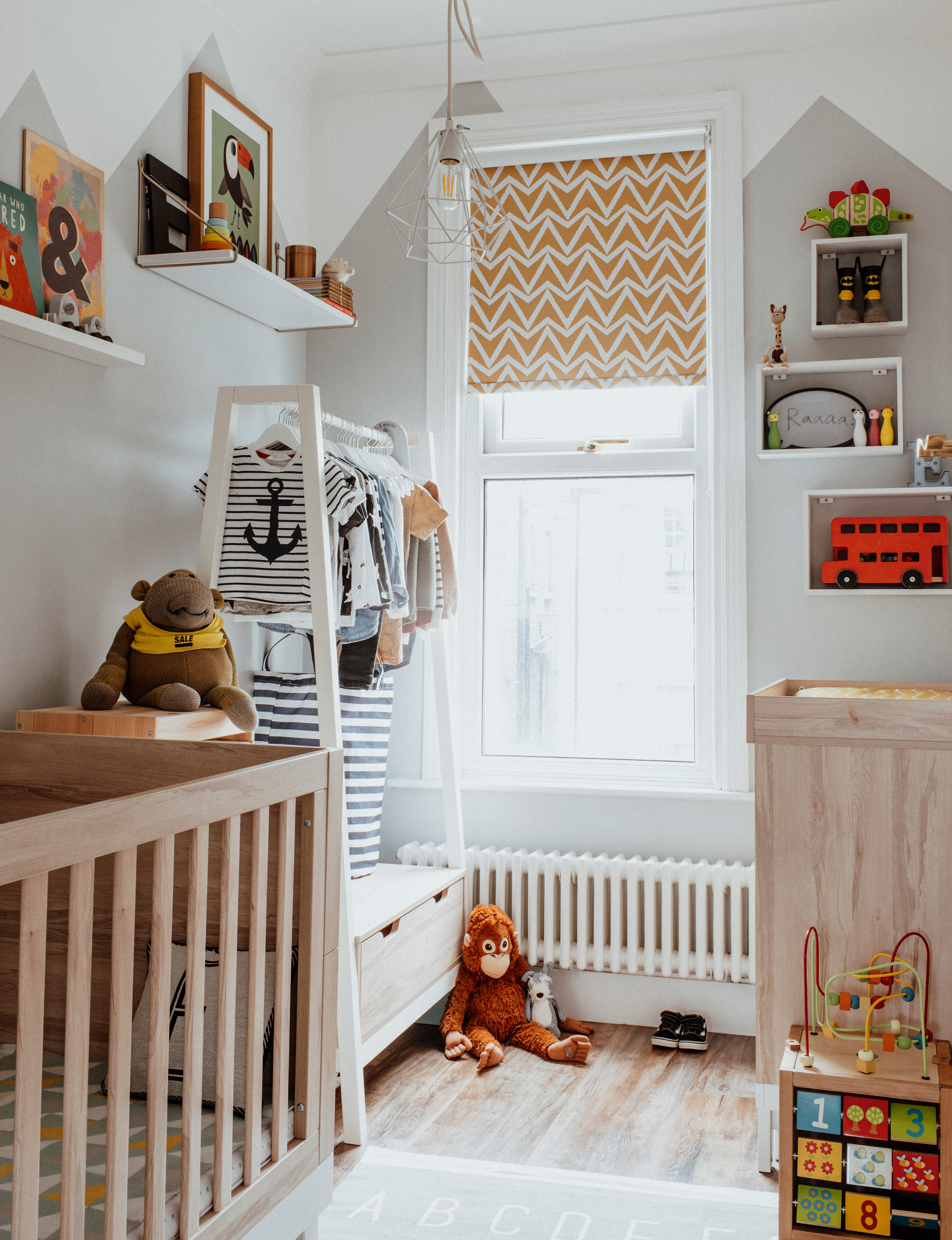
The small nursery room is light and bright to maximise the feeling of space. ‘It’s such a tiny room – the only real way to decorate was up high,’ says Ali. ‘My dad and I painted a fun mountain mural on the walls and added shelves as storage and to display prints and nice toys.’ Nursery furniture set, changing mat and blanket, all Mamas & Papas. Blackout blind, Blinds2go. Box shelves, B&Q. Picture ledges, Ikea. Shelf and shelf brackets, House Doctor. Rug and laundry basket, H&M Home. Walls painted in Tidy White and Summer Grey, Valspar
‘Ideally we would have loved a two-storey extension to add a bedroom and make our bathroom bigger, but that was never a possibility when living in a Conservation Area,' Rob admits. 'We had to keep plans within permitted development – but the pretty streets and lovely parks make up for that.’
Contacts
Builders So&Co Construction, 07402 707771
Bathroom fitters End Interiors
Bi-fold doors Vivafolio
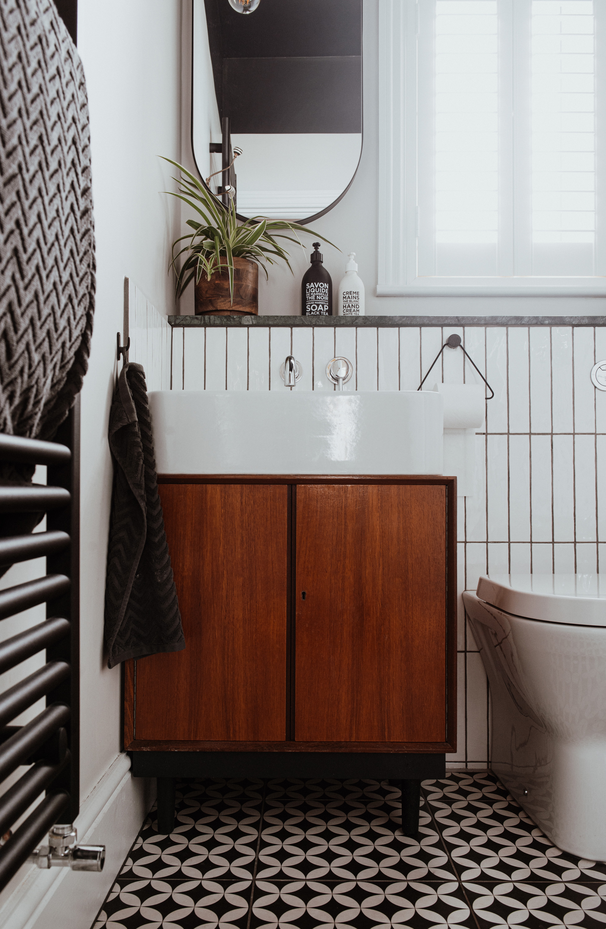
The newly-completed bathroom makes the most of a small space. ‘This room is tiny but very tall, so I chose a dark colour for the ceiling and floor,’ says Ali. ‘It’s a decorating trick that makes things feel closer to you, so the room looks more in proportion.’ The vanity sink unit was a record cabinet Ali sourced from a vintage furniture fair – she added legs and used yacht varnish to ensure the wood was protected in a damp room. Wall tiles, Walls & Floors. Floor tiles, British Ceramic Tile. Shutters, Blinds Direct. Sink and taps, Crosswater. Marble shelf, Stone Range Worktops. Towels, H&M Home. Ceiling light, Ikea. Mirror, Made. Toilet roll holder, Ferm Living. Towel rail, Victorian Plumbing. Walls painted in Cornforth White, Farrow & Ball
Subscribe to Real Homes magazine Want even more great ideas for your home from the expert team at Real Homes magazine? Subscribe to Real Homes magazine and get great content delivered straight to your door. From inspiring completed projects to the latest decorating trends and expert advice, you'll find everything you need to create your dream home inside each issue.
More reading:
Join our newsletter
Get small space home decor ideas, celeb inspiration, DIY tips and more, straight to your inbox!
-
 This colourful home makeover has space for kitchen discos
While the front of Leila and Joe's home features dark and moody chill-out spaces, the rest is light and bright and made for socialising
By Karen Wilson
-
 How to paint a door and refresh your home instantly
Painting doors is easy with our expert advice. This is how to get professional results on front and internal doors.
By Claire Douglas
-
 DIY transforms 1930s house into dream home
With several renovations behind them, Mary and Paul had creative expertise to draw on when it came to transforming their 1930s house
By Alison Jones
-
 12 easy ways to add curb appeal on a budget with DIY
You can give your home curb appeal at low cost. These are the DIY ways to boost its style
By Lucy Searle
-
 5 invaluable design learnings from a festive Edwardian house renovation
If you're renovating a period property, here are 5 design tips we've picked up from this festive Edwardian renovation
By Ellen Finch
-
 Real home: Glazed side extension creates the perfect garden link
Louise Potter and husband Sean's extension has transformed their Victorian house, now a showcase for their collection of art, vintage finds and Scandinavian pieces
By Laurie Davidson
-
 I tried this genius wallpaper hack, and it was perfect for my commitment issues
Beware: once you try this wallpaper hack, you'll never look back.
By Brittany Romano
-
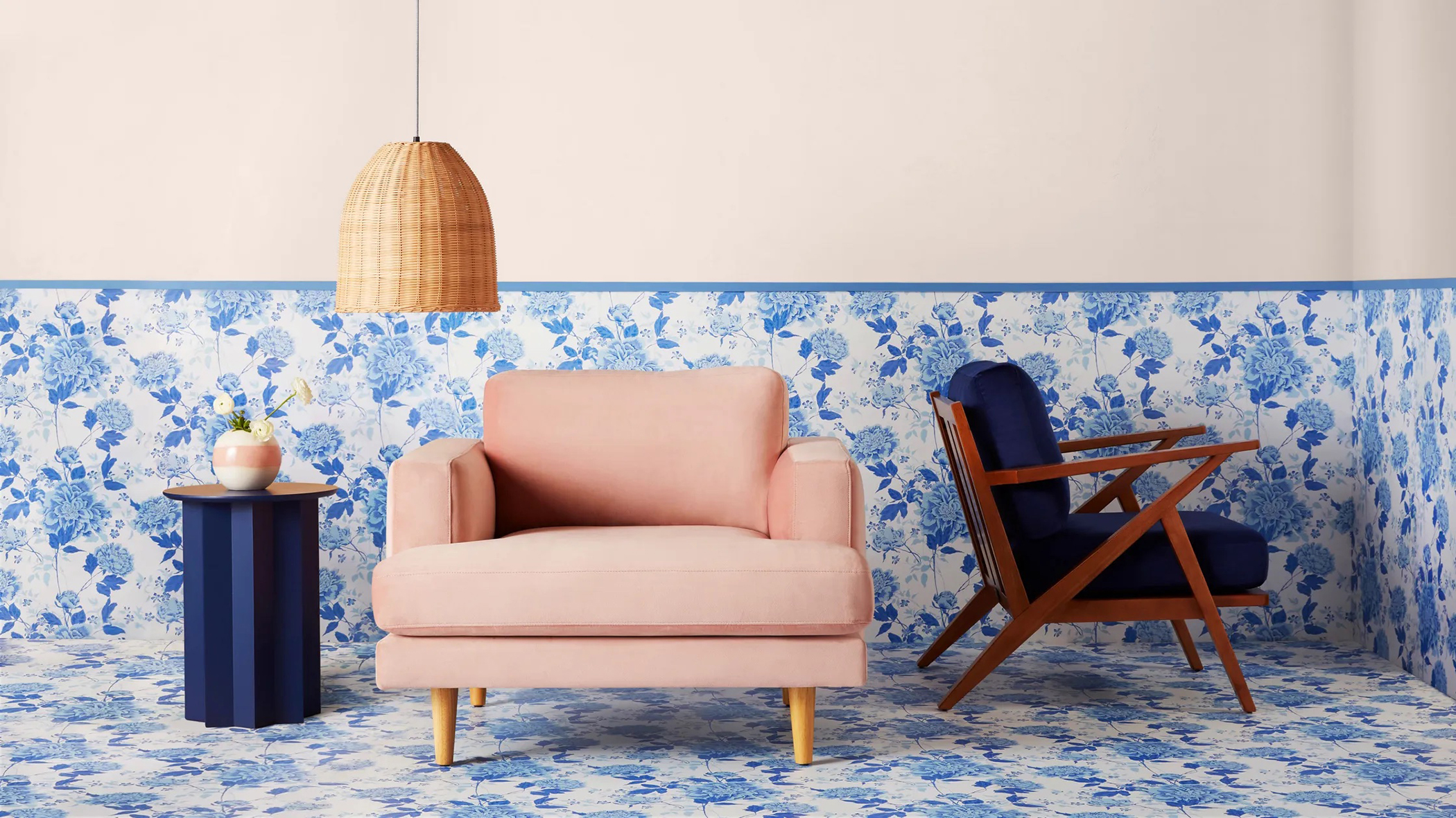 Drew Barrymore's new FLOWER Home paint collection wants to give your walls a makeover
Drew Barrymore FLOWER drops 27 brand-new paint shades, and every can is made from 100% post-consumer recycled plastic.
By Brittany Romano
