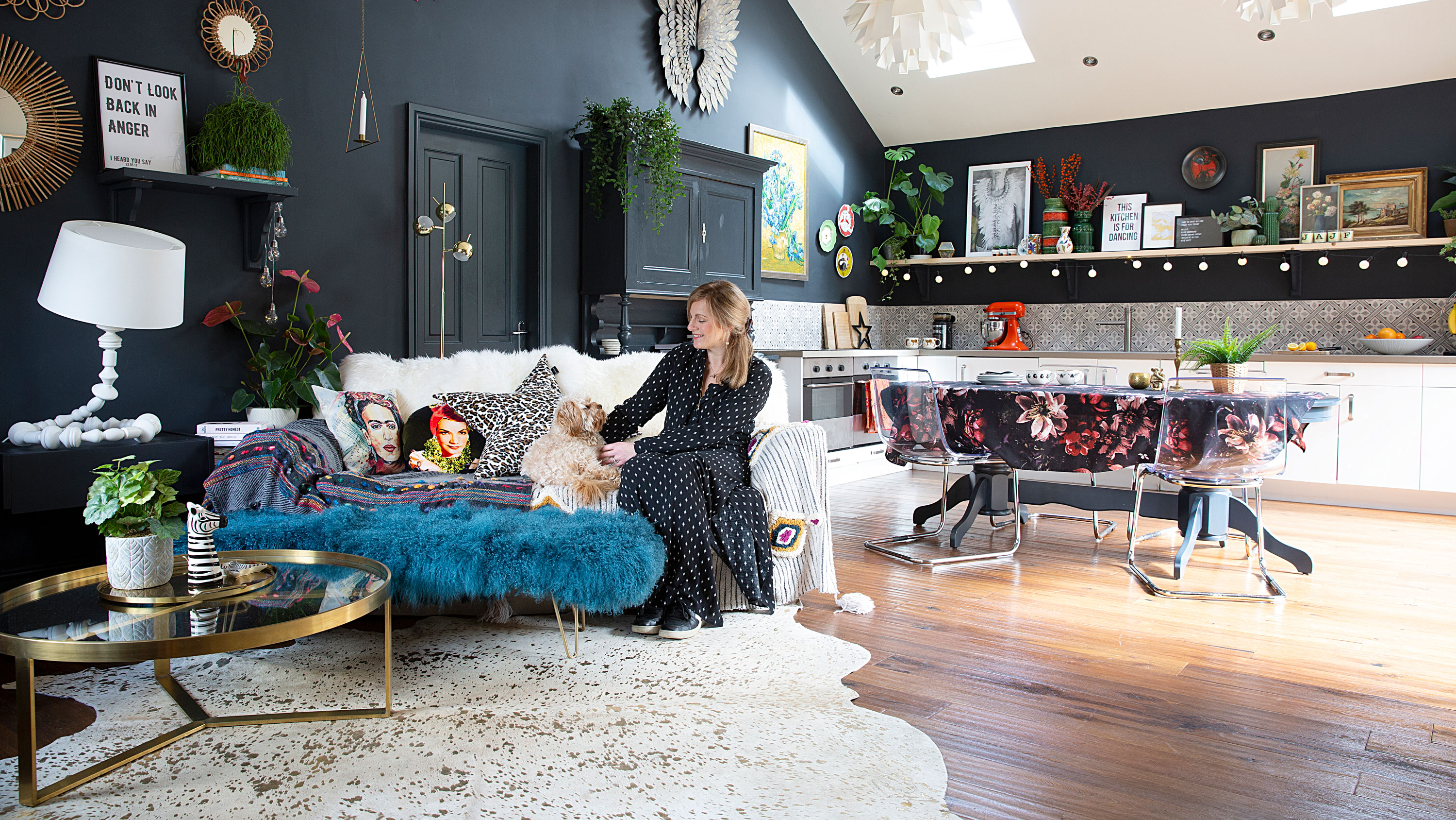

There’s something to be said for the bright, bold, in-your-face interest of a heavily-adorned maximalist home. No one knows this better than Julia Eldon, who creates lavish faux-fur stools, sheepskin rugs and embellished cushions for her homeware business. True to her brand, her own home is full of clashing prints, eye-catching wallpaper and a large assortment of art.
You might think Julia’s home requires hours of careful curation, but she says her approach is more intuitive, with a collection of artwork and curios that she’s compiled over years. That’s not to say that her extended 1960s house isn’t well thought out: she’s designed an open-plan layout perfect for parties, transforming the kitchen into an entertaining hub while hiding away the boring, functional bits in a utility.
Planning on extending your house? Read our expert advice on extending a house. And be inspired by more real home transformations on our hub page.
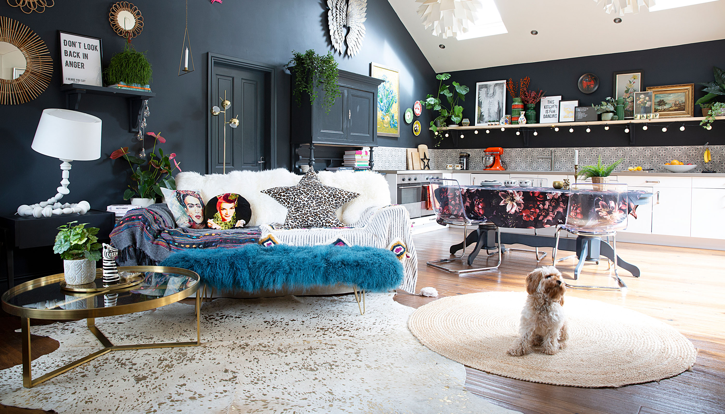
‘I love dark interiors, but I couldn’t live in an all-dark space,’ Julia says. ‘We added the dark blue to the kitchen quite recently. The wall was “mouse brown” but I felt that it needed more contrast. The light from the vaulted ceiling, bi-fold doors and rooflights balance it out.’ Walls painted in Railings and Lime White, Farrow & Ball. Pendant lights, Normann Copenhagen. Dining table, Ebay. Chairs, Ikea and Graham & Green. Splashback tiles, Tons of Tiles. Angel wings, Cox & Cox. Sofa, Ikea. Footstool, rug and leopard print cushion, Suburban Salon
Profile
The owners Julia Eldon, owner of home décor business Suburban Salon (suburbansalon.co.uk), lives with her husband, James, a head teacher, their children Fred and Amelia, and their dog, Teddy
The property A four-bedroom 1960s detached house in Stockport, Cheshire
Project cost £102,000
'This was one of those houses that had been extended and extended without a thought for the design. There were lots of doors and thoroughfares that didn’t make sense, but it had a big floorspace and we could see that it was quite a spacious house downstairs,' Julia recalls. 'The previous owners had made the front room into a study, behind it was the dining room, and behind that was a long galley kitchen so small there wasn’t enough room to swing a cat. Where the kitchen is now, there was a poorly converted double garage with a low ceiling that rendered it completely unusable – so it had to go.'
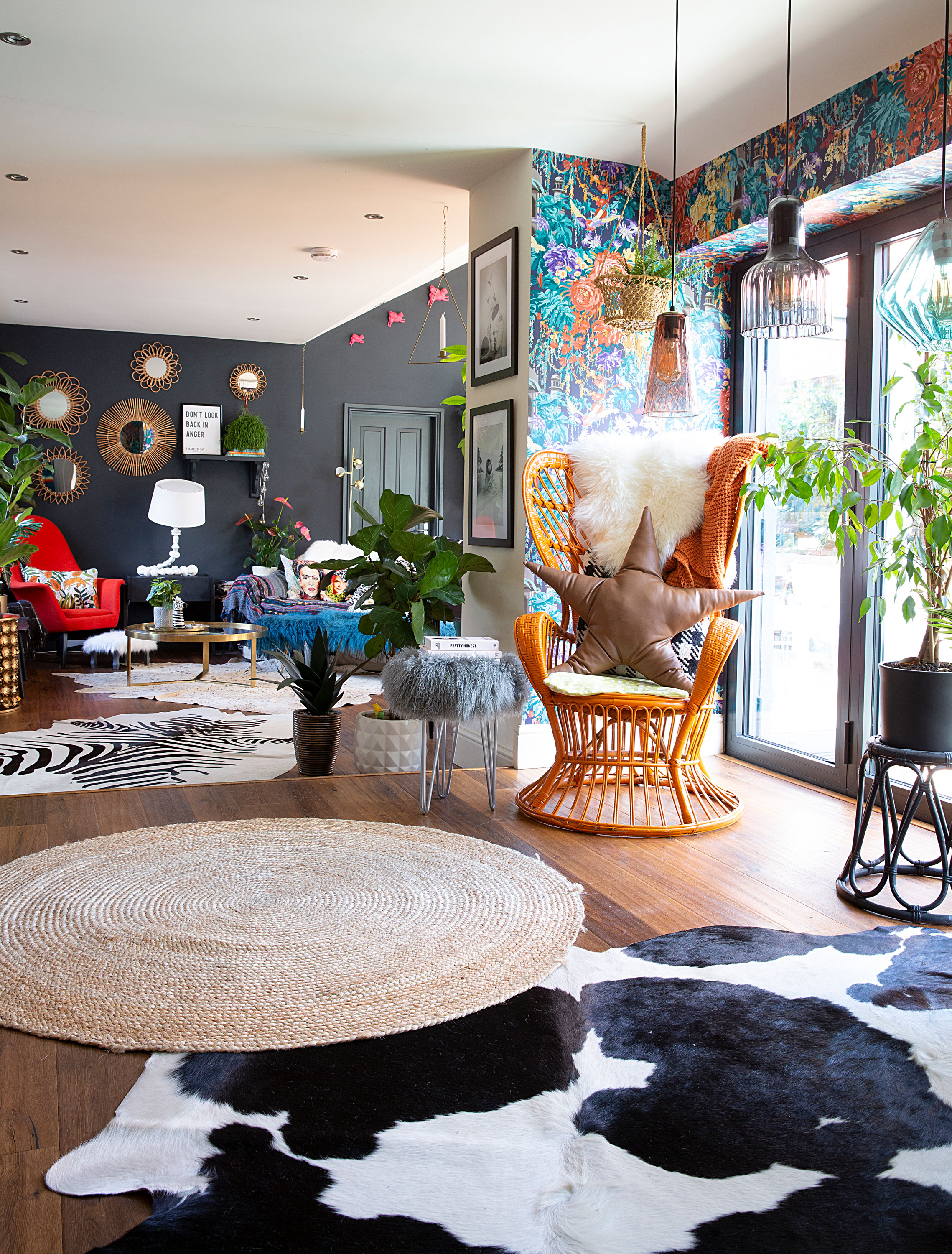
Rattan chair, vintage. Sheepskin rug and hairpin leg stool, Suburban Salon. Pendant lights, Swoon Editions
'The house was at the top of our budget, so we had to make it liveable and leave it at that for a while. We painted everything white and bought furniture from Ikea. It took us a while to work out what we wanted to do. We were concerned about the fact that when you walked to the kitchen, the sink was such a way from the door. We also wanted to have the best view possible of the garden from the kitchen.'
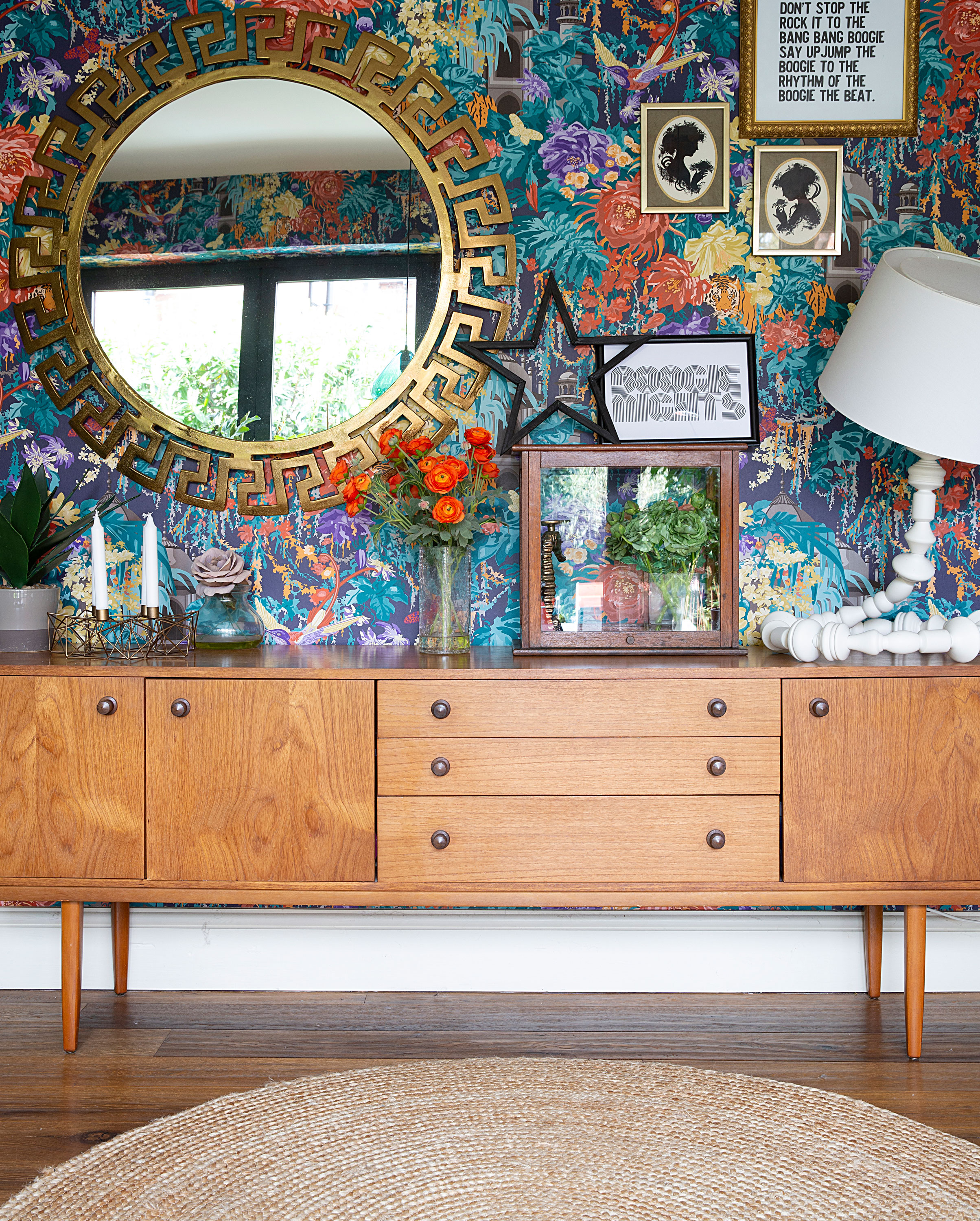
Matthew Williamson wallpaper, Osborne & Little. Sideboard, vintage; for similar, try Swoon Editions. Jute rug, The White Company
'It took about six years from when we first moved in before we started the building work. Prior to that, I focused on making it aesthetically pleasing. We wanted a big, light-filled kitchen that felt like a New York loft, with oak floors and no wall units. We have two Velux windows and two bi-fold doors to bring in that light. We entertain a lot so I didn’t want a kitchen island that couldn’t be moved. Instead, we opted for a big table so that when we throw a party, we can move it over to the bi-fold doors. We couldn’t extend upwards as well with the budget we had, but we changed the layout of the first floor bathroom, rebuilt the en-suite, and uncovered a small loft space that we knocked into to make my dressing room.'
'I designed the kitchen and drew up the floor plans. We had a draftsman do the maths behind it all to present to the builders, and we had to apply for planning permission, too. The process worked quite well. All in all, it took about six months. I was definitely hands-on – I had a plan and I made sure we stuck to it! We had the bathroom done at the same time to save time and budget, and we moved the boiler upstairs.'
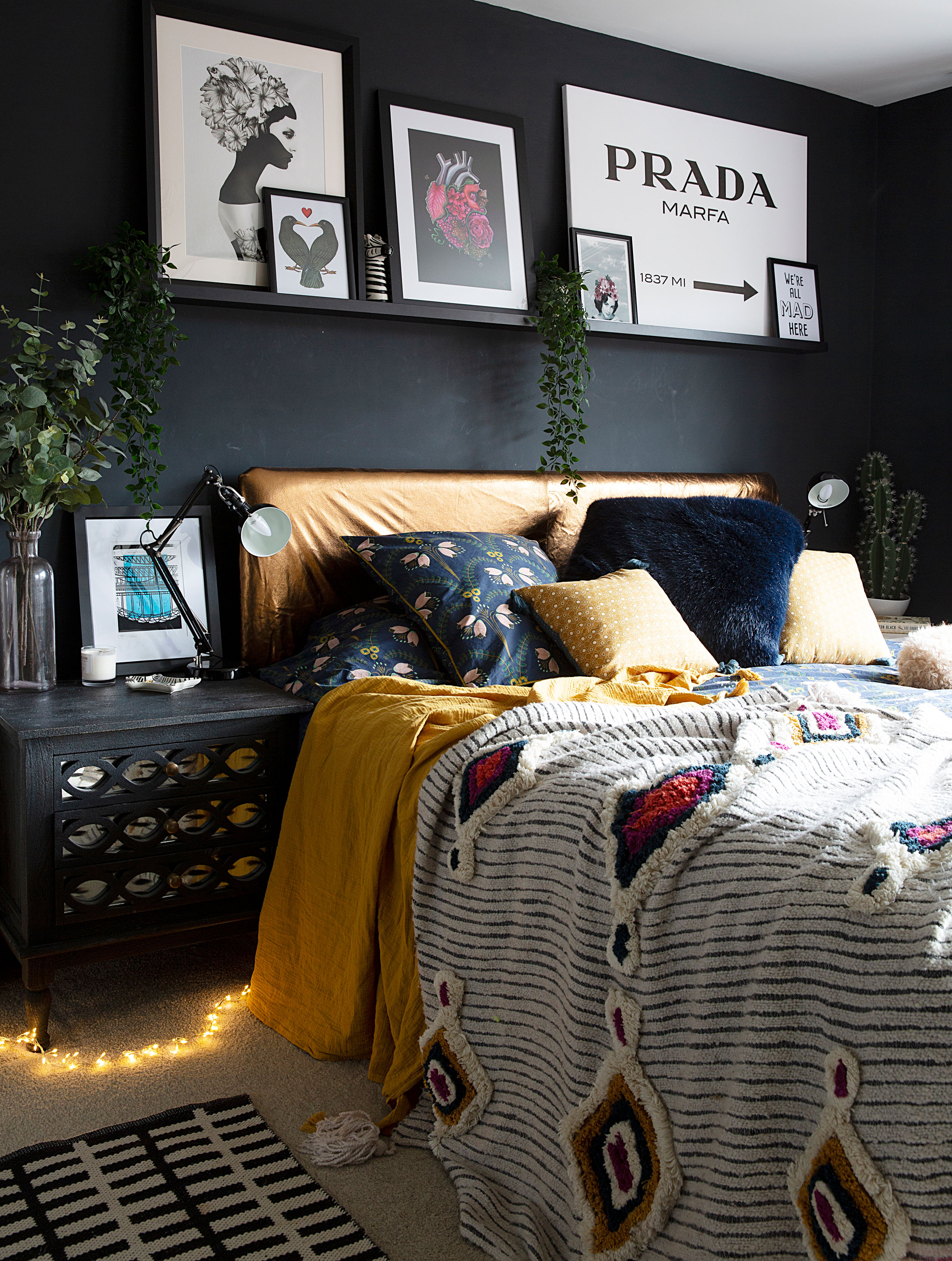
‘I think texture is such a key element to a bedroom, and I love layering the room with throws and rugs,’ Julia says. ‘It makes it feel homely, cosy and comfortable.’ Carpet, Brintons. Bedside tables, Swoon Editions. Bed covers and throw, La Redoute. Rug, DAY Birger Et Mikkelsen
'We created a separate utility that houses the wall units, microwave, fridge and so on, so the shelves in the main kitchen space can be stacked with art instead. It’s geared around our love of entertaining, and I’ve zoned the space so that you have that chilled-out sofa area, too.'
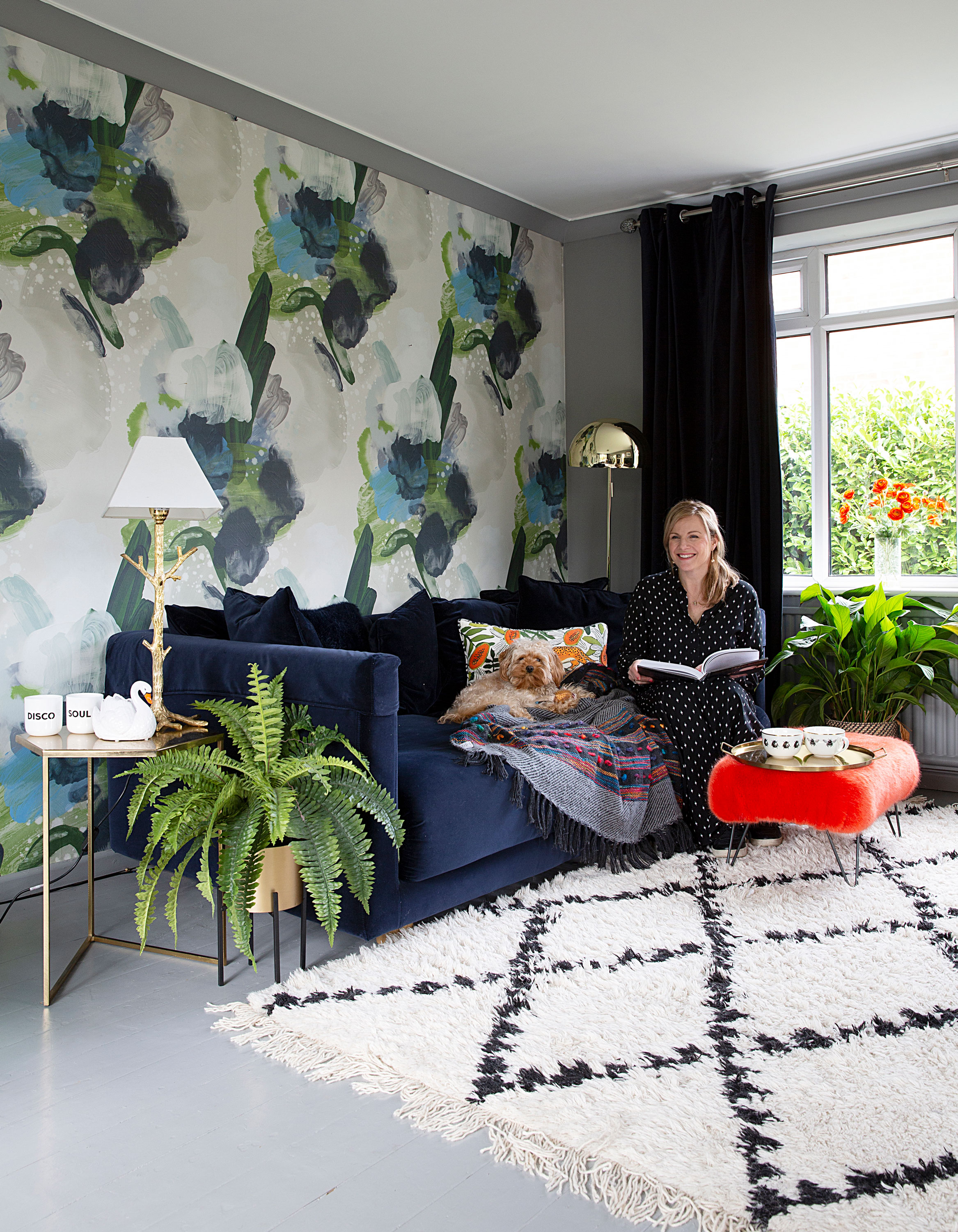
‘The living room is where we spend our evenings in winter,’ Julia says. ‘The scheme is based around the beautiful wallpaper. I’ve made it as cosy as possible with lots of rugs and texture.' Wallpaper, Feathr. Rug, DAY Birger Et Mikkelsen. Blue sofa, Ikea. Footstool, Suburban Salon. Side table, Made. Floor lamp, HomeSense. Table lamp and curtains, Ikea
'I’ve always loved pattern and colour and I think beautiful wallpaper anchors a space. I start by deciding where I’m going to place the pattern, be it wallpaper or fabric. I used to spend days choosing fabrics and making curtains for a space! I’ll base the entire colour scheme on that pattern. I’d describe my style as maximalist – it’s something I’ve developed over the years – but I’ve always loved a good dose of colour.'
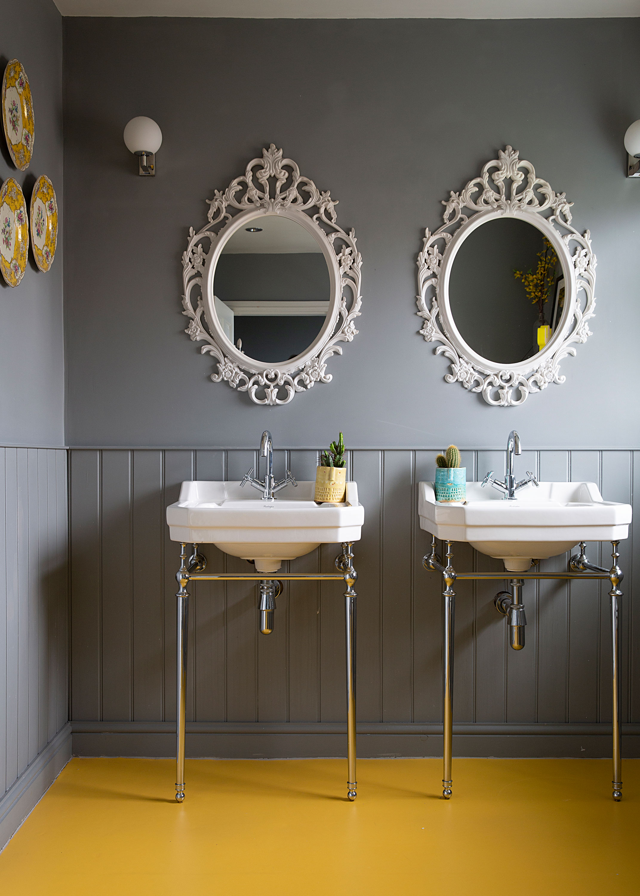
‘With any room, I tend to draw out the floor plan, then think about how the space might work best,’ Julia says. ‘The kids use this room most. We took the bath out so there was more space to play with – and the children get a sink each, which they love.’ Flooring, The Colour Flooring Co. Sinks, Burlington. Walls painted in Manor House Gray, Farrow & Ball. Mirrors, Ikea. Lights, John Lewis & Partners
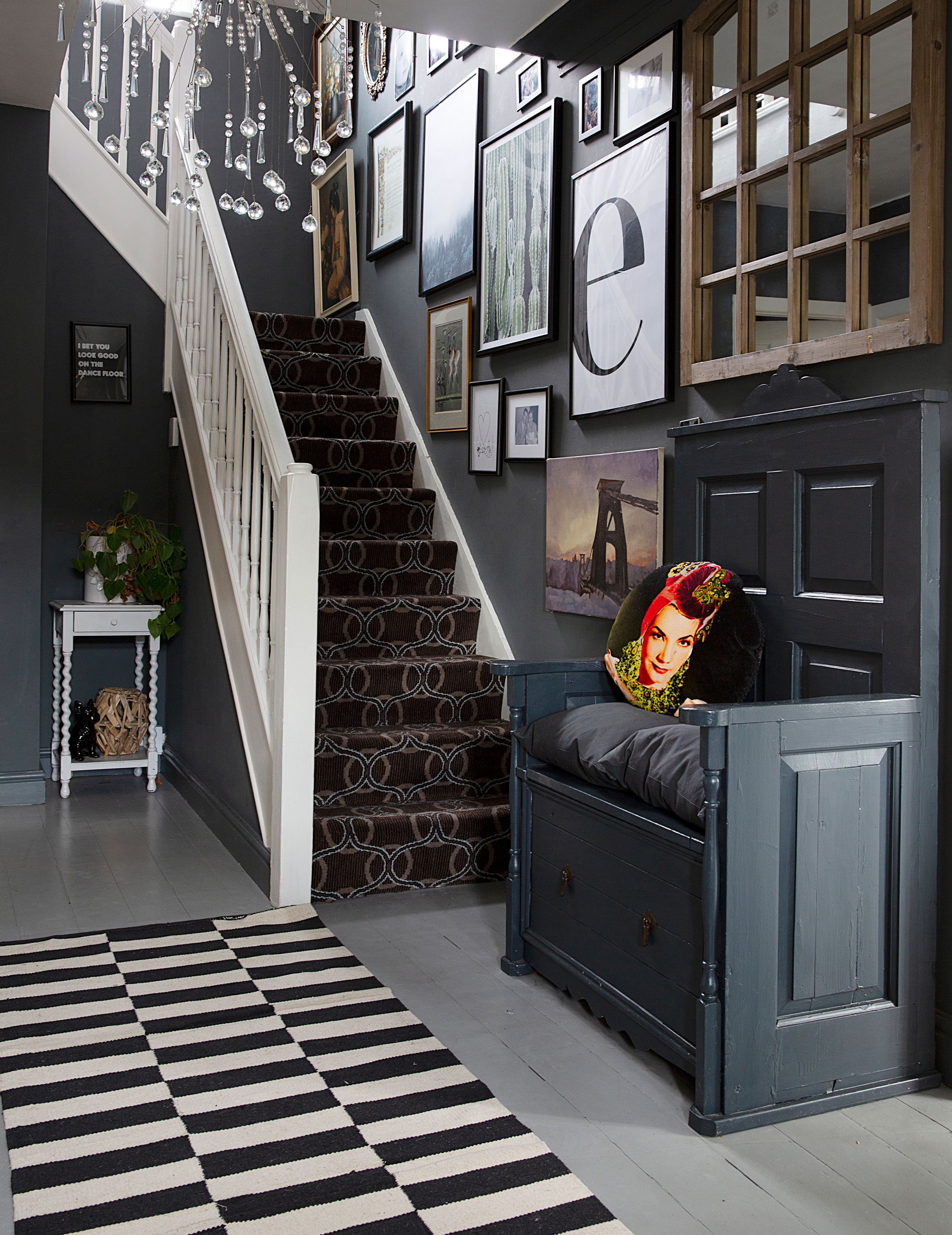
'When it comes to buying art, I never think it through! It’s a collection of things I’ve picked up over the years, whether it’s from small shops or auctions. I’m not one for trends – if I like something, I’ll have it. Generally, though, I love art, and I fill the walls with pieces that speak to me. I do try and make the house flow, but I take each room individually depending on its function.'
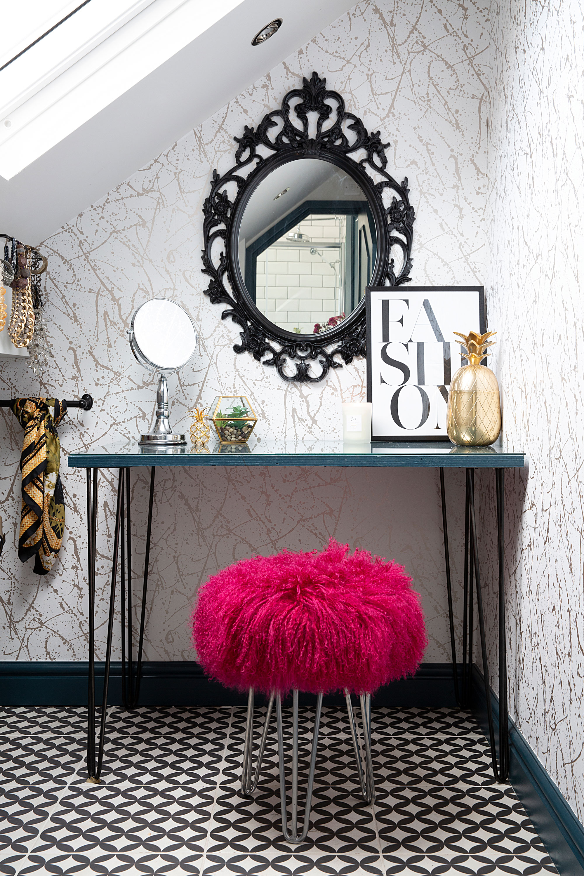
‘We discovered this loft space when we were renovating upstairs,’ Julia says. ‘We knocked through into it and I was quick to claim it as my dressing room.’ Kelly Hoppen wallpaper, Wallpaper Direct. Floor tiles, Tons of Tiles. Stool, Suburban Salon. Mirror, Ikea. ‘Fashion’ print, Desenio
Contacts
Bathroom flooring The Colour Flooring Co
Paint Farrow & Ball
Wallpaper Feathr
Accessories Suburban Salon
'We get the sun in the kitchen until about three o’clock on a longer day, then it moves to the bottom of the garden. We constantly have the doors open, even on grey days. The best decision we made was to put the bi-folds in – the light we get is incredible. The sofa area in the kitchen is the most sociable part of the house, and it’s so warm and sunny in the summer.'
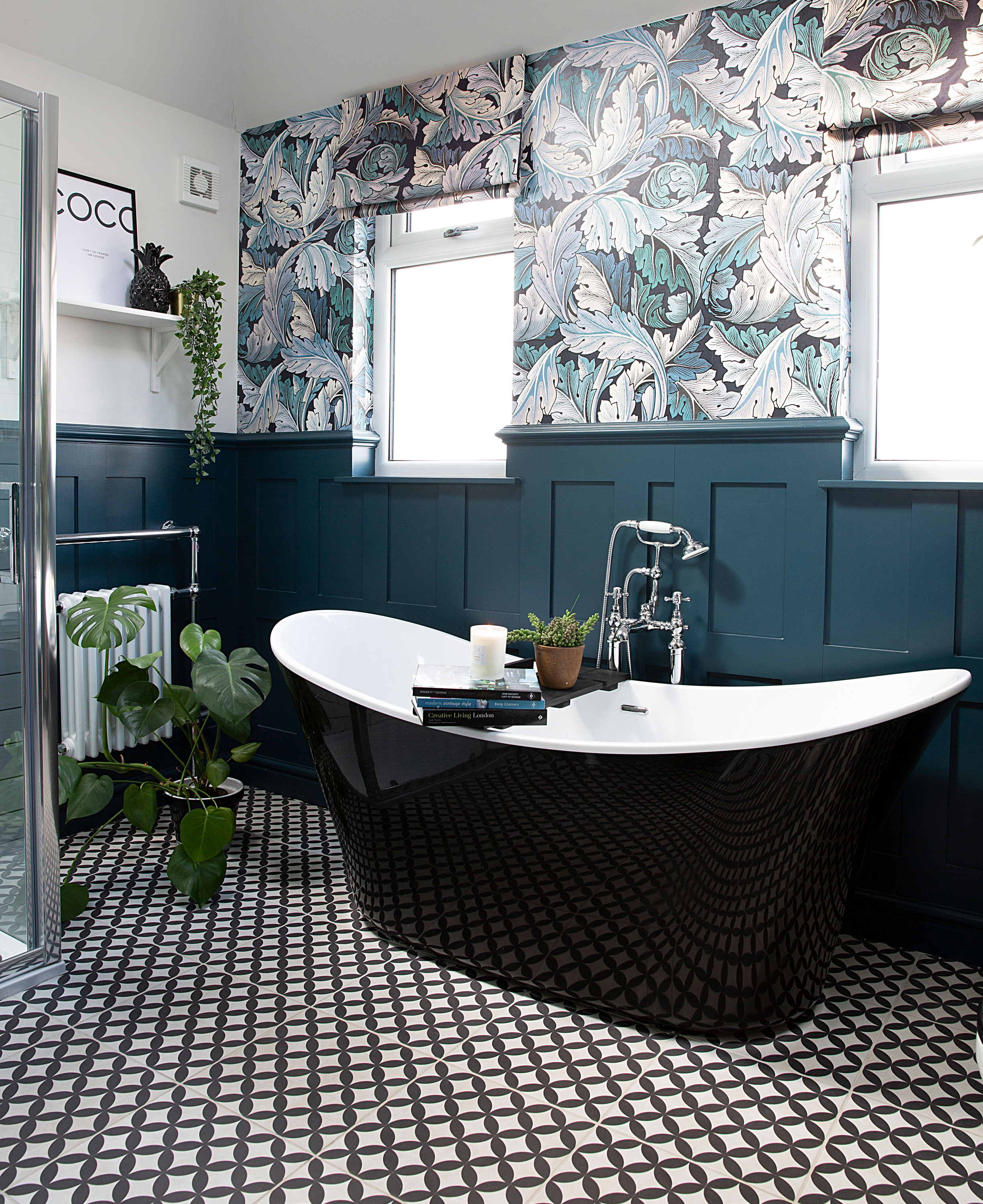
‘With most rooms, I’ll buy one thing I love, then shop around for deals on everything else,’ Julia says. ‘I spent all my money on French boutique-style sink for the bathroom – the rest of it is Ebay or DIY.’ Wallpaper, House of Hackney. Panelling painted in Hague Blue, Farrow & Ball. For a similar bath, try the Nemi, Pure Bathroom Collection
'With the build over, we have plans to landscape the garden. It’s a big space and now the kids are older, the climbing frames and trampoline have gone – so we’re reclaiming the space for ourselves!'
Subscribe to Real Homes magazine Want even more great ideas for your home from the expert team at Real Homes magazine? Subscribe to Real Homes magazine and get great content delivered straight to your door. From inspiring completed projects to the latest decorating trends and expert advice, you'll find everything you need to create your dream home inside each issue.
More reading
Join our newsletter
Get small space home decor ideas, celeb inspiration, DIY tips and more, straight to your inbox!

Formerly deputy editor of Real Homes magazine, Ellen has been lucky enough to spend most of her working life speaking to real people and writing about real homes, from extended Victorian terraces to modest apartments. She's recently bought her own home and has a special interest in sustainable living and clever storage.
-
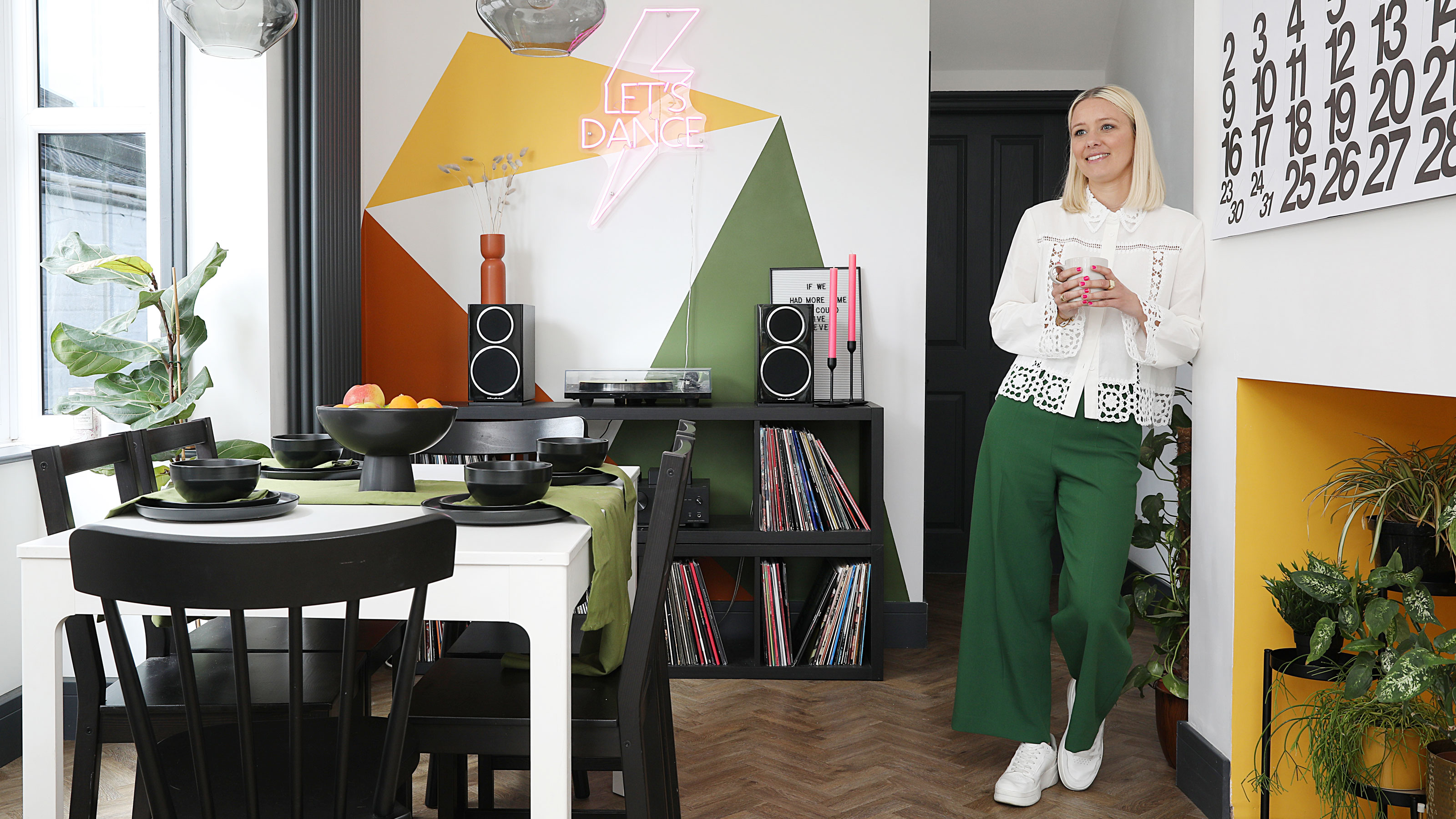 This colourful home makeover has space for kitchen discos
While the front of Leila and Joe's home features dark and moody chill-out spaces, the rest is light and bright and made for socialising
By Karen Wilson
-
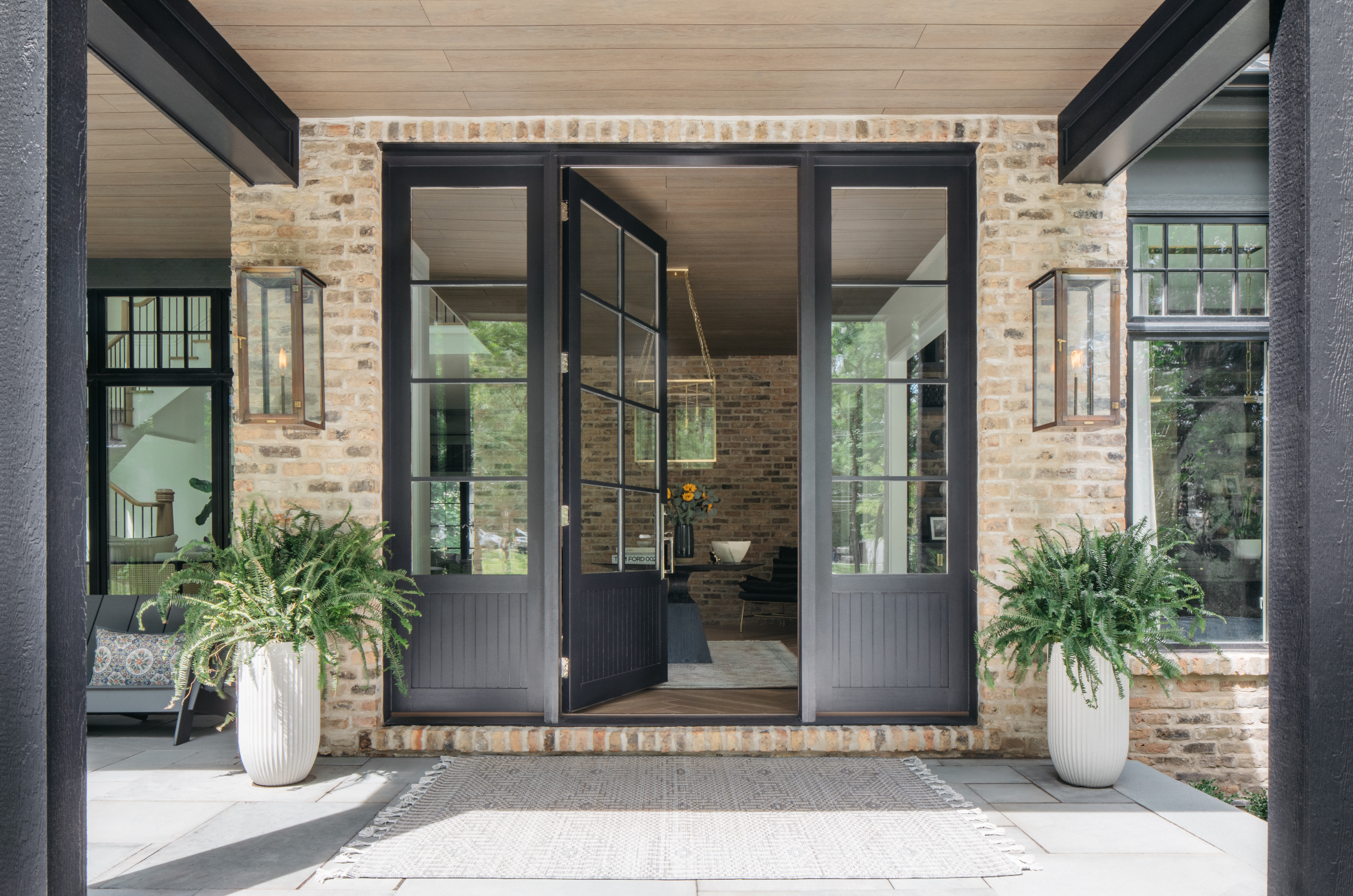 How to paint a door and refresh your home instantly
Painting doors is easy with our expert advice. This is how to get professional results on front and internal doors.
By Claire Douglas
-
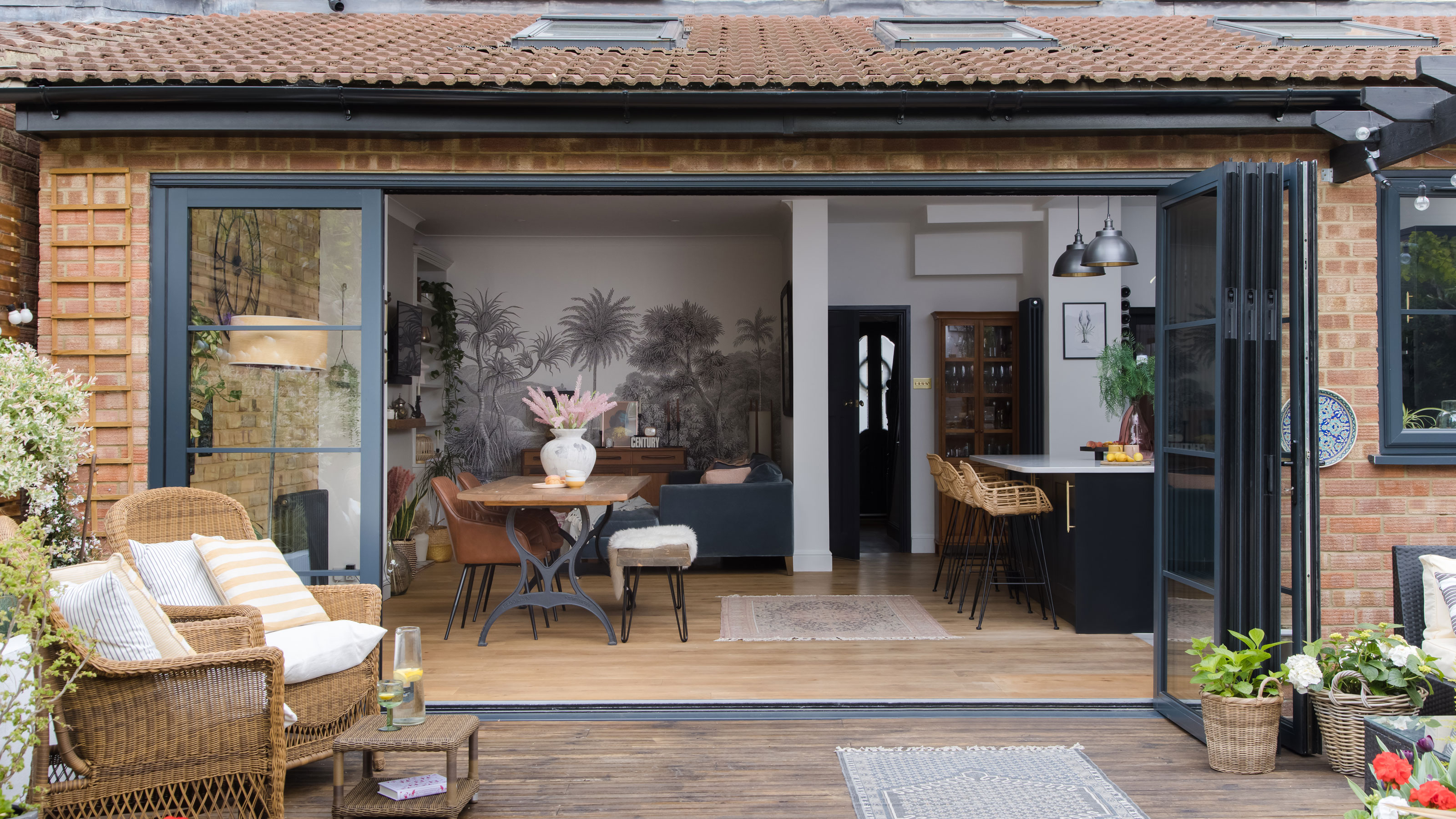 DIY transforms 1930s house into dream home
With several renovations behind them, Mary and Paul had creative expertise to draw on when it came to transforming their 1930s house
By Alison Jones
-
 12 easy ways to add curb appeal on a budget with DIY
You can give your home curb appeal at low cost. These are the DIY ways to boost its style
By Lucy Searle
-
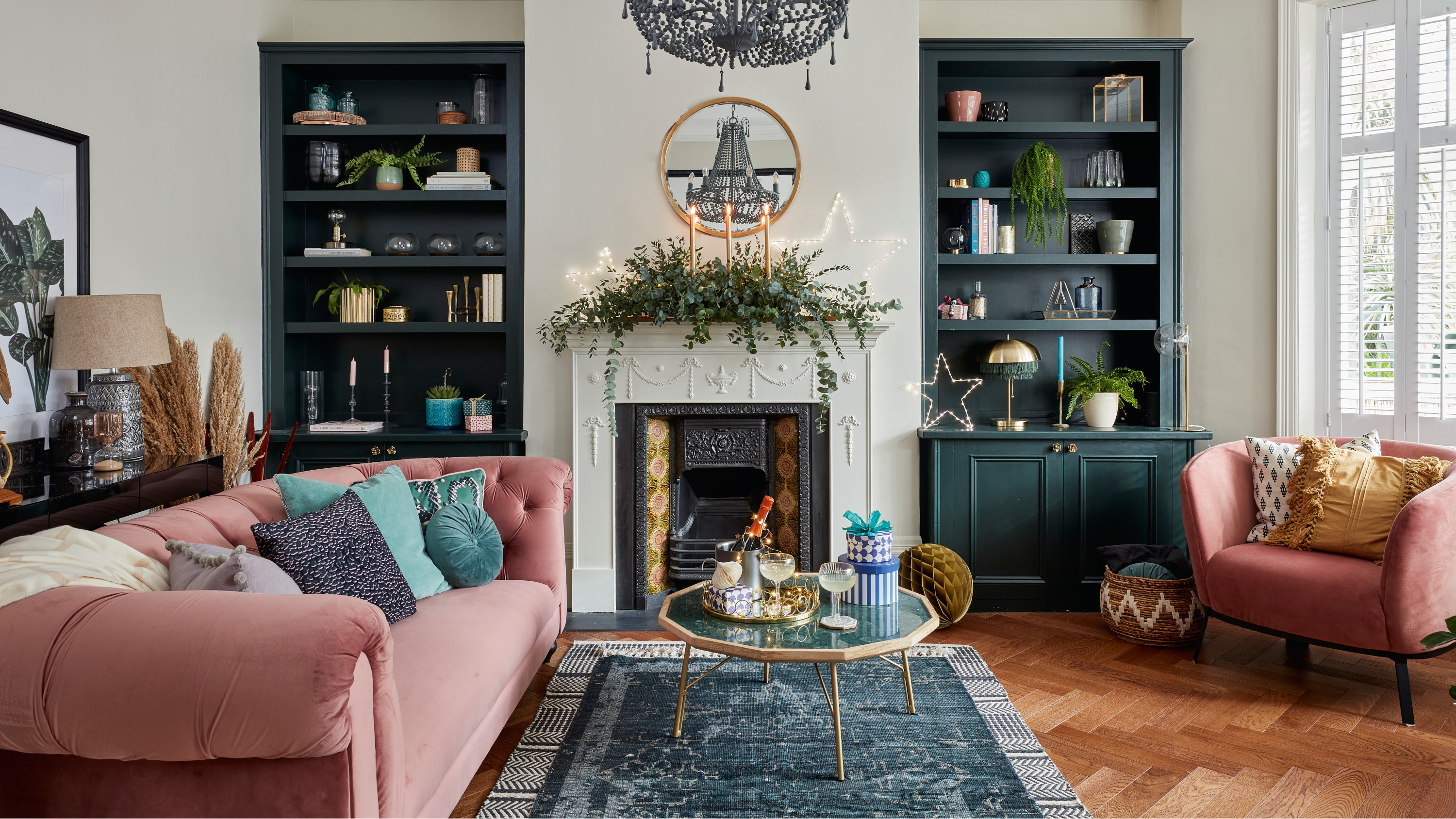 5 invaluable design learnings from a festive Edwardian house renovation
If you're renovating a period property, here are 5 design tips we've picked up from this festive Edwardian renovation
By Ellen Finch
-
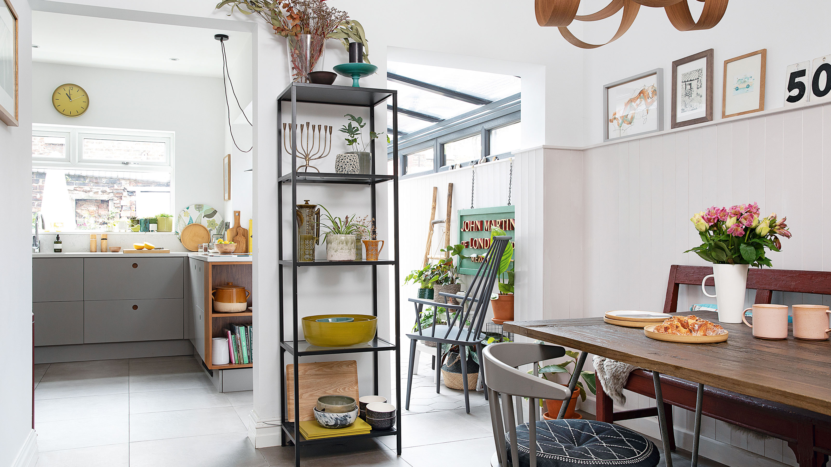 Real home: Glazed side extension creates the perfect garden link
Louise Potter and husband Sean's extension has transformed their Victorian house, now a showcase for their collection of art, vintage finds and Scandinavian pieces
By Laurie Davidson
-
 I tried this genius wallpaper hack, and it was perfect for my commitment issues
Beware: once you try this wallpaper hack, you'll never look back.
By Brittany Romano
-
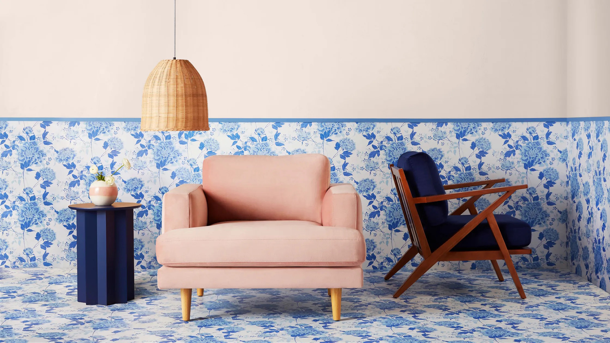 Drew Barrymore's new FLOWER Home paint collection wants to give your walls a makeover
Drew Barrymore FLOWER drops 27 brand-new paint shades, and every can is made from 100% post-consumer recycled plastic.
By Brittany Romano
