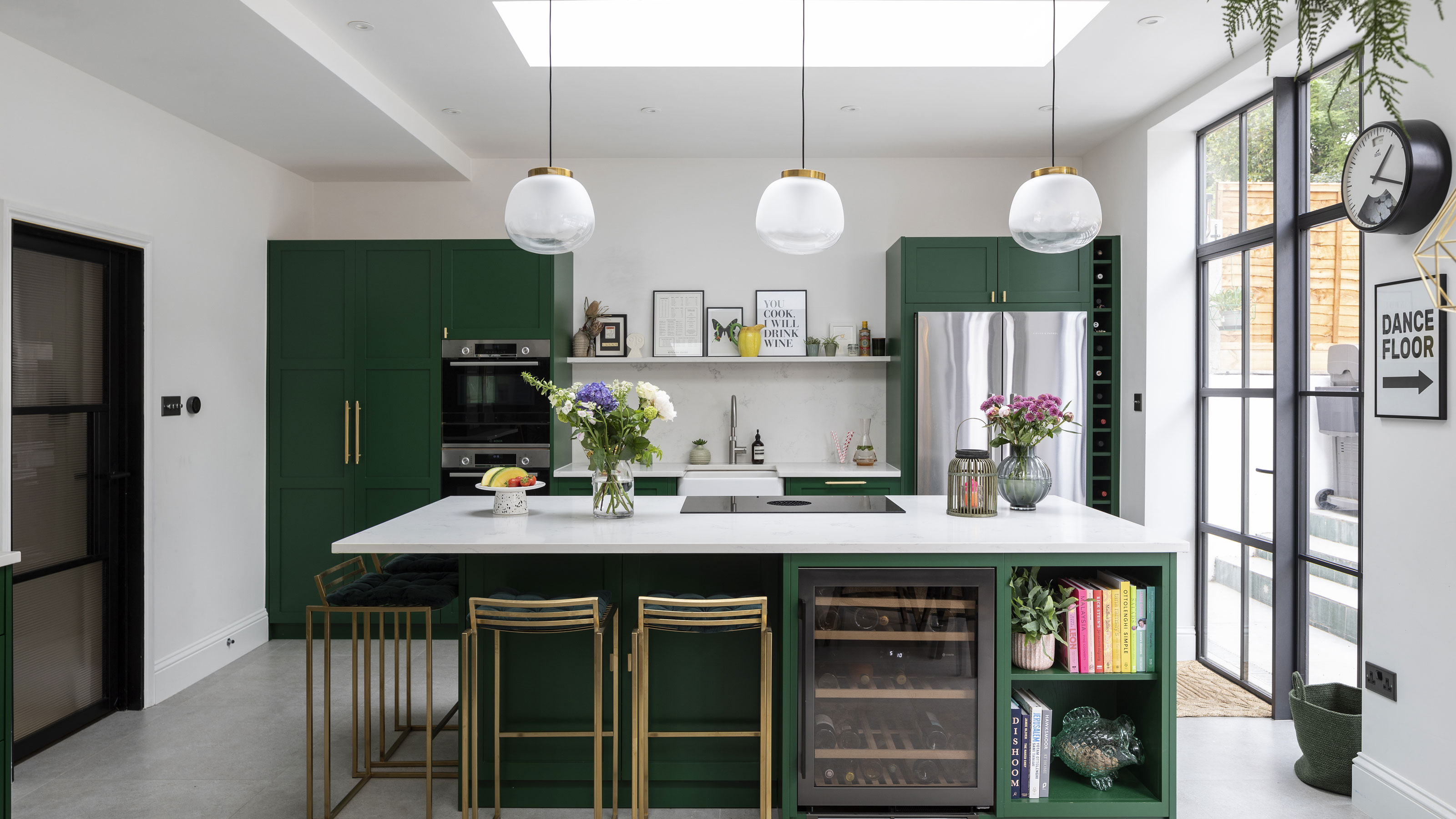
Sometimes you only know what you want when you see it, and that was exactly the case for Charley when she found a new family home for her husband, Adam, and their two young children. Although the house was a bit of a mismatch and looked like nothing had been done to it for a couple of decades, it had beautiful features such as stained glass, parquet flooring and fireplaces – all elements that helped seal the deal. Charley knew they’d build a beautiful new extension to replace a conservatory that was on its last legs – and now, with the project completed, she tells us how she did it.
- For more real home transformations, head to our hub page.
The couple had a good idea of the finish and style they wanted to achieve. Charley factored in lots of gold accents when choosing the colour scheme. Flooring, Tile Expert. Stools, Furniture & Design Studio. Pendants, Cox & Cox. Wine cooler, Caple
The owners Charley Smith (@thetreehouse_onthehill), who works in asset management, her husband Adam, who works in advertising, and their children, Esmeralda and Ruben
The property A five-bedroom 1920s house in Forest Hill
Project cost £180,000 (for kitchen extension and garden)
‘The house needed a bit more TLC than we thought,’ says Charley. ‘The windows were single glazed and the panes were cracked, so we needed to replace them, then other things cropped up that we didn’t think we’d have to do. The foundations needed to be deeper as the soil has a high water content and we’re on a hill. The floor was a beautiful mosaic, but was all cracked and needed to be replaced. We moved in December 2019 and started on the windows, then Covid happened and we had to stop with half the windows done. We got the building works completed between lockdowns one and two. We lived here during the build, but fortunately it was summer, so it wasn’t too cold.’
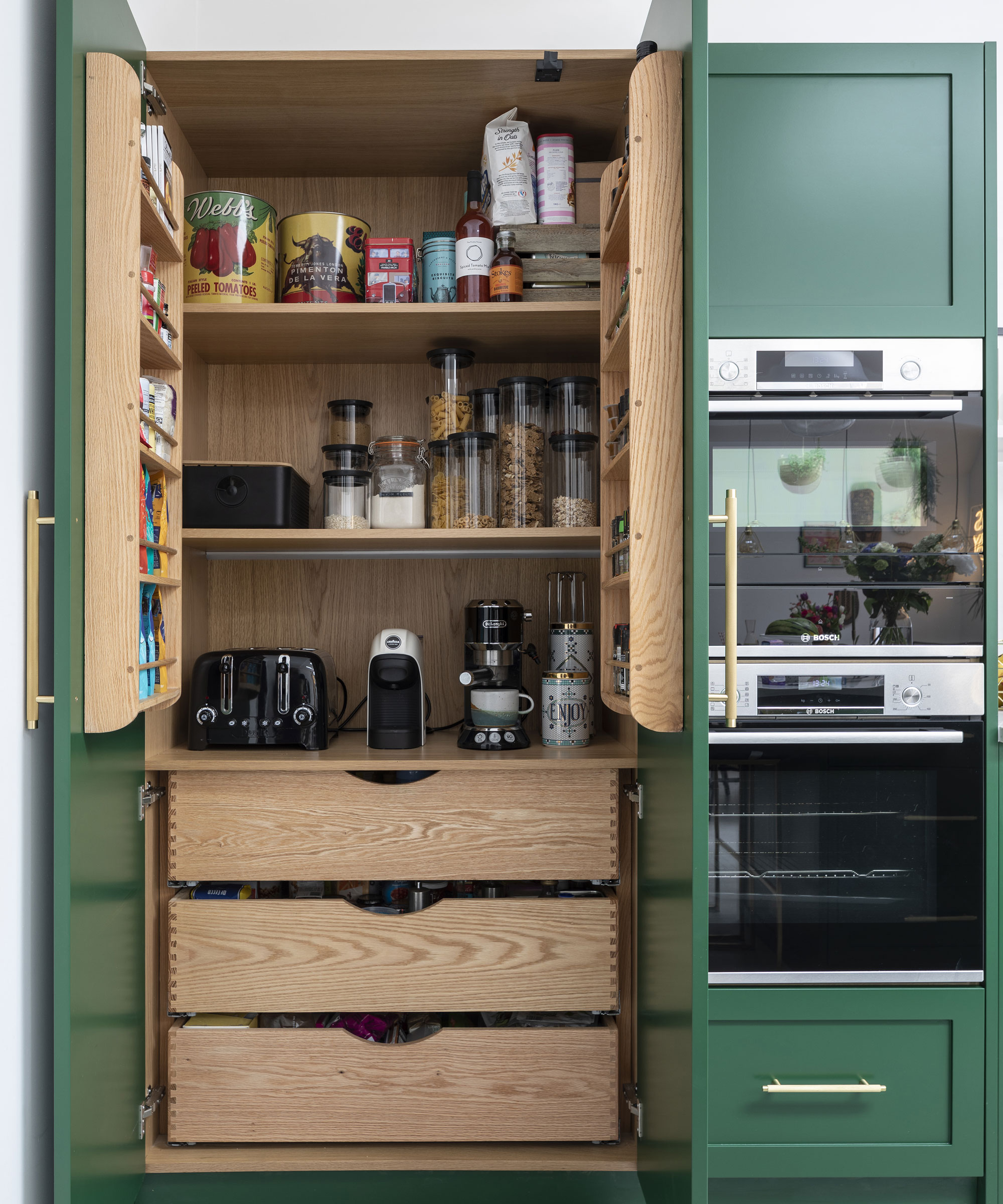
A larder cupboard provides lots of storage and makes it easy to tidy appliances away.
'We converted the original kitchen into a hallway and utility room, knocked down the old conservatory and built out and across. The former kitchen had a galley layout and a huge Aga, but we wanted something that was open plan and connected to the living area and playroom, and for us to be able to get out to the garden. We used a building firm that did a pre-planning package and knew what was allowed in terms of planning permissions. We had one pushback, which was that they wanted us to drop down the roof height once we reached the border of the neighbours. We wanted it to be as high as planning would allow so the room would feel more spacious and bring in lots of light.’
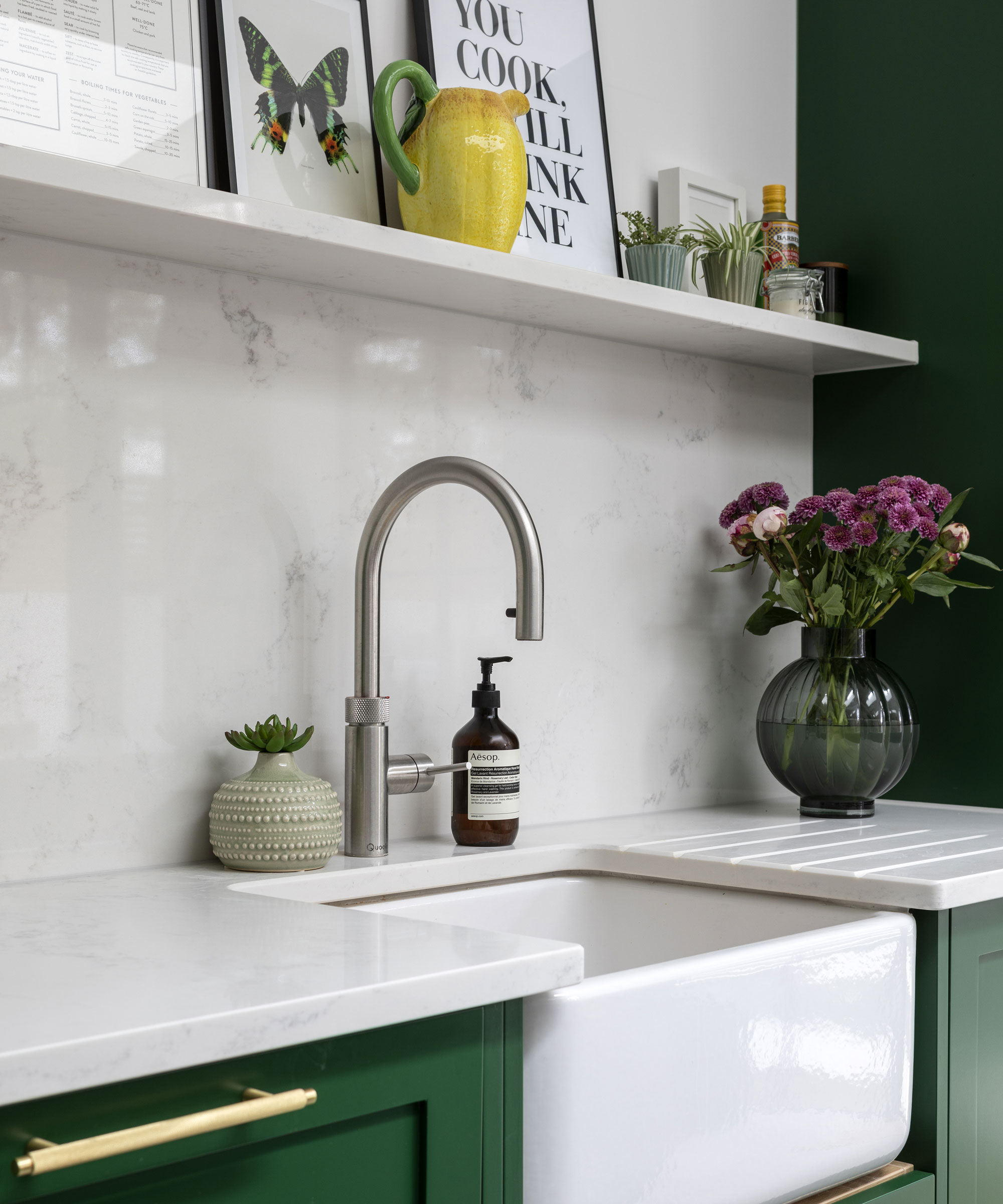
Charley considered the practicalities of family use when planning the design and choosing materials. ‘It was important to think about how easy the floors and work surfaces are to clean, as well as how durable the units are.' Sink, Perrin & Rowe. Tap, Quooker. Worktop, Croydon Granite. Oven, Bosch
‘We would have loved a deVOL kitchen, but it was out of budget. A friend recommended Naked and we found it to be a really good middle ground in terms of design and quality versus price. We did a lot of the planning ourselves and really led the project, telling them we wanted a bank of units along the wall, an island and a dresser. We went against advice for the distance between the island and wall units and brought the island out further to make the kitchen more spacious.
‘We wanted a style in keeping with the period of the house and chose frameless Shaker doors that are a bit more modern – I’d say what we have now is a mix of the old and new.’
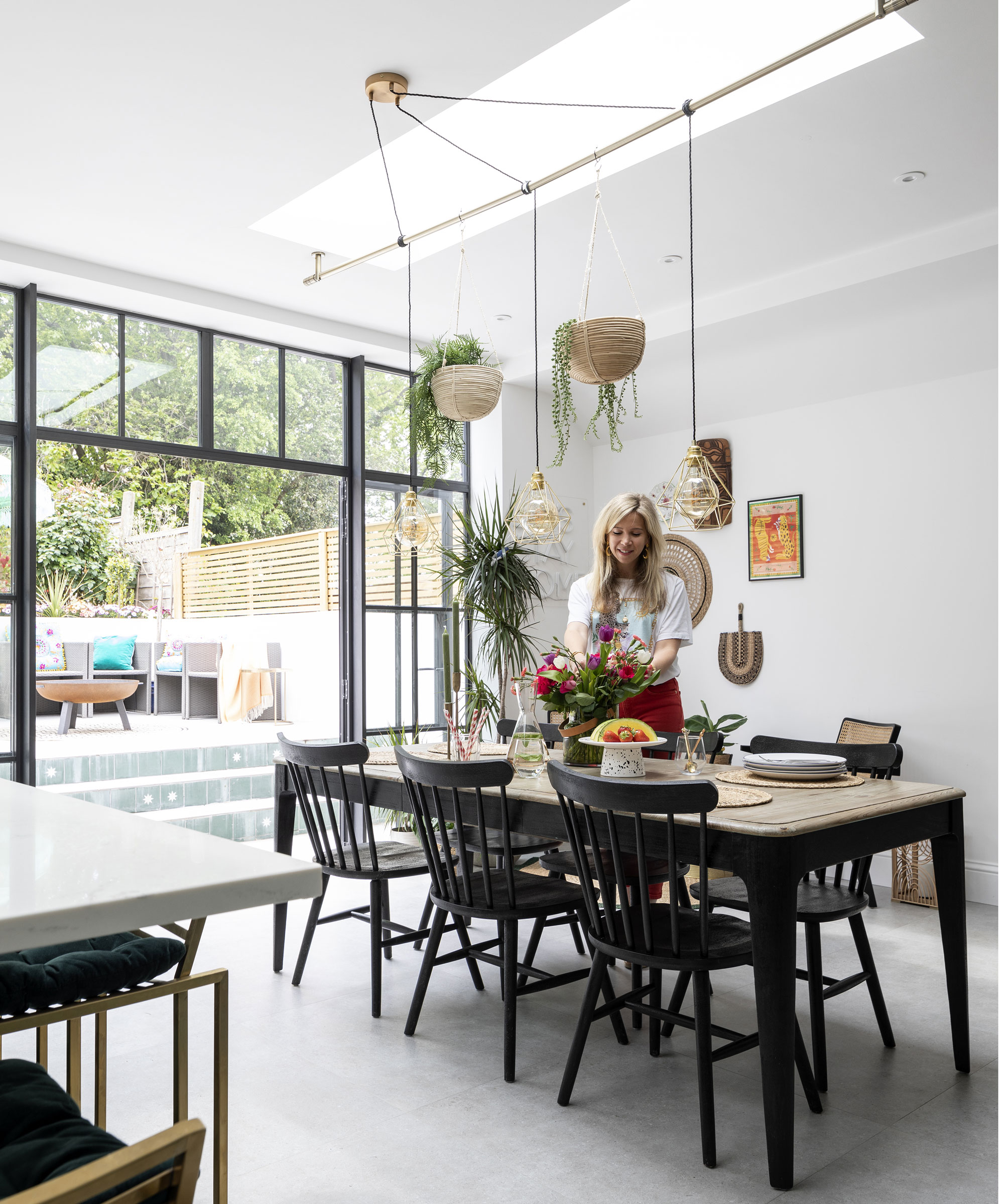
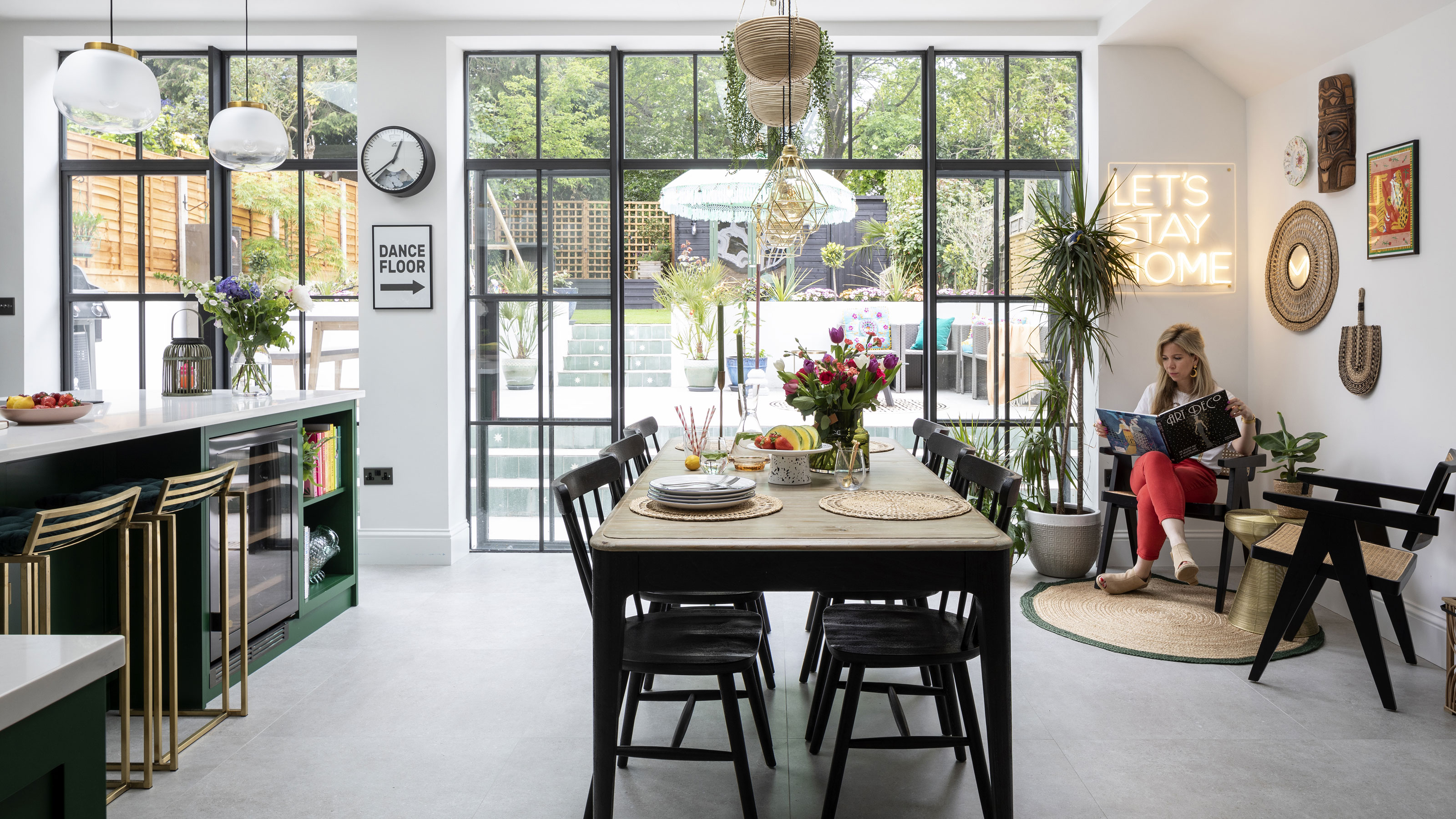
’For the lighting under the skylight, we came up with a creative solution using a curtain pole and a light we designed from Creative Cables.’ Discreet underfloor heating frees up wall space from radiators. Dining set, Loaf. Lights, Creative Cables. Chairs, Six The Residence
‘Originally our architect designed the extension with a whole wall of glass at the end, but I wanted some sort of separation between the kitchen and the dining area, so we have two sets of doors with a little wall in between. I think it actually makes the space feel bigger.
‘I ordered almost all the possible paint samples as I love colour, but we ended up choosing an emerald green I came across on social media – I really love it. We were originally looking at dark colours that would match the Crittall-style doors. I always wanted this style; it’s in keeping with the property and matches the stained glass windows, which are leaded.’
- See more green kitchen ideas that inspire.
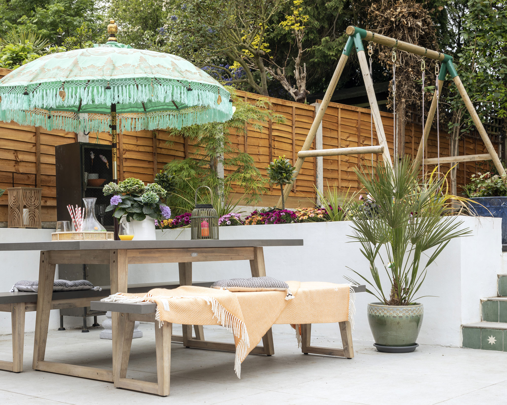
The garden has been tamed and offers a space for the children to play while the grown ups can watch them from the kitchen or the patio. Tiles, Bert & May. Parasol, Jumping Bean London. For a similar table and benches, try the Olbia by Beliani
‘We had a budget to stick to but because we were thrifty, we didn’t have to scrimp on anything. I searched high and low to get the Buster & Punch-style handles that I loved. I found the ones we used via Plank Hardware. I’d definitely recommend asking for a discount on every single purchase you make: you don’t always get one, but most people will be willing to give you something.'
Contacts
Kitchen Naked Kitchens
‘My other tip is to stay focused. You can get really distracted with Pinterest and Instagram and can get decision fatigue when doing a big project. Stick to what you love and go with your gut.’
Subscribe to Real Homes magazine Want even more great ideas for your home from the expert team at Real Homes magazine? Subscribe to Real Homes magazine and get great content delivered straight to your door. From inspiring completed projects to the latest decorating trends and expert advice, you'll find everything you need to create your dream home inside each issue.
Join our newsletter
Get small space home decor ideas, celeb inspiration, DIY tips and more, straight to your inbox!
-
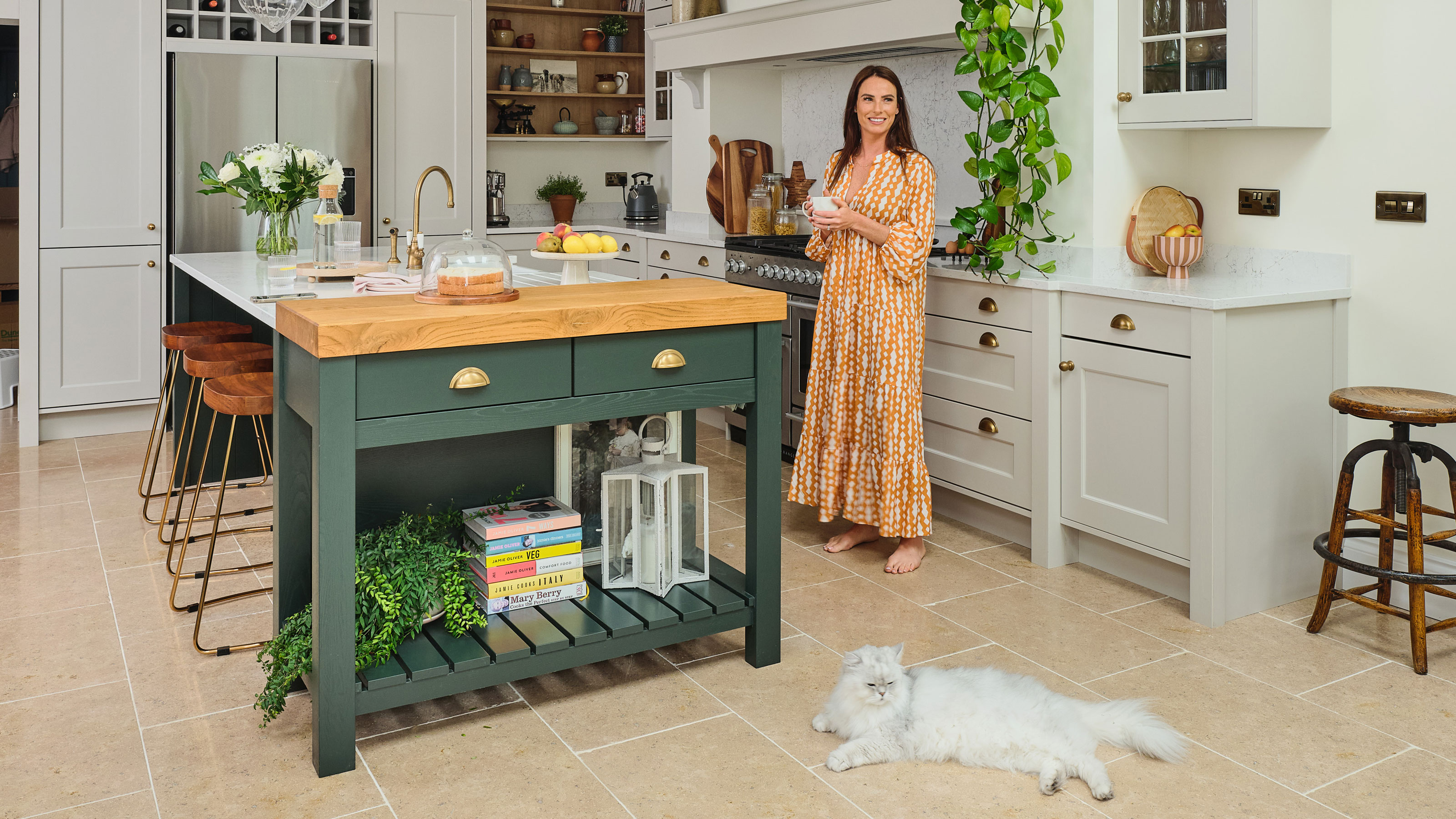 You won't believe this stunning five-bed family home used to be a tiny two-bed
Katie and Stuart went big with a double-story extension to create a dream space for themselves and their daughters
By Ifeoluwa Adedeji Published
-
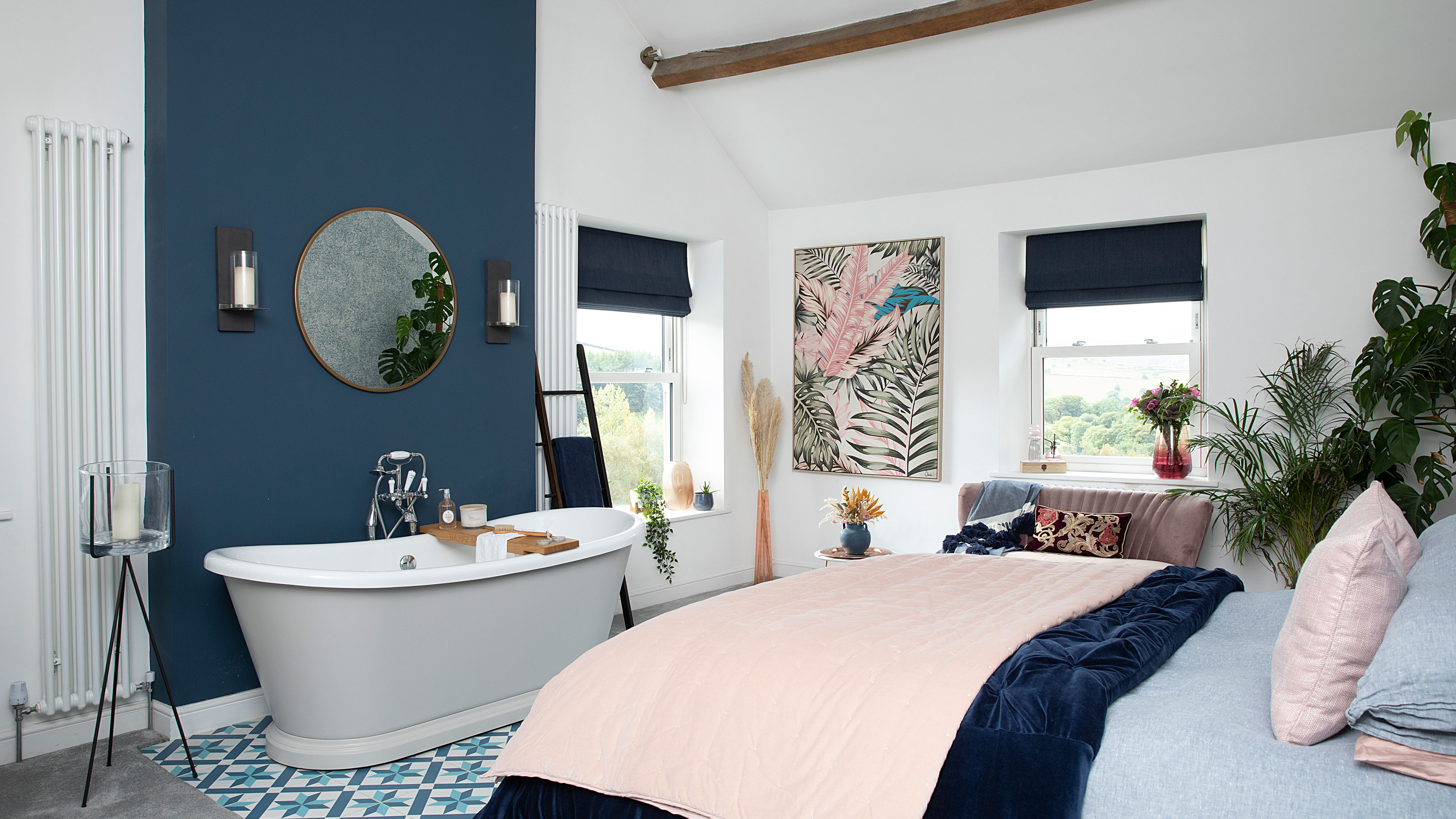 The freestanding bath in this dreamy bedroom is sheer five-star luxury
Emma and Martin wanted a suite just like in an upscale hotel — mission totally accomplished.
By Ellen Finch Published
-
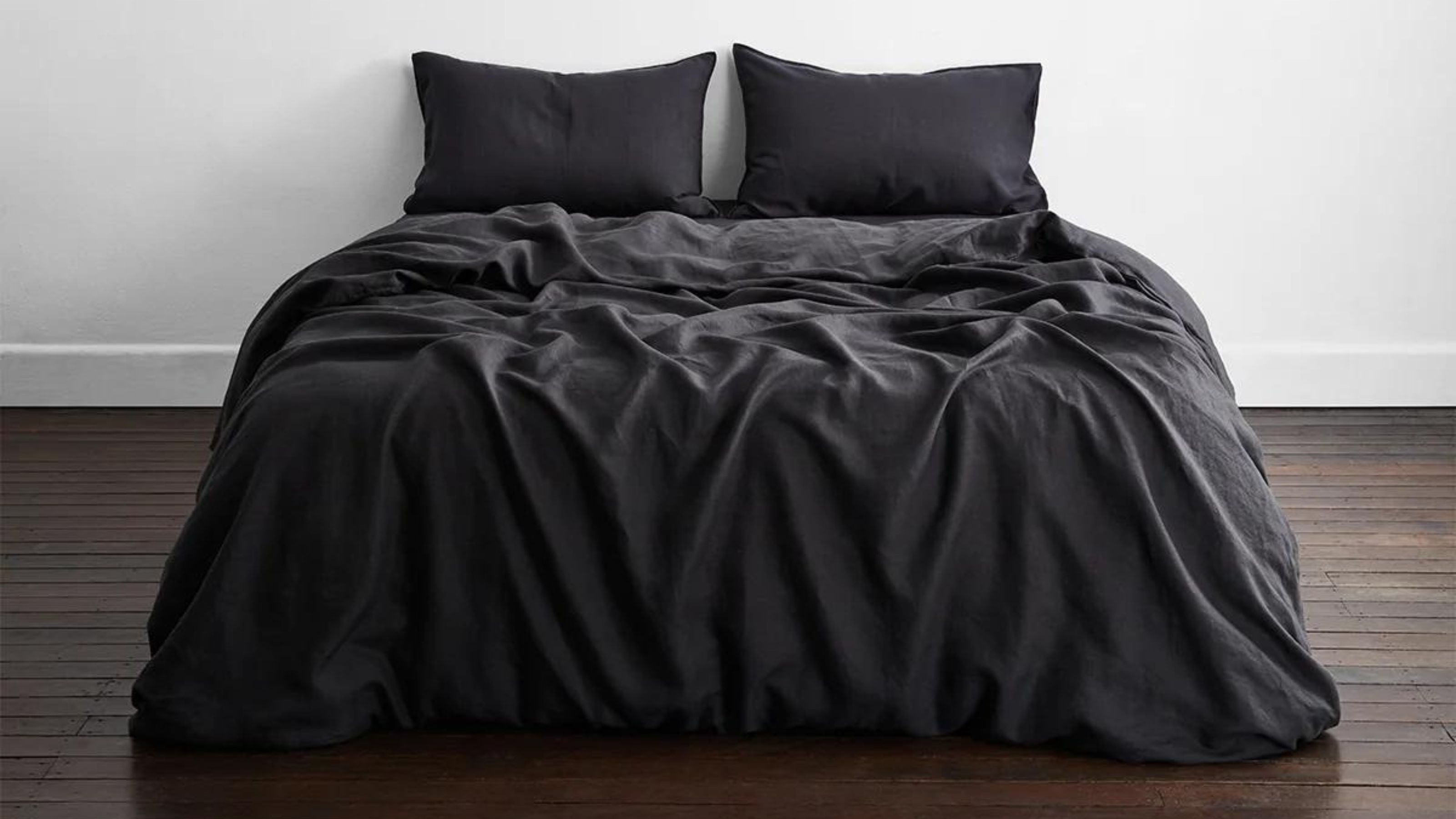 I just know 2023 is going to be all about black bedding sets
White sheets are out, black bedding sets are in — here's everything you need to know about this bedroom decor trend
By Louise Oliphant Published
-
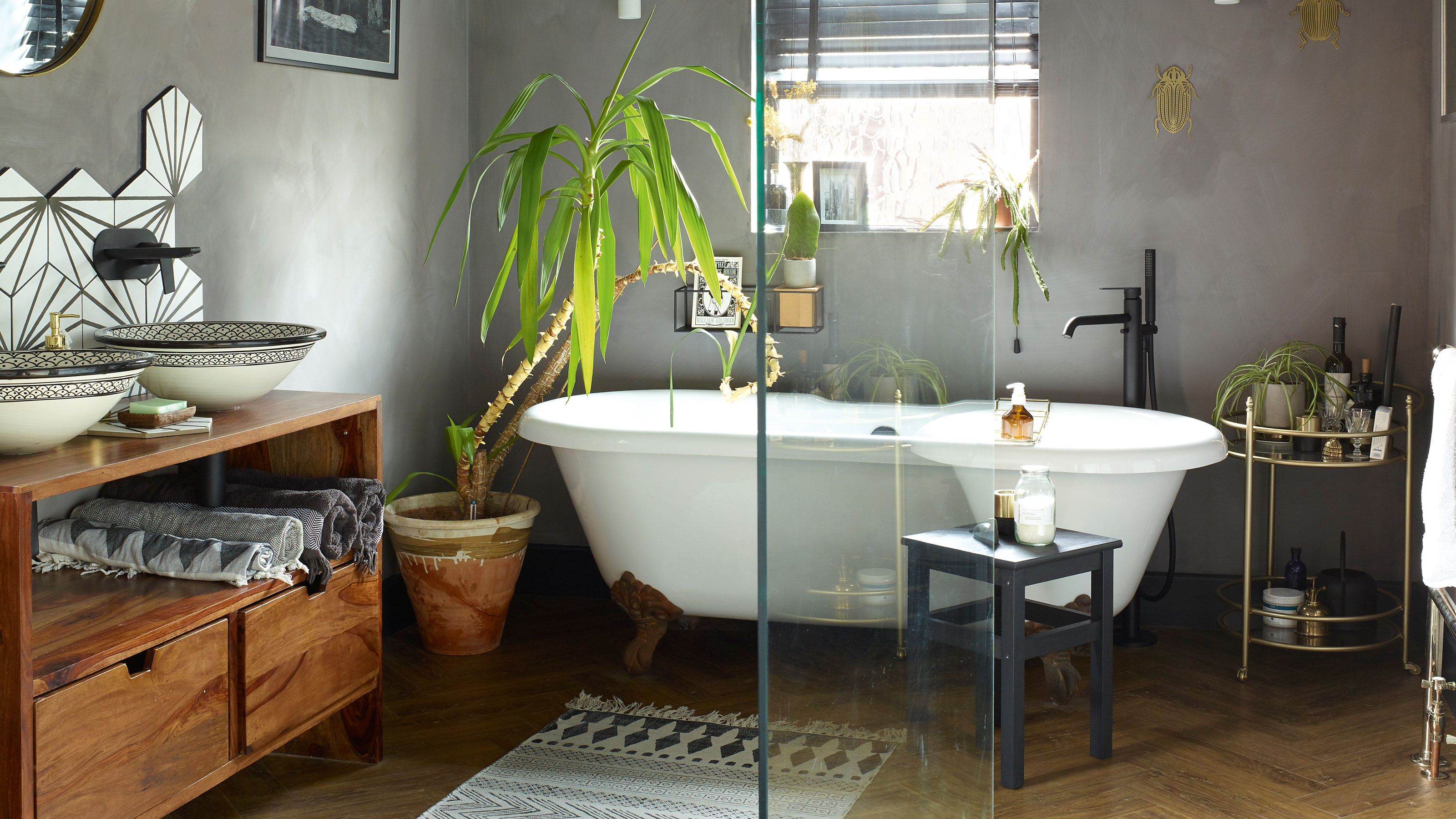 A bland beige bathroom is transformed into a STUNNING contemporary sanctuary
First-time homeowners Ellie and Oliver’s new bathroom is a well-planned fusion of modern pieces and exotic touches
By Ellen Finch Published
-
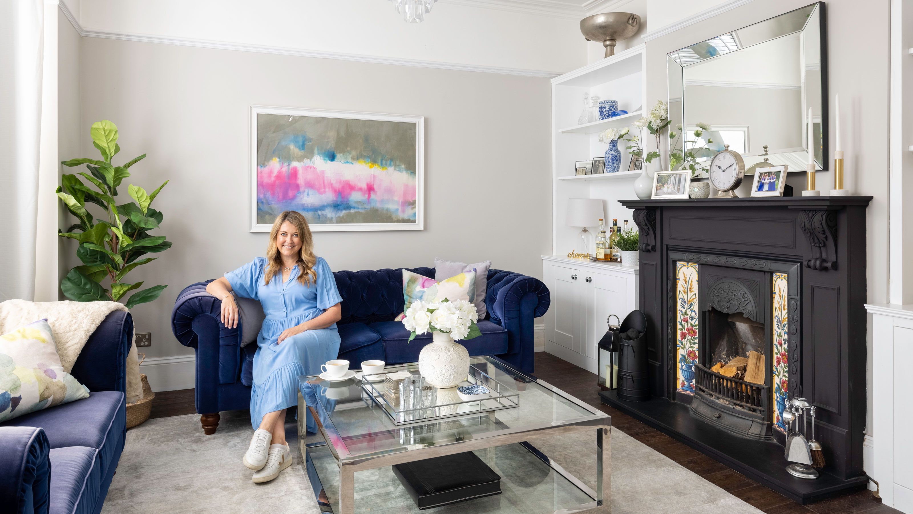 Restored seaside home oozes coastal charm
Laura and James Simpson turned a rundown eyesore into a stylish and welcoming family home featuring the colours of the sea
By Sharon Smith Published
-
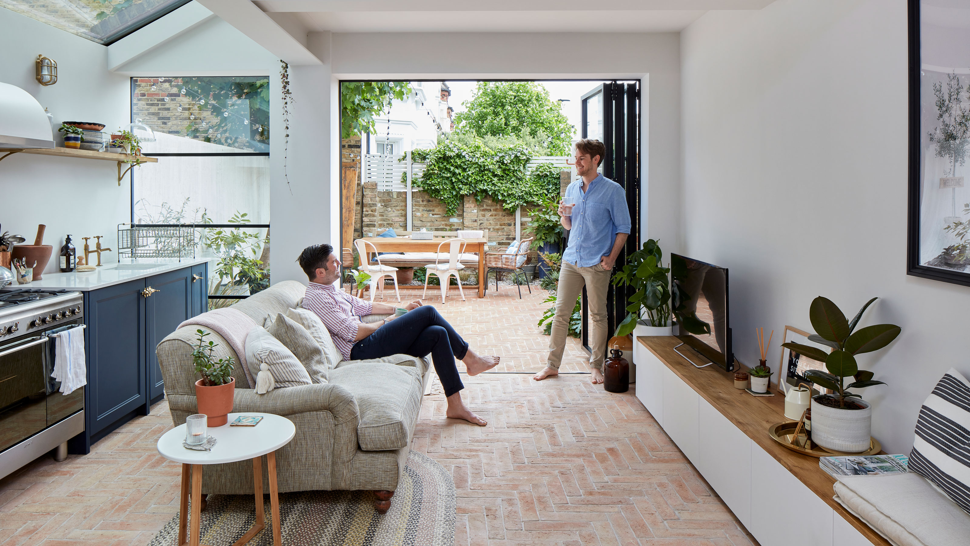 Real home: Extended kitchen/garden room has the flavour of Italy
Memories of the palazzo where they married inspired David and Andrew’s ‘bella’ new kitchen
By Alison Jones Last updated
-
 Before and after: cool plywood kitchen shows bespoke is the way to go
This extended space is packed with ideas
By Ellen Finch Last updated
-
 Before and after: this fashion buyer's £30k kitchen reno is full of ingenious cost-saving ideas
Plus there's some pretty serious colour inspo here
By Amelia Smith Last updated
