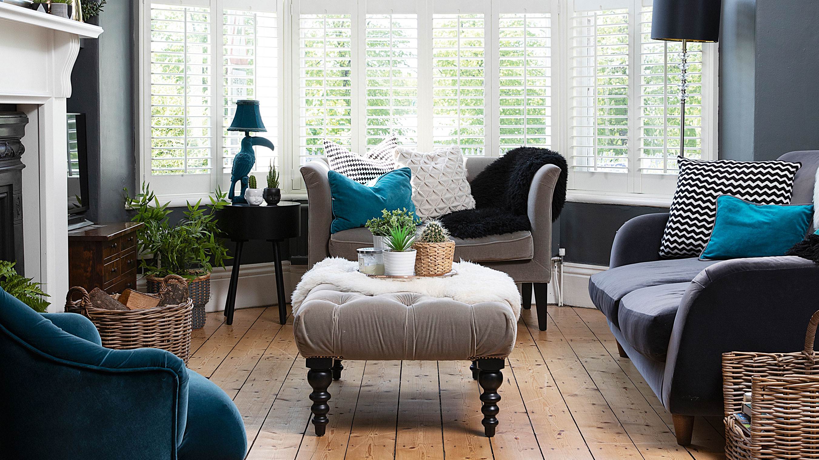

Karla Lucas inherited her Victorian home in a decent state – complete with an open-plan kitchen and French doors to the garden – but she’s been able to put her own stamp on the property while keeping its most precious features, including the original sash windows, fireplaces and bannister, intact.
In fact, Karla has gone so far as to celebrate them, restoring the original Victorian tiles of the hallway to their former glory and keeping, but painting over, the textured wallpaper that was there when she moved in. That isn’t to say that her home hasn’t moved with the times, though. Knocking the living and dining rooms through to each other has flooded the middle room with much-needed light, and a loft conversion provides daughter Amelia with her own little sanctuary up in the roof.
Intrigued? Keep scrolling for the full tour.
Want to put your stamp on a home with a makeover? Here's an overview of how to prepare your house for a renovation.
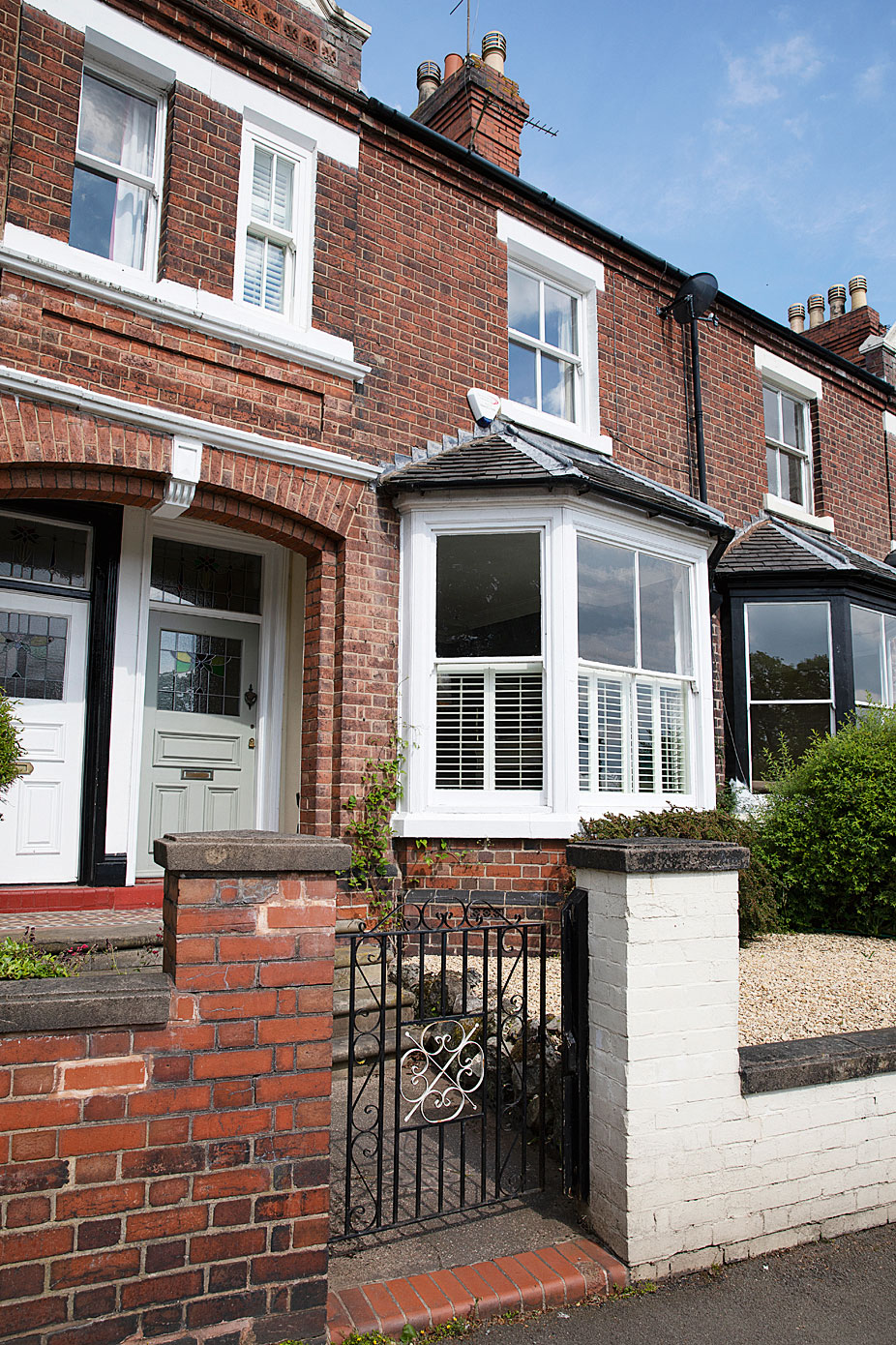
Sash windows, Roseview Windows, fitted by Strata
The profile
The owners Karla Lucas, a teacher, lives with her husband, Andy, who is in the army, and their daughter, Amelia
The property A four-bed Victorian terrace in Staffordshire
Project cost £46,000
'When we saw this house, we were drawn in by the original features,' says Karla. 'There were so many and they’d been so well-kept throughout the years – since 1901, basically. We lived in the house for a year to get a feel for it before we did anything. We knew the floorboards needed sanding, the fireplace mantles needed replacing, and the kitchen needed an update, but we hadn’t even considered anything like a loft conversion. All it needed was a lick of paint.'
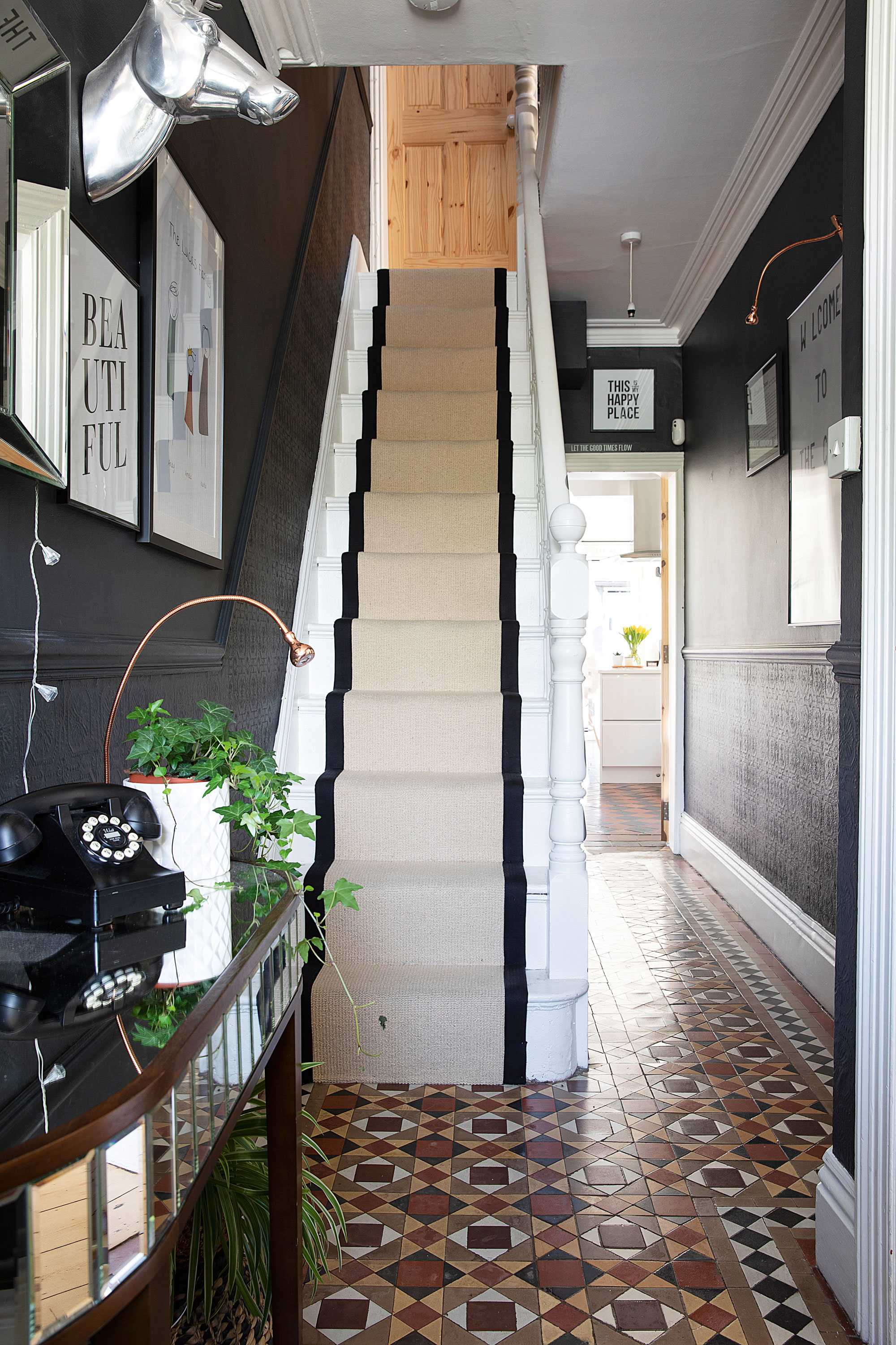
Stair runner, Vogue Carpets. Walls painted in Off Black, Farrow & Ball. Capri console table, Laura Ashley
'The handrail on the bannister was the original pine, while the stairs and spindles were white. Everything needed painting and there was carpet running up the middle that wasn’t fitted properly, so it was dangerous. We ripped it up and put an inexpensive beige runner up the middle. I painted the stairs myself and it took forever! I’d seen someone use a runner with edging – I found a stockist of Alternative Flooring to come and fit something similar.'
‘There was original wallpaper on the bottom half of the wall that we didn’t dare pull off, so we painted over it. You can still see a bit of the pattern and it has a lovely texture. All the houses along the road had stained glass in their front door except for us, so we restored that, too.'
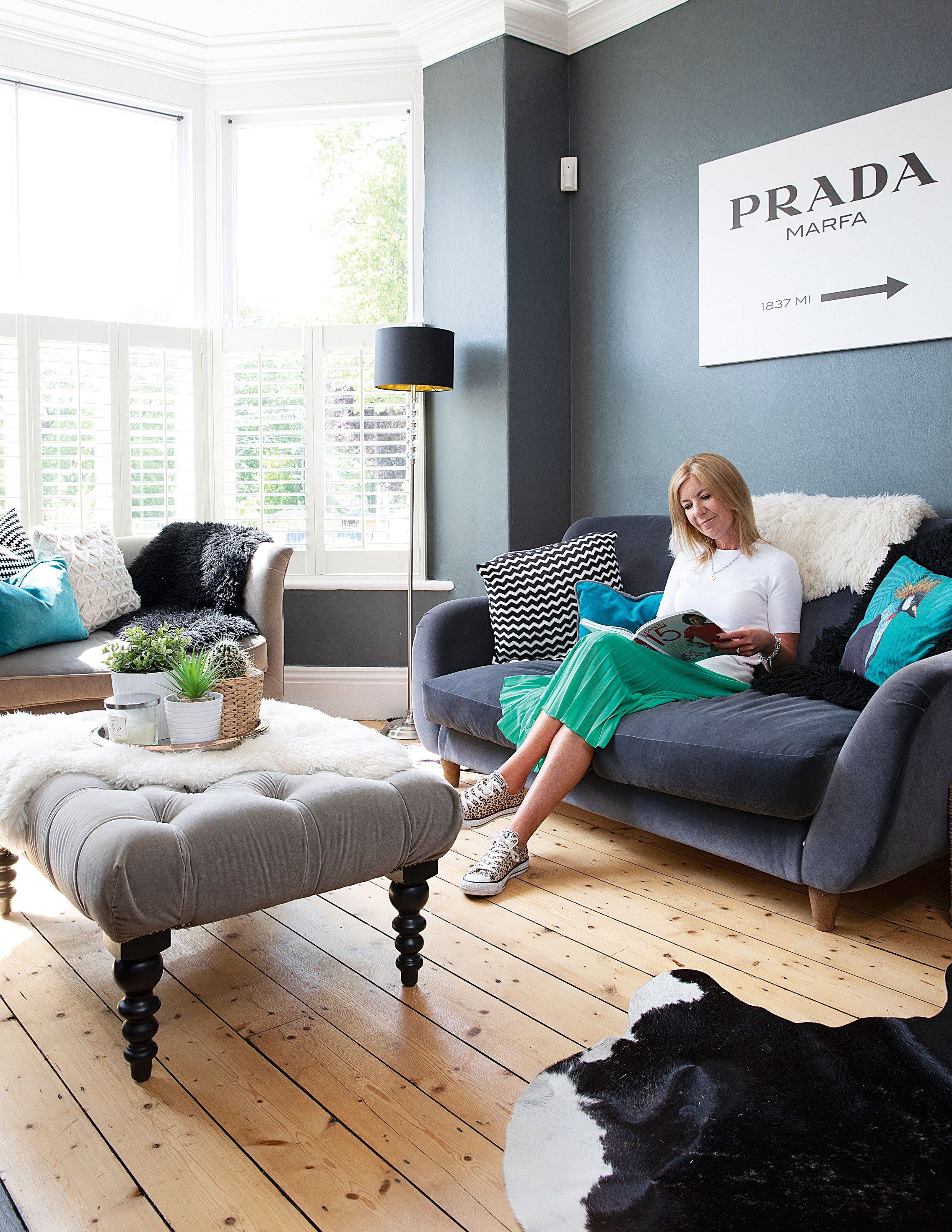
Walls painted in Down Pipe, Farrow & Ball. Large sofa, Loaf. Small sofa, armchair and coffee table, Sofa.com. Floor lamps, Habitat. Cowhide rug, Graham & Green. Shutters, Hillarys. Prada print, Amazon
‘I love making a feature of the traditional elements of the house, but my taste is quite modern – I like things to be clean, and everything to have its place. I get lots of ideas from magazines and the internet, save them in folders and revisit them. Trying out dark paint was the scariest – it feels like a bold move before you do it. We lived in military housing with magnolia walls for 20 years, so when dark interiors started taking off on Instagram and Pinterest, we decided to give it a go. We still love our darker living room even now.'
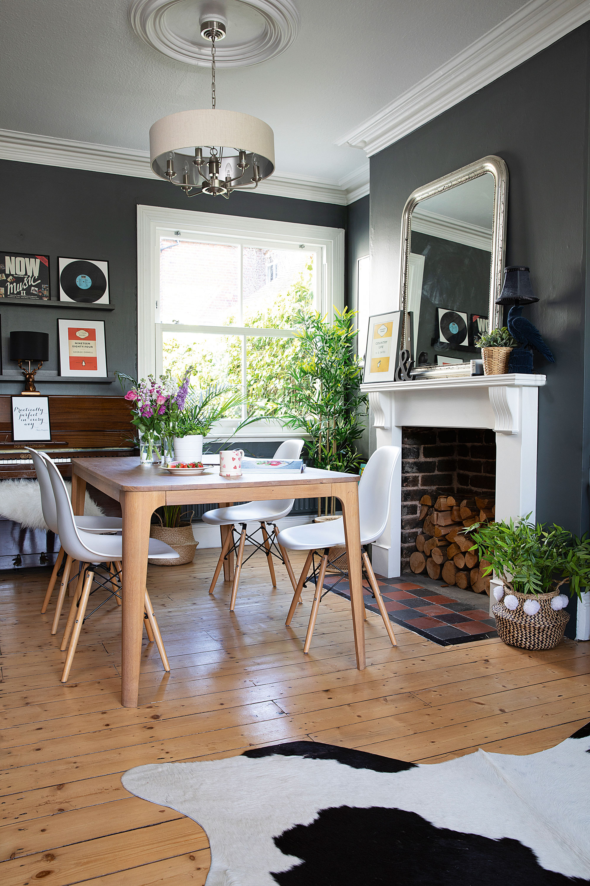
Ceiling light, Laura Ashley. Dining table, John Lewis & Partners. Chairs, Cult Furniture
‘One of the first things we did was to knock down the wall between the living and dining room. It was messy, but it was so effective for how inexpensive it was. It opened up the whole of the front room – the light is amazing now. We never used to go into the dining room at all because it was so dark. It had one window but it didn’t get any light because there are houses behind us.
‘The builder who did the work put all the coving back on afterwards so it matched the rest of the ceiling. We discovered at that point that the floorboards in the front room and the dining room run different ways. I put a rug in to cover the join and make it flow a little better. We use the space so much more now. Thanks to the open fire it warms up nicely, and it’s still so bright in winter because of the big bay window at the front.'
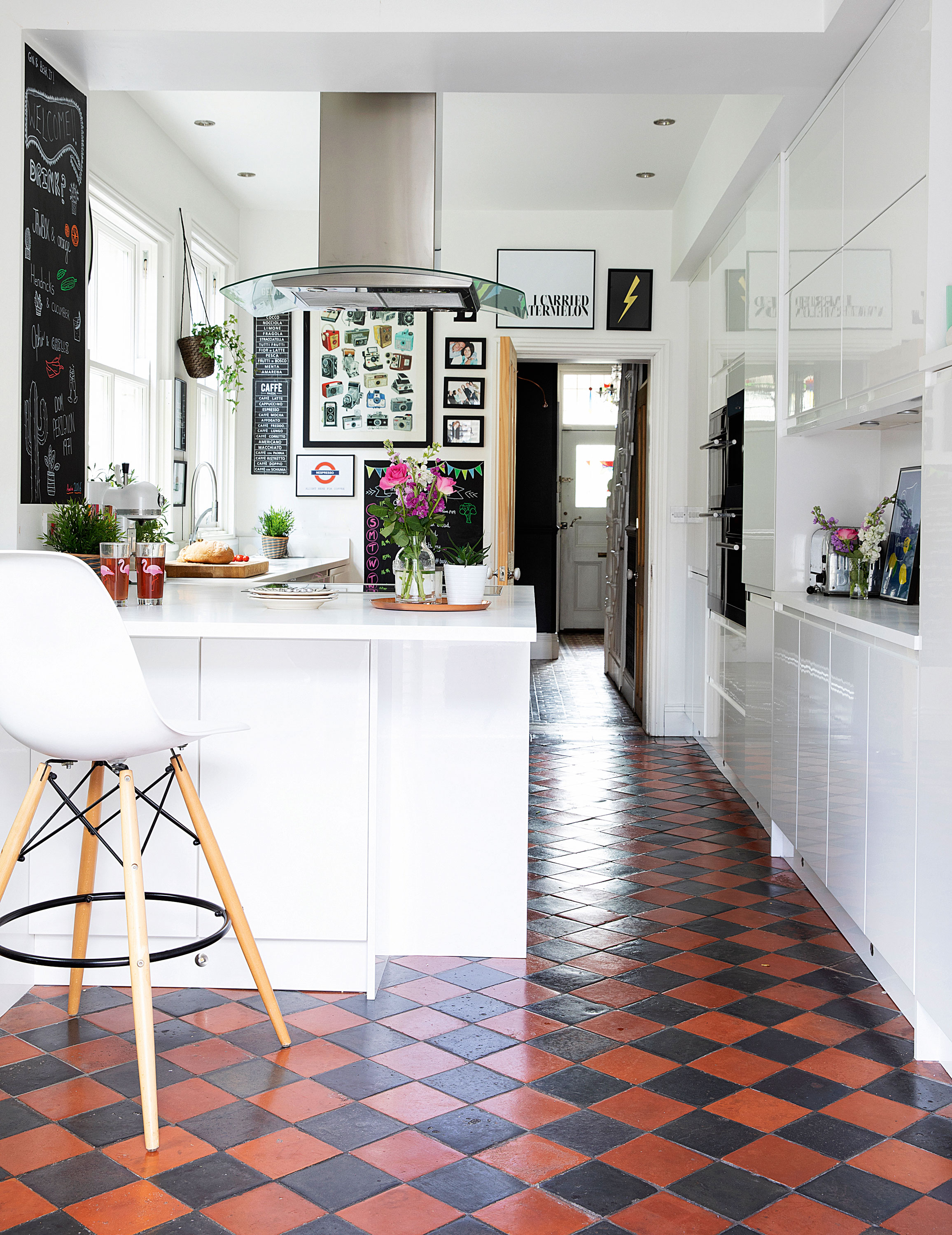
Kitchen, Wickes. Appliances, AEG. Tap, Franke. For a similar blackboard paint, try Rustins Quick Dry Blackboard Paint, Amazon. Bar stools, Cult Furniture
'The kitchen we inherited when we moved in was 10 years old and really dated. We knew we’d need to put a new one in. The cupboards weren’t in good repair and it wasn’t the layout I wanted – it wasn’t social enough. The space had already been knocked through by previous owners, but replacing the kitchen itself was one of the first things we did. We had to buy a few new quarry tiles that were missing from underneath the old kitchen but I knew I wanted to keep them – they’re an original feature and they’re still in such good condition. In fact, they sold us the house along with the tiles in the hall. I don’t know how people can carpet over them!’
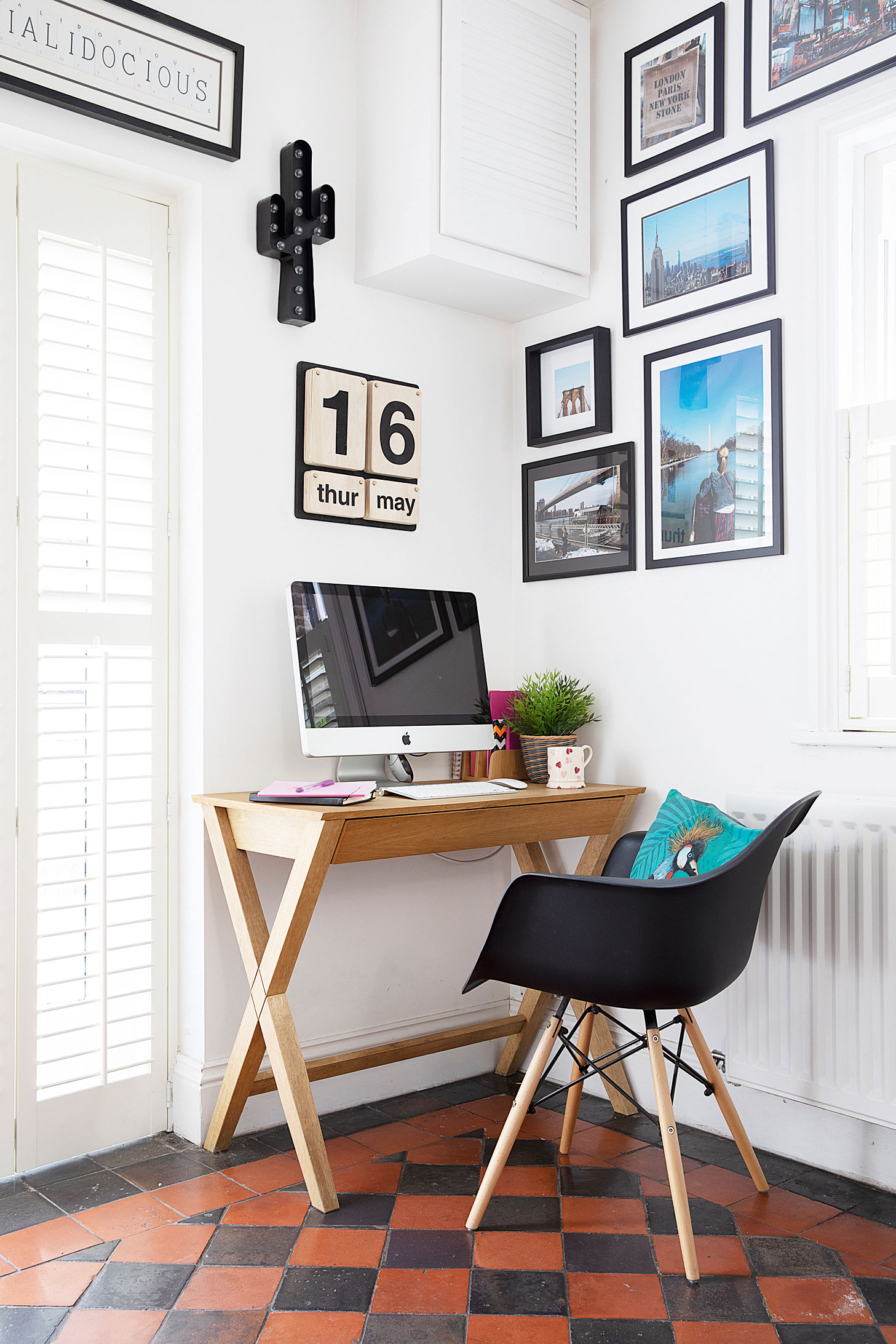
‘When we were choosing the new kitchen, I wanted a sleek, modern design. The kitchens in military quarters were always really dated with nowhere to put anything, so this needed to be the opposite of that. We also decided to opt for light units to prevent the room from feeling gloomy and make the tiles pop. We went to lots of different shops and ended up at Wickes. I just love the clean, slimline look. We kept it all white so that the only colour comes through the floor tiles and accessories.'
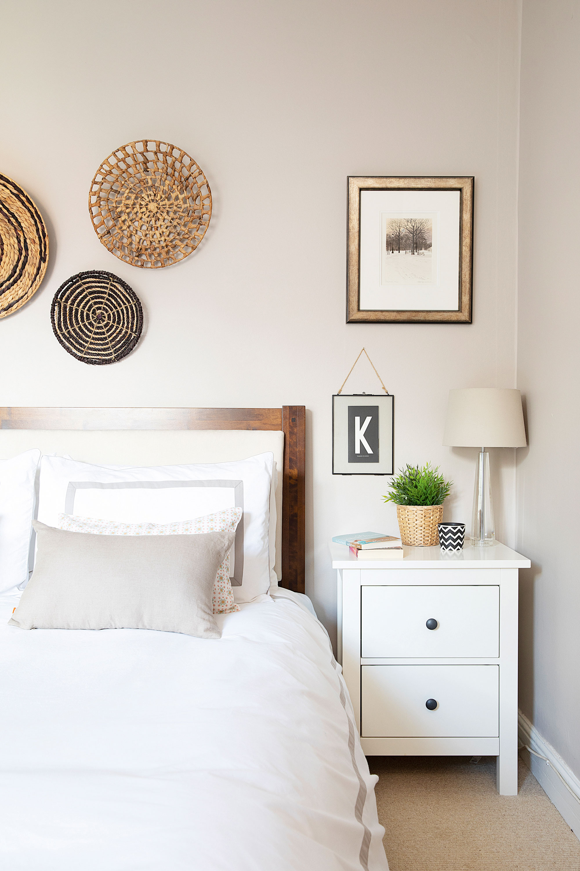
Walls painted in Elephant’s Breath, Farrow & Ball. Carpet, Vogue Carpets. Bed, Laura Ashley. Prints, New Icons of Print and Mark Spain limited edition from Bradbury Graphics of Belfast. Bedside tables, Ikea
'We decided not to go dark in the bedroom because we worried it wouldn’t feel like a calm, relaxing space. Instead, we opted for Farrow & Ball’s Elephant’s Breath. We were going to keep it white but it felt like the room needed warming up. The design is quite Scandi, with lots of wicker and beige tones. We wanted a toned-down, chilled-out room where we can unwind at the end of the day. All the furniture in here we brought from our old house, so there’s nothing new except the baskets and the lampshade.'
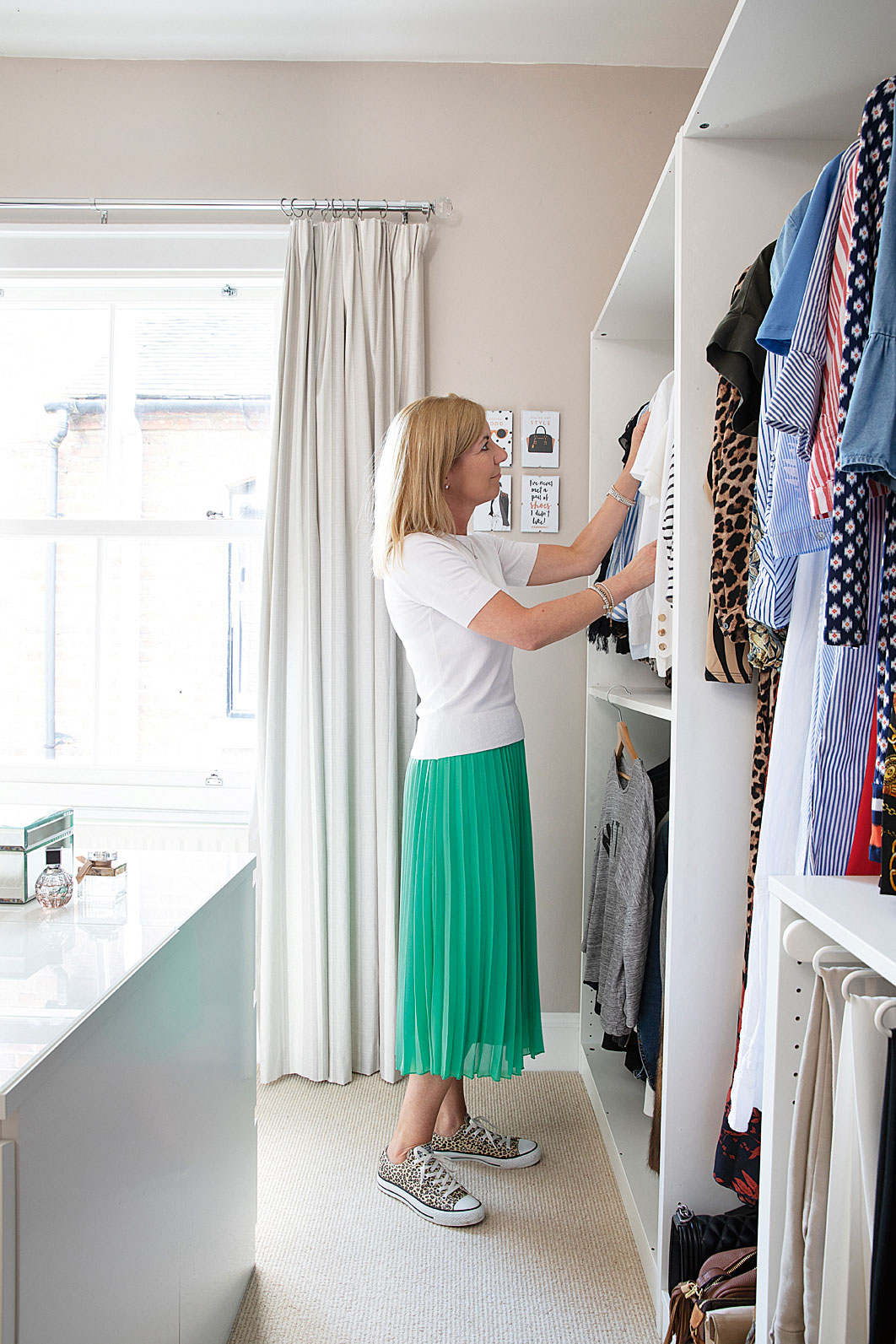
Wardrobes and unit, Ikea. Curtains, Laura Ashley. Walls painted in Elephant’s Breath, Farrow & Ball. Carpet, Vogue Carpets
'Once we’d moved Amelia up into the loft, it gave me a spare room to create a dressing room. In my opinion, it’s the best room in the house. My dad says it’s the most expensive dressing room he’s ever seen – after all, we did a whole loft conversion for it!'
Contacts
Loft Buckley Loft Conversions
Kitchen JT Richmond Kitchen Installations, 07976 261677
Sash windows Roseview Windows
'We did the loft last, but in hindsight, we should have done it first – it was an absolute mess! We had to replace all the carpets on the middle floor and staircase. In an old house like this, when you start knocking things down, the dust is black, so it was messy.'
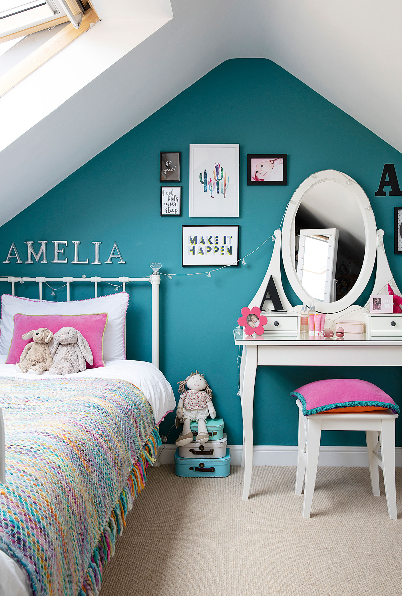
Walls painted in Vardo, Farrow & Ball. Bed, Next. ‘Amelia’ letters, Posh Graffiti. Dressing table and stool, Ikea
'‘The whole thing took three months. It’s like Amelia’s own little apartment. She chose the décor; she didn’t want pink any more so settled on a blue-green colour. There isn’t a bathroom up there because we wanted space for clothes, but she’s otherwise pretty self-sufficient – she has a desk for study, and she loves having friends over so they can hang out upstairs.'
Subscribe to Real Homes magazine
Want even more great ideas for your home from the expert team at Real Homes magazine? Subscribe to Real Homes magazine and get great content delivered straight to your door. From inspiring completed projects to the latest decorating trends and expert advice, you'll find everything you need to create your dream home inside each issue.
Keep reading:
Join our newsletter
Get small space home decor ideas, celeb inspiration, DIY tips and more, straight to your inbox!

Formerly deputy editor of Real Homes magazine, Ellen has been lucky enough to spend most of her working life speaking to real people and writing about real homes, from extended Victorian terraces to modest apartments. She's recently bought her own home and has a special interest in sustainable living and clever storage.
-
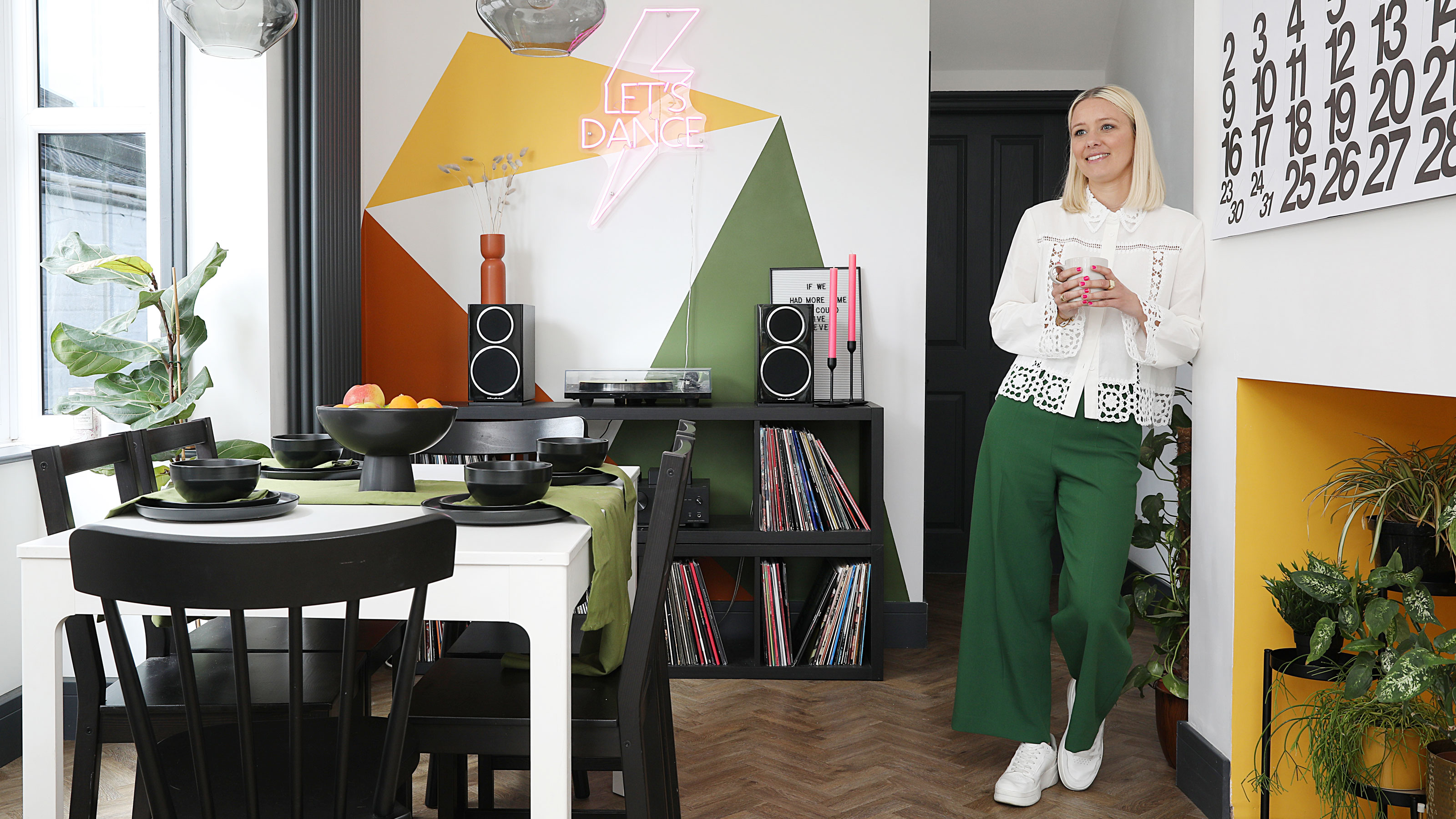 This colourful home makeover has space for kitchen discos
While the front of Leila and Joe's home features dark and moody chill-out spaces, the rest is light and bright and made for socialising
By Karen Wilson
-
 How to paint a door and refresh your home instantly
Painting doors is easy with our expert advice. This is how to get professional results on front and internal doors.
By Claire Douglas
-
 DIY transforms 1930s house into dream home
With several renovations behind them, Mary and Paul had creative expertise to draw on when it came to transforming their 1930s house
By Alison Jones
-
 12 easy ways to add curb appeal on a budget with DIY
You can give your home curb appeal at low cost. These are the DIY ways to boost its style
By Lucy Searle
-
 5 invaluable design learnings from a festive Edwardian house renovation
If you're renovating a period property, here are 5 design tips we've picked up from this festive Edwardian renovation
By Ellen Finch
-
 Real home: Glazed side extension creates the perfect garden link
Louise Potter and husband Sean's extension has transformed their Victorian house, now a showcase for their collection of art, vintage finds and Scandinavian pieces
By Laurie Davidson
-
 I tried this genius wallpaper hack, and it was perfect for my commitment issues
Beware: once you try this wallpaper hack, you'll never look back.
By Brittany Romano
-
 Drew Barrymore's new FLOWER Home paint collection wants to give your walls a makeover
Drew Barrymore FLOWER drops 27 brand-new paint shades, and every can is made from 100% post-consumer recycled plastic.
By Brittany Romano
