Real home: see how a kitchen extension creates a bright, family-friendly space
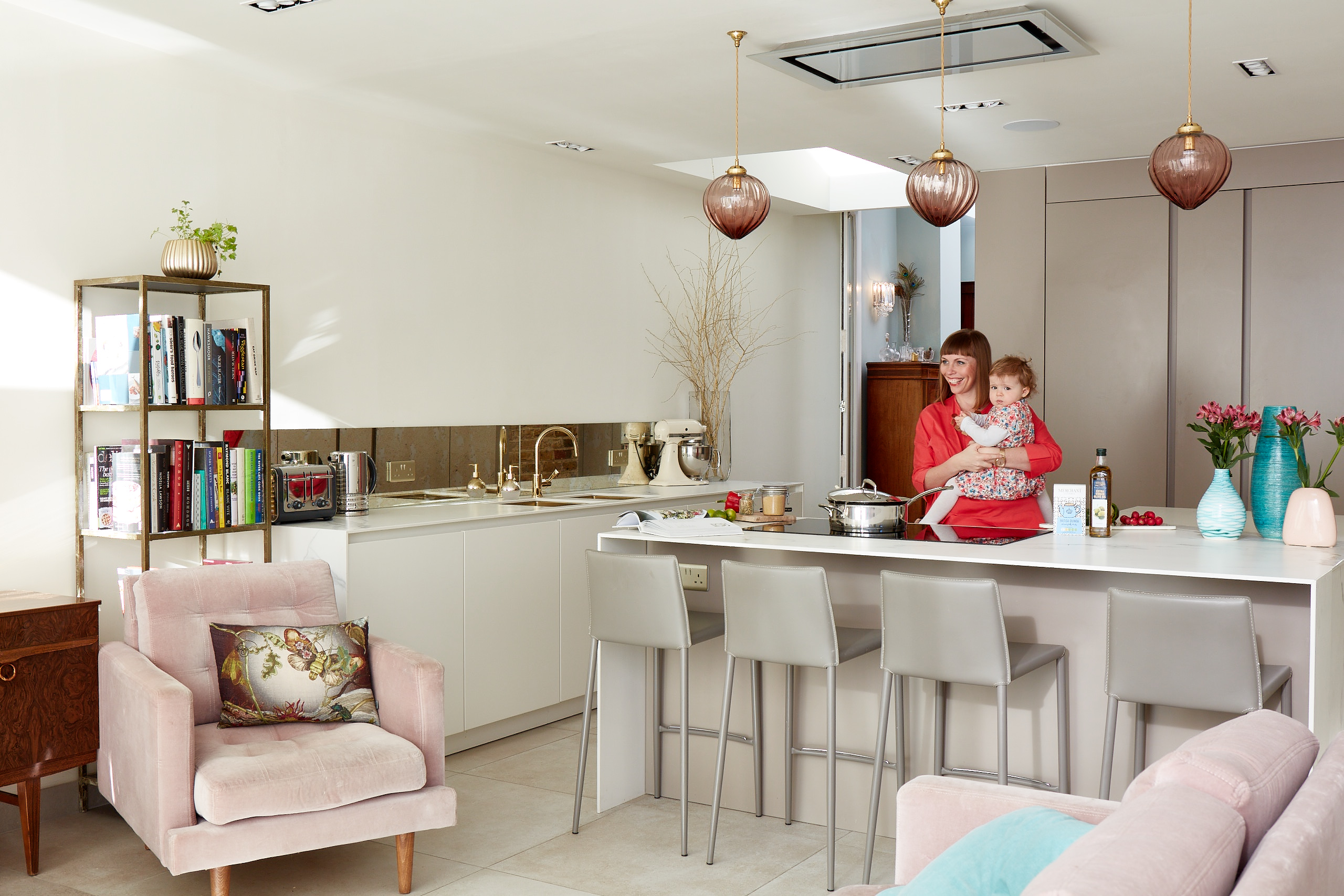
A love of gardening inspired the design of this kitchen extension – and the style of the room, with a palette of earthy textures and pretty pinks

Get small space home decor ideas, celeb inspiration, DIY tips and more, straight to your inbox!
You are now subscribed
Your newsletter sign-up was successful
For Keira and Martin Lloyd, their house was a forever home, but one that needed a bit of work when their daughter Cicely came along. The first project on their list? Extending their tiny flatpack kitchen to create a family room inspired by the summery palette of Keira’s beloved garden. Here, Keira shares the five-step plan that led to her dream indoor-outdoor space...
Love this? See all our real home transformations – and find out more about extending, too.
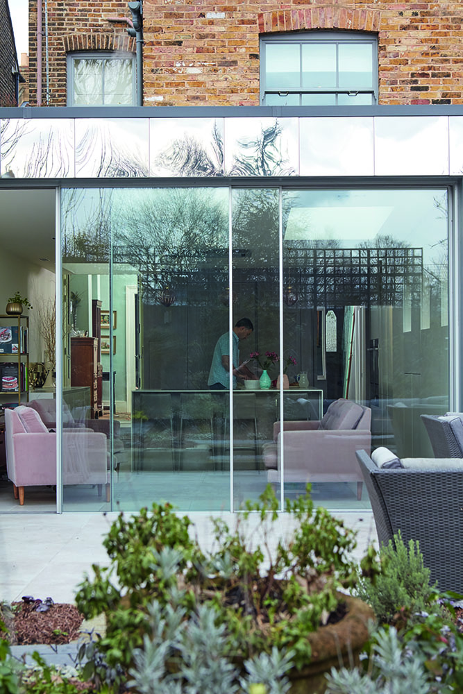
Slim-profile doors are framed by mirrored glass that reflects the greenery of the garden. ‘It was all about creating that indoor-outdoor link,’ Keira says. Glazing, Fusion Glazing. Flooring, Abbey Tiles
Profile
The owners
Keira Lloyd, a marketing director, lives here with
her husband Martin, an operations director,
and their daughter Cicely, two
The property
A four-bedroom Victorian semi-detached
house in Peckham, London
Project cost
A similar extension would cost in the
region of £80,000 to £100,000
‘By the time I fell pregnant with Cicely, I’d fallen in love with Peckham,’ Keira says. ‘We didn’t want to move out: we just wanted more space so we could enjoy it as a family home. You see it all the time: pregnant women and builders go together like jam and toast!
Article continues below‘The existing kitchen was long, narrow and fitted with Ikea units. It suited us for a while, but when Cicely arrived, it was time for an upgrade. We wanted an open-plan eating, living, dining and cooking area that works well with a young family. But the most important part of the brief was to bring the outside in. I developed a love of gardening when we bought the house and I’d spent time planting the scheme, so we decided to make the kitchen and the garden one seamless space.’
Keira’s palette is made up of natural tones and pink shades, picked from her garden flowers. ‘I love being in my garden so I was inspired by nature when it came to choosing the colour scheme,’ she says.
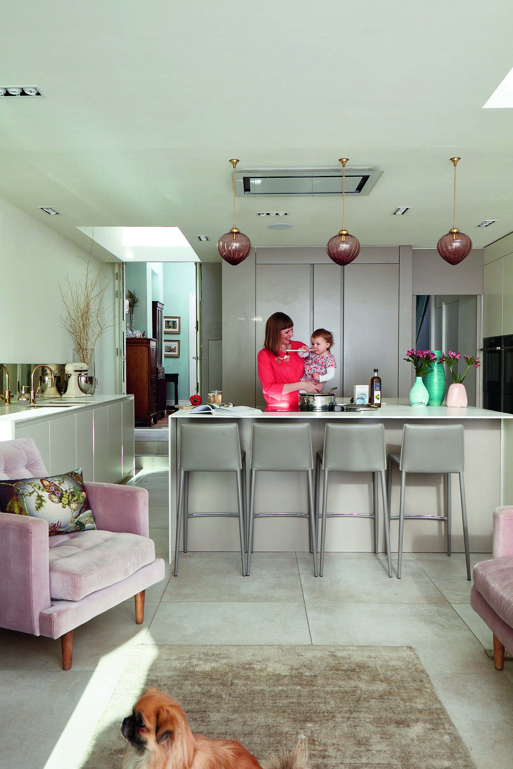
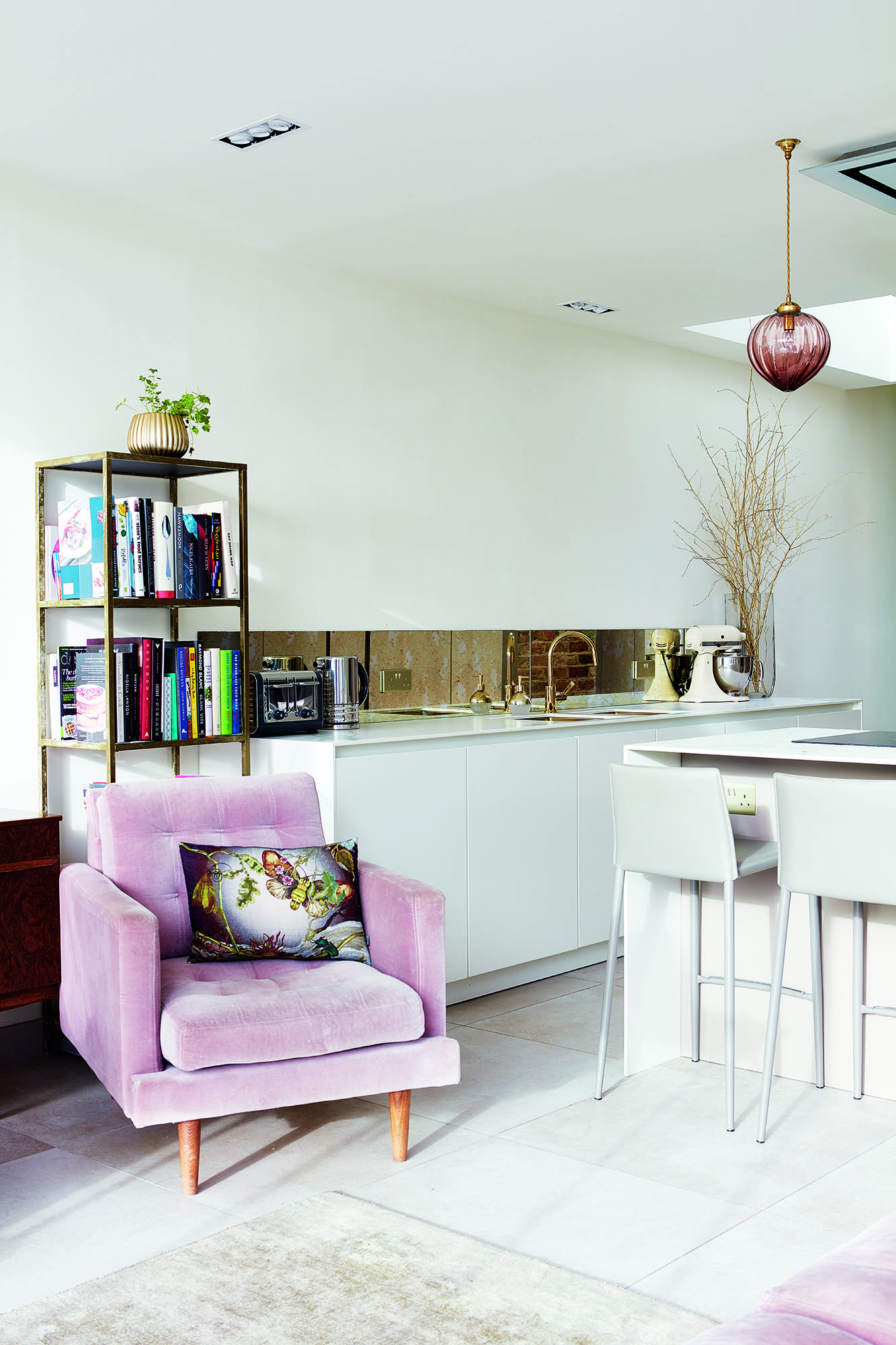
Flooring, Abbey Tiles. Bar stools, John Lewis. Armchair, Sofa.com. Rug, Habitat. Pendant lights, Rothschild & Bickers. Ceiling lights, YESSS Electrical
‘Living in a Conservation Area meant that we had to think sensitively. We went through the planning process and initially had an architect draw up plans, but in the end I project managed the process with a builder. We designed a lot of the kitchen on site, which was a brilliant experience as it allowed me to react to things and make choices as we went along.'
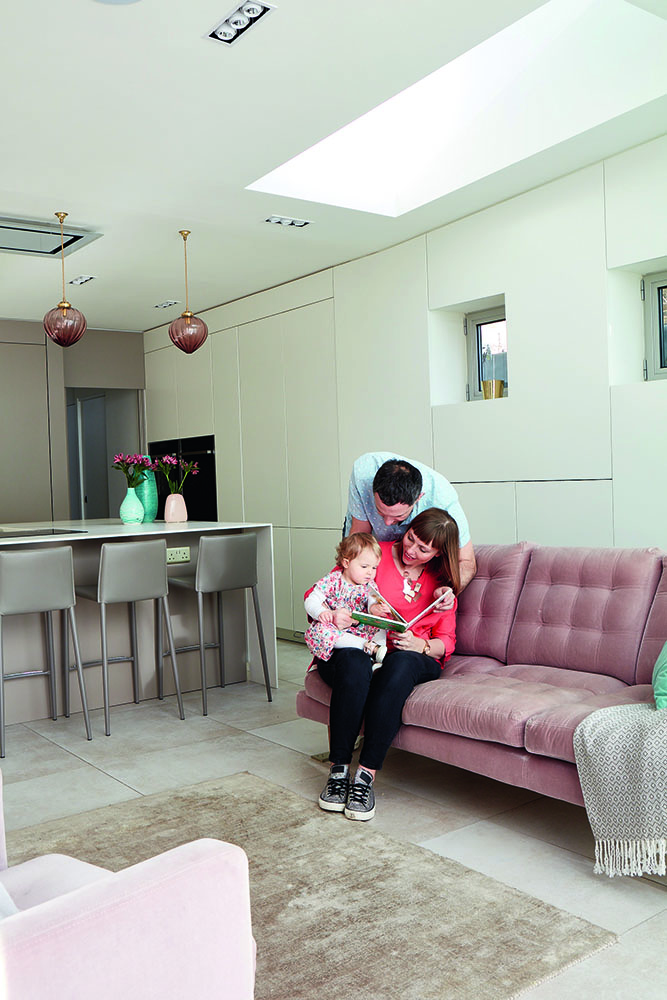
'For example, we’d originally planned a step ceiling for the extension, but as I was having a cup of tea with the joiners one morning when they were putting the roof on, I said, “That looks awful. Can we change it?” We ended up swapping it for a smoother style. Being on the spot meant that we were able to fix things that would have annoyed us later on, or that we hadn’t thought of in the initial design.’
Get small space home decor ideas, celeb inspiration, DIY tips and more, straight to your inbox!
‘I loved the build process. Even though we didn’t have a kitchen while it was being done, it worked out okay – it was summer so we ate a lot of salads.
'Every project has its tricky moments, but it was the poor builders who bore the brunt of my stress. When they worked outside, I constantly flitted around, making sure they didn’t squash any of my plants. I even rushed to the rescue when I found an upside down wheelbarrow in the border one day. Needless to say, they must have hated me at times!’
The sofa and the armchair are the same pink-mauve colour as Keira's garden flowers, as are the pendant lights. Armchair, sofa.com
MORE FROM REAL HOMES MAGAZINE

Want to see inside more stunning homes? Each month, Real Homes magazine features everything from modern extensions to cleverly redesigned family spaces. Get the magazine delivered straight to your door with a subscription deal.
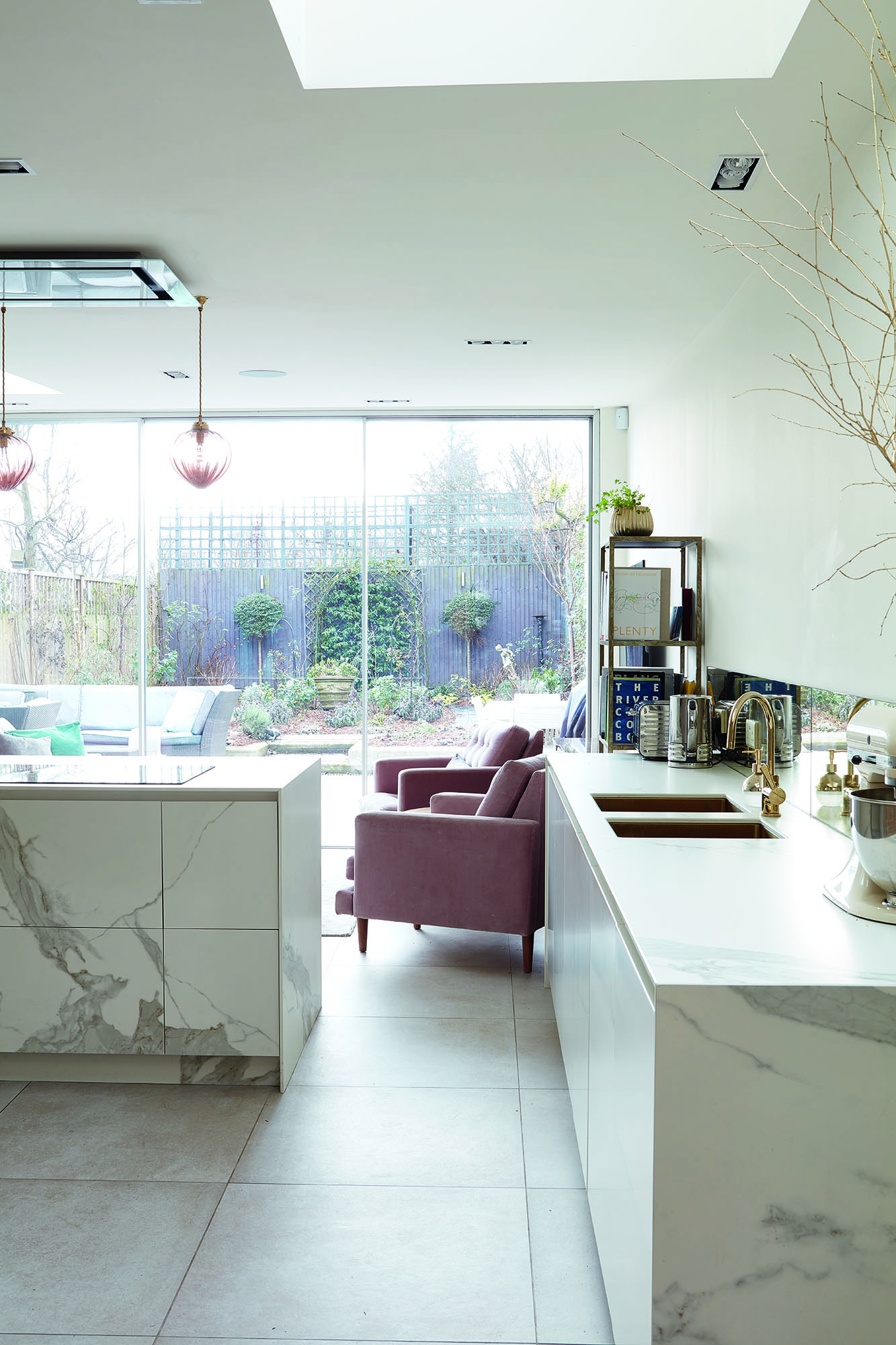
‘My garden is where I love to be, so the kitchen colour scheme was inspired by nature. Everything was based on an outdoor palette: earthy-coloured units and marble-effect work surfaces. The worktops are actually ceramic tile, which is a really serviceable alternative to natural marble. The sofa and the armchair are the same pink-mauve colour as my garden flowers, as are the pendant lights.
‘Outside, we chose mirrored glass for the frame of the extension, it reflects the garden and maximises the amount of greenery in the space. The slim-profile doors have a minimal frame. We also have the same floor tiles in the kitchen and outside. It took a lot of work to line them up, but it now looks like one big living area.’
Keira loves the marble-effect ceramic tiles covering the kitchen island. ‘They’re more serviceable than real marble but they still tie into that natural scheme,’ she explains.
‘We use the outside space whenever we can – it really is an extension of our home. We have breakfast outside at the weekends when it’s sunny, and I like to have a cup of coffee by myself in the morning before I go to work. If I’m working from home, it’s a great place to sit outside and gather my thoughts.'
Contacts
Builders LC Shopfitters, 01292 262339,
lcshopfitters.co.uk
Glazing Fusion Glazing, 020 8842 2122,
fusionglazingsystems.co.uk
Kitchen units Doca, 01978 661992, doca-gb.co.uk
Splashback 4M Joinery, 020 7021 0332,
4mgroup.co.uk
‘My favourite part of the extension is the view onto the garden through the doors. In the winter, it still feels like the garden is part of the space, and in the summer you can open the doors out to the terrace to extend the room.'
'My only regret is that we didn’t do the project earlier. In an ideal world, we’d have done it at the same time as other improvements to our house. In the end, it’s worked out better than I could have imagined. It’s the perfect space for us.’
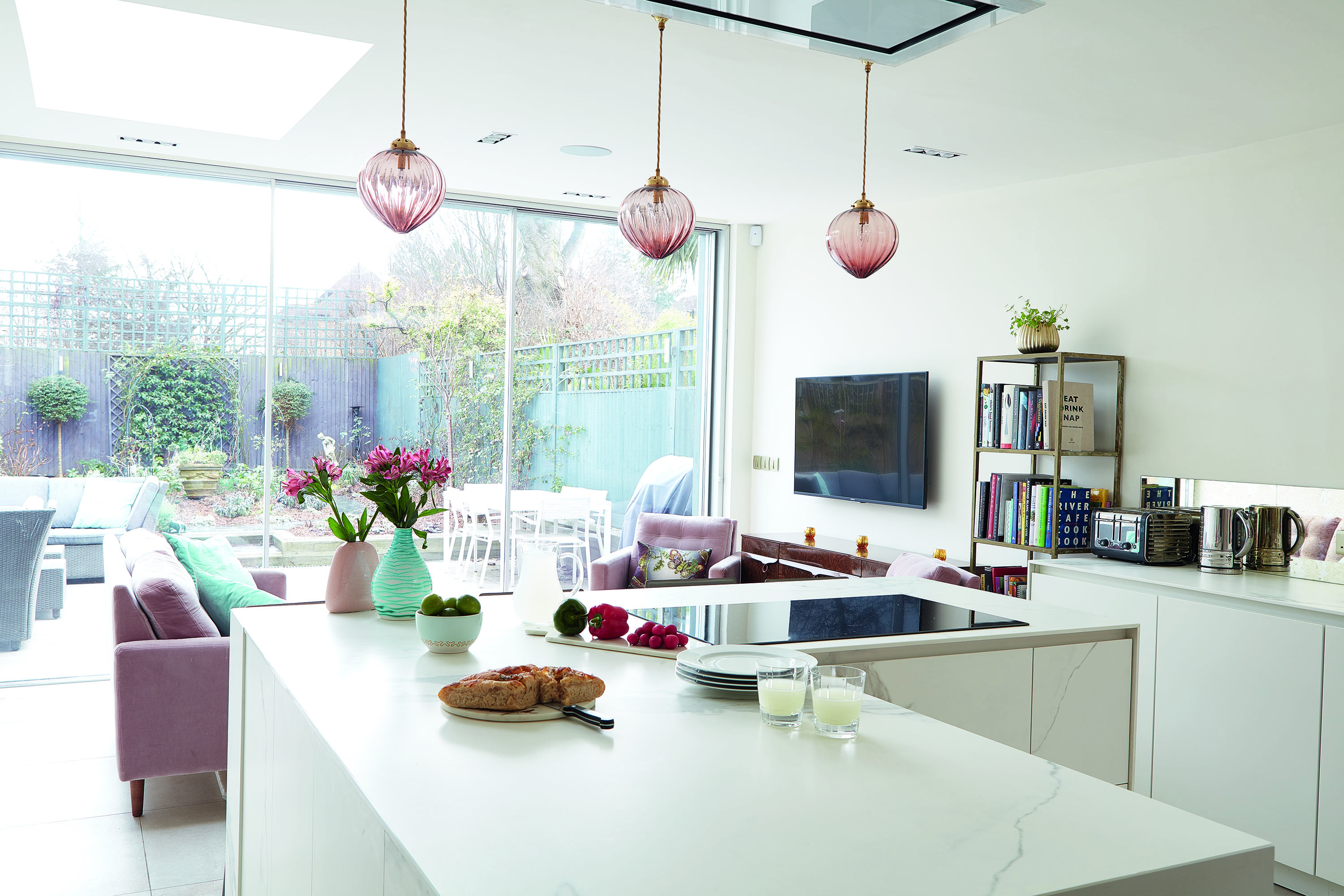
Details drawing on Keira’s outdoor scheme help bring the kitchen to life, including plants, vases of flowers and decorative twigs. Pendant lights, Rothschild & Bickers.
More gorgeous kitchen extensions to browse:

Formerly deputy editor of Real Homes magazine, Ellen has been lucky enough to spend most of her working life speaking to real people and writing about real homes, from extended Victorian terraces to modest apartments. She's recently bought her own home and has a special interest in sustainable living and clever storage.