There is always a sense of anticipation when you approach a house that could be ‘the one’. For Clare Pater, she knew that two years of looking for a home were over as she sat outside in the car. And her confidence wasn’t shaken when she finally entered and discovered it was an ‘absolute disaster’ inside.
With a limited budget to tap into and a head full of plans for the rooms, interior designer Clare called on her near-Olympian skills for tracking down bargains in order to put together a home that oozes designer quality. She reveals how she did it, and the secret savings she’s made that have fooled visitors as they admire the high-end look…
Inspired to tackle your own project? We have masses of ideas and helpful advice on what to do and where to start in our feature on house renovation. For more real home transformations, head to our hub page.
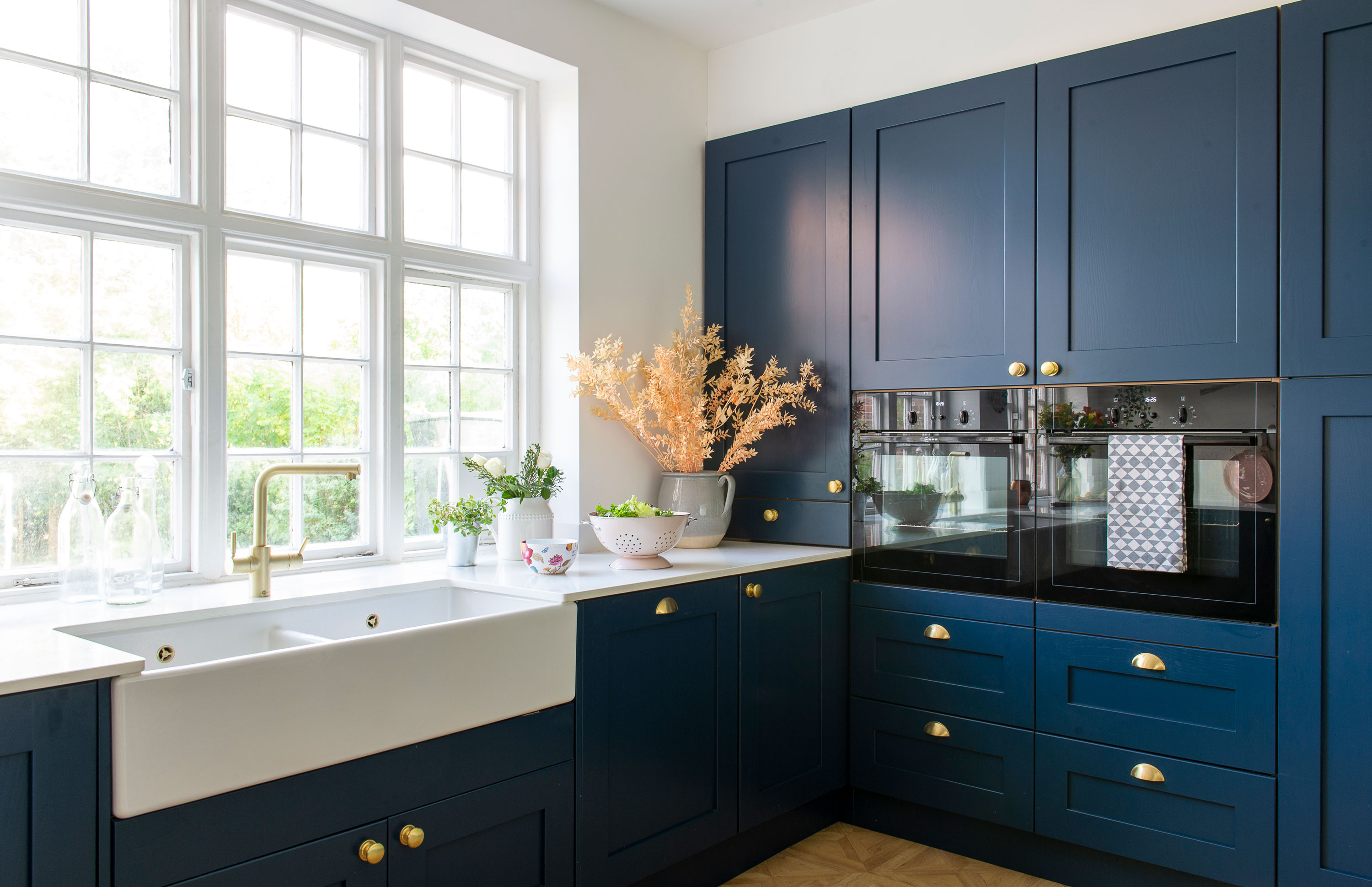
‘I’d always wanted a blue kitchen. It was an image I saw years ago and kept it in my head. When we put this one in around two years ago, people thought we were crazy: “Why do you want a blue kitchen?” Now they’re everywhere.’ Kitchen, First Impressions, supplied and fitted by Roger Chippeck Interiors. Brass handles, House of Brass. Sink, Shaws of England. Dishwashers, oven and hob, Neff
Profile
The owners Clare Pater, an interior designer (novanilla.co.uk), lives here with husband Jake, a partner in a commercial property company, their children Amelie, Asher, and Ava, and Oscar, the labradoodle puppy
The property A 1950s detached four-bedroom house in Hendon, London
Project cost £50,000 for then house renovation
'We wanted to stay in the area – the kids are at school and we have lots of friends round here – but we needed more space and somewhere a little quieter,' Clare explains. 'I’d done up our house already and wanted to do it all again, so I was ready for a project. This came up and we fell in love with it. I drove up outside with my dad the night before the viewing, and I knew without going inside that this was the one.'
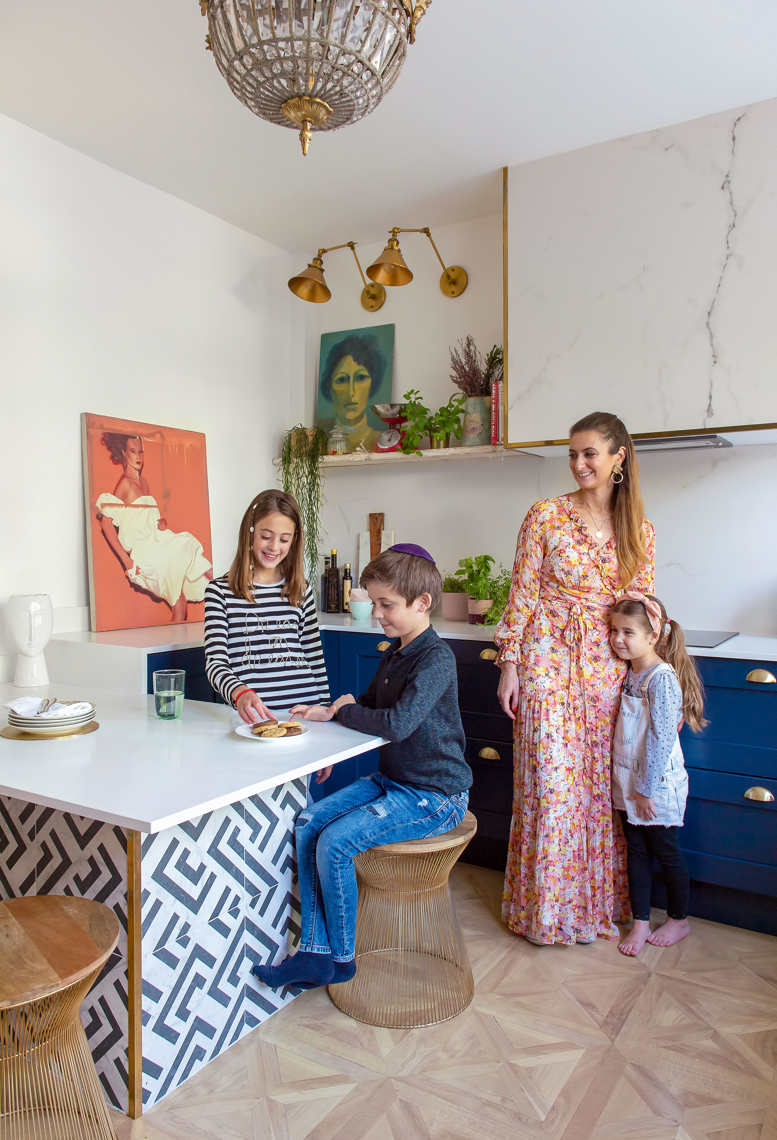
Artwork, Ebay and auctions. Splashback, Better Bathrooms. Black and white tiles, Tons of Tiles. Stools, Wayfair. Corner edging, Ironmongery Direct. Chandelier, French auction (delarte-antique.fr). Wall lights, Ebay
'Even when we went inside and it was an absolute disaster. It looked like it hadn’t been lived in for years but, sadly, it had been right up until we saw it. It was filthy, things were broken, there were weird paintings on all the walls; all sorts of mad things. There had been a divorce and I think the husband had been living in the front room, and the family in the rest of the house. It was miserable but we could see the potential.'
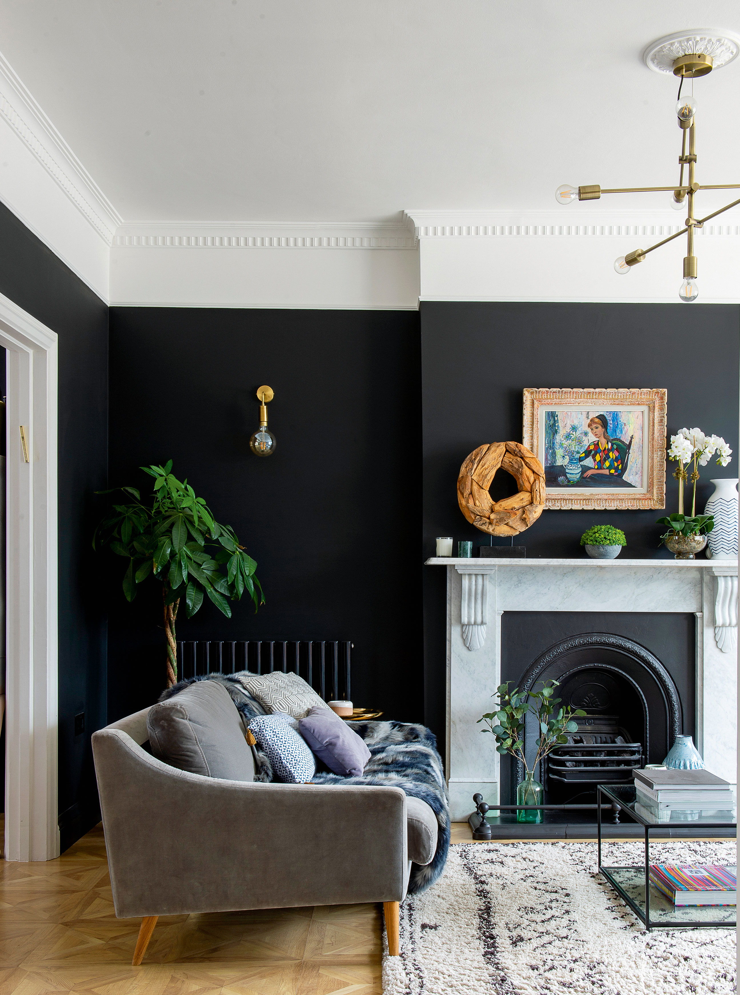
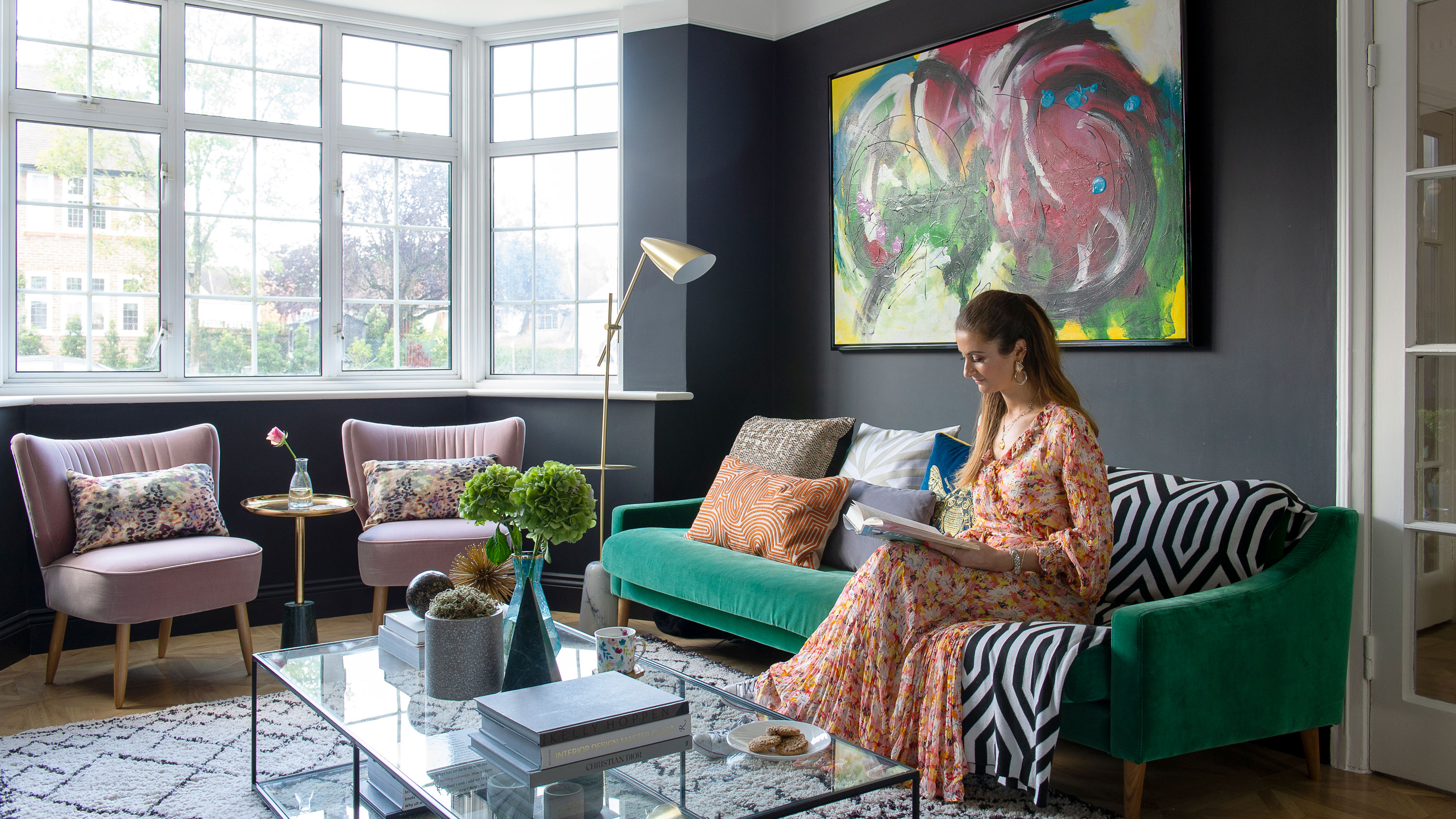
‘I knew I wanted to go very dark on the walls and have very traditional flooring. And I had to have coving – it just adds so much character. It looks like it’s meant to be there.’ Coving, Plaster Coving Ltd. Sofa, Swoon. Artwork above fireplace, Ebay. Rug and coffee table, La Redoute. Pendant, Living by Christiane Lemieux. Wall lights, Industville. Bulbs, Ikea. Walls painted in Valspar scrubbable colour matched paint – Farrow & Ball’s Pitch Black is similar
'We’d actually already decided to move in with my parents as we sold our house with nowhere to go, which was a bit of a risk. We had three weeks before we had to move out from our old house when we saw this place. I told my parents when we were moving in with them, "It could be a few months, it could be years." Luckily they took us in. We were there about seven months by the time we’d bought the house and done all the work. I was coming back to drop the kids off at school and my work is nearby so I’d visit the site every day to keep on top of things. And I was using builders I’d worked with before. We were lucky; there weren’t any major problems.'
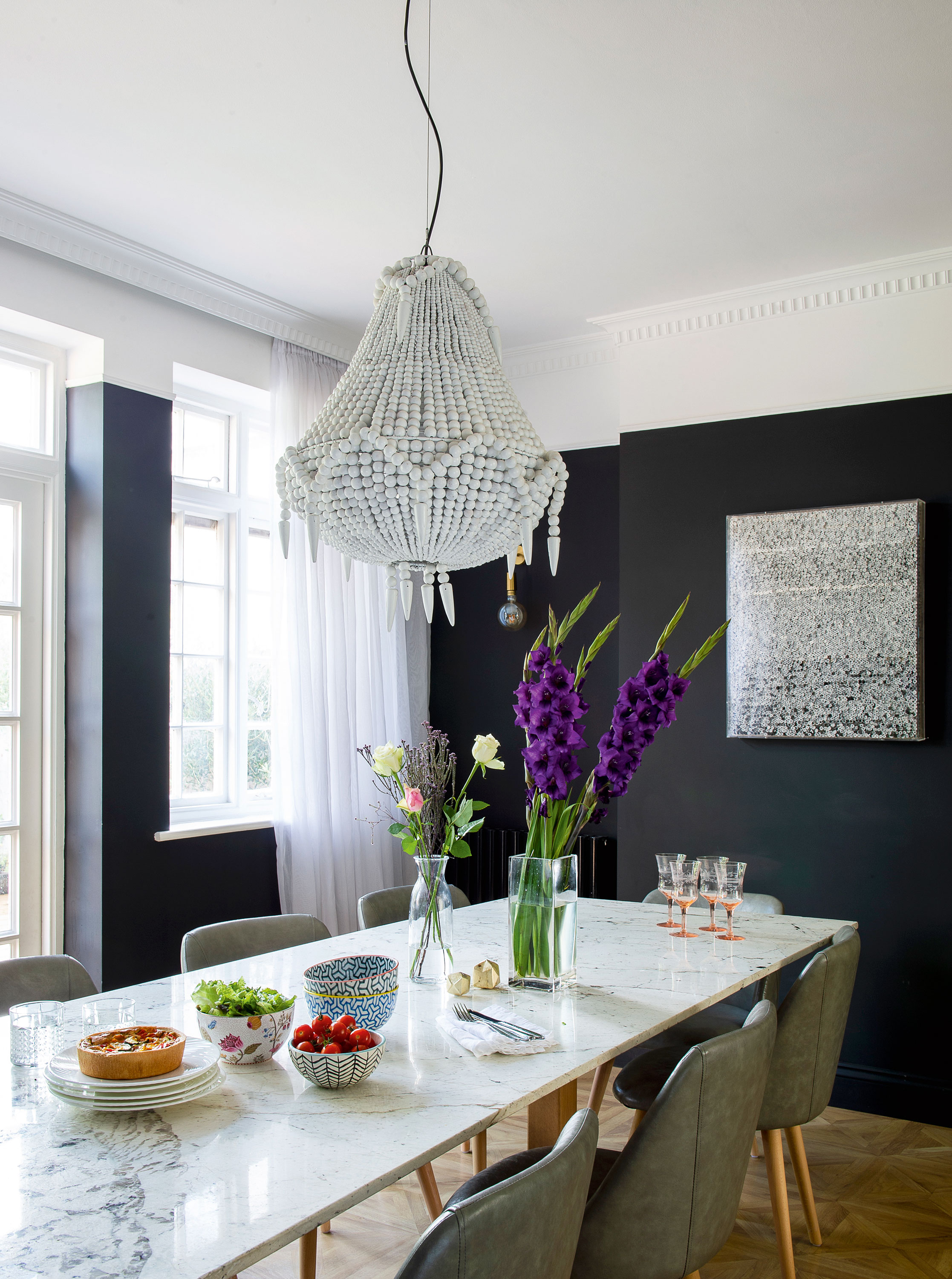
‘I bought an offcut of marble for the dining table. I spent weeks tracking down the perfect piece. Then I found the legs, had them shipped to the marble place and they put it all together.’ Artwork, Online auction. Marble slab, Openplan Design. Chairs, Cult Furniture. White bead chandelier, Out There Interiors
'Based on what we had to pay for the house, we had very little budget left to work with, so any ideas of extending just weren’t an option now. It started off with, "Okay, we’ll just give it a lick of paint". But the reality of the condition it was in meant that we had to do a lot – new bathroom, kitchen, decorating, everything other than structural work or moving walls. But I knew pretty much exactly what I wanted to do.'
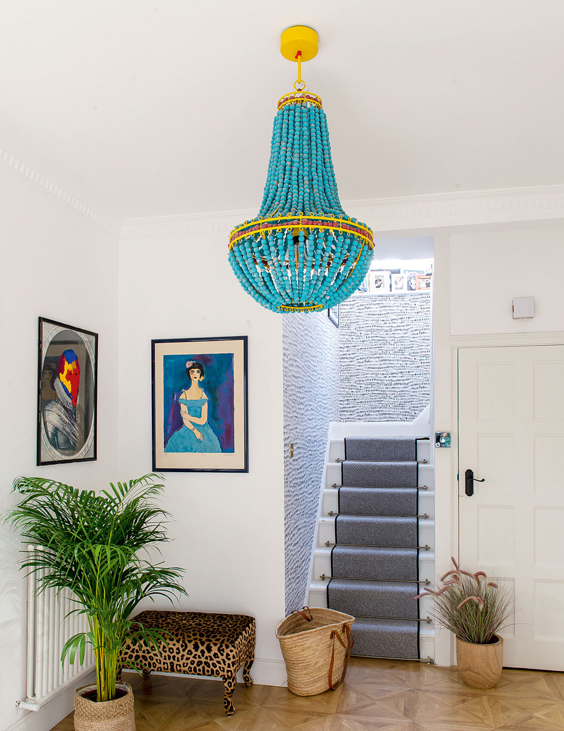
'I was obsessed with thinking the flooring had to be real wood, but I came round to laminate. It was a massive saving, and with kids, real wood does get damaged. This is from B&Q and is holding up amazingly.’ Artwork, Affordable Art Fair and upcycled charity shop finds. Leopard stool bench, reupholstered by Quality Lounge Suites. Blue bead chandelier, Ebay. Black and white wallpaper, Wayfair. Stair runner/carpet, Dan’s Carpet & Flooring
'I was very careful with what we spent the money on. In the kitchen I wanted the look of marble worktops and splashback, so I chose the plain white work surface while the whole splashback is actually a large-format porcelain tile. The parquet flooring is all laminate from B&Q. Even when people walk around on it, nobody realises it’s not real wood.'
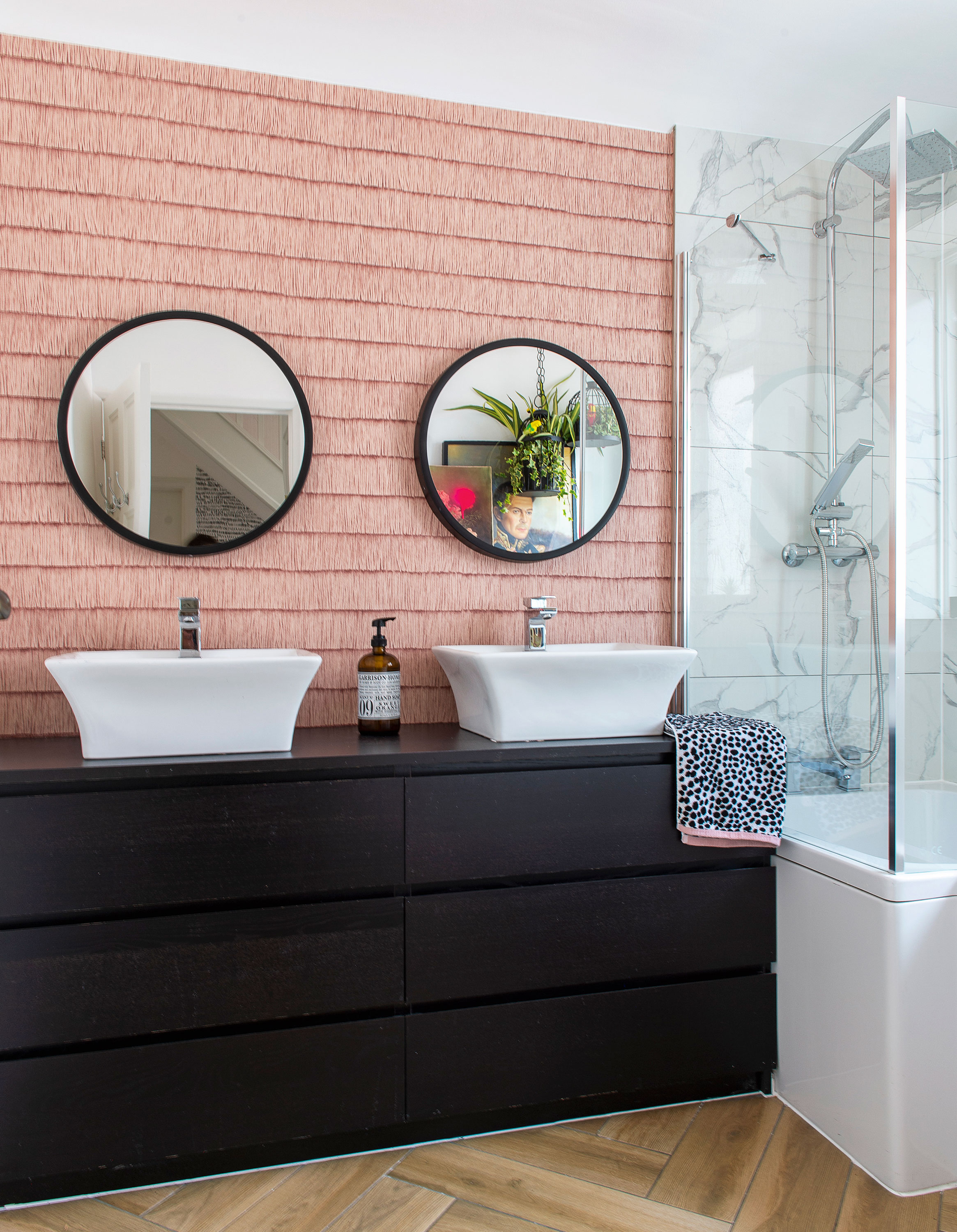
‘For the bathroom, we only tiled the areas the builder said had to be tiled to be made watertight. We just used the marble-effect ones in the shower; the rest of the tiles are cheaper porcelain or ceramic.’ Wooden floor tiles and marble-effect wall tiles, Wickes. Pink tassel wallpaper, Arte Wallcoverings. Black mirrors, Dunelm. Unit, converted Ikea drawers. Basins, Better Bathrooms
'Almost all of the art is from Ebay or charity shops. I really shopped around, got bathroom fittings from Ebay outlets that might be returns or end of line – sometimes I’d spend all night online. My intention wasn’t to go for the cheapest on absolutely everything, it was just picking a few key things to spend money on. I tend to pick small areas in the house where it’s worth using a top-end product, such as expensive wallpaper if I only needed one roll.'
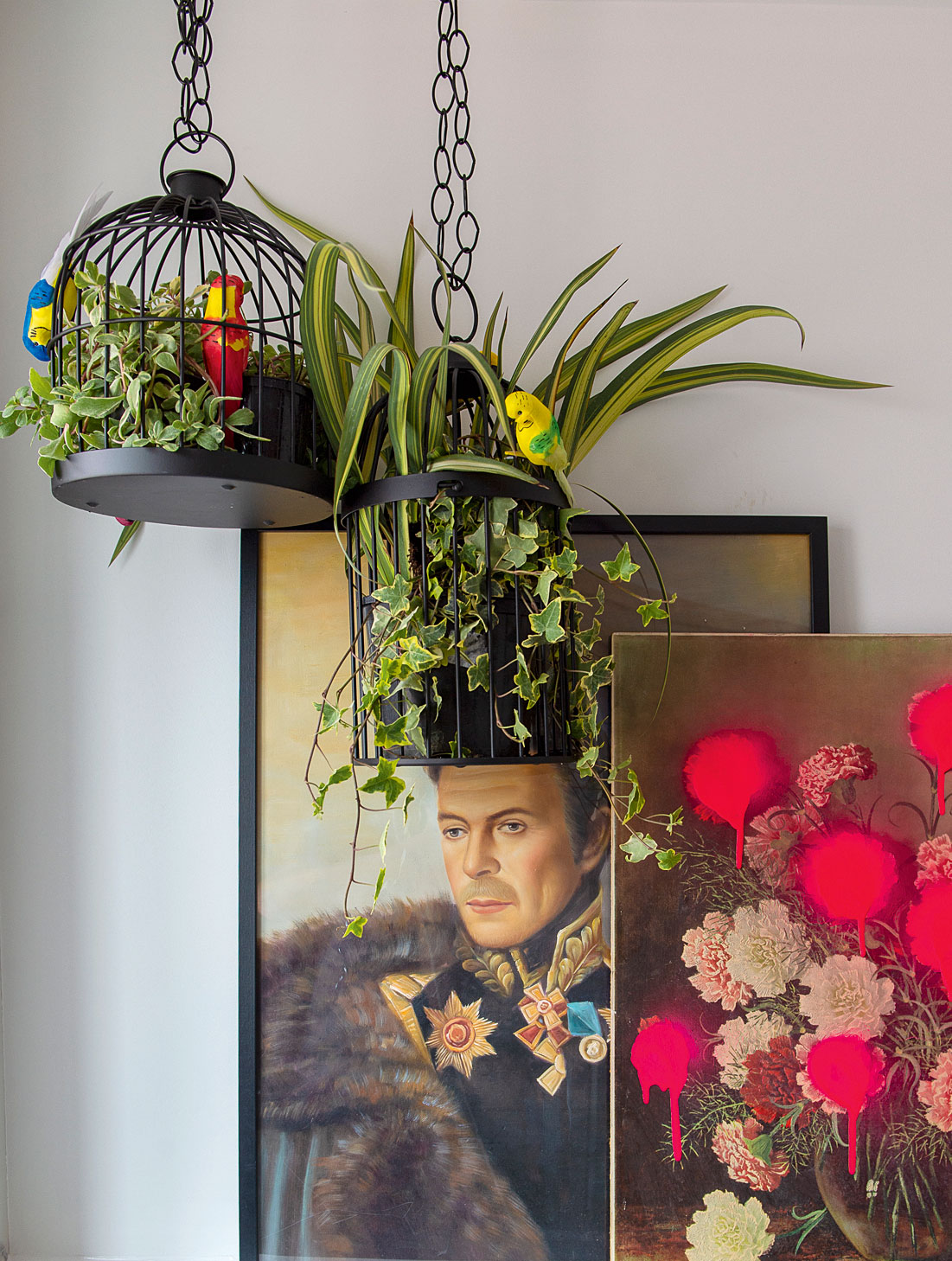
Artwork, charity shop/upcycled. Black birdcages, Ikea
'Everybody comes in the door and goes straight to the kitchen. I didn’t think it was going to be like that but it’s just how it is. There are tall cupboards on one side and no wall units as I feel like they close the kitchen in. I prefer the look of open shelving, and going for this option also saved us a lot of money. With the art on the shelves it makes it feel more homely, not like a kitchen. We also have an instant hot water tap, which was a real indulgence. My husband didn’t get why we needed one, but until you have one you don’t realise how great it is. I love lighting and the French antique chandelier was an opportunity to put some interest in, and it didn’t cost that much. It doesn’t let out a ton of light so with open shelving I was able to have wall lights over the work surface.'
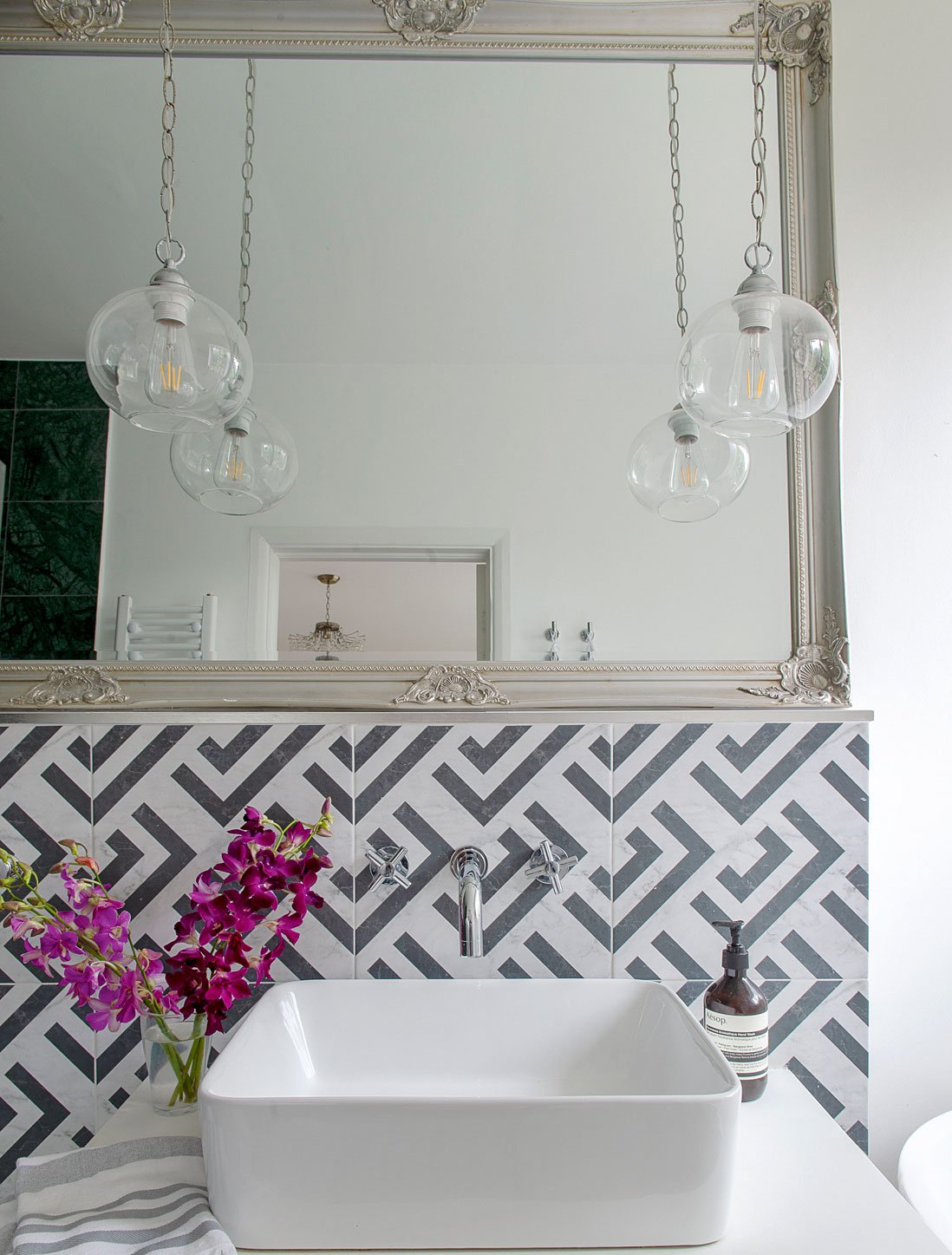
‘In our bathroom there was a double vanity and a shower bath in one. We decided we’d rather sacrifice a sink and have a separate bath and shower.’ Basin, Durovin from Ebay. Drawers, Ikea. Black and white tiles, Tons of Tiles. Provenzale floor tiles,
Tiles Direct. Wall-mounted taps, Victorian Plumbing
'My oldest daughter had a clear idea of what she wanted for her room, which was a vibrant tropical theme, though we toned it down by putting in pastels. She was very involved in the whole process. The other two kids chose their bedroom colours. We spent days with sample pots, trying them out. With my son we tried a broad range of blues. He said, "They’re all the same. I can’t see a bit of difference". So I said, "Okay, I’ll pick".'
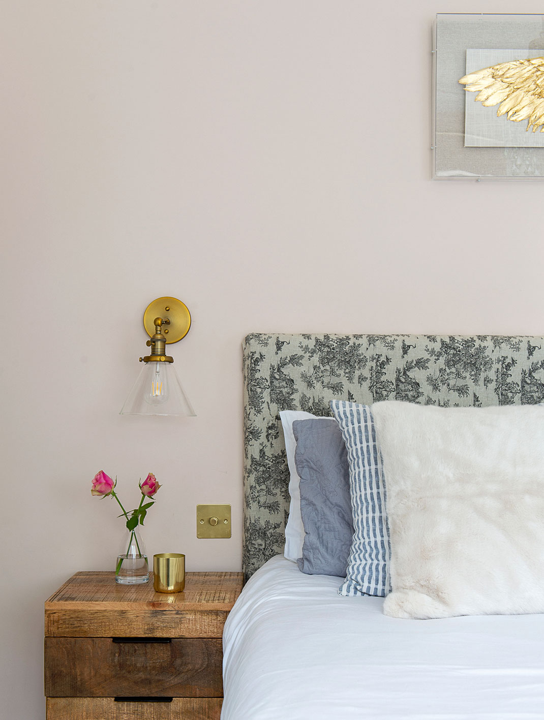
‘With the decorating my husband was very much, “I trust you, get on with it.” He knew at the end of it all it would be something that he liked, but he did not get involved.’ Headboard, recovered in Toile de Jouy fabric. Blue cushions, bedside tables, Wings artwork, HomeSense. Fur cushions, Ikea. Wall lights, Ebay
Contacts
Kitchen First Impressions
Interior design Nova Nilla Design
Upholstery Quality Lounge Suites
Stone/marble Openplan Design
'We went away in the summer so we left my parent’s house and then returned to this house, which was a bit mad. My little one thought you had to get here by plane – she was very confused by the whole experience! There are a lot of Jewish festivals after the summer and we love to entertain friends and family. Even though we still had boxes everywhere in one half of the room, we just put up trestle tables and had everyone gather round them in the other half!'
Subscribe to Real Homes magazine
Want even more great ideas for your home from the expert team at Real Homes magazine? Subscribe to Real Homes magazine and get great content delivered straight to your door. From inspiring completed projects to the latest decorating trends and expert advice, you'll find everything you need to create your dream home inside each issue.
More reading:
Join our newsletter
Get small space home decor ideas, celeb inspiration, DIY tips and more, straight to your inbox!

Alison is Assistant Editor on Real Homes magazine. She previously worked on national newspapers, in later years as a film critic and has also written on property, fashion and lifestyle. Having recently purchased a Victorian property in severe need of some updating, much of her time is spent solving the usual issues renovators encounter.
-
 This colourful home makeover has space for kitchen discos
While the front of Leila and Joe's home features dark and moody chill-out spaces, the rest is light and bright and made for socialising
By Karen Wilson
-
 How to paint a door and refresh your home instantly
Painting doors is easy with our expert advice. This is how to get professional results on front and internal doors.
By Claire Douglas
-
 DIY transforms 1930s house into dream home
With several renovations behind them, Mary and Paul had creative expertise to draw on when it came to transforming their 1930s house
By Alison Jones
-
 12 easy ways to add curb appeal on a budget with DIY
You can give your home curb appeal at low cost. These are the DIY ways to boost its style
By Lucy Searle
-
 5 invaluable design learnings from a festive Edwardian house renovation
If you're renovating a period property, here are 5 design tips we've picked up from this festive Edwardian renovation
By Ellen Finch
-
 Real home: Glazed side extension creates the perfect garden link
Louise Potter and husband Sean's extension has transformed their Victorian house, now a showcase for their collection of art, vintage finds and Scandinavian pieces
By Laurie Davidson
-
 I tried this genius wallpaper hack, and it was perfect for my commitment issues
Beware: once you try this wallpaper hack, you'll never look back.
By Brittany Romano
-
 Drew Barrymore's new FLOWER Home paint collection wants to give your walls a makeover
Drew Barrymore FLOWER drops 27 brand-new paint shades, and every can is made from 100% post-consumer recycled plastic.
By Brittany Romano
