After three years of renting, Nicola Brunton and Barry Dodsworth were desperate to banish all traces of magnolia when they bought a tired 1920s semi in Darlington. The couple had sold their home in Heighington village, County Durham, three years prior to buy the pub they’d been leasing in Darlington. Since they didn’t want to live above the business, they had rented a stone farmhouse half an hour’s drive away in Barnard Castle.
Selling the pub in 2017 gave them the funds they needed, and they continued living in their rented farmhouse for six months while working as labourers on the renovation project. The hard graft was worth it in the end, though: the couple and their three children now have a much larger open-plan kitchen-diner with a rustic industrial vibe and an extra bedroom and bathroom in the loft. Here the couple talk build details, lessons learned and how teamwork got them through the stressful moments.
If you are planning on extending your house to create the space you need, we have lots of ideas and helpful advice on what to do and where to start. For more real home transformations, head to our hub page.
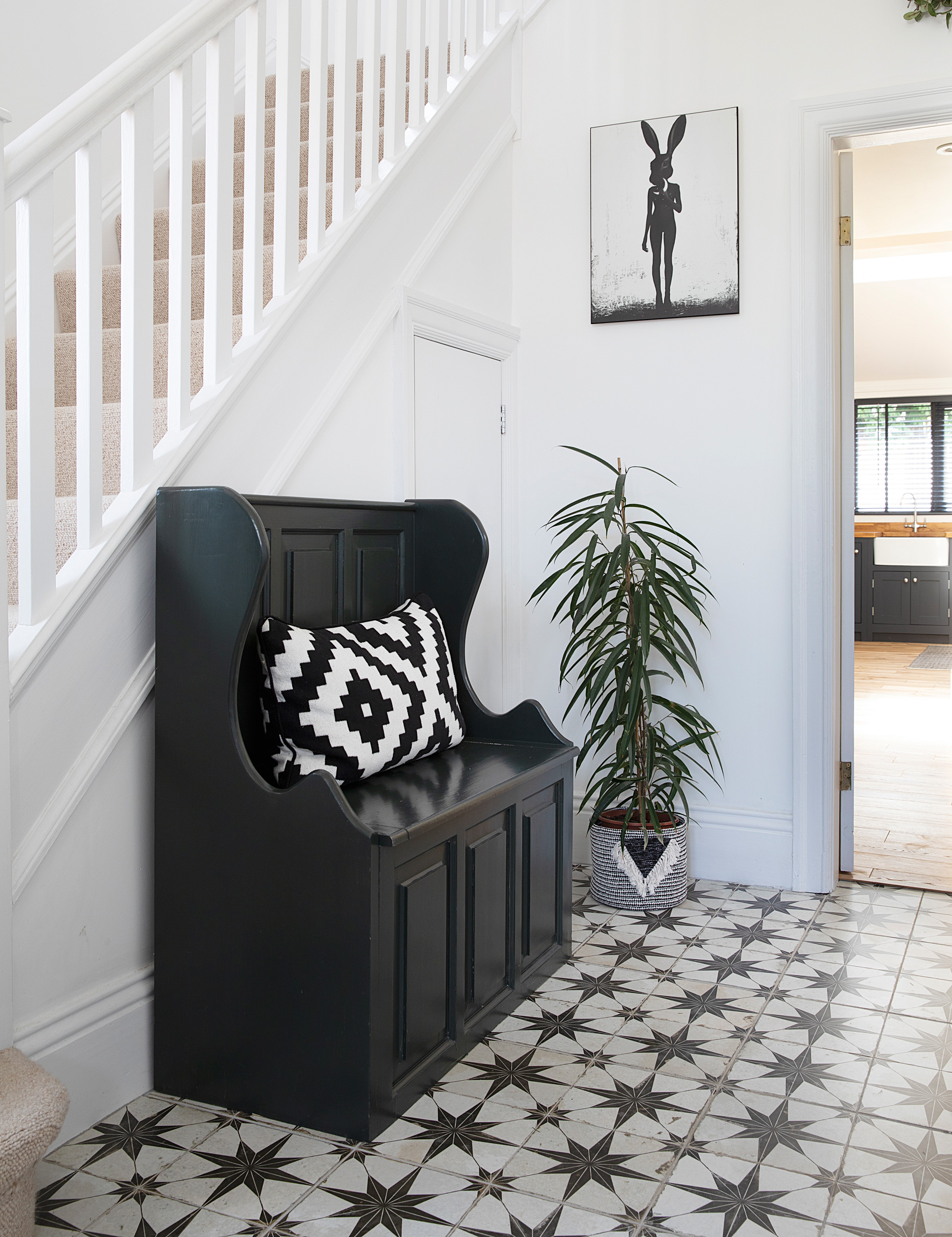
A simple monochrome look gives the hallway a timeless feel. It features a painted bench seat with storage underneath, which houses Nicola’s sewing machine. ‘Quite a lot of my furniture is old stuff that I’ve just repainted,’ she says. Metropolis star floor tiles,Tons of Tiles. Bench seat, Simply Dutch, painted in Studio Green, Farrow & Ball. Lepus print by Reuben Ireland, Juniqe. Cushion cover, Ikea
Profile
The owners Nicola Brunton, a process analyst and home stager (@darlington_home_staging), her partner, Barry Dodsworth, a driver, children Joe, Kizzy and Wilf, and cats Rosie and Michael
The property A 1920s four-bed semi in Darlington, County Durham
Project cost £85,000
‘We were rattling round in a big rented house in the middle of nowhere when we decided to look for a doer upper in Darlington,' says Nicola. 'I didn’t really enjoy living in the sticks and wanted to be closer to family and friends, with a good school nearby.
‘We didn’t plan to view this house, but we saw the owners outside and Barry, being cheeky, got chatting and asked if we could look around. It didn’t have much kerb appeal but I got a nice feeling about it. I loved the high ceilings and felt the south-facing garden had scope for an extension.'
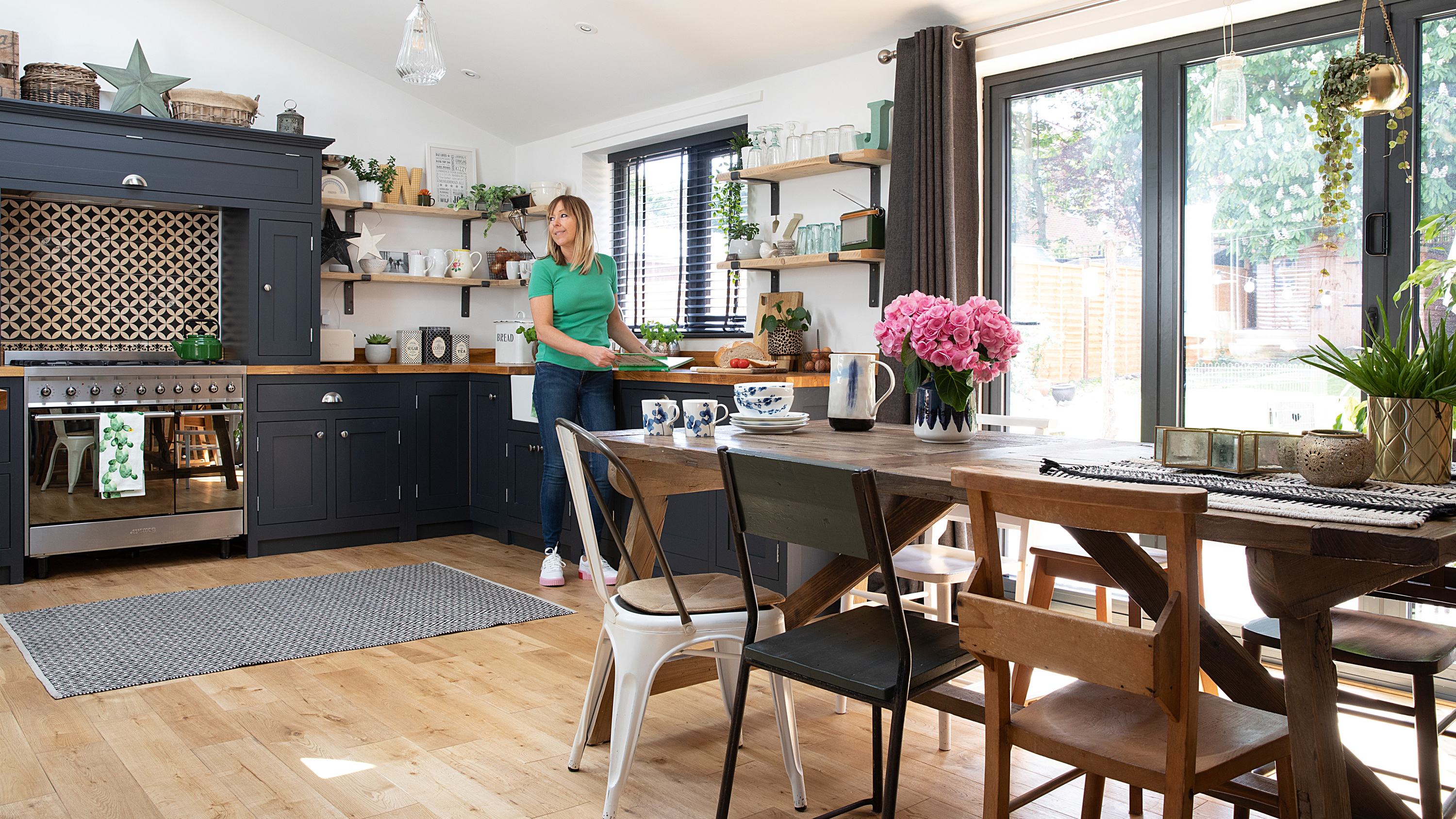
Nicola planned the kitchen herself using Magnet’s online kitchen design tool, choosing shelves rather than wall cabinets to blend into the living areas. ‘I’d seen The Shaker Kitchen Company on Facebook and loved their dark painted units,’ she says. ‘They were quite expensive but you can price up each cupboard online so there are no surprises. We used our own fitter to save money. I love the £40 vinyl splashback behind the cooker. When it fitted perfectly, I was over the moon.’ Units, sink and tap, The Shaker Kitchen Company. Worktops, Magnet. Shelves, Fabulous Tash Emporium. Oak Tuscan flooring, Rowland May. Smeg range cooker, Currys. Beija vinyl splashback, Rockett St George. For a similar rug, try Rug Vista. Venetian blinds, Argos. Wooden star (painted and waxed), The Range. Hob kettle, Labour & Wait. Tea towel, Marks & Spencer. Leopard print planter, TK Maxx. Metallic herb pots, Sainsbury’s
‘This project was our biggest so far but we’ve learnt a lot from it,' reveals Barry. 'Because we’d sold our business, we could be on site every day, which helped move things along. I’d advise not living among the mess if you can, especially if the roof needs to come off.
‘We definitely underestimated the work involved, particularly with the loft conversion. The bathroom was supposed to be an en suite but the stair company designed each stair slightly deeper, which reduced the size of the landing. However, we prefer how the layout’s worked out – the stairs are a normal size instead of the small ones you sometimes see in loft conversions.'
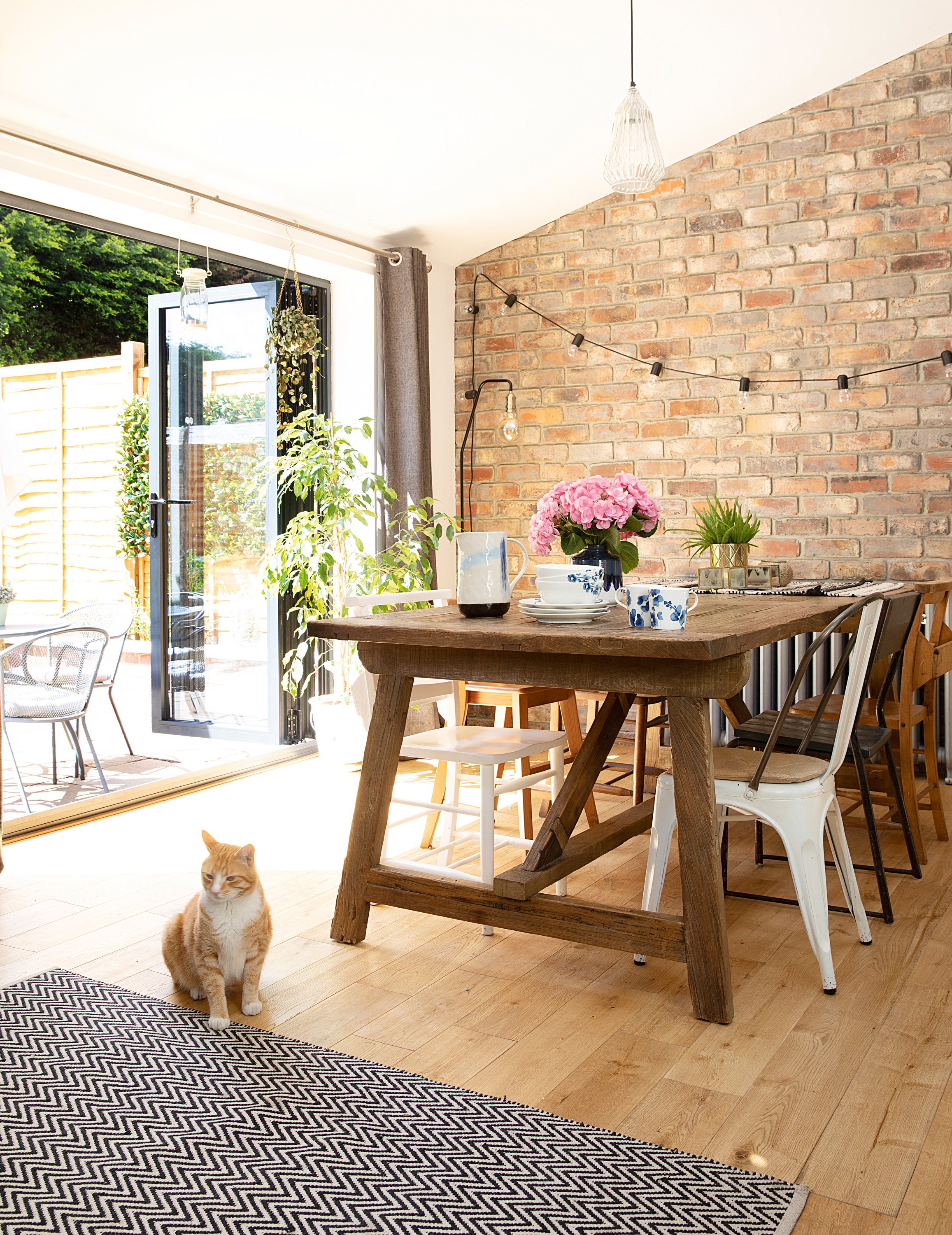
A wall of brick slips and a rustic dining table add character in the dining area. Nicola and Barry opted for an eclectic mixture of salvaged church and school chairs teamed with industrial Tolix stye metal chairs. ‘When the bi-folds are open in the summer, I love sitting out with a coffee or chilling on the patio with a glass of wine,’ says Barry. Bi-fold doors, RT Windows. Table and white metal dining chair, Barker & Stonehouse. For a similar ceiling light, try Graham & Green. Floor lamp, Made. Bistro lights, Ikea. Dinnerware, Marks & Spencer
‘As well as rewiring, new central heating and replastering, we knocked down the poky extension spanning half the width of the house, then built out four metres across the full width with a higher sloping ceiling,' says Nicola. 'Converting the loft for Kizzy’s bedroom and bathroom involved installing a dormer window for more head height on the stairs.
‘Having already done up a couple of properties before, we knew lots of tradespeople and we both mucked in, doing things like cutting up EcoTherm insulation for the extension and pointing the brick-slip wall in the dining room. I project managed and sourced materials while Barry dug foundations, filled skips and collected the materials. When the wooden beams were lifted onto the scaffolding for the loft conversion, Barry acted as ballast to counter balance it at the top. How we did it without a crane I’ll never know! He also drove to the Cotswolds to pick up our kitchen, saving us £500 on the delivery charge.'
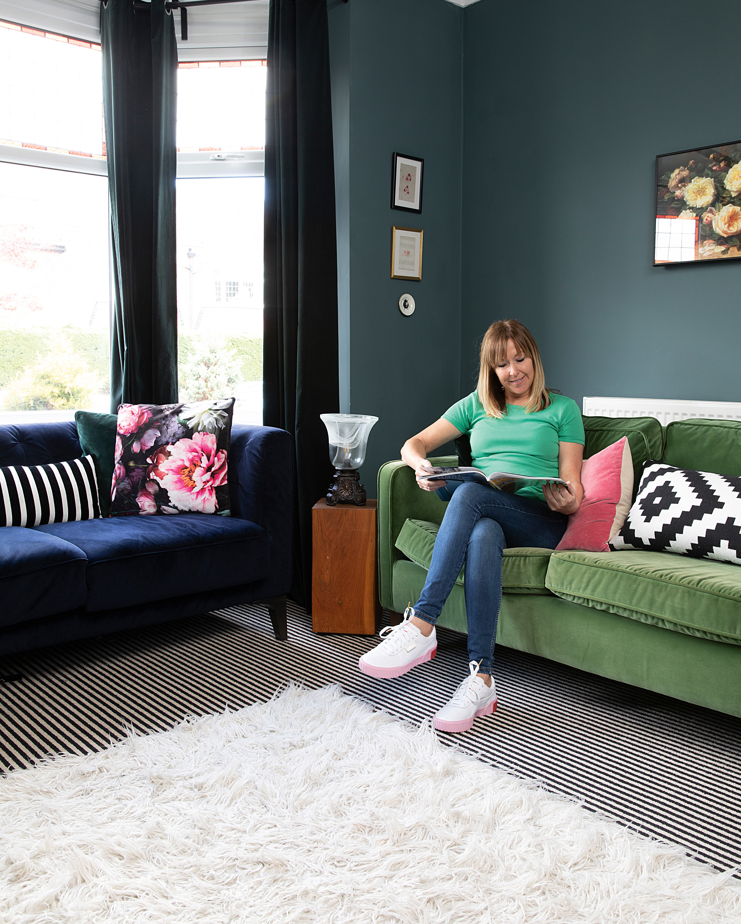
In the living room Nicola opted for a bold green and blue colour scheme teamed with a striped carpet and artwork from car boot sales and auctions. Walls painted in Inchyra Blue and Off-Black, Farrow & Ball. Purcell blue sofa, Barker & Stonehouse; try them for a similar green sofa. Table lamp, Dunelm
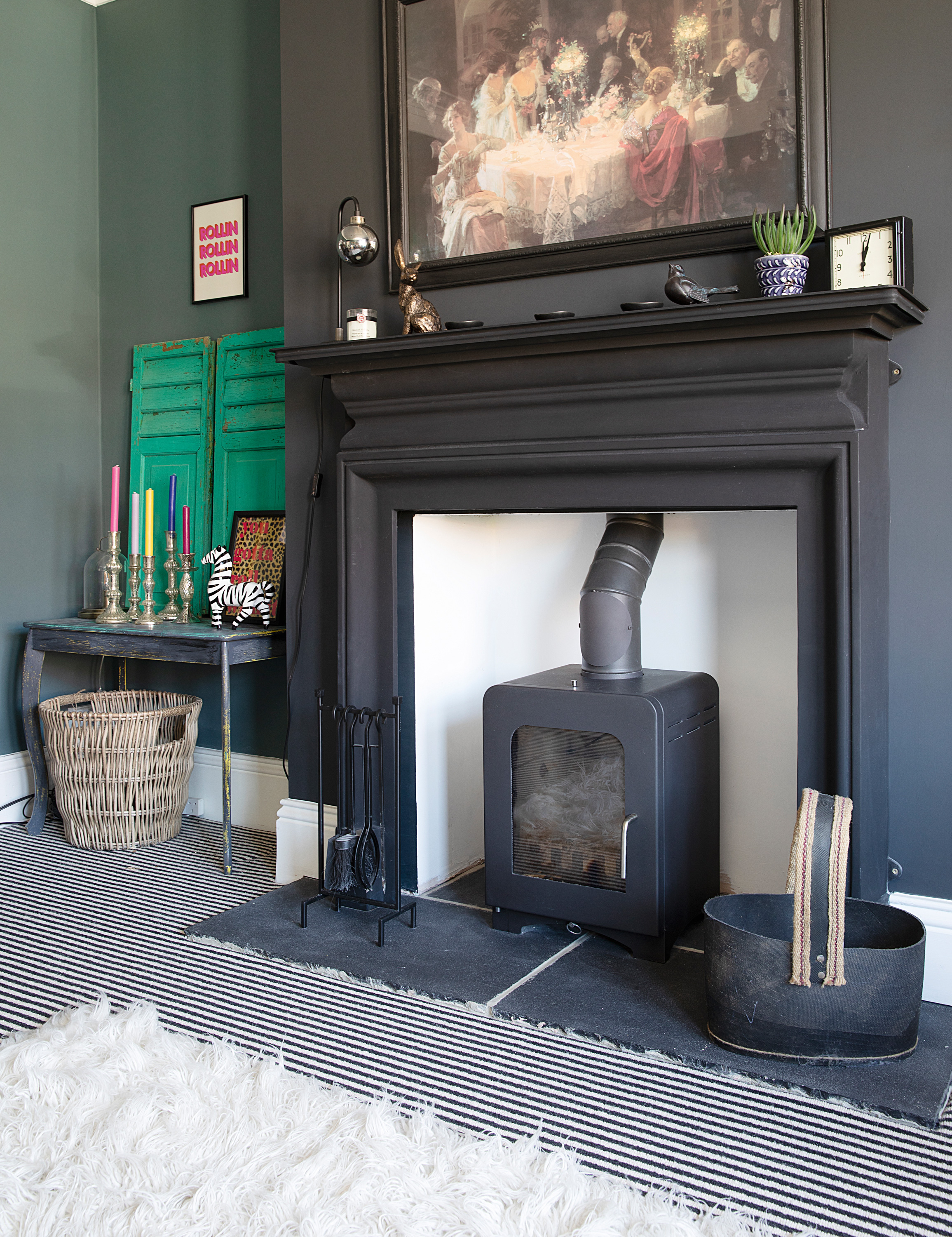
The living room chimney breast has been accented in black. ‘Because this room is self contained, I felt I could be a bit more experimental in here,’ says Nicola. ‘Having put up with magnolia in our rented place, I wanted something bold.’ Walls painted in Inchyra Blue and Off-Black, Farrow & Ball. For a similar carpet, try Carpetright. Saltfire ST2 multifuel stove, Direct Stoves. Green shutters, Ruby & D
‘When it comes to splitting tasks, I’m the brawn and Nicola’s the brains,' Barry admits. 'Her dad was a project manager so she gets that from him, and she has good spacial awareness. I’m the one covered in dirt filling skips with a wheelbarrow. Nicola has a flair for design. I’d never have thought of a bold floral wallpaper in the family room – I’d probably have it plain as I like things to look neat – but we have similar tastes. Around 99 per cent of the time we don’t disagree, but if we did, we’d find a compromise.
‘I insisted on taking the ceilings down. Nicola thought we could get away with plastering over some of them as she didn’t want the mess, but since two of them fell down during the build, I didn’t want to take any chances.'
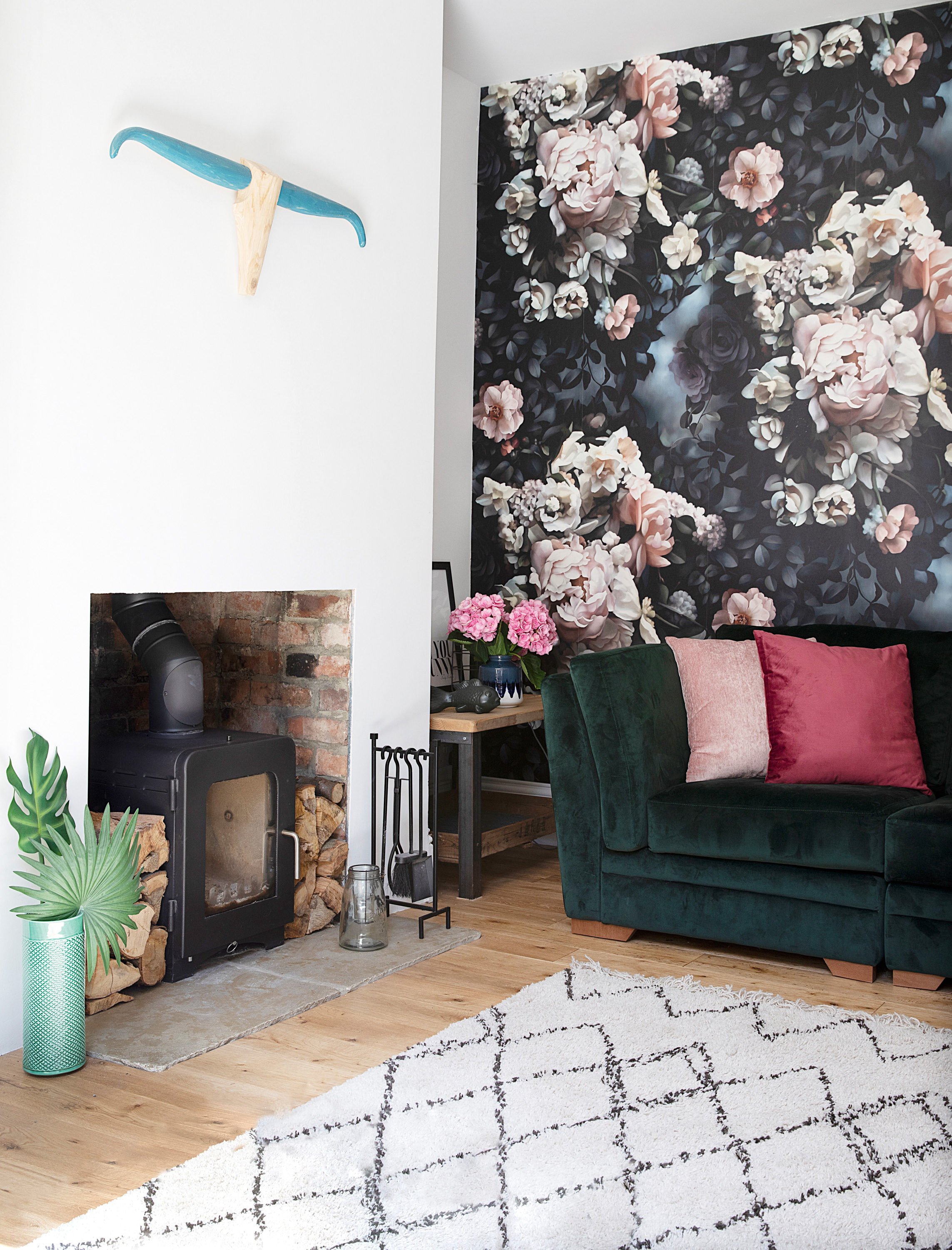
One of the two reception rooms has been incorporated into the open-plan space to make a family room/snug off the dining area with a bold floral wallpaper mural. Nicola and Barry’s builder created the fireplace for the log-burner, which proved cheaper than a stove company doing the work. Wallpaper, Ellie Cashman Design. Green velvet sofa, DFS. Rug, Homebase. Saltfire ST2 multifuel stove, Direct Stoves. Cattle skull wall décor, The Log Basket. Velvet cushions, Marks & Spencer
‘There were a few disasters along the way, though. I miscalculated how much oak flooring we needed, which cost us an extra £600,' Nicola admits. 'It wasn’t in stock anywhere locally so Barry ended up driving to Wales at 3am so it could be aired for 48 hours before it was laid. Painting the kitchen walls pink was also a mistake – it looked awful!
‘When it comes to design, Barry is happy with my ideas and is really easy going. He’s a good egg – a proper grafter who never complains. My style is a mishmash of new, vintage, recycled, salvaged, homemade and whatever catches my eye when I’m out and about. In the future, I’d love to take on an older Victorian or Georgian property, but it would definitely need a full renovation.’
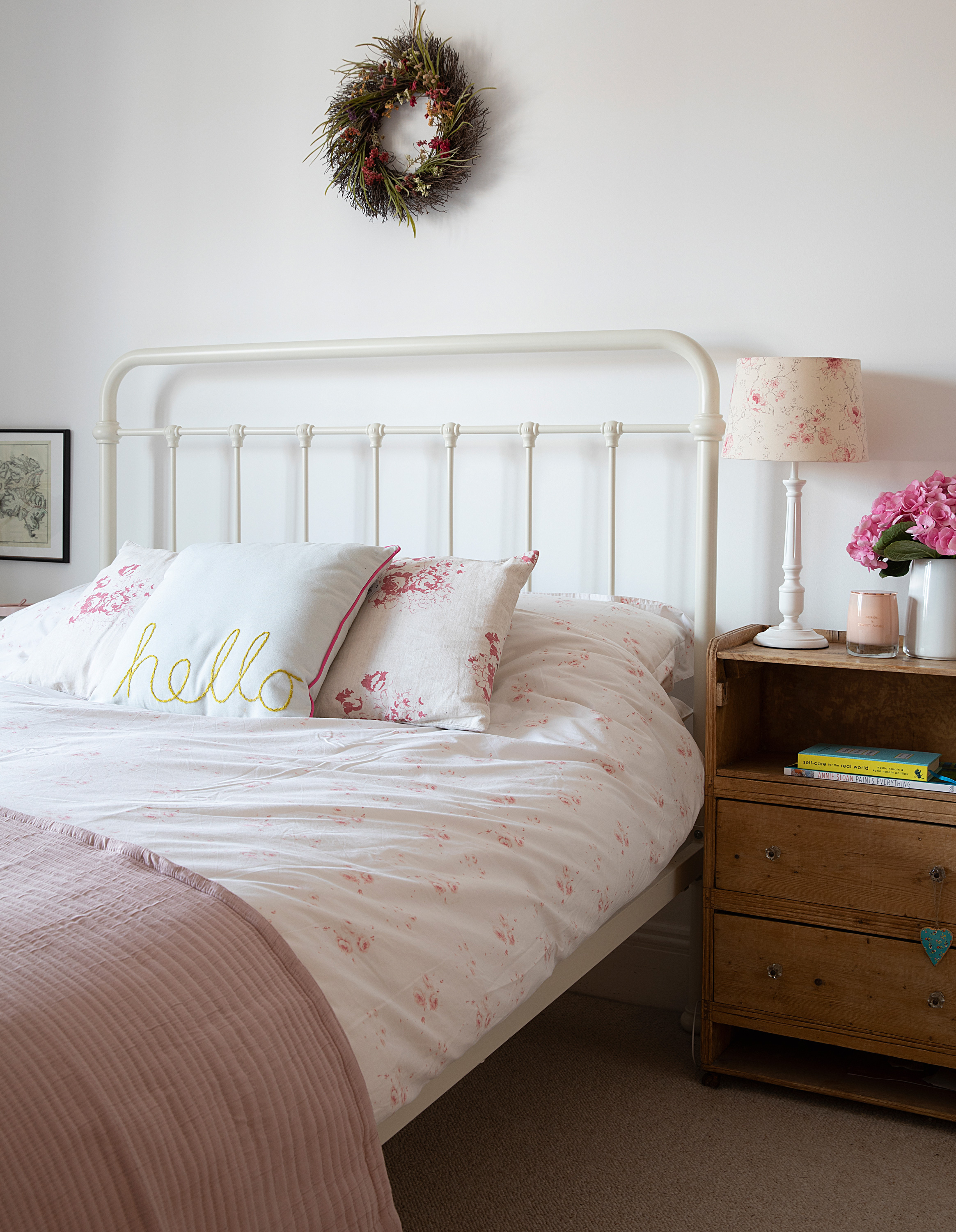
Calm, muted tones and vintage furniture make a tranquil sleep space. ’Our previous home had more of a country feel. A wallpaper sample I hadn’t used set the tone in here,’ says Nicola. Bed, Feather & Black. For a similar duvet, try Emporium Home Interiors. For a similar light shade, try Dunelm. Cushions made from Hatley Cerise fabric, Cabbages & Roses. Ribbed quilt and Hello cushion, Marks & Spencer
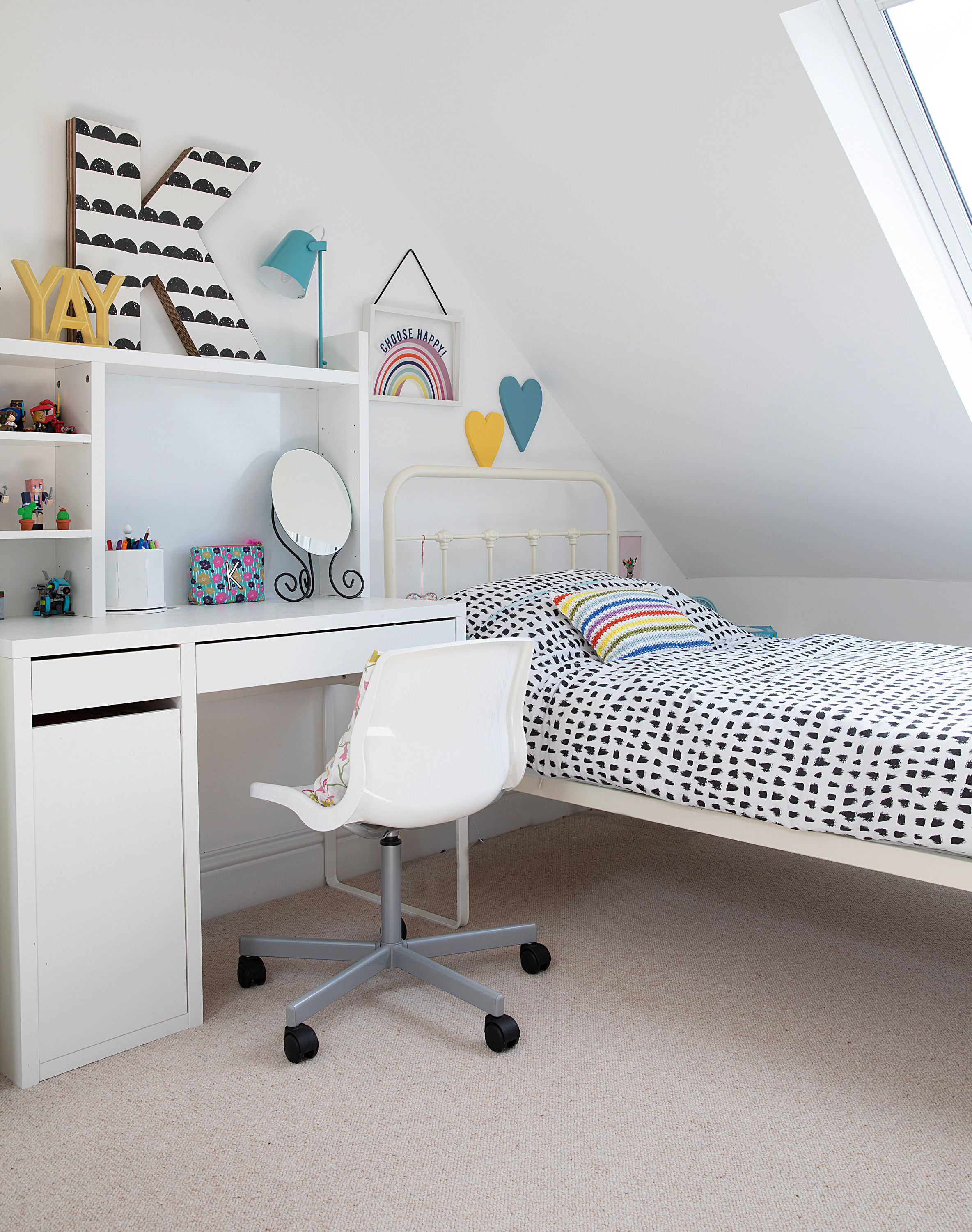
Kizzy’s bedroom has a Scandi vibe with a simple white backdrop and colour added through accessories. Nicola made the letter K herself, which led her to start an Etsy shop selling similar designs. For a similar bed, try Dunelm. For similar bedding, try the Ferm Living half-moon duvet cover, Connox. Striped crochet cushion cover, Zara Home. Desk and chair, Ikea. K, Letter Bomb Studio on Etsy. Hanging rainbow in frame, Next
Contacts
Bi-fold doors RT Windows
Carpentry Paul Crawford Joinery, 07971 523097; Oakfield Joinery
‘My favourite aspect is the brick wall in the kitchen-diner,' says Barry. 'and I think the wooden floor was my idea, too. It helps the open-plan space flow nicely. And Kizzy’s loft room is perfect as she becomes a teenager. I’m not into flash cars or an extravagant lifestyle, I’m into the family having a lovely home. We have the same mindset – it gives us the most pleasure.’
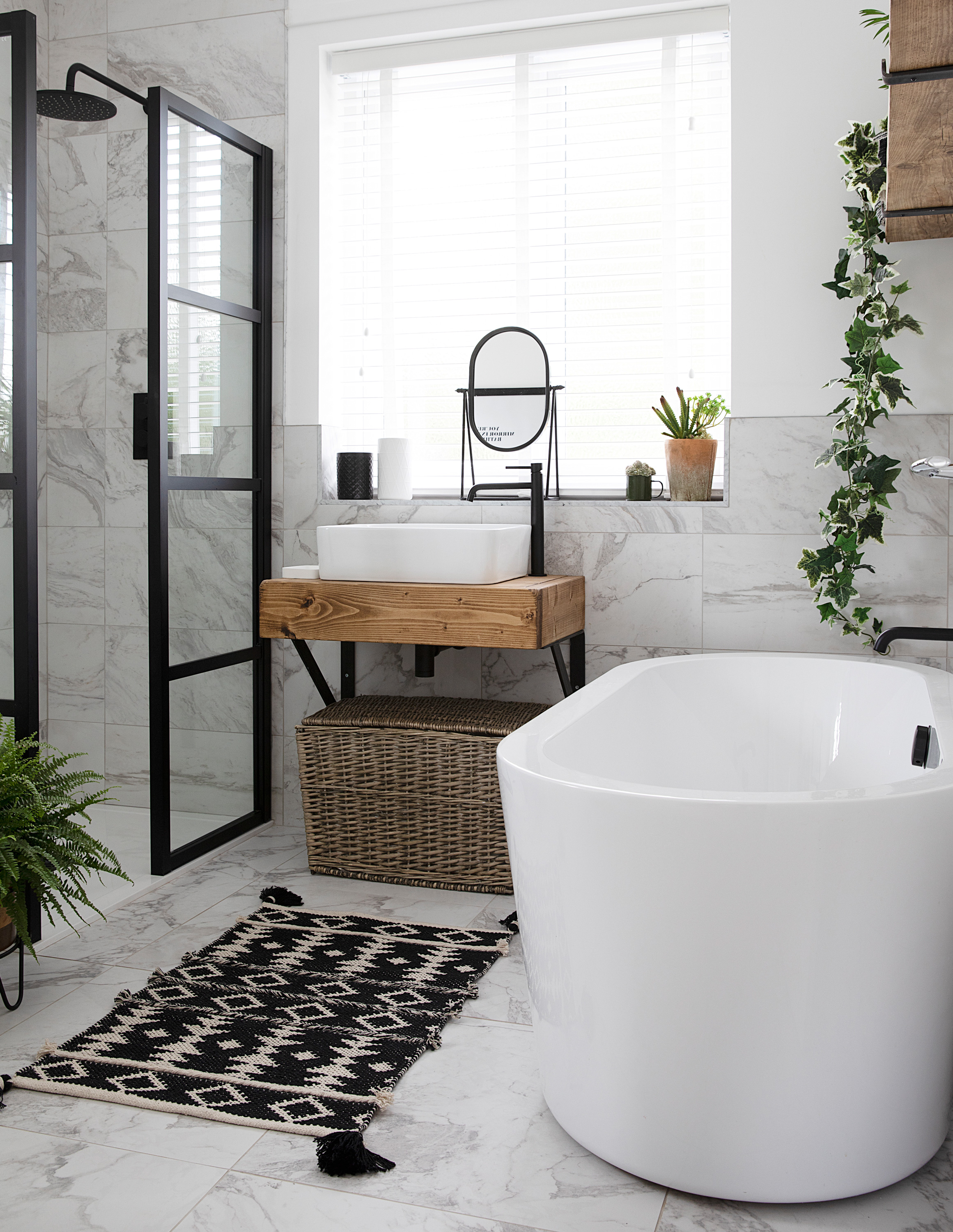
After ripping out the beige wall and floor tiles in the bathroom, Nicola kept the same layout but opted for a monochrome look with marble-style ceramic tiles, black fittings and a luxurious freestanding bath. ‘I drew everything to scale, cut out the components on paper and worked out where they’d fit,’ she says. ‘The wooden sink unit came from Etsy.’ Torrano Calacatta tiles, Topps Tiles. Shower, Victorian Plumbing; try them for a similar bath. Shower screen, Lusso Stone. Vanity unit, Simply Rustic Furniture. Bath mat, Nordic Nest
Subscribe to Real Homes magazine
Want even more great ideas for your home from the expert team at Real Homes magazine? Subscribe to Real Homes magazine and get great content delivered straight to your door. From inspiring completed projects to the latest decorating trends and expert advice, you'll find everything you need to create your dream home inside each issue.
Join our newsletter
Get small space home decor ideas, celeb inspiration, DIY tips and more, straight to your inbox!
-
 This colourful home makeover has space for kitchen discos
While the front of Leila and Joe's home features dark and moody chill-out spaces, the rest is light and bright and made for socialising
By Karen Wilson
-
 How to paint a door and refresh your home instantly
Painting doors is easy with our expert advice. This is how to get professional results on front and internal doors.
By Claire Douglas
-
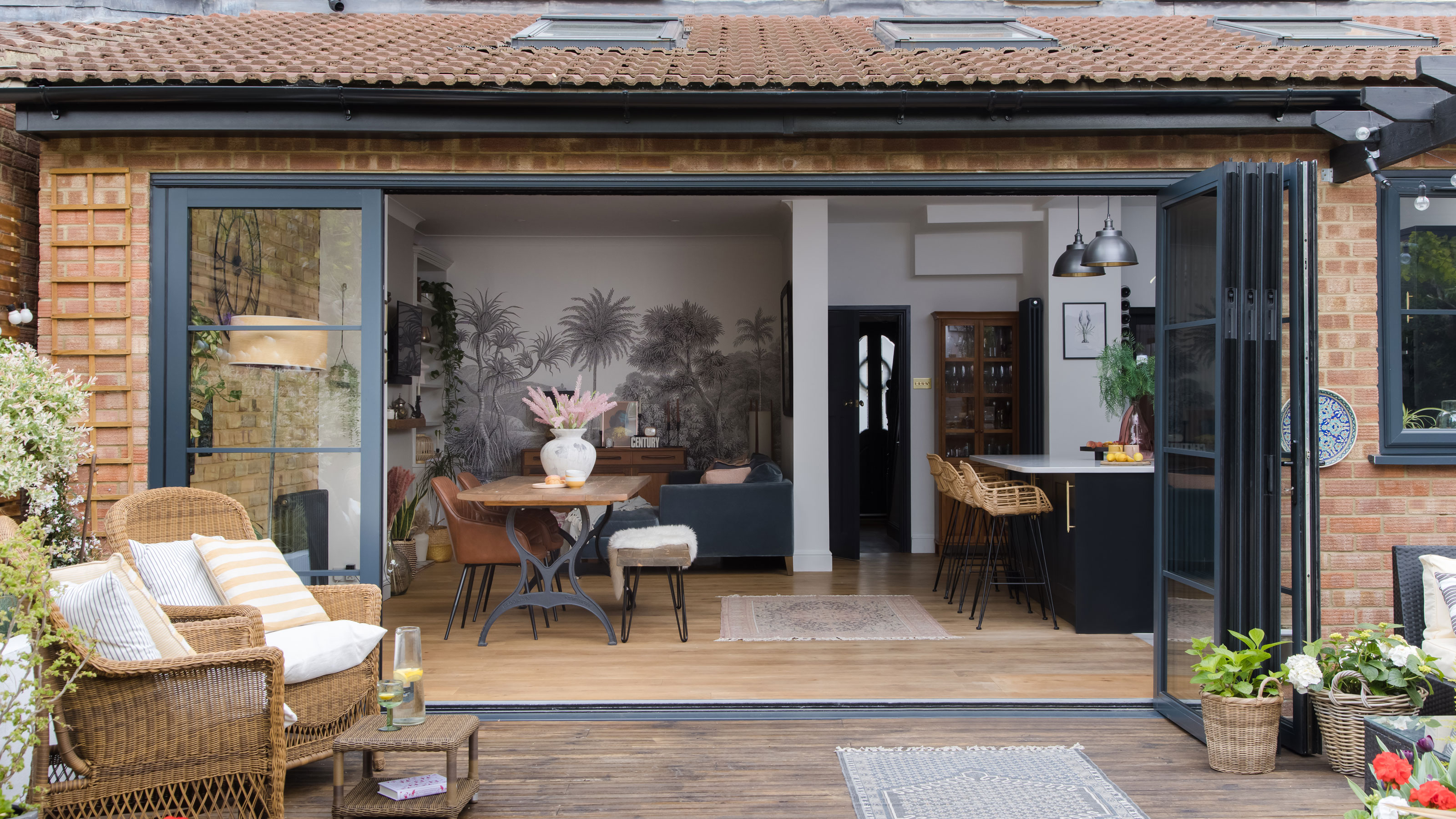 DIY transforms 1930s house into dream home
With several renovations behind them, Mary and Paul had creative expertise to draw on when it came to transforming their 1930s house
By Alison Jones
-
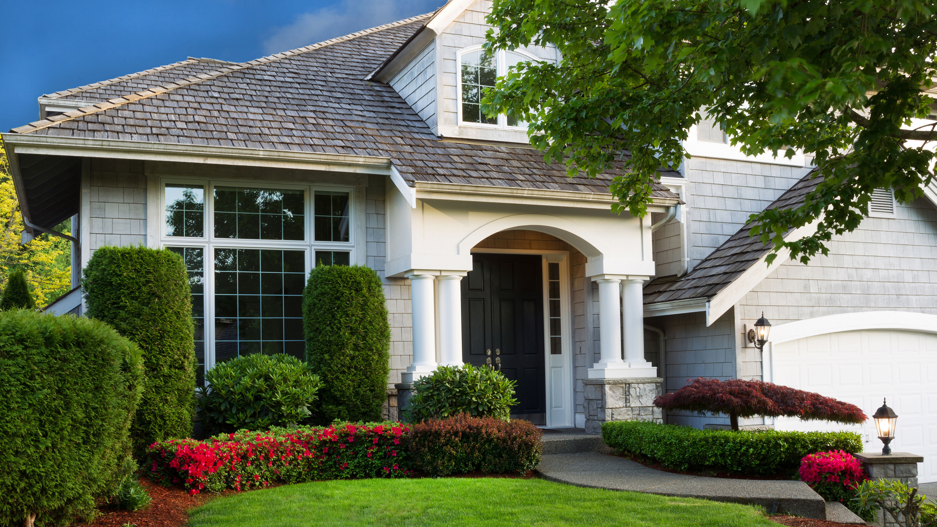 12 easy ways to add curb appeal on a budget with DIY
You can give your home curb appeal at low cost. These are the DIY ways to boost its style
By Lucy Searle
-
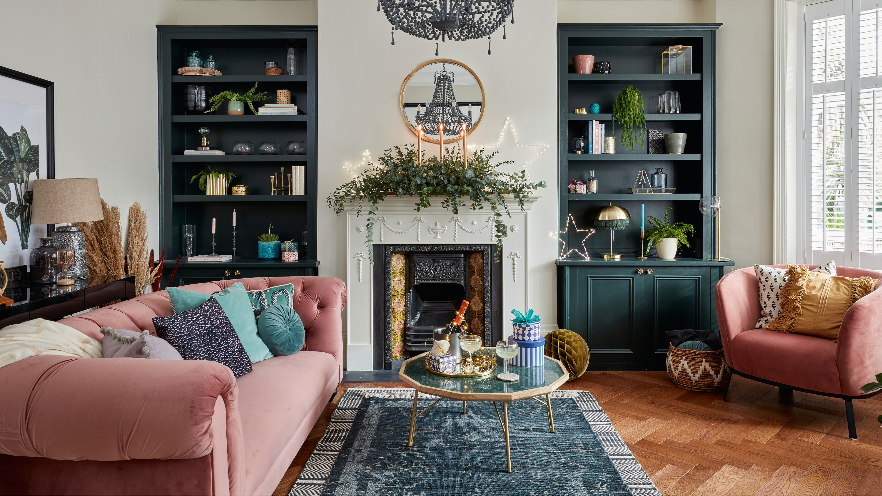 5 invaluable design learnings from a festive Edwardian house renovation
If you're renovating a period property, here are 5 design tips we've picked up from this festive Edwardian renovation
By Ellen Finch
-
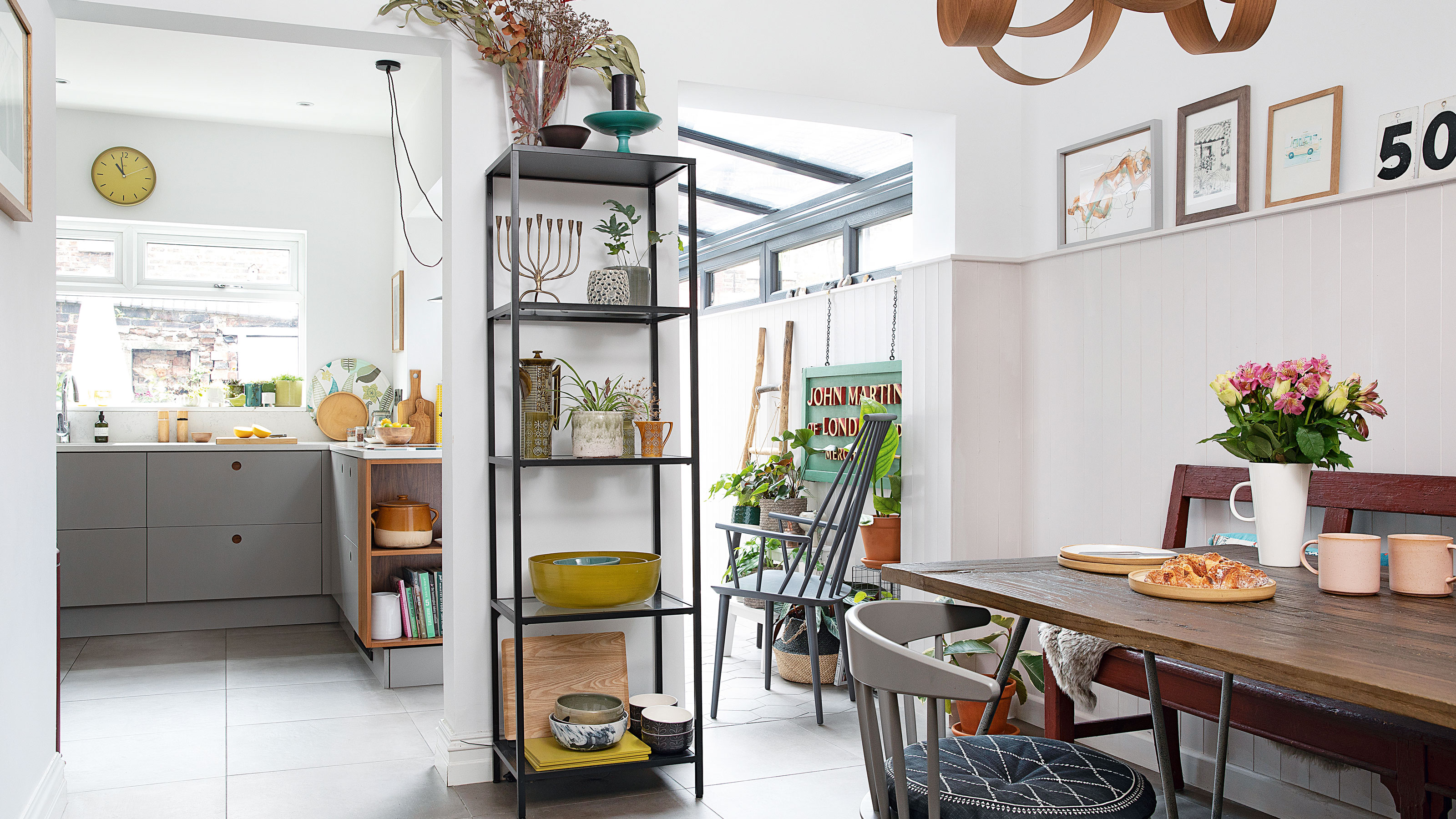 Real home: Glazed side extension creates the perfect garden link
Louise Potter and husband Sean's extension has transformed their Victorian house, now a showcase for their collection of art, vintage finds and Scandinavian pieces
By Laurie Davidson
-
 I tried this genius wallpaper hack, and it was perfect for my commitment issues
Beware: once you try this wallpaper hack, you'll never look back.
By Brittany Romano
-
 Drew Barrymore's new FLOWER Home paint collection wants to give your walls a makeover
Drew Barrymore FLOWER drops 27 brand-new paint shades, and every can is made from 100% post-consumer recycled plastic.
By Brittany Romano
