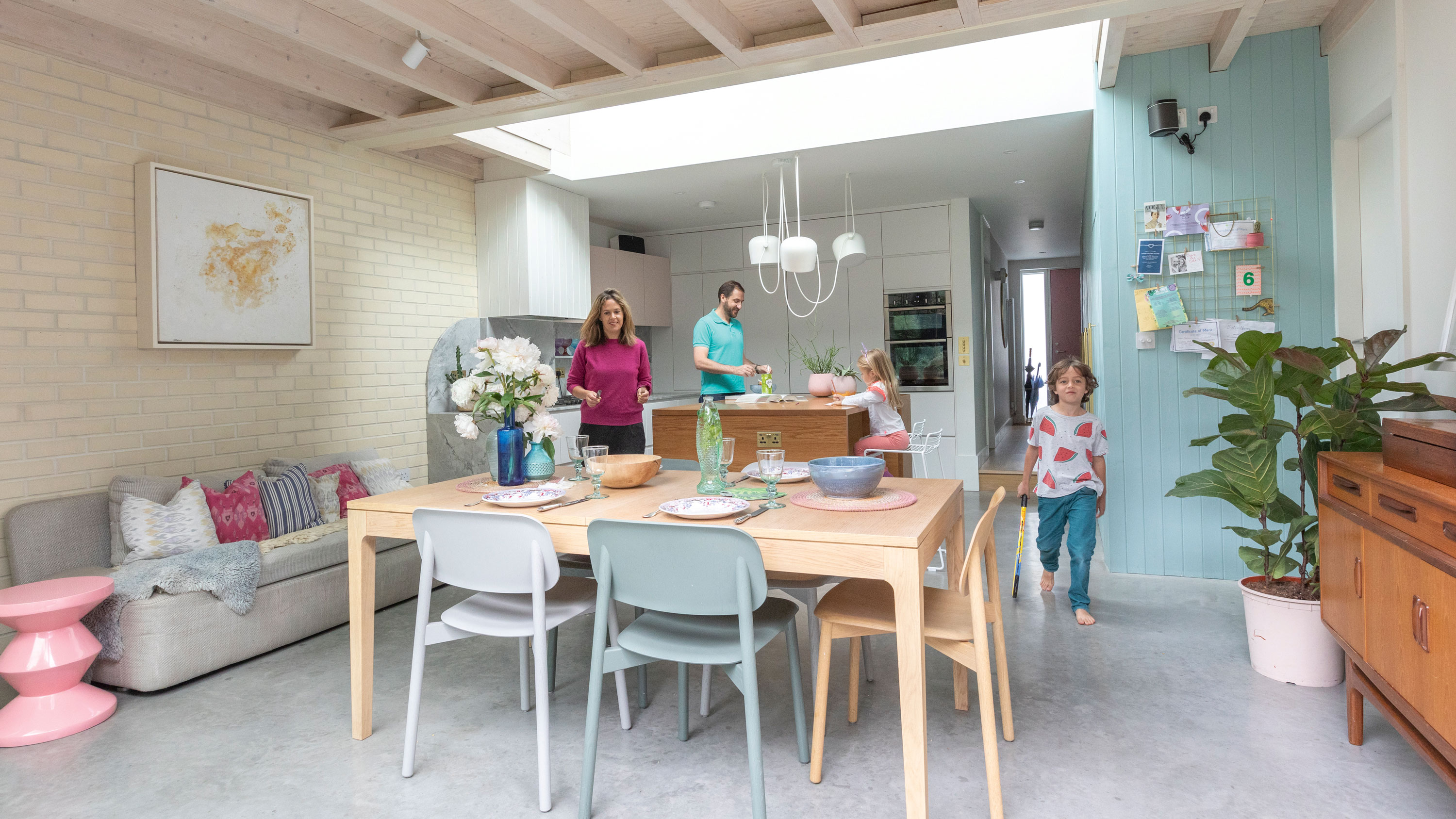

From elaborate mantlepieces to stained glass windows, period houses often come with a host of beautiful original features. But for those of us with a more modern property, it can be difficult to make our own mark. For Anna and John, the answer came in the form of an extension and some clever design trickery. In expanding their kitchen-diner, they’ve created a unique space with high ceilings and exposed woodwork that contrasts with the original 1950s structure of their terraced home.
The couple have plenty of experience between them. John, an architect, lent his eye for clean lines and utilitarian design to the house, creating a family home that’s pleasing to look at as well as practical. Meanwhile, Anna’s skills as a colour consultant and painter has given each room a character of its own. The ice-cream tones of the kitchen complement the neon colour pops in the children’s bedroom, while the adults-only living room is set apart with a dark and moody scheme.
We have masses of ideas and helpful advice on what to do if you are extending a house, like Anna and John. And for more inspiring real home transformations, head to our hub page.
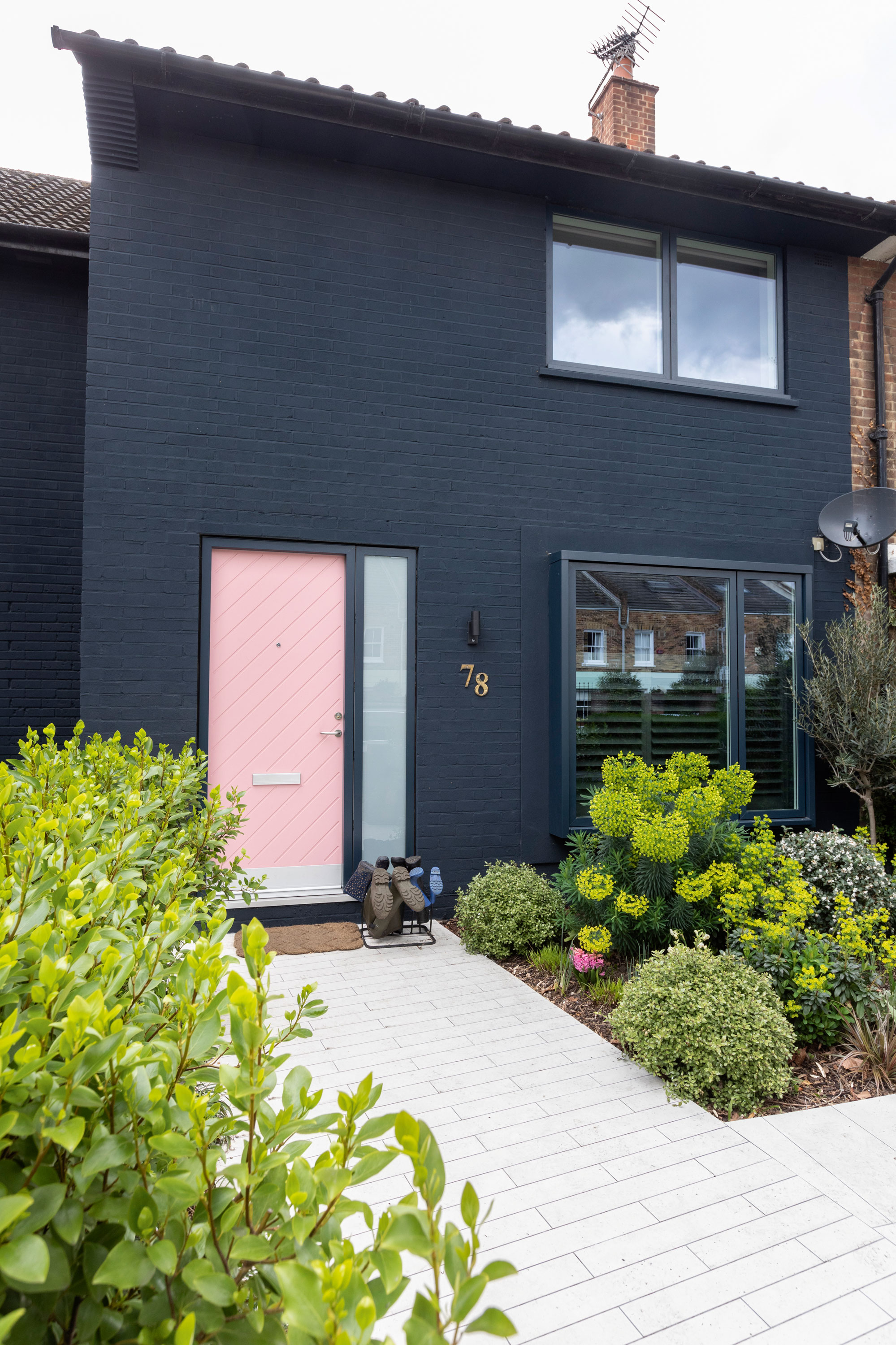
‘We replaced the windows and decided to give the exterior a new identity at the same time,’ Anna says. ‘The colour is quite exciting and a bit unusual. It sets off the plants at the front and adds a bit of drama.’ Brick painted in Basalt, Little Greene. Door, Velfac. Paving, Mosa
Profile
The owners Anna Proctor, an artist and colour consultant (annaproctor.com), lives with her husband, John, director and architect at Proctor & Shaw, and their children, Rufus and Scarlett
The property A four-bedroom 1950s terrace in Battersea, London
Project cost £320,000
‘John got very excited before he’d even seen the house in the flesh,' Anna recalls. 'He immediately went to his office and sketched a quick plan of what he thought we might do. We’d already put our flat on the market because we were originally going for another house, but that fell through. A few days later, this house came up and we had an offer for our flat. It was a bit of a whirlwind. We went from thinking we wouldn’t be moving at all to selling in a week! After living in a small flat with two kids, we were understandably desperate to move.'
‘The house was very brown and unloved, with a stairlift and loads of 1970s fittings – odd metallic textured wallpaper, varnished pine ceilings, strip lighting and swirly carpets. It was a little shabby, but in some ways, that made it easier – we could just get rid of everything and start again.'
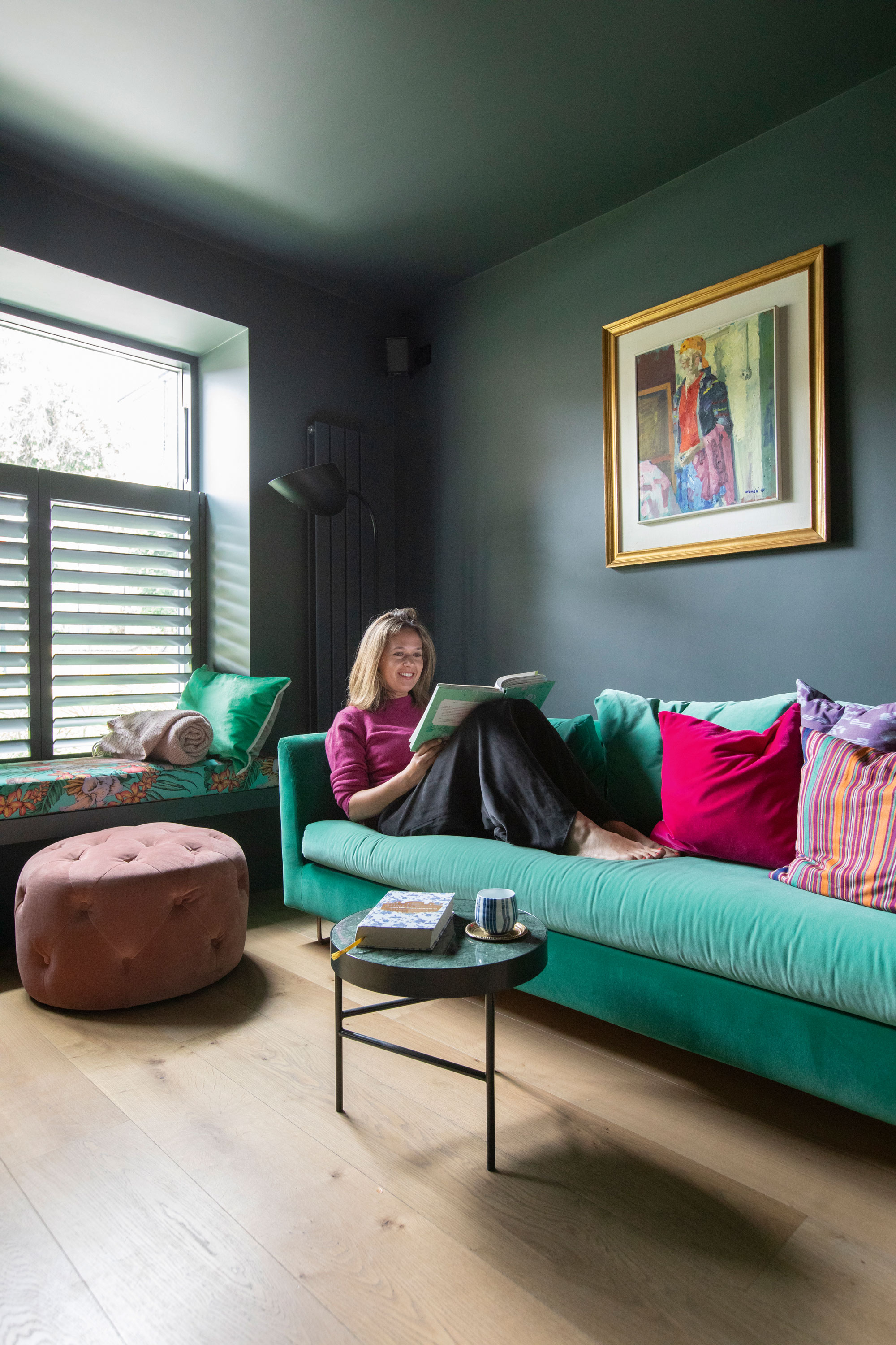
‘This is the only room in the house with a moody feel,’ Anna says. ‘We didn’t raise the ceiling in here, and it’s north-facing so it’s dark anyway. We decided to run with that and make it feel cosy and enclosed by painting the ceiling dark, too. I brought colour in through the sofa, cushions and artwork – it’s quite a vibrant space.’ Walls painted in Squid Ink, Paint & Paper Library. Floor, The Natural Wood Floor Co. Balance sofa, Designers Guild. Pouffe, Made. Window seat covered in Matthew Williamson Cubana Flamingo Club fabric, Osborne & Little. Side table, Ferm Living
‘We bought this house on probate from an elderly couple who had passed away, so it hadn’t been touched for a while, other than a few upgrades to facilitate their needs,' adds John. 'The interior needed a total facelift but I loved the width of the plot. It’s an end of terrace and because it was built in the 1950s, all the houses on the street have slightly larger gardens than their Victorian neighbours. There were purpose-built sheds attached to the mid-terrace properties, presumably to promote the use of gardens to grow fruit and vegetables amid post-war rations. Because there was already a permanent brick structure next door, we knew we should be able to pass planning for an extension with relative ease.'

‘The exposed spruce beams add height and character to a ceiling that was otherwise flat,’ Anna says. ‘Kitchens can easily become dull and unrelated to the rest of the house, though over the last few years they’ve become much more exciting, moody and colourful.’ Kitchen and island, Diamond Construction. Moonrock worktop and splashback, Marble Granite Limestone Warehouse. Pendant lights, Flos. Bar stools, Twentytwentyone. Blue cupboards painted in Constantia, Paint & Paper Library
‘Everything happened quite fast from when we first saw the property. We arranged a viewing for the same afternoon and put an offer in two days later, which was accepted almost straight away. We applied for planning and permitted development to cover all bases and booked in the builders.'
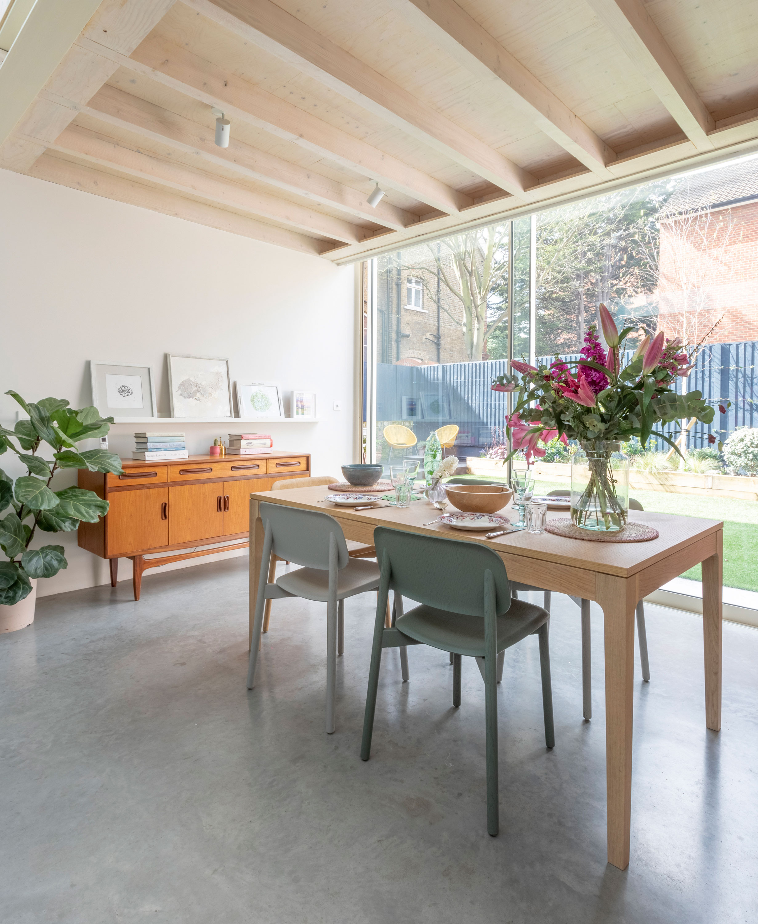
‘John’s been obsessed with having a concrete floor for as long as I’ve known him – he was building up to this moment!’ Anna says. ‘It’s a nice counterpoint to the pastel colours and other finishes in the room. The sliding doors make it easier to jump outside, and we have fake grass almost up to the door. There’s no mud, plus you get a sense of greenery all the time.’ Sliding doors, Maxlight. Dining table, Heal’s. Chairs, Twentytwentyone. Sideboard, vintage G-Plan
‘John has an amazing vision and a way of instantly knowing the potential of a house,' says Anna. 'Because this one is just outside a Conservation Area, we knew planning permission would be fairly straightforward, so we were quick to get it through and start building as soon as we moved in. We undertook a lot of work: a rear extension, loft conversion and a complete remodel of the interior. We also lowered the ground floor so that the floor level changes as you walk from the hallway to the kitchen. It gives you the extra ceiling height – 1950s houses have low ceilings – so we wanted to make the most of the airiness and open the kitchen up.'
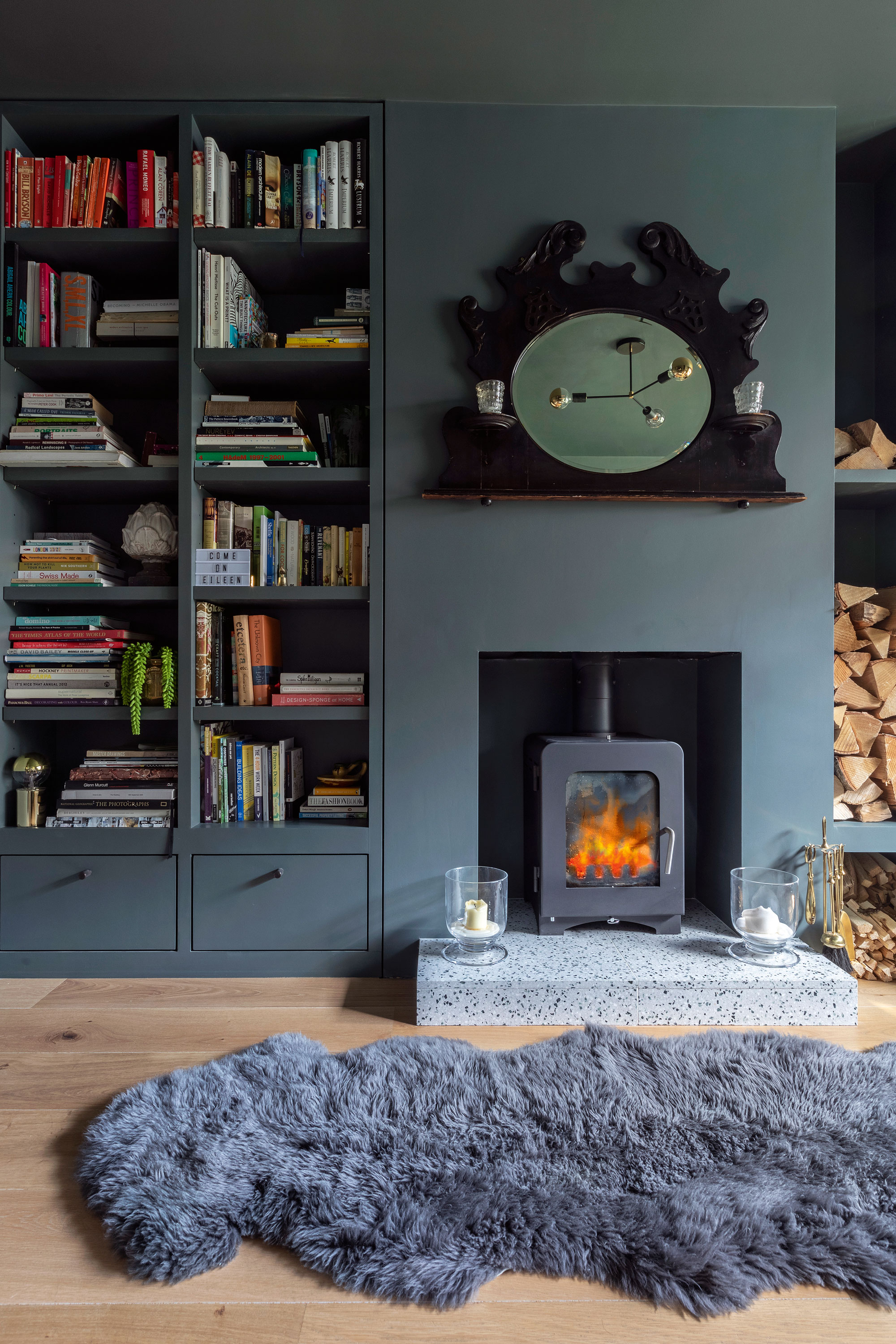
Hearth, Terrazzo Tiles. Stove, Stove Fitters Warehouse. For a blue sheepskin rug, try Dunelm
‘I’d done a couple of personal projects on our old flat and had learned to treat it as if I was working for a client,' says John. 'It’s the same process – there are no shortcuts. It was fun! Inevitably, Anna and I didn’t agree on everything, but she let me move forward with the architectural side of things. I worked with modernist concepts of clean lines, simplicity and light.'
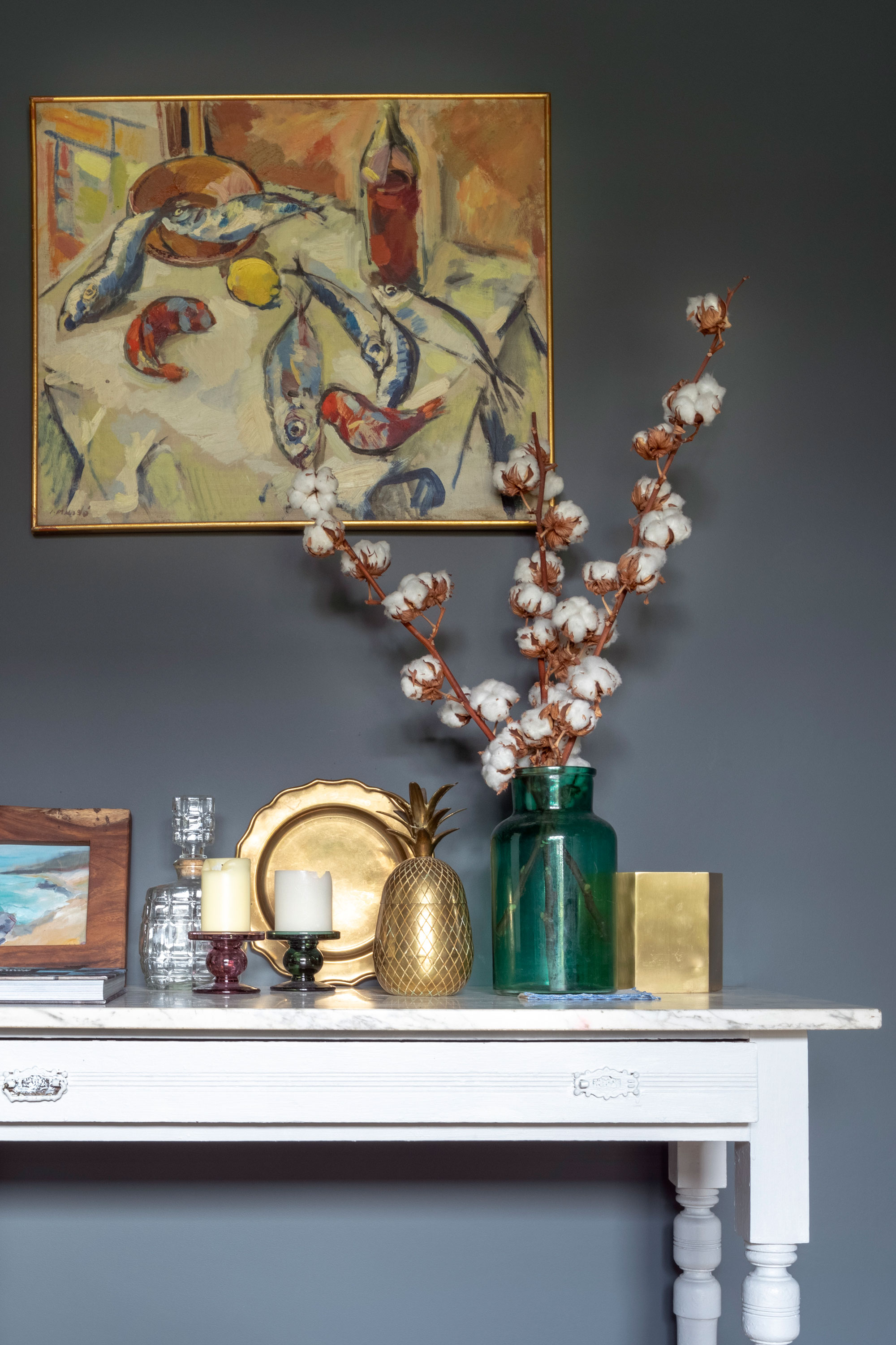
Console table, antique. Artwork over console table by Ignasi Mundo
‘The open-plan kitchen is practical with kids, and it’s great when people come over,' says Anna. 'We have family abroad and my mum lives in Oxfordshire, so she comes and stays for days at a time. We don’t have a lot of reception rooms – just a small living room at the front of the house and John’s office – so in terms of usable space, the kitchen really is the hub of the home.'
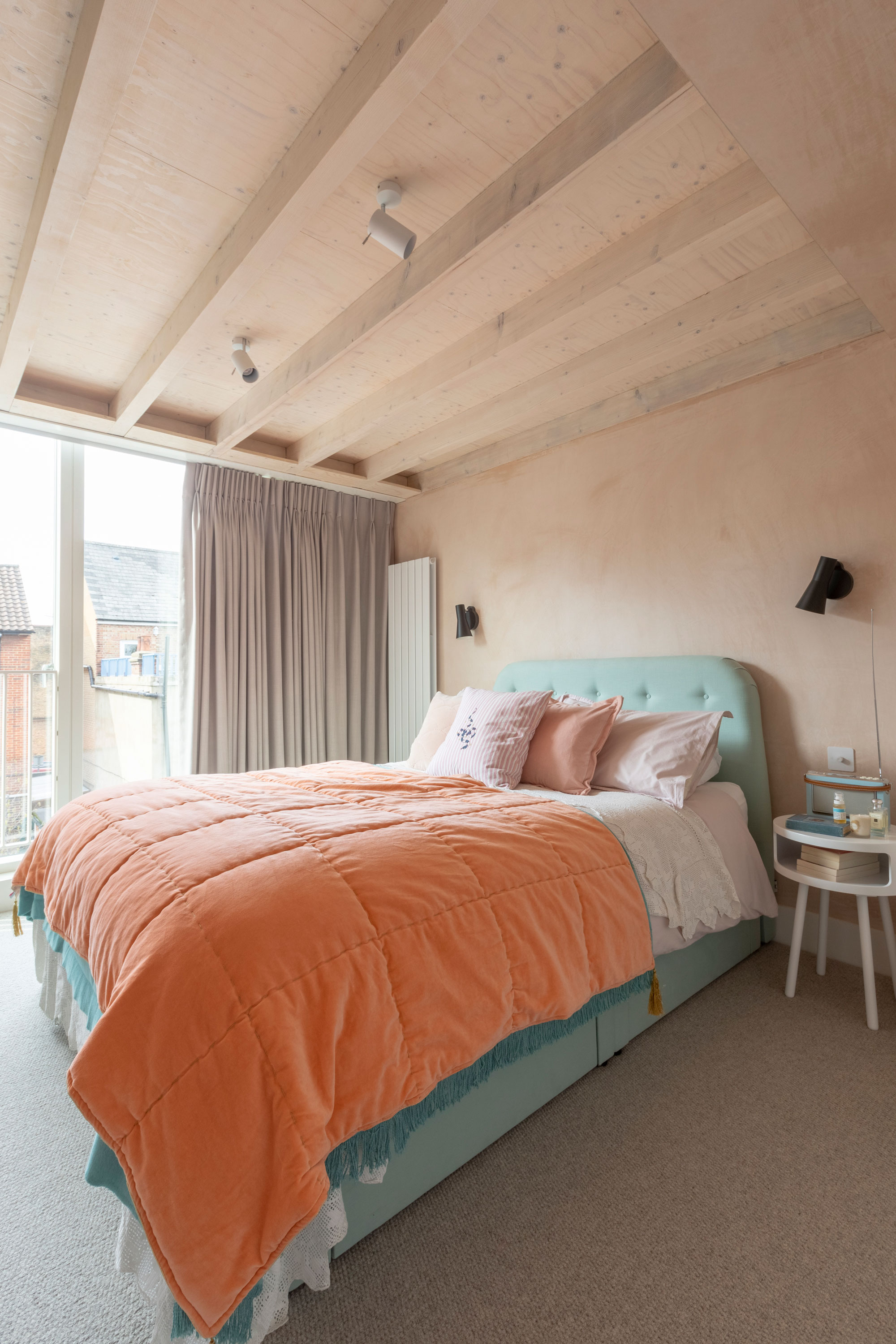
‘We decided on a sliding door in the loft bedroom, which we can part-open, to add ventilation. When we discussed the design of this space, we initially considered adding a balcony so we could sit out there for cocktails of an evening. We’d never have done it, though – not with kids around!’ Carpet, Carpetright. Sliding door, Velfac. Bed, Loaf. Throw, Rice. Wall lights, DM Lights. Curtains, Elegant Curtains. Bedside tables, Habitat
‘Previously, there were two bathrooms on the first floor. We knocked into one of them to create the kids’ bedroom. It stretches across the width of the house, with a window on each side of the room. It was originally the master bedroom, but we decided the kids needed the space more than we did. Our bedroom in the loft is a little smaller, but we have built-in storage in the eaves and a handy shower room. It made sense, with a project of this scale, to take on a loft conversion too – it adds value to the house.'
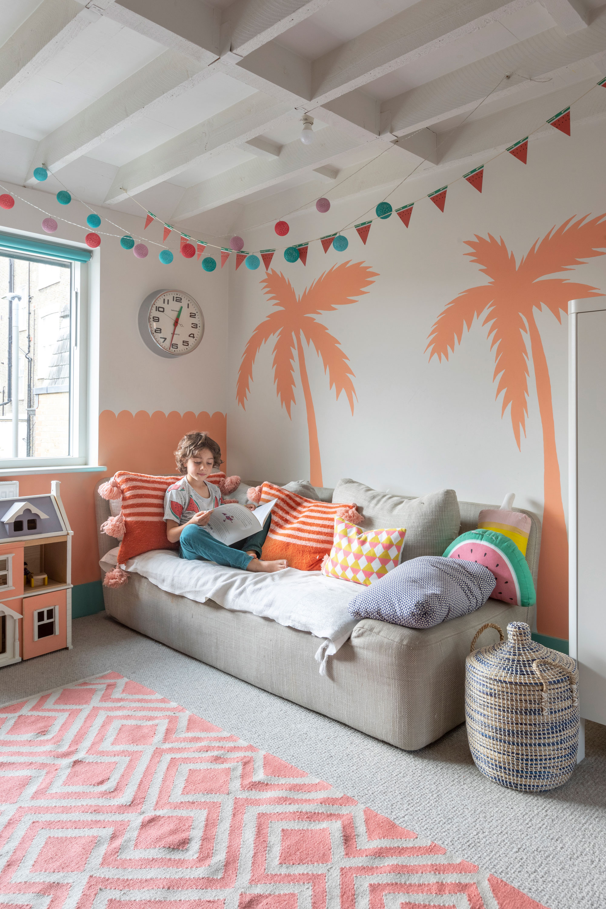
‘Giving the kids the bigger bedroom means they keep all their toys upstairs, they can play with their friends there when they come round, and it’s handy when people come to stay because guests can take the sofa,’ Anna says. Carpet, Carpetright. Rug, Weaver Green. Sofa, Habitat
‘If we had more money, we might have added a double-height extension to the back of the house, but I think it would have made us too close to neighbours upstairs – it’s quite a built-up area and there’s not much privacy. It’s easy to analyse every decision you’ve made, especially when you see so many cool new projects on Instagram – but you’ve got to make your mind up and go with what you like. Trust your gut.’
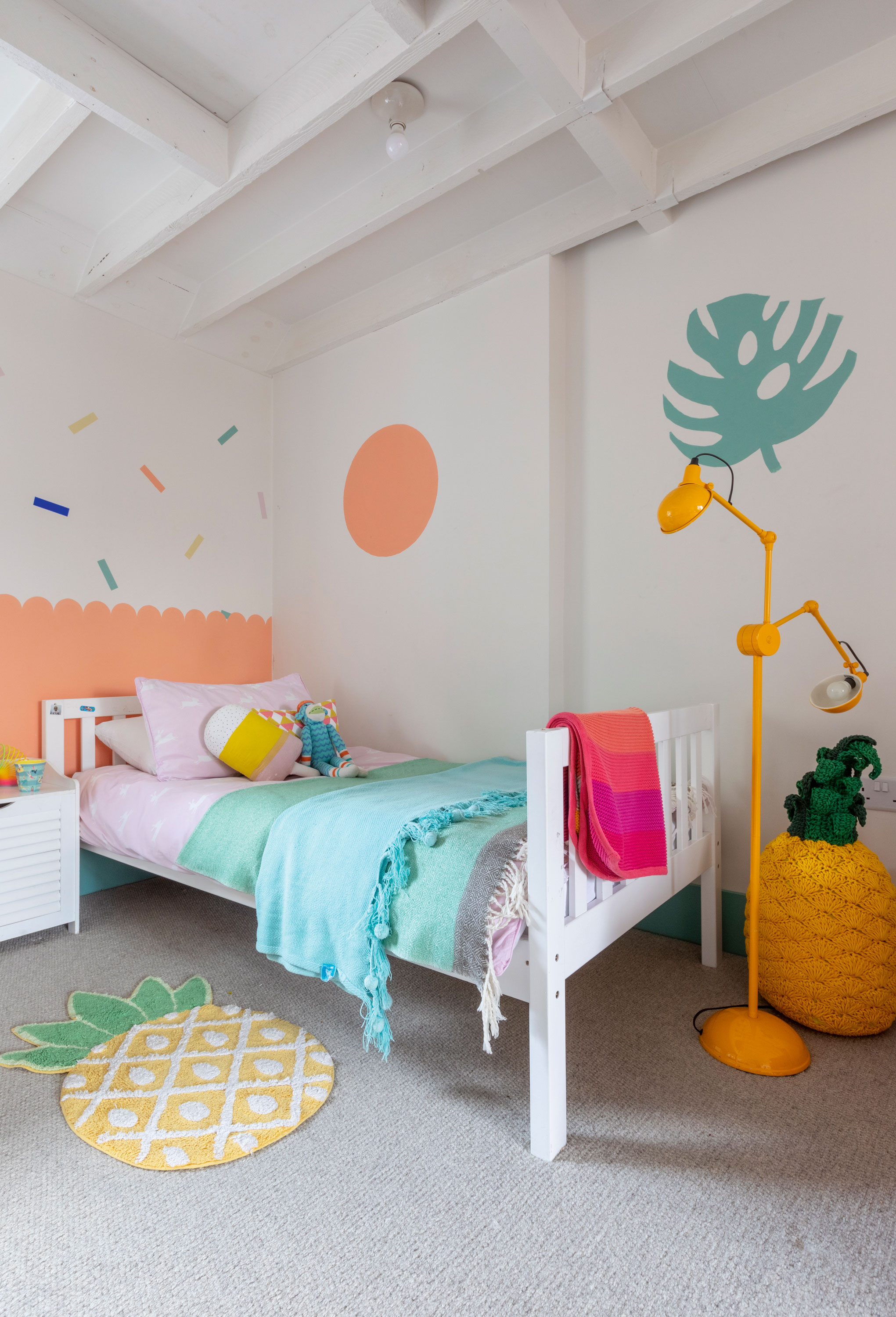
‘We lived in the Bahamas for a few years and Rufus was born over there, so this scheme is a nod to that time,’ Anna says. ‘I painted the beams white and they made the room look like a beach bar from that area, so I decided to continue the theme by painting some trees and decorations.’ Wall graphics painted in Bongo Jazz 3, Dulux, and Deep Water Green, Paint & Paper Library. Carpet, Carpetright. Bunk bed, divided in two, John Lewis & Partners. Rug, Sass & Belle. Floor lamp, Habitat. Anne-Claire Petit woven pineapple, The Conran Shop
‘Anna took the lead on the colours and the final interior touches,' John reveals. 'There was a bit of arm wrestling over it, but she has a good eye. We started with a key material palette – the magnolia brick of the extension, the concrete floor and the exposed ceiling – and the colours we’ve used enhance that. One of our friends described the palette as “island chic”, another as “1950s ice cream”! It feels appropriate – everything from the colours to the materials are a nod to the mid-century soul of the house.'
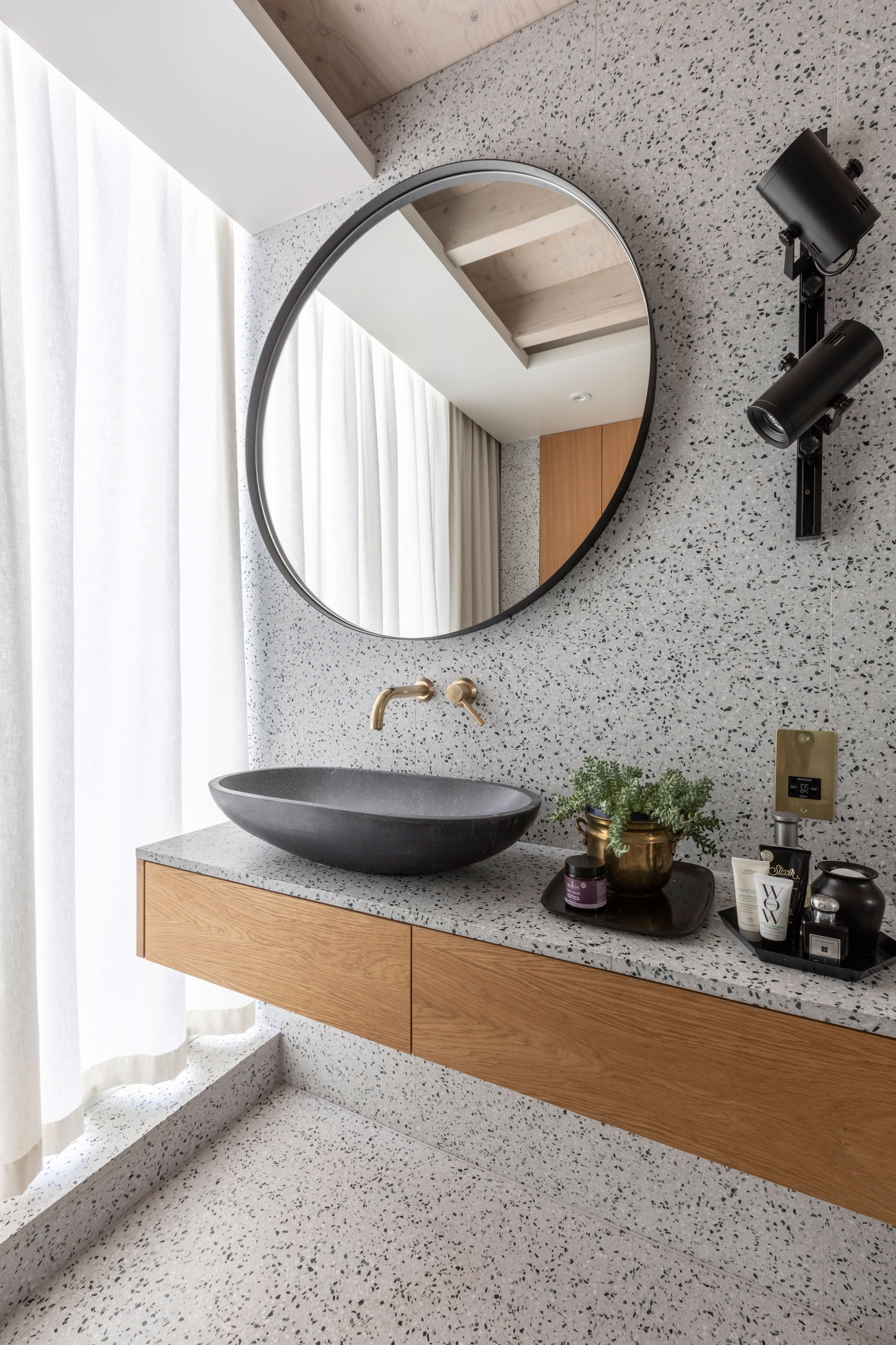
‘John was in charge of the en suite bathroom, so it’s quite minimal,’ Anna says. ‘The terrazzo has an interesting pattern that prevents the space from looking flat. It’s not a massive room, so we wanted to keep it simple, but it feels luxurious. Our old shower room was tiny with no windows – this is a real treat.’ Wall and floor tiles, Terrazzo Tiles. Sink, Ebay. Tap, Vado. Wall lights, DM Lights. For a similar mirror, try Maisons du Monde
Contacts
Architect Proctor & Shaw
Kitchen Diamond Construction
‘The project has been life-changing. Living in a small flat with two kids was difficult. Now they have enough room to express themselves under the same roof, it’s a lot more manageable. They don’t clutter up the downstairs family space, which was a real drag in the flat. The house has a real sense of space and luxury.'
Subscribe to Real Homes magazine
Want even more great ideas for your home from the expert team at Real Homes magazine? Subscribe to Real Homes magazine and get great content delivered straight to your door. From inspiring completed projects to the latest decorating trends and expert advice, you'll find everything you need to create your dream home inside each issue.
More reading
- Bi-fold and sliding doors: choose what's right for your home
- Fun playroom design ideas to get you inspired
- Beautiful living room paint ideas to try
Join our newsletter
Get small space home decor ideas, celeb inspiration, DIY tips and more, straight to your inbox!

Formerly deputy editor of Real Homes magazine, Ellen has been lucky enough to spend most of her working life speaking to real people and writing about real homes, from extended Victorian terraces to modest apartments. She's recently bought her own home and has a special interest in sustainable living and clever storage.
-
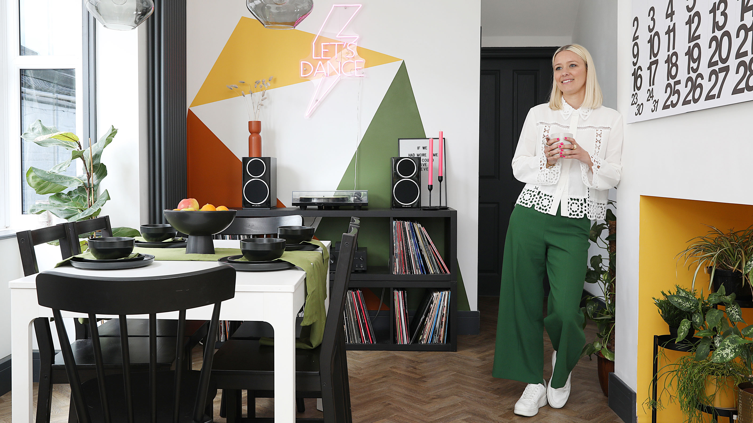 This colourful home makeover has space for kitchen discos
While the front of Leila and Joe's home features dark and moody chill-out spaces, the rest is light and bright and made for socialising
By Karen Wilson
-
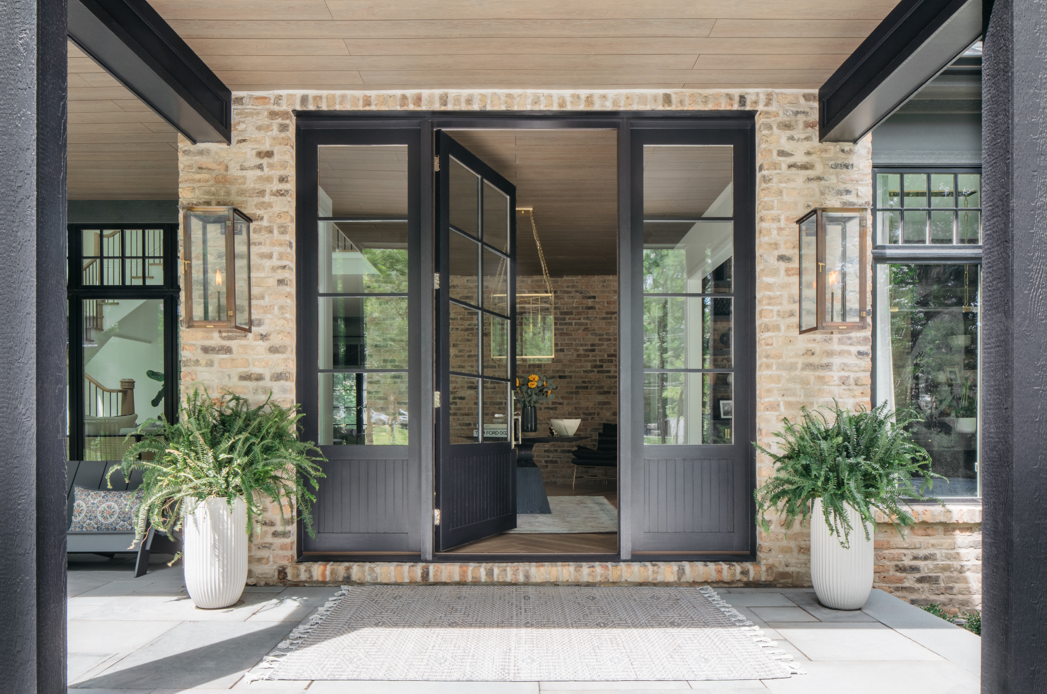 How to paint a door and refresh your home instantly
Painting doors is easy with our expert advice. This is how to get professional results on front and internal doors.
By Claire Douglas
-
 DIY transforms 1930s house into dream home
With several renovations behind them, Mary and Paul had creative expertise to draw on when it came to transforming their 1930s house
By Alison Jones
-
 12 easy ways to add curb appeal on a budget with DIY
You can give your home curb appeal at low cost. These are the DIY ways to boost its style
By Lucy Searle
-
 5 invaluable design learnings from a festive Edwardian house renovation
If you're renovating a period property, here are 5 design tips we've picked up from this festive Edwardian renovation
By Ellen Finch
-
 Real home: Glazed side extension creates the perfect garden link
Louise Potter and husband Sean's extension has transformed their Victorian house, now a showcase for their collection of art, vintage finds and Scandinavian pieces
By Laurie Davidson
-
 I tried this genius wallpaper hack, and it was perfect for my commitment issues
Beware: once you try this wallpaper hack, you'll never look back.
By Brittany Romano
-
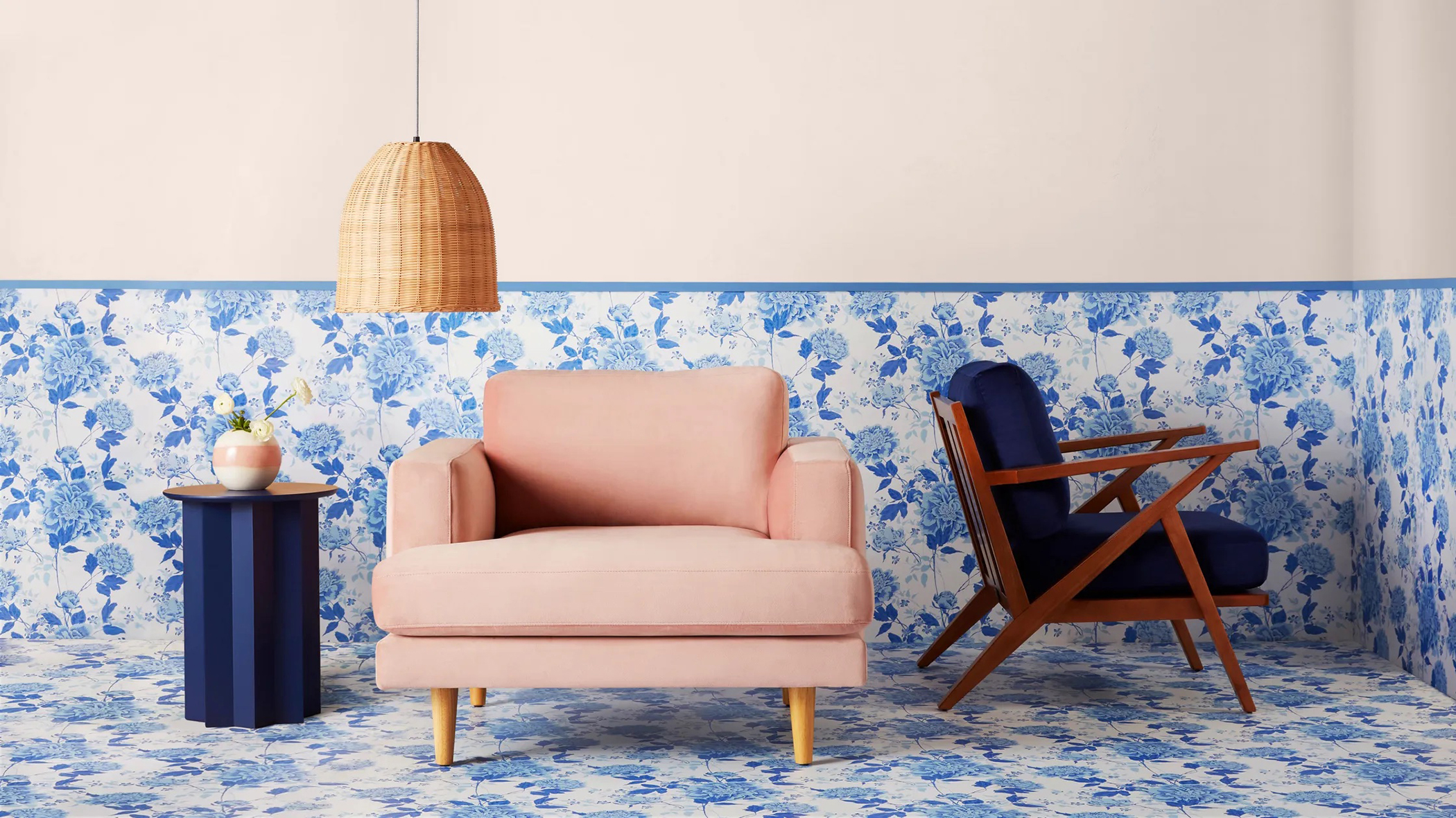 Drew Barrymore's new FLOWER Home paint collection wants to give your walls a makeover
Drew Barrymore FLOWER drops 27 brand-new paint shades, and every can is made from 100% post-consumer recycled plastic.
By Brittany Romano
